

Orange and cream sit in that sweet spot between playful citrus and comforting neutral. It brings warmth without overpowering your layout, making it easy to use across branding, UI, and print.
Below are 20 orange and cream color combinations with HEX codes, plus practical tips and AI prompts you can reuse to generate matching visuals.
In this article
Why Orange and Cream Combinations Work So Well
Orange cream color palettes feel inviting because they combine a sunny hue with a soft, milky base. The result is warm and friendly, but still light enough for modern layouts.
They’re also naturally flexible: cream can carry backgrounds and negative space, while orange becomes a clear accent for CTAs, badges, highlights, or seasonal cues.
Finally, orange and cream play nicely with both neutrals and contrast colors. Add browns for an earthy premium tone, charcoal for clean readability, or greens/teals to cool the warmth for a fresher balance.
20 Orange and Cream Color Combination Ideas (with HEX Codes)
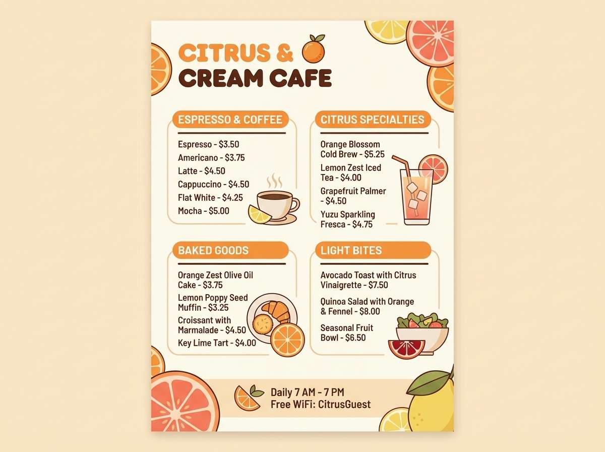
1) Citrus Silk
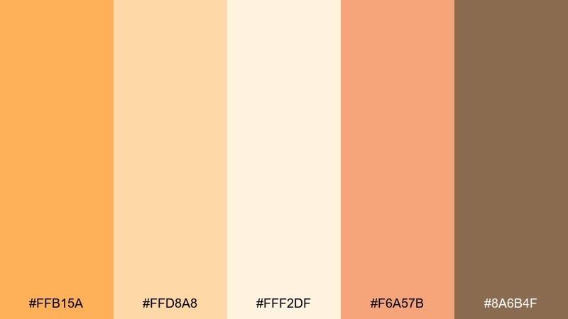
HEX: #FFB15A #FFD8A8 #FFF2DF #F6A57B #8A6B4F
Mood: bright, airy, welcoming
Best for: cafe branding and menu design
Bright and airy like a morning juice bar, these orange and cream tones feel friendly and modern. Use the cream as your base, then let the orange lead for headers, badges, and price highlights. Pair with warm brown for typography to keep it readable without turning harsh. Tip: reserve the deepest shade for small accents like icons and separators so the layout stays light.
Image example of citrus silk generated using media.io
Media.io is an online AI studio for creating and editing video, image, and audio in your browser.

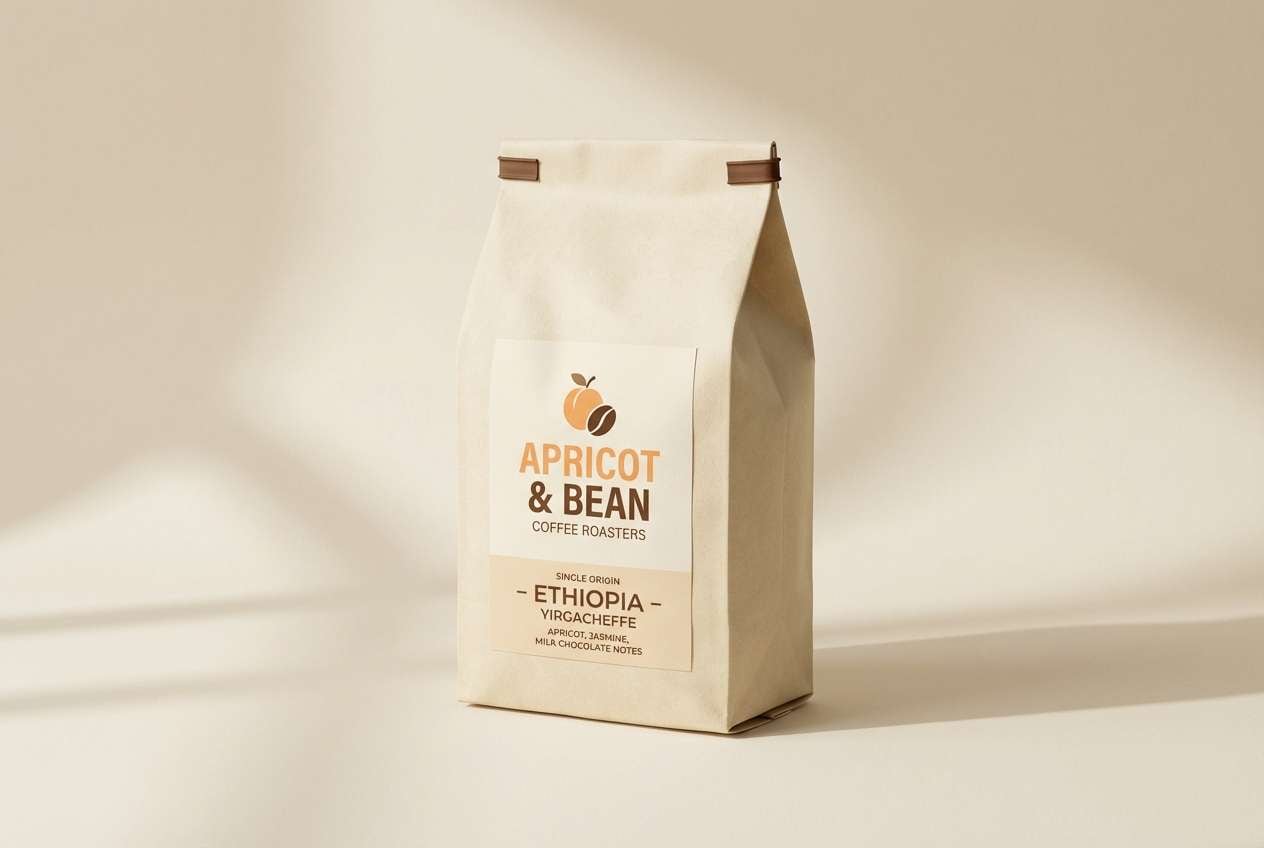
2) Apricot Latte
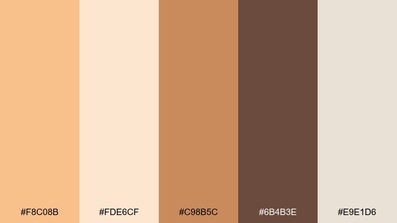
HEX: #F8C08B #FDE6CF #C98B5C #6B4B3E #E9E1D6
Mood: cozy, grounded, sophisticated
Best for: coffee packaging and label design
Cozy and grounded like steamed milk with a dash of spice, this set leans artisanal. The orange cream color palette works best when the light tones carry the label background and the darker coffee browns frame key info. Add the mid apricot as a band or seal to create a premium focal point. Tip: use matte finishes and minimal line art so the warmth reads upscale, not loud.
Image example of apricot latte generated using media.io
3) Sunset Sorbet
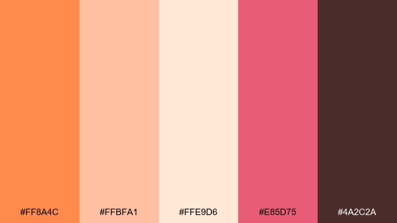
HEX: #FF8A4C #FFBFA1 #FFE9D6 #E85D75 #4A2C2A
Mood: playful, flirty, energetic
Best for: beauty social ads and promo posts
Playful like a sunset gelato scoop, the peach and rose notes feel instantly shareable. Keep the cream as negative space, then use the brighter orange for callouts and the rose for limited-time tags. The deep cocoa shade anchors text so the post stays legible on mobile. Tip: limit gradients to small areas so the palette still looks crisp in feeds.
Image example of sunset sorbet generated using media.io

4) Marmalade Minimal
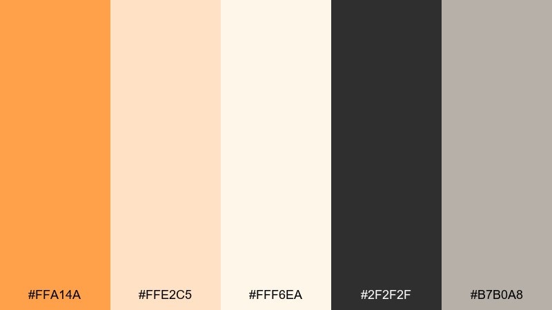
HEX: #FFA14A #FFE2C5 #FFF6EA #2F2F2F #B7B0A8
Mood: minimal, modern, confident
Best for: startup landing pages and UI
Minimal and confident, these tones feel like clean sunlight on paper with a sharp ink edge. An orange and cream color combination like this shines when the creams handle large surfaces and the orange is saved for one primary action. Use charcoal for body copy and the warm gray for borders, chips, and disabled states. Tip: keep the orange at one saturation level across components to maintain a consistent UI rhythm.
Image example of marmalade minimal generated using media.io

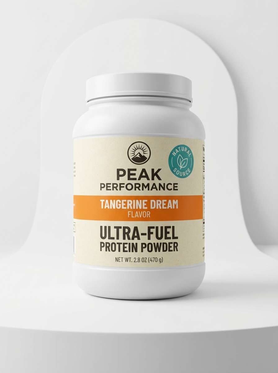
5) Creamsicle Pop
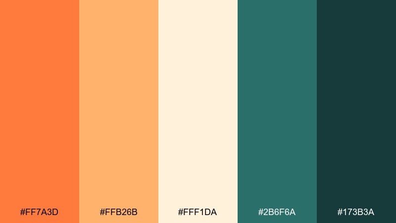
HEX: #FF7A3D #FFB26B #FFF1DA #2B6F6A #173B3A
Mood: bold, fresh, contemporary
Best for: sports nutrition packaging
Bold and fresh, the teal contrast makes the warm oranges feel extra crisp. Use the cream for breathing room on labels, then push the saturated orange for flavor cues and energy. The deep teal works well for ingredient panels and compliance text without looking clinical. Tip: keep teal as a secondary block color so the orange stays the hero.
Image example of creamsicle pop generated using media.io
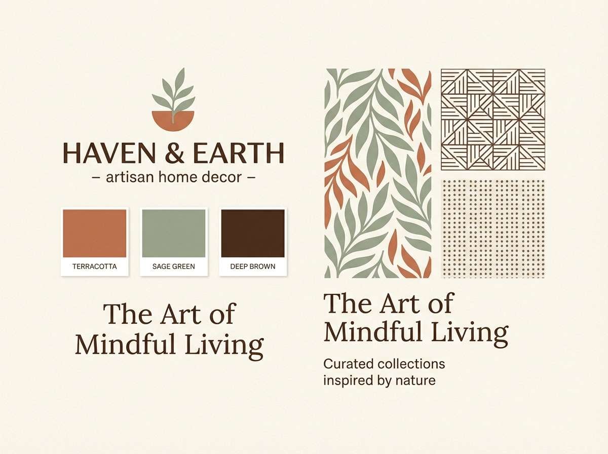
6) Terracotta Whisper
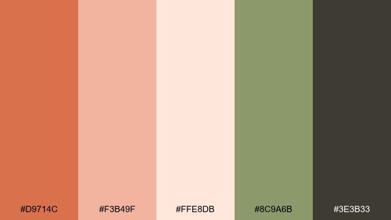
HEX: #D9714C #F3B49F #FFE8DB #8C9A6B #3E3B33
Mood: earthy, calm, refined
Best for: home decor brand identity
Earthy and calm, it evokes sun-baked clay, linen throws, and olive branches on a shelf. These orange and cream color combinations feel best when the greens are used as subtle supporting accents rather than loud blocks. Pair the deep charcoal-brown with generous spacing for a premium, editorial look. Tip: apply the terracotta to textures like patterns or borders to add depth without crowding the page.
Image example of terracotta whisper generated using media.io
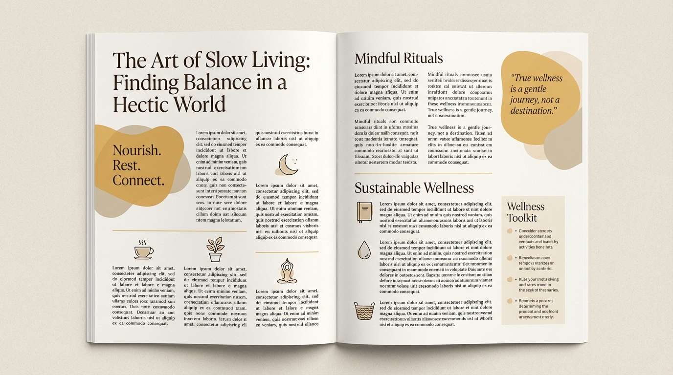
7) Honeyed Sand
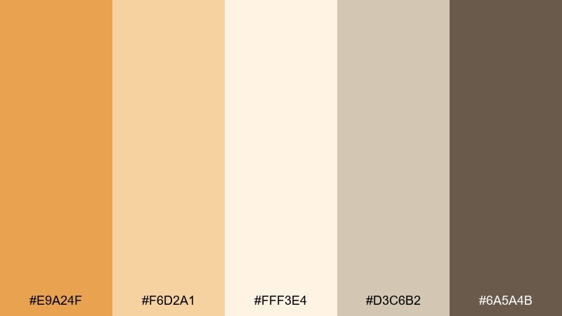
HEX: #E9A24F #F6D2A1 #FFF3E4 #D3C6B2 #6A5A4B
Mood: soft, natural, understated
Best for: wellness blog design and editorial
Soft and natural, these shades read like dunes, oats, and warm honey in afternoon light. Let the palest cream sit behind long-form text, then use the sand and taupe tones for pull quotes and section breaks. The deeper brown keeps headlines grounded without feeling stark. Tip: choose a serif headline font to amplify the calm, editorial vibe.
Image example of honeyed sand generated using media.io
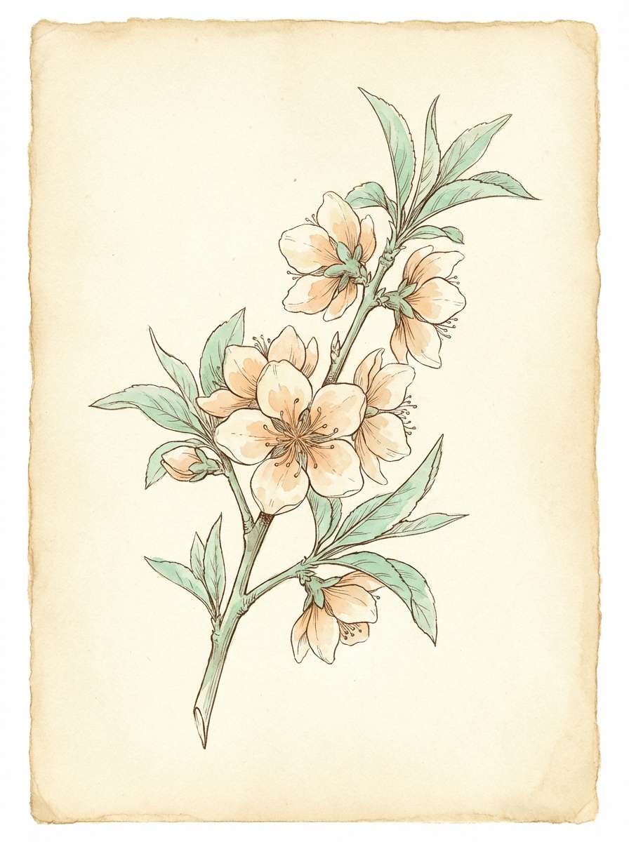
8) Peach Blossom
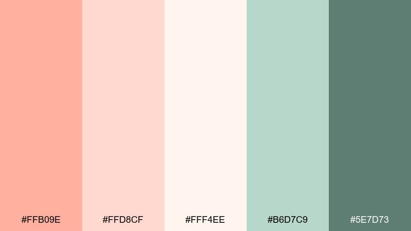
HEX: #FFB09E #FFD8CF #FFF4EE #B6D7C9 #5E7D73
Mood: gentle, romantic, springlike
Best for: botanical illustration sets
Gentle and springlike, it feels like petals, soft light, and fresh leaves. The minty greens balance the peach tones and keep the overall look airy. Use the darker green for fine linework and captions so details stay clear on pale backgrounds. Tip: keep washes transparent so the cream tone shows through and unifies the artwork.
Image example of peach blossom generated using media.io
9) Copper Candlelight
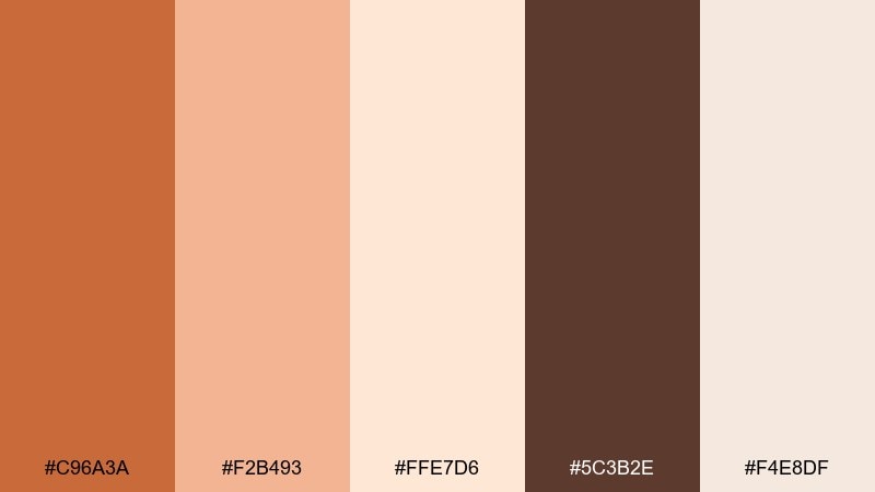
HEX: #C96A3A #F2B493 #FFE7D6 #5C3B2E #F4E8DF
Mood: warm, intimate, vintage
Best for: restaurant posters and specials
Warm and intimate, this orange cream color palette brings to mind candlelit tables and copper cookware. Use the pale creams for background space, then set menus or posters in rich cocoa for a classic, readable look. The copper shade works beautifully for borders, stamps, and small decorative icons. Tip: add a subtle paper grain effect to enhance the vintage mood without muddying the colors.
Image example of copper candlelight generated using media.io

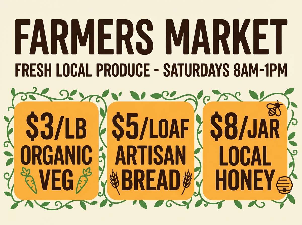
10) Vanilla Orchard
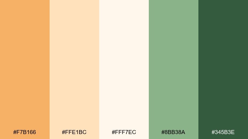
HEX: #F7B166 #FFE1BC #FFF7EC #8BB38A #345B3E
Mood: fresh, wholesome, outdoorsy
Best for: farmers market signage
Fresh and wholesome, it feels like orchard fruit, chalk signs, and leafy baskets. The greens keep the warm tones from feeling too dessert-like, making it great for produce-forward brands. Use the dark green for pricing and key labels, then let orange highlight seasonal picks. Tip: stick to simple shapes and big type so signs stay readable from a distance.
Image example of vanilla orchard generated using media.io
11) Retro Diner
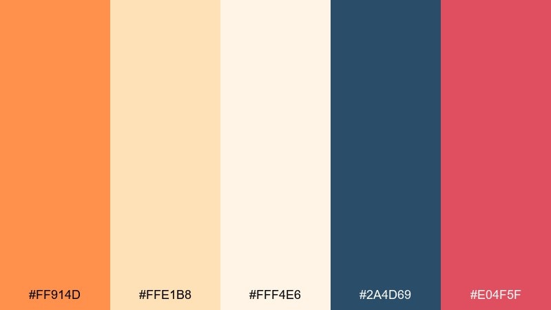
HEX: #FF914D #FFE1B8 #FFF4E6 #2A4D69 #E04F5F
Mood: retro, upbeat, graphic
Best for: event flyers and themed nights
Retro and upbeat, it channels neon signage softened into friendly print tones. These orange and cream color combinations pop when you use navy for structure and the pink-red for punchy callouts. Keep the lighter creams for large fields so the poster does not feel overcrowded. Tip: use chunky sans type and simple geometric badges to lock in the diner vibe.
Image example of retro diner generated using media.io

12) Spiced Coral
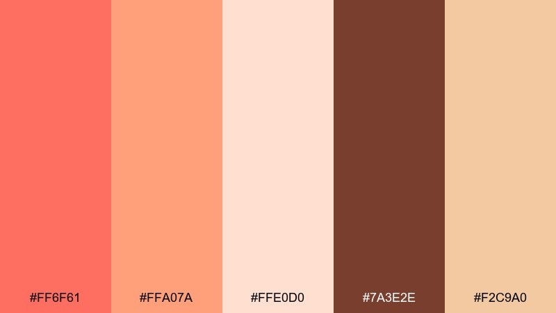
HEX: #FF6F61 #FFA07A #FFE0D0 #7A3E2E #F2C9A0
Mood: confident, warm, expressive
Best for: makeup launch landing pages
Confident and warm, it reads like coral lipstick against a creamy backdrop. Use the spiced brown for body text and navigation so the brighter coral can stay focused on hero moments. The peach tones are ideal for background gradients that feel smooth rather than loud. Tip: keep buttons in the deeper coral and use lighter peach for hover states to maintain contrast.
Image example of spiced coral generated using media.io
13) Coastal Cream
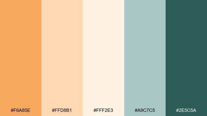
HEX: #F6A85E #FFD8B1 #FFF2E3 #A9C7C5 #2E5C5A
Mood: relaxed, clean, breezy
Best for: travel blog headers and thumbnails
Relaxed and breezy, it suggests sunlit boardwalks and weathered sea glass. The seafoam tones cool the warm oranges just enough for a balanced, modern look. Use deep teal for text overlays on thumbnails, and keep the cream for airy negative space. Tip: place orange accents near faces or focal points to guide the scroll.
Image example of coastal cream generated using media.io

14) Autumn Market
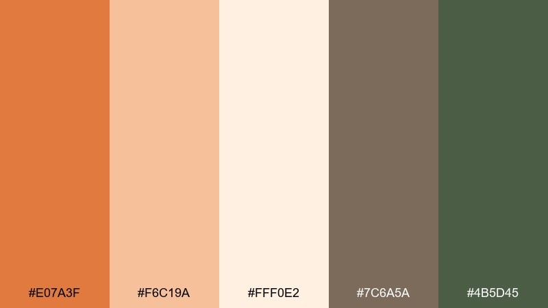
HEX: #E07A3F #F6C19A #FFF0E2 #7C6A5A #4B5D45
Mood: seasonal, rustic, inviting
Best for: fall promo banners and emails
Seasonal and inviting, it feels like pumpkins, kraft paper, and bundled herbs. Use the light cream for the email body, then layer orange for buttons and offer tags. The olive green works well for small iconography and dividers, adding a natural touch. Tip: keep promos to one accent color per module so the message stays clear.
Image example of autumn market generated using media.io

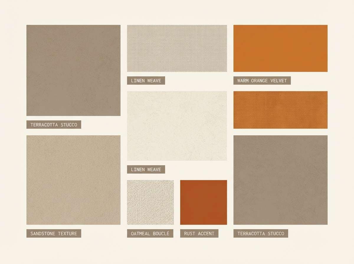
15) Desert Stucco
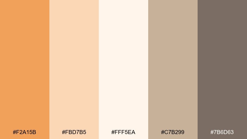
HEX: #F2A15B #FBD7B5 #FFF5EA #C7B299 #7B6D63
Mood: sunlit, neutral, architectural
Best for: interior design mood boards
Sunlit and architectural, it looks like stucco walls, clay tiles, and soft shadows. An orange cream color palette like this works beautifully for mood boards where you want warmth without clutter. Keep the mid neutrals for materials and swatches, and use the deeper taupe for captions and measurements. Tip: repeat the same cream tone behind every tile to make mixed textures feel cohesive.
Image example of desert stucco generated using media.io
16) Soft Typography
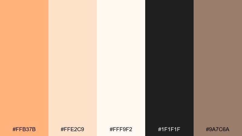
HEX: #FFB37B #FFE2C9 #FFF9F2 #1F1F1F #9A7C6A
Mood: calm, readable, modern
Best for: editorial websites and blogs
Calm and highly readable, it feels like warm paper with crisp ink. Use the near-white cream for long sections, then bring in the orange as a gentle highlight for links and category chips. The soft taupe is perfect for secondary text and metadata without losing hierarchy. Tip: set headings in charcoal and keep orange to interactive elements for a clean, accessible layout.
Image example of soft typography generated using media.io
17) Bridal Brunch

HEX: #F7A36B #FFD7C2 #FFF6EF #D8B4C8 #6B4A5A
Mood: romantic, celebratory, elegant
Best for: wedding invitations and RSVP cards
Romantic and celebratory, it brings to mind blush florals, mimosas, and soft linen. Use cream as the paper base, then layer peach and mauve for borders, monograms, and subtle motifs. The deep plum shade is ideal for names and key details to keep contrast high. Tip: foil the darkest tone sparingly on a crest or date line for a refined finish.
Image example of bridal brunch generated using media.io
18) Kids Storybook
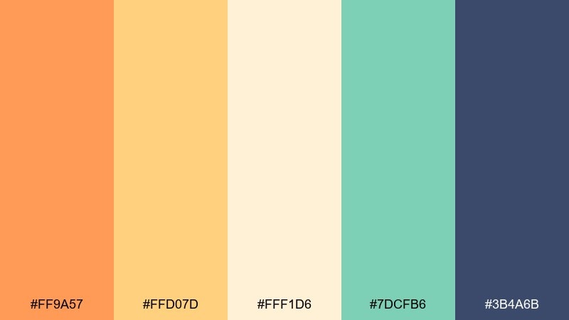
HEX: #FF9A57 #FFD07D #FFF1D6 #7DCFB6 #3B4A6B
Mood: cheerful, playful, friendly
Best for: children book covers and posters
Cheerful and playful, it feels like sticker packs, sunny snacks, and friendly characters. Use the cream as a soft page tone, then let orange and yellow carry the main illustrations. The mint keeps it fresh, while the deep blue is excellent for titles and outlines. Tip: keep backgrounds simple so the bright elements read clearly for young audiences.
Image example of kids storybook generated using media.io

19) Artisan Bakery
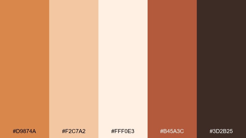
HEX: #D9874A #F2C7A2 #FFF0E3 #B45A3C #3D2B25
Mood: handmade, warm, appetizing
Best for: bakery storefront sign and stickers
Handmade and appetizing, it evokes toasted crusts, cinnamon, and warm paper bags. Use the cream and light tan for backgrounds, then pick the richer browns for typography to keep everything legible. The orange-brown makes a great highlight for flavor notes, stickers, and stamp marks. Tip: try a single-color illustration style so the palette feels cohesive across signage and packaging.
Image example of artisan bakery generated using media.io

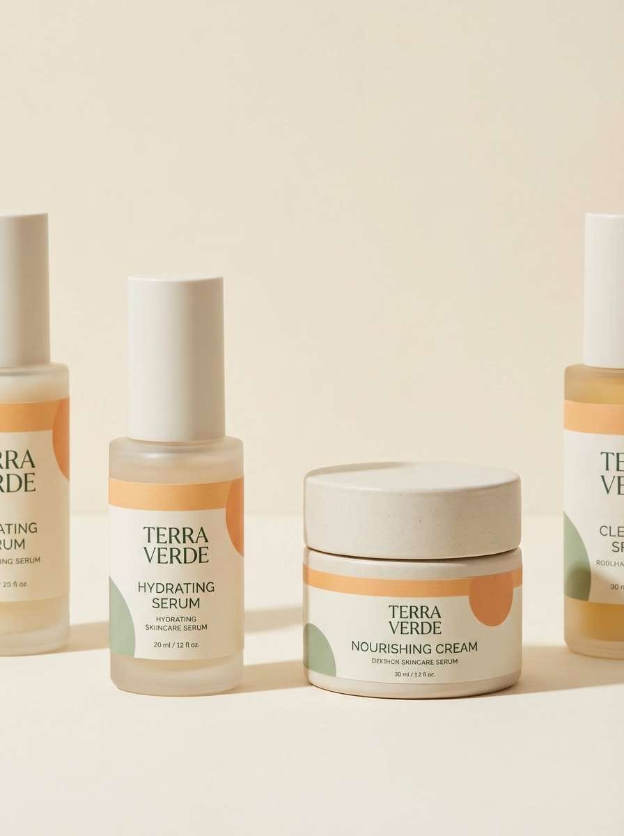
20) Modern Spa

HEX: #F4A96B #FFE0C4 #FFF7EE #9BB7A6 #2C4A3E
Mood: serene, clean, restorative
Best for: skincare product ads and packaging
Serene and restorative, these orange and cream combinations suggest warm steam, clean towels, and herbal calm. Let the creams dominate for a fresh, premium look, then add the soft orange as a gentle glow on key elements. The muted green feels botanical without turning the design too earthy. Tip: keep typography in the deep green and use orange only for small highlights like claims or scent notes.
Image example of modern spa generated using media.io
What Colors Go Well with Orange Cream?
Orange cream pairs naturally with warm neutrals like camel, taupe, and cocoa brown for a cozy, premium feel. These supporting shades help keep orange accents grounded and improve text readability.
For fresher contrast, add greens (sage, olive) or teals—cool tones that make orange feel brighter while keeping the overall palette balanced. This combo is especially useful for wellness, food, and lifestyle visuals.
If you want a modern UI look, use charcoal or near-black for typography and structure, then keep orange for interactive elements. The cream background prevents the design from feeling too sharp or sterile.
How to Use a Orange and Cream Color Combination in Real Designs
Start with cream as your base layer (pages, sections, packaging background) and treat orange as the attention color for CTAs, price tags, icons, or key labels. This keeps the design light while still guiding the eye.
Assign one dark anchor (charcoal, deep brown, or deep teal) to typography and important UI states. You’ll get consistent contrast across headings, body text, and navigation without relying on saturated orange everywhere.
For print and branding, repeat orange cream in small, consistent motifs—borders, stamps, or pattern trims—rather than large blocks. It reads more refined and helps your palette feel intentional across assets.
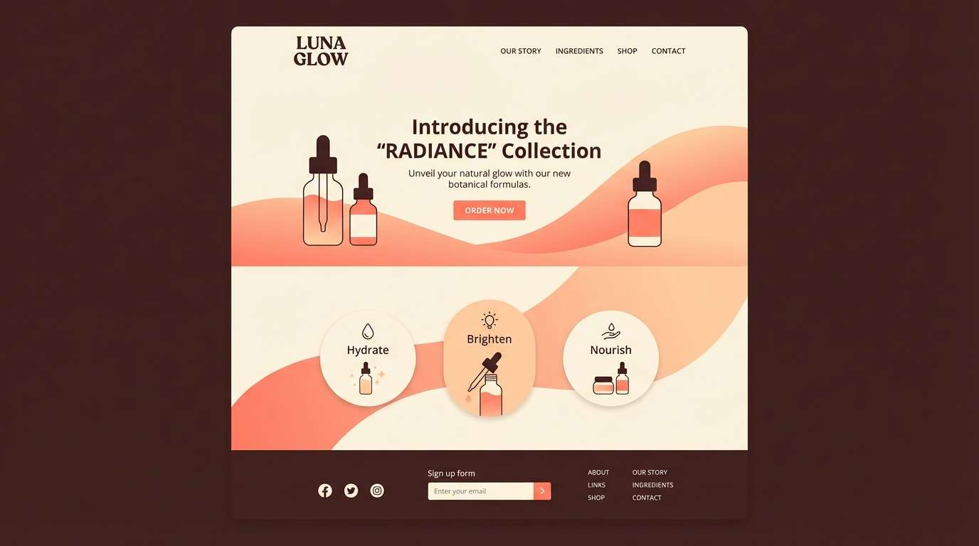
Create Orange Cream Palette Visuals with AI
If you have HEX codes but need matching visuals (posters, UI mockups, packaging, or invites), generating examples with AI helps you test mood and composition quickly. You can iterate on prompts to find the right balance of cream space and orange emphasis.
Try describing the layout first (menu, landing page hero, label, invitation), then specify “warm cream background” and add your accent colors (teal, sage, charcoal) for structure. Small prompt tweaks can shift the style from modern minimal to rustic or romantic.
Orange Cream Color Palette FAQs
-
What is an orange cream color palette?
An orange cream color palette combines warm orange tones (apricot, tangerine, peach) with soft cream or near-white neutrals, usually supported by a darker anchor color for readable text. -
Is orange cream good for website UI design?
Yes. Use cream for large backgrounds, charcoal/deep brown for text, and reserve orange for primary actions (buttons, links, badges). This keeps the interface warm while maintaining accessibility and contrast. -
What accent colors work best with orange cream?
Teal and deep green add crisp contrast, sage and olive feel earthy, and navy/charcoal create a modern structure. Soft mauves can also add a romantic, invitation-ready vibe. -
How do I keep orange cream designs from looking too “baby” or too sweet?
Add a grounded anchor (espresso brown, charcoal, deep teal) and limit saturated orange to small areas. Matte textures, minimal line art, and clean spacing also make the palette feel more premium. -
What are common uses for orange and cream combinations in branding?
They’re popular for cafes and bakeries, wellness and skincare, seasonal campaigns, and friendly startups—any brand that wants warmth, approachability, and a soft modern look. -
How many colors should I use from a 5-color palette?
A practical split is 1–2 creams as backgrounds, 1 orange as the main accent, 1 secondary accent (green/teal/rose), and 1 dark shade for type and UI structure. -
Can I generate orange cream visuals from these palettes with AI?
Yes. Use a text-to-image tool and describe the design format (poster, packaging, UI), then reference “warm cream background” and your palette’s orange/neutral/anchor tones to keep the output consistent.
Next: Coffee Color Palette


