A coffee color palette is a go-to for warm, reliable design because it blends deep browns with creamy neutrals that feel familiar and premium. From espresso-dark UI to latte-light packaging, coffee tones can look modern, cozy, or luxe depending on contrast.
Below are 20+ coffee color palette ideas with HEX codes, plus practical tips for pairing, accessibility, and generating on-brand visuals fast.
In this article
- Why Coffee Palettes Work So Well
-
- espresso crema
- cafe au lait
- mocha mist
- latte foam
- caramel drizzle
- cinnamon roast
- hazelnut glaze
- toffee bean
- brown sugar oat
- maple macchiato
- cocoa dusk
- smoky arabica
- vintage cafe sign
- desert cappuccino
- rainy roastery
- walnut linen
- sandstone brew
- copper kettle
- sable cream
- midnight pour
- cocoa canvas
- roasted almond
- forest mocha
- What Colors Go Well with Coffee?
- How to Use a Coffee Color Palette in Real Designs
- Create Coffee Palette Visuals with AI
Why Coffee Palettes Work So Well
Coffee tones sit in the warm-neutral sweet spot: they’re grounded like black or gray, but softer and more human. That makes them easy to trust for branding, packaging, and interfaces where you want calm confidence.
They also scale beautifully across contrast levels—from near-black espresso for navigation and typography to milk-foam creams for backgrounds and whitespace. With the right balance, coffee palettes can feel minimalist, nostalgic, artisanal, or luxurious.
Finally, coffee color schemes pair naturally with common materials and finishes (kraft paper, linen stock, matte labels, warm photography), so designs look cohesive in both digital and print.
20+ Coffee Color Palette Ideas (with HEX Codes)
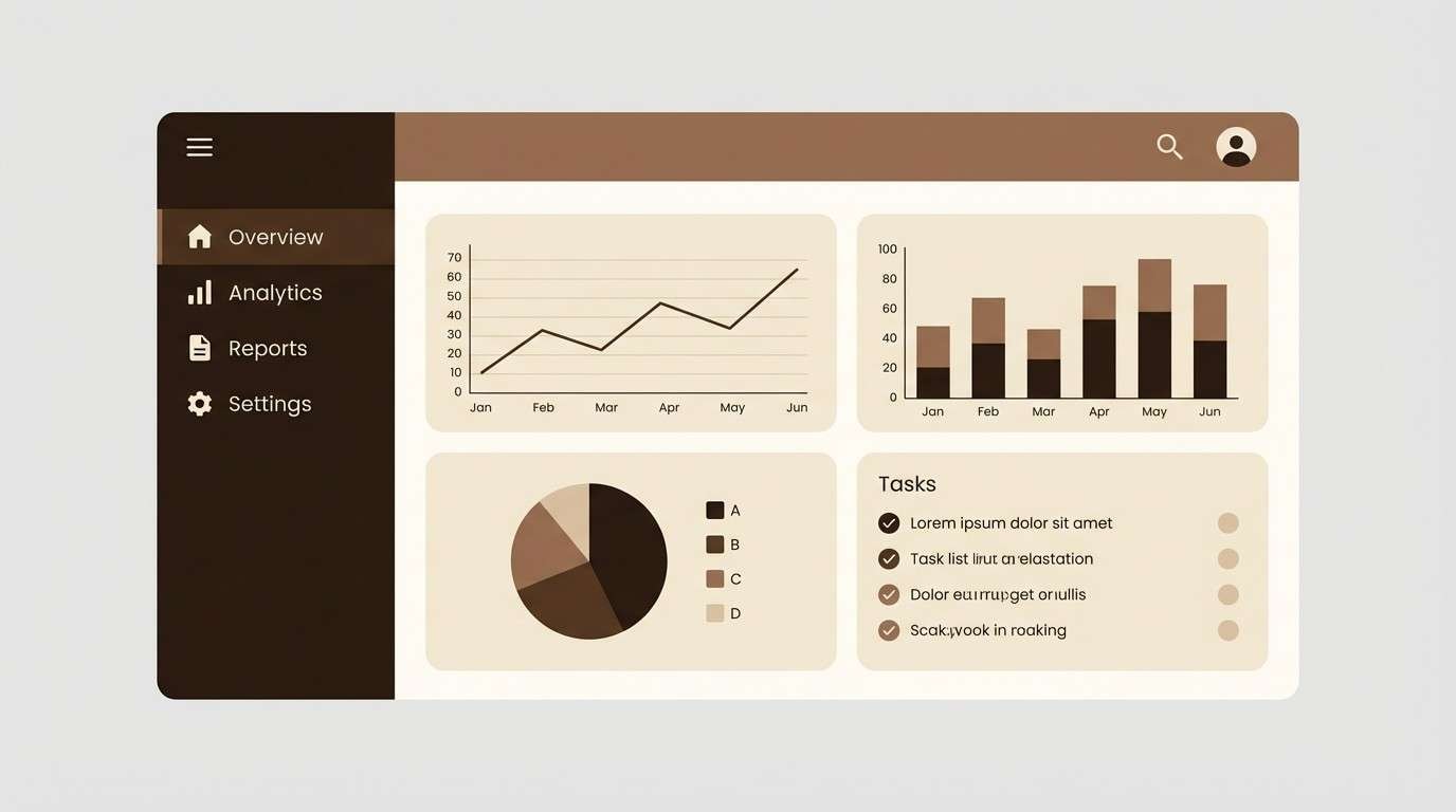
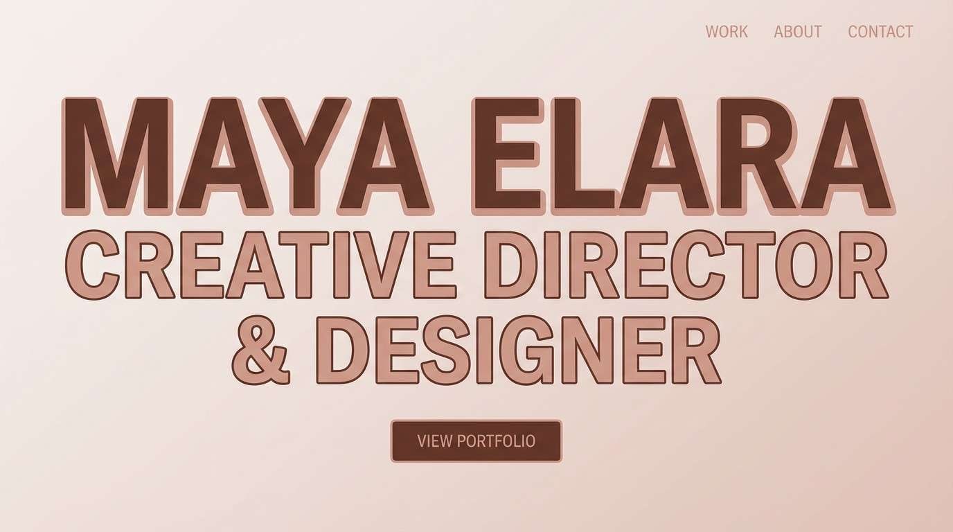
1) Espresso Crema
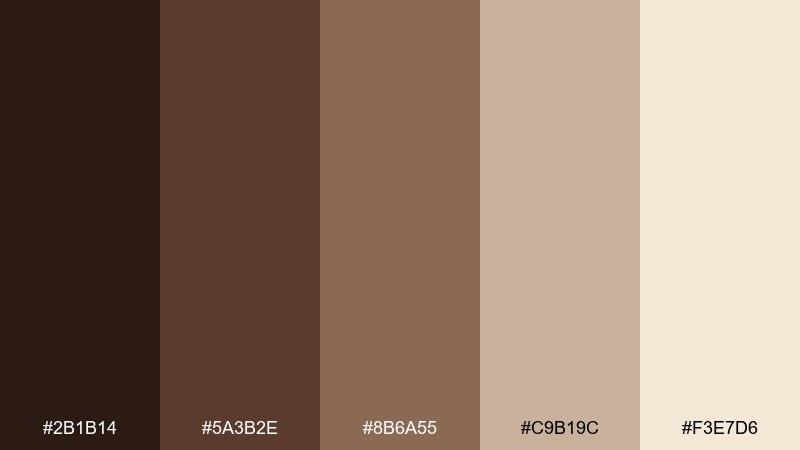
HEX: #2B1B14 #5A3B2E #8B6A55 #C9B19C #F3E7D6
Mood: rich and grounded
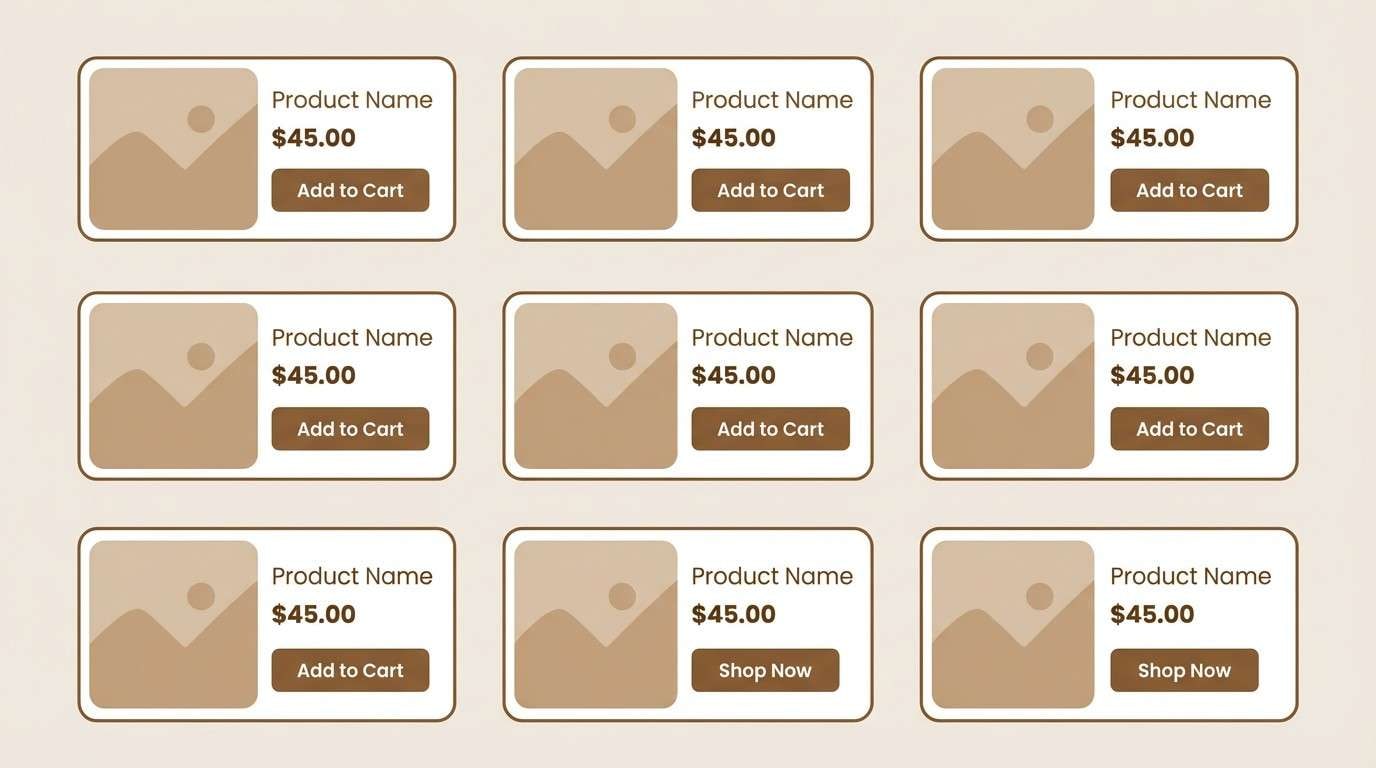
Best for: UI dashboard
Rich and grounded like a fresh espresso shot topped with crema. This coffee color scheme reads premium on screens, with dark bases for navigation and creamy highlights for cards. Pair it with clean sans-serif typography and plenty of whitespace to keep the deep browns from feeling heavy. Usage tip: reserve the lightest tone for key metrics to boost contrast and clarity.
Image example of espresso crema generated using media.io
Media.io is an online AI studio for creating and editing video, image, and audio in your browser.

2) Cafe Au Lait
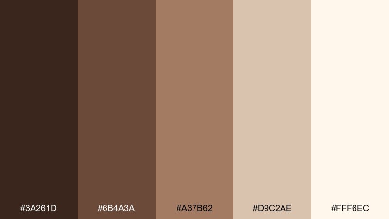
HEX: #3A261D #6B4A3A #A37B62 #D9C2AE #FFF6EC
Mood: soft and welcoming
Best for: cafe menu design
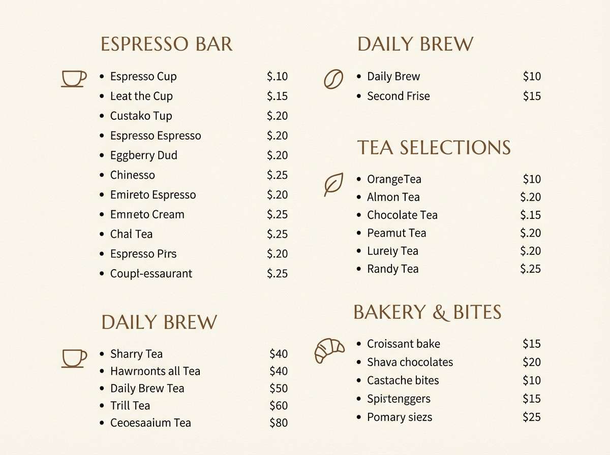
Soft and welcoming, like steamed milk swirling into a medium roast. The mid-tone browns give headings a friendly weight while the pale cream keeps the layout airy. Pair with hand-drawn line icons or subtle paper textures for a cozy, neighborhood feel. Usage tip: use the darkest brown only for prices and section titles to maintain readability.
Image example of cafe au lait generated using media.io
3) Mocha Mist
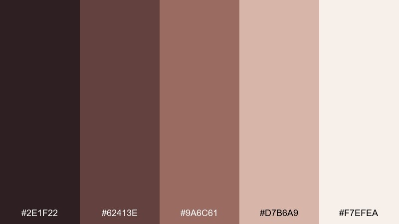
HEX: #2E1F22 #62413E #9A6C61 #D7B6A9 #F7EFEA
Mood: dusty and romantic
Best for: beauty brand social post
Dusty and romantic, like cocoa powder drifting over warm milk foam. This coffee color palette works beautifully for beauty content because the rosy-brown midtones feel flattering and modern. Pair it with soft gradients and minimal serif headlines for a boutique look. Usage tip: keep text in the deepest shade and let the lighter tones carry the imagery.
Image example of mocha mist generated using media.io
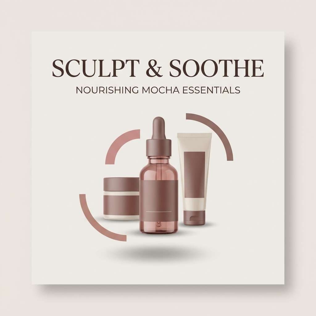
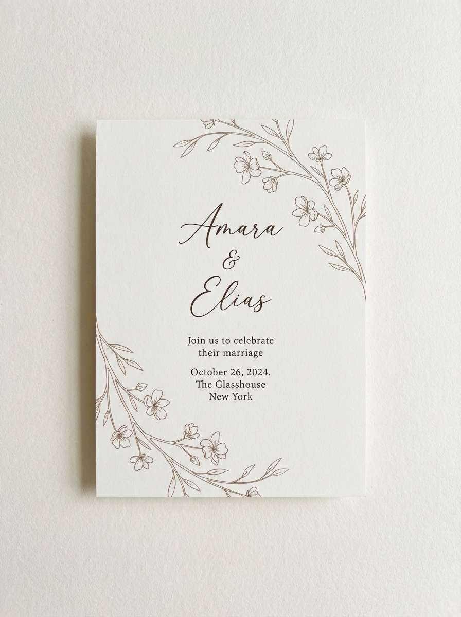
4) Latte Foam
HEX: #4A2F23 #7A5644 #B8947B #E6D3C2 #FFF9F2
Mood: calm and minimal
Best for: wedding invitation
Calm and minimal, like latte foam with a gentle caramel tint. The creamy whites and warm tans make type feel refined without going stark. Pair with delicate line florals or a blind-emboss effect for a tactile, elegant finish. Usage tip: use the caramel midtone for names and monograms, and keep body copy in the deeper brown.
Image example of latte foam generated using media.io
5) Caramel Drizzle
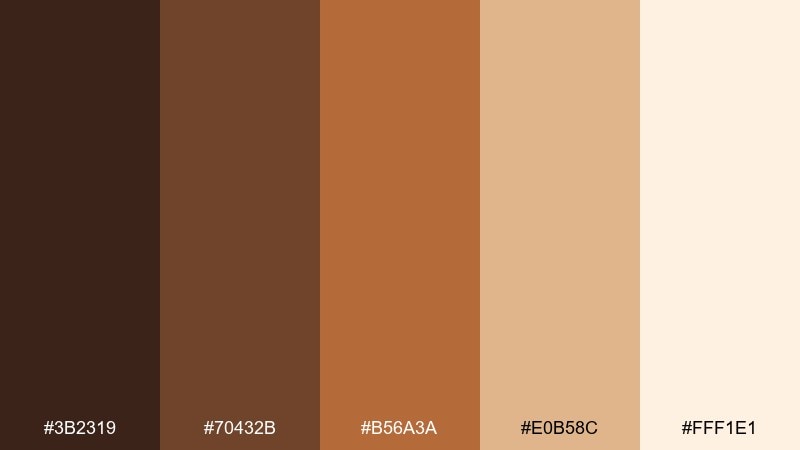
HEX: #3B2319 #70432B #B56A3A #E0B58C #FFF1E1
Mood: sweet and energetic
Best for: product packaging
Sweet and energetic, like caramel ribbons over a dark roast. The amber accent adds appetite appeal, while the deep brown keeps the look premium. Pair with kraft paper textures or matte finishes to make the warm tones feel authentic. Usage tip: use the caramel shade for callouts and badges to guide attention on shelf.
Image example of caramel drizzle generated using media.io
6) Cinnamon Roast
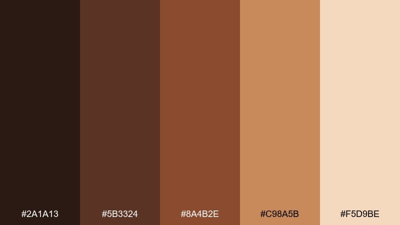
HEX: #2A1A13 #5B3324 #8A4B2E #C98A5B #F5D9BE
Mood: spiced and bold
Best for: seasonal promo poster
Spiced and bold, like a cinnamon roast warming up the room. These coffee color combinations bring instant seasonal energy when you lean into the rusty orange-browns as hero accents. Pair with chunky type, simple shapes, and a touch of grain for a vintage print vibe. Usage tip: keep the lightest tone as the poster background to prevent the palette from getting too dense.
Image example of cinnamon roast generated using media.io

7) Hazelnut Glaze
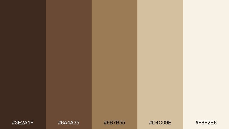
HEX: #3E2A1F #6A4A35 #9B7B55 #D4C09E #F8F2E6
Mood: toasty and natural
Best for: blog header
Toasty and natural, like roasted hazelnuts with a soft glaze. The muted midtones feel approachable for lifestyle content and pair nicely with warm photography. Combine with off-white backgrounds and subtle dividers for a clean editorial rhythm. Usage tip: set buttons in the darker brown and keep secondary UI elements in the hazelnut tan.
Image example of hazelnut glaze generated using media.io
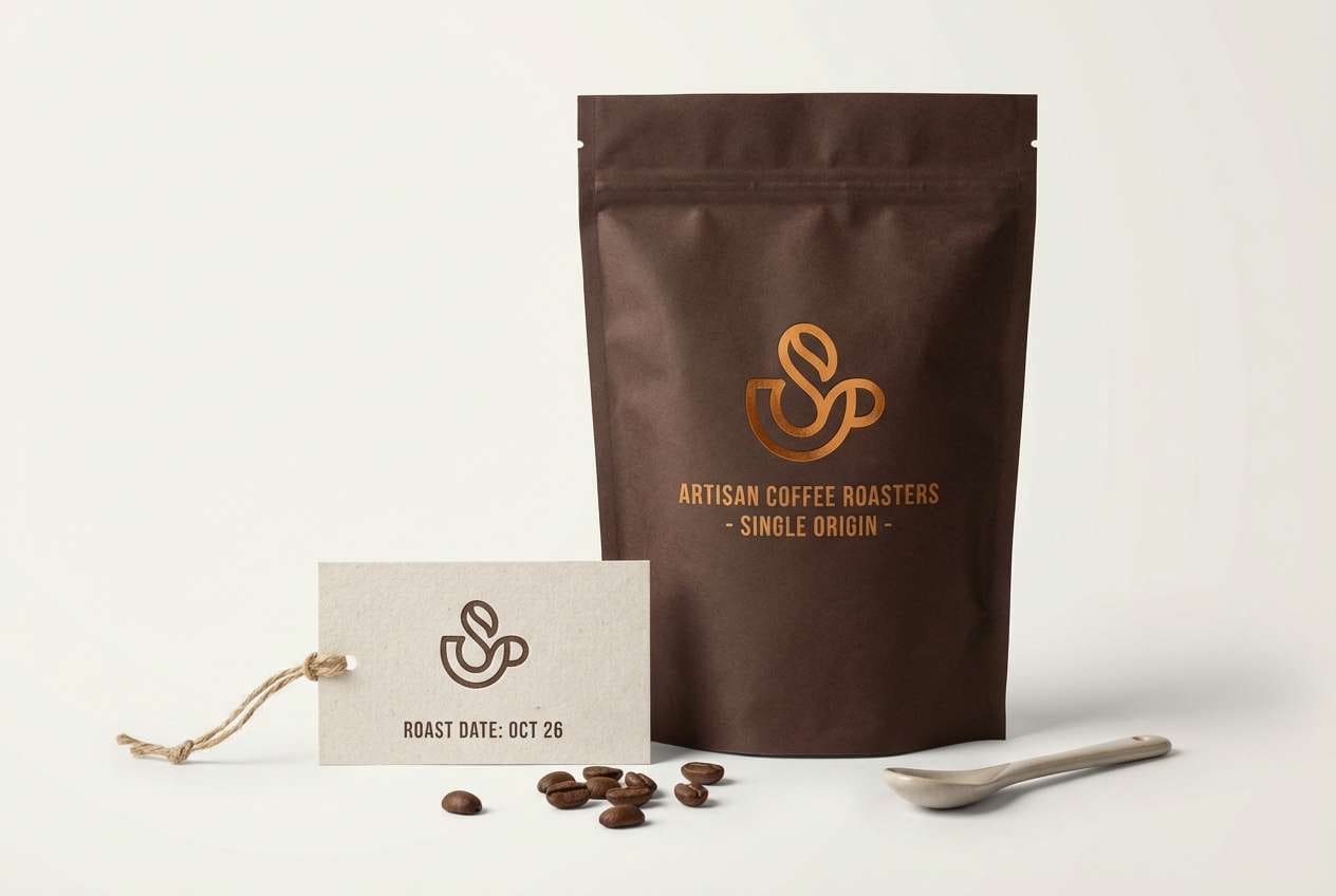
8) Toffee Bean
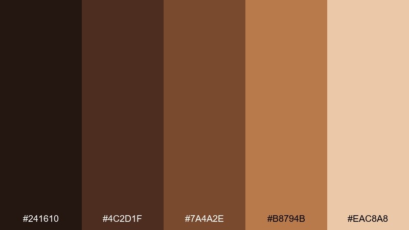
HEX: #241610 #4C2D1F #7A4A2E #B8794B #EAC8A8
Mood: warm and indulgent
Best for: food brand logo
Warm and indulgent, like toffee melting into a dark bean brew. The contrast between cocoa brown and golden toffee makes marks and icons feel memorable at small sizes. Pair with simple badge shapes and avoid thin strokes so the darker tones stay crisp. Usage tip: test the logo in one color using the deepest brown for flexible packaging applications.
Image example of toffee bean generated using media.io
9) Brown Sugar Oat
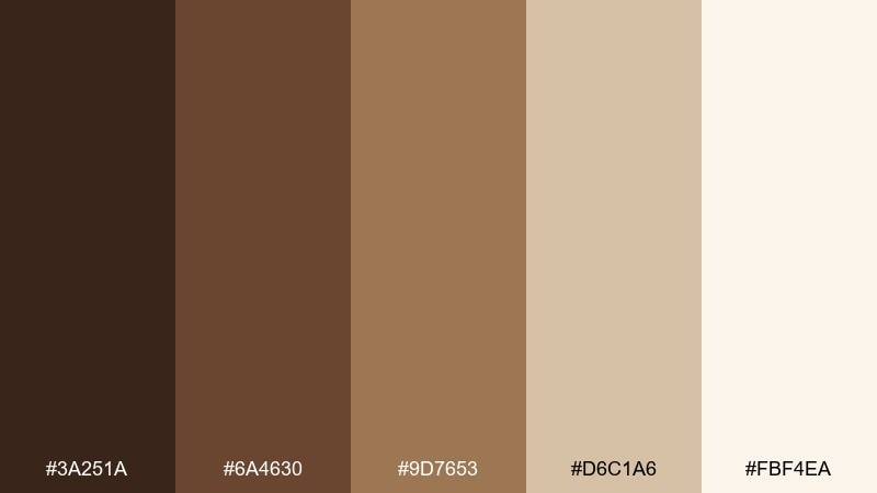
HEX: #3A251A #6A4630 #9D7653 #D6C1A6 #FBF4EA
Mood: cozy and wholesome
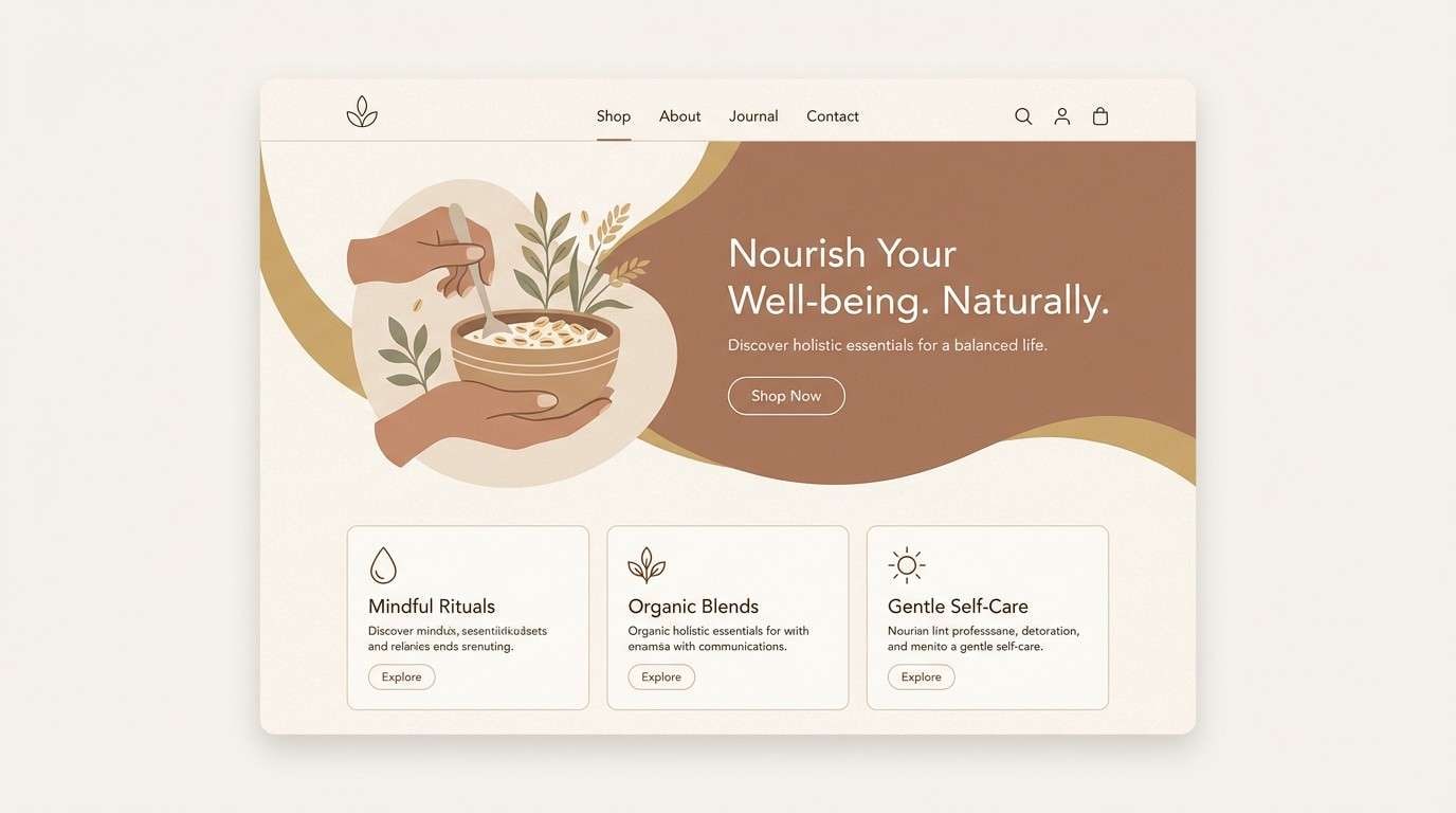
Best for: wellness landing page
Cozy and wholesome, like oatmeal sweetened with brown sugar. The creamy base keeps the page bright while the mid browns add warmth to sections and cards. Pair with soft rounded corners and natural product photography for an approachable tone. Usage tip: use the oat-cream shade for backgrounds and reserve darker tones for headings and CTAs.
Image example of brown sugar oat generated using media.io
10) Maple Macchiato
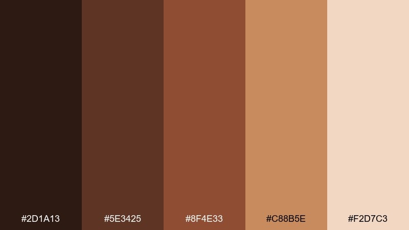
HEX: #2D1A13 #5E3425 #8F4E33 #C88B5E #F2D7C3
Mood: golden and confident
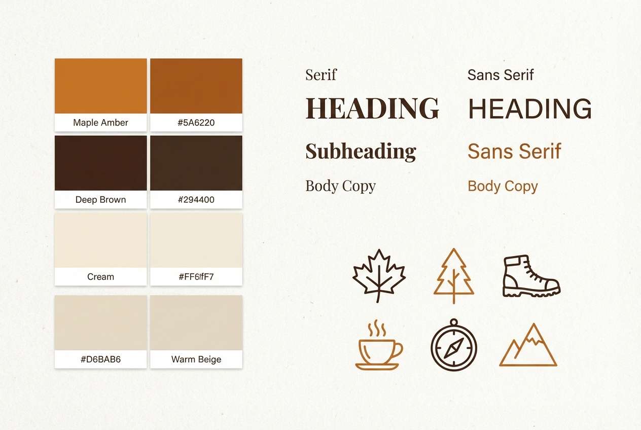
Best for: brand style guide
Golden and confident, like maple stirred into a macchiato. This coffee color combination shines in a style guide where you need clear roles for primaries, accents, and neutrals. Pair with simple swatches, accessibility notes, and warm photography to keep everything cohesive. Usage tip: assign the maple tone to highlights and icons so it never competes with body text.
Image example of maple macchiato generated using media.io
11) Cocoa Dusk
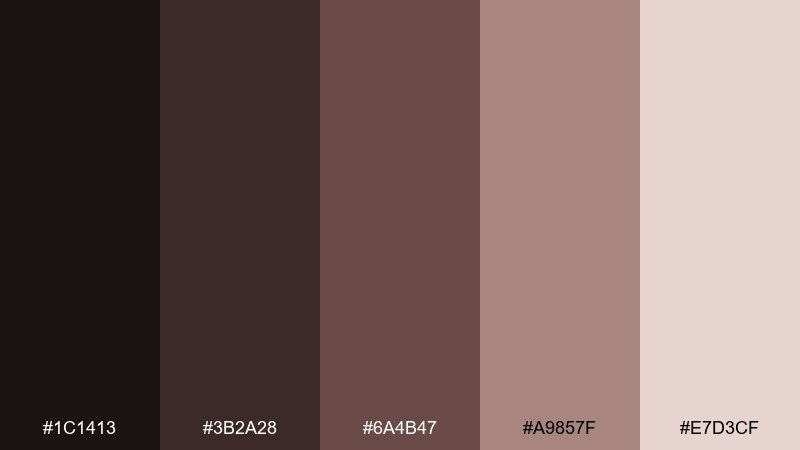
HEX: #1C1413 #3B2A28 #6A4B47 #A9857F #E7D3CF
Mood: moody and elegant
Best for: editorial magazine layout
Moody and elegant, like dusk settling over a cocoa-dark café. The near-black base gives you dramatic type contrast without going harsh. Pair with large serif headlines, generous margins, and monochrome imagery for a premium editorial feel. Usage tip: keep accent usage minimal and let the soft mauve-brown carry secondary text blocks.
Image example of cocoa dusk generated using media.io
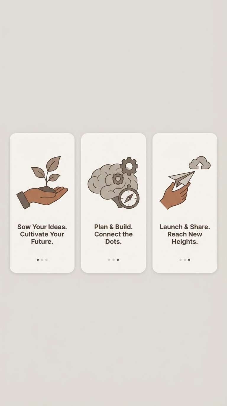
12) Smoky Arabica
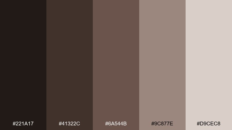
HEX: #221A17 #41322C #6A544B #9C877E #D9CEC8
Mood: smoky and understated
Best for: app onboarding screens
Smoky and understated, like a slow brew with a hint of cedar. The gray-browns feel modern and tech-friendly while still staying warm. Pair with soft gradients and simple illustrations for an onboarding flow that feels calm and premium. Usage tip: use the palest shade as the default background to keep text and icons crisp.
Image example of smoky arabica generated using media.io
13) Vintage Cafe Sign
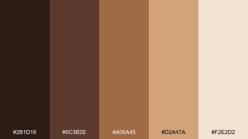
HEX: #2B1D16 #5C3B2E #A06A45 #D2A47A #F2E2D2
Mood: nostalgic and crafted
Best for: retro flyer
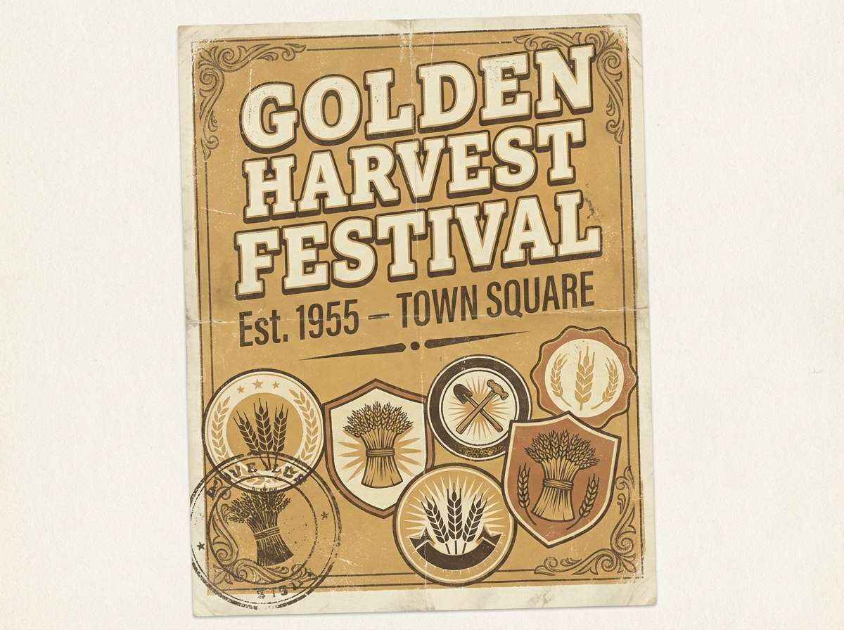
Nostalgic and crafted, like a hand-painted sign outside an old corner café. The warm ochre and toasted brown create instant heritage vibes for print. Pair with slab serif type and slightly imperfect textures to sell the retro look. Usage tip: limit the ochre to borders and badges so the layout stays readable from a distance.
Image example of vintage cafe sign generated using media.io
14) Desert Cappuccino
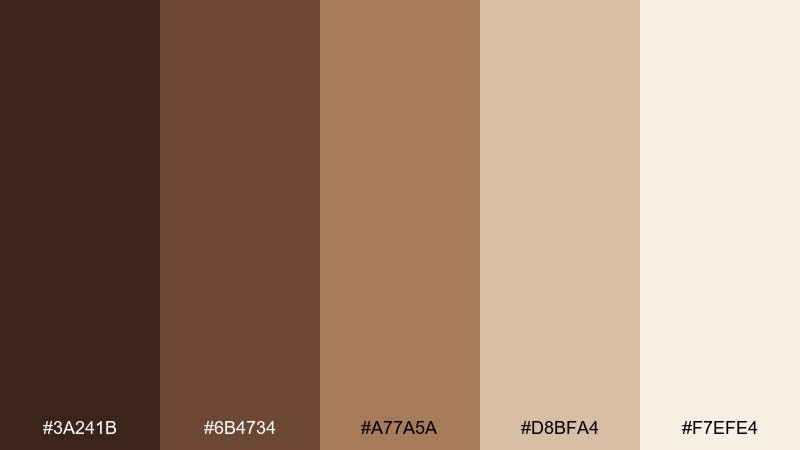
HEX: #3A241B #6B4734 #A77A5A #D8BFA4 #F7EFE4
Mood: sunlit and airy
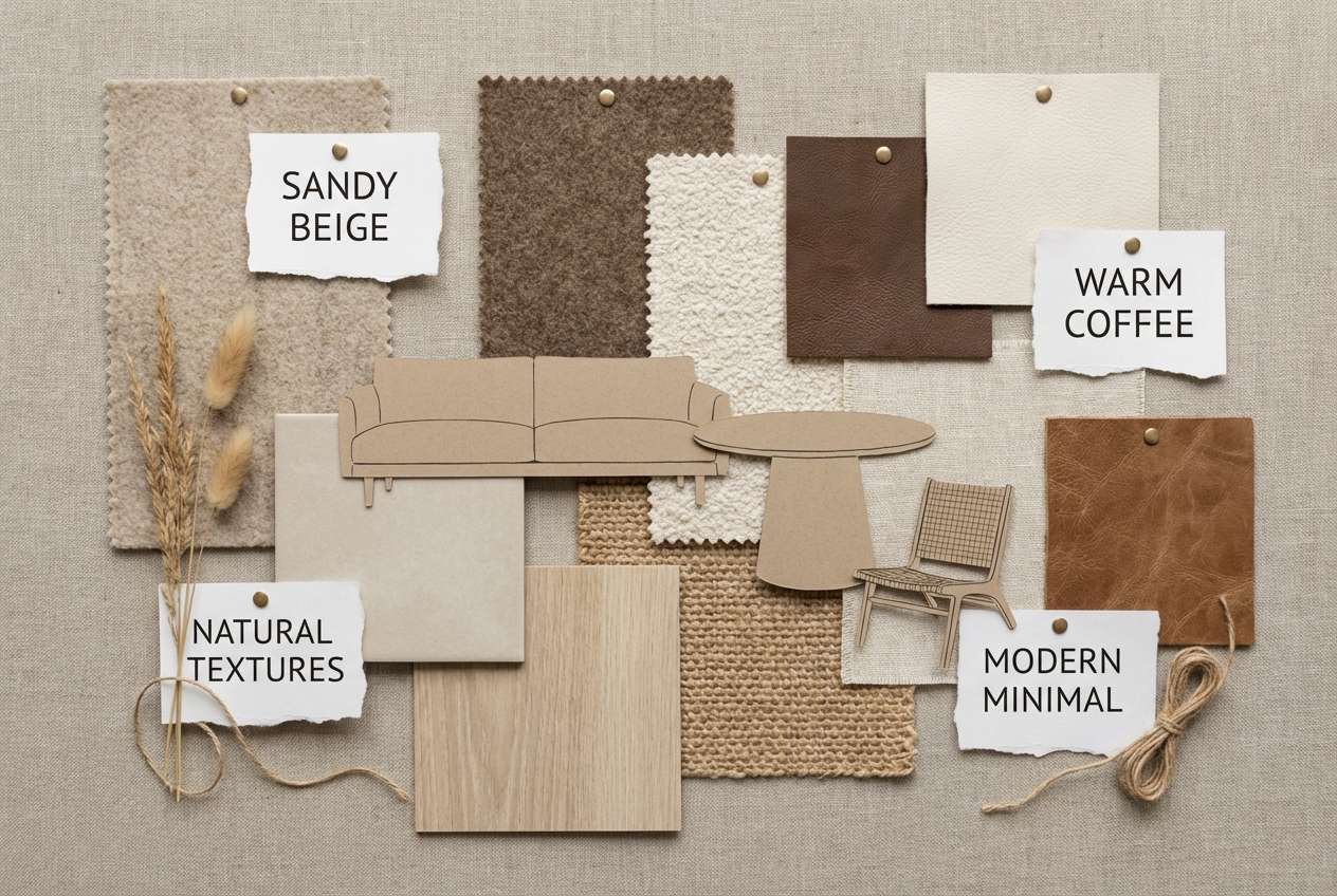
Best for: interior mood board
Sunlit and airy, like a cappuccino enjoyed on a bright desert morning. The sandy neutrals make a relaxed base for interiors, especially when you mix in natural wood and linen. Pair with terracotta pottery and matte black hardware for a balanced, modern contrast. Usage tip: keep the darkest brown to small accents like frames or lamp bases.
Image example of desert cappuccino generated using media.io
15) Rainy Roastery

HEX: #1F1B1A #3C3431 #6B5B55 #A69B94 #E6E0DC
Mood: cool and contemplative
Best for: podcast cover art
Cool and contemplative, like rain tapping the window of a quiet roastery. The charcoal-leaning browns feel mature and grounded, perfect for audio brands that want subtle confidence. Pair with high-contrast type and one strong geometric motif to keep the cover legible at thumbnail size. Usage tip: use the lightest gray-beige only for small highlights so the mood stays moody.
Image example of rainy roastery generated using media.io
16) Walnut Linen
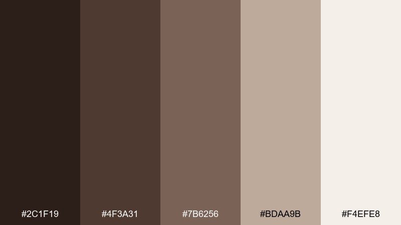
HEX: #2C1F19 #4F3A31 #7B6256 #BDAA9B #F4EFE8
Mood: refined and tactile
Best for: luxury stationery set
Refined and tactile, like walnut ink on textured linen paper. The gentle contrast keeps layouts elegant and easy on the eyes for long-form notes. Pair with debossed details, thin rules, and warm white stock to emphasize the craftsmanship. Usage tip: avoid pure black and use the deepest walnut shade for all typography.
Image example of walnut linen generated using media.io
17) Sandstone Brew
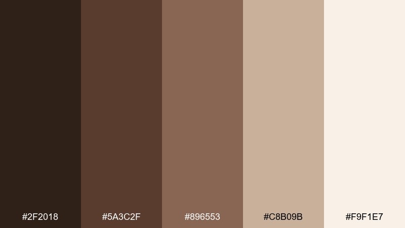
HEX: #2F2018 #5A3C2F #896553 #C8B09B #F9F1E7
Mood: natural and balanced
Best for: ecommerce product grid
Natural and balanced, like sandstone warmed by a fresh brew nearby. The beige-heavy mix keeps product thumbnails bright while still feeling warm and earthy. Pair with subtle shadows and thin dividers so the grid stays clean on mobile. Usage tip: use the medium brown for price and rating accents to guide scanning.
Image example of sandstone brew generated using media.io
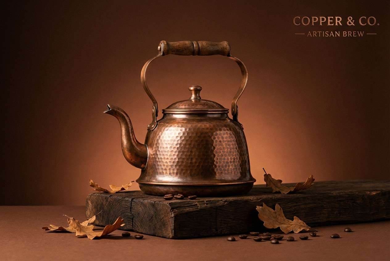
18) Copper Kettle
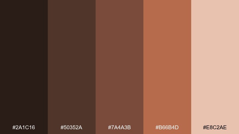
HEX: #2A1C16 #50352A #7A4A3B #B66B4D #E8C2AE
Mood: artisanal and warm
Best for: kitchen product ad
Artisanal and warm, like copper gleaming beside a simmering kettle. The coppery accent lifts the browns and adds a handcrafted, maker-friendly energy. Pair with clean studio lighting and simple props so the warm metals feel intentional, not noisy. Usage tip: make the copper tone the only bright accent and keep everything else muted.
Image example of copper kettle generated using media.io
19) Sable Cream
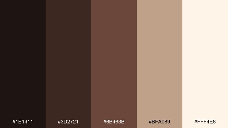
HEX: #1E1411 #3D2721 #6B463B #BFA089 #FFF4E8
Mood: high-contrast and luxe
Best for: branding mood board
High-contrast and luxe, like sable velvet against whipped cream. These coffee color combinations feel expensive when you keep the palette mostly dark and let cream act as negative space. Pair with minimal logos, thick letterforms, and soft spotlighting in imagery. Usage tip: use the cream shade for backgrounds and the sable shade for primary text to stay accessible.
Image example of sable cream generated using media.io
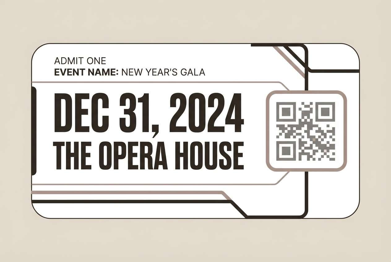
20) Midnight Pour
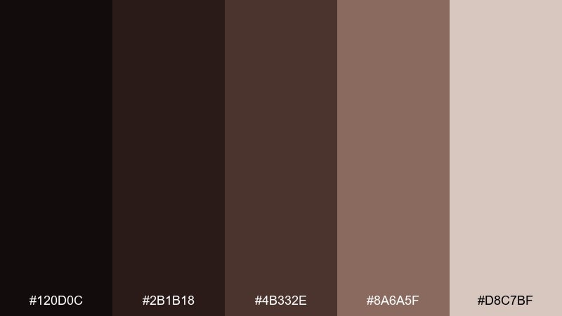
HEX: #120D0C #2B1B18 #4B332E #8A6A5F #D8C7BF
Mood: dramatic and modern
Best for: event ticket design
Dramatic and modern, like a midnight pour under low bar lights. The near-black base gives instant contrast for QR codes, dates, and seating info. Pair with condensed typography and one subtle pattern to keep the design sharp but not busy. Usage tip: print a test proof to ensure the darkest tones do not crush fine details.
Image example of midnight pour generated using media.io
21) Cocoa Canvas
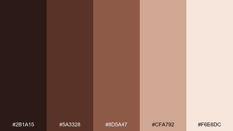
HEX: #2B1A15 #5A3328 #8D5A47 #CFA792 #F6E6DC
Mood: creative and warm
Best for: portfolio website hero
Creative and warm, like cocoa brushed across a blank canvas. This coffee color palette suits portfolios because it feels personal without looking informal. Pair with oversized type, spacious sections, and a single accent button in the rose-brown. Usage tip: keep imagery slightly desaturated so the palette remains the main visual signature.
Image example of cocoa canvas generated using media.io
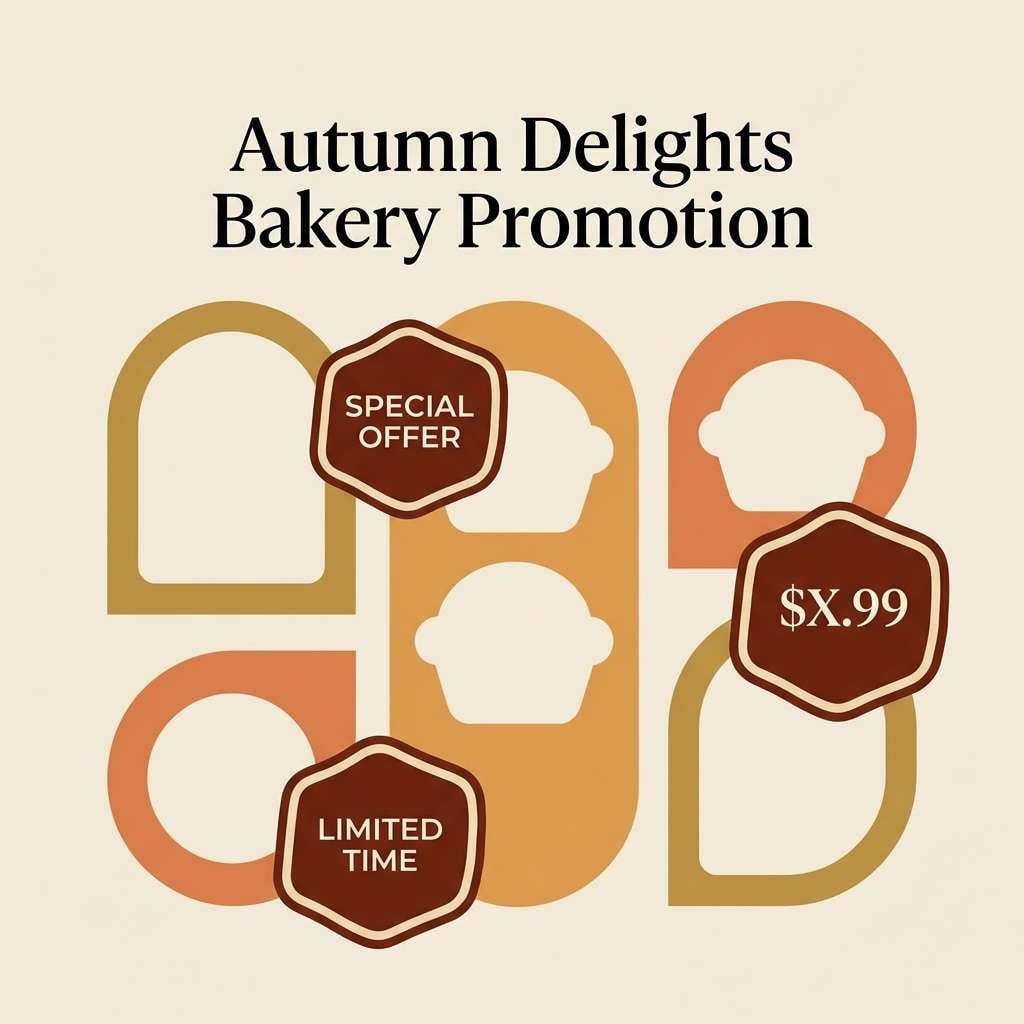
22) Roasted Almond
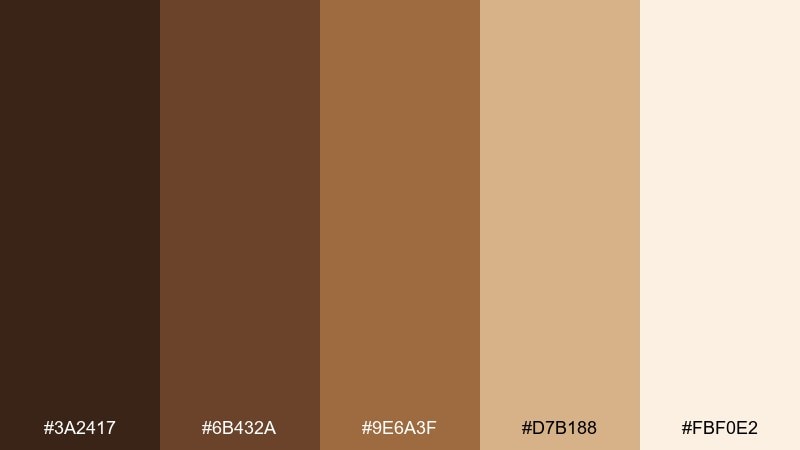
HEX: #3A2417 #6B432A #9E6A3F #D7B188 #FBF0E2
Mood: bright and appetizing
Best for: bakery Instagram ad
Bright and appetizing, like roasted almonds pulled from the oven. The golden browns bring a toasted glow that makes food promos feel irresistible. Pair with simple sticker-style callouts and clean product cutouts to keep the ad modern. Usage tip: limit the darkest shade to small type so the overall feel stays light and sweet.
Image example of roasted almond generated using media.io
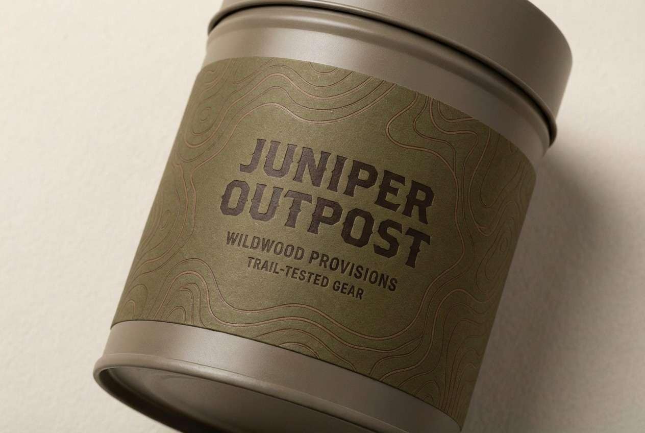
23) Forest Mocha
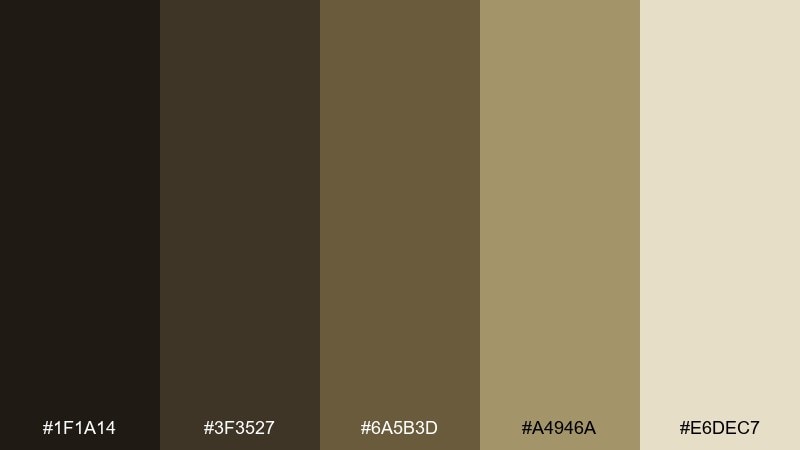
HEX: #1F1A14 #3F3527 #6A5B3D #A4946A #E6DEC7
Mood: earthy and adventurous
Best for: outdoor brand label
Earthy and adventurous, like mocha enjoyed on a forest trail. The olive-brown notes add a rugged twist to standard browns without turning the look cold. Pair with topographic line patterns and simple badge icons for an outdoor-ready label system. Usage tip: use the lightest tone for background panels so the green-brown stays readable.
Image example of forest mocha generated using media.io
What Colors Go Well with Coffee?
Coffee pairs best with other warm neutrals: cream, ivory, sand, and taupe help browns feel brighter and more modern. These lighter tones also create the negative space you need for clean UI and readable packaging.
For accents, try caramel/amber for energy, muted blush or mauve for a softer boutique feel, or olive-leaning browns for an outdoorsy twist. If you need sharper contrast, matte charcoal (instead of pure black) keeps the palette rich without turning harsh.
In general, balance is key: let one dark coffee shade lead, support it with two mid browns, and keep one to two creamy tones as backgrounds and highlights.
How to Use a Coffee Color Palette in Real Designs
Start by assigning roles: darkest brown for primary text and navigation, mid browns for headings and components, and a cream tone for backgrounds. This simple system keeps designs consistent across pages, ads, and packaging.
In UI, watch contrast on buttons and small labels—coffee midtones can look gorgeous but may need the lightest cream behind them. In print, do a proof for very dark “espresso” shades to avoid losing fine details, especially with matte finishes.
To keep coffee palettes from feeling too heavy, add breathing room: larger margins, thin dividers, and minimal decorative elements. Texture (kraft, paper grain, linen) can add warmth without adding more colors.
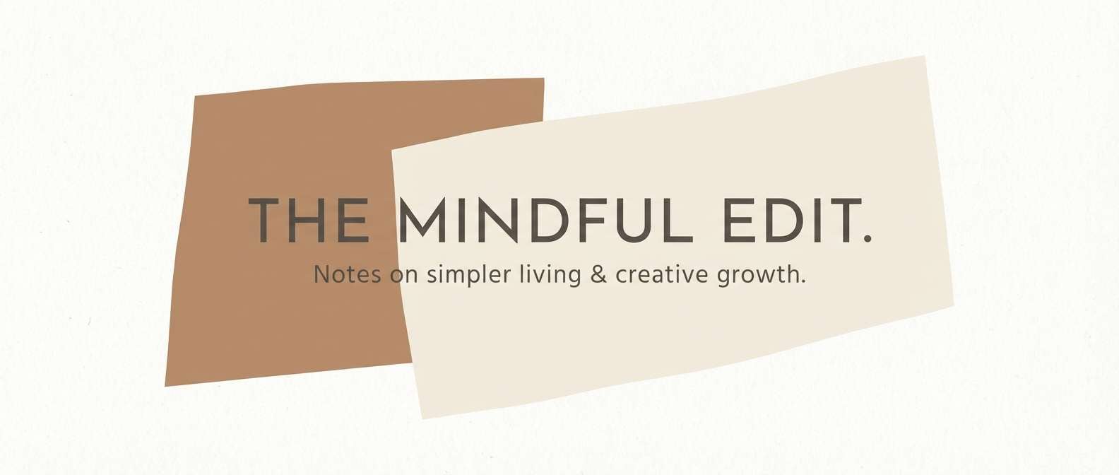
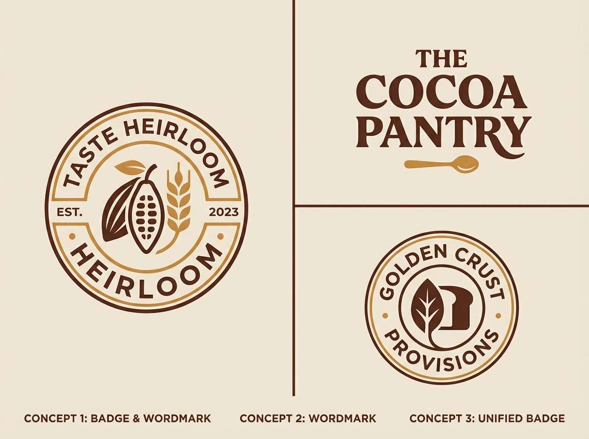
Create Coffee Palette Visuals with AI
If you’re building a brand board, UI mockup, menu, or label, generating quick visuals helps you test how your coffee tones behave in real layouts. You can iterate faster on contrast, typography, and composition before committing to production files.
With Media.io’s text-to-image tool, paste a prompt, set the aspect ratio, and create consistent coffee-themed graphics in minutes. It’s especially useful for exploring “espresso vs. latte” contrast levels across different design formats.
Coffee Color Palette FAQs
-
What is a coffee color palette?
A coffee color palette is a set of warm browns (espresso, mocha, cocoa) paired with lighter neutrals (cream, beige, oat) used to create a cohesive, grounded look in branding, UI, and print. -
Is coffee color more brown or black?
Coffee color is typically a deep brown with warm undertones. “Espresso” shades can look nearly black on screens or in print, but they usually retain brown warmth compared to true black. -
What are the best accent colors for coffee browns?
Great accents include caramel/amber for energy, blush/mauve for softness, and olive-leaning tones for an earthy, outdoor feel. Keep accents limited so the palette stays premium and readable. -
How do I keep a coffee palette from looking too dark?
Use a cream or warm off-white as the main background, reserve the darkest shade for typography/navigation, and rely on mid browns for surfaces. Spacing and minimal UI elements also prevent visual heaviness. -
Are coffee palettes good for UI and apps?
Yes—coffee palettes work well for dashboards, onboarding, and ecommerce when you prioritize contrast. Pair dark browns with light neutral backgrounds and test small text and icon states for accessibility. -
What finish works best for coffee-toned packaging?
Matte and soft-touch finishes make coffee browns feel rich and modern, while kraft textures push the look toward natural and artisanal. Always print a proof for very dark shades to avoid muddy results. -
Can I generate coffee palette mockups with AI?
Yes. You can use Media.io’s text-to-image generator to create brand boards, menus, label concepts, and UI mockups using specific coffee HEX-inspired tones and consistent prompts.
