

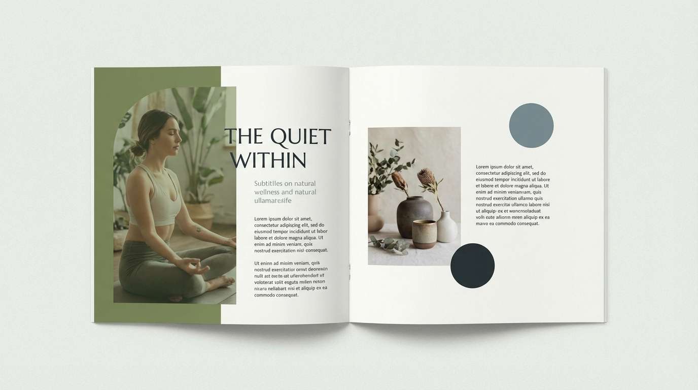
Olivine is a muted, earthy green that feels natural, calm, and quietly premium. It’s easy to live with in interiors, and it reads as trustworthy and organic in branding.
Below are 22 olivine color palette ideas with HEX codes, plus practical tips and AI prompts you can reuse to generate matching visuals.
In this article
- Why Olivine Palettes Work So Well
-
- moss and linen
- olive grove minimal
- vintage field notes
- desert sage studio
- forest tea time
- urban patio
- artisan apothecary
- modern cabin
- botanical watercolor
- soft clay garden
- retro outdoors
- coastal olive mist
- olive and copper luxe
- muted sportswear
- editorial earth
- kids nature book
- ui dark moss
- greenery wedding classic
- organic market packaging
- autumn hike
- stoneware kitchen
- mountain pass contrast
- What Colors Go Well with Olivine?
- How to Use a Olivine Color Palette in Real Designs
- Create Olivine Palette Visuals with AI
Why Olivine Palettes Work So Well
Olivine sits in a “soft middle” between olive green and sage, so it carries a nature-forward vibe without feeling loud or trendy. That makes it especially reliable for long-lasting brand systems and calm UI themes.
It also pairs easily with warm neutrals (linen, parchment, clay, walnut) and with cool structure colors (slate, blue-gray, charcoal). You can tune the same olivine base to feel rustic, modern, or luxurious by shifting the accent and the dark anchor.
Because olivine is muted, it helps reduce visual fatigue—useful for dashboards, editorial layouts, and packaging where readability and hierarchy matter.
20+ Olivine Color Palette Ideas (with HEX Codes)
1) Moss and Linen
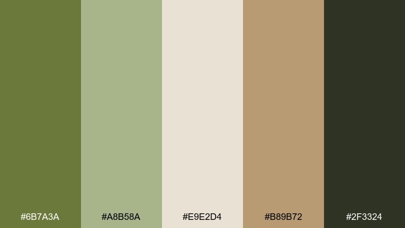
HEX: #6B7A3A #A8B58A #E9E2D4 #B89B72 #2F3324
Mood: calm, grounded, organic
Best for: natural skincare branding and labels
Calm and grounded like morning light on mossy stone, these tones feel clean without going sterile. They work beautifully for natural skincare, wellness packaging, and ingredient-forward labels. Pair the green with linen cream for breathing room and use the cocoa-charcoal as your typography anchor. Usage tip: keep the label background light and reserve the darkest shade for small, high-contrast details like batch numbers.
Image example of moss and linen generated using media.io
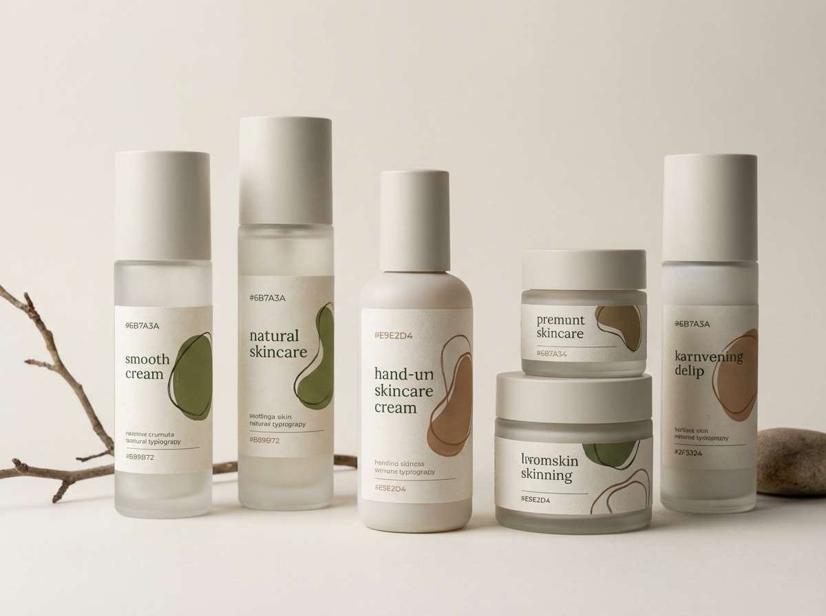
Media.io is an online AI studio for creating and editing video, image, and audio in your browser.

2) Olive Grove Minimal
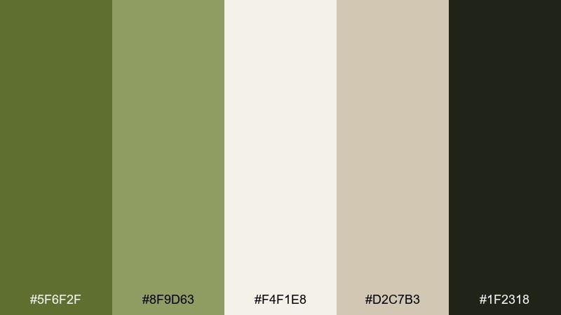
HEX: #5F6F2F #8F9D63 #F4F1E8 #D2C7B3 #1F2318
Mood: minimal, modern, restrained
Best for: clean SaaS landing page UI
Minimal and modern, it evokes a quiet olive grove with crisp shadows and lots of open space. The pale off-white keeps layouts airy while the deep green-black grounds nav bars and buttons. Pair with simple sans serif typography and generous spacing for a premium feel. Usage tip: make #5F6F2F your primary CTA color and keep secondary buttons in the soft taupe to reduce visual noise.
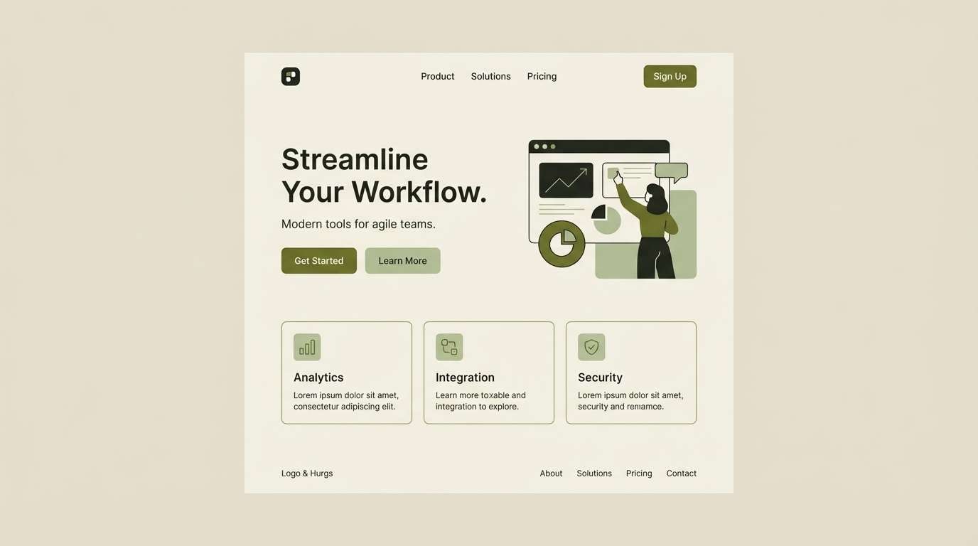
Image example of olive grove minimal generated using media.io
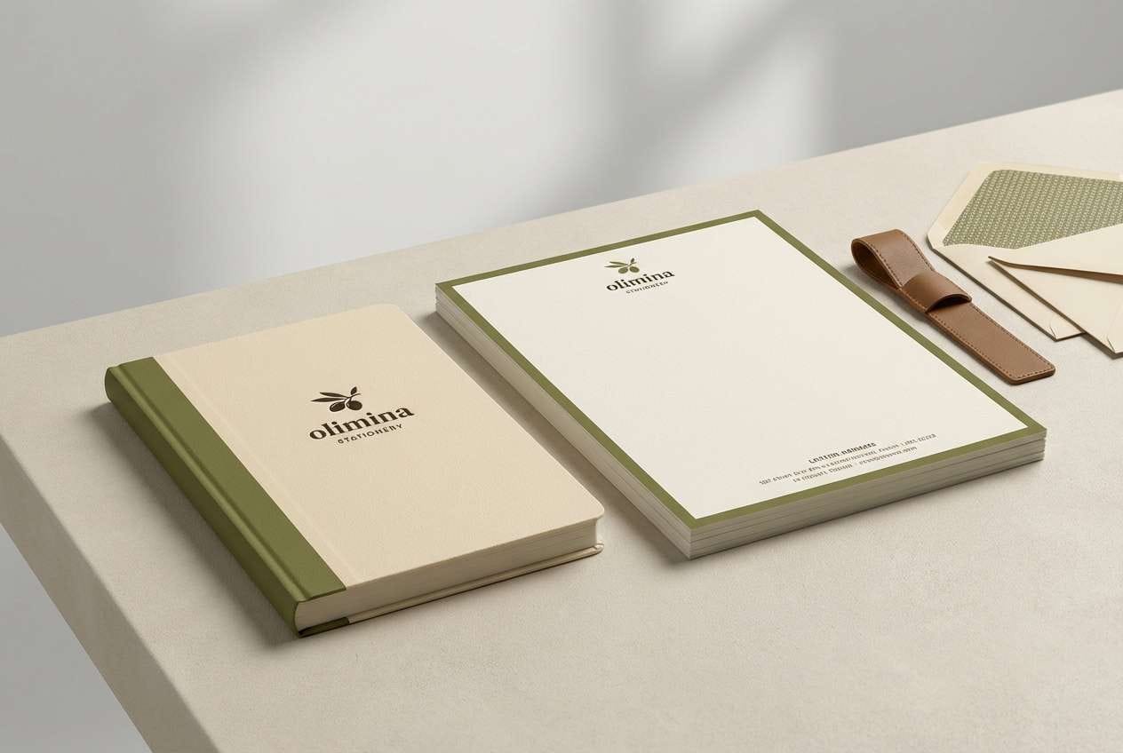
3) Vintage Field Notes
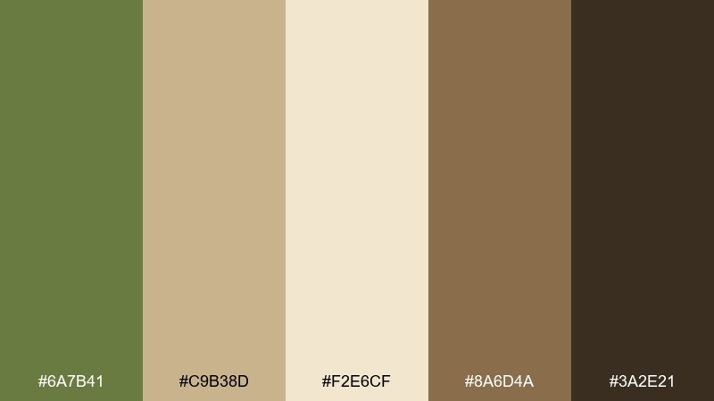
HEX: #6A7B41 #C9B38D #F2E6CF #8A6D4A #3A2E21
Mood: nostalgic, outdoorsy, warm
Best for: stationery set and notebook covers
Nostalgic and outdoorsy, it feels like pressed leaves tucked into an old journal. The warm parchment and leather browns soften the green and make the whole olivine color palette feel handcrafted. It shines on stationery, notebook covers, and heritage-style logos. Usage tip: emboss the darkest brown for titles and use the parchment tone as the main paper color to keep it authentic.
Image example of vintage field notes generated using media.io
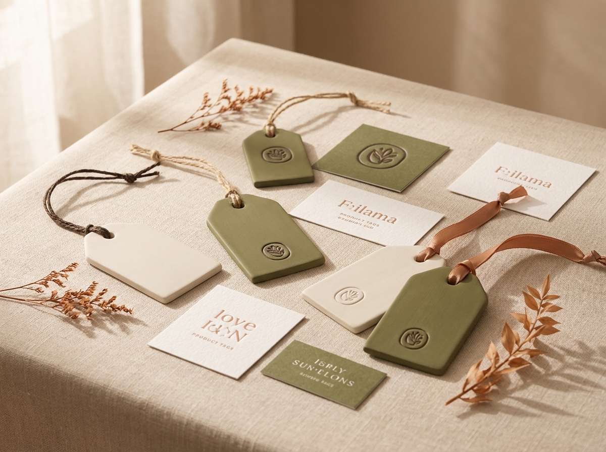
4) Desert Sage Studio
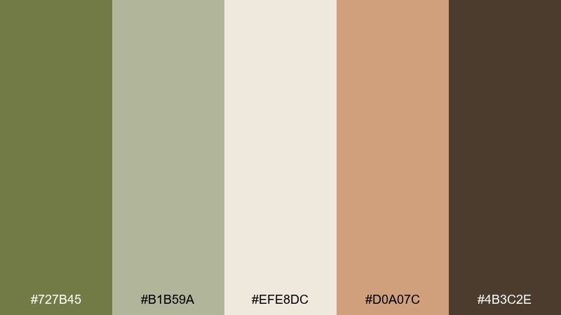
HEX: #727B45 #B1B59A #EFE8DC #D0A07C #4B3C2E
Mood: sun-baked, creative, relaxed
Best for: ceramic shop branding and product tags
Sun-baked and creative, it brings to mind desert sage, clay dust, and a quiet studio bench. The clay-peach accent adds warmth without overpowering the softened greens. It suits ceramic brands, handmade tags, and earthy social posts. Usage tip: use the peach tone sparingly as a highlight on pricing or limited-edition callouts to keep the palette feeling calm.
Image example of desert sage studio generated using media.io
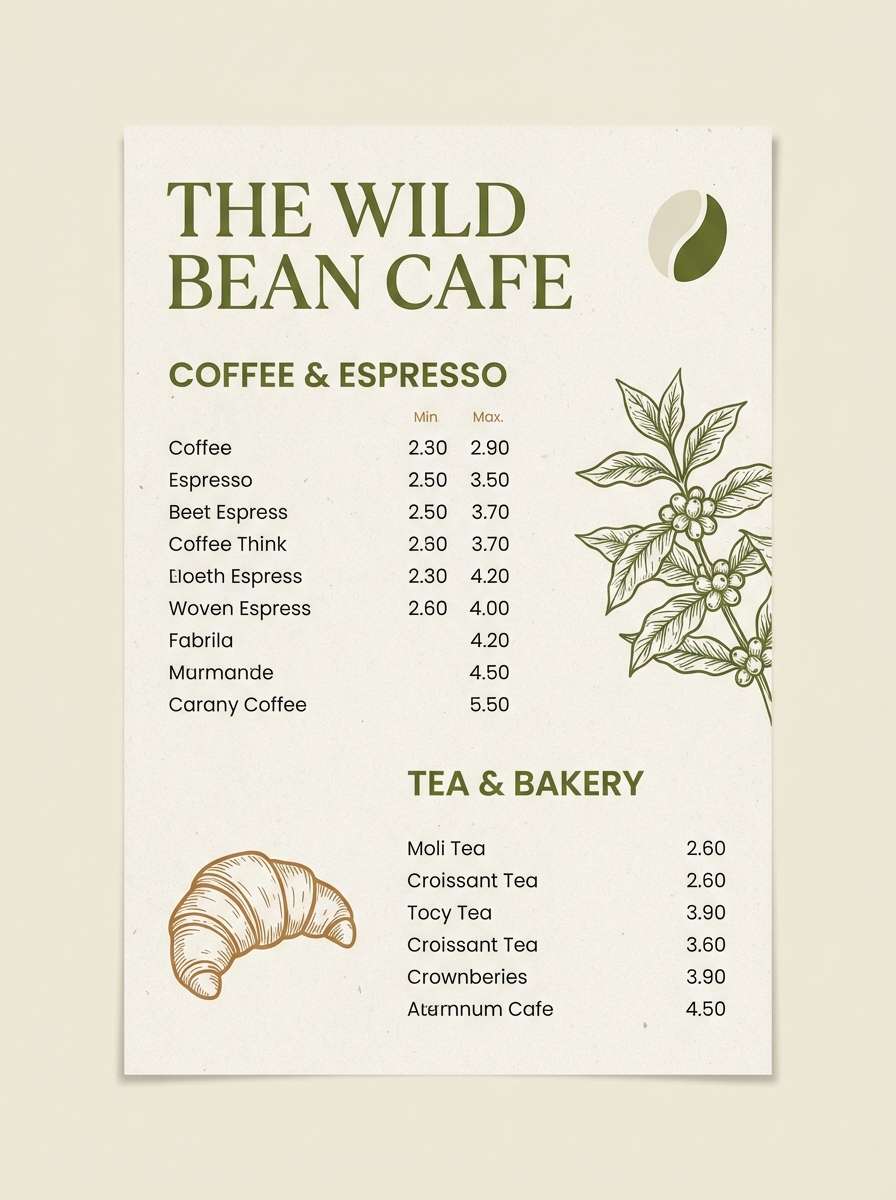
5) Forest Tea Time
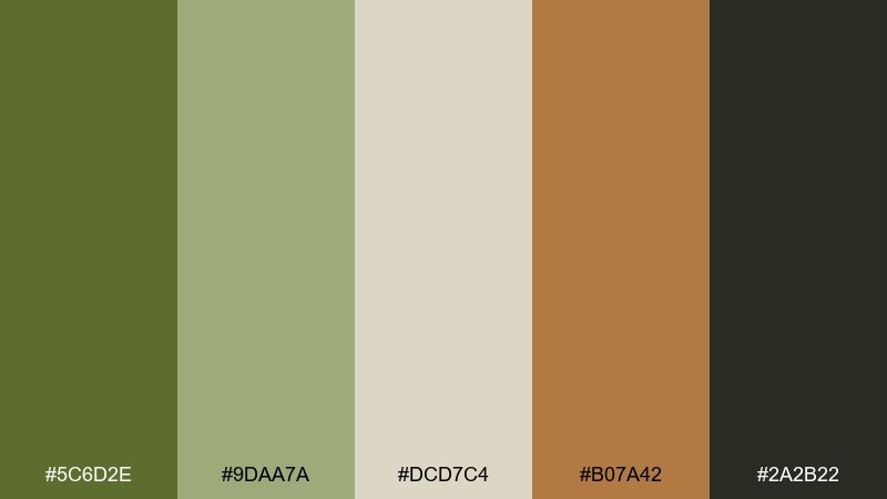
HEX: #5C6D2E #9DAA7A #DCD7C4 #B07A42 #2A2B22
Mood: cozy, rustic, comforting
Best for: cafe menu design
Cozy and rustic, it evokes steeped tea, wood grain, and a forest cabin window. The warm caramel accent pairs naturally with the muted greens for friendly, appetizing design. Use it for cafe menus, seasonal signage, and loyalty cards. Usage tip: set menu headings in the deep charcoal and highlight specials with the caramel so the hierarchy reads instantly.
Image example of forest tea time generated using media.io
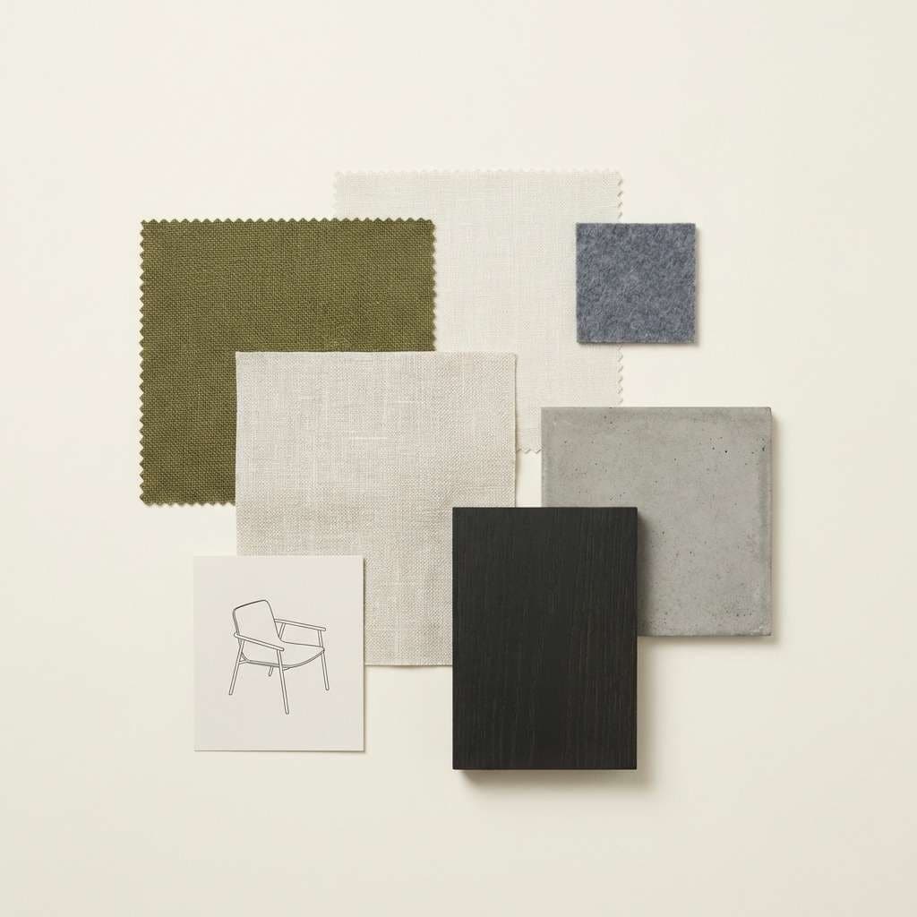
6) Urban Patio
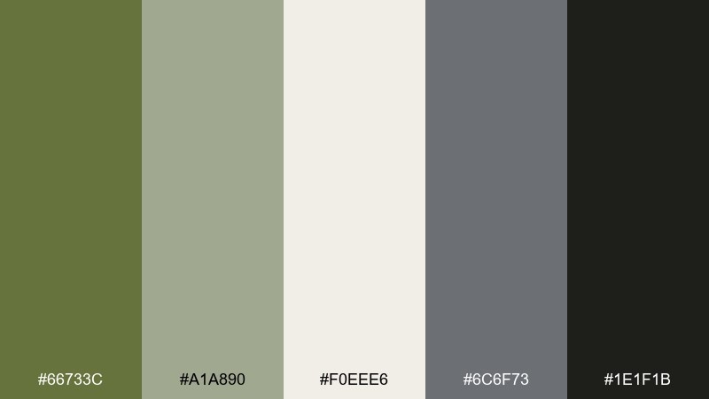
HEX: #66733C #A1A890 #F0EEE6 #6C6F73 #1E1F1B
Mood: modern, airy, city-calm
Best for: interior design mood board
Modern and airy, it feels like greenery on a concrete balcony with soft overcast light. The cool gray adds an architectural note that balances the organic green. Use it for interior mood boards, real-estate brochures, and decor lookbooks. Usage tip: let the off-white dominate and treat the olive as an accent across textiles or icons for a clean, upscale finish.
Image example of urban patio generated using media.io
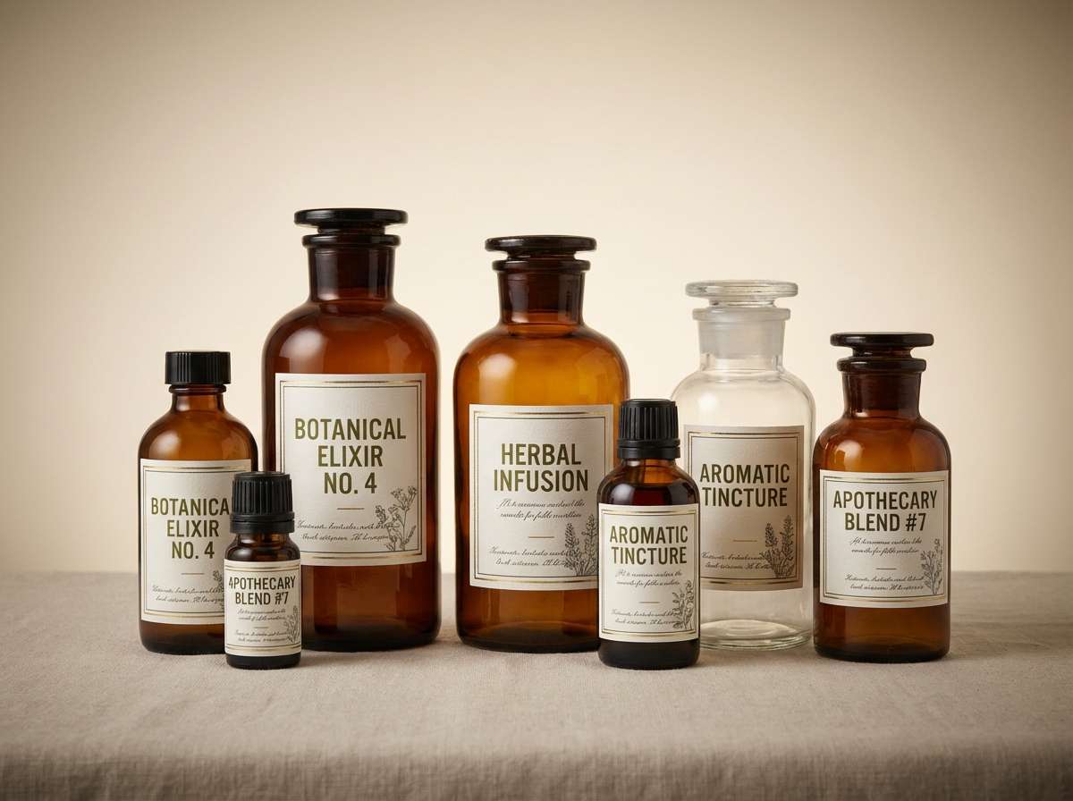
7) Artisan Apothecary
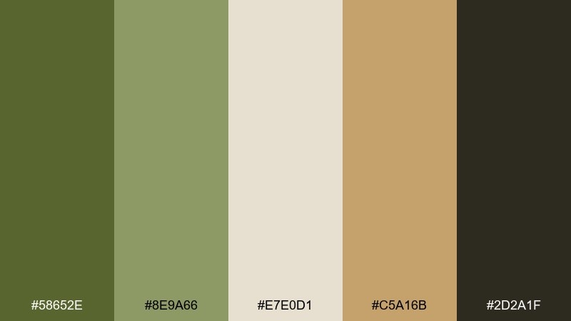
HEX: #58652E #8E9A66 #E7E0D1 #C5A16B #2D2A1F
Mood: heritage, botanical, premium
Best for: apothecary label system
Heritage and botanical, it suggests glass bottles, dried herbs, and a well-worn oak shelf. The gold-tan accent brings a premium edge to an otherwise grounded set of greens. For an olivine color scheme that feels upscale, pair the light cream with the near-black for strong label contrast. Usage tip: keep ornaments subtle and let the color blocks and typography do the work for a timeless look.
Image example of artisan apothecary generated using media.io
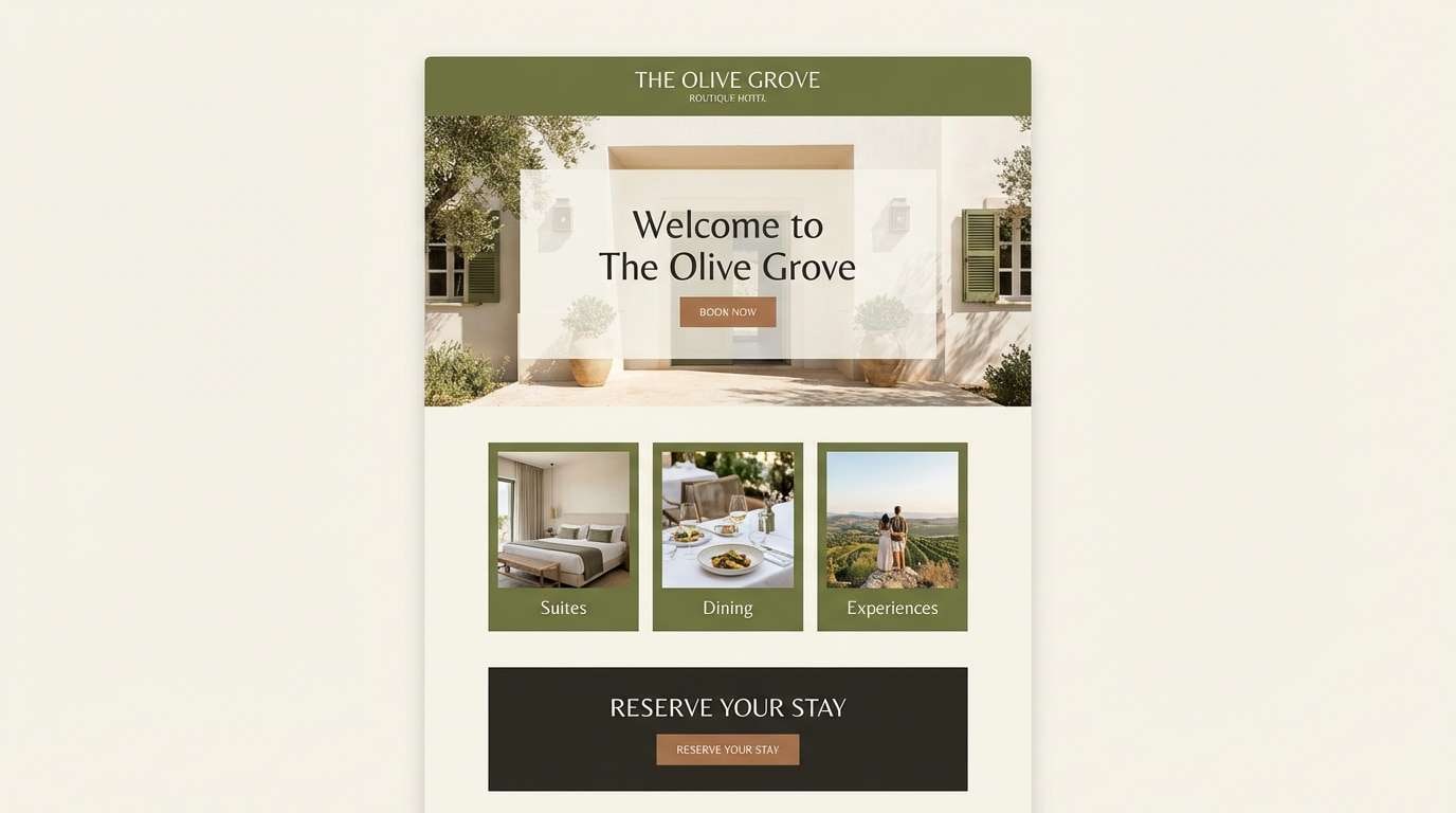
8) Modern Cabin
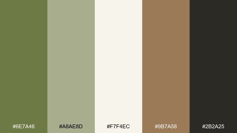
HEX: #6E7A46 #A8AE8D #F7F4EC #9B7A58 #2B2A25
Mood: warm, modern-rustic, relaxed
Best for: boutique hotel website
Warm and relaxed, it feels like a modern cabin with natural light and polished wood. The creamy white keeps pages bright while the walnut tone adds hospitality warmth. Great for boutique hotel websites, travel guides, and cozy booking flows. Usage tip: use the dark charcoal for footer sections and the olivine-green for interactive states like hover and active.
Image example of modern cabin generated using media.io
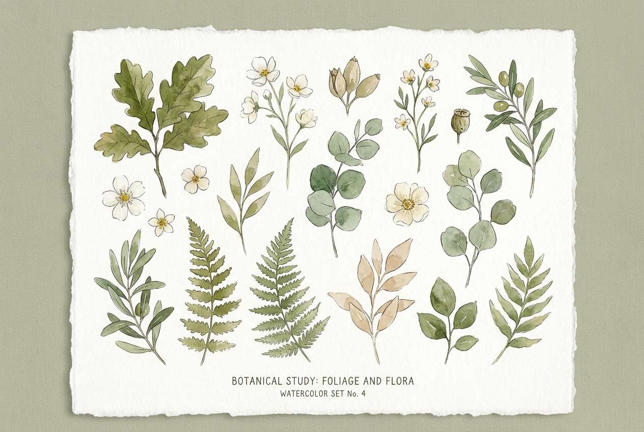
9) Botanical Watercolor
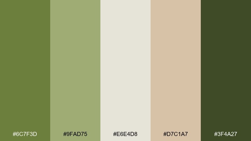
HEX: #6C7F3D #9FAD75 #E6E4D8 #D7C1A7 #3F4A27
Mood: fresh, soft, painterly
Best for: spring botanical illustration set
Fresh and painterly, it evokes watercolor leaves, light paper grain, and quiet spring air. The muted blush-tan keeps the greens soft and approachable for illustration work. Use it for botanical prints, sticker sheets, and gentle social graphics. Usage tip: keep outlines minimal and let #6C7F3D and #9FAD75 carry the form through layered washes.
Image example of botanical watercolor generated using media.io
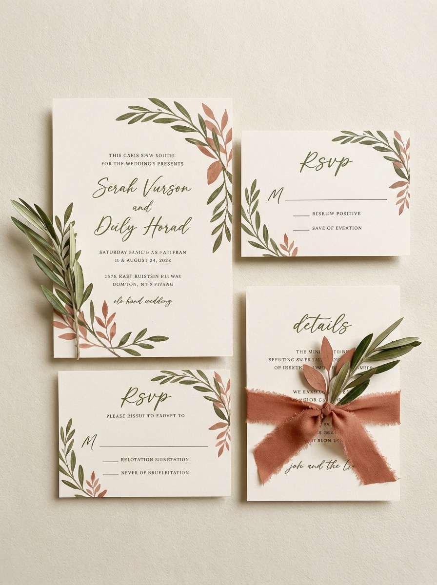
10) Soft Clay Garden
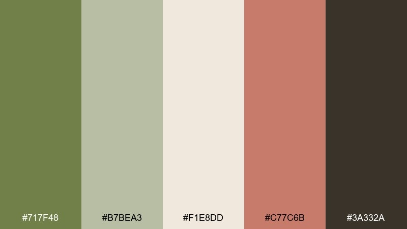
HEX: #717F48 #B7BEA3 #F1E8DD #C77C6B #3A332A
Mood: gentle, romantic, earthy
Best for: wedding invitation suite
Gentle and romantic, it feels like garden foliage against terracotta pots and cream paper. The clay-rose accent adds a warm celebratory touch while the greens stay understated. Perfect for wedding invitations, save-the-dates, and place cards with a natural theme. Usage tip: print on uncoated stock and use the deepest brown for names to keep readability high.
Image example of soft clay garden generated using media.io
11) Retro Outdoors
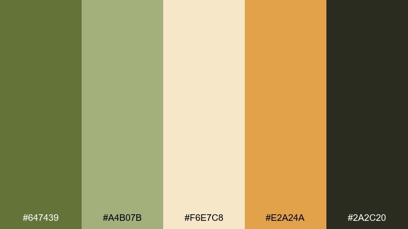
HEX: #647439 #A4B07B #F6E7C8 #E2A24A #2A2C20
Mood: playful, vintage, adventurous
Best for: camping poster design
Playful and adventurous, it channels vintage camping gear and sun-faded trail maps. The golden orange makes the green feel energetic rather than formal. Use these olivine color combinations for posters, merch graphics, and event flyers that need bold contrast. Usage tip: keep backgrounds light and let the orange pop only on key icons and headings for a classic retro balance.
Image example of retro outdoors generated using media.io

12) Coastal Olive Mist
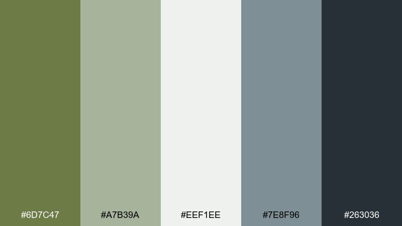
HEX: #6D7C47 #A7B39A #EEF1EE #7E8F96 #263036
Mood: fresh, breezy, refined
Best for: spa brochure layout
Fresh and breezy, it suggests sea mist drifting into a coastal garden. The blue-gray adds a cool, refined edge that keeps the greens from feeling too earthy. It works well for spa brochures, wellness decks, and calm editorial layouts. Usage tip: use the misty off-white as the main page color and reserve the deep slate for fine rules, captions, and footer text.
Image example of coastal olive mist generated using media.io
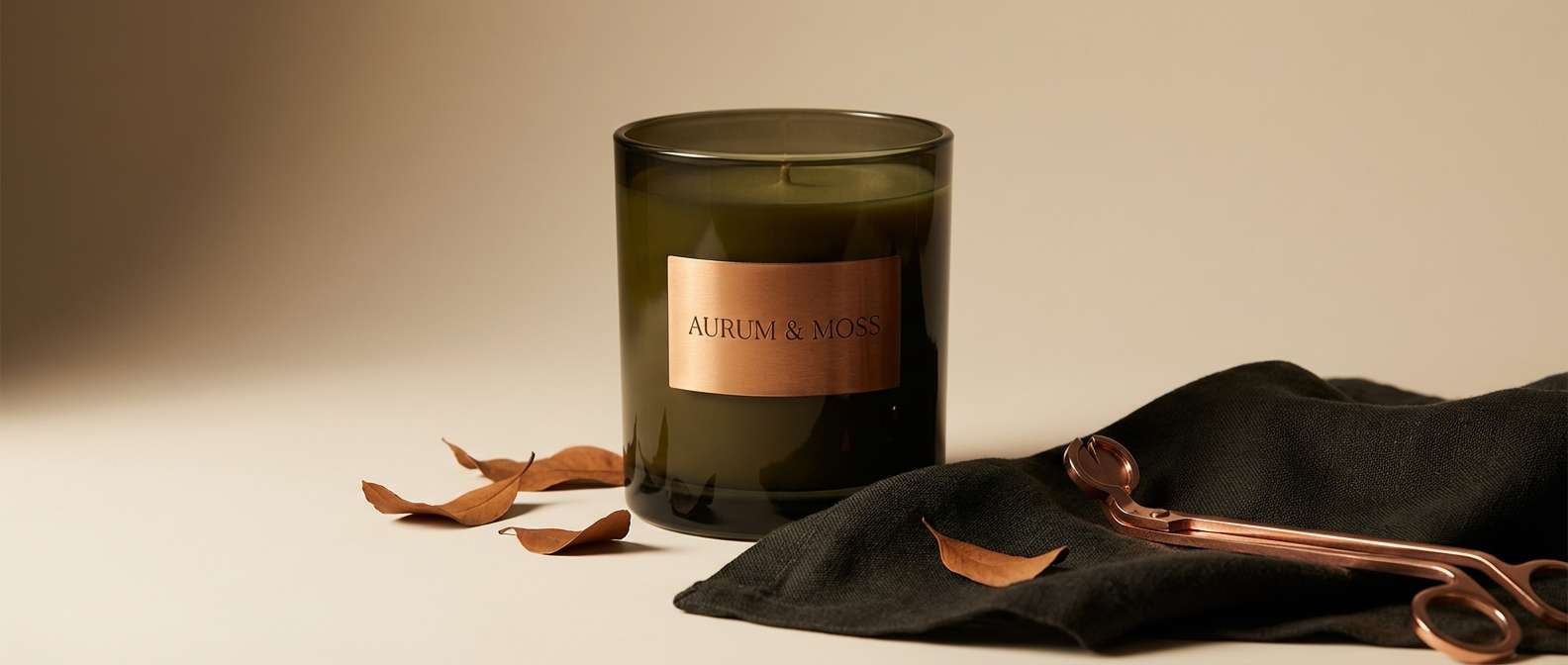
13) Olive and Copper Luxe
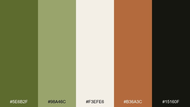
HEX: #5E6B2F #98A46C #F3EFE6 #B36A3C #15160F
Mood: luxurious, dramatic, warm
Best for: premium candle brand ad
Luxurious and dramatic, it feels like candlelight reflecting off copper and dark glass. The copper accent turns the muted greens into a rich, evening-ready pairing. Use it for premium ads, product hero banners, and giftable packaging. Usage tip: keep copper as a single focal element, then use the near-black for type so the layout reads crisp and expensive.
Image example of olive and copper luxe generated using media.io
14) Muted Sportswear
HEX: #6A7842 #9AA57E #E7E6DF #2F3F43 #C2A07C
Mood: athletic, muted, practical
Best for: activewear ecommerce banner
Athletic and practical, it reads like technical fabric in muted, wearable tones. The deep teal-charcoal adds strength while the warm tan keeps it approachable. Great for activewear banners, outdoor product pages, and performance-focused brand kits. Usage tip: put product names in the dark shade and use the mid green as your primary highlight for sizes, filters, and tags.
Image example of muted sportswear generated using media.io
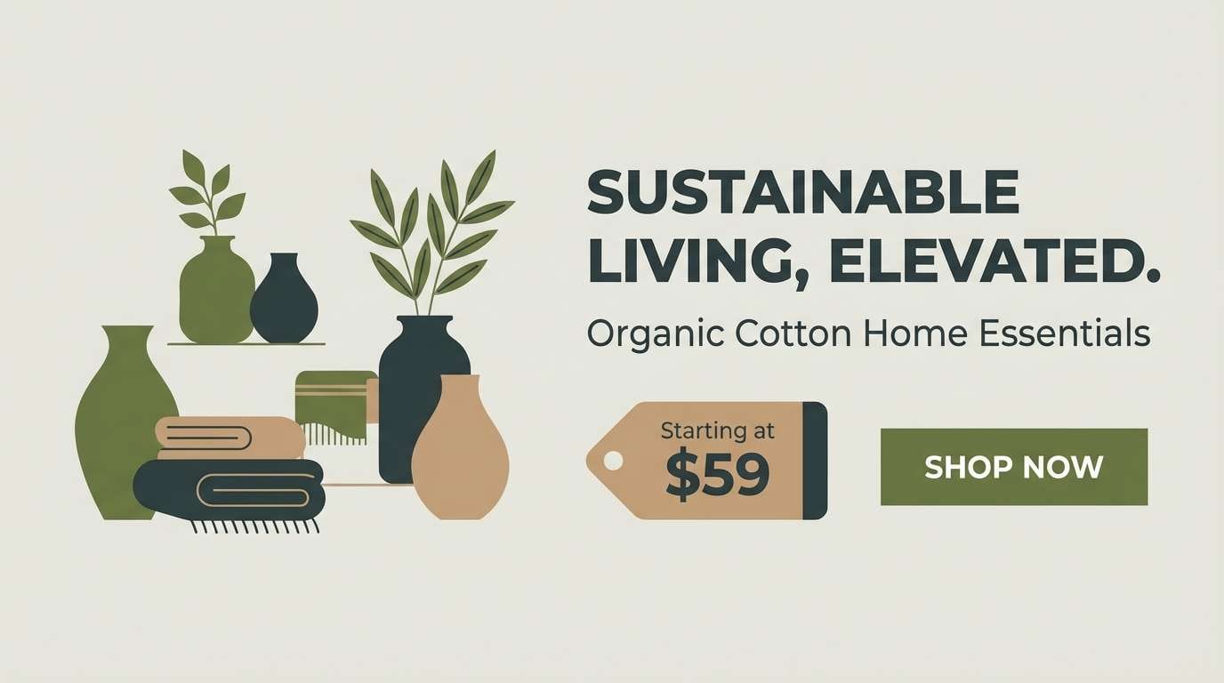
15) Editorial Earth
HEX: #6F7E4A #B8C0A6 #F6F3EA #B49A7B #2A2A26
Mood: thoughtful, editorial, understated
Best for: magazine feature spread
Thoughtful and understated, it feels like an editorial spread printed on soft, warm stock. The taupe-brown adds quiet sophistication and keeps the greens from leaning too playful. Use it for magazine layouts, long-form blog visuals, and reports that need a natural tone. Usage tip: limit body text to the deep charcoal and reserve the green only for pull quotes and section dividers.
Image example of editorial earth generated using media.io
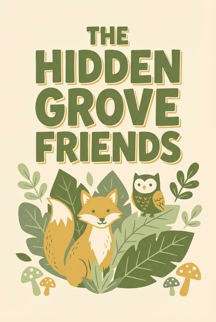
16) Kids Nature Book
HEX: #6C823F #AFC38B #FFF3DD #E6B55A #4B5A2D
Mood: friendly, bright, outdoorsy
Best for: children book cover design
Friendly and outdoorsy, it feels like a sunny nature walk illustrated in simple shapes. The butter-cream background keeps everything light while the warm yellow adds cheerful energy. Ideal for children book covers, classroom posters, and playful educational graphics. Usage tip: use the darker green for titles and outlines, then fill illustrations with the lighter green and yellow to keep contrast clear.
Image example of kids nature book generated using media.io
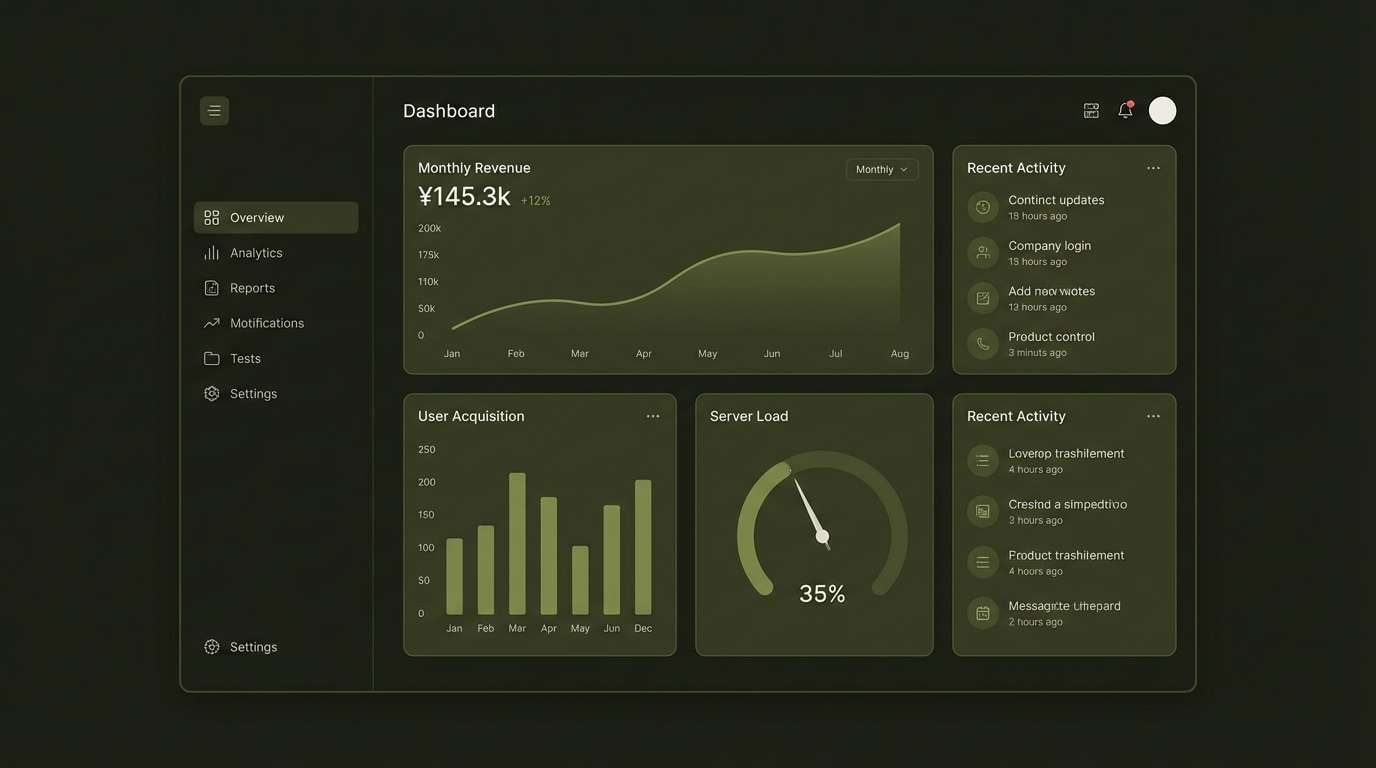
17) UI Dark Moss

HEX: #4E5B2A #74824C #C9D1B1 #1B1E14 #F4F2EA
Mood: moody, sleek, techy
Best for: dark mode dashboard UI
Moody and sleek, it evokes mossy shadows with a crisp, techy finish. The near-black base makes the greens glow subtly without becoming neon. Ideal for dashboards, analytics apps, and dark mode settings panels. Usage tip: keep text in the warm off-white and use the mid green only for active states and charts to avoid visual fatigue.
Image example of ui dark moss generated using media.io
18) Greenery Wedding Classic
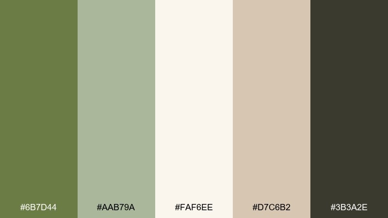
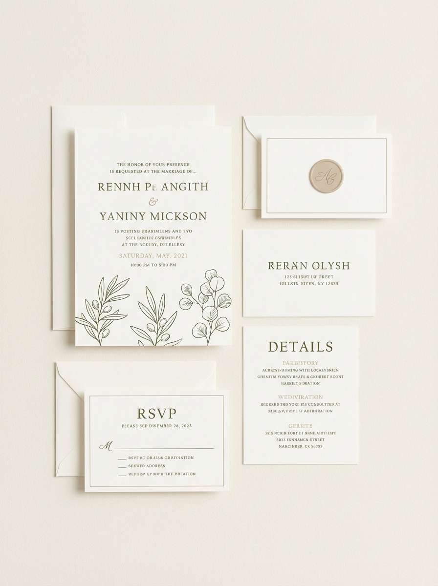
HEX: #6B7D44 #AAB79A #FAF6EE #D7C6B2 #3B3A2E
Mood: elegant, soft, timeless
Best for: formal wedding invitation suite
Elegant and timeless, it feels like greenery garlands against crisp cream paper. The dusty beige adds warmth while keeping everything refined and formal. For a modern olivine color palette in wedding print, pair the deep gray-brown with plenty of negative space and delicate line work. Usage tip: keep the green for monograms and small botanical motifs, and let the cream do most of the heavy lifting.
Image example of greenery wedding classic generated using media.io
19) Organic Market Packaging
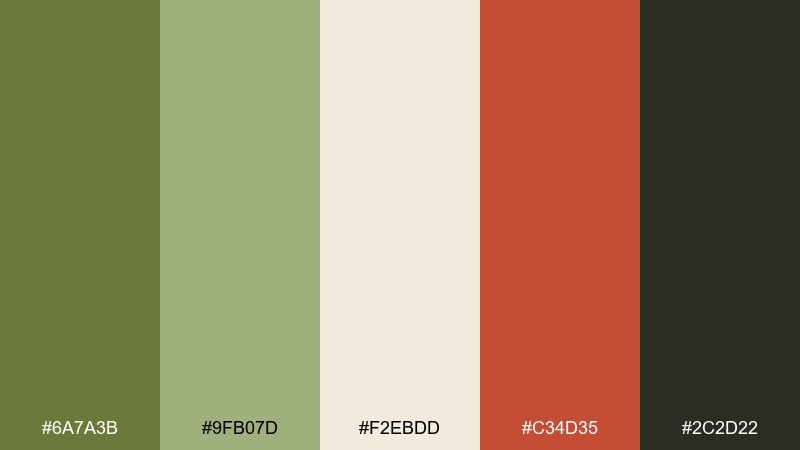
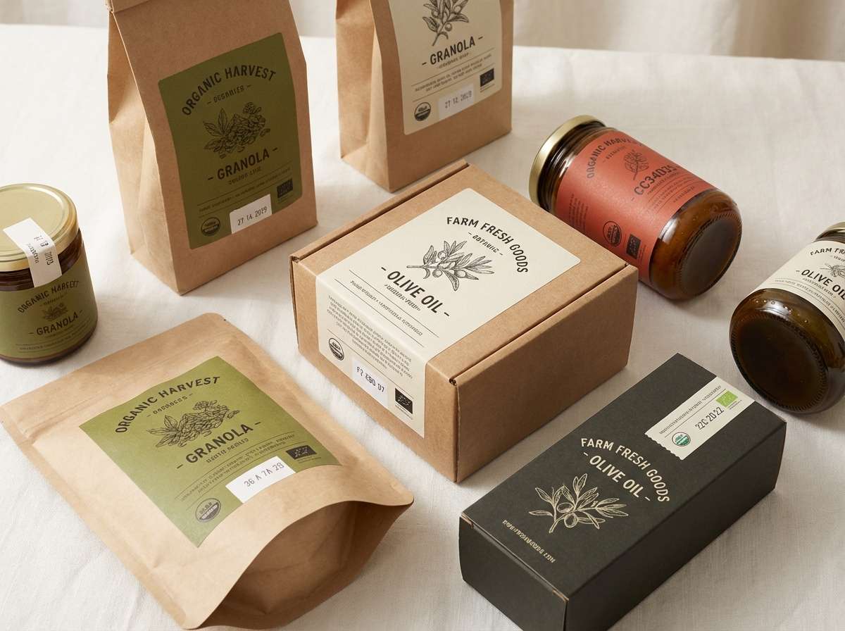
HEX: #6A7A3B #9FB07D #F2EBDD #C34D35 #2C2D22
Mood: fresh, bold, farmers-market
Best for: organic food packaging and stickers
Fresh and bold, it feels like produce crates, kraft paper, and hand-stamped stickers. The tomato-red accent gives the greens a lively contrast for shelf impact. These olivine color combinations work especially well for organic food packaging, jar labels, and market signage. Usage tip: keep the red as a small badge or flavor marker and rely on the green and cream for the main brand blocks.
Image example of organic market packaging generated using media.io
20) Autumn Hike
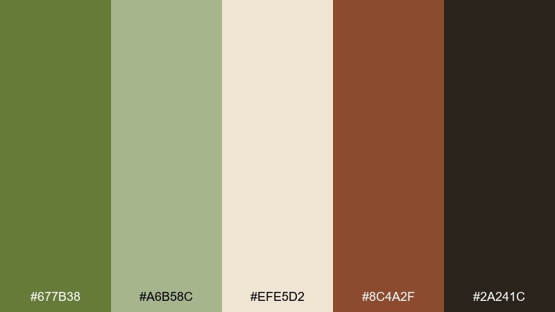
HEX: #677B38 #A6B58C #EFE5D2 #8C4A2F #2A241C
Mood: earthy, rugged, seasonal
Best for: outdoor brand social campaign
Earthy and rugged, it brings to mind leaf litter, worn boots, and late-season trail light. The rust-brown accent adds grit and makes the greens feel more adventurous. Use it for outdoor social campaigns, gear lookbooks, and trail event promos. Usage tip: set your headlines in the dark brown-black and use the rust as a punchy underline or badge to guide the eye.
Image example of autumn hike generated using media.io

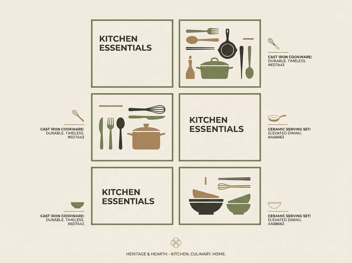
21) Stoneware Kitchen
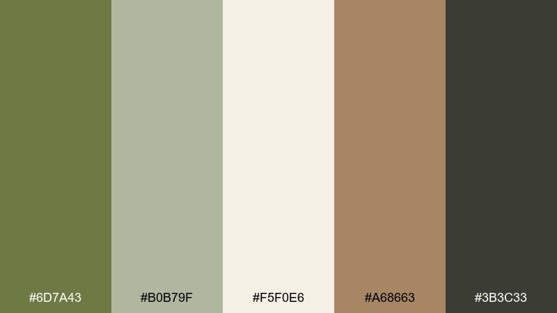
HEX: #6D7A43 #B0B79F #F5F0E6 #A68663 #3B3C33
Mood: homey, clean, artisanal
Best for: kitchen brand website and catalog
Homey and clean, it feels like stoneware bowls on a bright counter with leafy herbs nearby. The warm tan reads like wood and adds an artisanal note without clutter. Great for kitchen brands, cookware catalogs, and recipe layouts. Usage tip: make the off-white your canvas, then use the darkest gray for text and the green for section headers and icon fills.
Image example of stoneware kitchen generated using media.io
22) Mountain Pass Contrast
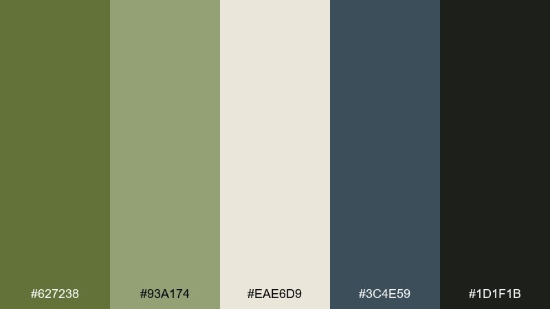
HEX: #627238 #93A174 #EAE6D9 #3C4E59 #1D1F1B
Mood: bold, crisp, adventurous
Best for: travel app onboarding screens
Bold and crisp, it evokes a mountain pass where evergreen meets cool slate rock. The blue-gray adds depth and makes the greens feel sharper and more modern. If you want an olivine color combination with extra contrast, use the slate for headers and the green for primary actions. Usage tip: keep backgrounds light and let the near-black handle body copy so onboarding screens stay readable.
Image example of mountain pass contrast generated using media.io
What Colors Go Well with Olivine?
Olivine pairs beautifully with warm neutrals like linen, cream, parchment, sand, and soft taupe—these keep the palette airy and natural. For a richer look, bring in walnut brown, cocoa, or near-black to sharpen typography and improve contrast.
If you want olivine to feel more modern, add cool accents such as slate, blue-gray, or deep teal-charcoal. For an expressive pop, copper, rust, clay-rose, tomato red, or golden yellow can energize the muted green without making it neon.
How to Use a Olivine Color Palette in Real Designs
Start with a clear role system: one light background (cream/off-white), one dark text color (charcoal/near-black), and one olivine as your brand or primary action color. Then keep accents (copper, rust, clay) limited to highlights like badges, pricing, or key icons.
In UI, use olivine for states (active, hover, selected) and reserve the darkest shade for navigation and body text to maintain readability. In print and packaging, lean on uncoated textures and let the light neutral do most of the surface area so the green feels calm and premium.
Create Olivine Palette Visuals with AI
If you have HEX codes but need matching mockups, lifestyle scenes, or UI examples, AI generation can quickly produce consistent visuals in your olivine color scheme. Reuse the prompts above and swap product types (labels, posters, dashboards) to fit your project.
With Media.io, you can generate images in specific aspect ratios and iterate fast—ideal for brand mood boards, landing pages, and campaign creatives that must stay color-accurate.
Olivine Color Palette FAQs
-
What color is olivine?
Olivine is a muted yellow-green inspired by the olivine gemstone and natural foliage. It usually sits between olive and sage, with a dusty, earthy softness. -
Is olivine the same as olive green?
Not exactly. Olive green is often deeper and browner; olivine tends to be slightly lighter and more mineral/natural in feel, which makes it easier to pair with creams and cool grays. -
What are the best neutral colors to pair with olivine?
Cream, linen, warm off-white, parchment, soft taupe, and light stone gray are the safest neutrals. For contrast, use charcoal or near-black as the typography anchor. -
What accent colors make olivine look more modern?
Blue-gray, slate, deep teal-charcoal, and cool concrete gray add a contemporary edge. Use them for headers, UI surfaces, or structured elements like dividers and cards. -
What accent colors make olivine feel warmer and more premium?
Copper, caramel, walnut brown, rust, and gold-tan push olivine toward an upscale, evening-ready look. Keep the accent area small so the palette stays refined. -
How do I keep an olivine UI accessible?
Use a dark text color (charcoal/near-black) on light backgrounds and avoid setting long body text in olivine. Reserve olivine for buttons, active states, charts, and small highlights with sufficient contrast. -
Can I generate olivine-themed brand visuals with AI using HEX codes?
Yes. Include your HEX codes in the prompt (dominant + accents), specify lighting/style (minimal, premium, rustic), and lock an aspect ratio. Then iterate by changing only the scene type to keep the palette consistent.


