

Blue lavender sits right between calm blue and romantic lavender, making it one of the most flexible “soft-but-modern” color directions for digital and print design.
Below you’ll find 20+ curated blue lavender color palette ideas with HEX codes, plus practical pairing tips for branding, UI, weddings, packaging, and more.
In this article
- Why Blue Lavender Palettes Work So Well
-
- misty periwinkle
- moonlit lilac
- coastal wisteria
- icy orchid
- denim lavender
- lavender fog neutrals
- electric iris pop
- vintage hydrangea
- nordic lavender blue
- sunset mauve blue
- soft tech ui
- ceremony periwinkle
- cosmic nebula
- botanical lavender mist
- gallery gray lavender
- kids room dream
- luxury spa lavender blue
- studio clay accent
- winter twilight
- modern poster punch
- soft gradient blend
- satin ribbon mix
- blueprint lavender
- What Colors Go Well with Blue Lavender?
- How to Use a Blue Lavender Color Palette in Real Designs
- Create Blue Lavender Palette Visuals with AI
Why Blue Lavender Palettes Work So Well
Blue lavender feels calm and trustworthy like blue, but softer and more emotional thanks to its lavender undertone. That balance helps brands feel modern without turning cold or overly corporate.
It also scales beautifully across UI states: light tints for surfaces, mid tones for navigation, and deeper indigo-plums for type and contrast. You can get hierarchy without needing aggressive saturation.
Finally, blue lavender pairs easily with both cool neutrals (white, slate, graphite) and warm accents (cream, clay, blush). That makes it a strong base for everything from minimal SaaS to romantic stationery.
20+ Blue Lavender Color Palette Ideas (with HEX Codes)
1) Misty Periwinkle
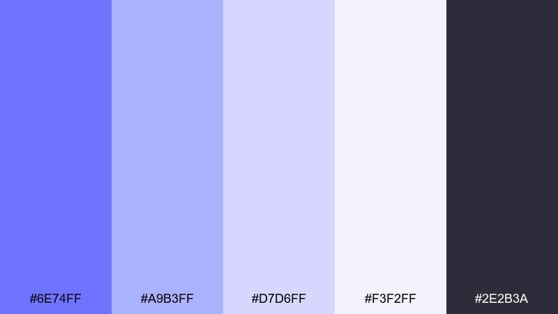
HEX: #6E74FF #A9B3FF #D7D6FF #F3F2FF #2E2B3A
Mood: airy, calm, modern
Best for: landing pages and app onboarding screens
Airy and calm like morning haze over soft periwinkle clouds, these tones feel gentle without going sleepy. Use the mid periwinkle as your primary UI color and keep the pale lilac whites for spacious backgrounds. Pair with near-black typography for crisp accessibility and a polished look. Tip: reserve the saturated violet-blue for CTAs only to keep the interface feeling light.
Image example of misty periwinkle generated using media.io
Media.io is an online AI studio for creating and editing video, image, and audio in your browser.

2) Moonlit Lilac
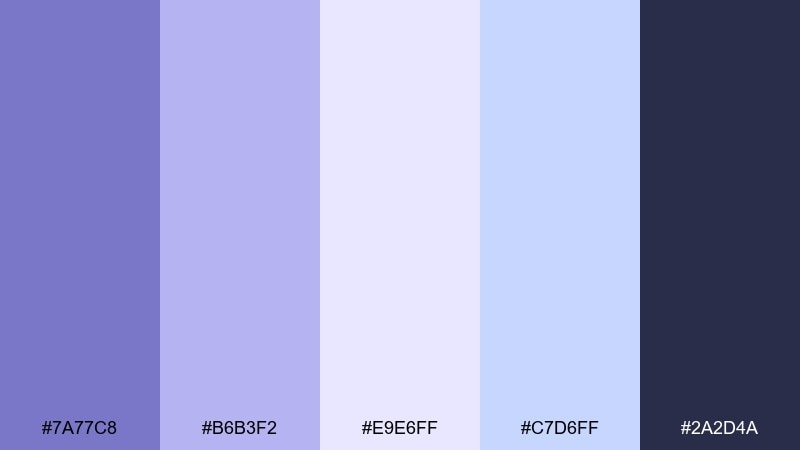
HEX: #7A77C8 #B6B3F2 #E9E6FF #C7D6FF #2A2D4A
Mood: dreamy, quiet, elegant
Best for: editorial layouts and lookbooks
Dreamy and quiet like moonlight on lilac petals, the contrast here feels refined rather than loud. Let the deep indigo anchor headlines and use the pale lilac as the page field for a premium, airy spread. The cool blue tint works beautifully for pull quotes and callouts. Tip: keep body text in the dark shade and avoid pure black to maintain the soft atmosphere.
Image example of moonlit lilac generated using media.io
3) Coastal Wisteria
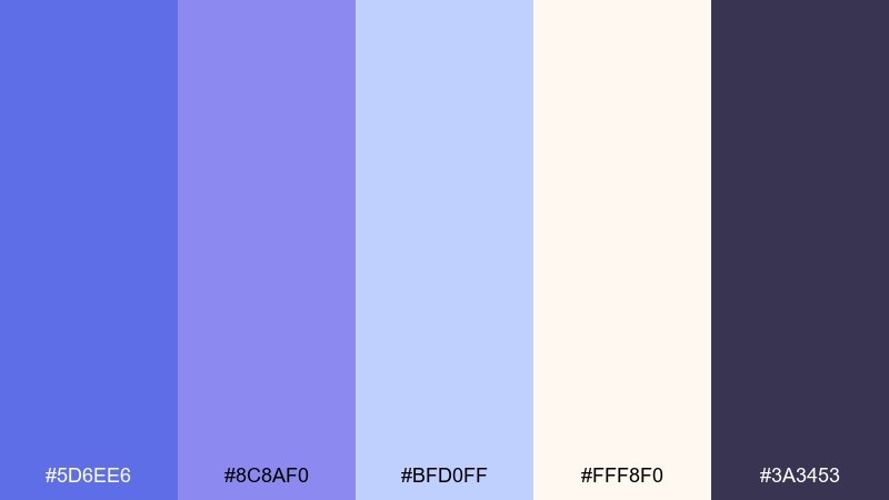
HEX: #5D6EE6 #8C8AF0 #BFD0FF #FFF8F0 #3A3453
Mood: fresh, coastal, optimistic
Best for: travel branding and social media templates
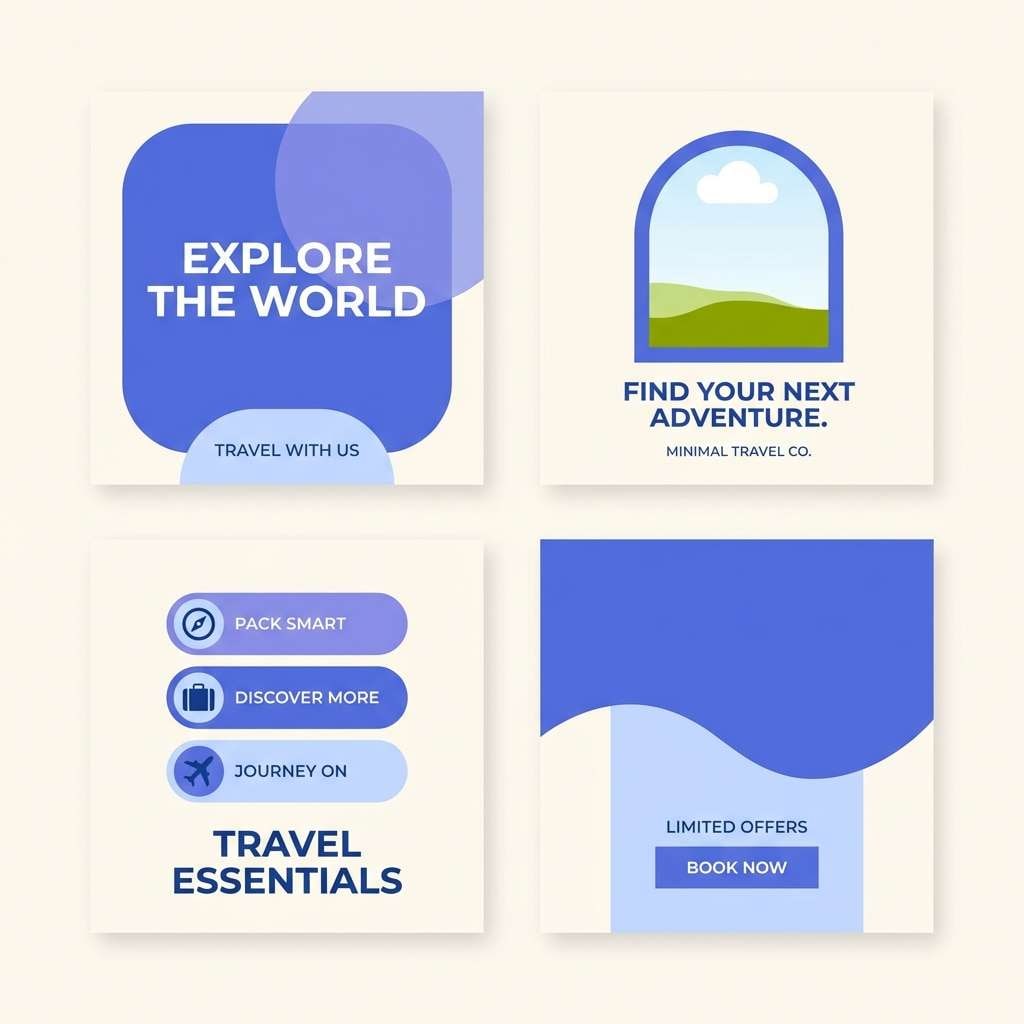
Fresh and coastal like wisteria vines against a bright shoreline, these colors read upbeat and inviting. Use the creamy off-white to warm the set so it does not feel too icy on screens. Pair the strong blue-violet with the soft periwinkle for gradients in headers or story templates. Tip: add the deep plum only for small type and logos to keep the vibe breezy.
Image example of coastal wisteria generated using media.io
4) Icy Orchid
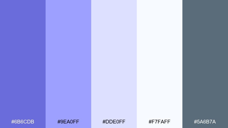
HEX: #6B6CDB #9EA0FF #DDE0FF #F7FAFF #5A6B7A
Mood: clean, cool, clinical
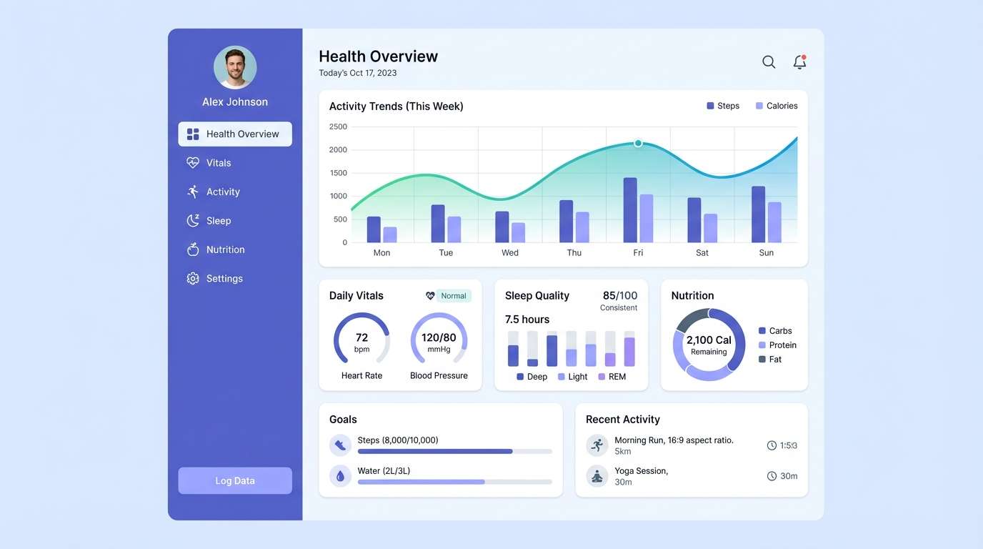
Best for: health tech dashboards and data panels
Clean and cool like an orchid under frosted glass, the palette feels organized and trustworthy. The icy neutrals give data tables a calm baseline while the violet-blue adds hierarchy to tabs and highlights. Pair with slate gray for icons and microcopy so the screen stays legible. Tip: use the brighter lavender only for alerts or progress states, not for long text.
Image example of icy orchid generated using media.io
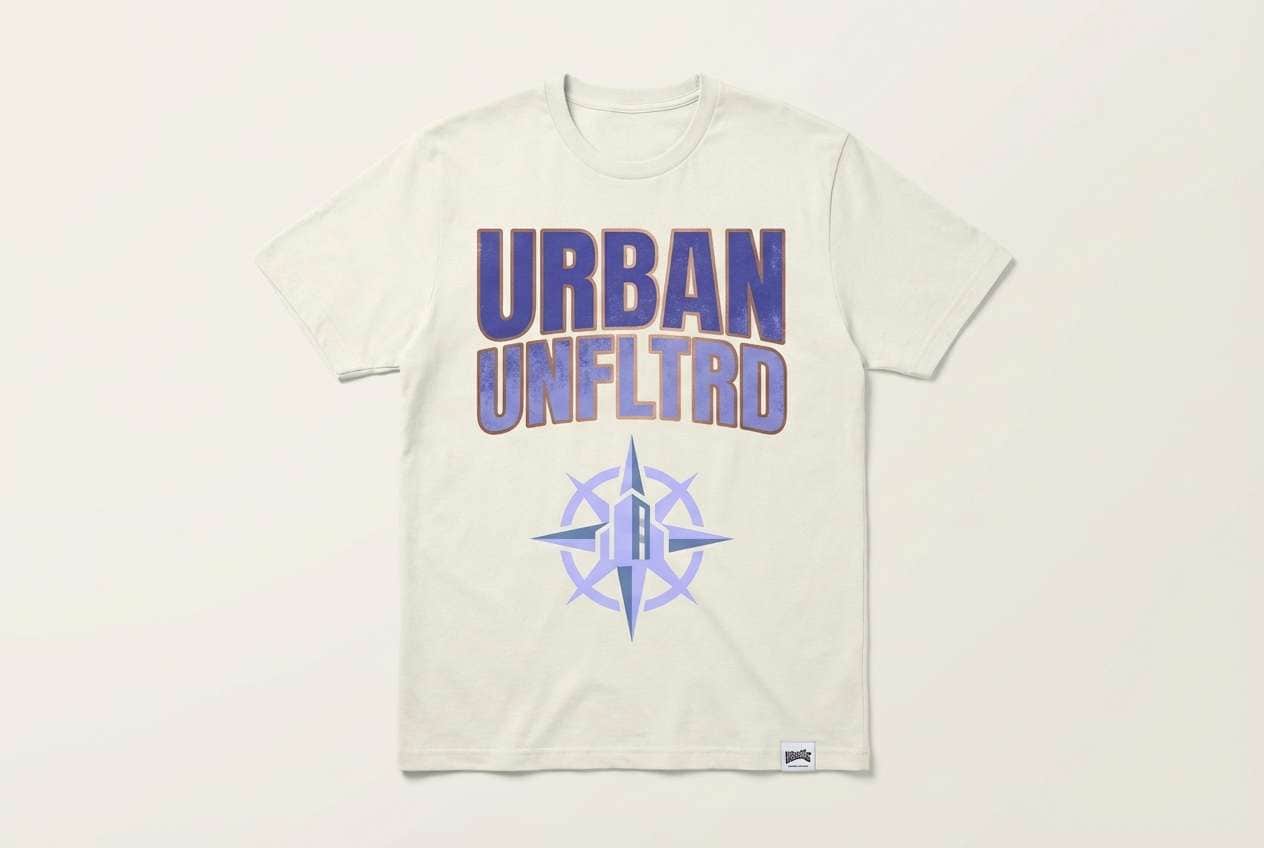
5) Denim Lavender
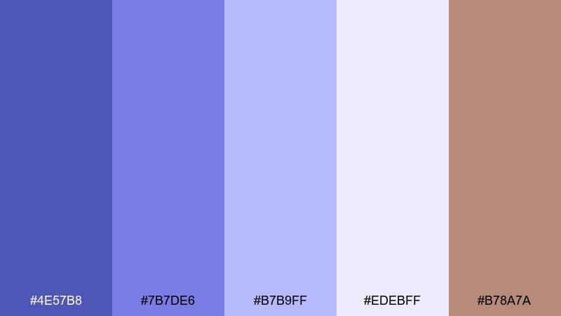
HEX: #4E57B8 #7B7DE6 #B7B9FF #EDEBFF #B78A7A
Mood: casual, creative, approachable
Best for: streetwear branding and merch graphics
Casual and creative like worn denim with a lavender wash, this mix has a friendly edge. It is a blue lavender color palette that works well on tees, tags, and stickers when you want color without neon. Pair the warm clay accent with the indigo base to keep prints from feeling too cold. Tip: screen print with the light lilac as a highlight layer to add depth on dark fabric.
Image example of denim lavender generated using media.io
6) Lavender Fog Neutrals
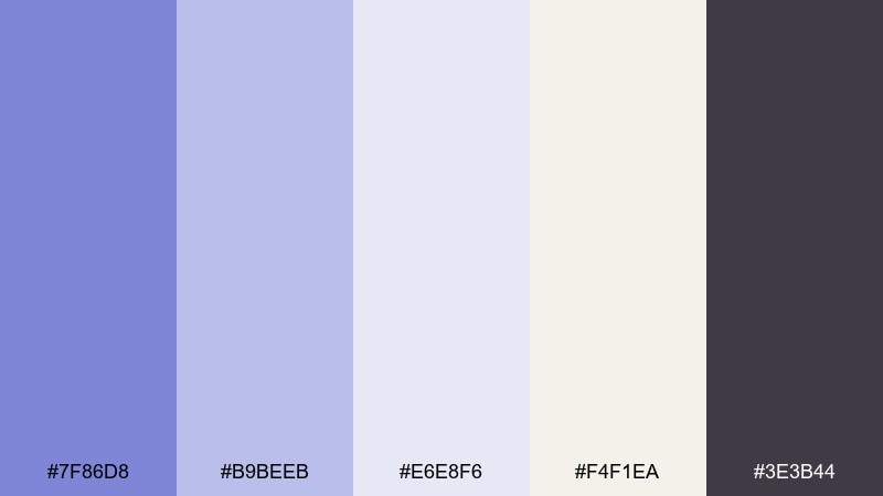
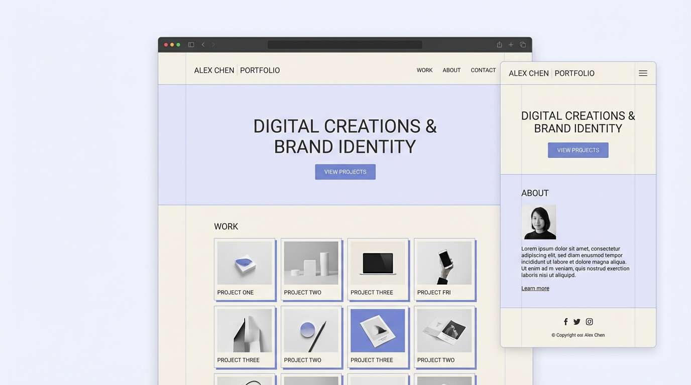
HEX: #7F86D8 #B9BEEB #E6E8F6 #F4F1EA #3E3B44
Mood: soft, minimal, calming
Best for: minimalist websites and portfolios
Soft and minimal like fog rolling over a quiet hillside, these neutrals feel soothing and grown-up. Use the warm off-white as your primary canvas and bring in lavender tones for section breaks and subtle buttons. The charcoal shade keeps typography grounded and prevents a washed-out look. Tip: add gentle shadows in the mid lavender to create depth without harsh contrast.
Image example of lavender fog neutrals generated using media.io
7) Electric Iris Pop
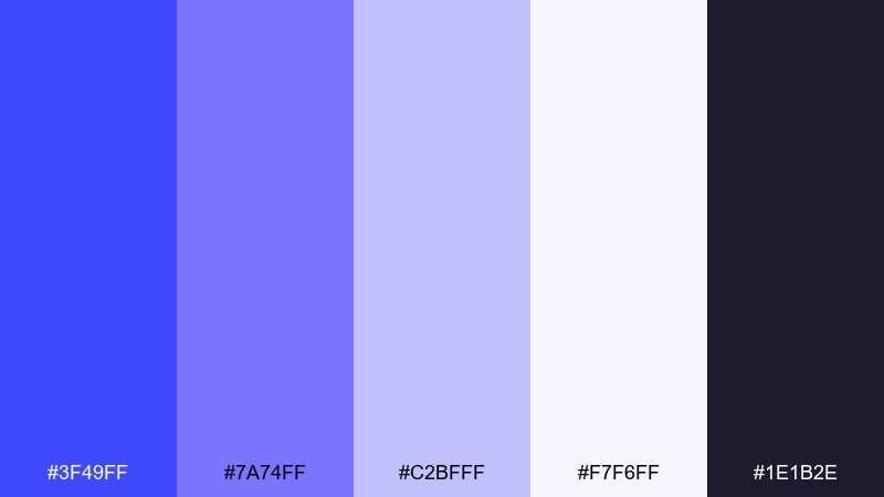
HEX: #3F49FF #7A74FF #C2BFFF #F7F6FF #1E1B2E
Mood: bold, youthful, energetic
Best for: event posters and music promo graphics
Bold and youthful like an iris lit by stage lights, this set is made for attention. Use the electric blue-violet for headlines and keep the pale lilac for breathing room around type. The deep ink shade keeps layouts sharp when you need strong contrast. Tip: try a two-color poster with the electric tone plus the dark shade, then add the lighter tints only for details and logos.
Image example of electric iris pop generated using media.io

8) Vintage Hydrangea
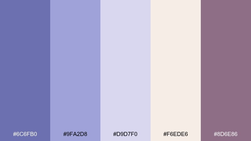
HEX: #6C6FB0 #9FA2D8 #D9D7F0 #F6EDE6 #8D6E86
Mood: romantic, nostalgic, gentle
Best for: wedding stationery and save the dates
Romantic and nostalgic like pressed hydrangea petals in an old book, the tones feel tender and timeless. These blue lavender color combinations shine on invitations with the cream as the paper base and the muted violet for typography. The mauve-plum accent is perfect for monograms or wax seal graphics. Tip: keep flourishes subtle and let the soft contrast do the elegance work.
Image example of vintage hydrangea generated using media.io
9) Nordic Lavender Blue

HEX: #5C64D6 #8D96F2 #C9D3FF #F8FBFF #2B2E3F
Mood: crisp, balanced, Scandinavian
Best for: product UI and SaaS branding
Crisp and balanced like a Scandinavian winter sky, these tones feel efficient and modern. Use the pale blue-white for backgrounds and the mid lavender-blue for navigation states and active elements. The dark graphite anchors logos and keeps the brand from feeling too pastel. Tip: choose one accent level for buttons and keep the rest as tints to avoid a noisy interface.
Image example of nordic lavender blue generated using media.io
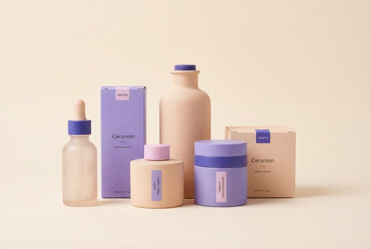
10) Sunset Mauve Blue
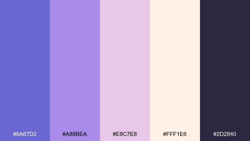
HEX: #6A67D2 #A88BEA #E8C7E8 #FFF1E6 #2D2840
Mood: warm, dreamy, uplifting
Best for: beauty packaging and product ads
Warm and dreamy like sunset light spilling into a violet sky, this blend feels flattering and premium. Let the soft peachy white be your background so the mauves read luminous, not heavy. Pair the deep indigo for ingredient text and fine lines to keep packaging readable. Tip: use the mid lavender-blue for brand marks and the mauve for secondary panels to create a gentle hierarchy.
Image example of sunset mauve blue generated using media.io
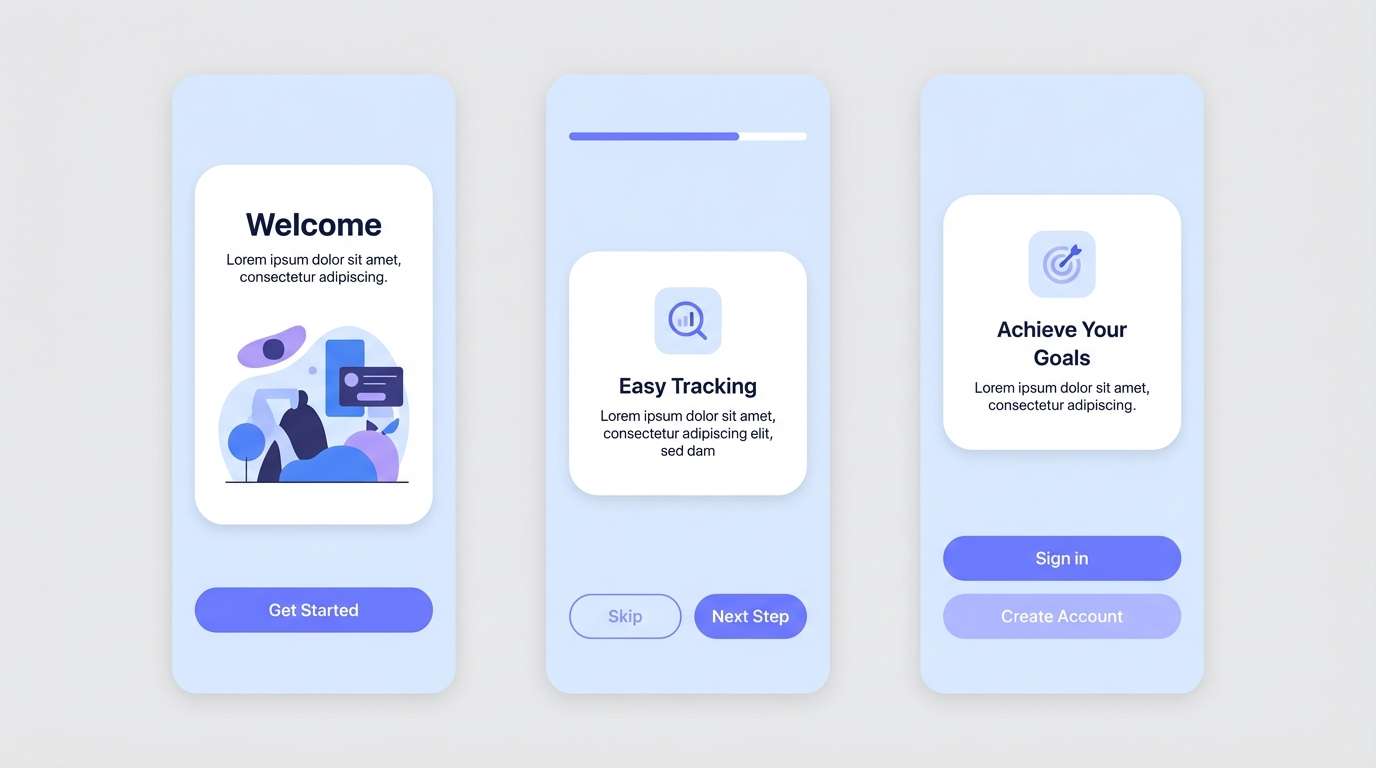
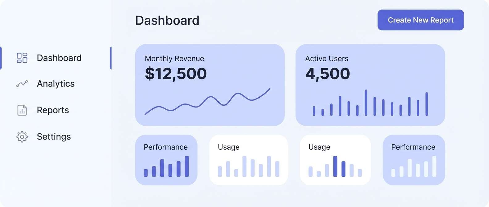
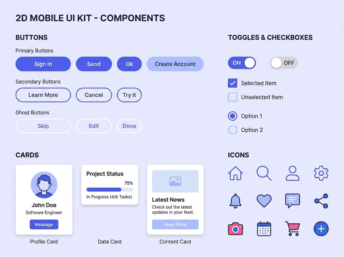
11) Soft Tech UI
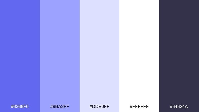
HEX: #6268F0 #9BA2FF #DDE0FF #FFFFFF #34324A
Mood: friendly, polished, tech-forward
Best for: mobile app UI kits and components
Friendly and polished like frosted glass UI with a hint of violet, this set keeps tech layouts approachable. Use white as the base, then layer the pale lavender for cards and surfaces. The primary blue-violet is strong enough for buttons while staying softer than a pure royal blue. Tip: keep icon strokes in the charcoal tone so the interface remains crisp across light backgrounds.
Image example of soft tech ui generated using media.io
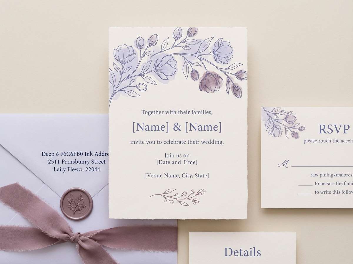
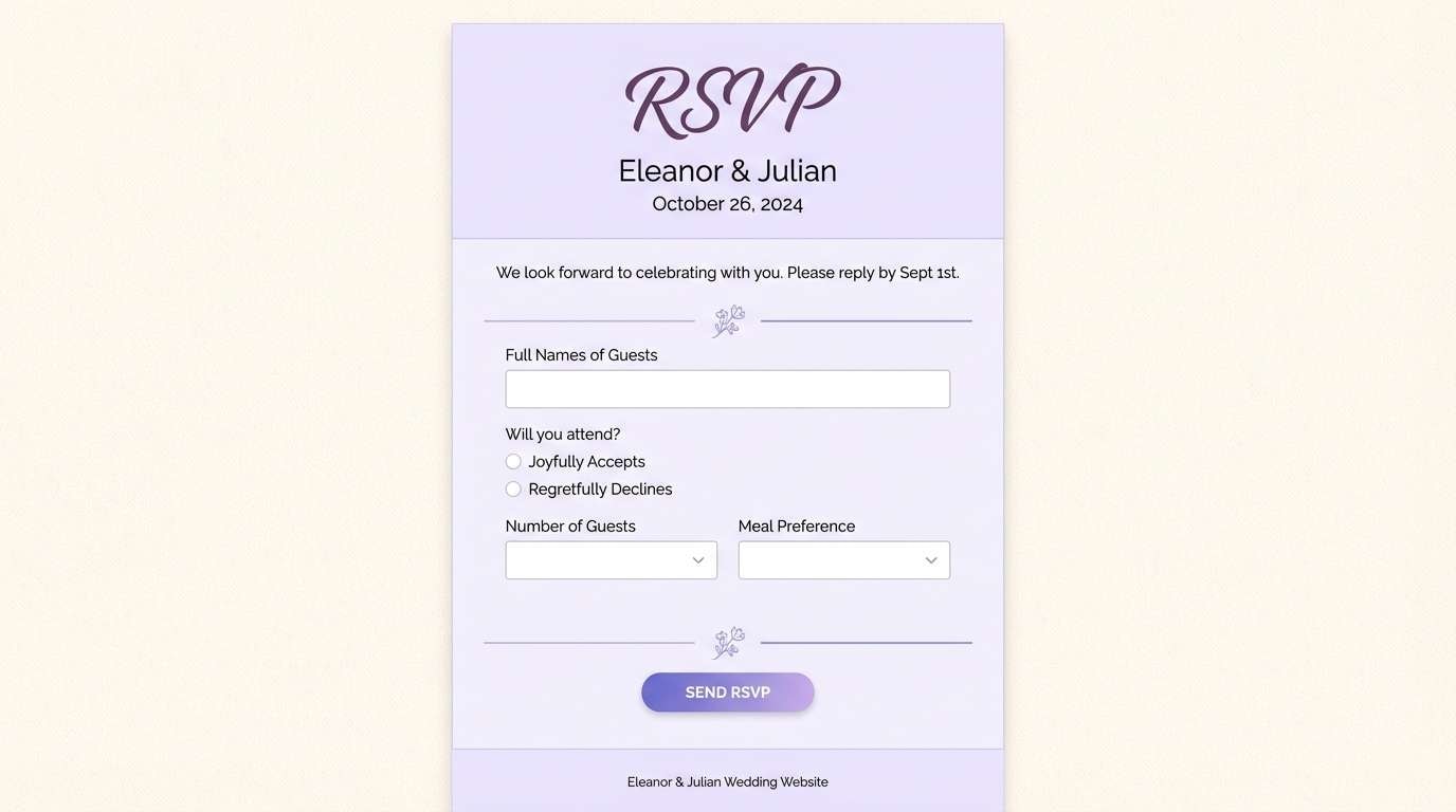
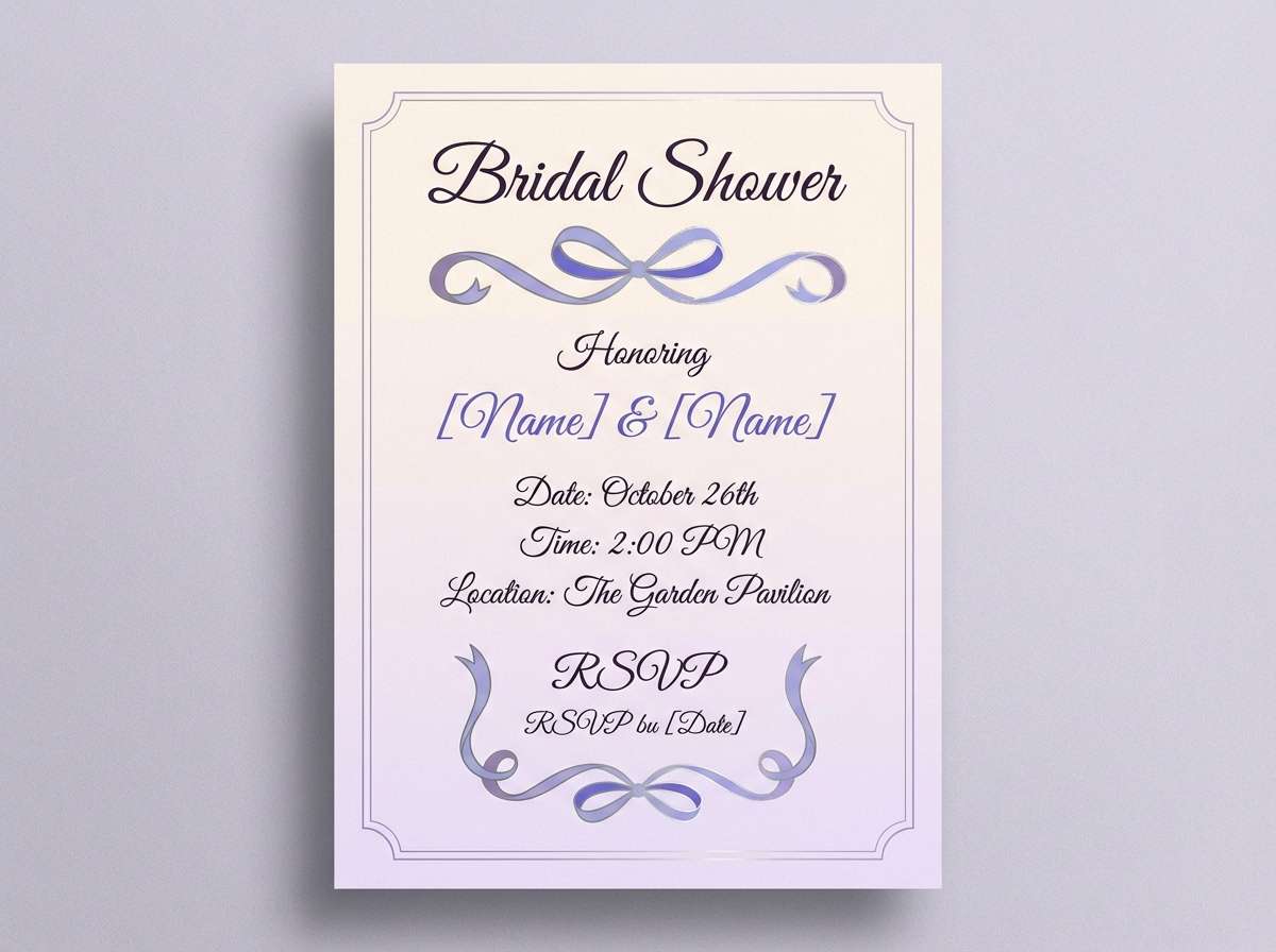
12) Ceremony Periwinkle
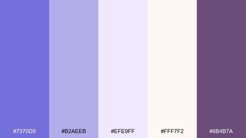
HEX: #7370D9 #B2AEEB #EFE9FF #FFF7F2 #6B4B7A
Mood: romantic, refined, celebratory
Best for: wedding websites and RSVP pages
Romantic and refined like satin ribbons and fresh blossoms, these tones feel celebratory without being loud. It is a blue lavender color palette that reads beautifully on wedding sites when paired with airy spacing and elegant serif type. Use the plum accent for small icons and section titles to add depth. Tip: keep the soft cream as the dominant background so photos look warm and natural.
Image example of ceremony periwinkle generated using media.io
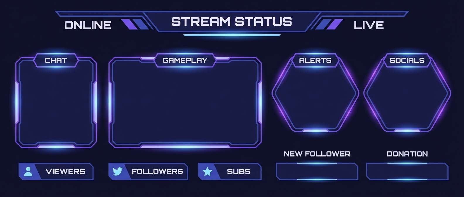
13) Cosmic Nebula
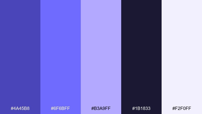
HEX: #4A45B8 #6F6BFF #B3A9FF #1B1833 #F2F0FF
Mood: mysterious, cinematic, high-contrast
Best for: gaming banners and streamer overlays
Mysterious and cinematic like a nebula glow in deep space, the contrast here feels dramatic and modern. Use the inky navy as the base, then layer the neon-leaning violet for highlights and gradients. The pale lilac can act as a soft glow for badges or labels without turning harsh. Tip: keep large text in the near-white and use the bright violet only for emphasis to avoid eye fatigue.
Image example of cosmic nebula generated using media.io
14) Botanical Lavender Mist
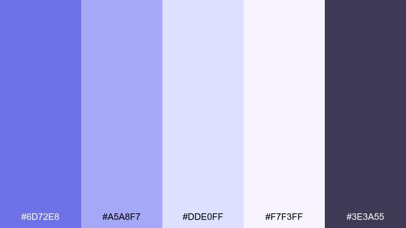
HEX: #6D72E8 #A5A8F7 #DDE0FF #F7F3FF #3E3A55
Mood: gentle, botanical, springlike
Best for: watercolor illustrations and botanical prints
Gentle and springlike like lavender sprigs painted in watercolor, these tints feel fresh and soothing. Use the light lilac washes for petals and background blooms, then add the deeper periwinkle for stems, shadows, and focal flowers. A touch of dark gray-purple helps define outlines without breaking the softness. Tip: keep saturation low in large areas and build depth through layered transparent strokes.
Image example of botanical lavender mist generated using media.io
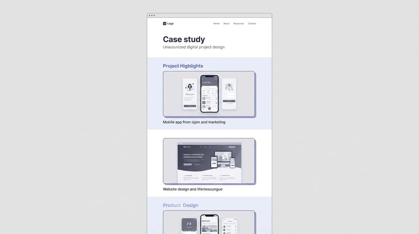
15) Gallery Gray Lavender
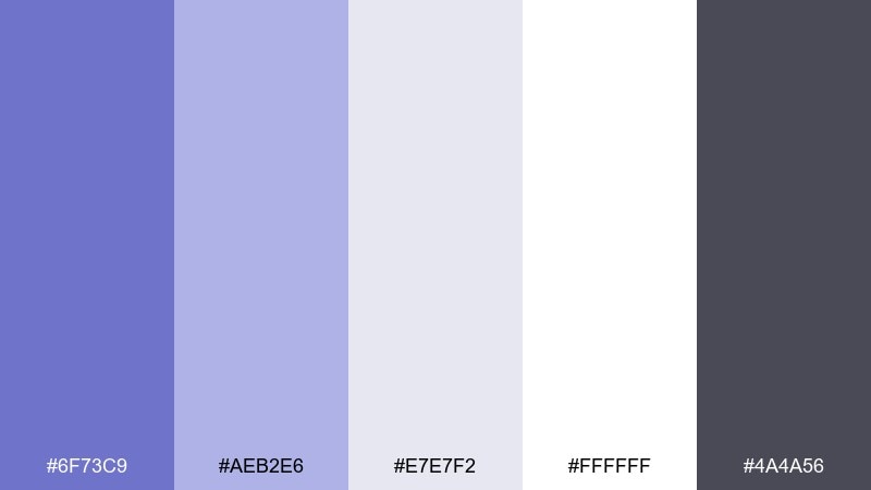
HEX: #6F73C9 #AEB2E6 #E7E7F2 #FFFFFF #4A4A56
Mood: neutral, curated, museum-clean
Best for: portfolio case studies and galleries
Neutral and curated like a quiet gallery wall, the lavender notes feel intentional rather than decorative. The cool grays keep the layout professional, while the violet-blue adds subtle brand personality. Use the mid lavender for links and section labels, and keep imagery framed by clean white margins. Tip: let one accent color do the work and avoid gradients for a more editorial finish.
Image example of gallery gray lavender generated using media.io
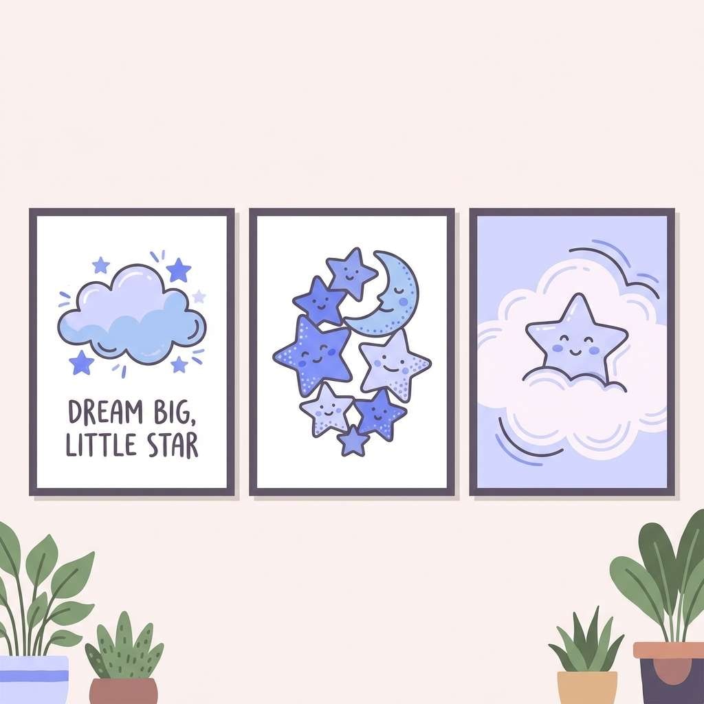
16) Kids Room Dream
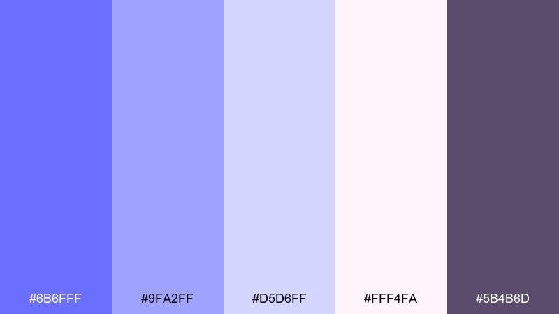
HEX: #6B6FFF #9FA2FF #D5D6FF #FFF4FA #5B4B6D
Mood: playful, sweet, comforting
Best for: nursery decor and kids brand visuals
Playful and sweet like bedtime stories under a soft nightlight, these tones feel comforting and bright. Use the pink-tinted white to warm up the cooler lavender-blue so the look stays kid-friendly. The darker purple-gray is great for outlines, labels, and small text. Tip: keep patterns simple, like dots or stars, and use the saturated violet sparingly as a focal accent.
Image example of kids room dream generated using media.io
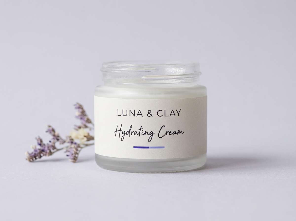
17) Luxury Spa Lavender Blue
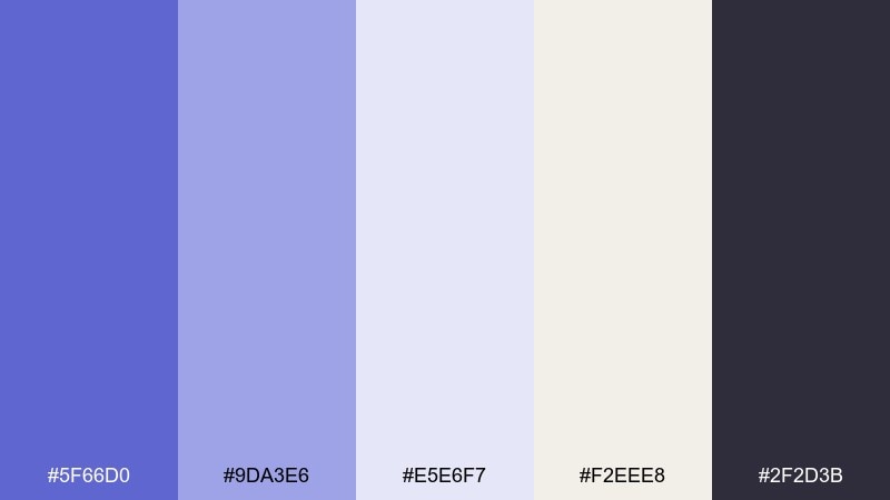
HEX: #5F66D0 #9DA3E6 #E5E6F7 #F2EEE8 #2F2D3B
Mood: serene, premium, restorative
Best for: spa branding and skincare labels
Serene and restorative like warm towels and quiet steam, this set feels premium without being flashy. The stone-like beige adds an organic softness that balances the cool lavender-blue. Use the darkest shade for ingredient lists and the mid tones for brand marks and borders. Tip: choose matte finishes and plenty of negative space so the colors read calm and luxurious.
Image example of luxury spa lavender blue generated using media.io
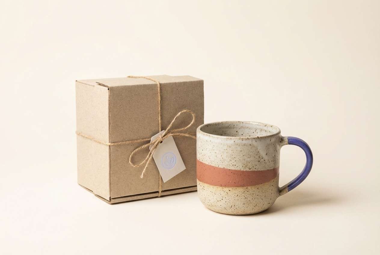
18) Studio Clay Accent
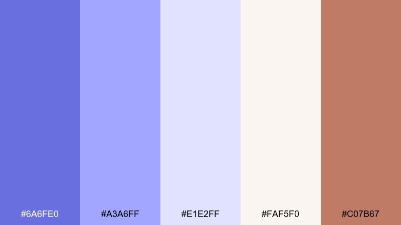
HEX: #6A6FE0 #A3A6FF #E1E2FF #FAF5F0 #C07B67
Mood: artsy, warm, handcrafted
Best for: ceramics shops and maker brands
Artsy and warm like a pottery studio at golden hour, the clay accent brings a handcrafted feel. Use the soft off-white for backgrounds and let the lavender-blue appear in badges, highlights, and product categories. The terracotta tone pairs beautifully for buttons, stamps, or packaging tape. Tip: keep photography warm and neutral so the accent color does not fight the product textures.
Image example of studio clay accent generated using media.io
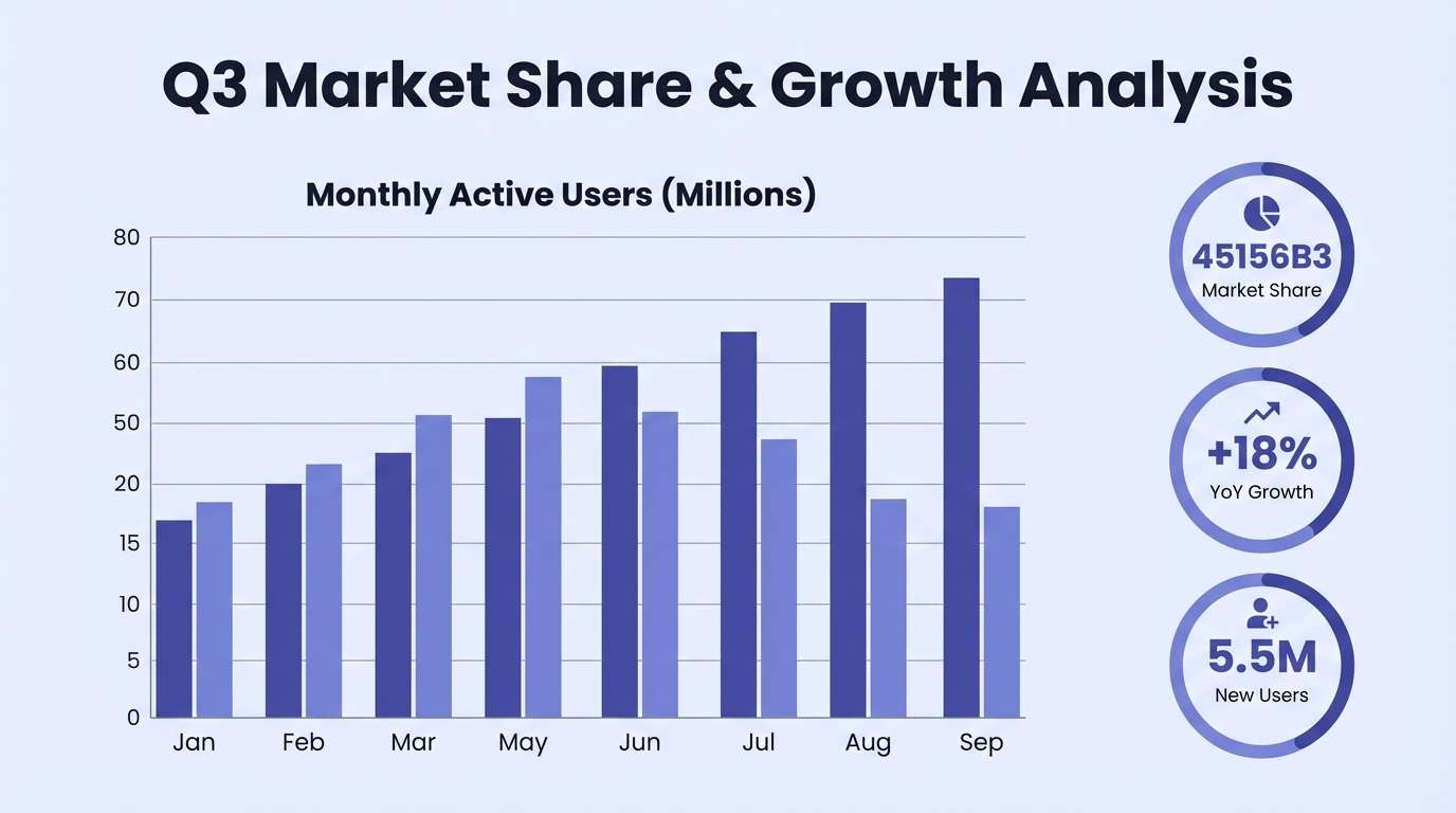
19) Winter Twilight
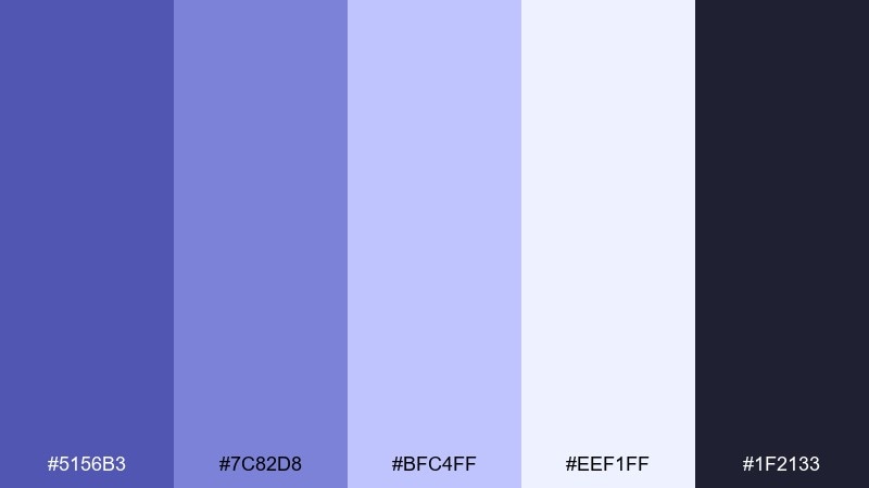
HEX: #5156B3 #7C82D8 #BFC4FF #EEF1FF #1F2133
Mood: cool, focused, sophisticated
Best for: corporate presentations and pitch decks
Cool and focused like twilight settling over snowy streets, this palette feels professional and composed. Use the darkest navy for titles and charts, then layer the lighter blues for sections and callouts. The pale icy tone works well as slide background to keep content readable. Tip: keep charts limited to two data colors and use the remaining tints for gridlines and emphasis.
Image example of winter twilight generated using media.io
20) Modern Poster Punch
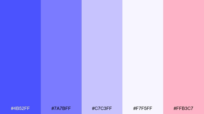
HEX: #4B52FF #7A7BFF #C7C3FF #F7F5FF #FFB3C7
Mood: fresh, punchy, contemporary
Best for: campaign posters and bold announcements
Fresh and punchy like ink on a new risograph print, the cool lavender blues pop against a soft paper base. These blue lavender color combinations get extra energy from the pink accent, which works well for dates, badges, or limited-time tags. Keep the saturated violet-blue for the headline to create instant hierarchy. Tip: limit the pink to one shape or line of text so the design stays modern, not candy-like.
Image example of modern poster punch generated using media.io
21) Soft Gradient Blend
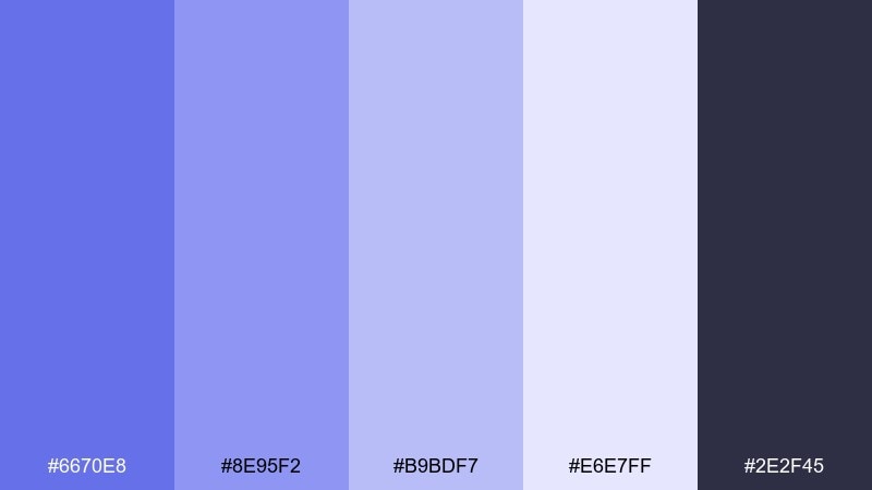
HEX: #6670E8 #8E95F2 #B9BDF7 #E6E7FF #2E2F45
Mood: smooth, soothing, contemporary
Best for: backgrounds, hero banners, and gradients
Smooth and soothing like a slow sunrise fade, these steps are made for gradients and layered UI surfaces. Use a two-stop blend from the mid lavender to the pale tint for hero areas, and keep text in the deep charcoal-blue. The middle tones make great glassmorphism overlays without turning muddy. Tip: add subtle noise to gradient backgrounds to reduce banding on large screens.
Image example of soft gradient blend generated using media.io
22) Satin Ribbon Mix
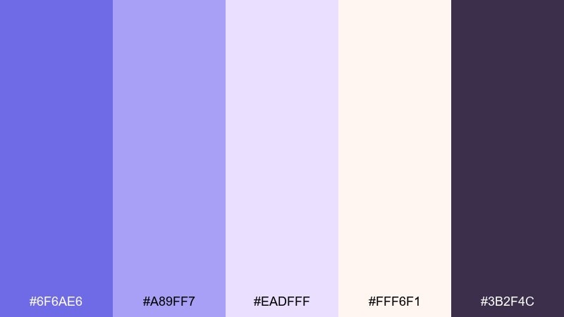
HEX: #6F6AE6 #A89FF7 #EADFFF #FFF6F1 #3B2F4C
Mood: soft, romantic, polished
Best for: bridal shower invites and elegant flyers
Soft and polished like satin ribbons laid on ivory paper, these tones feel celebratory and refined. The warm ivory keeps the lavender from going icy, while the deep plum adds a formal touch for headings. Use the mid lavender for borders, RSVP details, and delicate icons. Tip: choose one script font for accents and keep the rest in a clean serif to avoid visual clutter.
Image example of satin ribbon mix generated using media.io
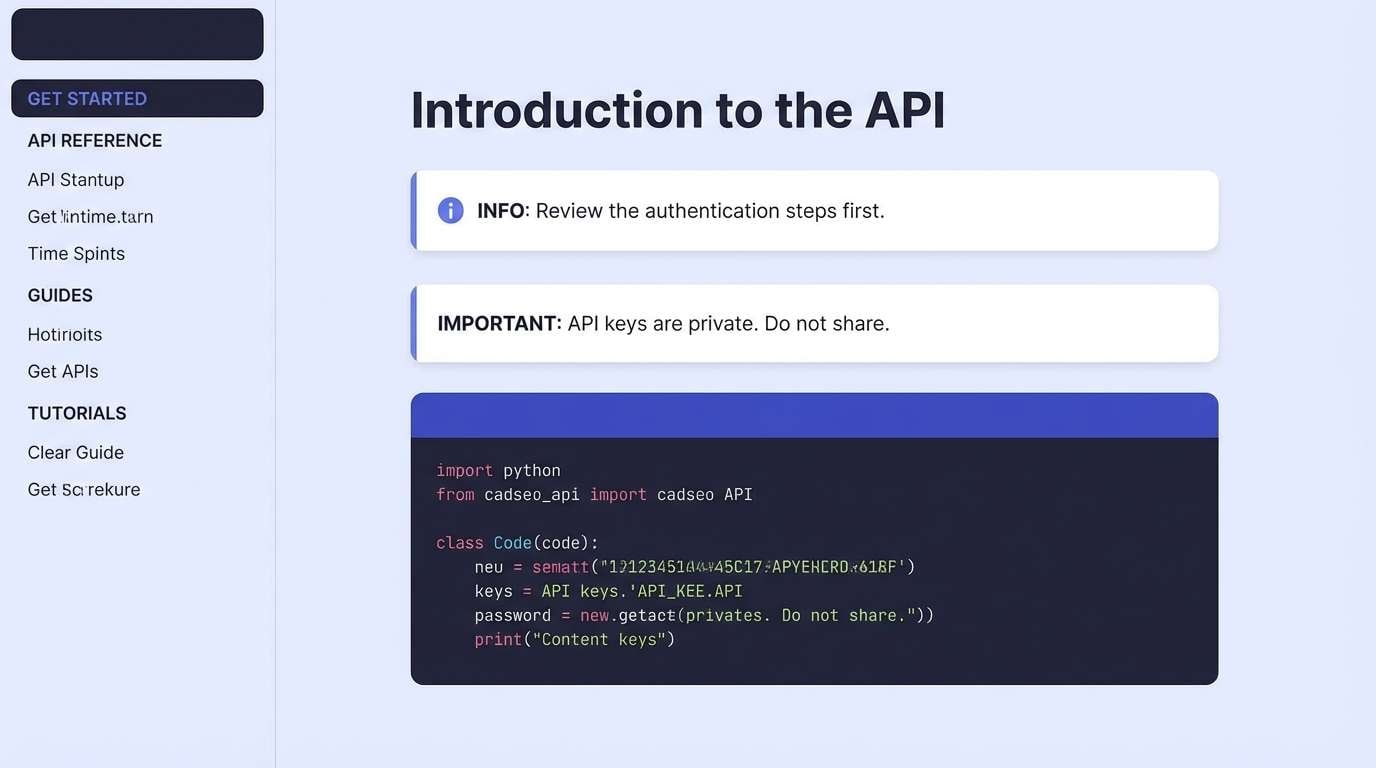
23) Blueprint Lavender
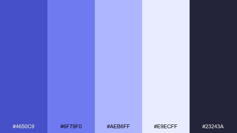
HEX: #4650C9 #6F79F0 #AEB6FF #E9ECFF #23243A
Mood: structured, smart, technical
Best for: developer docs and SaaS documentation sites
Structured and smart like blueprint lines on bright paper, this mix feels technical yet welcoming. Use the darkest tone for code blocks and navigation, then bring in the brighter violet-blue for links and active states. The pale tints are ideal for callout boxes and note sections. Tip: keep link styling consistent and avoid using the accent color for non-interactive text.
Image example of blueprint lavender generated using media.io
What Colors Go Well with Blue Lavender?
For clean, modern contrast, pair blue lavender with cool neutrals like white, soft gray, slate, and near-black typography. This keeps layouts readable while preserving the airy pastel mood.
If you want a warmer, more human feel, add cream, sand, clay/terracotta, or blush pink. Warm accents prevent blue lavender from looking icy—especially in packaging, invitations, and lifestyle branding.
For bold energy, use deep indigo, ink navy, or electric violet-blue as a punch color. Keep those high-chroma shades for CTAs, headlines, or small badges so the palette stays balanced.
How to Use a Blue Lavender Color Palette in Real Designs
In UI, treat blue lavender as a “surface + accent” system: pale tints for backgrounds/cards, mid tones for active states and links, and a deep charcoal/indigo for text. This creates clear hierarchy without harsh contrast.
In branding, pick one signature blue lavender for the logo and a supporting neutral (white/cream) for breathing room, then add one warm accent for memorability. The result feels both premium and approachable.
For print (weddings, posters, packaging), test your palette on the actual paper or substrate. Blue lavender can shift cooler under certain lighting, so a warmer off-white base often improves the final look.
Create Blue Lavender Palette Visuals with AI
If you already have HEX codes, you can quickly turn them into moodboards, UI mockups, posters, or packaging scenes using AI prompts. This helps you validate contrast, vibe, and hierarchy before you commit to full design production.
Start with one palette, describe the layout (e.g., onboarding UI, wedding invitation, skincare label), then include your key colors and lighting style. Iterate by adjusting only one variable at a time (background tone, accent usage, or typography mood).
When you find a direction you like, generate a few variations for different formats—square social, wide hero banners, and print ratios—so your blue lavender palette stays consistent across channels.
Blue Lavender Color Palette FAQs
-
What is the HEX code for a classic blue lavender?
Blue lavender can vary from periwinkle-leaning blues to muted lavender-blues. A common reference point is a soft periwinkle tone like #6E74FF or a slightly muted lavender-blue like #7A77C8, depending on how pastel you want it. -
Is blue lavender more blue or more purple?
It’s typically a blue-first color with a lavender (purple) undertone. If it looks more “calm and cool,” it’s leaning blue; if it looks more “romantic and floral,” it’s leaning purple. -
What neutrals pair best with blue lavender?
White, off-white/cream, light cool grays, slate, and charcoal work especially well. For UI and branding, charcoal or near-black text usually gives the cleanest contrast while keeping the palette soft. -
Can I use blue lavender for professional or corporate designs?
Yes. Use a restrained system: pale lavender tints for backgrounds, one mid tone for emphasis, and a deep navy/charcoal for typography and charts. This keeps it sophisticated rather than “cute.” -
What accent colors make blue lavender feel warmer?
Warm accents like beige, sand, terracotta/clay, peachy white, or blush pink add warmth and prevent the palette from feeling icy—great for packaging, weddings, and lifestyle brands.
Next: Mantis Color Palette


