

Old gold is a muted, heritage-inspired yellow-brown that reads luxurious without being flashy. It brings instant warmth to branding, interiors, packaging, and UI when you want a premium feel that still looks grounded.
Below are curated old gold color palette ideas with HEX codes, plus AI-ready prompts you can use to generate matching visuals for mood boards, mockups, and campaign concepts.
In this article
- Why Old Gold Palettes Work So Well
-
- gilded library
- antique brass linen
- desert heirloom
- botanical patina
- museum label
- warm minimal ui
- heritage wedding suite
- rustic packaging
- jazz night poster
- mediterranean tile
- autumn orchard
- artisan leather
- sunlit stucco
- vintage sport crest
- candlelit dining
- industrial loft
- royal sepia
- coastal dune
- olive grove table
- baroque frame
- What Colors Go Well with Old Gold?
- How to Use a Old Gold Color Palette in Real Designs
- Create Old Gold Palette Visuals with AI
Why Old Gold Palettes Work So Well
Old gold sits in a sweet spot between luxury and restraint. Unlike bright metallic golds, it feels timeless and tactile—more like patina, brass, or worn gilding than a shiny effect.
Because it’s muted, old gold pairs easily with modern neutrals (cream, charcoal, slate) and natural tones (sage, cocoa, terracotta). That balance helps designs feel warm and elevated without looking busy.
It also performs well as an accent color: headings, borders, badges, and key UI actions. A small amount can signal “premium” and guide attention while keeping layouts calm.
20+ Old Gold Color Palette Ideas (with HEX Codes)
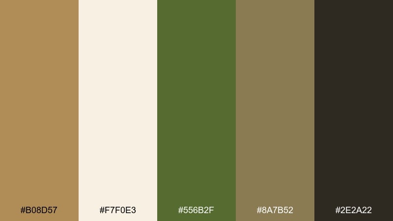
1) Gilded Library
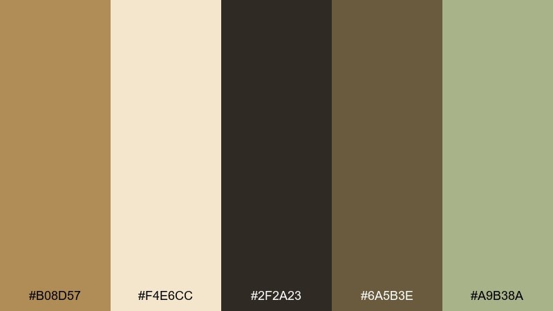
HEX: #b08d57 #f4e6cc #2f2a23 #6a5b3e #a9b38a
Mood: classic, scholarly, warm
Best for: book cover design and heritage branding
Classic warmth and quiet sophistication, like worn leather spines and sunlit paper. Use it for book covers, museum brands, or premium stationery where you want tradition without feeling dusty. Pair the dark ink brown with the creamy parchment as your base, then let old gold lead headlines or seals. Tip: keep the green as a small accent for tabs, ribbons, or subtle foliage motifs.
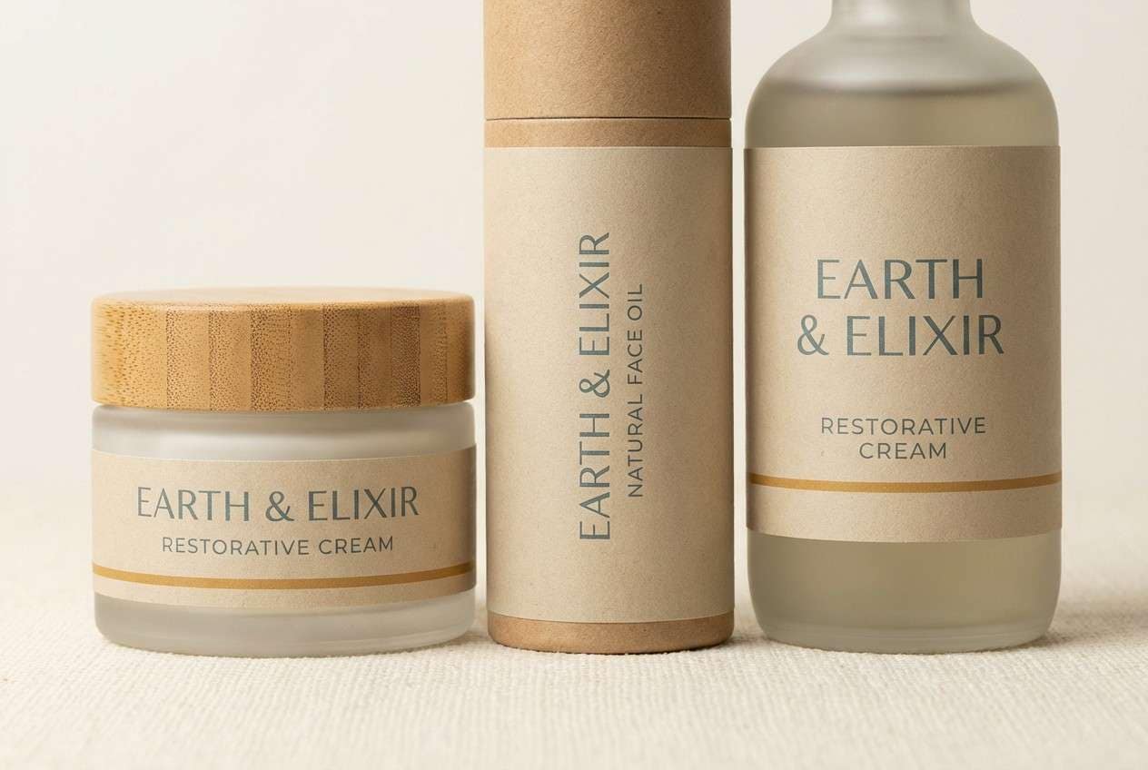
Image example of gilded library generated using media.io
Media.io is an online AI studio for creating and editing video, image, and audio in your browser.

2) Antique Brass Linen
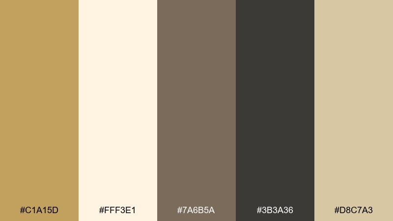
HEX: #c1a15d #fff3e1 #7a6b5a #3b3a36 #d8c7a3
Mood: soft, vintage, airy
Best for: minimal interiors and lifestyle lookbooks
Soft and breathable, like linen curtains catching late-afternoon light. It works beautifully for interior mood boards, lookbooks, and calm product photography where you want warmth without heavy contrast. Anchor layouts with charcoal text, then use brass-gold touches for trims, icons, or subtle borders. Tip: keep highlights on the creamy off-white to maintain an open, editorial feel.
Image example of antique brass linen generated using media.io
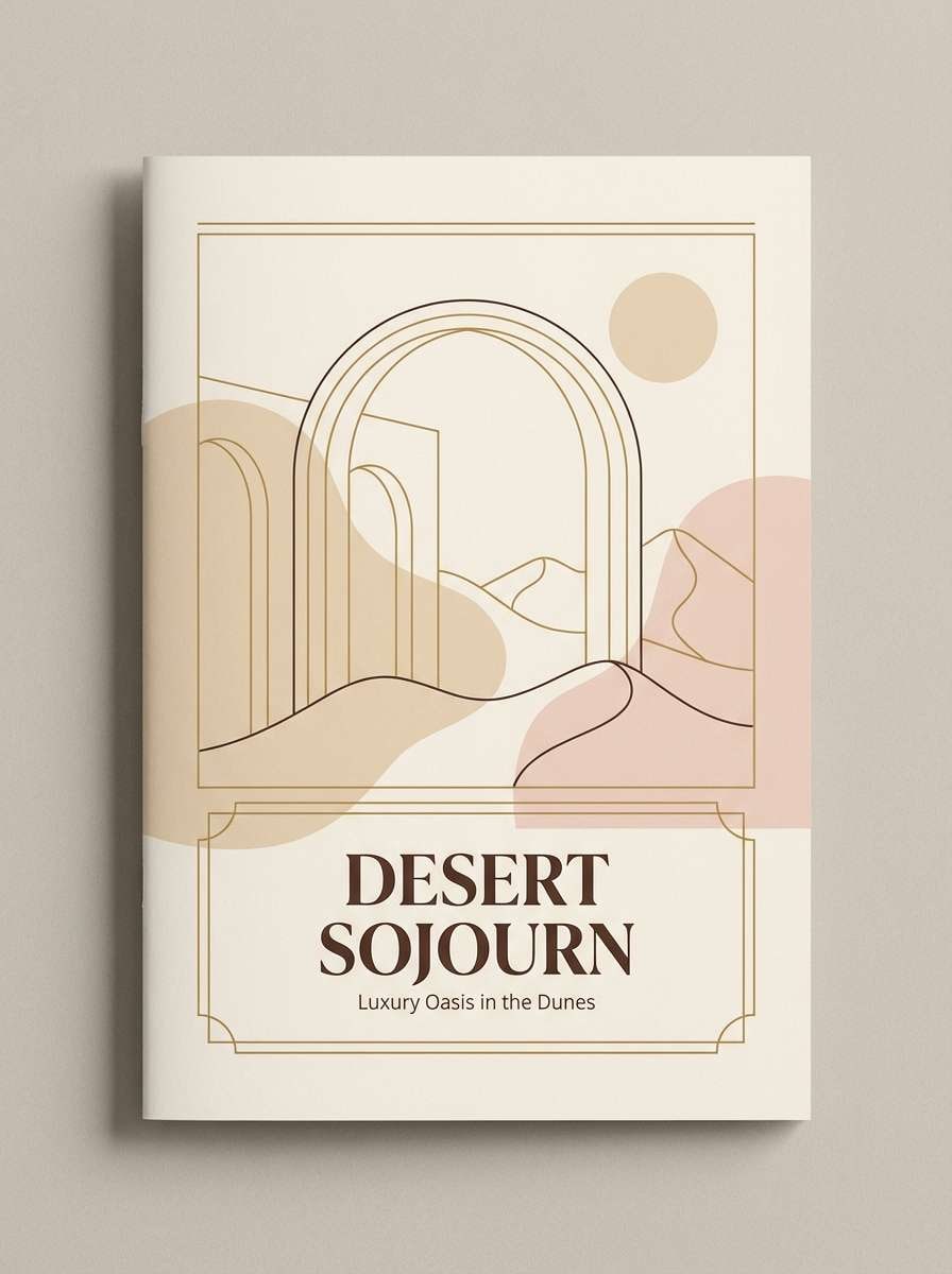
3) Desert Heirloom
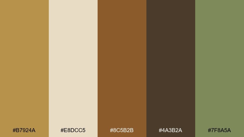
HEX: #b7924a #e8dcc5 #8c5b2b #4a3b2a #7f8a5a
Mood: earthy, sunbaked, grounded
Best for: artisan goods and outdoor brand identity
Earthy and sunbaked, like clay pots, dry grasses, and weathered wood. Use it for artisan goods, outdoor brands, or rustic landing pages where texture matters. Let the deep brown and sienna do the heavy lifting for typography and panels, then add the gold tone as a warm highlight. Tip: a small touch of sage prevents the palette from leaning too monochrome.
Image example of desert heirloom generated using media.io
4) Botanical Patina
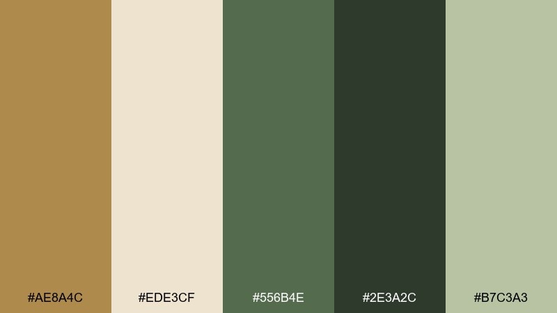
HEX: #ae8a4c #ede3cf #556b4e #2e3a2c #b7c3a3
Mood: botanical, mature, calm
Best for: wellness labels and botanical illustrations
Mature greenery with a gentle metallic warmth, like a greenhouse at dusk. It fits wellness labels, eco brands, and nature-forward packaging where trust and calm matter. Keep the cream as the background, build depth with the deep forest, and use the gold for badges or ingredient highlights. Tip: choose matte finishes to make the greens feel more organic and less glossy.
Image example of botanical patina generated using media.io
5) Museum Label
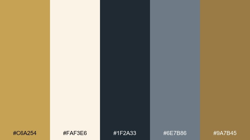
HEX: #c6a254 #faf3e6 #1f2a33 #6e7b86 #9a7b45
Mood: curated, refined, contemporary
Best for: editorial layouts and exhibition graphics
Curated and modern, like gallery walls and carefully typeset plaques. This old gold color palette shines in editorial spreads, exhibition graphics, and sophisticated slide decks. Use the deep blue-black for text, the cool gray-blue for secondary UI elements, and reserve the golds for section markers or numbering. Tip: lean on generous whitespace to keep it feeling premium, not busy.
Image example of museum label generated using media.io
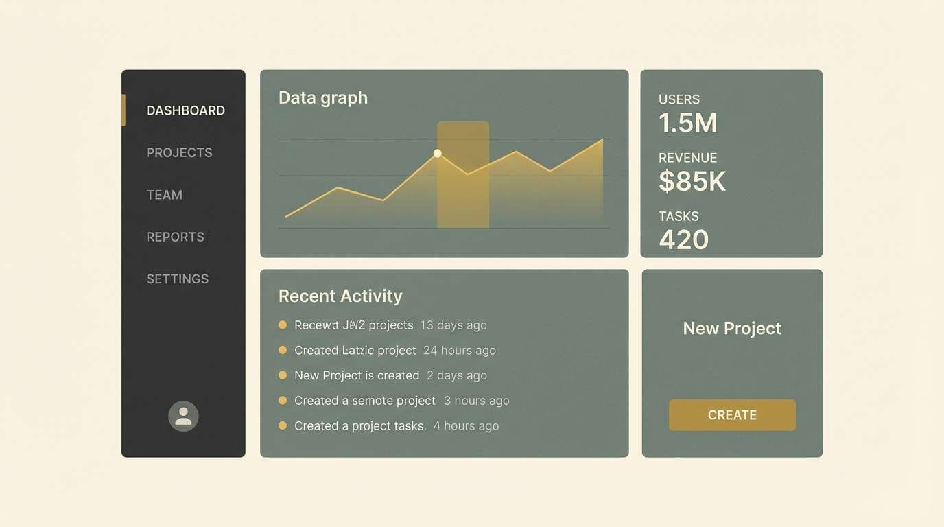
6) Warm Minimal UI
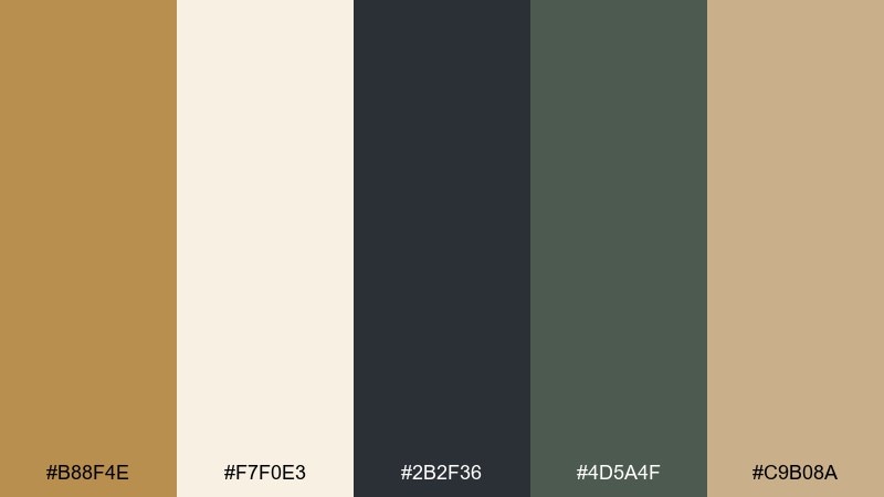
HEX: #b88f4e #f7f0e3 #2b2f36 #4d5a4f #c9b08a
Mood: clean, warm, professional
Best for: 2d dashboard UI and SaaS landing pages
Clean warmth with a practical edge, like brushed metal on soft paper. The old gold color scheme works well for dashboards and SaaS pages that need credibility without feeling cold. Use the charcoal for text and nav, the cream for surfaces, and the gold for primary buttons or key metrics. Tip: limit gold to one action color so the interface stays focused.
Image example of warm minimal ui generated using media.io
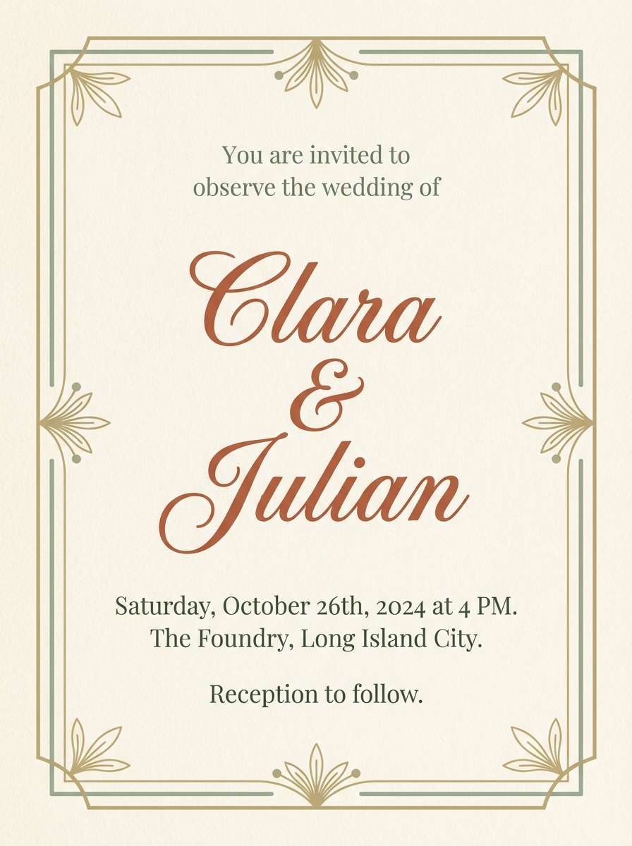
7) Heritage Wedding Suite
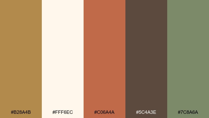
HEX: #b28a4b #fff6ec #c06a4a #5c4a3e #7c8a6a
Mood: romantic, classic, heartfelt
Best for: wedding invitations and event stationery
Romantic and timeworn, like pressed flowers tucked into a keepsake box. It suits wedding suites, vow books, and event stationery where warmth and intimacy are the goal. Keep the paper tone dominant, then add old-gold details for monograms and borders while using terracotta for names or dates. Tip: a slightly textured background helps the palette feel more handcrafted.
Image example of heritage wedding suite generated using media.io
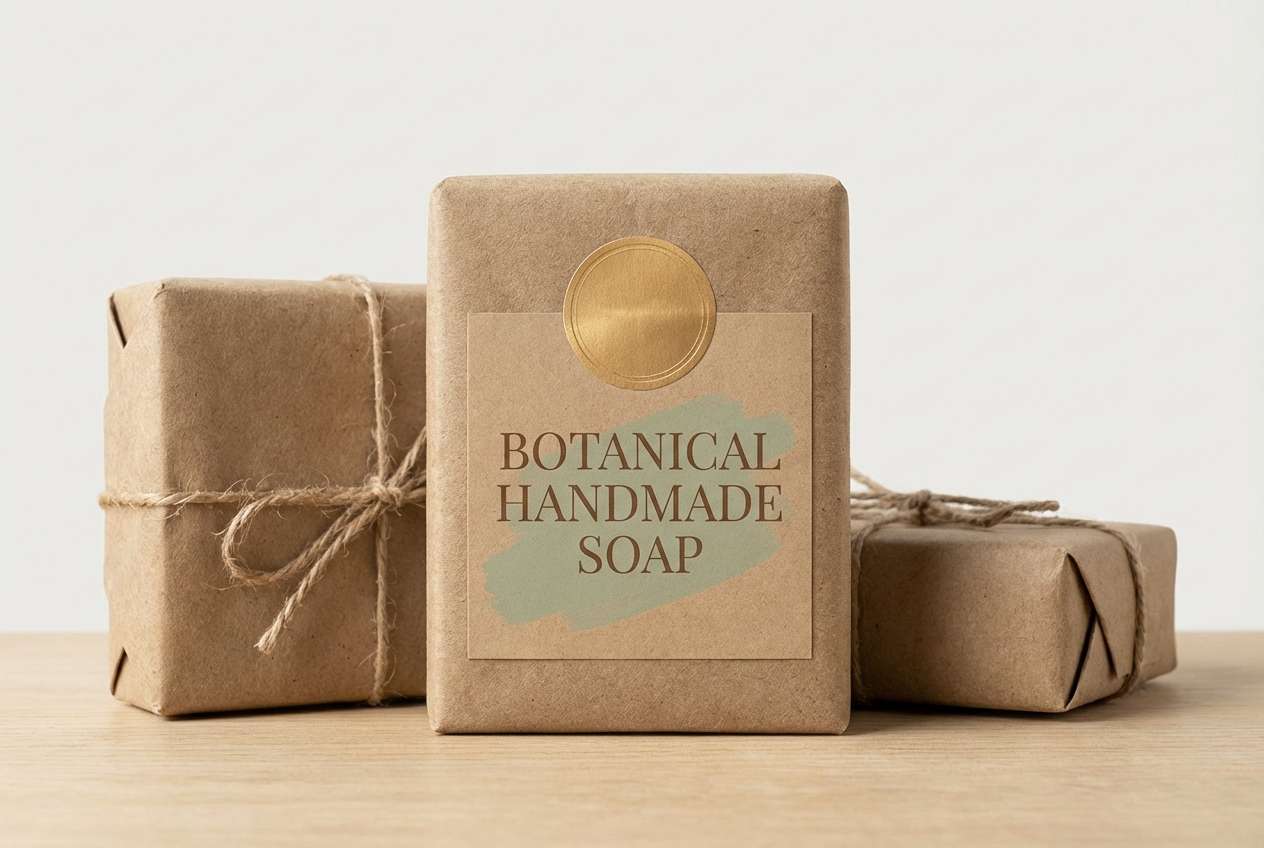
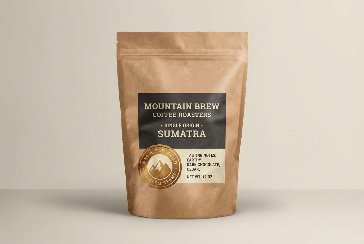
8) Rustic Packaging
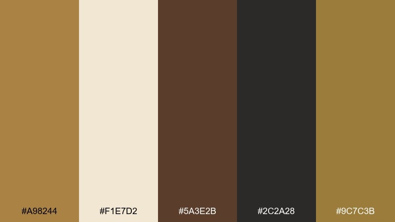
HEX: #a98244 #f1e7d2 #5a3e2b #2c2a28 #9c7c3b
Mood: handmade, sturdy, natural
Best for: coffee, spice, and craft food packaging
Sturdy and handmade, like burlap sacks and toasted grain. It is ideal for coffee, spices, and small-batch foods that want an honest, grounded look. Use the near-black for bold labels, the cream for readability, and the gold-brown tones for emblems and pattern bands. Tip: add subtle noise or paper grain so the warm browns feel tactile rather than flat.
Image example of rustic packaging generated using media.io
9) Jazz Night Poster
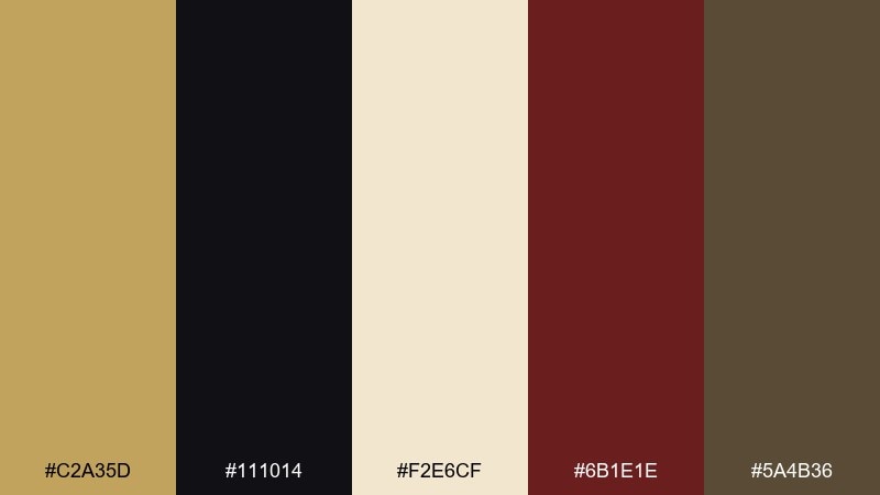
HEX: #c2a35d #111014 #f2e6cf #6b1e1e #5a4b36
Mood: dramatic, smoky, upscale
Best for: event posters and nightlife promos
Smoky and dramatic, like velvet curtains and a warm spotlight on stage. These old gold color combinations are perfect for jazz nights, cocktail bars, and premium event posters. Let black dominate for contrast, then use gold for headlines and the burgundy as a rich supporting accent. Tip: keep the cream for small details only, so the poster stays bold from a distance.
Image example of jazz night poster generated using media.io
10) Mediterranean Tile
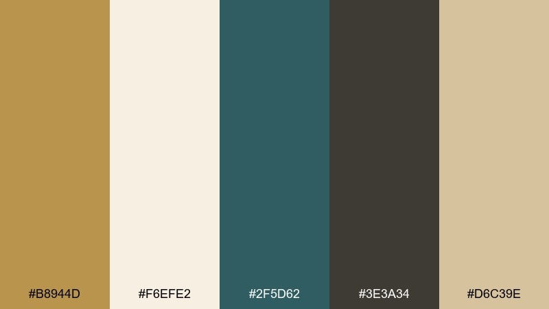
HEX: #b8944d #f6efe2 #2f5d62 #3e3a34 #d6c39e
Mood: sunny, coastal, artisanal
Best for: home decor branding and social templates
Sunny and artisanal, like glazed tiles warmed by coastal light. Use it for home decor brands, café menus, and social templates that need both freshness and warmth. Teal works as the standout hue against cream, while the gold and sand tones keep everything cohesive. Tip: repeat tile-like shapes in the accent color to create rhythm without clutter.
Image example of mediterranean tile generated using media.io
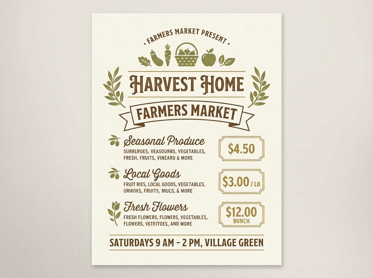
11) Autumn Orchard
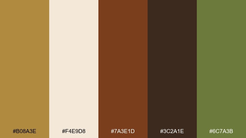
HEX: #b08a3e #f4e9d8 #7a3e1d #3c2a1e #6c7a3b
Mood: harvest, cozy, rustic
Best for: seasonal campaigns and farmers market signs
Harvest cozy, like apple skins, fallen leaves, and wooden crates. It is great for seasonal campaigns, farmers market signs, and recipe cards that want a natural, appetizing mood. Use the deep cocoa for text, the cream for breathing room, and the gold as a highlight for prices or callouts. Tip: keep the green muted and sparse so the warm browns stay in control.
Image example of autumn orchard generated using media.io
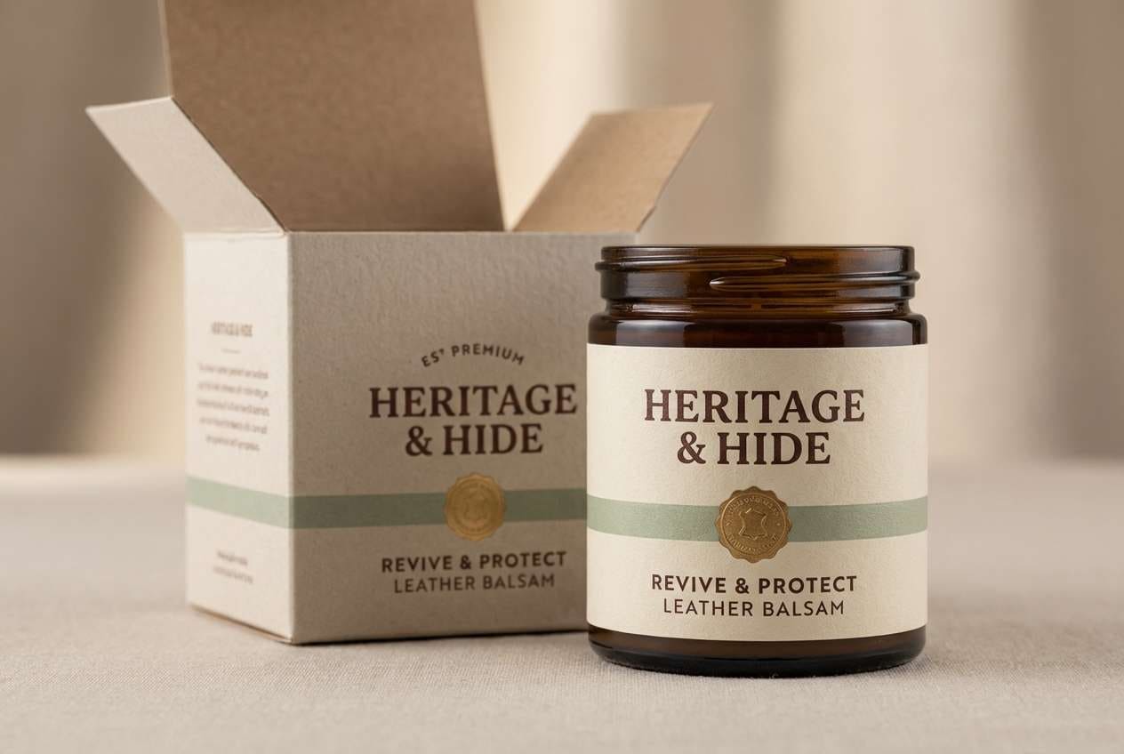
12) Artisan Leather
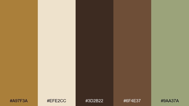
HEX: #a97f3a #efe2cc #3d2b22 #6f4e37 #9aa37a
Mood: craft, rugged, premium
Best for: menswear branding and product labels
Rugged and premium, like hand-stitched leather and oiled wood. It works well for menswear branding, craft workshops, and product labels that need a sturdy feel. Use the darkest brown for wordmarks and the gold-brown for badges, then soften everything with the cream. Tip: a simple icon in the sage tone can modernize the look without losing the heritage vibe.
Image example of artisan leather generated using media.io
13) Sunlit Stucco
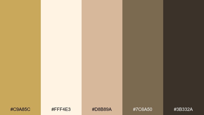
HEX: #c9a85c #fff4e3 #d8b89a #7c6a50 #3b332a
Mood: warm, Mediterranean, relaxed
Best for: hospitality branding and resort brochures
Warm and relaxed, like stucco walls, terracotta dust, and soft shadows. Use it for hospitality branding, resort brochures, and restaurant menus that want inviting sophistication. Let the cream and blush-sand build the background layers, then use the deeper brown for text and structure. Tip: keep gold accents thin and architectural, like lines, frames, or small seals.
Image example of sunlit stucco generated using media.io
14) Vintage Sport Crest
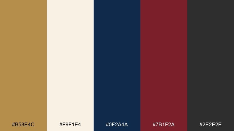
HEX: #b58e4c #f9f1e4 #0f2a4a #7b1f2a #2e2e2e
Mood: bold, nostalgic, collegiate
Best for: team badges and retro apparel graphics
Bold nostalgia, like stitched patches and old stadium banners. An old gold color combination with navy and maroon is a strong fit for crests, monograms, and retro apparel graphics. Use navy for the main field, old gold for outlines and lettering, and maroon for secondary shapes. Tip: add a tiny amount of cream only for highlights, so the badge stays punchy.
Image example of vintage sport crest generated using media.io

15) Candlelit Dining
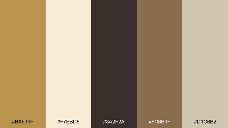
HEX: #ba934f #f7ebd6 #3a2f2a #8c6b4f #d1c6b2
Mood: intimate, cozy, elegant
Best for: restaurant menus and fine dining ads
Intimate and cozy, like candlelight reflecting on polished wood. It is made for restaurant menus, tasting notes, and fine dining ads where warmth sells the experience. Use the deep espresso for typography, the cream for the page, and the gold tone for section headers or small separators. Tip: avoid pure white and keep contrast soft to maintain the candlelit mood.
Image example of candlelit dining generated using media.io
16) Industrial Loft
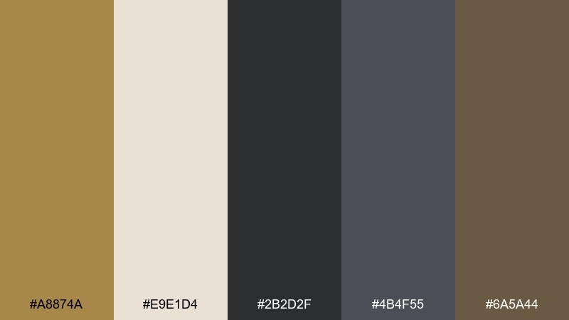
HEX: #a8874a #e9e1d4 #2b2d2f #4b4f55 #6a5a44
Mood: urban, moody, modern
Best for: portfolio sites and architecture presentations
Urban and moody, like concrete, steel, and a warm brass lamp in the corner. It suits architecture presentations, portfolio sites, and modern brand decks that need grit with polish. Use graphite and slate for structure, then bring in the gold-brown as a highlight for key stats or headings. Tip: pair with a condensed sans font to reinforce the industrial feel.
Image example of industrial loft generated using media.io

17) Royal Sepia
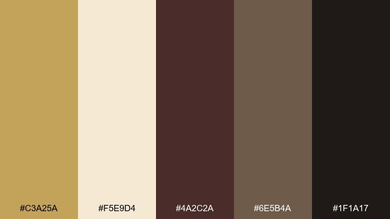
HEX: #c3a25a #f5e9d4 #4a2c2a #6e5b4a #1f1a17
Mood: regal, dramatic, vintage
Best for: luxury branding and premium certificates
Regal and dramatic, like sepia photographs framed in dark wood. It works for luxury branding, premium certificates, and boutique packaging that wants an old-world edge. Use the near-black for backgrounds or borders, then let the gold lead monograms and seals. Tip: keep the cream reserved for small text areas to preserve the rich, velvety contrast.
Image example of royal sepia generated using media.io

18) Coastal Dune
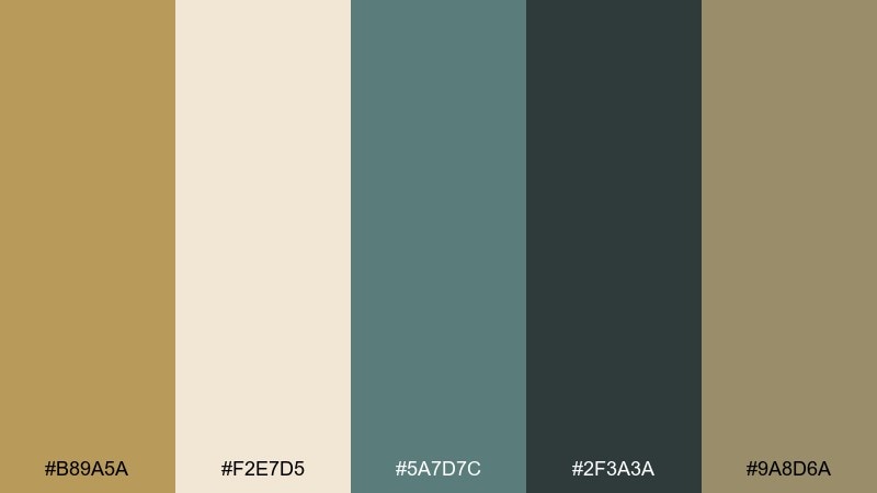
HEX: #b89a5a #f2e7d5 #5a7d7c #2f3a3a #9a8d6a
Mood: calm, breezy, natural
Best for: travel branding and eco-friendly packaging
Calm and breezy, like dunes, driftwood, and muted sea glass. It is a strong fit for travel branding, eco-friendly packaging, and calm blog visuals. Use the deep teal-gray for text, the cream for open space, and the gold-sand tones for highlights and warm balance. Tip: keep gradients subtle so the palette stays airy rather than glossy.
Image example of coastal dune generated using media.io
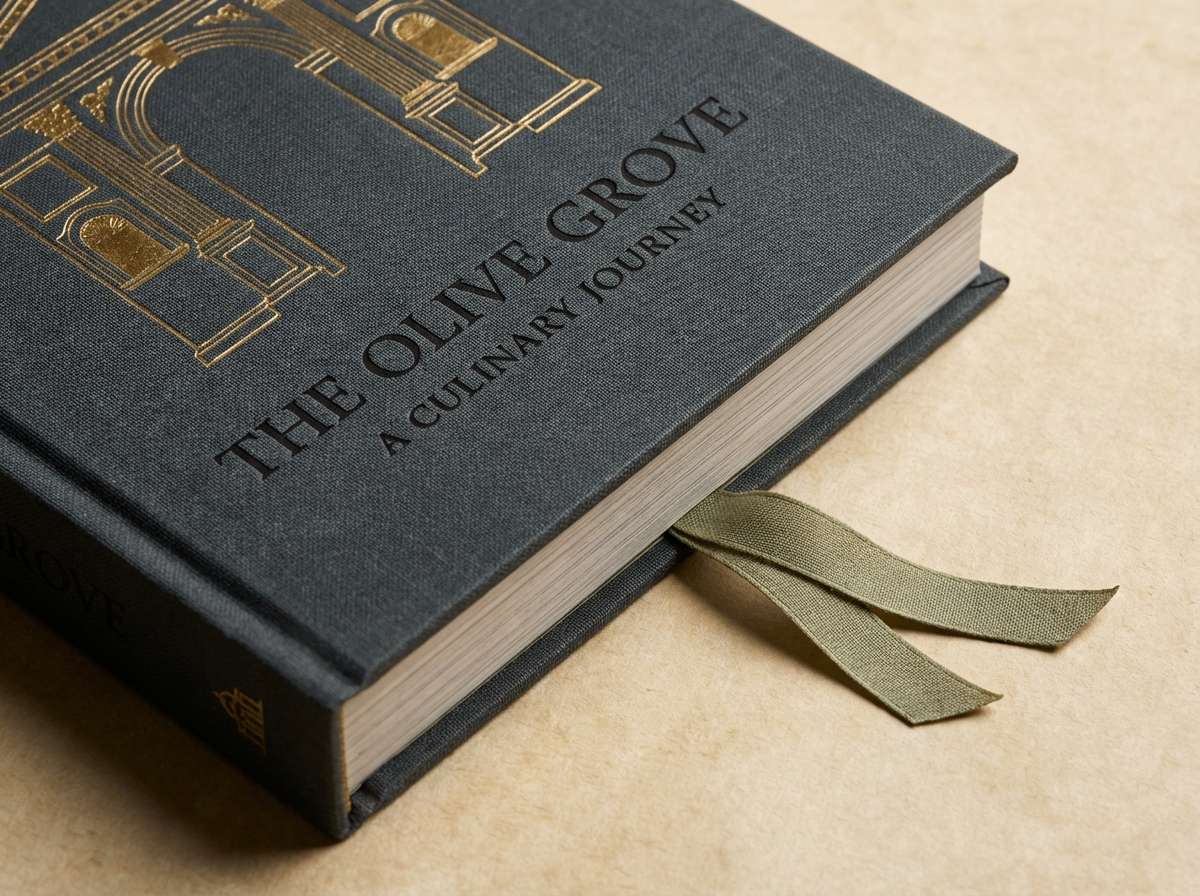
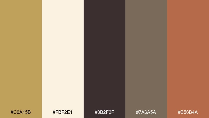
19) Olive Grove Table
HEX: #b08d57 #f7f0e3 #556b2f #8a7b52 #2e2a22
Mood: Mediterranean, savory, grounded
Best for: food branding and recipe card design
Savory and grounded, like olive oil, herbs, and warm stoneware. It is ideal for food branding, recipe cards, and deli packaging where earthy greens feel appetizing. Let olive green carry large blocks and illustrations, then use the gold as a warm counterpoint for headings or badges. Tip: keep the darkest tone for small text only, so the page stays inviting.
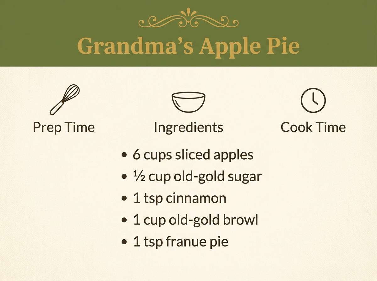
Image example of olive grove table generated using media.io
20) Baroque Frame
HEX: #c0a15b #fbf2e1 #3b2f2f #7a6a5a #b56b4a
Mood: ornate, warm, artistic
Best for: poster art and boutique branding
Ornate warmth, like carved frames and painted plaster. Use it for boutique branding, art posters, and elegant packaging where you want a touch of drama without going full black-and-gold. Let the cream handle the negative space, then layer cocoa and taupe for typography while the warm gold and clay bring the focal points. Tip: use thin decorative borders to echo the baroque vibe without overpowering the layout.
Image example of baroque frame generated using media.io
What Colors Go Well with Old Gold?
Old gold looks best with supportive neutrals that let it feel intentional: cream, parchment, warm off-white, and soft taupe create an editorial backdrop, while charcoal and near-black add structure and legibility.
For richer contrast, pair it with deep hues like navy, blue-black, forest green, or burgundy. These combinations keep the palette premium and make gold accents read like highlights rather than a full wash.
If you want a natural, modern twist, add muted greens (sage/olive) or teal-gray. They cool down the warmth and help old gold feel fresh in contemporary branding and UI.
How to Use a Old Gold Color Palette in Real Designs
Use old gold as an accent first: buttons, icons, dividers, numbering, and small badges. This keeps the look refined and prevents the design from turning overly sepia or “antique” when you’re aiming modern.
Choose one strong dark for typography (espresso, charcoal, blue-black) and one light surface (cream or parchment). Then let old gold become the “signal” color for emphasis, hierarchy, and premium cues.
In print or packaging, consider matte stocks and subtle texture; old gold reads more authentic when it feels tactile. In digital, keep backgrounds slightly warm (not pure white) so gold tones don’t look dull.
Create Old Gold Palette Visuals with AI
If you’re building a brand deck, mood board, or packaging concept, AI image generation can help you explore old gold pairings quickly—without hunting for perfect stock photos.
Start with a clean subject (poster, label, UI, invitation), then specify lighting (warm, candlelit, studio) and materials (linen, kraft, foil, matte paper). Reuse the prompts above and swap only the scene to stay on-palette.
When you get a result you like, generate variations for consistency across a campaign—hero images, close-ups, and social crops—while keeping your old gold accent consistent.
Old Gold Color Palette FAQs
-
What is the HEX code for old gold?
Old gold doesn’t have a single universal HEX value, but common “old gold” ranges sit around muted golden-brown tones like #b08d57 or #c1a15d. The best choice depends on whether you want it more brown (earthy) or more yellow (brassy). -
Is old gold warm or cool?
Old gold is typically warm because it leans toward yellow-brown. You can make it feel cooler by pairing it with teal-gray, slate, or blue-black, or warmer by pairing it with terracotta, cocoa, and cream. -
What colors pair best with old gold for branding?
For premium branding, pair old gold with cream and charcoal for a clean, timeless foundation, then add one deep accent like navy, forest green, or burgundy for contrast and depth. -
Can I use old gold in UI design without it looking dated?
Yes—use old gold sparingly as a single action/accent color (primary button, highlights, key metrics), keep surfaces warm-neutral (cream), and use a modern dark neutral (charcoal/blue-black) for text. -
Does old gold work with green?
Very well. Olive, sage, and forest green make old gold feel natural and grounded, which is why it’s popular for eco packaging, wellness labels, and food branding. -
How do I keep an old gold palette readable?
Reserve old gold for accents and use a darker neutral for body text (charcoal, espresso, or blue-black). For backgrounds, choose warm off-whites instead of pure white so the gold doesn’t lose contrast. -
What finish looks best for old gold in print?
Matte or satin finishes usually look more authentic for “old” gold because they feel patinated and tactile. Foil can work too—just keep it subtle (thin borders, small seals, or monograms).


