

Cream blue green palettes blend warm neutrals with water-and-leaf tones, creating a look that’s calm, modern, and easy to live with. They’re especially popular in UI, wellness, lifestyle branding, and print where you want softness without losing clarity.
Below are curated cream blue green color palette ideas with HEX codes, plus practical tips and AI prompts you can reuse to generate matching visuals.
In this article
- Why Cream Blue Green Palettes Work So Well
-
- sea glass brunch
- harbor mist minimal
- botanical gelato
- coastal stationery
- vintage apothecary label
- alpine spa retreat
- modern saas dashboard
- kids museum poster
- garden wedding invitation
- artisan soap packaging
- oceanfront editorial spread
- midcentury kitchen tiles
- study room calm
- café menu board
- eco skincare product ad
- spring herb illustration
- tech conference slide deck
- lakehouse logo kit
- ceramic pottery glaze
- night swim accent
- What Colors Go Well with Cream Blue Green?
- How to Use a Cream Blue Green Color Palette in Real Designs
- Create Cream Blue Green Palette Visuals with AI
Why Cream Blue Green Palettes Work So Well
Cream adds warmth and readability, while blues and greens bring a clean, breathable mood that feels both coastal and botanical. Together, they land in a “soft professional” zone that works for many industries.
This trio also supports strong hierarchy: cream for backgrounds, blue-teal for interactive elements, and deep green for anchors like navigation, prices, or key metrics. The result is contrast that feels calm instead of harsh.
Because these hues sit close to natural materials (linen, sea glass, herbs, eucalyptus), they tend to look premium in print and approachable in digital—without needing heavy textures or overly saturated accents.
20+ Cream Blue Green Color Palette Ideas (with HEX Codes)
1) Sea Glass Brunch
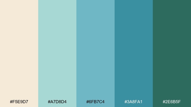
HEX: #F5E9D7 #A7D8D4 #6FB7C4 #3A8FA1 #2E6B5F
Mood: fresh, breezy, coastal
Best for: cafe branding and menu design
Fresh and breezy like sea glass on a sandy table, these tones feel clean without going sterile. Use the cream as your base, then layer aqua and teal for headings, icons, or illustrated accents. It shines on menus, loyalty cards, and light packaging where readability matters. Tip: reserve the deep green for prices and key calls to action so the layout stays airy.
Image example of sea glass brunch generated using media.io
Media.io is an online AI studio for creating and editing video, image, and audio in your browser.

2) Harbor Mist Minimal
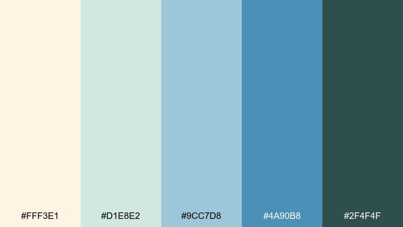
HEX: #FFF3E1 #D1E8E2 #9CC7D8 #4A90B8 #2F4F4F
Mood: quiet, modern, breathable
Best for: minimal web headers and landing pages
Quiet harbor mist vibes make this mix feel polished and spacious. Keep the warm cream for background blocks and use the pale green-blue for large sections to reduce glare. The brighter blue works best for primary buttons, while the slate tone grounds navigation and footers. Tip: add subtle gradients between the two light tones to avoid banding on large screens.
Image example of harbor mist minimal generated using media.io

3) Botanical Gelato
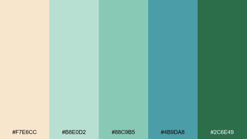
HEX: #F7E6CC #B8E0D2 #88C9B5 #4B9DA8 #2C6E49
Mood: playful, springy, artisanal
Best for: ice cream labels and seasonal promos
Playful and springy like a gelato case beside potted herbs, the colors feel sweet but grown-up. These cream blue green color combinations work especially well when the cream is your label background and the teal family carries flavor bands. Pair with rounded sans fonts or hand-drawn icons to amplify the artisanal mood. Tip: print-test the mid teal against the cream so small text stays crisp on coated stock.
Image example of botanical gelato generated using media.io
4) Coastal Stationery
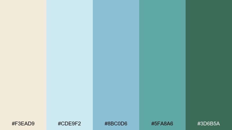
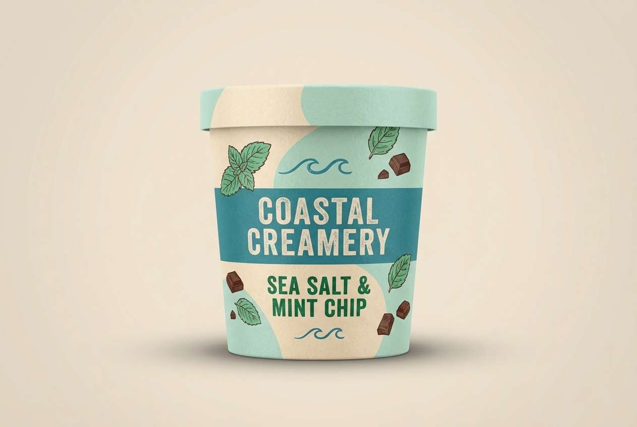
HEX: #F3EAD9 #CDE9F2 #8BC0D6 #5FA8A6 #3D6B5A
Mood: calm, airy, handwritten
Best for: thank-you cards and boutique stationery
Calm, airy tones evoke sun-faded paper and gentle surf. Use the pale blue as a soft canvas, then bring in the muted teal for borders, monograms, or wax-seal illustrations. The deeper green is ideal for small typographic details and address blocks. Tip: keep line art thin and let the cream show through to preserve that light stationery feel.
Image example of coastal stationery generated using media.io
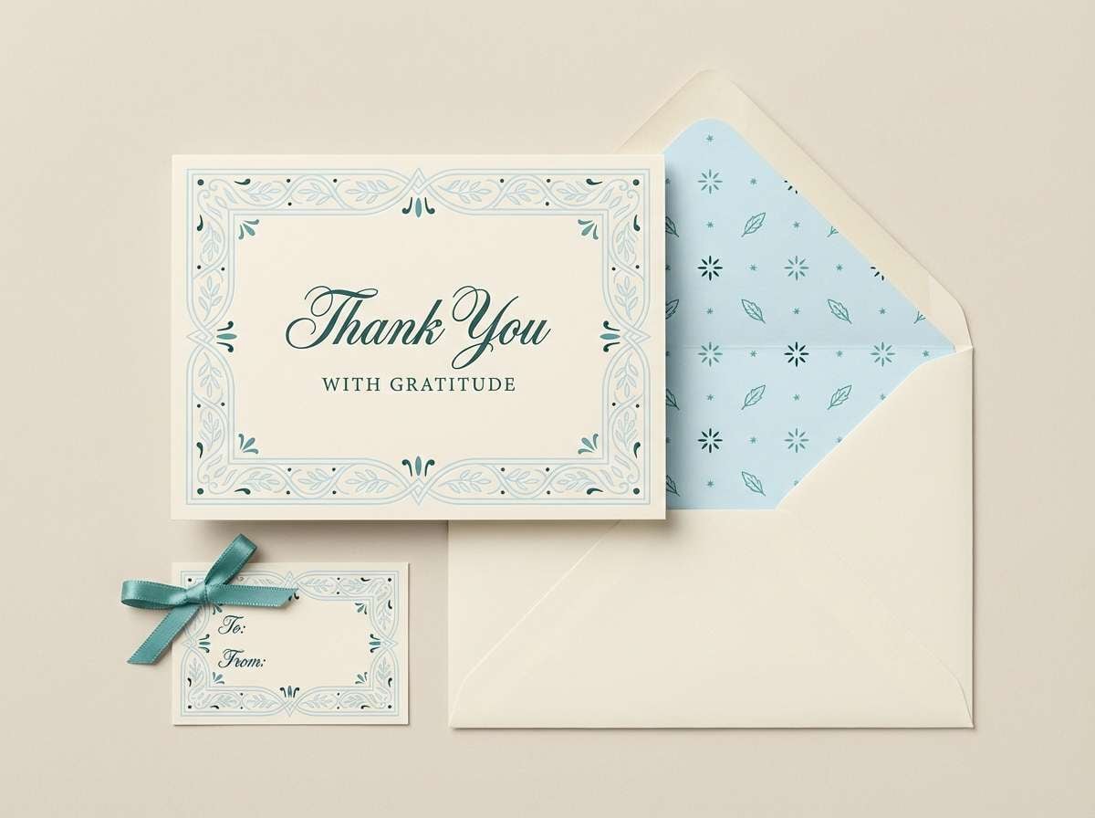
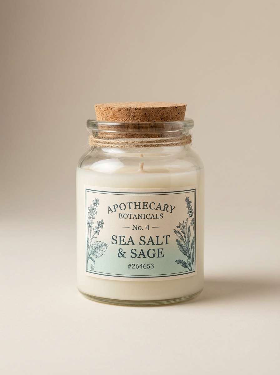
5) Vintage Apothecary Label
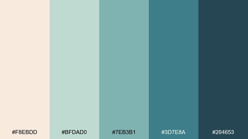
HEX: #F8EBDD #BFDAD0 #7EB3B1 #3D7E8A #264653
Mood: heritage, refined, slightly nautical
Best for: apothecary packaging and candle labels
Heritage and slightly nautical, this set feels like an old remedy bottle on a painted shelf. The creamy base keeps labels readable, while the dusty teals add that vintage ink vibe. Pair with serif type and simple stamp marks for a premium look. Tip: use the darkest shade for ingredient lists and legal text so it stays legible at small sizes.
Image example of vintage apothecary label generated using media.io
6) Alpine Spa Retreat
HEX: #F6EBDD #D7F0EA #A5D6C8 #5BAFA6 #2D6A4F
Mood: restorative, clean, nature-led
Best for: wellness websites and spa signage
Restorative and clean, it brings to mind eucalyptus steam and cool tiled pools. Let the soft minty tones dominate large surfaces, then use the teal for wayfinding or section headers. The forest green anchors logos and pricing so the design feels trustworthy. Tip: add generous spacing and light-weight type to keep the experience calm and premium.
Image example of alpine spa retreat generated using media.io
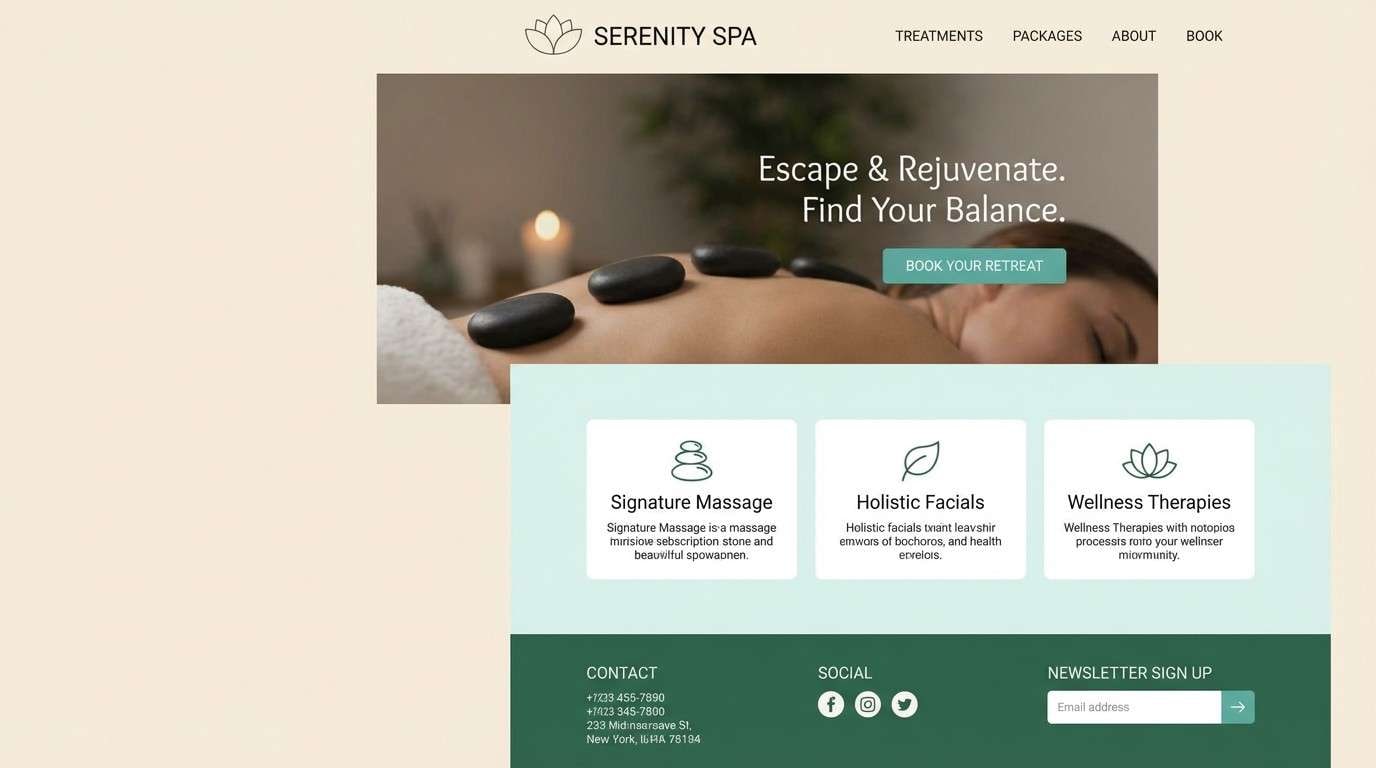
7) Modern SaaS Dashboard
HEX: #F4EDE0 #D9EEF7 #9ECDE0 #4D9DB3 #1F6F5B
Mood: focused, crisp, professional
Best for: analytics dashboards and admin panels
Focused and crisp, the tones read like a clean workspace with a view of open water. This cream blue green color palette is ideal for dashboards because it supports hierarchy without harsh contrast. Use the lightest shades for cards and tables, then reserve the teal-blue for active states and charts. Tip: keep the darkest green for success metrics and key highlights so users scan faster.
Image example of modern saas dashboard generated using media.io

8) Kids Museum Poster
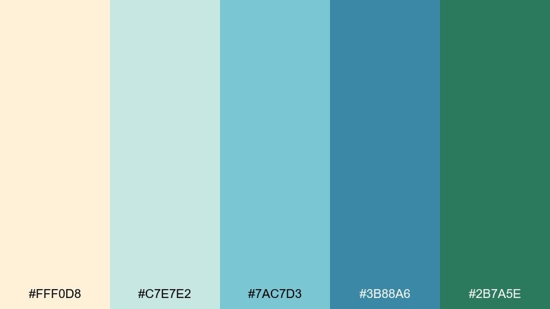
HEX: #FFF0D8 #C7E7E2 #7AC7D3 #3B88A6 #2B7A5E
Mood: bright, friendly, educational
Best for: event posters and family programs
Bright and friendly, it feels like a hands-on exhibit with watercolor waves and leaf shapes. Use the cream for breathing room, then let the aqua and blue carry big headline shapes and playful stickers. The darker tones help with dates, locations, and QR codes. Tip: choose bold, simple iconography so the palette stays kid-friendly without looking messy.
Image example of kids museum poster generated using media.io

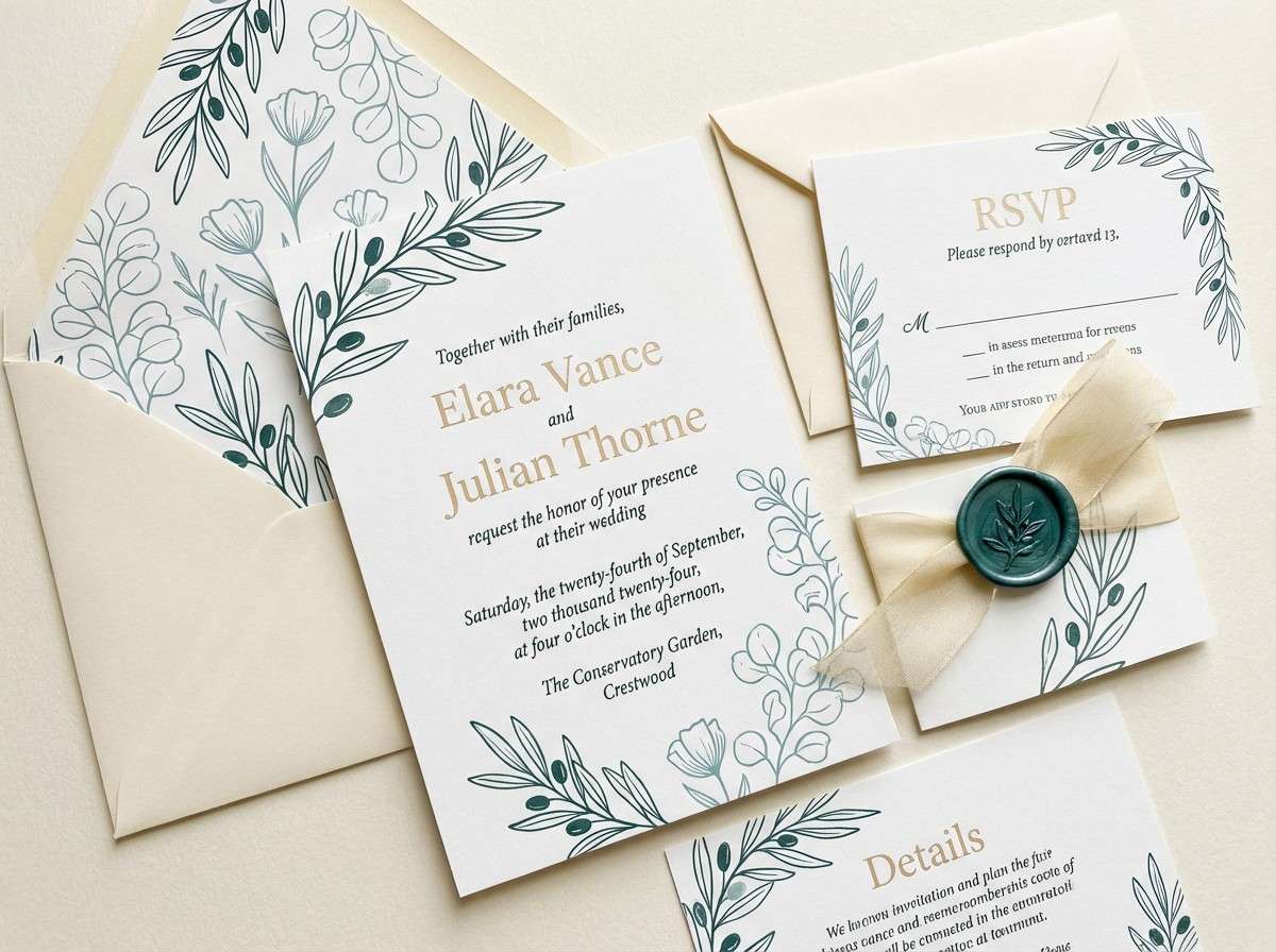
9) Garden Wedding Invitation
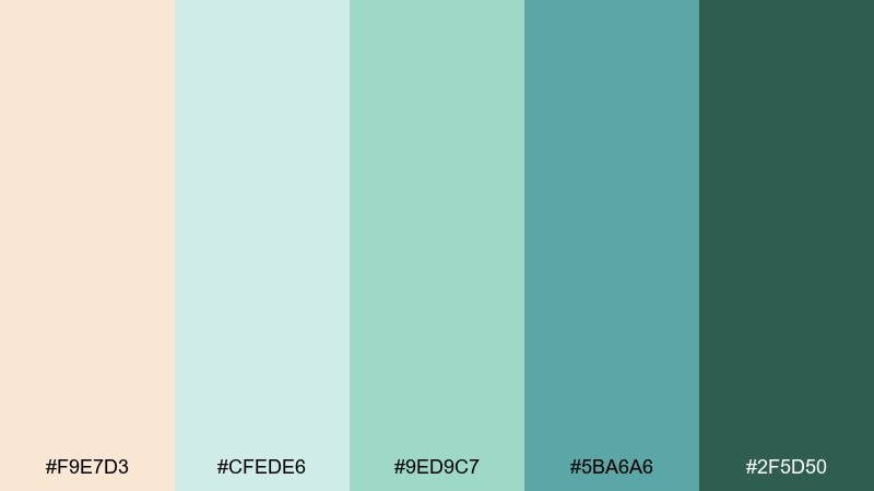
HEX: #F9E7D3 #CFEDE6 #9ED9C7 #5BA6A6 #2F5D50
Mood: romantic, soft, botanical
Best for: wedding invitation suites
Romantic and soft, it suggests ivy, linen, and a breezy outdoor ceremony. Keep the cream as the paper tone, then use the pale green for florals and the muted teal for monograms. Pair with elegant serif type and thin line illustrations for a timeless look. Tip: print the darkest green sparingly for names and key details to maintain the airy mood.
Image example of garden wedding invitation generated using media.io
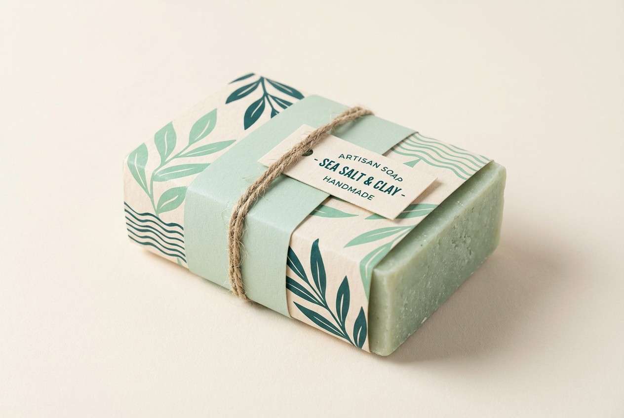
10) Artisan Soap Packaging
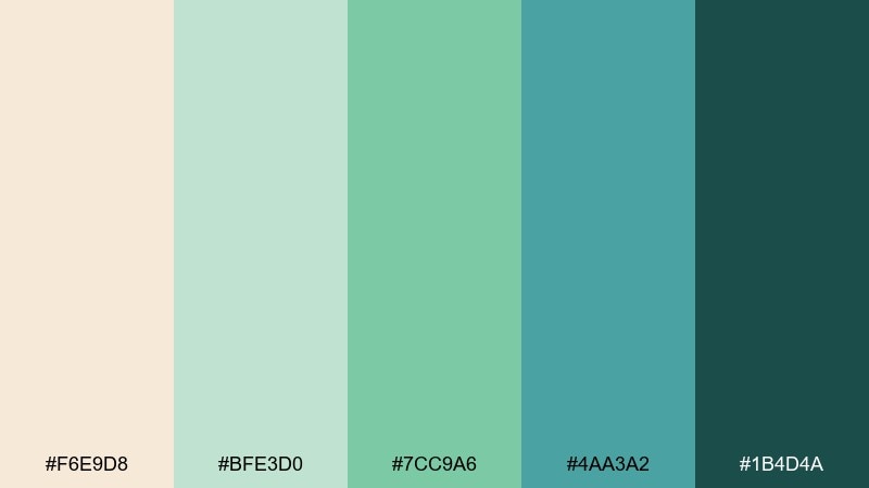
HEX: #F6E9D8 #BFE3D0 #7CC9A6 #4AA3A2 #1B4D4A
Mood: handmade, clean, market-fresh
Best for: soap wraps and eco-friendly packaging
Handmade and market-fresh, these shades feel like wrapped soap beside cut herbs. Use cream for the wrap base, then build patterns with the two mid tones for a crafted look. The deeper teal works well for ingredient icons and scent names. Tip: use uncoated paper and let the palette stay slightly muted to keep the eco vibe authentic.
Image example of artisan soap packaging generated using media.io
11) Oceanfront Editorial Spread
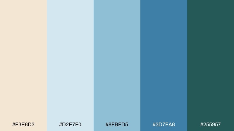
HEX: #F3E6D3 #D2E7F0 #8FBFD5 #3D7FA6 #255957
Mood: elevated, airy, magazine-polished
Best for: magazine layouts and lookbooks
Elevated and airy, it reads like an oceanfront hotel feature with crisp typography and soft light. Use the pale blue for column backgrounds and pull quotes, while the stronger blue sets section dividers and headings. The deep green-blue is perfect for small accents like page numbers and rules. Tip: balance large images with plenty of cream margins to keep the spread feeling premium.
Image example of oceanfront editorial spread generated using media.io
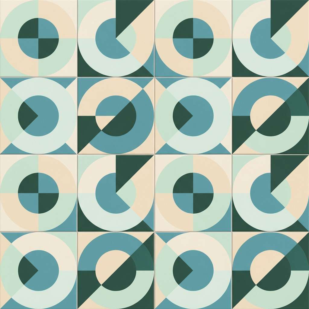
12) Midcentury Kitchen Tiles

HEX: #F8E7D0 #D1F0E5 #A1D5C8 #4FA7B8 #2D5B4E
Mood: retro, tidy, cheerful
Best for: interior mood boards and tile patterns
Retro and tidy, this mix feels like a midcentury kitchen with glossy tiles and sunny countertops. The cream makes a warm grout-like base, while the mint and teal create repeating geometric patterns. Add the blue for a punchy border or focal tile. Tip: keep pattern scale medium so the darker green can outline shapes without overpowering the room.
Image example of midcentury kitchen tiles generated using media.io
13) Study Room Calm
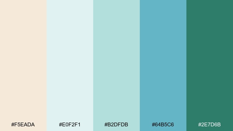
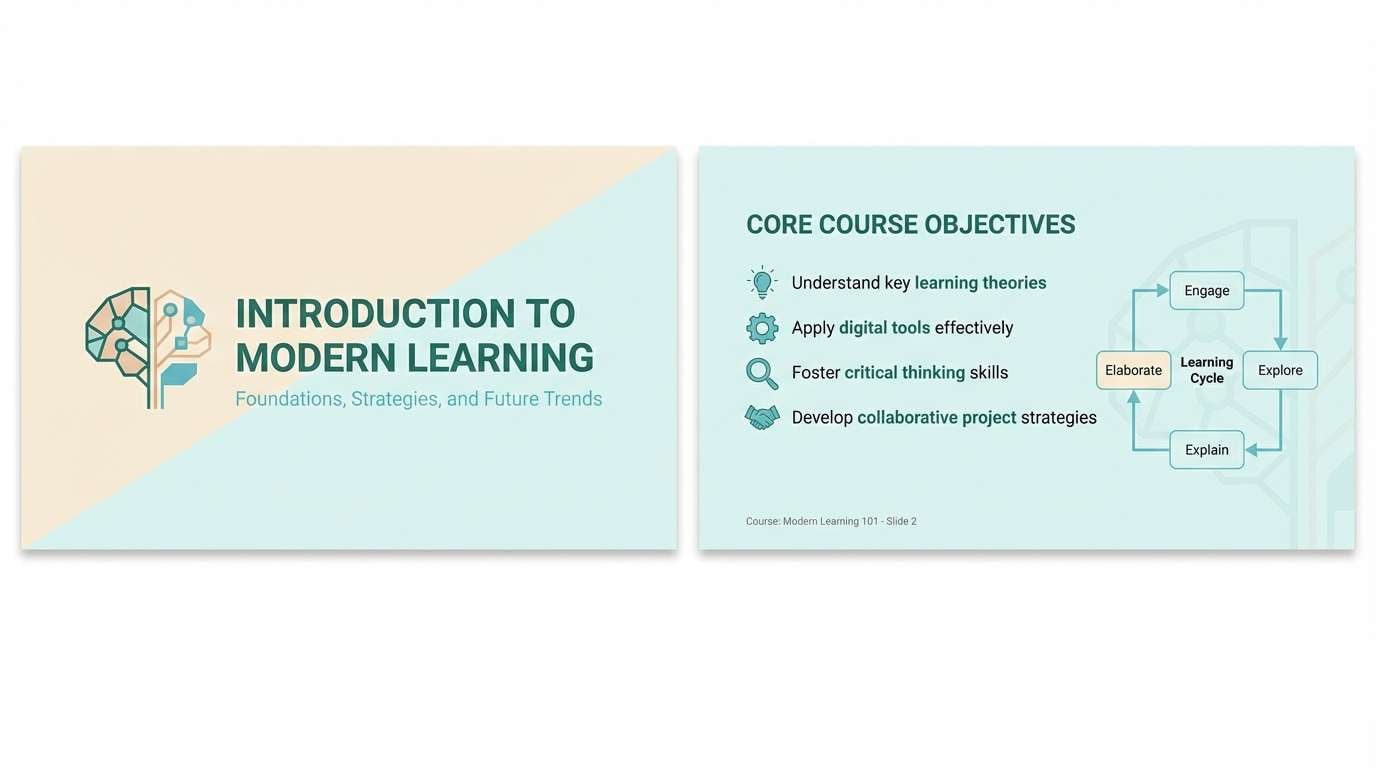
HEX: #F5EADA #E0F2F1 #B2DFDB #64B5C6 #2E7D6B
Mood: soft, focused, low-stress
Best for: education apps and course slides
Soft and focused, it brings the calm of a quiet study room with daylight bouncing off paper. Use the two light tones for slide backgrounds and content cards to reduce visual noise. The blue-teal makes an excellent highlight for links and progress states, while the deep green supports emphasis text. Tip: stick to one accent per screen to keep attention on the lesson content.
Image example of study room calm generated using media.io
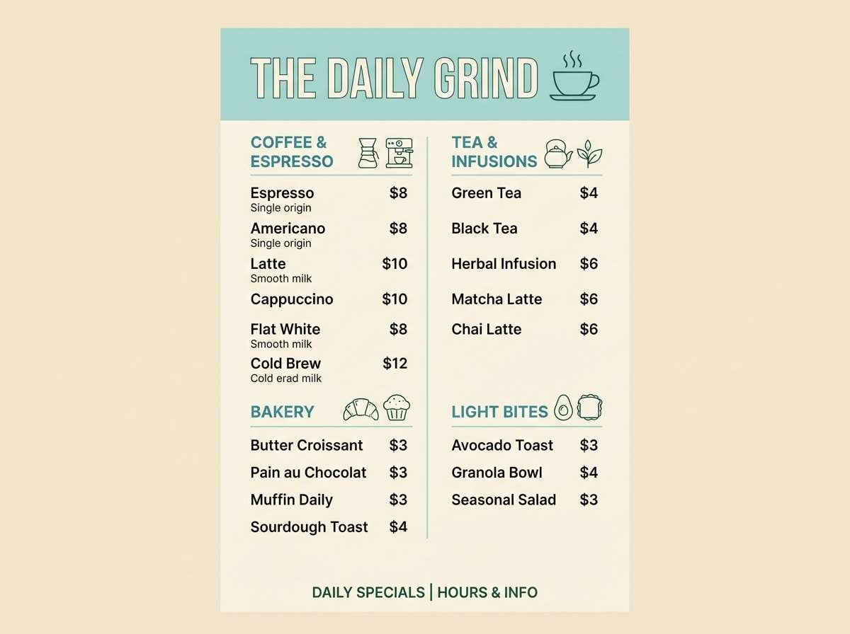
14) Café Menu Board
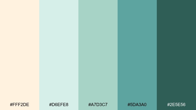
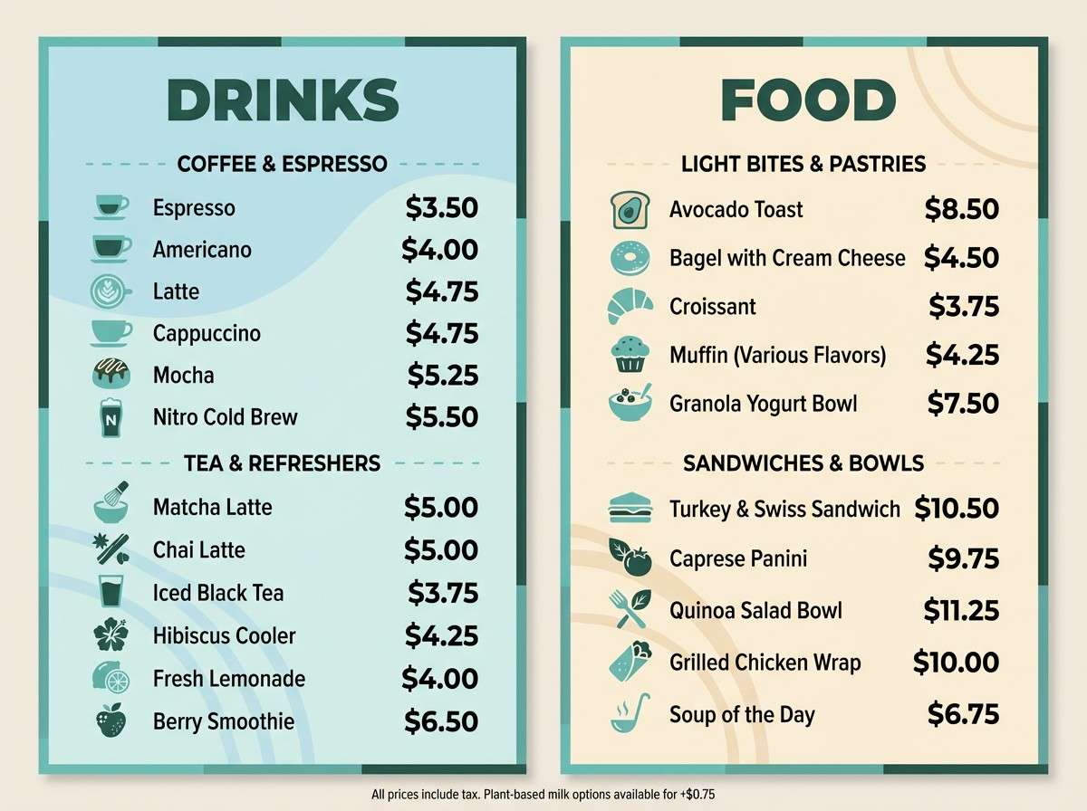
HEX: #FFF2DE #D6EFE8 #A7D3C7 #5DA3A0 #2E5E56
Mood: welcoming, clean, everyday
Best for: in-store menu boards and signage
Welcoming and clean, the tones feel like a light-filled café with painted trim and fresh herbs on the counter. Use cream for the main board background and the soft green for category panels. The teal is strong enough for prices and featured items without turning harsh. Tip: increase letter spacing slightly when using the darker green so signage stays readable from a distance.
Image example of café menu board generated using media.io
15) Eco Skincare Product Ad
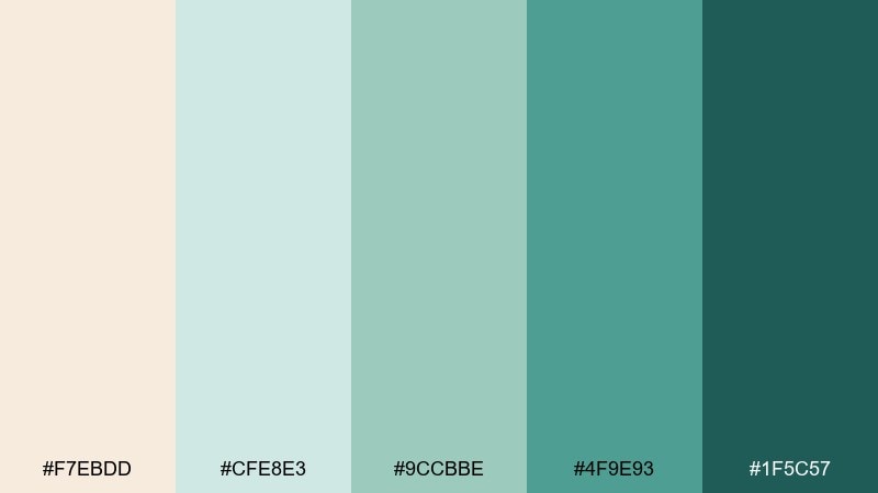
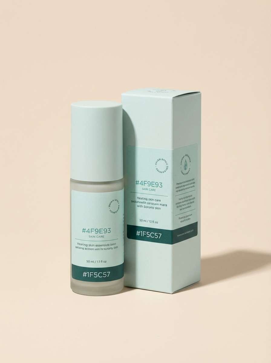
HEX: #F7EBDD #CFE8E3 #9CCBBE #4F9E93 #1F5C57
Mood: natural, premium, gentle
Best for: skincare ads and product pages
Natural and premium, it evokes clean ingredients and soft fabric textures. This cream blue green color combination works best with a minimalist layout and plenty of negative space. Use the mid teal for product claims and badges, while the darkest tone anchors the brand mark. Tip: keep background gradients subtle so the packaging remains the hero of the ad.
Image example of eco skincare product ad generated using media.io
16) Spring Herb Illustration
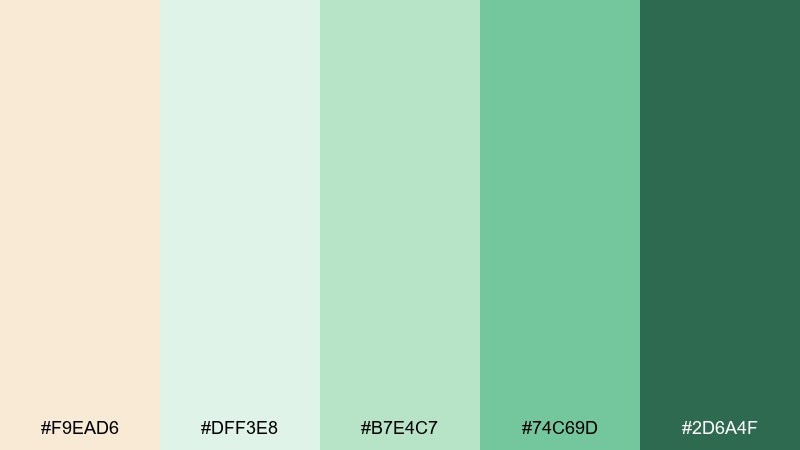
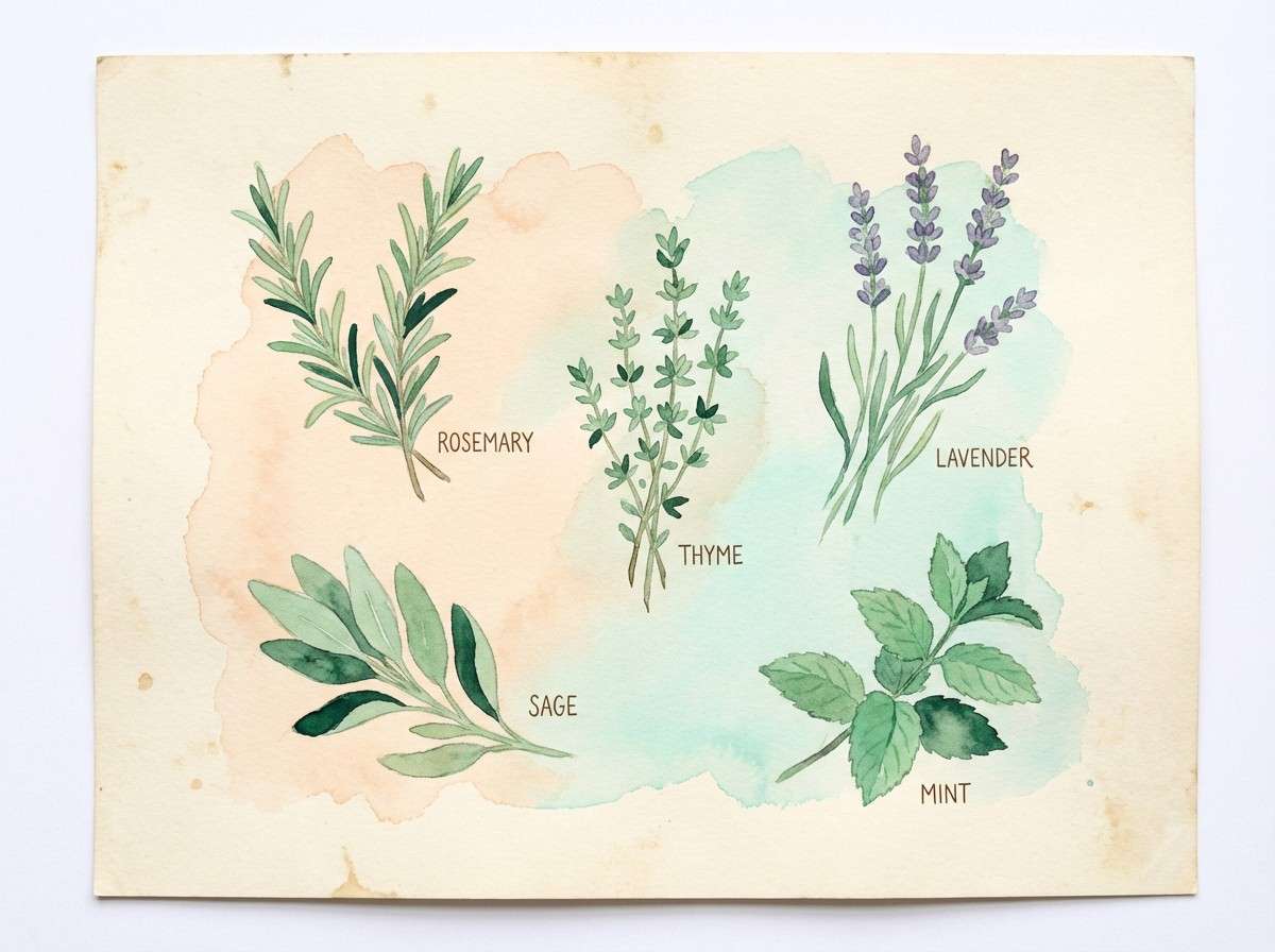
HEX: #F9EAD6 #DFF3E8 #B7E4C7 #74C69D #2D6A4F
Mood: spring, wholesome, botanical
Best for: botanical prints and blog headers
Springy and wholesome, it feels like watercolor herbs drying on a bright windowsill. Let the cream act as paper texture, then paint leaves with the two middle greens for a natural gradient. The deeper green is perfect for fine stems and handwritten labels. Tip: keep shadows minimal so the illustration stays light and airy.
Image example of spring herb illustration generated using media.io
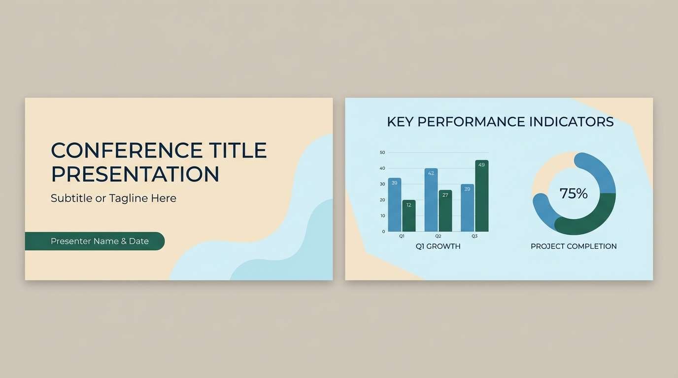
17) Tech Conference Slide Deck
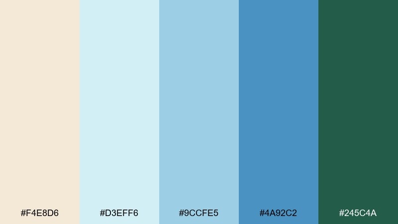
HEX: #F4E8D6 #D3EFF6 #9CCFE5 #4A92C2 #245C4A
Mood: confident, clear, modern
Best for: conference presentations and keynote templates
Confident and clear, the palette feels like a modern keynote with crisp diagrams and bright room lighting. Use the pale blue for content backgrounds, then bring in the stronger blue for charts and section breaks. The green adds contrast for highlights like takeaways and success metrics. Tip: keep body text in a dark neutral and use color only for structure and data emphasis.
Image example of tech conference slide deck generated using media.io
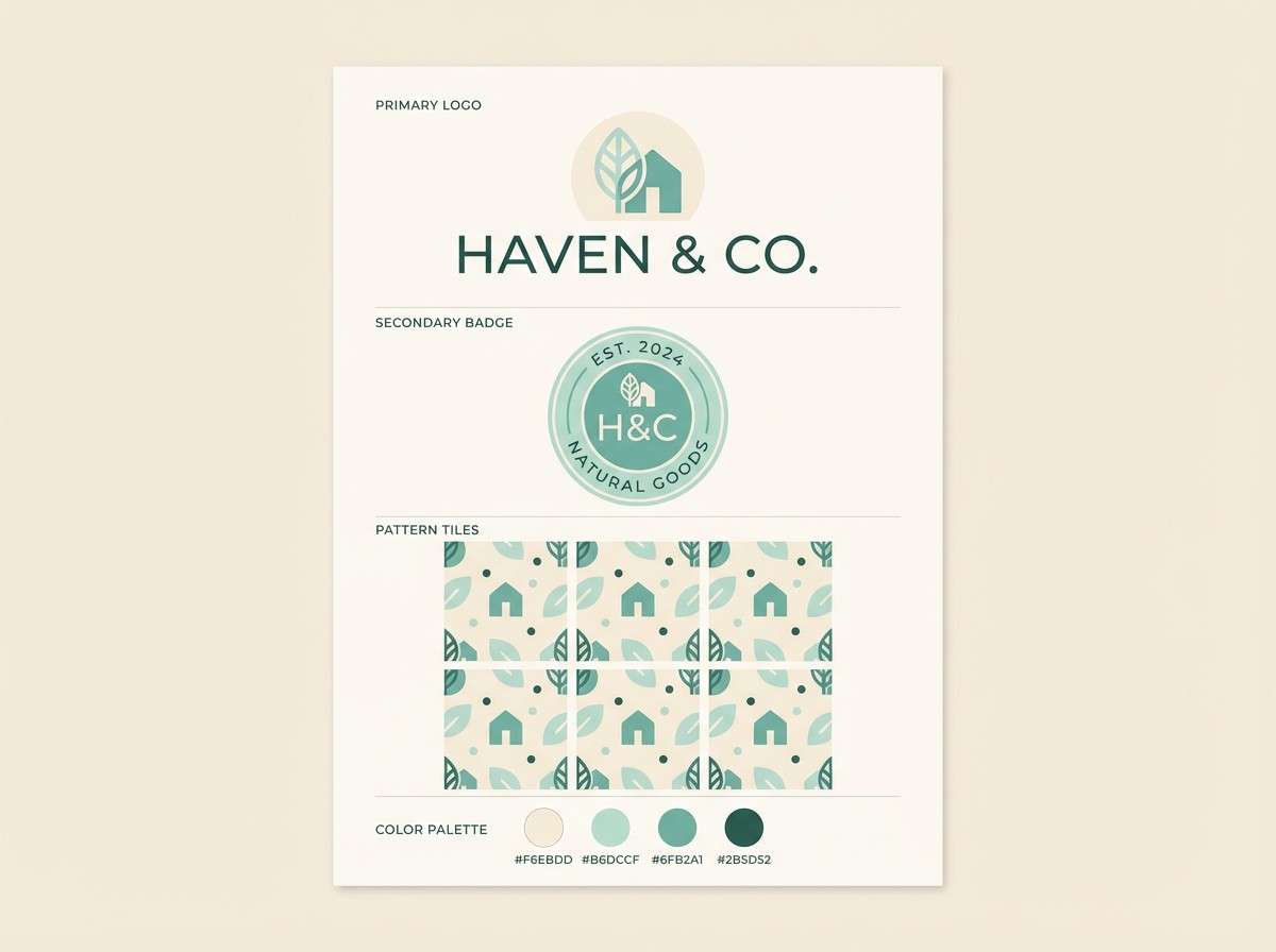
18) Lakehouse Logo Kit
HEX: #F6EBDD #E1F2EC #B6DCCF #6FB2A1 #2B5D52
Mood: outdoorsy, friendly, understated
Best for: logo systems and brand kits
Outdoorsy and understated, it suggests a lakehouse sign, pine shade, and sun-warmed siding. As a cream blue green color scheme, it works well for simple logos where the mark can switch between teal and deep green. Use cream for negative space and stationery, and keep the mid tones for secondary badges or patterns. Tip: design a one-color version in the darkest shade for stamps and embroidery.
Image example of lakehouse logo kit generated using media.io
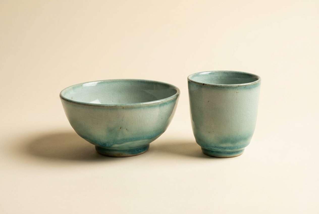
19) Ceramic Pottery Glaze
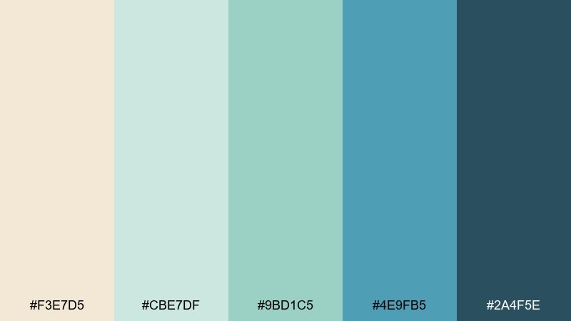
HEX: #F3E7D5 #CBE7DF #9BD1C5 #4E9FB5 #2A4F5E
Mood: handcrafted, earthy, oceanic
Best for: product photography for ceramics and home goods
Handcrafted and oceanic, these tones resemble celadon glaze and deep water shadows. Use the light hues for backgrounds and props, then let the blue-teal glaze carry the focal point. The darkest shade adds contrast for typography overlays or small brand stamps. Tip: keep lighting soft and diffuse so the subtle differences between the mid tones stay visible.
Image example of ceramic pottery glaze generated using media.io
20) Night Swim Accent
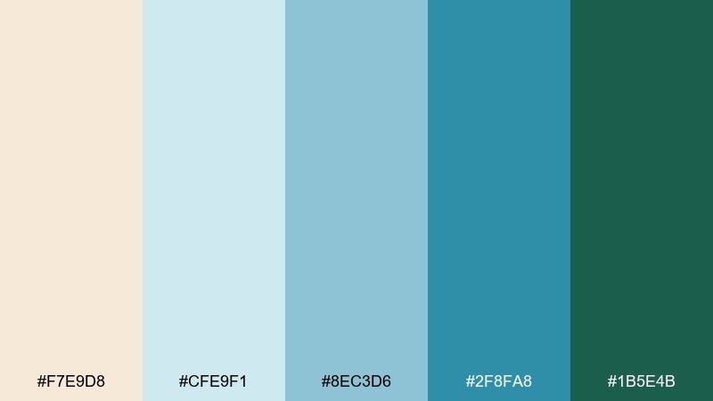
HEX: #F7E9D8 #CFE9F1 #8EC3D6 #2F8FA8 #1B5E4B
Mood: cool, bold, refreshing
Best for: app splash screens and hero banners
Cool and bold, it feels like a night swim with pool lights shimmering against stone. This cream blue green color palette looks best when the deep teal leads and the cream becomes a calm spotlight for text. Use the mid blues for gradients, icons, and progress states to add motion without noise. Tip: test contrast on buttons and links, especially where the light blue sits on cream.
Image example of night swim accent generated using media.io
What Colors Go Well with Cream Blue Green?
Dark neutrals like charcoal, slate, and ink pair smoothly with cream blue green tones, keeping typography crisp while preserving the palette’s calm vibe. For softer contrast, try warm gray or muted taupe instead of pure black.
For a natural extension, add sand, driftwood brown, or muted terracotta to warm up the scheme without overpowering the blues and greens. These accents work well in packaging, editorial layouts, and lifestyle branding.
If you need energy, introduce a small amount of coral, saffron, or citrus as a highlight color. Use it sparingly (badges, links, chart outliers) so the palette stays airy and premium.
How to Use a Cream Blue Green Color Palette in Real Designs
Start with cream as the primary background to create warmth and reduce glare, then choose one mid blue-teal as your main action color for buttons, links, and active states. Reserve the deepest green-blue for anchors like navigation, totals, or key labels.
In print, keep large fields in lighter tones to avoid heavy ink coverage, and test small text on cream to ensure it stays sharp. In UI, use the pale blue-green for cards and sections to separate content without visible borders.
When you want a more “coastal” feel, lean into aqua and blue; for a “botanical” feel, lean into mint and forest green. The same palette can shift mood just by changing which color dominates.
Create Cream Blue Green Palette Visuals with AI
If you’re building a brand board, ad mockup, or UI concept, AI-generated visuals help you preview how cream blue green combinations behave in real compositions. It’s also a fast way to test typography, spacing, and contrast before committing to production files.
Use prompts that specify background, layout style, and which HEX codes should dominate versus act as accents. That keeps results consistent across multiple assets like posters, packaging, and landing pages.
Generate a few variations with different aspect ratios (social, web hero, print) to see how your accent teal and deep green scale at different sizes.
Cream Blue Green Color Palette FAQs
-
What’s the best background color in a cream blue green scheme?
Cream is usually the most flexible background because it feels warm, prints well, and keeps text readable. For UI sections, a very pale blue-green can also work as a soft panel color to separate content without hard borders. -
Which color should I use for buttons and links?
Use a mid blue-teal for primary buttons and links, since it draws attention without looking aggressive. Save the darkest green-blue for hover states, headers, or critical emphasis so the interface keeps a clean hierarchy. -
Does cream blue green work for professional brands?
Yes—especially for SaaS, health, education, finance tools, and modern service brands that want to feel trustworthy and calm. Choose slightly desaturated teals and a darker anchor shade to keep the palette polished. -
How do I keep enough contrast for accessibility?
Pair light backgrounds (cream or pale aqua) with a dark anchor tone for body text, and check contrast ratios for links and button text. Avoid placing pale blue text on cream; instead, use the deepest shade for small typography. -
What accent colors can I add without breaking the vibe?
Muted terracotta, sand, driftwood brown, or soft coral add warmth while staying natural. If you need a brighter pop, use a tiny amount of saffron or coral for badges and key highlights. -
Is this palette better for matte or glossy printing?
It works for both, but matte or uncoated stocks often make these hues feel more organic and “spa-like.” If you print on glossy/coated paper, test mid teals for small text and adjust darkness to prevent fading. -
How can I quickly preview these palettes in real mockups?
Use Media.io text-to-image prompts that specify your layout (menu, UI header, label, poster) and list which HEX colors dominate vs. accent. Generate a few variations to compare contrast, balance, and brand feel before final design.


