

Music festival branding has to do a lot at once: feel exciting on-screen, stay readable at a distance, and translate cleanly from posters to wristbands to app UI.
Below are music festival color palette ideas built around common festival moments—neon stages, golden-hour sets, merch drops, wayfinding, and late-night afterparties—each with HEX codes you can use right away.
In this article
- Why Music Festival Palettes Work So Well
-
- neon stage glow
- sunset headliner
- glitter and denim
- desert daybreak
- midnight bass
- rainbow wristband
- indie poster ink
- food truck pastels
- tropical carnival
- vinyl market
- campfire afterparty
- electric lavender haze
- retro ticket stub
- hologram merch
- garden chillout
- stormy spotlight
- coral confetti
- minimal setlist
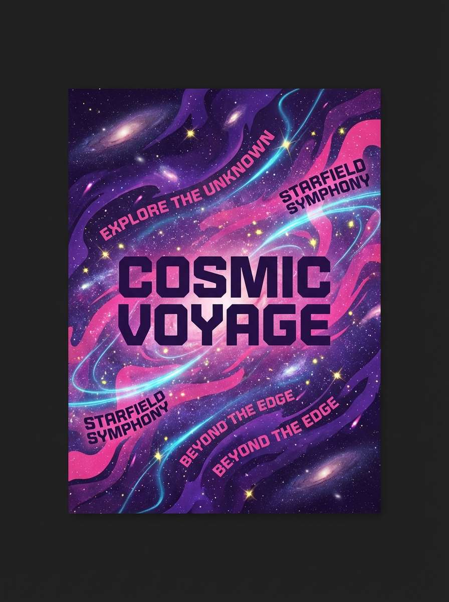
- cosmic pyro
- sunrise encore
- city night transit
- analog polaroid
- pulse and powder
- What Colors Go Well with Music Festival?
- How to Use a Music Festival Color Palette in Real Designs
- Create Music Festival Palette Visuals with AI
Why Music Festival Palettes Work So Well
Music festival color palettes are built for high attention and fast comprehension—people are scanning schedules, signs, and social posts in crowded, bright, and often low-light environments.
They also benefit from strong hierarchy: one or two “hero” colors for identity, a dark or neutral anchor for typography, and a few high-chroma accents for calls to action like tickets, gates, and set times.
Most importantly, festival palettes are designed to travel across mediums—print posters, LED screens, merch ink, app UI—so the colors stay recognizable even when lighting and materials change.
20+ Music Festival Color Palette Ideas (with HEX Codes)
1) Neon Stage Glow
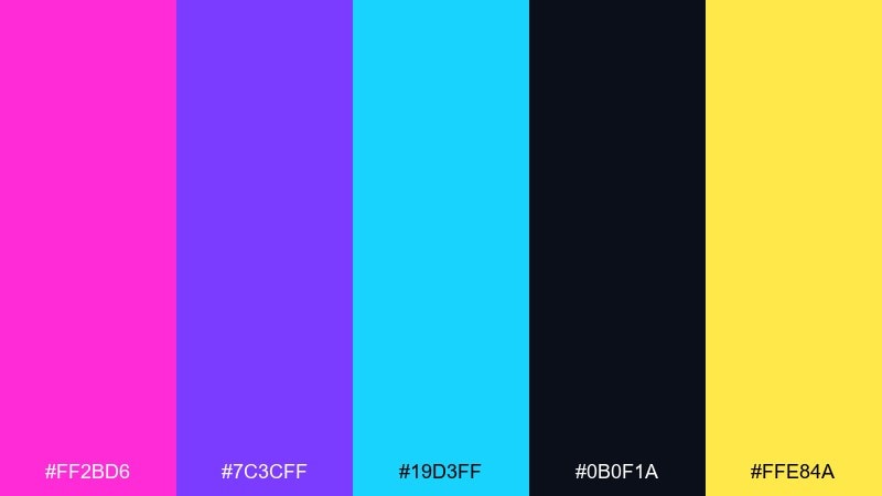
HEX: #ff2bd6 #7c3cff #19d3ff #0b0f1a #ffe84a
Mood: electric, high-energy, nightlife
Best for: headline poster and stage lineup graphics
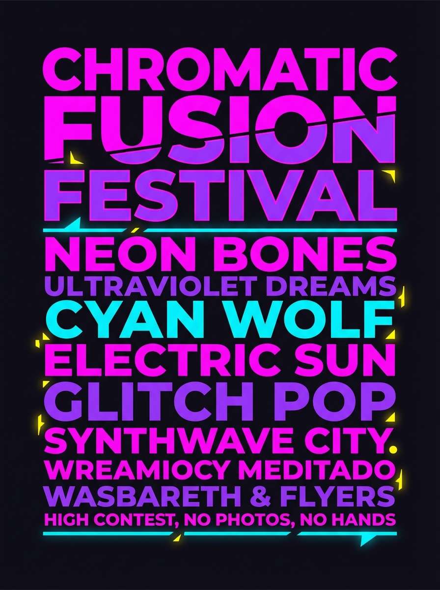
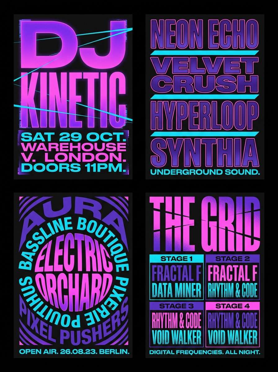
Electric and loud like LED bars cutting through haze, this mix feels built for peak-drop moments. Use the black as your anchor, then let magenta and violet carry the headlines and key acts. Cyan works best as a secondary highlight for times and locations, while yellow adds punch for callouts like tickets and gates. Tip: keep gradients subtle so text stays readable under neon contrast.
Image example of neon stage glow generated using media.io
Media.io is an online AI studio for creating and editing video, image, and audio in your browser.

2) Sunset Headliner
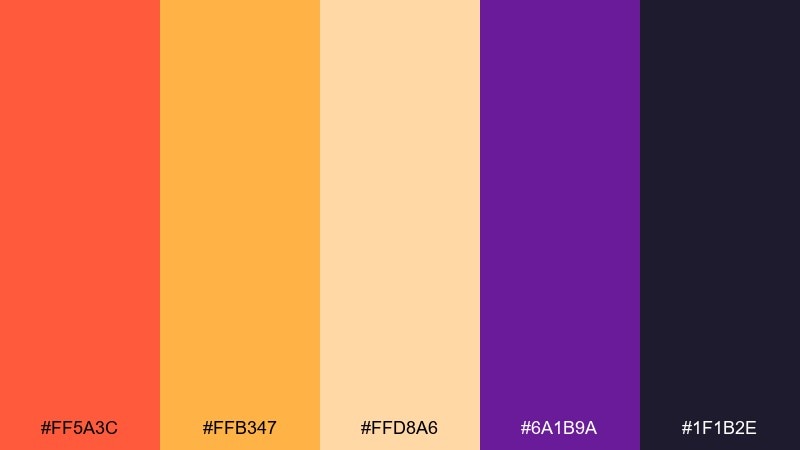
HEX: #ff5a3c #ffb347 #ffd8a6 #6a1b9a #1f1b2e
Mood: warm, cinematic, golden-hour
Best for: hero banner for a festival landing page
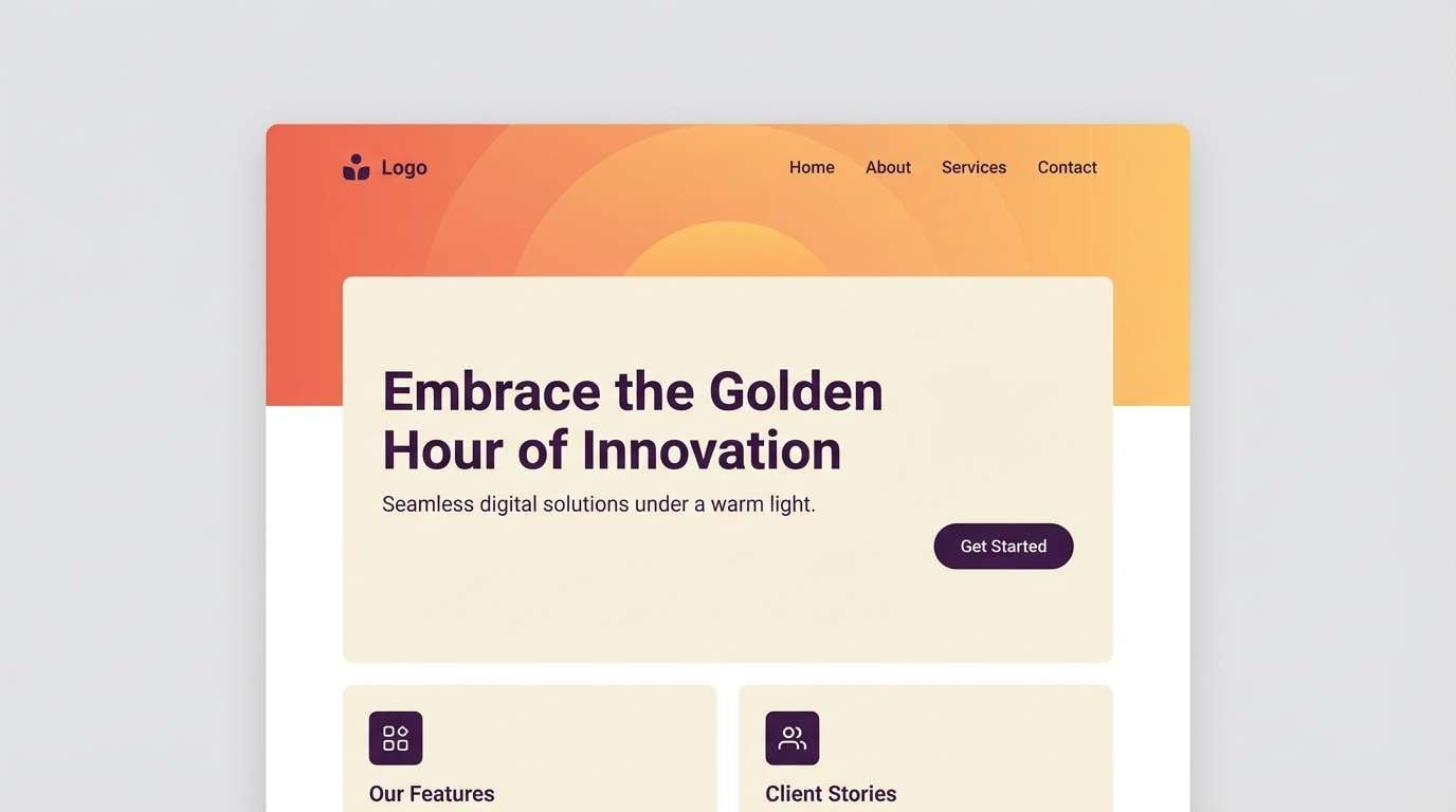
Warm and cinematic like the last set framed by a sunset, these tones bring instant nostalgia. The orange to amber range is perfect for big hero blocks, while the deep purple and near-black add depth for navigation and overlays. For music festival color combinations that still feel premium, keep cream as breathing room and reserve the darkest shade for typography. Tip: add a soft grain texture to avoid flat digital bands in warm gradients.
Image example of sunset headliner generated using media.io
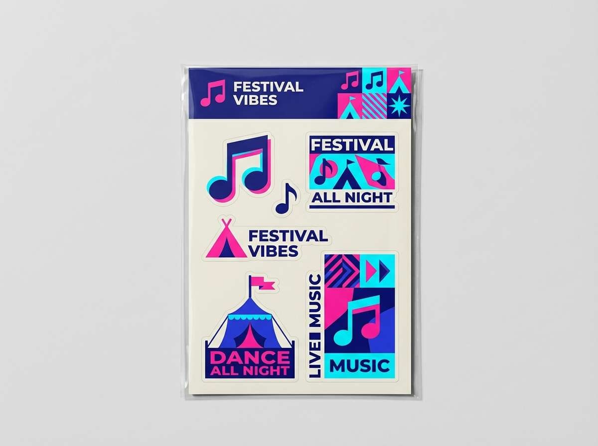
3) Glitter and Denim
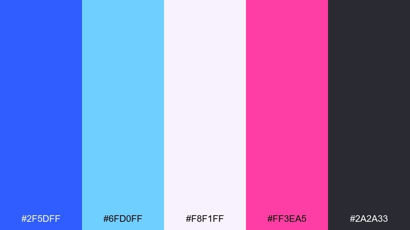
HEX: #2f5dff #6fd0ff #f8f1ff #ff3ea5 #2a2a33
Mood: playful, pop, streetwear
Best for: merch tee graphics and sticker packs
Playful and poppy like rhinestones on denim jackets, this set balances cool blues with a punchy pink. Use the deep blue for bold shapes and outlines, then drop in cyan for shine and motion. The off-white keeps designs feeling airy, while charcoal grounds the composition for print. Tip: for a music festival color palette that prints cleanly, keep the pink in flat fills instead of thin strokes.
Image example of glitter and denim generated using media.io
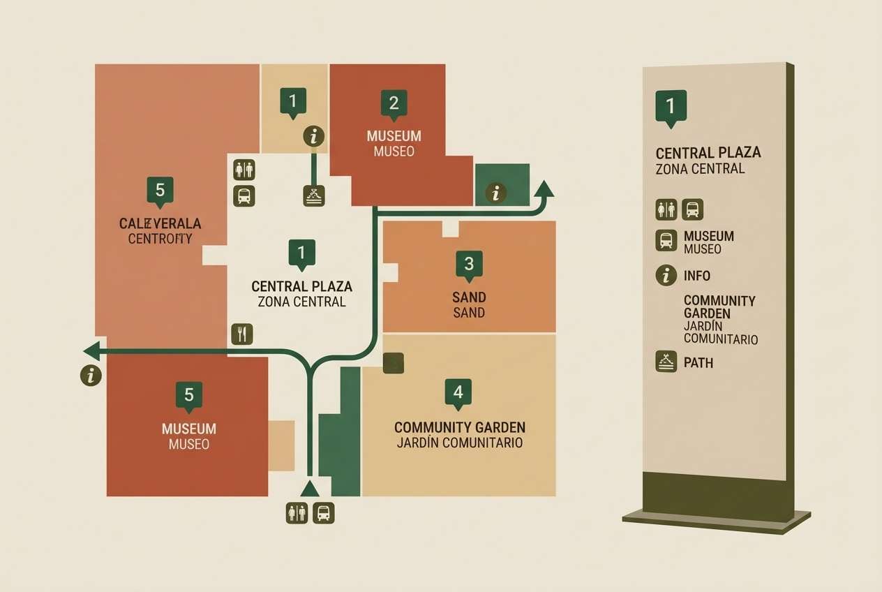
4) Desert Daybreak
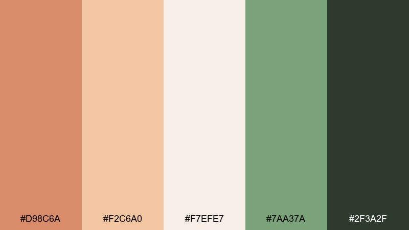
HEX: #d98c6a #f2c6a0 #f7efe7 #7aa37a #2f3a2f
Mood: earthy, calm, sun-washed
Best for: wayfinding signs and map design
Earthy and sun-washed like tents and dust at first light, these colors feel grounded and friendly. Clay and sand tones make large blocks approachable, while green adds a nature cue for chill zones, water stations, or camping. Use the deep olive for icons and labels so they stay legible outdoors. Tip: pair with simple pictograms and generous spacing for quick scanning in crowds.
Image example of desert daybreak generated using media.io
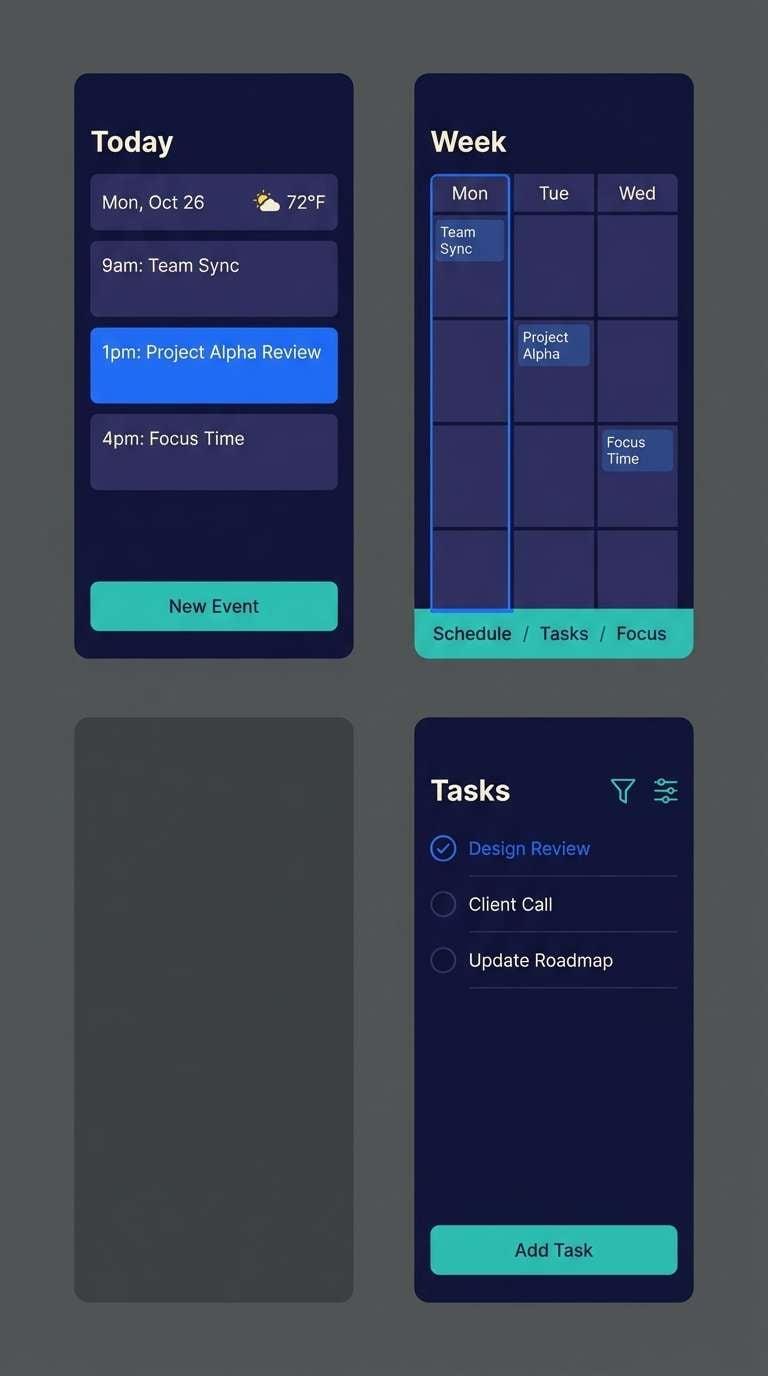
5) Midnight Bass
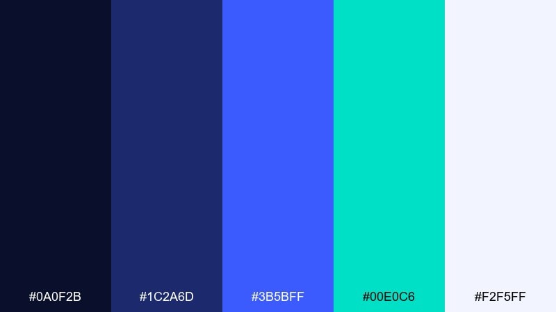
HEX: #0a0f2b #1c2a6d #3b5bff #00e0c6 #f2f5ff
Mood: sleek, nocturnal, techy
Best for: schedule app UI and dark mode screens
Sleek and nocturnal like a sub-heavy set after midnight, this palette is built for dark mode. Navy and indigo create depth, while electric blue and teal help key actions pop without harsh glare. Use the soft off-white for primary text and keep teal for one consistent action color across screens. Tip: add subtle separators in the mid-indigo to avoid a muddy UI.
Image example of midnight bass generated using media.io
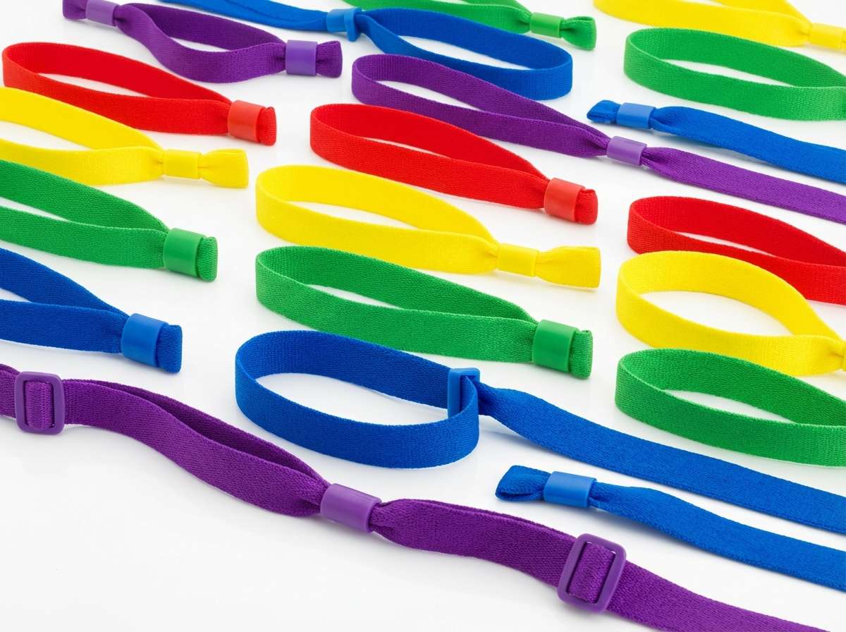
6) Rainbow Wristband
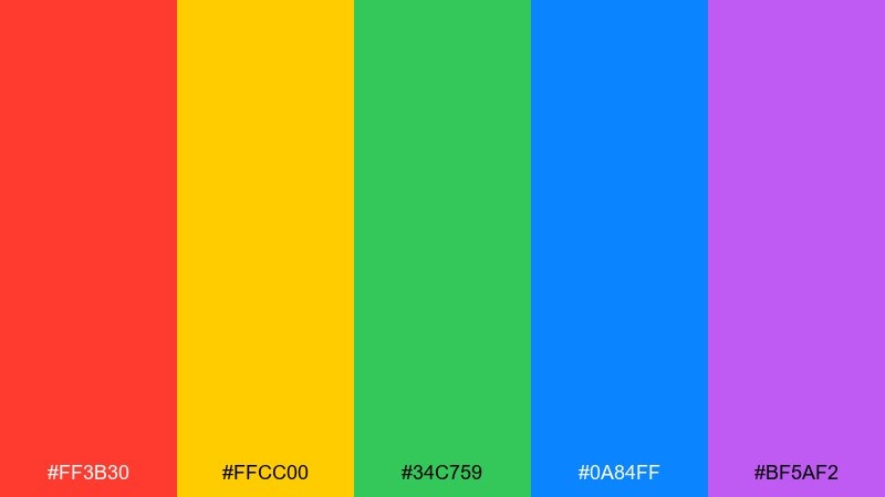
HEX: #ff3b30 #ffcc00 #34c759 #0a84ff #bf5af2
Mood: joyful, inclusive, high-visibility
Best for: wristbands, ticket tiers, and access badges
Joyful and high-visibility like stacked wristbands at the gate, these hues are made for fast recognition. Assign one color per ticket tier, then use the blue or purple as your premium level for instant hierarchy. Keep typography in black or white depending on the band color, and test contrast for outdoor light. Tip: avoid gradients here, flat fills scan faster in security checks.
Image example of rainbow wristband generated using media.io
7) Indie Poster Ink
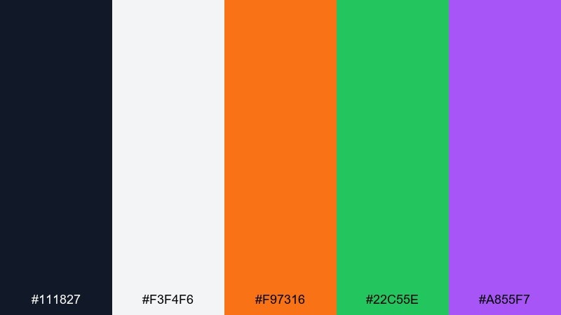
HEX: #111827 #f3f4f6 #f97316 #22c55e #a855f7
Mood: graphic, indie, print-ready
Best for: screen-printed poster and risograph flyer
Graphic and punchy like ink layers on textured paper, this set loves bold type and simple shapes. Use near-black for headlines, then rotate orange, green, and purple as accent blocks for stages or days. The light gray keeps the composition airy while still feeling more editorial than pure white. Tip: keep accent colors in larger areas so print registration issues look intentional.
Image example of indie poster ink generated using media.io
8) Food Truck Pastels
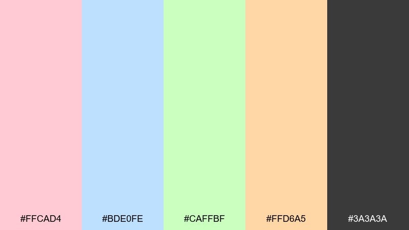
HEX: #ffcad4 #bde0fe #caffbf #ffd6a5 #3a3a3a
Mood: sweet, friendly, daytime
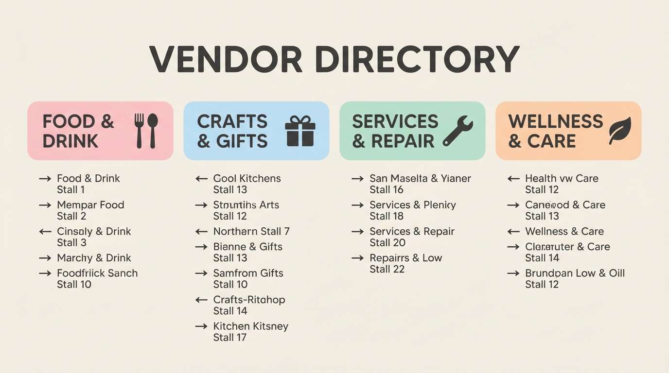
Best for: vendor directory and food court signage
Sweet and friendly like handwritten menus and afternoon snacks, these pastels keep things approachable. Use charcoal for clear labels and pricing, then assign each vendor category a soft color block. The peach and pink work well for dessert or drinks, while mint and baby blue suit vegan or coffee stands. Tip: add simple icons and keep backgrounds mostly light for easy readability.
Image example of food truck pastels generated using media.io
9) Tropical Carnival
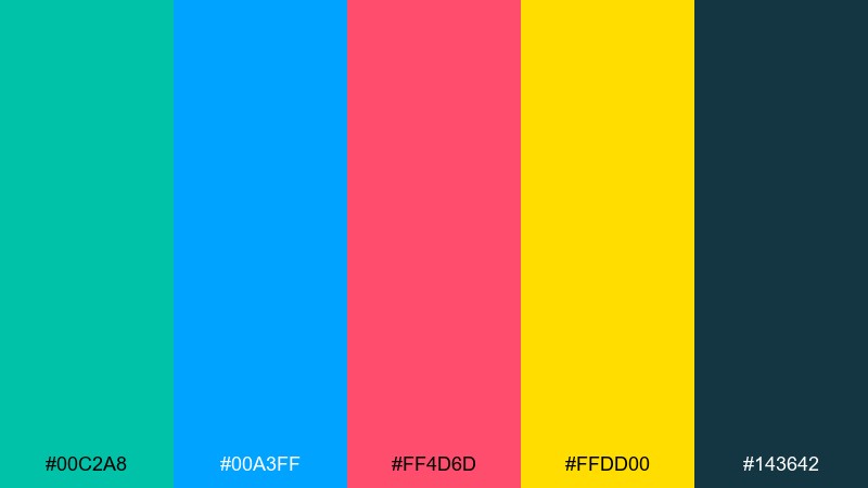
HEX: #00c2a8 #00a3ff #ff4d6d #ffdd00 #143642
Mood: tropical, bold, celebratory
Best for: social post templates and story graphics
Tropical and celebratory like confetti over palm silhouettes, this palette is made for fast-scrolling feeds. Teal and hot pink carry the energy, while yellow adds that sunlit pop for stickers and badges. Use deep blue-gray for text and frames so the brights do not overwhelm. Tip: keep one dominant bright per post to avoid visual noise.
Image example of tropical carnival generated using media.io
10) Vinyl Market
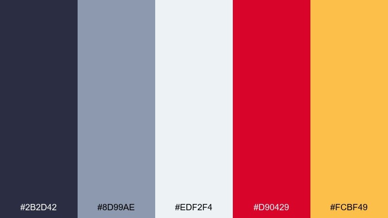
HEX: #2b2d42 #8d99ae #edf2f4 #d90429 #fcbf49
Mood: retro, curated, collector
Best for: record fair booth banners and price tags
Retro and curated like crate-digging at a pop-up market, these tones feel timeless. Slate and light gray create a clean base, while red adds urgency for deals and limited drops. Use the warm yellow for featured items or section headers to keep the layout lively. Tip: pair with condensed type and simple borders for a classic print vibe.
Image example of vinyl market generated using media.io
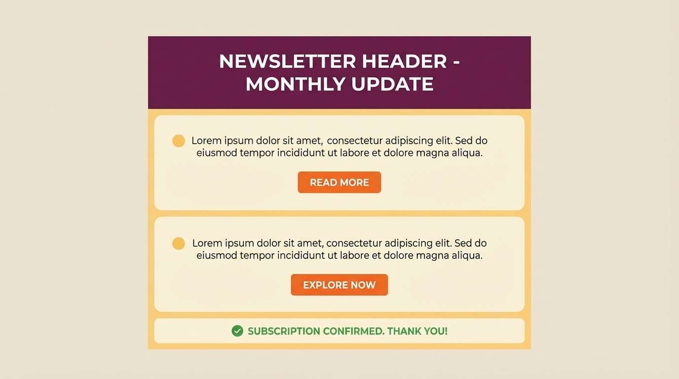
11) Campfire Afterparty
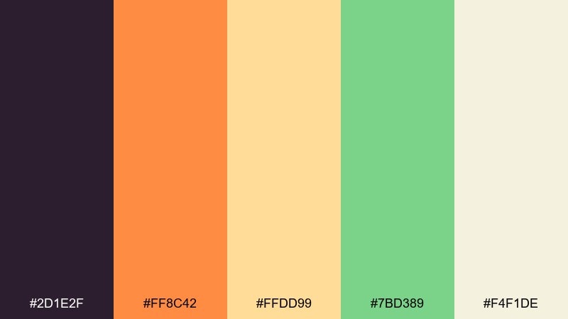
HEX: #2d1e2f #ff8c42 #ffdd99 #7bd389 #f4f1de
Mood: cozy, communal, late-night
Best for: email header and community announcements
Cozy and communal like stories around a campfire, this palette softens the night without losing energy. Use the deep plum for headers, then layer orange and warm cream for highlights and buttons. Green is best as a supportive accent for confirmations, checkmarks, or sustainability notes. Tip: for music festival color combinations that feel welcoming, keep the background light and let plum handle the contrast.
Image example of campfire afterparty generated using media.io
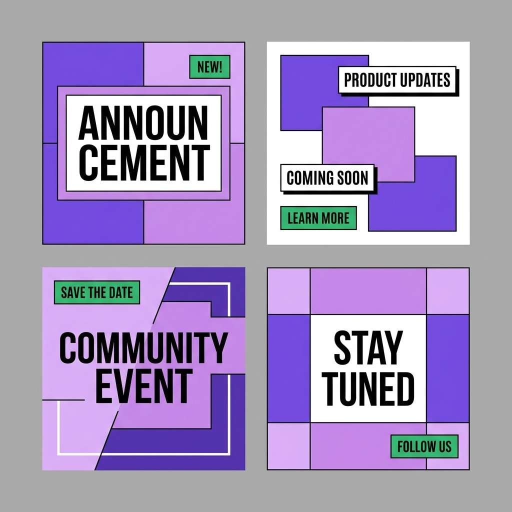
12) Electric Lavender Haze
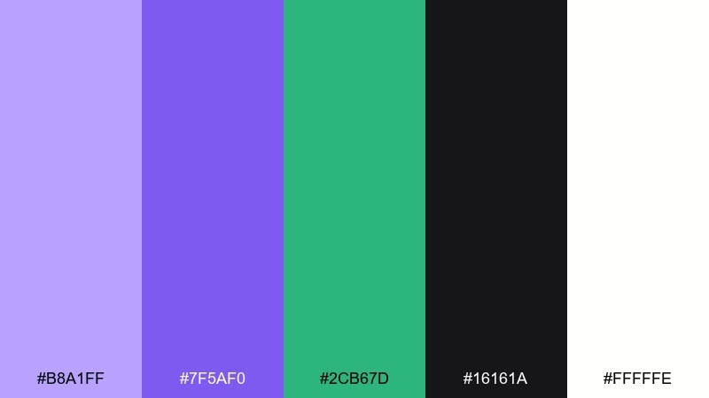
HEX: #b8a1ff #7f5af0 #2cb67d #16161a #fffffe
Mood: dreamy, modern, synthy
Best for: artist announcement carousel posts
Dreamy and modern like synth chords in a lavender fog, these colors feel trendy without going neon-heavy. Purple shades handle the main branding blocks, while green is the perfect contrast for dates, ticket links, or limited announcements. Black and white keep the system crisp and flexible across formats. Tip: use the lighter lavender for backgrounds so the darker violet reads as the hero accent.
Image example of electric lavender haze generated using media.io
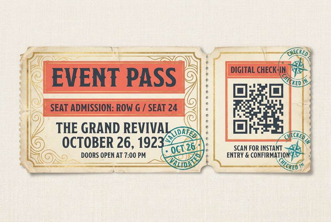
13) Retro Ticket Stub
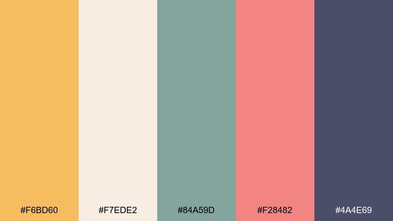
HEX: #f6bd60 #f7ede2 #84a59d #f28482 #4a4e69
Mood: nostalgic, warm, handcrafted
Best for: ticket design and check-in QR cards
Nostalgic and handcrafted like a saved ticket stub in a scrapbook, these tones feel instantly familiar. Use the warm gold as the main ticket paper color, then bring in coral for section labels and teal for security accents. The deep slate keeps QR codes and body copy readable. Tip: add a perforation line and keep contrast high around scanning areas.
Image example of retro ticket stub generated using media.io
14) Hologram Merch
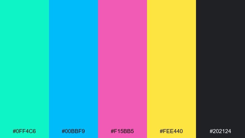
HEX: #0ff4c6 #00bbf9 #f15bb5 #fee440 #202124
Mood: futuristic, glossy, high-impact
Best for: product ad for limited merch drop
Futuristic and glossy like holographic foil under spotlights, this set screams limited edition. Let cyan and sky blue dominate, then use pink for the drop date and yellow for urgency tags like sold soon. Charcoal keeps everything grounded and makes the brights feel even more luminous. Tip: keep gradients contained to large shapes so small text stays sharp.
Image example of hologram merch generated using media.io

15) Garden Chillout
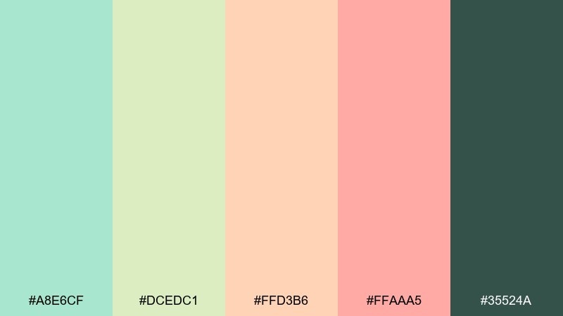
HEX: #a8e6cf #dcedc1 #ffd3b6 #ffaaa5 #35524a
Mood: soft, restorative, daytime lounge
Best for: wellness zone signage and workshop schedule
Soft and restorative like shade under trees between sets, these hues feel calm and breathable. Use mint and light green as the main background blocks, then bring in peach and blush for section markers. The deep green works best for typography and icon strokes so the system stays accessible. Tip: keep margins generous and avoid all-caps to maintain the relaxed tone.
Image example of garden chillout generated using media.io
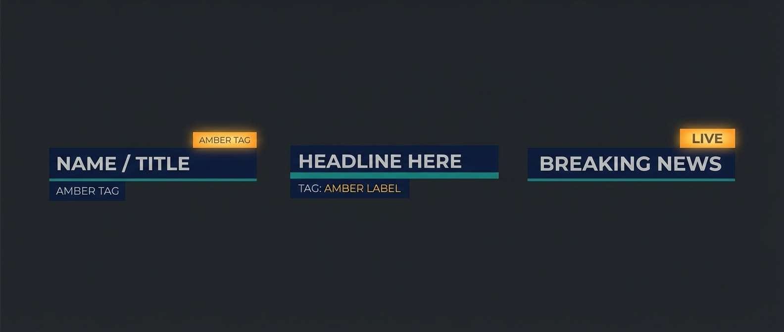
16) Stormy Spotlight
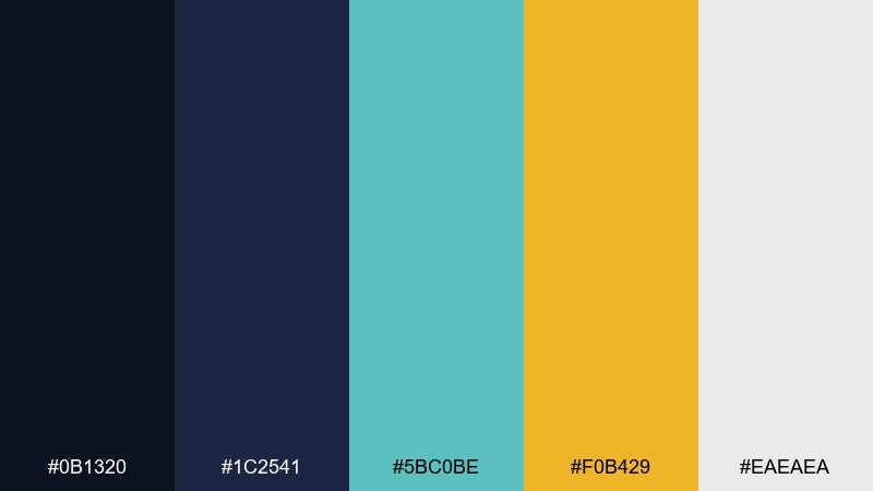
HEX: #0b1320 #1c2541 #5bc0be #f0b429 #eaeaea
Mood: dramatic, modern, moody
Best for: stage screen lower-thirds and overlays
Dramatic and modern like a spotlight cutting through storm clouds, this palette thrives on contrast. Deep blues set a cinematic base, while teal adds motion for animated elements and transitions. Use amber for key labels like now playing, and keep light gray for legibility on screens. Tip: limit amber to one or two elements per frame so it keeps its impact.
Image example of stormy spotlight generated using media.io
17) Coral Confetti
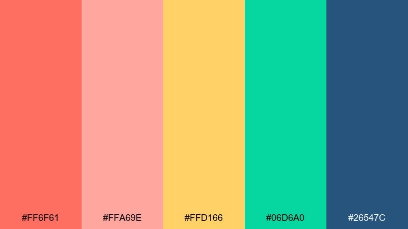
HEX: #ff6f61 #ffa69e #ffd166 #06d6a0 #26547c
Mood: bright, friendly, celebratory
Best for: family-friendly festival poster
Bright and friendly like confetti in the afternoon sun, this mix feels welcoming and upbeat. Coral and peach make strong headline colors, while yellow adds warmth for subheads and badges. Use teal for playful shapes and deep blue for body text so everything stays readable at a distance. Tip: pair with rounded typefaces and simple illustrations for a clean, modern look.
Image example of coral confetti generated using media.io
18) Minimal Setlist
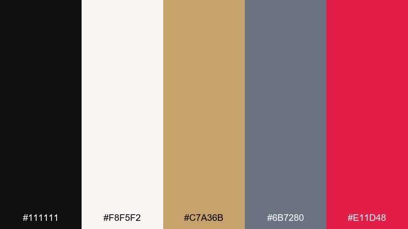
HEX: #111111 #f8f5f2 #c7a36b #6b7280 #e11d48
Mood: clean, modern, editorial
Best for: setlist graphics and minimalist branding kit
Clean and editorial like a printed setlist taped to a monitor, this palette keeps things sharp. Cream and black handle most of the surface area, while muted gold adds a premium detail for dividers and icons. Use slate gray for secondary text and a single rose accent for urgent announcements. Tip: if you need a music festival color palette that scales across print and web, keep the rose accent under 10 percent.
Image example of minimal setlist generated using media.io
19) Cosmic Pyro
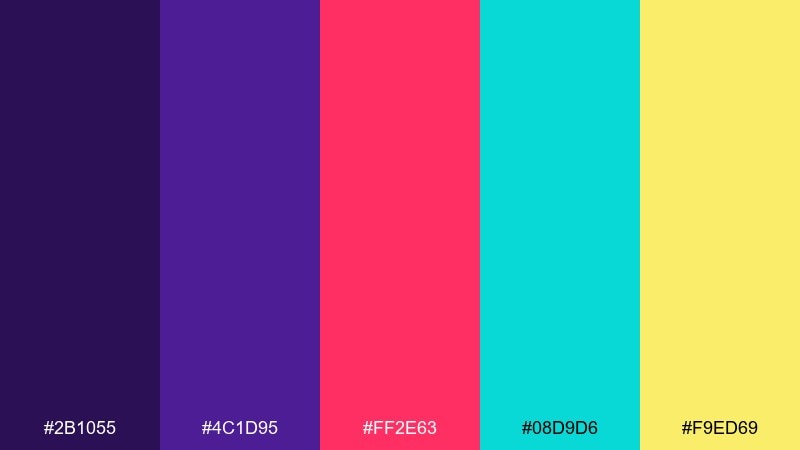
HEX: #2b1055 #4c1d95 #ff2e63 #08d9d6 #f9ed69
Mood: cosmic, explosive, peak-moment
Best for: closing night poster and countdown assets
Cosmic and explosive like pyro bursts against a violet sky, these colors feel made for finales. Keep purple tones as the base, then use hot pink for the headline and cyan for motion accents like streaks or outlines. Yellow is best as tiny sparks for dates, gates, or countdown numbers. Tip: add a subtle starfield texture so the brights feel anchored, not floating.
Image example of cosmic pyro generated using media.io
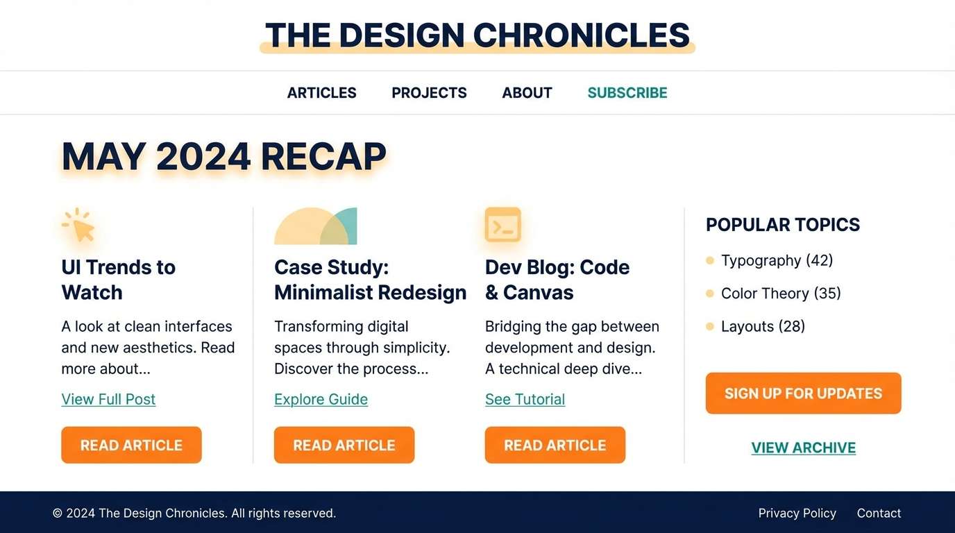
20) Sunrise Encore
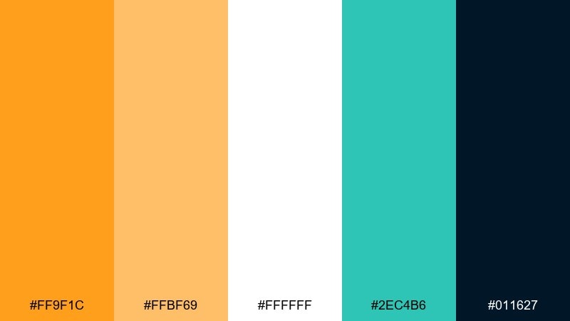
HEX: #ff9f1c #ffbf69 #ffffff #2ec4b6 #011627
Mood: optimistic, fresh, morning-after
Best for: thank-you page and recap blog header
Optimistic and fresh like the walk out at sunrise, these tones feel clean and uplifting. Use navy for crisp typography, then let orange and soft amber bring warmth to buttons and key stats. Teal works nicely for links and subtle chart highlights in recap content. Tip: keep backgrounds mostly white so the warm tones read as intentional accents, not clutter.
Image example of sunrise encore generated using media.io
21) City Night Transit
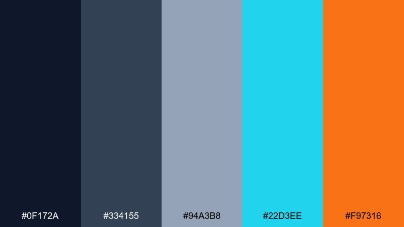
HEX: #0f172a #334155 #94a3b8 #22d3ee #f97316
Mood: urban, practical, directional
Best for: shuttle schedule boards and transit alerts
Urban and practical like a late-night route map, this palette is designed for clarity. Dark navy and slate keep the background steady, while cyan calls attention to routes and times. Use orange only for urgent alerts such as last shuttle or detours, and keep text in the light steel shade for comfort. Tip: test the cyan on both dark and mid-slate panels for consistent readability.
Image example of city night transit generated using media.io
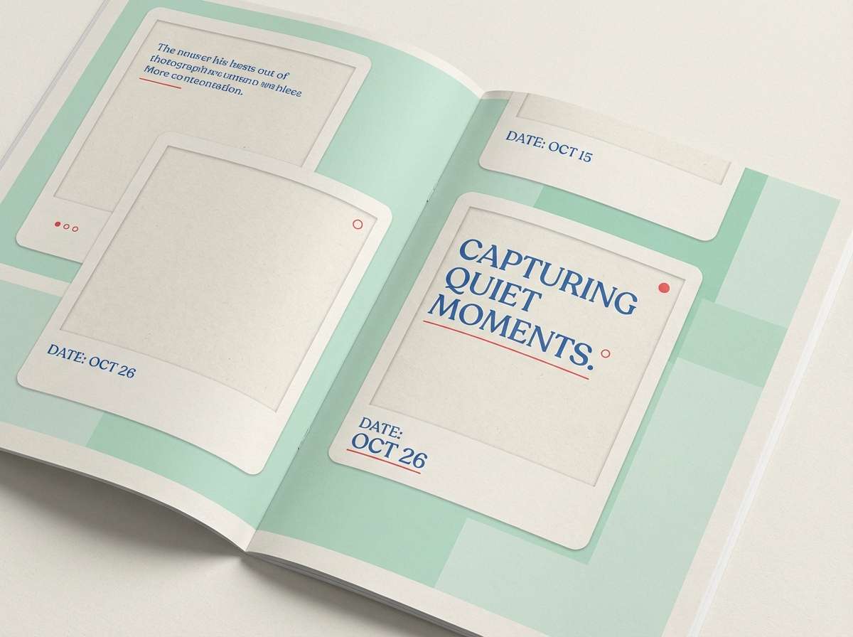
22) Analog Polaroid
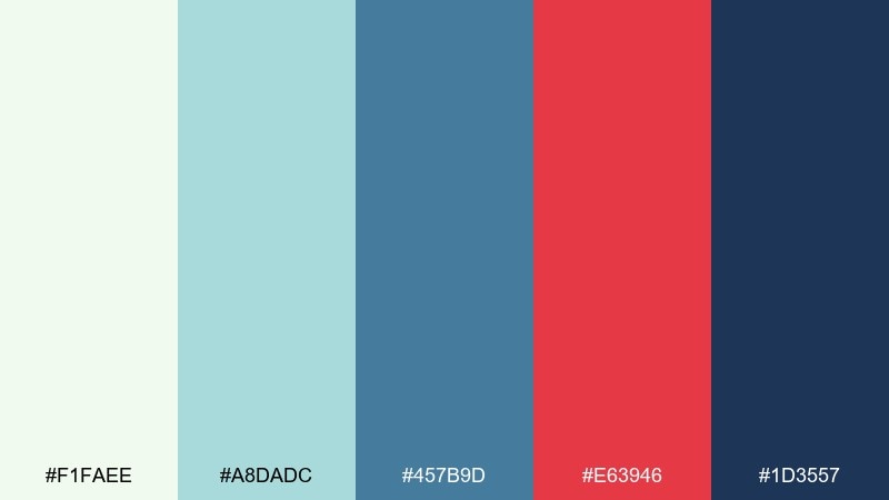
HEX: #f1faee #a8dadc #457b9d #e63946 #1d3557
Mood: nostalgic, candid, documentary
Best for: recap zine and photo caption system
Nostalgic and candid like instant photos pinned to a wall, these colors feel documentary and real. Keep the pale mint as the page base, then use blues for layout structure and captions. Red works best as a small marker for pull quotes, page numbers, or section starts. Tip: if you want one extra layer, use a slightly off-white paper texture to enhance the analog feel.
Image example of analog polaroid generated using media.io
23) Pulse and Powder
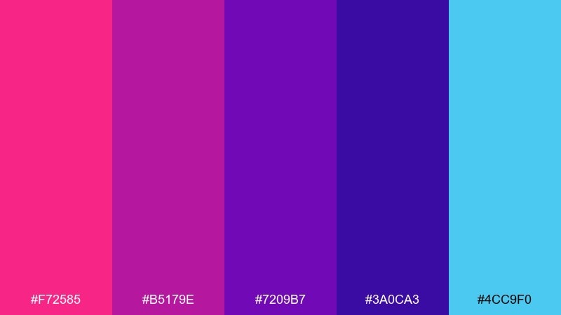
HEX: #f72585 #b5179e #7209b7 #3a0ca3 #4cc9f0
Mood: bold, euphoric, EDM
Best for: DJ poster series and stage branding
Bold and euphoric like color powder bursts synced to a drop, this set is unapologetically vibrant. Build the base with deep violet, then stack pink and magenta for titles and artist names. Cyan is your best contrast for time, location, and small UI tags. Tip: for a cohesive music festival color scheme, keep cyan limited to a single recurring element like icons or underlines.
Image example of pulse and powder generated using media.io
What Colors Go Well with Music Festival?
Music festival palettes pair best when you balance one dark anchor (near-black, navy, charcoal) with one or two high-saturation “stage” colors (magenta, electric blue, teal, neon green) and a warm pop (amber, yellow, coral) for calls to action.
For daytime festivals, sun-washed neutrals (cream, sand, light gray) combined with friendly brights (peach, mint, sky blue) keep signage and maps approachable while still on-brand.
For nightlife and EDM aesthetics, leaning into violet, cyan, and hot pink creates instant energy—just keep text on a stable dark base so readability holds under extreme contrast.
How to Use a Music Festival Color Palette in Real Designs
Start with roles, not just colors: assign a background color, a primary text color, a CTA color, and two accents. This makes your festival branding consistent across posters, wristbands, schedules, and social templates.
Design for real viewing conditions. Outdoor glare, stage lighting, and motion graphics can all reduce legibility, so test contrast for headlines and small type (set times, locations, QR instructions) before finalizing.
Keep your loudest colors for the moments that matter—ticket buttons, “Now Playing,” gate numbers, and critical alerts—so the experience stays clear even when the visuals are maximal.
Create Music Festival Palette Visuals with AI
If you want to preview how a music festival color palette will look on a poster, app screen, or merch mockup, generating quick concept visuals is the fastest way to validate contrast and vibe.
With Media.io’s Text to Image, you can paste a ready-made prompt, tweak the mood (neon, retro, minimal, cinematic), and iterate until your lineup graphics and brand assets feel right.
Try making two versions of the same layout: one optimized for daylight readability and another for night-stage impact, then reuse the same HEX system across both.
Music Festival Color Palette FAQs
-
What is a good music festival color palette for posters?
Use a dark anchor (black/navy) for readability, a bold hero color (magenta, electric blue, or coral) for headlines, and one warm highlight (yellow/amber) for tickets, gates, and key callouts. -
How many colors should an event branding palette include?
Five is a practical sweet spot: 1 background, 1 text/neutral, 1 primary brand color, and 2 accents for hierarchy (stages, days, alerts, or categories). -
What colors work best for wayfinding at festivals?
High-contrast combinations with clear neutrals: light backgrounds with dark text, plus one strong accent per zone. Avoid low-contrast pastels for critical directions unless paired with very dark typography. -
Are neon color combinations readable in print?
They can be, but keep neon hues in larger shapes and use dark neutrals for body copy. Always proof key pieces (posters, wristbands) because neon-like RGB colors may print duller in CMYK. -
What’s the best palette approach for a festival app UI?
Choose a dark-mode base (navy/charcoal), an off-white for text, and one consistent action color (teal or electric blue). Limit extra brights so the interface doesn’t feel noisy. -
How do I assign colors to ticket tiers or wristbands?
Use flat, highly distinct colors (red/yellow/green/blue/purple), keep labels in black or white depending on contrast, and avoid gradients so staff can identify tiers instantly. -
Can I generate festival color palette mockups with AI?
Yes. Generate poster, merch, and UI concepts using the same HEX-based direction in your prompt, then refine contrast and hierarchy before moving to final design files.
Next: Old Gold Color Palette


