

A good home office color palette makes work feel simpler: fewer visual distractions, clearer hierarchy, and a space that supports focus instead of fighting it.
Below are 20+ curated home office palettes with HEX codes, plus practical pairing tips for walls, UI dashboards, and brand assets—so you can apply the colors with confidence.
In this article
Why Home Office Palettes Work So Well
Home offices have to do double duty: they need to feel comfortable enough for long hours, while staying clean and structured so your brain can focus. A cohesive palette reduces “visual noise” and makes the room (or interface) feel intentional.
Color also drives hierarchy. When you reserve darker tones for text and key elements—like CTAs, headings, or one accent wall—you get clearer scanning, better readability, and fewer distractions across screens and print.
Finally, home office colors help unify your ecosystem: video call background, desk setup, brand templates, and UI components. When everything shares the same few tones, the result looks professional without being complicated.
20+ Home Office Color Palette Ideas (with HEX Codes)
1) Quiet Linen
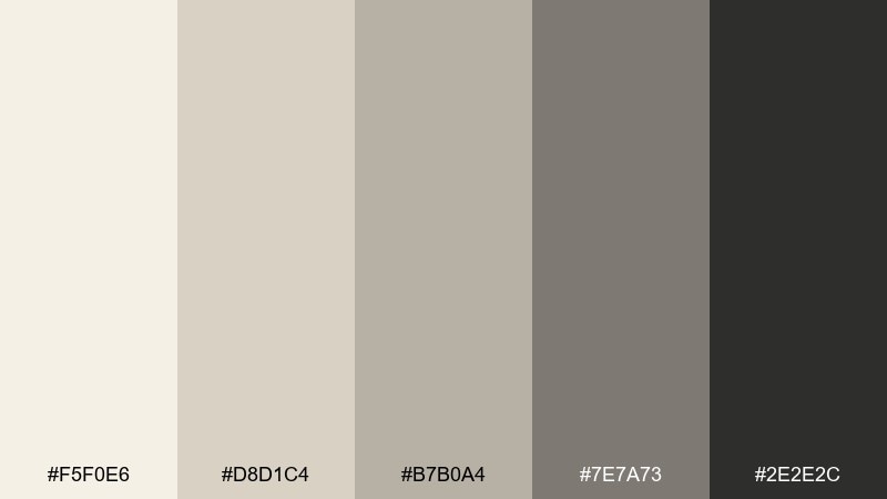
HEX: #F5F0E6 #D8D1C4 #B7B0A4 #7E7A73 #2E2E2C
Mood: calm and tidy
Best for: minimalist brand mood board for a consulting workspace
Calm, airy linen neutrals evoke a sunlit desk, crisp paper, and a clean start to the day. Use the light creams for backgrounds and the deep charcoal for type so everything stays readable. Pair with matte black hardware and pale oak textures to keep it warm, not sterile. Usage tip: keep contrast high by reserving the darkest tone for headings and icons.
Image example of quiet linen generated using media.io
Media.io is an online AI studio for creating and editing video, image, and audio in your browser.

2) Sage Focus
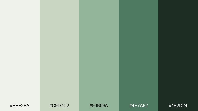
HEX: #EEF2EA #C9D7C2 #93B59A #4E7A62 #1E2D24
Mood: fresh and focused
Best for: project management dashboard UI
Fresh sage greens bring the feeling of indoor plants and clear breathing space. Let the pale green-gray carry the canvas while the mid sage highlights active states and progress. Pair with charcoal text and simple line icons for a calm, professional interface. Usage tip: use the darkest green only for primary CTAs to avoid visual fatigue.
Image example of sage focus generated using media.io

3) Graphite Grid
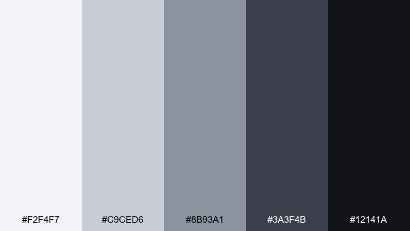
HEX: #F2F4F7 #C9CED6 #8B93A1 #3A3F4B #12141A
Mood: sharp and modern
Best for: dark mode code editor UI concept
Crisp grays and graphite blacks feel like a well-organized grid and a quiet late-night work session. Use the lightest gray for panels and spacing guides, then lean on the mid grays for dividers and secondary UI. Pair with minimal accent highlights from your brand so the interface stays serious and legible. Usage tip: keep large areas in the near-black to reduce glare and let content pop.
Image example of graphite grid generated using media.io
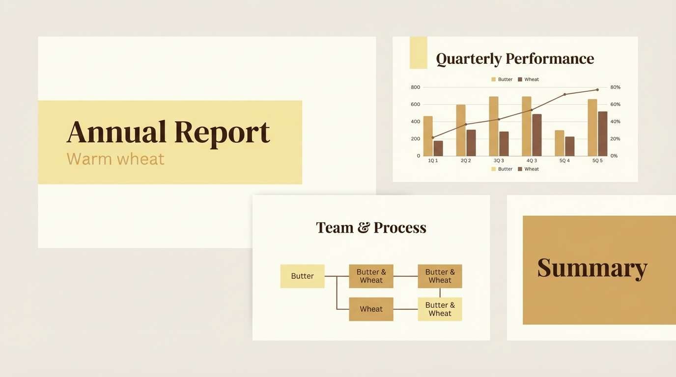
4) Sunlit Wheat
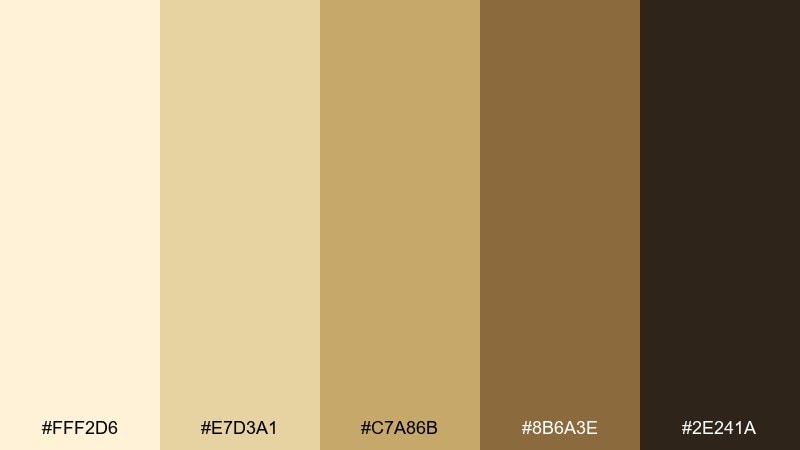
HEX: #FFF2D6 #E7D3A1 #C7A86B #8B6A3E #2E241A
Mood: warm and optimistic
Best for: presentation slide deck template
Warm wheat tones evoke morning light across a wooden desk and a fresh cup of tea. Use the pale butter base for slides, then bring in the golden tan for section headers and callouts. Pair with deep brown typography to keep the warmth grounded and professional. Usage tip: keep photos slightly desaturated so they harmonize with the golden range.
Image example of sunlit wheat generated using media.io
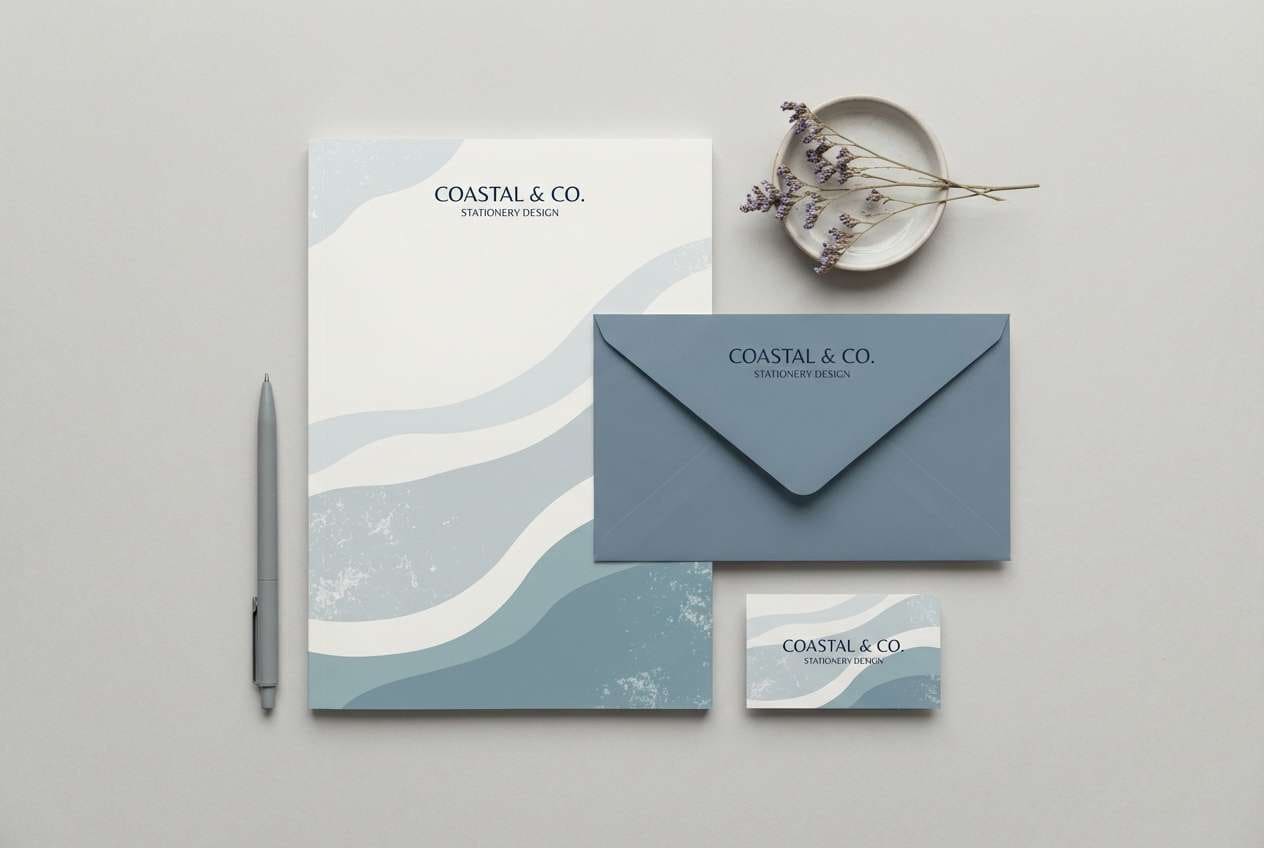
5) Coastal Fog
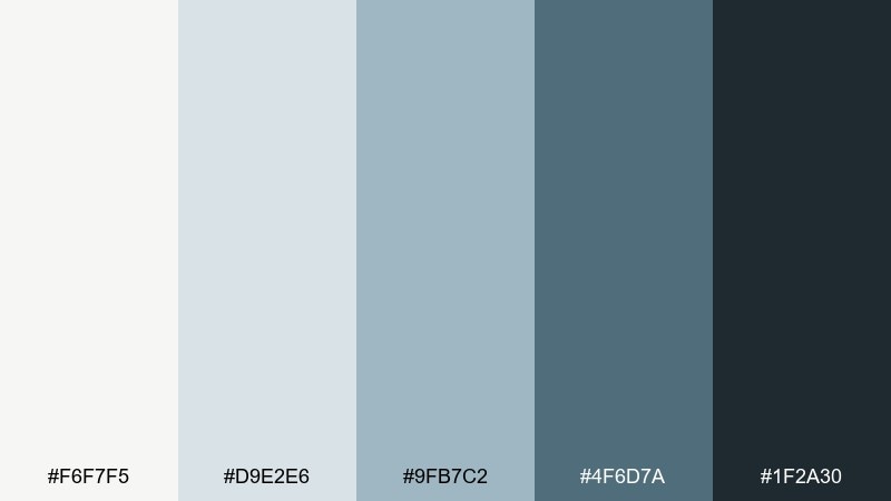
HEX: #F6F7F5 #D9E2E6 #9FB7C2 #4F6D7A #1F2A30
Mood: cool and clear
Best for: stationery set for a remote team kit
Cool misty blues feel like a quiet shoreline and a clear head before a deep work block. Use the pale fog shades for paper stock and backgrounds, then add the denim blue for subtle brand marks. Pair with graphite ink and clean sans-serif type for a modern, organized look. Usage tip: limit the darkest navy to logos and small accents to keep the set airy.
Image example of coastal fog generated using media.io
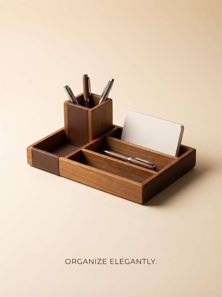
6) Espresso Cream
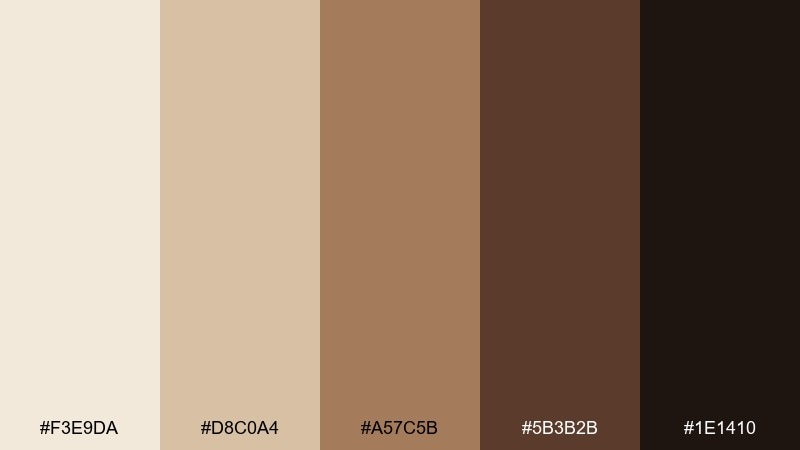
HEX: #F3E9DA #D8C0A4 #A57C5B #5B3B2B #1E1410
Mood: grounded and cozy
Best for: desk organizer product ad
Cream and espresso browns create a grounded, cozy mood like a favorite cafe corner. Use the creamy beige as the backdrop and bring in the medium caramel for warmth in secondary elements. Pair with dark espresso text and simple shapes for a premium, tactile feel. Usage tip: add a tiny highlight of the lightest cream on edges to make products look crisp.
Image example of espresso cream generated using media.io
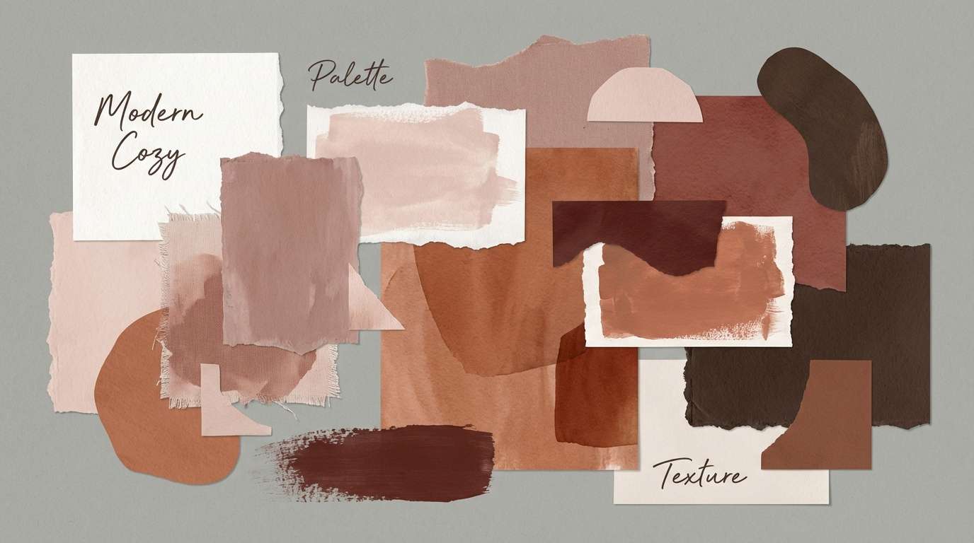
7) Soft Terracotta
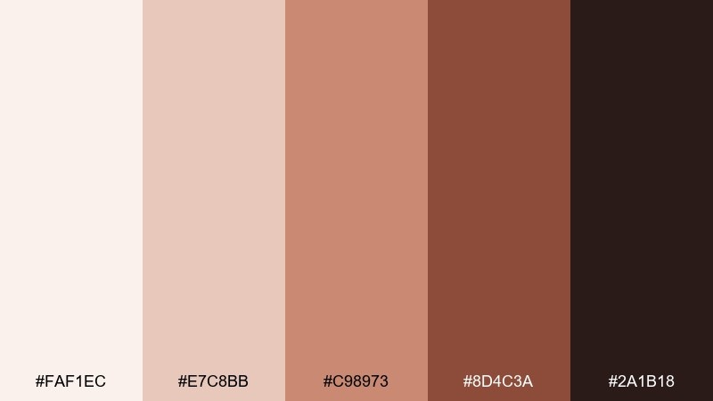
HEX: #FAF1EC #E7C8BB #C98973 #8D4C3A #2A1B18
Mood: welcoming and creative
Best for: home office interior mood board for wall paint and decor
Welcoming terracotta tones suggest clay, soft sunlight, and an inviting creative corner. These hues make memorable home office color combinations when you keep the blush base broad and the brick shade as an accent. Pair with warm wood, woven textures, and black metal for a modern-boho balance. Usage tip: test the mid terracotta on one wall first to avoid making the room feel smaller.
Image example of soft terracotta generated using media.io
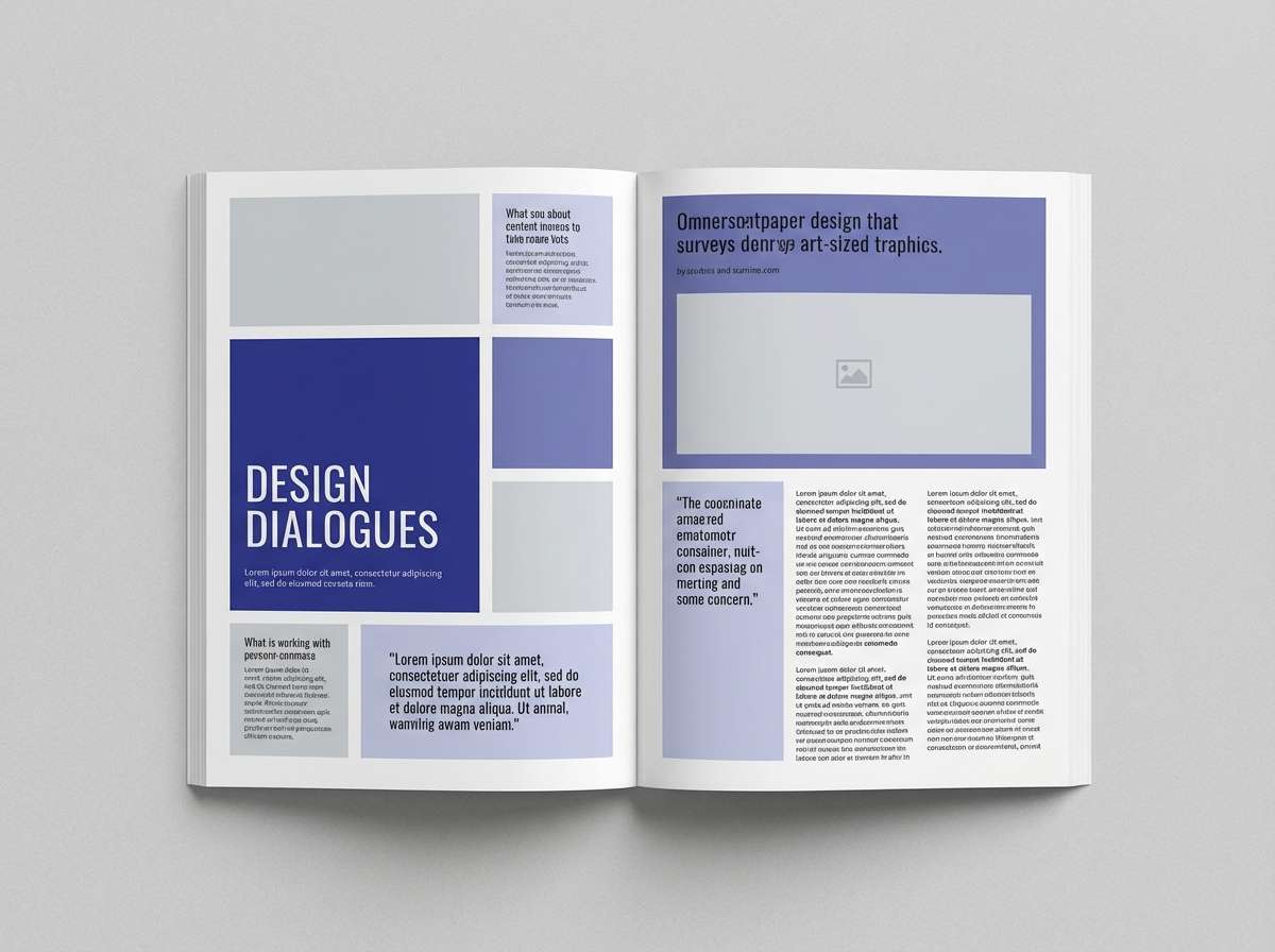
8) Indigo Focus
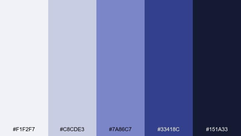
HEX: #F1F2F7 #C8CDE3 #7A86C7 #33418C #151A33
Mood: confident and cerebral
Best for: editorial magazine spread about productivity
Confident indigos evoke deep thinking, clear structure, and a quiet sense of momentum. Use the icy lavender-gray for page margins and the mid indigo for pull quotes or section tabs. Pair with near-black body text and plenty of whitespace to keep the layout sophisticated. Usage tip: reserve the saturated indigo for one focal element per page spread.
Image example of indigo focus generated using media.io
9) Blush Neutral
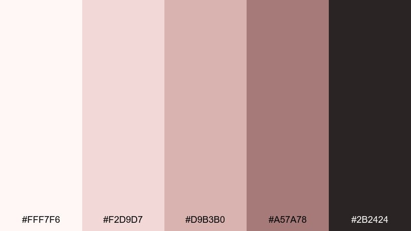
HEX: #FFF7F6 #F2D9D7 #D9B3B0 #A57A78 #2B2424
Mood: soft and reassuring
Best for: social media quote post templates for a coach
Soft blush neutrals feel reassuring, personal, and gently polished. Use the near-white blush as the main canvas and the dusty rose for blocks behind text. Pair with deep cocoa type and simple line illustrations for a modern, human touch. Usage tip: keep the darkest shade for headlines so small text stays readable on mobile.
Image example of blush neutral generated using media.io
10) Forest Study
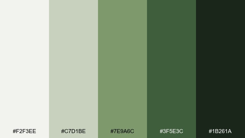
HEX: #F2F3EE #C7D1BE #7E9A6C #3F5E3C #1B261A
Mood: steady and restorative
Best for: nonfiction book cover design for a business title
Restorative forest greens bring a steady, grounded energy that still feels fresh. Use the light mossy tones for the background and the deeper pine for strong title contrast. Pair with cream paper textures and restrained geometric shapes for a confident, timeless cover. Usage tip: keep the mid green as a single band or badge so the hierarchy stays clear.
Image example of forest study generated using media.io
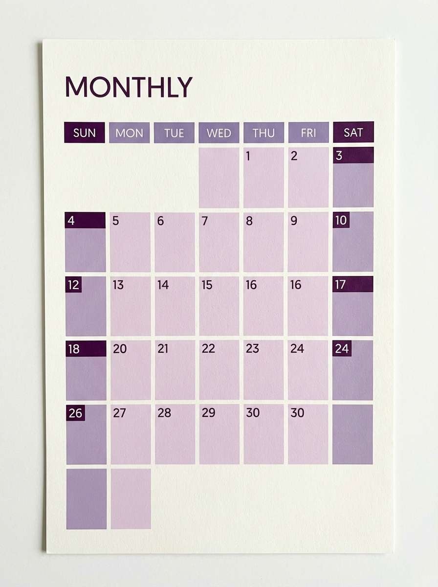
11) Misty Lavender
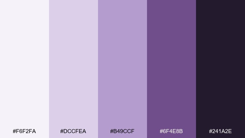
HEX: #F6F2FA #DCCFEA #B49CCF #6F4E8B #241A2E
Mood: gentle and imaginative
Best for: monthly calendar print design
Gentle lavender tones feel like soft dusk light, calm thoughts, and creative planning. Use the pale lilac as the page base and the medium purple for date highlights and categories. Pair with deep plum text and thin lines to keep it elegant rather than sugary. Usage tip: keep weekend blocks in the lightest tones so the grid stays airy.
Image example of misty lavender generated using media.io
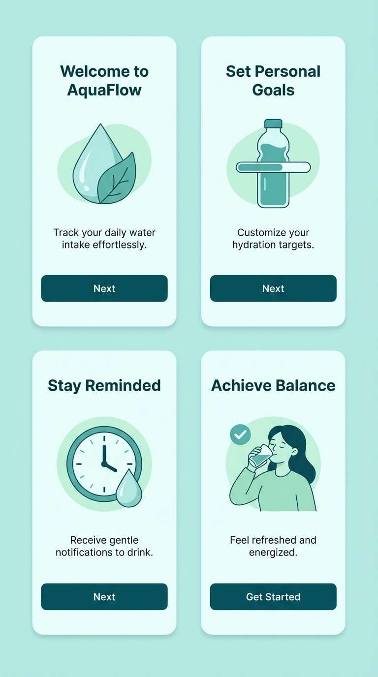
12) Modern Teal
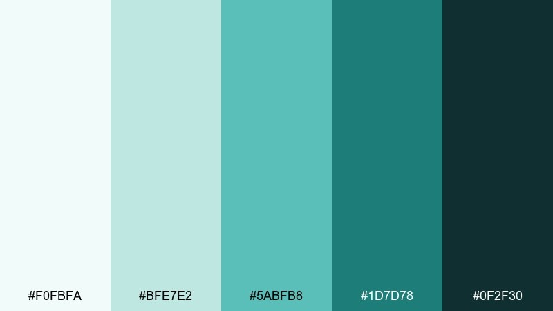
HEX: #F0FBFA #BFE7E2 #5ABFB8 #1D7D78 #0F2F30
Mood: clean and energetic
Best for: mobile app onboarding screens
Clean teals feel energetic without turning loud, like fresh water and crisp glass. This home office color palette works especially well for onboarding when you keep the light aqua as the base and use deep teal for primary buttons. Pair with simple illustrations and plenty of whitespace to maintain clarity. Usage tip: use the mid teal for progress indicators so the flow feels consistent.
Image example of modern teal generated using media.io
13) Warm Charcoal
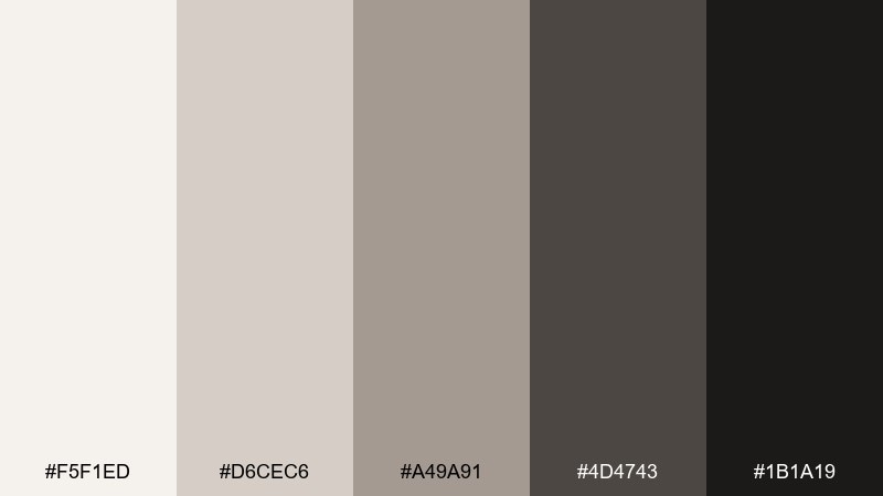
HEX: #F5F1ED #D6CEC6 #A49A91 #4D4743 #1B1A19
Mood: professional and understated
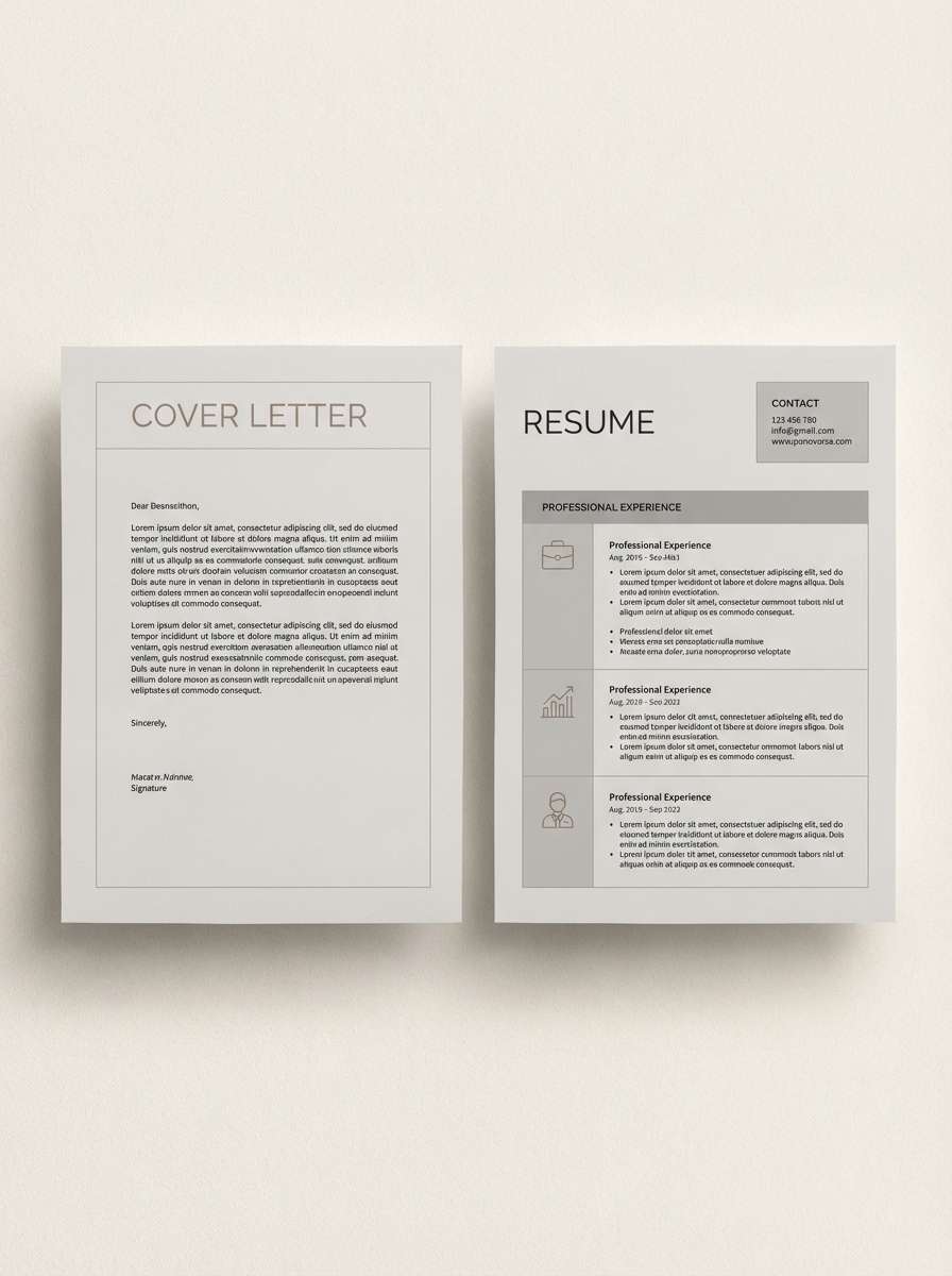
Best for: resume and cover letter template
Understated warm charcoals evoke tailored fabric, clean margins, and a confident tone. Use the creamy off-white for the page, then build hierarchy with mid gray subheads and dark charcoal body text. Pair with a single accent line or icon in the warm taupe to add polish. Usage tip: keep section dividers thin so the document feels modern, not boxed in.
Image example of warm charcoal generated using media.io
14) Sandstone Blue
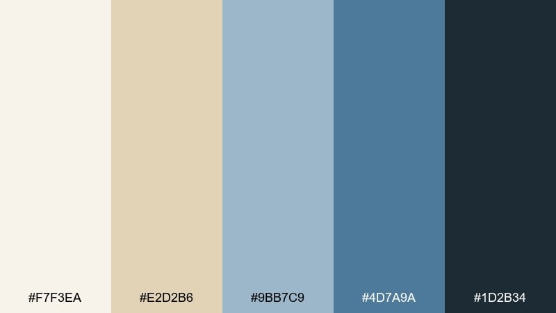
HEX: #F7F3EA #E2D2B6 #9BB7C9 #4D7A9A #1D2B34
Mood: balanced and breezy
Best for: website hero banner for a productivity tool
Balanced sand and ocean blues evoke open space, clarity, and steady progress. Let the sandstone cream handle big background areas and use the sky blue for supportive UI cards. Pair with deep navy text and a warm beige accent for buttons or badges. Usage tip: keep gradients subtle so the hero stays crisp across screens.
Image example of sandstone blue generated using media.io

15) Citrus Note
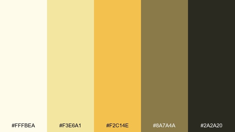
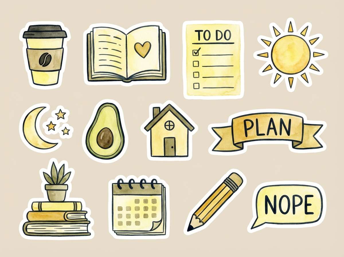
HEX: #FFFBEA #F3E6A1 #F2C14E #8A7A4A #2A2A20
Mood: bright and motivating
Best for: watercolor illustration for planner stickers
Bright citrus yellows feel like a sticky note reminder and a small spark of motivation. Use the pale lemon as the base and the golden yellow for highlights that guide attention. Pair with olive-khaki and near-black outlines to keep it mature and readable. Usage tip: limit the strongest yellow to small elements like icons, tabs, or bullet markers.
Image example of citrus note generated using media.io
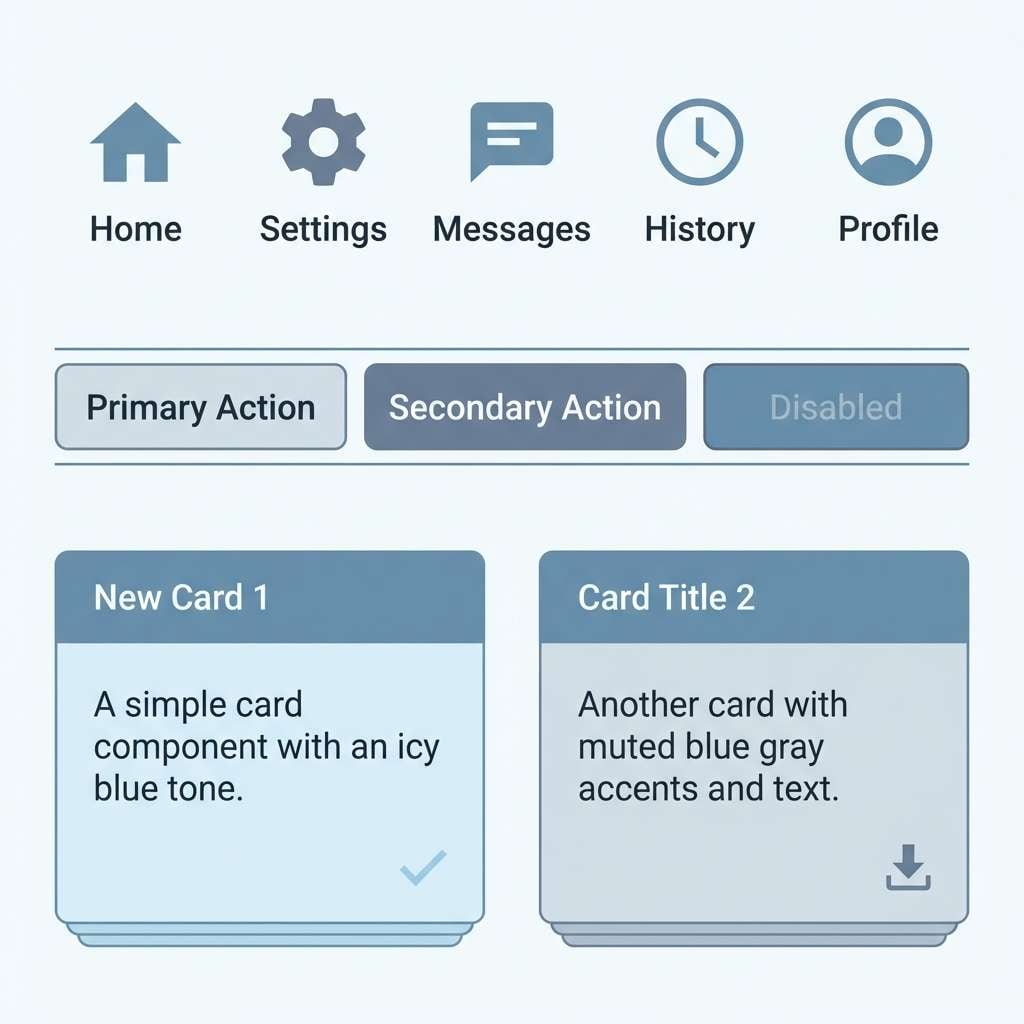
16) Nordic Frost
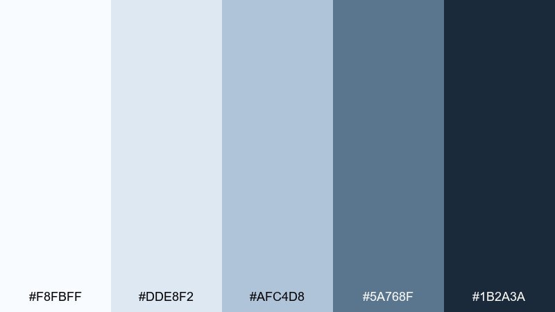
HEX: #F8FBFF #DDE8F2 #AFC4D8 #5A768F #1B2A3A
Mood: crisp and minimal
Best for: icon set and UI components for a finance app
Crisp frosty blues suggest clean air, tidy systems, and thoughtful decisions. Use the near-white ice tone for surfaces, then apply the steel blue for component states and tabs. Pair with deep slate text and simple outlines for a modern, trustworthy feel. Usage tip: keep shadows very light so the interface stays Nordic-clean.
Image example of nordic frost generated using media.io
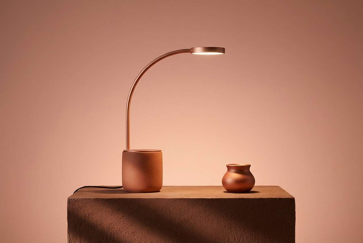
17) Clay Copper
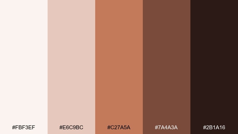
HEX: #FBF3EF #E6C9BC #C27A5A #7A4A3A #2B1A16
Mood: artisanal and warm
Best for: desk lamp product ad for a boutique brand
Artisanal clay and copper tones evoke handcrafted details and warm evening light. Use the pale blush base for clean negative space and the coppery mid tone for the hero product accent. Pair with dark brown typography and simple geometric shapes to keep it premium. Usage tip: add a small highlight of the lightest shade to make metal finishes feel realistic.
Image example of clay copper generated using media.io
18) Mono Slate
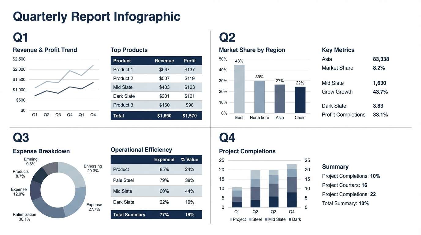
HEX: #F4F6F8 #D1D8DE #97A6B2 #5B6B78 #1E2830
Mood: structured and analytical
Best for: quarterly report infographic layout
Structured slate blues feel analytical, steady, and easy to scan for long sessions. Use the light gray-blue for chart backgrounds and the mid slate for bars, lines, and legend keys. Pair with deep navy text and restrained grid lines for a clean corporate look. Usage tip: keep one data series in the darkest tone so the main takeaway is obvious.
Image example of mono slate generated using media.io
19) Paper Ink
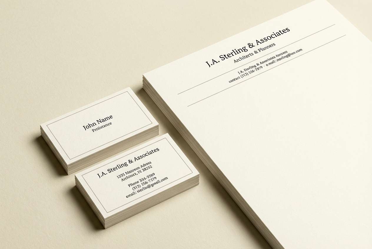
HEX: #FFFDF6 #E8E1D2 #B7B0A2 #4B4A45 #151515
Mood: classic and precise
Best for: letterhead and business card identity set
Classic paper and ink tones evoke archival stationery, careful notes, and a clear plan. Use the creamy paper shade as the primary background and bring in the warm gray for subtle rules and secondary text. Pair with rich black for logos and typography to keep the identity sharp. Usage tip: add texture sparingly so the layout stays clean when printed.
Image example of paper ink generated using media.io
20) Vintage Olive
HEX: #F3F1E7 #D6D0B6 #A6A06E #6A6B3E #232414
Mood: earthy and nostalgic
Best for: packaging label design for a notebook brand
Earthy vintage olive feels nostalgic, like well-worn notebooks and quiet routines. Use the pale parchment for the label base and bring in muted olive for borders and badges. Pair with deep olive-black type and simple stamp-style graphics for a timeless look. Usage tip: keep the mid olive as a single hero band so the label stays readable at small sizes.
Image example of vintage olive generated using media.io

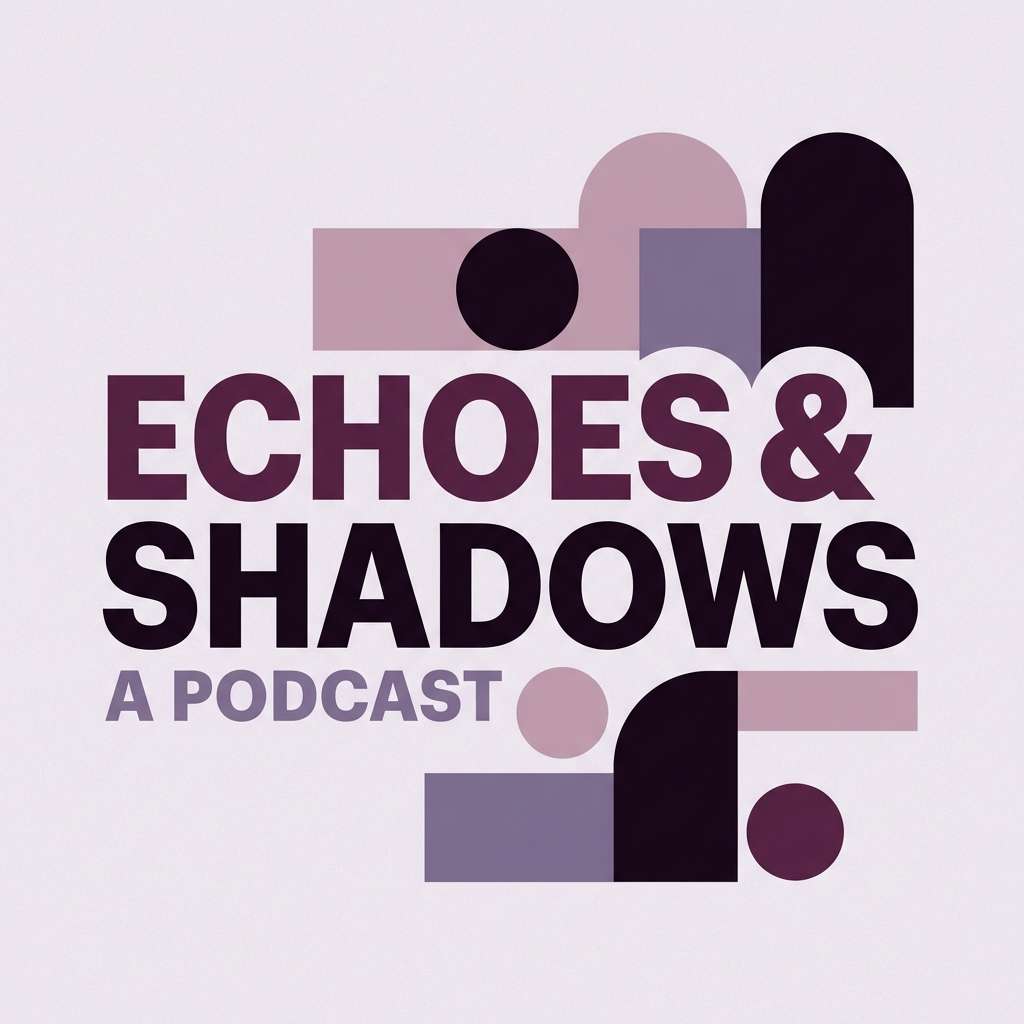
21) Midnight Plum
HEX: #F7F2F7 #D9C1D9 #A77AA6 #5A2D5E #1E0F20
Mood: bold and boutique
Best for: podcast cover art for a creative entrepreneur
Bold plum tones feel boutique and confident, like velvet shadows and a spotlight on ideas. These home office color combinations shine when you use the pale lavender as breathing room and the deep plum as the anchor. Pair with clean white type and a single geometric motif to keep it modern. Usage tip: avoid too many gradients and let flat shapes carry the drama.
Image example of midnight plum generated using media.io
What Colors Go Well with Home Office?
For most home offices, neutrals (warm off-whites, soft greiges, and charcoals) are the easiest foundation because they keep backgrounds quiet and improve screen readability on calls. Add one mid-tone for structure (panels, shelves, UI cards) and one dark tone for text and contrast.
Greens and blue-grays pair especially well with home office settings because they feel calm and “clean” without being cold. If you want a warmer, more creative vibe, bring in terracotta, wheat, or copper as controlled accents.
To keep things cohesive, repeat the same accent color across small touchpoints: a lamp, a notebook, a button color in your dashboard, or a highlight in your slide deck. This creates unity without overwhelming the space.
How to Use a Home Office Color Palette in Real Designs
Start with roles, not just colors. Assign one light shade to backgrounds, one mid shade to surfaces (cards, panels, paint trims), one accent for emphasis (CTAs, sticky notes, decor), and the darkest shade for typography and icons.
For interiors, treat the lightest tones as “air” (walls, curtains, large furniture) and keep saturated colors to 10–20% of what you see. For UI and branding, use the accent color on interactive states and key highlights, then rely on neutrals for the rest.
When in doubt, protect readability: dark text on light surfaces for most content, and use the darkest shade sparingly to avoid making the room or layout feel heavy.
Create Home Office Palette Visuals with AI
If you want to preview a home office color scheme before painting a wall, designing a dashboard, or building a brand kit, generating quick mock visuals can save hours. It’s also a fast way to test “what if” variations—cooler, warmer, lighter, or more dramatic.
With Media.io’s Text-to-Image tool, you can turn any palette idea into mood boards, UI mockups, stationery sets, or product ad concepts in minutes. Use the prompts above as a starting point, then swap in your own keywords and ratios.
Home Office Color Palette FAQs
-
What is the best color palette for a home office?
The best home office palette is usually light neutrals (off-white, greige) plus one calm accent (sage, blue-gray, teal) and a dark tone for text/contrast. This mix stays readable on screens and feels tidy for long work sessions. -
Which colors help you focus while working?
Muted greens, blue-grays, and cool slates often support focus because they feel calm and reduce visual stress. Pair them with high-contrast dark text (charcoal or near-black) so information stays easy to scan. -
Should a home office be warm or cool?
Cool palettes can feel crisp and distraction-free, while warm palettes feel inviting and cozy. If your room lacks sunlight, warmer neutrals (wheat, cream, terracotta) can help; if it gets lots of light, cooler foggy blues and slates can balance glare. -
How do I choose an accent color for my workspace?
Pick one accent color that matches your work style: green for calm productivity, teal for energy, terracotta for creativity, or indigo for a more cerebral mood. Use it in small areas (10–20%) like a chair, art, folders, or primary UI buttons. -
What colors look professional for remote work backgrounds?
Soft neutrals, warm charcoals, and muted blue-grays look professional on video calls because they don’t cast strong color onto your face. Avoid overly saturated reds and neon tones behind you—they can be distracting and harder for cameras to render. -
How can I apply a home office color palette to a UI dashboard?
Use the lightest tone as the canvas, mid tones for cards/dividers, and the darkest tone for body text and icons. Reserve the most saturated shade for CTAs and active states so the interface stays calm and consistent. -
Can I generate home office palette mockups with AI?
Yes. You can generate mood boards, room-style collages, UI screens, and brand layouts with AI by describing the layout and listing your palette colors. Media.io Text-to-Image makes it easy to iterate quickly and compare variations.
Next: Wedding Color Palette


