

Melon is a warm, sunlit family of coral-peach tones that instantly feels fresh, friendly, and modern. It’s bright enough for attention, but soft enough to stay premium across branding and UI.
Below are curated melon color palette ideas with HEX codes, mood notes, and practical pairing tips—plus AI-ready prompts you can use to generate on-brand visuals fast.
In this article
Why Melon Palettes Work So Well
Melon sits in the sweet spot between coral, peach, and cantaloupe—warm hues that feel energetic without the harshness of true neon. That makes melon color schemes ideal for brands that want approachability and “summer freshness” year-round.
These palettes also pair naturally with creamy neutrals and herb-like greens, giving you an easy warm/cool balance. In practice, that balance helps layouts feel bright and breathable while still maintaining readable contrast for text and UI states.
Because melon tones are flattering on product photography (skin, food, lifestyle), they’re a dependable choice for packaging, social graphics, and landing pages where color needs to amplify the subject—not fight it.
20+ Melon Color Palette Ideas (with HEX Codes)
1) Cantaloupe Cream
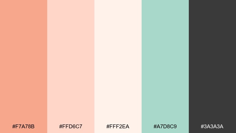
HEX: #F7A78B #FFD6C7 #FFF2EA #A7D8C9 #3A3A3A
Mood: airy, gentle, polished
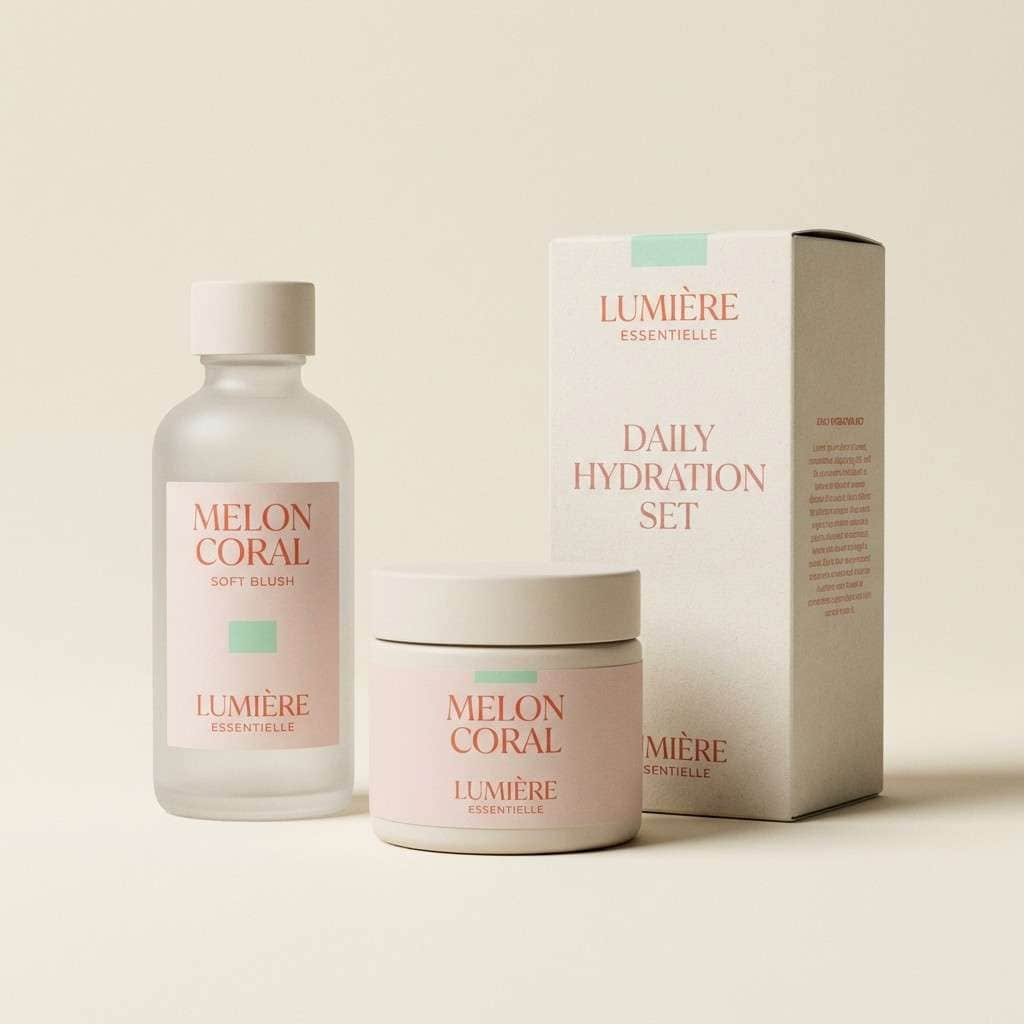
Best for: skincare product packaging
Airy and comforting, like sliced fruit on a linen table with a cool breeze of mint. Use the creamy lights as your main canvas and let the melon tone carry headlines or hero panels. Pair with charcoal for readable ingredient lists and a premium feel. Tip: keep the mint as a small accent band or seal mark so the warmth stays in control.
Image example of cantaloupe cream generated using media.io
Media.io is an online AI studio for creating and editing video, image, and audio in your browser.

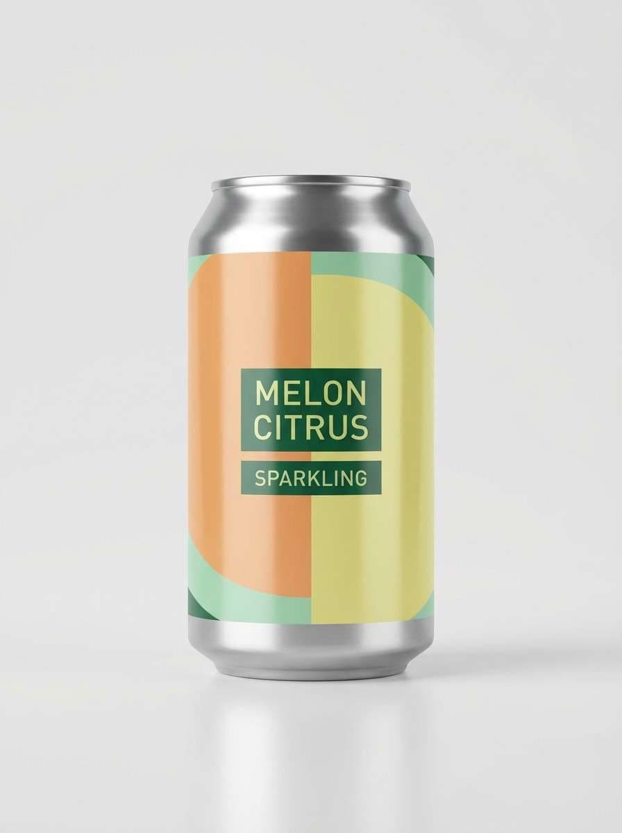
2) Melon Mojito
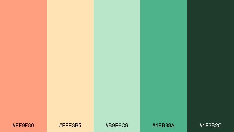
HEX: #FF9F80 #FFE3B5 #B9E6C9 #4EB38A #1F3B2C
Mood: refreshing, zesty, upbeat
Best for: summer beverage label design
Refreshing and zesty, like sparkling citrus over crushed ice with bright green herbs. These melon color combinations shine on cans, bottle sleeves, and bar menus where you need instant shelf pop. Keep the light citrus tone as background and use the deep green for nutrition blocks and legal text. Tip: add a simple diagonal color break to make the label look taller and more dynamic.
Image example of melon mojito generated using media.io
3) Sunset Rind
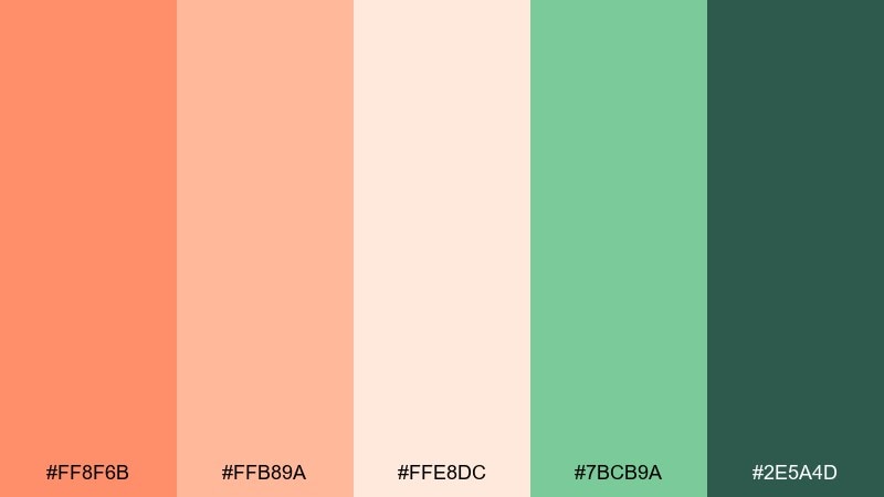
HEX: #FF8F6B #FFB89A #FFE8DC #7BCB9A #2E5A4D
Mood: sun-kissed, friendly, adventurous
Best for: travel poster design
Sun-kissed and friendly, like a coastal sunset fading into a green horizon. Use the bright melon tone for the title and the soft blush for gradients or sky bands. The deeper greens anchor maps, dates, and small print without feeling heavy. Tip: limit yourself to two large color fields and one accent to keep the poster bold from a distance.
Image example of sunset rind generated using media.io

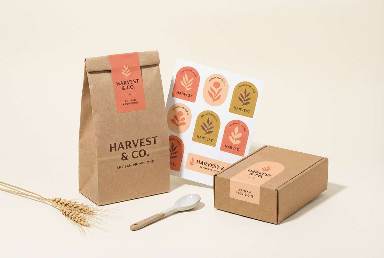
4) Coral Market
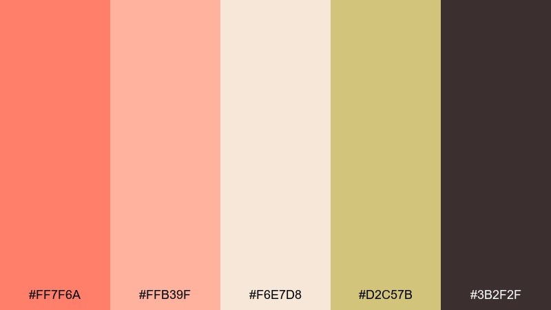
HEX: #FF7F6A #FFB39F #F6E7D8 #D2C57B #3B2F2F
Mood: artisanal, warm, inviting
Best for: artisan food brand identity
Artisanal and warm, like a weekend market with paper bags and ripe fruit stands. This melon color palette works beautifully for logos, stickers, and storefront signage when you want handmade energy without looking childish. Use the cream as negative space and reserve the dark brown for type and stamps. Tip: print tests matter here, so slightly deepen the coral for uncoated paper stock.
Image example of coral market generated using media.io
5) Apricot Clay
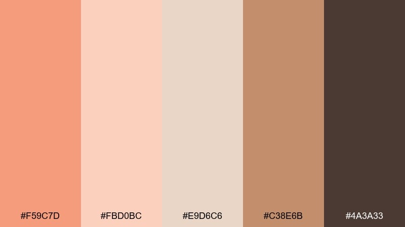
HEX: #F59C7D #FBD0BC #E9D6C6 #C38E6B #4A3A33
Mood: earthy, calm, crafted
Best for: pottery ecommerce UI
Earthy and calm, like sun-warmed clay with a soft apricot glaze. Let the pale neutrals dominate your product pages so ceramics photography stays the hero. Use the clay brown for buttons and active states to keep the interface grounded. Tip: apply the deepest shade only to key actions and prices for a boutique, gallery-like hierarchy.
Image example of apricot clay generated using media.io
6) Minted Melon
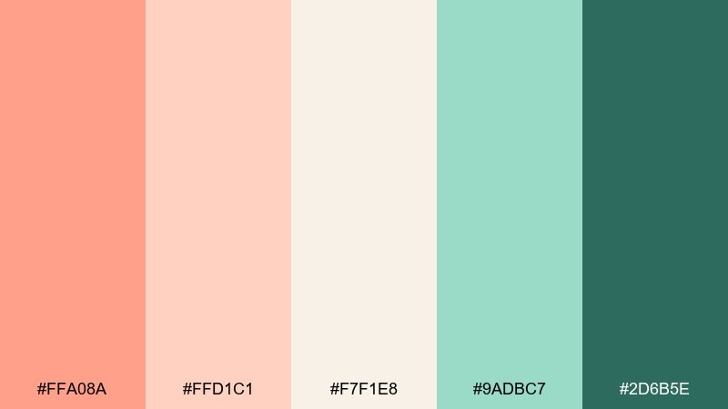
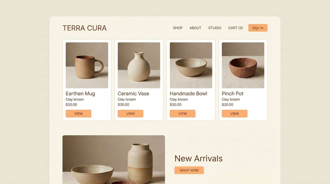
HEX: #FFA08A #FFD1C1 #F7F1E8 #9ADBC7 #2D6B5E
Mood: clean, soothing, optimistic
Best for: wellness app UI
Clean and soothing, like a spa towel warmed by sun with a cool mint rinse. For a modern melon color scheme, keep the background creamy and use mint for cards, toggles, and progress rings. The deep teal-green is perfect for navigation and accessibility-friendly text contrast. Tip: set the melon tone as your primary CTA and keep it consistent across all flows.
Image example of minted melon generated using media.io
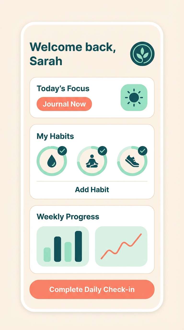
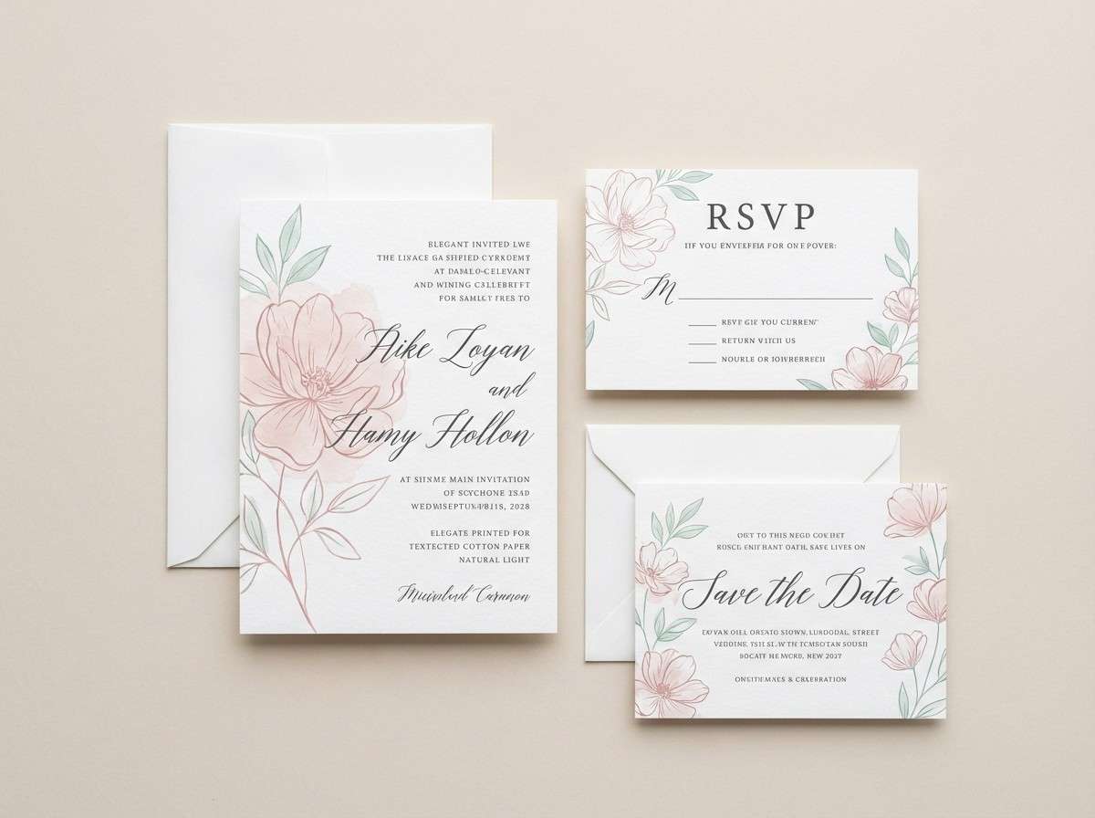
7) Rosewater Melon
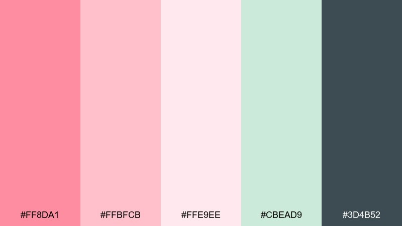
HEX: #FF8DA1 #FFBFCB #FFE9EE #CBEAD9 #3D4B52
Mood: romantic, soft, airy
Best for: wedding invitation suite
Romantic and airy, like rosewater frosting with a hint of fresh greenery. Use the blush tones for borders, monograms, and RSVP details while keeping the lightest pink as your paper base. The cool gray-blue gives typography a refined, contemporary edge. Tip: emboss the monogram in the deeper pink for elegance without overwhelming the page.
Image example of rosewater melon generated using media.io
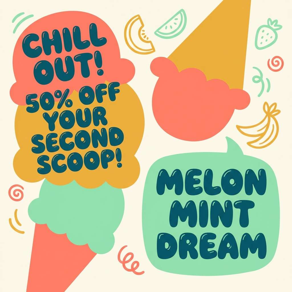
8) Tropical Sorbet
HEX: #FF8466 #FFCC7A #FFF1C7 #7DD6B8 #1F6A5B
Mood: playful, bright, summery
Best for: ice cream social ad creative
Playful and bright, like a scoop shop sign in the midday sun. These melon color combinations make social ads feel juicy and clickable without leaning neon. Let the buttery yellow handle big background areas and save the darker teal for pricing and fine print. Tip: use simple sticker-like shapes so the colors stay crisp at small sizes.
Image example of tropical sorbet generated using media.io
9) Desert Melon
HEX: #F4A182 #F7C6A7 #F3E6D6 #B7B08A #5B4A3E
Mood: grounded, mellow, natural
Best for: interior design mood board
Grounded and mellow, like desert stone warmed by late afternoon light. Use the creamy sand tone for walls and large textiles, then bring in the muted olive for plants and ceramics. The darker brown anchors wood furniture and metal fixtures without feeling stark. Tip: repeat the melon accent in two small spots (like cushions and artwork) for a cohesive room story.
Image example of desert melon generated using media.io
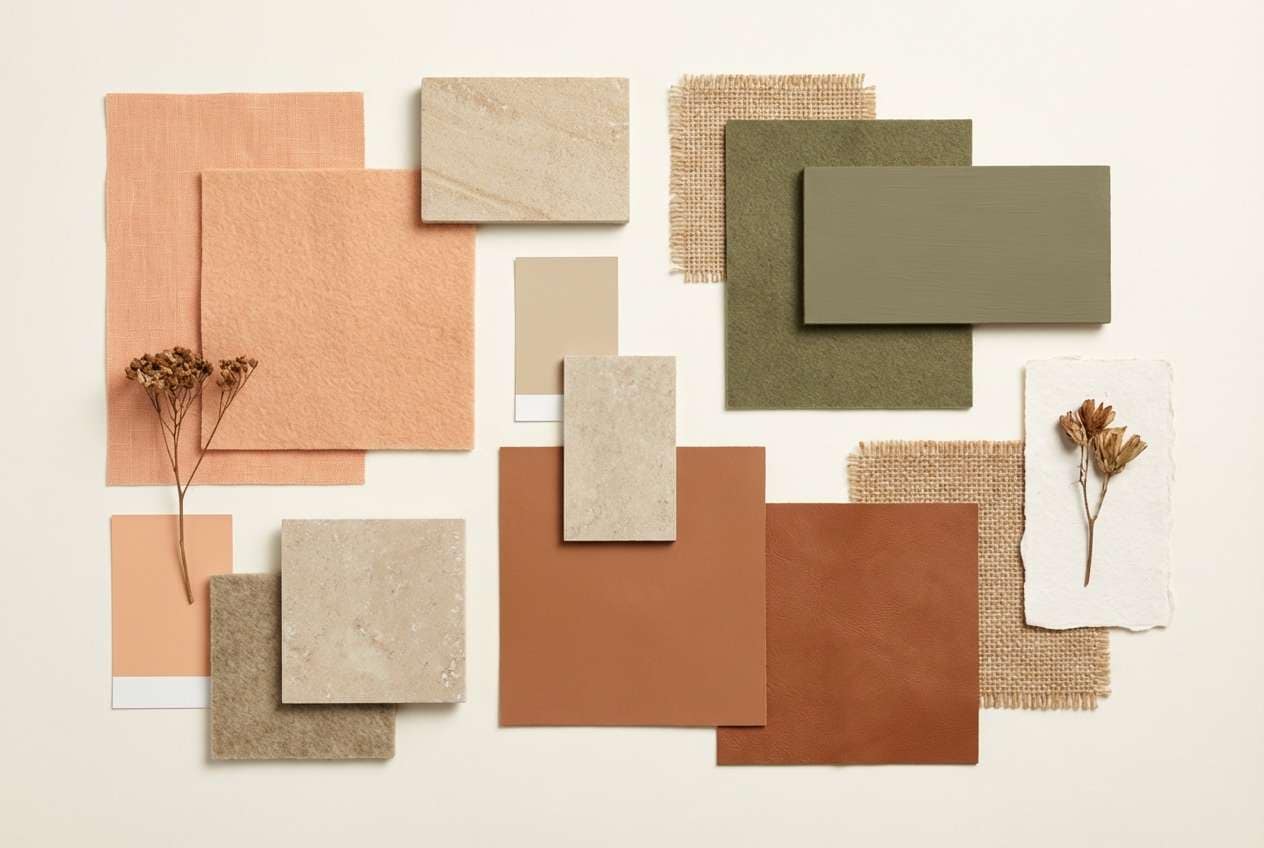
10) Fresh Cut Fruit
HEX: #FF906A #FFC6A3 #FFF3E0 #B8E3AE #2E523A
Mood: clean, friendly, wholesome
Best for: grocery flyer and signage
Clean and wholesome, like a chilled produce case with bright labels and tidy stacks. This melon color combination works well for weekly flyers where readability and appetite appeal matter most. Use the cream for background space and reserve the dark green for prices and product names. Tip: keep the green as a consistent badge color to guide shoppers across sections.
Image example of fresh cut fruit generated using media.io
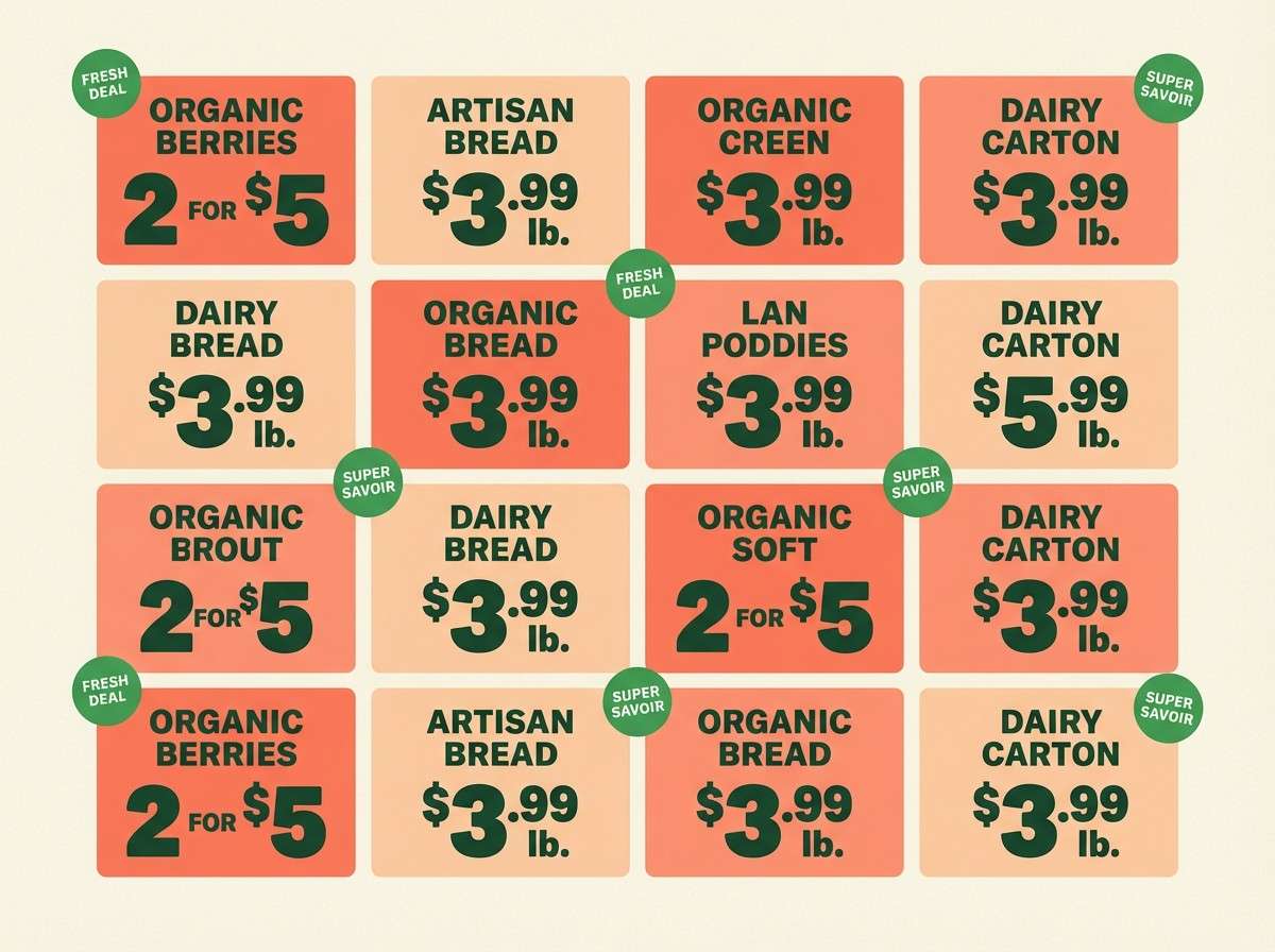
11) Soft Neon Melon
HEX: #FF6F61 #FFB199 #FFF0E9 #B5FFDC #203A33
Mood: bold, youthful, energetic
Best for: music festival poster
Bold and youthful, like stage lights softened through a hazy summer dusk. Use the punchy coral for the headliner name and let the pale tint calm the negative space. The mint glow works best as a highlighter stripe, icon fill, or ticket badge. Tip: keep type in the deep green to avoid harsh black and maintain the vibe.
Image example of soft neon melon generated using media.io

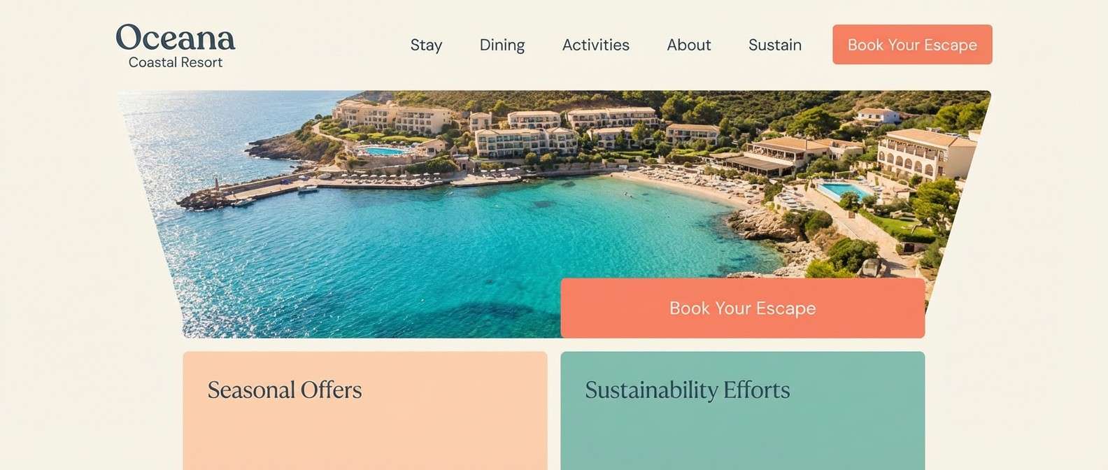
12) Coastal Melon
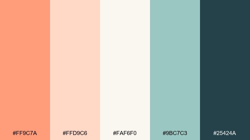
HEX: #FF9C7A #FFD9C6 #FAF6F0 #9BC7C3 #25424A
Mood: breezy, modern, relaxed
Best for: resort website hero UI
Breezy and modern, like seaside air over warm stone and sun-faded umbrellas. Use the off-white as your main field, then layer melon and seafoam blocks for section headers and CTAs. The deep blue-gray supports navigation and ensures contrast for accessibility. Tip: keep gradients subtle and rely on clean spacing to sell the premium resort feel.
Image example of coastal melon generated using media.io
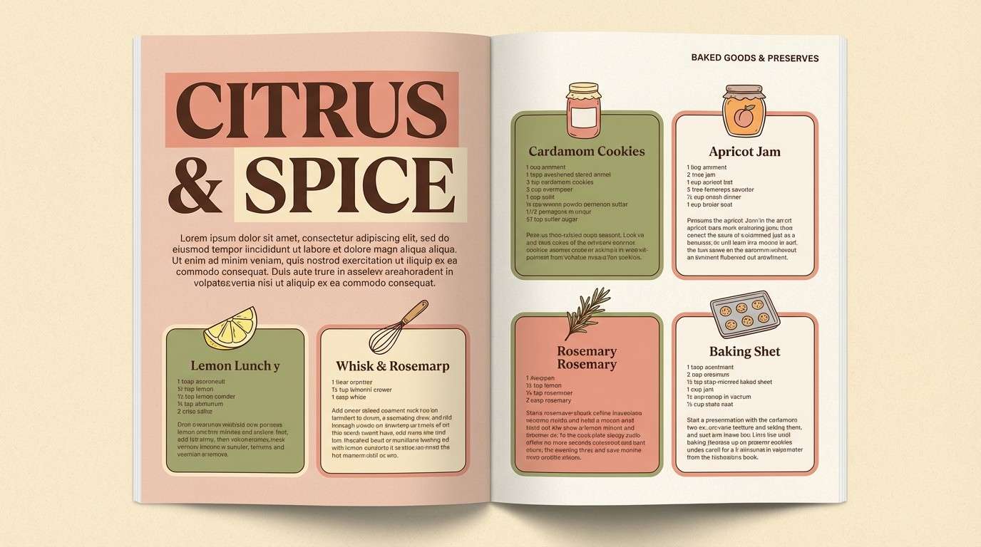
13) Vintage Picnic
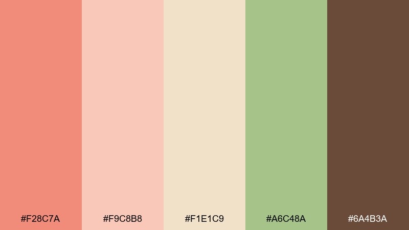
HEX: #F28C7A #F9C8B8 #F1E1C9 #A6C48A #6A4B3A
Mood: nostalgic, cozy, friendly
Best for: cookbook editorial spread
Nostalgic and cozy, like a checked blanket, handwritten recipes, and fruit salad in a glass bowl. This melon color palette is ideal for editorial layouts that need warmth without sacrificing readability. Use the tan and cream for page backgrounds, then bring in green for pull quotes and section tabs. Tip: keep the coral to headings and small illustrations so the spread feels balanced.
Image example of vintage picnic generated using media.io
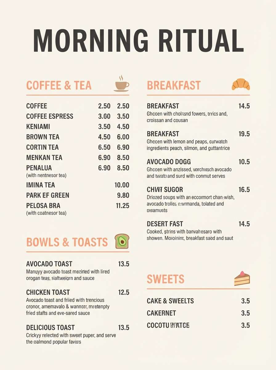
14) Melon Latte
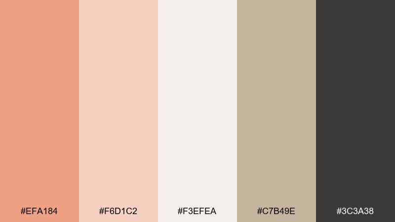
HEX: #EFA184 #F6D1C2 #F3EFEA #C7B49E #3C3A38
Mood: soft, minimal, café-chic
Best for: cafe menu design
Soft and café-chic, like a milky latte next to a warm pastry case. Use the light neutrals for plenty of whitespace and let the melon tone highlight signatures and seasonal specials. The taupe shade is great for dividers, icons, and subtle category labels. Tip: set one bold typographic scale for prices so the menu stays scannable from a distance.
Image example of melon latte generated using media.io
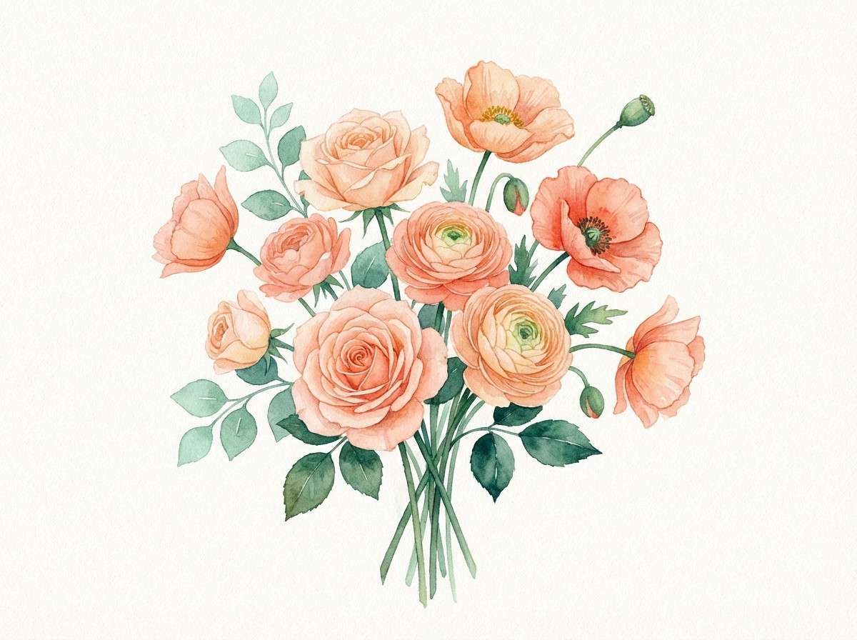
15) Garden Party
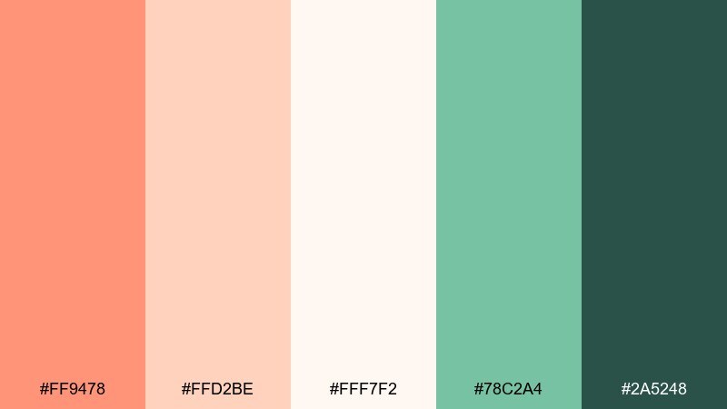
HEX: #FF9478 #FFD2BE #FFF7F2 #78C2A4 #2A5248
Mood: fresh, airy, celebratory
Best for: botanical watercolor illustration prints
Fresh and celebratory, like a backyard gathering with blossoms and chilled fruit. Let the soft off-white act like watercolor paper, then layer melon washes for petals and highlight edges. Use the greens for stems and leaf shadows to keep the illustration lively. Tip: keep outlines minimal and rely on transparent color layers for a hand-painted look.
Image example of garden party generated using media.io
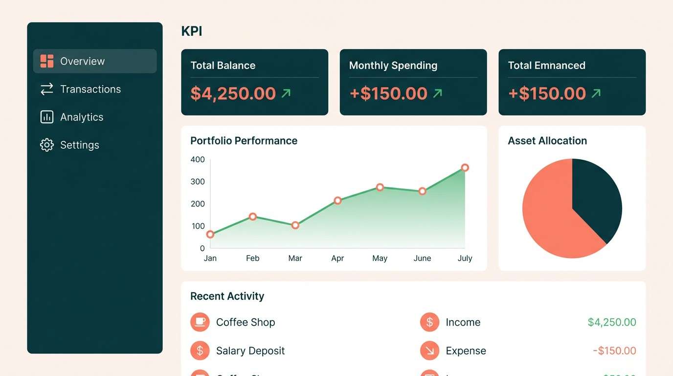
16) Modern Rind
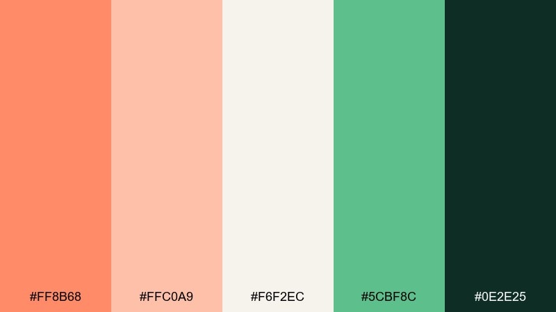
HEX: #FF8B68 #FFC0A9 #F6F2EC #5CBF8C #0E2E25
Mood: sleek, confident, tech-forward
Best for: fintech dashboard UI
Sleek and confident, like a modern dashboard with warm highlights instead of cold blues. Keep the interface neutral and use the melon tone for primary actions, alerts, and key metrics. The green reads as growth and stability, ideal for charts and positive indicators. Tip: reserve the darkest shade for headers and totals so the hierarchy stays crisp.
Image example of modern rind generated using media.io
17) Warm Minimal Melon
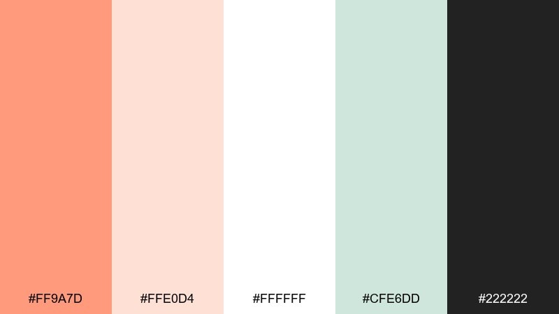
HEX: #FF9A7D #FFE0D4 #FFFFFF #CFE6DD #222222
Mood: minimal, bright, friendly
Best for: minimalist brand guidelines PDF
Minimal and bright, like clean stationery with a warm, friendly accent. This melon color palette is perfect for brand guides where you want lots of white space and one memorable signature color. Use the minty gray-green for diagrams and callout boxes to keep pages from feeling empty. Tip: keep the accent coral to one element per page (title, rule, or icon) for consistency.
Image example of warm minimal melon generated using media.io
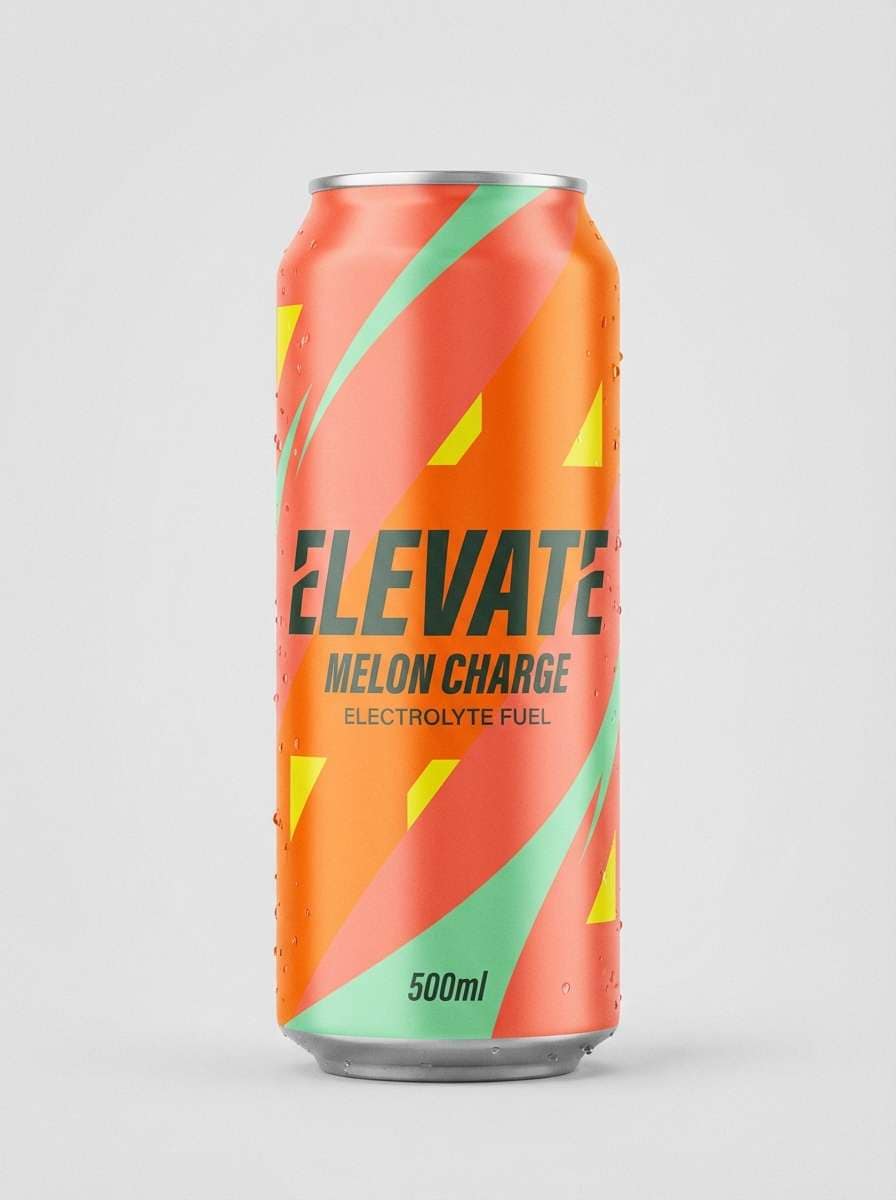
18) Citrus Melon Pop
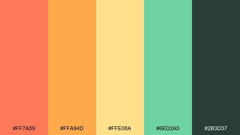
HEX: #FF7A59 #FFA94D #FFE08A #6ED2A5 #2B3D37
Mood: sporty, punchy, high-energy
Best for: sports drink can packaging
Sporty and punchy, like a quick burst of citrus before a workout. Use the orange and melon tones for bold diagonal panels and keep the yellow for highlight stripes or flavor cues. The mint-green adds a crisp counterpoint for icons and hydration claims. Tip: keep text in the dark green-gray so it stays legible on bright fields.
Image example of citrus melon pop generated using media.io
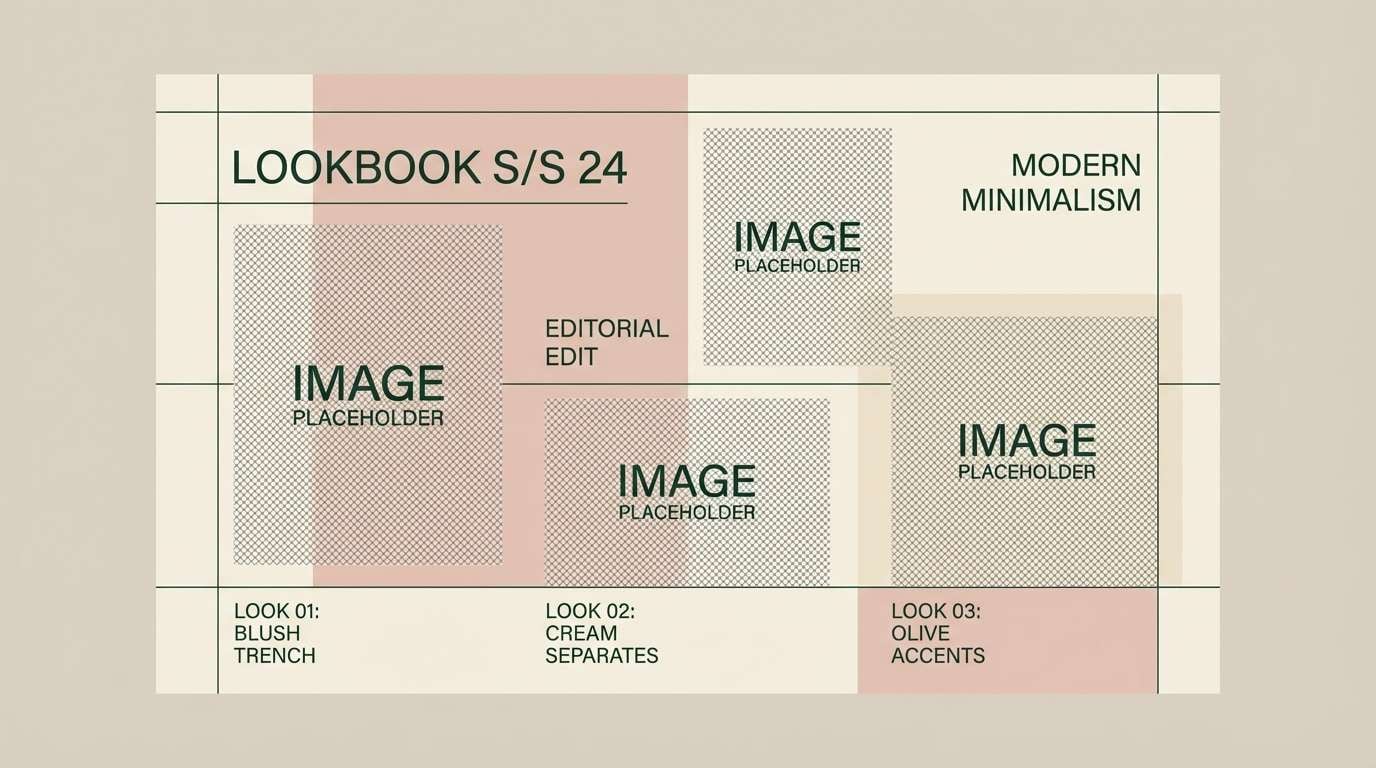
19) Blush and Basil
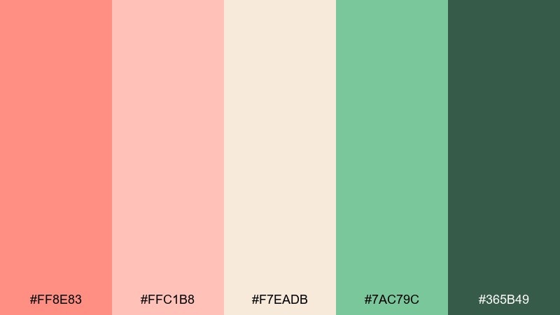
HEX: #FF8E83 #FFC1B8 #F7EADB #7AC79C #365B49
Mood: romantic, natural, contemporary
Best for: fashion lookbook editorial
Romantic and natural, like blush fabric against fresh basil leaves. Use the soft neutrals for generous margins and let the blush sit behind pull quotes and collection names. The greens are ideal for section dividers, captions, and small graphic motifs that suggest sustainability. Tip: keep imagery warm-toned so the palette feels intentional rather than competing with photography.
Image example of blush and basil generated using media.io
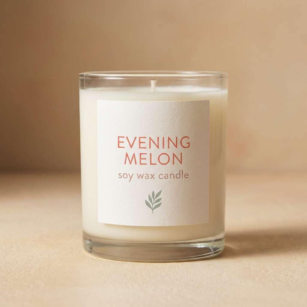
20) Evening Melon
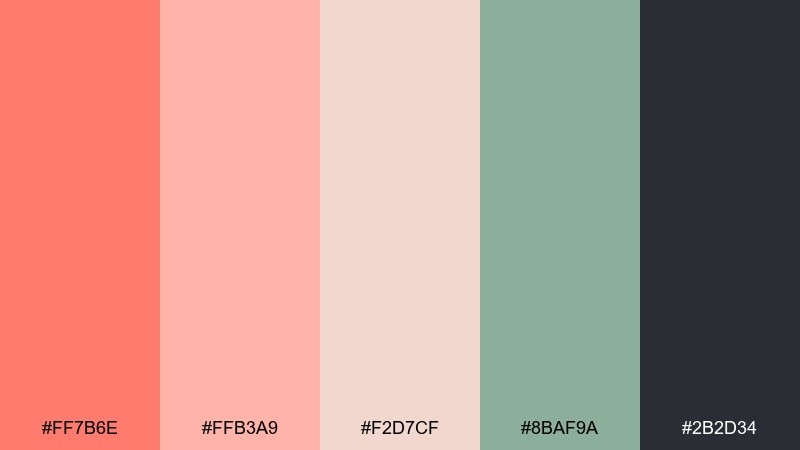
HEX: #FF7B6E #FFB3A9 #F2D7CF #8BAF9A #2B2D34
Mood: moody, cozy, elegant
Best for: candle label packaging
Moody and cozy, like candlelight reflecting off warm ceramics at dusk. The softer pink-beige keeps the design calm while the deeper melon shade adds a romantic focal point on the label. Use the muted green for scent variants or batch marks, and the near-black for type and barcode areas. Tip: matte labels with a small spot-gloss on the name look especially premium here.
Image example of evening melon generated using media.io
What Colors Go Well with Melon?
Melon pairs best with soft neutrals (cream, warm white, sand, latte) because they keep the palette bright and editorial while giving you plenty of negative space. Charcoal or deep blue-gray is often a cleaner choice than pure black for modern, readable typography.
For contrast, lean into greens inspired by herbs and rinds—mint, seafoam, sage, deep teal, and forest. These cool notes sharpen the warmth of melon and help create clear hierarchy for UI components, labels, and charts.
If you want extra punch, add a citrus yellow or muted mustard in small doses (badges, highlights, flavor cues). Keep it secondary so melon remains the signature color instead of competing for attention.
How to Use a Melon Color Palette in Real Designs
Start with a neutral base, then assign melon to one consistent role: primary CTA, headline bars, or hero shapes. This prevents “all-warm” layouts from feeling noisy and makes the brand color instantly recognizable.
Use the green or charcoal shade for functional clarity—navigation, body text, pricing, and legal copy. In print, do quick proofing on your chosen stock, because coral-peach hues can shift noticeably on uncoated paper.
In UI, reserve the deepest shade for headings and key metrics, and keep melon for moments of action or emphasis. That approach preserves accessibility while still delivering a sunny, optimistic look.
Create Melon Palette Visuals with AI
If you already have HEX codes, you can turn them into realistic mockups or clean graphic concepts in minutes using AI. The key is to describe the design scenario (label, poster, UI, invitation) and specify where melon acts as the hero vs. an accent.
Use the prompts above as templates, then swap product type, layout style, and aspect ratio to match your channel—square for social, 3:4 for packaging previews, or 16:9 for web hero sections.
When you find a palette you like, generate multiple variations with the same prompt to explore typography, spacing, and composition—while keeping your colors consistent.
Melon Color Palette FAQs
-
What is a melon color palette?
A melon color palette is a set of warm coral-peach tones (inspired by cantaloupe and melon flesh) paired with supporting neutrals and contrast shades—often mint/teal greens or charcoals—for balanced, usable designs. -
Is melon closer to coral or peach?
Melon typically sits between coral and peach: warmer and sunnier than pink coral, but more saturated than many peaches. In practical design terms, it can act as a friendly accent color with strong “summer” energy. -
What neutral colors match melon best?
Cream, warm white, latte, sand, and soft beige complement melon without dulling it. For text, charcoal or deep blue-gray often looks more refined than pure black. -
What accent colors go well with melon?
Mint, seafoam, sage, teal, and deep green are classic accents because they create cool contrast. Small touches of citrus yellow can add extra pop for packaging, ads, and seasonal graphics. -
How do I keep melon palettes from looking too “cute”?
Use more neutral space, keep melon to one main role (CTA or headline), and pair it with a deep, slightly cool dark (charcoal/teal). Clean typography and minimal shapes also push the look toward premium. -
Are melon color schemes good for UI design?
Yes—especially when melon is used as the primary action color and supported by high-contrast dark text. Add mint/teal for secondary UI states and keep backgrounds light for a calm, modern interface. -
Can I generate melon-themed design mockups with AI?
Yes. Use a clear prompt that names the design format (label, poster, app UI) and calls out melon coral/peach tones plus your supporting neutrals/greens. Then iterate on layout and lighting while keeping the palette consistent.
Next: Peach Mint Color Palette


