

A well-made meditation color palette makes your design feel quieter before users read a single word. Soft neutrals, balanced greens, and low-contrast accents help reduce visual “noise” and support focus.
Below are meditation color palette ideas with HEX codes, plus practical tips for using them in wellness apps, studio branding, packaging, and calming landing pages.
In this article
Why Meditation Palettes Work So Well
Meditation color schemes tend to sit in the “soft middle” of saturation and contrast. That keeps screens and printed materials from feeling demanding, which supports longer reading, slower scrolling, and calmer decision-making.
Natural tones (sage, sand, stone, misty whites) also trigger familiar environmental cues—forests, linen, incense smoke, candlelight—so the interface or brand feels grounded instead of overly digital.
When you limit accents and repeat a few calming values, hierarchy becomes clearer: one primary action, one highlight, and plenty of breathable space. The result is simpler, more focused design.
20+ Meditation Color Palette Ideas (with HEX Codes)
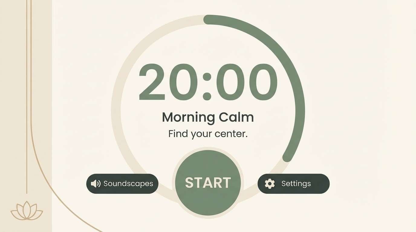
1) Quiet Sage
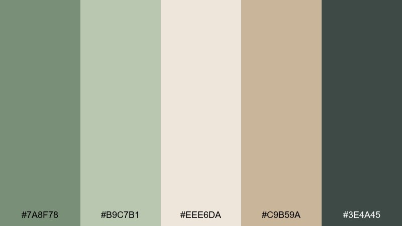
HEX: #7A8F78 #B9C7B1 #EEE6DA #C9B59A #3E4A45
Mood: grounded, gentle, restorative
Best for: wellness app UI and meditation timer screens
Grounded greens and warm linen tones evoke a quiet studio with soft light and slow breathing. Use this meditation color palette for dashboards, timers, and habit flows where clarity matters. Pair the deeper pine tone with lots of whitespace for legible type, then keep accents to the sand shade for calm hierarchy. Tip: reserve the darkest color for one primary action to avoid visual noise.
Image example of quiet sage generated using media.io
Media.io is an online AI studio for creating and editing video, image, and audio in your browser.

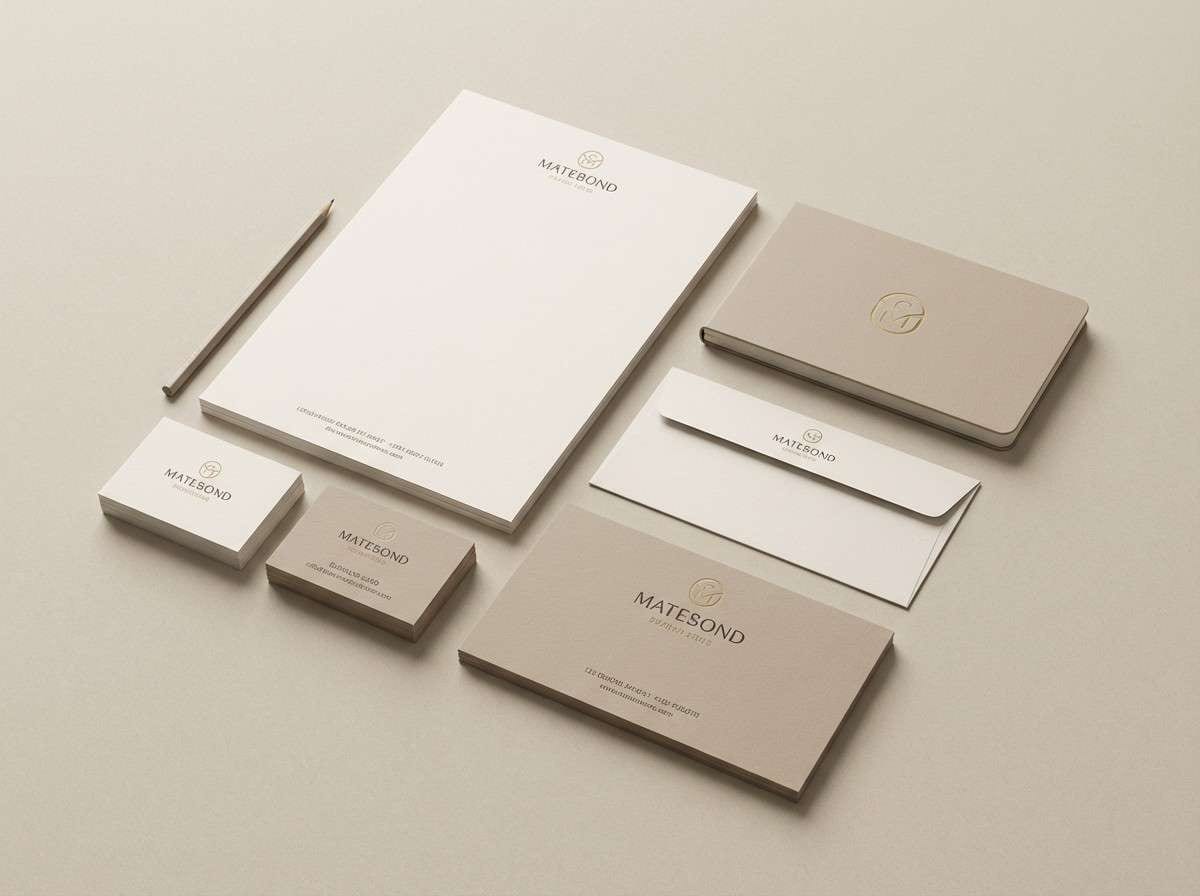
2) Sandalwood Mist
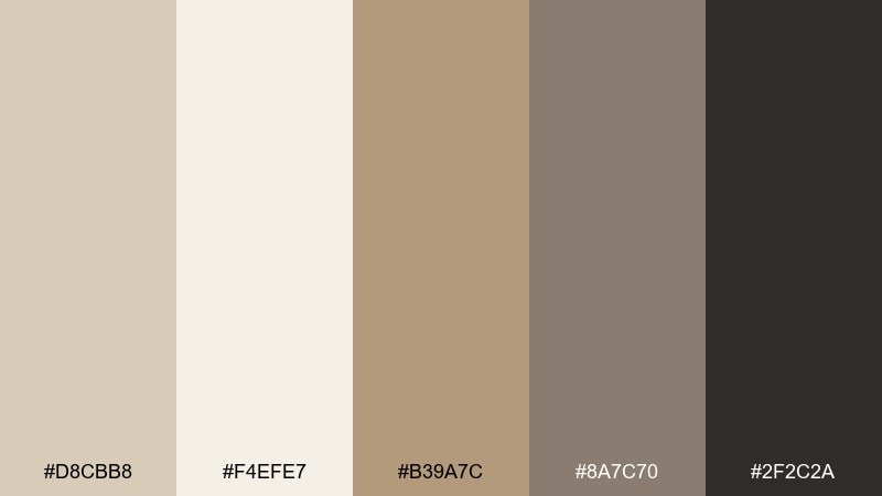
HEX: #D8CBB8 #F4EFE7 #B39A7C #8A7C70 #2F2C2A
Mood: warm, minimal, contemplative
Best for: yoga studio branding and stationery
Warm sand and creamy paper tones feel like sandalwood incense drifting through a quiet room. The palette works beautifully for logos, business cards, and calm brand systems that need a premium, tactile vibe. Use the charcoal as your type anchor and let the soft beige do most of the background work. Tip: print on uncoated stock to amplify the natural softness of these tones.
Image example of sandalwood mist generated using media.io
3) Lotus Dawn
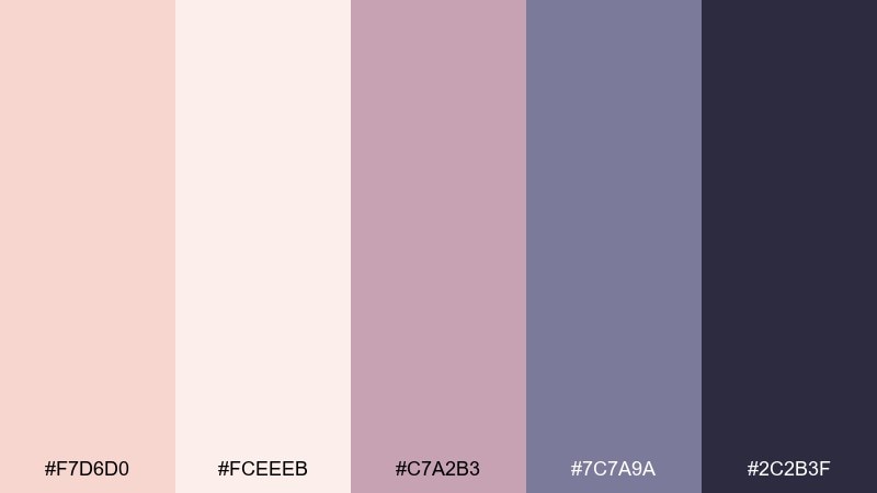
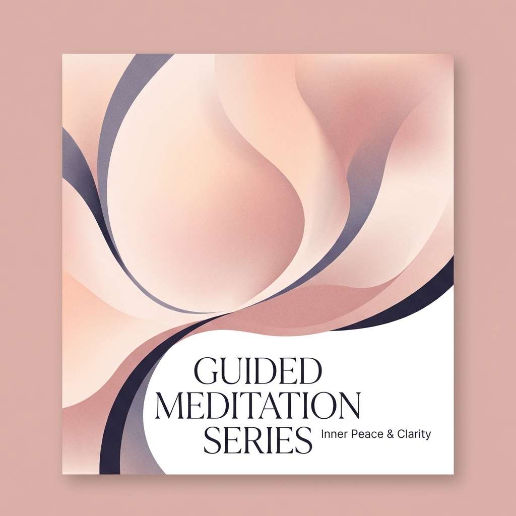
HEX: #F7D6D0 #FCEEEB #C7A2B3 #7C7A9A #2C2B3F
Mood: soft, hopeful, soothing
Best for: guided audio cover art and podcast thumbnails
Blush petals and misty lilac shadows suggest a sunrise practice and a slower pace. These meditation color combinations are ideal for cover art that needs warmth without feeling sugary. Keep the dark indigo for title contrast, and use the pale peach as the main field so artwork stays airy. Tip: add a subtle grain overlay to keep gradients looking organic.
Image example of lotus dawn generated using media.io
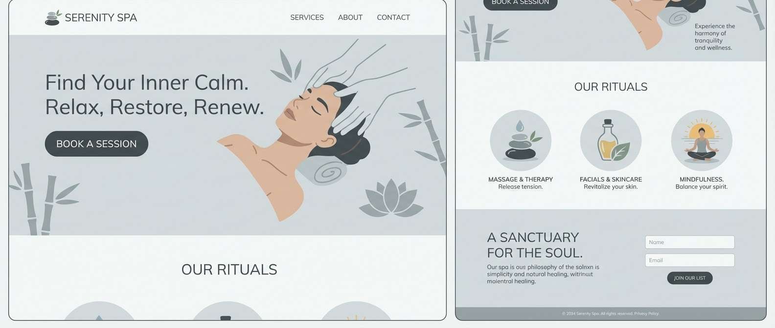
4) River Stone
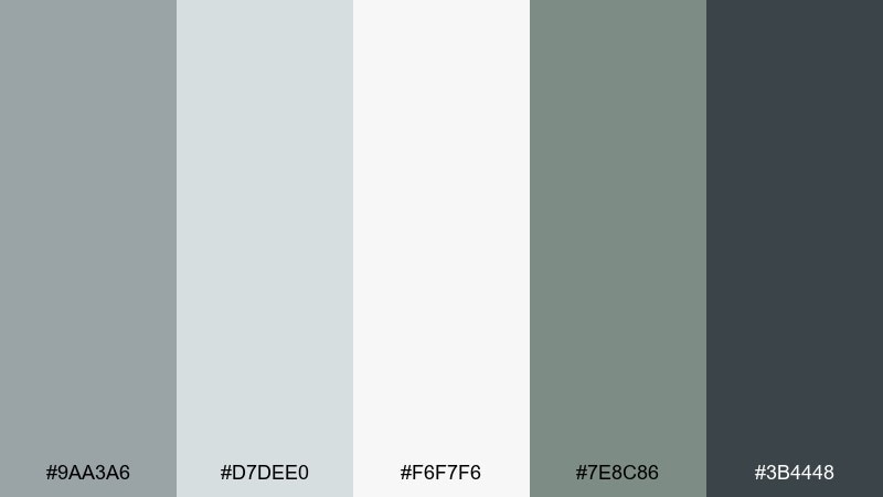
HEX: #9AA3A6 #D7DEE0 #F6F7F6 #7E8C86 #3B4448
Mood: cool, steady, uncluttered
Best for: spa websites and calming landing pages
Cool grays and mineral whites feel like smooth stones beside still water. Use these tones for landing pages where you want a clean, breathable layout and a clinical-free calm. The slate and charcoal pair well with thin line icons and generous spacing. Tip: keep shadows extremely subtle so the page stays serene instead of techy.
Image example of river stone generated using media.io
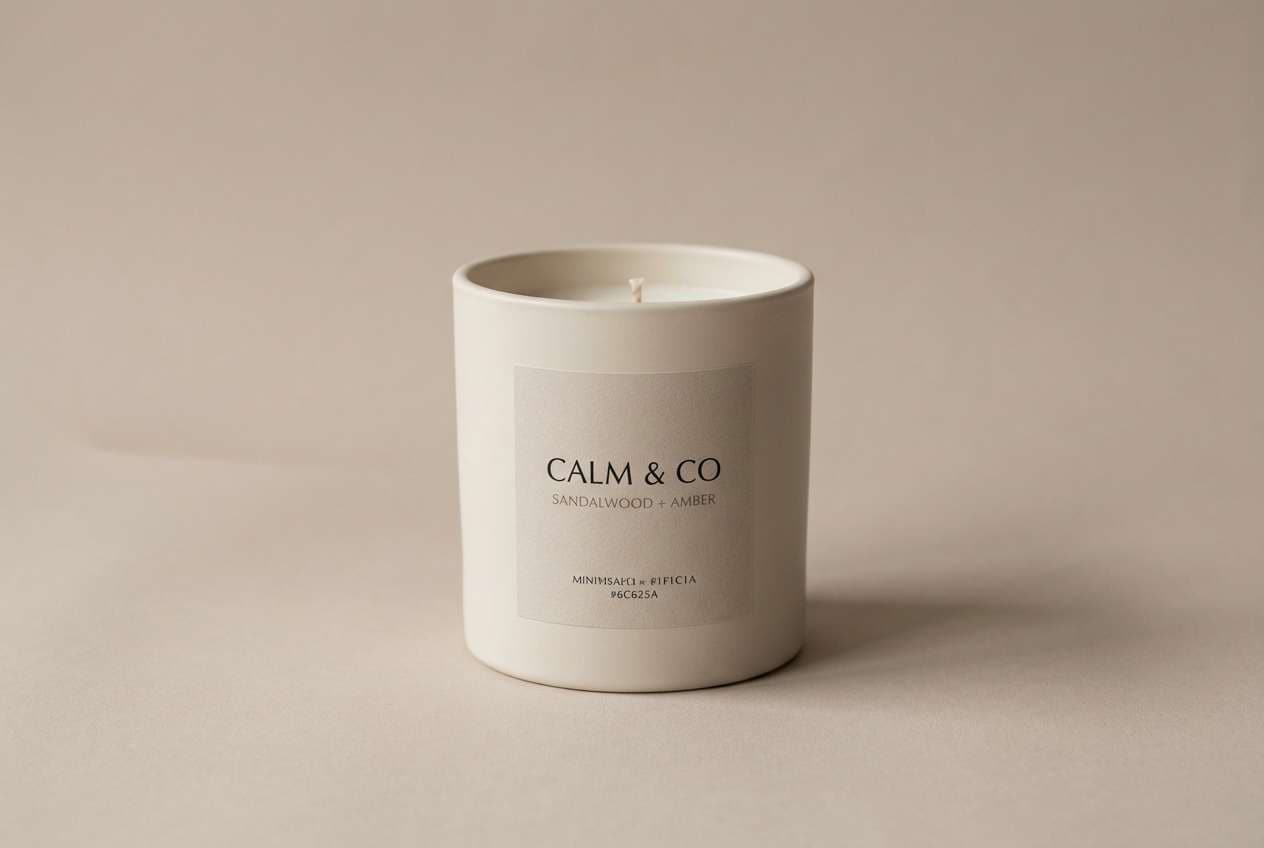
5) Incense Smoke
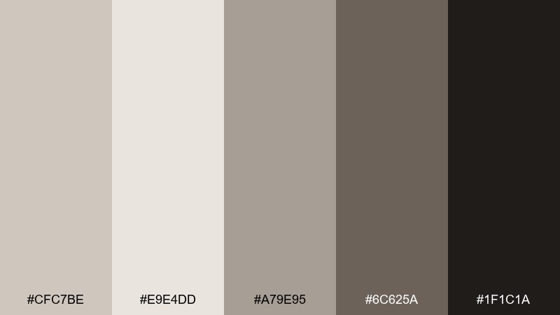
HEX: #CFC7BE #E9E4DD #A79E95 #6C625A #1F1C1A
Mood: moody, grounded, intimate
Best for: candle packaging and product ads
Smoky taupes and soft ash tones evoke evening rituals and a dimly lit altar. This mix works well for premium packaging where you want calm with a hint of mystery. Pair the deepest shade with simple serif type and let the pale gray-beige carry the background. Tip: use matte finishes to avoid glare and keep the mood subdued.
Image example of incense smoke generated using media.io
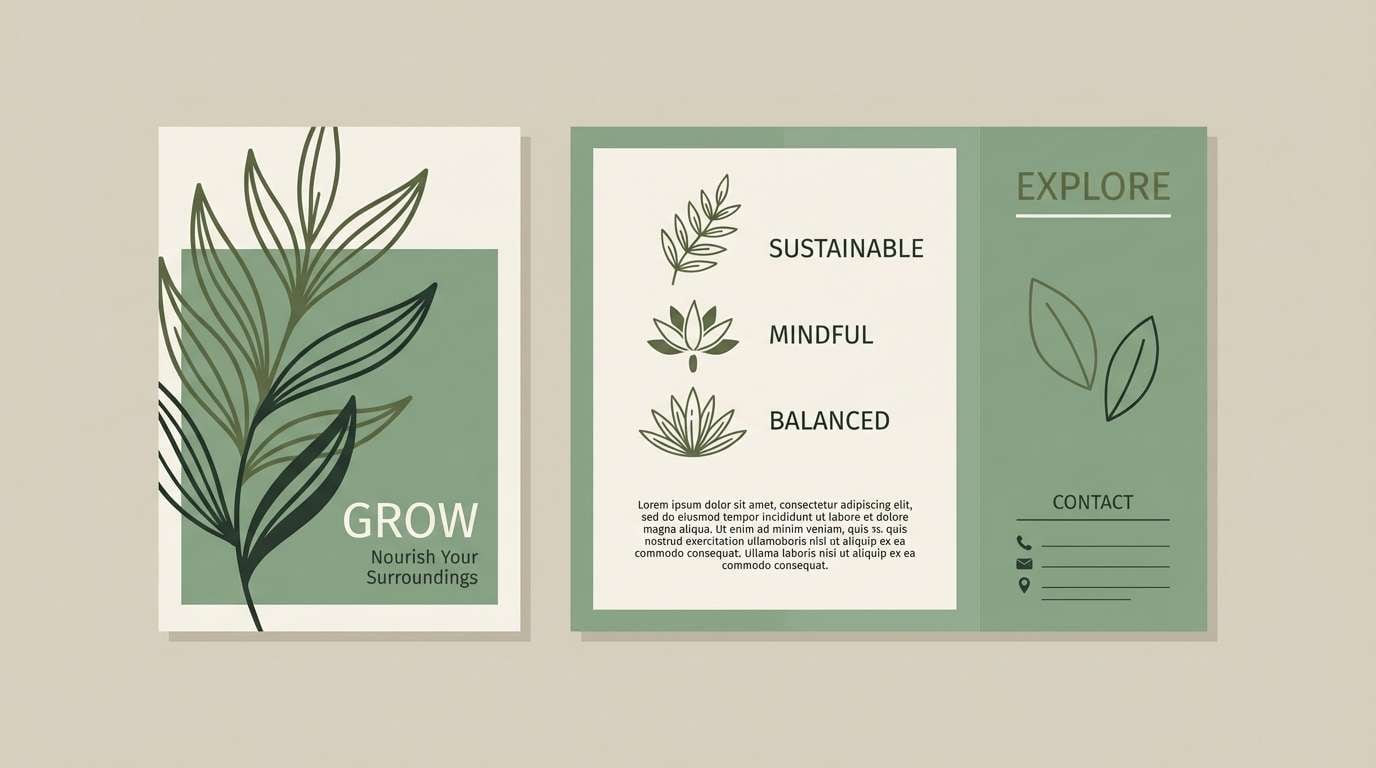
6) Fern Breath
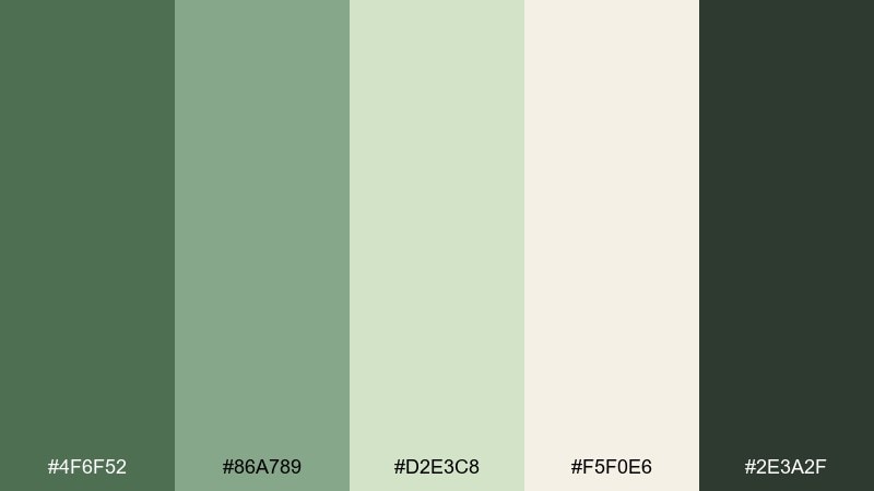
HEX: #4F6F52 #86A789 #D2E3C8 #F5F0E6 #2E3A2F
Mood: fresh, balanced, outdoorsy
Best for: retreat brochures and nature-forward branding
Fresh fern greens and creamy neutrals feel like a forest inhale after rain. Use the mid green as your hero tone, then soften layouts with the pale cream to keep the page open. The darker evergreen is perfect for headings and subtle dividers. Tip: pair with botanical line drawings to reinforce the natural rhythm.
Image example of fern breath generated using media.io
7) Clay Mantra
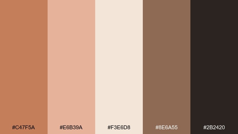
HEX: #C47F5A #E6B39A #F3E6D8 #8E6A55 #2B2420
Mood: earthy, cozy, reassuring
Best for: ceramics studio promos and workshop flyers
Terracotta clay and warm biscuit tones recall handmade bowls and steady hands. The palette is great for workshop flyers, social posts, and small business promos that want warmth without loud saturation. Use the deep brown for strong headers and keep the peachy tones for background blocks. Tip: add a subtle paper texture to make the design feel crafted.
Image example of clay mantra generated using media.io

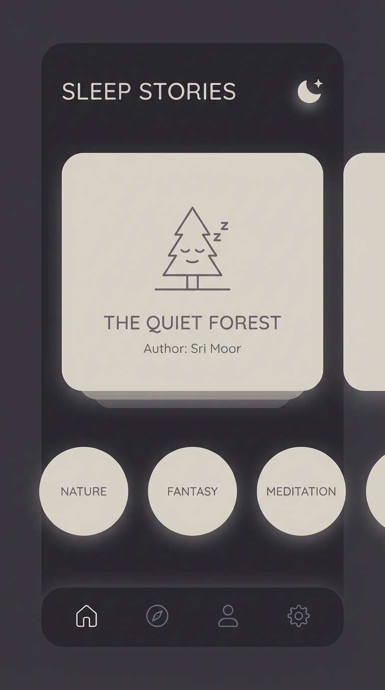
8) Moonlit Linen
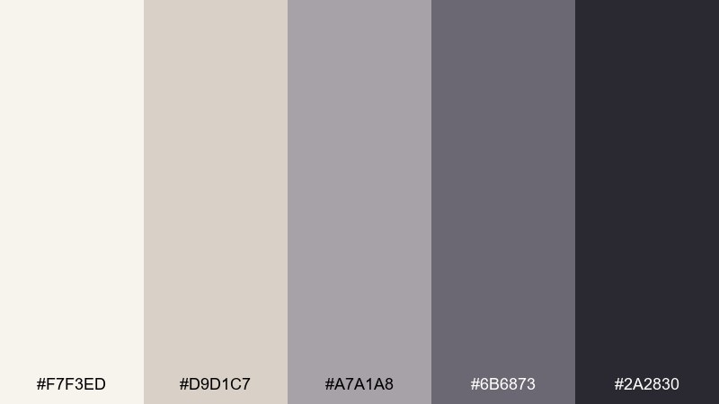
HEX: #F7F3ED #D9D1C7 #A7A1A8 #6B6873 #2A2830
Mood: quiet, elegant, slow-night calm
Best for: sleep stories UI and nighttime modes
Soft linen and dusk purples evoke moonlight on folded fabric. Use this set for bedtime interfaces where contrast should stay gentle and fatigue-friendly. The mid gray-lilac works well for secondary text, while the deep plum anchors navigation. Tip: avoid pure white highlights and keep icons slightly muted for comfort.
Image example of moonlit linen generated using media.io
9) Tea Ceremony
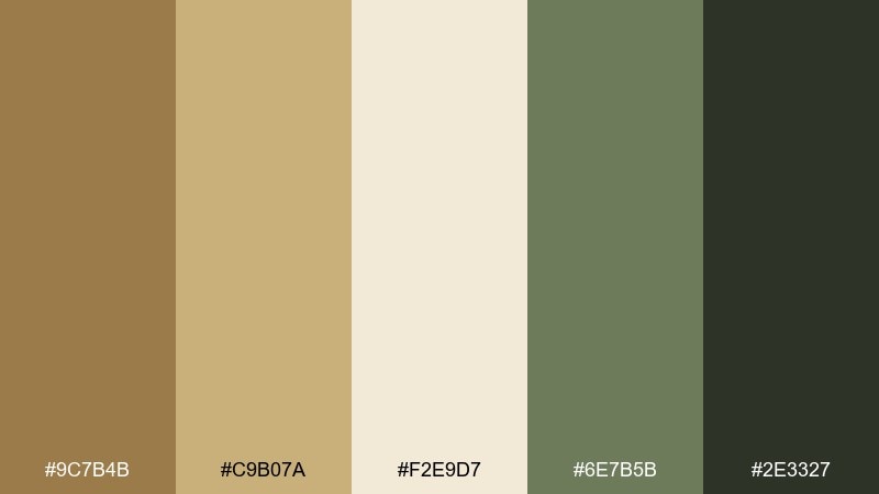
HEX: #9C7B4B #C9B07A #F2E9D7 #6E7B5B #2E3327
Mood: centered, warm, mindful
Best for: brand identity for tea and wellness shops
Toasty amber and matcha greens feel like steam rising from a ceramic cup. These meditation color combinations suit identity systems that mix tradition with modern simplicity. Let the cream serve as negative space, then use the olive as a calm accent for buttons, stamps, or seals. Tip: keep gold-like tones limited to small highlights so they read as refined, not flashy.
Image example of tea ceremony generated using media.io
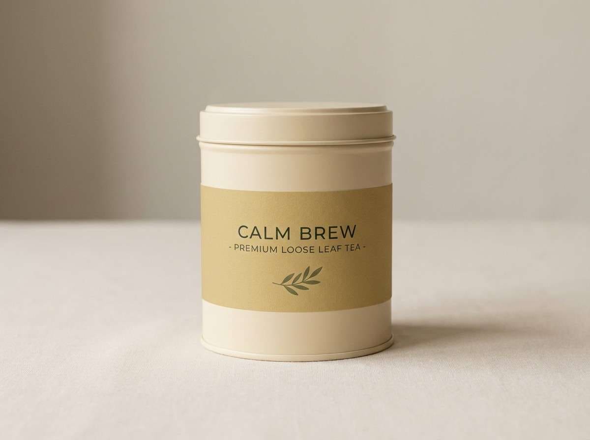
10) Himalayan Salt
HEX: #F2C6B6 #F9E2DA #FFF6F0 #C8B3B0 #5A4B4B
Mood: comforting, rosy, soft-spoken
Best for: spa menus and service price lists
Rosy salt and milky blush shades feel like warm towels and quiet breathing. Use this set for menus, price sheets, and booking pages where you want friendly warmth and clear readability. Pair the deep cocoa with larger type sizes to keep contrast accessible. Tip: add thin dividers in the muted mauve to guide the eye without harsh lines.
Image example of himalayan salt generated using media.io
11) Zen Garden
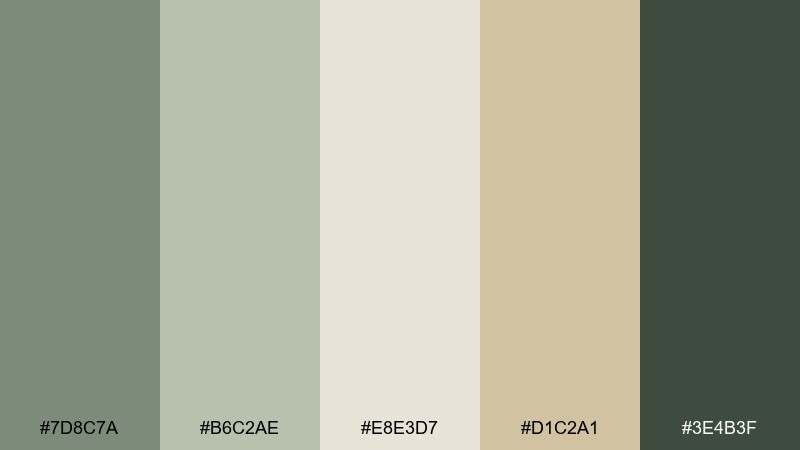
HEX: #7D8C7A #B6C2AE #E8E3D7 #D1C2A1 #3E4B3F
Mood: peaceful, natural, balanced
Best for: meditation studio websites and signage
Mossy greens and raked-sand neutrals evoke a quiet garden path and steady steps. This meditation color palette fits studio websites, sign systems, and class schedules that need calm structure. Use the sand tone for backgrounds and reserve the deep green for headings and directional cues. Tip: pair with simple geometric shapes to echo stones and pathways.
Image example of zen garden generated using media.io
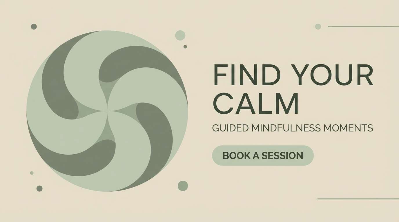
12) Soft Charcoal
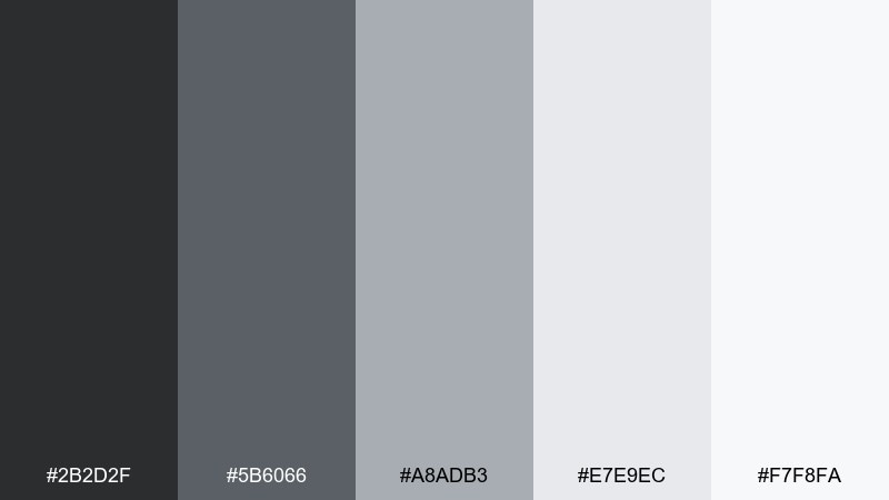
HEX: #2B2D2F #5B6066 #A8ADB3 #E7E9EC #F7F8FA
Mood: modern, calm, focused
Best for: editorial layouts and mindfulness articles
Soft charcoal and foggy grays create a focused, modern calm with plenty of breathing room. Use it for editorial pages, long reads, and blog templates where typography leads the experience. The light grays keep sections organized without heavy boxes, while the near-black sets crisp headers. Tip: choose one accent color outside this set sparingly if you need a single callout style.
Image example of soft charcoal generated using media.io
13) Eucalyptus Breeze
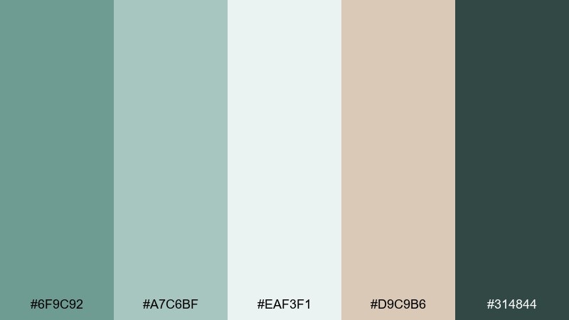
HEX: #6F9C92 #A7C6BF #EAF3F1 #D9C9B6 #314844
Mood: clean, airy, refreshing
Best for: skincare product ads and labels
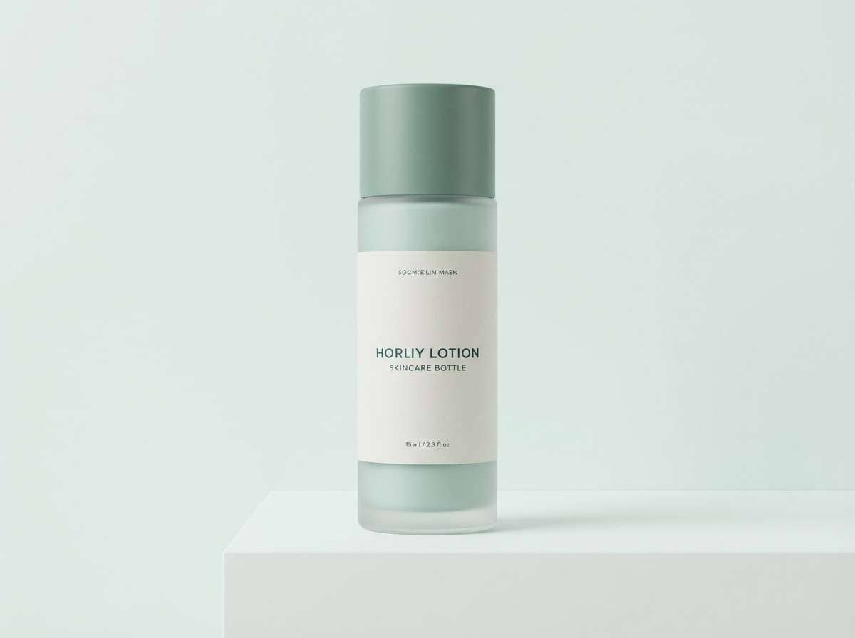
Cool eucalyptus greens and spa-clean whites feel like a fresh towel and open windows. This palette is strong for skincare labels, ingredient callouts, and clean product ads. Pair the dark teal with small caps typography and keep the tan as a warm counterbalance. Tip: limit gradients and lean on crisp blocks for a modern, clinical-light look.
Image example of eucalyptus breeze generated using media.io
14) Amber Candle
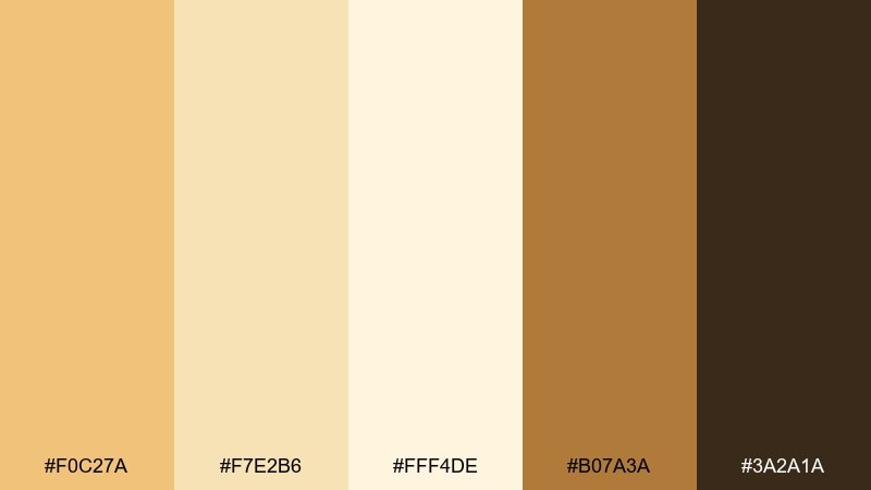
HEX: #F0C27A #F7E2B6 #FFF4DE #B07A3A #3A2A1A
Mood: glowing, cozy, inviting
Best for: event posters for sound baths and evening classes
Golden amber and warm cream tones glow like candlelight in a quiet room. Use this set for posters and social graphics promoting evening sessions, sound baths, or slow yoga. Anchor text in the deep brown to keep it readable, and let the pale cream carry large open areas. Tip: add a soft vignette in the golden shade to guide attention toward the headline.
Image example of amber candle generated using media.io

15) Pearl Mala
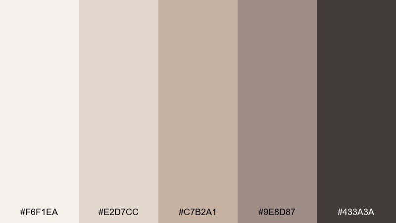
HEX: #F6F1EA #E2D7CC #C7B2A1 #9E8D87 #433A3A
Mood: classic, gentle, refined
Best for: jewelry lookbooks and product pages
Pearly creams and soft taupes feel like polished beads and quiet intention. Use this set for lookbooks and ecommerce pages where products should feel premium and calm. The mid taupe supports subtle dividers and UI borders without turning harsh. Tip: keep imagery bright and neutral so the palette reads as soft luxury rather than beige-heavy.
Image example of pearl mala generated using media.io
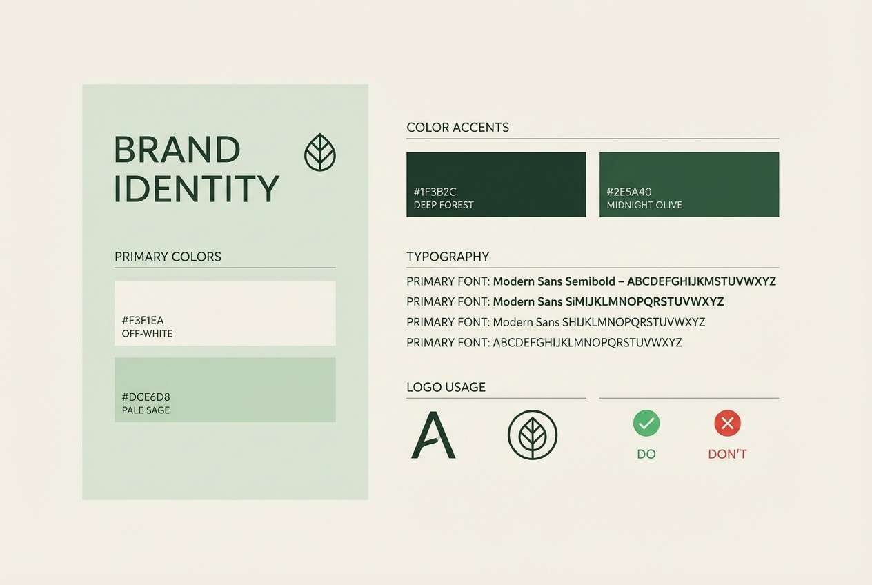
16) Deep Forest Stillness
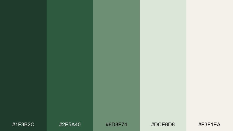
HEX: #1F3B2C #2E5A40 #6D8F74 #DCE6D8 #F3F1EA
Mood: steady, introspective, grounded
Best for: brand systems for coaches and therapists
Deep forest greens and misty tints evoke long walks, quiet reflection, and steady presence. Use this meditation color scheme for brand systems that need trust, depth, and a modern natural feel. Pair the darkest green with warm off-white for strong contrast, and use the sage tint to soften large blocks. Tip: keep accent usage minimal so the deep tones stay intentional, not heavy.
Image example of deep forest stillness generated using media.io
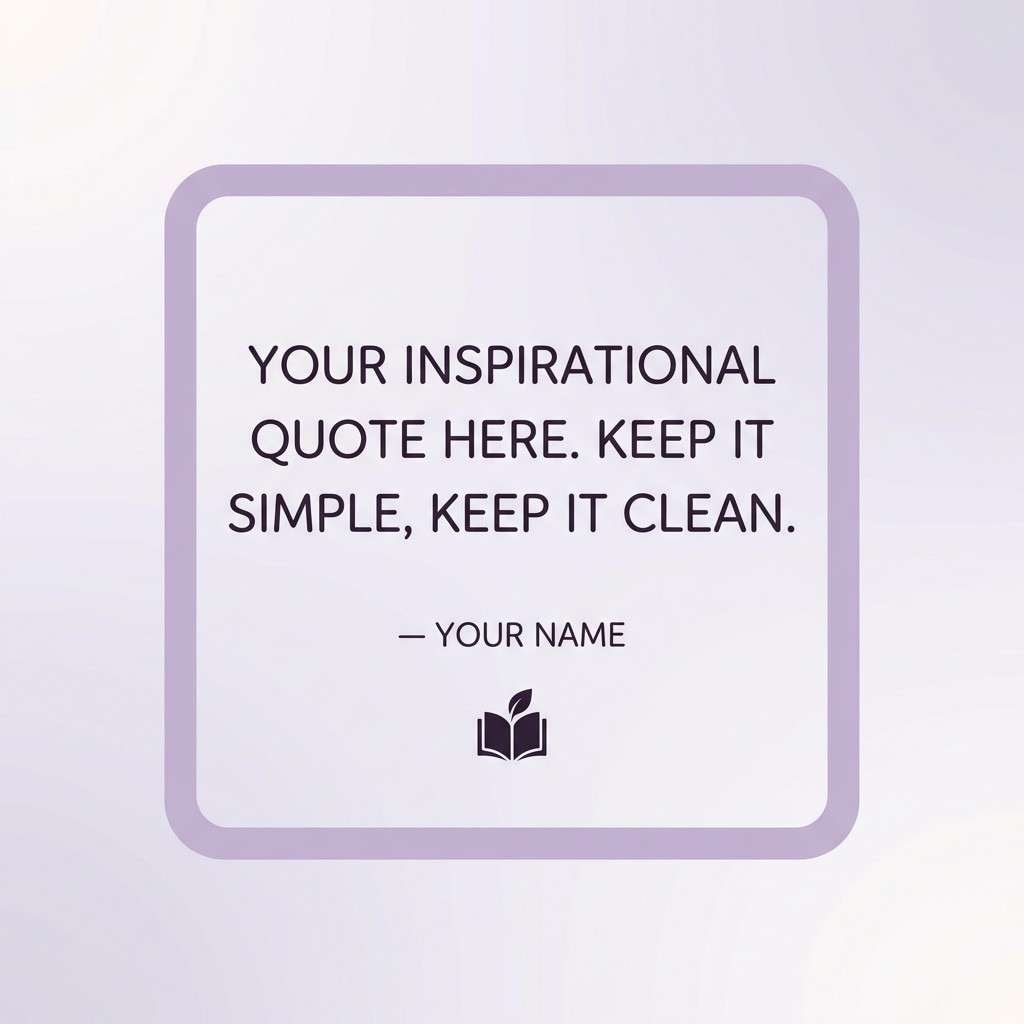
17) Lavender Exhale
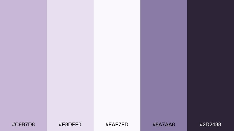
HEX: #C9B7D8 #E8DFF0 #FAF7FD #8A7AA6 #2D2438
Mood: dreamy, gentle, reassuring
Best for: affirmation cards and social quote templates
Lavender haze and soft violets feel like a long exhale at the end of the day. Use this meditation color palette for affirmation cards, quote templates, and gentle carousel posts. Keep the background near-white for airiness and use the deep plum only for key words or author lines. Tip: combine with rounded type and generous line spacing to preserve the soothing rhythm.
Image example of lavender exhale generated using media.io
18) Coastal Retreat
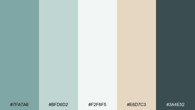
HEX: #7FA7A6 #BFD6D2 #F2F6F5 #E6D7C3 #3A4E52
Mood: open, breezy, restful
Best for: retreat landing pages and email headers
Sea-glass teal and airy whites evoke quiet waves and wide horizons. Use these tones for retreat landing pages, newsletters, and booking flows that should feel open and unpressured. Pair the warm sand with teal CTAs to keep contrast friendly rather than stark. Tip: use large, soft-edged shapes to mimic water and keep the layout flowing.
Image example of coastal retreat generated using media.io

19) Golden Hour Calm
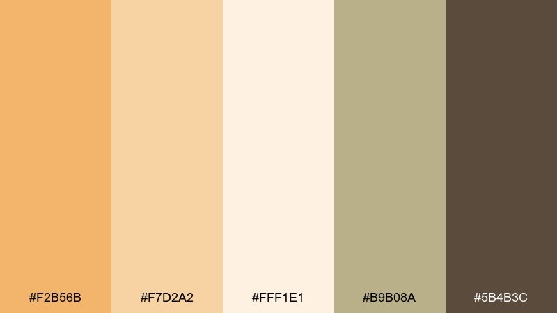
HEX: #F2B56B #F7D2A2 #FFF1E1 #B9B08A #5B4B3C
Mood: uplifting, warm, optimistic
Best for: wellness newsletters and community invites
Honeyed light and soft wheat tones feel like late-afternoon sun through curtains. These meditation color combinations work well for newsletters and invitation designs that should feel friendly and energizing, not loud. Use the creamy shade for backgrounds and the cocoa for readable type, then keep the gold to headers and small highlights. Tip: avoid heavy borders and let spacing create structure.
Image example of golden hour calm generated using media.io

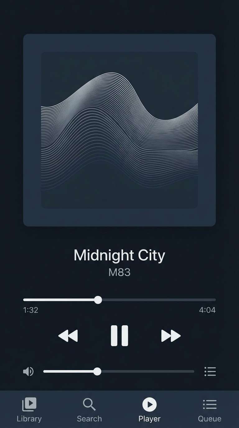
20) Night Studio
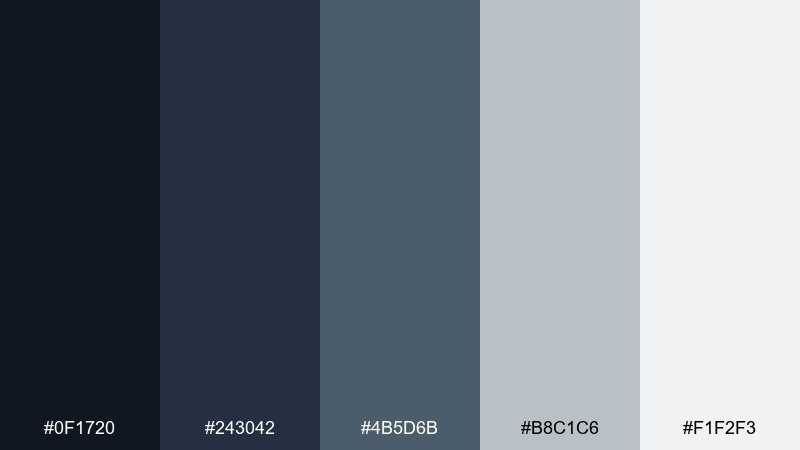
HEX: #0F1720 #243042 #4B5D6B #B8C1C6 #F1F2F3
Mood: quiet, focused, modern
Best for: dark UI dashboards and audio player screens
Inky navy and steel grays evoke a late-night studio and uninterrupted focus. Use it for dark dashboards and audio player screens where you want calm contrast without harsh blacks. Pair the pale gray with larger text sizes for accessibility, and save the mid steel tone for secondary buttons. Tip: keep shadows minimal and rely on value contrast to separate panels.
Image example of night studio generated using media.io
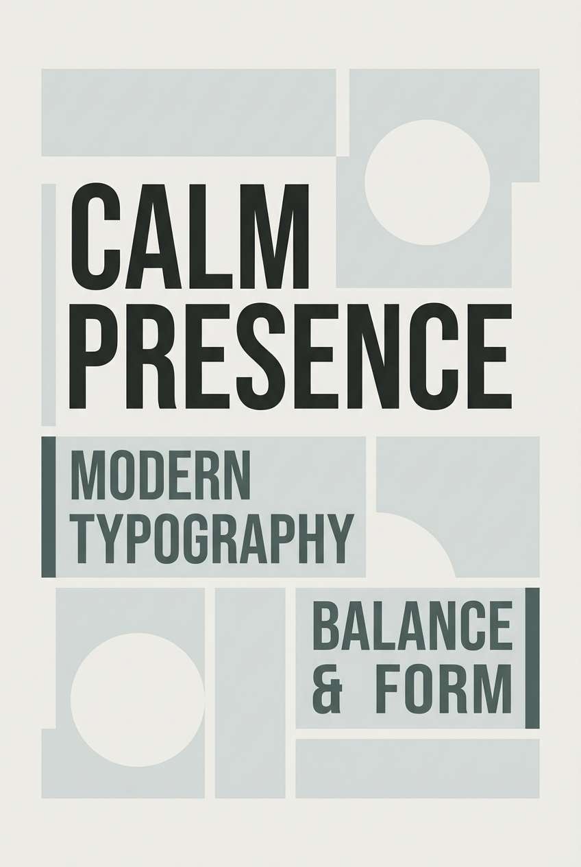
21) Rainy Temple
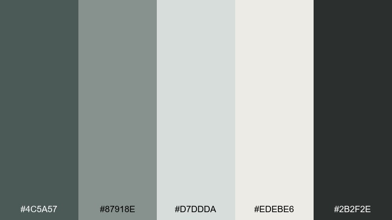
HEX: #4C5A57 #87918E #D7DDDA #EDEBE6 #2B2F2E
Mood: quiet, cool, meditative
Best for: minimal posters and typographic prints
Cool stone greens and soft fog neutrals feel like rain on temple steps and a slower heartbeat. The tones are ideal for typographic prints where you want calm, structured hierarchy. Use the pale off-white for the canvas, then build depth with the mossy gray and charcoal. Tip: keep the layout grid strict and let the muted colors do the softening.
Image example of rainy temple generated using media.io
What Colors Go Well with Meditation?
Greens (sage, fern, eucalyptus) are a natural fit for meditation design because they suggest balance, growth, and a steady pace. Pair them with warm neutrals like linen, sand, or soft clay to keep the mood human and inviting.
For a more “quiet-luxe” look, add smoky taupes, charcoal, or deep forest tones for structure and readability. If you want a gentle emotional lift, blush and lavender accents can work well—just keep saturation low.
In general, meditation color combinations work best when you prioritize value harmony (similar lightness levels) and reserve the darkest shade for type and key actions.
How to Use a Meditation Color Palette in Real Designs
Start with one main background neutral (off-white, mist, or cream), then choose one hero color (often a muted green) to carry the brand’s identity across sections. Use the darkest tone for headings and primary CTAs so the interface stays calm but still navigable.
Keep gradients, shadows, and borders subtle. Meditation palettes look most “still” when spacing does the heavy lifting—generous margins, clean grids, and fewer visual dividers.
Finally, test contrast for accessibility. Many calming colors are close in value, so increase font size/weight or use the deepest shade for text on light surfaces to maintain clarity.
Create Meditation Palette Visuals with AI
If you want to preview a meditation color scheme before committing, generate quick mockups for UI screens, posters, packaging, or social templates. Seeing the palette applied to real layouts makes it easier to spot contrast issues and refine accents.
With Media.io, you can turn a short prompt (plus your HEX colors) into consistent visuals for different formats—square covers, wide hero banners, or mobile UI concepts—without switching tools.
Try a few variations: swap the hero color, reduce accent usage, and compare how “quiet” the design feels across backgrounds and typography.
Meditation Color Palette FAQs
-
What is a meditation color palette?
A meditation color palette is a set of calm, low-saturation colors (often soft neutrals, greens, and muted accents) used to create a peaceful, focused visual mood in interfaces, branding, or print. -
Which colors are best for a calming meditation color scheme?
Muted greens (sage, fern), warm neutrals (linen, sand), and cool mineral grays are common choices. They feel natural and balanced, especially when paired with plenty of whitespace. -
How many colors should a meditation color palette include?
Five colors is a practical starting point: one background, one surface tone, one primary/hero color, one accent, and one dark anchor for text and key actions. -
How do I keep a meditation UI from looking washed out?
Use one dark anchor color for headings and primary buttons, increase type size/weight, and avoid using mid-tones for body text on light backgrounds. Calm doesn’t have to mean low readability. -
Can I use warm colors like terracotta or amber in meditation branding?
Yes. Warm clay, sand, and amber can feel cozy and reassuring. Keep saturation controlled and balance warm tones with creamy neutrals so the design stays soothing rather than energetic. -
What’s a good meditation color palette for dark mode?
Try deep navy or plum backgrounds with soft gray text and muted panels (like Moonlit Linen or Night Studio). Avoid pure black and pure white—slightly softened values reduce eye fatigue. -
How can I generate meditation palette mockups quickly?
Use an AI text-to-image tool like Media.io. Add your HEX colors to a short prompt (UI screen, poster, packaging, etc.) and generate multiple variations to compare hierarchy and mood.
Next: Fern Color Palette


