

Fern greens sit in that sweet spot between “natural” and “designed,” so they feel trustworthy in branding and calming in UI. They also play nicely with warm neutrals, charcoal text, and earthy accents.
Below are 20 fern color palette ideas with HEX codes, plus quick guidance on mood, best uses, and AI-ready prompts you can reuse to visualize each look.
In this article
- Why Fern Palettes Work So Well
-
- woodland mist
- sage trail
- fern frond & cream
- rainy canopy
- vintage herbarium
- riverbank neutral
- deep moss night
- spring conservatory
- forest latte
- botanical ui minimal
- cottage garden paper
- alpine hike gear
- modern spa stone
- olive fern contrast
- sunlit greenhouse
- dark academia green
- tropical understory
- earthy terracotta fern
- dusty fern pastels
- metallic fern luxe
- What Colors Go Well with Fern?
- How to Use a Fern Color Palette in Real Designs
- Create Fern Palette Visuals with AI
Why Fern Palettes Work So Well
Fern palettes feel familiar because they echo real-world materials—leaves, bark, stone, and paper—so they read as authentic across digital and print. That “borrowed from nature” quality makes them great for brands that want to feel human, healthy, or grounded.
They’re also versatile: muted fern greens can behave like neutrals in UI, while deeper moss tones can anchor premium, high-contrast layouts. Add a warm accent (tan, terracotta, honey) and the whole system becomes more energetic without turning loud.
Most fern schemes are naturally readable because they pair well with off-whites and charcoals. With the right contrast choices, you can keep screens calm and still hit accessibility targets for body text and buttons.
20+ Fern Color Palette Ideas (with HEX Codes)
1) Woodland Mist
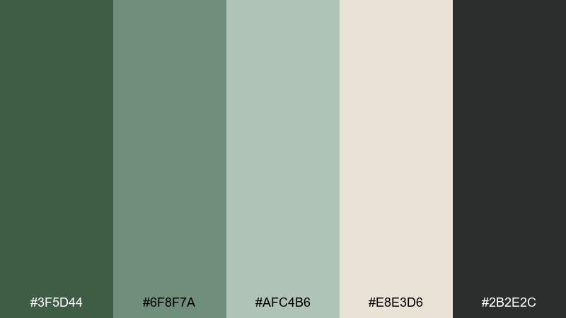
HEX: #3F5D44 #6F8F7A #AFC4B6 #E8E3D6 #2B2E2C
Mood: calm, dewy, grounded
Best for: wellness branding and minimalist websites
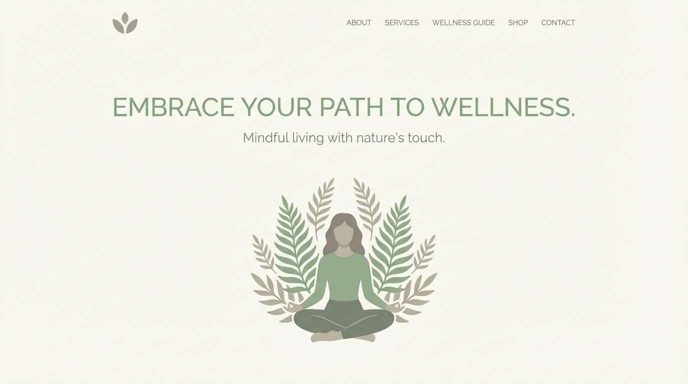
Calm, dewy greens feel like early fog drifting through pines. The muted midtones keep layouts serene while the charcoal adds crisp structure for type. Pair it with lots of negative space and soft photography to maintain the airy mood. Usage tip: reserve the darkest shade for headings and buttons so the lighter greens can stay spacious.
Image example of woodland mist generated using media.io
Media.io is an online AI studio for creating and editing video, image, and audio in your browser.

2) Sage Trail
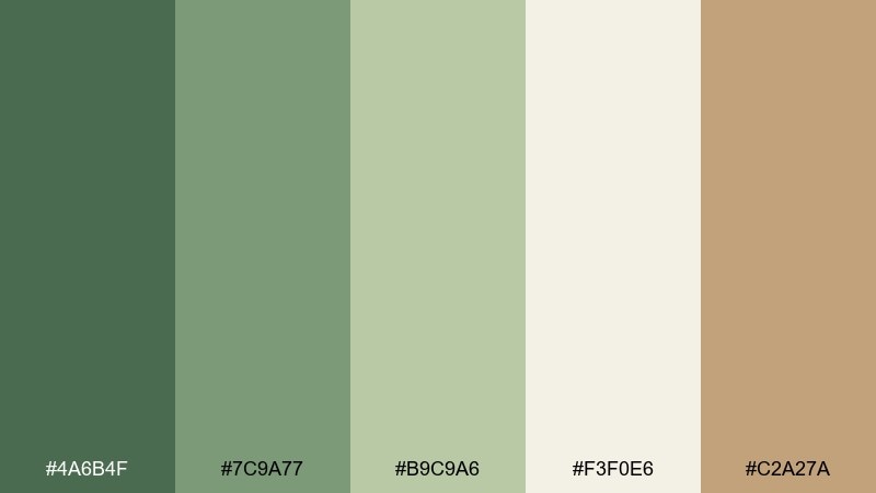
HEX: #4A6B4F #7C9A77 #B9C9A6 #F3F0E6 #C2A27A
Mood: fresh, outdoorsy, friendly
Best for: eco product packaging and labels
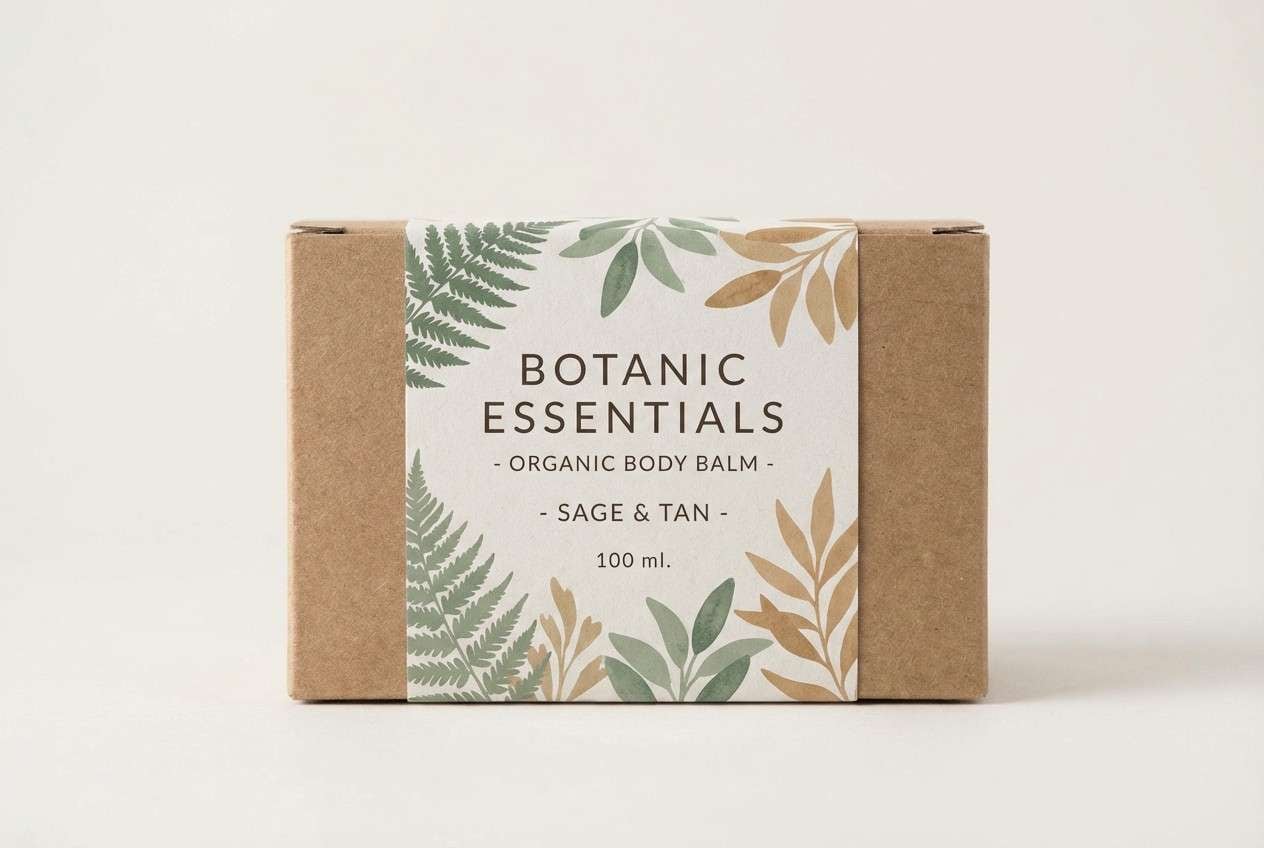
Fresh trail greens and warm grain tones suggest hiking paths and sunlit leaves. The creamy off-white keeps packaging clean, while the tan accent adds a natural, paper-like warmth. Pair it with uncoated textures and simple line icons for a credible eco feel. Usage tip: print the mid green as the hero color and use the tan sparingly for callouts.
Image example of sage trail generated using media.io
3) Fern Frond & Cream
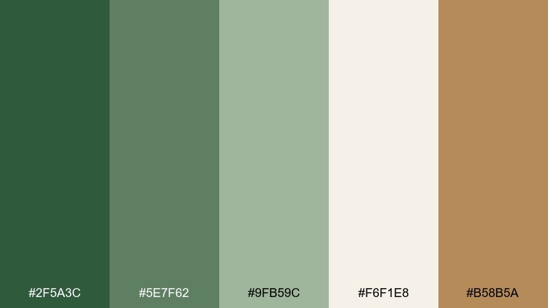
HEX: #2F5A3C #5E7F62 #9FB59C #F6F1E8 #B58B5A
Mood: soft, natural, comforting
Best for: home decor mood boards and lifestyle blogs
Soft, natural greens read like fronds against linen curtains and warm morning light. The creamy base makes the darker greens feel less heavy, and the clay-brown accent brings in cozy, lived-in warmth. This fern color palette works beautifully with wood textures, woven fabrics, and matte ceramics. Usage tip: repeat the cream as the main background to keep the composition bright.
Image example of fern frond & cream generated using media.io
4) Rainy Canopy
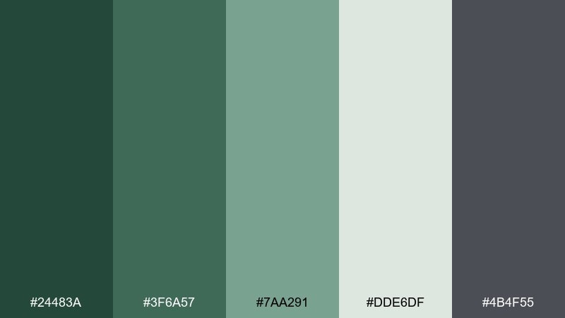
HEX: #24483A #3F6A57 #7AA291 #DDE6DF #4B4F55
Mood: moody, cool, contemplative
Best for: editorial layouts and book covers
Moody canopy greens and cool grays evoke rain on leaves and quiet city parks. The soft minty tint keeps the palette readable, while the slate gray stabilizes headlines and captions. Pair it with serif typography and high-contrast black-and-white photography for a refined look. Usage tip: use the deepest green for title blocks and the pale gray-green for columns and pull quotes.
Image example of rainy canopy generated using media.io
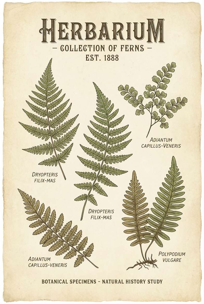
5) Vintage Herbarium
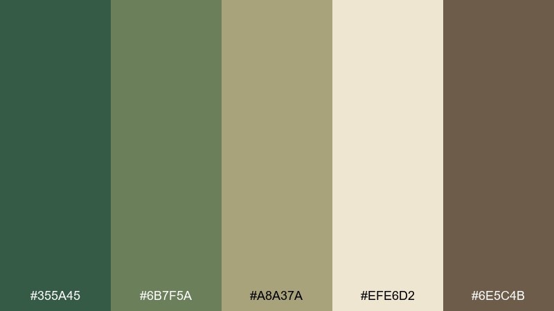
HEX: #355A45 #6B7F5A #A8A37A #EFE6D2 #6E5C4B
Mood: nostalgic, academic, earthy
Best for: museum flyers and botanical prints
Nostalgic greens with parchment and sepia browns feel like pressed leaves in an old notebook. The olive-tan midtone gives designs a gentle patina without looking dull. Pair it with grain, thin borders, and classic illustration to lean into the archival vibe. Usage tip: keep backgrounds parchment-light and use the darker brown only for small type and stamps.
Image example of vintage herbarium generated using media.io
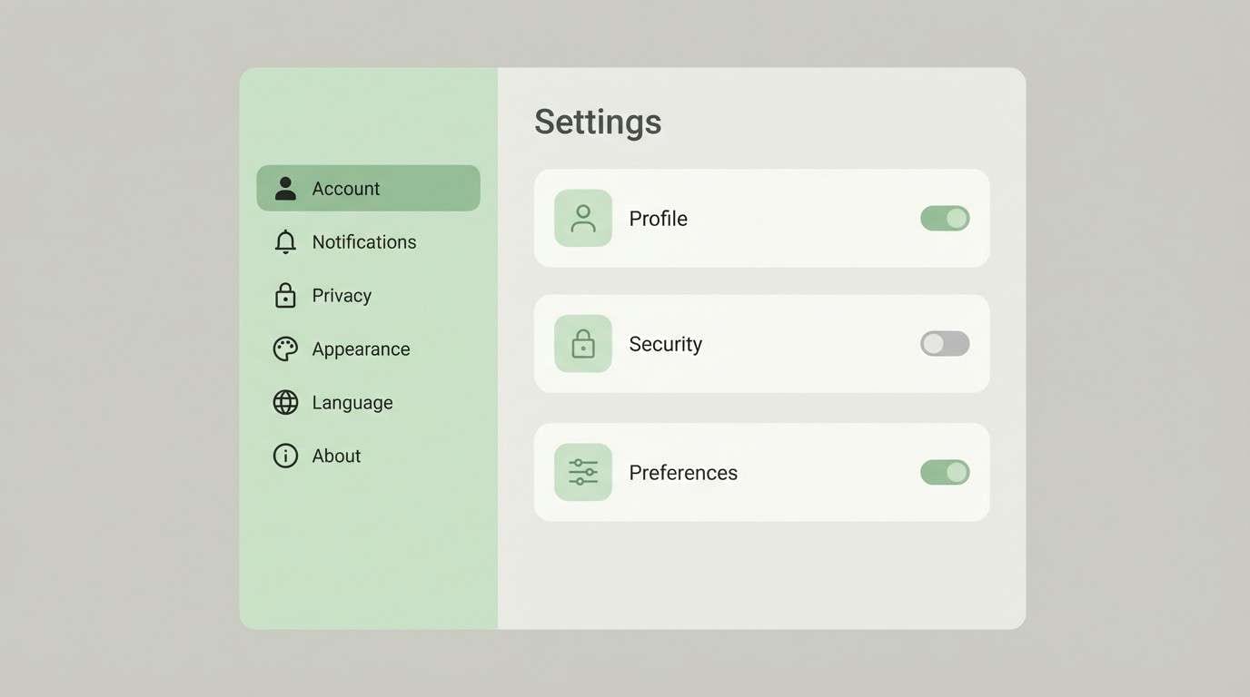
6) Riverbank Neutral
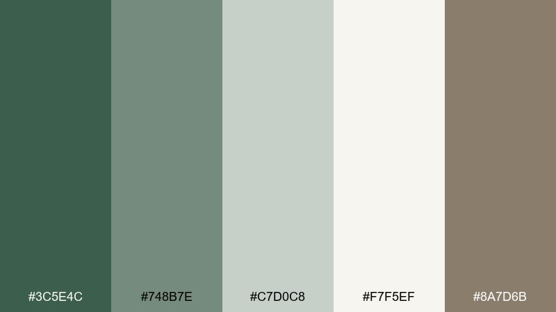
HEX: #3C5E4C #748B7E #C7D0C8 #F7F5EF #8A7D6B
Mood: balanced, airy, natural
Best for: UI settings screens and SaaS dashboards
Balanced riverbank greens read clean and approachable, like smooth stones beside water. The pale neutrals give you plenty of room for tables and forms, while the warm taupe softens the tech feel. Pair it with simple icons and subtle dividers to keep information calm and scannable. Usage tip: set the mid green as your primary action and keep the darkest green for active states only.
Image example of riverbank neutral generated using media.io
7) Deep Moss Night
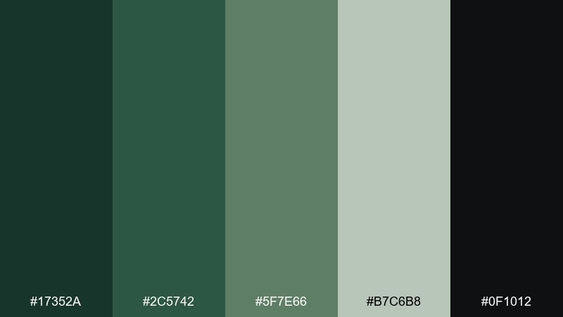
HEX: #17352A #2C5742 #5F7E66 #B7C6B8 #0F1012
Mood: dramatic, luxe, mysterious
Best for: premium spirits branding and dark-mode UI
Dramatic mossy depths feel like a forest at dusk, rich and a little mysterious. The near-black anchors the look and makes the muted green accents glow without turning neon. Pair it with foil-like highlights, tight typography, and minimal ornament for a premium finish. Usage tip: keep contrast high by placing light text on the darkest green rather than pure black.
Image example of deep moss night generated using media.io
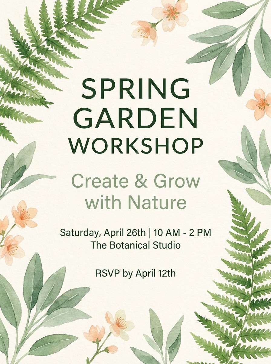
8) Spring Conservatory
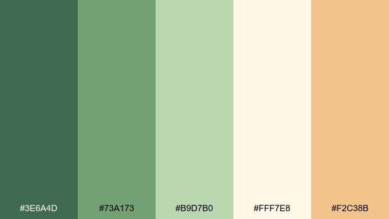
HEX: #3E6A4D #73A173 #B9D7B0 #FFF7E8 #F2C38B
Mood: bright, hopeful, botanical
Best for: spring event invitations and garden workshops
Bright, hopeful greens evoke greenhouse glass, new growth, and sun-warmed petals. The peachy accent adds a friendly spark that keeps the greens from feeling too serious. These fern color combinations shine on invitations, workshop posters, and social tiles with illustrated florals. Usage tip: use the lightest cream as the paper base and let the peach appear only in icons or date badges.
Image example of spring conservatory generated using media.io
9) Forest Latte
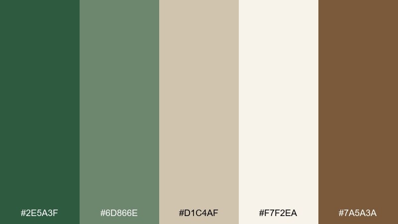
HEX: #2E5A3F #6D866E #D1C4AF #F7F2EA #7A5A3A
Mood: cozy, rustic, welcoming
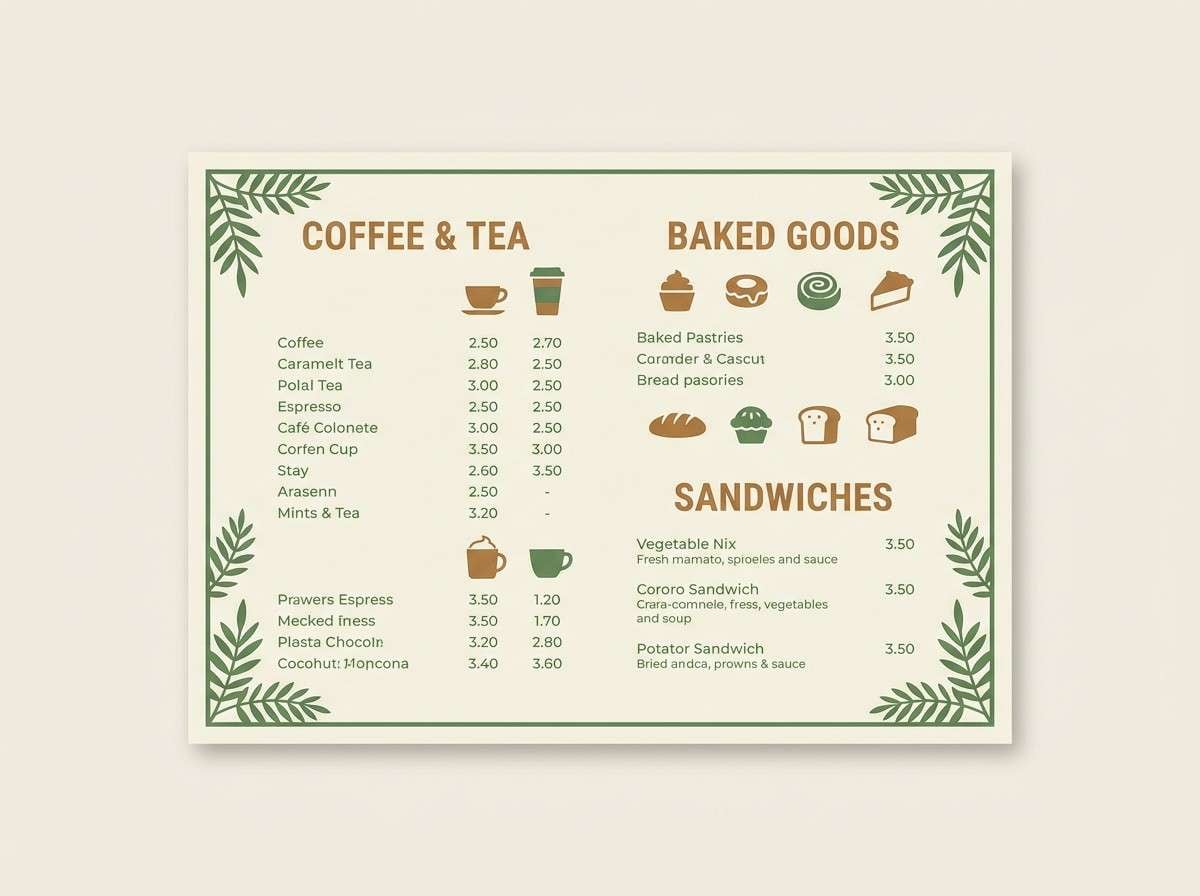
Best for: coffee shop branding and menu design
Cozy forest greens with latte creams feel like a warm cafe tucked near a trailhead. The caramel brown reads delicious and helps the green look more approachable. Pair it with kraft textures, friendly sans-serif type, and simple stamp graphics. Usage tip: keep menus mostly cream, then use green bars to organize sections for quick scanning.
Image example of forest latte generated using media.io
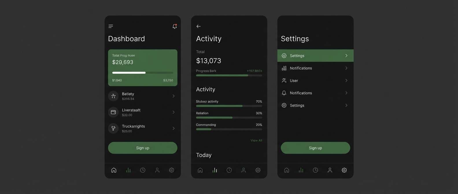
10) Botanical UI Minimal
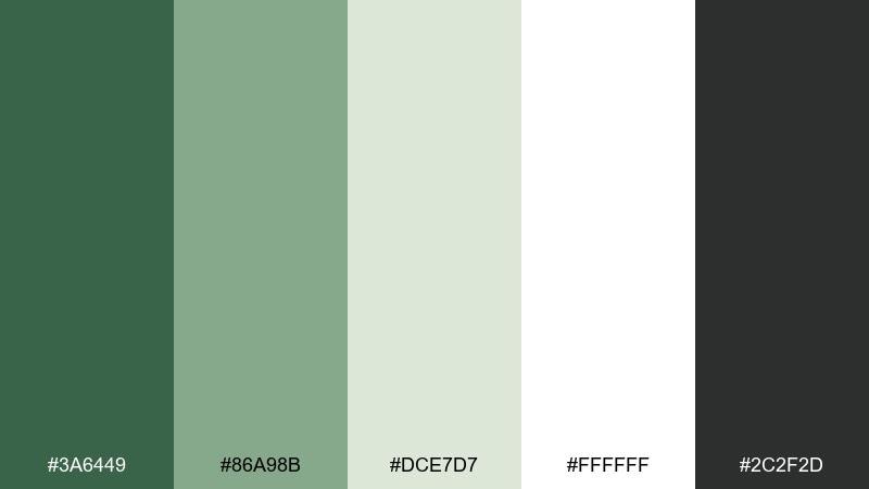
HEX: #3A6449 #86A98B #DCE7D7 #FFFFFF #2C2F2D
Mood: clean, modern, soothing
Best for: health apps and onboarding screens
Clean botanical greens create a soothing, modern interface that still feels human. The near-white and pale green make ideal surfaces for cards, modals, and long-form text. Pair it with rounded components and gentle shadows for a friendly onboarding experience. Usage tip: use the charcoal only for critical text to keep the overall UI soft.
Image example of botanical ui minimal generated using media.io

11) Cottage Garden Paper
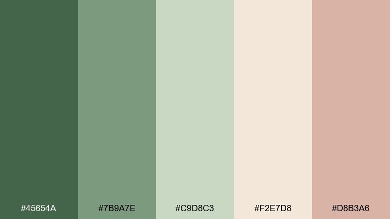
HEX: #45654A #7B9A7E #C9D8C3 #F2E7D8 #D8B3A6
Mood: gentle, handcrafted, romantic
Best for: wedding stationery and thank-you cards
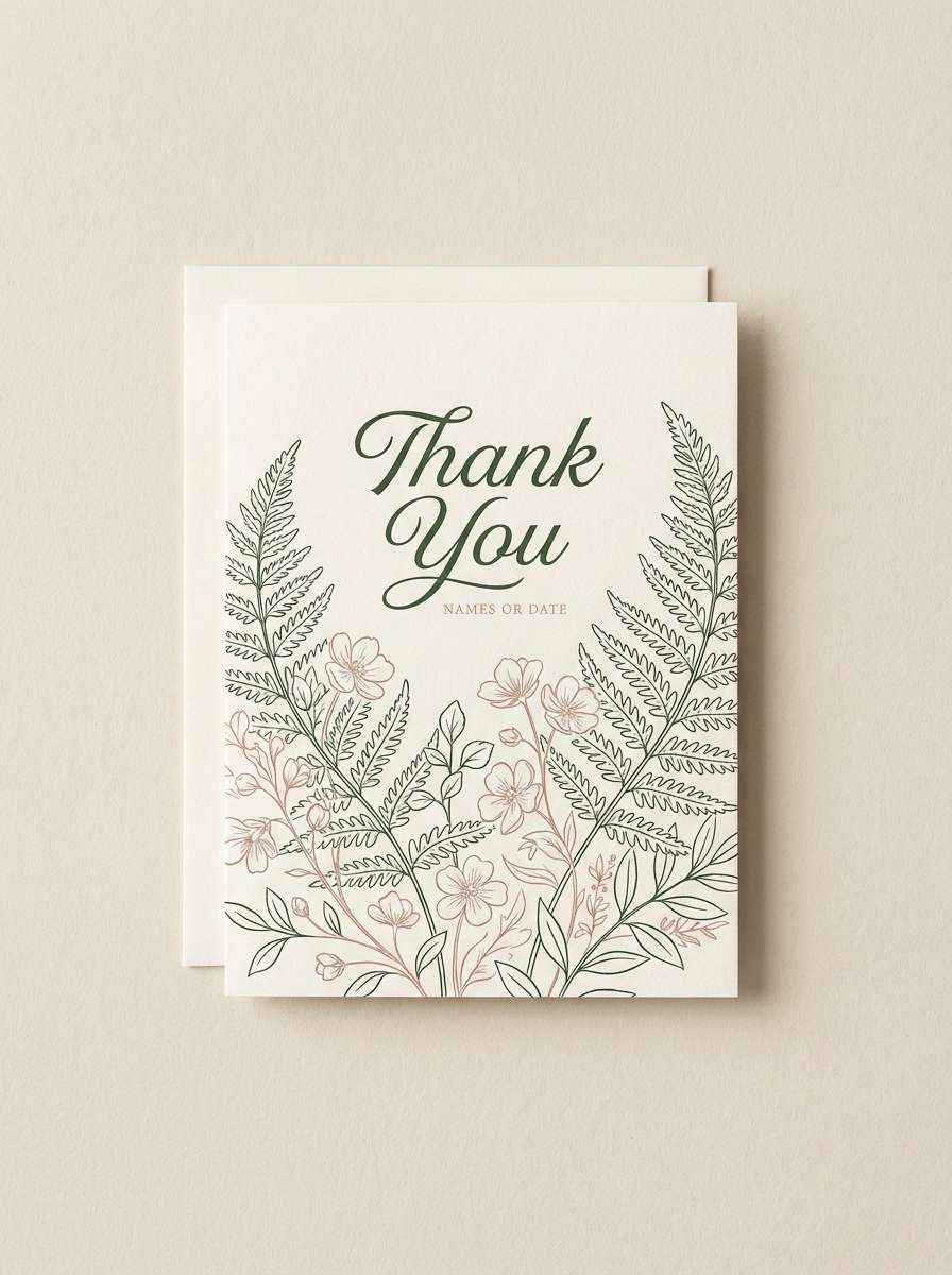
Gentle garden greens with blush paper tones feel handmade and quietly romantic. The warm cream keeps the palette flattering for invitations and letterpress-inspired designs. Pair it with floral line art, deckled edges, and simple monograms for a cottage look. Usage tip: print the blush as a small accent to avoid overpowering the greenery.
Image example of cottage garden paper generated using media.io
12) Alpine Hike Gear
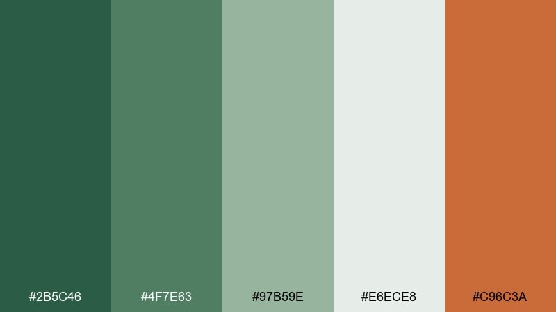
HEX: #2B5C46 #4F7E63 #97B59E #E6ECE8 #C96C3A
Mood: active, rugged, upbeat
Best for: outdoor gear ads and campaign banners
Active alpine greens with a punchy burnt orange feel rugged and energized. The pale gray-green keeps the set from becoming too heavy, making it easy to layer copy over imagery. Pair it with bold condensed type and simple badge shapes for sporty clarity. Usage tip: let the orange mark key CTAs, while greens handle backgrounds and secondary buttons.
Image example of alpine hike gear generated using media.io

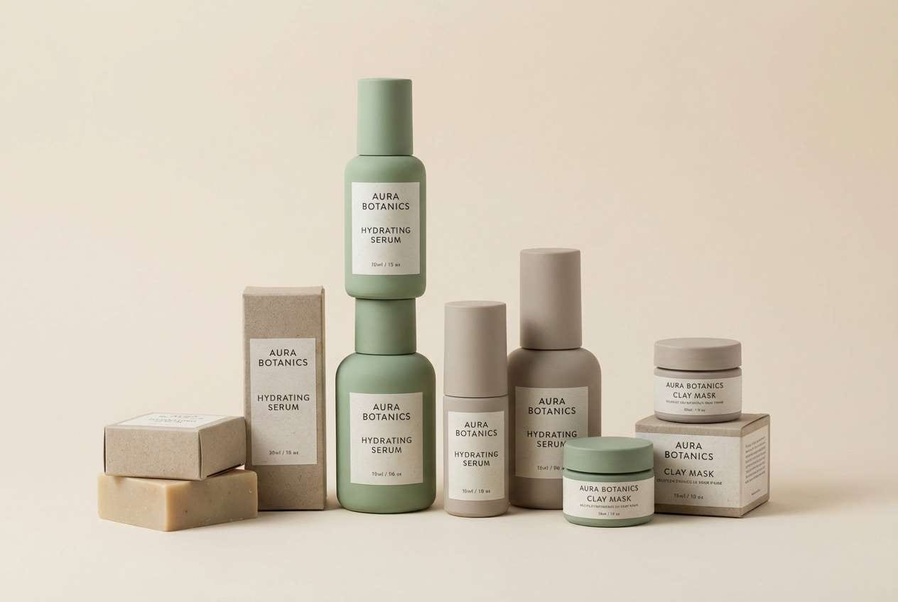
13) Modern Spa Stone
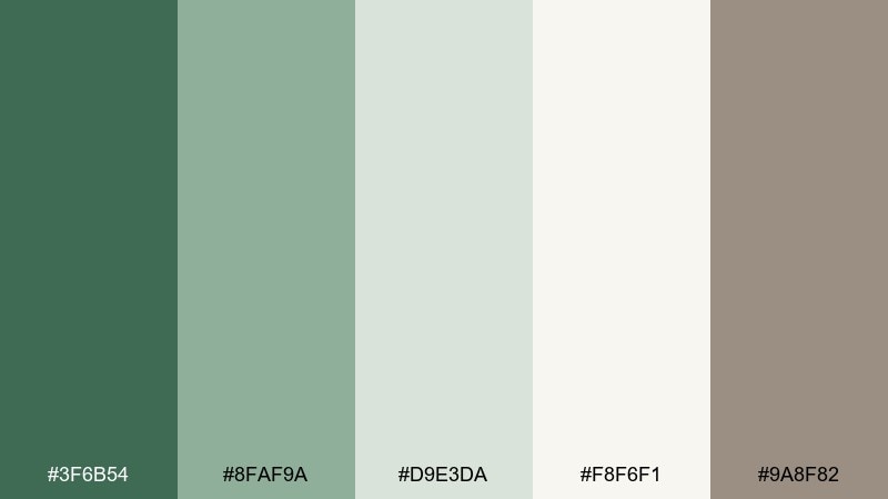
HEX: #3F6B54 #8FAF9A #D9E3DA #F8F6F1 #9A8F82
Mood: spa-like, quiet, refined
Best for: skincare packaging and spa brochures
Spa-like greens with stone neutrals evoke steam, eucalyptus, and a clean tiled room. The warm gray-beige keeps it grounded and prevents the greens from reading too cool. Pair it with minimal product photography and generous margins for an upscale feel. Usage tip: choose one green for labels and keep the rest as soft background tones to maintain calm.
Image example of modern spa stone generated using media.io
14) Olive Fern Contrast
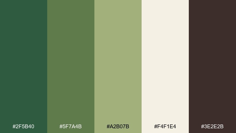
HEX: #2F5B40 #5F7A4B #A2B07B #F4F1E4 #3E2E2B
Mood: bold, earthy, high-contrast
Best for: restaurant branding and signboards
Bold olive-leaning greens with deep espresso brown feel earthy and confident. The creamy neutral keeps the contrast readable for signage, menus, and storefront marks. Pair it with chunky serif type or simple geometric logos for a strong identity. Usage tip: use the darkest brown for outlines and type to keep greens from competing.
Image example of olive fern contrast generated using media.io
15) Sunlit Greenhouse
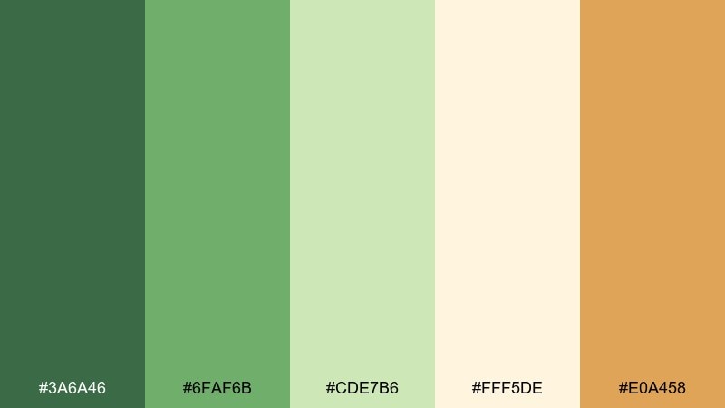
HEX: #3A6A46 #6FAF6B #CDE7B6 #FFF5DE #E0A458
Mood: sunny, lively, optimistic
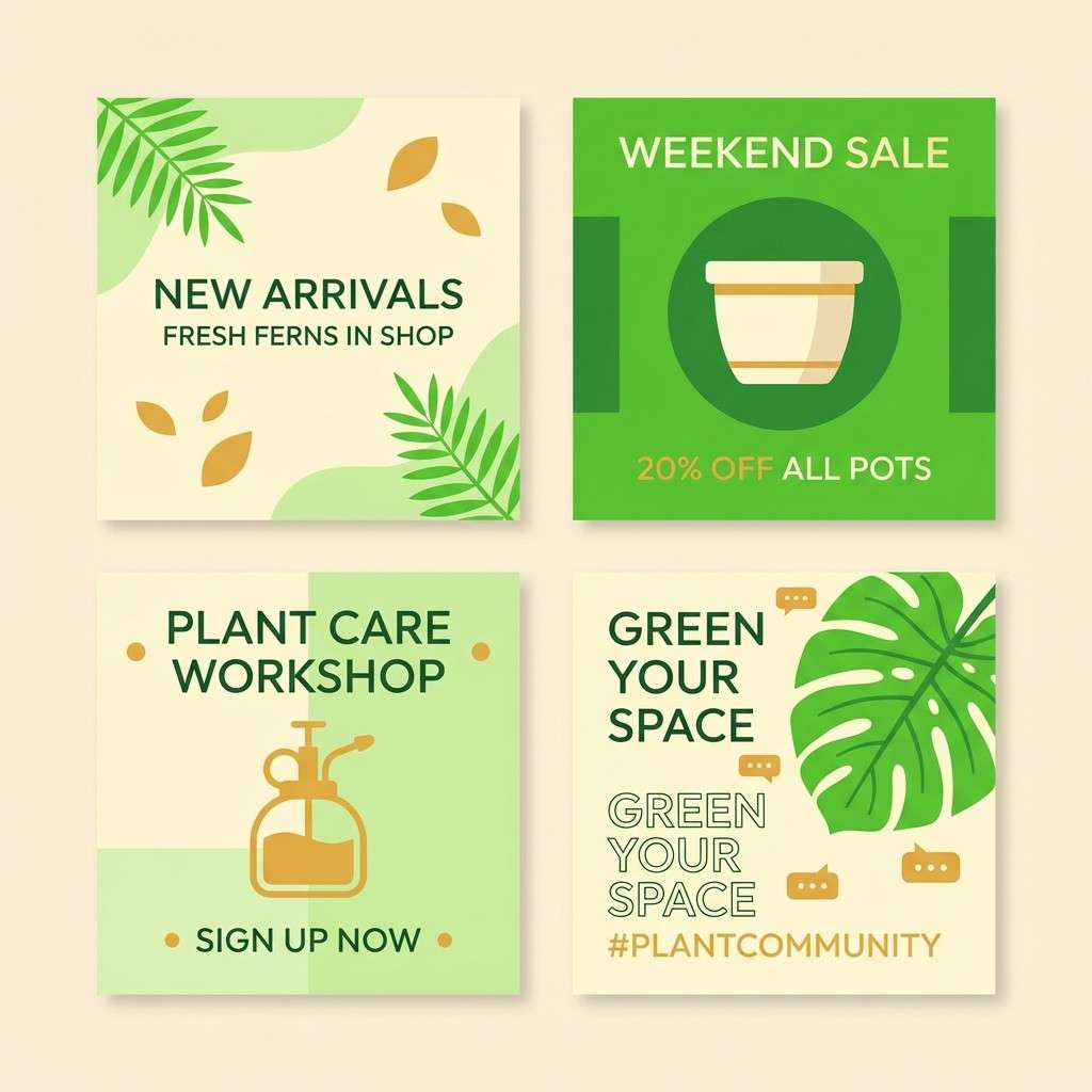
Best for: social media templates for plant shops
Sunny greenhouse greens and warm honey accents feel lively and optimistic. The pale butter background makes posts look bright even when screens are dimmed. Pair it with playful icons, rounded shapes, and simple plant silhouettes for quick recognition. Usage tip: keep text mostly dark green and use the honey tone as a sticker-like highlight.
Image example of sunlit greenhouse generated using media.io
16) Dark Academia Green
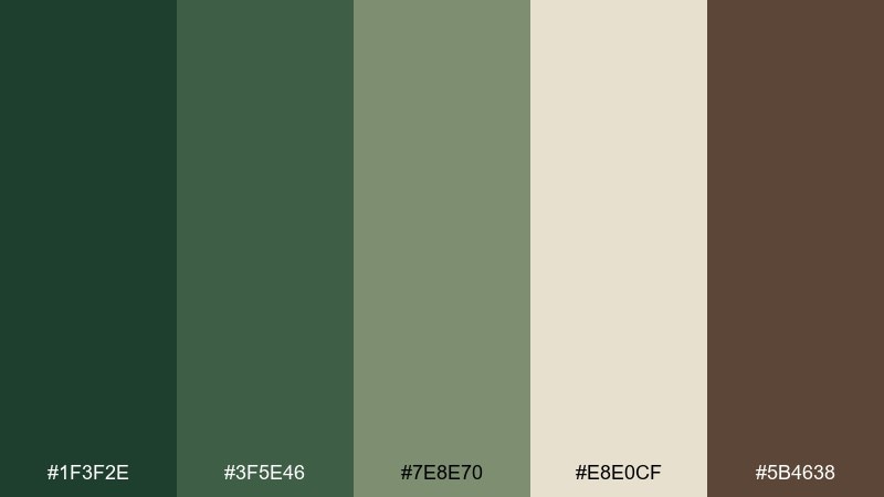
HEX: #1F3F2E #3F5E46 #7E8E70 #E8E0CF #5B4638
Mood: scholarly, moody, classic
Best for: book covers and academic posters
Scholarly dark greens and antique parchment tones evoke libraries, leather spines, and quiet focus. The olive-gray midtone helps gradients and shaded illustrations look intentional rather than flat. This fern color palette pairs well with serif titles, thin rules, and subtle paper grain. Usage tip: set the parchment as the main field and frame it with deep green borders for a classic finish.
Image example of dark academia green generated using media.io
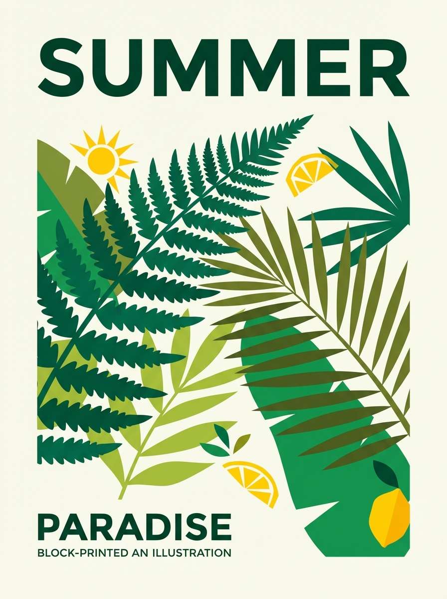
17) Tropical Understory
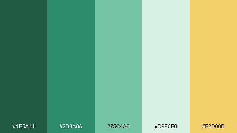
HEX: #1E5A44 #2D8A6A #75C4A6 #D9F0E6 #F2D06B
Mood: lush, vibrant, playful
Best for: summer posters and beverage branding
Lush understory greens with a zesty yellow feel vibrant without going neon. The aqua-leaning greens add a fresh, humid energy that works well for seasonal campaigns. Pair it with bold shapes and illustrated leaves for a playful, modern tropical vibe. Usage tip: let yellow appear in small bursts for emphasis so the greens stay dominant.
Image example of tropical understory generated using media.io
18) Earthy Terracotta Fern
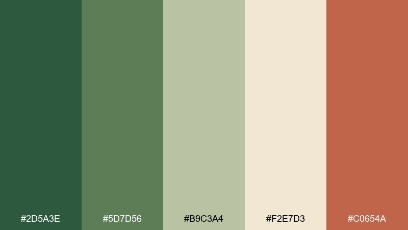
HEX: #2D5A3E #5D7D56 #B9C3A4 #F2E7D3 #C0654A
Mood: artisanal, warm, grounded
Best for: ceramics brands and craft market flyers
Artisanal greens with terracotta warmth evoke clay pots, studio shelves, and leafy cuttings. The dusty light green keeps layouts soft while the earthy red-brown adds personality and depth. These fern color combinations are especially strong for handmade brands that want to feel modern but not sterile. Usage tip: use terracotta for price tags or key icons, and keep greens as the main canvas.
Image example of earthy terracotta fern generated using media.io

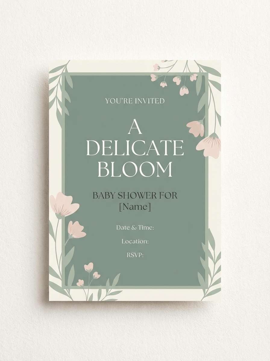
19) Dusty Fern Pastels
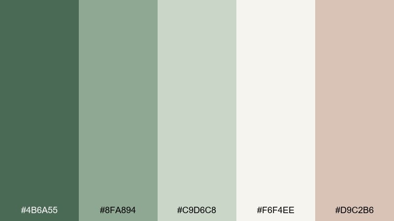
HEX: #4B6A55 #8FA894 #C9D6C8 #F6F4EE #D9C2B6
Mood: soft, airy, gentle
Best for: baby shower invitations and light blog themes
Soft dusty greens with a blush-tinted neutral feel airy and gentle. The palette reads clean on screens and prints beautifully on textured paper. Pair it with delicate illustrations, thin strokes, and light shadows to keep everything calm. Usage tip: keep contrast accessible by using the deepest green for body text when backgrounds are pastel.
Image example of dusty fern pastels generated using media.io
20) Metallic Fern Luxe
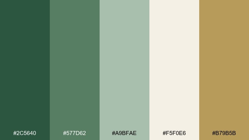
HEX: #2C5640 #577D62 #A9BFAE #F5F0E6 #B79B5B
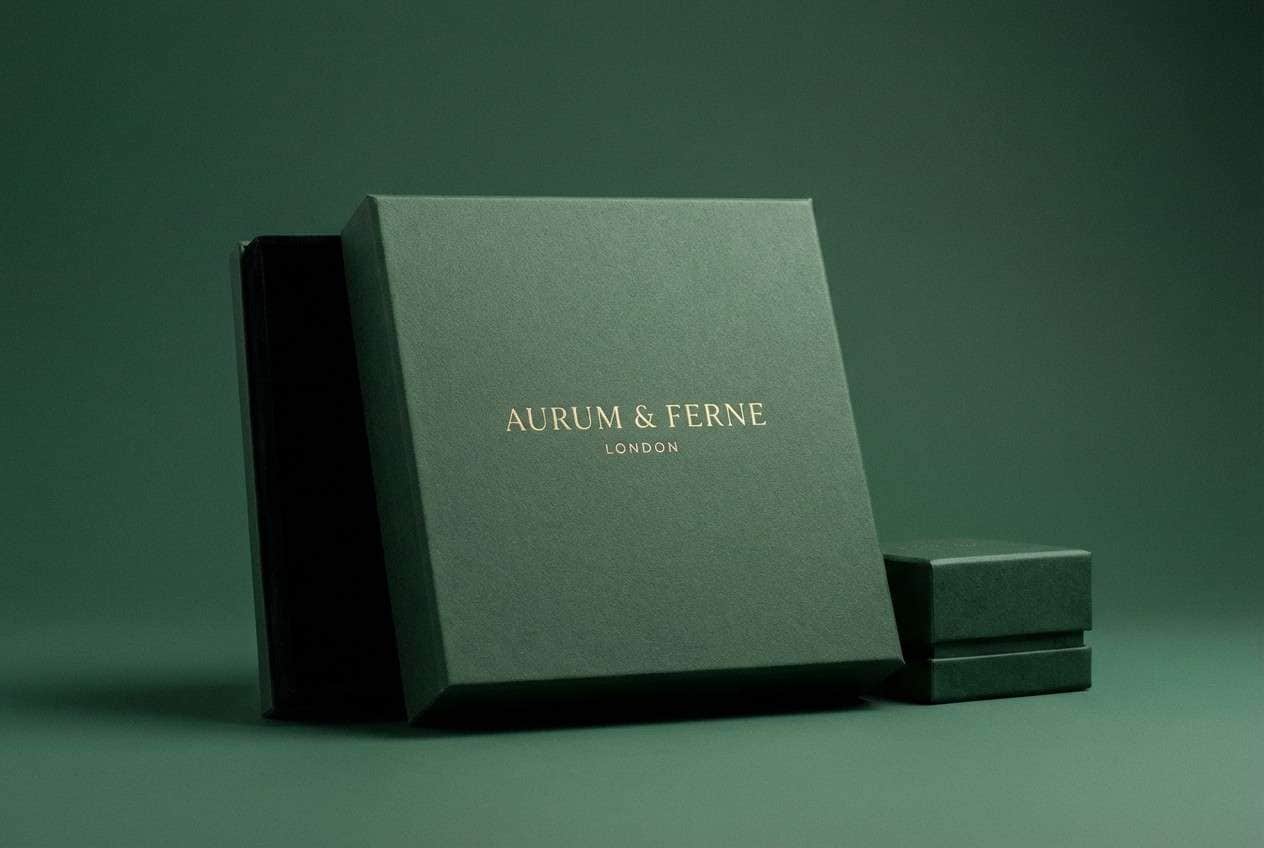
Mood: elegant, premium, polished
Best for: jewelry ads and luxury gift boxes
Elegant greens with a muted gold accent feel polished and premium, like velvet beside brushed brass. The creamy base keeps the look upscale and gives space for product shots and pricing. Pair it with thin sans-serif type, subtle gradients, and metallic foiling for a high-end finish. Usage tip: treat the gold tone as a highlight only, used for borders, icons, or a single callout line.
Image example of metallic fern luxe generated using media.io
What Colors Go Well with Fern?
Fern green pairs especially well with warm, natural neutrals—cream, parchment, beige, taupe, and latte browns—because they keep the palette organic and readable. These combinations are ideal for packaging, interiors, and calming web layouts.
For stronger contrast, use charcoal or espresso brown for typography and outlines, then keep fern tones for fills, cards, and brand blocks. If you want more energy, add a restrained accent like terracotta, honey, peach, or muted gold.
Cool companions can work too: slate gray, misty mint, and pale blue-green push the palette toward editorial or modern UI. The key is to pick one “temperature” direction (warm or cool) and let fern remain the dominant anchor.
How to Use a Fern Color Palette in Real Designs
Start by assigning roles: choose one mid fern as your primary brand color, a deep moss/charcoal for text and buttons, and a light cream/near-white for backgrounds. This gives you a reliable system for pages, ads, and templates.
In UI, keep large surfaces light and use fern in small, repeatable components (tabs, toggles, badges, focus states). In print, fern inks look best with uncoated stocks, subtle grain, and earthy finishes like kraft, emboss, or spot accents.
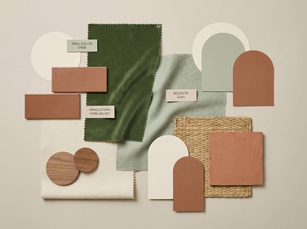
For decor and mood boards, pair fern walls or textiles with warm wood, stone neutrals, and matte ceramics. If the room or layout feels heavy, introduce more cream and reduce the darkest green to just frames, hardware, or typography.
Create Fern Palette Visuals with AI
If you want to see these fern tones in context—labels, UI screens, posters, or invitations—generate mock visuals first. It’s a fast way to validate contrast, mood, and accent balance before you commit to production files.
Reuse the prompts above as a starting point, then swap the layout type (poster, app screen, packaging) and add your brand keywords. Keep the prompt focused on style, lighting, and composition so the palette stays consistent.
With Media.io, you can turn a fern color scheme into polished concept images in minutes, then iterate until the look matches your brand.
Fern Color Palette FAQs
-
What is a fern green color palette?
A fern green color palette is a set of greens inspired by fern leaves—usually muted, natural mid-greens—paired with supporting neutrals (cream, taupe, gray) and one accent color (like terracotta, honey, or gold) for contrast. -
Is fern green warm or cool?
Fern green can be either, depending on the undertone. Yellow-leaning fern reads warmer (more olive), while blue-leaning fern reads cooler (more moss/teal). Check how it looks next to cream (warms up) vs slate gray (cools down). -
What accent colors look best with fern green?
Warm accents like terracotta, caramel, honey, peach, and muted gold create a friendly, organic contrast. For a more restrained look, use charcoal or espresso instead of a bright accent. -
What’s the best background color for fern green designs?
Off-whites and soft creams are the most forgiving backgrounds because they keep fern tones natural and readable. For dark-mode styles, pair fern with near-black and use lighter sage/mist tones for surfaces and dividers. -
How do I keep fern palettes accessible for UI?
Use the darkest green or charcoal for body text, and reserve lighter greens for backgrounds and cards. For buttons, test contrast with white text (or dark text on light buttons) and avoid using mid-green text on pastel green backgrounds. -
Do fern palettes work for luxury branding?
Yes—combine deep moss greens with near-black, creamy neutrals, and a restrained metallic accent (muted gold/brass). Keep typography crisp and spacing generous so the palette feels premium rather than rustic. -
What finish or texture pairs well with fern green in print?
Uncoated paper, subtle grain, and matte finishes complement fern greens and keep them earthy. For upscale projects, use embossing or metallic foiling sparingly with deep fern backgrounds.
Next: Travel Color Palette


