

Byzantine color palettes are built around imperial purples, glowing golds, parchment creams, and deep jewel accents. The result is a rich, historic look that still feels modern in branding, UI, and print.
Below are 20 ready-to-use Byzantine color palette ideas with HEX codes—plus AI image prompts you can copy into Media.io to generate matching visuals fast.
In this article
- Why Byzantine Palettes Work So Well
-
- imperial mosaic
- basilica glow
- pomegranate velvet
- icon painter
- night procession
- plum and pearl
- royal cloisonne
- saffron fresco
- midnight orchid
- antique tapestry
- violet marble
- candlelit nave
- sea glass inlay
- garnet reliquary
- lavender ember
- dusty iconography
- golden halo
- turquoise tesserae
- raisin and linen
- amaranth court
- What Colors Go Well with Byzantine?
- How to Use a Byzantine Color Palette in Real Designs
- Create Byzantine Palette Visuals with AI
Why Byzantine Palettes Work So Well
Byzantine color schemes balance high-status drama (imperial purple, near-black, deep teal) with luminous highlights (gold, ivory, parchment). That contrast creates instant hierarchy—perfect for headlines, hero sections, and premium packaging.
They also feel “crafted” rather than generic: warm neutrals soften the intensity, while jewel accents add a ceremonial, mosaic-like richness. Used thoughtfully, the palette can read historical, modern, or both at once.
Most importantly, Byzantine palettes are versatile across mediums: the dark anchors hold up on screens, while creams and metallic-adjacent tones translate beautifully to print.
20+ Byzantine Color Palette Ideas (with HEX Codes)
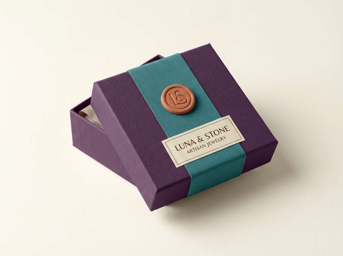
1) Imperial Mosaic
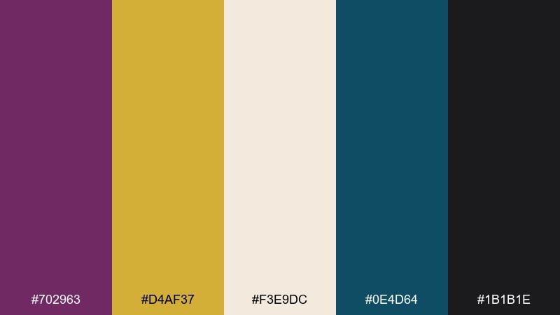
HEX: #702963 #D4AF37 #F3E9DC #0E4D64 #1B1B1E
Mood: regal, sacred, dramatic
Best for: luxury branding and premium packaging
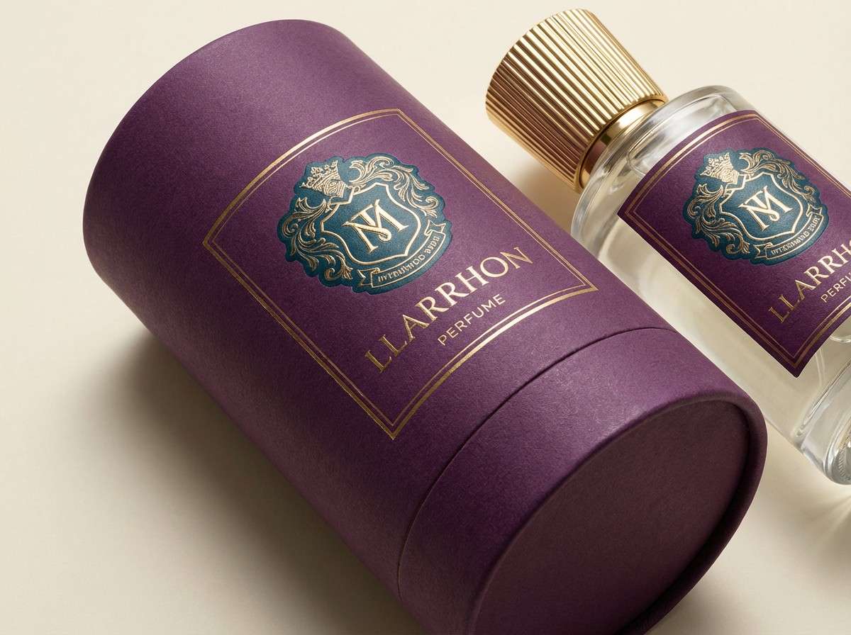
Regal and candlelit, these tones feel like gilded tiles against deep velvet drapery. Use the purple and gold as your main anchors, then let parchment cream soften headlines and backgrounds. Deep teal works best as a controlled accent for seals, ribbons, or small icons. Tip: keep black for fine typography only so the gold stays luminous.
Image example of imperial mosaic generated using media.io
Media.io is an online AI studio for creating and editing video, image, and audio in your browser.

2) Basilica Glow
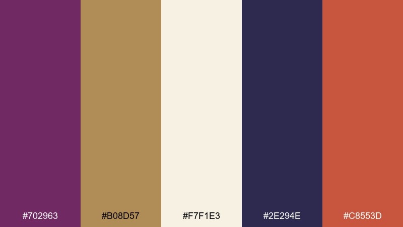
HEX: #702963 #B08D57 #F7F1E3 #2E294E #C8553D
Mood: warm, reverent, inviting
Best for: event posters and cultural flyers
Warm and reverent, it reads like lamplight on stone with a flush of incense-red. These byzantine color combinations shine on posters when you set cream as the base and reserve purple for titles. Bronze keeps the layout sophisticated without overpowering the type. Tip: use the terracotta red only for calls to action and dates to guide the eye.
Image example of basilica glow generated using media.io
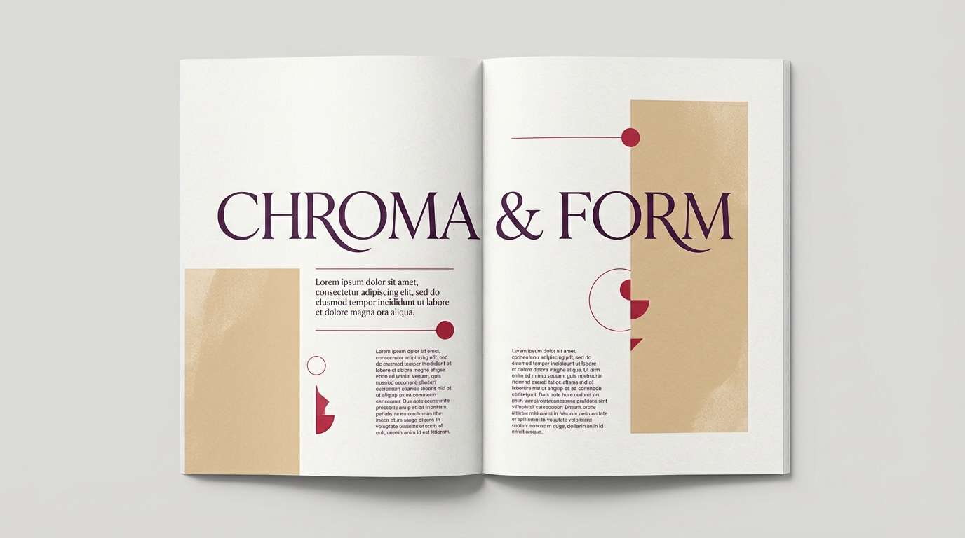
3) Pomegranate Velvet
HEX: #702963 #9E2A2B #F2D0A4 #3D1A2B #E9E5D6
Mood: romantic, rich, editorial
Best for: magazine spreads and lookbook editorials
Romantic and rich, it evokes crushed fruit, velvet curtains, and soft studio light. Use the blushy sand tone for margins and captions to keep the spread airy. Pair the deep plum with restrained pomegranate red for pull quotes and section breaks. Tip: keep imagery warm and low-contrast so the palette feels cohesive across pages.
Image example of pomegranate velvet generated using media.io
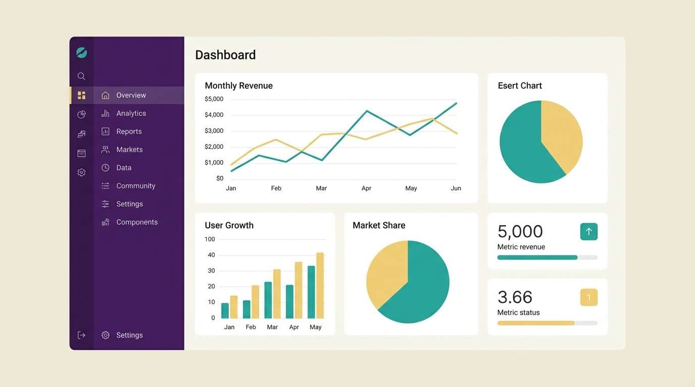
4) Icon Painter
HEX: #702963 #F5EFE6 #1F7A8C #F0C808 #2D2A32
Mood: bold, clean, luminous
Best for: SaaS dashboard UI and data visualizations
Bold and clean, it feels like bright pigment laid onto a dark ground with a halo of light. Keep the interface mostly ivory and charcoal for readability, then deploy purple for navigation and active states. Teal and yellow work best in charts where contrast matters most. Tip: avoid using teal and yellow together on the same element to prevent visual noise.
Image example of icon painter generated using media.io
5) Night Procession
HEX: #702963 #0B1320 #A67C52 #2F2D2E #E6D5B8
Mood: mysterious, cinematic, stately
Best for: film posters and dramatic key art
Mysterious and stately, it brings to mind midnight fabric, brass ornaments, and a soft torchlit glow. Use near-black as the background so the purple can carry the title with authority. Bronze is ideal for laurels, borders, or subtle typography effects. Tip: keep the cream for a single focal highlight, like a tagline or critic quote, to maintain suspense.
Image example of night procession generated using media.io
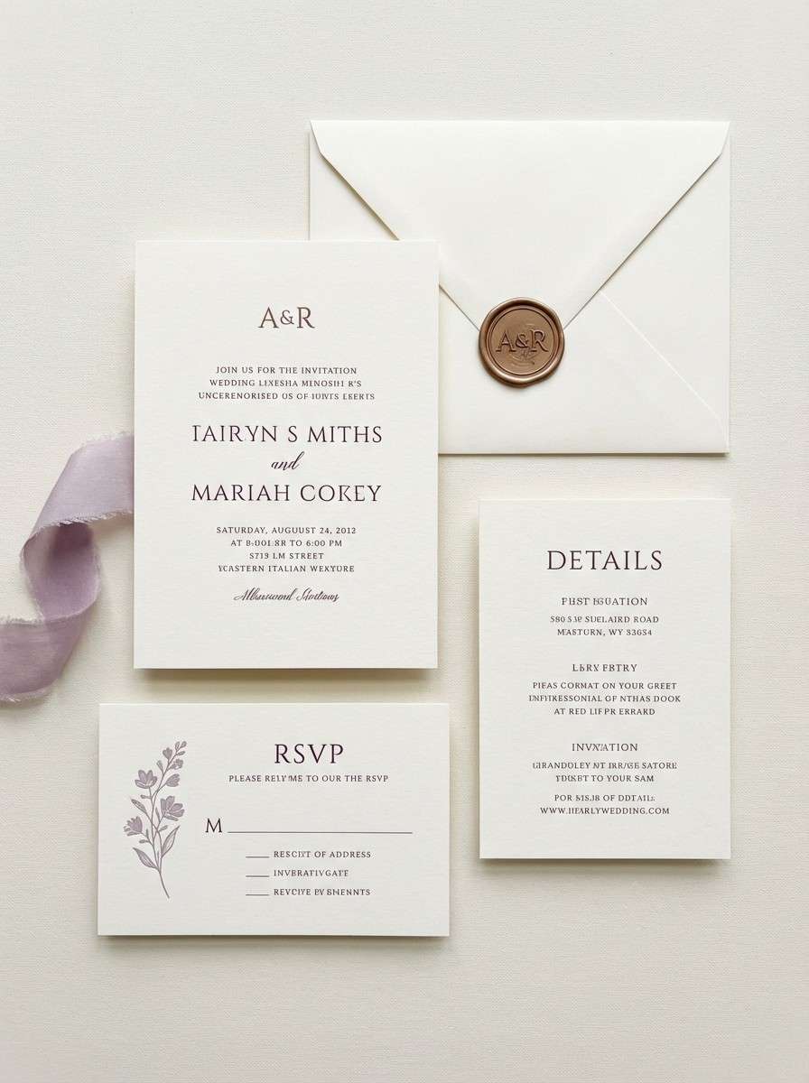
6) Plum and Pearl
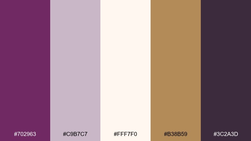
HEX: #702963 #C9B7C7 #FFF7F0 #B38B59 #3C2A3D
Mood: soft, elegant, romantic
Best for: wedding invitations and formal stationery
Soft and elegant, it suggests pearl paper with a plum wax seal and warm metallic touches. Let the creamy white dominate so the layout feels refined and readable. Use muted lilac for supporting type and section dividers, then add bronze sparingly for monograms. Tip: print the plum in a slightly matte finish so the metallic accent can do the shining.
Image example of plum and pearl generated using media.io
7) Royal Cloisonne
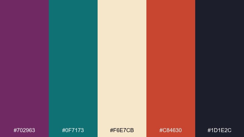
HEX: #702963 #0F7173 #F6E7CB #C84630 #1D1E2C
Mood: ornate, vibrant, confident
Best for: jewelry ads and artisan product launches
Ornate and vibrant, it feels like enamel jewelry set against dark velvet. A byzantine color palette like this works best when you pick one hero tone, then keep the rest as supporting inlays. Use teal for secondary badges and terracotta for price or limited-edition notes. Tip: keep backgrounds creamy and uncluttered so the product stays the focal point.
Image example of royal cloisonne generated using media.io
8) Saffron Fresco
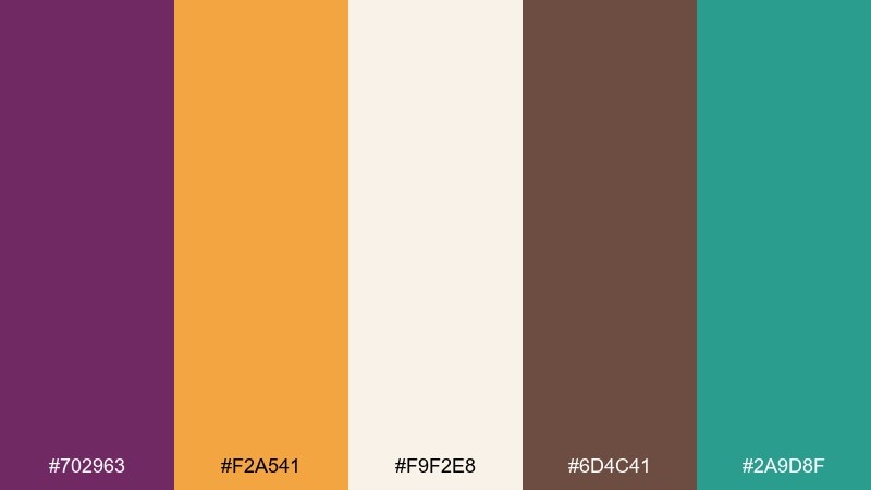
HEX: #702963 #F2A541 #F9F2E8 #6D4C41 #2A9D8F
Mood: sunlit, artisanal, friendly
Best for: cafe menus and small business signage
Sunlit and artisanal, it recalls painted walls, warm bread tones, and a playful splash of green-blue. Use saffron as the eye-catcher for headings and category bars, while cream keeps the menu easy to scan. The deep brown grounds the design and pairs well with hand-drawn icons. Tip: limit purple to logo marks and section titles so the palette stays appetizing.
Image example of saffron fresco generated using media.io
9) Midnight Orchid
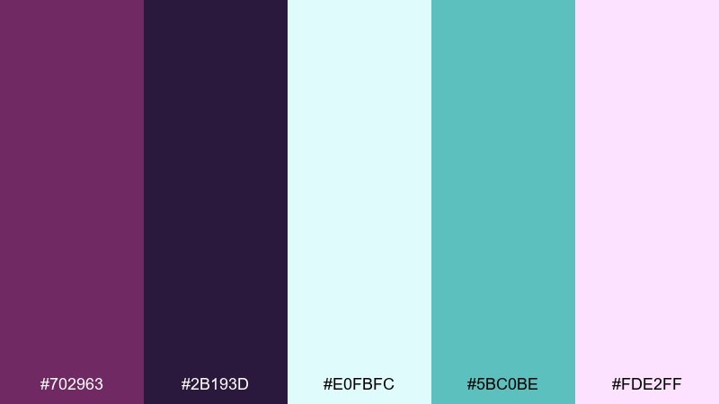
HEX: #702963 #2B193D #E0FBFC #5BC0BE #FDE2FF
Mood: dreamy, modern, high-contrast
Best for: app onboarding screens and landing pages
Dreamy and modern, it looks like orchid petals lit by neon-soft aqua on a night sky. Use the darkest purple for backgrounds to make the pale tints feel luminous. Aqua is perfect for primary buttons, while blush can highlight illustrations or soft gradients. Tip: keep body text on the lightest cyan tint to avoid harsh contrast on dark screens.
Image example of midnight orchid generated using media.io

10) Antique Tapestry
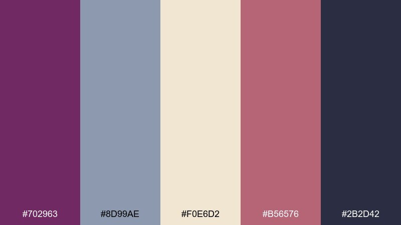
HEX: #702963 #8D99AE #F0E6D2 #B56576 #2B2D42
Mood: heritage, calm, curated
Best for: interior mood boards and lifestyle blogs
Heritage and calm, it feels like a worn textile with muted dye and careful stitching. Keep the linen tone as the dominant canvas for mood boards and blog sections. Dusty slate and charcoal provide structure for headings and grids. Tip: use the rose accent for pins or highlights, not full blocks, to preserve that antique softness.
Image example of antique tapestry generated using media.io
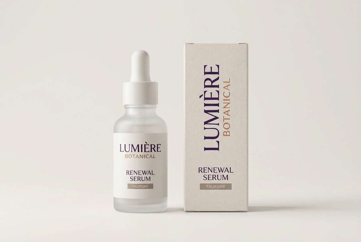
11) Violet Marble
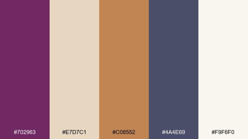
HEX: #702963 #E7D7C1 #C08552 #4A4E69 #F9F6F0
Mood: polished, upscale, serene
Best for: cosmetics packaging and skincare labels
Polished and upscale, it suggests veined marble, warm metal caps, and a quiet vanity glow. Use off-white for the label base and reserve purple for the brand name to feel premium. Bronze and taupe make great supporting typography colors for ingredients and claims. Tip: add one thin purple border line to unify multiple product variants on a shelf.
Image example of violet marble generated using media.io
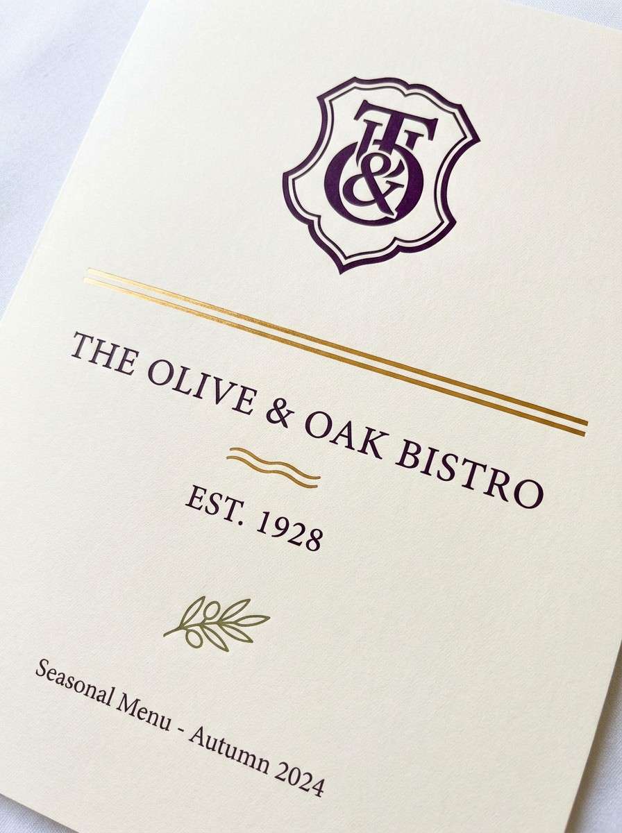
12) Candlelit Nave
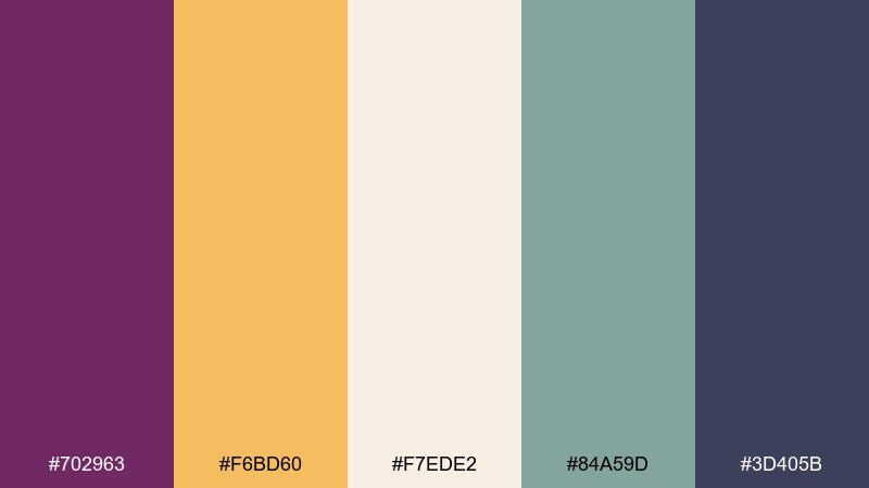
HEX: #702963 #F6BD60 #F7EDE2 #84A59D #3D405B
Mood: cozy, refined, welcoming
Best for: restaurant branding and seasonal menus
Cozy and refined, it evokes candlelight on cream linens with a cool herbal note. Use cream for most surfaces, then bring in purple for the logotype and menu section headers. The muted green adds freshness for vegetarian callouts or icons. Tip: use the honey gold only in small highlights, like separators or star dishes, to avoid looking brassy.
Image example of candlelit nave generated using media.io
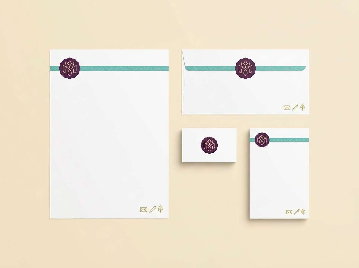
13) Sea Glass Inlay
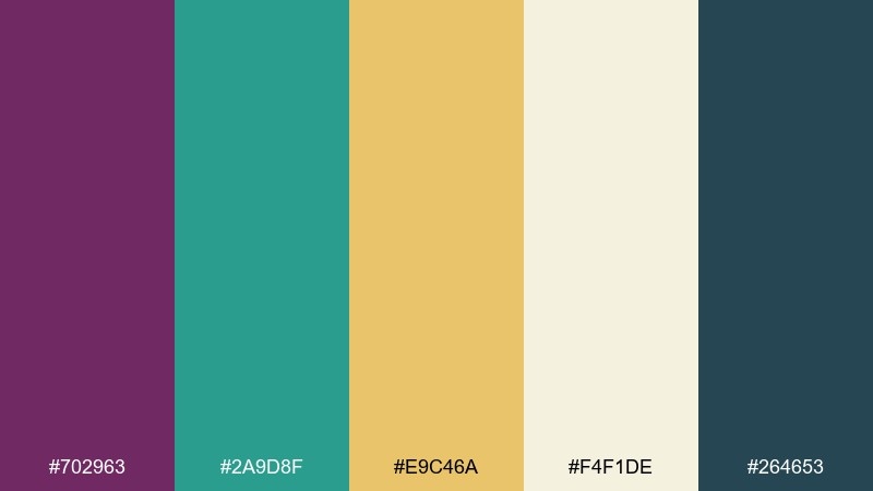
HEX: #702963 #2A9D8F #E9C46A #F4F1DE #264653
Mood: fresh, crafted, coastal
Best for: handmade stationery and boutique branding
Fresh and crafted, it feels like sea glass set into a warm, sunlit border. A byzantine color combination like this stays balanced when cream leads and teal becomes the accent. Use gold as a cheerful highlight for stamps, bullets, or small icons. Tip: keep purple for your logo and one key heading so the coastal notes stay light.
Image example of sea glass inlay generated using media.io
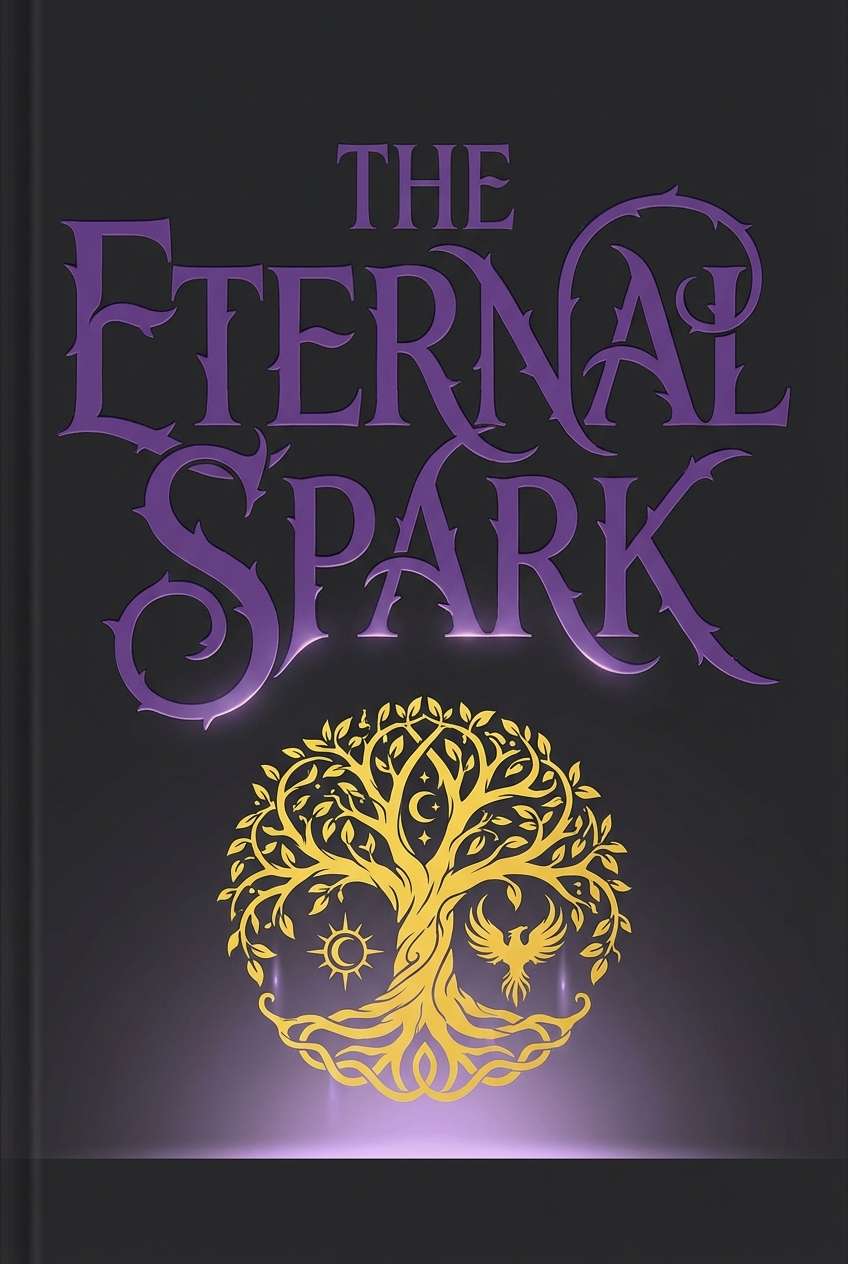
14) Garnet Reliquary
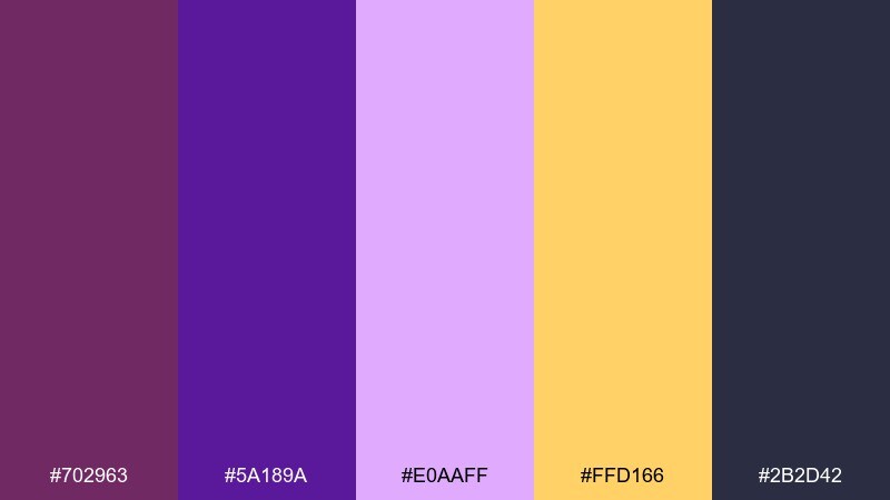
HEX: #702963 #5A189A #E0AAFF #FFD166 #2B2D42
Mood: dramatic, mystical, energetic
Best for: fantasy book covers and album art
Dramatic and mystical, it reads like gemstones glowing in a dark cabinet. Use charcoal as the backdrop so the lilac highlight can create depth around the title. Golden yellow is a strong spotlight for award seals or a single symbol. Tip: avoid long paragraphs in the light lavender and keep it to display type for better contrast.
Image example of garnet reliquary generated using media.io
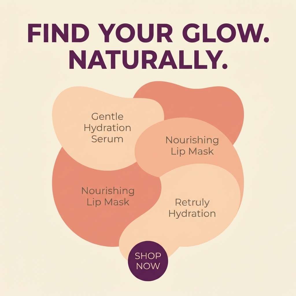
15) Lavender Ember
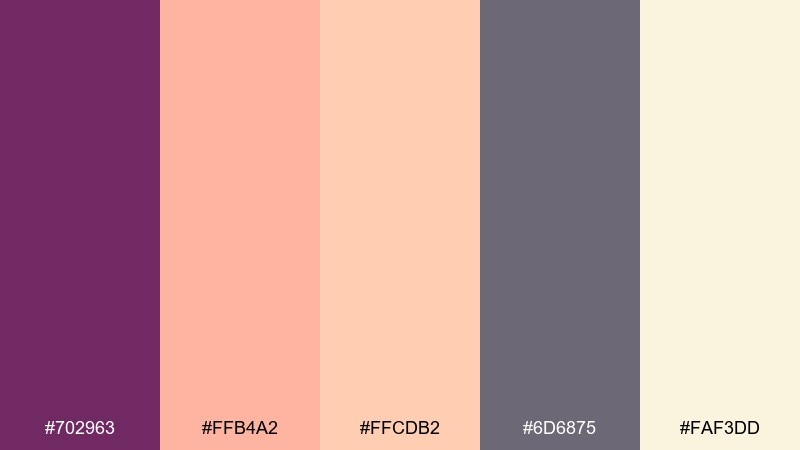
HEX: #702963 #FFB4A2 #FFCDB2 #6D6875 #FAF3DD
Mood: playful, warm, modern
Best for: social media ads and lifestyle promos
Playful and warm, it feels like soft lavender smoke with peachy highlights. Use the pale cream as your background to keep posts bright and scroll-stopping. Purple works well for the brand handle and key price points, while gray grounds secondary copy. Tip: choose one peach tone per layout so the message stays crisp.
Image example of lavender ember generated using media.io
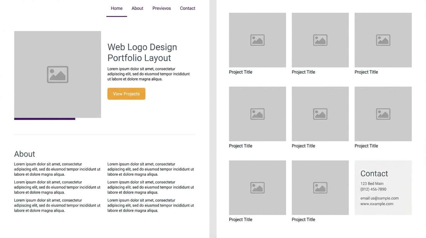
16) Dusty Iconography
HEX: #702963 #CBD5E1 #F8FAFC #475569 #F59E0B
Mood: minimal, professional, approachable
Best for: portfolio websites and case study pages
Minimal and professional, it suggests crisp paper, muted shadows, and a confident pop of amber. Keep the page mostly white and slate so content stays readable and polished. Use purple for links and hover states, and reserve amber for one primary button per view. Tip: set charts in slate tones first, then add purple only to highlight key metrics.
Image example of dusty iconography generated using media.io
17) Golden Halo
HEX: #702963 #F4D35E #EE964B #FAF0CA #0D3B66
Mood: uplifting, ceremonial, radiant
Best for: anniversary flyers and community announcements
Uplifting and radiant, it feels like a warm halo against a cool, dignified blue. Use the cream as your base to keep flyers friendly and legible. Purple and navy should handle the typography hierarchy, while the two golds add celebratory emphasis. Tip: keep gradients subtle or skip them entirely to preserve a classic, ceremonial look.
Image example of golden halo generated using media.io

18) Turquoise Tesserae
HEX: #702963 #1D9BF0 #17BEBB #F6F7EB #2E282A
Mood: bright, modern, high-energy
Best for: ceramics packaging and artisan shop ads
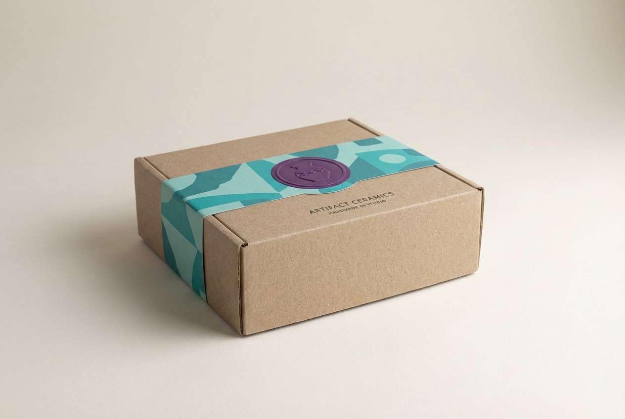
Bright and high-energy, it recalls glossy tiles with a punchy turquoise sparkle. In a byzantine color scheme like this, let off-white carry the label space and use purple for the brand mark. Keep the two blue-greens for pattern bands, stickers, or secondary panels. Tip: avoid using both turquoise tones at full saturation on large areas, and balance with charcoal text for clarity.
Image example of turquoise tesserae generated using media.io
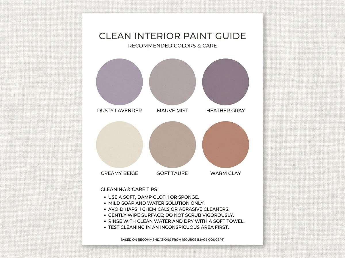
19) Raisin and Linen
HEX: #702963 #6B5B95 #D6CCC2 #F5F1ED #3A3335
Mood: quiet, cozy, timeless
Best for: interior paint guides and decor branding
Quiet and timeless, it feels like linen upholstery with a raisin-toned throw. Keep the two light neutrals as the main wall or webpage background for a calm, airy mood. Use the deeper purple tones on accent walls, buttons, or trim details. Tip: pick one dark tone for hardware and typography so the space does not feel heavy.
Image example of raisin and linen generated using media.io
20) Amaranth Court
HEX: #702963 #A4133C #FFDDD2 #B7B7A4 #2C2A4A
Mood: fashion-forward, bold, romantic
Best for: fashion lookbooks and brand campaigns
Fashion-forward and bold, it suggests amaranth lipstick, blush silk, and a dark, tailored backdrop. Use blush as the page base for lookbooks to keep images and headlines feeling editorial. Pair the deep purple with amaranth for strong section dividers and callout text. Tip: keep the sage-gray as a quiet neutral for size charts and fine print so the campaign still feels luxe.
Image example of amaranth court generated using media.io
What Colors Go Well with Byzantine?
Byzantine pairs best with warm metallics (gold, bronze, saffron) and soft neutrals (ivory, parchment, linen). These tones keep imperial purple from feeling too heavy while preserving a premium, historic mood.
For contrast, add deep anchors like charcoal, near-black, or navy to sharpen typography and UI elements. If you want a fresher modern twist, a controlled teal or turquoise accent can brighten the palette without losing the “mosaic” feel.
In practice, choose one hero purple, one light neutral, and one accent (gold or teal). Then use darker supporting tones for structure, borders, and readable text.
How to Use a Byzantine Color Palette in Real Designs
Start with hierarchy: use cream/ivory as the main background, purple for brand marks and headings, and gold as the “spotlight” for key actions (buttons, badges, prices, dates). This keeps the look luxurious without becoming cluttered.
For UI, reserve the most saturated tones for states (active nav, highlights, chart emphasis) and keep the rest calm and readable. In print, mimic Byzantine richness by pairing deep purple with generous whitespace and one warm metallic-adjacent highlight.
To avoid visual noise, limit yourself to one bright accent per layout and repeat it consistently. The magic of a Byzantine color scheme is restraint—rich colors, but disciplined placement.
Create Byzantine Palette Visuals with AI
If you’re building a brand board, landing page mock, or packaging concept, you can generate on-style visuals from a single prompt. Use the example prompts above, then swap in your product type (app, flyer, label) and keep the same palette cues.
Media.io makes it easy to iterate: generate multiple compositions, adjust lighting and background, and quickly compare which Byzantine color combinations feel most premium for your use case.
When your palette is set, export visuals for presentations, social posts, and design handoffs—so your colors stay consistent from concept to production.
Byzantine Color Palette FAQs
-
What is a Byzantine color palette?
A Byzantine color palette typically centers on imperial purple and pairs it with luminous golds, parchment-like creams, and deep jewel accents (teal, navy, near-black) for a regal, mosaic-inspired look. -
Is Byzantine the same as imperial purple?
Not exactly. Imperial purple is often the hero color, but a Byzantine palette is the full scheme around it—usually including gold, ivory/cream, and darker anchors that create dramatic contrast. -
What colors complement Byzantine purple best?
Gold and bronze are classic complements for a luxury feel, while ivory and linen keep layouts readable. Teal/turquoise can add a modern edge when used as a controlled accent. -
How do I use a Byzantine color scheme in UI design?
Use light neutrals for the main surfaces, purple for navigation and active states, and a single accent (gold or teal) for highlights and charts. Keep near-black/charcoal for text to maintain accessibility. -
Can Byzantine palettes work for modern brands?
Yes—especially for premium, cultural, beauty, or artisan brands. The key is to use the jewel tones sparingly and rely on clean typography and generous whitespace to keep it contemporary. -
How do I keep a purple and gold palette from looking too busy?
Limit gold to small “spark” elements (badges, separators, icons) and let a cream background do most of the work. Use one dark anchor (charcoal or navy) for text and structure. -
What’s the best background for Byzantine colors?
For airy designs, choose cream/ivory. For cinematic designs, choose near-black or deep purple, then use gold and pale tints for focal highlights and readable type.


