

Mantis is a lively yellow-green that instantly signals freshness, growth, and modern energy. It’s bright enough to feel optimistic, but flexible enough to work in calm, minimal layouts.
Below are 20 mantis color palette ideas with HEX codes, plus practical guidance for branding, UI, and print so you can use these greens with confidence.
In this article
- Why Mantis Palettes Work So Well
-
- fresh meadow
- lime sherbet
- sage studio
- bamboo and sand
- minty minimal ui
- citrus leaf pop
- rainforest editorial
- spring botanical wash
- matcha latte
- emerald night accent
- greenhouse branding
- aloe and clay
- pistachio pastel
- olive drift
- seafoam tech
- herbal spa calm
- art deco green
- forest and fog
- chartreuse spotlight
- stone garden modern
- What Colors Go Well with Mantis?
- How to Use a Mantis Color Palette in Real Designs
- Create Mantis Palette Visuals with AI
Why Mantis Palettes Work So Well
Mantis green sits in that “fresh-but-punchy” zone between natural leaf greens and neon chartreuse. That makes it easy to grab attention while still feeling organic and approachable.
It also pairs beautifully with crisp neutrals (white, cream, stone) that prevent the green from overpowering the layout. Add a deep green-black for typography, and you get instant structure and readability.
Finally, mantis handles accents extremely well: warm yellows feel sunny, corals add friendly energy, and purples introduce a modern twist. With the right balance, it can look calm, premium, playful, or bold.
20+ Mantis Color Palette Ideas (with HEX Codes)
1) Fresh Meadow
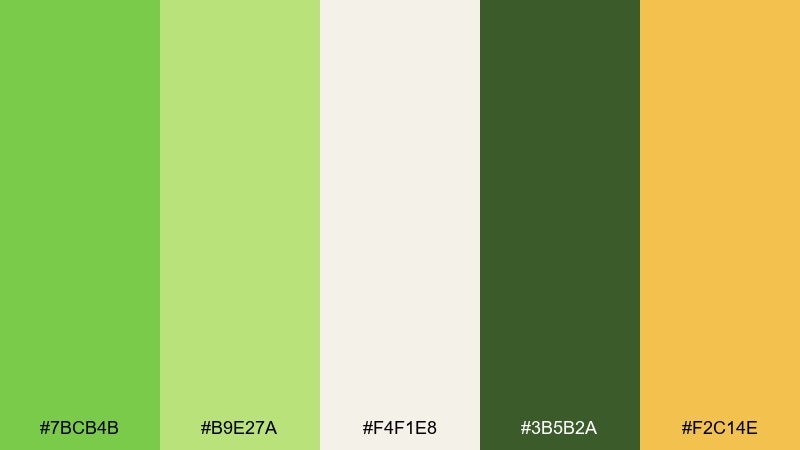
HEX: #7BCB4B #B9E27A #F4F1E8 #3B5B2A #F2C14E
Mood: bright, outdoorsy, optimistic
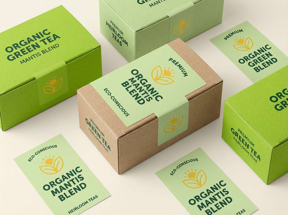
Best for: organic tea packaging
Bright meadow greens feel sunlit and clean, like new grass after a spring rain. Use the light green for the main field color, then ground the design with the deep leaf tone for type and badges. Cream keeps the look natural, while the warm yellow adds a friendly highlight for icons or flavor notes. Tip: print the darkest green slightly richer to avoid it turning muddy on matte paper.
Image example of fresh meadow generated using media.io
Media.io is an online AI studio for creating and editing video, image, and audio in your browser.

2) Lime Sherbet
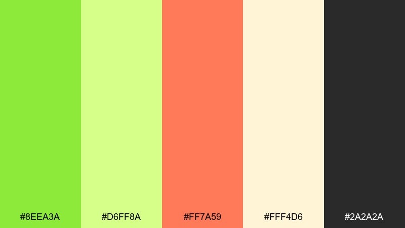
HEX: #8EEA3A #D6FF8A #FF7A59 #FFF4D6 #2A2A2A
Mood: playful, zesty, youthful
Best for: social media ad banner
Zesty lime and sherbet tones read like fizzy candy and summer pop. These mantis color combinations work best when you let the neon-leaning green lead, then use coral as the punchy call to action. Cream softens the contrast, and charcoal keeps headlines crisp on small screens. Tip: keep coral to one button or price tag so the banner stays fresh, not chaotic.
Image example of lime sherbet generated using media.io

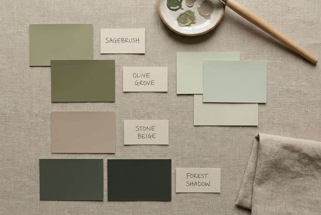
3) Sage Studio
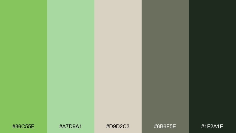
HEX: #86C55E #A7D9A1 #D9D2C3 #6B6F5E #1F2A1E
Mood: calm, refined, modern
Best for: interior paint mood board
Soft studio greens feel composed and architectural, like a quiet design showroom. Pair the mid green with warm stone neutrals for walls, fabrics, and trim swatches that still feel contemporary. The dark near-black green makes a strong anchor for captions and room labels without looking harsh. Tip: use the pale green as a large chip to preview how it shifts in natural vs warm indoor lighting.
Image example of sage studio generated using media.io
4) Bamboo and Sand
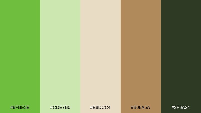
HEX: #6FBE3E #CDE7B0 #E8DCC4 #B08A5A #2F3A24
Mood: natural, grounded, resort-like
Best for: eco resort brochure cover
Bamboo greens with sandy neutrals evoke shaded pathways and woven textures. Let the sand and tan tones dominate the background for an airy, premium feel, then layer the greens in headers and section dividers. The dark green works well for small copy and navigation marks because it stays readable on warm paper. Tip: add subtle grain or recycled-paper texture to reinforce the organic theme without dulling the greens.
Image example of bamboo and sand generated using media.io
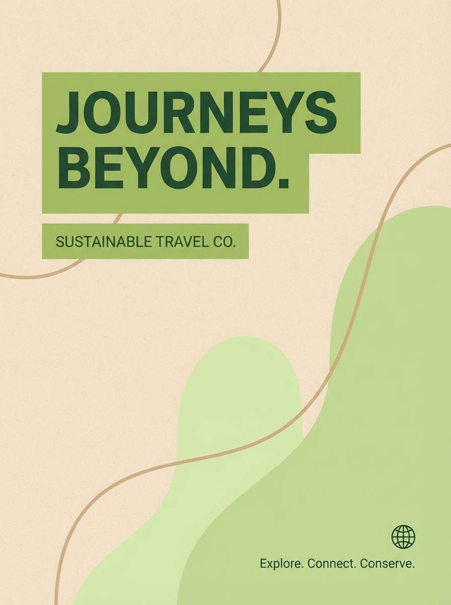
5) Minty Minimal UI
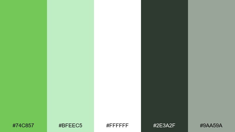
HEX: #74C857 #BFEEC5 #FFFFFF #2E3A2F #9AA59A
Mood: clean, friendly, trustworthy
Best for: finance dashboard UI
Minty greens feel crisp and reassuring, like a fresh start and clear balances. This mantis color palette shines when you keep the interface mostly white, then use the brighter green for primary actions and success states. Charcoal and soft gray-green keep charts and labels readable while still feeling gentle. Tip: reserve the brightest green for one main button per screen to maintain hierarchy.
Image example of minty minimal ui generated using media.io
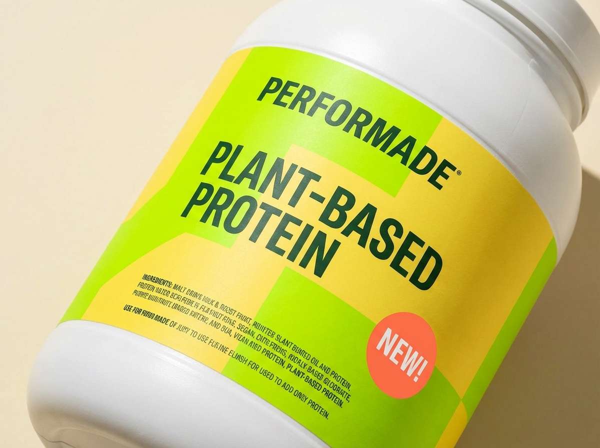
6) Citrus Leaf Pop
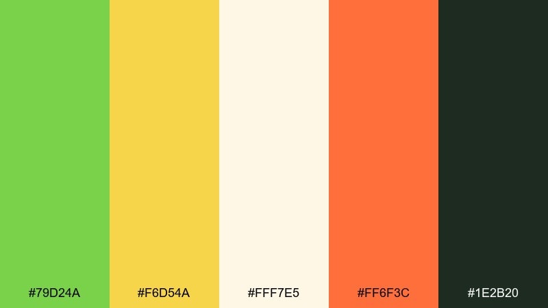
HEX: #79D24A #F6D54A #FFF7E5 #FF6F3C #1E2B20
Mood: energetic, sporty, sunny
Best for: sports nutrition product label
Citrus greens and golden yellow feel like a squeeze of lime over bright sunlight. Use the yellow for flavor cues and the green for the main brand block, then bring in coral sparingly for warnings, new badges, or limited-edition tags. The dark green keeps ingredients and serving info legible without a stark black. Tip: keep the cream as breathing room so the label does not feel overly loud.
Image example of citrus leaf pop generated using media.io
7) Rainforest Editorial
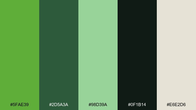
HEX: #5FAE39 #2D5A3A #98D39A #0F1B14 #E6E2D6
Mood: lush, dramatic, premium
Best for: magazine spread layout
Deep rainforest greens feel cinematic and layered, like shadowy canopies with a soft mist. This mantis color scheme works beautifully for editorial pages when you use the pale green for pull quotes and the dark greens for grids, rules, and headlines. Warm off-white keeps the layout readable and adds a print-like softness. Tip: set body text in near-black green for a refined look that is easier on the eyes than pure black.
Image example of rainforest editorial generated using media.io
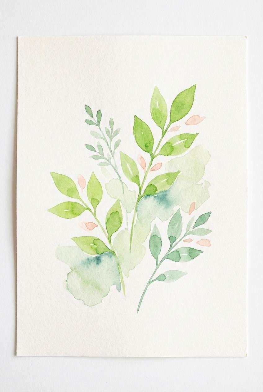
8) Spring Botanical Wash
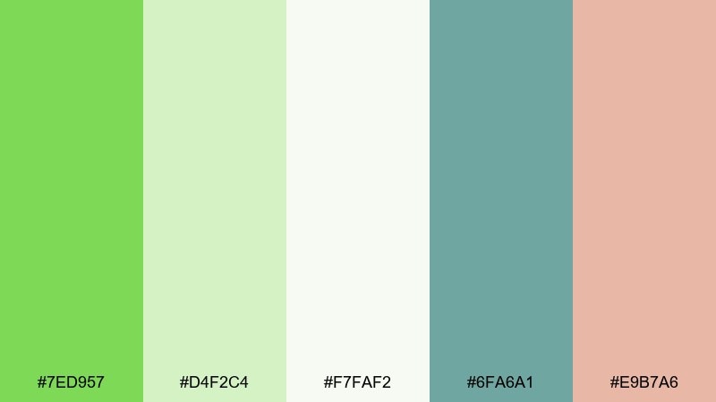
HEX: #7ED957 #D4F2C4 #F7FAF2 #6FA6A1 #E9B7A6
Mood: airy, gentle, fresh
Best for: botanical watercolor wall print
Watery spring greens look soft and breathable, like leaves painted with a light brush. Let the pale green and off-white carry most of the space, then add teal-green for stems or shadows to keep the illustration dimensional. The blush accent adds a delicate floral touch without stealing focus. Tip: keep edges slightly imperfect so the wash effect stays natural and not overly digital.
Image example of spring botanical wash generated using media.io
9) Matcha Latte
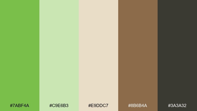
HEX: #7ABF4A #C9E6B3 #E9DDC7 #8B6B4A #3A3A32
Mood: cozy, earthy, cafe-like
Best for: cafe menu design
Matcha greens and latte browns feel comforting, like warm ceramics and steamed milk. Use the cream and light green as the menu base, then set headings in espresso brown for a handcrafted vibe. The deeper neutral keeps prices and footnotes sharp without feeling corporate. Tip: add small green icons for dietary labels so scanning is quick and friendly.
Image example of matcha latte generated using media.io
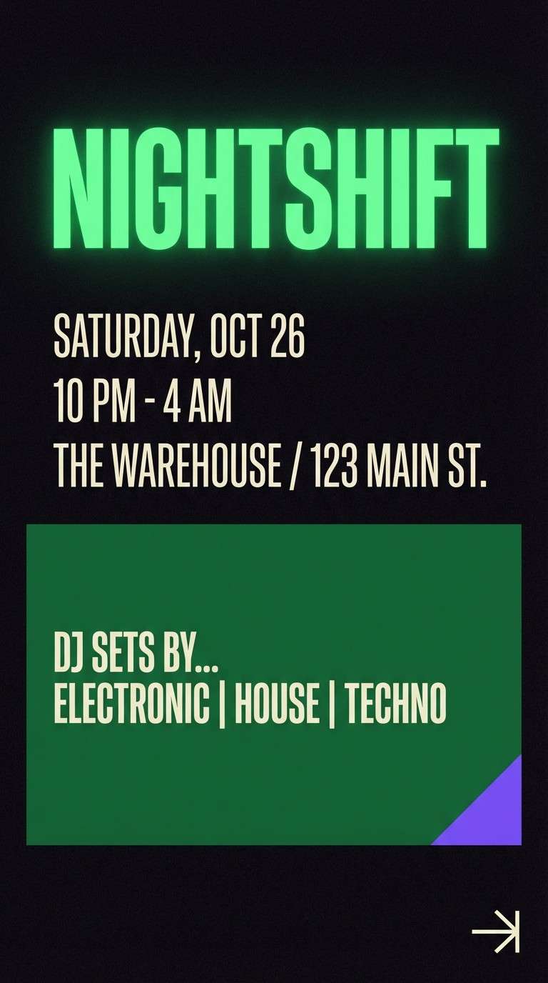
10) Emerald Night Accent
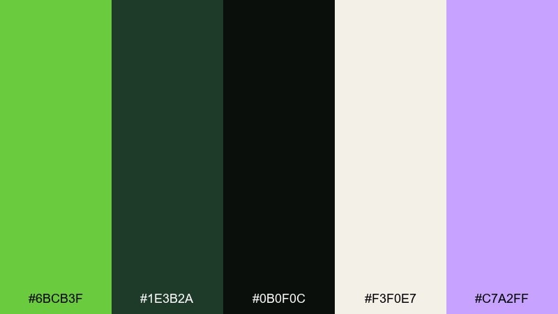
HEX: #6BCB3F #1E3B2A #0B0F0C #F3F0E7 #C7A2FF
Mood: moody, futuristic, high-contrast
Best for: nightlife event poster
Neon-leaning green against near-black feels electric, like club lights cutting through the dark. Keep the background deep and let the bright green handle the main title, then use off-white for details to protect readability. A small violet accent adds an unexpected twist that feels modern and premium. Tip: avoid thin strokes in green on black and use bold weights to prevent flicker on screens.
Image example of emerald night accent generated using media.io
11) Greenhouse Branding
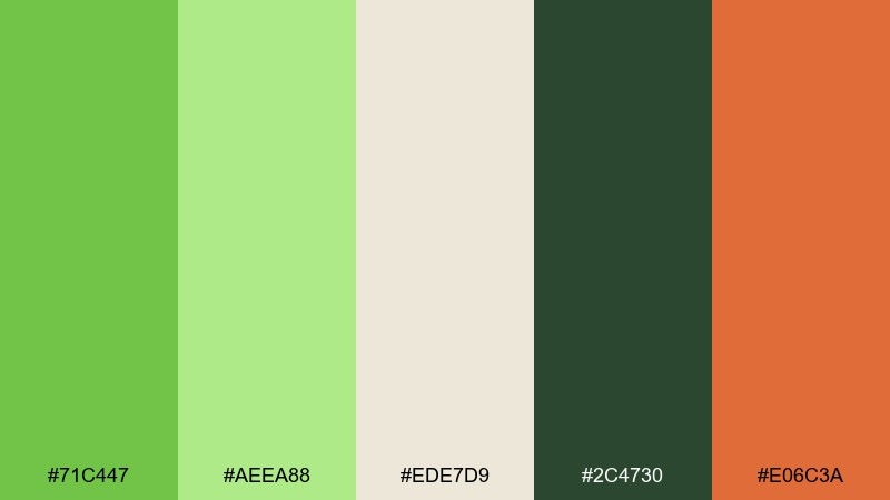
HEX: #71C447 #AEEA88 #EDE7D9 #2C4730 #E06C3A
Mood: fresh, welcoming, craft-forward
Best for: startup brand kit presentation
Greenhouse greens feel lively and entrepreneurial, like plants in bright window light. This mantis color palette pairs well with warm cream for slides, then uses the deep green for logotypes and supporting text. Coral is best as a single energetic accent for buttons, highlights, or key metrics. Tip: keep the light green to background shapes so the main green stays the recognizable brand cue.
Image example of greenhouse branding generated using media.io
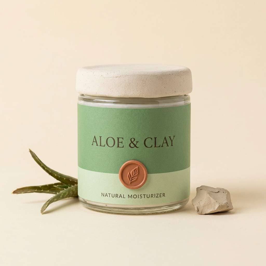
12) Aloe and Clay
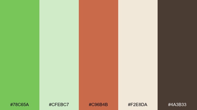
HEX: #78C65A #CFEBC7 #C96B4B #F2E8DA #4A3B33
Mood: earthy, artisan, soothing
Best for: skincare jar packaging
Aloe greens with clay and cocoa tones feel grounded, like natural skincare made in small batches. Use the warm cream for the label base, then set the brand name in dark brown for an organic, tactile look. The clay accent gives a friendly pop for variant names while the greens signal freshness. Tip: choose uncoated stock so the palette reads soft and botanical rather than glossy.
Image example of aloe and clay generated using media.io
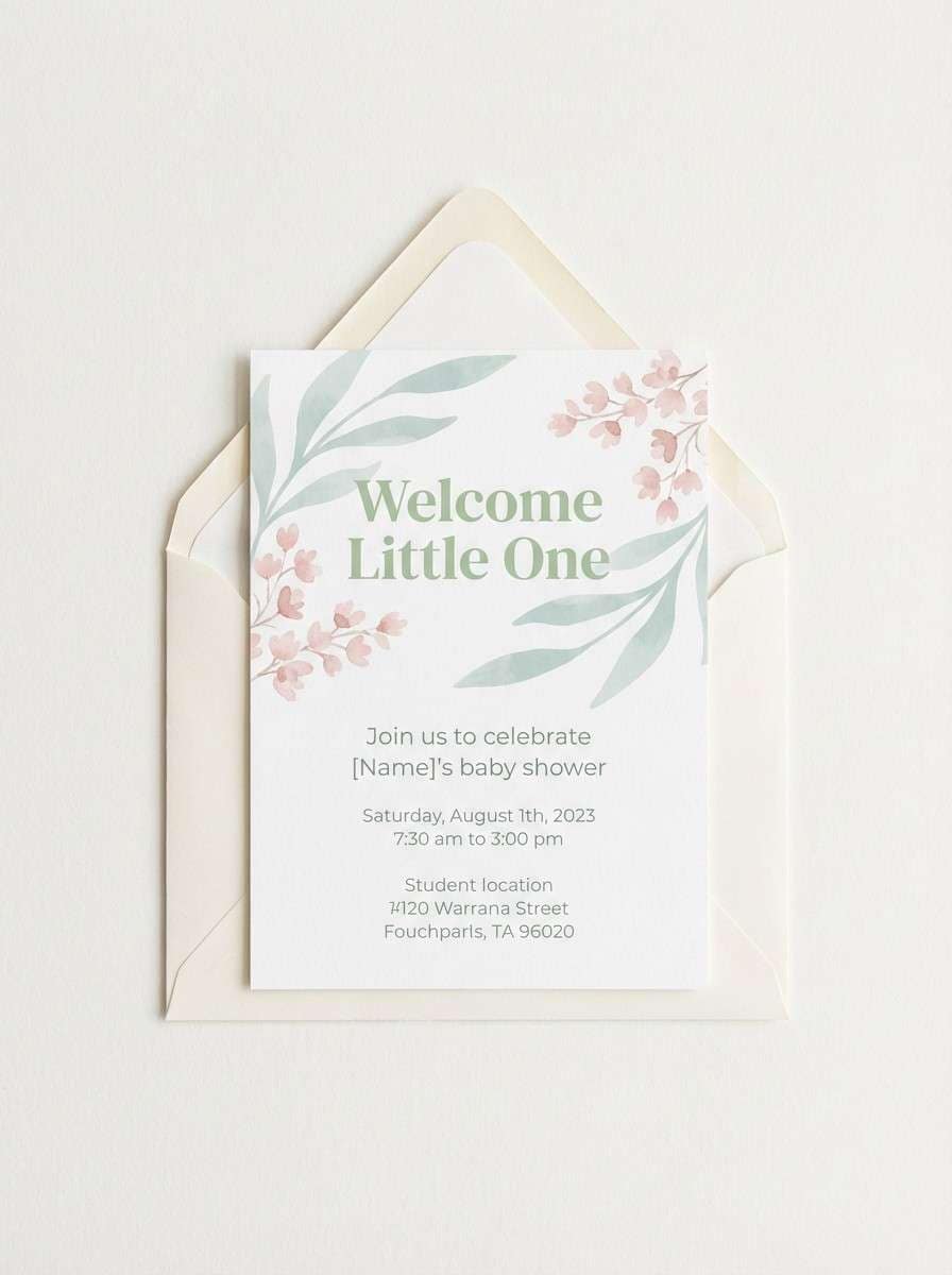
13) Pistachio Pastel
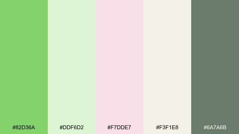
HEX: #82D36A #DDF6D2 #F7DDE7 #F3F1E8 #6A7A6B
Mood: soft, sweet, celebratory
Best for: baby shower invitation
Pistachio green with blush pastel feels light and joyful, like frosted desserts and delicate ribbons. Use the off-white and pale green for the invitation base, then add blush for small motifs or borders. The muted gray-green keeps names and details readable while staying gentle. Tip: keep typography airy with extra line spacing so the pastels do not feel crowded.
Image example of pistachio pastel generated using media.io
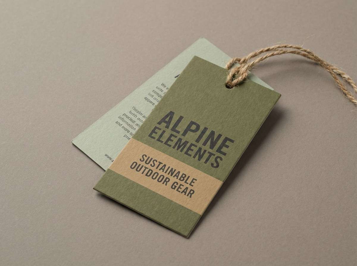
14) Olive Drift
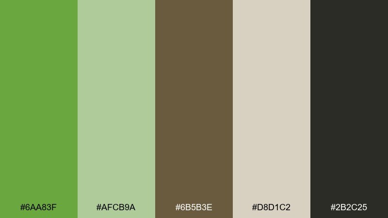
HEX: #6AA83F #AFCB9A #6B5B3E #D8D1C2 #2B2C25
Mood: heritage, outdoors, understated
Best for: outdoor apparel hangtag
Olive-leaning greens feel worn-in and reliable, like well-made gear and trail maps. Let the warm gray and tan set the base, then use olive for the brand mark and key callouts. The dark near-black keeps care details crisp and durable-looking. Tip: add a small tan stripe or icon set to break up large green fields on tiny tags.
Image example of olive drift generated using media.io
15) Seafoam Tech
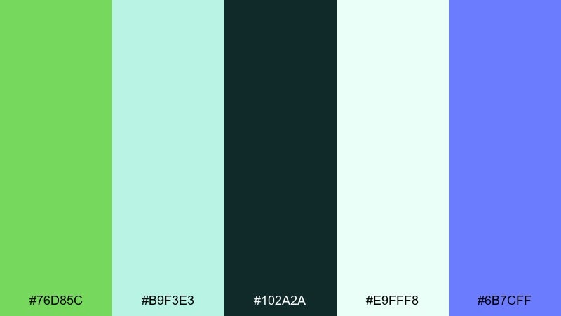
HEX: #76D85C #B9F3E3 #102A2A #E9FFF8 #6B7CFF
Mood: fresh, techy, polished
Best for: SaaS landing page UI
Seafoam and bright green read clean and modern, like a streamlined product that feels easy to use. Use the near-white mint as the background, then push the brighter green into key CTAs and highlight chips. Deep teal keeps copy sharp, while periwinkle can signal links or secondary actions. Tip: keep gradients subtle so the greens stay crisp and not overly candy-like.
Image example of seafoam tech generated using media.io

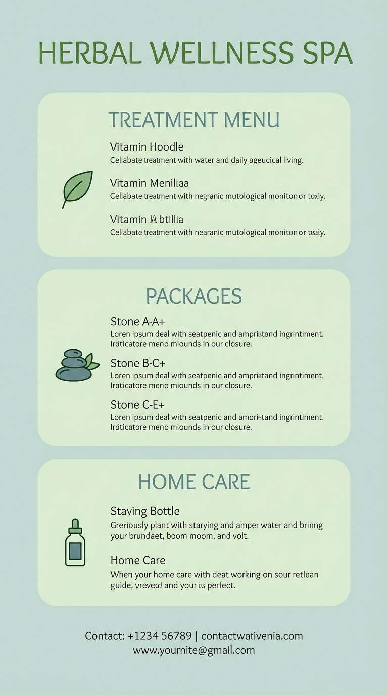
16) Herbal Spa Calm
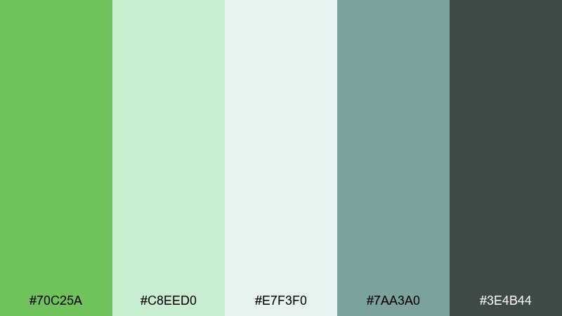
HEX: #70C25A #C8EED0 #E7F3F0 #7AA3A0 #3E4B44
Mood: serene, spa-like, restorative
Best for: spa flyer design
Herbal greens with misty neutrals feel quiet and restorative, like steam rising in a spa room. Use the soft gray-mint as the background, then place the brighter green on headers or small icons to guide the eye. Teal-gray works well for subheads, and the deep neutral keeps terms and contact info legible. Tip: limit contrast spikes and choose rounded type to maintain the calm tone.
Image example of herbal spa calm generated using media.io
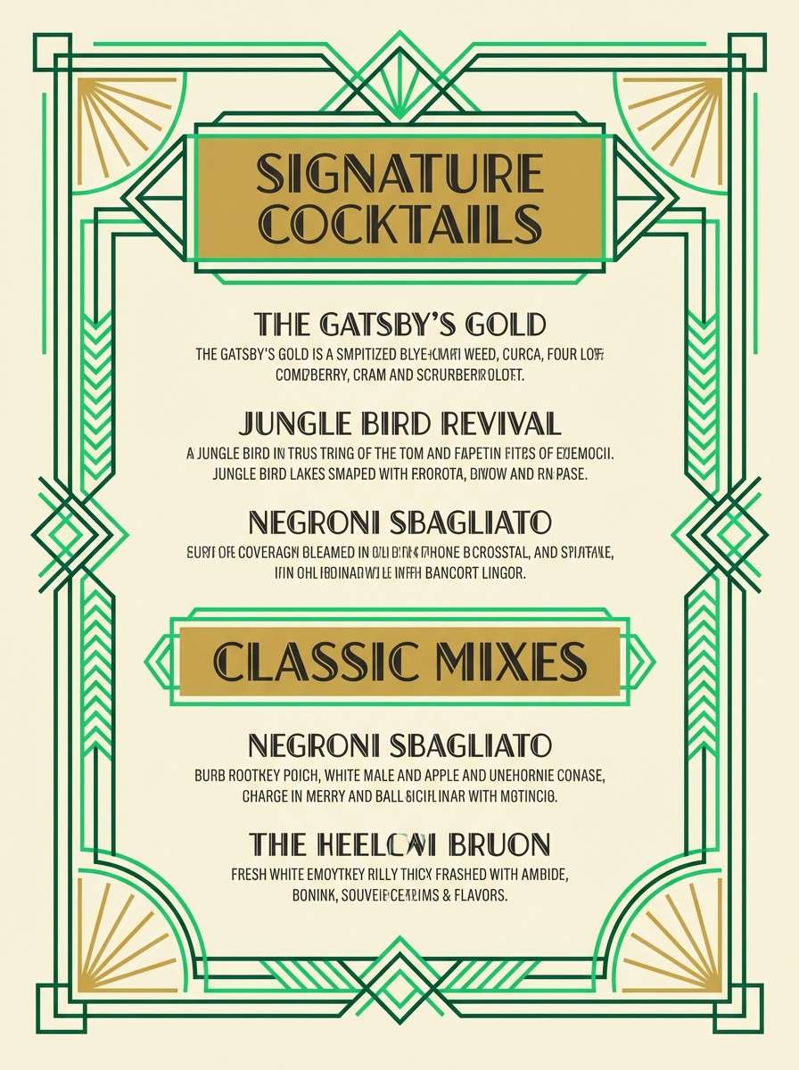
17) Art Deco Green
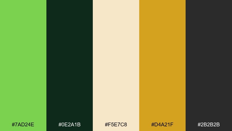
HEX: #7AD24E #0E2A1B #F5E7C8 #D4A21F #2B2B2B
Mood: glam, structured, vintage-modern
Best for: cocktail bar menu
Deco greens with gold read glamorous and structured, like brass details under low light. Use cream as the menu base, then frame sections with deep green borders and geometric dividers. The gold tone works best as a foil-like accent for headings, while charcoal keeps body text clean. Tip: repeat one geometric motif in green so the style feels intentional, not costume-like.
Image example of art deco green generated using media.io
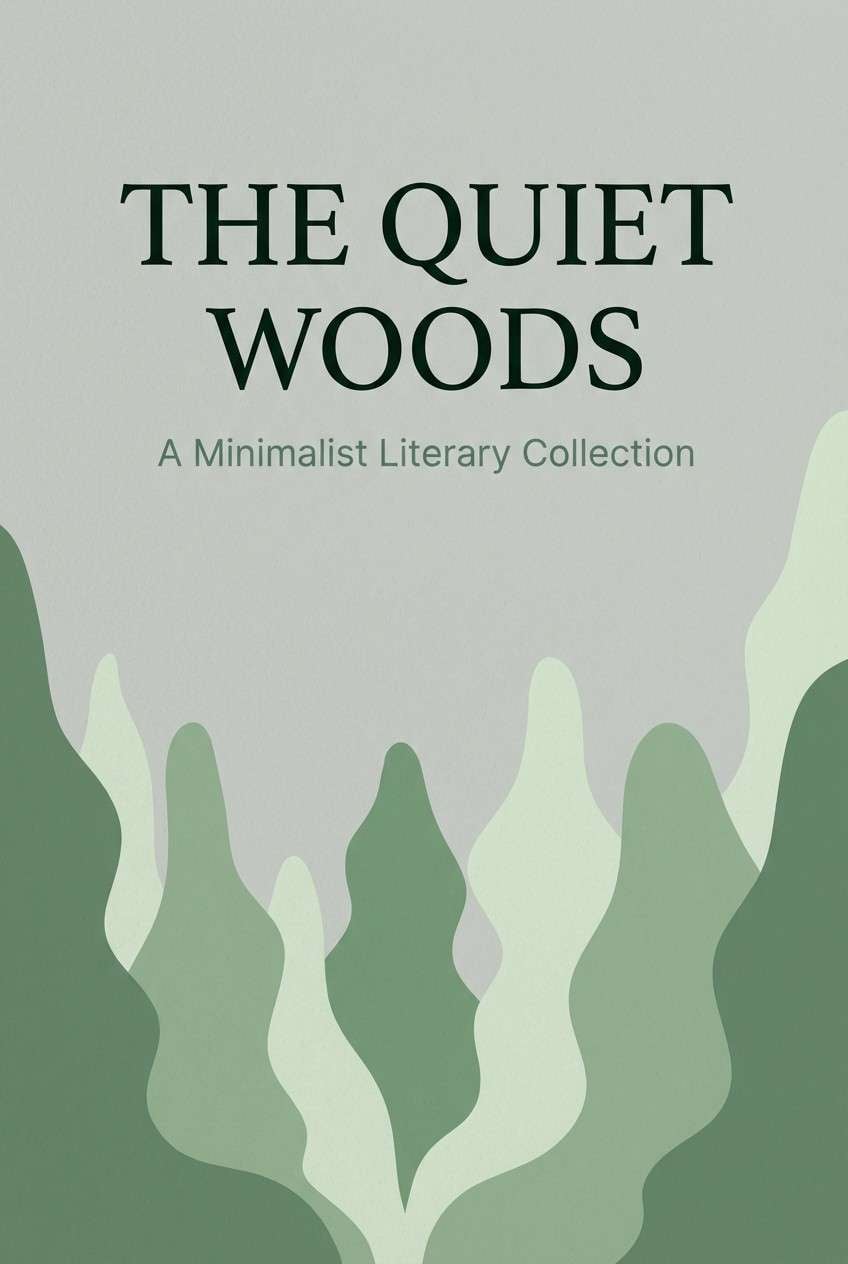
18) Forest and Fog
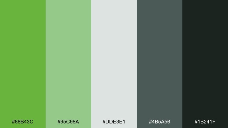
HEX: #68B43C #95C98A #DDE3E1 #4B5A56 #1B241F
Mood: quiet, outdoors, cinematic
Best for: book cover design
Foggy greens feel moody and thoughtful, like a trail disappearing into morning haze. Use the pale fog tone for negative space and the mid greens for layered shapes or typographic panels. Slate green supports subtitles, while the deep green-black anchors the title for strong shelf readability. Tip: keep gradients low-contrast so the cover stays calm and literary rather than action-driven.
Image example of forest and fog generated using media.io
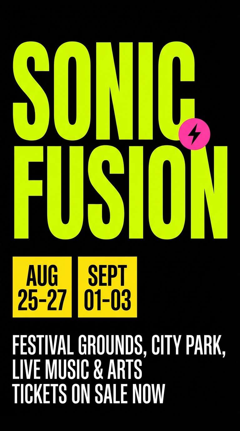
19) Chartreuse Spotlight
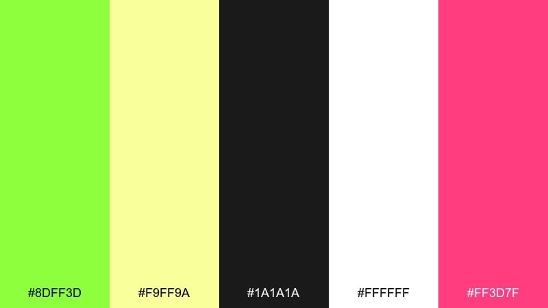
HEX: #8DFF3D #F9FF9A #1A1A1A #FFFFFF #FF3D7F
Mood: bold, loud, attention-grabbing
Best for: music festival poster
High-voltage chartreuse feels like a stage spotlight, sharp and impossible to ignore. These mantis color combinations are perfect for posters when you use black for the base and let the bright green dominate the headline. Lemon adds a second punch for lineups or date blocks, while hot pink works best as a tiny accent for a single badge. Tip: keep backgrounds simple so the neon-like green does the work without visual noise.
Image example of chartreuse spotlight generated using media.io
20) Stone Garden Modern
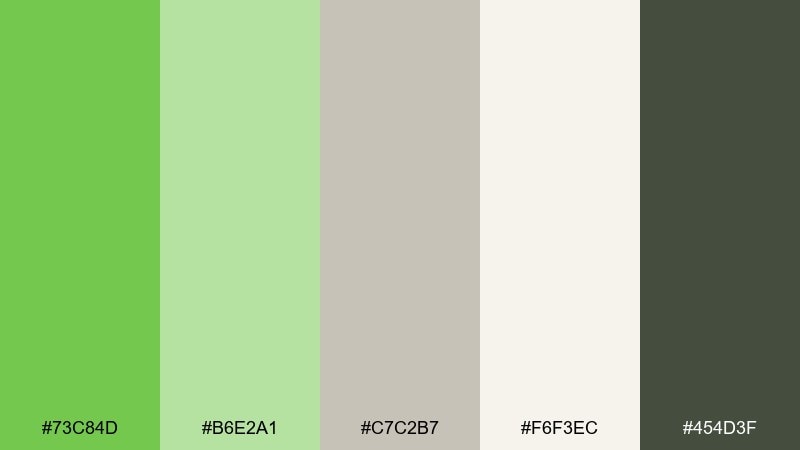
HEX: #73C84D #B6E2A1 #C7C2B7 #F6F3EC #454D3F
Mood: minimal, contemporary, balanced
Best for: architecture portfolio layout
Garden greens against soft stone neutrals feel modern and composed, like a gallery wall with a single living plant. Keep most pages off-white and stone-gray, then use the main green for section tabs and key annotations. The darker green-gray reads sophisticated for captions and project metadata. Tip: use the pale green only as a thin highlight so it does not compete with photography or drawings.
Image example of stone garden modern generated using media.io
What Colors Go Well with Mantis?
Neutrals are the easiest win: white, warm cream, and stone-gray make mantis feel airy and premium. For typography, a near-black green or charcoal often looks more refined than pure black.
For accents, try warm yellow for sunshine energy, coral for friendly calls to action, or violet/periwinkle for a modern tech edge. If you want a more outdoorsy vibe, olive and tan create a heritage, trail-ready look.
When in doubt, keep mantis as the hero color, add one deep anchor for readability, and choose one accent at low usage to avoid visual noise.
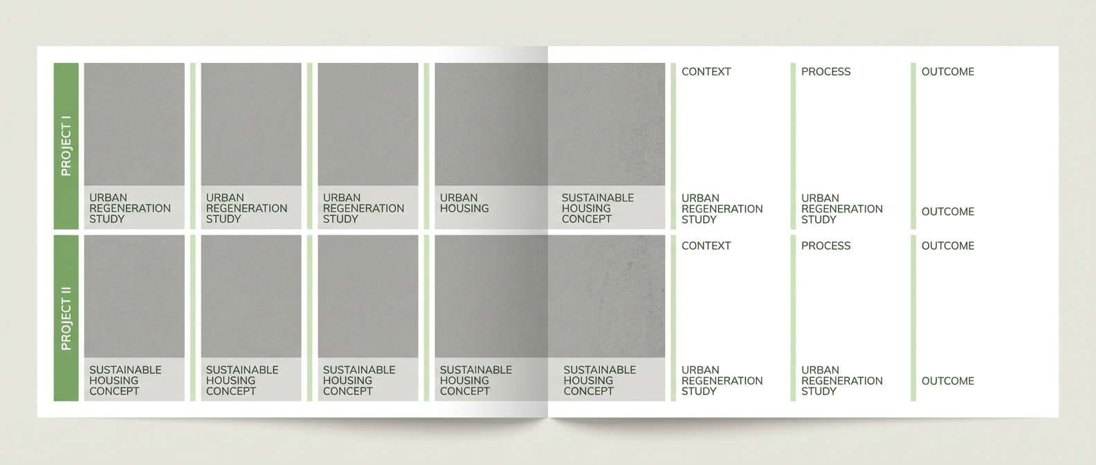
How to Use a Mantis Color Palette in Real Designs
In branding, use mantis for recognizable brand blocks (logo backgrounds, labels, key shapes), then rely on cream/stone for breathing room. Add a darker green for wordmarks and fine print so the system stays readable across packaging and print.
In UI, treat mantis as a “state” and “action” color: primary CTA, success, progress, highlights. Keep backgrounds light and reserve the brightest green for one main button per screen to maintain hierarchy.
For print, watch saturation and paper choice—uncoated stocks can soften greens in a pleasing way, while matte stocks may dull dark greens. Always proof the darkest shade so it doesn’t shift muddy.
Create Mantis Palette Visuals with AI
If you want to preview how a mantis color scheme looks on posters, packaging, invitations, or UI screens, generating mock visuals helps you validate contrast and mood fast. You can also test different accents (coral vs yellow vs violet) without redesigning from scratch.
With Media.io’s text-to-image tool, paste a prompt, specify the aspect ratio, and iterate until the palette feels right for your brand. It’s a quick way to explore style directions before moving into final production files.
Mantis Color Palette FAQs
-
What is “mantis green” in HEX?
Mantis green is commonly represented by bright yellow-green tones; a frequent mantis-like pick in this article is #7BCB4B, but “mantis” can vary from softer spring greens to high-voltage chartreuse depending on the palette. -
Is mantis closer to green or chartreuse?
Mantis typically sits between fresh green and chartreuse, leaning yellow-green. If you increase yellow and saturation (like #8DFF3D), it reads more chartreuse; if you add depth or reduce saturation, it reads more botanical/leafy. -
What neutral backgrounds work best with mantis?
Warm off-white and cream backgrounds (like #F4F1E8 or #F6F3EC) keep mantis feeling natural and premium. Stone-gray neutrals add a modern architectural feel, while pure white makes the palette look crisp and UI-friendly. -
What accent colors pair well with mantis?
Coral/orange accents create energetic CTAs, warm yellows add sunny highlights, and violet/periwinkle introduces a modern tech contrast. Use accents sparingly so mantis remains the main cue. -
How do I keep mantis readable in UI design?
Use a dark anchor color for text (charcoal or near-black green) and reserve the brightest mantis shade for primary actions and success states. Avoid thin green text on white or black; use stronger weights and sufficient contrast. -
Does mantis print well on matte paper?
Yes, but dark greens can shift muddy on matte stocks and very bright greens can dull slightly. Consider boosting the darkest green a touch and always run a proof, especially for large solid fills. -
Can I use mantis for luxury branding?
Yes—pair mantis with warm cream, deep green-black typography, and restrained accents (gold or muted stone). Keeping saturation controlled and spacing generous makes the palette feel premium rather than sporty.


