

Magnolia is a creamy, warm off-white that instantly makes designs feel calm, clean, and premium. It’s especially useful when you want a neutral base that isn’t as stark as pure white.
Below are 20 magnolia color palette ideas with HEX codes, plus practical tips and AI prompts you can use to generate matching visuals for branding, UI, print, and interiors.
In this article
- Why Magnolia Palettes Work So Well
-
- porcelain bloom
- blush linen
- tea room neutrals
- warm clay accent
- quiet almond ui
- garden mist watercolor
- champagne nightfall
- rosewood editorial
- coastal sandstone
- apricot cream pop
- silk and sage
- mocha marble
- dusty lilac veil
- terracotta ink
- buttercream minimal
- autumn pear
- petal and pewter
- sunlit coral
- hearthstone bluegray
- midnight cocoa
- What Colors Go Well with Magnolia?
- How to Use a Magnolia Color Palette in Real Designs
- Create Magnolia Palette Visuals with AI
Why Magnolia Palettes Work So Well
Magnolia sits in that sweet spot between ivory and warm cream, so it softens contrast without making layouts look dull. It’s an easy “paper-like” base that feels natural in both digital and print designs.
Because magnolia is warm, it pairs beautifully with taupes, blushes, clay, sage, and even charcoal-browns—letting you build depth with neutrals instead of relying on bright colors. This makes it ideal for brands that want calm confidence.
It also supports readability: use magnolia for backgrounds and reserve deeper browns/charcoals for typography and UI controls. The result is a balanced palette that feels premium and approachable.
20+ Magnolia Color Palette Ideas (with HEX Codes)
1) Porcelain Bloom
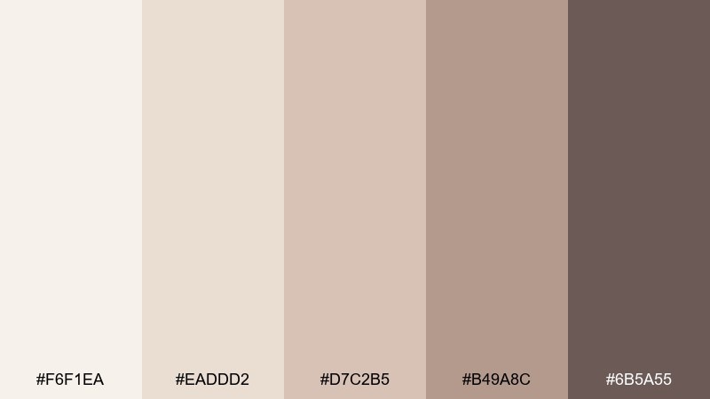
HEX: #F6F1EA #EADDD2 #D7C2B5 #B49A8C #6B5A55
Mood: airy, refined
Best for: minimal branding and stationery
Airy porcelain tones and warm nude shadows feel calm, polished, and quietly luxurious. Use it for logos, letterheads, and brand guidelines where softness should still read premium. Pair the deep cocoa with lots of negative space to keep contrast clean, and use the mid taupe for secondary typography. Tip: reserve the darkest shade for small accents like rules, icons, and monograms.
Image example of porcelain bloom generated using media.io
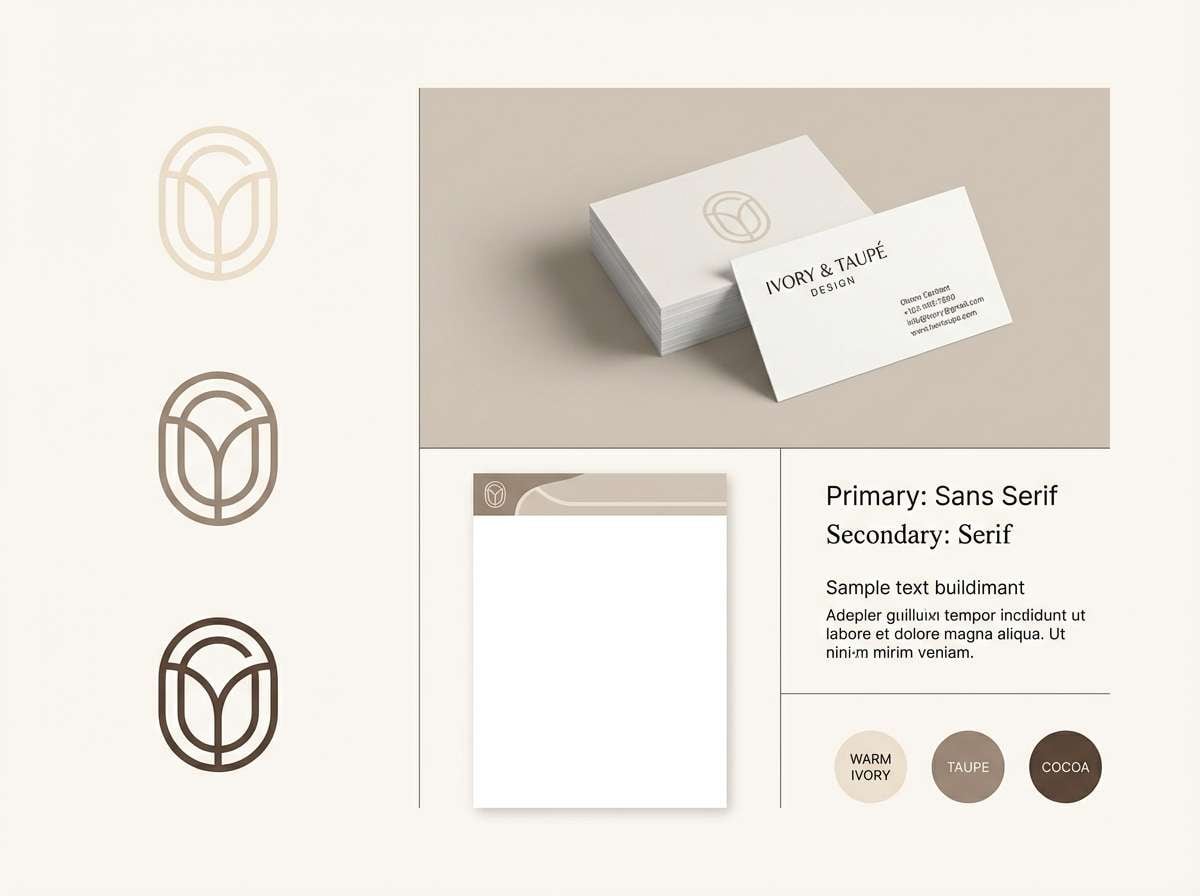
Media.io is an online AI studio for creating and editing video, image, and audio in your browser.

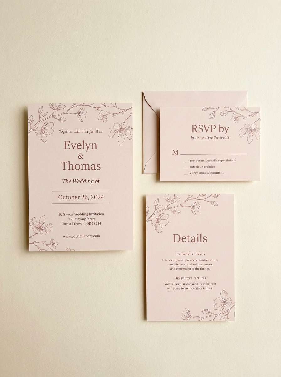
2) Blush Linen
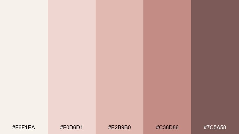
HEX: #F6F1EA #F0D6D1 #E2B9B0 #C38D86 #7C5A58
Mood: romantic, soft
Best for: wedding invitations and save the dates
Soft blush and linen warmth evoke petals, silk ribbon, and golden-hour portraits. This magnolia color palette shines on invitations, RSVP cards, and day-of signage where you want gentle contrast. Pair the deepest rose-brown with fine serif type and keep the light ivory as the paper base. Tip: add a subtle blush gradient behind headings to give dimension without looking busy.
Image example of blush linen generated using media.io
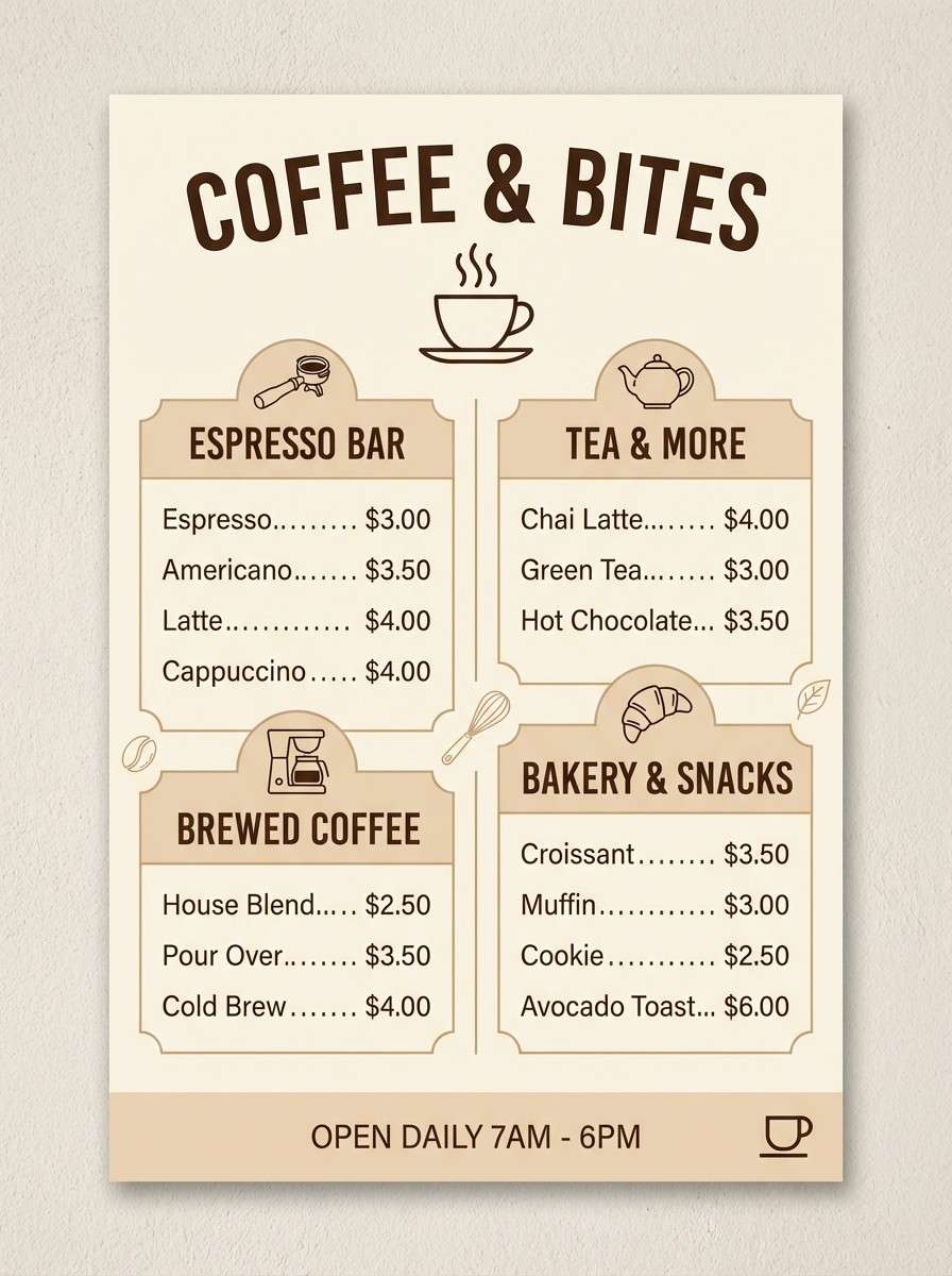
3) Tea Room Neutrals
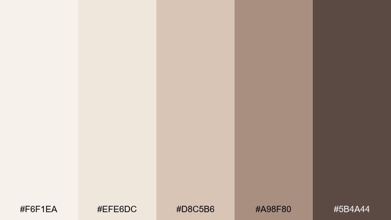
HEX: #F6F1EA #EFE6DC #D8C5B6 #A98F80 #5B4A44
Mood: cozy, classic
Best for: cafe menus and artisan food labels
Cozy cream and toasted beige tones bring to mind steamed milk, baked shortbread, and handwritten recipe cards. It works beautifully for menus, loyalty cards, and packaging where readability matters. Use the darkest coffee tone for headings, and keep the mid beige for section dividers and icons. Tip: choose uncoated, textured paper stock to make the neutrals feel richer.
Image example of tea room neutrals generated using media.io
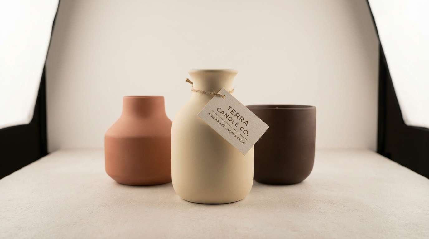
4) Warm Clay Accent
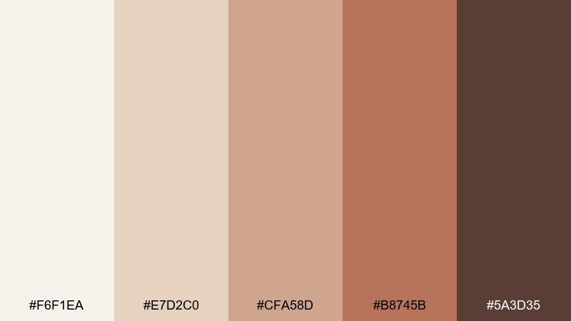
HEX: #F6F1EA #E7D2C0 #CFA58D #B8745B #5A3D35
Mood: sunbaked, grounded
Best for: handmade packaging and ceramic brands
Sunbaked clay and creamy highlights feel tactile, earthy, and artisanal. Use it for candle boxes, pottery tags, or small-batch product packaging where warmth sells the craft story. Pair the terracotta with simple blackless brown type so it stays soft, not harsh. Tip: print the darker brown as a spot color for stamps and seals to elevate the handmade vibe.
Image example of warm clay accent generated using media.io
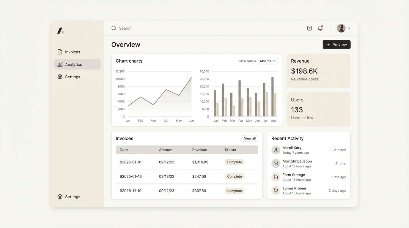
5) Quiet Almond UI
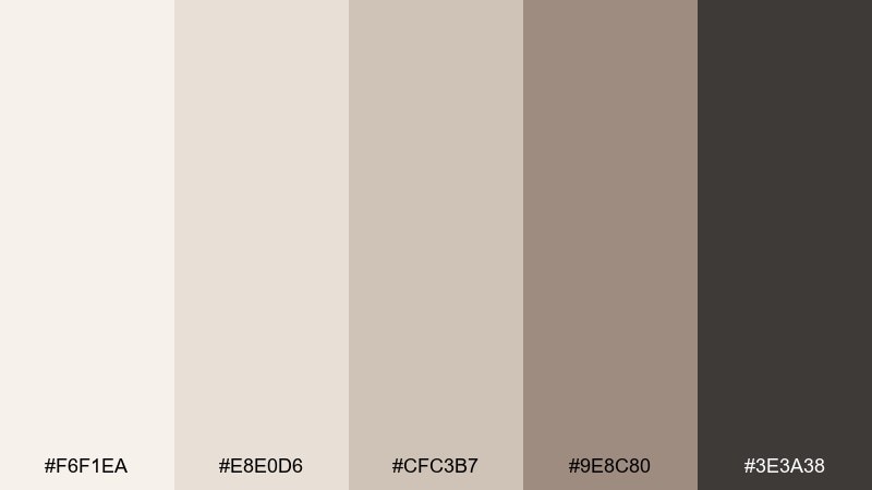
HEX: #F6F1EA #E8E0D6 #CFC3B7 #9E8C80 #3E3A38
Mood: calm, modern
Best for: SaaS dashboards and settings screens
Quiet almond neutrals create a calm, focused interface that feels modern and approachable. Use the pale ivory for page backgrounds, then layer soft stone panels to separate sections without heavy borders. Pair the charcoal-brown with high-contrast text styles for accessibility. Tip: keep interactive states subtle by shifting only one step darker rather than changing hue.
Image example of quiet almond ui generated using media.io
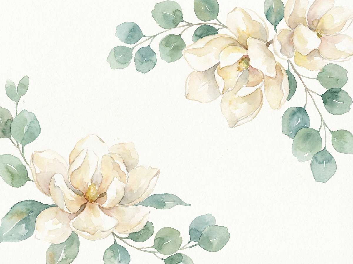
6) Garden Mist Watercolor
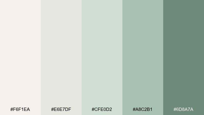
HEX: #F6F1EA #E6E7DF #CFE0D2 #A8C2B1 #6D8A7A
Mood: fresh, delicate
Best for: spring botanical illustrations
Fresh misty greens over creamy paper evoke early spring leaves and dewy morning air. It is ideal for watercolor botanicals, journal covers, and gentle social graphics. Pair the deeper eucalyptus tone with fine brush textures to keep the artwork grounded. Tip: let the ivory show through as paper grain so the palette stays light and breathable.
Image example of garden mist watercolor generated using media.io
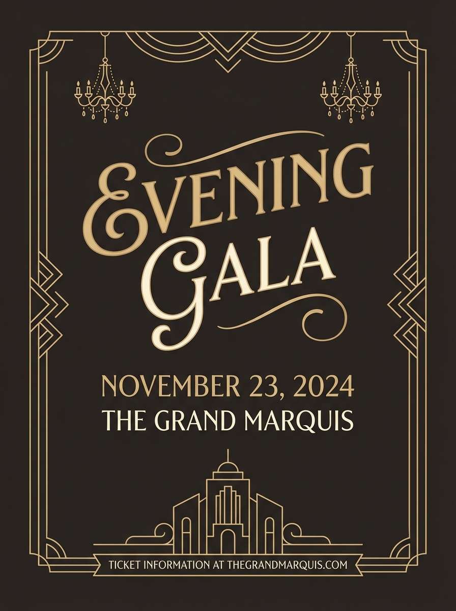
7) Champagne Nightfall
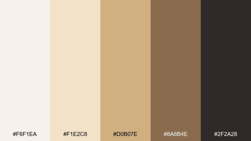
HEX: #F6F1EA #F1E2C8 #D0B07E #8A6B4E #2F2A28
Mood: glam, intimate
Best for: evening event posters and gala invites
Champagne gold and espresso shadows feel like candlelight, velvet curtains, and a late-night toast. These magnolia color combinations work best when the dark base takes the lead and the gold becomes a spotlight. Pair with thin geometric lines and high-contrast type to keep it sophisticated. Tip: use the mid caramel tone for subtle texture blocks behind important details.
Image example of champagne nightfall generated using media.io
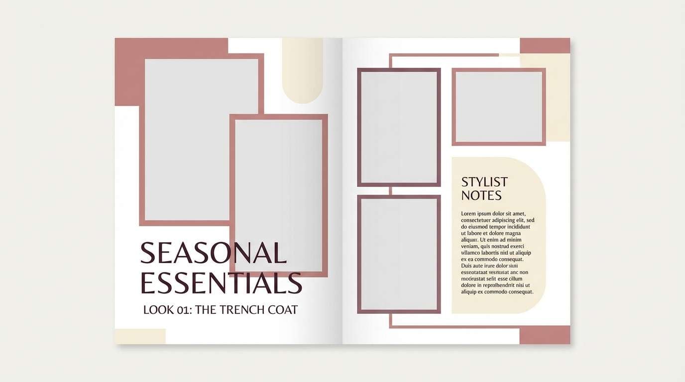
8) Rosewood Editorial
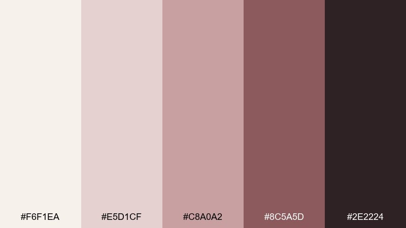
HEX: #F6F1EA #E5D1CF #C8A0A2 #8C5A5D #2E2224
Mood: moody, editorial
Best for: magazine layouts and lookbooks
Dusty rosewood and inky plum-brown evoke vintage lipstick, silk lining, and thoughtful storytelling. Use it for print-like layouts where photos need a warm, romantic frame. Pair the dark shade with generous margins and let the muted rose handle pull quotes and section labels. Tip: keep body text on the pale ivory for easy reading and a premium feel.
Image example of rosewood editorial generated using media.io
9) Coastal Sandstone
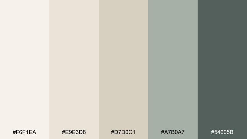
HEX: #F6F1EA #E9E3D8 #D7D0C1 #A7B0A7 #54605B
Mood: serene, natural
Best for: interior mood boards and home decor
Serene sand, driftwood gray, and soft stone greens feel like a quiet shoreline and sun-faded linens. It is perfect for interior mood boards, paint coordination, and airy living spaces. Pair the deeper slate-green with natural woods and woven textures to avoid a flat look. Tip: repeat the mid greige in multiple materials to make the room feel cohesive.
Image example of coastal sandstone generated using media.io
10) Apricot Cream Pop
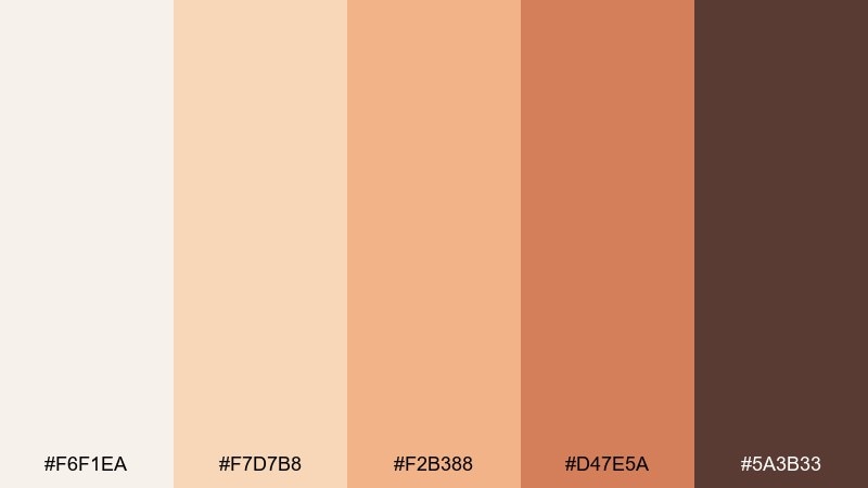
HEX: #F6F1EA #F7D7B8 #F2B388 #D47E5A #5A3B33
Mood: cheerful, warm
Best for: social promos and seasonal campaigns
Apricot creams and toasted caramel accents feel upbeat, sunny, and friendly. Use it for limited-time offers, event announcements, and warm lifestyle brands that need energy without neon. Pair the deepest brown with bold sans-serif headings and keep the bright apricot for buttons or price tags. Tip: limit the saturated orange to one focal area per layout to avoid visual noise.
Image example of apricot cream pop generated using media.io

11) Silk and Sage
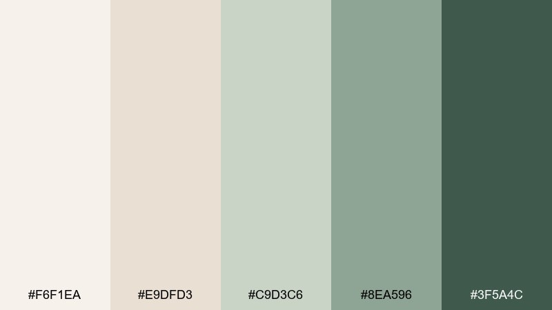
HEX: #F6F1EA #E9DFD3 #C9D3C6 #8EA596 #3F5A4C
Mood: clean, restorative
Best for: wellness branding and spa websites
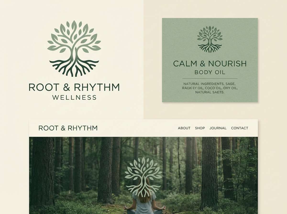
Silky neutrals with soothing sage feel restorative, clean, and quietly confident. This magnolia color palette works well for wellness brands, spas, and mindful products that need warmth without looking sugary. Pair the deep green with natural imagery and keep buttons in the mid sage for a gentle call to action. Tip: use the light beige as a background to reduce glare compared to pure white.
Image example of silk and sage generated using media.io
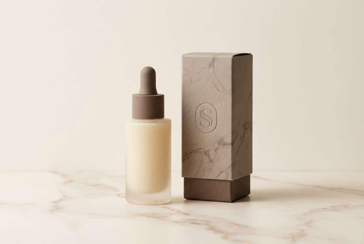
12) Mocha Marble
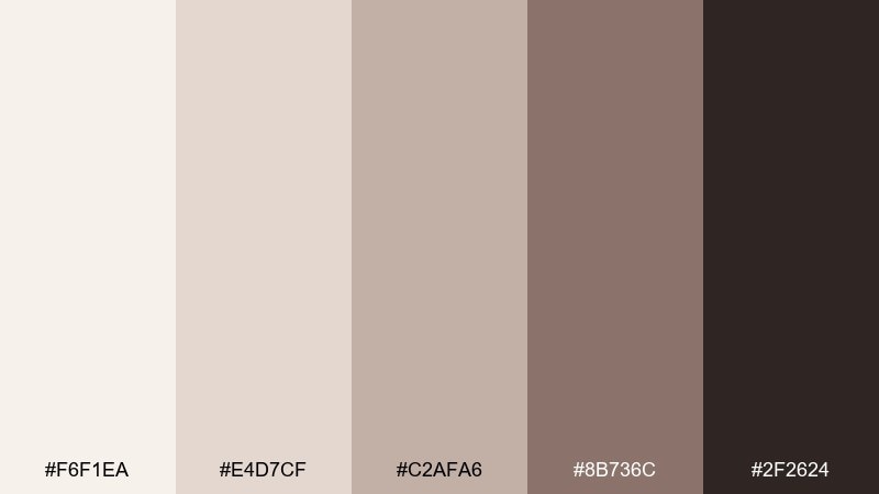
HEX: #F6F1EA #E4D7CF #C2AFA6 #8B736C #2F2624
Mood: luxury, understated
Best for: premium product ads and skincare packaging
Creamy marble and mocha browns evoke stone countertops, satin boxes, and understated luxury. Use it for premium skincare, fragrance, or boutique packaging where every detail should feel intentional. Pair the darkest shade with minimal copy and plenty of spacing to keep the ad editorial. Tip: add a subtle marbled texture in the mid tones to suggest depth without stealing focus.
Image example of mocha marble generated using media.io
13) Dusty Lilac Veil
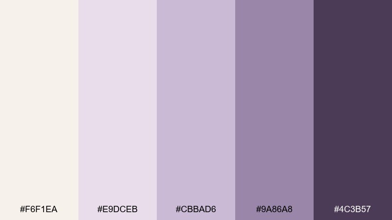
HEX: #F6F1EA #E9DCEB #CBBAD6 #9A86A8 #4C3B57
Mood: dreamy, delicate
Best for: bridal shower invites and feminine posts
Dusty lilac over creamy ivory feels like chiffon, pressed flowers, and soft evening light. It fits bridal showers, beauty announcements, and gentle lifestyle content. Pair the deeper violet with thin strokes and delicate ornaments so the look stays airy. Tip: keep photos slightly desaturated so the lilac accents do not clash with skin tones.
Image example of dusty lilac veil generated using media.io
14) Terracotta Ink
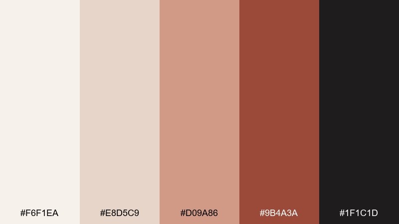
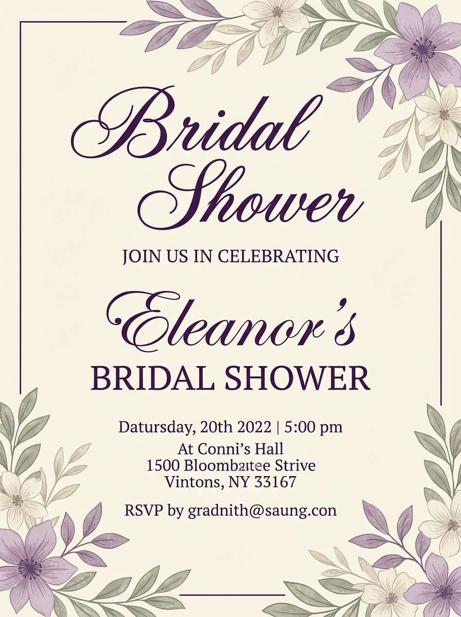
HEX: #F6F1EA #E8D5C9 #D09A86 #9B4A3A #1F1C1D
Mood: bold, artsy
Best for: restaurant branding and menu systems
Bold terracotta with inky depth evokes brick ovens, hand-thrown plates, and modern bistro energy. This magnolia color combination is strong enough for logos and wayfinding while still feeling warm. Pair the black-ink tone with clean sans-serif type, and use the soft ivory for negative space and readability. Tip: keep terracotta for highlights like dish names and section headers to guide the eye.
Image example of terracotta ink generated using media.io
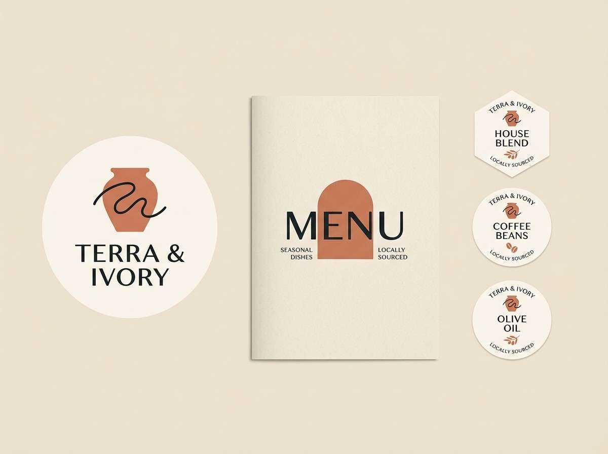
15) Buttercream Minimal
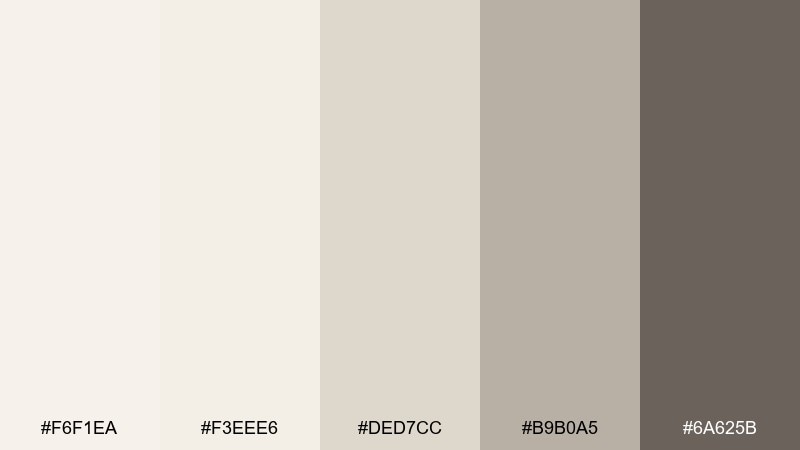
HEX: #F6F1EA #F3EEE6 #DED7CC #B9B0A5 #6A625B
Mood: soft, minimalist
Best for: clean websites and portfolios
Buttercream layers feel gentle, modern, and quietly confident, like a gallery wall in warm daylight. Use it for portfolios, studios, and personal sites that need clarity without stark white. Pair the mid greige with subtle dividers and let the darker stone define navigation and footers. Tip: rely on typography scale and spacing, not extra colors, to create hierarchy.
Image example of buttercream minimal generated using media.io
16) Autumn Pear
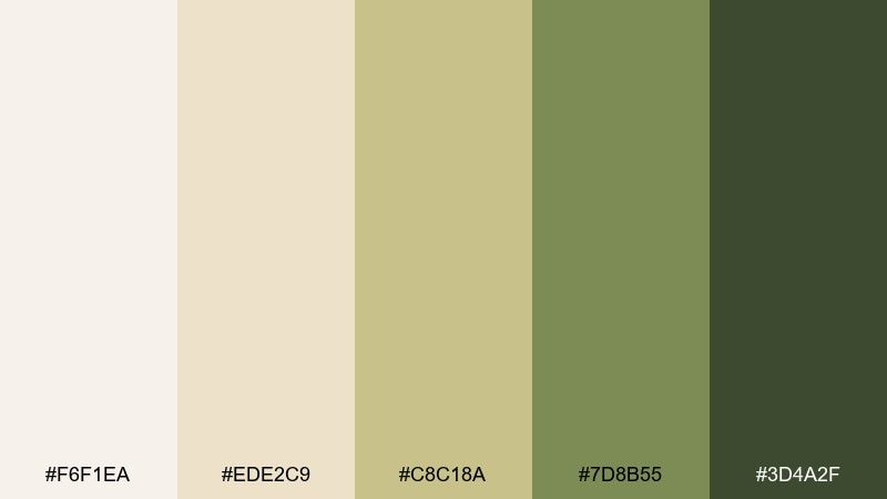
HEX: #F6F1EA #EDE2C9 #C8C18A #7D8B55 #3D4A2F
Mood: earthy, seasonal
Best for: fall packaging and harvest campaigns
Muted pear greens with creamy wheat tones evoke orchards, knit sweaters, and late-season markets. It is a great fit for fall packaging, farmers market signage, and seasonal email headers. Pair the deep olive with simple icons and keep the light ivory as a breathable base. Tip: use the yellow-green sparingly as a highlight so it reads intentional, not sour.
Image example of autumn pear generated using media.io
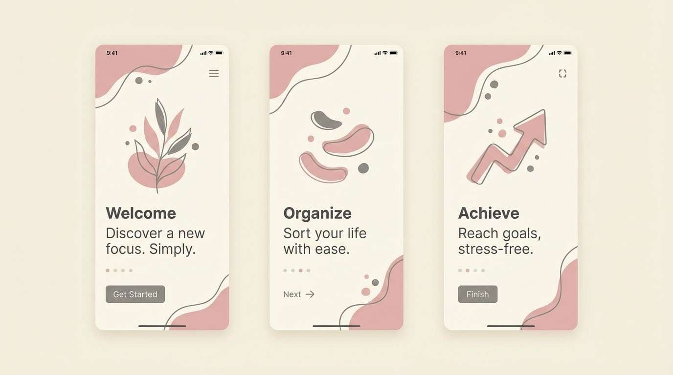
17) Petal and Pewter
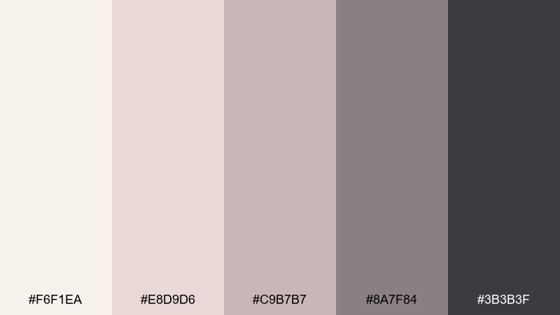
HEX: #F6F1EA #E8D9D6 #C9B7B7 #8A7F84 #3B3B3F
Mood: calm, balanced
Best for: app onboarding and product tours
Soft petal neutrals with pewter depth feel balanced, dependable, and modern. Use it for onboarding screens where you want warmth while keeping UI controls crisp. Pair the dark graphite with clear iconography and use the muted mauve-gray for secondary buttons. Tip: keep illustrations in two dominant tones so the onboarding flow stays consistent.
Image example of petal and pewter generated using media.io
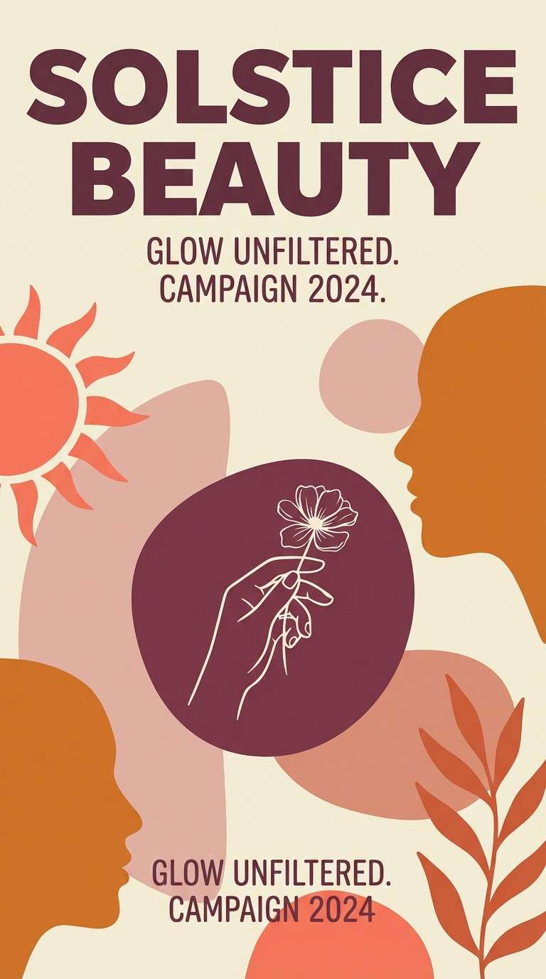
18) Sunlit Coral
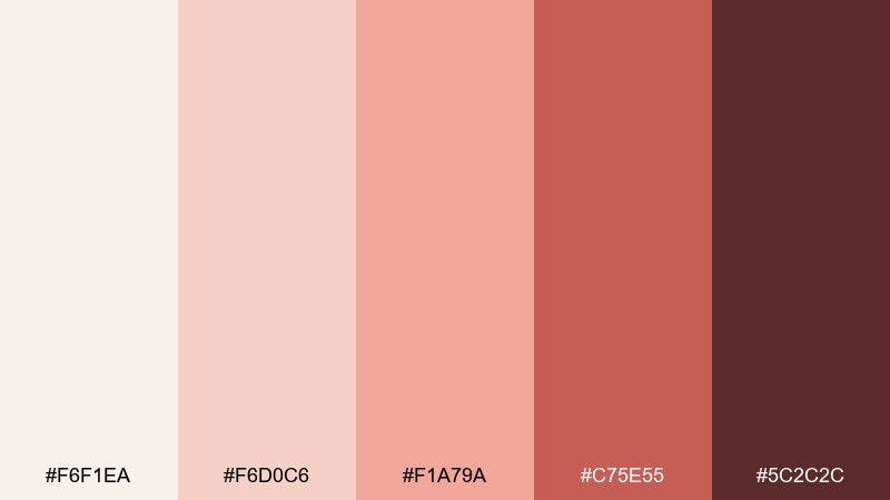
HEX: #F6F1EA #F6D0C6 #F1A79A #C75E55 #5C2C2C
Mood: confident, lively
Best for: beauty campaign posters and launches
Sunlit coral and warm blush create a lively, confident vibe that still feels sophisticated. It is ideal for beauty launches, pop-up announcements, and bold social ads. Pair the deep berry-brown with crisp, oversized type and keep the ivory as a clean buffer around product shots. Tip: use coral as the hero color and let blush support it in backgrounds and shapes.
Image example of sunlit coral generated using media.io
19) Hearthstone Bluegray
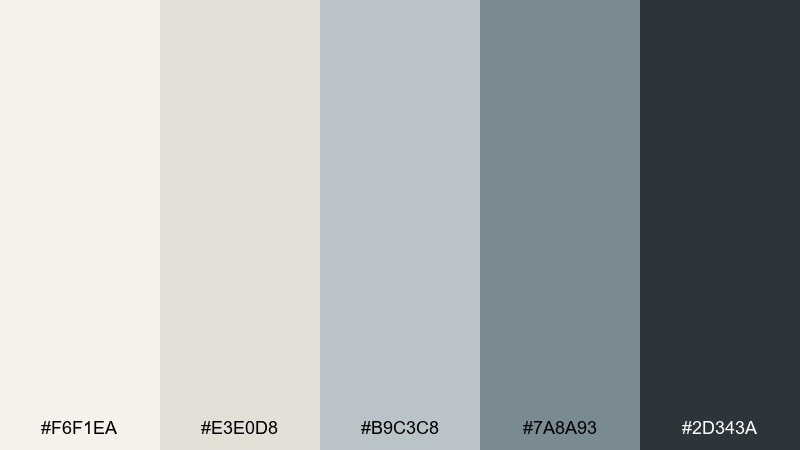
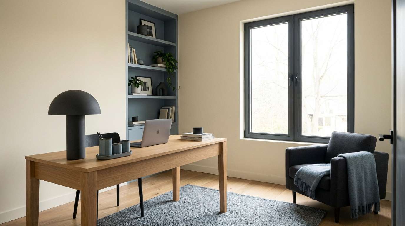
HEX: #F6F1EA #E3E0D8 #B9C3C8 #7A8A93 #2D343A
Mood: cool, composed
Best for: home office interiors and productivity brands
Cool blue-gray stones against creamy ivory feel composed, focused, and quietly professional. Use it for home office palettes, productivity branding, or calm presentation decks. Pair the slate tones with brushed metal finishes and warm wood to keep the space from feeling cold. Tip: repeat the darkest charcoal in hardware, frames, or headings for a strong anchor.
Image example of hearthstone bluegray generated using media.io
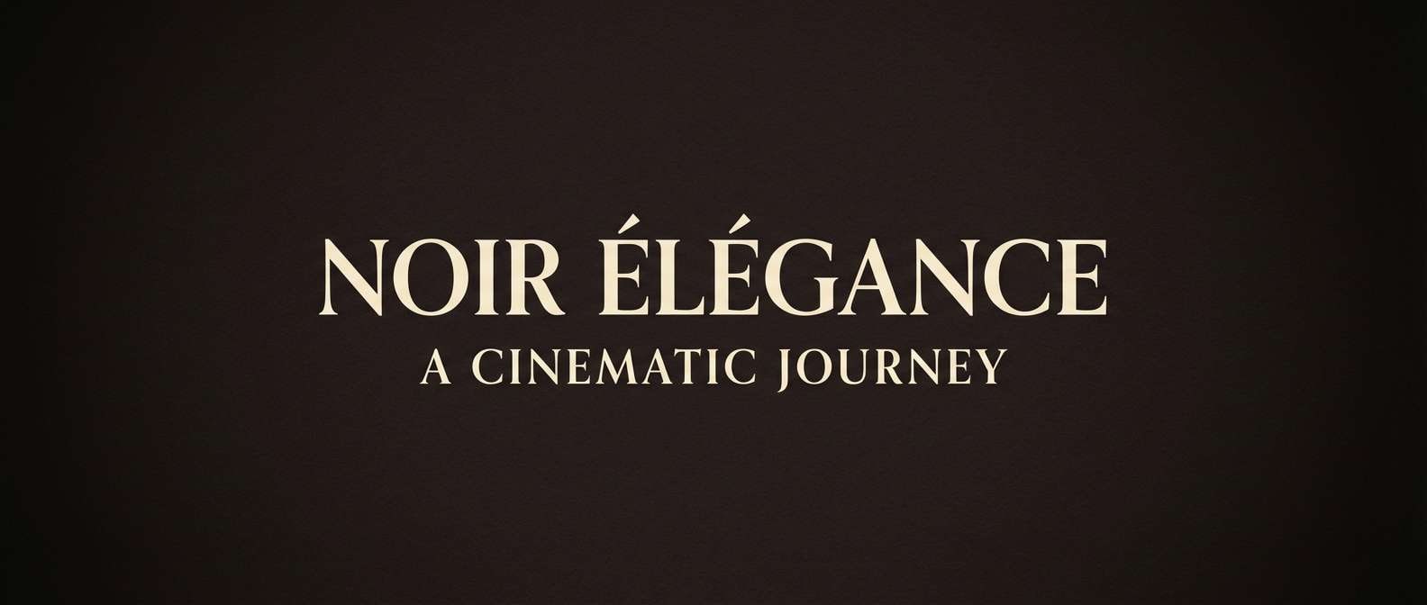
20) Midnight Cocoa
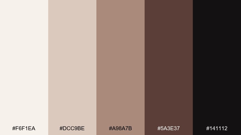
HEX: #F6F1EA #DCC9BE #A98A7B #5A3E37 #141112
Mood: dramatic, cinematic
Best for: title cards and luxury announcements
Midnight black-brown and cocoa gradients evoke cinema velvet, espresso crema, and a hush before the reveal. It works for title cards, luxury announcements, and moody hero banners where contrast is the point. Pair the ivory as a spotlight for type or logos, and keep the mid browns for subtle depth. Tip: add a gentle vignette using the darkest shade so the center content pops.
Image example of midnight cocoa generated using media.io
What Colors Go Well with Magnolia?
Magnolia pairs best with other warm neutrals like beige, greige, taupe, and cocoa-browns, because the undertones stay cohesive. These combinations are ideal when you want a soft, premium look with consistent warmth.
For gentle color, add dusty blush, clay/terracotta, or muted coral—these keep the palette friendly without becoming loud. If you want a fresher direction, try sage, eucalyptus, or blue-gray for a calm contrast that still feels modern.
For strong anchors, use deep charcoal-brown or near-black in small doses (type, icons, dividers). This creates crisp hierarchy while keeping the overall mood creamy and calm.
How to Use a Magnolia Color Palette in Real Designs
Start with magnolia as your primary background (web pages, packaging base, or “paper” color), then pick one mid-tone neutral for surfaces (cards, panels, shapes) and one dark tone for typography. This structure keeps layouts readable and prevents the palette from feeling washed out.
Use one accent color (blush, terracotta, sage, or gold) for emphasis: buttons, badges, section headers, or small decorative elements. The key is restraint—magnolia works best when accents are intentional focal points, not everywhere.
When printing, test on the actual stock: magnolia can shift warmer on uncoated paper. Adjust contrast by deepening your text color (cocoa/charcoal) rather than making the background whiter.
Create Magnolia Palette Visuals with AI
If you already have HEX codes, the fastest way to validate a palette is to see it applied to real compositions—invites, UI screens, brand boards, packaging, and posters. AI mockups let you check contrast, mood, and hierarchy before you commit to production.
To get consistent results, reuse a single prompt style and only swap the color direction (sage vs. terracotta vs. blue-gray). Add format hints like “flat 2d design” or “realistic studio shot,” and keep magnolia as the dominant base for cohesion.
Generate a few variations, then choose the one where text areas stay clean and the darkest shade is used as an anchor—not a fill color.
Magnolia Color Palette FAQs
-
What is a magnolia color (in design terms)?
Magnolia is a warm, creamy off-white (often close to ivory) used as a softer alternative to pure white for backgrounds, paper-like surfaces, and neutral branding. -
Is magnolia warm or cool?
Most magnolia shades are warm because they lean slightly yellow, beige, or peach. That warmth is why it pairs naturally with taupe, cocoa, terracotta, and blush. -
What text color works best on a magnolia background?
Deep charcoal-brown, espresso, or near-black typically provides strong readability without the harshness of pure black. Avoid very light grays for body text because contrast can drop quickly. -
What accent colors pair well with magnolia?
Muted blush, clay/terracotta, sage/eucalyptus, champagne gold, and blue-gray are reliable accents. Choose one accent and keep the rest neutral for a clean, premium look. -
How do I keep a magnolia palette from looking “flat”?
Add depth with at least one dark anchor (cocoa/charcoal) and one mid-tone neutral (greige/taupe). You can also introduce subtle texture (paper grain, marble, or soft gradients) in mid tones. -
Is magnolia a good choice for UI design?
Yes—magnolia reduces glare versus pure white and feels calmer. Just ensure interactive elements and text meet contrast guidelines by using a sufficiently dark foreground color. -
Can I use magnolia for wedding invitations and stationery?
Absolutely. Magnolia works beautifully as a “paper base” and looks elegant with blush, rosewood, lilac, or champagne-gold accents—especially with fine serif typography and plenty of whitespace.


