

Mountain sunset color palettes capture that split-second balance between glowing warmth and grounded shadow. They’re perfect when you want designs to feel adventurous, cinematic, or quietly romantic.
Below are 20+ mountain sunset color scheme ideas with ready-to-use HEX codes, plus AI prompt examples you can recreate in seconds.
In this article
- Why Mountain Sunset Palettes Work So Well
-
- alpenglow ember
- granite rose
- pine ridge dusk
- summit sorbet
- canyon afterglow
- twilight lavender
- copper horizon
- glacier blush
- sienna trail
- nightfall vista
- warm quartz
- dusty apricot
- plum shadow peaks
- rust lilac glow
- hearthlight ridge
- misty mauve range
- espresso sunset
- deserted lookout
- vivid emberline
- quiet campfire
- skyline serenade
- ridgeline gradient
- What Colors Go Well with Mountain Sunset?
- How to Use a Mountain Sunset Color Palette in Real Designs
- Create Mountain Sunset Palette Visuals with AI
Why Mountain Sunset Palettes Work So Well
Mountain sunset colors naturally pair high-energy warms (coral, amber, apricot) with stabilizing darks (plum, indigo, charcoal). That contrast creates instant depth—like a ridgeline silhouette cutting through glowing sky.
They also look great in gradients. Sunset hues blend smoothly, so you can build backgrounds, hero banners, and poster skies without harsh transitions.
Most importantly, these palettes are flexible: push the warm tones for excitement, or let the dusk shadows lead for a premium, moody feel.
20+ Mountain Sunset Color Palette Ideas (with HEX Codes)
1) Alpenglow Ember
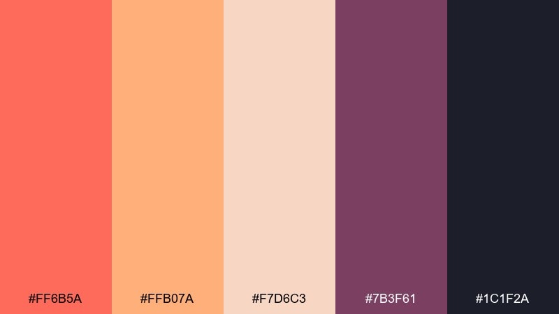
HEX: #ff6b5a #ffb07a #f7d6c3 #7b3f61 #1c1f2a
Mood: dramatic and warm
Best for: travel poster design
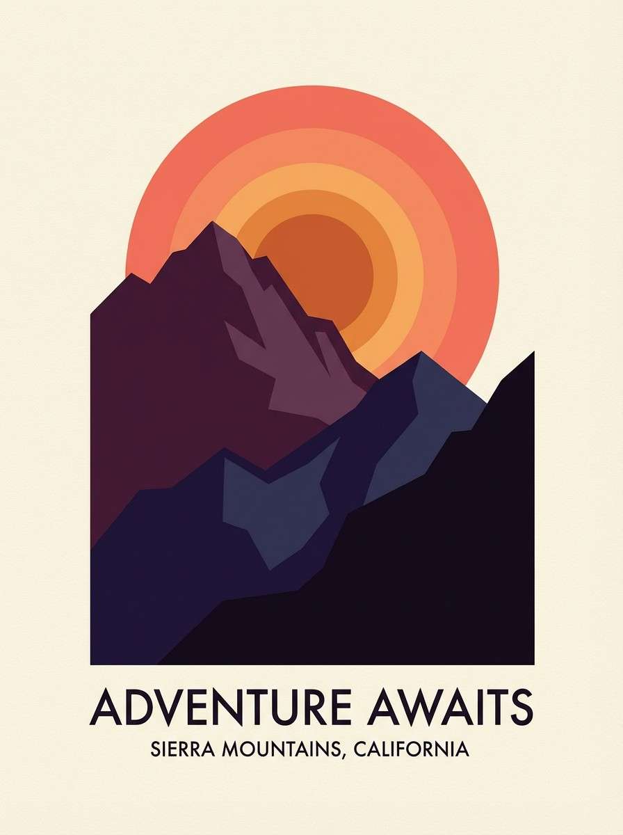
Dramatic and warm, it feels like the last flare of light catching jagged ridgelines. Use the coral and apricot as headline and focal accents, then let plum and near-black anchor the layout. It works beautifully for bold type, sunlit gradients, and silhouetted mountain shapes. Tip: keep the darkest tone for text and outlines to maintain contrast without looking harsh.
Image example of alpenglow ember generated using media.io
Media.io is an online AI studio for creating and editing video, image, and audio in your browser.

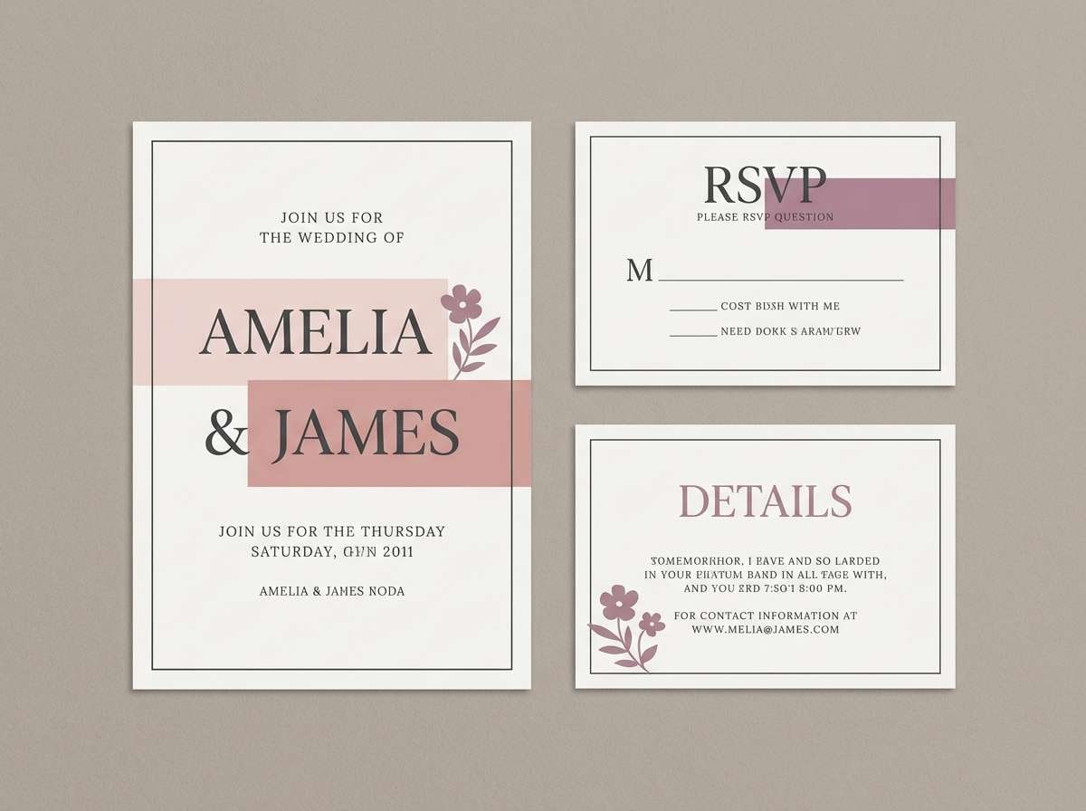
2) Granite Rose
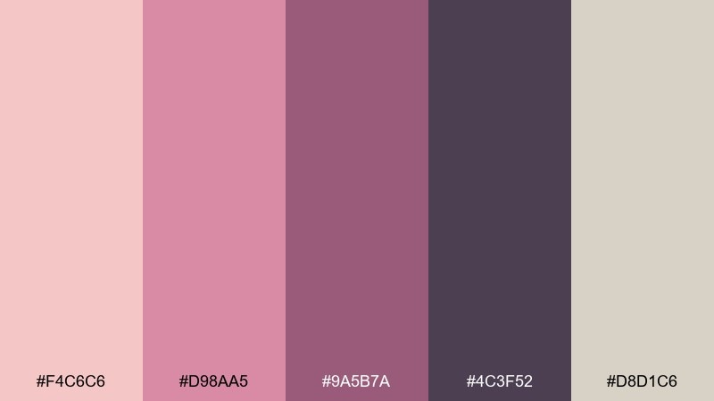
HEX: #f4c6c6 #d98aa5 #9a5b7a #4c3f52 #d8d1c6
Mood: soft and romantic
Best for: wedding invitation suite
Soft and romantic, it evokes rosy clouds drifting over stone peaks. Lean on blush and dusty rose for paper backgrounds, and use mauve for typography and monograms. The granite charcoal adds structure, while the warm greige keeps everything calm and premium. Tip: print the darkest tone in letterpress or foil for a subtle, tactile contrast.
Image example of granite rose generated using media.io
3) Pine Ridge Dusk
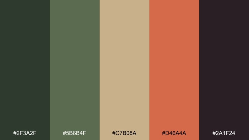
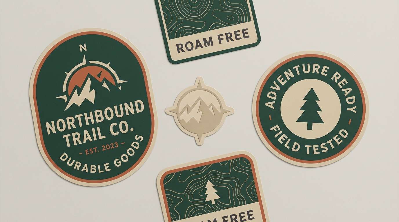
HEX: #2f3a2f #5b6b4f #c7b08a #d46a4a #2a1f24
Mood: earthy and grounded
Best for: outdoor brand logo and labels
Earthy and grounded, it reads like pine silhouettes against a fading ember sky. Pair forest tones with the sand neutral for packaging bases, then add the terracotta as a confident accent. It fits heritage logos, stamped marks, and rugged labels without feeling dull. Tip: reserve terracotta for one element only, like a badge or callout, to keep the palette disciplined.
Image example of pine ridge dusk generated using media.io
4) Summit Sorbet
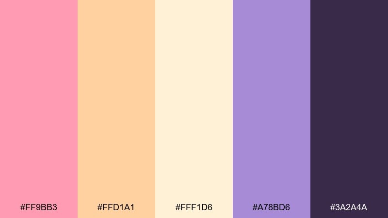
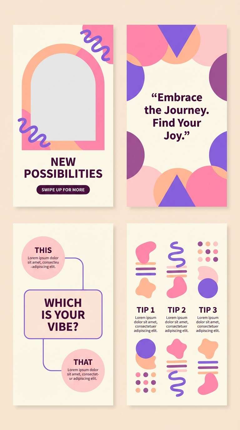
HEX: #ff9bb3 #ffd1a1 #fff1d6 #a78bd6 #3a2a4a
Mood: playful and airy
Best for: social media story templates
Playful and airy, it brings to mind cotton-candy skies above a calm summit. Use the creamy highlight as negative space, then layer peach and pink for stickers, buttons, or banners. Violet and deep aubergine help keep text readable and the layout modern. Tip: build a simple gradient from pink to peach for instant sunset energy without overpowering the content.
Image example of summit sorbet generated using media.io
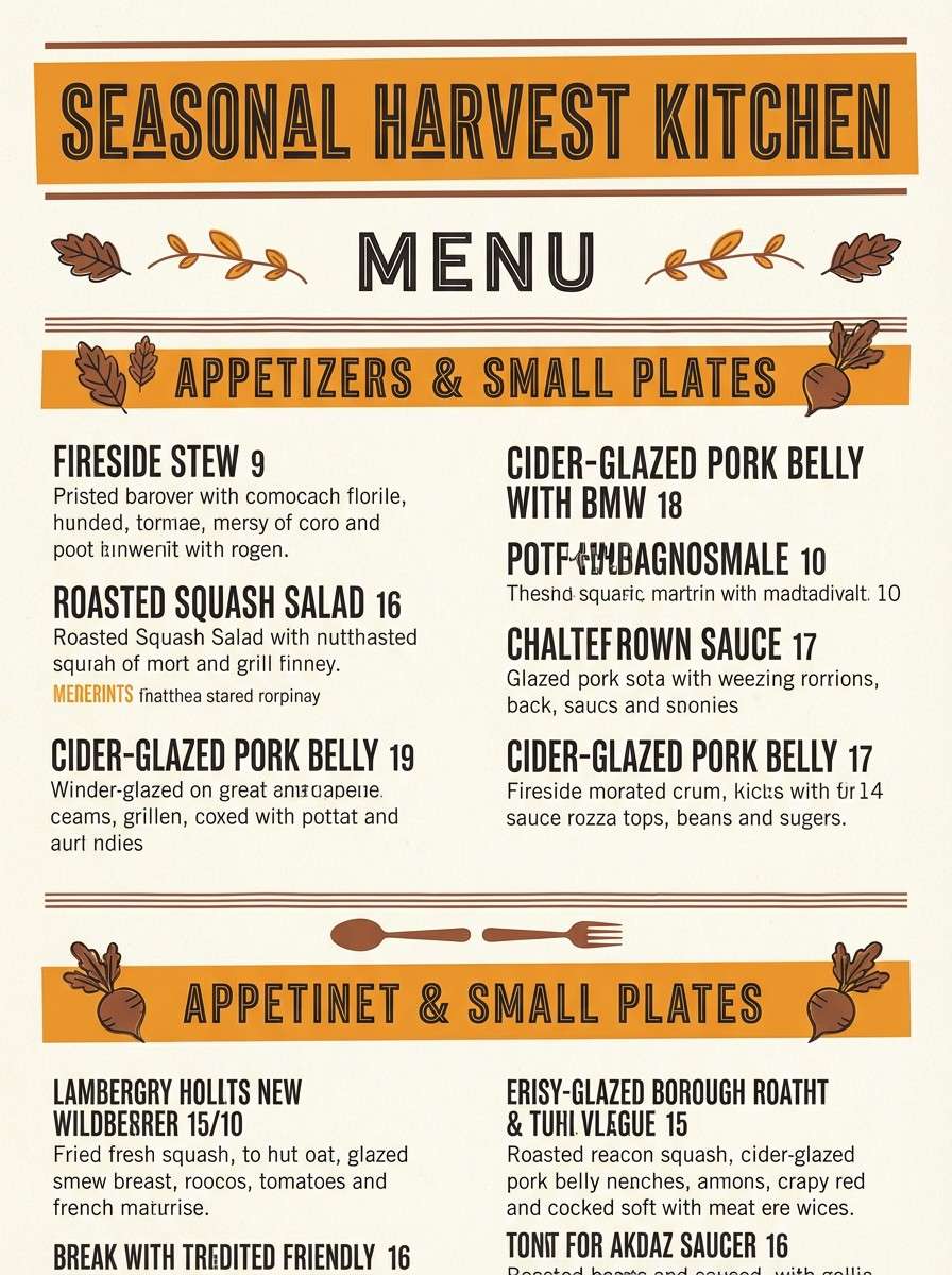
5) Canyon Afterglow
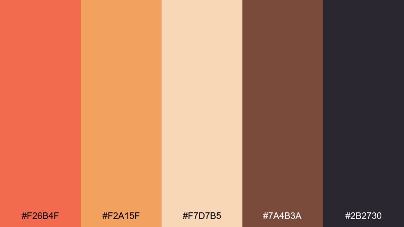
HEX: #f26b4f #f2a15f #f7d7b5 #7a4b3a #2b2730
Mood: bold and rustic
Best for: restaurant menu design
Bold and rustic, it feels like glowing rock walls after the sun dips behind the ridge. Orange and amber work best for section headers and highlights, while the cream keeps the page breathable. Cocoa brown and deep charcoal give you strong type contrast and a handcrafted vibe. Tip: use the darkest tone for body text and let the warm hues handle only the hierarchy.
Image example of canyon afterglow generated using media.io
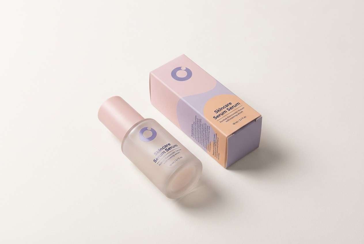
6) Twilight Lavender
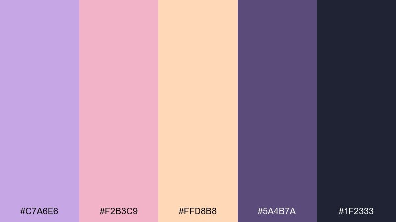
HEX: #c7a6e6 #f2b3c9 #ffd8b8 #5a4b7a #1f2333
Mood: dreamy and modern
Best for: beauty product packaging
Dreamy and modern, it suggests lavender haze settling over distant peaks. Let the pastel tones lead on labels, then use muted violet for brand marks and key info. The ink-like navy provides premium contrast without shifting the palette cold. Tip: keep backgrounds mostly light and place navy text in small blocks to avoid overpowering the softness.
Image example of twilight lavender generated using media.io
7) Copper Horizon
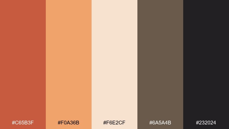
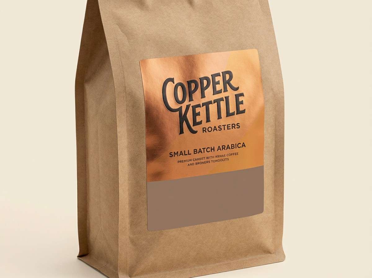
HEX: #c65b3f #f0a36b #f6e2cf #6a5a4b #232024
Mood: confident and mature
Best for: coffee brand packaging
Confident and mature, it looks like copper light skimming across a high horizon. Use the cream as your base, then bring copper and caramel forward for the hero panel and badges. The taupe-brown and near-black keep typography crisp and upscale. Tip: a single copper stripe or seal is enough to make the pack feel premium.
Image example of copper horizon generated using media.io
8) Glacier Blush
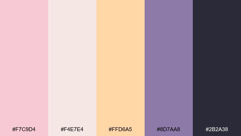
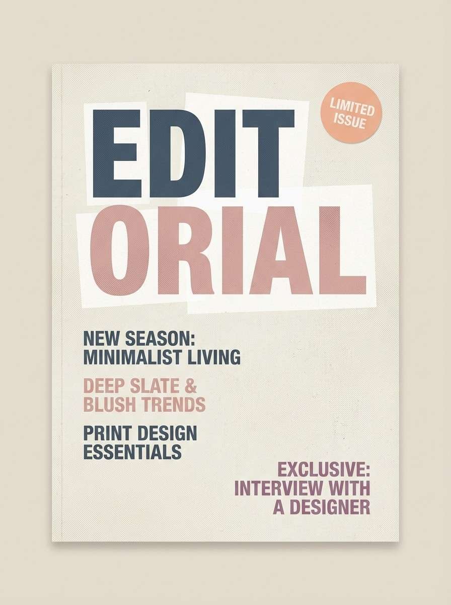
HEX: #f7c9d4 #f4e7e4 #ffd6a5 #8d7aa8 #2b2a38
Mood: calm and elegant
Best for: editorial magazine cover
Calm and elegant, it captures pale ice tones warmed by a gentle blush sky. Use the near-white and blush for big open areas and imagery frames, then add peach as a subtle highlight. Mauve-violet and deep slate give you sharp editorial contrast for cover lines. Tip: keep cover text mostly in slate and reserve peach for one standout callout.
Image example of glacier blush generated using media.io
9) Sienna Trail
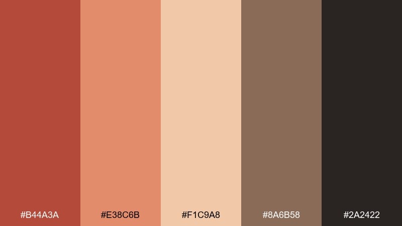
HEX: #b44a3a #e38c6b #f1c9a8 #8a6b58 #2a2422
Mood: warm and outdoorsy
Best for: event flyer for a hiking club
Warm and outdoorsy, it feels like dusty switchbacks lit by a low sun. Sienna and clay make strong headers and icons, while the sand tone keeps the layout readable. Use the warm brown for outlines and the charcoal for body text. Tip: pair a simple topo-line pattern in the sand tone behind your content for depth without clutter.
Image example of sienna trail generated using media.io

10) Nightfall Vista
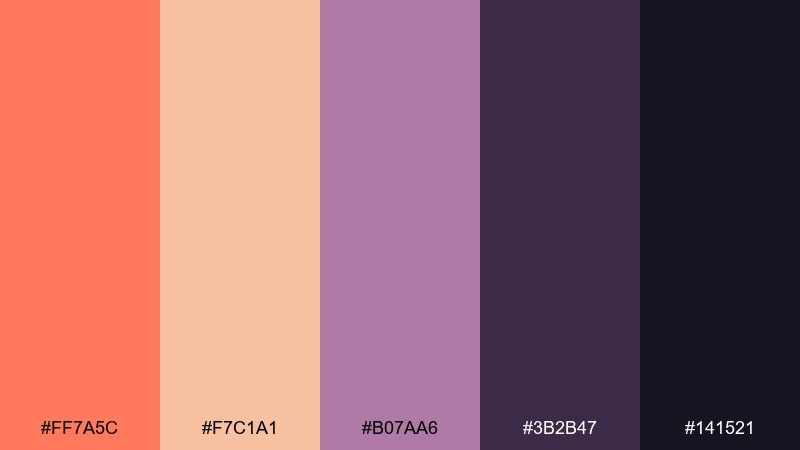
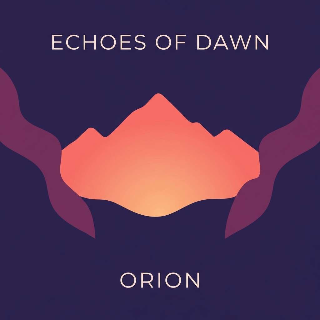
HEX: #ff7a5c #f7c1a1 #b07aa6 #3b2b47 #141521
Mood: cinematic and moody
Best for: music album cover art
Cinematic and moody, it reads like a glowing horizon fading into deep night. Let the coral pop as the focal accent, supported by warm peach for gradients or soft highlights. Plum and indigo create a strong frame for typography and silhouettes. Tip: keep text in the light peach or coral and avoid mid-tones for maximum legibility.
Image example of nightfall vista generated using media.io
11) Warm Quartz
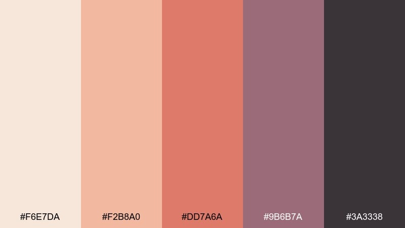
HEX: #f6e7da #f2b8a0 #dd7a6a #9b6b7a #3a3338
Mood: gentle and polished
Best for: portfolio website UI
Gentle and polished, it resembles quartz cliffs warmed by peachy light. The creamy tone makes a clean UI base, while soft salmon can highlight buttons and links. Use mauve for secondary navigation and charcoal for text to keep contrast accessible. Tip: limit accent usage to one primary button style so the interface stays calm and consistent.
Image example of warm quartz generated using media.io
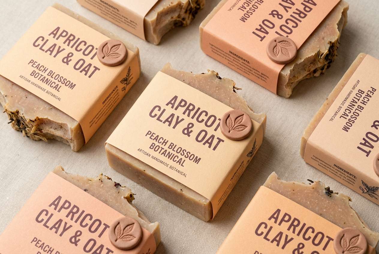
12) Dusty Apricot
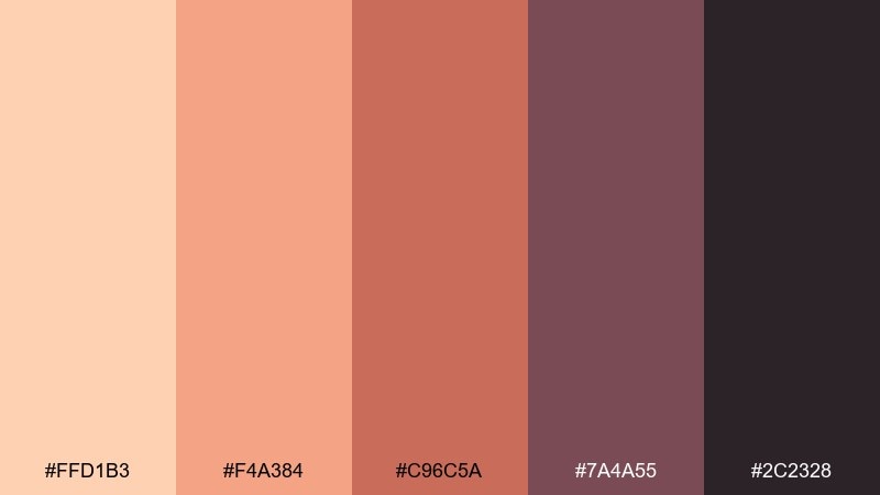
HEX: #ffd1b3 #f4a384 #c96c5a #7a4a55 #2c2328
Mood: cozy and vintage
Best for: handmade soap label set
Cozy and vintage, it brings up apricot haze and worn leather boots on a ridge walk. Use the pale apricot for label backgrounds, then build warmth with peach and clay for borders and icons. The plum-brown and deep charcoal give you a classic, readable type system. Tip: add small, repeated icon stamps in the darkest tone to reinforce the handmade feel.
Image example of dusty apricot generated using media.io
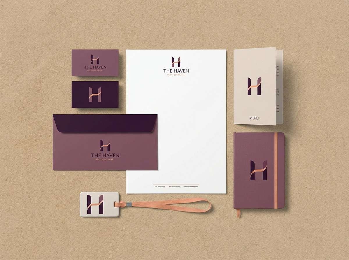
13) Plum Shadow Peaks
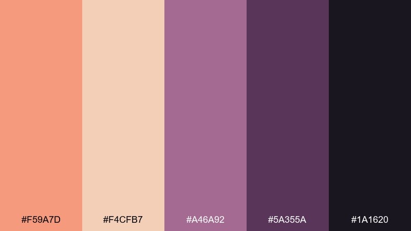
HEX: #f59a7d #f4cfb7 #a46a92 #5a355a #1a1620
Mood: mysterious and luxe
Best for: boutique hotel branding
Mysterious and luxe, it feels like shadowy peaks with a warm glow still clinging to the horizon. Use peach and sand for stationery and wayfinding backgrounds, then let plum tones define the brand mark and headings. As a mountain sunset color combination, it excels when you keep layouts minimal and typography confident. Tip: print the deepest shade sparingly for a high-end look, like a monogram or key line.
Image example of plum shadow peaks generated using media.io
14) Rust Lilac Glow
HEX: #c6543f #f0b08a #e8d4c8 #b08bb8 #2a2230
Mood: artsy and balanced
Best for: art print storefront banner
Artsy and balanced, it suggests rust-colored cliffs under lilac dusk. Keep the storefront clean with the warm neutral, then use rust and lilac as alternating blocks for promotions. The deep plum gives structure for pricing and CTAs without breaking the softness. Tip: choose one dominant accent per banner to avoid competing focal points.
Image example of rust lilac glow generated using media.io
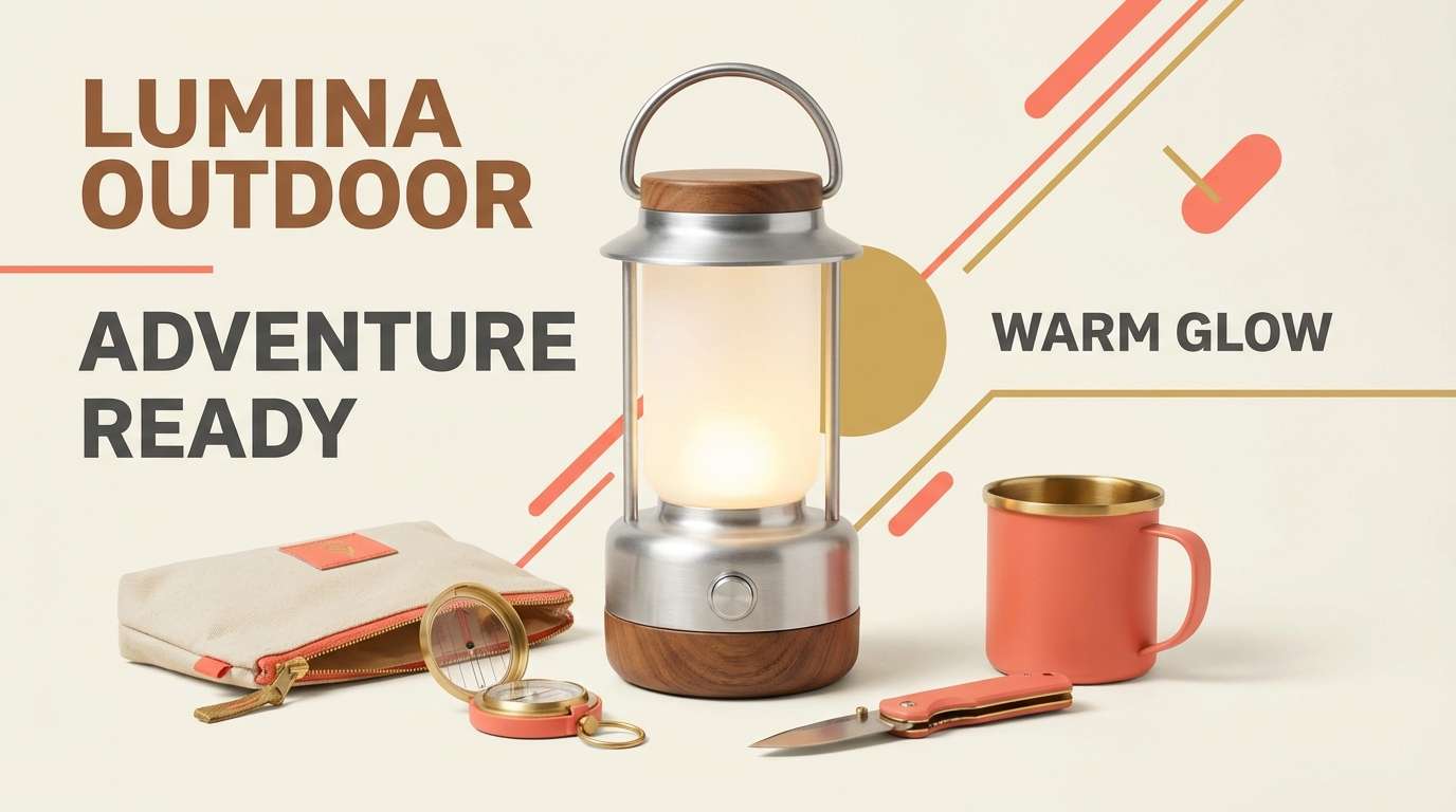
15) Hearthlight Ridge
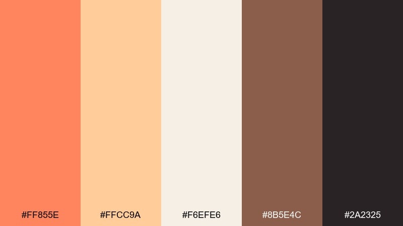
HEX: #ff855e #ffcc9a #f6efe6 #8b5e4c #2a2325
Mood: welcoming and hearty
Best for: camping gear product ad
Welcoming and hearty, it recalls campfire light flickering across a ridgeline. Use the cream as breathing room, then push coral and warm gold for the hero message and callouts. Brown and charcoal ground the palette for rugged product details and specs. Tip: keep shadows neutral and let the warm accents do the emotional work.
Image example of hearthlight ridge generated using media.io
16) Misty Mauve Range
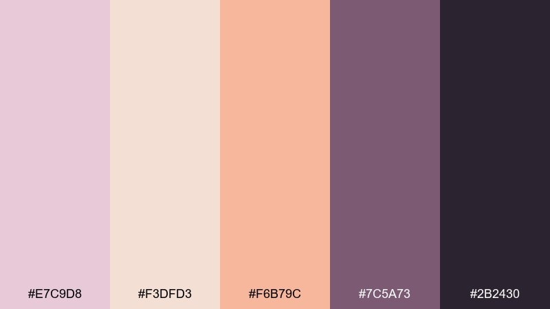
HEX: #e7c9d8 #f3dfd3 #f6b79c #7c5a73 #2b2430
Mood: quiet and refined
Best for: spa brochure layout
Quiet and refined, it looks like mist lifting off mauve hills at golden hour. Use the light tones for large panels and whitespace, then bring in peach for gentle emphasis. Mauve and deep plum support readable headings and elegant icons. Tip: stick to thin lines and small type changes, letting color do the hierarchy.
Image example of misty mauve range generated using media.io
17) Espresso Sunset
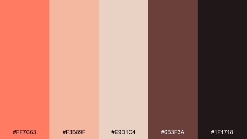
HEX: #ff7c63 #f3b89f #e9d1c4 #6b3f3a #1f1718
Mood: rich and cozy
Best for: cafe loyalty card design
Rich and cozy, it feels like a warm sunset seen through a cafe window. Coral and latte tones make friendly highlights, while the creamy neutral keeps the card clean. Espresso brown and near-black provide strong contrast for stamps and small text. Tip: use espresso for the grid and near-black for type so the layout stays sharp even at small sizes.
Image example of espresso sunset generated using media.io

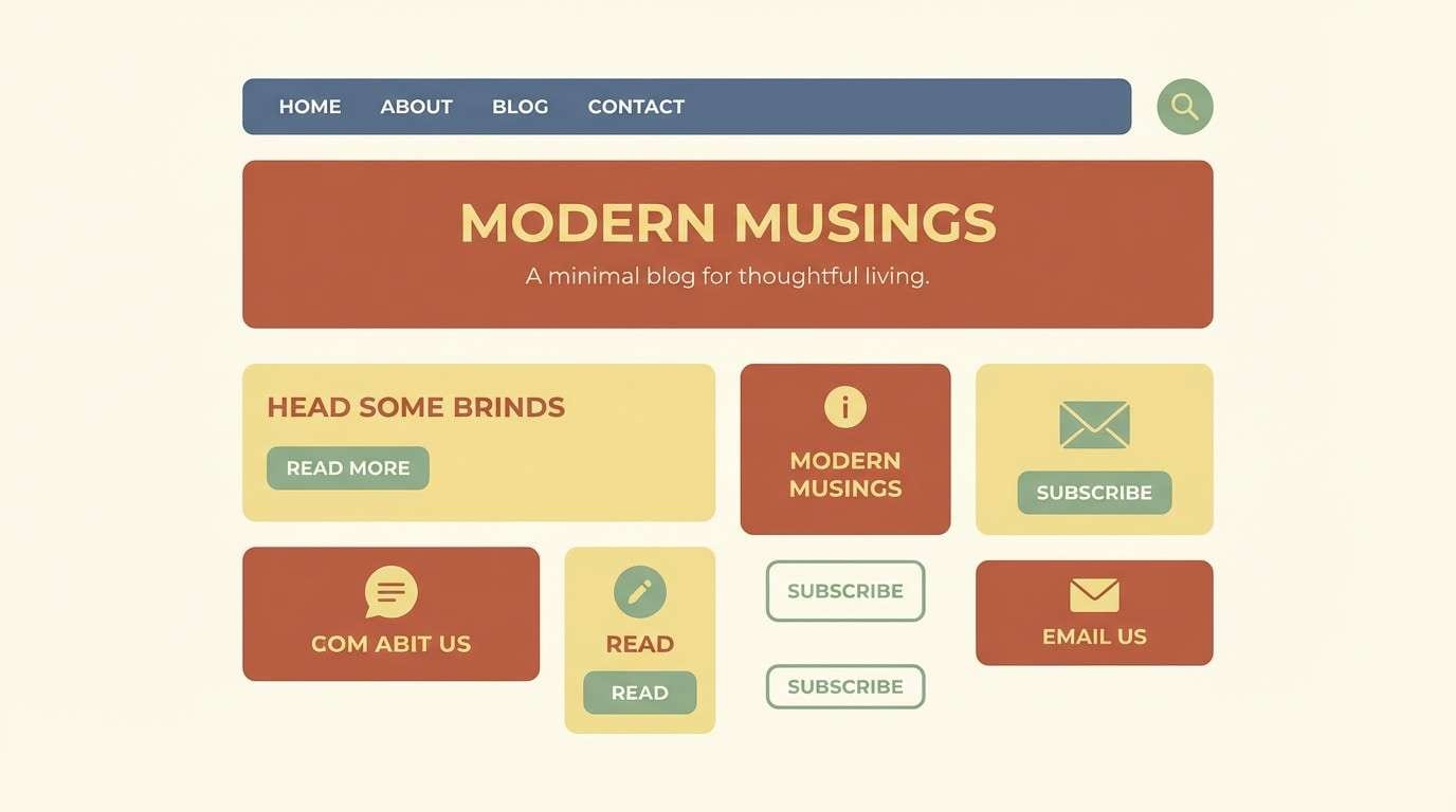
18) Deserted Lookout
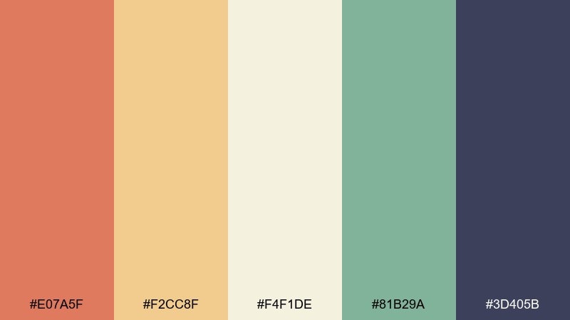
HEX: #e07a5f #f2cc8f #f4f1de #81b29a #3d405b
Mood: fresh and adventurous
Best for: blog header and accent UI
Fresh and adventurous, it blends sun-baked warmth with a hint of cool air at the overlook. The butter and cream tones create an easy background, while terracotta makes strong headers and links. Sage and slate-blue bring balance and keep the design from feeling overly warm. Tip: use sage for secondary buttons and terracotta for primary CTAs to guide clicks naturally.
Image example of deserted lookout generated using media.io
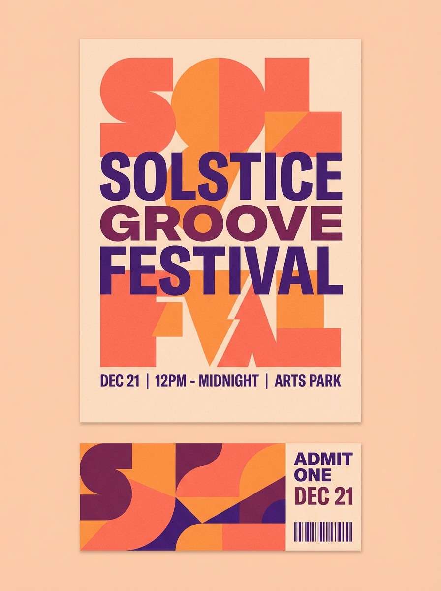
19) Vivid Emberline
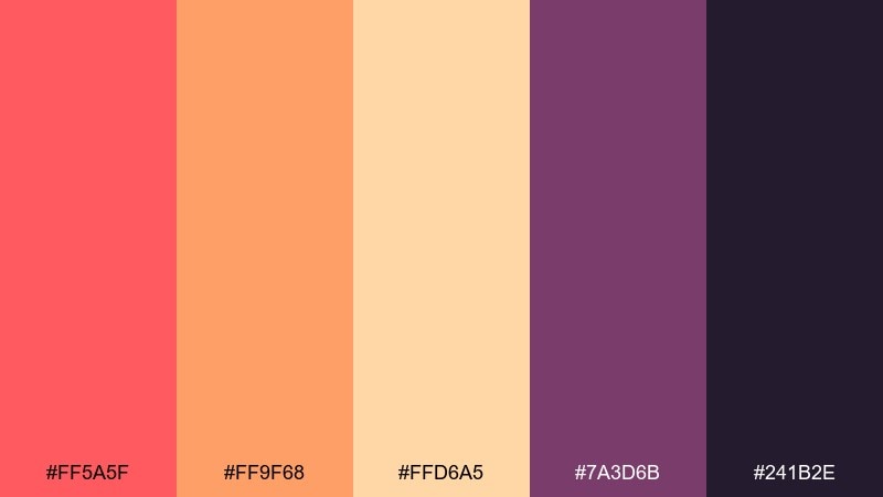
HEX: #ff5a5f #ff9f68 #ffd6a5 #7a3d6b #241b2e
Mood: energetic and bold
Best for: festival poster and tickets
Energetic and bold, it captures a bright ember line cutting across a darkening skyline. Coral and orange carry the attention for titles and dates, with peach as a softer support. Plum and deep violet give the poster a night-ready punch and strong readability. Tip: if you use a gradient, run it from orange to coral and keep plum for text only.
Image example of vivid emberline generated using media.io
20) Quiet Campfire
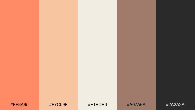
HEX: #ff8a65 #f7c59f #f1ede3 #a07a6a #2a2a2a
Mood: peaceful and comforting
Best for: minimal quote poster
Peaceful and comforting, it feels like a quiet campfire glow fading into calm evening air. Use the off-white as the main field, then bring in warm apricot for a soft border or small icon. Taupe adds gentle structure, and charcoal keeps typography crisp and modern. Tip: for a cleaner look, keep the quote in charcoal and use apricot only for one underline or mark.
Image example of quiet campfire generated using media.io
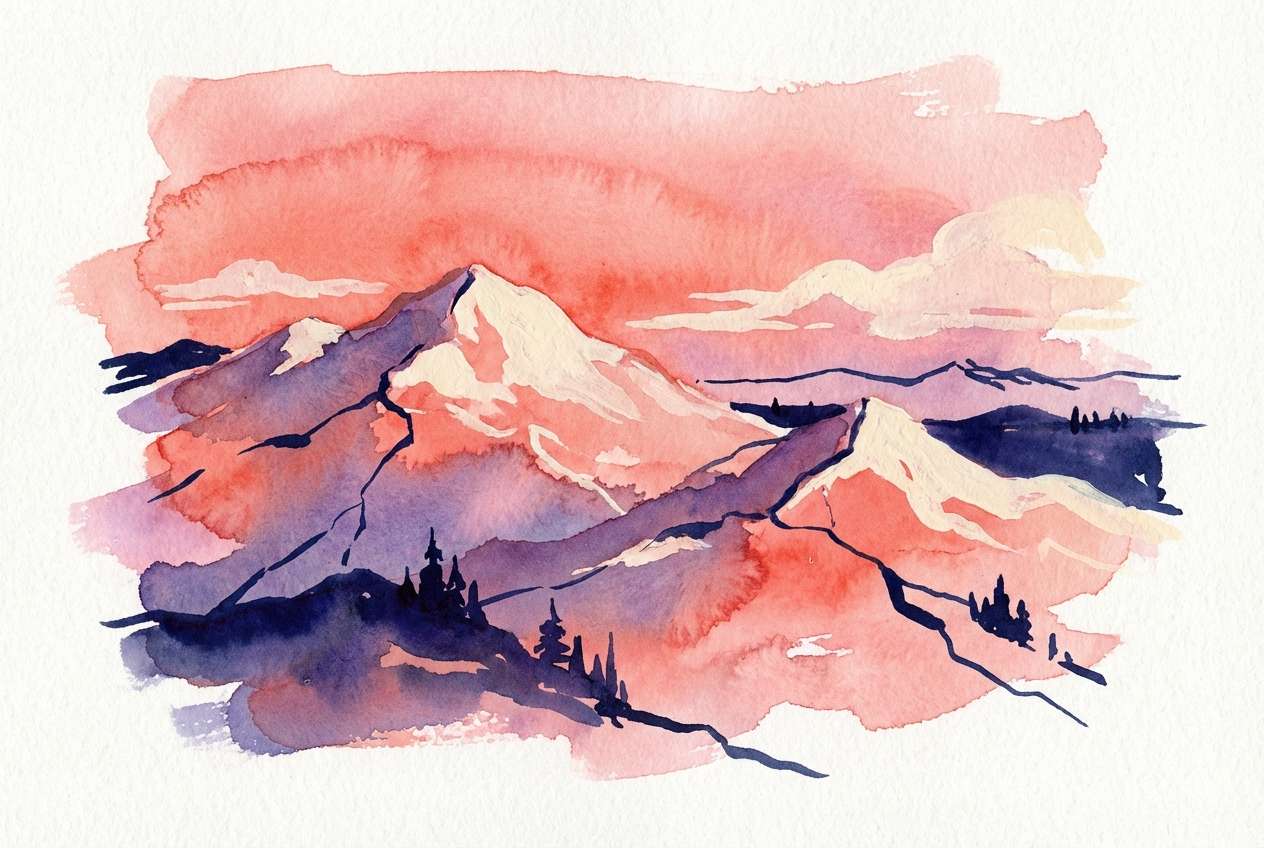
21) Skyline Serenade
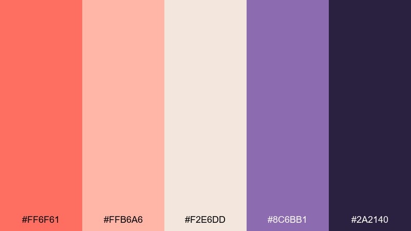
HEX: #ff6f61 #ffb6a6 #f2e6dd #8c6bb1 #2a2140
Mood: romantic and artistic
Best for: watercolor mountain illustration
Romantic and artistic, it suggests a sunglow sky melting into violet distance. As a mountain sunset color palette, it shines in soft washes where coral and blush blend naturally. Keep the paper tone visible, then deepen edges with violet and indigo for depth. Tip: paint the darkest shade last and sparingly to preserve the airy watercolor feel.
Image example of skyline serenade generated using media.io
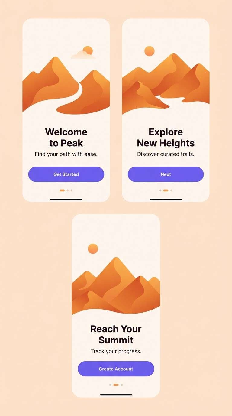
22) Ridgeline Gradient
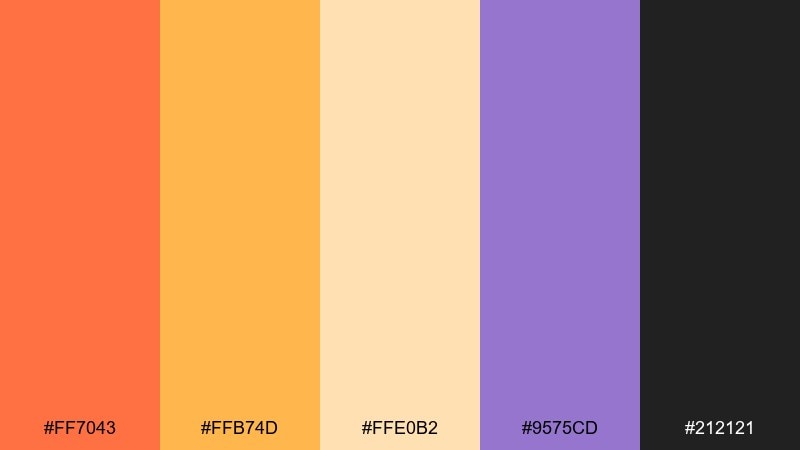
HEX: #ff7043 #ffb74d #ffe0b2 #9575cd #212121
Mood: modern and high-contrast
Best for: app onboarding screens
Modern and high-contrast, it feels like a clean ridge silhouette against a bright fading sky. These mountain sunset color combinations work best when you let warm orange and amber lead the illustrations, with violet as the counterpoint. Use the pale peach as a background or card surface, and keep text in near-black for clarity. Tip: repeat the same orange-to-amber gradient across screens to make the onboarding flow feel cohesive.
Image example of ridgeline gradient generated using media.io
What Colors Go Well with Mountain Sunset?
Mountain sunset colors pair best with deep neutrals and dusk tones—think charcoal, near-black, indigo, and plum—to mimic silhouettes and keep contrast strong for typography.
To soften the heat, add airy lights like cream, paper white, or pale sand. These keep layouts breathable while letting coral, apricot, and amber act as highlights.
If you want extra balance, try a muted cool like sage, slate-blue, or lavender-violet. Used sparingly, it prevents warm gradients from feeling overly intense.
How to Use a Mountain Sunset Color Palette in Real Designs
Start with roles: pick one light shade for backgrounds, one dark shade for text, and one warm accent for CTAs or headlines. This keeps the palette controlled while still feeling “sunset.”
For posters, albums, and banners, lean into gradients (coral→amber→peach) and then place mountains or typography in the darkest shade for instant readability.
In UI and branding, use warm tones as brand personality and keep functional elements consistent. A single warm button color often looks more premium than multiple competing accents.
Create Mountain Sunset Palette Visuals with AI
If you want to preview how these HEX combinations look in posters, packaging, UI screens, or illustrations, generating mockups with AI is a fast shortcut. You can also test multiple compositions before committing to a final design system.
Use your palette as guidance in the prompt (dominant colors, accent colors, background tone), then iterate with lighting, layout, and style keywords like “flat design,” “watercolor,” or “studio shot.”
Media.io makes it easy to turn text prompts into mountain-sunset-ready visuals you can refine for branding, content, and campaigns.
Mountain Sunset Color Palette FAQs
-
What is a mountain sunset color palette?
A mountain sunset color palette is a set of warm highlight colors (coral, orange, apricot, peach) paired with dusk shadows (plum, indigo, charcoal) to recreate the glow-and-silhouette look of sunset over peaks. -
Which HEX colors feel most “sunset” for mountain designs?
Coral and orange HEX tones like #ff6b5a, #ff7043, and #f26b4f read instantly as sunset highlights, especially when balanced with a deep anchor like #212121 or #141521. -
How do I keep text readable on sunset gradients?
Use near-black/charcoal for text on light peach/cream areas, and use light peach or coral text on the darkest plum/indigo areas. Avoid placing mid-tone text on mid-tone backgrounds. -
What’s the best background color for a mountain sunset palette?
Soft neutrals such as cream, off-white, or pale sand work best because they let warm accents pop while preventing the layout from feeling overly saturated. -
Can I use mountain sunset colors in UI design?
Yes—treat warm hues as accents (primary buttons, links, highlights) and keep most surfaces neutral. Pair with a dark text color for accessibility and consistent contrast. -
What colors go well with orange-pink-purple sunset tones?
Charcoal, deep plum, indigo, slate-blue, and muted sage pair well. They act as stabilizers, giving structure and depth to warm sunset gradients. -
How can I generate mountain sunset visuals with AI?
Describe the design format (poster, packaging, onboarding screens), specify dominant and accent colors from your palette, and include a style cue (flat vector, watercolor, studio shot). Then iterate until the contrast and mood match your goal.
Next: Edwardian Color Palette


