

Planning an interior color palette gets easier when you treat your space like a layered outfit: a calm base, a few mid-tones for depth, and one confident accent for personality.
Below are 20 room-ready interior color combinations with HEX codes—built for real walls, textiles, wood tones, and the lighting conditions that make colors shift.
In this article
- Why Interior Color Schemes Work So Well
-
- warm linen retreat
- terracotta and sage nook
- midnight brass drama
- coastal stonewash
- moody library walnut
- minimal concrete blush
- olive clay kitchen
- nordic blue gray calm
- sunlit citrus entry
- dusty rose velvet
- desert sand and ink
- charcoal mint studio
- vintage ochre tiles
- rainy day greige
- jade and cream serenity
- berry smoke statement
- earthy atelier mix
- soft black and camel
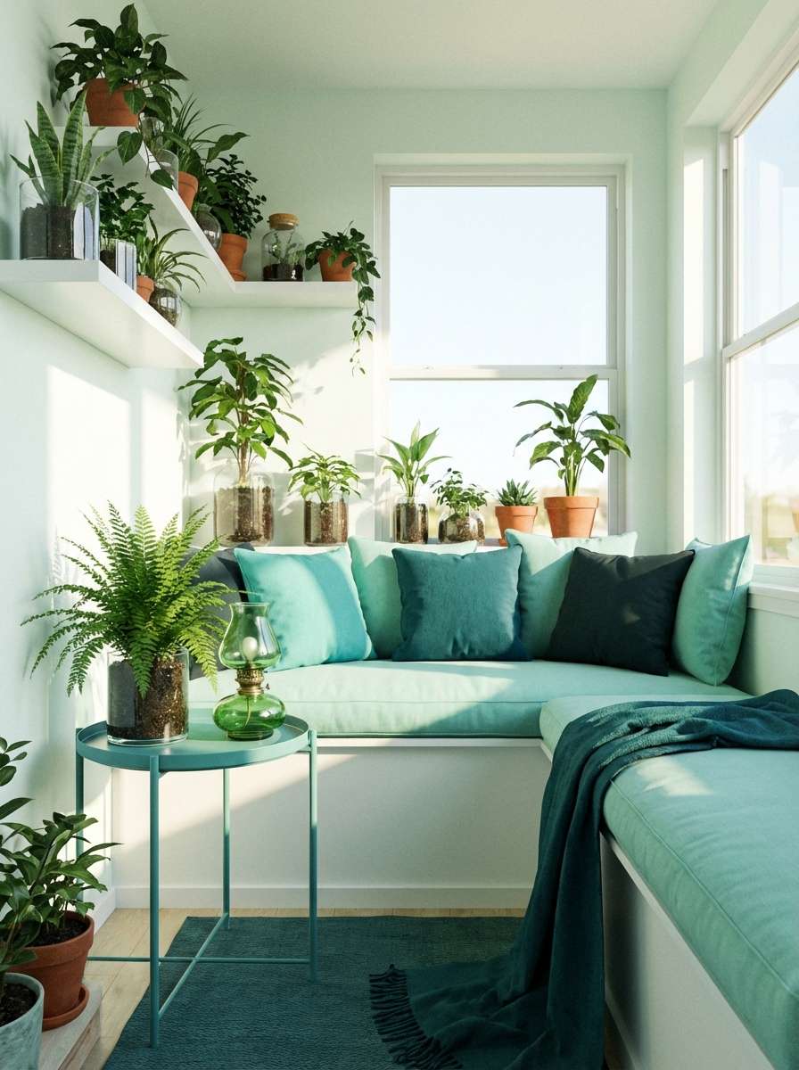
- aqua terrarium fresh
- golden hour neutrals
- What Colors Go Well with Interior?
- How to Use a Interior Color Scheme in Real Designs
- Create Interior Palette Visuals with AI
Why Interior Color Schemes Work So Well
Interior spaces are made of many surfaces—walls, floors, ceilings, cabinetry, fabric, and metal—so a palette gives you a repeatable system that keeps everything looking intentional.
Because colors change with daylight, warm bulbs, and shadows, a pre-planned mix of light, mid, and dark tones prevents rooms from feeling “off” once paint meets real life.
Most importantly, a strong interior color scheme creates rhythm: when you repeat a few key shades across different materials, the whole room feels cohesive even with varied furniture styles.
20+ Interior Color Combinations (with HEX Codes)
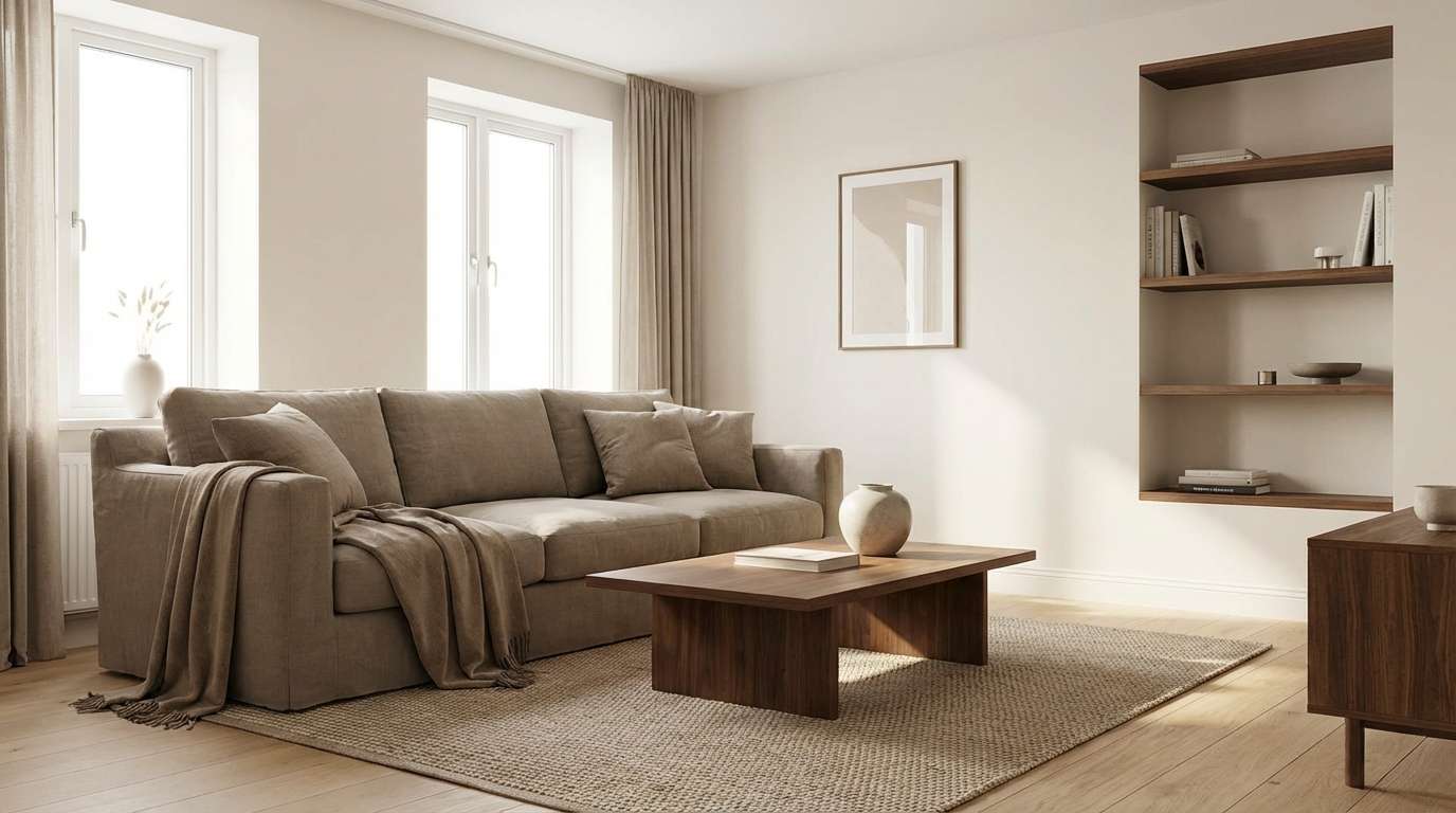
1) Warm Linen Retreat
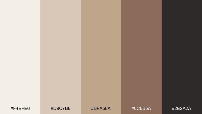
HEX: #f4efe6 #d9c7b8 #bfa58a #8c6b5a #2e2a2a
Mood: cozy, airy, grounded
Best for: scandinavian living room
Cozy and sun-warmed, this interior color mix feels like natural linen, oak floors, and soft morning light. Use the creamy tones on walls to keep the room open, then layer the taupes and browns in textiles and wood. The deep near-black works best in small hits like metal hardware, picture frames, or a coffee table base. Tip: repeat the darkest shade at least twice so it reads intentional, not accidental.
Image example of warm linen retreat generated using media.io
Media.io is an online AI studio for creating and editing video, image, and audio in your browser.

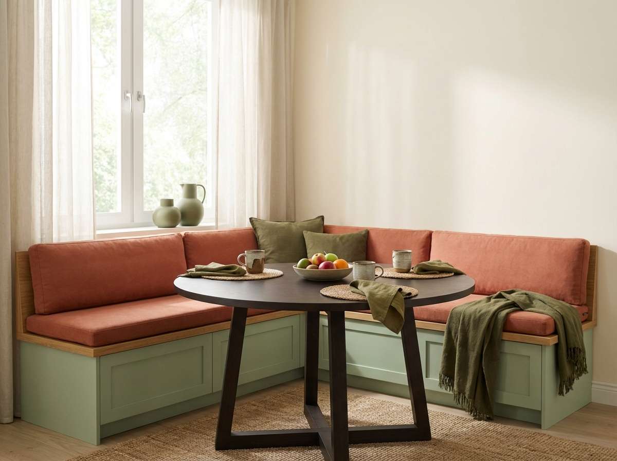
2) Terracotta and Sage Nook
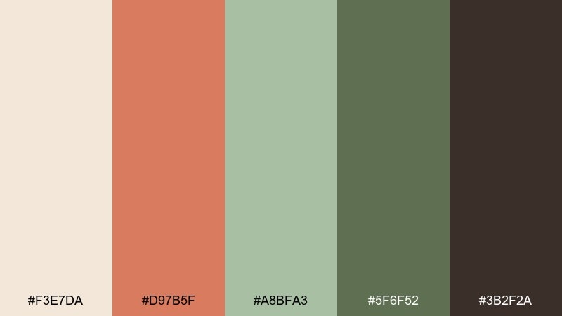
HEX: #f3e7da #d97b5f #a8bfa3 #5f6f52 #3b2f2a
Mood: earthy, welcoming, relaxed
Best for: breakfast nook with built-in bench
Earthy and welcoming, this interior color palette evokes clay planters, sunbaked walls, and fresh herbs on the counter. Keep the light cream for the backdrop, then bring terracotta in through upholstery or a statement pendant. Sage and olive are ideal for cabinetry, trim, or a painted bench to make the space feel grounded. Tip: pair with warm brass or aged bronze so the greens stay soft, not clinical.
Image example of terracotta and sage nook generated using media.io
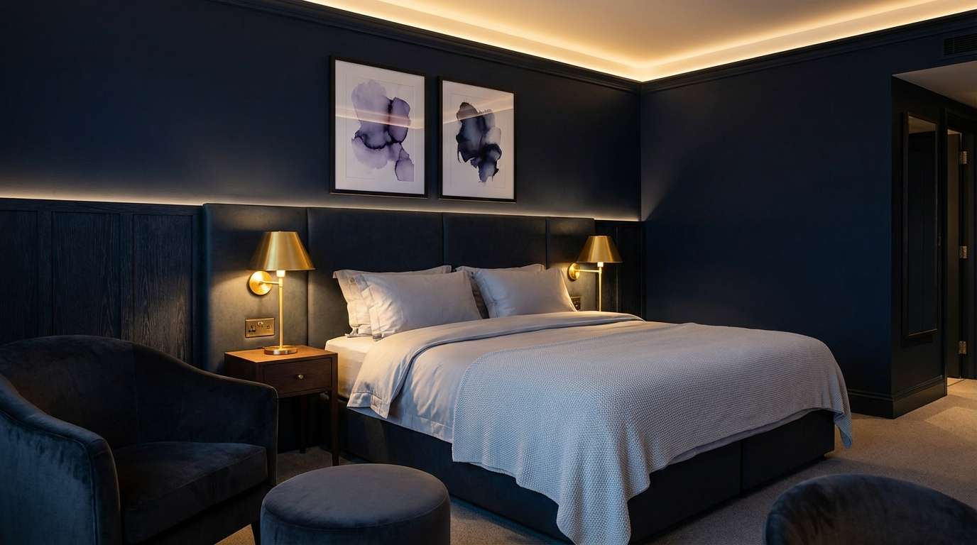
3) Midnight Brass Drama
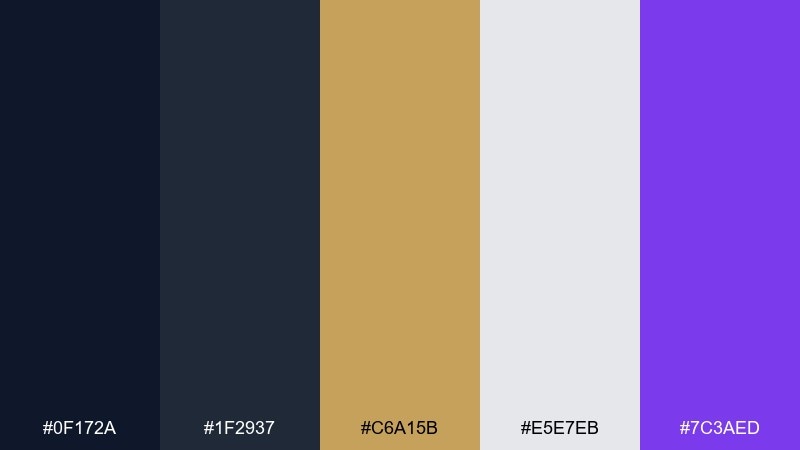
HEX: #0f172a #1f2937 #c6a15b #e5e7eb #7c3aed
Mood: dramatic, luxe, contemporary
Best for: hotel-style bedroom accent wall
Dramatic and luxe, it brings to mind a midnight sky lit by warm brass and a hint of violet. These interior color combinations shine in bedrooms where you want depth without visual clutter. Use the near-navy on one wall or built-ins, keep linens light, and let brass show up in lamps and pulls. Tip: add the violet sparingly in art or a throw so the room stays sophisticated, not loud.
Image example of midnight brass drama generated using media.io
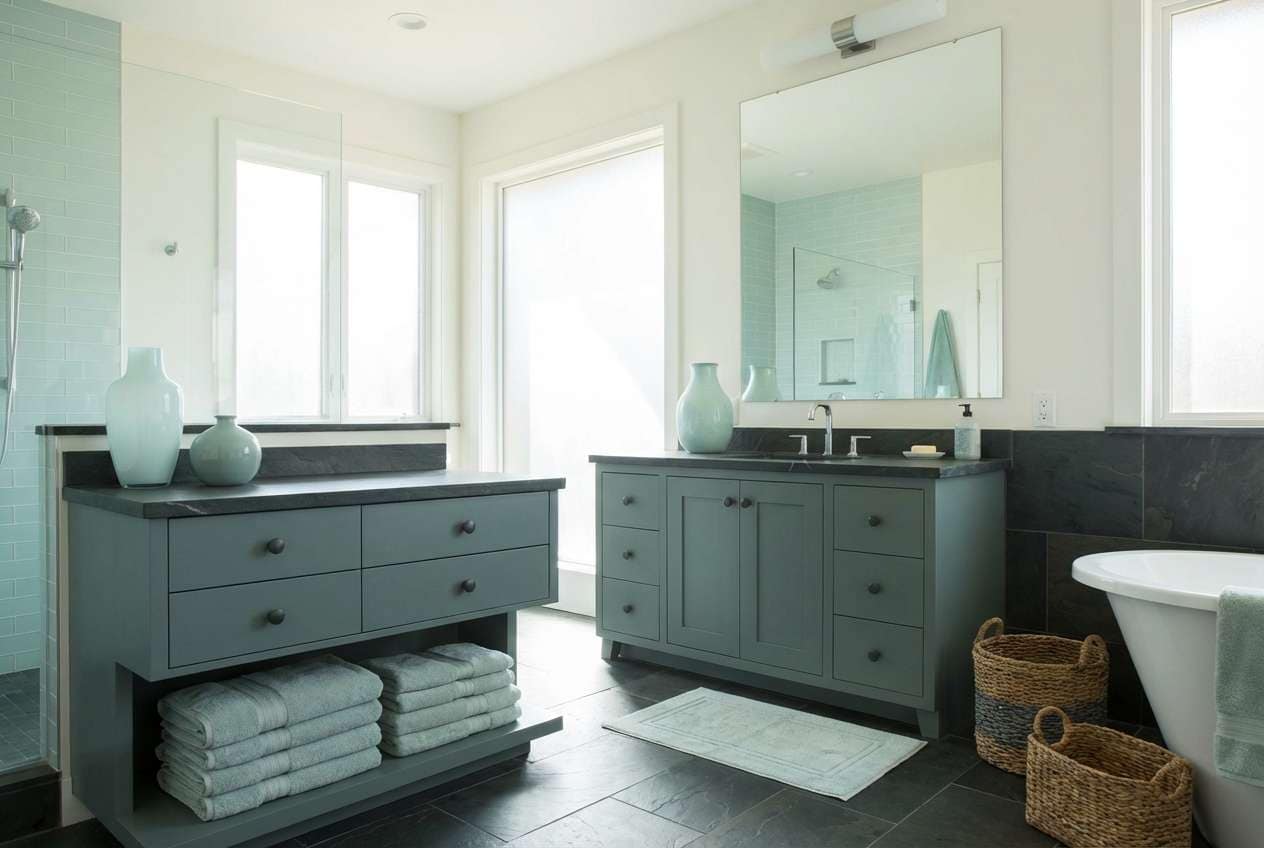
4) Coastal Stonewash
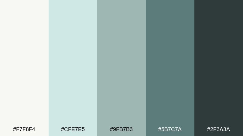
HEX: #f7f8f4 #cfe7e5 #9fb7b3 #5b7c7a #2f3a3a
Mood: fresh, breezy, clean
Best for: spa-inspired bathroom
Fresh and breezy, the interior color scheme feels like sea glass against pale stone and clean cotton towels. Use the off-white for tile or walls, then bring in the soft aquas through paint, cabinetry, or accessories. The deeper teal-gray is perfect for a vanity, mirror frame, or grout detail to add contrast. Tip: keep metal finishes consistent, like brushed nickel, to maintain the calm vibe.
Image example of coastal stonewash generated using media.io
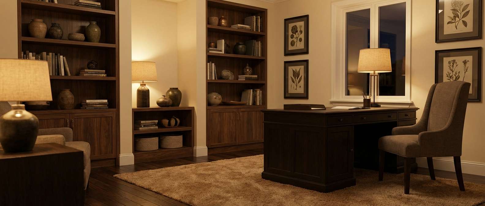
5) Moody Library Walnut
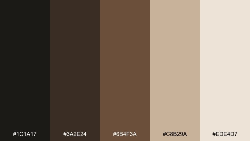
HEX: #1c1a17 #3a2e24 #6b4f3a #c8b29a #ede4d7
Mood: classic, intimate, scholarly
Best for: home office with built-in shelves
Classic and intimate, the interior color palette suggests worn leather, walnut shelves, and a quiet reading corner. Let the creams keep the room from feeling heavy, then build richness with mid and dark browns on millwork or furniture. The near-black works well for window trim or a desk lamp to sharpen edges. Tip: choose warm bulbs and matte finishes to avoid glare on darker walls.
Image example of moody library walnut generated using media.io
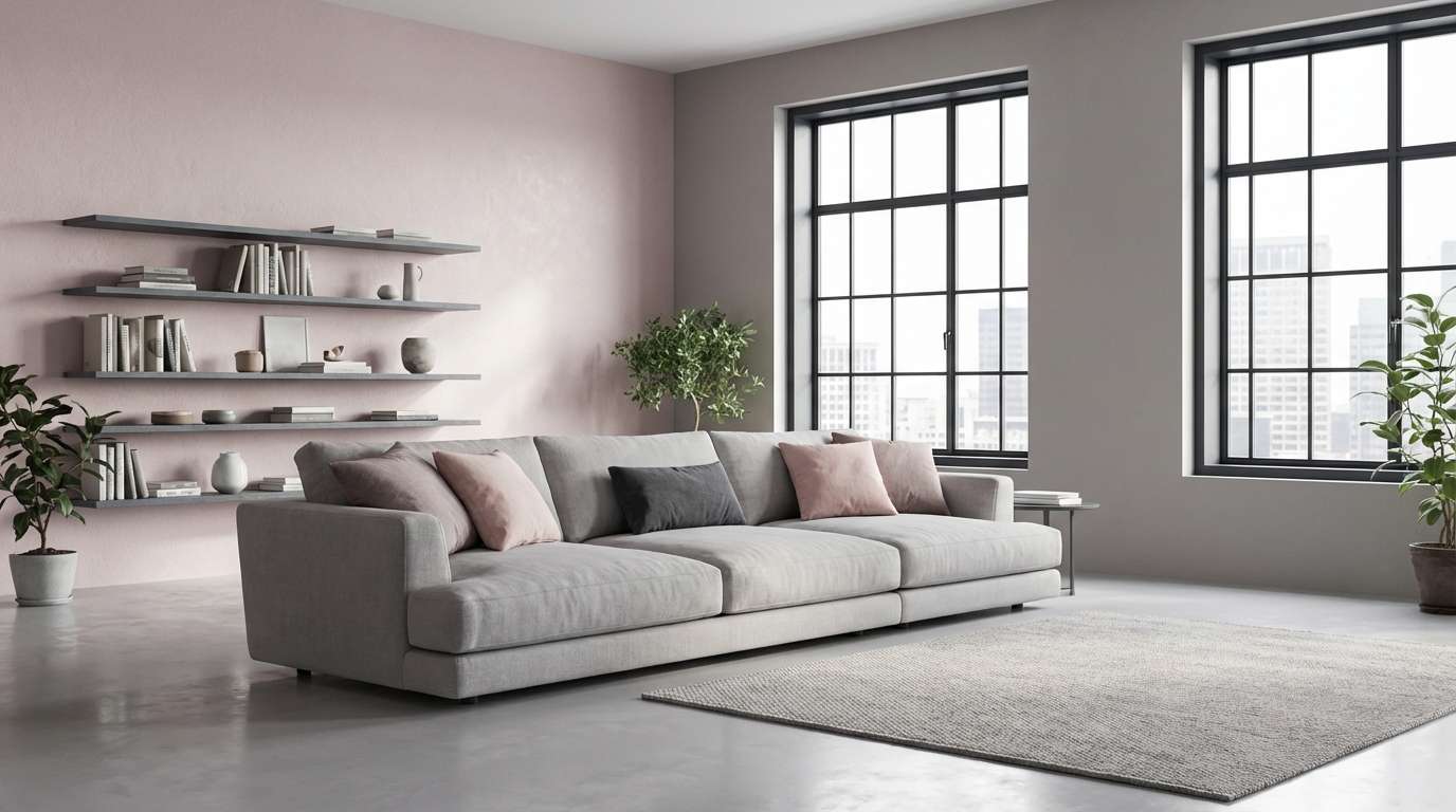
6) Minimal Concrete Blush
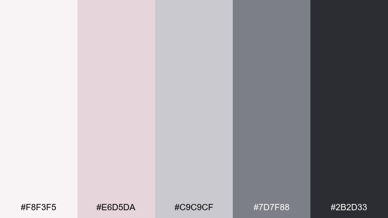
HEX: #f8f3f5 #e6d5da #c9c9cf #7d7f88 #2b2d33
Mood: modern, soft, urban
Best for: loft apartment living area
Modern and soft, these interior color combinations feel like blush plaster against cool concrete and steel. Use the pale pink and warm gray as a gentle base on walls and large rugs, then add the deeper slate in lighting or shelving. The charcoal is ideal for thin lines like window frames and hardware, keeping everything crisp. Tip: bring in texture, like boucle or felt, so the grays do not read flat.
Image example of minimal concrete blush generated using media.io
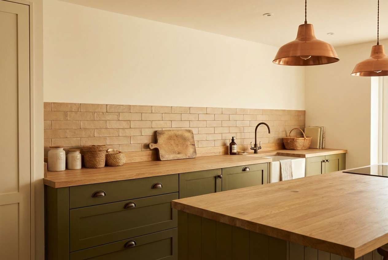
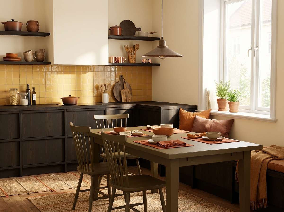
7) Olive Clay Kitchen
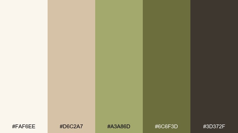
HEX: #faf6ee #d6c2a7 #a3a86d #6c6f3d #3d372f
Mood: rustic, natural, hearty
Best for: modern rustic kitchen cabinets
Rustic and natural, these interior color combos bring to mind olive branches, handmade ceramics, and stone counters. The creamy off-white keeps the kitchen bright, while the tan works beautifully on backsplash tile or bar stools. Use olive on lower cabinets for a grounded look and keep the darkest shade for hardware or open shelving brackets. Tip: pair with light oak or ash wood to prevent the greens from turning muddy.
Image example of olive clay kitchen generated using media.io
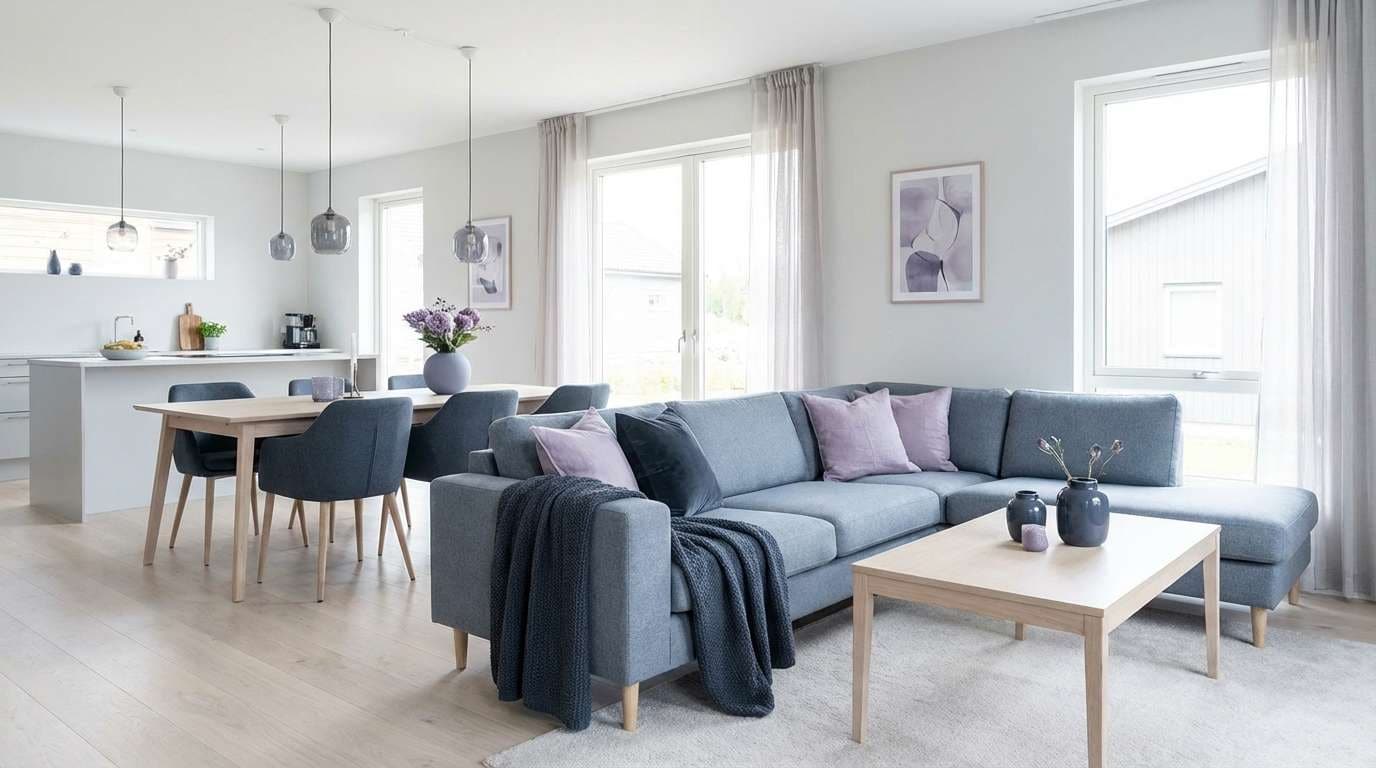
8) Nordic Blue Gray Calm
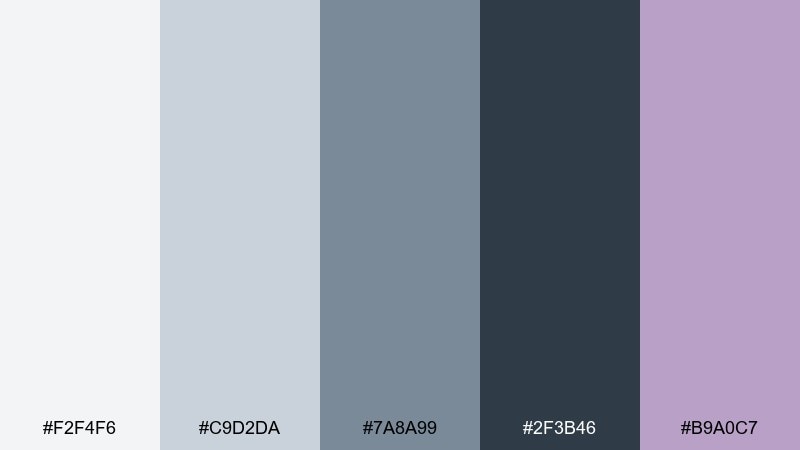
HEX: #f2f4f6 #c9d2da #7a8a99 #2f3b46 #b9a0c7
Mood: calm, tidy, balanced
Best for: open-plan living and dining
Calm and tidy, it recalls foggy coastlines, pale wood, and a quiet evening glow. For an open-plan area, this interior color scheme works best when the light grays stay dominant and the blue-grays appear in repeated accents. Bring in the muted lavender as a soft surprise in art, ceramics, or a single chair. Tip: keep curtains and large upholstery near the lightest shade to protect the airy feel.
Image example of nordic blue gray calm generated using media.io
9) Sunlit Citrus Entry
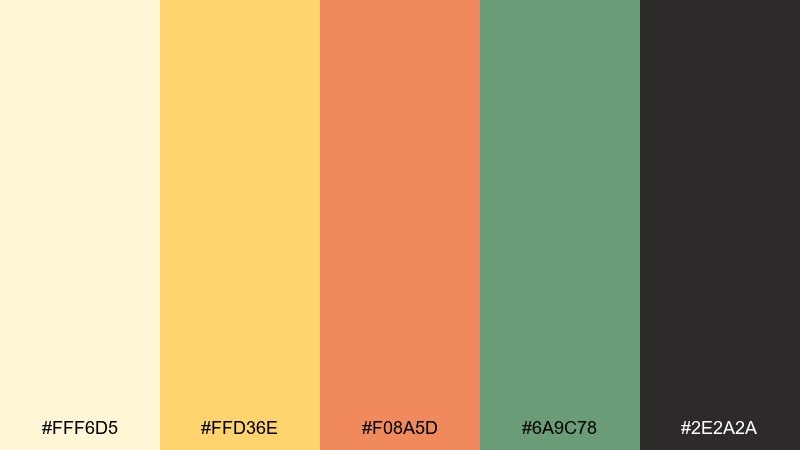
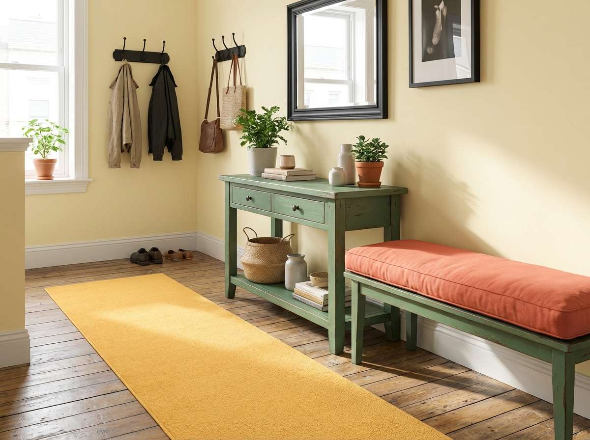
HEX: #fff6d5 #ffd36e #f08a5d #6a9c78 #2e2a2a
Mood: cheerful, energetic, welcoming
Best for: small apartment entryway
Cheerful and punchy, this interior color palette feels like late-afternoon sun on citrus peel and warm terracotta. Use the pale yellow as your bright base, then let the amber and coral pop on a runner, bench cushion, or wall art. The green keeps the warmth from feeling too sweet and looks great on a slim console or coat hooks. Tip: anchor the space with black accents so the brights stay sharp in a tight footprint.
Image example of sunlit citrus entry generated using media.io
10) Dusty Rose Velvet
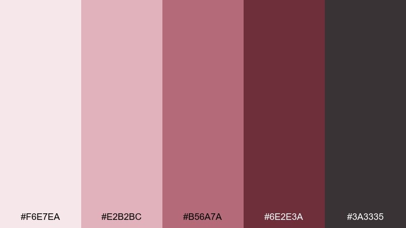
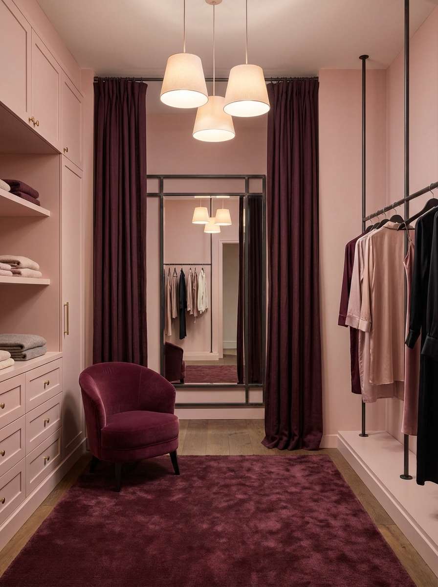
HEX: #f6e7ea #e2b2bc #b56a7a #6e2e3a #3a3335
Mood: romantic, plush, refined
Best for: boutique dressing room
Romantic and plush, these interior colors suggest velvet drapes, vintage perfume bottles, and rosy evening light. Keep the palest pink on walls or cabinetry for a flattering glow, then deepen the look with berry tones in seating and mirrors. The near-black is best in small details like handles and thin frames to keep the palette grown-up. Tip: add warm white lighting to avoid making the rose shades feel gray.
Image example of dusty rose velvet generated using media.io
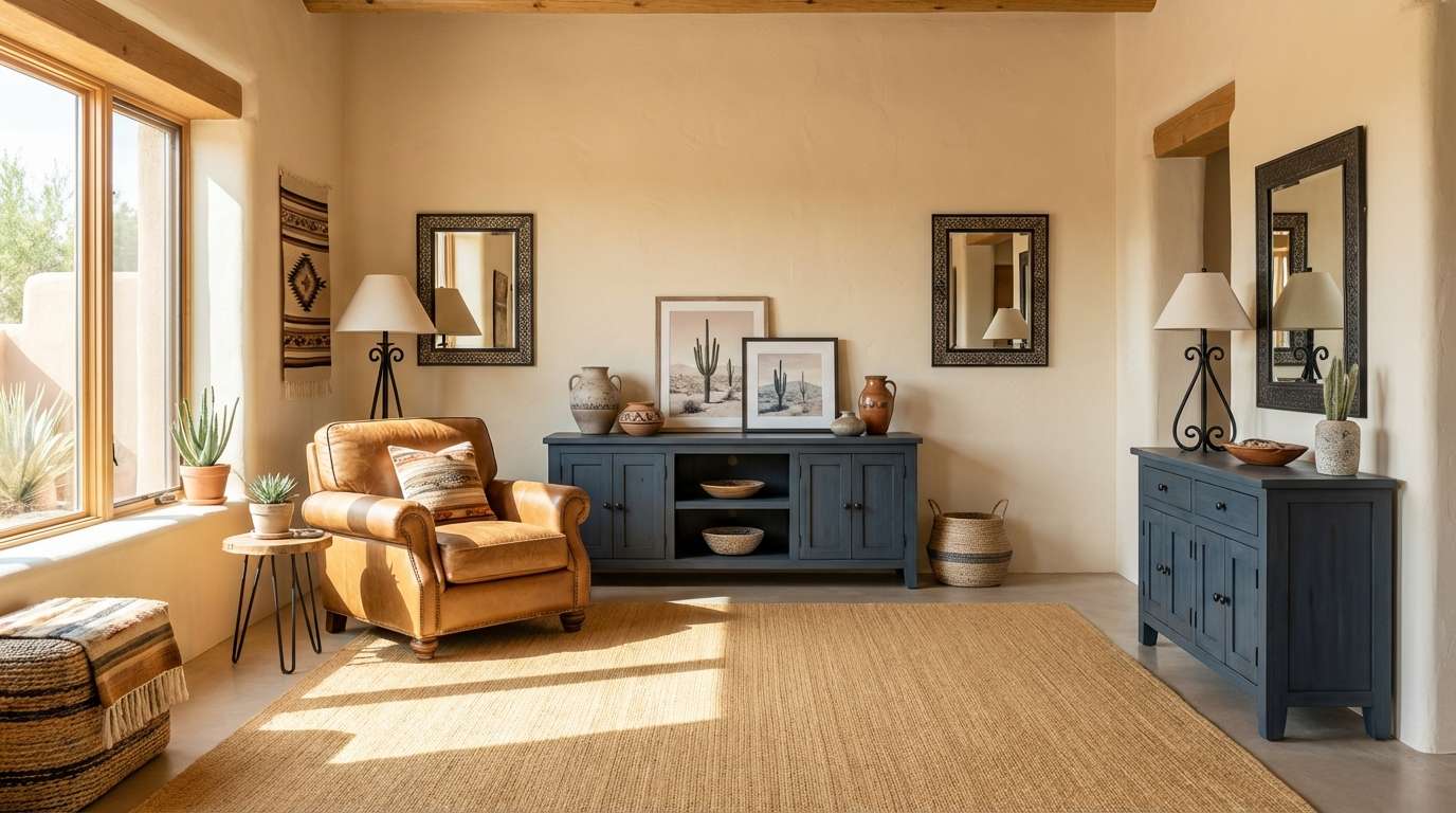
11) Desert Sand and Ink
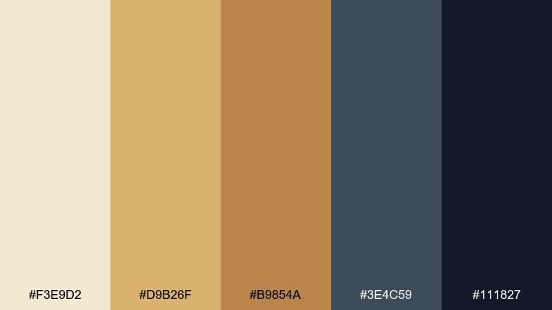
HEX: #f3e9d2 #d9b26f #b9854a #3e4c59 #111827
Mood: adventurous, warm, graphic
Best for: southwest-inspired living room
Adventurous and warm, these interior color combinations evoke desert dunes, leather, and ink-dark shadows at sunset. Use the sands for walls and rugs, then bring in the golden browns through wood, woven baskets, and accent chairs. The blue-charcoal works as a modern counterpoint for a media unit or feature wall. Tip: choose black sparingly and keep it matte so it reads as a clean outline, not a heavy block.
Image example of desert sand and ink generated using media.io
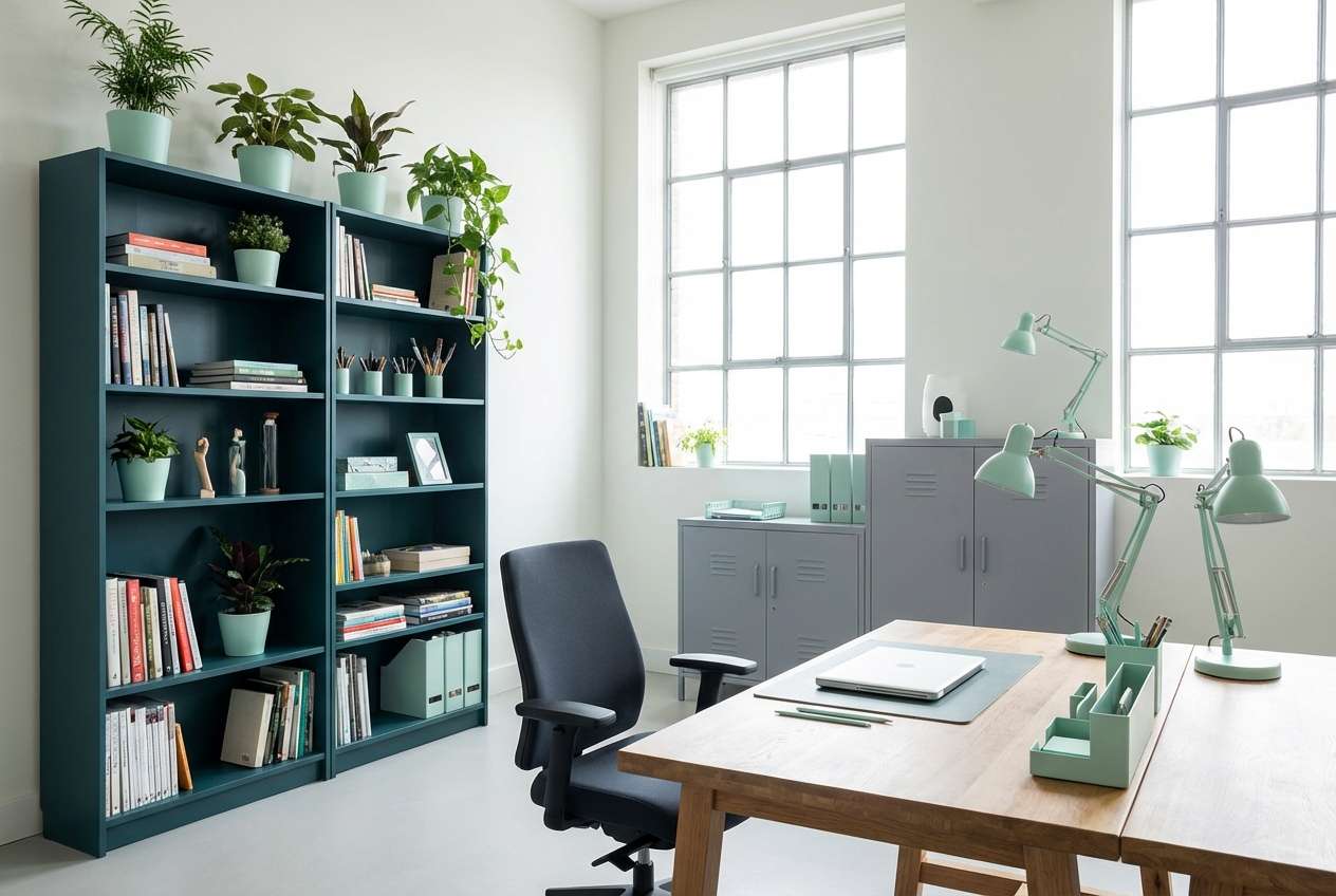
12) Charcoal Mint Studio
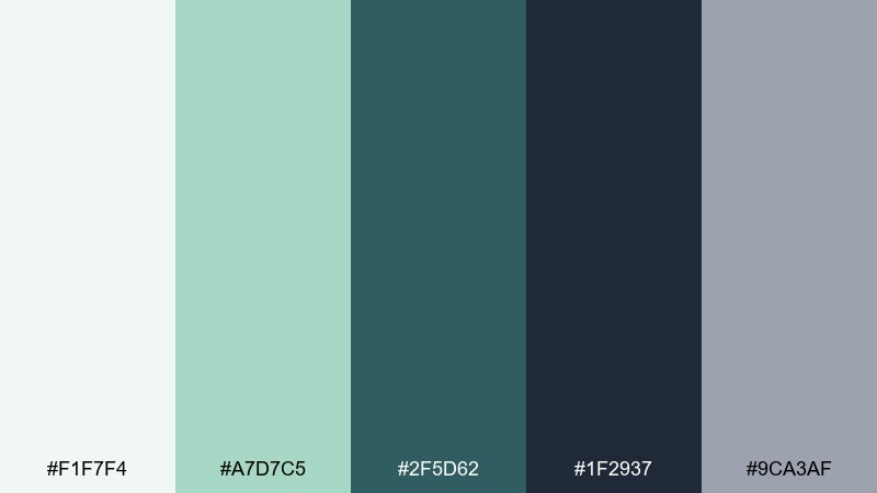
HEX: #f1f7f4 #a7d7c5 #2f5d62 #1f2937 #9ca3af
Mood: focused, fresh, contemporary
Best for: creative studio workspace
Focused and fresh, it feels like clean paper, mint glass, and dark graphite. Keep the background light so the mint reads crisp, then use teal and charcoal for shelving, task chairs, or a pinboard wall. The soft gray is a great bridge for textiles and storage bins to prevent harsh contrast. Tip: repeat mint in two zones, like a chair and a lamp, to make the accent feel deliberate.
Image example of charcoal mint studio generated using media.io
13) Vintage Ochre Tiles

HEX: #fff3e0 #f0c05a #c27c2c #6b5b3e #2d2a26
Mood: sunny, nostalgic, handcrafted
Best for: kitchen backsplash and dining corner
Sunny and nostalgic, this interior color palette brings up thoughts of hand-painted tiles, worn wood, and café light. Use the cream as the main field color, then work ochre and burnt orange into tile, art, or seat cushions. The olive-brown is excellent for wood tones and keeps the warm shades from feeling too sweet. Tip: combine with matte black fixtures for a modern edge that still feels timeless.
Image example of vintage ochre tiles generated using media.io
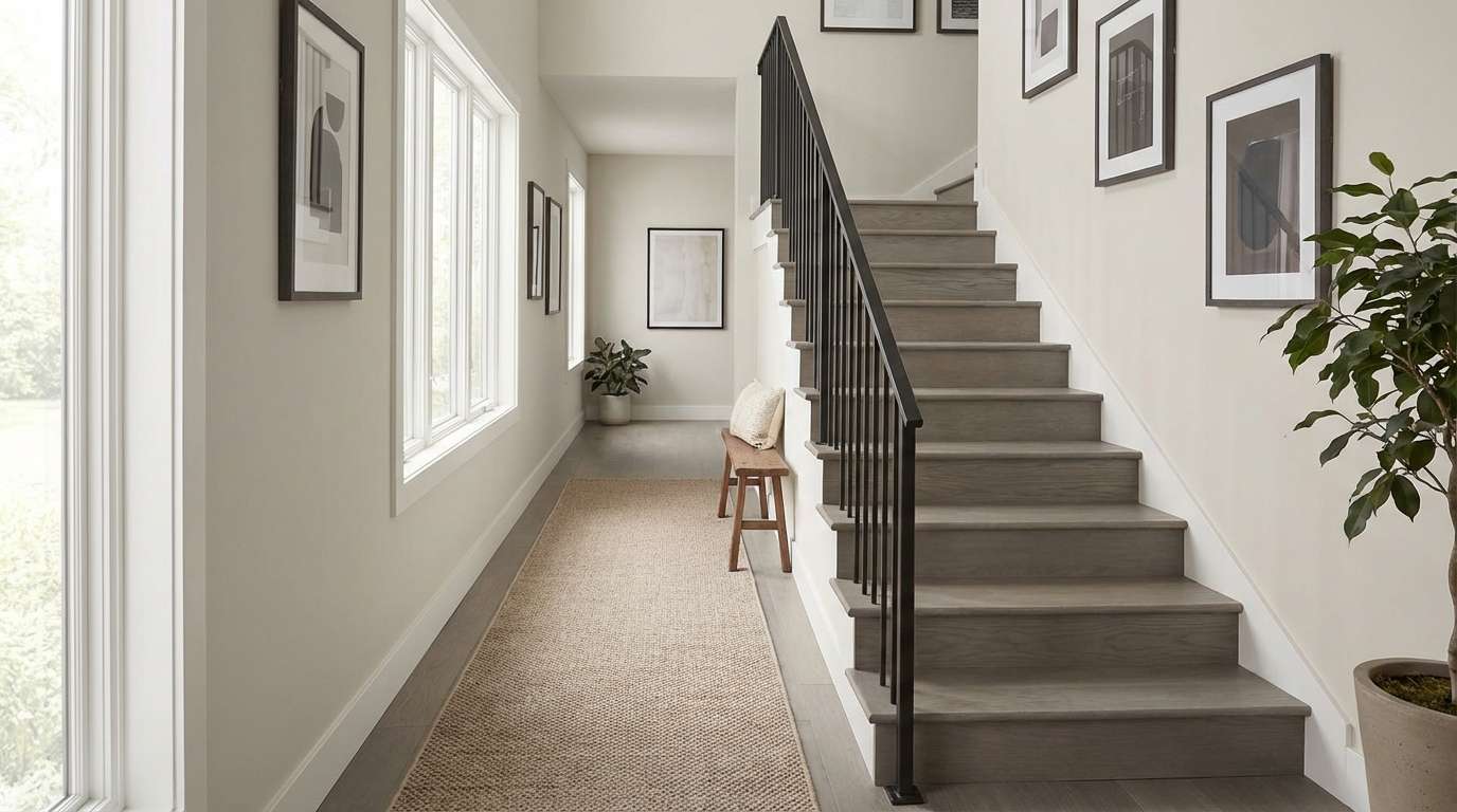
14) Rainy Day Greige
HEX: #f5f2ec #d8d1c7 #a7a19a #5d5a57 #2c2b2a
Mood: quiet, balanced, timeless
Best for: modern hallway and stairwell
Quiet and timeless, it feels like rain on stone and soft wool coats by the door. These interior color combinations are ideal for transitional spaces where you want cohesion without bold color. Use the light greige on walls, deepen the stairs or trim with mid grays, and save the darkest tone for frames and railings. Tip: choose a warmer bulb temperature so the neutrals stay inviting, not cold.
Image example of rainy day greige generated using media.io
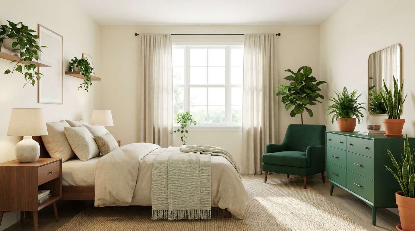
15) Jade and Cream Serenity
HEX: #f7f3e8 #dde6d5 #2f6b4f #184a3b #8c6b5a
Mood: serene, botanical, restorative
Best for: primary bedroom with plants
Serene and restorative, this interior color scheme evokes leafy shadows, creamy linens, and a grounded, earthy calm. Use the creams for bedding and walls, then bring jade in through a painted dresser, curtains, or an upholstered headboard. The deeper green reads luxurious in small blocks like a reading chair or bedside table, while the warm brown keeps it natural. Tip: add woven textures and real greenery to make the greens feel alive.
Image example of jade and cream serenity generated using media.io
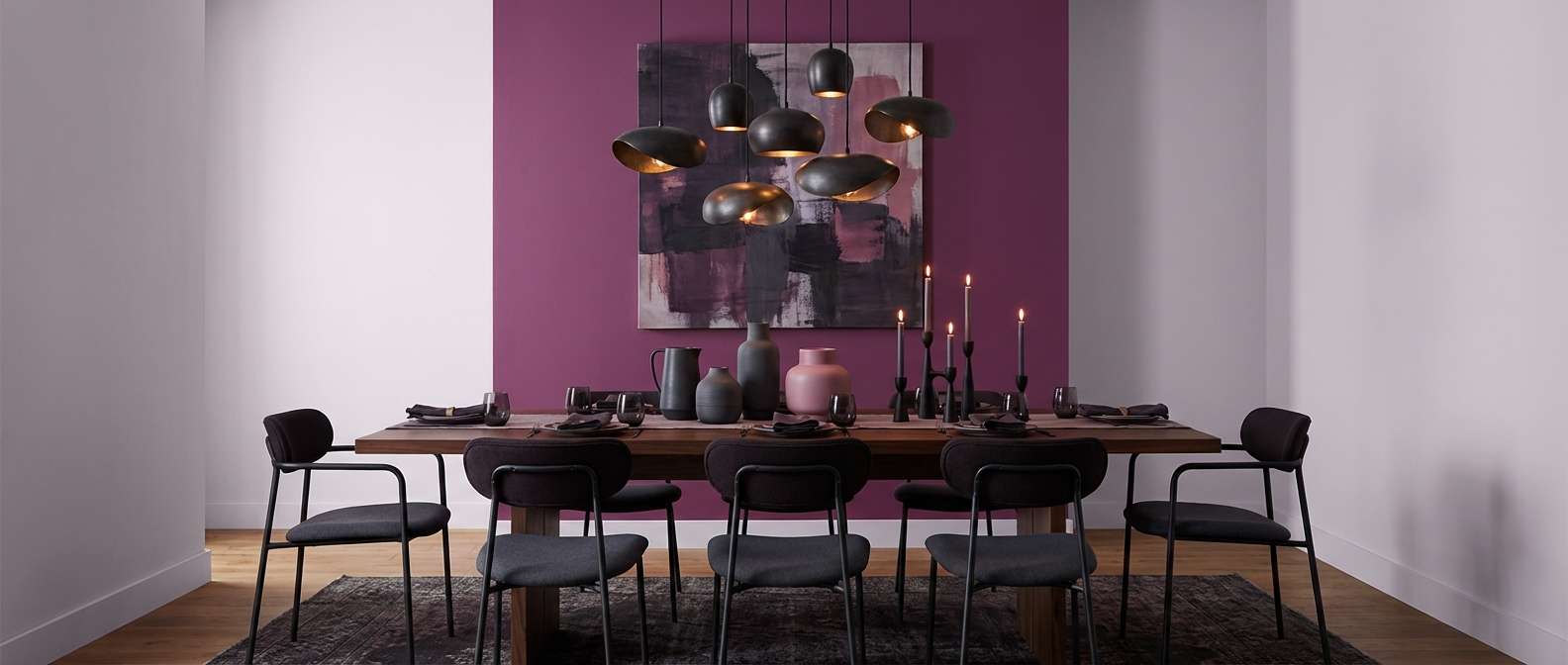
16) Berry Smoke Statement
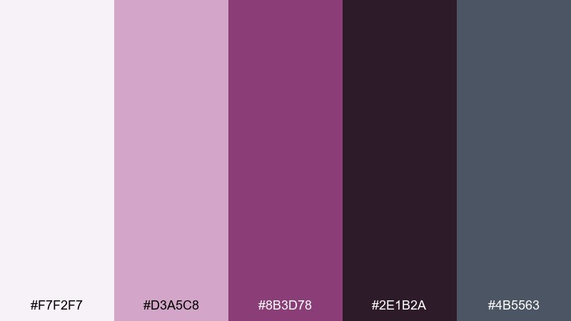
HEX: #f7f2f7 #d3a5c8 #8b3d78 #2e1b2a #4b5563
Mood: bold, artistic, nocturnal
Best for: statement dining room
Bold and artistic, this interior color palette feels like berry wine, smoky shadows, and a gallery-like mood. Use the light lavender-gray as a ceiling or trim softener, then let the rich purple carry the drama on a wall or upholstered chairs. Charcoal gray and near-black help the palette feel modern, especially in a long dining room. Tip: keep table linens simple so the purple stays the star.
Image example of berry smoke statement generated using media.io
17) Earthy Atelier Mix
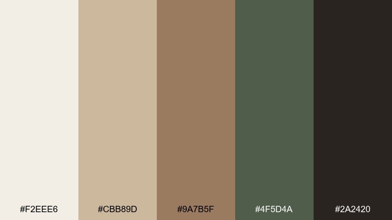
HEX: #f2eee6 #cbb89d #9a7b5f #4f5d4a #2a2420
Mood: creative, grounded, curated
Best for: artist loft corner and gallery wall
Creative and grounded, it brings to mind kraft paper, clay, and dried botanicals pinned beside sketches. As an interior color palette, it works beautifully for a curated gallery wall because the neutrals let frames and art breathe. Use the warm off-white as your base, then layer tan and wood-brown in shelving and seating, with olive as a subtle accent. Tip: mix matte black frames with a few natural wood frames to echo the palette without matching too perfectly.
Image example of earthy atelier mix generated using media.io
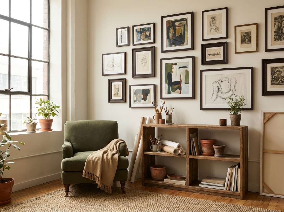
18) Soft Black and Camel
HEX: #faf7f0 #e0c6a8 #b68d63 #3b3a38 #0b0b0c
Mood: chic, confident, minimal
Best for: modern living room with leather sofa
Chic and confident, these interior color combinations feel like camel leather against soft black details and creamy plaster. Keep the lightest shade on walls to avoid a heavy look, then bring camel and tan in a sofa, rug, or curtains. The grays and blacks should stay structural, like frames, lamps, and side tables, for a crisp silhouette. Tip: add one tactile element, like a boucle chair, to soften the dark accents.
Image example of soft black and camel generated using media.io
19) Aqua Terrarium Fresh
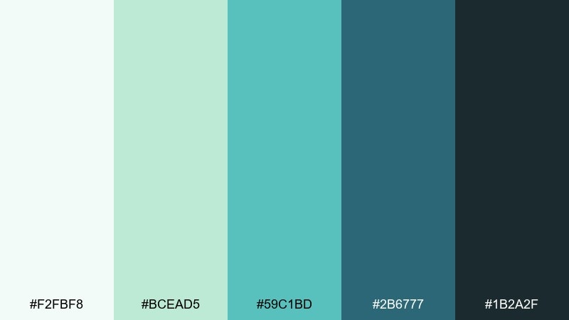
HEX: #f2fbf8 #bcead5 #59c1bd #2b6777 #1b2a2f
Mood: fresh, aquatic, lively
Best for: sunroom reading corner
Fresh and lively, these interior color combos evoke glass terrariums, clean water, and bright summer air. Use the light minty white on walls, then layer the aqua tones in cushions, planters, and a painted side table. The deep teal and inky slate work best in small accents so the room stays light-filled. Tip: add natural rattan or pale wood to keep the aquas feeling warm and relaxed.
Image example of aqua terrarium fresh generated using media.io
20) Golden Hour Neutrals
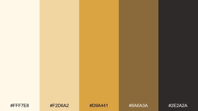
HEX: #fff7e8 #f2d6a2 #d9a441 #8a6a3a #2e2a2a
Mood: warm, uplifting, polished
Best for: open living room with large windows
Warm and uplifting, this interior color palette feels like golden hour spilling across plaster walls and woven textiles. Use the pale cream as the main canvas, then bring the honey shades into rugs, throws, and light wood furniture. The deeper brown and near-black are ideal for grounding the room through frames, side tables, or a fireplace surround. Tip: keep the strongest gold tone to one or two pieces so it reads as a highlight, not a wash.
Image example of golden hour neutrals generated using media.io
What Colors Go Well with Interior?
For interiors, the most reliable pairings are layered neutrals (warm whites, greige, taupe) plus one or two grounded darks (charcoal, espresso, inky navy) to create structure.
Earth tones—terracotta, clay, camel, olive—blend naturally with wood and stone, making them easy choices for home decor colors that won’t feel trendy overnight.
If you want bolder room color ideas, try jewel accents (violet, jade, deep teal) in smaller doses like art, pillows, or a single painted built-in to keep the space livable.
How to Use a Interior Color Scheme in Real Designs
Start by assigning roles: choose one light shade for the largest surfaces, two mid-tones for furniture and textiles, and one dark for outlines like frames, hardware, or railings.
Repeat your accent color at least twice in different materials (for example, a painted side table and a cushion) so it reads like a design decision, not a one-off item.
Test swatches under your actual lighting—day and night—because modern interiors often mix daylight with warm LEDs, which can shift grays cooler and creams warmer.
Create Interior Palette Visuals with AI
If you can describe a room, you can preview an interior color scheme before you paint. Generating visuals helps you judge contrast, warmth, and how the palette behaves on big surfaces.
Use your palette HEX codes as “dominant tones,” then specify the room type, materials (linen, oak, brass), and lighting (warm, diffused daylight) for more realistic results.
When you find a look you love, iterate by swapping one shade at a time—like changing the accent color—so you can compare options without starting over.
Interior Color Palette FAQs
-
How do I choose an interior color palette for an open-plan space?
Pick one light neutral for most walls, then repeat 1–2 mid-tones across both zones (living + dining). Use a single dark shade for outlines (frames, lighting, hardware) to make the whole plan feel connected. -
What is the easiest interior color scheme that won’t feel dated?
Warm whites + greige/taupe + a soft black or espresso accent is the safest “timeless” mix. It works with most floors, wood species, and metal finishes. -
How many colors should an interior palette include?
Five is a practical sweet spot: one base, two supporting mid-tones, one accent, and one anchor dark. You can still add decor variety by changing textures and materials. -
How do I keep dark accent walls from making a room feel smaller?
Use the dark on a single wall or built-ins, keep the ceiling and adjacent walls lighter, and add warm lighting. Repeating the dark color in small details (frames, hardware) also helps it feel intentional. -
What colors pair well with lots of wood in interiors?
For warm woods, use creamy whites, camel, and muted greens like sage or olive. For cooler woods, try soft grays, blue-grays, and off-whites to keep the room balanced. -
How can I test an interior color palette before painting?
Paint large sample boards (not tiny swatches) and move them around the room through the day. Also compare them next to fixed elements like flooring, countertops, and large upholstery. -
Can I generate interior color combination mockups with AI?
Yes—describe the room type, materials, lighting, and include your HEX codes as dominant tones. Then iterate with small changes (like swapping one accent) to quickly compare options.
Next: Fandango Color Palette


