

Linen is a warm, breathable neutral that makes designs feel calm, premium, and natural—without looking plain. It sits between beige, ecru, and soft sand, so it pairs easily with both earthy and modern accents.
Below are ready-to-use linen color palettes with HEX codes, plus practical tips for branding, interiors, and UI. You’ll also find AI prompts you can reuse to generate matching visuals fast.
In this article
Why Linen Palettes Work So Well
Linen palettes are built on warm neutrals, which makes them naturally versatile across print, digital, and interiors. They soften harsh contrast, reduce visual noise, and create a clean foundation for typography and imagery.
Because linen sits in that “not too yellow, not too gray” zone, it can feel modern and minimal or earthy and handcrafted—depending on the accent colors you add. This flexibility is why linen tones show up so often in premium packaging, wellness design, and editorial layouts.
Another advantage: linen-like neutrals tend to age well. They’re less trend-dependent than bright hues, so your brand system or room styling can stay consistent for longer without looking dated.
20+ Linen Color Palette Ideas (with HEX Codes)
1) Sunwashed Canvas
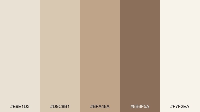
HEX: #E9E1D3 #D9C8B1 #BFA48A #8B6F5A #F7F2EA
Mood: bright, calm, minimal
Best for: minimal website UI and landing pages
Bright and breezy, it feels like morning light on natural fabric and clean paper. Use the cream and sand tones for spacious layouts, then let the warm brown add readable contrast for headings. Pair it with simple line icons and plenty of whitespace to keep the look effortless. Tip: reserve the darkest shade for key CTAs so the page stays airy.
Image example of sunwashed canvas generated using media.io
Media.io is an online AI studio for creating and editing video, image, and audio in your browser.

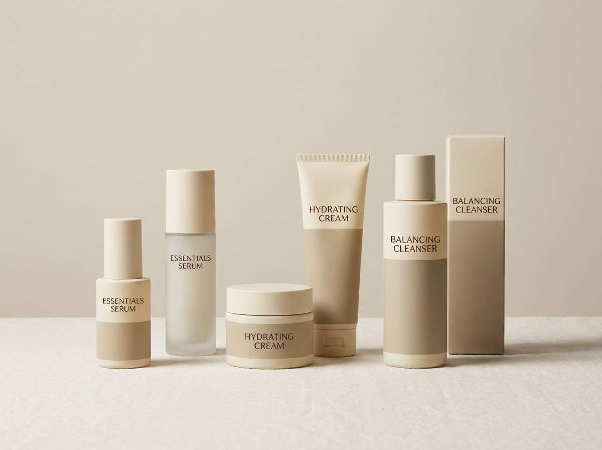
2) Oatmilk Minimal
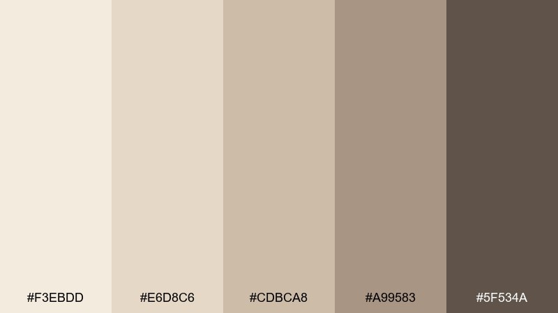
HEX: #F3EBDD #E6D8C6 #CDBCA8 #A99583 #5F534A
Mood: soft, modern, understated
Best for: skincare label design and packaging
Soft and creamy, this mix reads like oatmilk foam and warm stoneware. Keep the light tones dominant on labels, and use the deep brown for ingredient text and barcode clarity. It pairs well with minimalist typography and subtle embossing or matte finishes. Tip: print tests matter here, since the mid beiges can shift warmer under store lighting.
Image example of oatmilk minimal generated using media.io
3) Clay and Flax
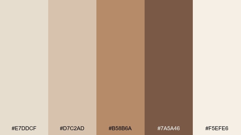
HEX: #E7DDCF #D7C2AD #B58B6A #7A5A46 #F5EFE6
Mood: earthy, grounded, craft
Best for: interior mood boards and material palettes
Earthy and tactile, it evokes hand-thrown clay, flax fibers, and sun-warmed plaster. For a linen color palette that feels handmade, lean on the pale neutrals for walls and bring in the clay and walnut shades through wood, leather, or ceramics. Pair it with nubby textures and brushed metals for depth. Tip: repeat the mid clay tone in two or three spots to keep the room cohesive.
Image example of clay and flax generated using media.io
4) Sandstone Studio
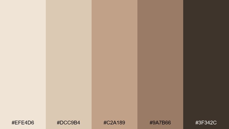
HEX: #EFE4D6 #DCC9B4 #C2A189 #9A7B66 #3F342C
Mood: warm, editorial, refined
Best for: magazine layouts and lookbooks
Warm and editorial, it feels like a studio filled with paper stocks and sandstone blocks. Use the light tones as generous margins and background fields, then set body copy in the charcoal-brown for a classic print feel. It pairs beautifully with serif headlines and monochrome photography. Tip: keep accent blocks small so the layout stays premium, not heavy.
Image example of sandstone studio generated using media.io
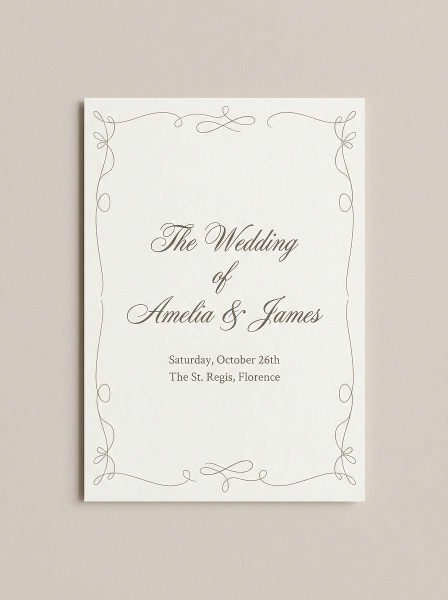
5) Pearl Drift
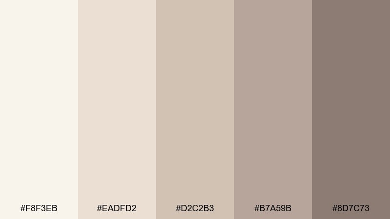
HEX: #F8F3EB #EADFD2 #D2C2B3 #B7A59B #8D7C73
Mood: romantic, delicate, airy
Best for: wedding invitations and stationery
Romantic and weightless, it brings to mind pearls, soft tulle, and handwritten vows. Use the palest shade as your invitation base, with gentle taupe for borders and monograms. Pair it with warm gray ink and subtle florals to keep it timeless. Tip: choose textured paper so the quiet colors still feel special.
Image example of pearl drift generated using media.io
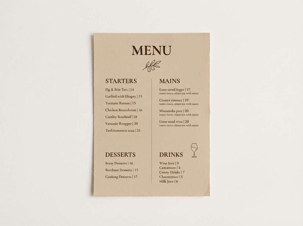
6) Dune Twilight
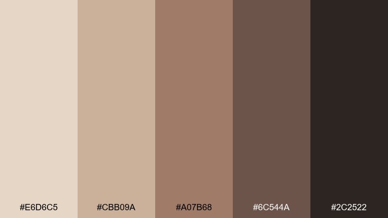
HEX: #E6D6C5 #CBB09A #A07B68 #6C544A #2C2522
Mood: moody, cinematic, cozy
Best for: restaurant menus and cocktail lists
Moody and cinematic, it feels like desert dunes after sunset and candlelight on wood. Use the lighter beige for menu pages, then bring in the deeper browns for section headers and price hierarchy. It pairs well with foil details and warm photography of food. Tip: keep the near-black for small highlights like rules and icons to avoid a heavy page.
Image example of dune twilight generated using media.io
7) Terracotta Thread
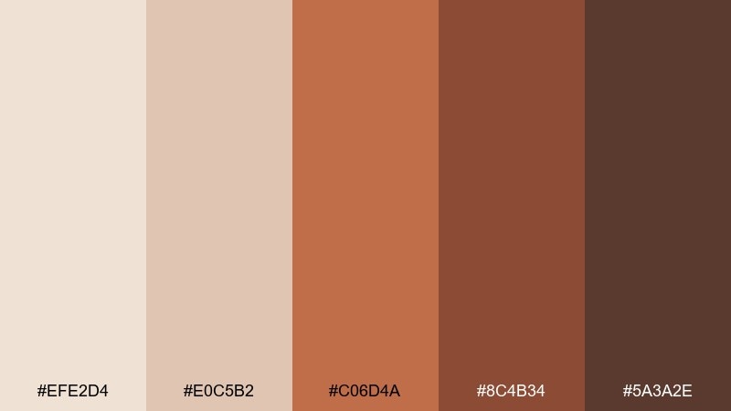
HEX: #EFE2D4 #E0C5B2 #C06D4A #8C4B34 #5A3A2E
Mood: warm, lively, artisan
Best for: boho brand kits and social templates
Warm and lively, it recalls sunbaked terracotta, woven rugs, and spice markets. These linen color combinations shine when the soft neutrals hold the background and the terracotta tones drive buttons, badges, and highlight shapes. Pair with imperfect textures or hand-drawn patterns for an artisan edge. Tip: keep the brightest terracotta to one primary accent so feeds feel curated, not busy.
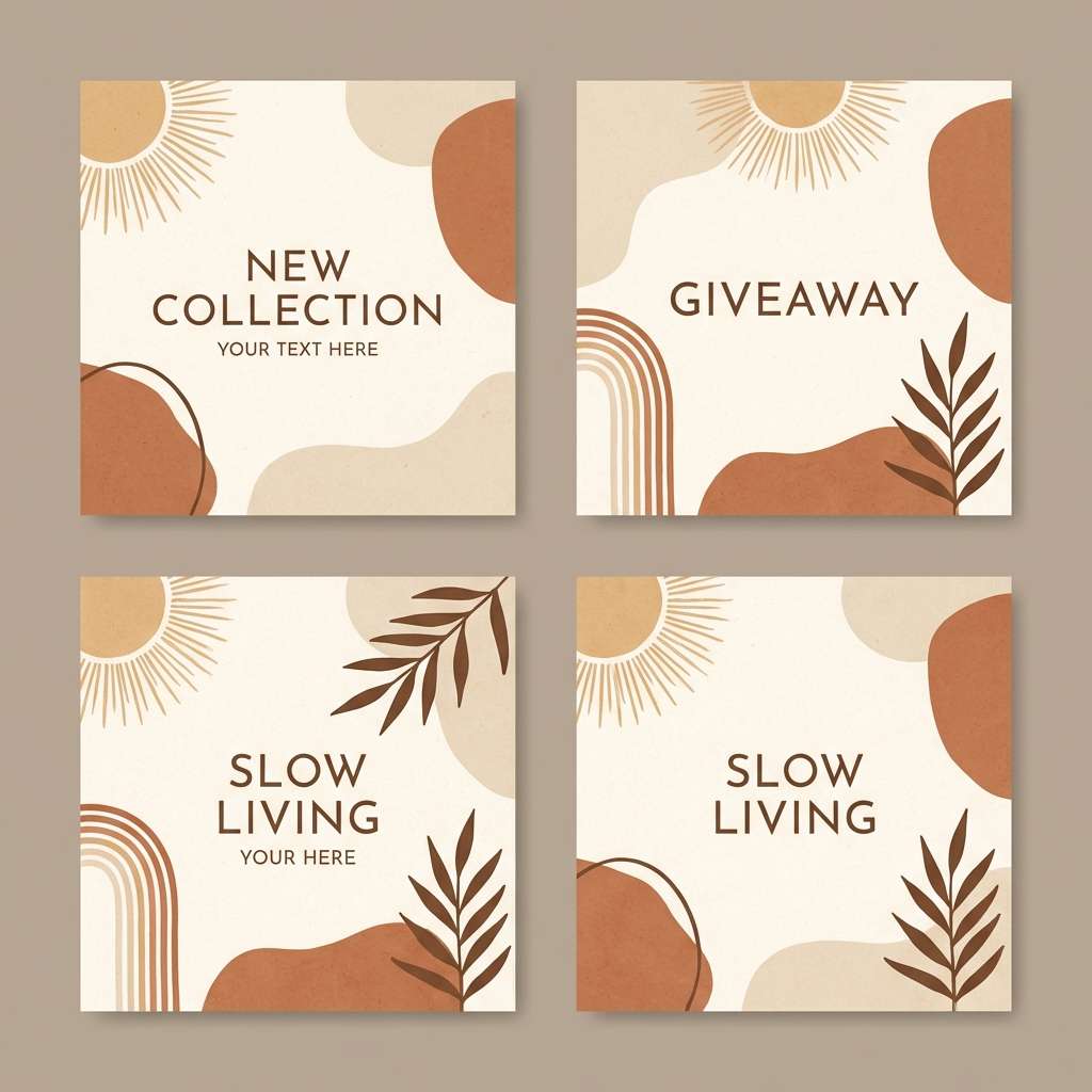
Image example of terracotta thread generated using media.io
8) Sage Linen
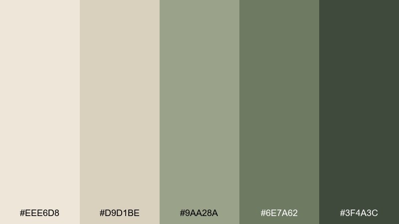
HEX: #EEE6D8 #D9D1BE #9AA28A #6E7A62 #3F4A3C
Mood: fresh, natural, calming
Best for: botanical prints and wellness illustrations
Fresh and calming, it suggests crushed sage leaves on cream paper. Let the greens appear in foliage shapes and headings, while the warm neutrals keep the composition soft and breathable. It pairs nicely with watercolor textures and fine pencil outlines. Tip: vary the green values across elements so the artwork has depth without feeling loud.
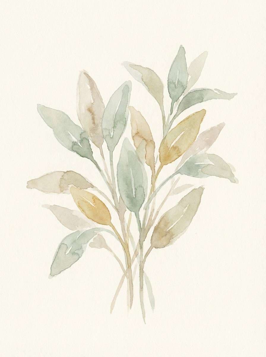
Image example of sage linen generated using media.io
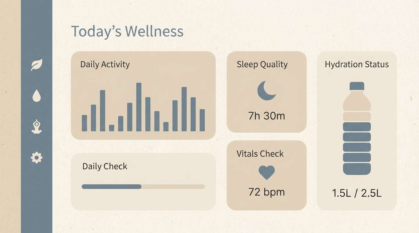
9) Coastal Ecru
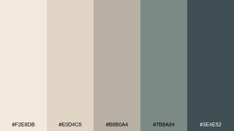
HEX: #F2E8DB #E0D4C5 #B8B0A4 #7B8A84 #3E4E52
Mood: clean, coastal, spa-like
Best for: spa websites and wellness dashboards
Clean and coastal, it feels like driftwood, sea mist, and pale sand. Use the ecru tones for large surfaces, then bring in the blue-gray shades sparingly for navigation and key metrics. It pairs well with airy photography and rounded UI components. Tip: keep contrast accessible by using the deep slate for text over the lightest background.
Image example of coastal ecru generated using media.io
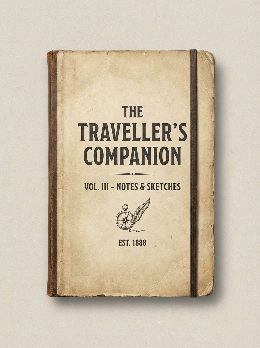
10) Vintage Ledger
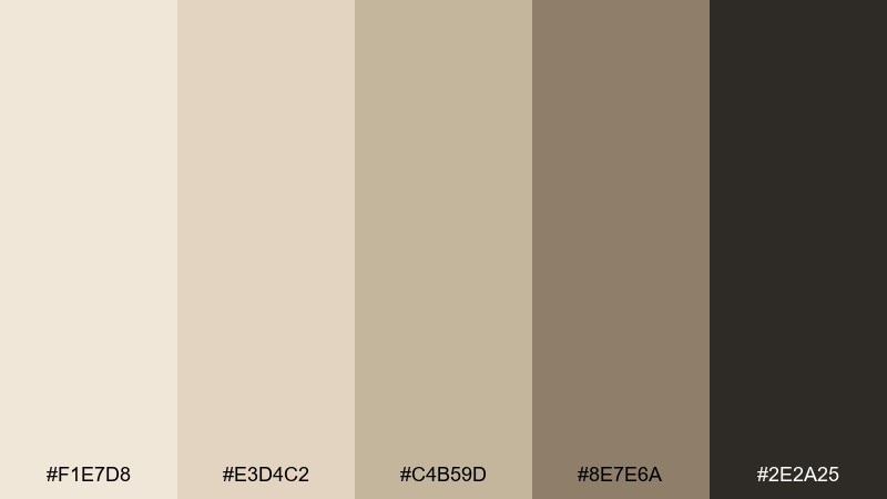
HEX: #F1E7D8 #E3D4C2 #C4B59D #8E7E6A #2E2A25
Mood: nostalgic, bookish, classic
Best for: notebook covers and book branding
Nostalgic and bookish, it evokes old ledgers, paper edges, and ink-stamped dates. Use the light parchment shades for backgrounds and patterns, with the inky dark for titles and spine text. Pair it with vintage serif fonts and subtle grain textures for authenticity. Tip: add a thin border in the mid taupe to frame cover art without overpowering it.
Image example of vintage ledger generated using media.io
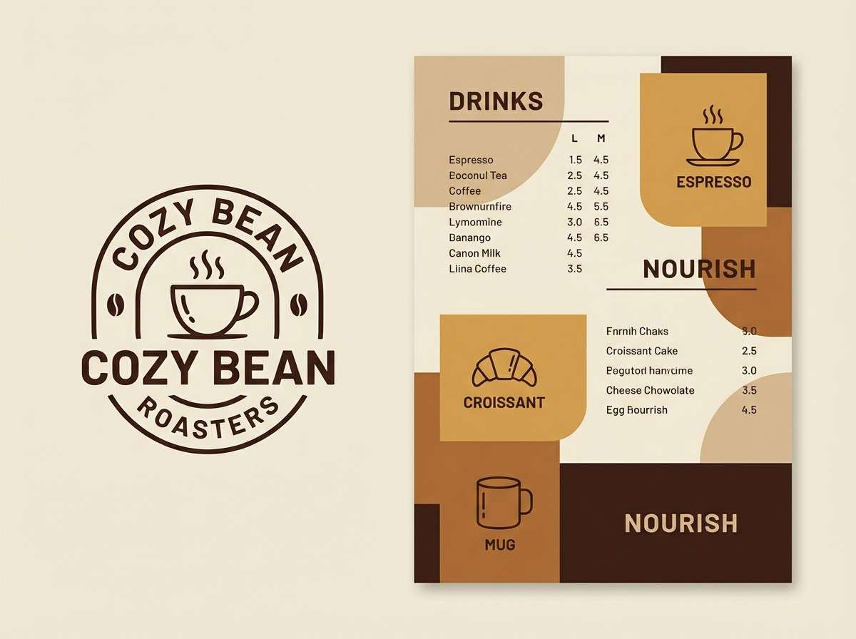
11) Cafe Au Lait
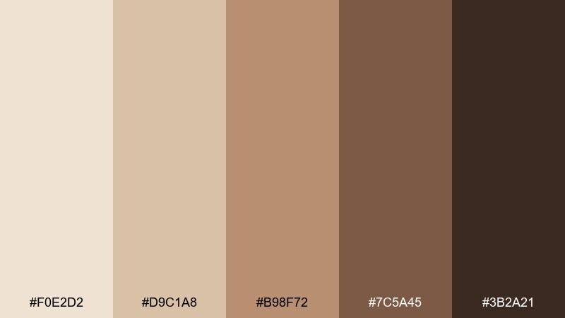
HEX: #F0E2D2 #D9C1A8 #B98F72 #7C5A45 #3B2A21
Mood: cozy, inviting, warm
Best for: coffee shop branding and menus
Cozy and inviting, it reads like steamed milk, caramel drizzle, and dark roast. Use the creamy tones for backgrounds and packaging, then let the espresso brown anchor logos and headings. It pairs well with hand-lettered accents and simple icon sets. Tip: keep the caramel shade as your secondary accent to avoid a muddy look.
Image example of cafe au lait generated using media.io
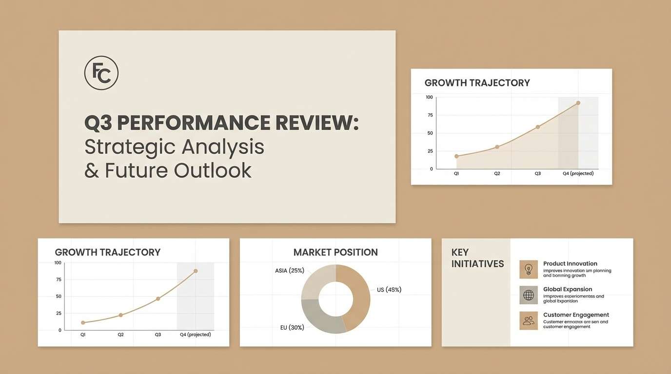
12) Warm Stone
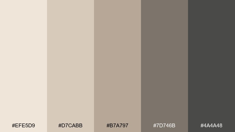
HEX: #EFE5D9 #D7CABB #B7A797 #7D746B #4A4A48
Mood: balanced, professional, timeless
Best for: brand identity systems and slide decks
Balanced and professional, it feels like warm stone, polished concrete, and clean stationery. A linen color palette like this works best when the light shades carry most surfaces and the darker grays handle type and dividers. Pair it with a single metallic accent in print or a subtle gradient in digital. Tip: define a strict hierarchy of neutrals so your deck looks consistent slide to slide.
Image example of warm stone generated using media.io
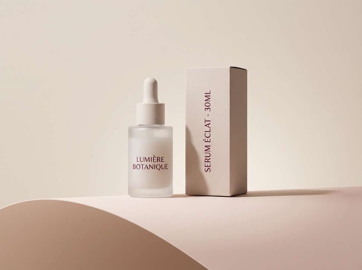
13) Blush Weave
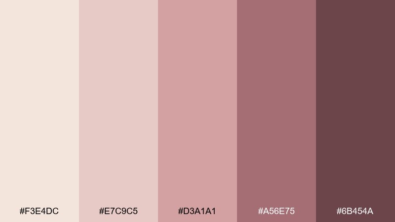
HEX: #F3E4DC #E7C9C5 #D3A1A1 #A56E75 #6B454A
Mood: soft, elegant, modern romantic
Best for: beauty product ads and hero banners
Soft and elegant, it evokes blush fabric, rose clay, and gentle candlelight. Use the pale pink-beige for the backdrop and reserve the deeper berry tone for headlines and price callouts. It pairs well with clean product photography and simple shapes. Tip: keep shadows subtle so the palette stays airy rather than heavy.
Image example of blush weave generated using media.io
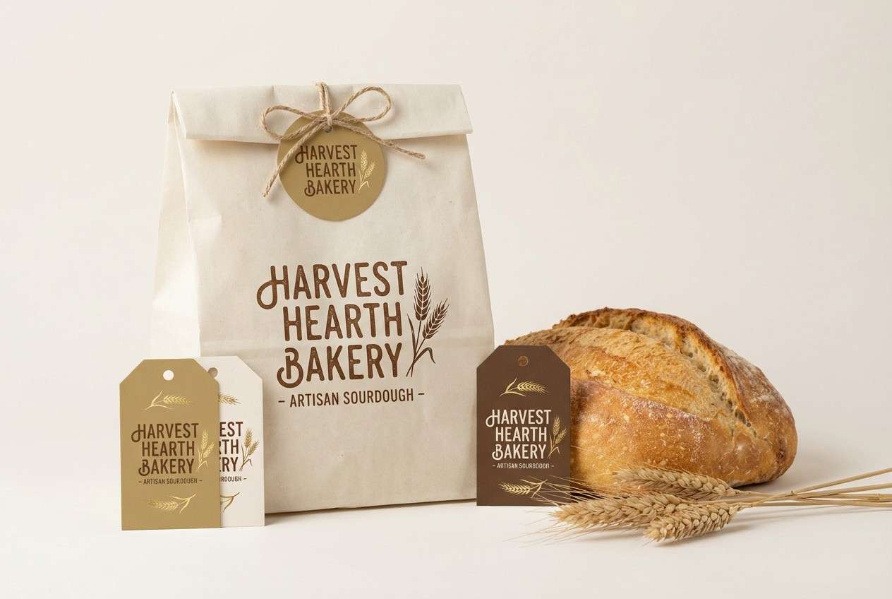
14) Golden Wheat
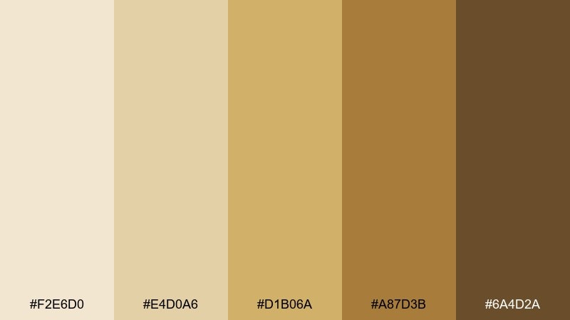
HEX: #F2E6D0 #E4D0A6 #D1B06A #A87D3B #6A4D2A
Mood: sunny, rustic, appetizing
Best for: bakery packaging and food labels
Sunny and rustic, it brings to mind wheat fields, honey, and toasted crust. Use the pale cream for bag or box bases, then layer golden tones for stripes, stamps, or ingredient highlights. It pairs beautifully with kraft paper textures and classic serif labels. Tip: use the darkest brown for small text so nutrition panels remain legible.
Image example of golden wheat generated using media.io
15) Smoky Taupe
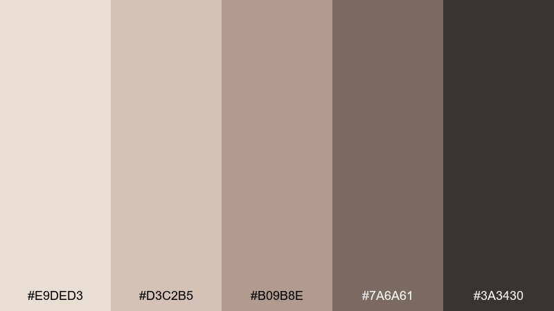
HEX: #E9DED3 #D3C2B5 #B09B8E #7A6A61 #3A3430
Mood: quiet, modern, sophisticated
Best for: living room styling and decor guides
Quiet and sophisticated, it feels like soft smoke, taupe textiles, and matte ceramics. Use the light shades for walls or large upholstery, then bring in the darker tones through frames, lamps, and hardware. It pairs well with natural wood and blackened metal for a modern finish. Tip: add one high-contrast element, like a dark coffee table, to stop the room from looking flat.
Image example of smoky taupe generated using media.io
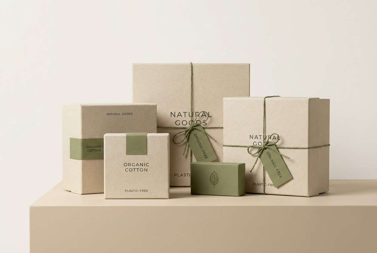
16) Olive Grove Neutral
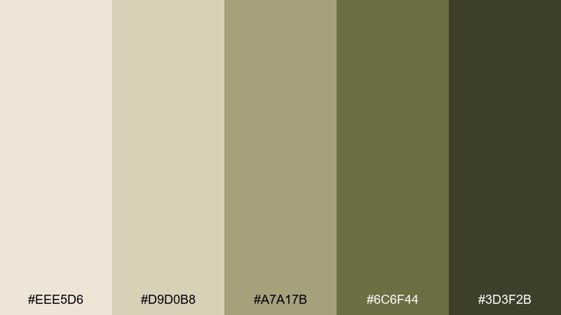
HEX: #EEE5D6 #D9D0B8 #A7A17B #6C6F44 #3D3F2B
Mood: earthy, organic, calm
Best for: eco packaging and sustainable branding
Earthy and organic, it suggests olive leaves, dried grasses, and recycled paper. Use the warm off-white as the main surface, then let olive tones highlight badges like vegan, refillable, or organic. It pairs naturally with minimalist iconography and uncoated paper stocks. Tip: avoid overusing the darkest olive so the look stays light and eco-friendly.
Image example of olive grove neutral generated using media.io
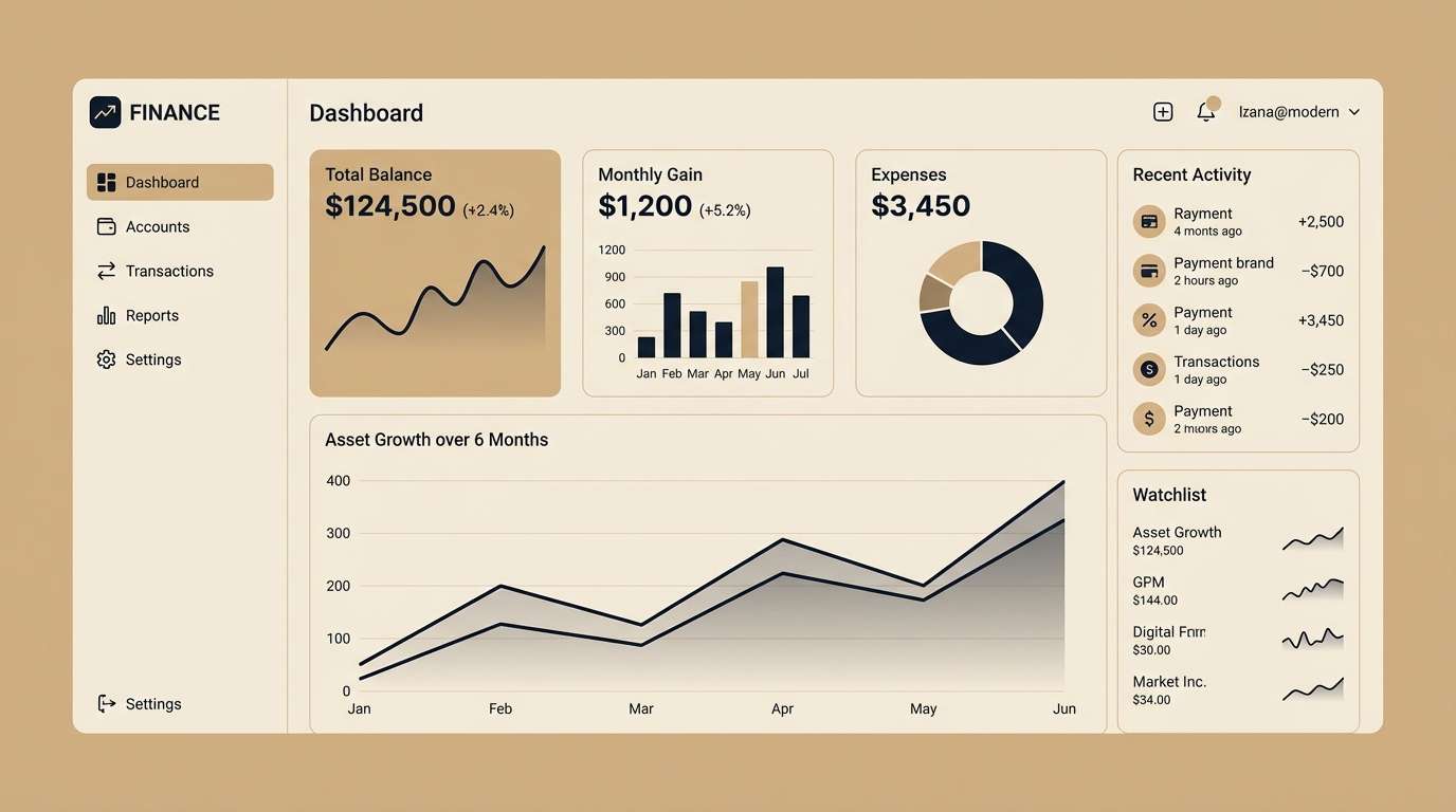
17) Ink on Linen
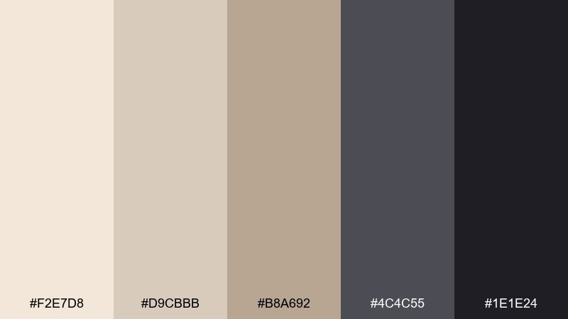
HEX: #F2E7D8 #D9CBBB #B8A692 #4C4C55 #1E1E24
Mood: sharp, contemporary, high-contrast
Best for: finance app UI and dashboards
Sharp and contemporary, it feels like dark ink laid over warm paper. Use the linen-toned neutrals for cards and panels, while the inky shades define navigation, charts, and key numbers. It pairs well with thin dividers and restrained icons for a premium fintech vibe. Tip: apply the darkest color to only the most important metrics to guide attention.
Image example of ink on linen generated using media.io
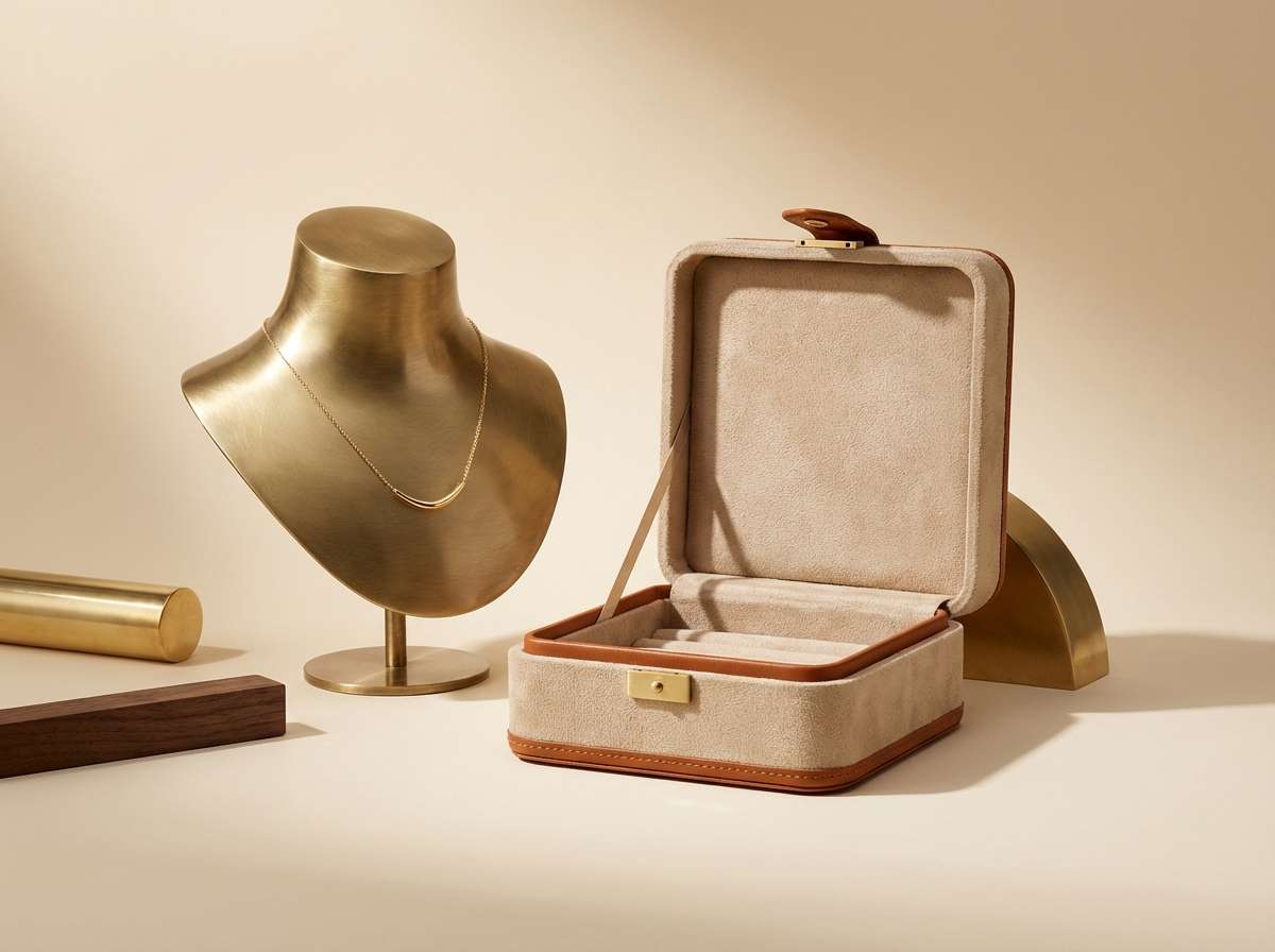
18) Rusted Brass
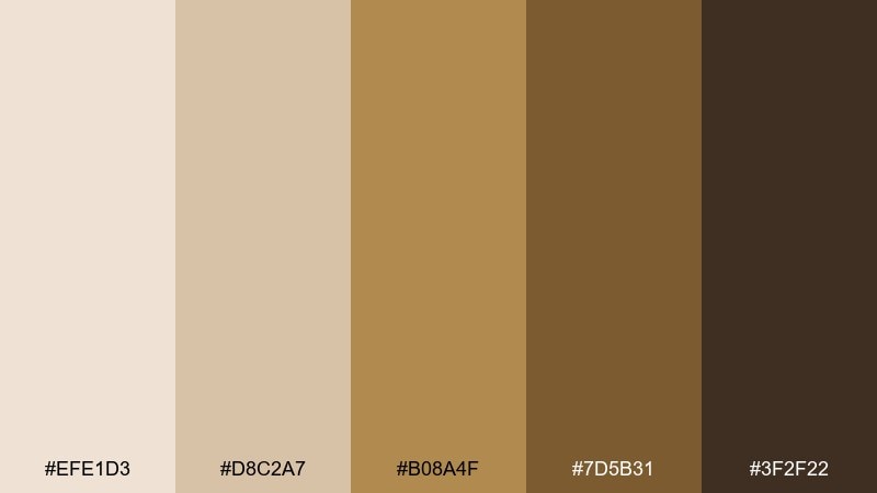
HEX: #EFE1D3 #D8C2A7 #B08A4F #7D5B31 #3F2F22
Mood: vintage, warm, luxe
Best for: jewelry product ads and packaging
Vintage and luxe, it recalls aged brass, velvet boxes, and warm gallery lights. These linen color combinations work best with creamy backdrops and a restrained metallic-gold tone for focal points. Pair with dark chocolate accents for typography and premium contrast. Tip: use the gold shade as a highlight, not a fill, to keep it feeling refined.
Image example of rusted brass generated using media.io
19) Mauve Haze
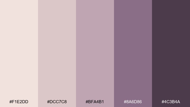
HEX: #F1E2DD #DCC7C8 #BFA4B1 #8A6D86 #4C3B4A
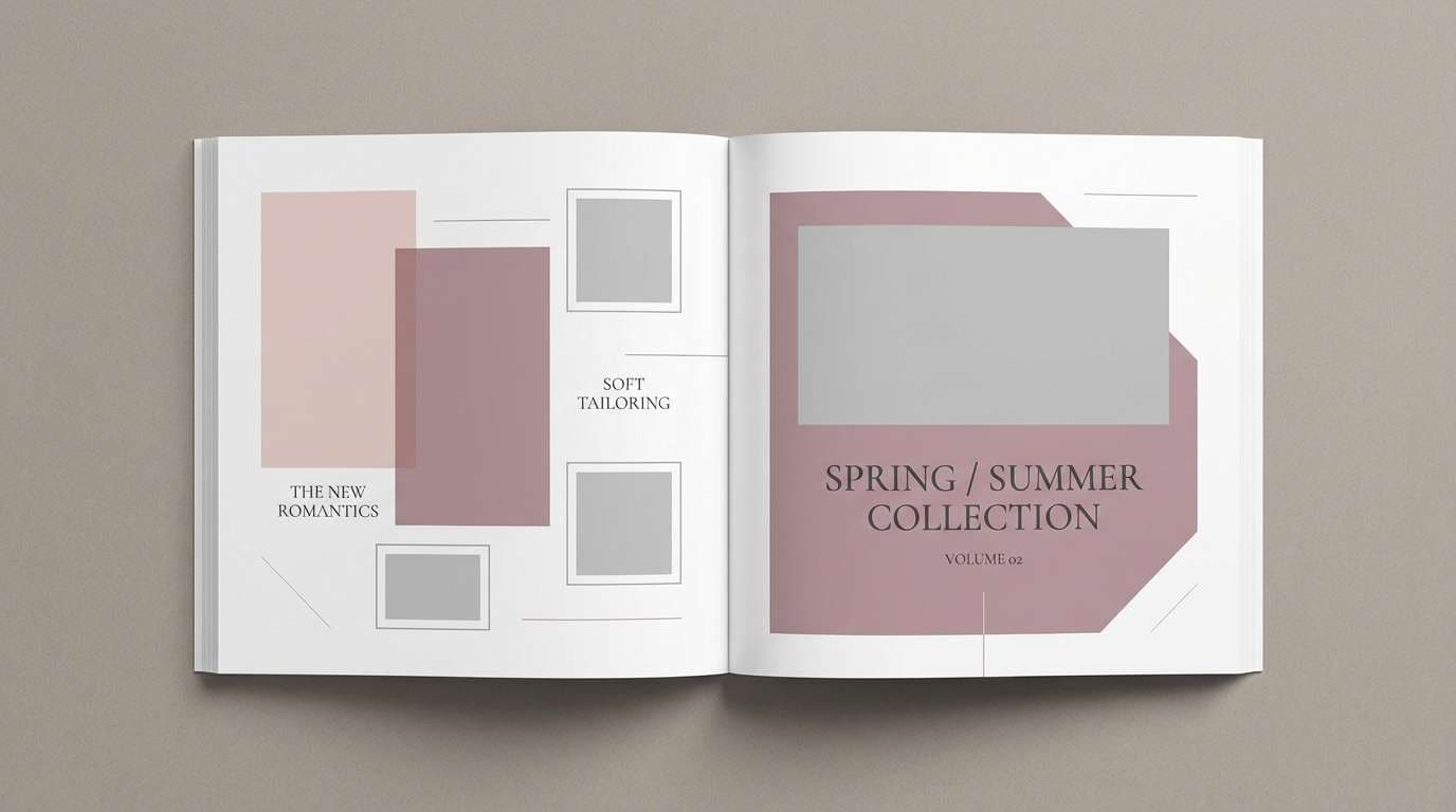
Mood: dreamy, artistic, soft luxe
Best for: fashion lookbooks and campaign layouts
Dreamy and artistic, it feels like mauve haze in late afternoon light. Use the pale blush tones for spacious spreads, then anchor the typography with plum for a polished finish. It pairs well with minimal photography and plenty of negative space. Tip: keep backgrounds clean so the mauves do not turn dusty in print.
Image example of mauve haze generated using media.io
20) Cocoa Biscuit
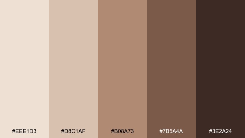
HEX: #EEE1D3 #D8C1AF #B08A73 #7B5A4A #3E2A24
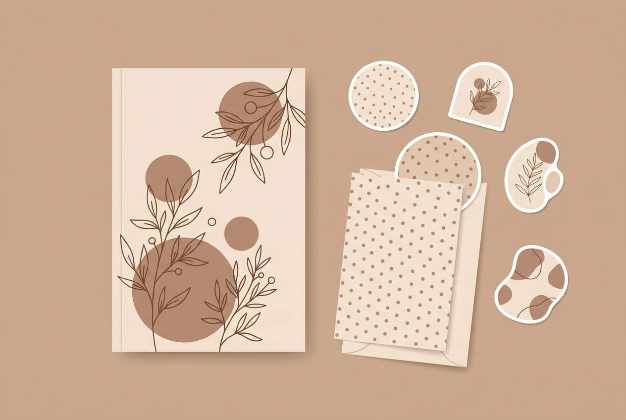
Mood: comforting, cozy, homey
Best for: stationery sets and journal covers
Comforting and cozy, it brings to mind cocoa biscuits, brown sugar, and well-loved notebooks. Use the pale neutral as your base paper color and layer the mid browns for patterns, tabs, or label shapes. It pairs nicely with hand-drawn illustrations and warm, natural textures. Tip: add contrast with the darkest cocoa on titles so the design stays readable.
Image example of cocoa biscuit generated using media.io
What Colors Go Well with Linen?
Linen pairs beautifully with earthy accents like terracotta, clay, cocoa brown, olive, and warm charcoal. These combinations keep the natural feel while adding structure and contrast for type, icons, or trim.
For a fresher direction, mix linen with muted greens (sage, eucalyptus) or coastal blue-grays. The result is clean and calming—ideal for wellness brands, dashboards, and airy interiors.
If you want a more elevated look, add controlled “luxe” tones like brass-gold, mauve, or deep ink. Keep linen as the main canvas and use richer hues as small, intentional highlights.
How to Use a Linen Color Palette in Real Designs
Start with linen as your dominant background (60–80%) to create softness and breathing room. Then assign mid-tones to secondary surfaces (cards, sections, packaging panels) so the design doesn’t look washed out.
Reserve your darkest shade for functional contrast: headings, body text, navigation, or key UI states. For print, do quick proof checks—mid beiges and taupes can shift under different lighting or paper stocks.
To avoid “all-neutral fatigue,” introduce one accent role (CTA, badge, highlight) and repeat it consistently. A single terracotta, sage, or brass note often makes the entire system feel intentional.
Create Linen Palette Visuals with AI
If you already have HEX codes, you can generate matching mockups in seconds—landing pages, packaging, invitations, mood boards, or social templates—by describing the layout and materials you want.
Reuse the prompts above and swap subjects (menu, label, dashboard) while keeping the same linen tones. This helps you explore multiple directions without rebuilding a design from scratch.
Media.io lets you go from text prompt to on-brand images quickly, so you can validate a linen color scheme before committing to production or print.
Linen Color Palette FAQs
-
What color is “linen” in design?
Linen is a warm, off-white neutral that sits between beige and ecru. It often has a soft yellow or tan undertone, similar to natural fabric or unbleached paper. -
Is linen closer to beige or gray?
Linen is usually closer to beige than gray, but it can lean slightly gray depending on the mix. Pairing it with warm browns makes it feel beige; pairing it with slate or blue-gray makes it read cooler. -
What’s the best text color on a linen background?
Deep espresso browns, warm charcoal, or near-black inks work best for readability. Aim for strong contrast—especially in UI—so body text and small labels remain accessible. -
What accent colors look good with linen?
Sage and olive greens, terracotta and clay, brass-gold tones, dusty mauves, and blue-grays all complement linen. Keep accents limited to 1–2 key hues so the palette stays clean. -
How do I keep a linen palette from looking flat?
Use a clear neutral hierarchy: one main linen background, one mid-tone for sections/cards, and one dark for text. Add texture (grain, paper, fabric) or a single higher-contrast anchor element to create depth. -
Do linen colors print well on packaging?
Yes, but mid beiges and taupes can shift warmer or darker depending on paper and lighting. Always run print tests and consider uncoated stocks or matte finishes for the most “linen-like” result. -
Can I generate linen-themed mockups with AI using these palettes?
Yes—use the included prompts as templates, then specify the subject (label, UI, invitation) and keep your color direction consistent. Media.io makes it easy to iterate quickly and compare variations.


