

A fantasy forest color palette blends enchanted greens, bark browns, misty neutrals, and occasional magical accents like amber or plum. The result feels natural, cinematic, and story-driven—without locking you into one “forest green” look.
Below are 20 ready-to-use fantasy forest palettes with HEX codes, plus AI prompts you can reuse to generate consistent visuals for branding, UI, posters, covers, and product design.
In this article
- Why Fantasy Forest Palettes Work So Well
-
- moonlit moss
- faerie fern glow
- ancient bark sage
- crystal creek canopy
- mushroom grove neutrals
- spellbook evergreen
- firefly amber leaves
- twilight thicket
- druid meadow mist
- runestone lichen
- velvet pine plum
- teal plum grove
- glade blossom moss
- shadowroot charcoal
- sunlit canopy gold
- rainwashed spruce
- elf court tapestry
- witch hazel hush
- aurora woodland
- nightcap violet fern
- What Colors Go Well with Fantasy Forest?
- How to Use a Fantasy Forest Color Palette in Real Designs
- Create Fantasy Forest Palette Visuals with AI
Why Fantasy Forest Palettes Work So Well
Fantasy forest colors feel instantly immersive because they echo real-world cues: deep evergreens for canopy shadow, warm browns for bark and soil, and pale mist tones for atmosphere. That natural “logic” makes designs feel believable even when the concept is magical.
They also balance drama with usability. Dark bases create depth for covers and posters, while foggy highlights and muted midtones keep interfaces and layouts readable without harsh contrast.
Finally, fantasy forest palettes are flexible: you can steer them cool with creek teals, warm with amber gold, or elegant with plum and lavender—while still staying rooted in nature.
20+ Fantasy Forest Color Palette Ideas (with HEX Codes)
1) Moonlit Moss
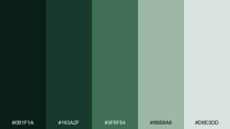
HEX: #0b1f1a #163a2f #3f6f54 #9bb8a6 #d8e3dd
Mood: mysterious, calm, nocturnal
Best for: dark fantasy book cover design
Mysterious moonlight over damp moss and deep evergreen shadows sets a calm, nocturnal tone. This fantasy forest color palette shines on book covers, game key art, and cinematic posters where you want depth without harsh contrast. Pair the pale misty green with the darkest shade for title readability, then use the mid moss as your main field color. Tip: keep highlights soft and limited to preserve the night-scene mood.
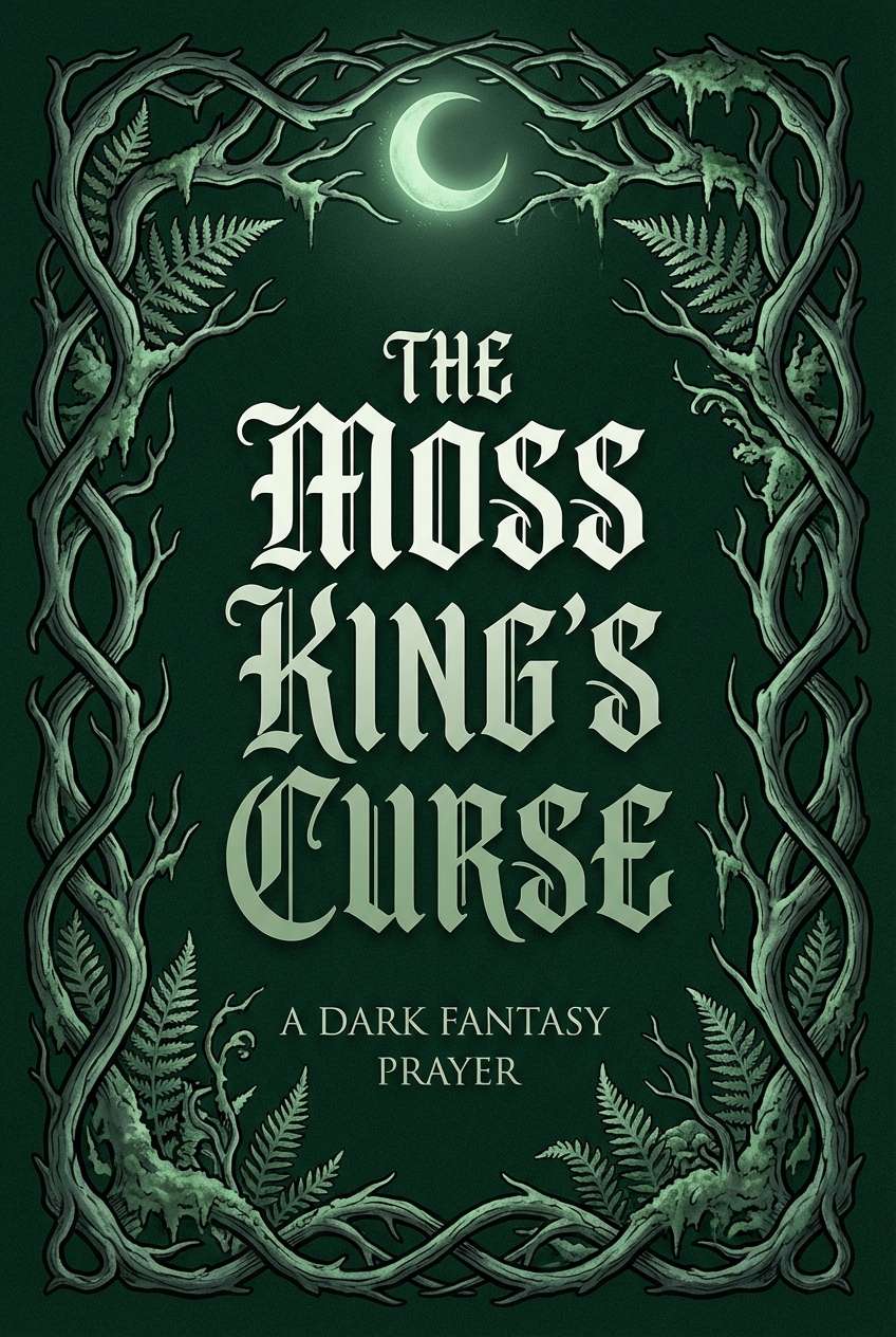
Image example of moonlit moss generated using media.io
Media.io is an online AI studio for creating and editing video, image, and audio in your browser.

2) Faerie Fern Glow
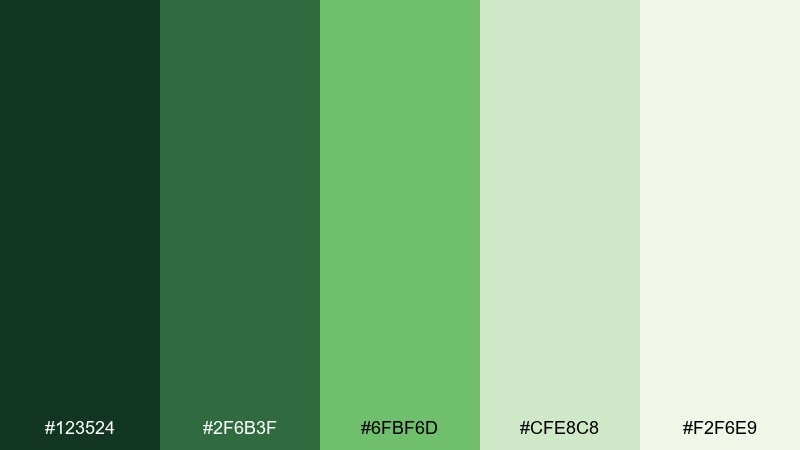
HEX: #123524 #2f6b3f #6fbf6d #cfe8c8 #f2f6e9
Mood: fresh, whimsical, bright
Best for: watercolor botanical print
Fresh fern greens and soft leaf-light create a whimsical, morning-in-the-glade feeling. It works beautifully for watercolor botanicals, nursery art, and springtime stationery where you want gentle contrast. Let the pale cream act as paper, then layer the mid greens for foliage depth. Tip: reserve the brightest green for tiny sparkles and focal leaves so the piece stays airy.
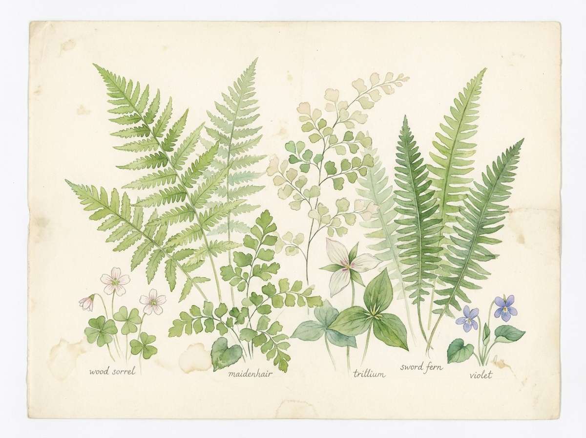
Image example of faerie fern glow generated using media.io
3) Ancient Bark Sage
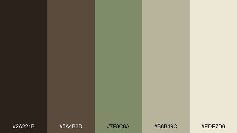
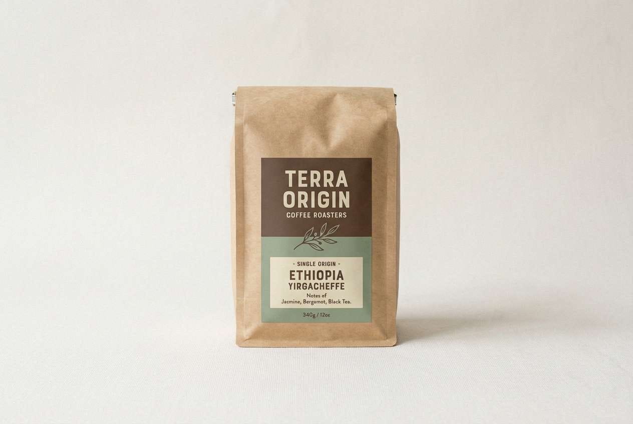
HEX: #2a221b #5a4b3d #7f8c6a #b8b49c #ede7d6
Mood: grounded, rustic, heritage
Best for: craft coffee packaging label
Grounded bark browns with muted sage feel like old trees, leather-bound maps, and well-worn trails. These tones are ideal for artisanal packaging, heritage branding, and labels that need warmth and authenticity. Use the deep brown for typography and the sage as a calm brand accent. Tip: add subtle paper texture so the light beige reads like natural stock.
Image example of ancient bark sage generated using media.io
4) Crystal Creek Canopy
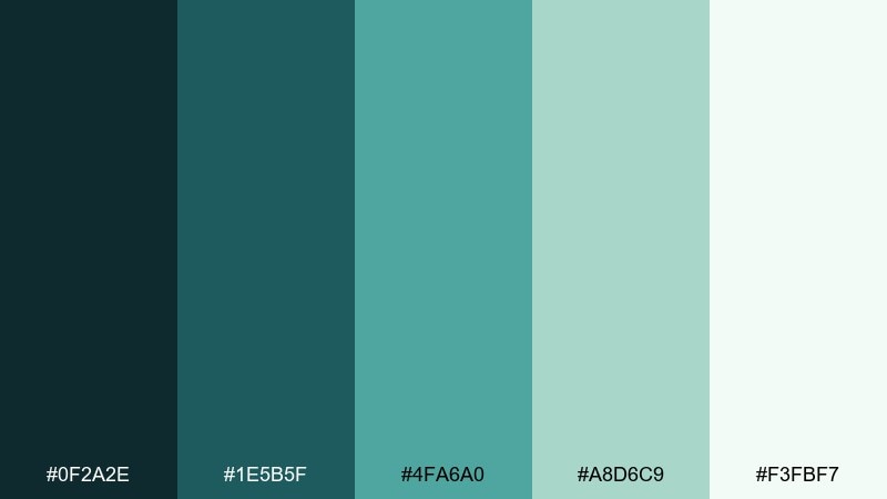
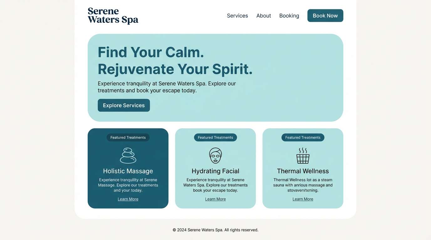
HEX: #0f2a2e #1e5b5f #4fa6a0 #a8d6c9 #f3fbf7
Mood: cool, enchanted, refreshing
Best for: spa brand landing page UI
Cool creek-teal and airy foam-white evoke clear water under a canopy of leaves. These fantasy forest color combinations fit wellness UI, spa branding, and calm dashboards that need freshness without feeling cold. Make the darkest teal your header and primary text, then use the soft aqua for cards and highlights. Tip: keep buttons in the mid teal so calls to action stand out without shouting.
Image example of crystal creek canopy generated using media.io
5) Mushroom Grove Neutrals
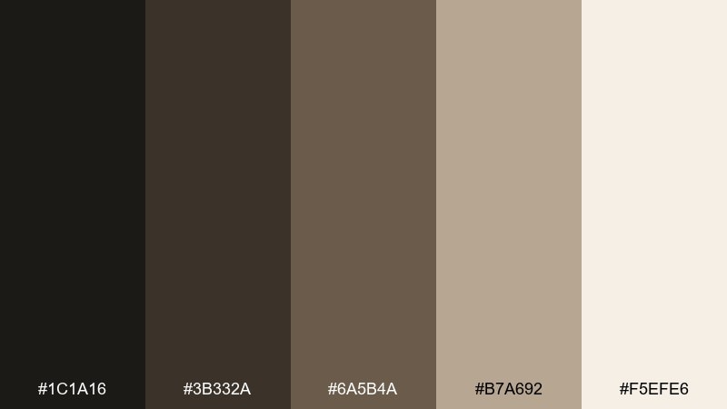
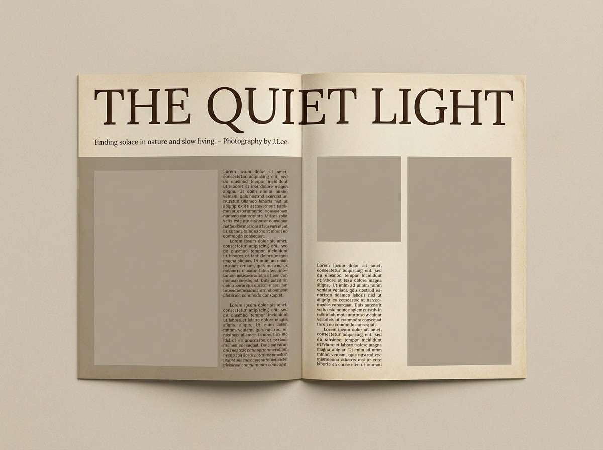
HEX: #1c1a16 #3b332a #6a5b4a #b7a692 #f5efe6
Mood: cozy, earthy, understated
Best for: minimal editorial magazine spread
Cozy soil browns and mushroom beige feel quiet, tactile, and a little smoky. They are perfect for editorial layouts, slow-living brands, and photography-heavy pages where the content should lead. Use the near-black for headlines and the warm beige for generous margins. Tip: lean on contrast through type scale rather than bright accent colors.
Image example of mushroom grove neutrals generated using media.io
6) Spellbook Evergreen
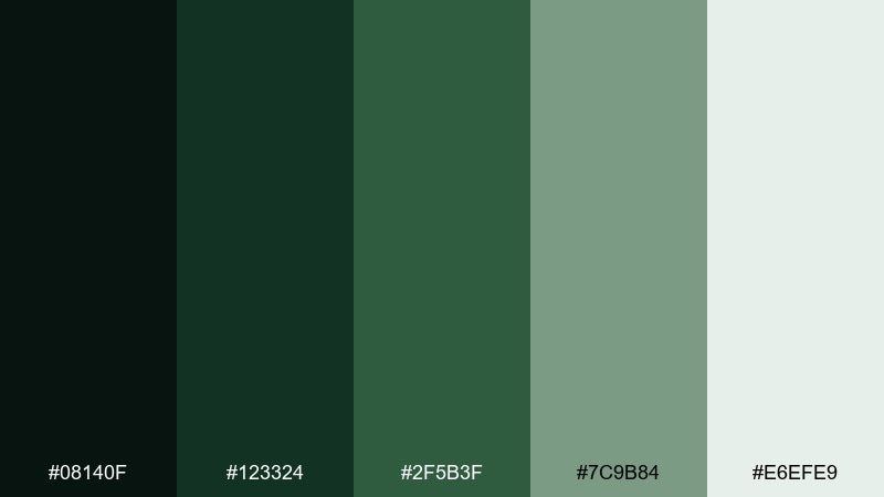
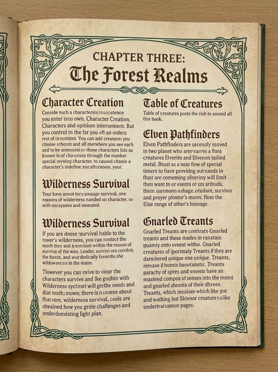
HEX: #08140f #123324 #2f5b3f #7c9b84 #e6efe9
Mood: arcane, classic, refined
Best for: fantasy tabletop game rulebook layout
Arcane evergreen shadows with parchment-tinted light feel like a spellbook opened beside candlelit leaves. The mix supports rulebooks, lore pages, and long-form reading where calm contrast matters. Keep body text on the lightest tone and reserve the darkest green for headers and separators. Tip: add thin line ornaments in the mid green to suggest engraved detail without clutter.
Image example of spellbook evergreen generated using media.io
7) Firefly Amber Leaves
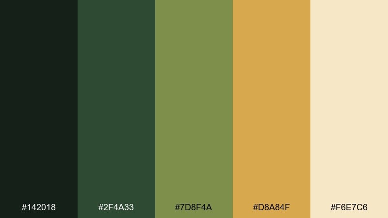
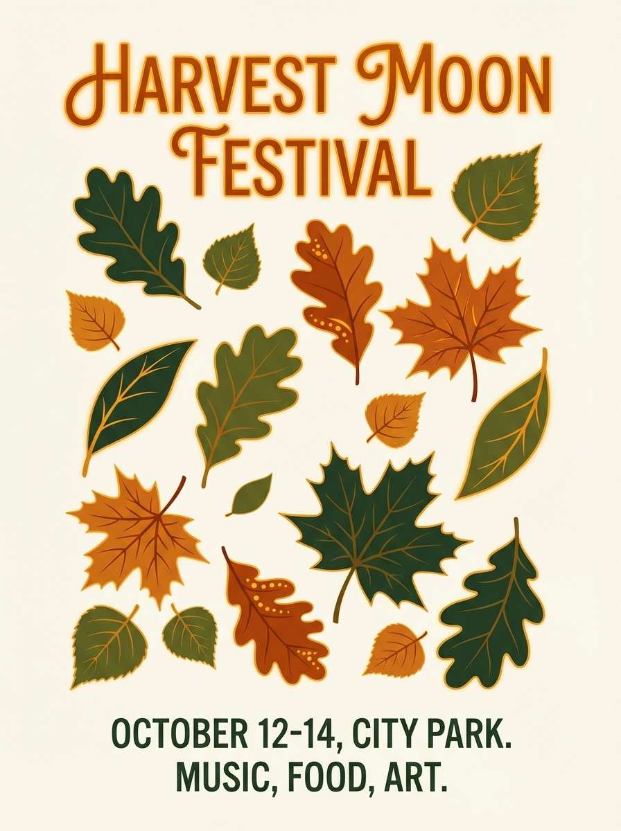
HEX: #142018 #2f4a33 #7d8f4a #d8a84f #f6e7c6
Mood: glowing, warm, storybook
Best for: autumn festival poster design
Glowing amber against forest greens feels like fireflies blinking through late-summer leaves. It is a strong fit for posters, event graphics, and campaign creatives that need a warm focal accent. Use the amber as your headline or icon color and keep the rest grounded in greens. Tip: pair the cream with the darkest green for legible body copy and balanced contrast.
Image example of firefly amber leaves generated using media.io
8) Twilight Thicket
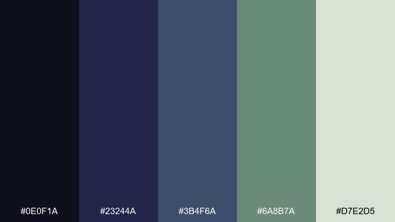
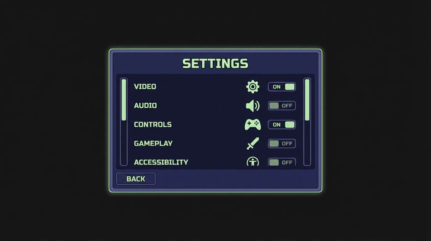
HEX: #0e0f1a #23244a #3b4f6a #6a8b7a #d7e2d5
Mood: moody, magical, cinematic
Best for: game UI settings screen
Moody indigo and desaturated greens feel like twilight settling over a dense thicket. This set works well for game UI, especially settings and overlays where readability must stay high. Use the near-black for backgrounds, the indigo for panels, and the pale green for text and toggles. Tip: keep interactive states in the slate tone so focus changes are noticeable without bright neon.
Image example of twilight thicket generated using media.io
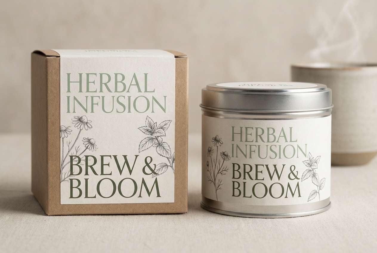
9) Druid Meadow Mist
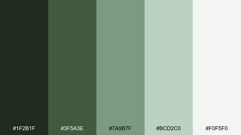
HEX: #1f2b1f #3f5a3e #7a9b7f #bcd2c0 #f0f5f0
Mood: soft, herbal, peaceful
Best for: herbal tea product packaging
Soft meadow greens and light misty neutrals feel herbal, peaceful, and clean. These fantasy forest color combinations suit tea packaging, apothecary labels, and calm ecommerce visuals. Build the pack base in the pale mist tone, then use the deep green for logos and ingredients. Tip: add a single mid-green illustration linework layer to keep the design premium and restrained.
Image example of druid meadow mist generated using media.io
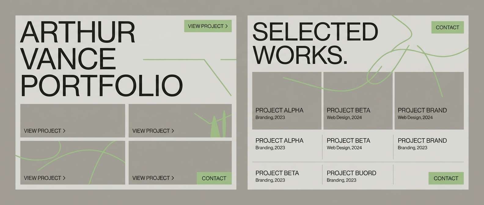
10) Runestone Lichen
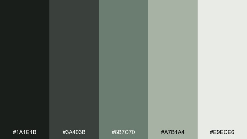
HEX: #1a1e1b #3a403b #6b7c70 #a7b1a4 #e9ece6
Mood: stonewashed, minimal, modern
Best for: architecture portfolio website UI
Stonewashed grays with lichen green hints feel modern, quiet, and intentional. They are great for architecture portfolios, case studies, and product pages that rely on white space and strong typography. Use the darkest charcoal for navigation and the mid lichen for subtle dividers and hover states. Tip: keep imagery slightly desaturated so it harmonizes with the palette instead of fighting it.
Image example of runestone lichen generated using media.io
11) Velvet Pine Plum
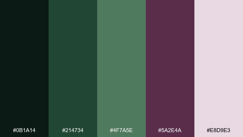
HEX: #0b1a14 #214734 #4f7a5e #5a2e4a #e8d9e3
Mood: lush, romantic, mysterious
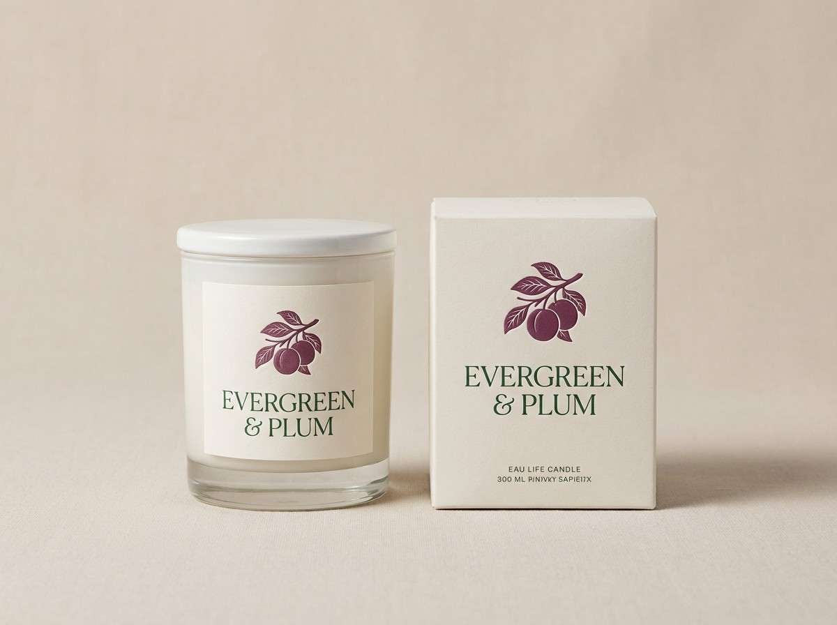
Best for: boutique candle label and box
Lush pine greens with a velvet plum accent feel romantic, mysterious, and boutique-ready. The deep plum makes an elegant focal color for logos, seals, or small pattern details. Keep the packaging base light and let the green handle supporting copy and ingredient lists. Tip: use matte finishes for green areas and a spot-gloss on plum to amplify contrast.
Image example of velvet pine plum generated using media.io
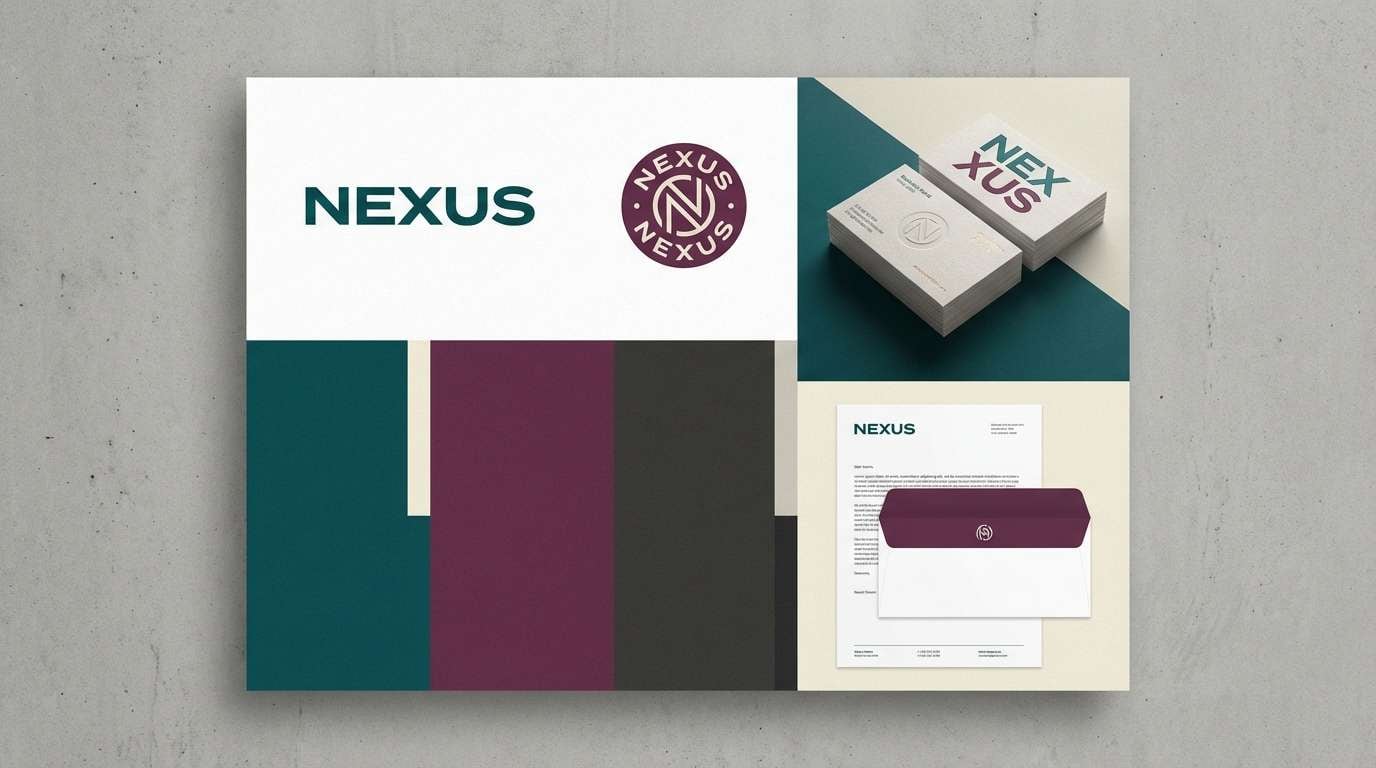
12) Teal Plum Grove
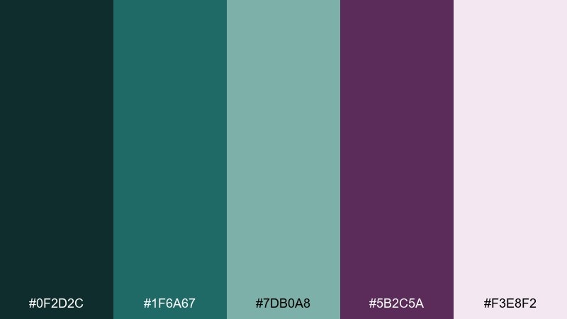
HEX: #0f2d2c #1f6a67 #7db0a8 #5b2c5a #f3e8f2
Mood: enchanted, bold, elegant
Best for: creative agency brand identity
Enchanted teal with a confident plum accent feels like a hidden grove lit by magic. This fantasy forest color palette is strong for creative agencies, music releases, and branding that wants nature without looking rustic. Use teal as the primary brand field color, and deploy plum sparingly for CTAs, badges, or hero highlights. Tip: keep typography mostly dark teal to avoid over-sweetening the look.
Image example of teal plum grove generated using media.io
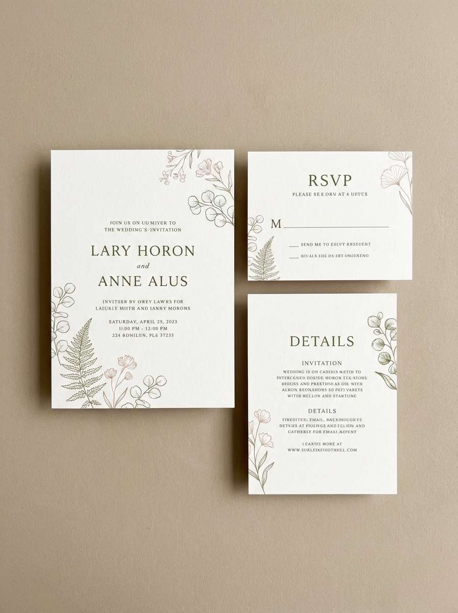
13) Glade Blossom Moss
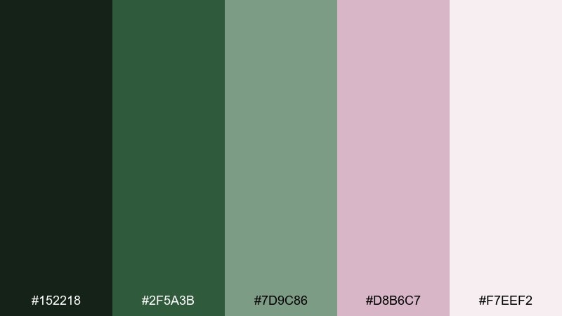
HEX: #152218 #2f5a3b #7d9c86 #d8b6c7 #f7eef2
Mood: soft, romantic, botanical
Best for: garden wedding invitation set
Soft moss greens with blush blossom tones feel like petals scattered on shaded grass. It is ideal for wedding invitations, floral brands, and gentle social templates that need a romantic lift. Let blush handle names and key details, while the darkest green anchors text blocks and borders. Tip: pair with fine-line botanical illustrations for a cohesive, airy finish.
Image example of glade blossom moss generated using media.io
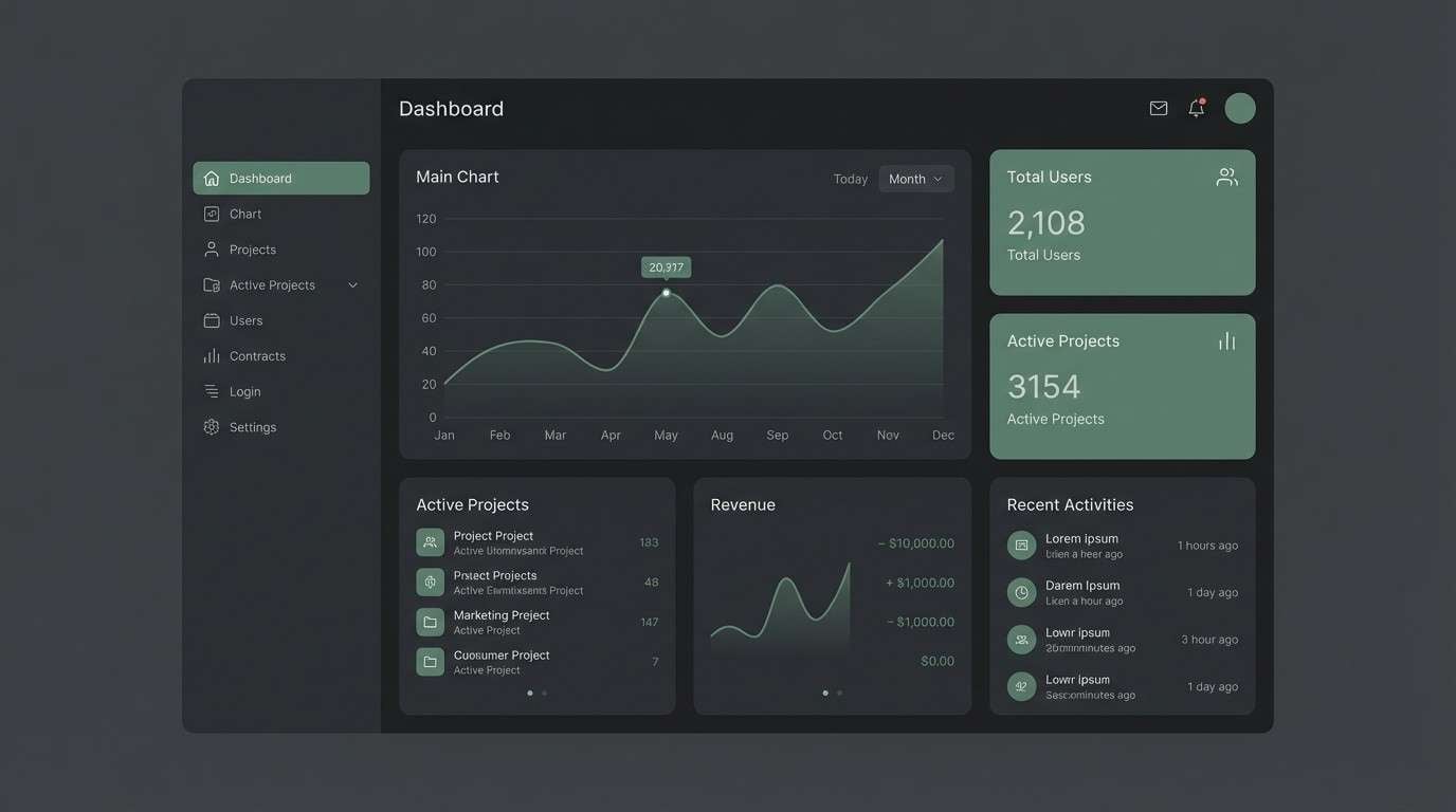
14) Shadowroot Charcoal
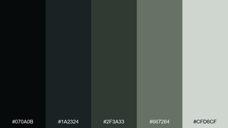
HEX: #070a0b #1a2324 #2f3a33 #667264 #cfd6cf
Mood: stealthy, gritty, modern
Best for: cyber-fantasy app dashboard UI
Stealthy charcoal and muted pine read like roots disappearing into shadowy soil. The tones suit dark-mode dashboards and apps that want a gritty, modern edge while staying earthy. Use the near-black as the canvas, and lift content with the pale gray-green for legible text. Tip: keep accent usage tight and rely on spacing to communicate hierarchy.
Image example of shadowroot charcoal generated using media.io
15) Sunlit Canopy Gold
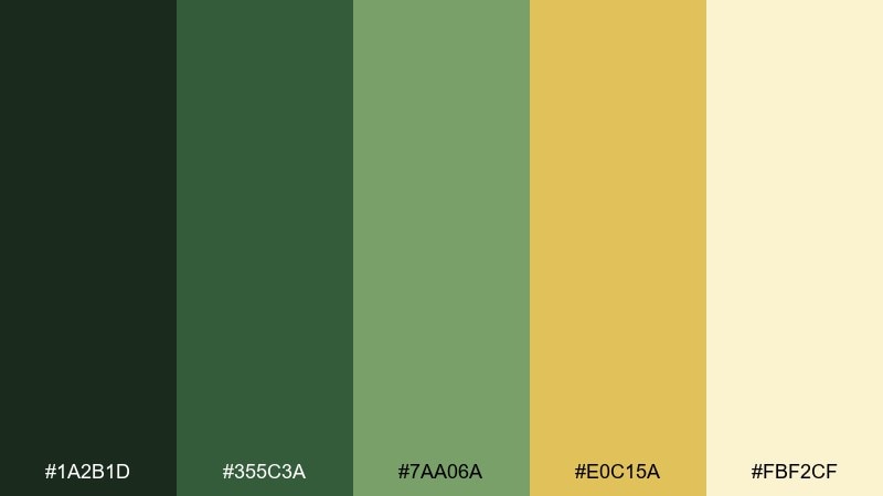
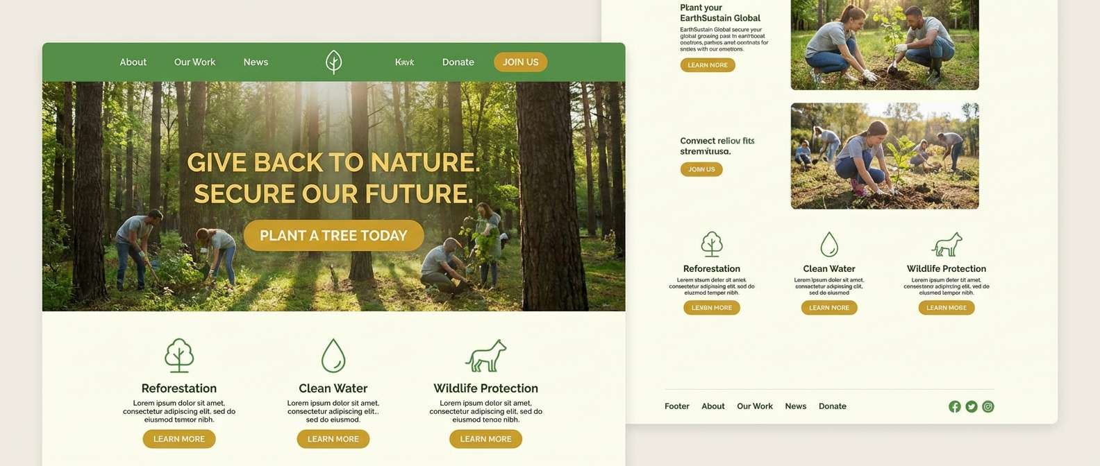
HEX: #1a2b1d #355c3a #7aa06a #e0c15a #fbf2cf
Mood: uplifting, warm, optimistic
Best for: eco nonprofit campaign landing page
Warm canopy gold with healthy greens feels like sunlight breaking through leaves. It is a strong choice for eco campaigns, nonprofit pages, and community projects where optimism should be immediate. Use gold for buttons and key statistics, while greens hold navigation and section headers. Tip: keep backgrounds light and let the dark green carry accessibility for text.
Image example of sunlit canopy gold generated using media.io
16) Rainwashed Spruce
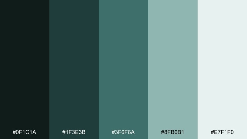
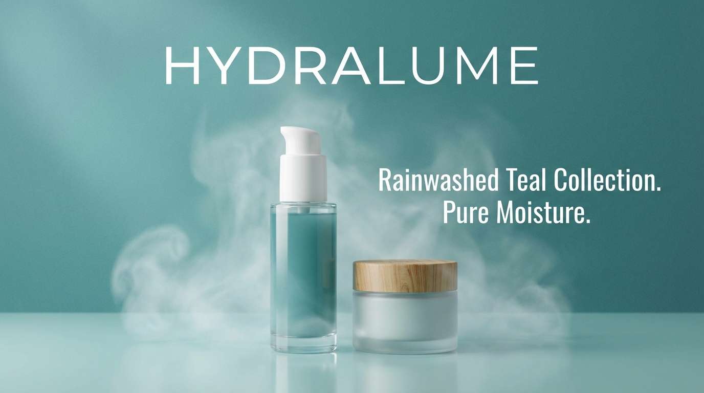
HEX: #0f1c1a #1f3e3b #3f6f6a #8fb6b1 #e7f1f0
Mood: clean, rainy, soothing
Best for: skincare product ad banner
Rainwashed spruce teals and soft mist highlights feel clean, soothing, and slightly cool. They fit skincare banners, wellness ads, and product pages that want clarity and trust. Use the lightest tone as your background and the deep spruce for product names and pricing. Tip: add gentle gradients in the mid teal to mimic water without introducing new colors.
Image example of rainwashed spruce generated using media.io
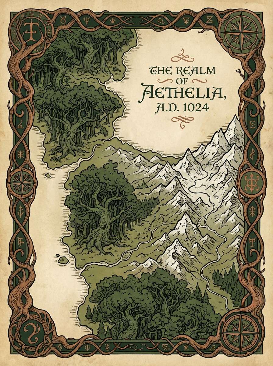
17) Elf Court Tapestry
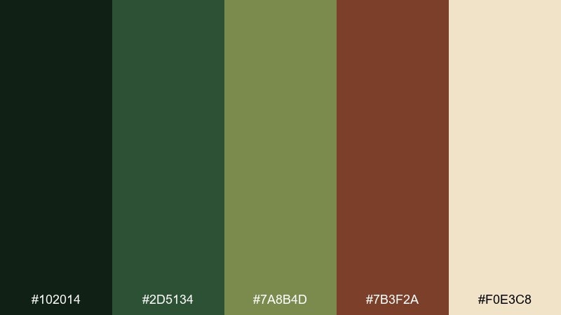
HEX: #102014 #2d5134 #7a8b4d #7b3f2a #f0e3c8
Mood: regal, storied, earthy
Best for: fantasy map poster
Regal greens with weathered copper-brown feel like an elven tapestry woven from leaves and old leather. It is excellent for maps, lore posters, and collectible prints where you want a storied, handcrafted look. Use the parchment tone for the base, then build terrain with the olive and deep green. Tip: keep the copper-brown for borders, labels, and compass details to guide the eye.
Image example of elf court tapestry generated using media.io
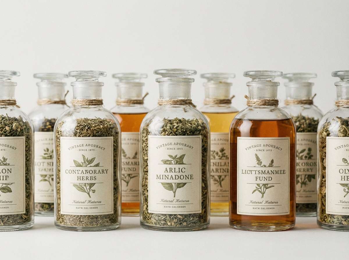
18) Witch Hazel Hush
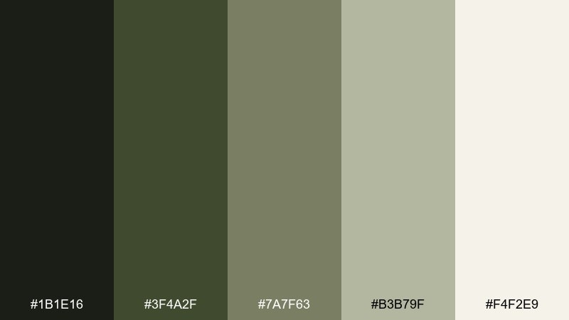
HEX: #1b1e16 #3f4a2f #7a7f63 #b3b79f #f4f2e9
Mood: quiet, herbal, vintage
Best for: apothecary label set
Quiet hazel greens and faded herbs feel vintage, herbal, and softly mysterious. They work well for apothecary labels, soap wraps, and small-batch goods that lean natural and classic. Use the darkest tone for product names and the muted olive for ingredient callouts. Tip: add tiny iconography in the mid sage to keep the system consistent across a label series.
Image example of witch hazel hush generated using media.io
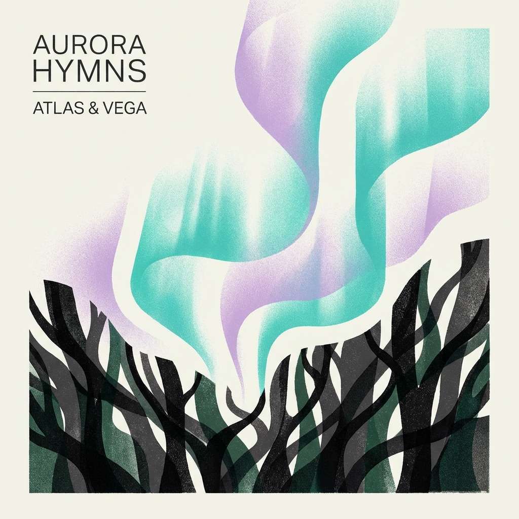
19) Aurora Woodland
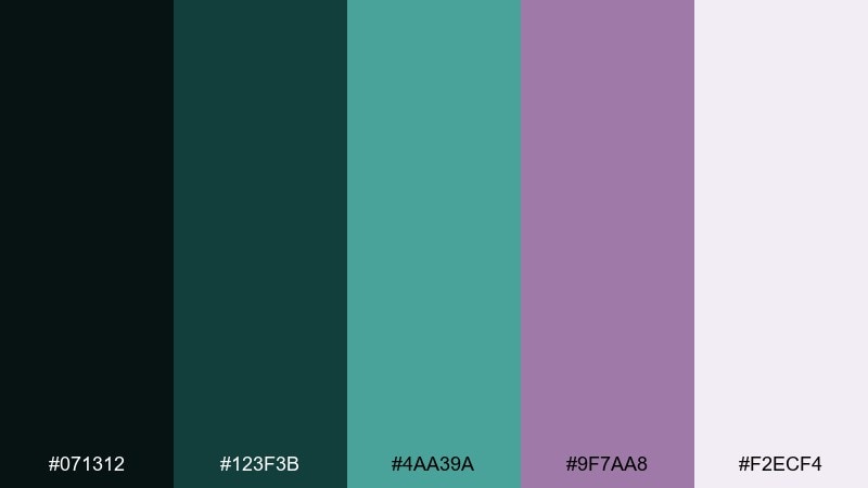
HEX: #071312 #123f3b #4aa39a #9f7aa8 #f2ecf4
Mood: dreamy, luminous, otherworldly
Best for: music album cover artwork
Dreamy teal glow with a lavender haze feels like aurora light drifting through treetops. It is a great fit for album covers, streaming thumbnails, and creator branding that wants an otherworldly edge. Use the dark base for contrast and keep the luminous teal as your main glow color. Tip: let lavender stay secondary so the composition reads forest-first, not candy-sweet.
Image example of aurora woodland generated using media.io
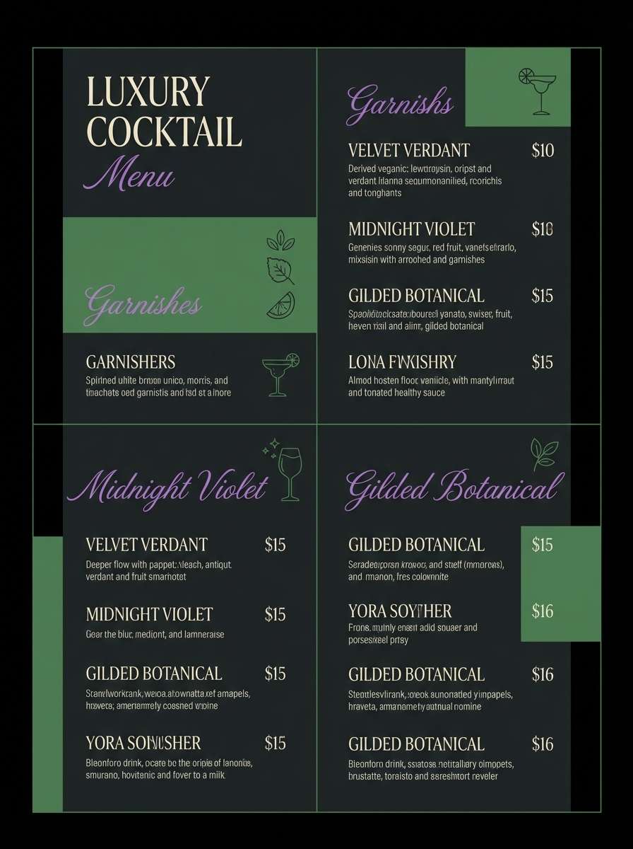
20) Nightcap Violet Fern
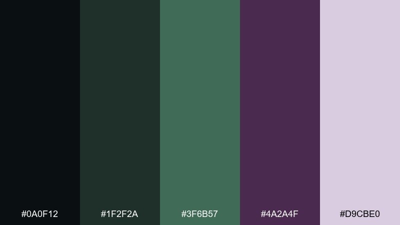
HEX: #0a0f12 #1f2f2a #3f6b57 #4a2a4f #d9cbe0
Mood: dark, elegant, enchanted
Best for: luxury cocktail menu design
Dark fern green and nightcap violet feel elegant, enchanted, and a touch theatrical. This mix suits cocktail menus, boutique hospitality branding, and evening event collateral. Use the near-black as the menu base and set headings in violet for a refined focal rhythm. Tip: keep body text in the pale lavender-tint to stay readable while preserving the nocturne vibe.
Image example of nightcap violet fern generated using media.io
What Colors Go Well with Fantasy Forest?
Fantasy forest palettes pair best with grounded neutrals and soft atmospheric lights. Think parchment beige, foggy off-white, mushroom taupe, and charcoal—these keep the scene believable and give your typography room to breathe.
For accents, choose one “magic” hue and use it sparingly: amber gold for warmth, creek teal for freshness, or plum/lavender for a mysterious romantic edge. A single accent color is usually enough to make the design feel enchanted.
If you need more contrast for UI, lean on deep evergreen or near-black backgrounds with misty green text, then reserve mid-tones for borders, cards, and hover states to maintain clarity.
How to Use a Fantasy Forest Color Palette in Real Designs
Start by assigning roles: pick a dark base (background), a light mist tone (surface), a mid green (primary), and one accent (gold, plum, or teal). This keeps your system consistent across pages, screens, and assets.
For branding and packaging, let earthy shades carry trust (browns/greens) and keep bright colors limited to seals, icons, or a single headline. For posters and covers, push contrast by pairing the lightest mist with the darkest evergreen for readable titles.
When mixing imagery, desaturate photos or illustrations slightly so they harmonize with the palette. This prevents competing greens and makes the overall composition feel intentionally “world-built.”
Create Fantasy Forest Palette Visuals with AI
Want to preview how your fantasy forest colors look on a cover, UI screen, label, or poster? You can generate concept visuals quickly with AI—then refine typography and layout once the mood feels right.
Reuse the prompts above, swap in your palette name, and keep the color directions consistent (dark base, mist highlights, one accent). This helps you produce a cohesive set of mockups for clients or content.
With Media.io text-to-image, you can iterate fast in your browser and export results for mood boards, brand decks, and early design exploration.
Fantasy Forest Color Palette FAQs
-
What defines a “fantasy forest” color palette?
A fantasy forest palette usually combines deep greens (canopy/shadow), earthy browns (bark/soil), and misty pale tones (fog/light), plus an optional magical accent like amber, teal, or plum. -
Which fantasy forest colors are best for readable UI?
Use a near-black or deep evergreen for backgrounds, then choose a misty off-white/gray-green for text. Keep mid-tones for cards and dividers, and reserve your accent color for buttons and active states. -
How do I keep forest palettes from looking too “muddy”?
Increase separation between your darkest and lightest tones, and add one clean highlight (mist/cream). Avoid using too many mid-browns and mid-greens at the same time without a light neutral. -
What accent color works best with forest green: gold, teal, or plum?
Gold feels warm and optimistic, teal feels fresh and enchanted, and plum feels elegant and mysterious. Pick one accent based on the story you want the design to tell, and use it sparingly. -
Are fantasy forest palettes good for branding?
Yes—especially for wellness, eco, artisan goods, games, books, and boutique hospitality. They communicate natural depth and craft, and they scale well from packaging to social templates to websites. -
Can I generate fantasy forest mockups with AI using these palettes?
Yes. Use the prompts in the examples, keep the palette colors consistent across outputs, and iterate on composition (layout, borders, typography space) until the mood matches your brand or project. -
What’s the simplest way to apply a fantasy forest palette to a design system?
Assign roles: 1 dark base, 1 light surface, 2 supportive mids, and 1 accent. Then apply those roles consistently to backgrounds, text, borders, and CTAs instead of swapping colors randomly.
Next: Teal Plum Color Palette


