

Light apricot is a warm, airy pastel that sits between peach and soft terracotta. It adds friendliness without feeling overly sweet, which makes it a go-to for modern branding, calm UI, and welcoming interiors.
Below are light apricot pairing ideas you can copy fast, with ready HEX codes and AI prompts you can use to generate matching visuals.
In this article
- Why Light Apricot Palettes Work So Well
-
- apricot linen
- sunlit clay
- peach orchard
- soft terracotta neutrals
- apricot & sage ui
- creamy coral wedding
- citrus sherbet
- apricot dusk
- rosewood apricot
- dusty peach denim
- apricot mint gelato
- warm minimal stationery
- apricot & midnight
- blush apricot spa
- apricot citrus kitchen
- apricot seashell
- autumn apricot harvest
- apricot lavender glow
- apricot graphite modern
- apricot jungle pop
- What Colors Go Well with Light Apricot?
- How to Use a Light Apricot Color Palette in Real Designs
- Create Light Apricot Palette Visuals with AI
Why Light Apricot Palettes Work So Well
Light apricot reads as optimistic and human because it carries warmth without the intensity of orange. In branding, it can feel approachable and “made with care,” especially when paired with creamy whites and cocoa browns.
It’s also highly flexible: push it toward earthy clay for handcrafted vibes, or balance it with cool sages, blues, and charcoals for a more contemporary, UI-friendly look.
Most importantly, light apricot supports clean hierarchy. Use it as a background wash or accent, then rely on deep neutrals (espresso, charcoal, navy) for accessibility and crisp typography.
20+ Light Apricot Color Palette Ideas (with HEX Codes)
1) Apricot Linen
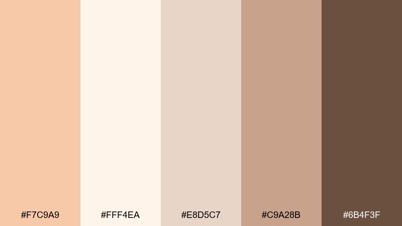
HEX: #F7C9A9 #FFF4EA #E8D5C7 #C9A28B #6B4F3F
Mood: airy, warm, minimal
Best for: lifestyle blog header design
Airy and sun-washed, these tones feel like linen curtains glowing at golden hour. Use the creamy off-white as breathing room and let the apricot sit in headlines or buttons. Pair with the cocoa brown for legible text and a grounded footer. Tip: keep contrast high by reserving the darker brown for small but important elements like navigation and CTAs.
Image example of apricot linen generated using media.io
Media.io is an online AI studio for creating and editing video, image, and audio in your browser.

2) Sunlit Clay
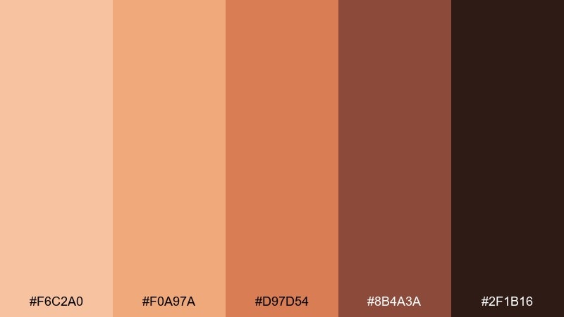
HEX: #F6C2A0 #F0A97A #D97D54 #8B4A3A #2F1B16
Mood: earthy, bright, handcrafted
Best for: skincare product packaging
Earthy warmth meets a fresh, sunlit pop, like terracotta warmed on a windowsill. The mid clay and toasted brown create instant credibility for labels, while the lighter apricot keeps it friendly and approachable. Pair with matte black for small text and ingredient lines to avoid muddy contrast. Tip: use the brightest apricot as a spot color on seals or side panels for shelf standout.
Image example of sunlit clay generated using media.io
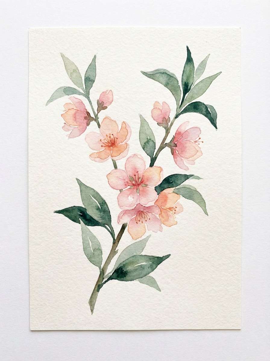
3) Peach Orchard
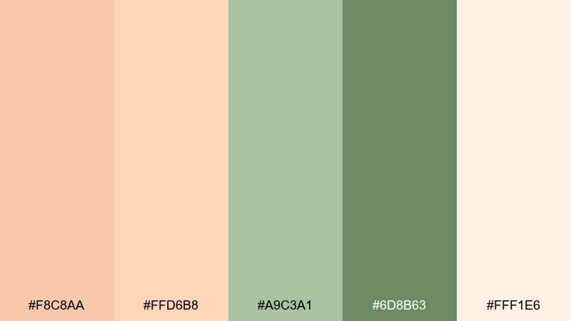
HEX: #F8C8AA #FFD6B8 #A9C3A1 #6D8B63 #FFF1E6
Mood: fresh, botanical, optimistic
Best for: spring botanical illustration
Fresh and breezy, it evokes orchard blossoms with soft fruit tones against leafy greens. Let the pale cream act as paper texture while the apricot shades form petals and highlights. The sage greens make a calm counterbalance, ideal for stems, borders, and small icons. Tip: keep the darkest green for fine outlines so the illustration stays airy instead of heavy.
Image example of peach orchard generated using media.io
4) Soft Terracotta Neutrals
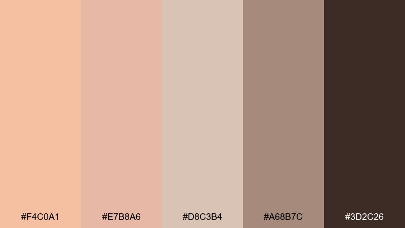
HEX: #F4C0A1 #E7B8A6 #D8C3B4 #A68B7C #3D2C26
Mood: cozy, muted, sophisticated
Best for: interior design moodboard
Cozy and muted, these shades feel like plaster walls, warm clay, and worn leather. The dusty midtones are perfect for large surfaces, while the dark espresso anchors typography and small details. Pair with natural textures like oak, boucle, and stone to keep it tactile. Tip: use the lightest apricot only as a highlight so the whole board reads calm and premium.
Image example of soft terracotta neutrals generated using media.io
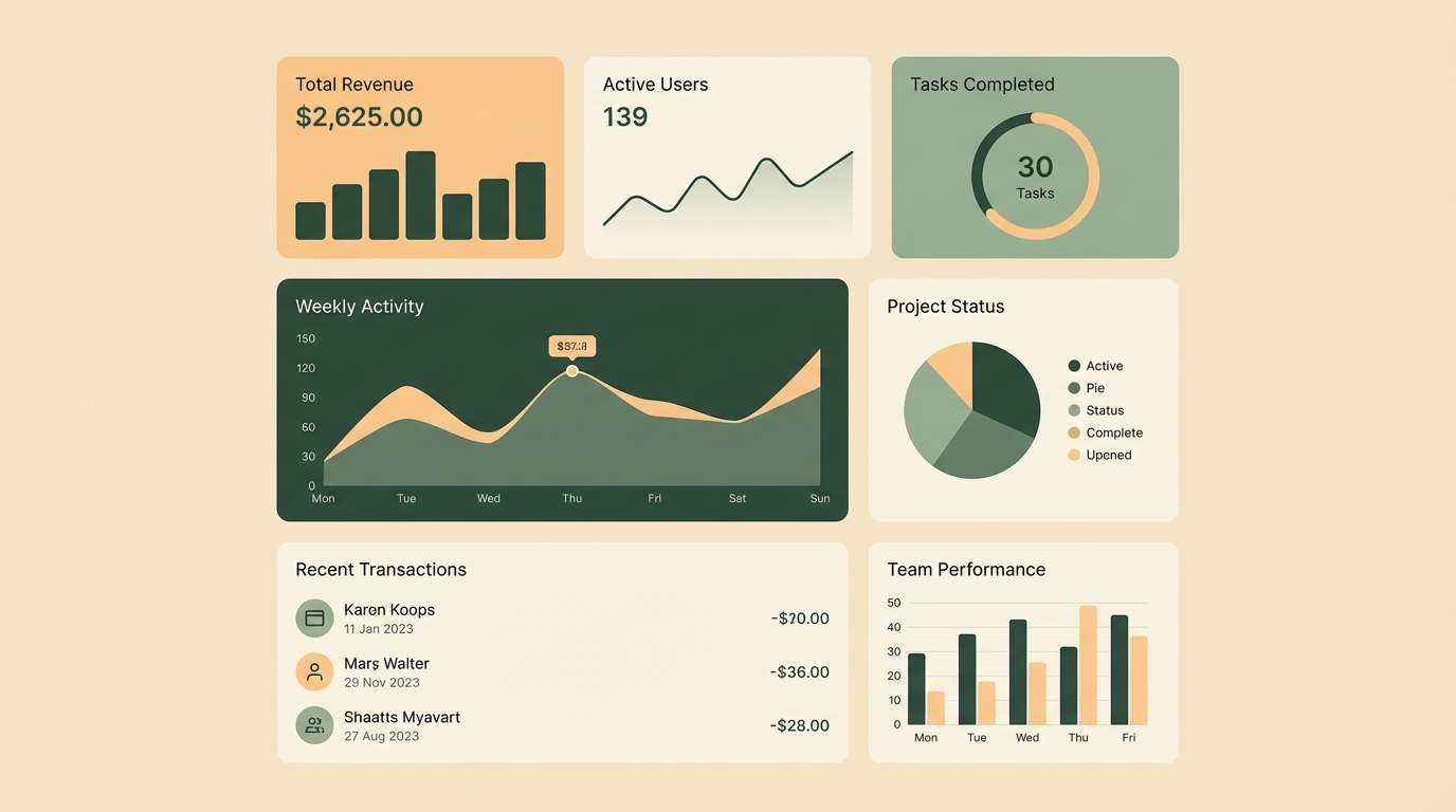
5) Apricot & Sage UI
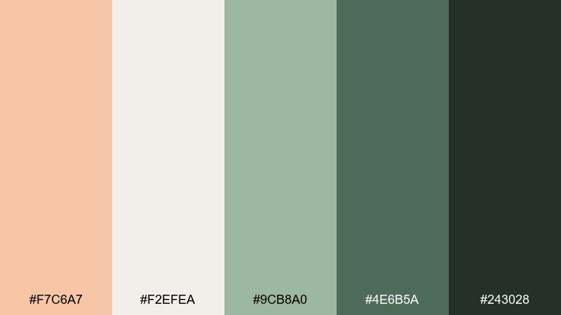
HEX: #F7C6A7 #F2EFEA #9CB8A0 #4E6B5A #243028
Mood: calm, modern, nature-led
Best for: 2D UI dashboard mockup
Calm and quietly modern, it brings to mind a wellness studio with potted herbs and soft daylight. This light apricot color scheme works well when the cream is your canvas and sage becomes the navigation and active states. Pair the deep green with small icons and labels to keep accessibility strong. Tip: use apricot sparingly for notifications and primary buttons so it reads as intentional emphasis.
Image example of apricot & sage ui generated using media.io
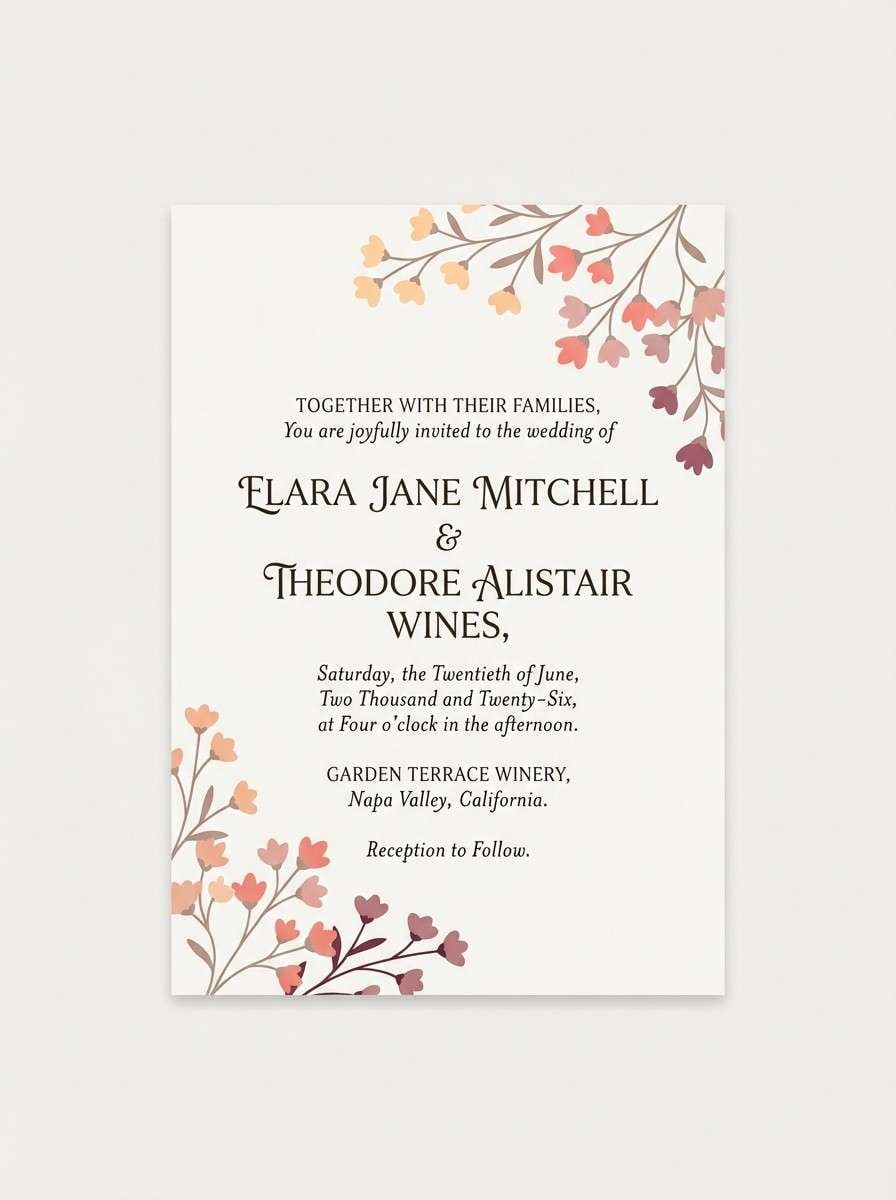
6) Creamy Coral Wedding
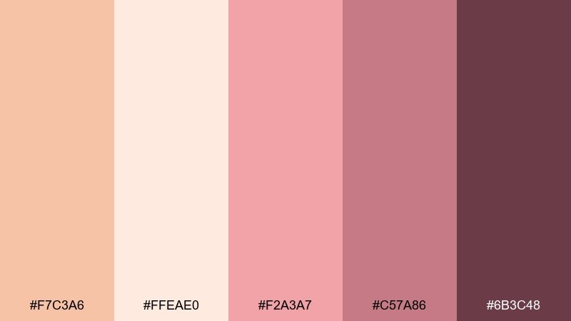
HEX: #F7C3A6 #FFEAE0 #F2A3A7 #C57A86 #6B3C48
Mood: romantic, soft, celebratory
Best for: wedding invitation design
Romantic and creamy, the mix feels like blush florals layered over warm candlelight. Use the pale peach as the invitation base, then bring in coral for names or monograms. The wine tone adds elegance for date and venue details without looking harsh. Tip: print with a slight texture (cotton or eggshell) so the soft colors stay rich instead of flat.
Image example of creamy coral wedding generated using media.io
7) Citrus Sherbet
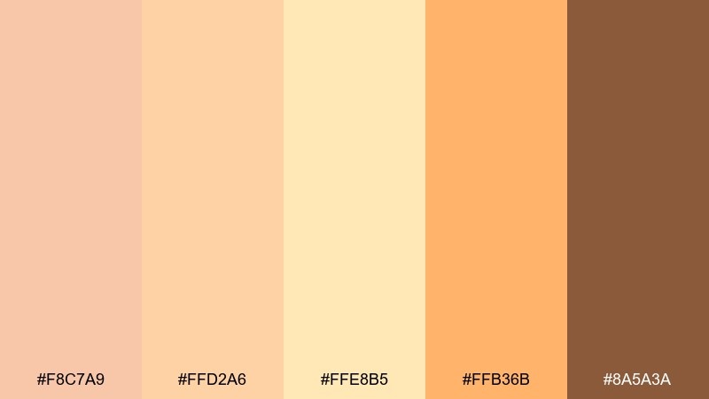
HEX: #F8C7A9 #FFD2A6 #FFE8B5 #FFB36B #8A5A3A
Mood: playful, sunny, energizing
Best for: summer event poster
Playful and sunny, it looks like sherbet swirls and late-afternoon light. Let the buttery yellow soften big blocks of color, while the bright orange becomes your headline accent. The deep caramel brown keeps typography readable and prevents the palette from feeling too candy-like. Tip: use simple geometric shapes so the warm hues feel modern rather than retro.
Image example of citrus sherbet generated using media.io

8) Apricot Dusk
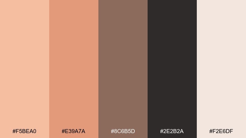
HEX: #F5BEA0 #E39A7A #8C6B5D #2E2B2A #F2E6DF
Mood: moody, cinematic, refined
Best for: editorial magazine layout
Moody and cinematic, it suggests twilight on warm stone with ink-dark shadows. Use the soft off-white as the page base, then lean on the charcoal for body text and grid lines. The deeper taupe gives you a natural midtone for pull quotes and section headers. Tip: keep photos warm-toned so they harmonize with the dusk apricot instead of fighting it.
Image example of apricot dusk generated using media.io
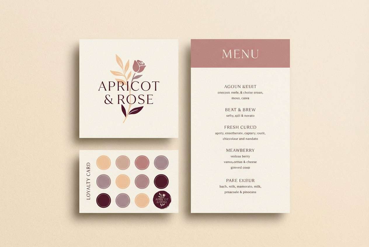
9) Rosewood Apricot
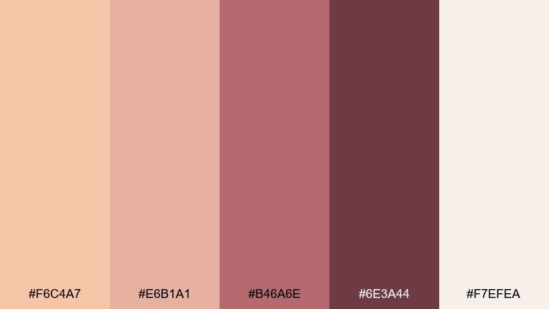
HEX: #F6C4A7 #E6B1A1 #B46A6E #6E3A44 #F7EFEA
Mood: boutique, intimate, elegant
Best for: boutique cafe branding
Boutique and intimate, it feels like rosewood furniture against soft pastries and steamed milk. This light apricot color palette shines on menus, loyalty cards, and small signage where warmth matters. Pair the deep wine with plenty of cream space for a premium, readable look. Tip: use the muted rose as a secondary accent for patterns so the brand stays cohesive across print and digital.
Image example of rosewood apricot generated using media.io
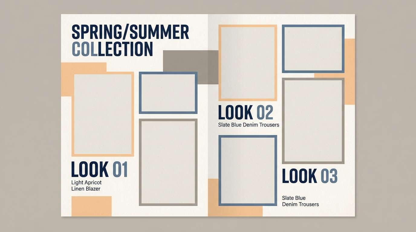
10) Dusty Peach Denim
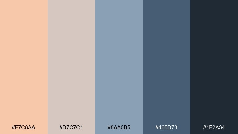
HEX: #F7C8AA #D7C7C1 #8AA0B5 #465D73 #1F2A34
Mood: cool-balanced, modern, casual
Best for: fashion lookbook layout
Cool-balanced and modern, it pairs soft peach with denim blues for an effortless casual vibe. Use the light peach and warm gray as backgrounds, then rely on slate and navy for type and framing. It works especially well for streetwear, capsule collections, and seasonal edits. Tip: keep imagery slightly desaturated so the denim tones feel intentional and not overly saturated.
Image example of dusty peach denim generated using media.io
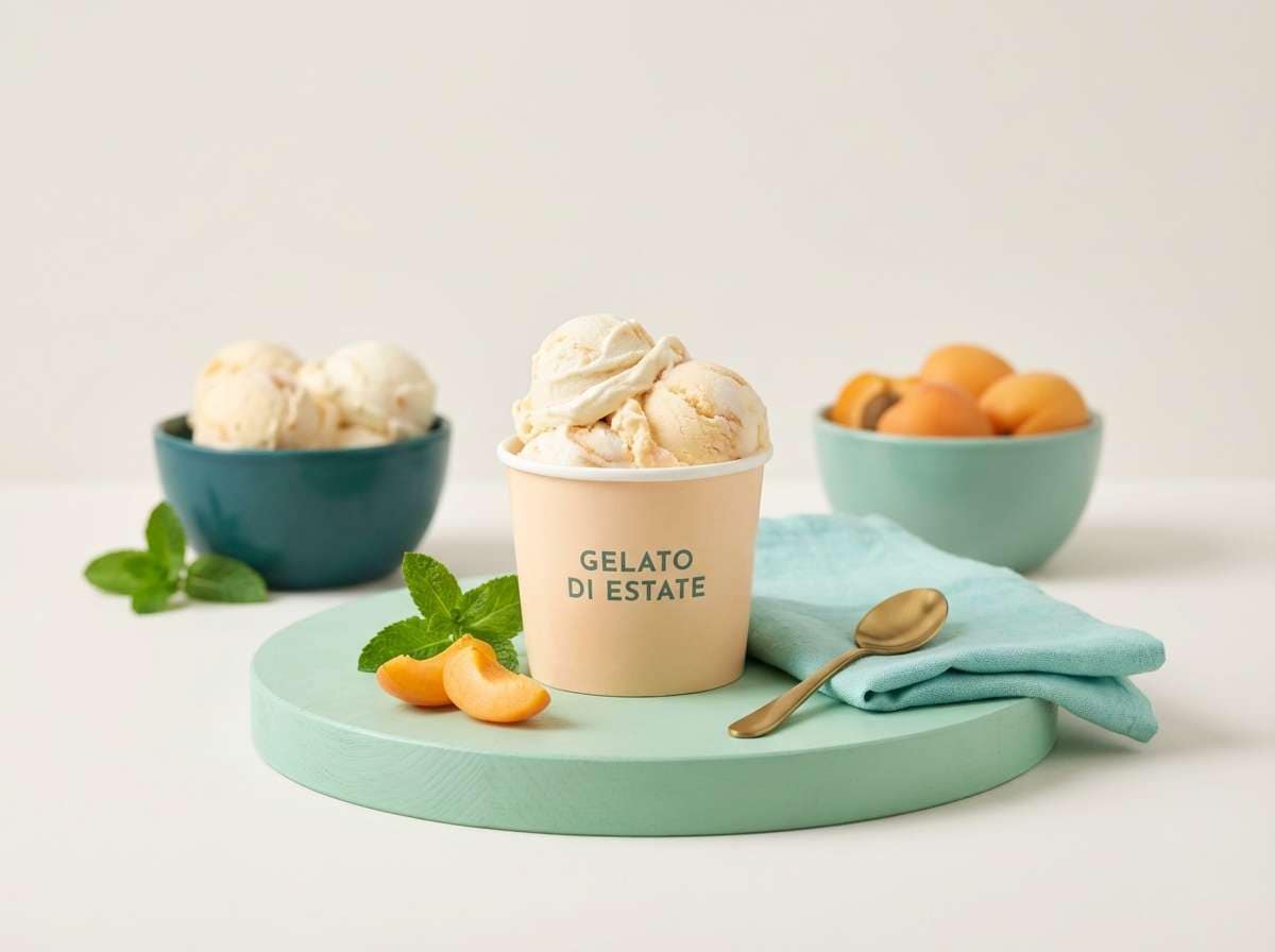
11) Apricot Mint Gelato
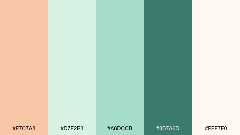
HEX: #F7C7A8 #D7F2E3 #A6DCCB #3B7A6D #FFF7F0
Mood: refreshing, sweet, friendly
Best for: ice cream product ad
Refreshing and sweet, it feels like gelato in a sunlit case with minty air. Use the pale cream as negative space, letting apricot lead the hero flavor and mint play the supporting note. The deep teal is perfect for pricing and small copy that needs to pop. Tip: choose a matte background so the soft pastels look creamy rather than shiny.
Image example of apricot mint gelato generated using media.io
12) Warm Minimal Stationery
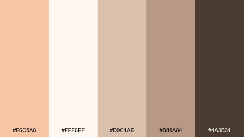
HEX: #F6C5A6 #FFF6EF #D9C1AE #B89A84 #4A3B31
Mood: clean, calm, artisanal
Best for: stationery set mockup
Clean and calm, it evokes handmade paper, soft envelopes, and a tidy desk. Keep the off-white as your base, then add apricot for subtle borders, seals, or brand marks. The warm browns deliver readable text and a grounded, craft feel. Tip: use the taupe shade for secondary typography so the dark brown can stay reserved for headings only.
Image example of warm minimal stationery generated using media.io
13) Apricot & Midnight
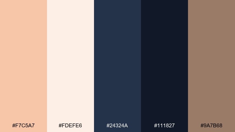
HEX: #F7C5A7 #FDEFE6 #24324A #111827 #9A7B68
Mood: bold, modern, high-contrast
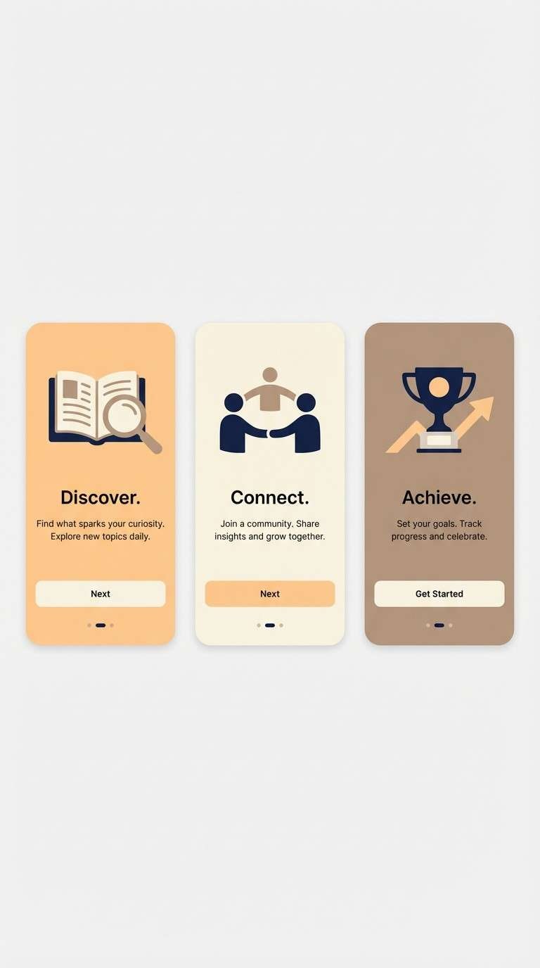
Best for: app onboarding screens
Bold and modern, it feels like warm light against a midnight sky. This light apricot color combination is strong for onboarding because the dark navies give instant contrast and focus. Pair the warm taupe with illustrations or icon fills to soften transitions between screens. Tip: keep primary buttons in apricot and reserve the darkest navy for text so the hierarchy stays crystal clear.
Image example of apricot & midnight generated using media.io
14) Blush Apricot Spa
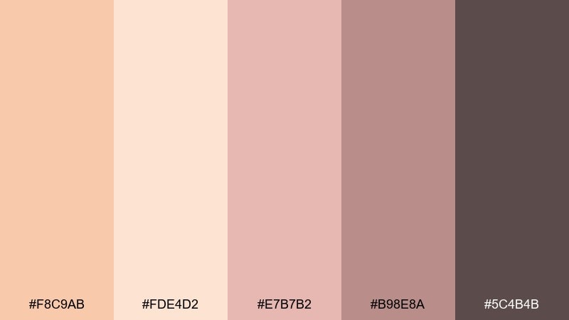
HEX: #F8C9AB #FDE4D2 #E7B7B2 #B98E8A #5C4B4B
Mood: soothing, gentle, nurturing
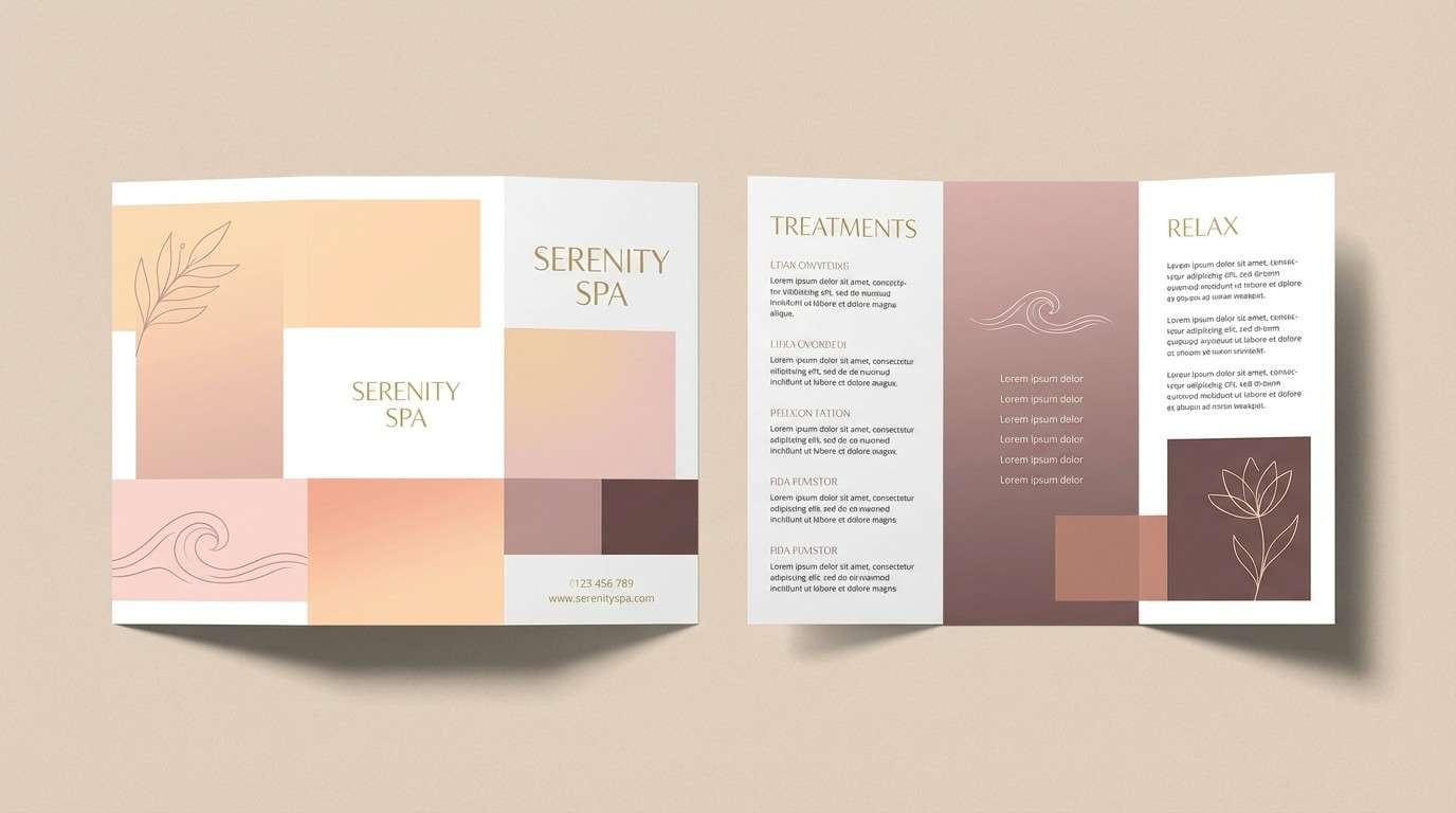
Best for: spa brochure design
Soothing and gentle, it suggests warm towels, soft blush petals, and quiet treatment rooms. The pale peach makes a welcoming background for service lists and pricing tables. Use the deeper mauve-brown for headings so the design stays readable without turning stark. Tip: add plenty of whitespace and thin dividers to keep the brochure feeling calm and breathable.
Image example of blush apricot spa generated using media.io
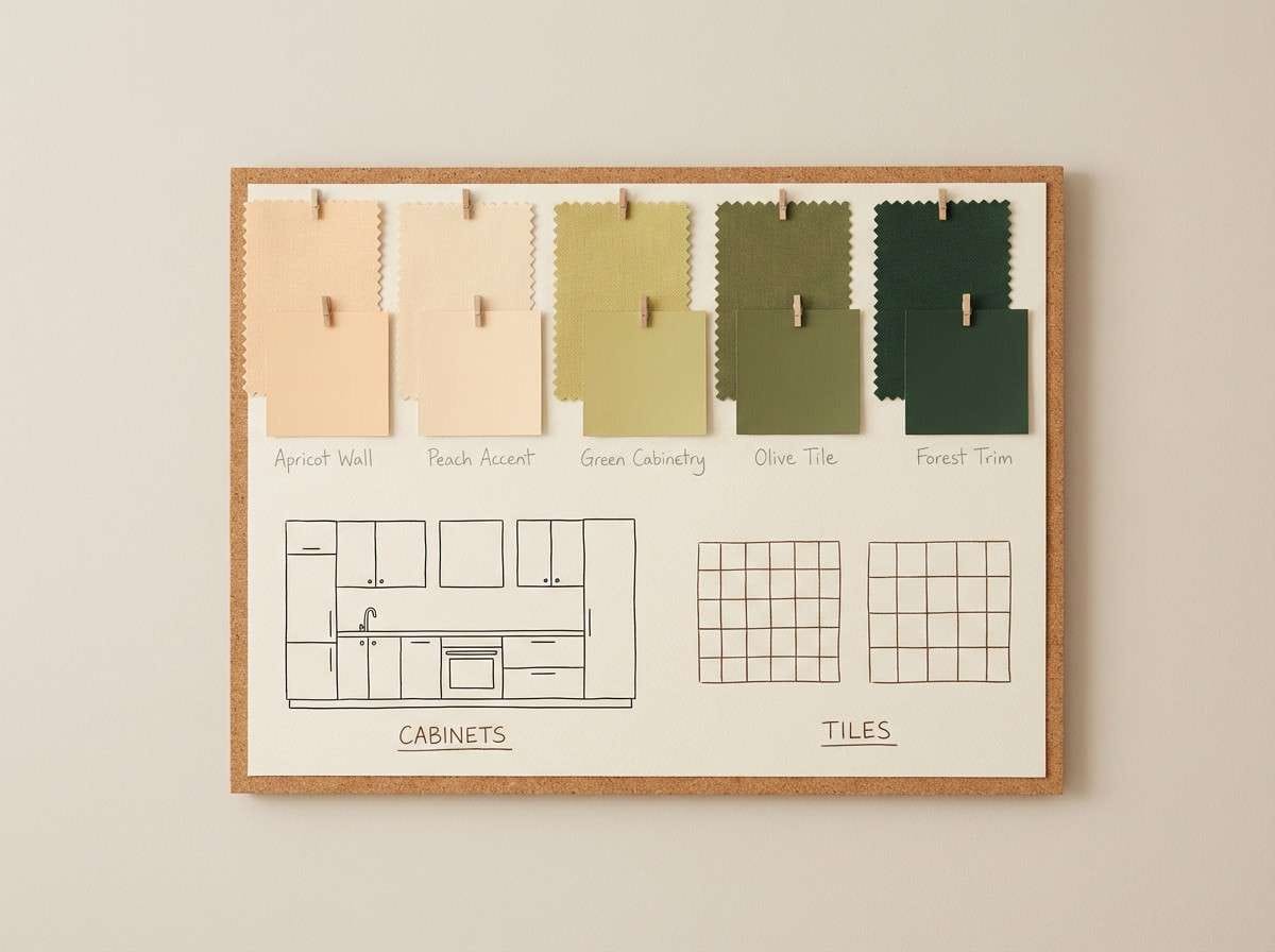
15) Apricot Citrus Kitchen
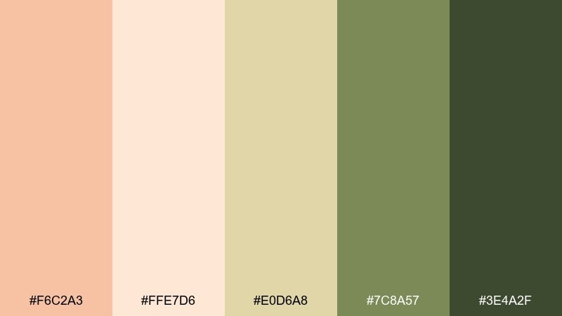
HEX: #F6C2A3 #FFE7D6 #E0D6A8 #7C8A57 #3E4A2F
Mood: homey, fresh, organic
Best for: kitchen interior color planning
Homey and fresh, it feels like citrus peel, olive leaves, and sun on a countertop. Use the creamy peach on walls or cabinetry, and bring the greens into tile accents or textiles. The muted yellow-green is great for small decor moments that add life without shouting. Tip: keep the darkest green for hardware or thin lines so the space stays light and open.
Image example of apricot citrus kitchen generated using media.io
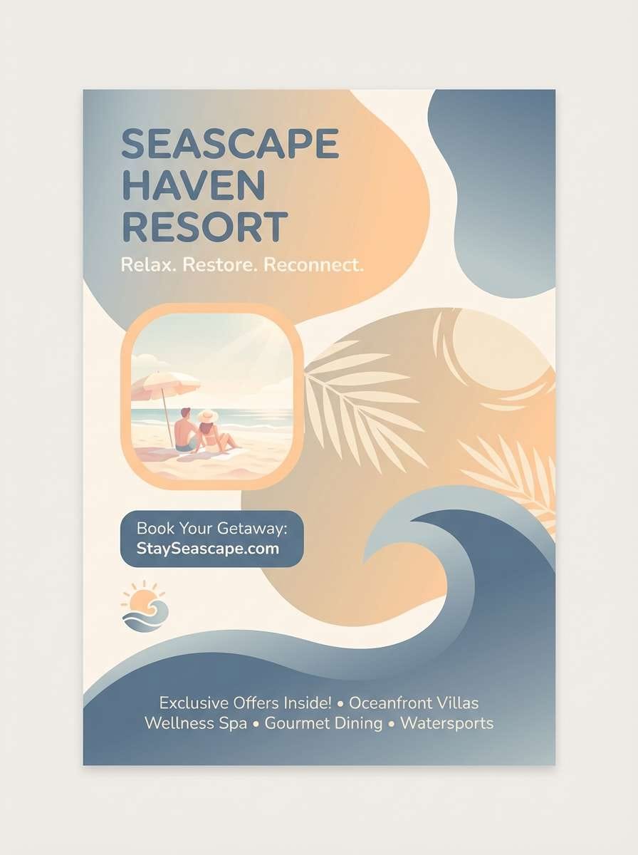
16) Apricot Seashell
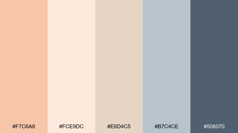
HEX: #F7C6A8 #FCE9DC #E6D4C5 #B7C4CE #506070
Mood: coastal, soft, breezy
Best for: beach resort flyer
Coastal and breezy, it brings to mind seashells, warm sand, and hazy blue horizons. Use the sand-cream tones for large backgrounds and reserve the steel blue for details like dates, locations, and QR codes. The slate blue adds a modern, airy contrast that keeps the warmth from feeling too sweet. Tip: choose rounded shapes and light gradients to echo the seaside softness.
Image example of apricot seashell generated using media.io
17) Autumn Apricot Harvest
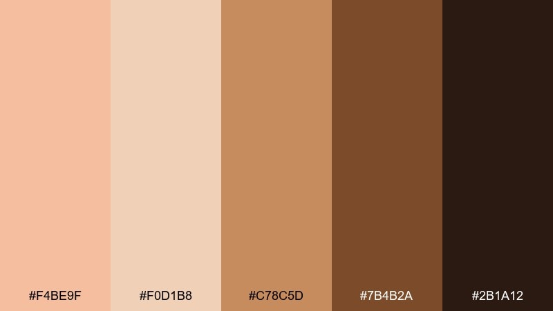
HEX: #F4BE9F #F0D1B8 #C78C5D #7B4B2A #2B1A12
Mood: rustic, autumnal, inviting
Best for: fall market poster
Rustic and inviting, it feels like baked pies, hay bales, and dusk at a harvest fair. These light apricot color combinations work best when the pale tones lead and the deeper browns frame the composition. Pair the caramel shade with simple illustrations of pumpkins or leaves for a friendly handmade look. Tip: limit the darkest brown to small text and outlines so the poster stays warm, not heavy.
Image example of autumn apricot harvest generated using media.io

18) Apricot Lavender Glow
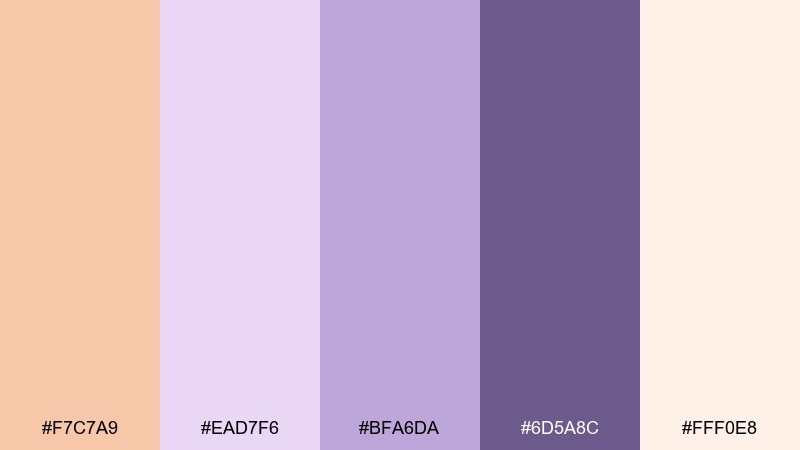
HEX: #F7C7A9 #EAD7F6 #BFA6DA #6D5A8C #FFF0E8
Mood: dreamy, modern, softly romantic
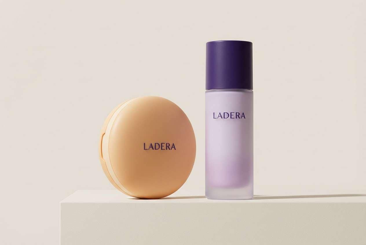
Best for: beauty product packaging
Dreamy and softly romantic, it looks like apricot light melting into lavender haze. Use the pale cream-peach as the package base, then layer lilac for gradients or soft patterning. The deep violet gives you a premium anchor for brand marks and ingredients. Tip: keep finishes satin or soft-touch so the gentle colors feel elevated rather than childish.
Image example of apricot lavender glow generated using media.io
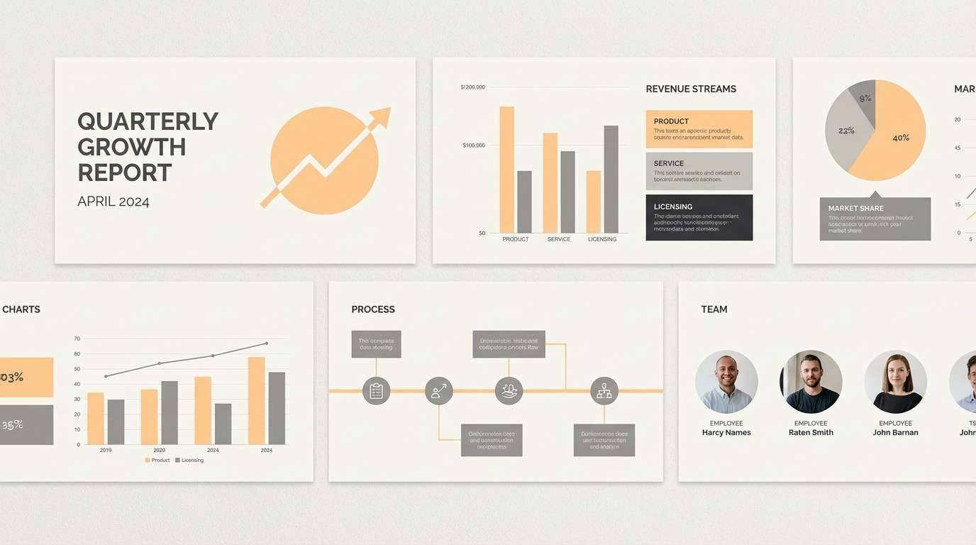
19) Apricot Graphite Modern
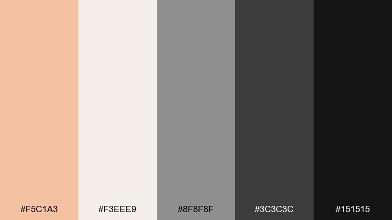
HEX: #F5C1A3 #F3EEE9 #8F8F8F #3C3C3C #151515
Mood: sleek, professional, contemporary
Best for: corporate presentation template
Sleek and contemporary, it feels like warm light on polished graphite. This light apricot color palette is a strong fit for decks when you want friendly energy without losing professionalism. Pair the off-white with gray blocks for charts, and use near-black for titles and key numbers. Tip: keep apricot limited to callouts and section dividers to maintain a sharp, executive look.
Image example of apricot graphite modern generated using media.io
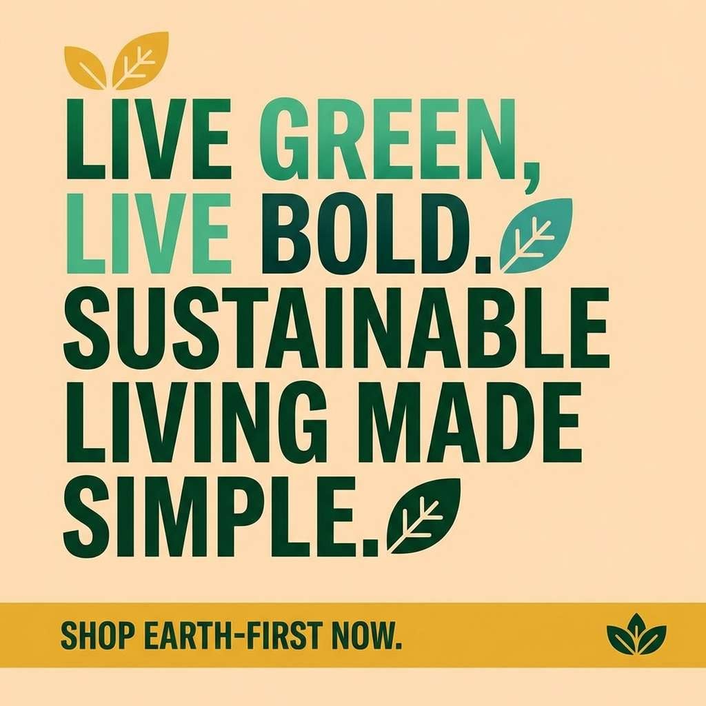
20) Apricot Jungle Pop
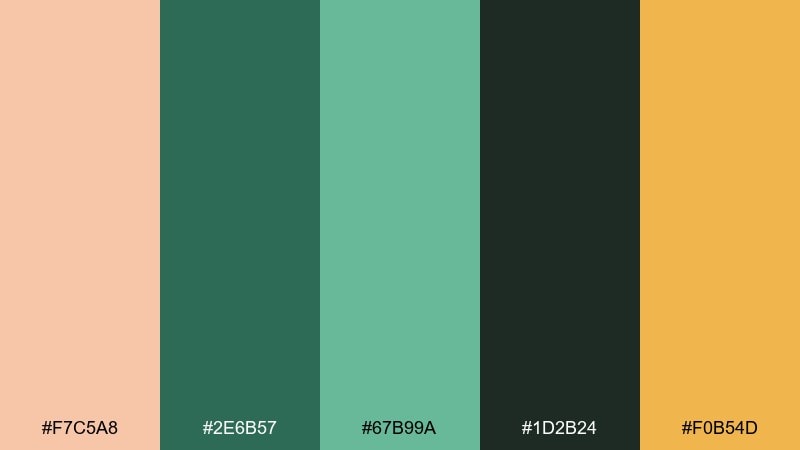
HEX: #F7C5A8 #2E6B57 #67B99A #1D2B24 #F0B54D
Mood: vibrant, eco, confident
Best for: eco brand social media promo
Vibrant and eco-forward, it suggests ripe fruit against deep jungle greens. Use the apricot as the main background for posts, then add the dark greens for punchy typography and icon shapes. The golden accent is ideal for price tags, limited-time badges, or small motion elements. Tip: keep gradients subtle so the green tones stay rich and natural rather than neon.
Image example of apricot jungle pop generated using media.io
What Colors Go Well with Light Apricot?
Light apricot pairs naturally with warm neutrals like cream, sand, taupe, and cocoa brown, creating a soft, modern “sunlit” look that’s great for lifestyle branding and editorial layouts.
For a fresher contrast, combine it with greens (sage, olive, deep forest) to get a botanical balance that still feels gentle. This is especially effective for wellness, skincare, and eco-focused designs.
If you want bolder results, anchor apricot with navy or charcoal for high contrast. The dark base keeps typography accessible and makes apricot accents feel intentional (buttons, badges, callouts).
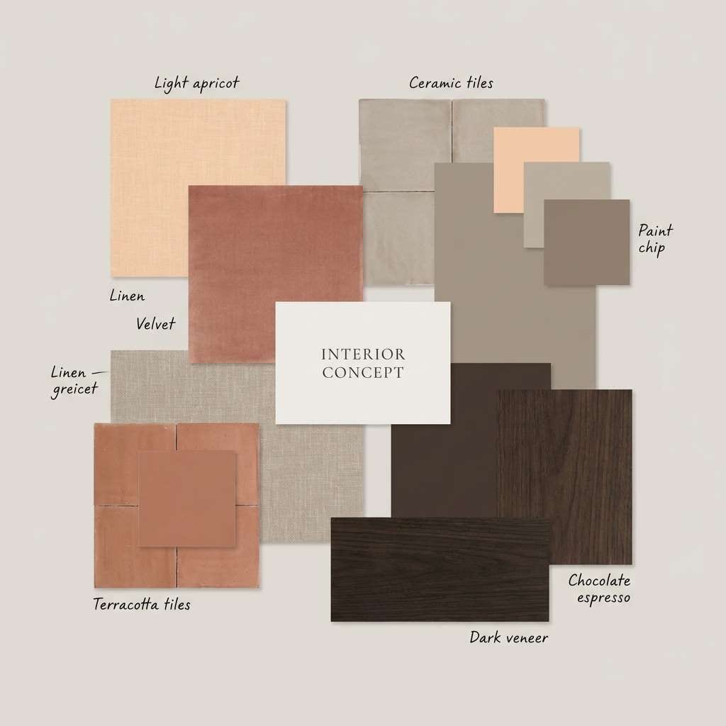
How to Use a Light Apricot Color Palette in Real Designs
In UI and web design, treat light apricot as an accent first: primary buttons, highlights, empty-state illustrations, or notification chips. Keep backgrounds mostly cream/off-white to avoid overwhelming screens with warmth.
In print (packaging, invitations, posters), apricot shines when paired with tactile cues: paper textures, soft-touch finishes, subtle gradients, and thin dividers. Use deeper browns, wine tones, or navies for small text to maintain clarity.
For interiors or decor boards, use apricot in controlled areas (paint wash, pillows, art, ceramics) and let wood, stone, and warm grays do the heavy lifting. This keeps the space cozy without tipping into overly peachy.
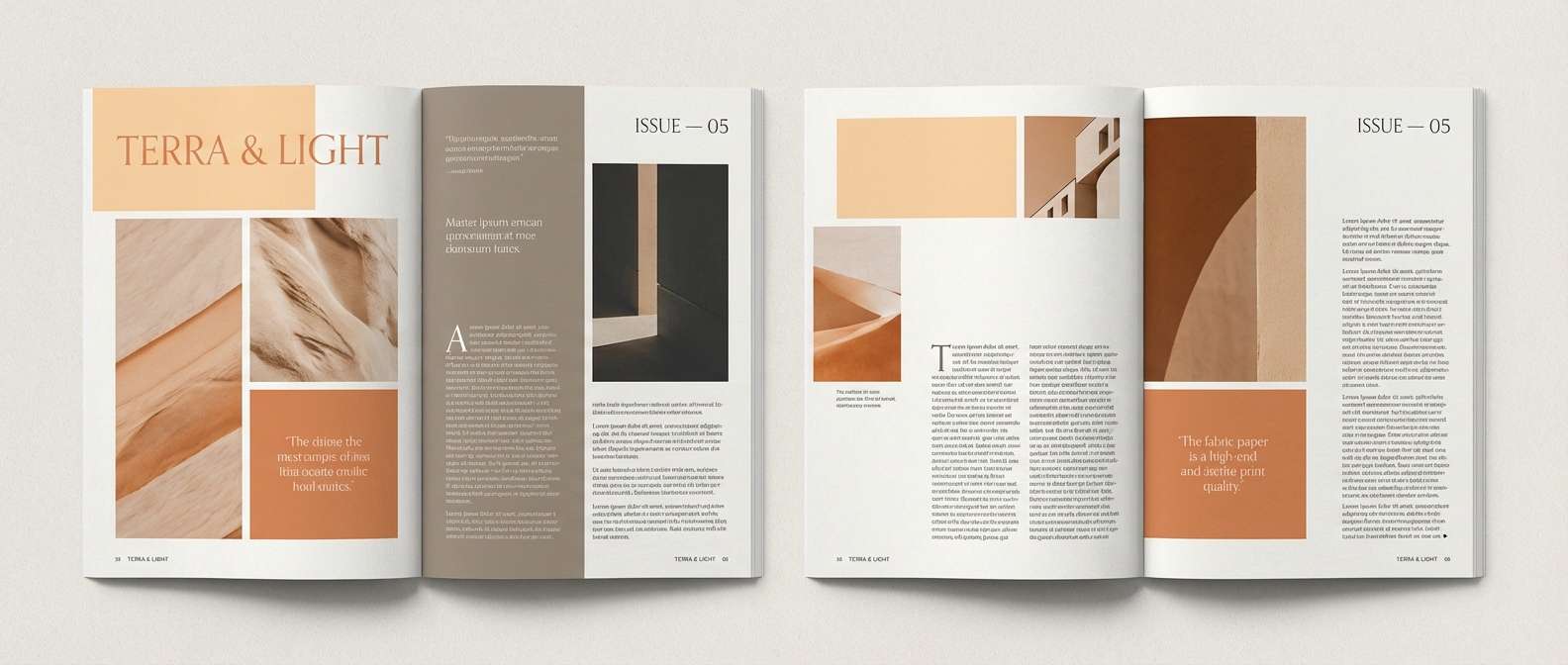
Create Light Apricot Palette Visuals with AI
If you already have HEX codes, the fastest way to validate a palette is to generate a few mockups: a hero banner, a UI screen, a label, and a social post. You’ll quickly see if your contrast, saturation, and mood match the brand.
With Media.io’s text-to-image, you can paste a prompt like the examples above and iterate styles (minimal, editorial, realistic packaging) while keeping the same light apricot color direction.
Start with one palette from this list, generate 2–3 variations, then lock in a consistent background color and one “anchor” dark for typography.
Light Apricot Color Palette FAQs
-
What is a common light apricot HEX code?
A popular light apricot starting point is #F7C9A9. It’s warm, soft, and easy to pair with creams, taupes, and deep browns for readable contrast. -
Is light apricot a peach or an orange?
Light apricot sits between peach and soft orange. It has orange warmth, but it’s muted and lightened enough to behave like a pastel in most designs. -
What neutral colors pair best with light apricot?
Warm neutrals work best: creamy white, linen beige, warm greige, taupe, cocoa, and espresso. These keep the palette cohesive and prevent apricot from feeling too candy-like. -
What are the best high-contrast pairings for accessibility?
Use deep navy, charcoal, or near-black for text and key UI labels. For example, pairing light apricot with #111827 or #2E2B2A typically creates clearer hierarchy than mid-browns. -
Does light apricot work for modern UI design?
Yes—especially as an accent color for buttons, tags, and highlights on a cream background. Pair it with sage greens or dark navies to keep the interface calm and contemporary. -
How do I keep a light apricot palette from looking too pink?
Introduce grounding tones like taupe, cocoa brown, slate blue, or olive green. Also limit apricot to 1–2 key roles (CTA, headline accent) instead of using it everywhere. -
Can I use light apricot for branding and packaging?
Absolutely. Light apricot signals warmth and approachability, making it strong for skincare, cafes, weddings, and lifestyle brands. Just ensure small print uses a darker anchor (espresso, wine, or navy) for legibility.


