

An aurora borealis color scheme captures the Northern Lights’ signature movement: deep polar blues shifting into icy cyan, luminous teal, and electric green.
Below you’ll find practical aurora borealis color palette ideas with HEX codes—built for UI, branding, posters, and more—plus AI prompts you can reuse to generate matching visuals.
In this article
- Why Aurora Borealis Color Schemes Work So Well
-
- polar night glow
- arctic emerald haze
- icy cyan drift
- midnight teal ribbon
- glacier mist
- neon tundra
- boreal twilight
- aurora lagoon
- starlit spruce
- frosted violet sheen
- north sea shimmer
- electric celadon
- pine and plasma
- winter horizon
- cosmic icefield
- verdigris aurora
- mint nebula
- deep space mint
- silver polar arc
- greenfire dusk
- What Colors Go Well with Aurora Borealis?
- How to Use a Aurora Borealis Color Palette in Real Designs
- Create Aurora Borealis Palette Visuals with AI
Why Aurora Borealis Color Schemes Work So Well
Aurora borealis schemes naturally balance contrast: a night-sky base (navy/indigo) makes the glow colors (teal, cyan, neon green) feel brighter without needing heavy saturation everywhere.
They also communicate “clean + futuristic” while still feeling organic, because the hues mimic real atmospheric light and water/ice reflections. That makes them flexible for tech, travel, wellness, and entertainment.
Most importantly, the palette structure is design-friendly: you get reliable dark anchors for layout, mid-tones for UI structure, and a single bright accent for calls-to-action and highlights.
20+ Aurora Borealis Color Palette Ideas (with HEX Codes)
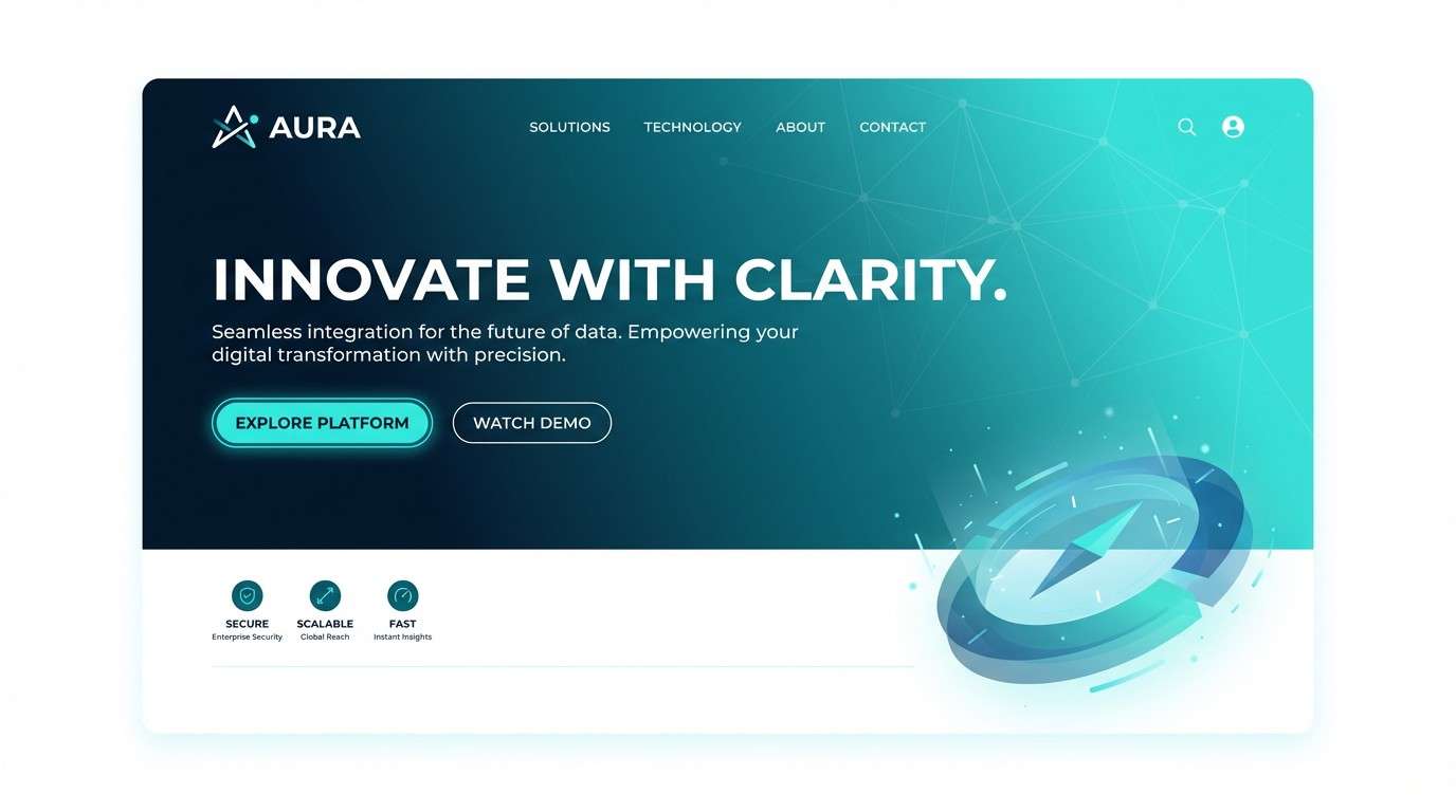
1) Polar Night Glow
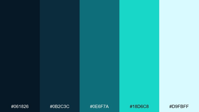
HEX: #061826 #0B2C3C #0E6F7A #18D6C8 #D9FBFF
Mood: crisp, quiet, luminous
Best for: website hero gradient for a tech brand
Crisp and quiet like a clear winter sky, these Northern Lights tones glow with a soft teal shimmer over deep navy. Use the dark blues for headers and navigation, then let the aqua carry the gradient in hero sections. Pair with white space and thin-line icons to keep it airy. Tip: reserve the bright aqua for primary CTAs so it feels like a single beam of light.
Image example of polar night glow generated using media.io
Media.io is an online AI studio for creating and editing video, image, and audio in your browser.

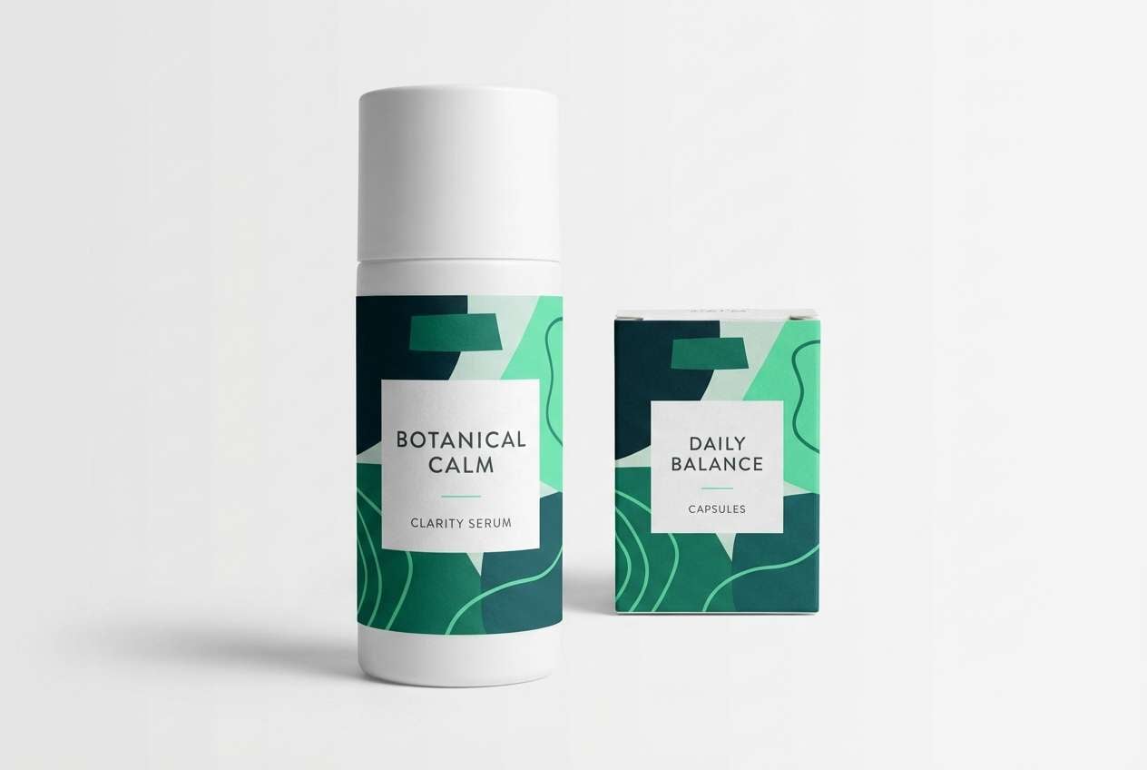
2) Arctic Emerald Haze
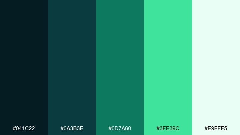
HEX: #041C22 #0A3B3E #0D7A60 #3FE39C #E9FFF5
Mood: fresh, botanical, modern
Best for: wellness packaging and label design
Fresh and botanical, this aurora borealis mix feels like green light drifting through cold air. The deep teal reads premium on labels, while the emerald and mint bring instant clarity to highlights and badges. Pair with matte white packaging and minimal sans-serif type for a clean, clinical look. Tip: use the mint as a spot color on seals to make the product feel lighter and more breathable.
Image example of arctic emerald haze generated using media.io
3) Icy Cyan Drift
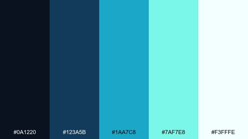
HEX: #0A1220 #123A5B #1AA7C8 #7AF7E8 #F3FFFE
Mood: clean, airy, energetic
Best for: SaaS dashboard UI accents
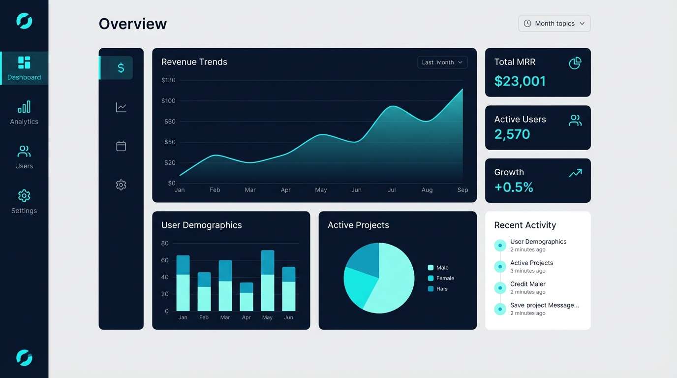
Clean and airy, these blues and cyans feel like light skipping across ice. Keep the midnight tone for sidebars and charts so data stays grounded, then use cyan and seafoam for states and highlights. Pair with cool grays and simple grid layouts for clarity. Tip: limit the brightest seafoam to success states to avoid visual fatigue in dense screens.
Image example of icy cyan drift generated using media.io
4) Midnight Teal Ribbon
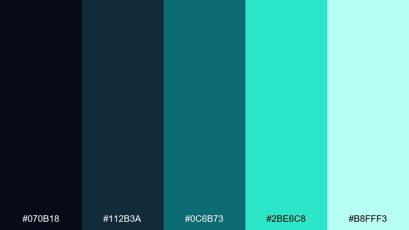
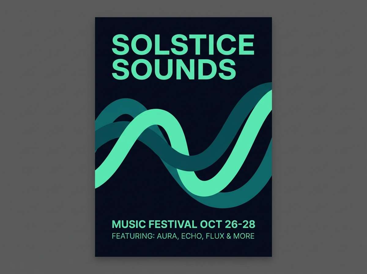
HEX: #070B18 #112B3A #0C6B73 #2BE6C8 #B8FFF3
Mood: mysterious, sleek, high-contrast
Best for: music festival poster design
Mysterious and sleek, the dark base makes the teal look like a ribbon of light cutting through night. This aurora borealis color palette shines on posters when you set type in pale mint and keep the background near-black. Pair with simple geometric shapes or a single wave motif to echo the movement. Tip: add a subtle grain to the dark areas so the glow feels more cinematic and less flat.
Image example of midnight teal ribbon generated using media.io
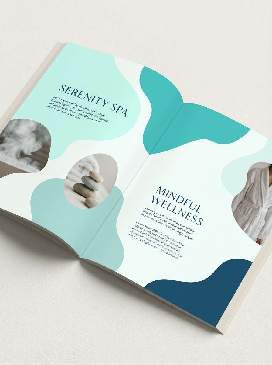
5) Glacier Mist
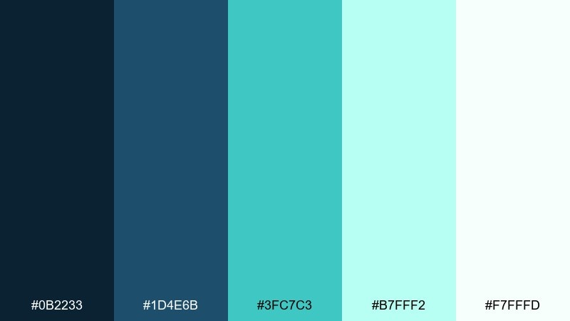
HEX: #0B2233 #1D4E6B #3FC7C3 #B7FFF2 #F7FFFD
Mood: soft, calm, coastal-cold
Best for: spa brochure and print collateral
Soft and calm, these aurora borealis tones feel like fog rolling over a frozen shoreline. Use the mid-blue for headings and the pale aqua for spacious panels, letting the near-white keep everything serene. Pair with warm gray paper stock or subtle texture to avoid an overly clinical finish. Tip: keep body text in a dark blue instead of pure black for a gentler read.
Image example of glacier mist generated using media.io
6) Neon Tundra
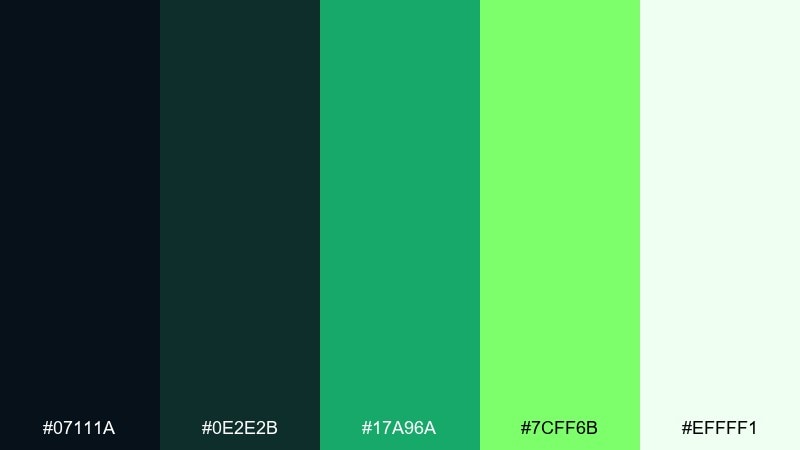
HEX: #07111A #0E2E2B #17A96A #7CFF6B #EFFFF1
Mood: bold, electric, outdoorsy
Best for: sports drink product ad
Bold and electric, this mix looks like green light bursting over dark terrain. The near-black and deep teal make a strong base for ads, while the neon green becomes an unmistakable energy cue. Pair with condensed type and high-contrast layouts to keep it punchy. Tip: use the neon only for key numbers and the main callout so it stays premium instead of toy-like.
Image example of neon tundra generated using media.io

7) Boreal Twilight
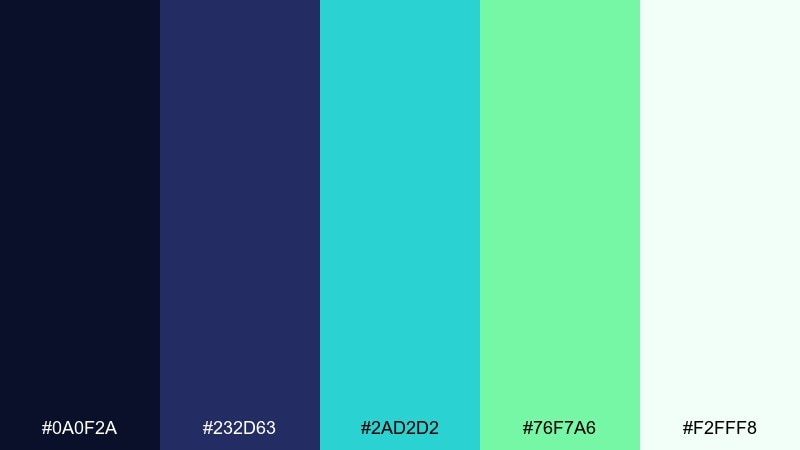
HEX: #0A0F2A #232D63 #2AD2D2 #76F7A6 #F2FFF8
Mood: dreamy, vibrant, twilight-cool
Best for: travel landing page for northern tours
Dreamy and vibrant, these aurora borealis hues capture that twilight moment when blue turns to glowing seafoam. For aurora borealis color schemes on a travel page, set the deep indigo as the canvas and let cyan-to-mint gradients lead the eye to booking sections. Pair with crisp white cards and subtle shadow for readability. Tip: keep button text dark indigo so it stays legible on the brighter greens.
Image example of boreal twilight generated using media.io
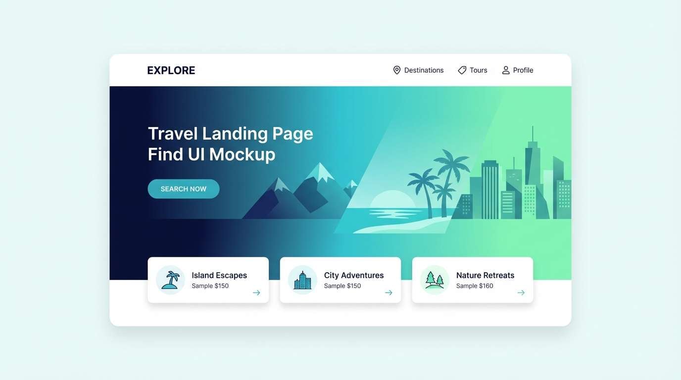
8) Aurora Lagoon
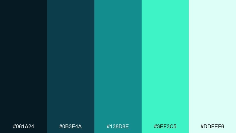
HEX: #061A24 #0B3E4A #138D8E #3EF3C5 #DDFEF6
Mood: liquid, refreshing, tropical-cool
Best for: app onboarding screens
Liquid and refreshing, these teals feel like a calm lagoon lit from underneath. Use the darker tones for full-bleed backgrounds and place white cards on top so onboarding steps stay readable. Pair with rounded icons and generous spacing for a friendly feel. Tip: animate the bright aqua as a progress indicator to add motion without clutter.
Image example of aurora lagoon generated using media.io
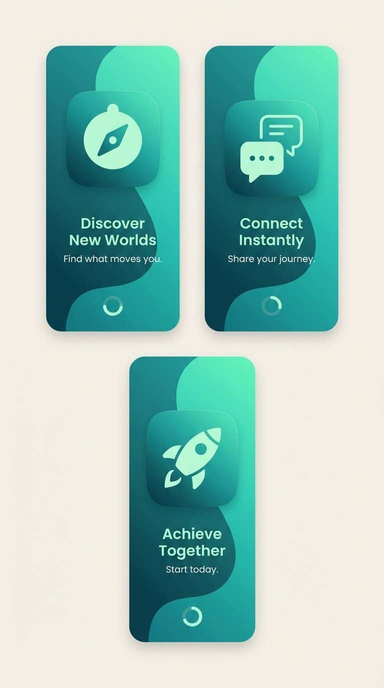
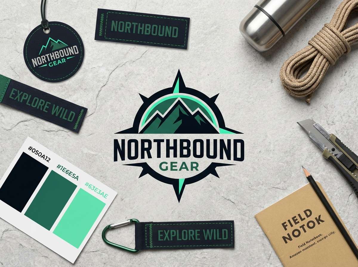
9) Starlit Spruce
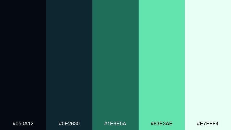
HEX: #050A12 #0E2630 #1E6E5A #63E3AE #E7FFF4
Mood: grounded, natural, night-forest
Best for: outdoor gear brand identity
Grounded and natural, it reads like spruce silhouettes under a starry sky. This aurora borealis color palette works best when the greens are used as accents on a nearly black base for logos, hang tags, and web headers. Pair with off-white backgrounds and rugged textures like canvas or recycled paper. Tip: keep the mint for small highlights such as zipper icons or size badges to avoid washing out the deep tones.
Image example of starlit spruce generated using media.io
10) Frosted Violet Sheen
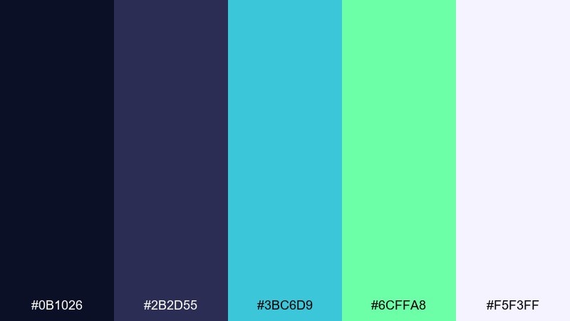
HEX: #0B1026 #2B2D55 #3BC6D9 #6CFFA8 #F5F3FF
Mood: cosmic, glossy, slightly playful
Best for: streaming thumbnail template
Cosmic and glossy, the violet undertone adds depth to the cool glow. Use the indigo-violet for the base layer, then bring in cyan and neon mint for titles and badges that need to pop at small sizes. Pair with simple shapes and high-contrast type to avoid muddy edges. Tip: keep the pale lavender-white as a quiet buffer behind text for better thumbnail readability.
Image example of frosted violet sheen generated using media.io

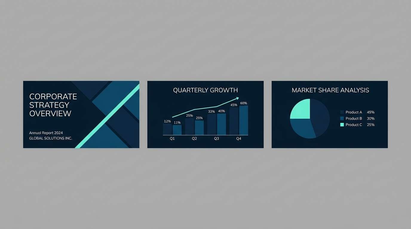
11) North Sea Shimmer
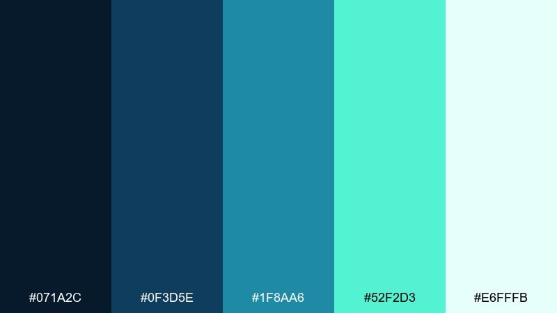
HEX: #071A2C #0F3D5E #1F8AA6 #52F2D3 #E6FFFB
Mood: clean, maritime, polished
Best for: corporate slide deck theme
Clean and maritime, this Northern Lights color palette feels like moonlight reflecting off cold water. Use the navy for title slides and the mid-blue for charts, then drop in the aqua as a consistent highlight color. Pair with lots of whitespace and simple iconography for a confident, executive look. Tip: keep gradients subtle in presentations so projectors do not crush the darker tones.
Image example of north sea shimmer generated using media.io
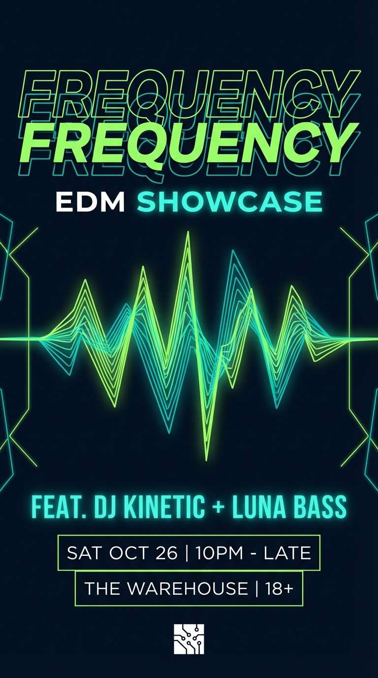
12) Electric Celadon
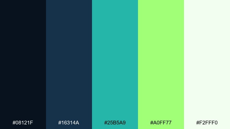
HEX: #08121F #16314A #25B5A9 #A0FF77 #F2FFF0
Mood: sporty, bright, futuristic
Best for: event flyer for an EDM night
Sporty and futuristic, celadon teal plus neon green gives instant motion. For an aurora borealis color palette on a flyer, keep the background dark and let the green carry the hierarchy for headliners and time blocks. Pair with crisp white microcopy and a single geometric pattern to avoid visual noise. Tip: use the teal for secondary details so the neon stays special and readable.
Image example of electric celadon generated using media.io
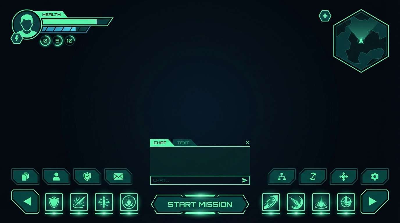
13) Pine and Plasma
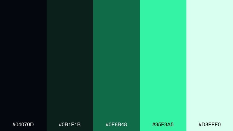
HEX: #04070D #0B1F1B #0F6B48 #35F3A5 #D8FFF0
Mood: moody, sharp, adventurous
Best for: gaming UI theme
Moody and sharp, this Northern Lights color palette mixes pine-dark shadows with a plasma-like mint glow. Use the near-black for the main UI, then apply the bright mint to focus states, toggles, and key stats. Pair with subtle grid textures and thin borders to keep it game-like but not busy. Tip: cap the glow color to one or two components so it feels intentional rather than everywhere.
Image example of pine and plasma generated using media.io
14) Winter Horizon
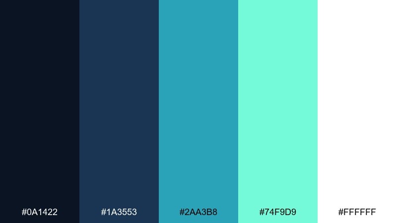
HEX: #0A1422 #1A3553 #2AA3B8 #74F9D9 #FFFFFF
Mood: bright, optimistic, open
Best for: clean fintech website UI
Bright and optimistic, it feels like the first light on a winter horizon. Use the blue for structure in nav and footers, then let turquoise and seafoam guide users through forms and key actions. Pair with plenty of white and restrained shadows for a trustworthy fintech tone. Tip: keep error states neutral and rely on the turquoise family for positive reinforcement.
Image example of winter horizon generated using media.io

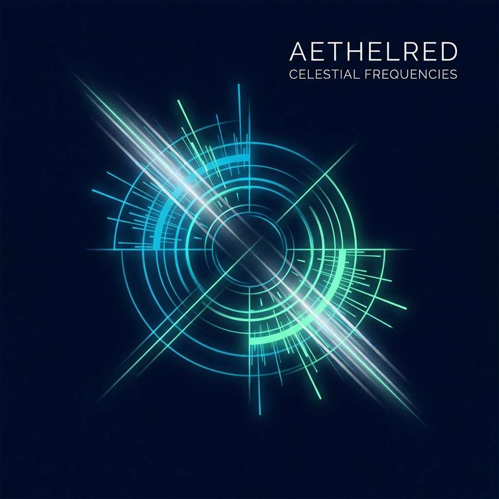
15) Cosmic Icefield
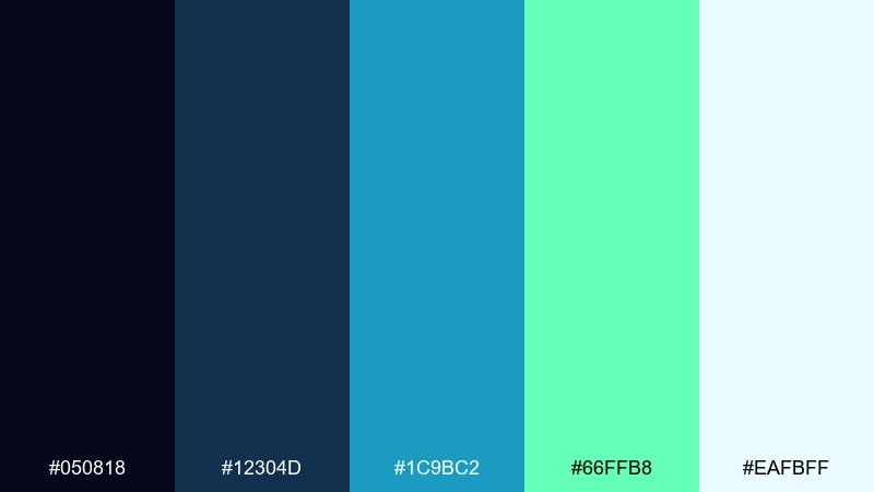
HEX: #050818 #12304D #1C9BC2 #66FFB8 #EAFBFF
Mood: expansive, luminous, sci-fi calm
Best for: album cover artwork
Expansive and luminous, it looks like cold starlight spreading across an icefield. This aurora borealis color palette is ideal for album covers where you want a dark backdrop with a clean, glowing focal point. Pair with minimalist typography and one abstract shape or flare for a modern sci-fi vibe. Tip: keep the bright green as a single highlight so the composition stays focused.
Image example of cosmic icefield generated using media.io
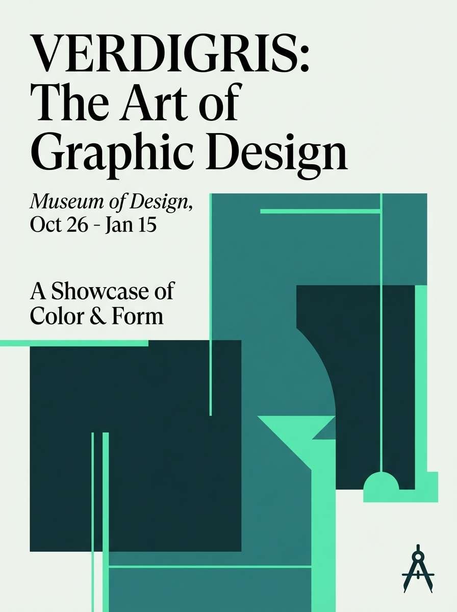
16) Verdigris Aurora
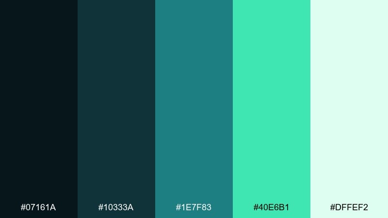
HEX: #07161A #10333A #1E7F83 #40E6B1 #DFFEF2
Mood: artisan, mineral, balanced
Best for: museum exhibition poster
Artisan and mineral, the verdigris tones feel like oxidized copper catching a cool glow. Use the deep teal for large fields, then layer the softer green for titles and section dividers. Pair with off-white paper texture and serif headlines for an editorial, cultural look. Tip: avoid heavy gradients here and lean on flat blocks for a more gallery-ready finish.
Image example of verdigris aurora generated using media.io
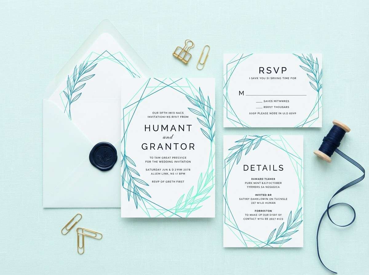
17) Mint Nebula
HEX: #070A14 #1C2941 #2D8FB5 #76FCD7 #F0FFFB
Mood: soft, celestial, optimistic
Best for: wedding invitation suite
Soft and celestial, this aurora borealis color palette evokes a mint nebula floating over a deep blue night. Use the pale mint as the paper tone and bring in the blue-teal for names, borders, and small motifs. Pair with delicate line art and lots of breathing room for an elegant finish. Tip: keep the darkest navy for tiny details only, like RSVP codes, to maintain the airy mood.
Image example of mint nebula generated using media.io
18) Deep Space Mint
HEX: #03060F #0F2036 #0D6C88 #4CFFCC #CFFFEF
Mood: sleek, futuristic, high-contrast
Best for: crypto app dark mode UI
Sleek and futuristic, the mint glow feels like indicators floating in deep space. Treat this as an aurora borealis color scheme by using the darkest shades for the canvas and the mint for key numbers, charts, and active states. Pair with thin dividers and restrained shadows so the interface stays sharp. Tip: keep the bright mint for one primary action per screen to reduce glare in dark mode.
Image example of deep space mint generated using media.io
19) Silver Polar Arc
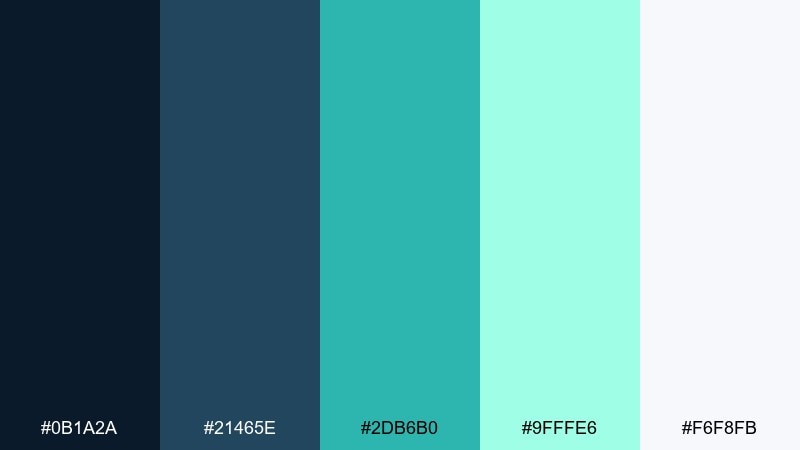
HEX: #0B1A2A #21465E #2DB6B0 #9FFFE6 #F6F8FB
Mood: polished, clean, slightly formal
Best for: B2B SaaS brand kit
Polished and clean, it feels like a pale arc of light over steel-blue water. Use the slate blues for brand foundations and let the teal sit in charts, icons, and link states. Pair with cool neutrals and a geometric sans-serif to keep it modern without feeling cold. Tip: apply the near-white as your primary background to make the teal look more premium and less neon.
Image example of silver polar arc generated using media.io
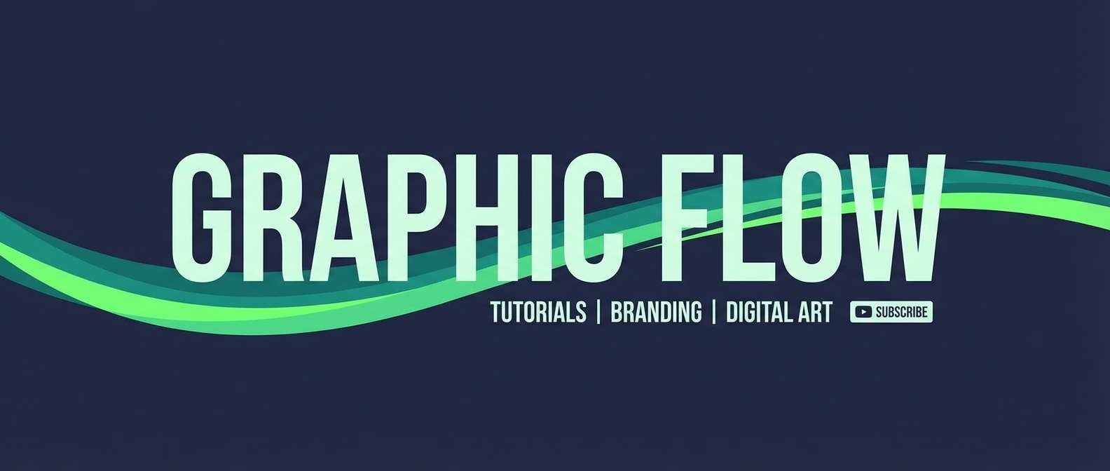
20) Greenfire Dusk
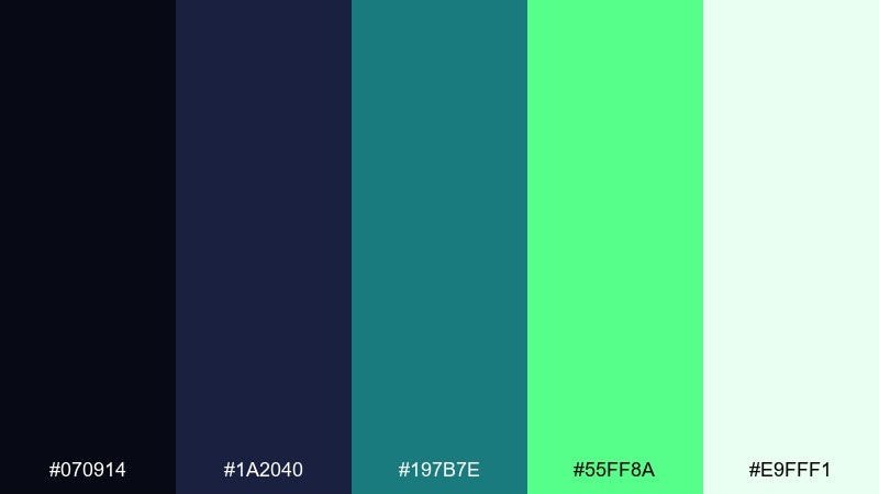
HEX: #070914 #1A2040 #197B7E #55FF8A #E9FFF1
Mood: dramatic, energetic, modern
Best for: YouTube channel banner design
Dramatic and energetic, it looks like greenfire cutting across dusk-blue clouds. Use the indigo for the base banner area, then place the bright green as a single streak behind the channel name. Pair with white or pale mint text and keep additional elements minimal so it reads well at a glance. Tip: test the banner at small sizes and reduce teal details if they soften too much on mobile.
Image example of greenfire dusk generated using media.io
What Colors Go Well with Aurora Borealis?
Aurora borealis colors pair best with cool neutrals and dark anchors: midnight navy, charcoal, slate blue, and soft whites help the glow hues read as intentional rather than overly bright.
For accents, silver/steel tones and icy grays keep the palette crisp, while a controlled warm contrast (like a muted sand or soft copper) can add depth without fighting the teal-green spectrum.
If you’re building gradients, keep the “glow” range tight—cyan to teal to mint—then let whitespace or deep indigo provide breathing room.
How to Use a Aurora Borealis Color Palette in Real Designs
Start with a dark base for structure (nav, footer, poster background), then choose one mid-tone teal for most components (cards, dividers, secondary buttons). This prevents the design from becoming a neon wash.
Use the brightest mint/green as a single-purpose highlight: primary CTA, success state, or a headline streak. That one constraint makes aurora color combinations feel premium and readable.
For print or branding, reduce gradients and lean on flat blocks plus subtle texture (grain, paper, canvas) so the glow effect feels natural instead of digital-only.
Create Aurora Borealis Palette Visuals with AI
If you want matching visuals (posters, mockups, hero headers, thumbnails), generate palette-consistent images by feeding your HEX set into a prompt and describing the layout or product.
With Media.io Text to Image, you can iterate quickly: keep the same palette, swap the scene, and export options for web and social without rebuilding from scratch.
Use the prompts above as templates—just replace the subject (UI, packaging, banner) while keeping the dominant colors consistent.
Aurora Borealis Color Palette FAQs
-
What are the main aurora borealis colors?
Most aurora borealis color schemes are built from deep navy/indigo, cyan/teal glow tones, and a bright mint or neon green accent, often supported by icy white highlights. -
How do I keep an aurora palette from looking too neon?
Use a dark base (navy/near-black) and limit the brightest green/mint to one or two UI elements (like CTAs or badges). Let cool whites and slate blues do the “quiet” work. -
Which aurora borealis palette is best for dark mode UI?
Try palettes like Deep Space Mint or Pine and Plasma: they provide a near-black canvas with a controlled mint glow for active states, charts, and key numbers. -
What font colors work on aurora gradients?
On bright cyan/green areas, use very dark indigo/navy text for contrast. On deep navy backgrounds, use off-white or pale mint instead of pure white for a softer, premium feel. -
Can I use aurora borealis colors for professional branding?
Yes—choose a more restrained set such as Silver Polar Arc or North Sea Shimmer, keep gradients subtle, and use teal as a consistent link/chart highlight rather than a dominant fill. -
What’s a simple 5-color aurora palette formula?
1) near-black navy, 2) deep slate blue, 3) mid teal, 4) bright aqua/mint, 5) icy white. This structure covers layout, components, accents, and background space. -
How can I generate aurora palette images that match my HEX codes?
Use Media.io Text to Image and include your dominant HEX colors in the prompt, plus the design type (poster, UI, packaging) and lighting style (glow, cinematic, minimal) to keep outputs consistent.


