

Fireworks palettes capture the feeling of light in motion: deep night bases, neon sparks, and warm metallic highlights that pop from a distance.
Below are curated fireworks color palette ideas with HEX codes, plus practical pairing tips and AI prompts you can reuse for posters, branding, UI, and more.
In this article
- Why Fireworks Palettes Work So Well
-
- neon burst
- midnight spark
- golden finale
- carnival rockets
- electric peony
- sky ember
- prism confetti
- sapphire smoke
- ruby thunder
- aurora crackle
- champagne glitter
- retro pyro
- city skyline pop
- pastel firework haze
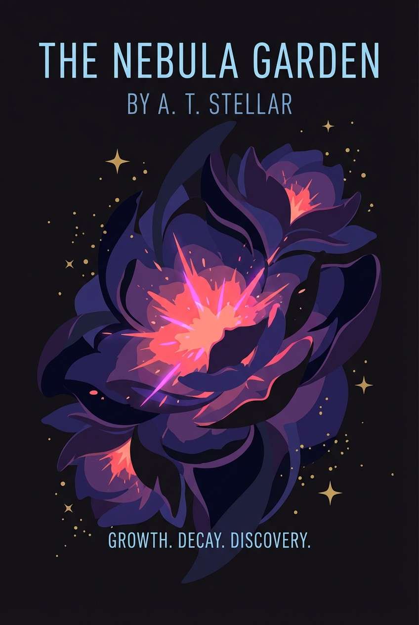
- cosmic bloom
- festival lanterns
- firefly trail
- velvet nightfall
- metallic starburst
- cosmic bloom deluxe
- harbor afterglow
- tropical boom
- What Colors Go Well with Fireworks?
- How to Use a Fireworks Color Palette in Real Designs
- Create Fireworks Palette Visuals with AI
Why Fireworks Palettes Work So Well
Fireworks color schemes naturally build contrast: a dark “night sky” base makes bright accents feel louder, cleaner, and more readable across screens and print.
They also create instant hierarchy. One or two electric hues can carry headlines, buttons, or focal shapes, while supportive neutrals keep the design from becoming chaotic.
Most fireworks palettes mix warm and cool light (gold/orange with cyan/pink/violet), which adds depth and motion—perfect for celebrations, launches, and high-energy campaigns.
20+ Fireworks Color Palette Ideas (with HEX Codes)
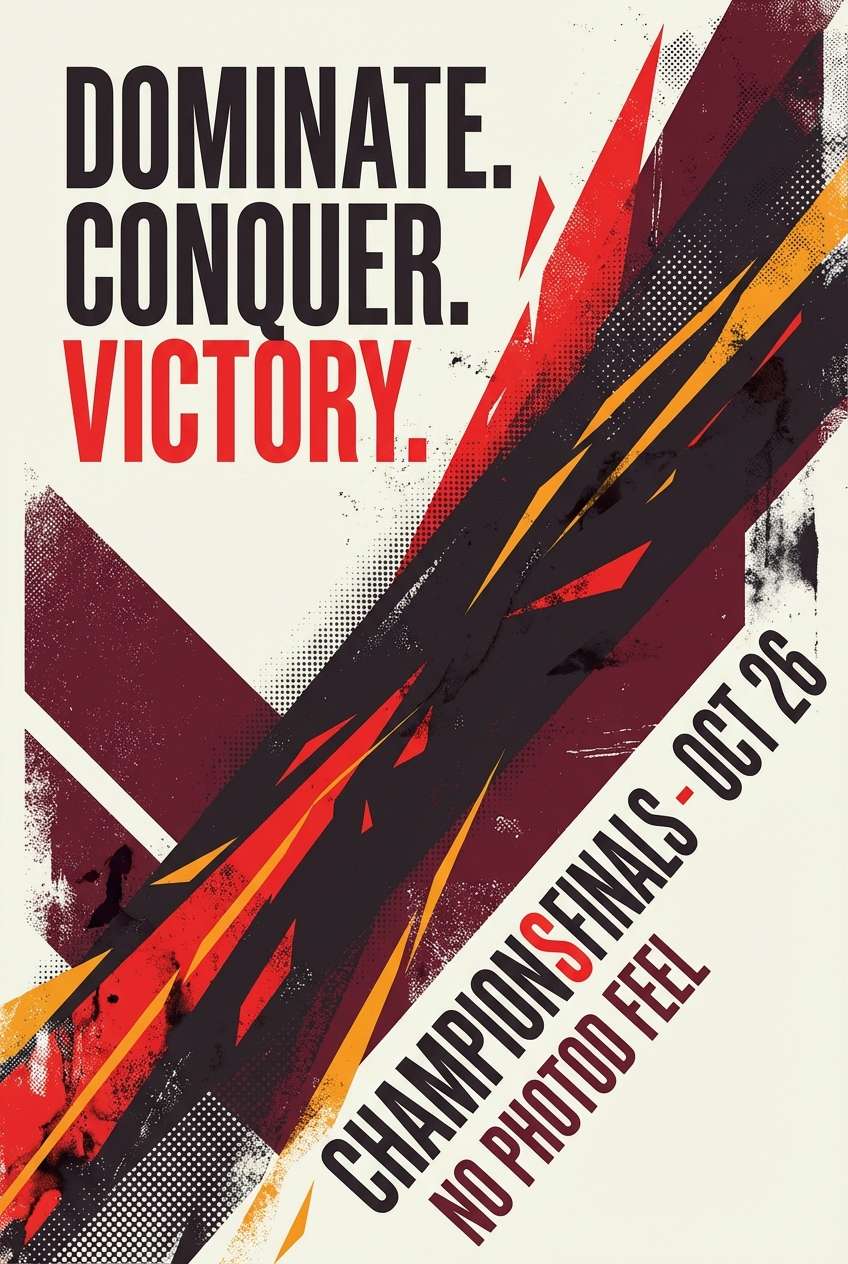
1) Neon Burst
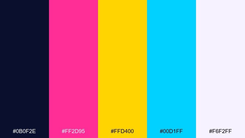
HEX: #0B0F2E #FF2D95 #FFD400 #00D1FF #F6F2FF
Mood: electric, playful, high-energy
Best for: music festival poster design
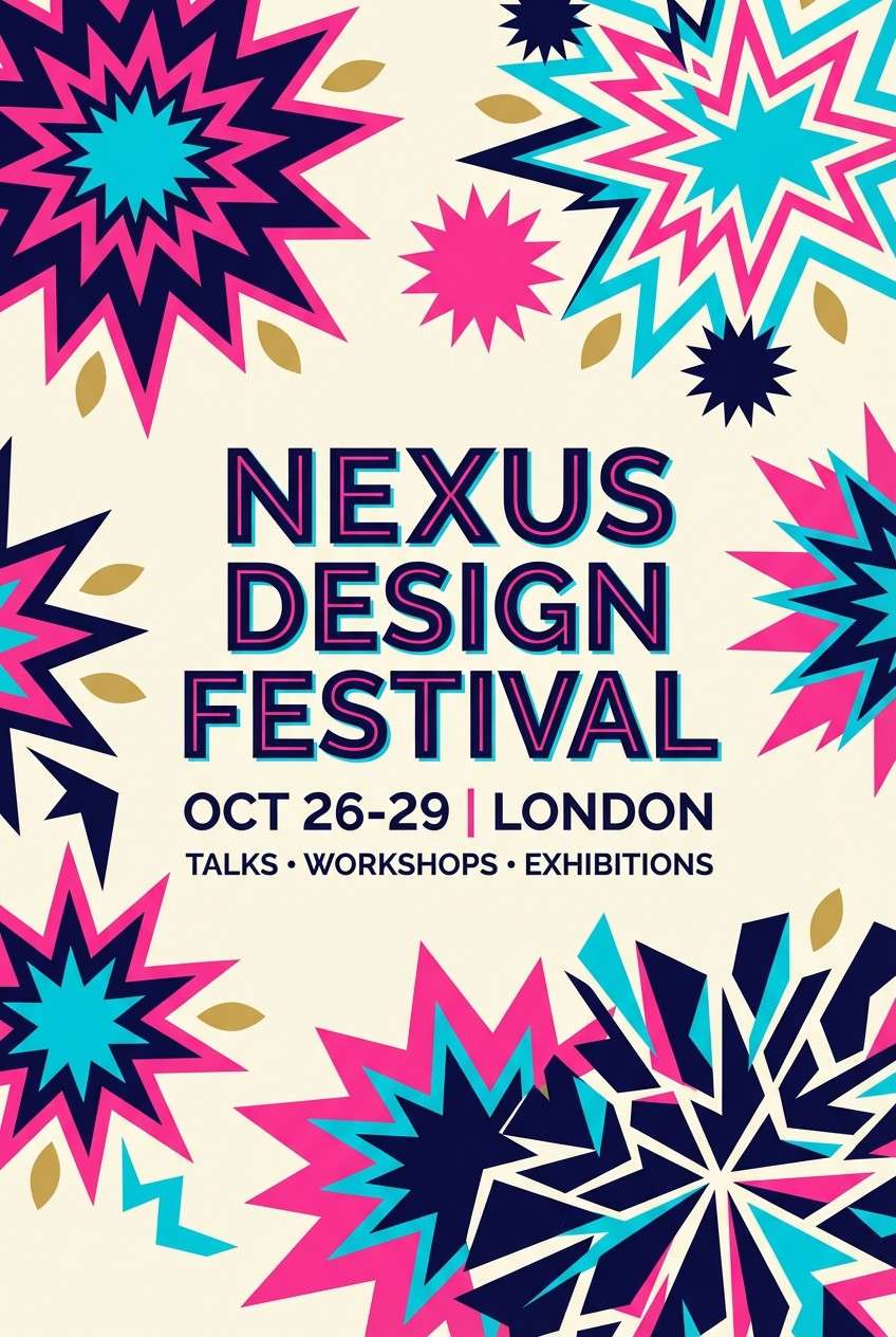
Electric and playful, it feels like neon trails cutting through a midnight sky. Use the deep navy as your base, then let pink and cyan carry headlines and graphic shapes. Gold works best as a punchy highlight for dates, pricing, or calls to action. Tip: keep type mostly light on dark for readability, then reserve the brightest hues for the focal burst.
Image example of neon burst generated using media.io
Media.io is an online AI studio for creating and editing video, image, and audio in your browser.

2) Midnight Spark
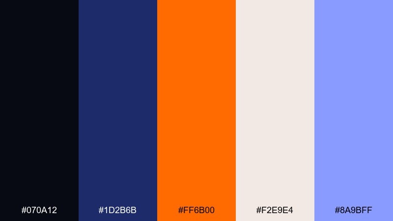
HEX: #070A12 #1D2B6B #FF6B00 #F2E9E4 #8A9BFF
Mood: dramatic, cinematic, bold
Best for: movie title card and key art
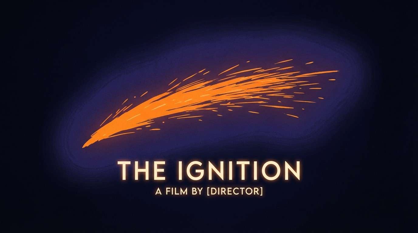
Dramatic and cinematic, it brings to mind a bright ember flashing against deep night. Let near-black and indigo dominate the background to build tension, then place orange as the explosive accent. Cream is ideal for credits and small copy, keeping everything legible without dulling the mood. Tip: add a subtle glow around orange elements to mimic a spark without cluttering the layout.
Image example of midnight spark generated using media.io
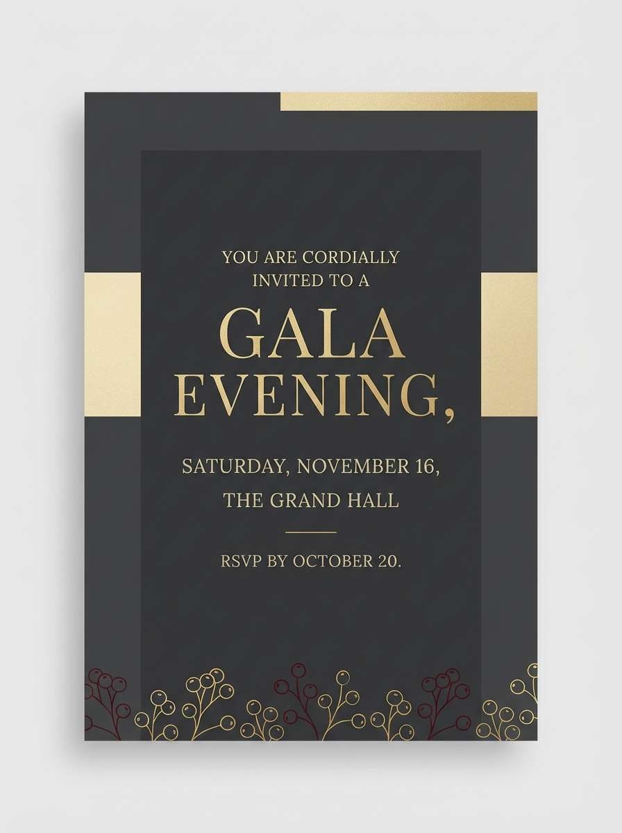
3) Golden Finale
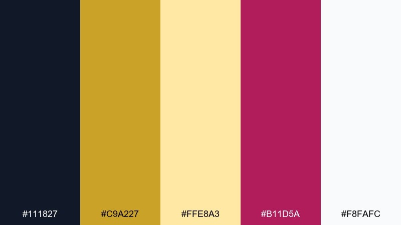
HEX: #111827 #C9A227 #FFE8A3 #B11D5A #F8FAFC
Mood: luxurious, festive, radiant
Best for: premium event invitation
Luxurious and festive, it reads like a grand finale showering the sky in warm gold. These fireworks color combinations shine on textured paper, foil stamping, and elegant typography. Pair deep charcoal with rich gold for the frame, then use berry as a refined accent for names or RSVP details. Tip: keep the light gold as a soft background block so the metallic tones feel intentional, not noisy.
Image example of golden finale generated using media.io
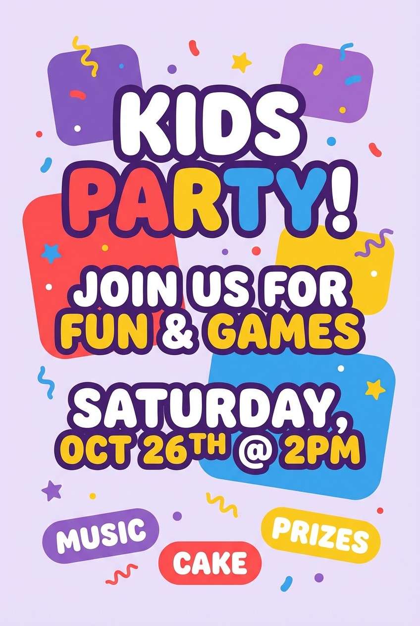
4) Carnival Rockets
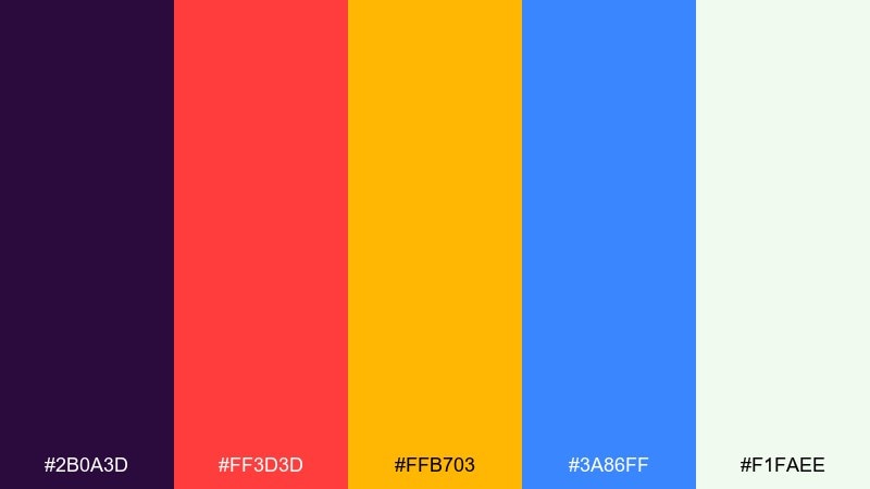
HEX: #2B0A3D #FF3D3D #FFB703 #3A86FF #F1FAEE
Mood: joyful, loud, upbeat
Best for: kids party flyer
Joyful and loud, it feels like bright rockets and confetti over a bustling fairground. Use the purple as your anchor so the red, yellow, and blue can stay bold without fighting each other. White space keeps the flyer from becoming chaotic, especially around schedules and contact details. Tip: put one bright color per section header to create quick visual scanning for parents.
Image example of carnival rockets generated using media.io
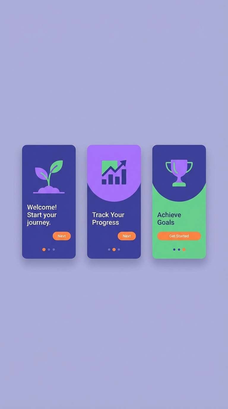
5) Electric Peony
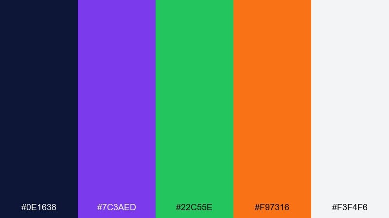
HEX: #0E1638 #7C3AED #22C55E #F97316 #F3F4F6
Mood: vivid, modern, energetic
Best for: app onboarding screens
Vivid and modern, it suggests a blooming burst with crisp edges and electric glow. Indigo makes a strong base for onboarding, while violet and green can separate steps or feature highlights. Orange is best used sparingly for primary buttons so users always know where to tap. Tip: keep illustrations minimal and let the color blocks do the storytelling across each screen.
Image example of electric peony generated using media.io
6) Sky Ember
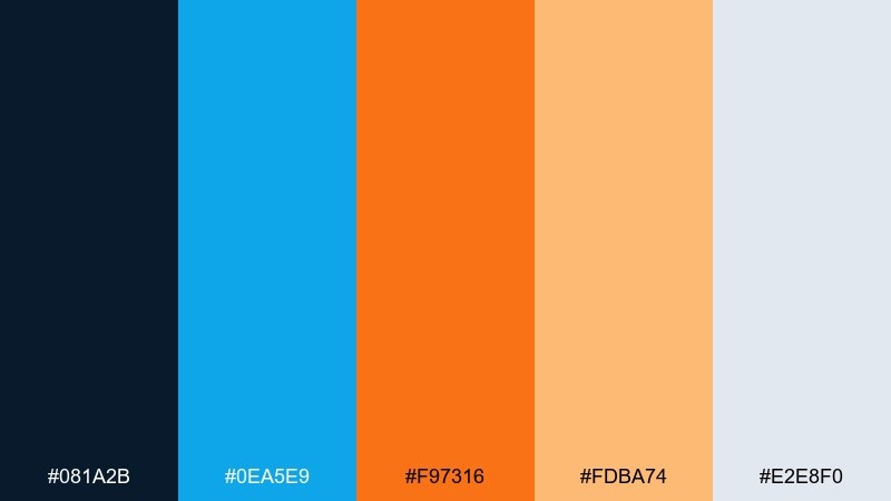
HEX: #081A2B #0EA5E9 #F97316 #FDBA74 #E2E8F0
Mood: fresh, optimistic, crisp
Best for: summer sale web banner
Fresh and optimistic, it looks like a glowing ember drifting through a clear blue night. The fireworks color palette works best with a dark header bar and bright cyan shapes that guide the eye. Use orange for price tags and key offers, while soft peach supports secondary highlights. Tip: avoid using cyan and orange in equal amounts; pick one as the hero and let the other act as a spotlight.
Image example of sky ember generated using media.io

7) Prism Confetti
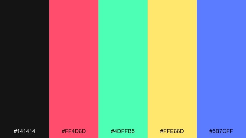
HEX: #141414 #FF4D6D #4DFFB5 #FFE66D #5B7CFF
Mood: fun, punchy, youthful
Best for: social media carousel graphics
Fun and punchy, it brings prism-like confetti and quick motion to your feed. Start with black for strong contrast, then rotate the bright accents across slides to keep attention. Yellow works well for stickers and badges, while mint balances the intensity of pink. Tip: keep each slide to two dominant colors so the carousel feels cohesive when viewed as a grid.
Image example of prism confetti generated using media.io
8) Sapphire Smoke
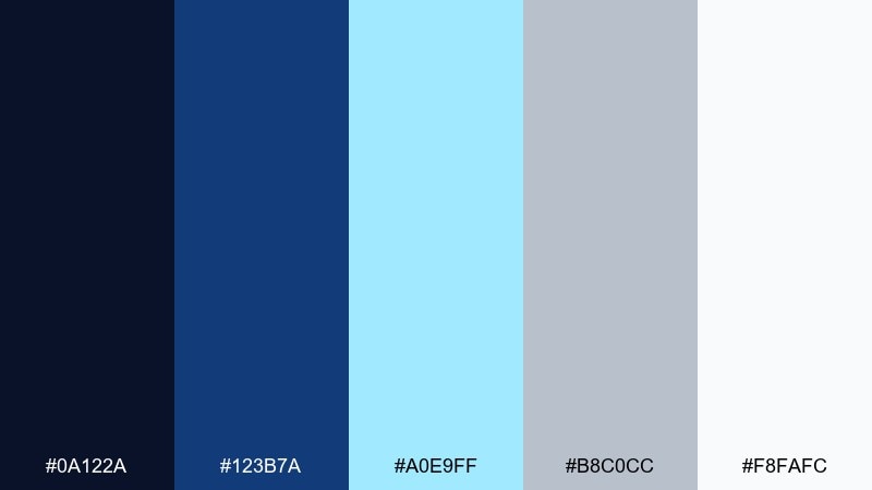
HEX: #0A122A #123B7A #A0E9FF #B8C0CC #F8FAFC
Mood: cool, airy, sophisticated
Best for: corporate presentation deck
Cool and airy, it evokes smoky trails fading into a sapphire sky. Use the darkest blues for title slides and section dividers, then lean on pale cyan for charts and callouts. The gray-blue tones are perfect for table fills and subtle grid lines. Tip: reserve the brightest cyan for one data series so your key metric stands out instantly.
Image example of sapphire smoke generated using media.io
9) Ruby Thunder
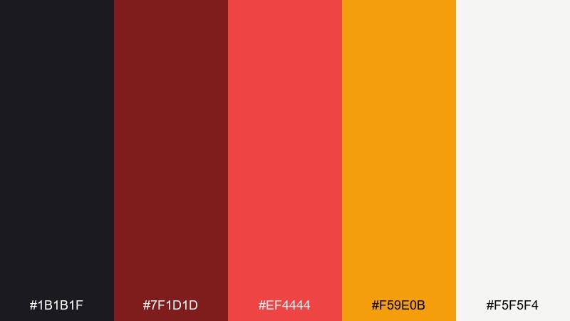
HEX: #1B1B1F #7F1D1D #EF4444 #F59E0B #F5F5F4
Mood: intense, powerful, dramatic
Best for: sports promo poster
Intense and powerful, it feels like a thunderous boom followed by a red flare. Build the poster on charcoal and deep maroon, then use bright red for athlete names and action lines. Amber makes a strong secondary accent for stats, dates, and ticket info. Tip: add diagonal shapes in maroon to create movement while keeping red reserved for the main punch.
Image example of ruby thunder generated using media.io
10) Aurora Crackle
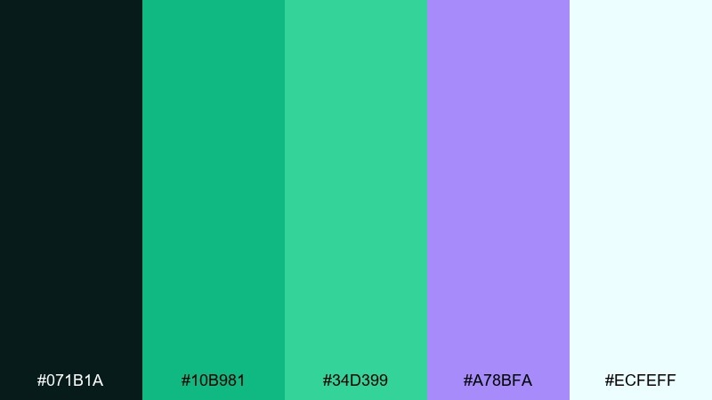
HEX: #071B1A #10B981 #34D399 #A78BFA #ECFEFF
Mood: dreamy, luminous, modern
Best for: wellness brand landing page
Dreamy and luminous, it resembles an aurora crackling softly over dark water. Use the deep teal as a grounding header color, then layer mint gradients for sections and feature cards. Violet makes an elegant accent for links and subtle highlights without breaking the calm. Tip: keep the background very light so your greens feel fresh rather than heavy.
Image example of aurora crackle generated using media.io
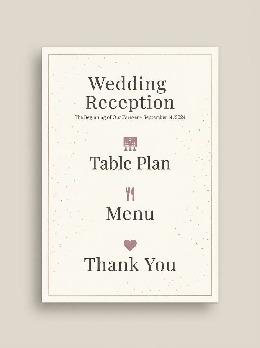
11) Champagne Glitter
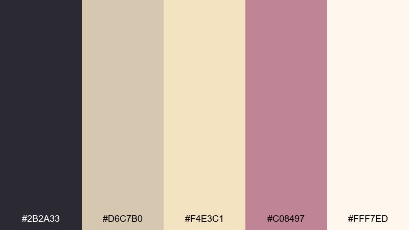
HEX: #2B2A33 #D6C7B0 #F4E3C1 #C08497 #FFF7ED
Mood: soft, celebratory, elegant
Best for: wedding reception signage
Soft and celebratory, it suggests champagne bubbles and glitter drifting in warm light. Use cream and blush as the main canvas, then bring in charcoal for high-contrast text. The mauve tone is ideal for icons, monograms, or directional arrows. Tip: choose one script font and keep the rest in clean sans serif to maintain an upscale feel.
Image example of champagne glitter generated using media.io
12) Retro Pyro
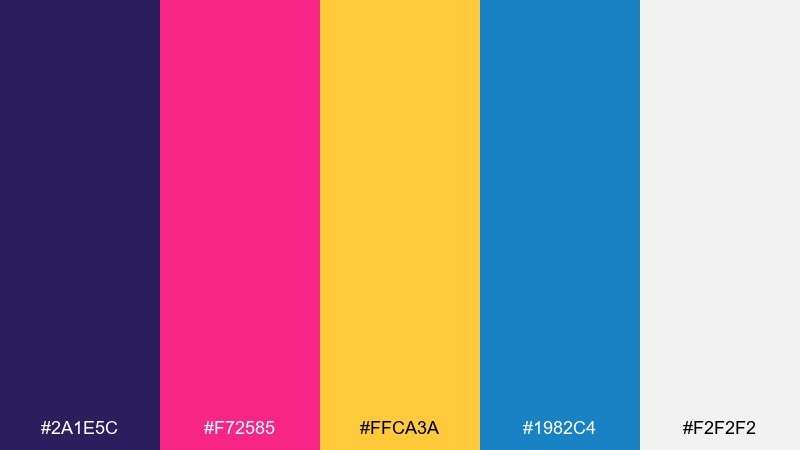
HEX: #2A1E5C #F72585 #FFCA3A #1982C4 #F2F2F2
Mood: retro, pop, upbeat
Best for: album cover artwork
Retro and pop, it looks like an 80s light show with saturated ink and bold shapes. This fireworks color combination works well with chunky typography, halftone textures, and simple iconography. Let purple and pink dominate, then use yellow as the high-voltage highlight for the title. Tip: keep blue for small supporting elements so it reads as a cool counterbalance, not a competing headline color.
Image example of retro pyro generated using media.io
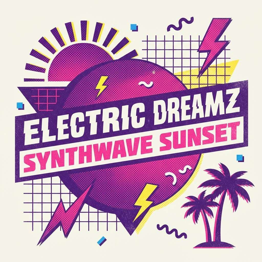
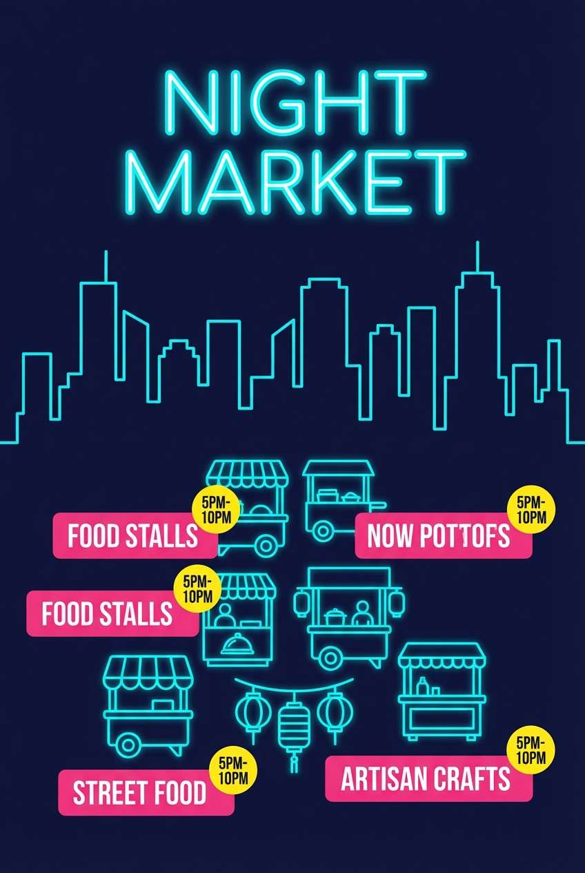
13) City Skyline Pop
HEX: #0F172A #22D3EE #F43F5E #FDE047 #E5E7EB
Mood: urban, sharp, energetic
Best for: night market poster
Urban and sharp, it feels like neon signage reflecting off a city skyline. Use navy as the night base, then let cyan draw borders and map-like lines. Pink is perfect for vendor highlights, while yellow works as a quick attention cue for times and locations. Tip: keep your layout grid tight and consistent so the bright accents look intentional rather than scattered.
Image example of city skyline pop generated using media.io
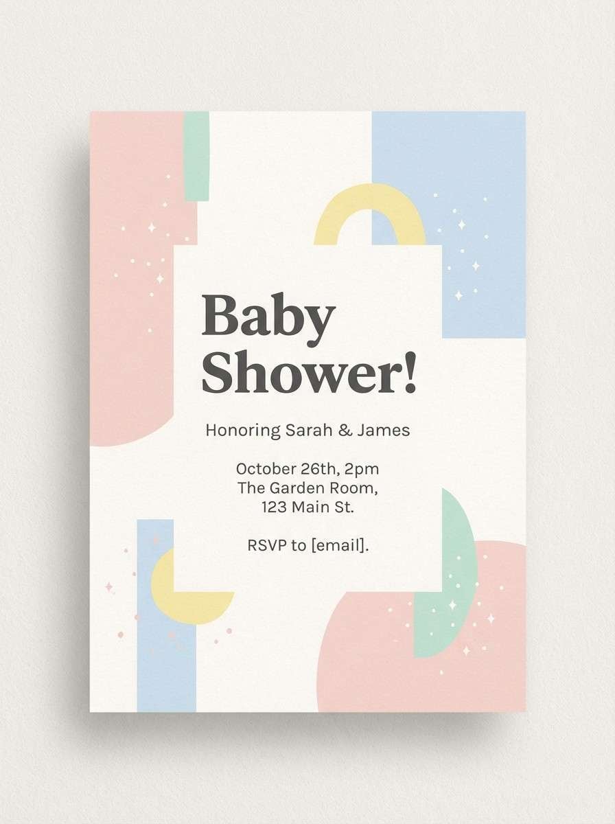
14) Pastel Firework Haze
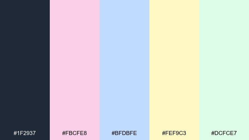
HEX: #1F2937 #FBCFE8 #BFDBFE #FEF9C3 #DCFCE7
Mood: soft, airy, gentle
Best for: baby shower invitation
Soft and airy, it resembles a gentle haze after a distant burst, all in calm pastels. Use charcoal for text so the invitation stays readable on light backgrounds. Rotate the pastel blocks for sections like date, venue, and registry without overwhelming the page. Tip: add small dot patterns in one pastel tone to suggest sparkle while keeping everything minimal.
Image example of pastel firework haze generated using media.io
15) Cosmic Bloom
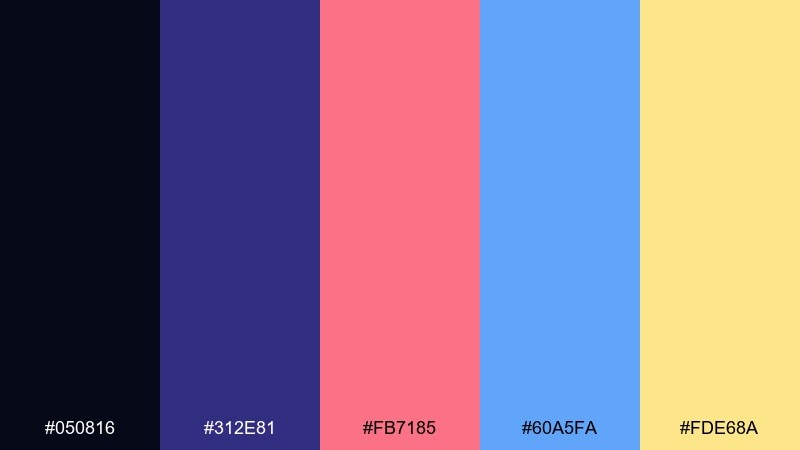
HEX: #050816 #312E81 #FB7185 #60A5FA #FDE68A
Mood: cosmic, imaginative, bright
Best for: sci-fi book cover
Cosmic and imaginative, it feels like a bloom of light in deep space. Use the near-black and indigo for the backdrop, then let coral carry the title or focal emblem. Light blue supports secondary elements like author name and series tags, while soft gold adds a starlit finish. Tip: keep gradients subtle so the cover stays crisp at thumbnail size.
Image example of cosmic bloom generated using media.io
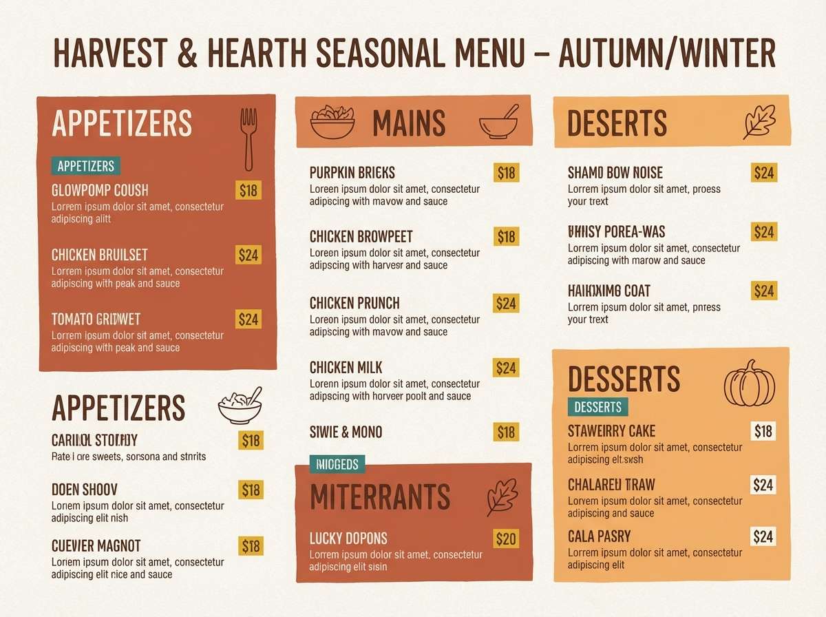
16) Festival Lanterns
HEX: #2D1B12 #E76F51 #F4A261 #E9C46A #264653
Mood: warm, welcoming, rustic
Best for: restaurant seasonal menu
Warm and welcoming, it evokes lantern light, toasted spices, and late-night gatherings. Use the cocoa brown for headings and dividers, then bring in terracotta for feature dishes and specials. Mustard works well as a highlight for prices, while teal provides a cool counterpoint for icons and category labels. Tip: keep the background light and textured so the warm tones feel handcrafted, not heavy.
Image example of festival lanterns generated using media.io
17) Firefly Trail
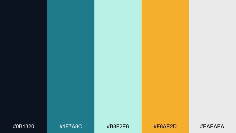
HEX: #0B1320 #1F7A8C #B8F2E6 #F6AE2D #EAEAEA
Mood: calm, enchanting, nature-inspired
Best for: outdoor event email header
Calm and enchanting, it feels like fireflies tracing soft arcs over a cool lakeside night. Use the dark blue as the header base, then add teal shapes to guide the eye toward the main message. Amber is best for the primary button so it reads as a warm light in the scene. Tip: keep body text on white or very light gray to avoid contrast issues in email clients.
Image example of firefly trail generated using media.io

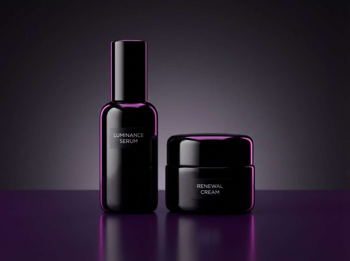
18) Velvet Nightfall
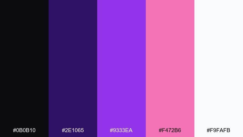
HEX: #0B0B10 #2E1065 #9333EA #F472B6 #F9FAFB
Mood: luxurious, moody, stylish
Best for: beauty product ad
Luxurious and moody, it suggests velvet shadows with a magenta glow at the edges. Use black as the stage for your product, then choose one violet tone for packaging accents and one pink tone for the headline. A clean white label area keeps ingredients and claims easy to read. Tip: add a soft gradient behind the product to create depth without introducing new colors.
Image example of velvet nightfall generated using media.io
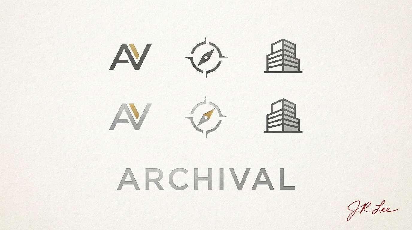
19) Metallic Starburst
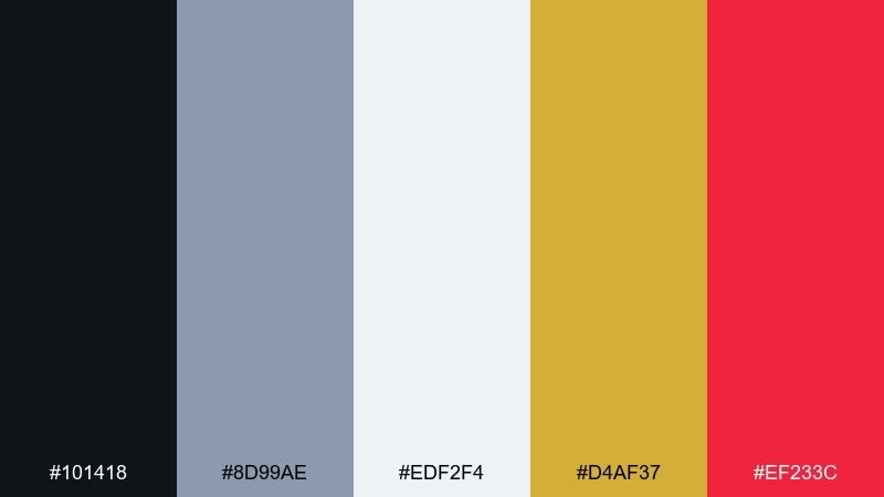
HEX: #101418 #8D99AE #EDF2F4 #D4AF37 #EF233C
Mood: sleek, premium, high-contrast
Best for: tech brand logo and identity
Sleek and premium, it reads like a metallic starburst with a precise red strike. Use graphite and silver tones for the core identity system, then apply gold as a controlled highlight for key moments. Red should be reserved for one signature element, like an icon corner or a notification dot. Tip: test the logo in one-color silver first, then add gold only where it improves hierarchy.
Image example of metallic starburst generated using media.io
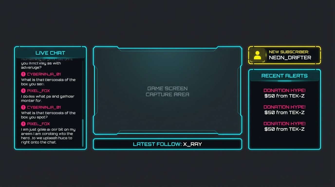
20) Cosmic Bloom Deluxe
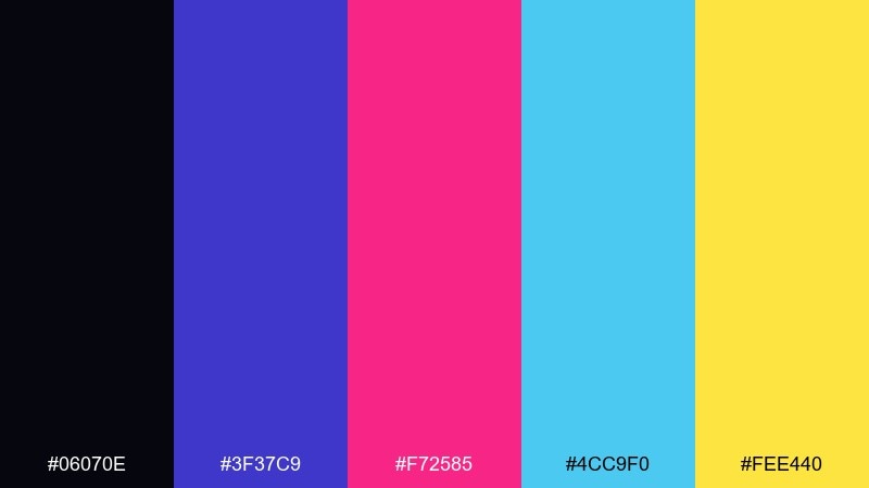
HEX: #06070E #3F37C9 #F72585 #4CC9F0 #FEE440
Mood: bold, futuristic, explosive
Best for: gaming stream overlay
Bold and futuristic, it feels like a cosmic blast with sharp neon edges. The fireworks color palette is perfect for overlays where you need instant hierarchy: dark base, bright labels, and high-visibility alerts. Use cyan for panels and frames, keep pink for alerts, and drop yellow only on the most important callouts. Tip: apply a thin cyan stroke around text blocks so they remain readable over gameplay.
Image example of cosmic bloom deluxe generated using media.io
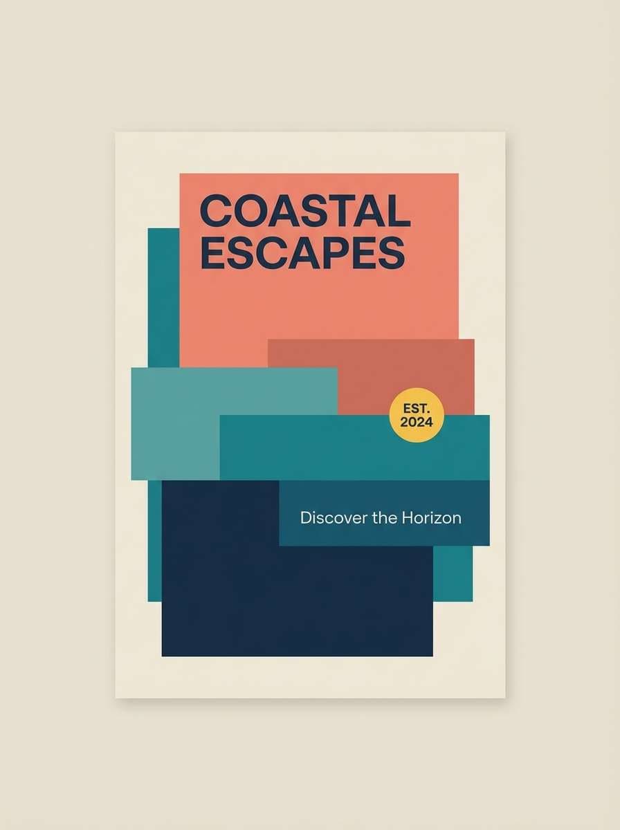
21) Harbor Afterglow
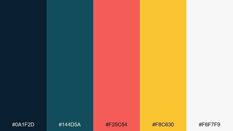
HEX: #0A1F2D #144D5A #F25C54 #F8C630 #F6F7F9
Mood: coastal, warm, balanced
Best for: travel brochure cover
Coastal and warm, it evokes an afterglow over water with a hint of coral light. Use deep blue-green tones for large background shapes and photo placeholders, then add coral for headlines and wayfinding. Yellow works best as a small accent for badges like limited offer or new route. Tip: keep margins generous so the warm accents feel like highlights, not clutter.
Image example of harbor afterglow generated using media.io
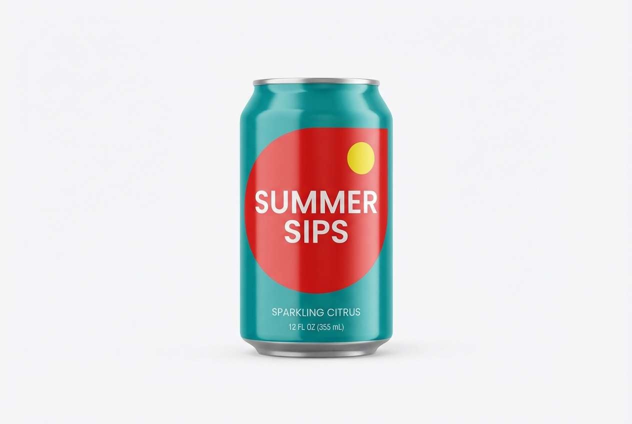
22) Tropical Boom
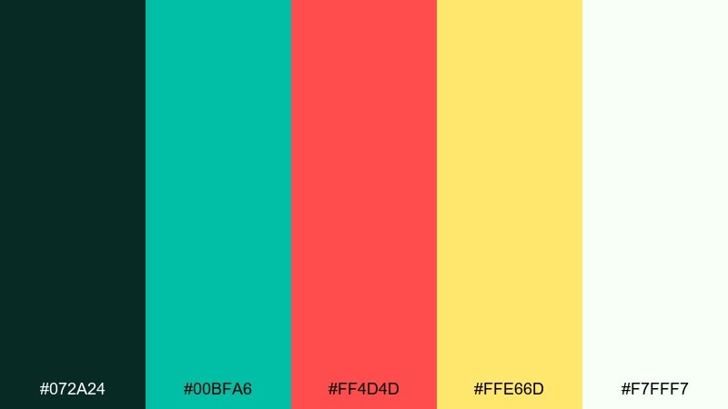
HEX: #072A24 #00BFA6 #FF4D4D #FFE66D #F7FFF7
Mood: bright, sunny, adventurous
Best for: summer beverage packaging
Bright and adventurous, it feels like a tropical boom of color under warm night air. Lean on teal as the main brand tone, then use red as the flavor signal and yellow as a playful pop. White space keeps the pack clean and helps the typography stay crisp at shelf distance. Tip: limit the red to one main graphic shape so it reads as a bold stamp rather than visual noise.
Image example of tropical boom generated using media.io
What Colors Go Well with Fireworks?
Fireworks palettes pair best with dark anchors like near-black, navy, or deep indigo to recreate “night sky” contrast and make saturated accents feel brighter.
For accents, combine one warm spark (gold, amber, orange, coral) with one cool glow (cyan, mint, periwinkle, violet). This warm/cool split helps your design feel energetic without turning messy.
To keep layouts readable, add a soft neutral (off-white, cream, light gray) for body copy, cards, and spacing—especially in UI and presentation slides.
How to Use a Fireworks Color Palette in Real Designs
Start with a 70/20/10 balance: 70% dark base, 20% supportive mid-tone (indigo/teal/gray-blue), and 10% “burst” accents for CTAs, highlights, and key labels.
Use the brightest hue for one job only (for example: buttons or headlines). Then choose the second-brightest hue for supporting callouts like badges, icons, or dividers.
If you’re designing for print, test a proof: some neon-like colors shift darker on paper. In digital, check contrast on small text and add subtle glow or stroke effects only when they improve legibility.
Create Fireworks Palette Visuals with AI
Want to see these fireworks color combinations in context before you commit? Generate fast mockups—posters, overlays, landing pages, packaging, and invitations—using the prompts included under each palette.
Adjust the prompt by swapping “poster” for your format (logo, UI, brochure), then keep the same color direction and aspect ratio to maintain a consistent fireworks look.
When you find a winner, reuse the same palette across variants (social sizes, ads, and headers) to keep your campaign cohesive.
Fireworks Color Palette FAQs
-
What is a fireworks color palette?
A fireworks color palette is a high-contrast scheme built around dark “night sky” bases and bright accent colors (neon or metallic) that mimic bursts, sparks, and glow. -
Which background color works best for fireworks themes?
Near-black, deep navy, or indigo usually works best because it increases contrast and makes bright accents like cyan, pink, gold, and orange look more luminous. -
How many bright colors should I use at once?
For clean results, use 1–2 bright “burst” colors at a time, then rely on dark and neutral tones for the rest. Too many equally bright hues can compete for attention. -
Are fireworks palettes good for UI design?
Yes—use the dark tone for surfaces, a light neutral for text, and reserve one saturated color for primary actions (buttons, active tabs) so the interface stays readable. -
How do I make neon colors readable on dark backgrounds?
Keep body text in off-white/light gray, increase font weight for small sizes, and add a subtle stroke or glow to neon elements only when needed for contrast. -
What’s a safe accent color if my palette feels too loud?
Soft neutrals like cream or cool light gray calm the layout, while muted blue-gray tones help transition between dark bases and saturated accents. -
Can I generate fireworks-style graphics from these palettes?
Yes—use the included prompts as a starting point in Media.io Text-to-Image, then iterate by specifying your layout type (poster, invitation, UI) and keeping the same palette cues.


