

Fandango is a vivid magenta-purple that instantly adds confidence, romance, and modern energy to a design. It’s a standout accent color that can feel premium, playful, or dramatic depending on the supporting tones.
Below are 20+ fandango color palette ideas with HEX codes—each one includes a real-world use case and an AI prompt you can reuse to generate matching visuals.
In this article
- Why Fandango Palettes Work So Well
-
- velvet orchid
- raspberry noir
- blush and cocoa
- neon fandango pop
- dusty mauve studio
- sunset fuchsia
- botanical berry
- art deco plum
- rose gold glam
- minimal magenta ui
- berry sorbet
- wine and linen
- retro arcade pink
- lavender haze
- cherry blossom night
- festival poster punch
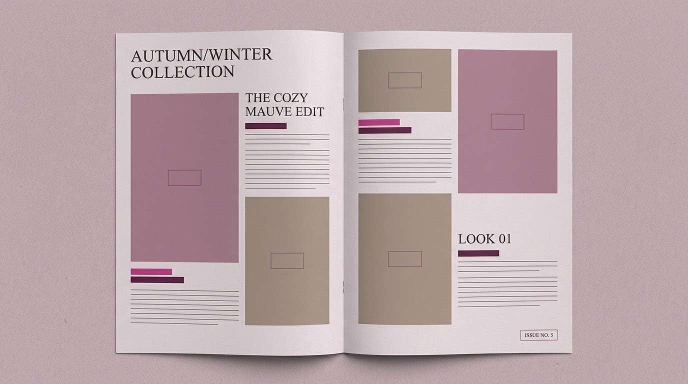
- cozy knit mauve
- luxury cosmetics
- modern editorial fuchsia
- dreamy gradient bloom
- plum slate contrast
- berry bronze pairing
- What Colors Go Well with Fandango?
- How to Use a Fandango Color Palette in Real Designs
- Create Fandango Palette Visuals with AI
Why Fandango Palettes Work So Well
Fandango (often seen around #b53389) sits between magenta and purple, so it carries both the punch of pink and the depth of violet. That balance makes it flexible: it can read energetic in neon pairings or sophisticated next to plum and charcoal.
It also performs well as an accent color. Even small touches—buttons, icons, seals, highlights, or pull quotes—feel intentional and “designed,” especially when the rest of the palette is built from neutrals and dusty mid-tones.
Finally, fandango is easy to theme across branding, UI, and print because it pairs cleanly with warm ivories, cool grays, chocolate browns, and deep near-blacks—helping you control contrast without losing personality.
20+ Fandango Color Palette Ideas (with HEX Codes)
1) Velvet Orchid
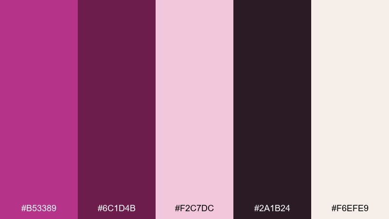
HEX: #b53389 #6c1d4b #f2c7dc #2a1b24 #f6efe9
Mood: luxurious, dramatic, romantic
Best for: beauty branding and hero banners
Luxurious and velvety, these tones feel like orchid petals under low light. Deep plum and near-black add drama while the blush and warm ivory keep it wearable. Use it for premium beauty branding, landing page heroes, or editorial-style banners. Pair with thin serif type and a lot of negative space, and keep the darkest shade for small accents so it stays elegant.
Image example of velvet orchid generated using media.io
Media.io is an online AI studio for creating and editing video, image, and audio in your browser.

2) Raspberry Noir
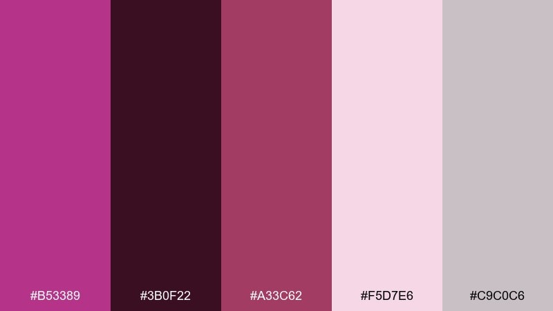
HEX: #b53389 #3b0f22 #a33c62 #f5d7e6 #c9c0c6
Mood: moody, bold, upscale
Best for: nightlife posters and event flyers
Moody and bold, it evokes raspberry syrup against a dark velvet curtain. The noir base makes the magenta pop, while dusty lavender-gray keeps gradients smooth. Use it for nightlife posters, DJ flyers, or bold social graphics where contrast matters. Tip: set the text on the pale pink and reserve the darkest shade for the outer frame to avoid muddy type.
Image example of raspberry noir generated using media.io
3) Blush and Cocoa
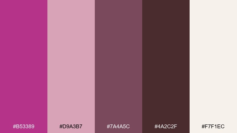
HEX: #b53389 #d9a3b7 #7a4a5c #4a2c2f #f7f1ec
Mood: cozy, tasteful, grounded
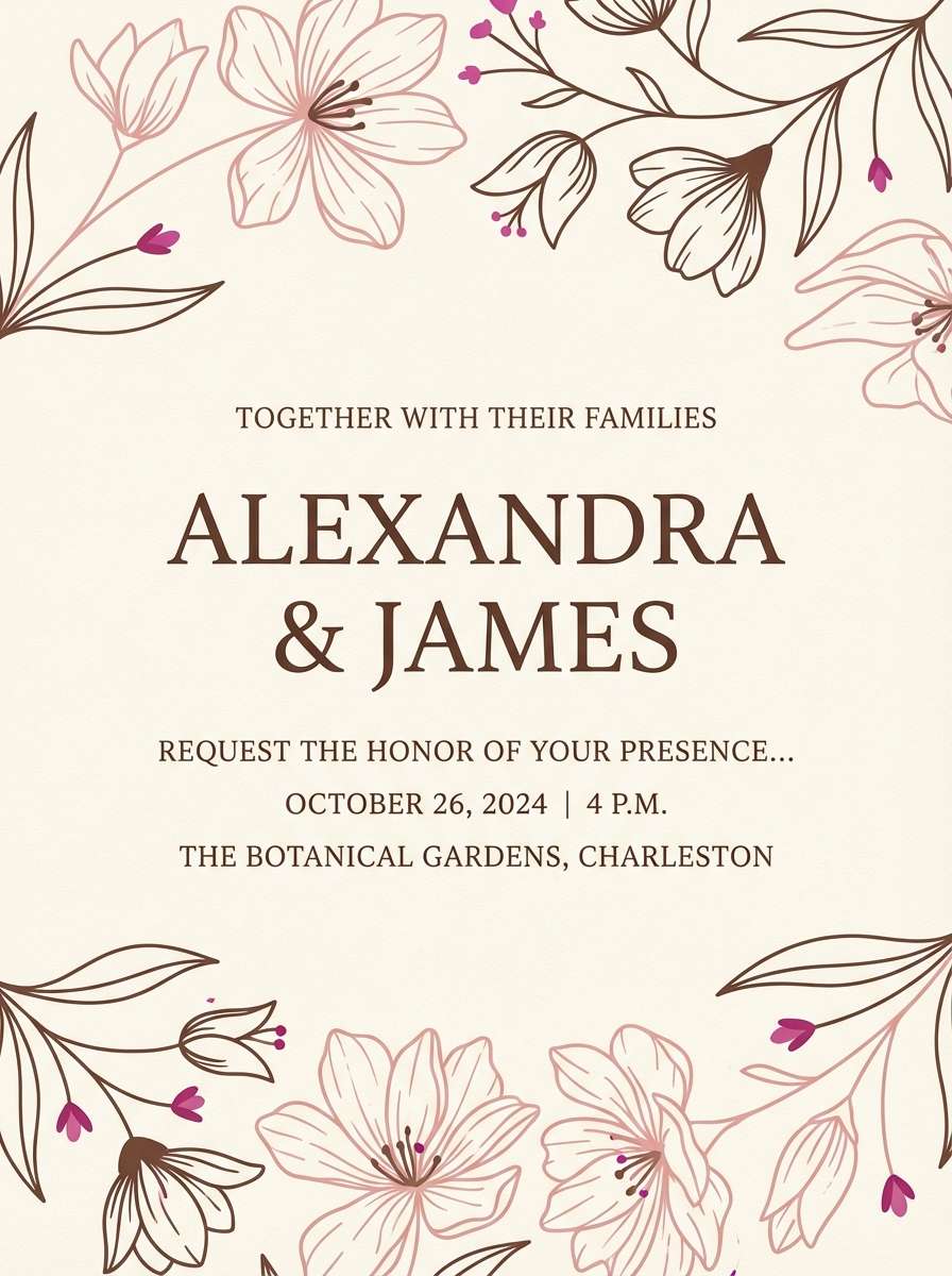
Best for: wedding stationery and invitations
Cozy and tasteful, it feels like rose petals, cocoa powder, and soft linen. The warm browns ground the brighter magenta so it reads romantic rather than loud. Use it for wedding invitations, menus, or RSVP cards, especially with textured paper. Keep the magenta as a seal, monogram, or small flourish so the neutrals remain the main story.
Image example of blush and cocoa generated using media.io
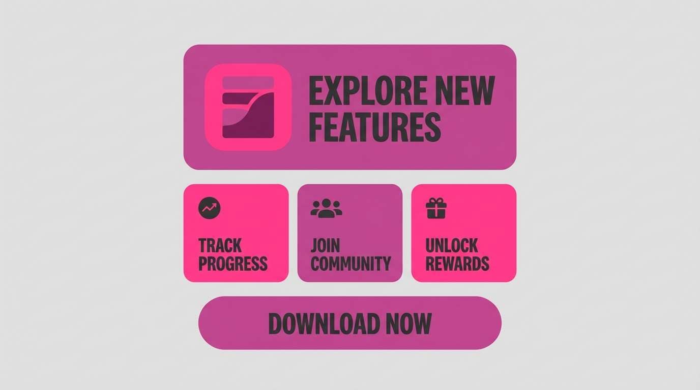
4) Neon Fandango Pop
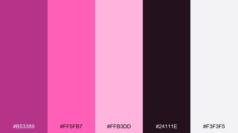
HEX: #b53389 #ff5fb7 #ffb3dd #24111e #f3f3f5
Mood: playful, punchy, modern
Best for: app launch graphics and promo ads
Playful and punchy, it looks like neon signage reflected on glossy surfaces. The extra-bright pinks push energy while the charcoal keeps it grounded and modern. This set shines in app launch graphics, promo ads, and short-form video overlays. For clarity, use the near-black for text and keep the brightest pink for buttons or one standout callout.
Image example of neon fandango pop generated using media.io
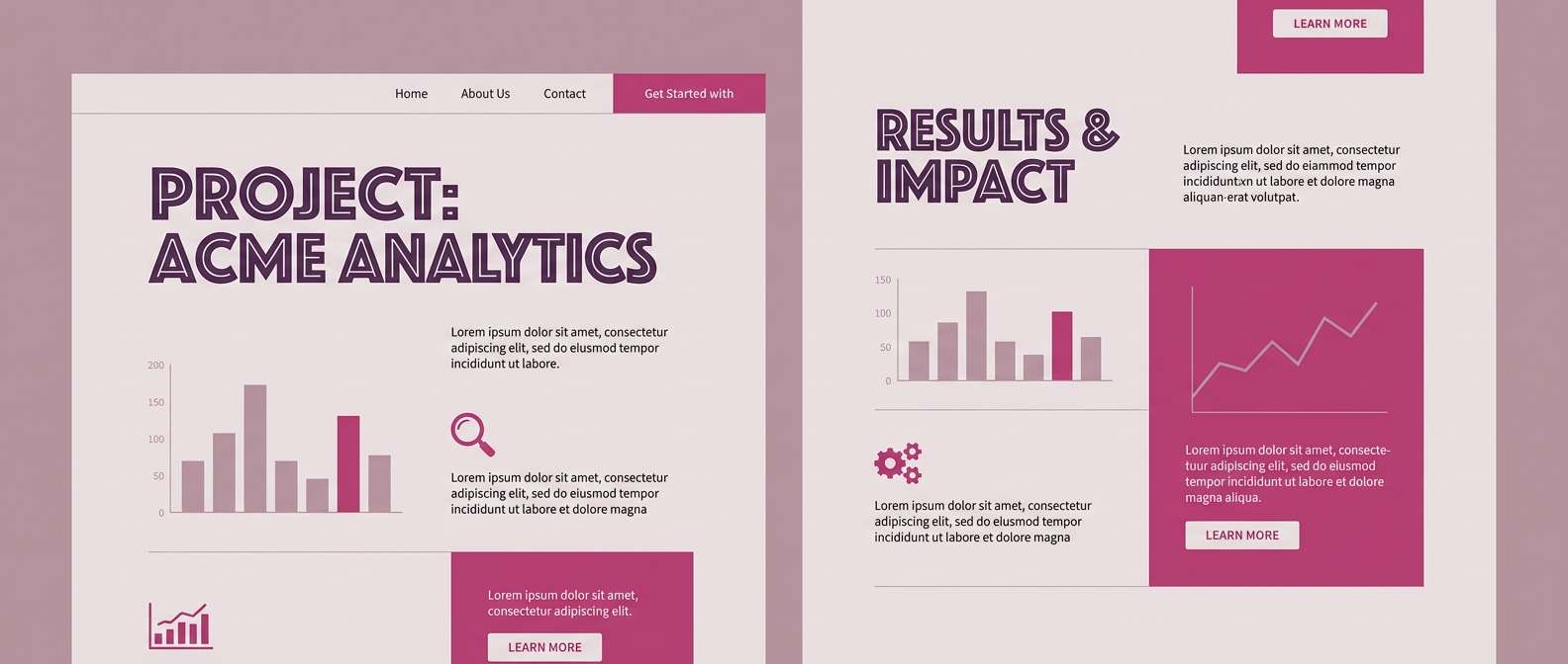
5) Dusty Mauve Studio
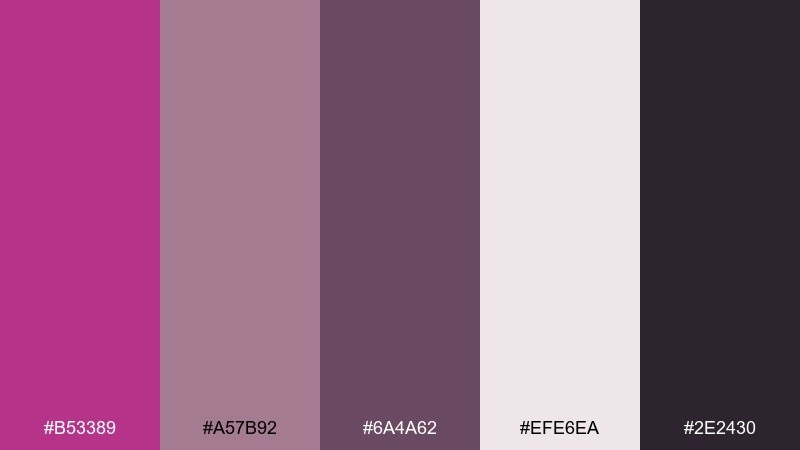
HEX: #b53389 #a57b92 #6a4a62 #efe6ea #2e2430
Mood: calm, refined, understated
Best for: portfolio websites and case studies
Calm and refined, these dusty mauves feel like a quiet studio wall at golden hour. The muted middle tones soften the magenta, making layouts feel mature and intentional. Use it for portfolio sites, case-study pages, or minimalist decks that need personality without noise. Tip: keep backgrounds in the pale mauve and use the deep purple for section headers to create clean hierarchy.
Image example of dusty mauve studio generated using media.io
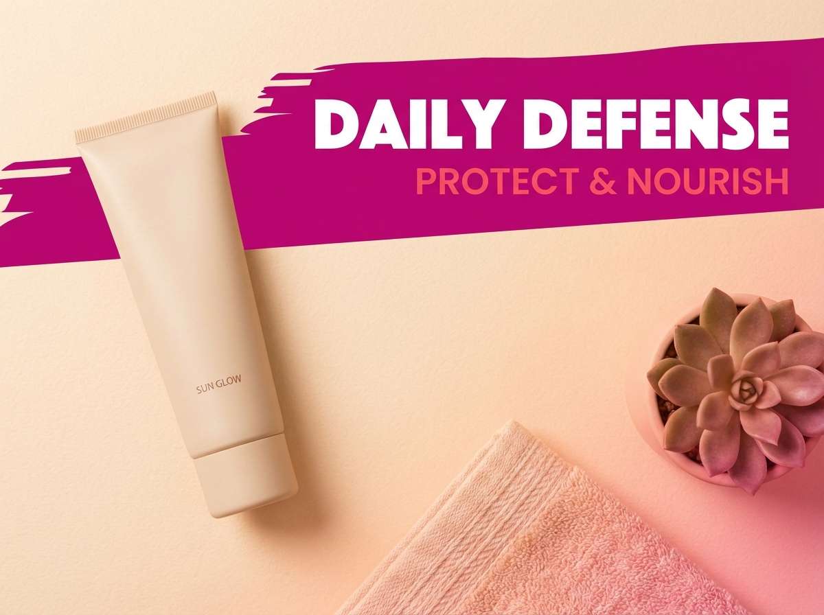
6) Sunset Fuchsia
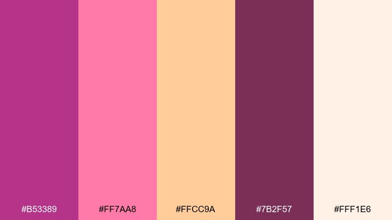
HEX: #b53389 #ff7aa8 #ffcc9a #7b2f57 #fff1e6
Mood: warm, optimistic, glowing
Best for: summer campaigns and lifestyle ads
Warm and glowing, it evokes a fuchsia sunset melting into peachy clouds. The creamy highlights keep everything airy while the deeper berry gives structure. Use it for summer campaigns, lifestyle ads, or upbeat email headers. A simple tip: let peach act as the main background and use magenta only for headlines and CTA elements to prevent overwhelm.
Image example of sunset fuchsia generated using media.io
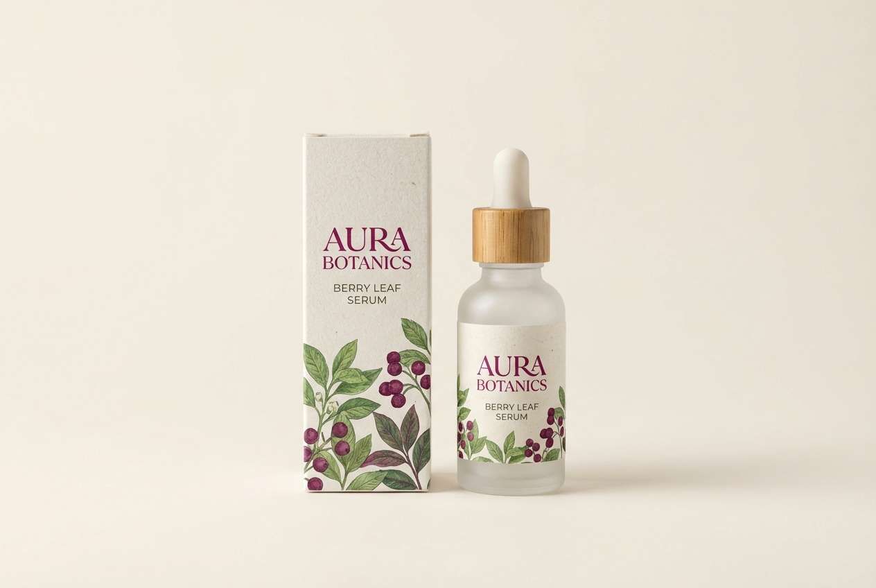
7) Botanical Berry
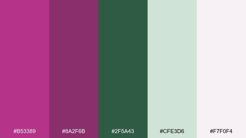
HEX: #b53389 #8a2f6b #2f5a43 #cfe3d6 #f7f0f4
Mood: fresh, organic, modern
Best for: skincare packaging and botanical labels
Fresh and botanical, it suggests berries, leaves, and soft paper packaging. The green makes the magenta feel more natural and less cosmetic-heavy. Use it for skincare labels, tea tins, or eco-friendly product lines where you want a modern organic vibe. Try keeping the background pale and using the green for ingredient blocks, with magenta reserved for the brand mark.
Image example of botanical berry generated using media.io
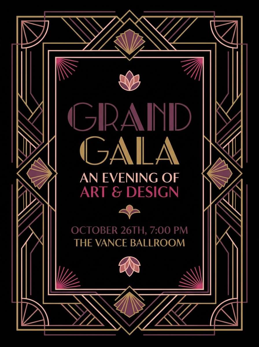
8) Art Deco Plum
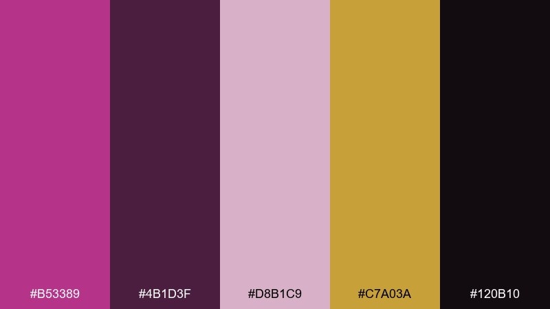
HEX: #b53389 #4b1d3f #d8b1c9 #c7a03a #120b10
Mood: glamorous, vintage, theatrical
Best for: gala invitations and luxury posters
Glamorous and theatrical, it channels Art Deco interiors with plum velvet and muted gold details. The inky black gives the palette its stage-like depth, while blush keeps it sophisticated. Use it for gala invitations, luxury posters, or a boutique hotel identity. Tip: use gold only for thin lines and icons so the plum stays the headline color.
Image example of art deco plum generated using media.io
9) Rose Gold Glam
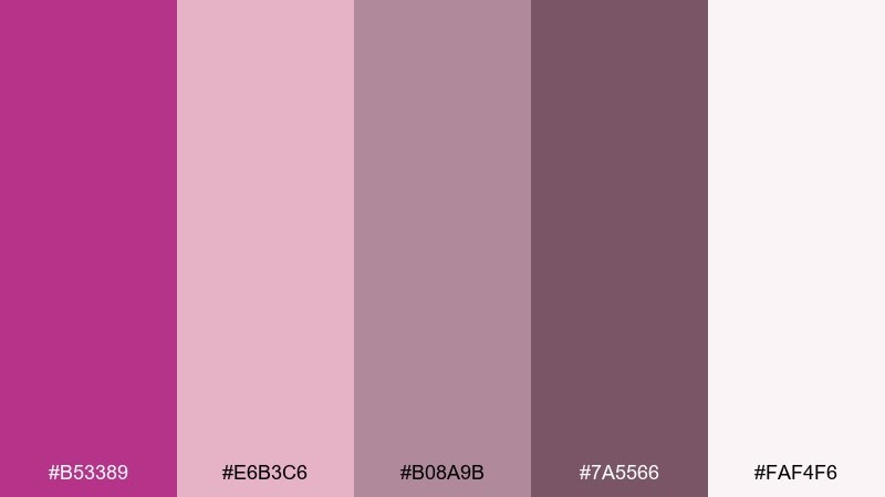
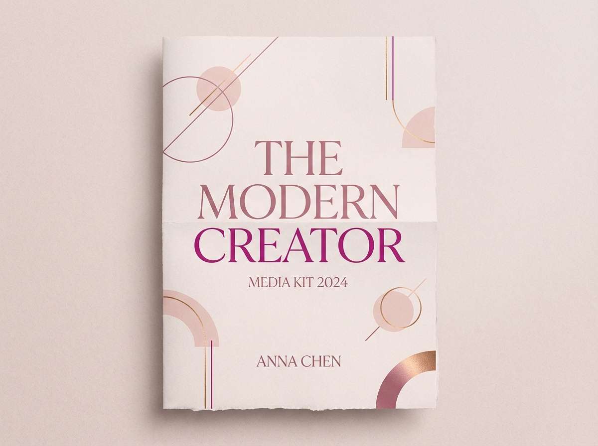
HEX: #b53389 #e6b3c6 #b08a9b #7a5566 #faf4f6
Mood: soft glam, polished, feminine
Best for: influencer media kits and cover pages
Soft glam and polished, it feels like rose-gold makeup brushes and satin robes. The dusty mid-tones keep the bright magenta from feeling too loud. Use it for influencer media kits, cover pages, or a beauty creator's brand deck. For a cleaner look, set body text in the deeper mauve and use the magenta only for section dividers and key numbers.
Image example of rose gold glam generated using media.io
10) Minimal Magenta UI
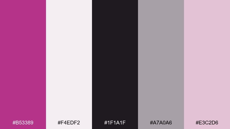
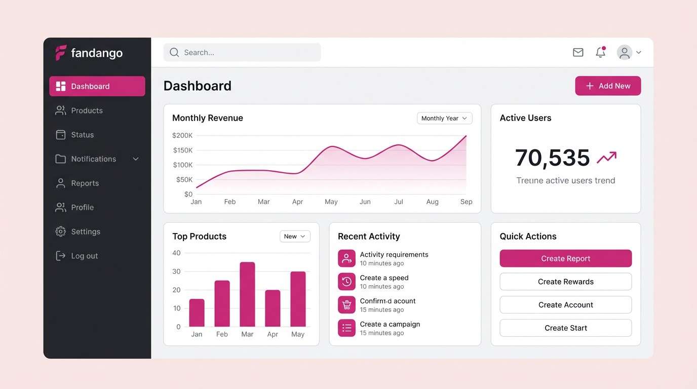
HEX: #b53389 #f4edf2 #1f1a1f #a7a0a6 #e3c2d6
Mood: clean, confident, tech-forward
Best for: SaaS dashboards and UI components
Clean and confident, it reads like a modern interface with one sharp magenta accent. The pale blush and cool grays create breathing room, while the near-black keeps contrast accessible. Use it for SaaS dashboards, UI kits, or settings screens where clarity is the priority. Tip: reserve the magenta for primary actions and active states, and keep everything else neutral to avoid fatigue.
Image example of minimal magenta ui generated using media.io
11) Berry Sorbet
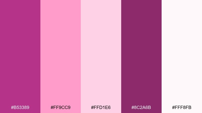
HEX: #b53389 #ff9cc9 #ffd1e6 #8c2a6b #fff8fb
Mood: sweet, airy, youthful
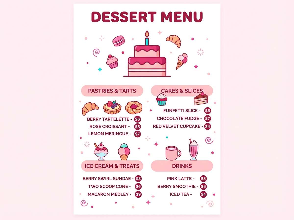
Best for: dessert menus and café promos
Sweet and airy, it feels like berry sorbet swirled into whipped cream. The pale tints create a friendly softness while the deeper berry keeps the design from going flat. Use it for dessert menus, café promos, or bakery packaging where you want a playful tone. Try using the deepest shade for prices and the bright pink for stickers, stamps, or small bursts of emphasis.
Image example of berry sorbet generated using media.io
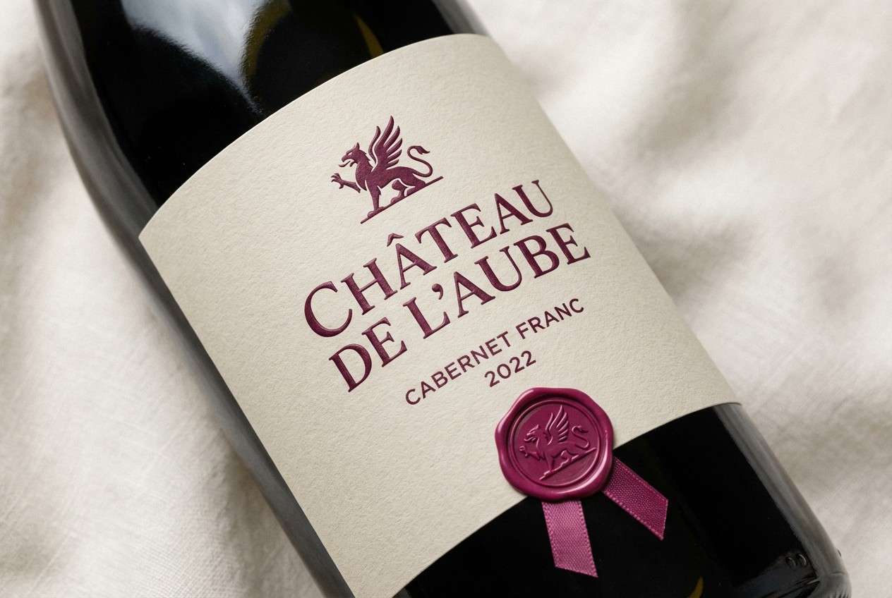
12) Wine and Linen
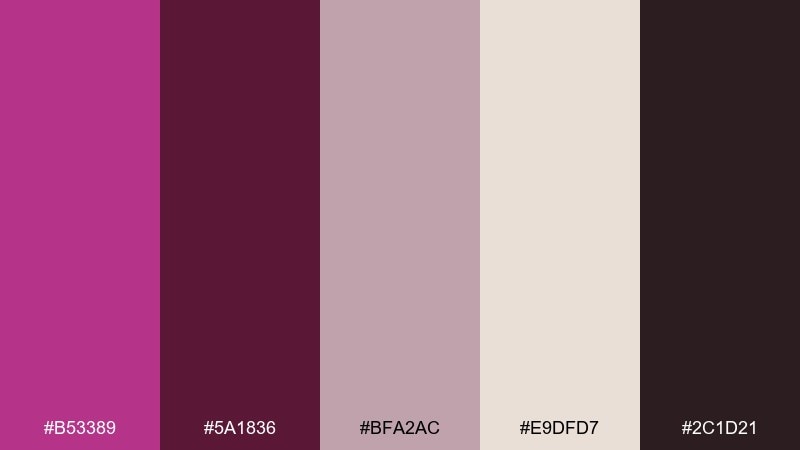
HEX: #b53389 #5a1836 #bfa2ac #e9dfd7 #2c1d21
Mood: mature, intimate, timeless
Best for: restaurant branding and wine labels
Mature and intimate, it evokes red wine stains on natural linen and candlelit tables. The earthy neutrals soften the magenta and make it feel more culinary than candy. Use it for restaurant branding, wine labels, or tasting event collateral. A practical tip: keep the linen tone as the main label background and use the darkest shade for typography to ensure readability.
Image example of wine and linen generated using media.io
13) Retro Arcade Pink
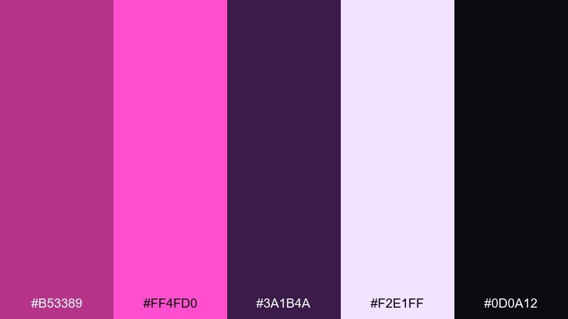
HEX: #b53389 #ff4fd0 #3a1b4a #f2e1ff #0d0a12
Mood: retro, electric, high-contrast
Best for: gaming thumbnails and streamer banners
Retro and electric, it feels like arcade lights buzzing in a dark room. The deep violet and near-black create that neon contrast, while the lilac tint keeps it readable. Use it for gaming thumbnails, streamer banners, or retro-themed merch. Tip: stick to big shapes and thick type so the bright pink reads crisp against the dark tones.
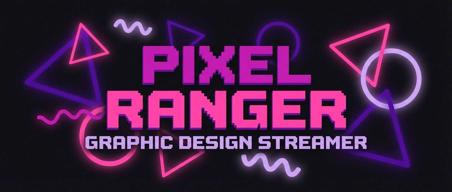
Image example of retro arcade pink generated using media.io
14) Lavender Haze
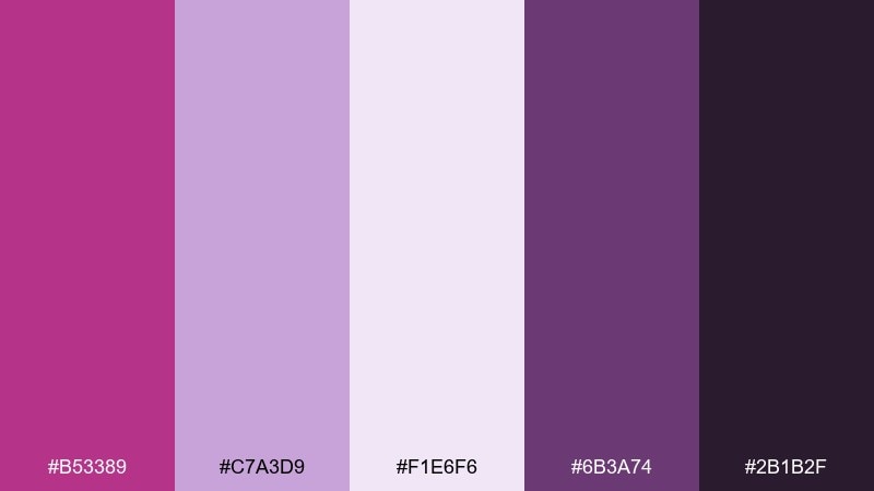
HEX: #b53389 #c7a3d9 #f1e6f6 #6b3a74 #2b1b2f
Mood: dreamy, soft, atmospheric
Best for: music covers and dreamy posters
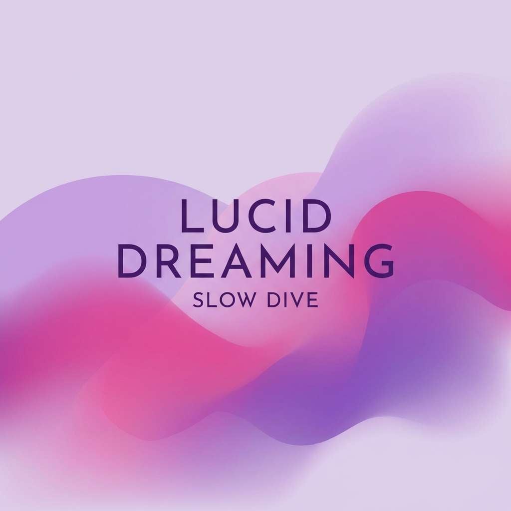
Dreamy and atmospheric, it suggests lavender haze drifting over a late-night skyline. The soft lilac and misty off-white make room for gentle gradients, while the dark purple anchors the layout. Use it for music cover art, dreamy posters, or ambient event visuals. For best results, blend the light tones in the background and keep text in the darkest shade to stay legible.
Image example of lavender haze generated using media.io
15) Cherry Blossom Night
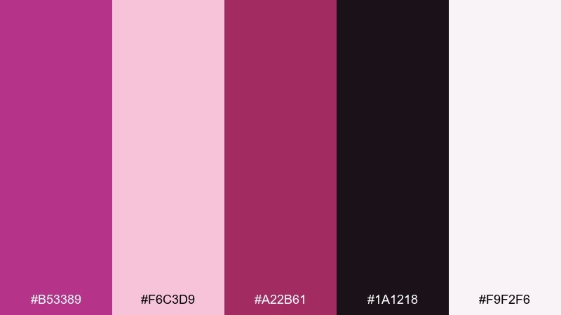
HEX: #b53389 #f6c3d9 #a22b61 #1a1218 #f9f2f6
Mood: romantic, cinematic, night-bloom
Best for: date-night promos and cinema ads
Romantic and cinematic, it feels like cherry blossoms lit by street lamps at night. The inky base makes the pinks glow, while the soft off-white keeps layouts from feeling heavy. Use it for date-night promos, cinema ads, or social posts that need drama without harsh colors. Tip: use the off-white for copy blocks and keep the brightest pink for the headline only.
Image example of cherry blossom night generated using media.io
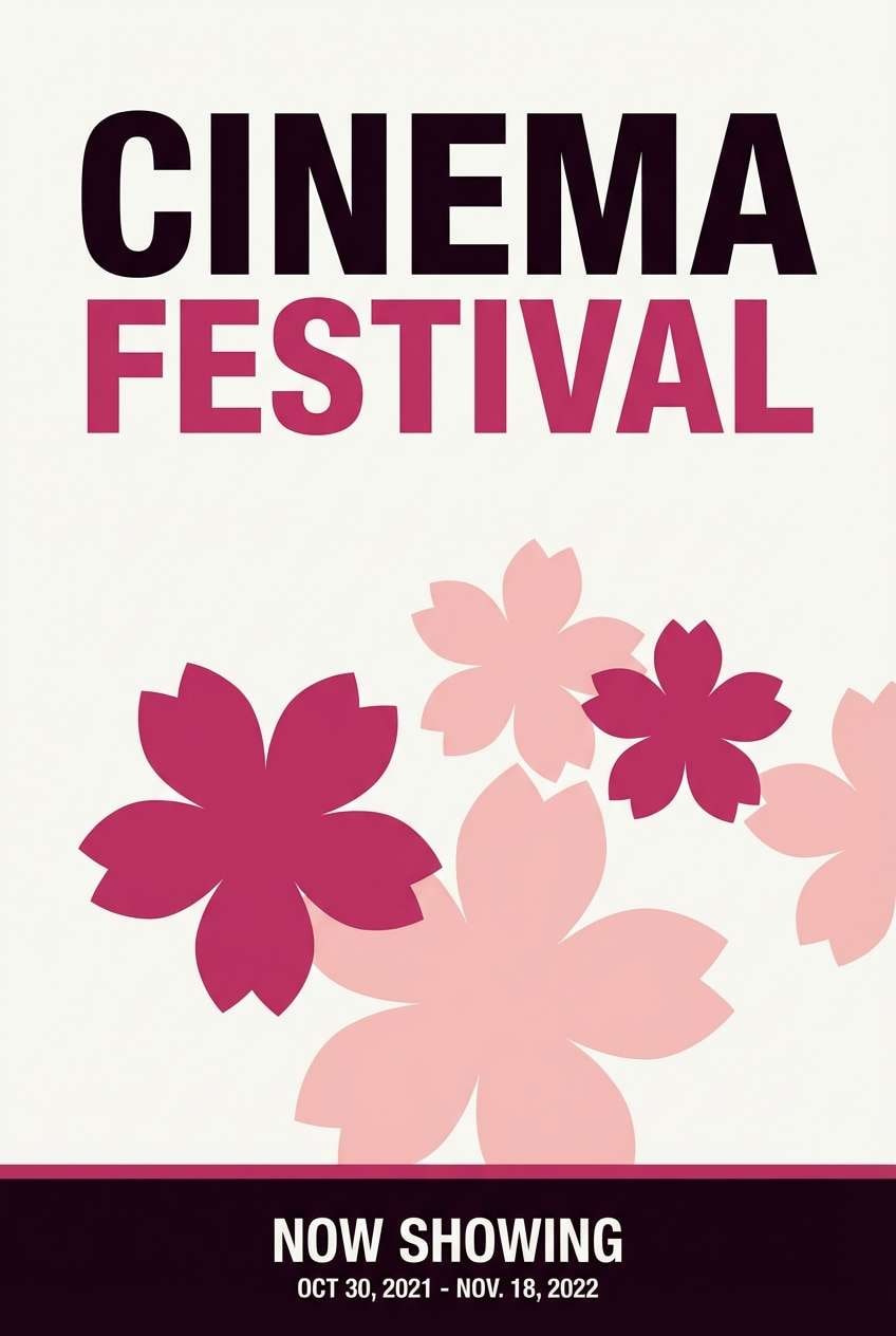
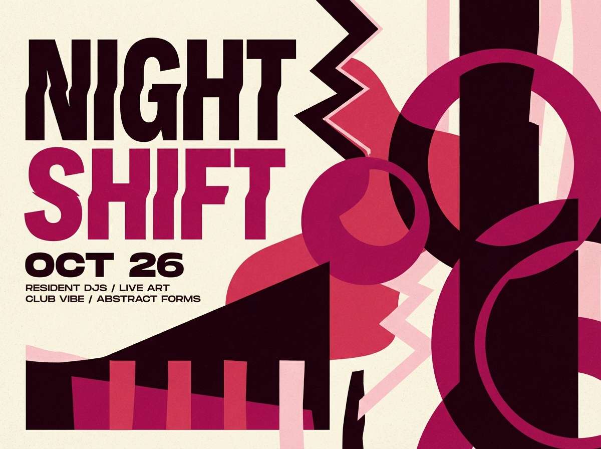
16) Festival Poster Punch
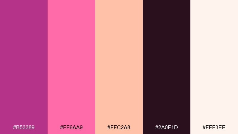
HEX: #b53389 #ff6aa9 #ffc2a8 #2a0f1d #fff3ee
Mood: energetic, fun, attention-grabbing
Best for: music festival posters and ticket graphics
Energetic and attention-grabbing, it looks like confetti bursts over warm spotlights. Peach and cream soften the intensity, letting the magenta take the lead without screaming. These fandango color combinations work especially well for festival posters, ticket graphics, and bold announcement cards. Keep the layout simple and let one oversized headline carry the punch while smaller text stays on the lightest tone.
Image example of festival poster punch generated using media.io

17) Cozy Knit Mauve
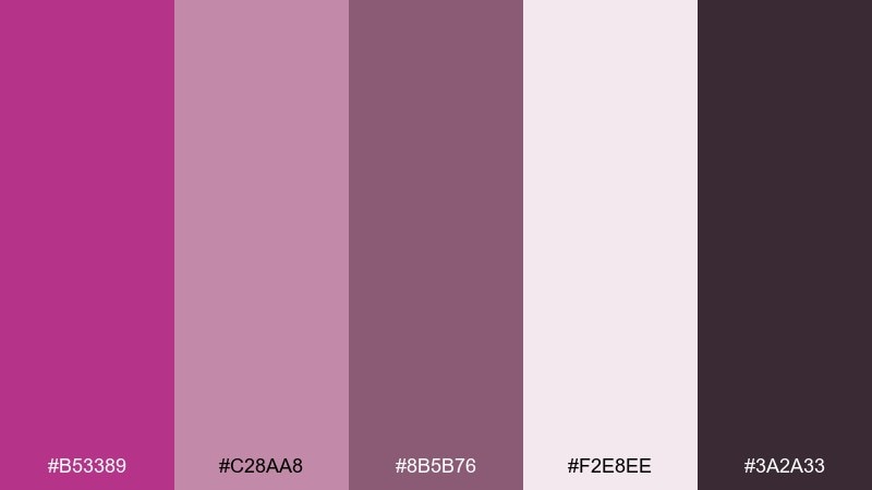
HEX: #b53389 #c28aa8 #8b5b76 #f2e8ee #3a2a33
Mood: cozy, soft, comforting
Best for: fall lookbooks and fashion emailers
Cozy and comforting, it feels like a mauve knit sweater and warm indoor light. The dusty mid-tones create a gentle rhythm, while the darker plum keeps headings strong. Use it for fall lookbooks, fashion emailers, or a boutique's seasonal campaign. Tip: build sections with the light background, then alternate the two mid-tones for blocks so the design feels textured without adding patterns.
Image example of cozy knit mauve generated using media.io
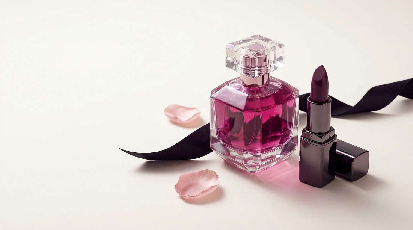
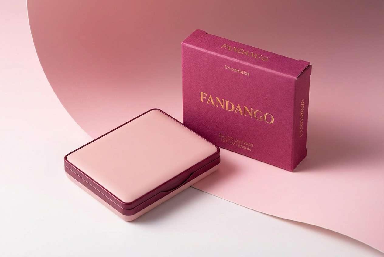
18) Luxury Cosmetics
HEX: #b53389 #9a2f78 #f3d4e3 #5b2a46 #fff7fa
Mood: premium, glossy, confident
Best for: product packaging and storefront banners
Premium and glossy, it brings to mind lacquered compact cases and soft powder tones. The layered berries add depth, while the pink-white base keeps everything clean and modern. Use it for product packaging, storefront banners, or gifting sets where polish matters. If you want a sleek look, print the darkest berry as small text and let the magenta own the logo and seals.
Image example of luxury cosmetics generated using media.io
19) Modern Editorial Fuchsia
HEX: #b53389 #e7b6d2 #2b2028 #9b7a8f #f9f4f7
Mood: editorial, smart, modern
Best for: magazine layouts and blog headers
Editorial and smart, it feels like a glossy magazine spread with sharp type and soft blush margins. The near-black gives strong readability, and the muted mauve helps secondary elements fade back. Use it for magazine-style layouts, blog headers, or portfolio essays. Tip: treat the magenta as a highlight for pull quotes and links, and keep large text blocks on the off-white to reduce eye strain.
Image example of modern editorial fuchsia generated using media.io
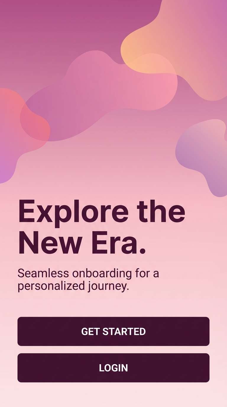
20) Dreamy Gradient Bloom
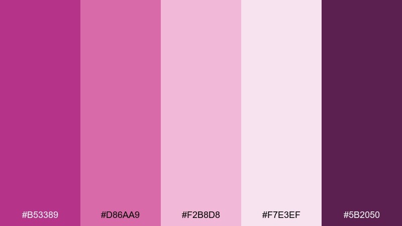
HEX: #b53389 #d86aa9 #f2b8d8 #f7e3ef #5b2050
Mood: romantic, soft, luminous
Best for: landing page gradients and onboarding screens
Romantic and luminous, it reads like a petal-soft gradient blooming from center to edge. The lighter tints make transitions feel airy, while the deep plum keeps buttons and key UI elements grounded. Use it for onboarding screens, landing page backgrounds, or gentle product tours. This fandango color palette works best when you limit text to the darkest shade and keep gradients subtle instead of high-contrast.
Image example of dreamy gradient bloom generated using media.io
21) Plum Slate Contrast
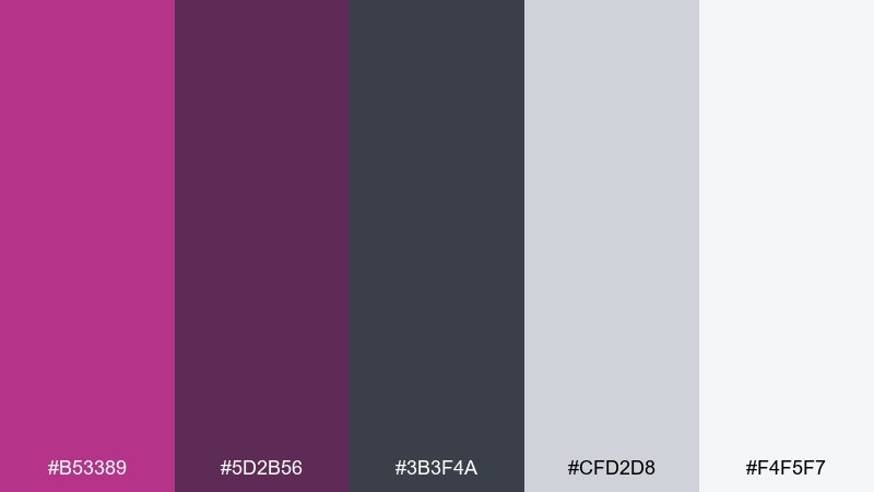
HEX: #b53389 #5d2b56 #3b3f4a #cfd2d8 #f4f5f7
Mood: professional, balanced, confident
Best for: corporate decks and data reports
Professional and balanced, it feels like plum ink on cool slate paper. The grays make the magenta read confident and modern rather than playful. Use it for corporate decks, data reports, or B2B one-pagers where you want a distinctive accent color. Tip: keep charts mostly grayscale and use the magenta only for one key series or KPI callout.
Image example of plum slate contrast generated using media.io
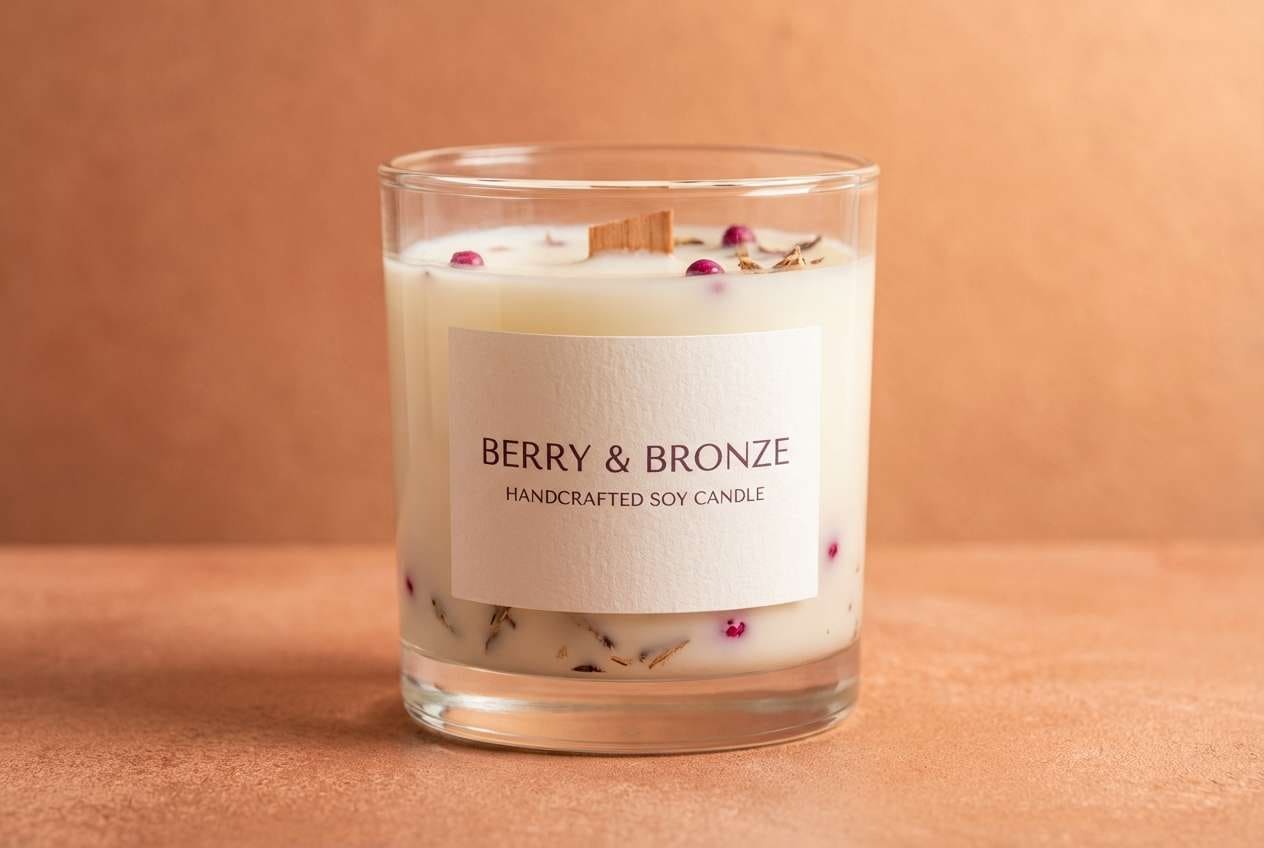
22) Berry Bronze Pairing
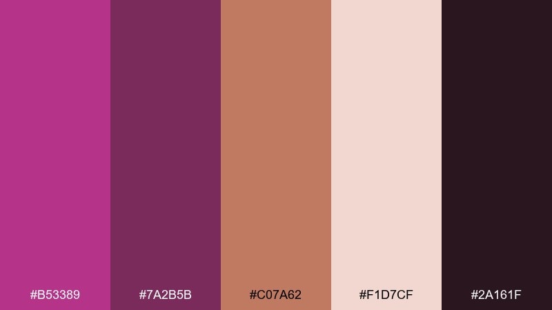
HEX: #b53389 #7a2b5b #c07a62 #f1d7cf #2a161f
Mood: earthy glam, warm, artistic
Best for: handcrafted product labels and candles
Earthy glam and warm, it suggests berry jam, bronze clay, and smoky glass. The bronze-peach note makes the magenta feel artisanal and tactile. These fandango color combinations are ideal for handcrafted product labels, candle packaging, or small-batch brand stories. Tip: use the bronze tone for backgrounds and keep the darkest shade for ingredient text so it stays readable on textured stocks.
Image example of berry bronze pairing generated using media.io
What Colors Go Well with Fandango?
Fandango pairs beautifully with deep plums, near-black charcoals, and wine tones for a luxe, cinematic look. If you want a more modern UI feel, cool grays and off-whites keep the magenta crisp and readable.
For a softer, romantic direction, match it with blush, warm ivory, and dusty mauves. To add contrast without harshness, bring in cocoa browns or slate grays rather than pure black.
For fresh, brandable combinations, try balancing fandango with botanicals like leafy green or sage. The green pulls the palette away from “cosmetic pink” and toward an organic, product-friendly vibe.
How to Use a Fandango Color Palette in Real Designs
Use fandango as an accent first: primary buttons, active states, badges, or small brand marks. This keeps the design premium and prevents the color from overpowering your layout, especially on long pages.
In print, fandango works best with textured neutrals (linen, ivory, blush) and a single dark ink-like tone for type. For posters and ads, push contrast by pairing it with deep plum or near-black and using large, simple typography.
For UI, ensure accessibility by placing text on pale tints and keeping your darkest color for body copy. Save the bright magenta for actions and highlights so users can scan quickly.
Create Fandango Palette Visuals with AI
If you want consistent brand visuals, generate a set of images that match the same fandango palette—hero banners, posters, packaging mockups, or UI screens. Using a repeatable prompt style helps keep your designs cohesive across campaigns.
Start with one palette above, then reuse its HEX codes and mood keywords (like “luxurious,” “dreamy,” or “corporate”) in your prompt. Keep the composition simple and let the color relationships do the heavy lifting.
Media.io makes it easy to turn these prompts into ready-to-use visuals, then refine them with fast edits in your browser.
Fandango Color Palette FAQs
-
What is the HEX code for fandango?
A commonly used fandango HEX is #b53389, a saturated magenta-purple that works well as an accent in both print and UI. -
Is fandango closer to magenta or purple?
Fandango sits between magenta and purple. It has the energy of pink-magenta, with enough purple depth to feel more dramatic and premium. -
What neutral colors pair best with fandango?
Warm ivories, blush off-whites, linen beiges, cool light grays, and charcoal/near-black all pair cleanly with fandango and help control contrast. -
How do I use fandango in a UI without overwhelming users?
Keep most surfaces neutral (off-white/gray), use near-black for text, and reserve fandango for primary actions, active states, and small highlights. -
What’s a good complementary accent for fandango besides neutrals?
Leafy green or sage is a strong counterbalance. It makes fandango feel more organic and “botanical,” especially for packaging and lifestyle branding. -
Does fandango work for professional or corporate designs?
Yes—pair it with slate grays and soft off-whites, then limit magenta to one data series, KPI callouts, or small brand elements for a confident B2B look. -
How can I generate fandango palette images for branding quickly?
Use a text-to-image tool and specify your palette’s mood plus key objects (packaging, UI, posters). Reuse the prompts above to keep results consistent.
Next: Meditation Color Palette


