

Modern infographic design is all about clarity: strong hierarchy, readable labels, and a color system that helps your audience scan data fast.
Below are curated infographic color palette ideas (with HEX codes) you can copy for dashboards, reports, slides, and social stats—plus AI prompts you can reuse to generate matching visuals.
In this article
- Why Infographic Palettes Work So Well
-
- emerald turquoise grid
- minty chalkboard
- coral marker highlights
- navy citrus contrast
- sandstone dashboard
- berry neon callouts
- ocean fog minimal
- retro print cyan
- forest copper report
- lilac slate metrics
- sunlit mango charts
- teal rose infoposter
- charcoal lime labels
- soft pastel storyboard
- burgundy cream columns
- glacier teal clarity
- clay sage overview
- graphite aqua focus
- citrus teal blueprint
- neon night scatter
- glacier aqua clean
- warm earthy timeline
- What Colors Go Well with Infographic?
- How to Use a Infographic Color Palette in Real Designs
- Create Infographic Palette Visuals with AI
Why Infographic Palettes Work So Well
Infographics succeed when color does a job: separating series, grouping sections, and pulling attention to the one number that matters. A good palette turns “busy data” into an easy visual story.
Unlike general brand palettes, data visualization colors need predictable contrast for axes, labels, and small marks (dots, lines, ticks). That’s why many infographic schemes pair a strong neutral (navy/charcoal) with 2–3 accents.
Curated sets also reduce decision fatigue. When each color has a role (primary series, secondary series, highlight, background), your charts stay consistent across slides, dashboards, and printouts.
20+ Infographic Color Palette Ideas (with HEX Codes)
1) Emerald Turquoise Grid
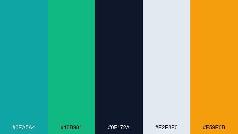
HEX: #0ea5a4 #10b981 #0f172a #e2e8f0 #f59e0b
Mood: fresh, confident, modern
Best for: dashboard UI charts and KPI cards
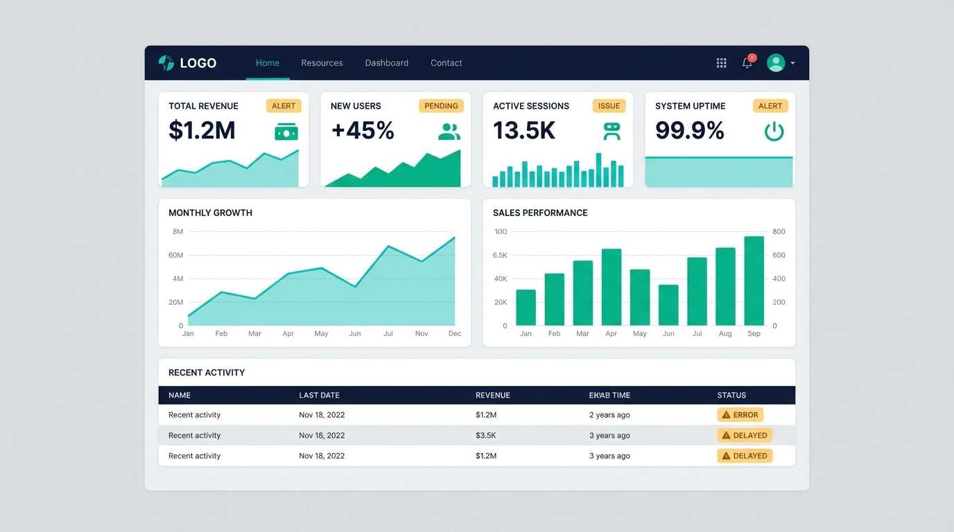
Fresh and confident like a clean analytics workspace with bright teal pins on a dark grid. Use the turquoise and emerald as the main series colors, then rely on the deep navy for headings and axis text. The warm amber works best as a sparing alert color for spikes and outliers. Pair with generous spacing and thin dividers so the contrast feels crisp rather than busy.
Image example of emerald turquoise grid generated using media.io
Media.io is an online AI studio for creating and editing video, image, and audio in your browser.

2) Minty Chalkboard
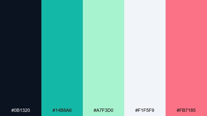
HEX: #0b1320 #14b8a6 #a7f3d0 #f1f5f9 #fb7185
Mood: smart, playful, high-contrast
Best for: classroom-style explainer slides
Smart and playful, like mint chalk lines on a deep slate board with a bright sticky-note accent. Keep the dark tone for big blocks and let mint do the heavy lifting for icons, rules, and chart strokes. The soft seafoam is ideal for secondary series when you need two related data lines. Use the pink only for key takeaways so it reads like a highlight pen, not a competing series.
Image example of minty chalkboard generated using media.io
3) Coral Marker Highlights
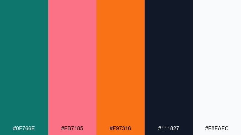
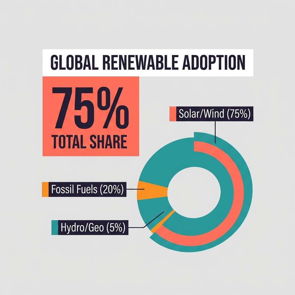
HEX: #0f766e #fb7185 #f97316 #111827 #f8fafc
Mood: energetic, bold, attention-grabbing
Best for: social infographic posts and quick stats
Energetic and bold, like coral marker strokes over a tidy teal base. This infographic color palette works best when teal handles structure while coral and orange punch up the numbers that matter. Keep the near-black for body copy so the bright accents stay readable and clean. Tip: reserve orange for a single chart series to prevent it from overpowering the layout.
Image example of coral marker highlights generated using media.io
4) Navy Citrus Contrast
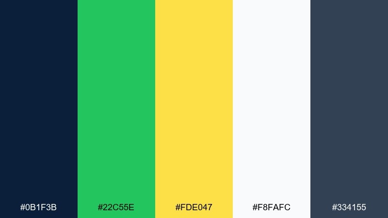
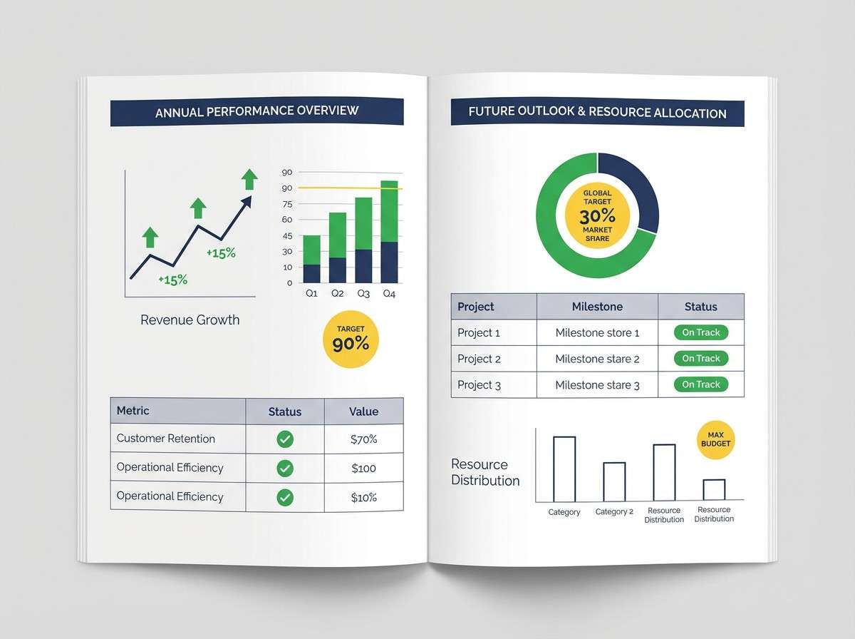
HEX: #0b1f3b #22c55e #fde047 #f8fafc #334155
Mood: sharp, sporty, high-clarity
Best for: finance reports and performance charts
Sharp and high-clarity, like bright citrus labels on a midnight report cover. Use navy for headers and table bands, then bring in green for positive movement and yellow for benchmarks or targets. The slate tone is a reliable neutral for secondary text and grid lines. For readability, keep yellow on light backgrounds and use it as an outline or badge when placed near navy.
Image example of navy citrus contrast generated using media.io
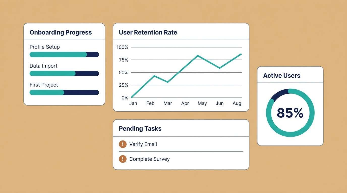
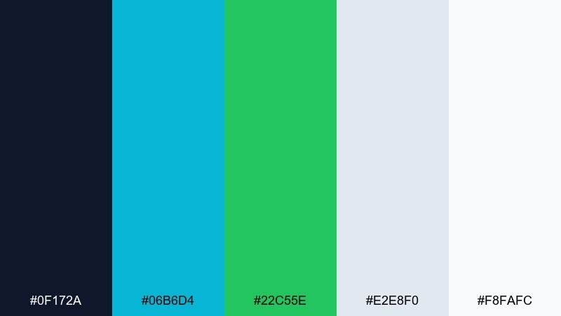
5) Sandstone Dashboard
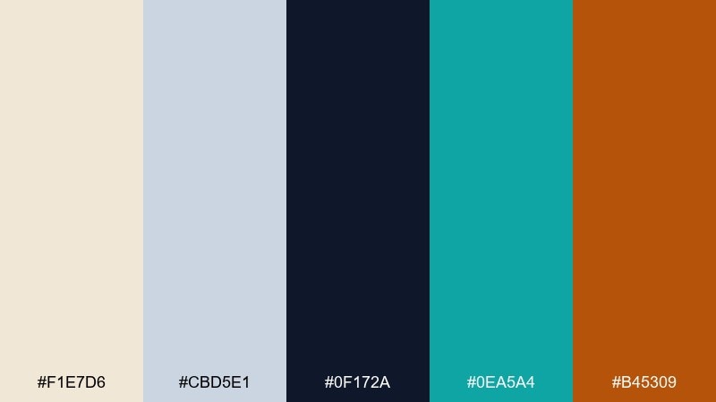
HEX: #f1e7d6 #cbd5e1 #0f172a #0ea5a4 #b45309
Mood: calm, grounded, professional
Best for: SaaS onboarding analytics screens
Calm and grounded, like warm paper and polished stone with a cool teal pin. Use the sandstone as the main surface color to soften dense metrics, then set type in deep navy for crisp contrast. Teal makes a great primary action and chart series, while the copper tone is ideal for warnings or churn indicators. Keep grid lines subtle with the light slate so the dashboard feels airy.
Image example of sandstone dashboard generated using media.io
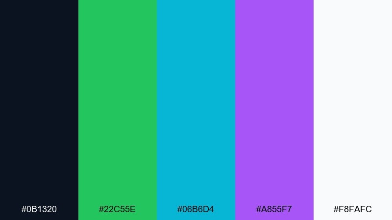
6) Berry Neon Callouts
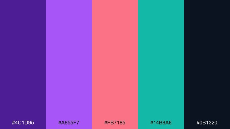
HEX: #4c1d95 #a855f7 #fb7185 #14b8a6 #0b1320
Mood: punchy, youthful, high-energy
Best for: event recap infographics and timelines
Punchy and youthful, like neon ink on a dark stage backdrop. These infographic color combinations shine when you keep the background nearly black and let purple own the main structure. Coral is perfect for standout numbers and timeline dots, while teal gives you a cool counterpoint for secondary facts. Usage tip: avoid long paragraphs in coral, and keep it to short labels so it stays legible.
Image example of berry neon callouts generated using media.io
7) Ocean Fog Minimal
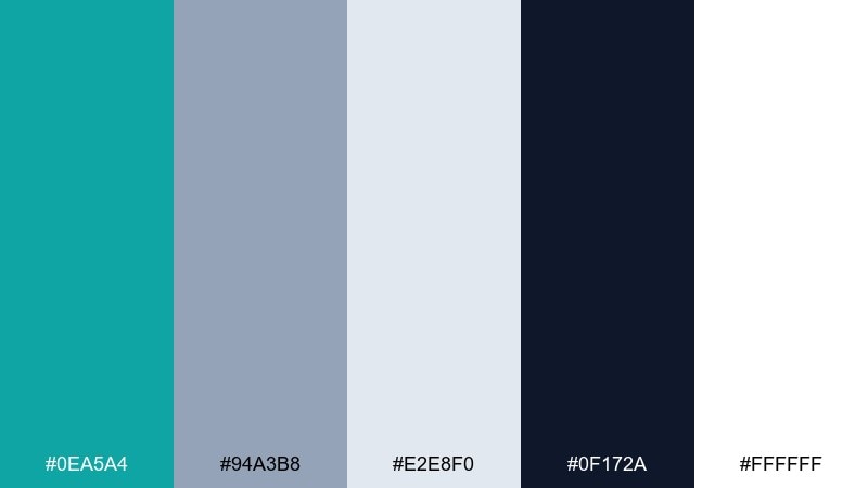
HEX: #0ea5a4 #94a3b8 #e2e8f0 #0f172a #ffffff
Mood: minimal, cool, trustworthy
Best for: B2B one-pagers and data summaries
Minimal and trustworthy, like sea mist over clean glass with a deep horizon line. Use teal for one primary series and repeat it in section headers to unify the page. The foggy slate works well for secondary series and neutral icons without stealing attention. Tip: keep your charts thin and precise so the soft grays read intentional rather than washed out.
Image example of ocean fog minimal generated using media.io
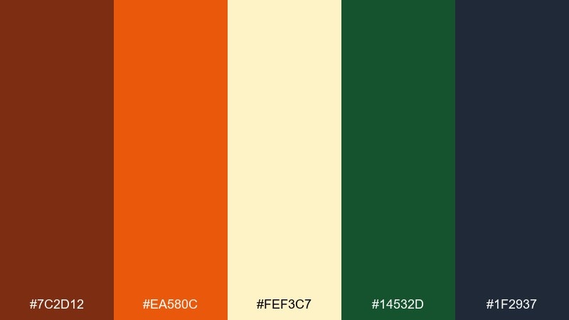
8) Retro Print Cyan
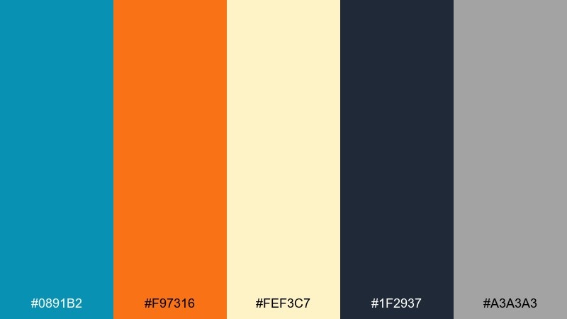
HEX: #0891b2 #f97316 #fef3c7 #1f2937 #a3a3a3
Mood: retro, friendly, editorial
Best for: magazine-style infographic spreads
Retro and friendly, like a cyan spot color on textured cream paper with orange ink stamps. Let cyan run the main charts, then use orange for callouts, arrows, and small badges. The warm cream is a strong background choice that keeps everything easy on the eyes. To keep it editorial, use dark gray for typography and avoid pure black for large blocks.
Image example of retro print cyan generated using media.io
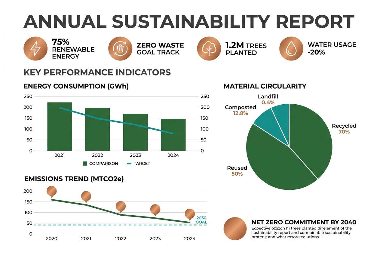
9) Forest Copper Report
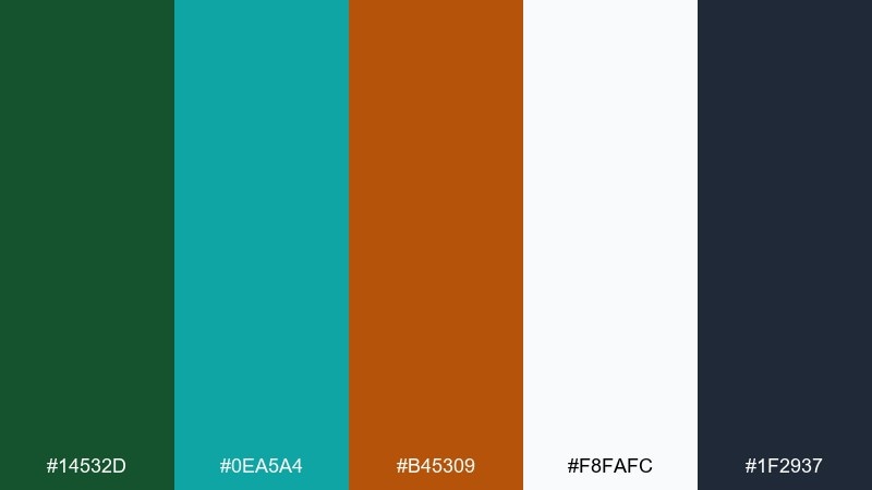
HEX: #14532d #0ea5a4 #b45309 #f8fafc #1f2937
Mood: reliable, earthy, mature
Best for: sustainability reports and impact stats
Reliable and earthy, like evergreen leaves with a copper seal on a clean report cover. Use forest green for primary data categories and teal for comparisons or benchmarks. Copper reads best as a highlight for totals, badges, or small icons rather than full chart fills. Tip: keep backgrounds white so the darker greens do not feel heavy in long documents.
Image example of forest copper report generated using media.io
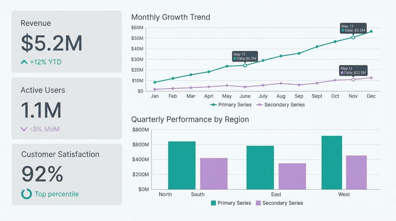
10) Lilac Slate Metrics
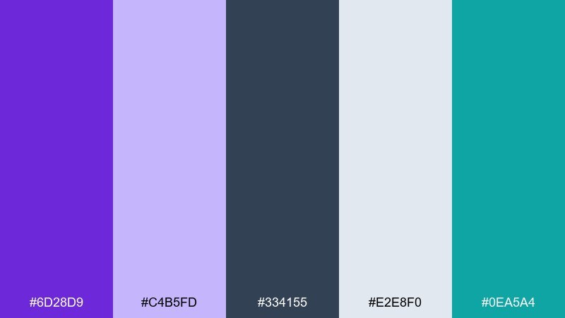
HEX: #6d28d9 #c4b5fd #334155 #e2e8f0 #0ea5a4
Mood: modern, calm, slightly creative
Best for: product metrics decks and quarterly updates
Modern and calm, like lilac lighting on a polished slate wall. Use slate for type and chart axes, then bring lilac in for secondary series that should feel softer than the main trend. Teal adds a crisp focal color for the primary KPI line or the most important bar. Usage tip: keep lilac fills at lower opacity so labels stay sharp over them.
Image example of lilac slate metrics generated using media.io
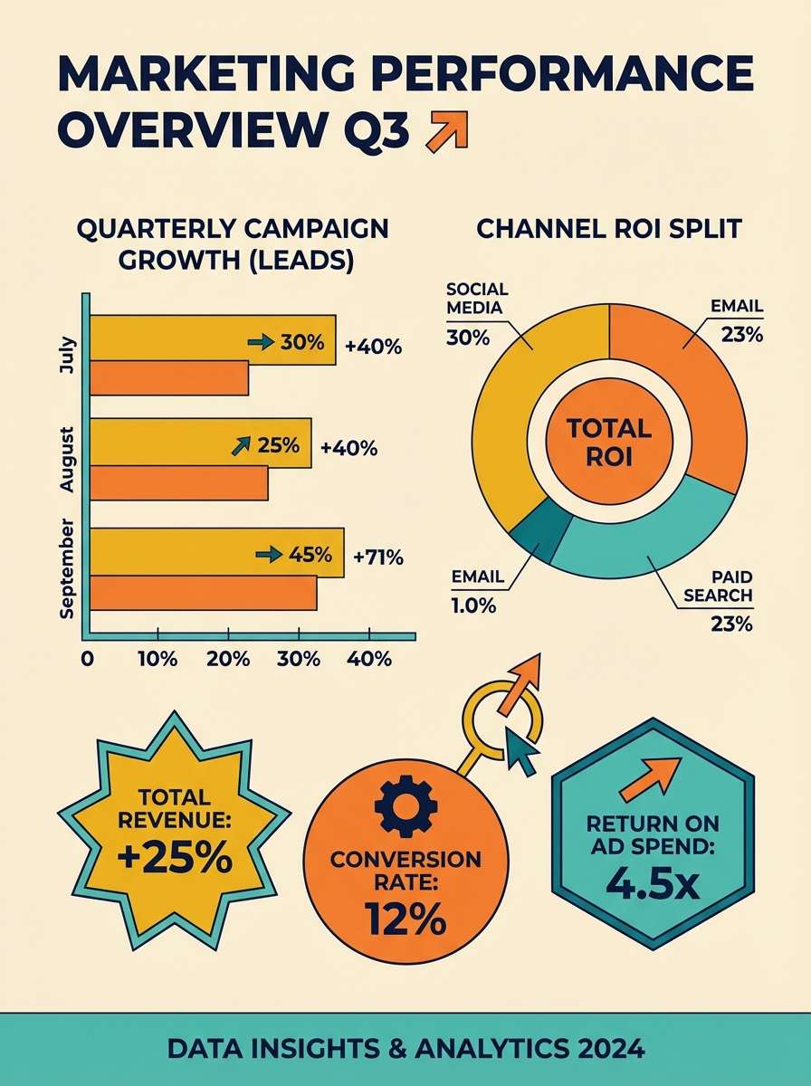
11) Sunlit Mango Charts
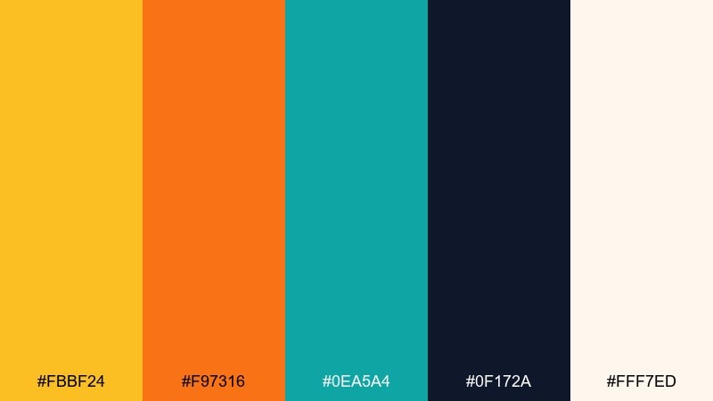
HEX: #fbbf24 #f97316 #0ea5a4 #0f172a #fff7ed
Mood: optimistic, warm, clear
Best for: marketing performance infographics
Optimistic and warm, like morning sunlight over mango and citrus slices. Use the golden tone for major chart areas and reserve orange for the strongest callouts, such as conversions or peaks. Teal balances the warmth and helps secondary elements feel stable and credible. Tip: keep the background creamy and avoid stark white to maintain the sunny feel.
Image example of sunlit mango charts generated using media.io
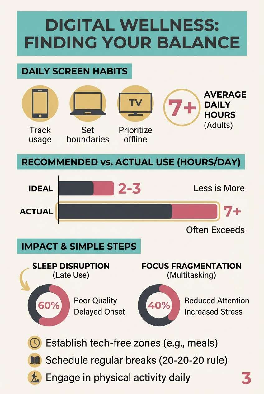
12) Teal Rose Infoposter
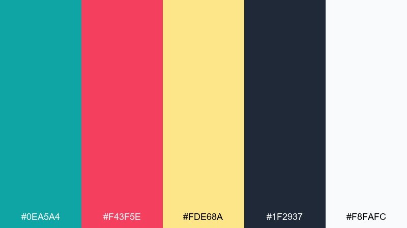
HEX: #0ea5a4 #f43f5e #fde68a #1f2937 #f8fafc
Mood: bright, approachable, modern
Best for: public awareness posters with stats
Bright and approachable, like a fresh teal banner with rose stickers and a soft sunlit accent. Use teal as the main header and section blocks, then pull rose for emphasis on key numbers and short labels. The light gold works best for background shapes or subtle chart fills that should not shout. Tip: keep icons simple and thick so they hold up at a distance on posters.
Image example of teal rose infoposter generated using media.io
13) Charcoal Lime Labels
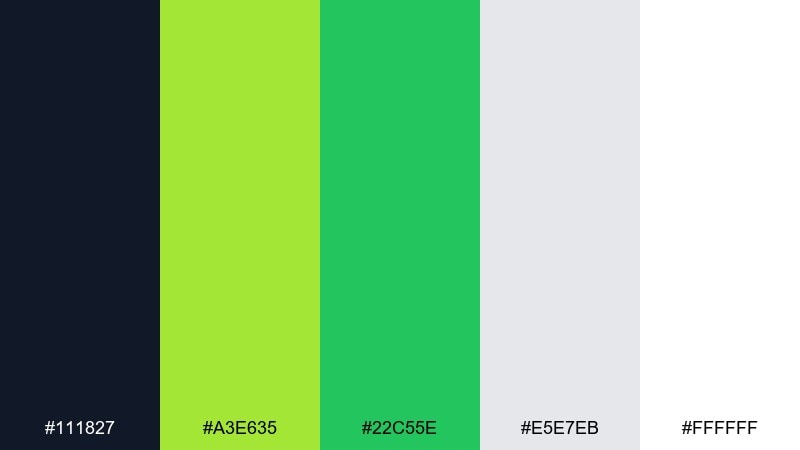
HEX: #111827 #a3e635 #22c55e #e5e7eb #ffffff
Mood: crisp, technical, high-contrast
Best for: engineering dashboards and ops charts
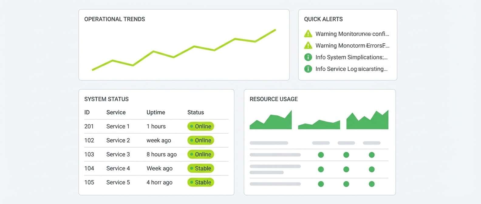
Crisp and technical, like neon labels on a charcoal console. Use charcoal for dense tables and axis text, then apply lime for the primary success signal and green for secondary status. The soft gray keeps separators and card borders visible without clutter. Usage tip: avoid large lime backgrounds and stick to strokes, chips, and key markers for maximum readability.
Image example of charcoal lime labels generated using media.io
14) Soft Pastel Storyboard
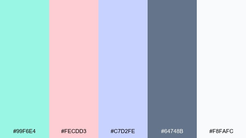
HEX: #99f6e4 #fecdd3 #c7d2fe #64748b #f8fafc
Mood: gentle, friendly, story-driven
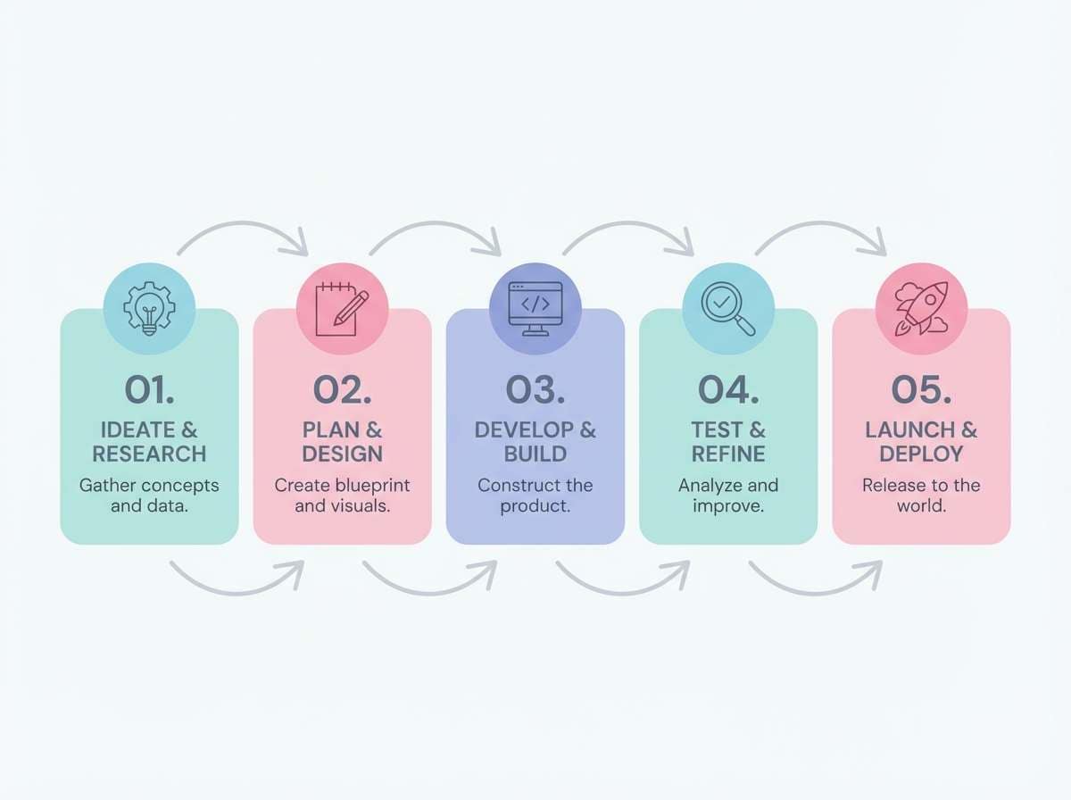
Best for: step-by-step process infographics
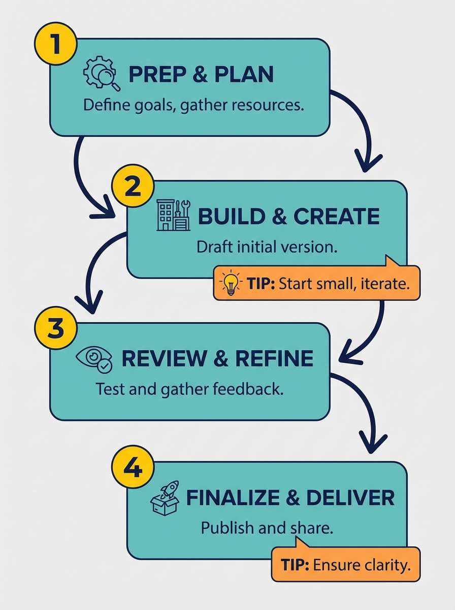
Gentle and story-driven, like pastel sticky notes arranged into a calm storyboard. This infographic color palette is great for multi-step flows where you need different sections without harsh contrast. Use slate for text and lines, then assign each pastel to a step, keeping shapes large and labels short. Tip: add plenty of white space so the light tones stay distinct from each other.
Image example of soft pastel storyboard generated using media.io
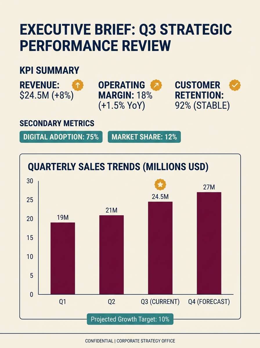
15) Burgundy Cream Columns

HEX: #7f1d1d #f5f5f4 #f59e0b #0f172a #14b8a6
Mood: premium, grounded, editorial
Best for: annual summaries and executive briefs
Premium and grounded, like burgundy ink on cream stationery with a subtle gold seal. Use burgundy for the main data series or section headers, and keep the cream as the page base for an executive feel. Teal can signal secondary metrics without competing, while amber is best saved for single-point highlights. Tip: stick to one bold chart per page and let typography do the rest.
Image example of burgundy cream columns generated using media.io
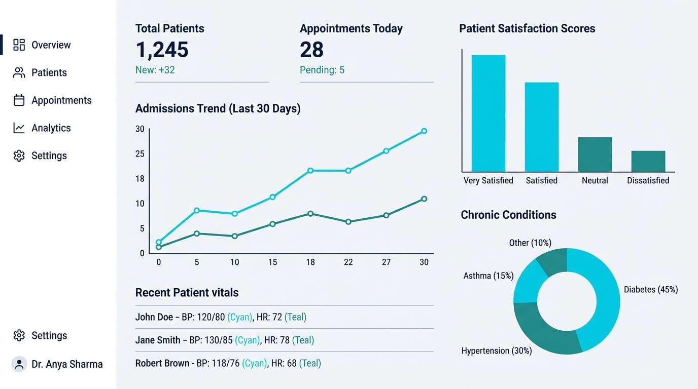
16) Glacier Teal Clarity
HEX: #06b6d4 #0ea5a4 #0f172a #cbd5e1 #f8fafc
Mood: cool, clean, precise
Best for: healthcare data dashboards
Cool and precise, like glacier water and polished instruments in a bright clinic. Use cyan for primary series and teal for comparisons, keeping navy for text to preserve medical-grade legibility. The soft slate is perfect for grid lines and card borders without distracting from numbers. Tip: avoid heavy fills and prefer strokes and dots so the design stays hygienic and light.
Image example of glacier teal clarity generated using media.io
17) Clay Sage Overview
HEX: #a16207 #84cc16 #14532d #fef3c7 #1f2937
Mood: earthy, warm, approachable
Best for: community reports and survey results
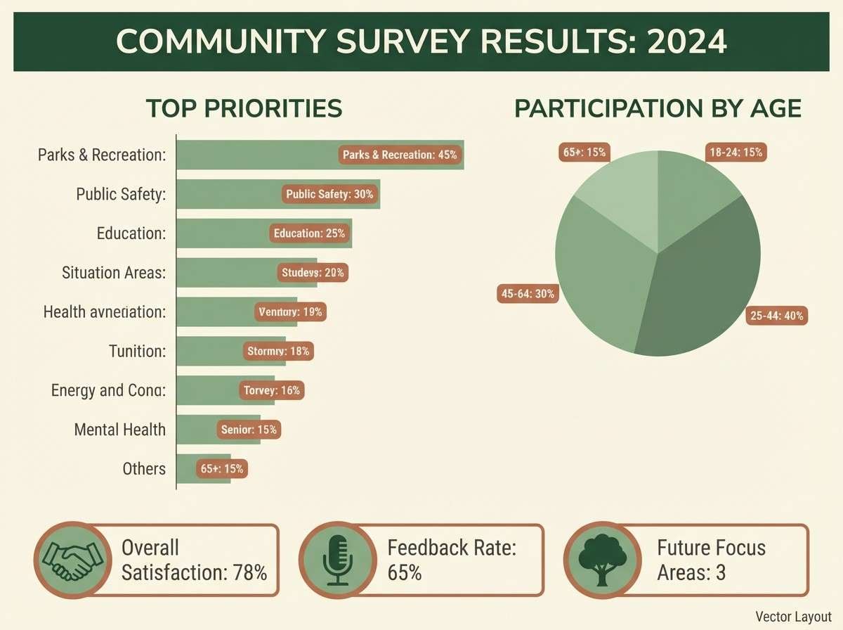
Earthy and approachable, like clay pots and fresh sage in afternoon light. Use the sage green for the primary series and the deeper forest for labels and headings that need weight. Creamy yellow makes an inviting background for charts and short quotes. Tip: keep the clay tone for small badges or category chips so it reads as a friendly accent, not visual noise.
Image example of clay sage overview generated using media.io
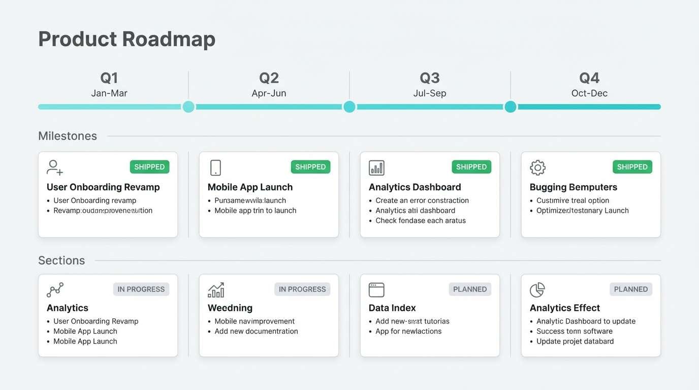
18) Graphite Aqua Focus
HEX: #0f172a #06b6d4 #22c55e #e2e8f0 #f8fafc
Mood: focused, modern, high-legibility
Best for: product roadmap infographics
Focused and modern, like graphite sketches with aqua ink and a green check mark. This infographic color palette helps roadmaps stay scannable by keeping structure dark and accents bright. Use aqua for the timeline line and milestone cards, then apply green to mark shipped items or wins. Tip: keep backgrounds very light and use gray separators to guide the eye from quarter to quarter.
Image example of graphite aqua focus generated using media.io
19) Citrus Teal Blueprint
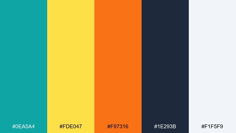
HEX: #0ea5a4 #fde047 #f97316 #1e293b #f1f5f9
Mood: lively, structured, optimistic
Best for: how-to guides and instructional infographics
Lively and structured, like a teal blueprint with bright citrus stickers marking each step. Use teal and navy for the framework, then apply yellow for numbered circles and orange for warnings or key tips. The pale background keeps the whole page open and readable. Tip: limit orange to one element type, such as icons, so the guide feels consistent.
Image example of citrus teal blueprint generated using media.io
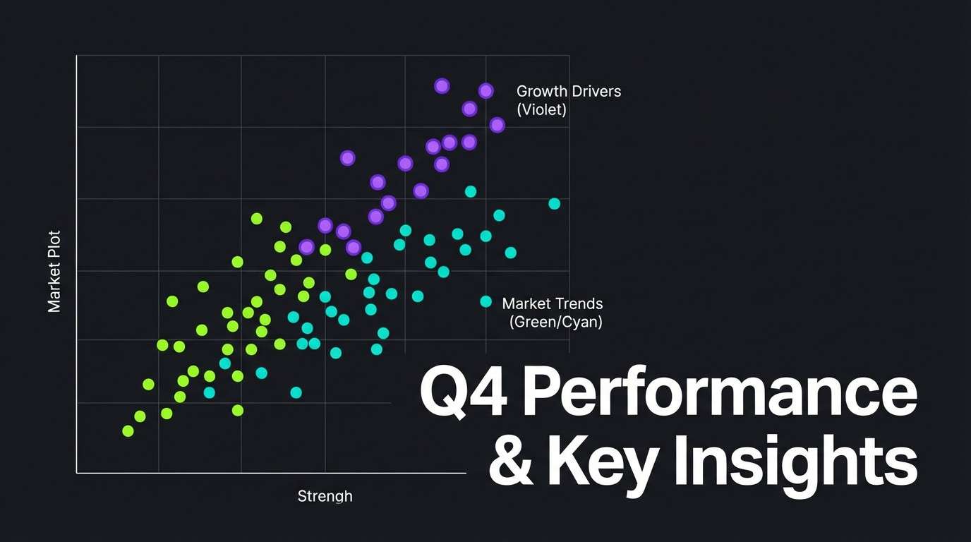
20) Neon Night Scatter
HEX: #0b1320 #22c55e #06b6d4 #a855f7 #f8fafc
Mood: electric, futuristic, contrast-rich
Best for: tech keynote slides and data storytelling
Electric and futuristic, like neon points floating in a night sky. These infographic color combinations are ideal for scatter plots and line charts where each series needs a distinct glow. Keep the background deep and use white only for labels and ticks, letting green, cyan, and violet carry the story. Tip: reduce grid density and use bigger markers so the neon colors feel intentional, not noisy.
Image example of neon night scatter generated using media.io
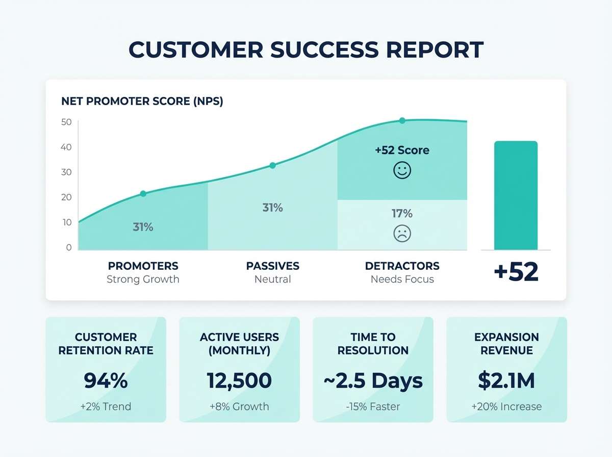
21) Glacier Aqua Clean
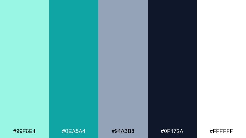
HEX: #99f6e4 #0ea5a4 #94a3b8 #0f172a #ffffff
Mood: airy, clean, reassuring
Best for: customer success reports and NPS charts
Airy and reassuring, like clean water and soft fog with a confident dark headline. Use aqua for gentle fills and teal for the main trend line so results feel positive and calm. The slate tone is perfect for secondary annotations and small legends. Tip: keep the darkest color for headings only, and let the cool greens carry the charts.
Image example of glacier aqua clean generated using media.io
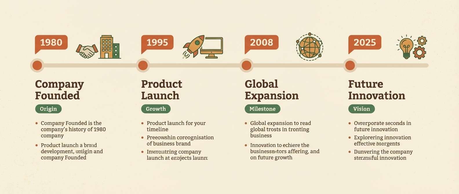
22) Warm Earthy Timeline
HEX: #7c2d12 #ea580c #fef3c7 #14532d #1f2937
Mood: warm, narrative, grounded
Best for: company history timelines and milestones
Warm and narrative, like vintage paper with burnt orange stamps and a deep green bookmark. Use orange for milestone dots and short date tags, then rely on the dark neutrals for text so the story reads smoothly. The forest green works well for category grouping or era labels. Tip: keep the cream background consistent across panels to avoid distracting jumps between sections.
Image example of warm earthy timeline generated using media.io
What Colors Go Well with Infographic?
The most reliable infographic combinations start with a neutral foundation (white, off-white, light gray) and a dark text color (navy or charcoal). This keeps labels readable and prevents charts from looking washed out on screens.
From there, pick 2–3 accent colors with clearly different brightness levels. Teal + green works well for “related” series, while a warm accent like amber or coral can be reserved for callouts, targets, and alerts.
If you need more categories, extend the palette by shifting saturation (soft vs vivid) rather than changing hue too often. It helps viewers recognize groups quickly without relying on legends.
How to Use a Infographic Color Palette in Real Designs
Assign roles before you design: one primary series color, one secondary series color, one highlight/alert, plus neutrals for background and typography. This prevents accidental “rainbow charts” where everything competes.
Keep contrast consistent across components—titles, axis labels, tooltips, and data labels. If your palette includes bright yellow or lime, use it as a badge, stroke, or marker instead of a large fill behind text.
For presentations and print, test your palette at small sizes (legends and thin lines) and in grayscale. If two series look identical in grayscale, adjust lightness so comparisons remain clear.
Create Infographic Palette Visuals with AI
Want to preview how a palette feels in a dashboard, report spread, or social stat card? Generate quick mockups using the included prompts, then iterate on layout and contrast before you commit to final charts.
With Media.io, you can turn a text prompt into infographic-style visuals in minutes—useful for concepting themes, matching brand vibes, or exploring multiple color directions for the same dataset.
Start with one palette above, keep the prompt structure, and swap only the colors or layout type (timeline, KPI cards, donut chart) to stay consistent.
Infographic Color Palette FAQs
-
How many colors should an infographic palette include?
For most charts and layouts, 5 colors is a sweet spot: 1–2 neutrals (background + text) and 2–3 accents (primary series, secondary series, highlight). If you have many categories, reuse accents with tints/shades instead of adding random new hues. -
What’s the best text color for infographic designs?
Deep navy or charcoal usually reads cleaner than pure black, especially on modern UI-style infographics. Use the darkest palette color for headings and axis labels, and reserve pure white for dark-mode slides or dark backgrounds. -
How do I choose highlight colors for key numbers?
Pick one warm, attention-grabbing accent (amber, coral, orange, or pink) and use it only for callouts, peaks, or alerts. Keeping highlights rare makes them feel meaningful and prevents “everything is important” design. -
Are teal and turquoise good for data visualization colors?
Yes—teal/turquoise are popular because they feel modern, trustworthy, and they contrast well with navy/charcoal text. They also work across UI, presentation, and print when you keep backgrounds light and labels dark. -
How can I make multi-series charts easier to read?
Separate series by lightness as well as hue. For example, make one series vivid (teal) and another softer (slate or lilac), then add a distinct highlight color for annotations rather than adding more series colors. -
Do infographic palettes work for print reports too?
They can, as long as you watch contrast and avoid ultra-neon colors that may shift in CMYK printing. Test a proof and consider using slightly muted versions of neon accents for large areas, keeping vivid tones for badges or markers. -
Can I generate infographic palette mockups with AI?
Yes. Use a consistent prompt style (dashboard, poster, report spread, timeline) and specify your palette roles (background, headings, chart series, warning tags). Media.io Text to Image makes it easy to iterate quickly before finalizing your design system.


