

An impressionist color palette is all about light, atmosphere, and soft transitions—like brushstrokes you can almost feel. These schemes blend painterly pastels with grounded neutrals, making them easy to use in modern UI, branding, and print.
Below are 20+ impressionist-inspired color palette ideas with HEX codes, plus practical use tips and AI prompts to generate matching visuals fast.
In this article
- Why Impressionist Palettes Work So Well
-
- sunlit studio
- garden mist
- riverbank pastels
- cafe terrace
- dusk on the water
- meadow brushstrokes
- pearl and ochre
- lilac haze
- coastal canvas
- apricot glow
- rainy boulevard
- antique linen
- bluebell shadow
- poppy and sage
- orchard morning
- clay and sky
- lantern light
- misty harbor
- soft prism
- museum wall neutrals
- seine afternoon
- buttercup sketch
- What Colors Go Well with Impressionist?
- How to Use a Impressionist Color Palette in Real Designs
- Create Impressionist Palette Visuals with AI
Why Impressionist Palettes Work So Well
Impressionist palettes feel natural because they mimic how we perceive light in real life: highlights are warmer, shadows are cooler, and edges are rarely pure black. That built-in realism helps designs look premium and “lived-in” without extra effects.
They also balance contrast gently. Instead of harsh primaries, you get muted warms, softened cools, and a dependable dark neutral for type—perfect for readability across web, branding, and editorial layouts.
Most importantly, impressionist color schemes create mood fast. With only five colors, you can communicate calm, nostalgia, romance, or freshness—while still leaving space for photography, illustration, or product focus.
20+ Impressionist Color Palette Ideas (with HEX Codes)
1) Sunlit Studio
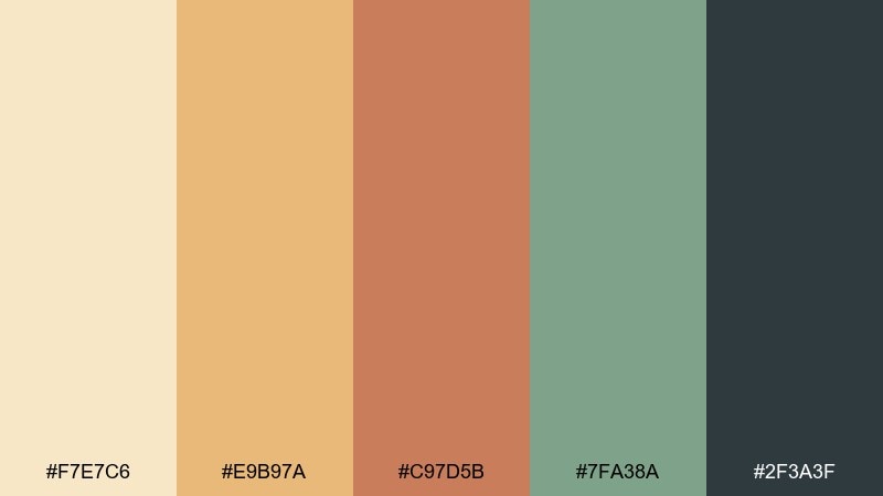
HEX: #F7E7C6 #E9B97A #C97D5B #7FA38A #2F3A3F
Mood: warm, optimistic, artisanal
Best for: brand identity for a handmade goods shop
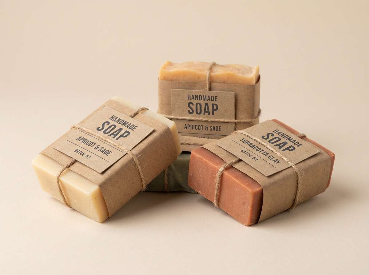
Warm morning light and wood tones give this set an upbeat, crafted feel. Use the creamy beige as the base, then let apricot and terracotta carry headlines and key accents. Sage works well for secondary buttons or pattern fills, while the deep charcoal keeps everything legible. Tip: keep charcoal for type only and let the warm colors do the storytelling.
Image example of sunlit studio generated using media.io
Media.io is an online AI studio for creating and editing video, image, and audio in your browser.

2) Garden Mist
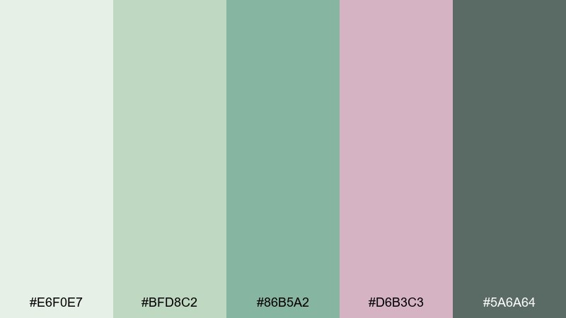
HEX: #E6F0E7 #BFD8C2 #86B5A2 #D6B3C3 #5A6A64
Mood: fresh, dewy, calming
Best for: watercolor botanical print
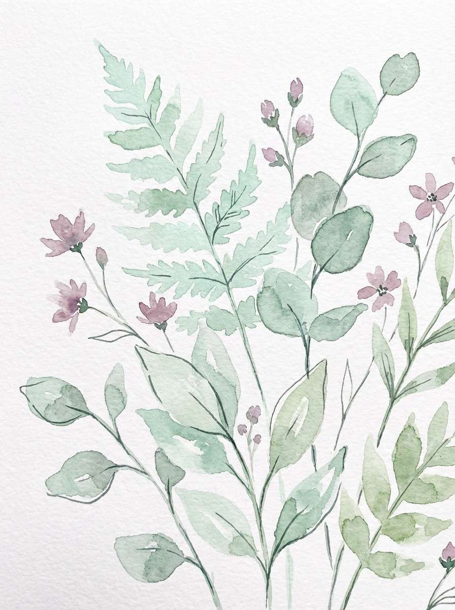
Fresh greens and a blush tint evoke early fog drifting over a garden bed. Let the pale minty white act as paper, with soft greens building stems and leaves. The dusty mauve adds a gentle floral pop without turning sugary. Tip: reserve the darkest green-gray for fine linework so the watercolor wash stays airy.
Image example of garden mist generated using media.io
3) Riverbank Pastels
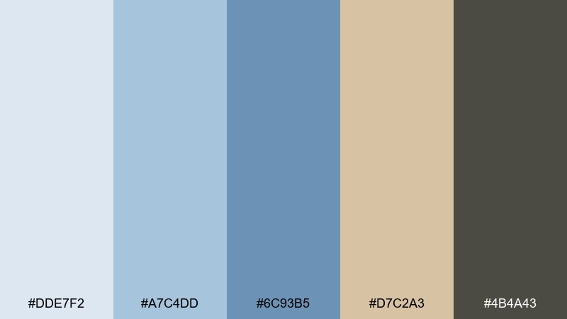
HEX: #DDE7F2 #A7C4DD #6C93B5 #D7C2A3 #4B4A43
Mood: quiet, reflective, breezy
Best for: website hero banner for a travel blog
Cool sky blues and sandy beige feel like a calm pause by the water. Use the light blue as the background gradient and bring in denim blue for headline emphasis. The warm sand keeps the layout from feeling too cold, especially in icon fills or subtle dividers. Tip: pair with generous whitespace so the blues read like atmosphere, not blocks.
Image example of riverbank pastels generated using media.io

4) Cafe Terrace
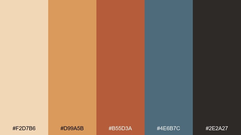
HEX: #F2D7B6 #D99A5B #B55D3A #4E6B7C #2E2A27
Mood: lively, cozy, urban
Best for: poster for a neighborhood coffee event
Toasty caramel and brick red bring the bustle of a sidewalk cafe to life. Use the pale cream as your poster field, then build hierarchy with burnt orange for titles and brick for highlights. The steel blue adds a smart counterbalance for secondary text blocks or graphic shapes. Tip: keep the darkest espresso tone for small type and logos so the warm colors stay inviting.
Image example of cafe terrace generated using media.io
5) Dusk on the Water
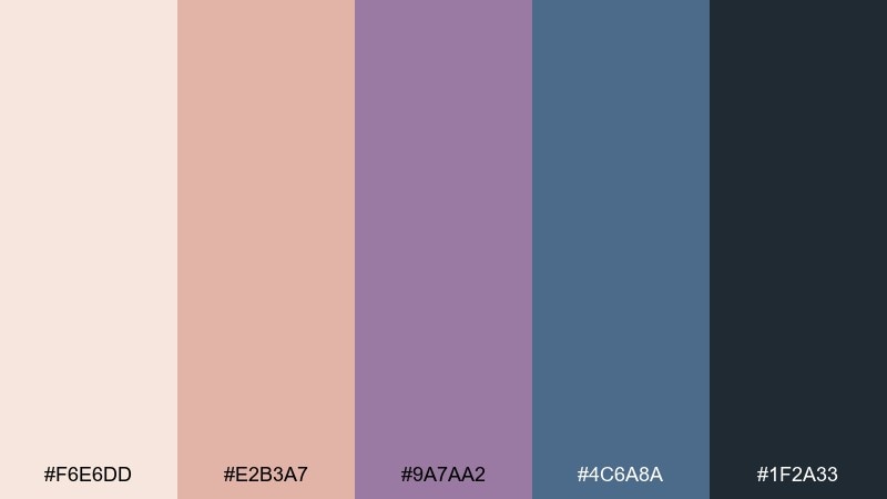
HEX: #F6E6DD #E2B3A7 #9A7AA2 #4C6A8A #1F2A33
Mood: dreamy, romantic, cinematic
Best for: album cover artwork
Dusty rose and violet drift into deep blue like twilight reflections. Use the pale blush as a soft halo behind the title, then layer mauve and violet for depth in shapes and textures. Navy anchors the composition and keeps the mood cinematic rather than sweet. Tip: add grain or watercolor texture so the gradients feel hand-brushed instead of digital.
Image example of dusk on the water generated using media.io
6) Meadow Brushstrokes
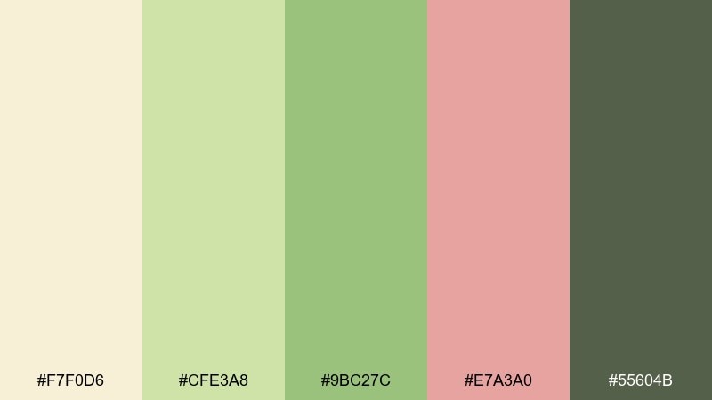
HEX: #F7F0D6 #CFE3A8 #9BC27C #E7A3A0 #55604B
Mood: playful, sunny, pastoral
Best for: spring social media promo for a farmers market
Sunny cream and meadow greens feel like quick brushstrokes across fresh grass. Let light butter serve as the canvas, then use leafy greens for badges, prices, and simple illustrations. The soft coral is perfect for calls to action and small decorative flourishes. Tip: keep coral to one or two elements per tile so the feed stays calm and readable.
Image example of meadow brushstrokes generated using media.io
7) Pearl and Ochre
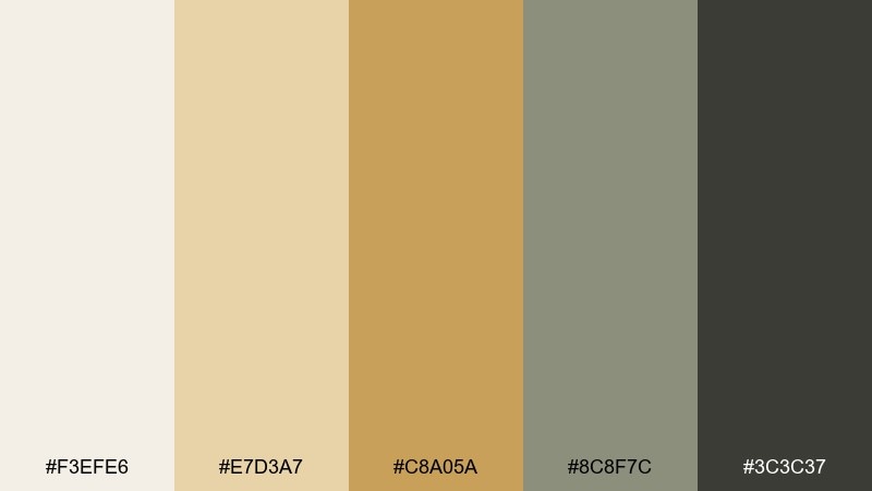
HEX: #F3EFE6 #E7D3A7 #C8A05A #8C8F7C #3C3C37
Mood: refined, gallery-like, timeless
Best for: editorial magazine layout
Pearly neutrals and mellow ochre read like aged paper under soft museum lights. This impressionist color palette works beautifully for long-form pages, where the warm off-white keeps fatigue low. Bring in ochre for section headers and pull quotes, then use the gray-green as a quiet support tone for rules and captions. Tip: keep body text in charcoal and limit ochre to consistent, repeatable components.
Image example of pearl and ochre generated using media.io
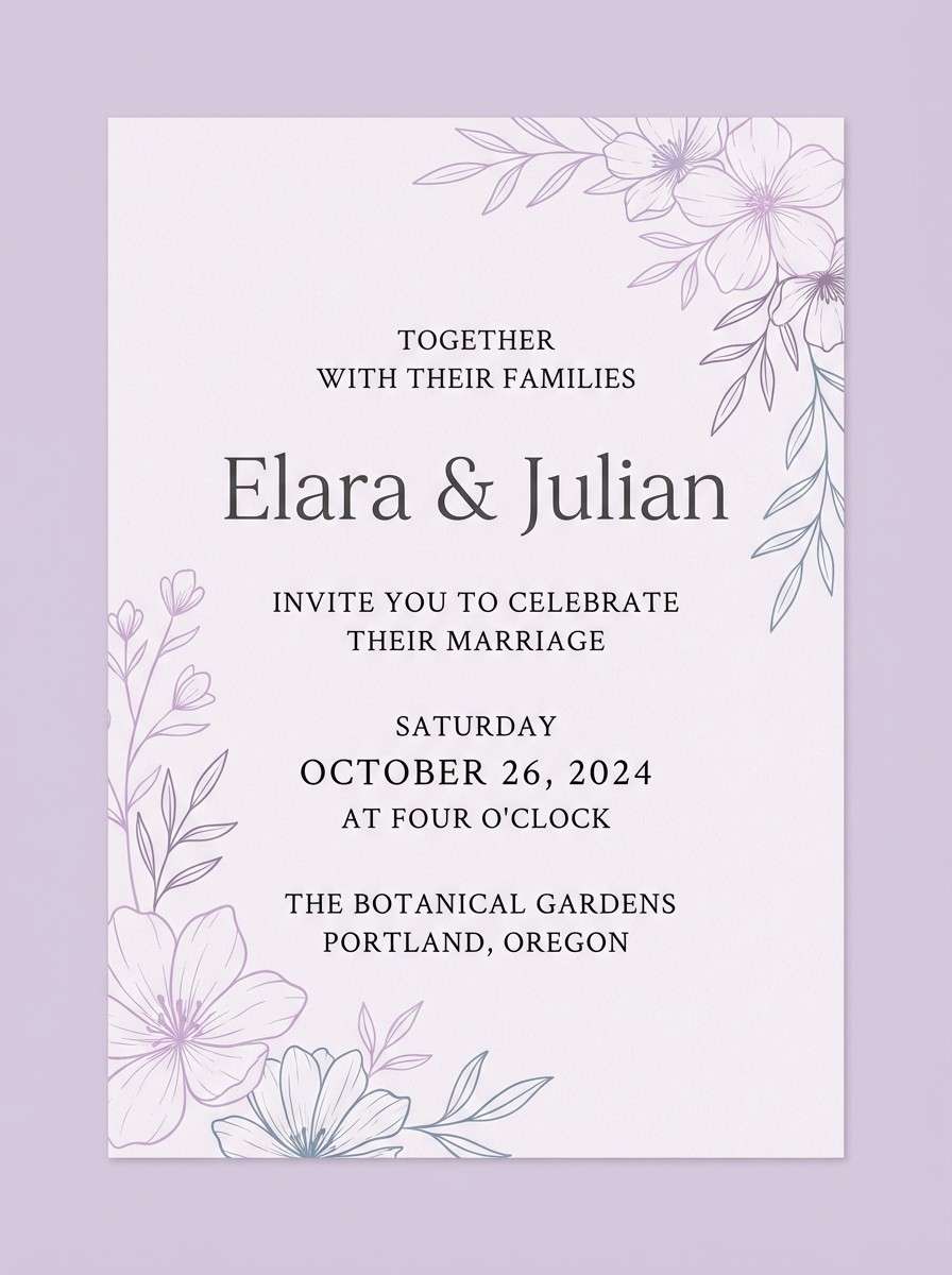
8) Lilac Haze
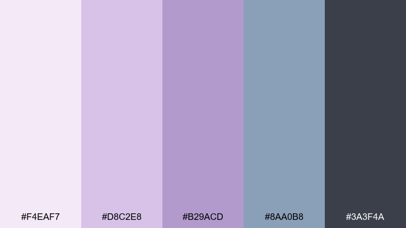
HEX: #F4EAF7 #D8C2E8 #B29ACD #8AA0B8 #3A3F4A
Mood: soft, airy, modern romantic
Best for: wedding invitation suite
A lilac haze and cool slate feel like petals pressed into paper. Use the palest lavender as the background, then let mid lilac carry names and key details in a refined serif. The blue-gray keeps the set contemporary and prevents the purples from turning too sugary. Tip: add a thin slate border to tie the whole suite together and improve contrast.
Image example of lilac haze generated using media.io
9) Coastal Canvas
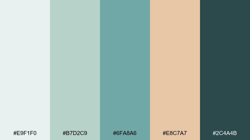
HEX: #E9F1F0 #B7D2C9 #6FA8A6 #E8C7A7 #2C4A4B
Mood: clean, breezy, seaside
Best for: spa website UI mockup
Sea-glass teal and sand beige feel clean and restorative. As an impressionist color combination, it shines when the lightest aqua is used for spacious sections and cards. Bring teal into icons and primary buttons, and use sand only as a soft accent so the interface stays cool and calm. Tip: keep button text dark and avoid pure black to maintain the gentle coastal vibe.
Image example of coastal canvas generated using media.io
10) Apricot Glow
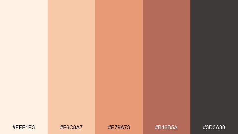
HEX: #FFF1E3 #F6C8A7 #E79A73 #B46B5A #3D3A38
Mood: friendly, warm, approachable
Best for: product ad for skincare
Apricot glow and soft browns feel like warm light on skin. Use the creamy peach as the background and keep the mid apricot as the hero tone for labels or a central shape. Deeper clay and cocoa build a premium look for text, seals, and shadows without going harsh. Tip: use a single bold apricot block behind the product name to make it pop at a glance.
Image example of apricot glow generated using media.io
11) Rainy Boulevard
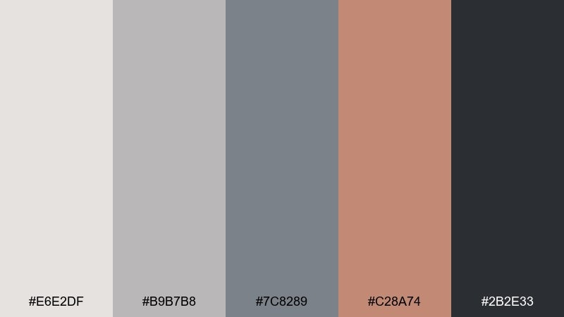
HEX: #E6E2DF #B9B7B8 #7C8289 #C28A74 #2B2E33
Mood: moody, urban, understated
Best for: mobile app onboarding screens
Soft grays and wet-asphalt blues feel like a city after rain, with a muted terracotta glow from streetlights. This impressionist color scheme is great for onboarding because the neutrals keep focus on content. Use terracotta sparingly for progress dots and primary actions to guide the eye. Tip: keep illustrations in monochrome gray-blue with only one terracotta highlight per screen.
Image example of rainy boulevard generated using media.io
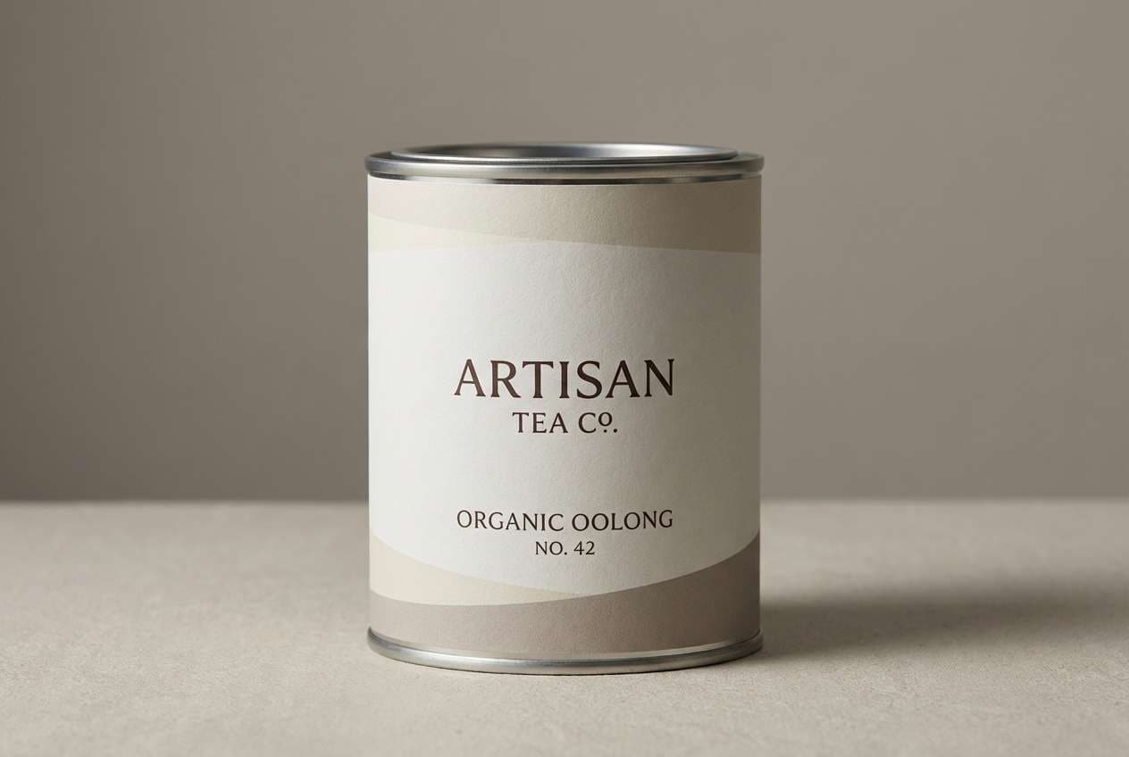
12) Antique Linen
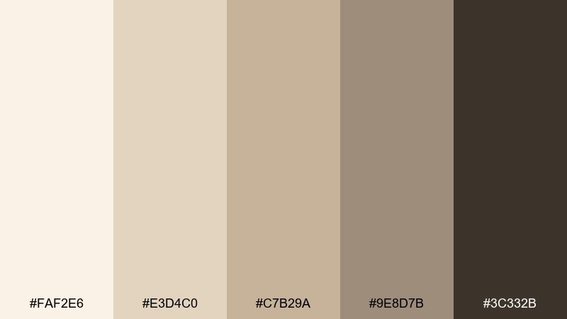
HEX: #FAF2E6 #E3D4C0 #C7B29A #9E8D7B #3C332B
Mood: cozy, heritage, minimal
Best for: packaging for artisan tea
Antique linen neutrals feel calm, tactile, and quietly premium. Use the light cream for the main panel and build depth with warm taupes for borders and secondary labels. The darkest brown grounds the brand mark and keeps small print crisp on matte stock. Tip: add subtle paper texture and avoid glossy finishes to preserve the vintage warmth.
Image example of antique linen generated using media.io
13) Bluebell Shadow
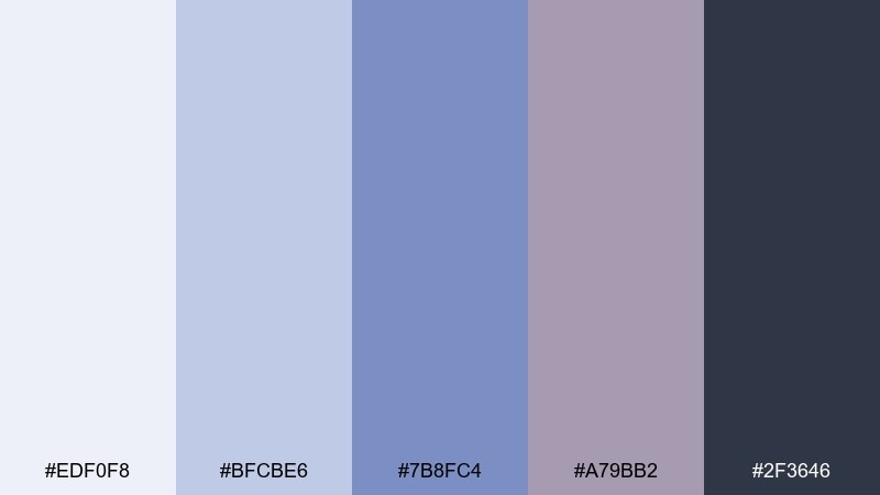
HEX: #EDF0F8 #BFCBE6 #7B8FC4 #A79BB2 #2F3646
Mood: cool, thoughtful, gentle
Best for: presentation slide deck theme
Powdery blues and muted violet feel like bluebells in shade. Use the palest blue for slide backgrounds and keep navy for titles and chart labels. The mid periwinkle is excellent for data highlights, while the mauve-gray adds variety in callouts. Tip: avoid using the darkest navy for large blocks, and instead lean on periwinkle to keep the deck soft.
Image example of bluebell shadow generated using media.io
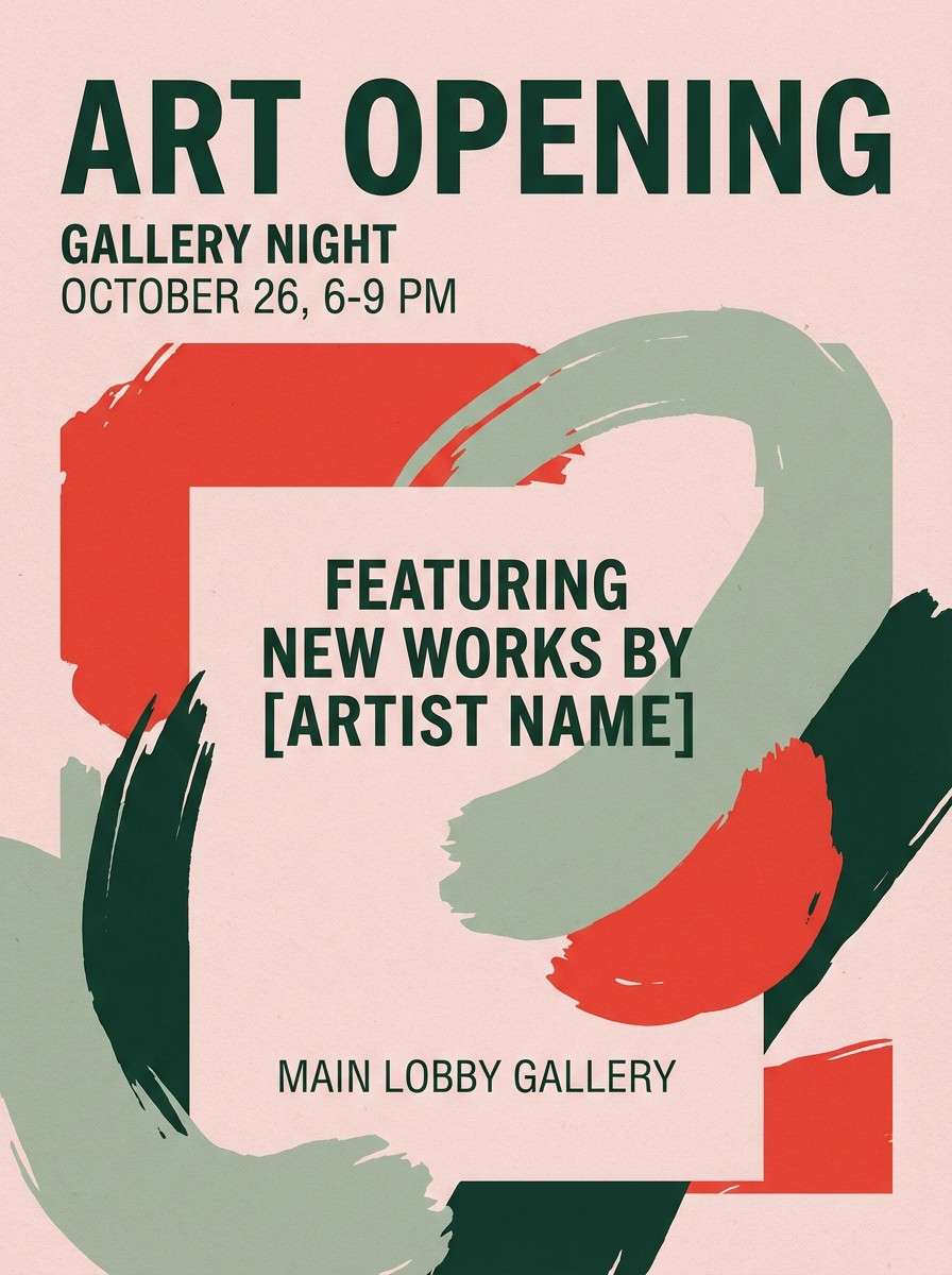
14) Poppy and Sage
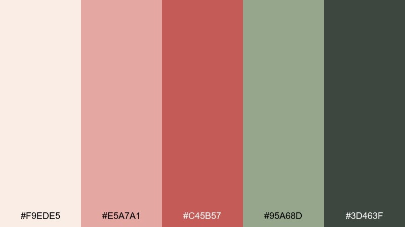
HEX: #F9EDE5 #E5A7A1 #C45B57 #95A68D #3D463F
Mood: bold, earthy, artistic
Best for: gallery flyer for an art opening
Poppy reds against sage green feel confident, expressive, and a little rebellious. This impressionist color combination is strongest when the blush base stays dominant and the red is used as a punchy accent. Sage keeps the layout grounded for details like date, venue, and sponsor marks. Tip: use the deep forest tone for body copy so the red can stay purely decorative and impactful.
Image example of poppy and sage generated using media.io
15) Orchard Morning
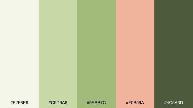
HEX: #F2F6E9 #C9D9A6 #9EBB7C #F0B59A #4C5A3D
Mood: fresh, wholesome, sunny
Best for: food blog recipe card template
Crisp greens with a peach accent feel like fruit trees in early light. Use the pale green-white for the card background, then set headings in the darker leaf tone for clarity. The peach works best for timers, ratings, or a single highlight label. Tip: keep photography borders and dividers in the soft mid green so the card reads cohesive even with different dishes.
Image example of orchard morning generated using media.io
16) Clay and Sky
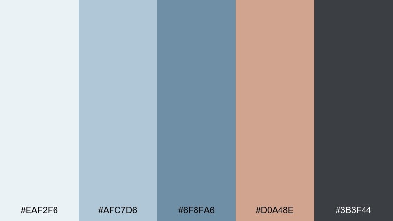
HEX: #EAF2F6 #AFC7D6 #6F8FA6 #D0A48E #3B3F44
Mood: balanced, modern, grounded
Best for: SaaS dashboard UI
Soft sky blues and warm clay feel stable without being corporate-cold. An impressionist color palette like this works well when the lightest blue becomes your main surface and the clay is reserved for alerts or key totals. Use the steel blue for charts and active navigation states. Tip: keep status colors within this set by tinting clay lighter or darker instead of adding bright reds.
Image example of clay and sky generated using media.io

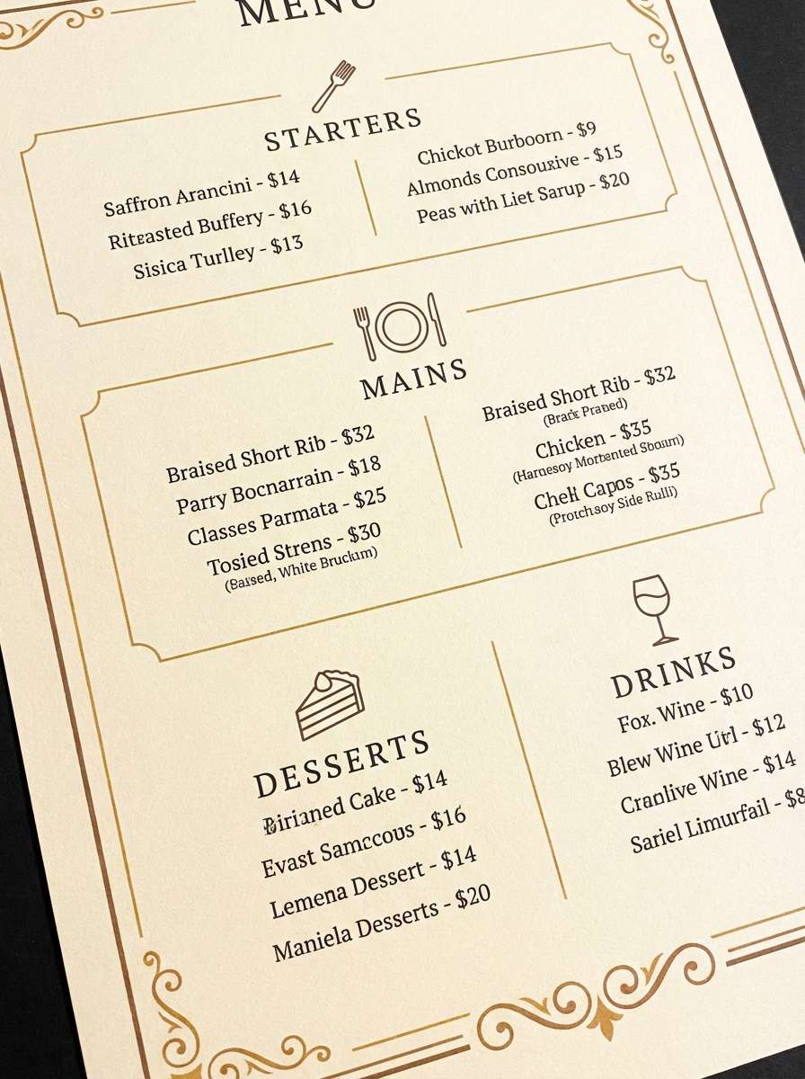
17) Lantern Light
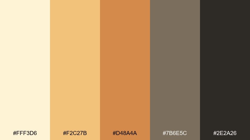
HEX: #FFF3D6 #F2C27B #D48A4A #7B6E5C #2E2A26
Mood: glowing, intimate, nostalgic
Best for: restaurant menu design
Lantern golds and warm browns feel like a cozy table by candlelight. Use the pale butter tone as the menu background and set section headers in amber for a welcoming hierarchy. The muted taupe is great for dividers and small notes, while the near-black keeps dish names sharp. Tip: avoid heavy blocks of amber and instead use thin rules and small icons to maintain a refined look.
Image example of lantern light generated using media.io
18) Misty Harbor
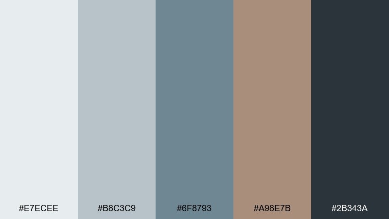
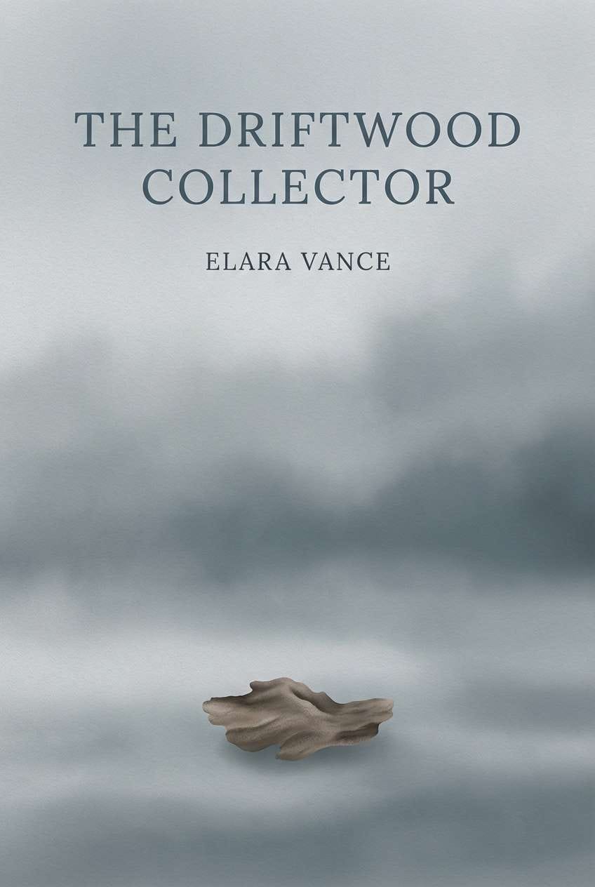
HEX: #E7ECEE #B8C3C9 #6F8793 #A98E7B #2B343A
Mood: cool, foggy, nautical
Best for: book cover for literary fiction
Foggy grays and muted blue feel like distant boats dissolving into mist. The warm driftwood brown adds a human, lived-in note that keeps the palette from turning sterile. Use the darkest slate for title contrast and the mid blue-gray for large shapes or gradients. Tip: add subtle texture like paper grain to echo the harbor haze without cluttering the cover.
Image example of misty harbor generated using media.io
19) Soft Prism
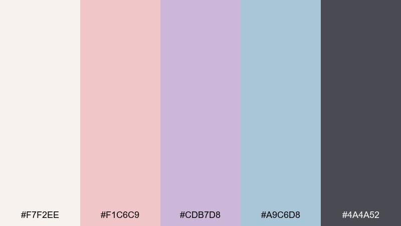
HEX: #F7F2EE #F1C6C9 #CDB7D8 #A9C6D8 #4A4A52
Mood: light, creative, contemporary
Best for: creative agency landing page
Blush, lilac, and airy blue feel like light passing through a frosted prism. Use the warm off-white for large sections, then alternate lilac and sky blue in cards to create rhythm. Blush makes a friendly highlight for buttons or small badges, while the deep gray keeps typography crisp. Tip: pick two dominant accents per page section so the color story feels intentional, not pastel chaos.
Image example of soft prism generated using media.io
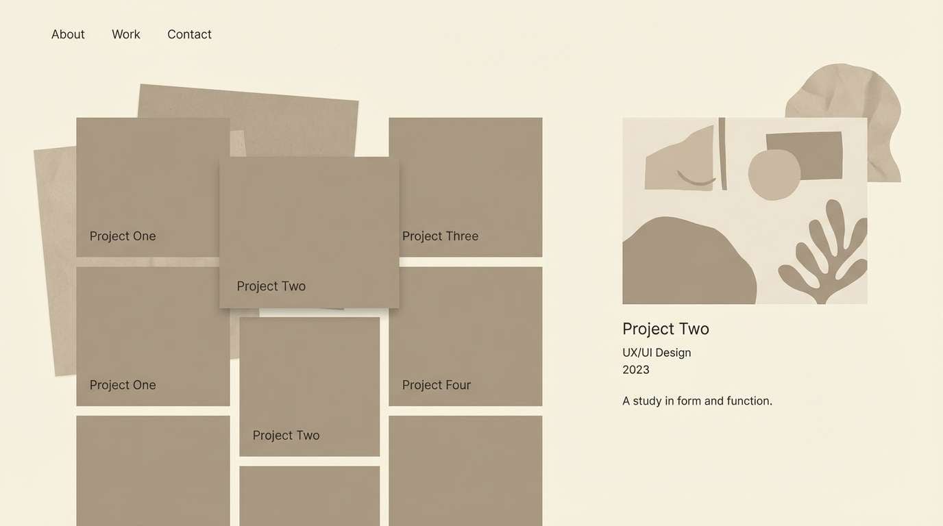
20) Museum Wall Neutrals
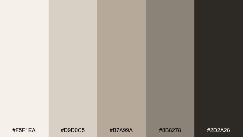
HEX: #F5F1EA #D9D0C5 #B7A99A #8B8278 #2D2A26
Mood: quiet, curated, sophisticated
Best for: portfolio website theme
Quiet museum neutrals feel curated and confident, like artwork against a calm wall. These impressionist color combinations are ideal when you want images to lead and UI to stay understated. Use the light cream for backgrounds, taupe for navigation, and charcoal for typography and active states. Tip: keep hover states subtle by shifting one step darker rather than introducing new colors.
Image example of museum wall neutrals generated using media.io
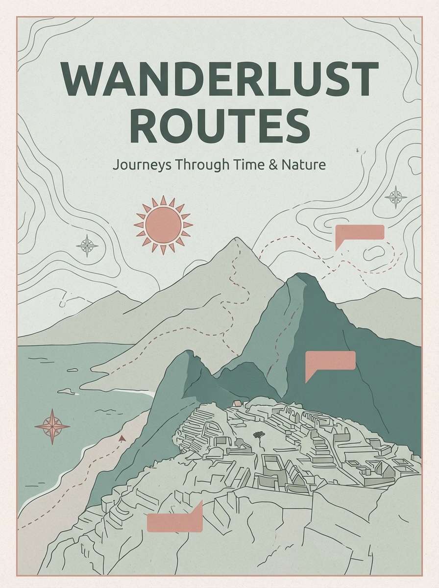
21) Seine Afternoon
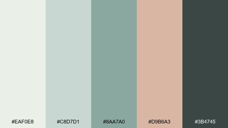
HEX: #EAF0E8 #C8D7D1 #8AA7A0 #D9B6A3 #3B4745
Mood: relaxed, elegant, European
Best for: travel brochure cover
Muted green-grays and warm stone pink suggest a slow afternoon by the river. Let the pale gray-green carry the background and keep the mid teal-green for titles and route markers. The rosy stone tone is best as a small accent for highlights like dates or featured neighborhoods. Tip: keep large photos framed with thin green-gray rules to avoid visual clutter.
Image example of seine afternoon generated using media.io
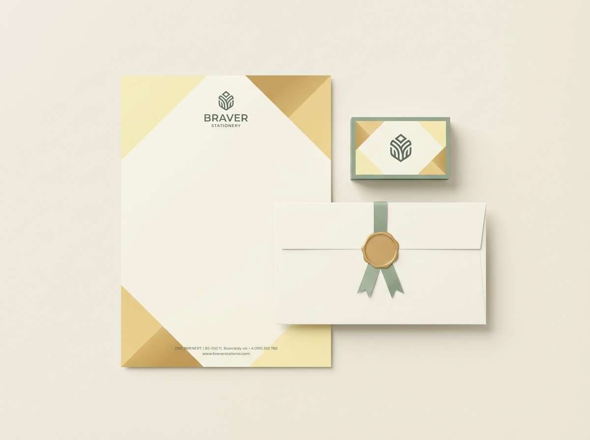
22) Buttercup Sketch
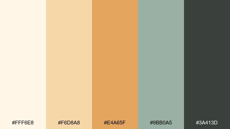
HEX: #FFF6E8 #F6D8A8 #E4A65F #9BB0A5 #3A413D
Mood: cheerful, handcrafted, light
Best for: stationery set for a small business
Buttercup yellow with soft sage feels like quick sketches in a sunny notebook. Use the creamy base for paper goods, and bring the golden tones into headers, stamps, or envelope liners. Sage keeps the look grounded and pairs nicely with simple line illustrations. Tip: limit the deepest green to the logo mark so the stationery stays bright and friendly.
Image example of buttercup sketch generated using media.io
What Colors Go Well with Impressionist?
Impressionist tones pair best with softened, nature-based colors: warm creams, dusty roses, sand beiges, sage greens, sea-glass teals, and misty blues. These hues share similar “low-to-mid saturation,” so they blend without fighting for attention.
To keep contrast usable for UI and print, add one reliable anchor—charcoal, deep slate, or espresso brown—then let the rest stay airy. This gives you the impressionist softness while still meeting practical readability needs.
If you want a slightly more modern edge, introduce one cool gray-blue or steel tone. It behaves like a shadow color in a painting and helps the palette feel structured instead of purely pastel.
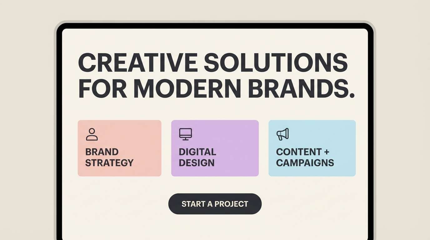
How to Use a Impressionist Color Palette in Real Designs
Start with a “canvas color” (usually the lightest cream, blush, or pale blue) for backgrounds and large surfaces. Then pick one mid-tone for primary components (buttons, headings, section blocks), and reserve the boldest warm accent for small, repeatable moments like badges, highlights, or icons.
In branding, impressionist palettes shine with tactile materials: matte paper, subtle grain, watercolor textures, or soft gradients. Keep the dark neutral for typography and logos so the rest can stay painterly without sacrificing clarity.
For print, test your lightest tones with real-world ink or proofing—soft colors can wash out. Slightly deepen the mid-tones (not the highlights) to preserve that impressionist glow while ensuring elements still separate cleanly.
Create Impressionist Palette Visuals with AI
If you want your palette to feel consistent across posters, UI mockups, packaging, and covers, generating a few matching visuals is the fastest way to validate the mood. With Media.io, you can turn a short prompt into on-style images in minutes.
Reuse the prompts above and simply swap the subject (e.g., “menu,” “hero banner,” “album cover”) while keeping the same lighting and texture notes. This helps your impressionist color palette stay cohesive across formats.
Once you have a few AI outputs you like, sample colors, refine contrast for text, and lock a small set of reusable components (buttons, labels, dividers) so your design system remains calm and painterly.
Impressionist Color Palette FAQs
-
What is an impressionist color palette?
An impressionist color palette uses soft, light-driven colors—often warm highlights, cool shadows, and muted mid-tones—to recreate a painterly, atmospheric look. It typically includes gentle pastels plus one dark neutral for contrast. -
Are impressionist color schemes good for websites and UI?
Yes, as long as you keep one deep neutral (charcoal/slate/espresso) for text and key UI states. Use the lighter hues for surfaces and spacing so the interface feels airy rather than low-contrast. -
How do I keep an impressionist palette from looking “too pastel”?
Add a grounded neutral (deep gray, dark green-gray, or brown) and a slightly desaturated cool tone (steel blue, slate). Limit bright accents and rely on texture (grain, paper, watercolor) for richness instead of saturation. -
What’s the best background color for an impressionist design?
Most impressionist designs work best on warm off-white, pale cream, blush, or misty blue backgrounds. These act like a “canvas,” making accents feel like layered paint rather than flat blocks. -
How can I use these HEX codes for print projects?
Convert HEX to CMYK or spot colors, then run a proof—soft tones can shift when printed. If colors look washed out, deepen the mid-tones slightly while keeping the highlights light to preserve the impressionist glow. -
Which impressionist palette is best for branding?
For approachable brands, try warm sets like Sunlit Studio or Apricot Glow. For premium/editorial brands, Pearl and Ochre or Museum Wall Neutrals are strong choices because they’re calm, readable, and timeless. -
Can Media.io generate images that match a specific palette?
Yes. Use a prompt that lists your key colors (or describes them clearly) along with lighting and texture cues (e.g., “soft diffused light,” “paper grain,” “watercolor wash”). Generate several variations, then pick outputs that best match your intended contrast and mood.
Next: Tundra Color Palette


