

A graveyard color palette is all about moody depth: charcoals, mossy greens, dusty purples, and bone-like neutrals that feel cinematic yet surprisingly versatile.
Below are 20+ graveyard-inspired color combinations with HEX codes, plus practical tips for contrast, accents, and how to generate matching visuals with AI.
In this article
Why Graveyard Palettes Work So Well
Graveyard palettes balance mystery with usability. They rely on low-saturation colors (charcoal, stone, moss, fog) that feel atmospheric without overwhelming a layout.
Because the hues are muted, they’re easy to layer: dark anchors for headers and type, mid-tones for sections, and pale “bone” neutrals for breathing room and readability.
They also pair naturally with texture—grain, paper, worn metal, marble, or misty gradients—so even simple designs can look premium and intentional.
20+ Graveyard Color Palette Ideas (with HEX Codes)
1) Moonlit Moss
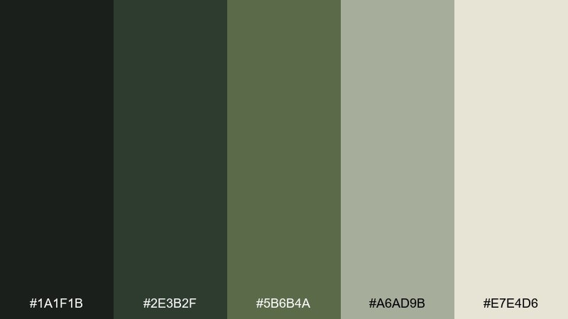
HEX: #1A1F1B #2E3B2F #5B6B4A #A6AD9B #E7E4D6
Mood: misty, earthy, calm
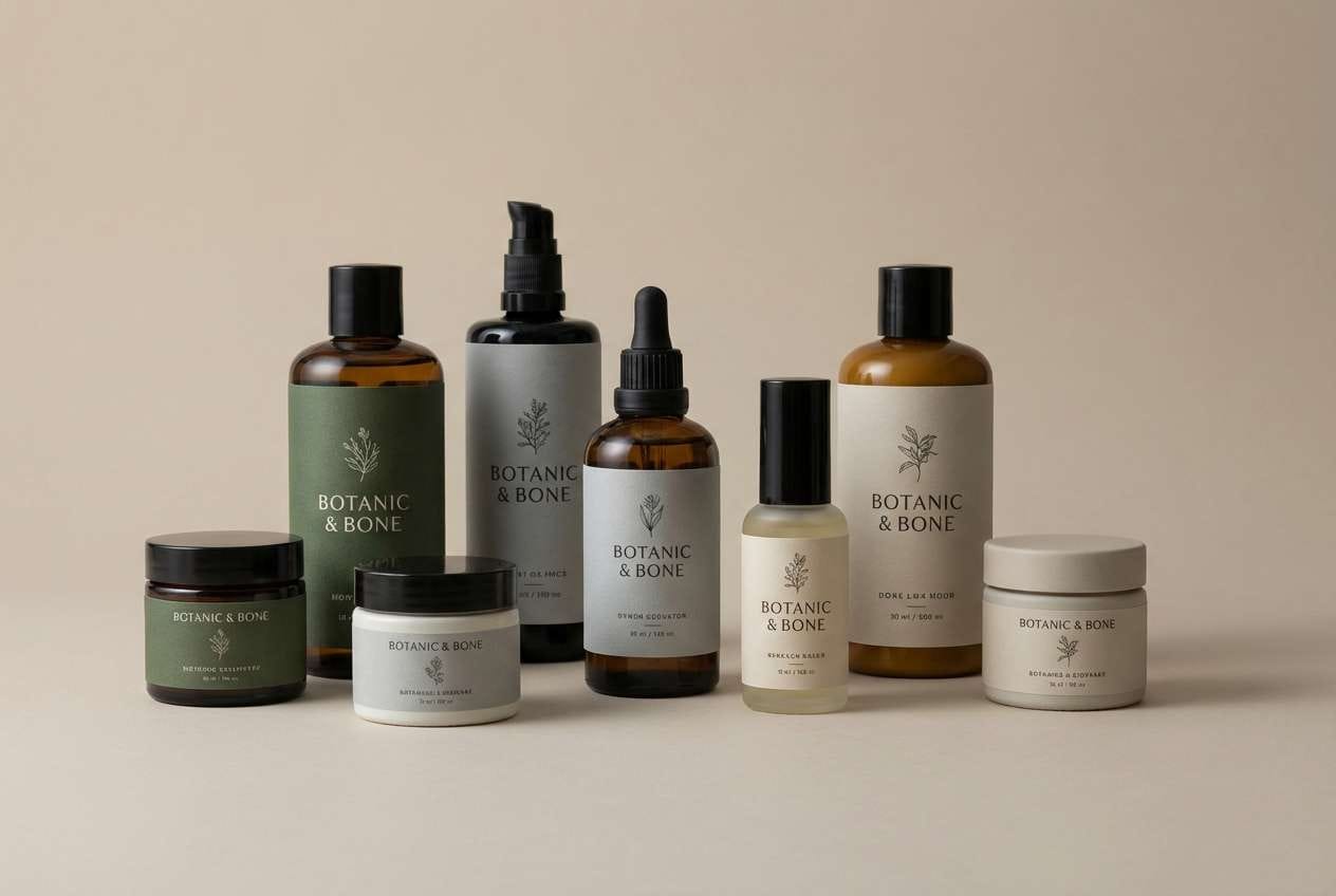
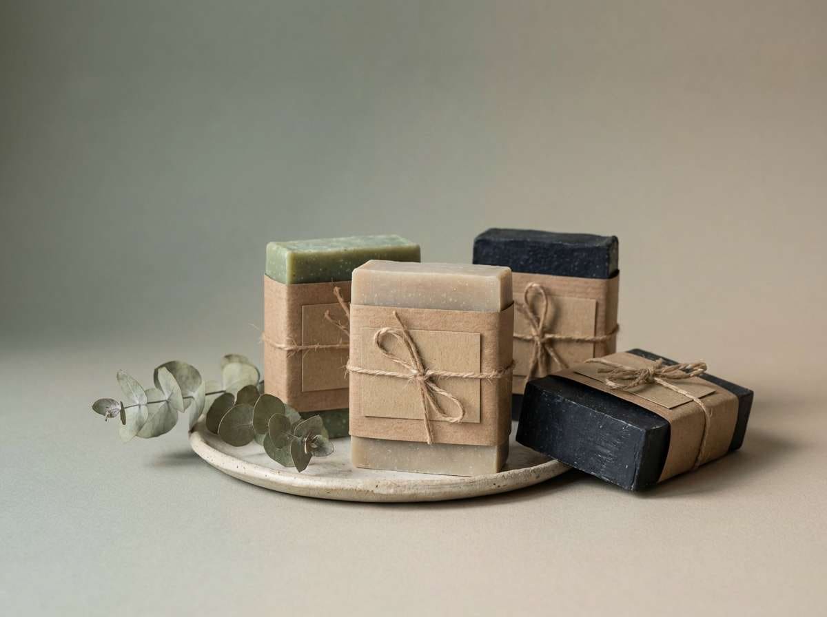
Best for: nature-forward branding and skincare packaging
Misty moonlight over damp stone and mossy paths comes to mind, with deep greens softened by foggy neutrals. Use the darker tones for logos and type, then let the pale bone shade open up negative space. Pair it with uncoated paper textures or subtle grain for a grounded feel. Usage tip: keep the lightest color as the dominant background so the greens read fresh, not murky.
Image example of moonlit moss generated using media.io
Media.io is an online AI studio for creating and editing video, image, and audio in your browser.

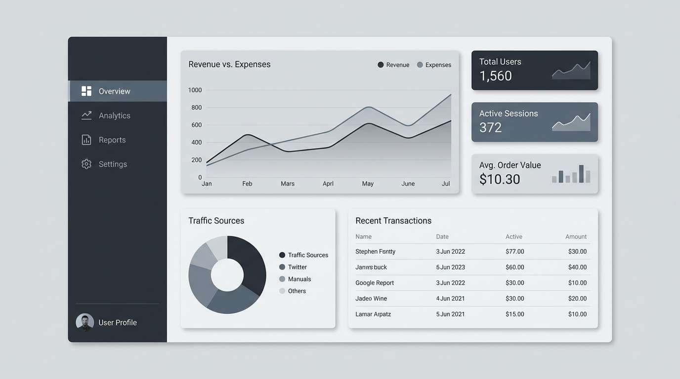
2) Tombstone Fog
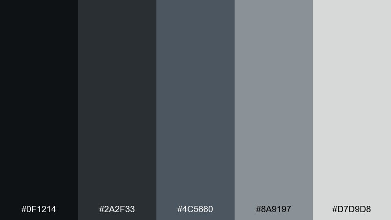
HEX: #0F1214 #2A2F33 #4C5660 #8A9197 #D7D9D8
Mood: cool, quiet, cinematic
Best for: clean UI dashboards and data-heavy screens
Cold fog rolling between weathered markers feels modern here, built from layered charcoals and soft steel grays. It works best when you push contrast: dark headers, mid-tone panels, and a light surface for cards. Pair with a single bright accent color only for alerts, not decoration. Usage tip: reserve the lightest gray for key metrics to guide the eye.
Image example of tombstone fog generated using media.io
3) Iron Gate
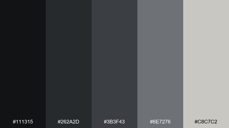
HEX: #111315 #262A2D #3B3F43 #6E7276 #C8C7C2
Mood: industrial, restrained, bold
Best for: modern logo systems and monochrome brand kits
Heavy wrought iron and shadowed stone create a tough, minimal atmosphere that still feels premium. Use the near-black for marks and the mid-grays for flexible backgrounds across print and web. Pair with a warm metallic foil or spot varnish when you need a luxe twist. Usage tip: keep gradients subtle so the palette stays sharp and architectural.
Image example of iron gate generated using media.io
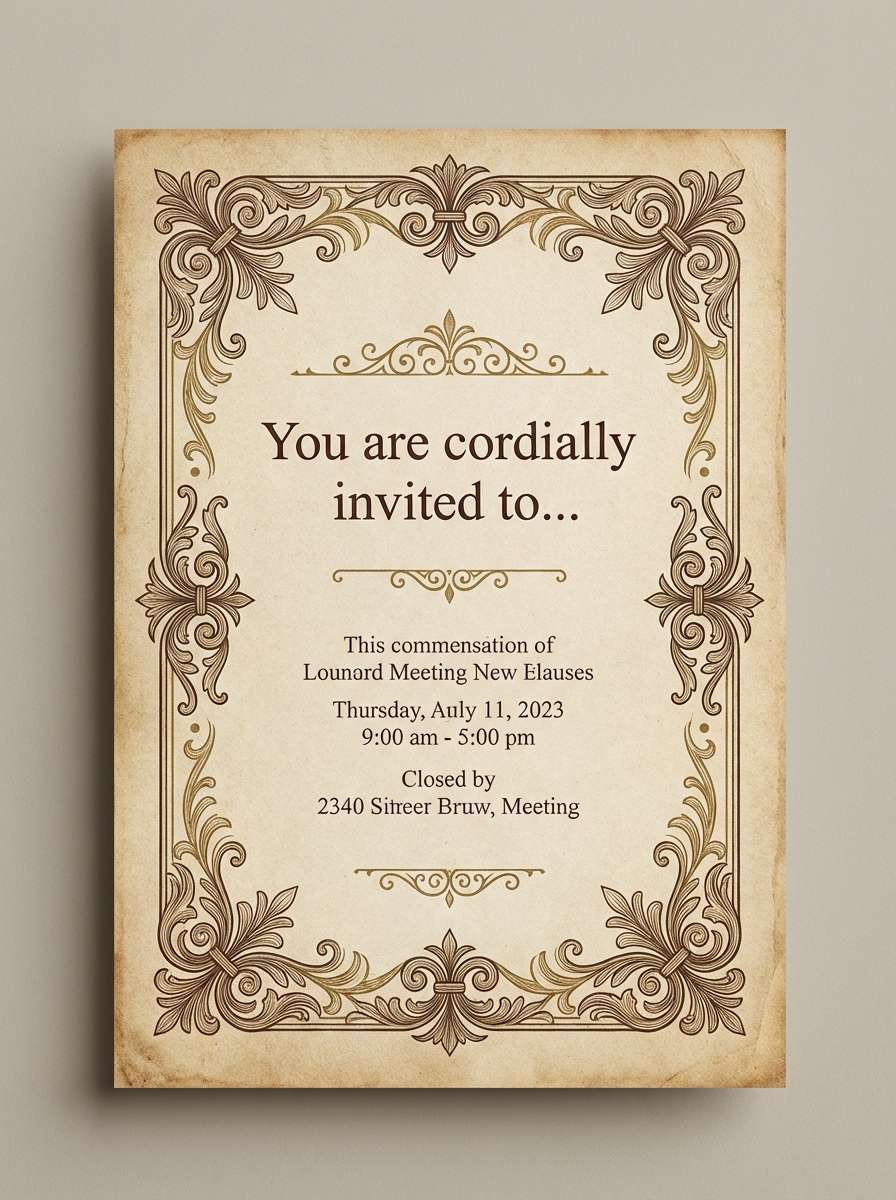
4) Candle Wax
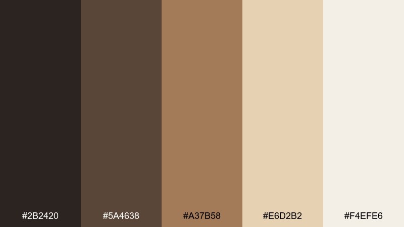
HEX: #2B2420 #5A4638 #A37B58 #E6D2B2 #F4EFE6
Mood: warm, antique, intimate
Best for: invitation suites and vintage-style flyers
Soft candlelight on old parchment brings warmth to a scene that could otherwise feel too cold. As a graveyard color scheme, it shines on invites, menus, and posters where you want history and romance. Pair the deep brown with the waxy creams, then add the coppery mid-tone for borders and icons. Usage tip: print on textured stock to make the light shades feel truly luminous.
Image example of candle wax generated using media.io
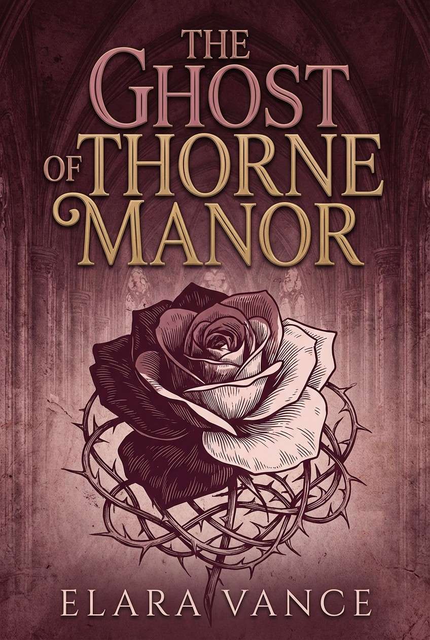
5) Wilted Rose
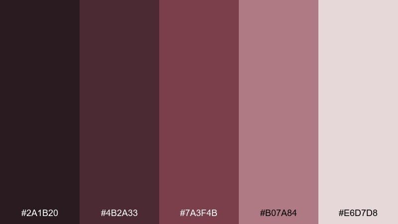
HEX: #2A1B20 #4B2A33 #7A3F4B #B07A84 #E6D7D8
Mood: romantic, dusty, dramatic
Best for: book covers and album artwork
Faded petals and dried bouquets give this mix a poetic, slightly haunted softness. The deep wine shades are ideal for title type, while the blushy neutral keeps layouts from feeling too heavy. Pair with minimal line art or a single botanical motif for a clean, contemporary edge. Usage tip: limit the mid-rose tone to highlights so the darks stay in control.
Image example of wilted rose generated using media.io
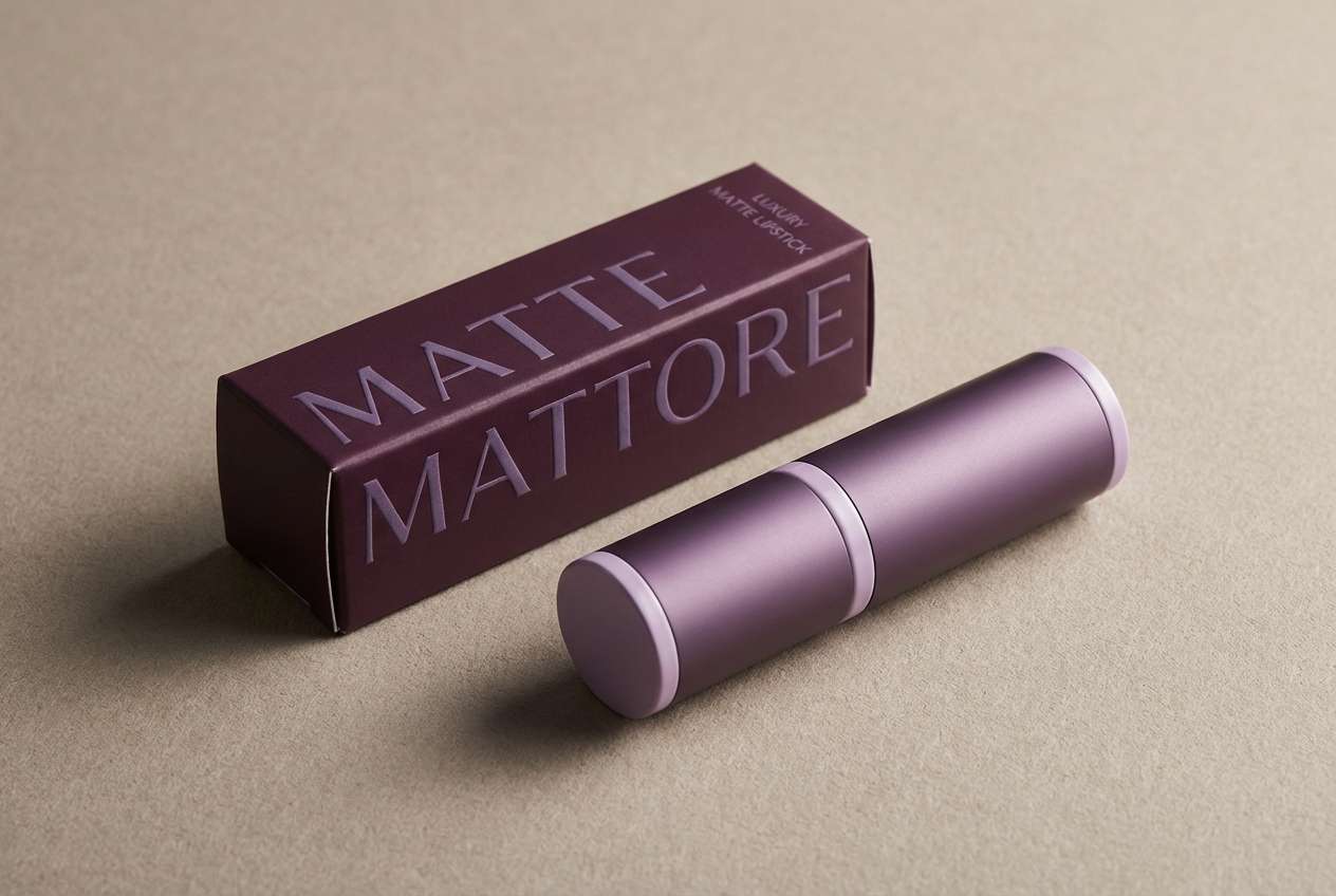
6) Raven Plum
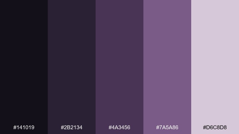
HEX: #141019 #2B2134 #4A3456 #7A5A86 #D6C8D8
Mood: mysterious, luxe, nocturnal
Best for: cosmetics branding and nightlife posters
Dark feathers and velvet curtains come through in these inky purples and soft lavender haze. Use the near-black plum for background blocks, then set type in the pale lilac for crisp readability. Pair with subtle metallic accents like silver or gunmetal to keep it high-end. Usage tip: add generous spacing so the deep tones feel elegant, not crowded.
Image example of raven plum generated using media.io
7) Lichen Stone
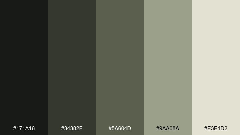
HEX: #171A16 #34382F #5A604D #9AA08A #E3E1D2
Mood: organic, weathered, balanced
Best for: outdoor brands and eco product labels
Old limestone flecked with lichen feels steady and understated, with greens that read natural instead of loud. Use the pale stone as your base color, then build hierarchy with the darker mossy grays. Pair with kraft textures, woodgrain, or simple botanical illustrations. Usage tip: keep saturation low in photos so the palette stays cohesive across print runs.
Image example of lichen stone generated using media.io
8) Crypt Copper
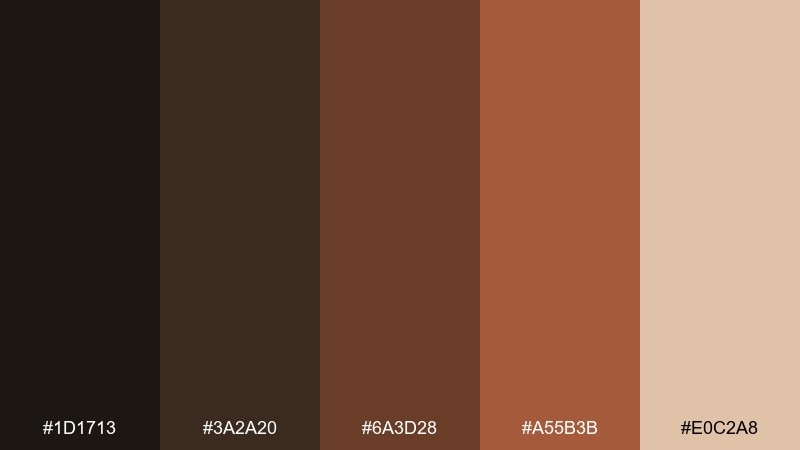
HEX: #1D1713 #3A2A20 #6A3D28 #A55B3B #E0C2A8
Mood: rustic, aged, fiery
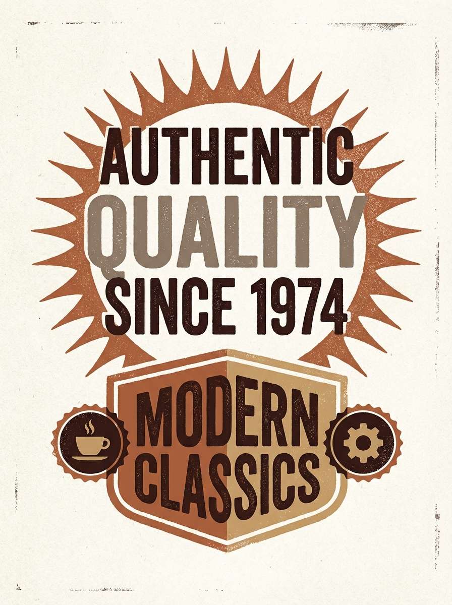
Best for: whiskey labels and retro poster design
Rust on old fixtures and torchlight warmth give this set a bold, timeworn character. For a striking graveyard color combination, let the darkest espresso shade anchor the layout and use copper as the attention grabber. Pair with condensed typography and simple stamp-like graphics for instant vintage energy. Usage tip: avoid pure black and let the deep brown do the heavy lifting for a softer, richer look.
Image example of crypt copper generated using media.io
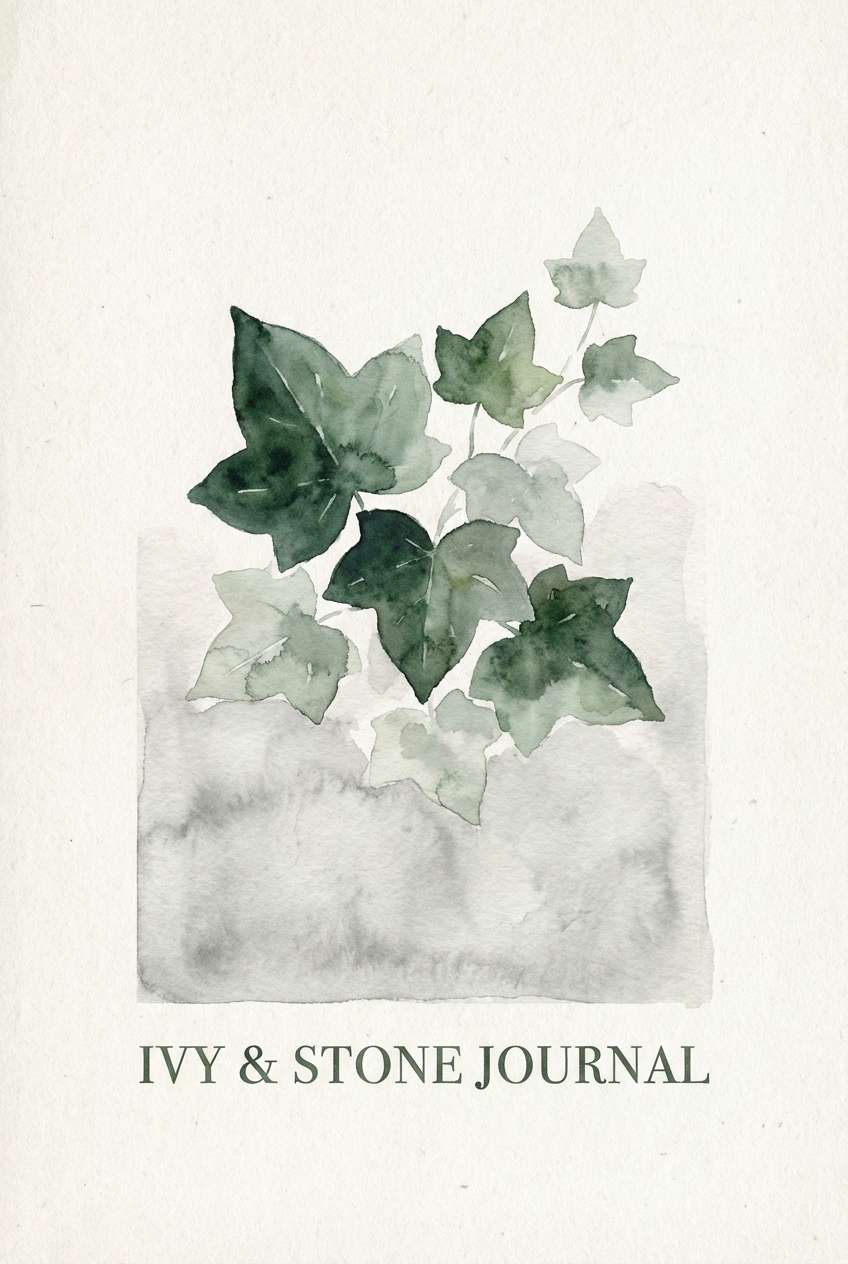
9) Evening Ivy
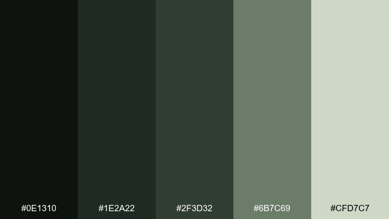
HEX: #0E1310 #1E2A22 #2F3D32 #6B7C69 #CFD7C7
Mood: shadowy, botanical, soothing
Best for: watercolor illustrations and journal covers
Twilight vines climbing over stone feel calm and natural, with deep greens softened by misty sage. Use the darkest green for outlines and titles, then let the pale gray-green carry backgrounds and paper areas. Pair with watercolor washes or pencil textures to keep the mood gentle. Usage tip: choose one mid-green as your main accent and keep the rest supportive.
Image example of evening ivy generated using media.io
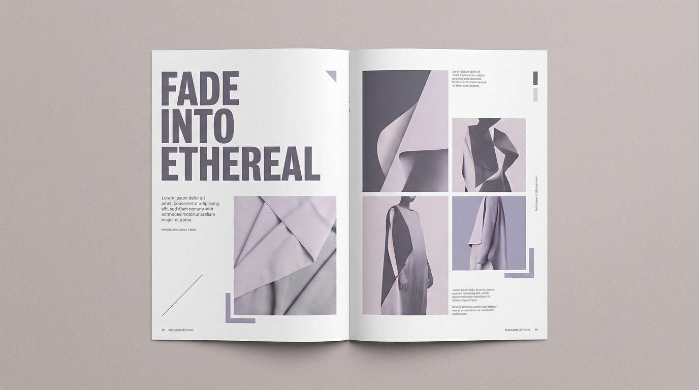
10) Ashen Lilac
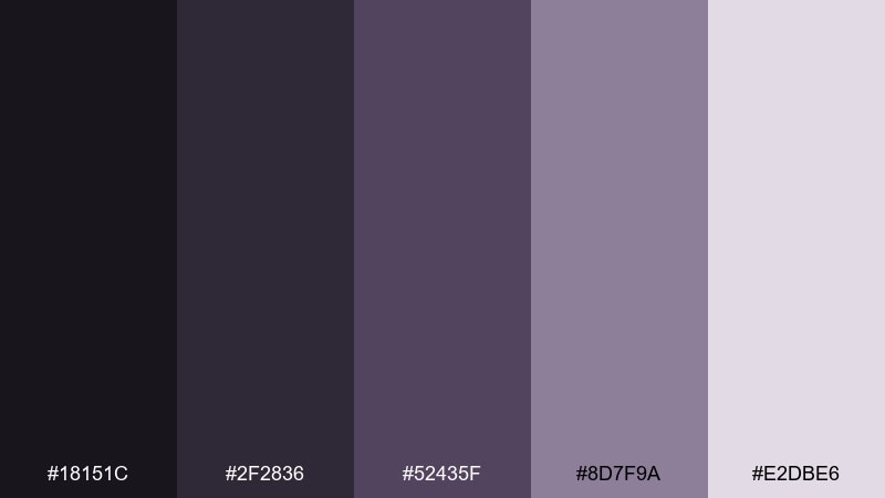
HEX: #18151C #2F2836 #52435F #8D7F9A #E2DBE6
Mood: dreamy, smoky, modern
Best for: editorial layouts and fashion lookbooks
Smoky lilac tones evoke cold air and distant bells, equal parts soft and sophisticated. Use the deep violet-grays for headlines and the pale lavender as breathing room around images. Pair with monochrome photography and minimal grid systems for a high-fashion finish. Usage tip: keep body text on the lightest shade to maintain readability.
Image example of ashen lilac generated using media.io
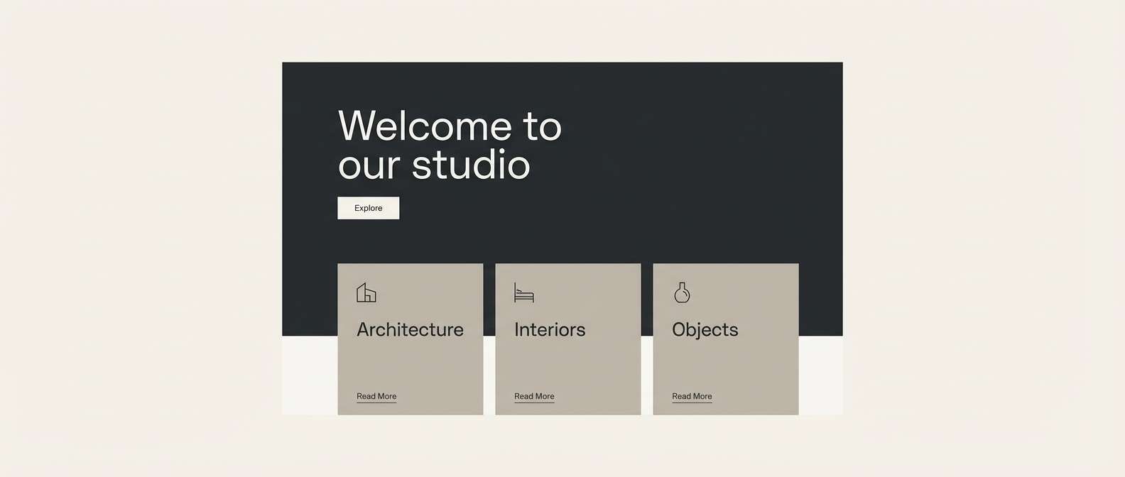
11) Bone and Dust
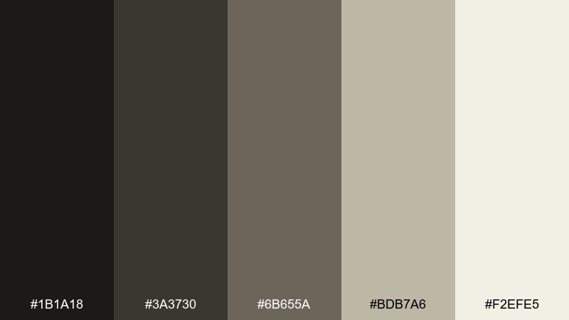
HEX: #1B1A18 #3A3730 #6B655A #BDB7A6 #F2EFE5
Mood: neutral, gritty, timeless
Best for: website backgrounds and minimalist branding
Dry dust on bone-white stone feels classic and understated, built for designs that need mood without strong color. This graveyard color palette excels in web layouts, where warm grays can separate sections without visual noise. Pair with one muted accent like olive or burgundy when you need a call-to-action. Usage tip: use the lightest shade as a base and introduce darker tones only for structure and type.
Image example of bone and dust generated using media.io
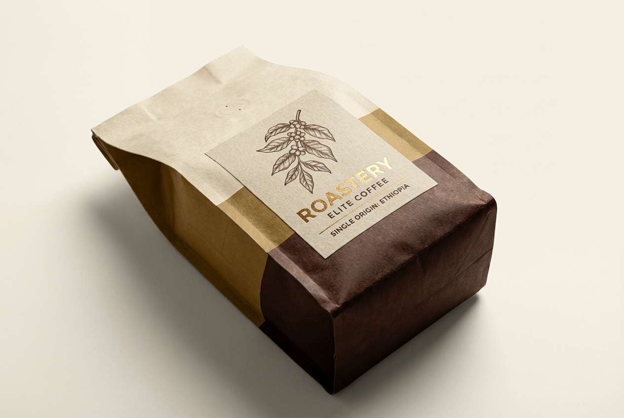
12) Marrow Gold
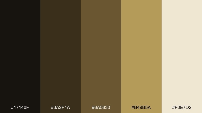
HEX: #17140F #3A2F1A #6A5630 #B49B5A #F0E7D2
Mood: antique, warm, refined
Best for: premium coffee packaging and labels
Aged brass and worn wood tones give a cozy, old-world glow that still feels polished. Use the creamy marrow shade for labels and the gold-brown for badges and highlights. Pair with engraved-style illustration or serif typography to lean into heritage cues. Usage tip: keep the darkest brown for small details so the label stays warm, not heavy.
Image example of marrow gold generated using media.io
13) Stormy Mausoleum
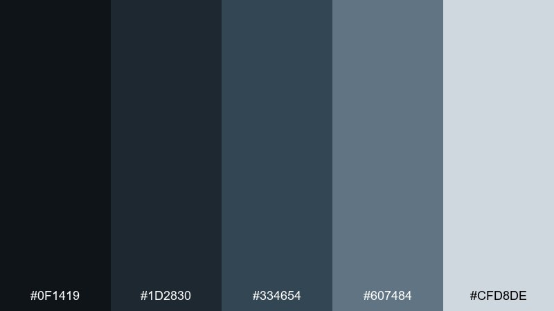
HEX: #0F1419 #1D2830 #334654 #607484 #CFD8DE
Mood: stormy, serious, sleek
Best for: tech branding and cybersecurity visuals
Rainy skies over stone arches show up as deep blue-grays and clean, icy highlights. Use the darkest tones for hero sections and the pale steel shade for crisp UI surfaces. Pair with thin line icons and geometric patterns to keep it modern. Usage tip: add a single bright accent only for critical states, like warnings and confirmations.
Image example of stormy mausoleum generated using media.io

14) Mossy Marble
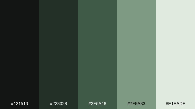
HEX: #121513 #223028 #3F5A46 #7F9A83 #E1EADF
Mood: fresh, natural, upscale
Best for: spa menus and botanical product ads
Polished marble with a hint of green veining feels clean, cool, and quietly luxurious. Use the pale minty gray as the dominant canvas, then layer the mid greens for sections and callouts. Pair with soft botanical photography and lots of whitespace for a premium look. Usage tip: keep shadows subtle so the greens stay airy instead of muddy.
Image example of mossy marble generated using media.io
15) Night Soil
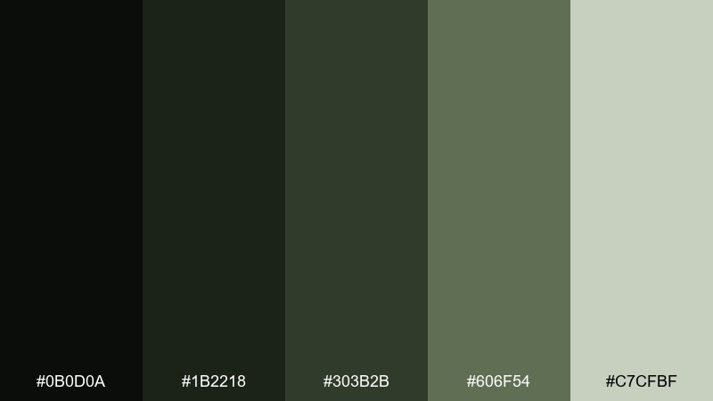
HEX: #0B0D0A #1B2218 #303B2B #606F54 #C7CFBF
Mood: grounded, dark, rugged
Best for: outdoor gear branding and patch designs
Deep earth and forest floor tones feel tough and practical, like boots on wet ground after rain. Use the near-black as a base for patches, then bring in olive and sage for icons and borders. Pair with bold sans type and simple silhouettes for maximum clarity. Usage tip: choose one lighter green for stitching or embroidery so details stay visible from a distance.
Image example of night soil generated using media.io
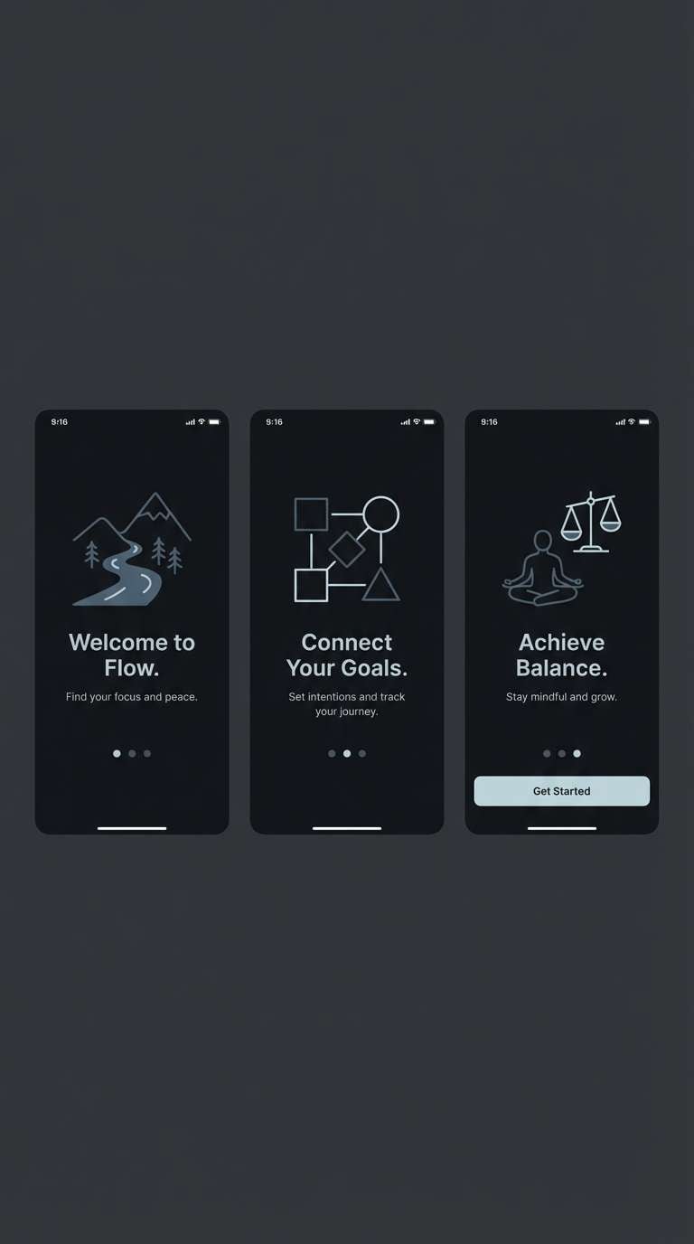
16) Epitaph Ink
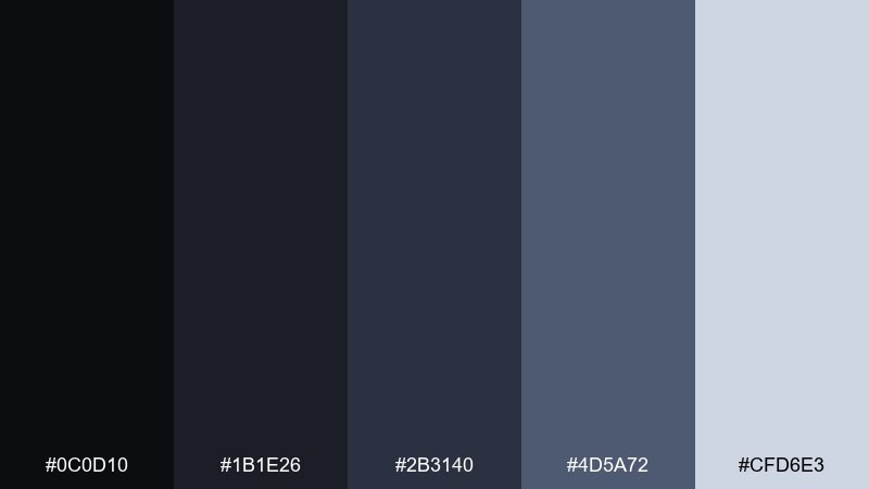
HEX: #0C0D10 #1B1E26 #2B3140 #4D5A72 #CFD6E3
Mood: inky, modern, high-contrast
Best for: app onboarding screens and dark mode UI
Ink on carved lettering feels crisp and modern, with cool blue-grays that read clean in digital products. These graveyard color combinations work especially well for dark mode, where the pale blue-gray becomes your primary text and icon color. Pair with a single soft gradient or thin stroke lines to avoid visual clutter. Usage tip: keep interactive elements in the lighter tones and leave backgrounds nearly black for depth.
Image example of epitaph ink generated using media.io
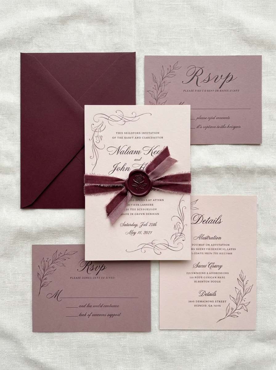
17) Chapel Velvet
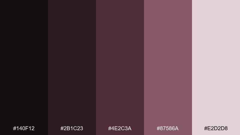
HEX: #140F12 #2B1C23 #4E2C3A #87586A #E2D2D8
Mood: velvet, dramatic, elegant
Best for: wedding stationery with gothic romance vibes
Velvet drapes and candlelit pews come through in burgundy shadows and soft rose dust. Use the pale blush as your paper tone, then set type in the darkest wine for a refined contrast. Pair with delicate flourishes, wax seals, or minimal floral line art to keep it tasteful. Usage tip: limit the mauve accent to headings and monograms for a clean hierarchy.
Image example of chapel velvet generated using media.io
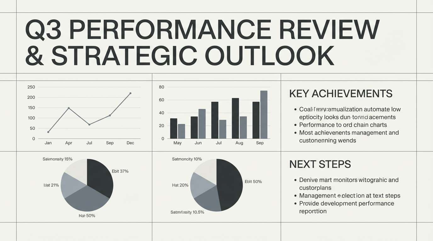
18) Frosted Granite
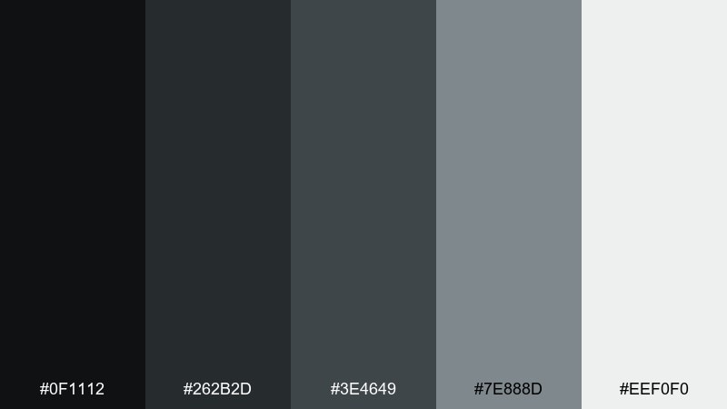
HEX: #0F1112 #262B2D #3E4649 #7E888D #EEF0F0
Mood: icy, minimal, professional
Best for: presentation templates and corporate reports
Cold granite and a thin layer of frost make this palette feel crisp, controlled, and quietly powerful. Use the lightest gray for slides and pages, then build structure with graphite headers and dividers. Pair with clean charts and simple iconography for a no-nonsense look. Usage tip: keep contrast strong for accessibility, especially on small labels and footnotes.
Image example of frosted granite generated using media.io
19) Harvest Wreath
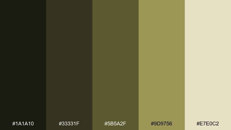
HEX: #1A1A10 #33331F #5B5A2F #9D9756 #E7E0C2
Mood: autumnal, muted, nostalgic
Best for: seasonal event flyers and craft labels
Dried leaves and late-season light feel earthy and nostalgic, with olive tones that lean natural rather than bright. Use the pale straw shade as a background and the darker olives for type and borders. Pair with hand-drawn elements and subtle paper textures for a crafted look. Usage tip: add the yellow-olive only in small doses so it reads like a highlight, not a tint.
Image example of harvest wreath generated using media.io

20) Dusk Lantern
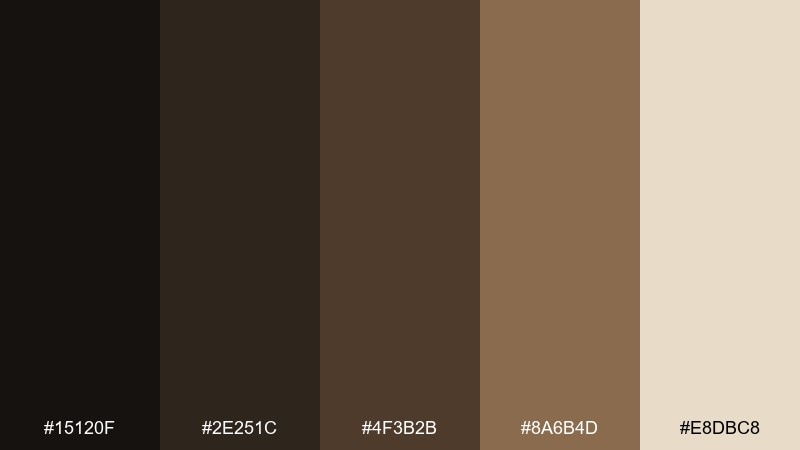
HEX: #15120F #2E251C #4F3B2B #8A6B4D #E8DBC8
Mood: cozy, rustic, cinematic
Best for: product ads for candles and home decor
A lantern glow at dusk feels warm and story-driven, balancing rich browns with a creamy highlight. Use the lightest shade for negative space and the mid browns for typography and frames. Pair with soft shadows and gentle gradients to mimic real light without going glossy. Usage tip: keep the darkest brown for small text and icons so the ad stays inviting.
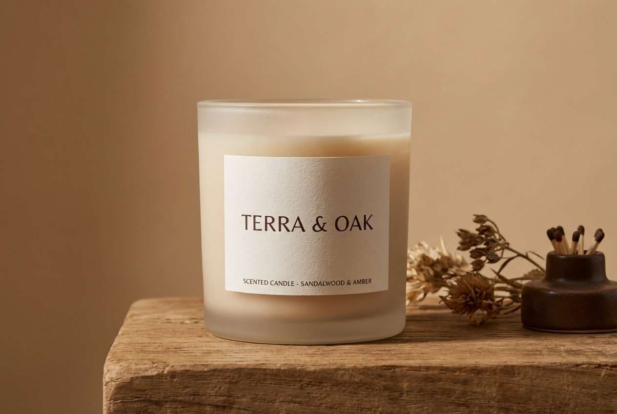
Image example of dusk lantern generated using media.io
21) Sable Thicket
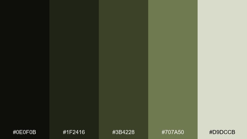
HEX: #0E0F0B #1F2416 #3B4228 #707A50 #D9DCCB
Mood: wild, moody, natural
Best for: fantasy game UI and quest menus
Dense thickets at night feel mysterious and wild, with shadowy greens that suggest hidden paths. Use the near-black for menu panels, then pull olive tones into buttons, tabs, and progress bars. Pair with subtle texture overlays like worn leather or parchment for immersion. Usage tip: keep the lightest tint for selected states so navigation is instantly readable.
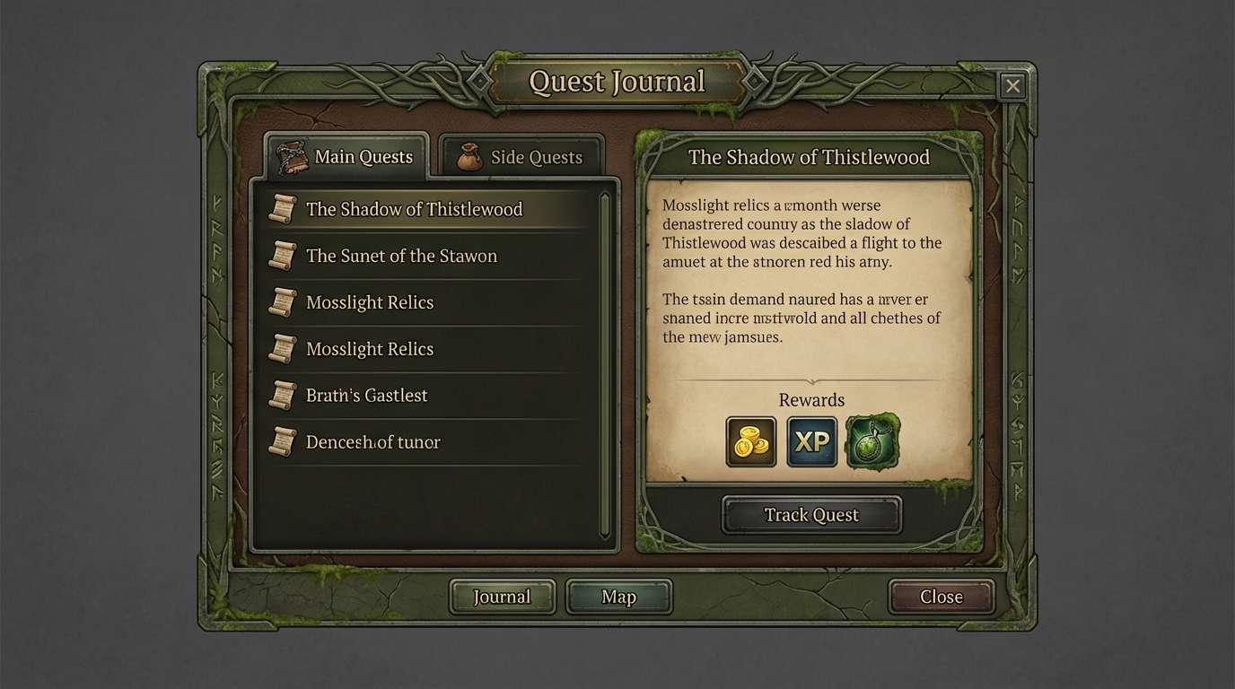
Image example of sable thicket generated using media.io
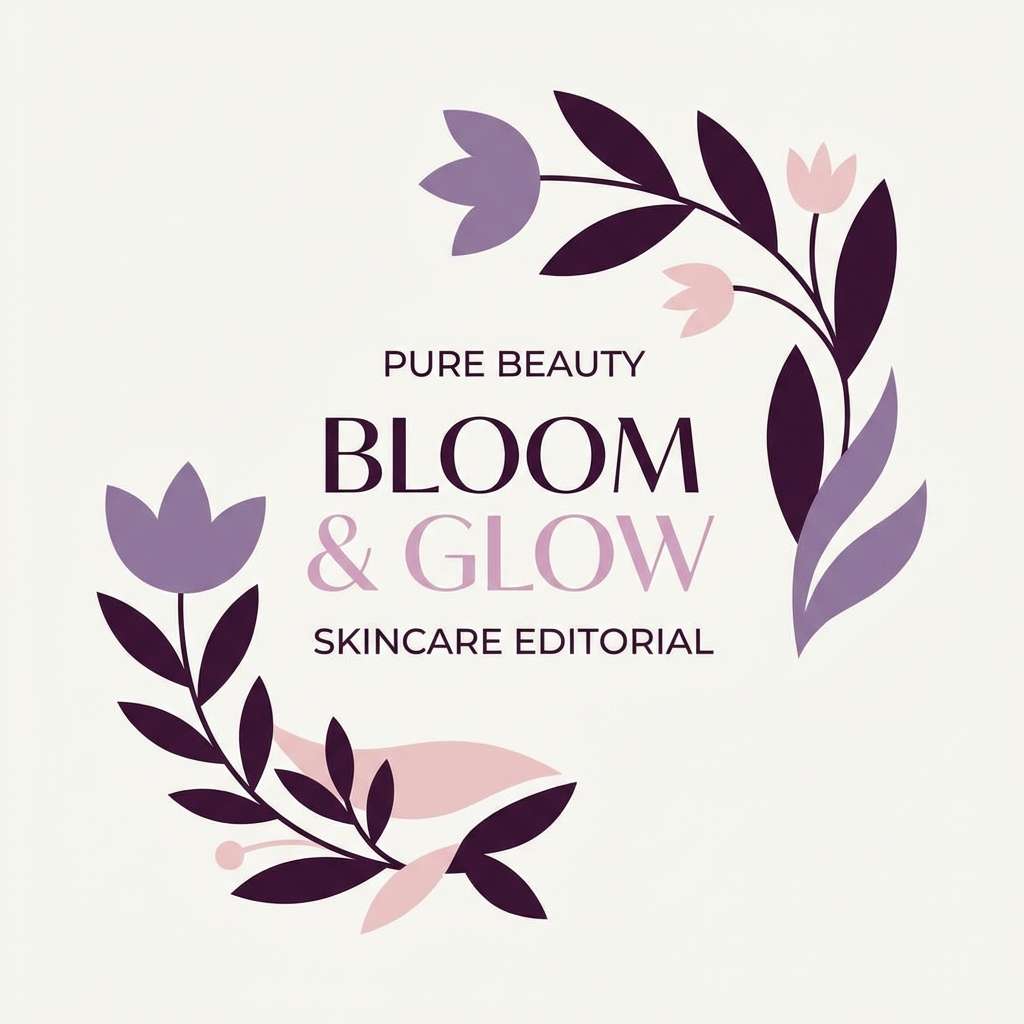
22) Obsidian Orchid
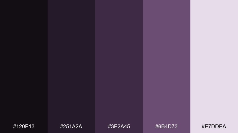
HEX: #120E13 #251A2A #3E2A45 #6B4D73 #E7DDEA
Mood: gothic, floral, sophisticated
Best for: beauty editorial graphics and social posts
Dark orchids and soft haze create a dramatic, editorial vibe with a refined purple undertone. Use the pale lavender-pink as a canvas for captions, then set strong headings in the deepest shade. Pair with high-contrast black-and-white portraits to keep the palette feeling modern. Usage tip: keep decorative elements minimal so the colors do the storytelling.
Image example of obsidian orchid generated using media.io
What Colors Go Well with Graveyard?
Graveyard tones pair best with soft neutrals and aged accents. Think bone/off-white backgrounds, stone gray surfaces, and charcoal typography to keep the mood grounded.
For highlights, use antique metals (bronze/copper), muted golds, or dusty rose and lilac—these bring “gothic romance” without turning neon.
If you need a modern UI punch, add one controlled accent (teal, acid-lime, or warning amber) and reserve it for states like buttons, alerts, and key data.
How to Use a Graveyard Color Palette in Real Designs
Start with a light “bone” neutral as your main canvas, then layer mid-tone moss/stone shades for sections and cards. Use the darkest charcoal for headings, icons, and navigation to create clear structure.
Keep saturation low in imagery so the palette stays cohesive across banners, product shots, and social templates. A subtle grain or paper texture can make dark palettes feel warmer and less flat.
For accessibility, aim for strong contrast on text (especially on dark mode) and avoid placing mid-gray text on mid-gray backgrounds—use the lightest tint for copy whenever possible.
Create Graveyard Palette Visuals with AI
If you have HEX codes but no matching visuals, AI can help you generate consistent mockups—posters, UI screens, packaging, or social graphics—without hunting for the perfect stock photo.
With Media.io’s text-to-image tool, you can describe the mood (foggy, gothic, mossy, candlelit) and keep outputs aligned by reusing the same palette and prompt style across variations.
Once you like a direction, iterate fast: swap “skincare packaging” for “album cover” or “dashboard UI” while keeping the same graveyard tones for brand consistency.
Graveyard Color Palette FAQs
-
What is a graveyard color palette?
A graveyard color palette is a set of moody, low-saturation colors inspired by fog, stone, moss, iron, and candlelight—typically built around charcoal grays, deep greens, dusty purples, and bone-like neutrals. -
Are graveyard palettes only for Halloween designs?
No. While they work great for Halloween posters, they’re also popular in luxury beauty, editorial layouts, dark mode UI, book covers, and nature-forward branding because the tones feel cinematic and refined. -
What accent colors work best with graveyard tones?
Antique copper/bronze, muted gold, dusty rose, and smoky lilac are classic accents. For digital products, a single bright accent (like teal or amber) can be reserved for CTAs and status indicators. -
How do I keep a graveyard palette from looking muddy?
Make the lightest neutral your dominant background, then use darker shades for structure and type. Avoid using too many mid-tones at once, and add whitespace so deep colors feel intentional rather than heavy. -
What’s the best way to use graveyard colors in UI design?
Use near-black for backgrounds, a light fog/blue-gray for primary text, and mid-tone slates for surfaces (cards, panels). Keep one accent color strictly for interactive elements and alerts to maintain clarity. -
Which graveyard palette is best for branding?
For minimal branding, try Iron Gate or Bone and Dust. For botanical or eco brands, Moonlit Moss, Lichen Stone, or Mossy Marble work well. For gothic romance, Wilted Rose or Chapel Velvet are strong picks. -
Can I generate graveyard-themed images that match my HEX codes?
Yes. You can use Media.io’s AI image generator to create posters, packaging mockups, and UI concepts, then iterate prompts to keep the same moody graveyard vibe across your visuals.
Next: Shamrock Color Palette


