

Green, blue, and purple is a versatile trio that can feel fresh like ocean air, futuristic like neon city lights, or calm like twilight botanicals. It’s a go-to scheme for UI, branding, posters, and editorial layouts because it balances nature (green) with trust (blue) and creativity (purple).
Below are 20 curated green blue purple color palette ideas with HEX codes, plus quick tips on pairing neutrals, building contrast, and choosing accent colors for real projects.
In this article
Why Green Blue Purple Palettes Work So Well
Green, blue, and purple sit close enough on the color wheel to blend smoothly, which makes gradients and layered backgrounds feel natural. At the same time, each hue has a distinct role, helping you build hierarchy without introducing “random” extra colors.
In practice, blue is often the stabilizer for structure and readability, green communicates vitality or success states, and purple adds a premium or imaginative accent. That division of labor is especially useful in UI, branding systems, and poster layouts.
This trio also adapts easily to different moods: push saturation for bold neon looks, or mute the tones for vintage stationery and editorial design. You can keep it airy with pale tints, or cinematic with dark bases and bright highlights.
20+ Green Blue Purple Color Palette Ideas (with HEX Codes)
1) Aurora Lagoon
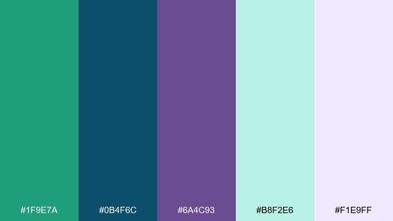
HEX: #1F9E7A #0B4F6C #6A4C93 #B8F2E6 #F1E9FF
Mood: fresh and dreamy
Best for: travel brand identity and mood boards
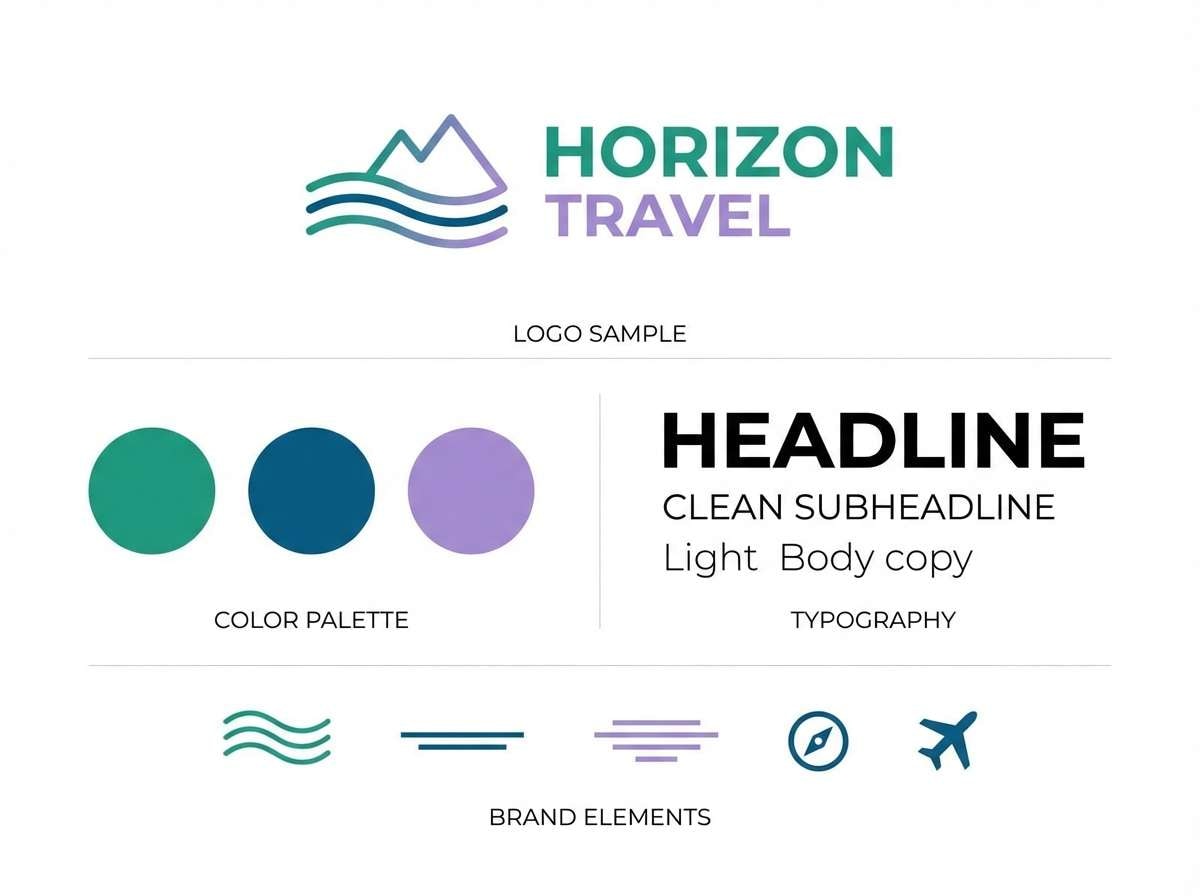
Fresh and dreamy like northern lights over calm water, these tones feel airy yet confident. Use the deep blue as your anchor, then let teal and violet carry the storytelling moments. It works beautifully for travel, wellness, or lifestyle branding paired with clean whites and soft gradients. Usage tip: keep text in the navy tone for readability and reserve purple for buttons or highlights.
Image example of aurora lagoon generated using media.io
Media.io is an online AI studio for creating and editing video, image, and audio in your browser.

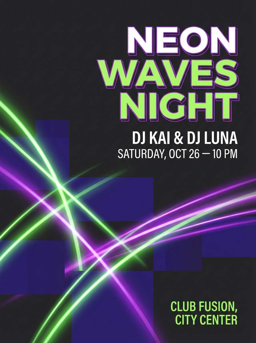
2) Neon Orchid Depths
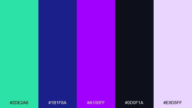
HEX: #2DE2A6 #1B1F8A #A100FF #0D0F1A #E9D5FF
Mood: bold and electric
Best for: nightclub event posters and DJ flyers
Bold and electric, it evokes laser lights cutting through a midnight room. The near-black base keeps the neon green and orchid purple from feeling chaotic. Use it for nightlife promos, music drops, or esports announcements, and pair with sharp sans-serif type. Usage tip: limit neon accents to key details like date, venue, and callouts to avoid visual fatigue.
Image example of neon orchid depths generated using media.io
3) Forest Prism
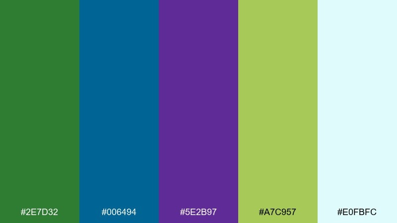
HEX: #2E7D32 #006494 #5E2B97 #A7C957 #E0FBFC
Mood: grounded and optimistic
Best for: eco tech startup websites and landing pages
Grounded and optimistic, it feels like sunlight breaking through a forest canopy. The forest green and ocean blue build trust, while purple adds a subtle innovation vibe. It fits sustainability sites, product explainers, and onboarding flows when paired with plenty of whitespace. Usage tip: use the lime tone sparingly for status tags, active states, or success messages.
Image example of forest prism generated using media.io
4) Midnight Lotus
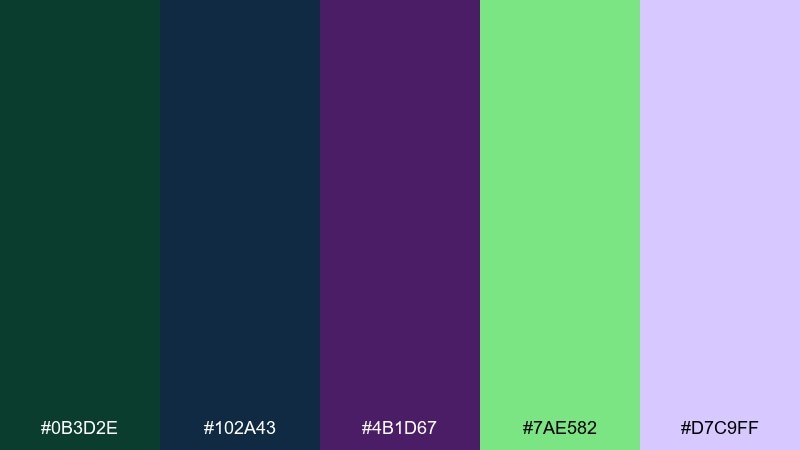
HEX: #0B3D2E #102A43 #4B1D67 #7AE582 #D7C9FF
Mood: luxurious and calm
Best for: luxury skincare packaging and product ads
Luxurious and calm, it suggests a spa at night with a hint of botanical freshness. Deep green and inky blue create a premium base, while muted violet adds softness. Ideal for skincare, fragrance, and boutique packaging with metallic foil or emboss details. Usage tip: print the dark tones matte and use the mint as a thin border or seal mark for contrast.
Image example of midnight lotus generated using media.io
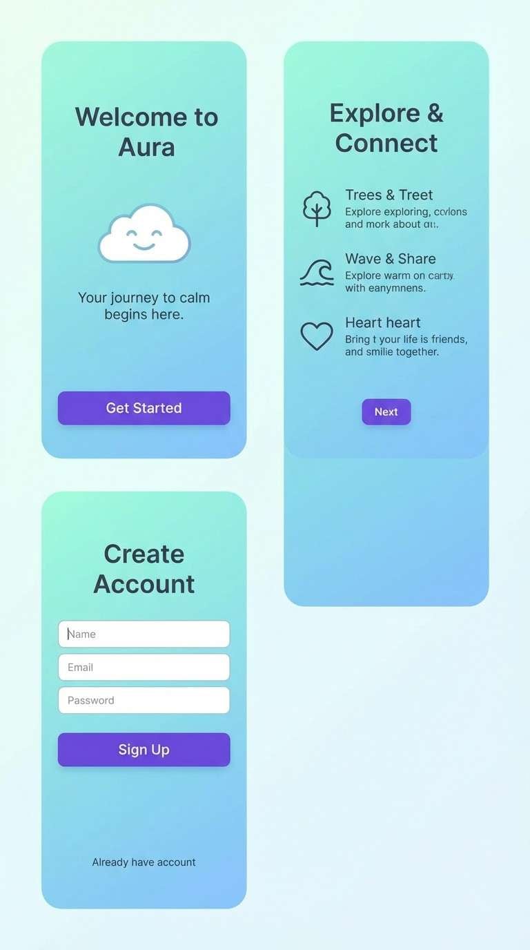
5) Glacier Iris
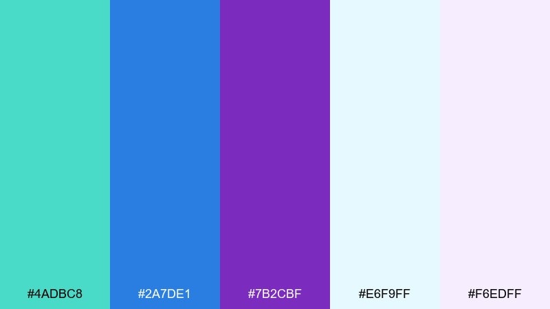
HEX: #4ADBC8 #2A7DE1 #7B2CBF #E6F9FF #F6EDFF
Mood: clean and uplifting
Best for: wellness app onboarding and habit trackers
Clean and uplifting, it feels like crisp air and soft light bouncing off ice. Bright aqua and sky blue keep the mood positive, while iris purple adds a friendly sense of depth. Great for wellness apps, coaching platforms, and gentle data visuals paired with rounded UI elements. Usage tip: set onboarding illustrations on the pale tints and save the saturated purple for primary CTAs.
Image example of glacier iris generated using media.io
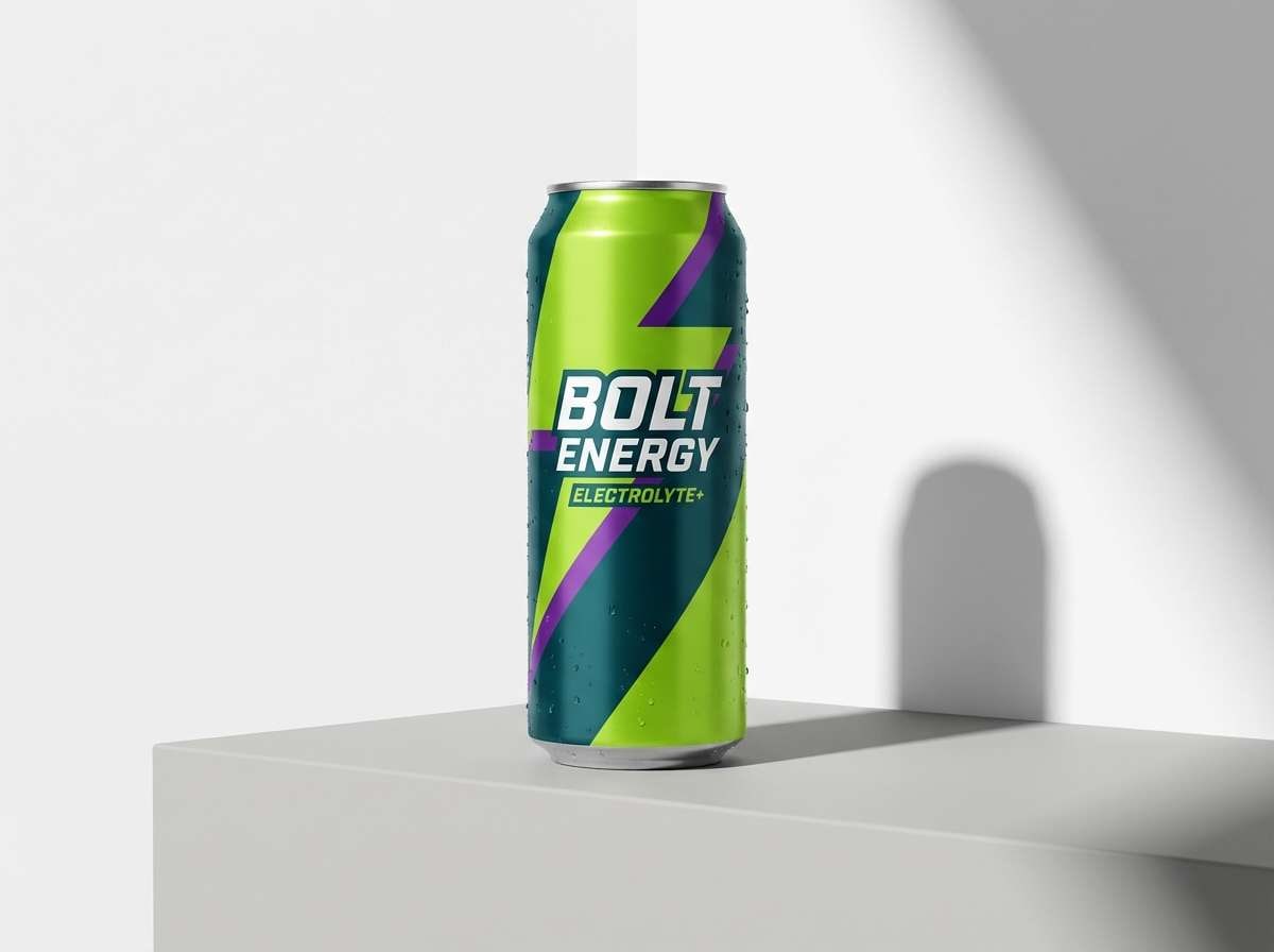
6) Electric Kelp
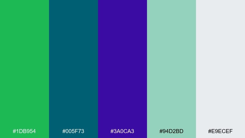
HEX: #1DB954 #005F73 #3A0CA3 #94D2BD #E9ECEF
Mood: energetic and sporty
Best for: energy drink ads and athletic promos
Energetic and sporty, it brings to mind seaweed greens and deep-water currents with a jolt of violet. The bold green works as the hero, while teal-blue grounds the layout for a tougher edge. Use it for fitness campaigns, product launches, and punchy social ads with strong contrast. Usage tip: keep purple for one focal element like a badge or flavor callout to avoid competing accents.
Image example of electric kelp generated using media.io
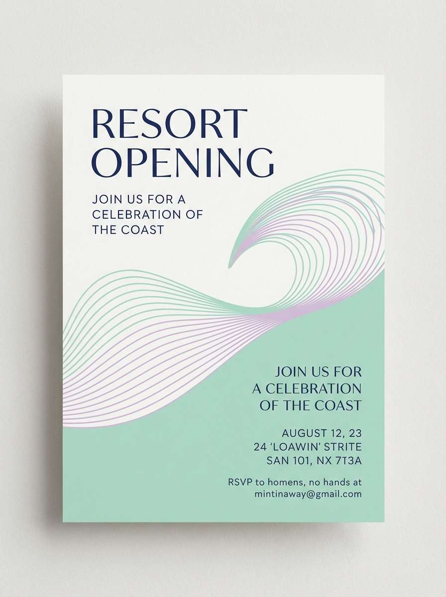
7) Lavender Tide
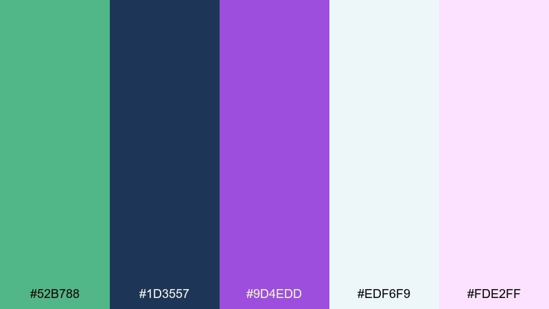
HEX: #52B788 #1D3557 #9D4EDD #EDF6F9 #FDE2FF
Mood: romantic and breezy
Best for: resort invitations and summer announcements
Romantic and breezy, it feels like lavender mist drifting over a quiet shoreline. Navy adds structure, while soft mint and lilac keep the overall look light and welcoming. Perfect for invitations, seasonal promos, and gentle editorial graphics paired with thin line icons. Usage tip: set body copy in the navy and use the pink-lilac tint as a background wash for headings.
Image example of lavender tide generated using media.io
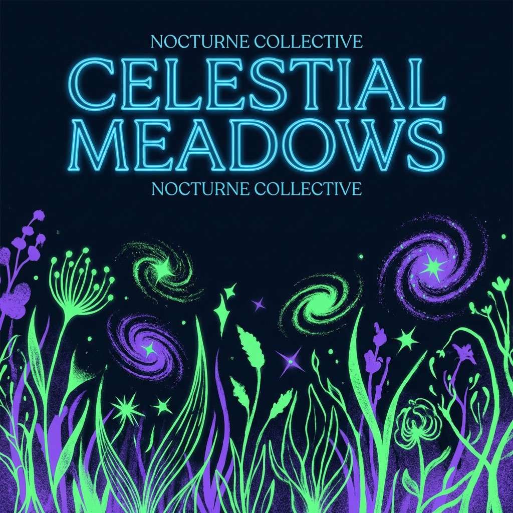
8) Cosmic Meadow
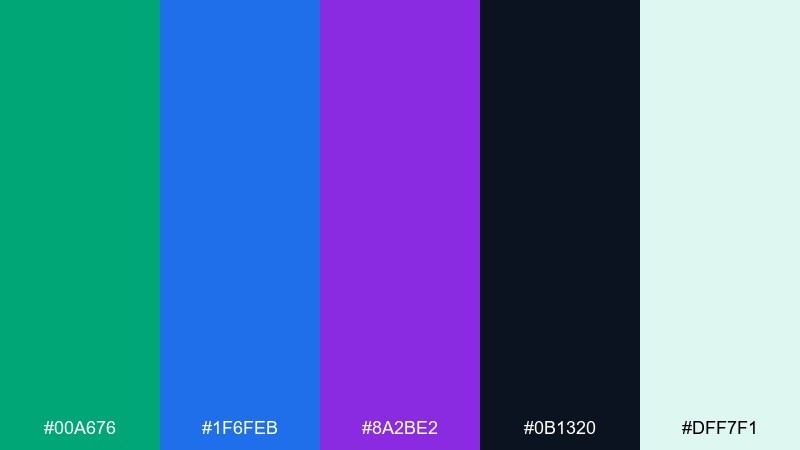
HEX: #00A676 #1F6FEB #8A2BE2 #0B1320 #DFF7F1
Mood: mystical and vibrant
Best for: album covers and streaming thumbnails
Mystical and vibrant, it suggests wild grass under a star-filled sky. These green blue purple color combinations shine when you let the dark base frame brighter accents. Use it for album art, podcast covers, or merch graphics, pairing with bold geometric shapes and a single display font. Usage tip: keep your brightest blue for the title so it pops at small thumbnail sizes.
Image example of cosmic meadow generated using media.io
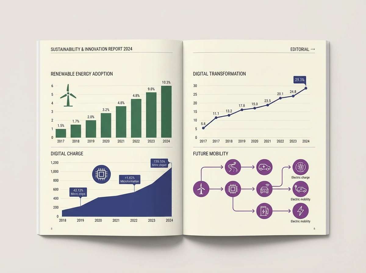
9) Indigo Spruce
HEX: #0E7C66 #273469 #5A189A #CAD2C5 #F7F7FF
Mood: smart and dependable
Best for: reports, charts, and editorial infographics
Smart and dependable, it feels like a crisp workbook with a sophisticated ink palette. Indigo and spruce green keep data visuals authoritative, while purple helps separate categories without clashing. Use it in reports, dashboards, and editorial infographics paired with light neutrals for breathing room. Usage tip: assign one hue per data series and keep gridlines in the palest tint for clarity.
Image example of indigo spruce generated using media.io
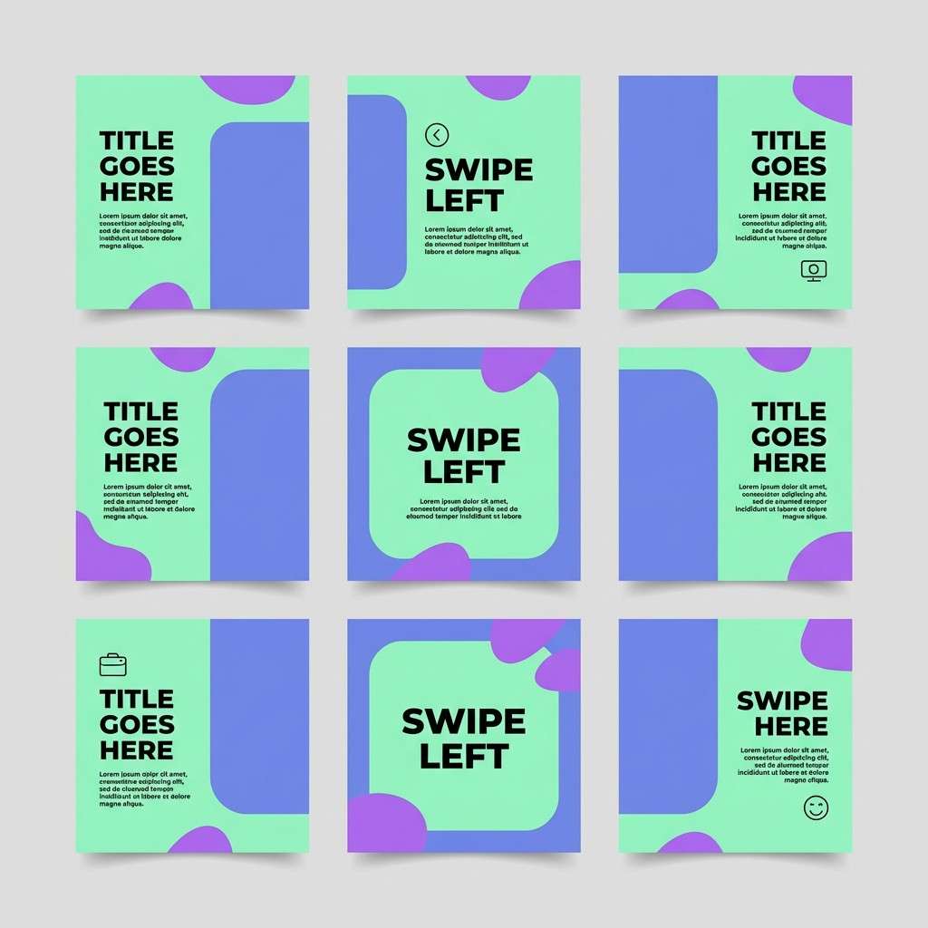
10) Mint Nebula
HEX: #2EC4B6 #4361EE #7209B7 #CBF3F0 #FFF7FF
Mood: playful and modern
Best for: social media carousel templates and stories
Playful and modern, it looks like candy-coated clouds swirling into a neon nebula. The mint tones soften the bold blue and purple, making it friendly for everyday content. Great for carousels, creator toolkits, and promo templates where you need quick visual hierarchy. Usage tip: alternate mint backgrounds with blue headline bars to keep each slide distinct.
Image example of mint nebula generated using media.io
11) Peacock Velvet
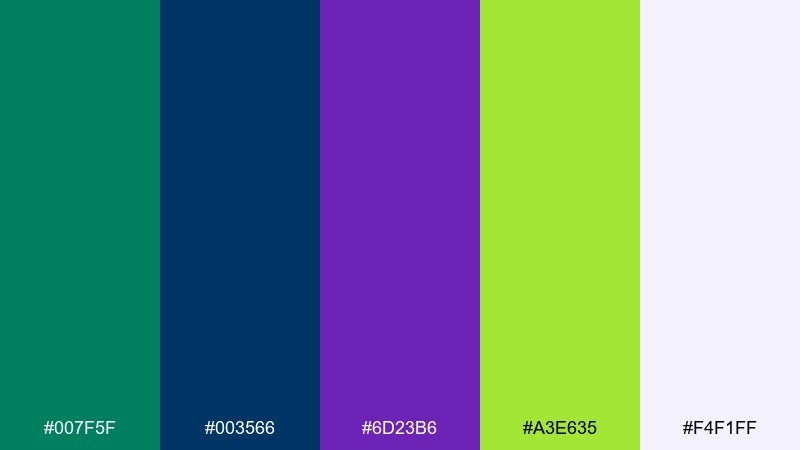
HEX: #007F5F #003566 #6D23B6 #A3E635 #F4F1FF
Mood: confident and high-contrast
Best for: gaming brand headers and stream overlays
Confident and high-contrast, it feels like velvet fabric lit by arcade signage. Deep teal and navy build a strong frame, while vibrant purple and chartreuse add instant energy. Perfect for gaming brands, stream headers, and bold promo banners with chunky type. Usage tip: use chartreuse only for highlights like scores, badges, or hover states to keep it premium.
Image example of peacock velvet generated using media.io

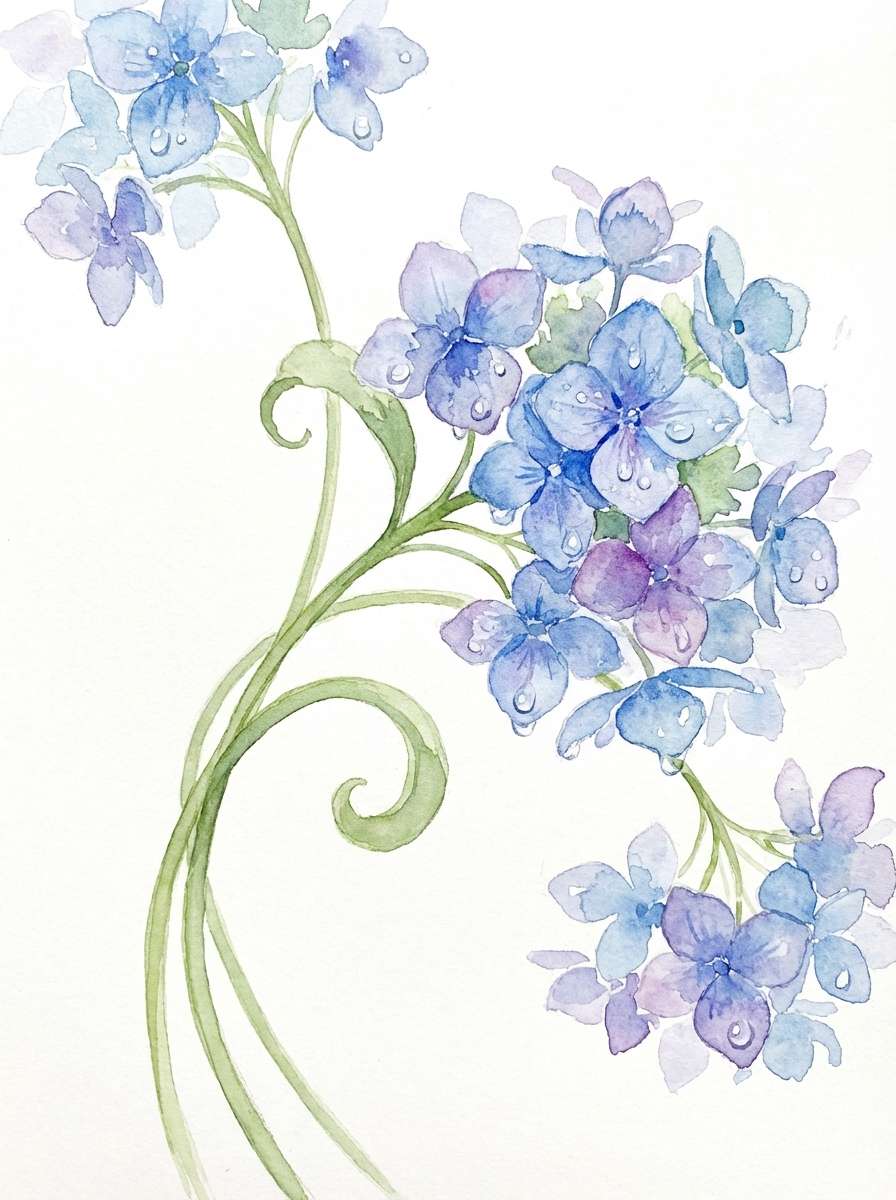
12) Rainy Hydrangea
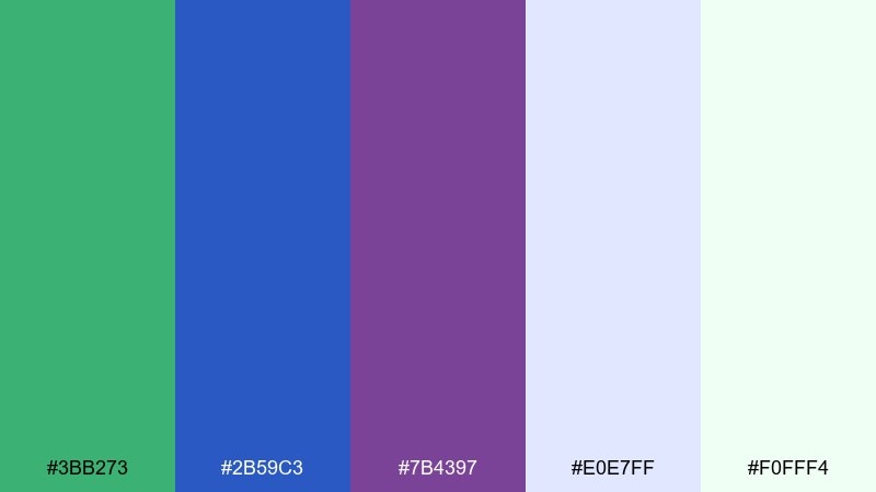
HEX: #3BB273 #2B59C3 #7B4397 #E0E7FF #F0FFF4
Mood: soft and refreshing
Best for: spring illustrations and stationery art
Soft and refreshing, it evokes hydrangea petals after a light rain. The green keeps it natural, blue adds clarity, and purple brings a gentle floral richness. Lovely for seasonal stationery, blog headers, and calm packaging when paired with off-white paper textures. Usage tip: keep outlines in the deeper blue and fill petals with the pale tints for a watercolor feel.
Image example of rainy hydrangea generated using media.io
13) Jade Amethyst
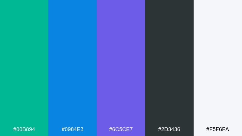
HEX: #00B894 #0984E3 #6C5CE7 #2D3436 #F5F6FA
Mood: sleek and tech-forward
Best for: fintech dashboards and analytics UI
Sleek and tech-forward, it feels like polished glass and clean metrics. Jade and blue create a trustworthy base, while amethyst adds a distinctive signature for active states. Use it for fintech dashboards, admin panels, and analytics products with plenty of spacing and clear typography. Usage tip: place key KPIs in dark gray and use jade for positive trends to reinforce meaning.
Image example of jade amethyst generated using media.io
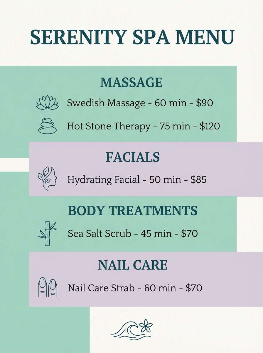
14) Seafoam Dusk
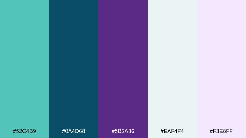
HEX: #52C4B9 #0A4D68 #5B2A86 #EAF4F4 #F3E8FF
Mood: calm and elegant
Best for: spa menus, service flyers, and price lists
Calm and elegant, it brings to mind seafoam settling as the sun drops behind the horizon. The dark teal-blue reads refined for headings, while purple adds a soothing premium accent. Great for spa menus, service brochures, and appointment cards paired with thin dividers and generous margins. Usage tip: use the pale violet as a section background to guide the eye without heavy boxes.
Image example of seafoam dusk generated using media.io
15) Ultraviolet Garden
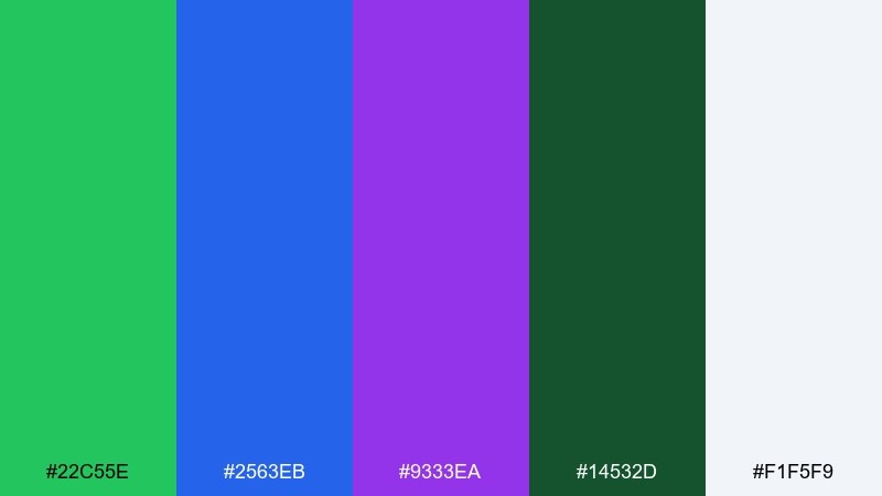
HEX: #22C55E #2563EB #9333EA #14532D #F1F5F9
Mood: lush and punchy
Best for: botanical product labels and herb packaging
Lush and punchy, it feels like a greenhouse lit with dramatic evening glow. The dark green supports bright leaf tones, while electric blue and violet create a modern botanical twist. Ideal for plant-based products, supplements, and label systems paired with simple illustrations and clean type. Usage tip: print the label base in the darker green and keep blue and purple for flavor variants.
Image example of ultraviolet garden generated using media.io
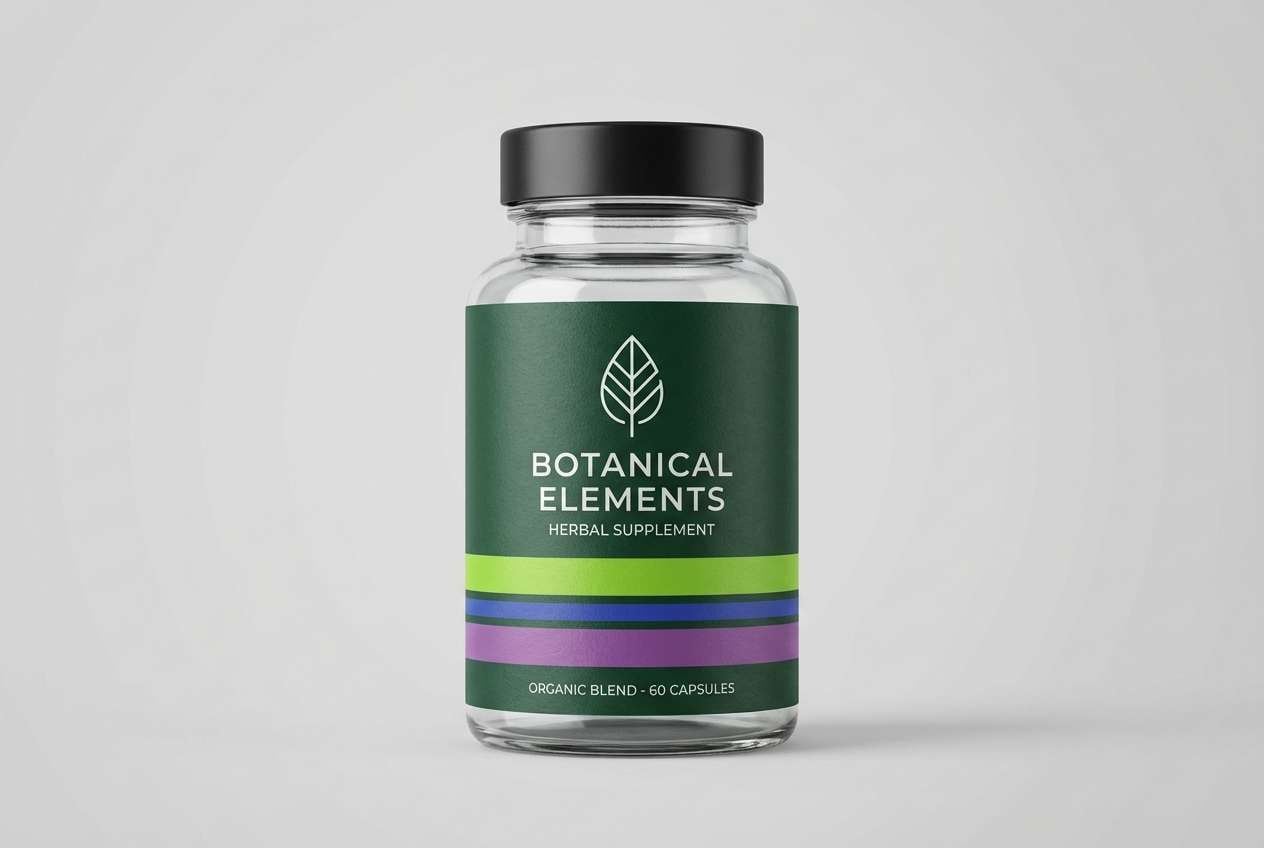
16) Sapphire Fern
HEX: #2F9E44 #0B4DFF #4C1D95 #C7F9CC #F8FAFF
Mood: adventurous and bright
Best for: outdoor apparel lookbooks and catalog covers
Adventurous and bright, it suggests fresh trail air with a bold sapphire sky. The green tones keep it organic, while saturated blue adds crisp focus and purple gives a premium edge. Use it for outdoor apparel, seasonal lookbooks, and catalog covers paired with strong grids and big headlines. Usage tip: keep the page background near-white and let blue carry the title for maximum pop.
Image example of sapphire fern generated using media.io
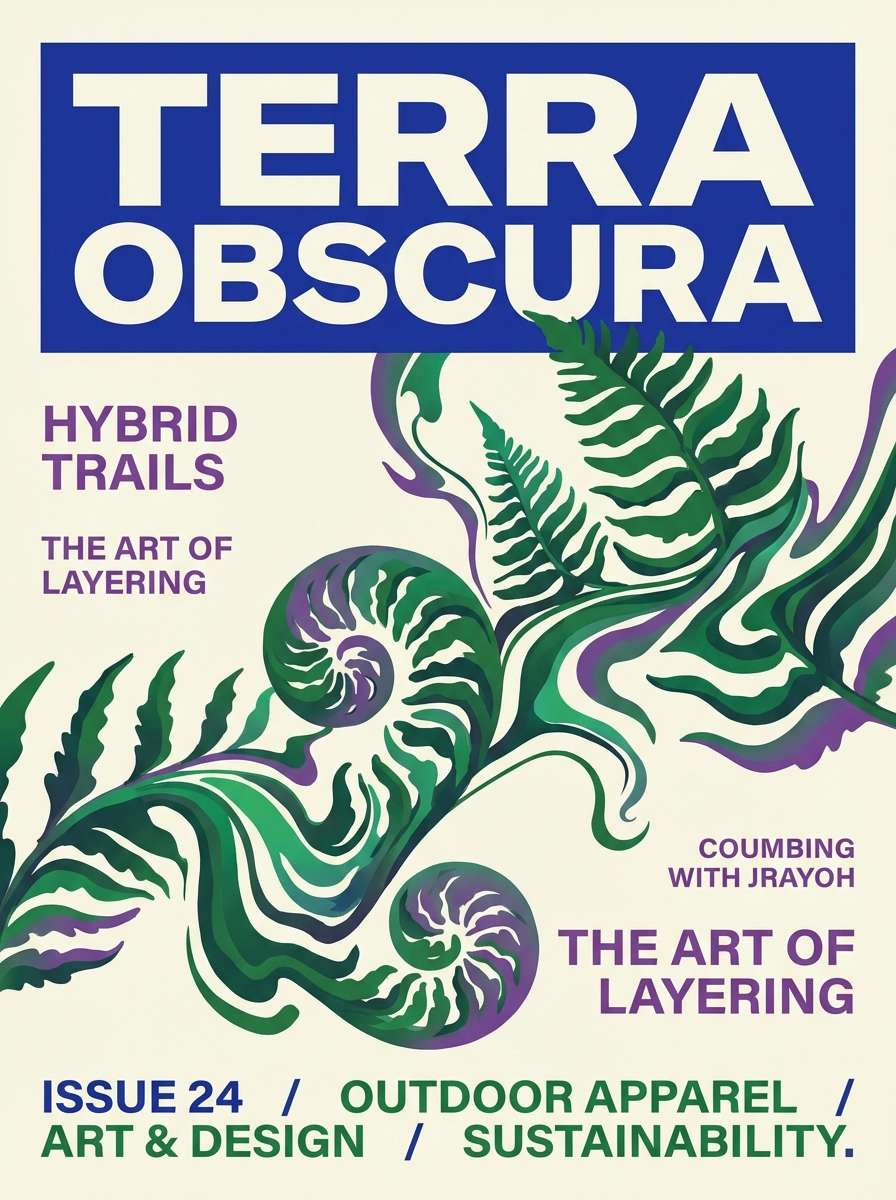
17) Plum Reef
HEX: #0FA3B1 #274C77 #7F1D8D #B5E2FA #FDE8FF
Mood: artsy and aquatic
Best for: museum posters and aquarium exhibit graphics
Artsy and aquatic, it feels like coral shadows moving through clear water. Teal and slate blue give it an educational, trustworthy tone, while plum adds gallery-level drama. Great for exhibit posters, cultural events, and illustration-heavy layouts paired with lots of negative space. Usage tip: use the pale blue as the main background and keep plum for titles or key specimen labels.
Image example of plum reef generated using media.io
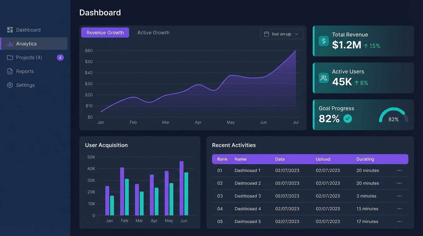
18) Northern Lights UI
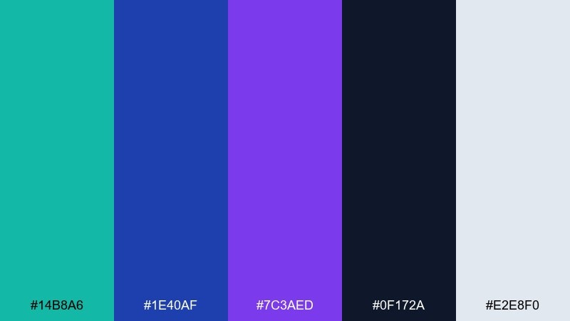
HEX: #14B8A6 #1E40AF #7C3AED #0F172A #E2E8F0
Mood: modern and high-contrast
Best for: saas dashboards, charts, and navigation systems
Modern and high-contrast, it mirrors aurora streaks across a deep winter sky. This green blue purple color scheme is especially strong for UI because each hue can map to a clear function: success, primary, and highlight. Use it for saas dashboards, settings panels, and data-heavy screens paired with a cool gray surface. Usage tip: keep the background dark and use the light gray for body text to reduce eye strain.
Image example of northern lights ui generated using media.io
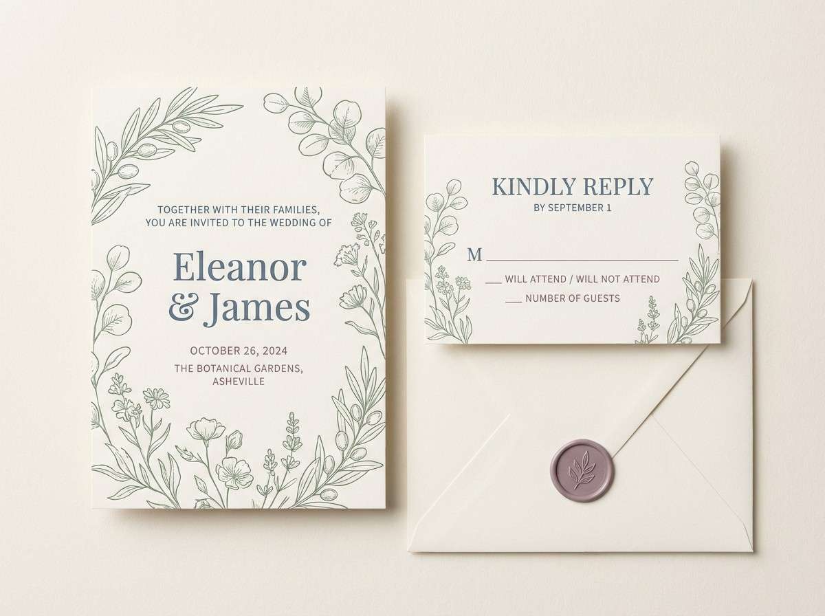
19) Vintage Botanical
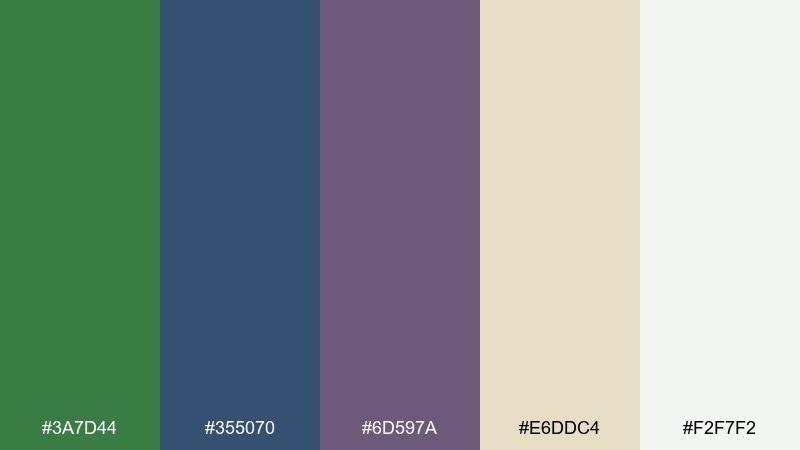
HEX: #3A7D44 #355070 #6D597A #E6DDC4 #F2F7F2
Mood: nostalgic and refined
Best for: wedding stationery and printed invitations
Nostalgic and refined, it recalls pressed leaves in an old journal. Muted green and slate blue feel classic, while dusty purple adds gentle romance without turning sugary. Ideal for wedding suites, menus, and thank-you cards paired with cream paper and serif typography. Usage tip: use the beige tone as your base and keep the darker hues for borders, monograms, and section titles.
Image example of vintage botanical generated using media.io
20) City Night Gradient
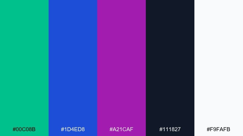
HEX: #00C08B #1D4ED8 #A21CAF #111827 #F9FAFB
Mood: sleek and futuristic
Best for: tech conference hero banners and announcements
Sleek and futuristic, it feels like city lights reflecting off glass at midnight. The bright teal and electric blue create forward momentum, while magenta-purple delivers a bold signature. Use it for conference hero banners, product announcements, and motion graphics paired with dark mode layouts. Usage tip: build a diagonal gradient from teal to purple and keep copy in near-white for instant contrast.
Image example of city night gradient generated using media.io

What Colors Go Well with Green Blue Purple?
Neutrals are the easiest match: crisp white, cool light gray, deep charcoal, and inky near-black help green/blue/purple look intentional and readable. For print, warm off-whites and cream paper can make the trio feel softer and more premium.
For accents, choose one warm counterpoint rather than many: coral, peach, or soft gold can add energy without fighting the palette. If you want a punchy highlight, try chartreuse or mint—but keep it limited to UI states, badges, or small callouts.
When building gradients, keep transitions inside the family (green → teal → blue → violet) for smooth results. Use the warm accent separately as a “spark” color for focus elements like CTA buttons or key labels.
How to Use a Green Blue Purple Color Palette in Real Designs
Assign roles: pick one primary (often blue), one supportive (green), and one highlight (purple). This prevents every element from competing and makes your design system easier to scale across pages, components, or campaign assets.
Control contrast early by testing text on both the darkest and lightest swatches. Dark navy/charcoal text usually wins on pale tints, while near-white text is safest on deep blue or deep purple sections.
For branding, keep your logo and typography mostly neutral, then let green/blue/purple show up in patterns, gradients, buttons, and illustrations. This keeps the identity flexible across light and dark backgrounds.
Create Green Blue Purple Palette Visuals with AI
If you already have HEX codes, you can turn them into mood boards, posters, UI mockups, or product label concepts in minutes by describing the layout and style you want. The key is to specify your dominant color, your accent color, and the background tone so the AI keeps a consistent hierarchy.
Start simple: “clean UI mockup,” “minimal poster,” or “brand board on white,” then add details like typography style, shapes, and lighting. Once you like the direction, iterate by swapping only one element at a time (for example, changing the purple intensity or moving to a dark-mode background).
Green Blue Purple Color Palette FAQs
-
What does a green blue purple color palette communicate?
It commonly signals a mix of natural energy (green), trust and stability (blue), and creativity or premium flair (purple). Depending on saturation, it can feel either calm and elegant or bold and futuristic. -
Is green blue purple a good palette for UI design?
Yes. Blue works well for primary navigation, green maps naturally to success states, and purple makes a strong highlight for active tabs or CTAs. Pair with cool grays for readability and consistent contrast. -
How do I keep green, blue, and purple from looking too “neon”?
Lower saturation, use more tint (add white), and anchor the scheme with neutral surfaces (light gray, cream, or charcoal). Reserve the brightest hue for small accents like badges or buttons. -
What background colors work best with a green blue purple palette?
For light themes, use white, off-white, or very pale blue/purple tints. For dark themes, use deep navy or near-black, then set text in near-white to maintain strong contrast. -
What accent color pairs well with green blue purple?
Pick one warm accent such as coral, peach, or soft gold to create a complementary pop. Use it sparingly for emphasis so it doesn’t compete with the purple highlight. -
Can I use green blue purple for print projects like invitations?
Absolutely. Choose muted tones (sage, slate blue, dusty purple) and combine them with cream paper textures. Keep typography mostly neutral and use the colors for borders, monograms, or floral elements. -
How do I build a green blue purple gradient?
Blend through neighboring hues for a smooth transition: green → teal → blue → indigo → violet. Avoid jumping directly from green to purple without a blue bridge, or it may look muddy.


