

Dark salmon is a warm, muted coral that feels friendly without turning sugary. It can read modern in UI, handcrafted in packaging, or romantic in wedding stationery—depending on what you pair it with.
Below are 20+ dark salmon color palette ideas with HEX codes, plus practical notes on mood, use cases, and AI prompts you can reuse to generate visuals.
In this article
- Why Dark Salmon Palettes Work So Well
-
- sunset clay
- rosewood linen
- coastal terracotta
- sage blush
- vintage apricot
- desert dusk
- coral caffeine
- modern bridal
- warm minimal ui
- autumn market
- botanical peach
- gallery poster
- spa candle
- retro diner
- night garden
- kids storybook
- mediterranean tiles
- coffee shop brand
- soft gradient app
- festive harvest
- porcelain rose
- charcoal bloom
- What Colors Go Well with Dark Salmon?
- How to Use a Dark Salmon Color Palette in Real Designs
- Create Dark Salmon Palette Visuals with AI
Why Dark Salmon Palettes Work So Well
Dark salmon sits in a sweet spot between pink and orange, so it brings warmth without feeling overly bright. That balance makes it versatile for both playful and premium designs.
It also pairs naturally with modern neutrals (cream, greige, charcoal), which helps you build clean layouts with one memorable accent. A small salmon highlight can guide attention without overwhelming the page.
When you add greens, teals, or deep blues, dark salmon gets even stronger—those cooler hues create contrast that feels sophisticated, not loud.
20+ Dark Salmon Color Palette Ideas (with HEX Codes)
1) Sunset Clay
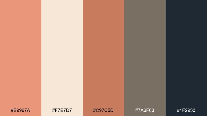
HEX: #E9967A #F7E7D7 #C97C5D #7A6F63 #1F2933
Mood: warm, grounded, modern
Best for: branding for artisan goods
Warm and grounded like clay at golden hour, this mix feels handcrafted yet clean. It shines on logos, labels, and social templates where you want a cozy premium tone. Pair the salmon and clay shades with the deep charcoal for contrast, and let the cream act as breathing room. Tip: keep charcoal for type and use salmon for small, memorable highlights.
Image example of sunset clay generated using media.io
Media.io is an online AI studio for creating and editing video, image, and audio in your browser.

2) Rosewood Linen
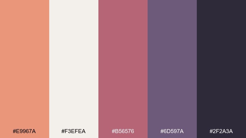
HEX: #E9967A #F3EFEA #B56576 #6D597A #2F2A3A
Mood: romantic, editorial, moody
Best for: fashion lookbook layout
Romantic and editorial with a soft linen base and wine-tinted depth. It works beautifully for fashion spreads, beauty campaigns, and premium lifestyle headers. Use the plum and near-black for strong hierarchy, then bring in salmon for callouts and section dividers. Tip: keep imagery warm and slightly desaturated so the palette feels cohesive on print and web.
Image example of rosewood linen generated using media.io
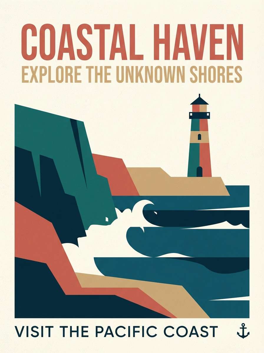
3) Coastal Terracotta
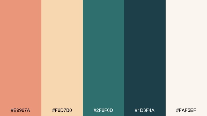
HEX: #E9967A #F6D7B0 #2F6F6D #1D3F4A #FAF5EF
Mood: sunlit, coastal, adventurous
Best for: travel poster design
Sunlit and breezy, like terracotta rooftops against deep sea tones. It fits travel posters, destination guides, and bold homepage hero sections. Let teal and deep ocean anchor the layout, then use salmon and sand for warmth and highlights. Tip: try a two-tone background split (cream to teal) for instant depth without clutter.
Image example of coastal terracotta generated using media.io
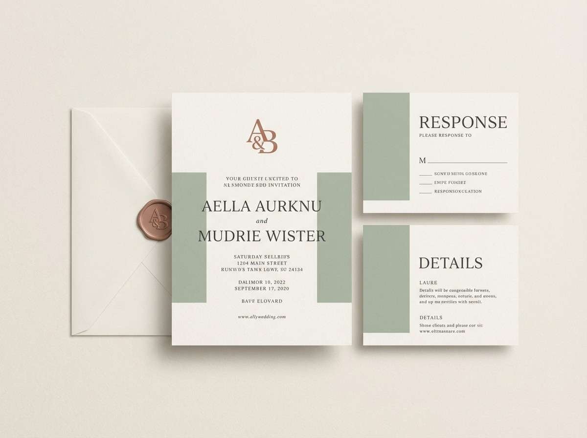
4) Sage Blush
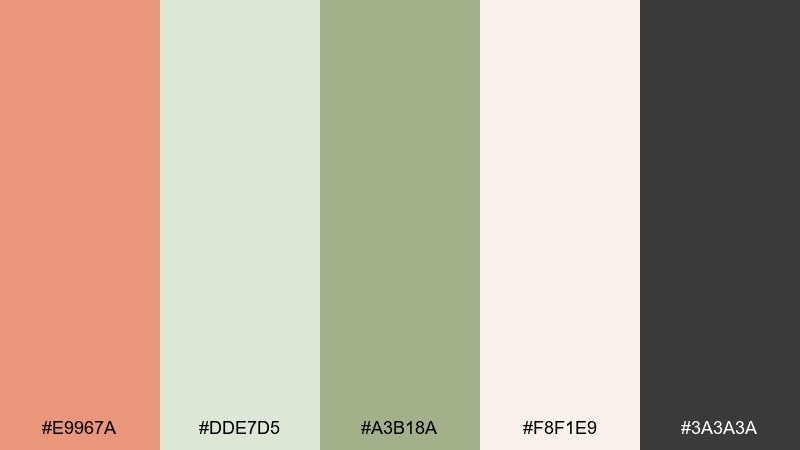
HEX: #E9967A #DDE7D5 #A3B18A #F8F1E9 #3A3A3A
Mood: fresh, calm, natural
Best for: wedding invitation suite
Fresh and calm like a garden morning with a gentle blush glow. It is ideal for invitations, menus, and minimal wedding websites where softness matters. Keep sage and cream as the main fields, then add salmon for monograms or wax-seal style details. Tip: use charcoal sparingly for readability so the suite stays airy and romantic.
Image example of sage blush generated using media.io
5) Vintage Apricot
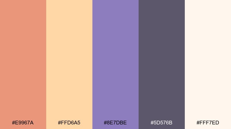
HEX: #E9967A #FFD6A5 #8E7DBE #5D576B #FFF7ED
Mood: playful, retro, cozy
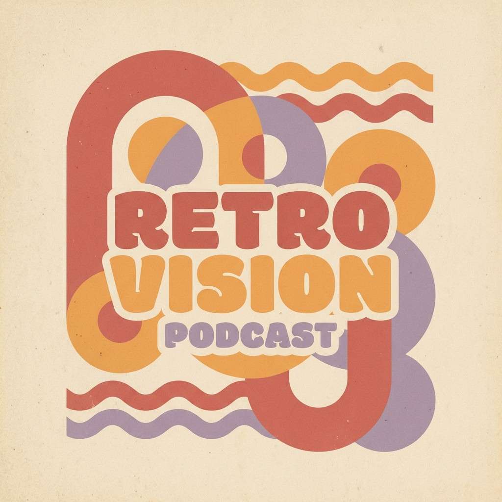
Best for: podcast cover art
Playful and retro with apricot warmth and a lilac twist that feels nostalgic. Great for podcast covers, creator branding, and cheerful promo graphics. Balance the sweetness by using the deep muted purple for titles and borders, then reserve salmon for the focal icon. Tip: add subtle grain or halftone texture to sell the vintage vibe without muddying the colors.
Image example of vintage apricot generated using media.io
6) Desert Dusk
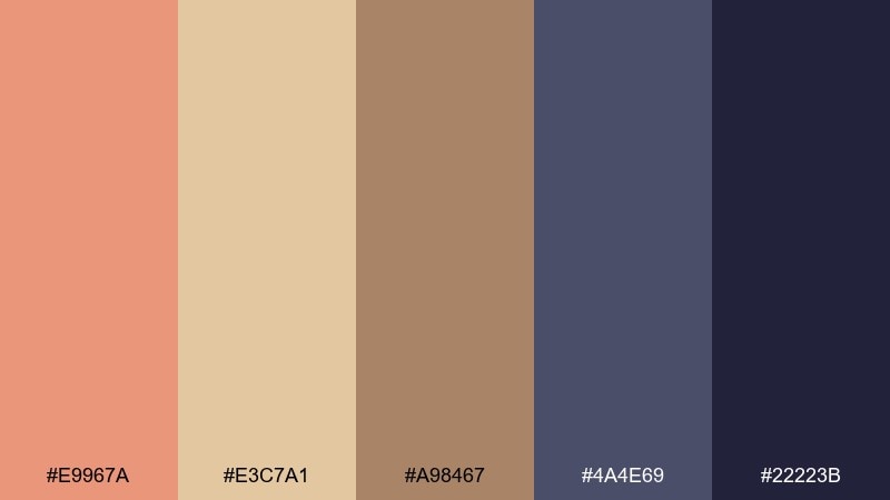
HEX: #E9967A #E3C7A1 #A98467 #4A4E69 #22223B
Mood: cinematic, earthy, dramatic
Best for: film festival flyer
Cinematic and earthy, like desert sand cooling into twilight. It works for festival flyers, event branding, and bold announcements that need atmosphere. Use the indigo tones as the base and bring in salmon for dates, badges, or key calls to action. Tip: keep the warm browns in gradients or large shapes so the design stays modern instead of rustic.
Image example of desert dusk generated using media.io

7) Coral Caffeine
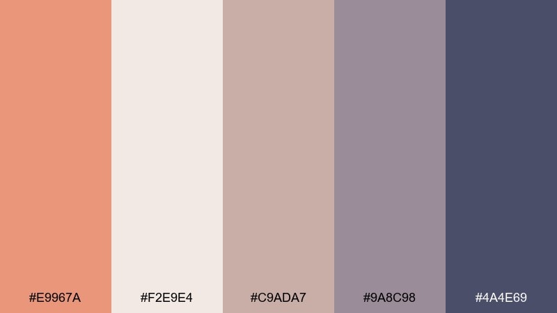
HEX: #E9967A #F2E9E4 #C9ADA7 #9A8C98 #4A4E69
Mood: soft, cozy, cafe-chic
Best for: coffee shop menu
Soft and cozy like steamed milk with a coral blush on top. Perfect for menus, loyalty cards, and cafe signage where you want warmth without loud color. Use the dusty mauves for sections and pricing, then add salmon for featured items and stamps. Tip: keep the background creamy and increase line spacing for a relaxed, premium feel.
Image example of coral caffeine generated using media.io
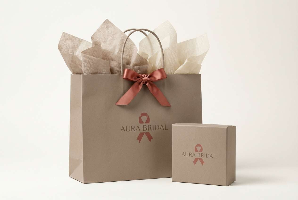
8) Modern Bridal
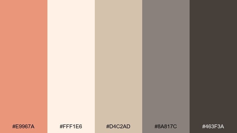
HEX: #E9967A #FFF1E6 #D4C2AD #8A817C #463F3A
Mood: elegant, minimal, timeless
Best for: bridal boutique branding
Elegant and minimal with soft blush warmth framed by tailored neutrals. It suits bridal boutiques, atelier websites, and refined packaging. Use the deeper taupe for typography and line work, letting salmon appear in small brand marks or ribbon details. Tip: pair with matte paper textures and plenty of white space for a high-end finish.
Image example of modern bridal generated using media.io
9) Warm Minimal UI
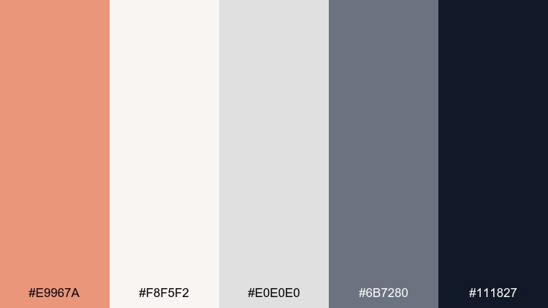
HEX: #E9967A #F8F5F2 #E0E0E0 #6B7280 #111827
Mood: clean, friendly, modern
Best for: dashboard UI mockup
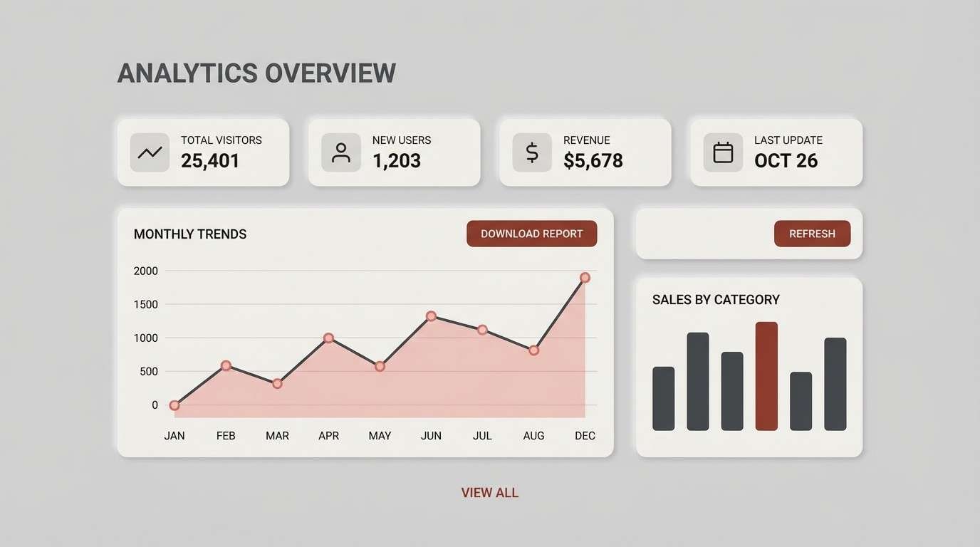
Clean and friendly, like a modern workspace warmed by a blush accent. These tones are made for dashboards, settings pages, and onboarding where clarity is key. Keep surfaces in off-white and light gray, then use salmon for primary buttons and active states. Tip: test contrast on the salmon buttons and use the near-black for body text to stay accessible.
Image example of warm minimal ui generated using media.io
10) Autumn Market
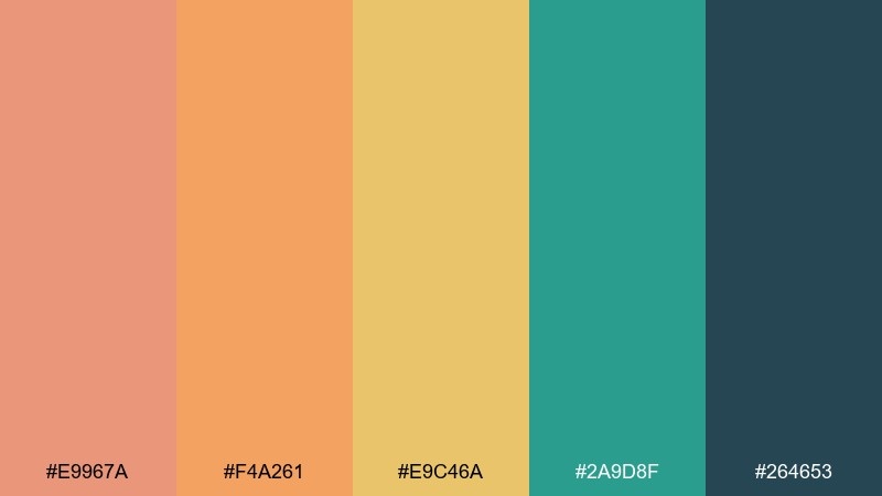
HEX: #E9967A #F4A261 #E9C46A #2A9D8F #264653
Mood: lively, rustic, inviting
Best for: farmers market poster
Lively and inviting, like late-season fruit stands and hand-painted signs. It is great for market posters, community events, and small-business promos. Let teal and deep blue-green carry headlines, and use salmon with golden tones for badges and price highlights. Tip: stick to big color blocks and simple icons so the palette reads from a distance.
Image example of autumn market generated using media.io

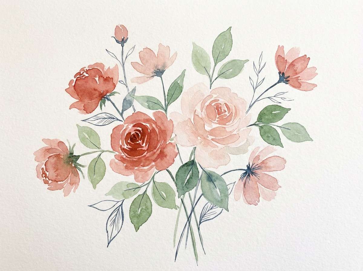
11) Botanical Peach
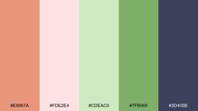
HEX: #E9967A #FDE2E4 #CDEAC0 #7FB069 #3D405B
Mood: airy, springy, botanical
Best for: watercolor floral illustration
Airy and springy, like peach petals and fresh leaves in a sketchbook. It is ideal for botanical prints, skincare labels, and gentle social graphics. Use the leaf greens for stems and frames, keeping salmon and blush for blossoms and focal details. Tip: choose one dark outline color (the deep slate) to keep watercolor elements crisp.
Image example of botanical peach generated using media.io
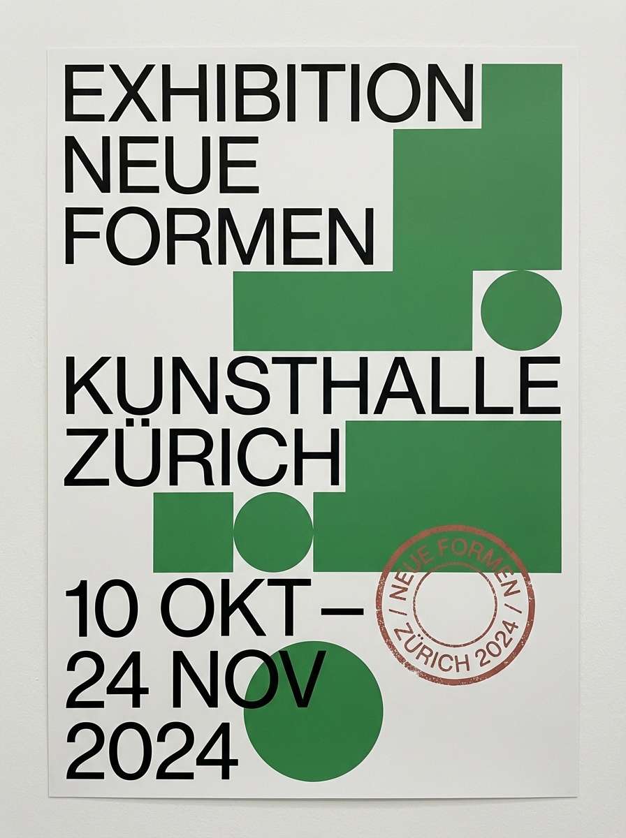
12) Gallery Poster
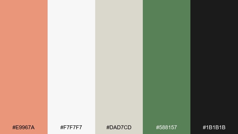
HEX: #E9967A #F7F7F7 #DAD7CD #588157 #1B1B1B
Mood: artful, refined, contemporary
Best for: exhibition poster layout
Artful and refined, like a white-walled gallery with a bold accent wall nearby. It suits exhibition posters, lecture announcements, and minimalist print collateral. Use black for type and structure, bring in green for blocks and rules, and let salmon pop as a single focal stamp. Tip: limit salmon to one element per page to keep the design feeling curated.
Image example of gallery poster generated using media.io
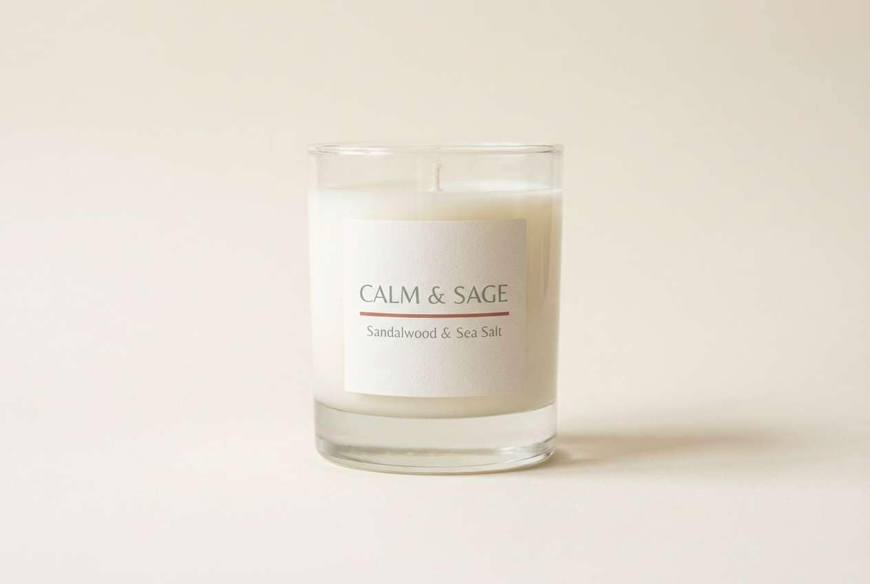
13) Spa Candle
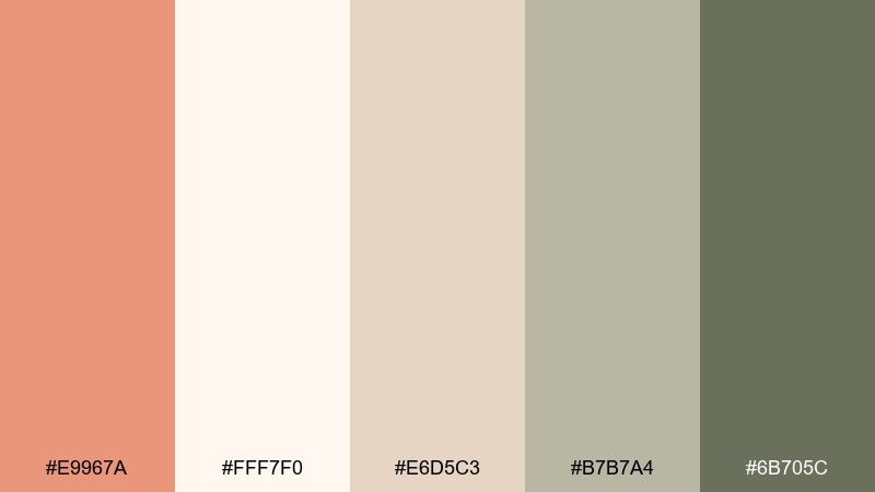
HEX: #E9967A #FFF7F0 #E6D5C3 #B7B7A4 #6B705C
Mood: soothing, clean, wellness
Best for: candle label and packaging
Soothing and clean, like warm steam and soft towels in a quiet spa. It works for candle labels, bath products, and wellness landing pages. Keep the creams and sand tones dominant, then use salmon as a gentle seal or scent indicator. Tip: choose uncoated paper and minimal line icons to reinforce the calm, natural feel.
Image example of spa candle generated using media.io
14) Retro Diner
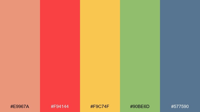
HEX: #E9967A #F94144 #F9C74F #90BE6D #577590
Mood: bold, upbeat, nostalgic
Best for: restaurant promo flyer
Bold and upbeat, like neon signs and vinyl booths with a modern polish. It is a great fit for restaurant promos, limited-time offers, and punchy social ads. Use salmon as a softer bridge between the red and the cooler blue, keeping the layout balanced. Tip: set one dominant color per section and avoid using all brights at equal weight.
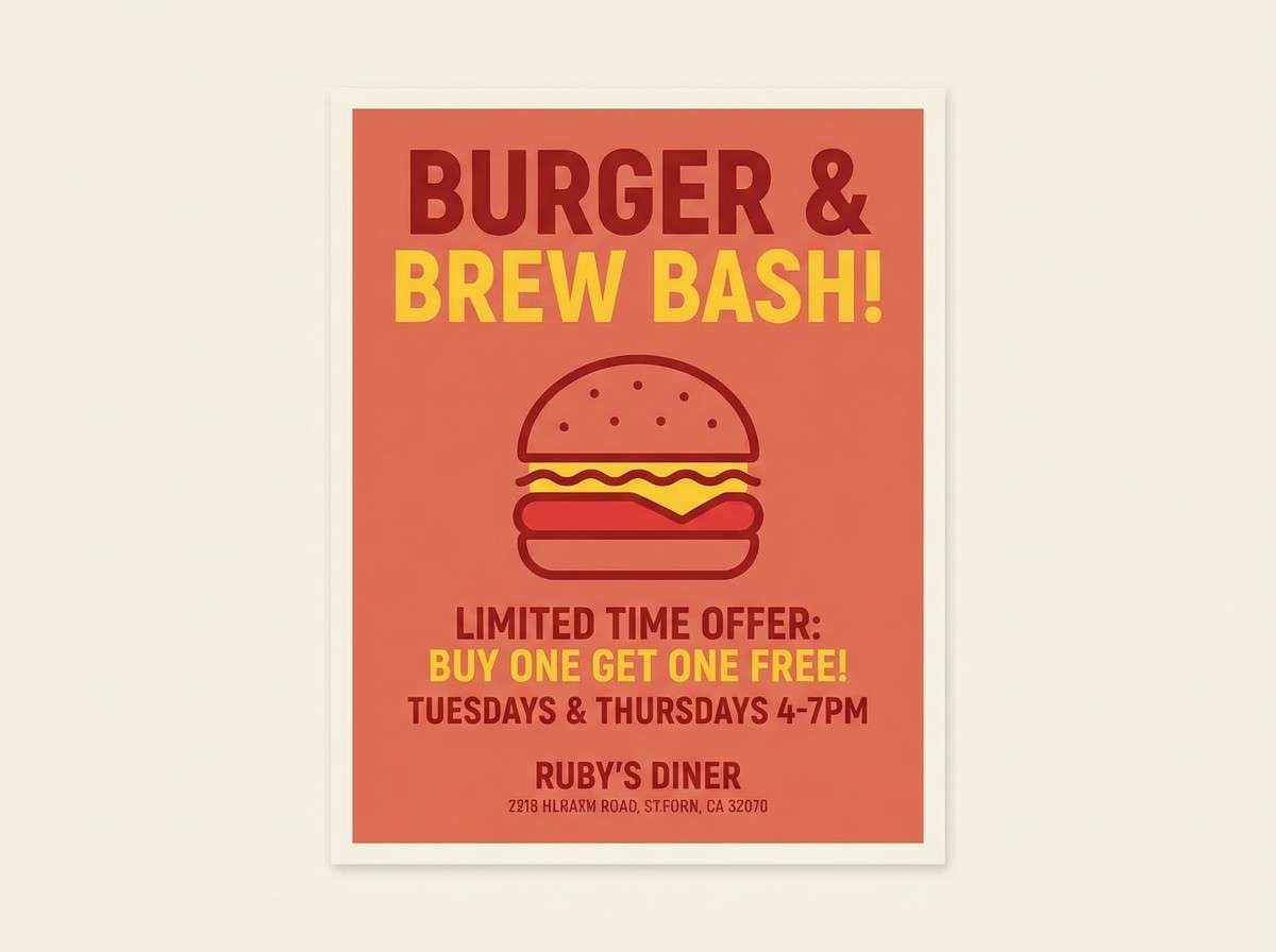
Image example of retro diner generated using media.io
15) Night Garden
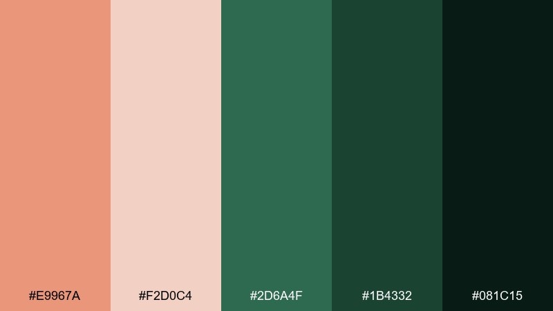
HEX: #E9967A #F2D0C4 #2D6A4F #1B4332 #081C15
Mood: lush, moody, sophisticated
Best for: cocktail bar menu
Lush and moody, like flowers glowing against deep garden greens at night. Ideal for cocktail menus, event invites, and upscale hospitality branding. Use the dark greens as the base, then add salmon for featured drinks, garnish icons, or section headers. Tip: print on textured stock and keep salmon elements slightly muted for a classy, not candy-like, result.
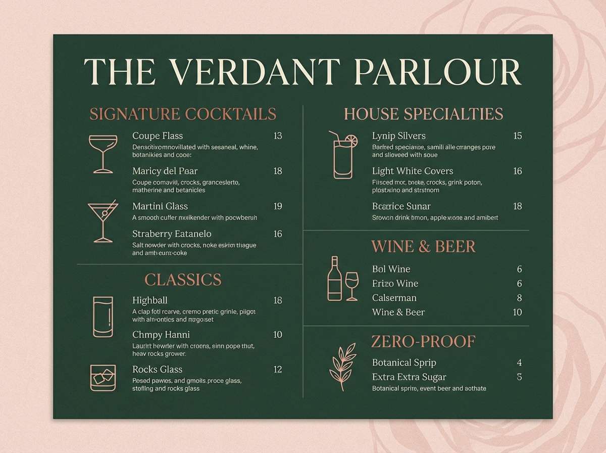
Image example of night garden generated using media.io
16) Kids Storybook
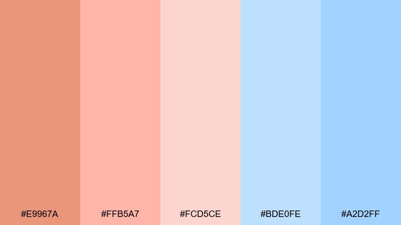
HEX: #E9967A #FFB5A7 #FCD5CE #BDE0FE #A2D2FF
Mood: sweet, playful, gentle
Best for: storybook cover illustration
Sweet and playful, like cotton-candy skies with a soft peach glow. Perfect for kids storybook covers, classroom posters, and friendly app illustrations. Use the blues for big background shapes and keep salmon and blush for characters or title badges. Tip: add rounded shapes and generous spacing so the palette stays calm rather than busy.
Image example of kids storybook generated using media.io

17) Mediterranean Tiles
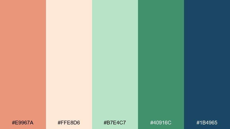
HEX: #E9967A #FFE8D6 #B7E4C7 #40916C #1B4965
Mood: fresh, patterned, sun-kissed
Best for: home decor product ad
Fresh and sun-kissed, like patterned tiles in a bright courtyard. It works for home decor ads, lifestyle banners, and product pages that need color without chaos. Use navy for structure and readability, then layer greens with salmon as the warm accent that keeps it inviting. Tip: try repeating small tile motifs in the light neutrals to add texture without overpowering the product.
Image example of mediterranean tiles generated using media.io
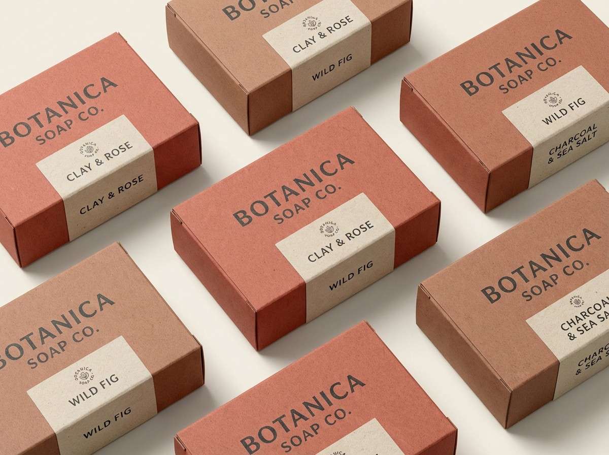
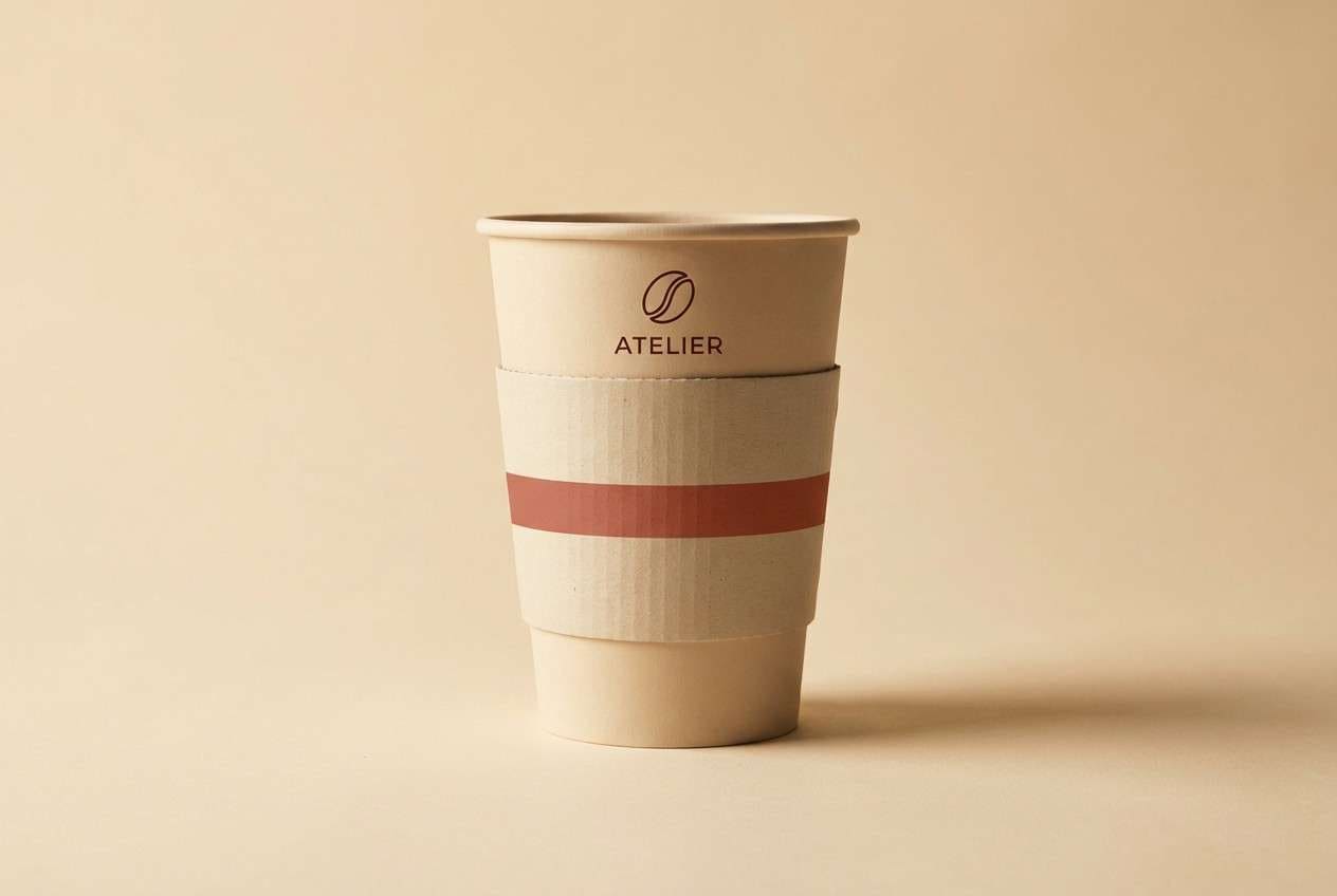
18) Coffee Shop Brand
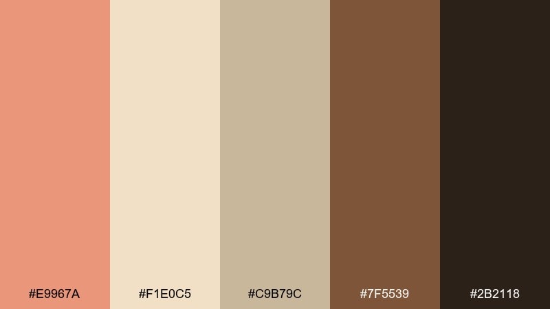
HEX: #E9967A #F1E0C5 #C9B79C #7F5539 #2B2118
Mood: warm, inviting, premium
Best for: logo and cup mockup
Warm and inviting, like toasted sugar and espresso crema. These dark salmon color combinations feel especially strong for cafe branding, where you want comfort plus contrast. Keep the deep coffee brown for wordmarks and use salmon as an accent stripe or stamp on cups and sleeves. Tip: ensure the cream background stays dominant so the brand looks bright and modern, not heavy.
Image example of coffee shop brand generated using media.io
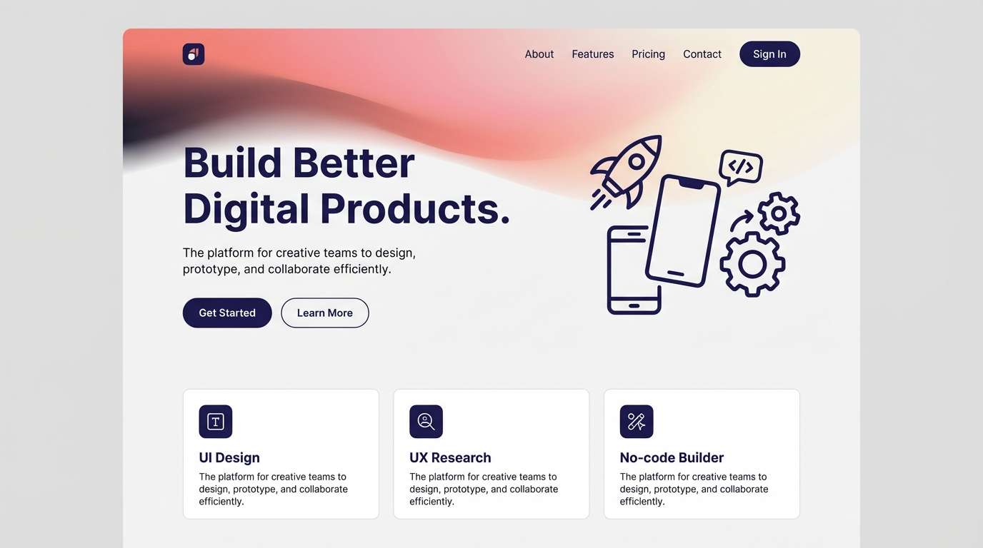
19) Soft Gradient App
HEX: #E9967A #F8C8B8 #FDF2E9 #B8C0FF #5E60CE
Mood: soft, modern, optimistic
Best for: mobile app landing UI
Soft and optimistic, like a sunrise gradient that still feels polished. It suits landing pages, feature sections, and signup flows where you want warmth without losing clarity. Use salmon and blush in gradients for hero panels, then lean on indigo for links, icons, and focus states. Tip: keep gradients subtle and reserve the deep purple for interactive elements to guide the eye.
Image example of soft gradient app generated using media.io
20) Festive Harvest
HEX: #E9967A #D62828 #F77F00 #FCBF49 #003049
Mood: festive, bold, energetic
Best for: seasonal sale banner
Festive and energetic, like harvest lights and bold signage. It is built for seasonal banners, retail promos, and attention-grabbing headers. Use navy as the stabilizer, then layer orange and gold for warmth while salmon bridges into softer callouts. Tip: keep text areas on cream or gold blocks for legibility and avoid placing small type on salmon.
Image example of festive harvest generated using media.io

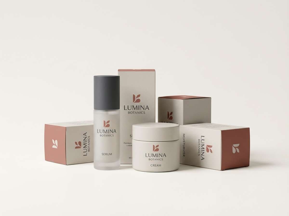
21) Porcelain Rose
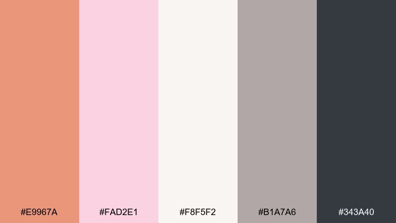
HEX: #E9967A #FAD2E1 #F8F5F2 #B1A7A6 #343A40
Mood: delicate, polished, airy
Best for: skincare product packaging
Delicate and polished, like porcelain with a rosy tint. As a dark salmon color palette, it fits skincare packaging and clean e-commerce visuals where trust matters. Use the off-white as the main surface, keep gray for ingredient text, and apply salmon for the brand mark or a subtle cap color. Tip: print salmon slightly lighter to prevent it from feeling too loud on small boxes.
Image example of porcelain rose generated using media.io
22) Charcoal Bloom
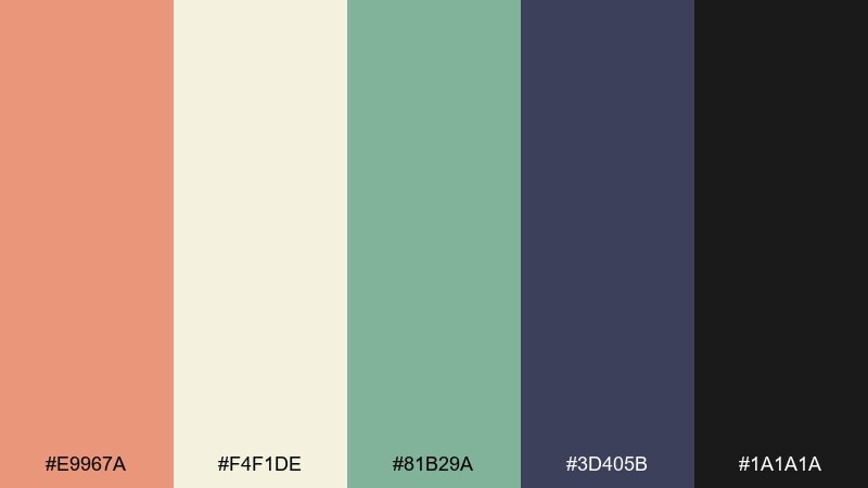
HEX: #E9967A #F4F1DE #81B29A #3D405B #1A1A1A
Mood: confident, balanced, contemporary
Best for: startup pitch deck theme
Confident and balanced, like a modern bouquet set against a charcoal backdrop. These dark salmon color combinations are excellent for pitch decks and brand systems that need warmth without losing authority. Use charcoal for title slides, bring in cream for content pages, and reserve salmon for emphasis and key metrics. Tip: keep charts mostly green and slate, using salmon only to spotlight one data series.
Image example of charcoal bloom generated using media.io

What Colors Go Well with Dark Salmon?
Dark salmon pairs best with soft neutrals like warm white, cream, sand, and greige—these keep the palette airy and let salmon feel intentional rather than overpowering. Charcoal and near-black add modern structure and make typography crisp.
For contrast, lean into cool partners: sage, eucalyptus, teal, deep ocean blue, slate, and indigo. Greens and teals are especially effective because they temper salmon’s warmth while keeping the overall look natural.
If you want a more playful outcome, add golden yellows or apricot tones; for a moodier editorial feel, combine salmon with wine, plum, or deep forest green.
How to Use a Dark Salmon Color Palette in Real Designs
In UI, treat dark salmon as an accent: primary buttons, active states, badges, and small highlights. Keep most surfaces neutral and reserve the darkest color for text to protect readability and hierarchy.
For branding and packaging, use salmon on memorable touchpoints—seals, ribbons, icons, or a single label stripe—then support it with cream and one deep anchor color (charcoal, navy, espresso) for contrast.
In print like invitations and menus, salmon works beautifully with textured paper vibes. Use it for monograms, dividers, or headings, and rely on muted greens or taupes to keep the design refined.
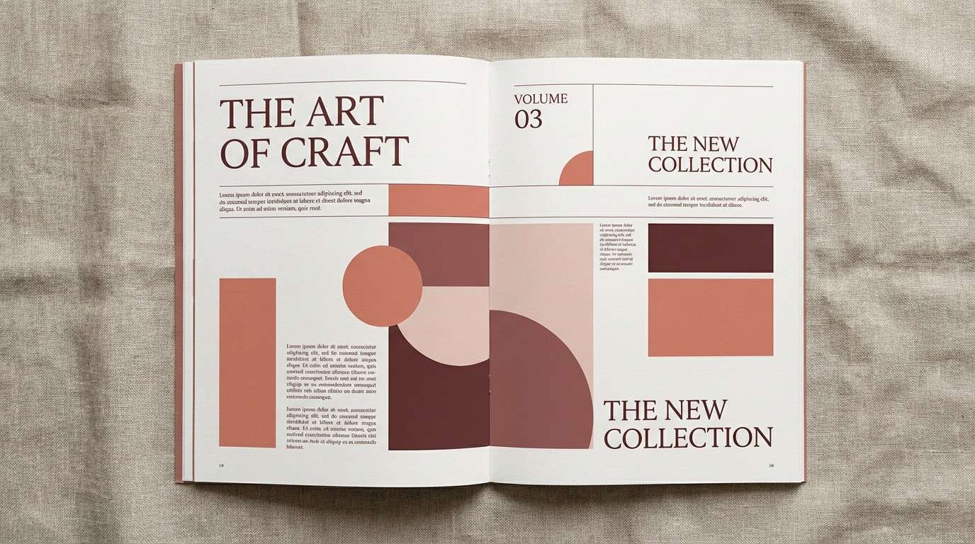
Create Dark Salmon Palette Visuals with AI
If you already have HEX codes, you can turn them into real mockups faster by generating on-brand images: posters, packaging scenes, UI previews, and more. The prompts above are designed to be copied and adjusted for your layout or product.
To stay consistent, reuse one base prompt, then swap only the subject (menu, candle, dashboard) while keeping lighting and style the same. That approach helps a full set of visuals feel like one cohesive brand system.
When you generate, keep dark salmon as the “accent” instruction and specify where it appears (buttons, ribbon, stamp, monogram). You’ll get cleaner results than asking the model to paint everything salmon.
Dark Salmon Color Palette FAQs
-
What is the HEX code for dark salmon?
A commonly used HEX for dark salmon is #E9967A. It’s a muted coral that sits between warm pink and soft orange. -
Is dark salmon a good color for UI buttons?
Yes—use it as an accent for primary buttons, active tabs, and badges, then pair it with off-white surfaces and near-black text. Always check contrast for accessibility before shipping. -
What neutral colors match dark salmon best?
Cream, warm white, sand, and greige make dark salmon feel modern and breathable. Charcoal or deep taupe adds the structure you need for typography and layouts. -
What are the best contrasting colors with dark salmon?
Teal, deep ocean blue, indigo, and forest green create strong, sophisticated contrast. These cooler hues keep the palette balanced and prevent salmon from feeling too sweet. -
Can dark salmon work for wedding stationery?
Yes—pair it with sage, soft cream, and a restrained charcoal for type. Dark salmon is ideal for monograms, wax-seal accents, and gentle section dividers. -
How do I keep a dark salmon palette from looking too “pink”?
Anchor it with one dark neutral (charcoal, espresso, navy) and include a cool supporting color (sage or teal). Also limit salmon to 10–20% of the layout for a more premium feel. -
How can I generate dark salmon palette mockups quickly?
Use an AI text-to-image tool and describe the subject plus exactly where salmon appears (ribbon, button, stamp). Reuse a consistent style prompt (lighting, background, typography) for cohesive outputs.
Next: Celeste Color Palette


