Pale blue is the shortcut to designs that feel calm, open, and instantly modern. It reads as clean without being stark, which makes it a dependable base for both digital products and printed pieces.
Below are 20 pale blue color palette ideas with HEX codes, plus practical ways to apply them to branding, UI, and decor so your layouts stay airy while still feeling structured.
In this article
- Why Pale Blue Palettes Work So Well
-
- sea glass whisper
- powdered sky minimal
- bluebell and cream
- frosted denim
- ice mint breeze
- harbor morning
- cloudline neutral
- silver lake
- cottage blue floral
- arctic cotton
- pastel storm
- ceramic bath
- soft orbit
- pearl and periwinkle
- blueprint pastel
- nordic haze
- linen sky
- museum air
- dawn over water
- quiet glacier
- What Colors Go Well with Pale Blue?
- How to Use a Pale Blue Color Palette in Real Designs
- Create Pale Blue Palette Visuals with AI
Why Pale Blue Palettes Work So Well
Pale blue sits in a sweet spot: it feels fresh and uplifting, yet it’s soft enough to keep interfaces and layouts from becoming visually loud. That makes it especially effective for brands that want to communicate clarity, care, or trust.
As a background color, pale blue adds just enough tone to separate sections and components while still reading as “near-neutral.” It helps whitespace feel intentional, not empty, and it pairs smoothly with both cool and warm accents.
In practice, pale blue also supports hierarchy. You can use slightly deeper blue steps for states (hover/active), progress, and highlights, while keeping dark blue-grays for readable typography and icons.
20+ Pale Blue Color Palette Ideas (with HEX Codes)
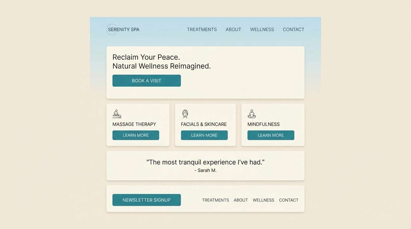
1) Sea Glass Whisper
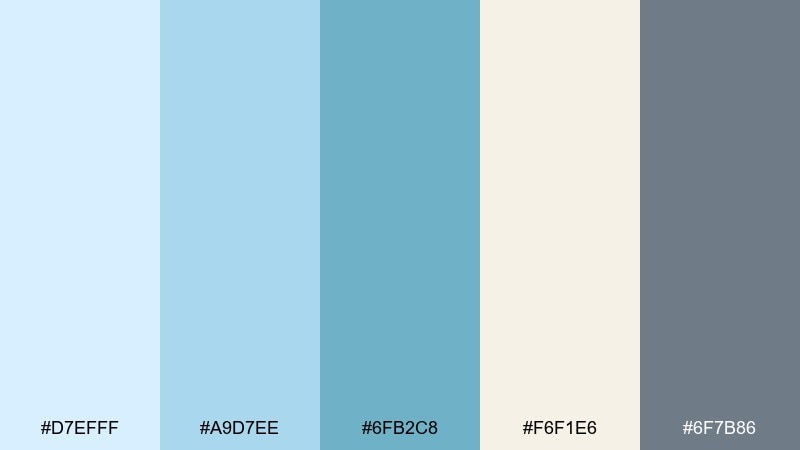
HEX: #d7efff #a9d7ee #6fb2c8 #f6f1e6 #6f7b86
Mood: coastal, calm, airy
Best for: wellness branding and spa landing pages
Coastal and weightless, these tones feel like sea glass washed up on a quiet morning. Use the lightest blue for backgrounds, then bring in the deeper teal for buttons or key highlights. Cream keeps the look warm, while slate anchors type and icons without going harsh. Tip: add plenty of white space so the soft blues stay crisp and modern.
Image example of sea glass whisper generated using media.io
Media.io is an online AI studio for creating and editing video, image, and audio in your browser.

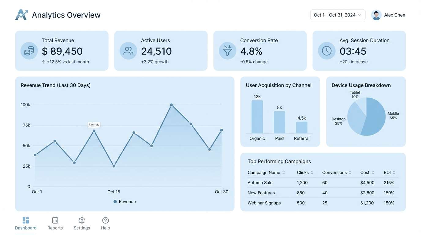
2) Powdered Sky Minimal
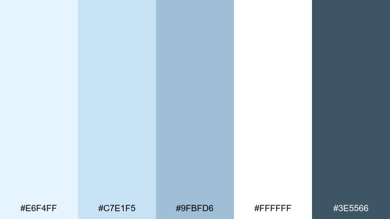
HEX: #e6f4ff #c7e1f5 #9fbfd6 #ffffff #3e5566
Mood: minimal, fresh, breathable
Best for: startup UI kits and dashboard components
Clean and breathable, this mix reads like a bright sky through a studio window. Keep white as the main canvas, then layer the two light blues for cards, dividers, and subtle states. Use the deeper blue-gray for text to maintain contrast without feeling heavy. Tip: reserve the mid blue for active tabs and selected controls to guide attention.
Image example of powdered sky minimal generated using media.io
3) Bluebell and Cream
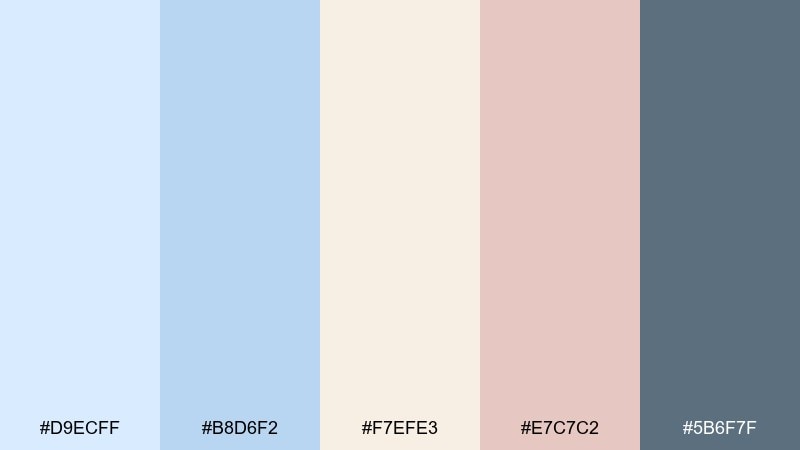
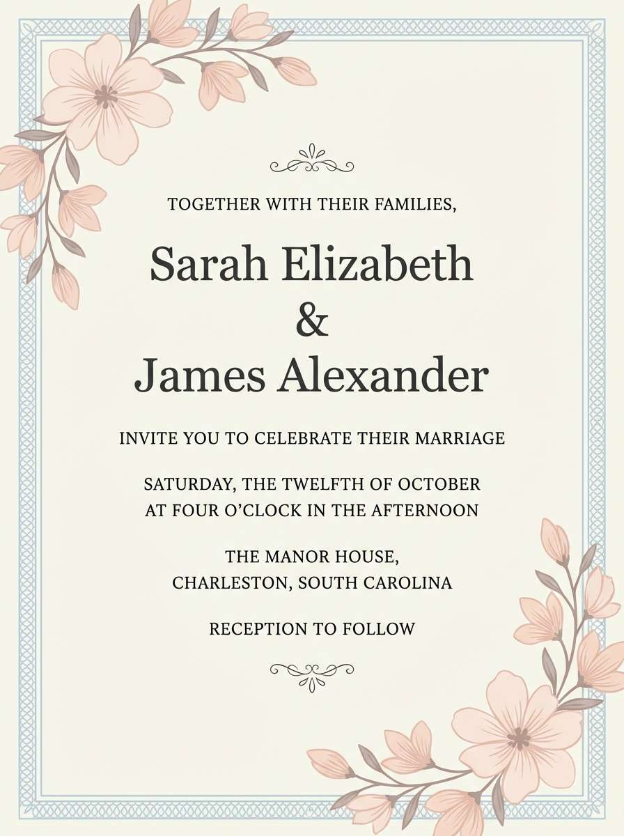
HEX: #d9ecff #b8d6f2 #f7efe3 #e7c7c2 #5b6f7f
Mood: romantic, soft, classic
Best for: wedding invitations and event stationery
Romantic and delicate, these hues suggest pressed petals and airy fabric. Cream makes a gentle paper-like base, while pale blues keep the layout light and refined. Add the blush accent sparingly for monograms, wax-seal motifs, or RSVP details, and use the muted steel tone for readable copy. Tip: pair with serif typography and generous line spacing for an elegant finish.
Image example of bluebell and cream generated using media.io
4) Frosted Denim
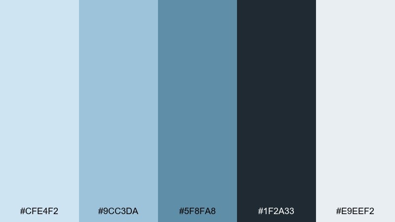
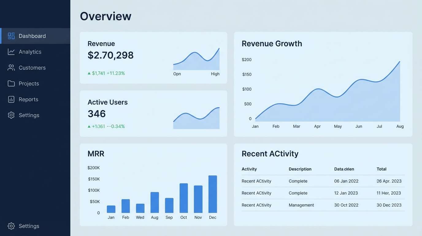
HEX: #cfe4f2 #9cc3da #5f8fa8 #1f2a33 #e9eef2
Mood: confident, cool, structured
Best for: B2B SaaS branding and product dashboards
Cool and structured, this set feels like frosted denim with crisp seams. Use the icy gray as your base, then build hierarchy with pale and mid blues for panels, charts, and progress states. The near-black is ideal for headings and dense data tables where contrast matters. Tip: keep the darkest shade limited to type and nav so the interface stays light.
Image example of frosted denim generated using media.io
5) Ice Mint Breeze
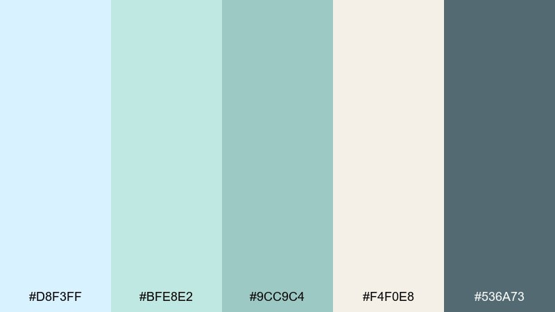
HEX: #d8f3ff #bfe8e2 #9cc9c4 #f4f0e8 #536a73
Mood: clean, soothing, spa-like
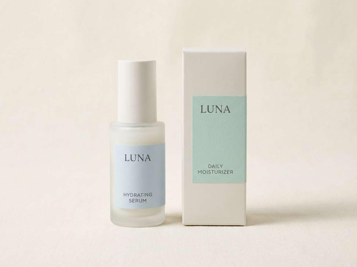
Best for: skincare packaging and product ads
Soothing and clean, these shades evoke chilled water, mint leaves, and soft linen. The mint and pale blue work beautifully for labels, while the warm off-white keeps the look friendly instead of clinical. Add the deeper teal for ingredient callouts or brand marks, and use the blue-gray for readable copy. Tip: choose a matte finish to make the pastels feel premium.
Image example of ice mint breeze generated using media.io
6) Harbor Morning
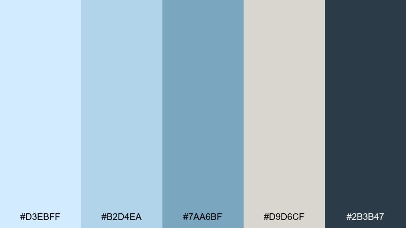
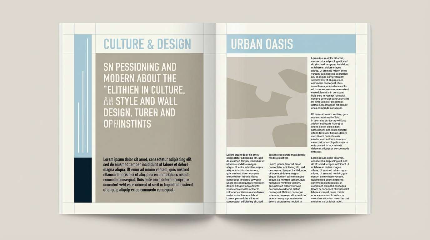
HEX: #d3ebff #b2d4ea #7aa6bf #d9d6cf #2b3b47
Mood: editorial, grounded, maritime
Best for: magazine layouts and blog hero graphics
Grounded and maritime, this mix feels like fog lifting over a harbor. Use the light blues for generous margins and pull-quote boxes, then bring in the steel blue for section headers. The warm gray-beige softens the page and pairs well with paper textures or subtle grain. Tip: keep body text in the deep blue-black for a print-like reading experience.
Image example of harbor morning generated using media.io
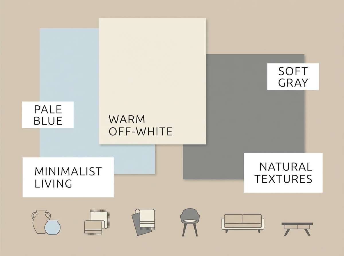
7) Cloudline Neutral
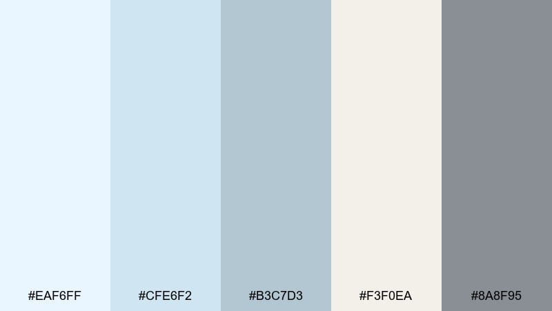
HEX: #eaf6ff #cfe6f2 #b3c7d3 #f3f0ea #8a8f95
Mood: soft, modern, understated
Best for: interior mood boards and minimalist branding
Understated and modern, these colors resemble layered clouds over a muted horizon. Use the warm off-white for large surfaces, then add pale blue in textiles, UI backgrounds, or packaging panels. The gentle grays help with structure, borders, and typography without breaking the calm. Tip: introduce texture like paper grain or brushed fabric to keep the palette from feeling flat.
Image example of cloudline neutral generated using media.io
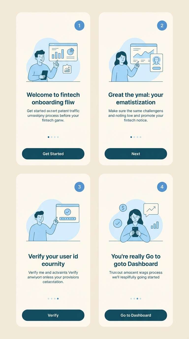
8) Silver Lake
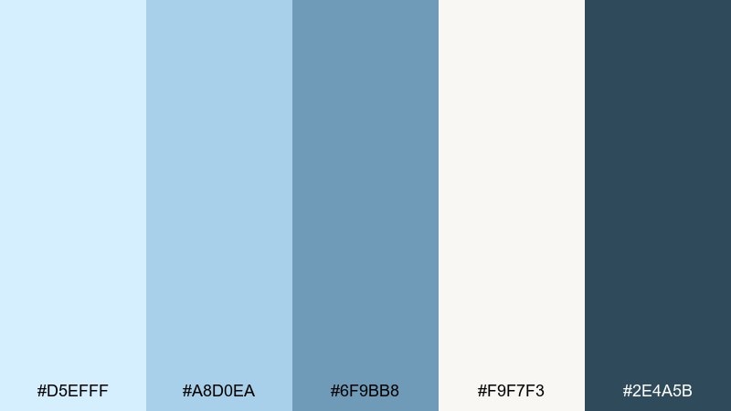
HEX: #d5efff #a8d0ea #6f9bb8 #f9f7f3 #2e4a5b
Mood: trustworthy, polished, calm
Best for: finance branding and fintech onboarding
Polished and trustworthy, these tones feel like still water with a silver sheen. Use the palest blue for onboarding screens and empty states, then pull in the mid blue for progress indicators and charts. The dark teal is strong enough for headings and primary actions, especially on the warm off-white base. Tip: keep accent use consistent so key actions always share the same shade.
Image example of silver lake generated using media.io
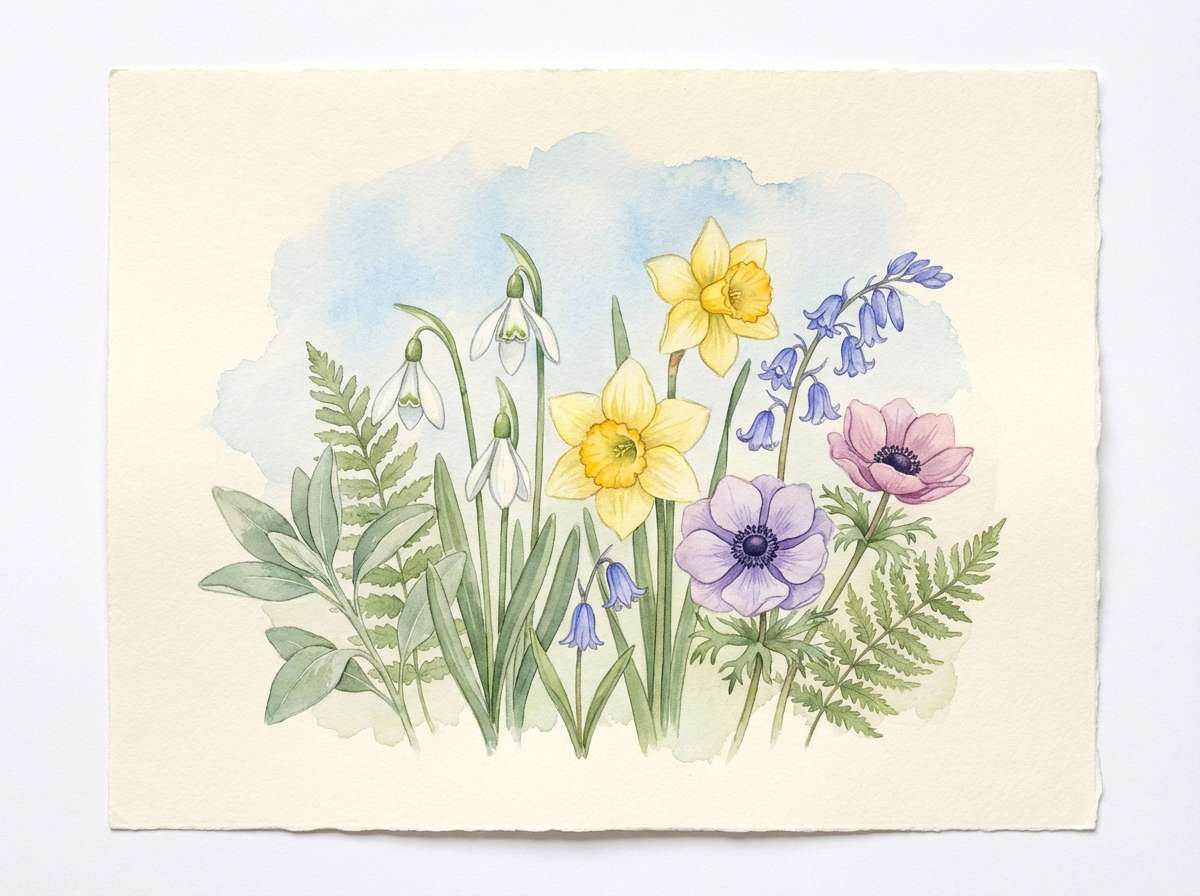
9) Cottage Blue Floral
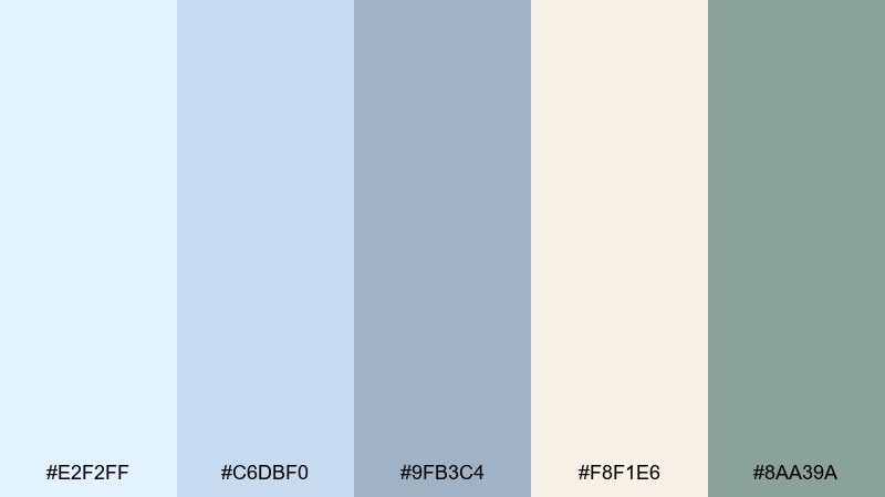
HEX: #e2f2ff #c6dbf0 #9fb3c4 #f8f1e6 #8aa39a
Mood: gentle, botanical, nostalgic
Best for: spring botanical illustrations and prints
Gentle and nostalgic, this set brings to mind cottage gardens and sun-faded ceramics. The pale blues make an airy sky wash, while the soft sage works beautifully for stems and leaves. Warm cream keeps the paper feeling natural, and the muted gray-blue can define line work and shadows. Tip: limit outlines and let watercolor bleeds do most of the blending.
Image example of cottage blue floral generated using media.io
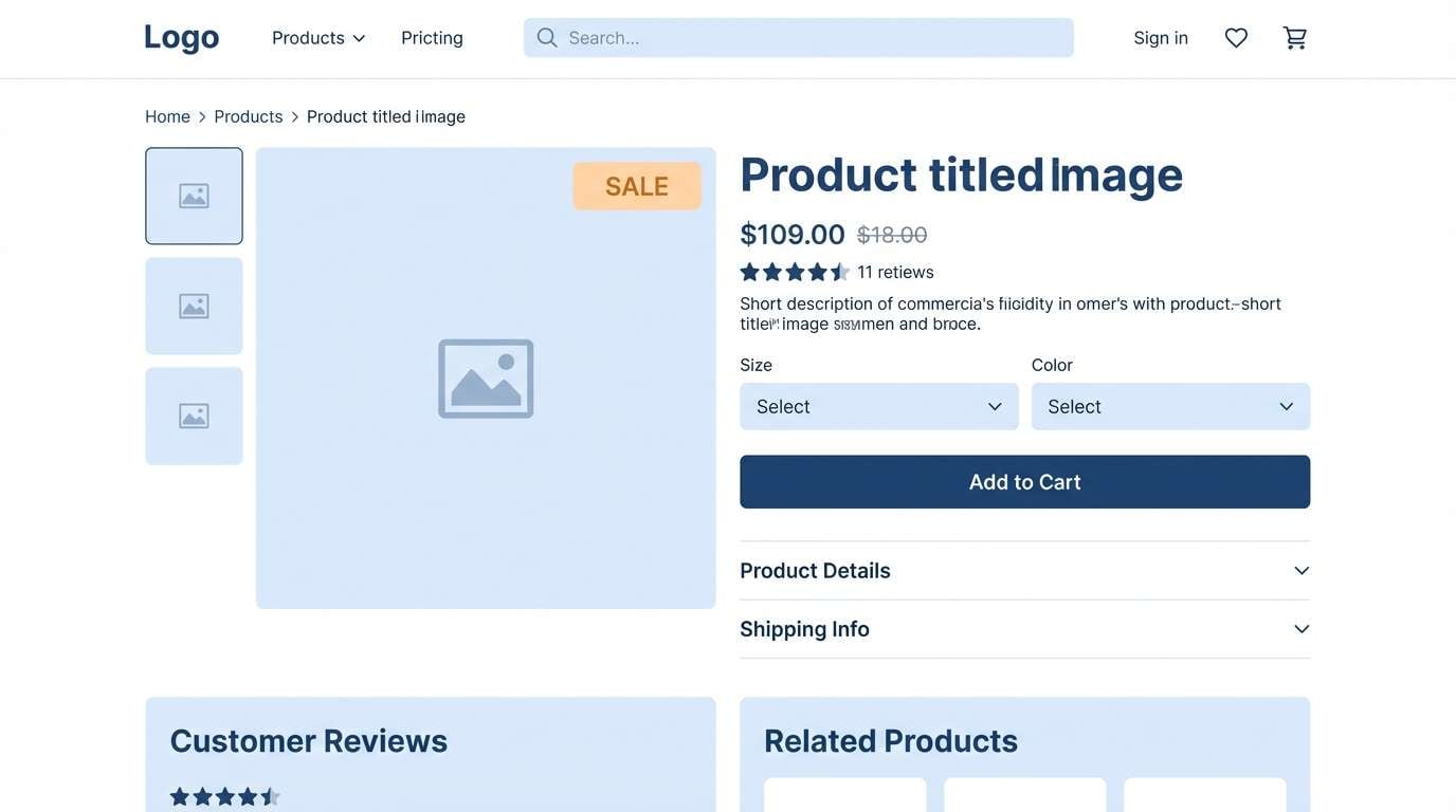
10) Arctic Cotton
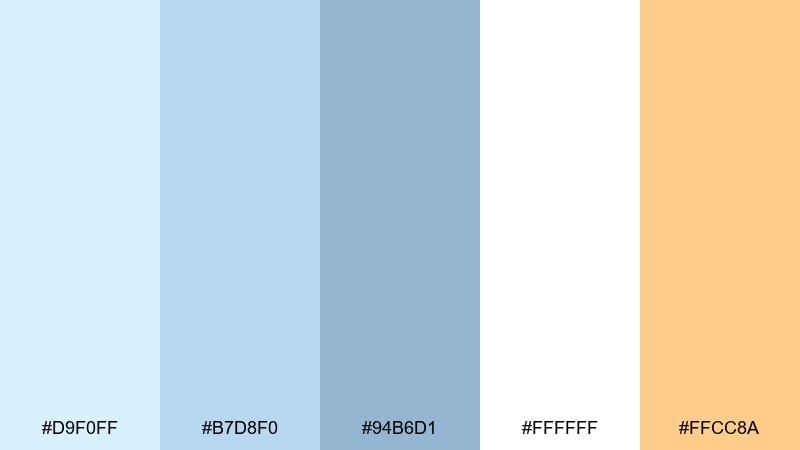
HEX: #d9f0ff #b7d8f0 #94b6d1 #ffffff #ffcc8a
Mood: bright, friendly, modern
Best for: ecommerce product pages and promo banners
Bright and friendly, these hues feel like fresh cotton under winter light. White and pale blue keep layouts clean, while the deeper blue supports headings and price highlights. The soft apricot accent adds warmth for badges, limited-time tags, or add-to-cart nudges without shouting. Tip: use the apricot in small, repeatable UI elements to improve scanning.
Image example of arctic cotton generated using media.io
11) Pastel Storm
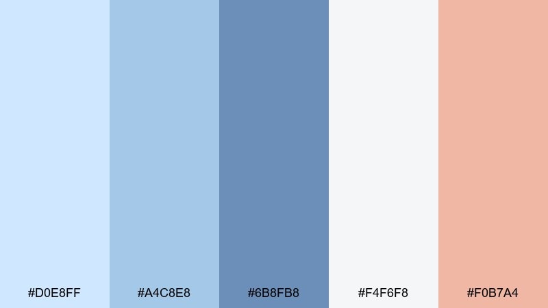
HEX: #d0e8ff #a4c8e8 #6b8fb8 #f4f6f8 #f0b7a4
Mood: dynamic, soft, contemporary
Best for: music posters and social graphics
Dynamic yet soft, this palette feels like a storm cloud lit by pastel sunset. Layer the light blues for gradient backdrops, then use the stronger blue for titles and graphic shapes. The peach accent is perfect for dates, stickers, or small icons that need to pop without going neon. Tip: keep the peach to one or two focal areas so the composition stays balanced.
Image example of pastel storm generated using media.io

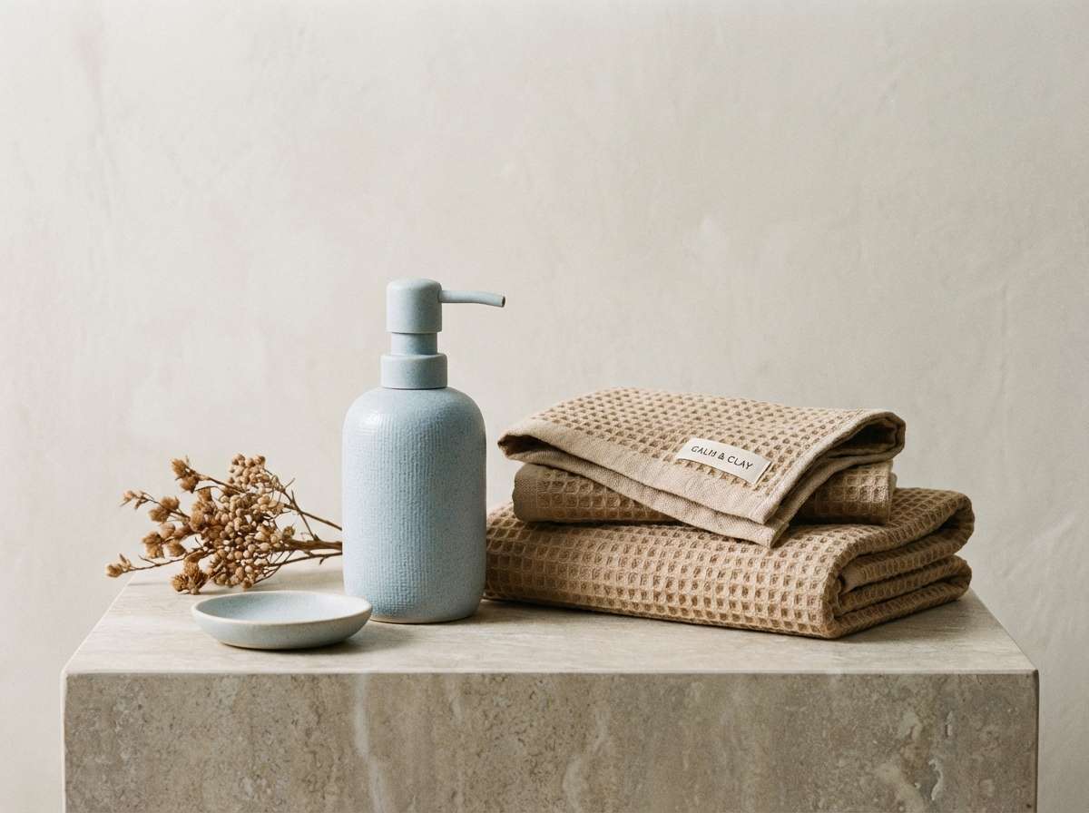
12) Ceramic Bath

HEX: #e1f1ff #b9d3e6 #8fb0c6 #f2e7dd #59656f
Mood: clean, homey, relaxed
Best for: bathroom decor concepts and lifestyle branding
Relaxed and homey, these tones resemble glazed ceramic and warm stone. Use the warm beige as the grounding neutral, then bring in pale blue on tiles, labels, or background blocks. The mid blue adds definition for trim lines and icons, while the slate supports readable text. Tip: pair with natural materials like oak or linen textures for extra warmth.
Image example of ceramic bath generated using media.io
13) Soft Orbit
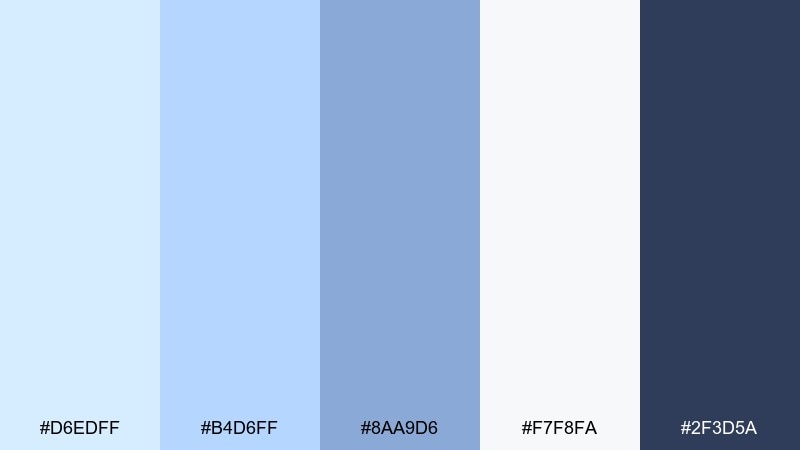
HEX: #d6edff #b4d6ff #8aa9d6 #f7f8fa #2f3d5a
Mood: techy, optimistic, smooth
Best for: SaaS onboarding screens and feature pages
Optimistic and smooth, these blues feel like a soft orbit around a bright interface. Use the lightest tones for backgrounds and illustration fills, then step up to periwinkle-blue for cards and highlights. The deep navy is ideal for headlines and primary buttons, giving the design a confident spine. Tip: add subtle shadows instead of heavy borders to keep everything floating.
Image example of soft orbit generated using media.io
14) Pearl and Periwinkle
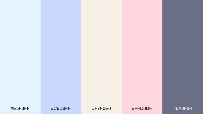
HEX: #e5f3ff #c9d8ff #f7f0e6 #ffd6df #6a6f86
Mood: sweet, polished, playful
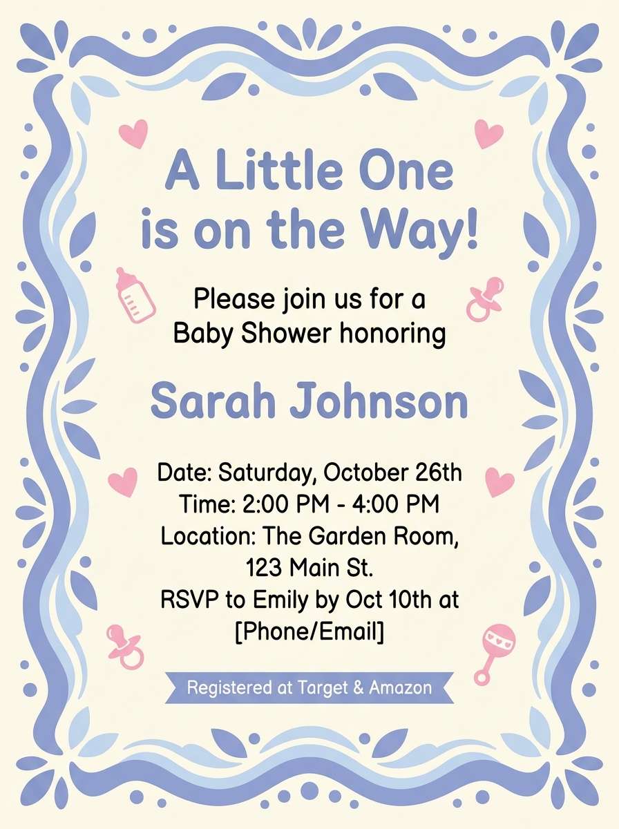
Best for: baby shower invitations and party flyers
Sweet and polished, these shades feel like pearl candies and soft ribbons. Use the warm cream as your base, then layer pale blue and periwinkle for frames, headings, and decorative shapes. The pink accent works best as a sprinkle for icons or RSVP highlights, while the muted violet-gray keeps text readable. Tip: stick to rounded type and simple illustrations to keep it charming, not busy.
Image example of pearl and periwinkle generated using media.io
15) Blueprint Pastel
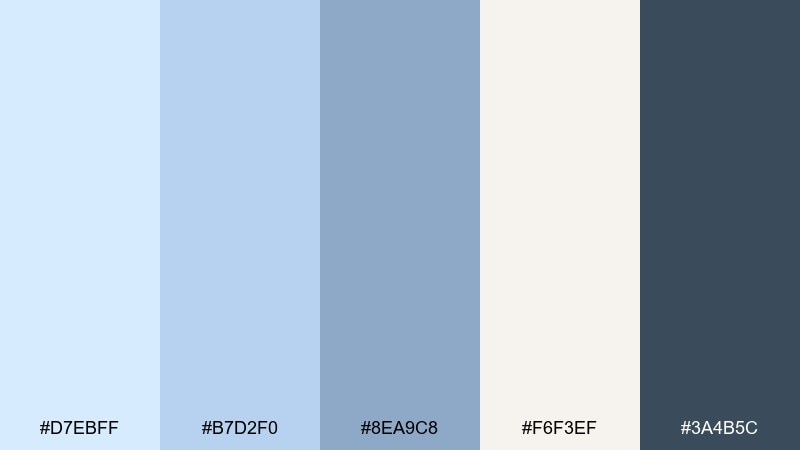
HEX: #d7ebff #b7d2f0 #8ea9c8 #f6f3ef #3a4b5c
Mood: organized, creative, professional
Best for: pitch decks and presentation templates
Organized and professional, these tones suggest tidy notes on a light blueprint. Use the warm off-white for slide backgrounds, then apply the pale blues for section breaks and chart fills. The deeper blue-gray is strong for titles and bullet points, keeping readability high in meeting rooms. Tip: assign one blue to data visuals and another to UI elements so the deck stays consistent.
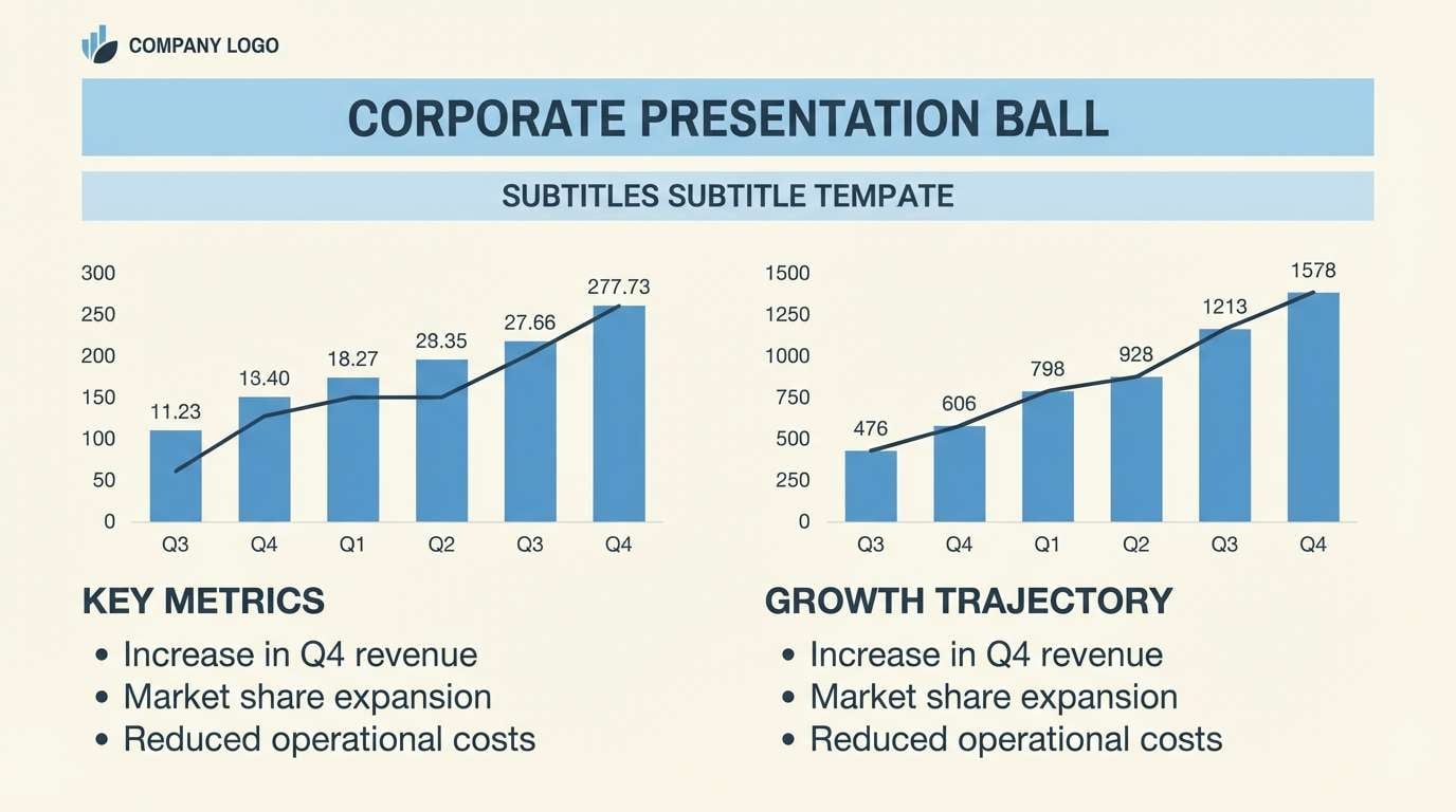
Image example of blueprint pastel generated using media.io
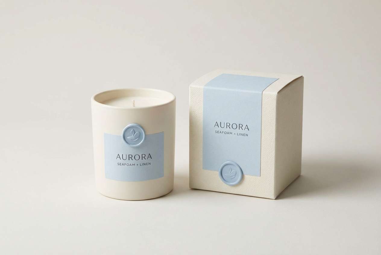
16) Nordic Haze
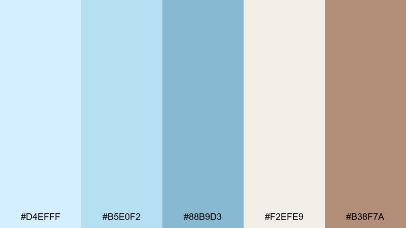
HEX: #d4efff #b5e0f2 #88b9d3 #f2efe9 #b38f7a
Mood: soft, premium, Scandinavian
Best for: home fragrance packaging and product ads
Soft and premium, this set feels like Nordic light against warm wood. The pale blues create an airy label base, while the warm ivory keeps the design approachable. Use the clay accent for small brand marks or scent notes to add a handcrafted touch. Tip: pair with minimalist sans serif type and embossed details for a boutique look.
Image example of nordic haze generated using media.io
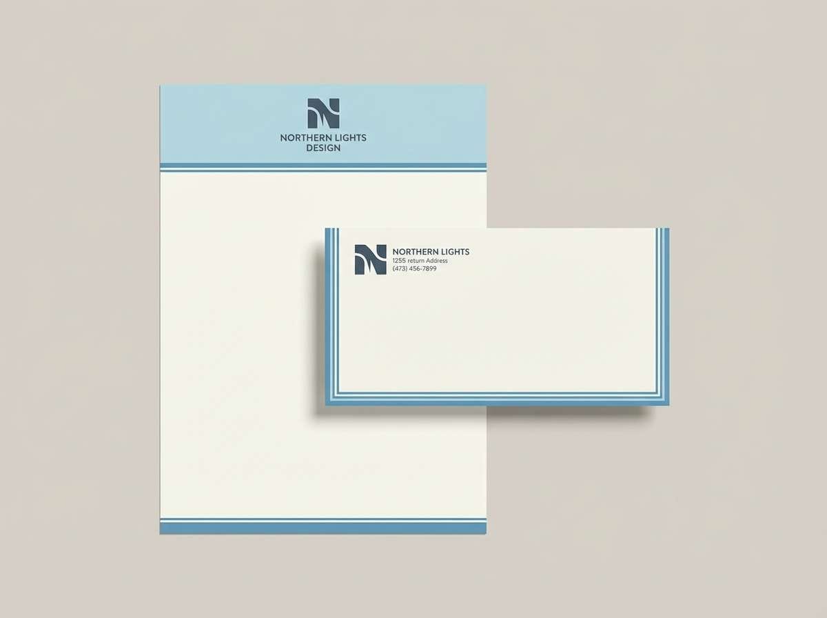
17) Linen Sky
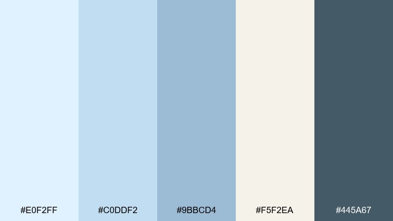
HEX: #e0f2ff #c0ddf2 #9bbcd4 #f5f2ea #445a67
Mood: calm, tidy, timeless
Best for: brand stationery and letterhead sets
Calm and tidy, these colors look like crisp linen under a pale morning sky. A pale blue color palette like this works beautifully for letterheads, envelopes, and subtle brand patterns without feeling loud. Use the warm off-white as the paper tone, then keep the darker blue-gray for logos and text so everything stays legible. Tip: add a thin border line in the mid blue to elevate the print feel.
Image example of linen sky generated using media.io
18) Museum Air
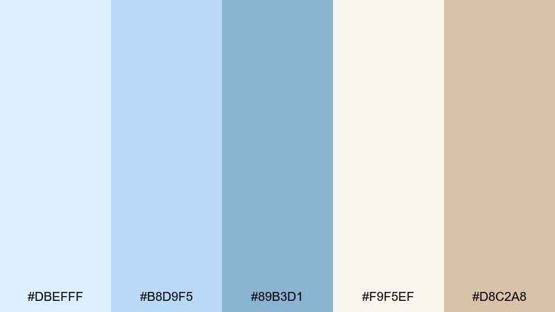
HEX: #dbefff #b8d9f5 #89b3d1 #f9f5ef #d8c2a8
Mood: curated, airy, sophisticated
Best for: gallery branding and exhibition posters
Curated and airy, these tones evoke quiet galleries and sunlit walls. The pale blues pair best with warm off-white and a hint of tan, giving you pale blue color combinations that feel modern but not cold. Use the mid blue for titles and directional signage, then keep the tan accent for dates or ticket info. Tip: let typography do the heavy lifting and keep imagery framed with lots of margin.
Image example of museum air generated using media.io
19) Dawn Over Water
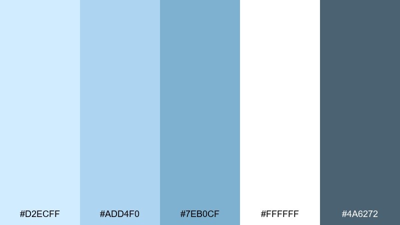
HEX: #d2ecff #add4f0 #7eb0cf #ffffff #4a6272
Mood: fresh, open, travel-ready
Best for: travel brochures and hotel websites
Fresh and open, these hues feel like first light spreading across calm water. Use white and the palest blue for large sections, then apply the brighter blue for links, icons, and subtle gradients. A pale blue color palette like this also pairs well with natural photography, especially beaches and city skylines. Tip: keep the slate tone for text and nav so images remain the hero.
Image example of dawn over water generated using media.io
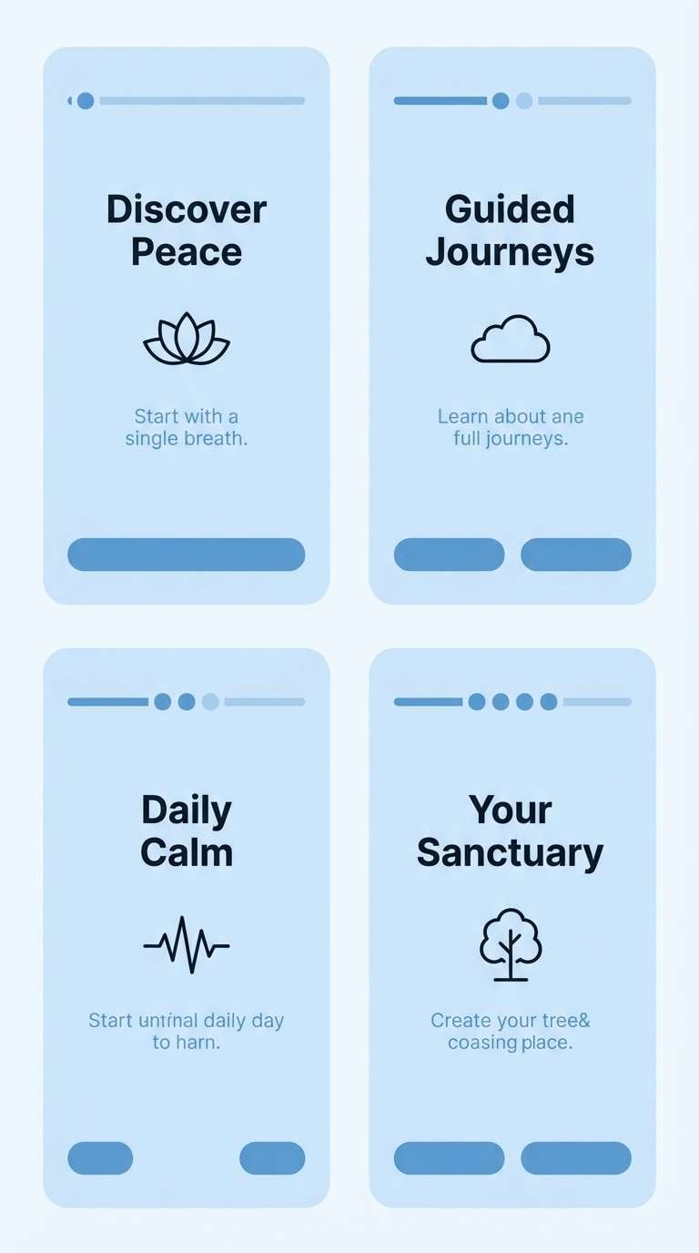
20) Quiet Glacier
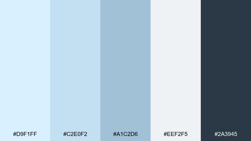
HEX: #d9f1ff #c2e0f2 #a1c2d6 #eef2f5 #2a3945
Mood: cool, calm, focused
Best for: meditation apps and calm onboarding UI
Cool and focused, this set feels like a quiet glacier with smooth edges. Use the light blue and misty gray for screen backgrounds, then pick the mid blue for progress rings and toggles. The deep blue-black is strong for headings and accessibility-friendly contrast. Tip: animate only one accent element per screen to keep the experience soothing.
Image example of quiet glacier generated using media.io
What Colors Go Well with Pale Blue?
Warm neutrals like cream, ivory, sand, and warm gray keep pale blue from feeling too cold. This is the easiest route for inviting branding, editorial layouts, and interiors where you want softness without losing clarity.
For contrast, deep blue-black, slate, and navy make typography and UI controls readable while staying harmonious. If you need a brighter “spark,” peach, apricot, blush, or muted tan add energy without overpowering the calm base.
For nature-forward pairings, pale blue also plays nicely with gentle sage, eucalyptus, and dusty teal. These combos are especially effective in wellness, skincare, and lifestyle design where a clean-but-organic look matters.
How to Use a Pale Blue Color Palette in Real Designs
Start with pale blue as a background or section color, then reserve mid blues for UI states (active tabs, selected chips, progress bars). This keeps hierarchy clear while maintaining a light overall feel.
Use a dark blue-gray for text instead of pure black to avoid harsh contrast and to match the softness of pastel blues. For print pieces, warm off-whites can mimic paper tones and make the blues look more premium.
If you add an accent (like peach or tan), keep it repeatable and limited—badges, small icons, or one key call-to-action style—so your design stays calm and intentional.
Create Pale Blue Palette Visuals with AI
Want to see your pale blue color palette in action before committing to a full design? Generate quick mockups like landing pages, packaging, posters, or mood boards using a simple text prompt.
With Media.io, you can experiment with different pale blue tones, swap accents, and iterate on layout styles fast—then keep the best prompt as a reusable creative template for your brand.
Try describing the use case (e.g., “fintech onboarding UI” or “wedding invitation”) and include your preferred HEX colors for more controlled results.
Pale Blue Color Palette FAQs
-
What does pale blue communicate in design?
Pale blue commonly signals calm, cleanliness, and trust. It’s popular in wellness, tech, and finance because it feels clear and reassuring without being overly bold. -
Is pale blue a good background color for websites?
Yes—pale blue works well as a soft background that still feels like “white space.” Pair it with dark blue-gray text for comfortable contrast and use mid blues for buttons and active states. -
What accent colors pair best with pale blue?
Warm accents like peach, apricot, blush, and tan add life to pale blue without clashing. If you prefer cool accents, try sage, dusty teal, or periwinkle for a more tonal look. -
How do I keep a pale blue palette from looking washed out?
Add one darker anchor color (navy, slate, or deep teal) for typography and key UI elements. Also use spacing, subtle shadows, or texture so the light tones don’t blend together. -
What’s the best text color on pale blue?
Deep blue-gray or near-black navy usually looks more natural than pure black and keeps the palette cohesive. For accessibility, always check contrast ratios for body text and small UI labels. -
Can pale blue work for branding and packaging?
Absolutely. Pale blue feels premium when paired with warm off-whites and a restrained accent, especially with matte finishes, minimal typography, and simple geometric layouts. -
How can I generate pale blue palette mockups quickly?
Use Media.io text-to-image: describe the design type (UI, poster, packaging), the vibe (calm, minimal, premium), and include a few HEX codes. You can iterate prompts until the result matches your brand style.
Next: Elegant Color Palette