

Goldenrod is a warm yellow that brings instant energy, friendliness, and “sunlit” confidence to a design. It reads as earthy and premium at the same time, which is why it works across branding, UI, and print.
Below are 20 goldenrod color palette ideas with HEX codes, plus quick guidance on what to pair with goldenrod and how to apply it in real layouts.
In this article
Why Goldenrod Palettes Work So Well
Goldenrod sits in the sweet spot between bright yellow and warm amber, so it naturally draws attention without feeling neon. That makes it ideal for accents like buttons, badges, highlights, and small UI states.
It also pairs easily with grounded neutrals (cream, greige, charcoal) and nature tones (olive, forest green, clay brown). Those supporting colors keep the warmth controlled and make goldenrod feel intentional rather than overpowering.
In print, goldenrod often reads “tactile” and premium—especially beside dark inks and paper-like off-whites. Used sparingly, it can suggest heritage, craft, and quality without needing heavy ornament.
20+ Goldenrod Color Palette Ideas (with HEX Codes)
1) Harvest Market
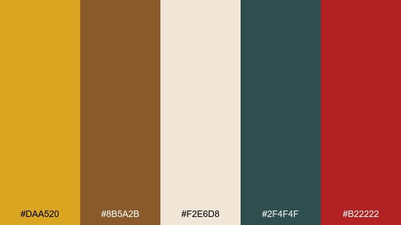
HEX: #DAA520 #8B5A2B #F2E6D8 #2F4F4F #B22222
Mood: warm, rustic, inviting
Best for: farmers market branding and label design
Warm and rustic, like late-summer produce stalls and hand-lettered kraft tags. Use the golden tone for badges and price highlights, then ground it with deep teal and chestnut brown. Creamy neutrals keep the layout readable on labels and signage. Tip: reserve the red accent for small callouts so the main warmth stays cohesive.
Image example of harvest market generated using media.io
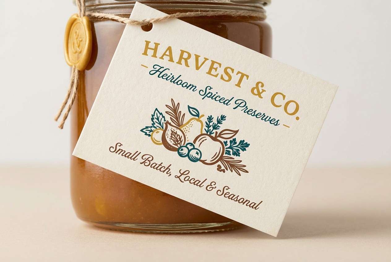
Media.io is an online AI studio for creating and editing video, image, and audio in your browser.

2) Sunlit Linen
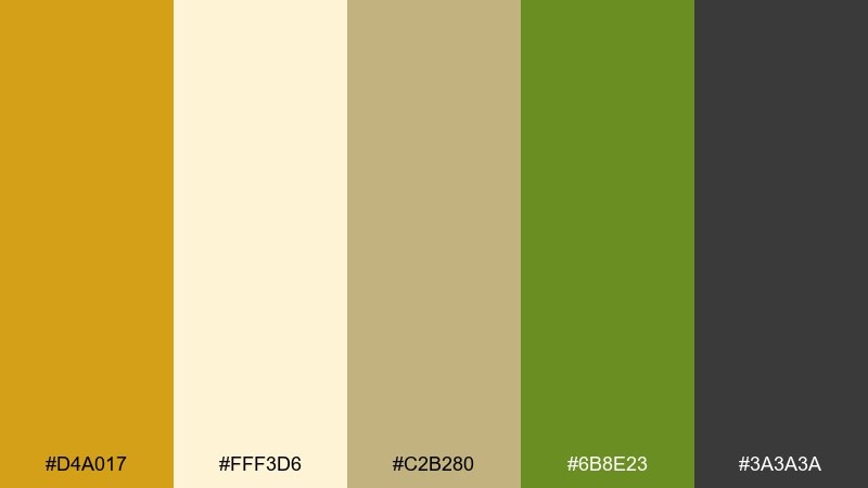
HEX: #D4A017 #FFF3D6 #C2B280 #6B8E23 #3A3A3A
Mood: light, calm, natural
Best for: wellness websites and clean lifestyle brands
Light and calm, like sun falling across linen curtains in a quiet studio. Pair the golden highlight with warm sand and soft cream to keep pages airy and approachable. Olive green adds a grounded, botanical note without turning too loud. Tip: use charcoal for body text and keep the golden accent for buttons and key icons.
Image example of sunlit linen generated using media.io
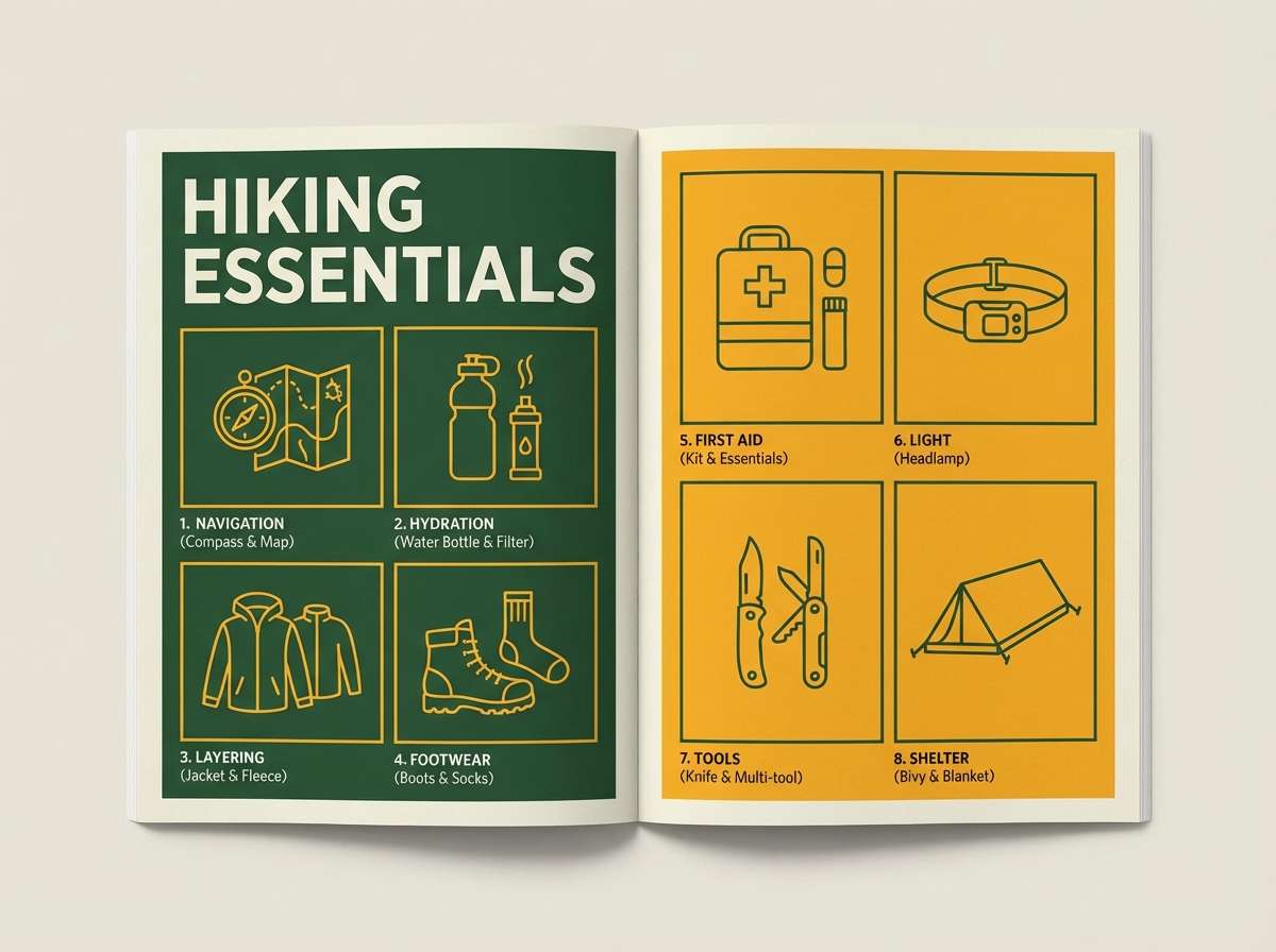
3) Amber Forest
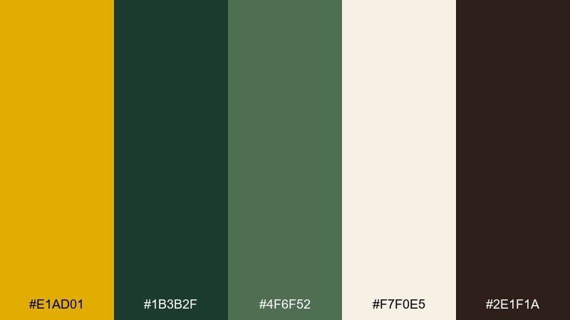
HEX: #E1AD01 #1B3B2F #4F6F52 #F7F0E5 #2E1F1A
Mood: earthy, grounded, outdoorsy
Best for: outdoor gear branding and editorial spreads
Earthy and grounded, like amber light filtering through evergreen trails. The deep forest green makes the warm yellow feel intentional rather than loud. Use the off-white as breathing room for headlines, then add espresso brown for premium contrast. Tip: keep photography slightly warm so the palette reads cohesive across print and web.
Image example of amber forest generated using media.io
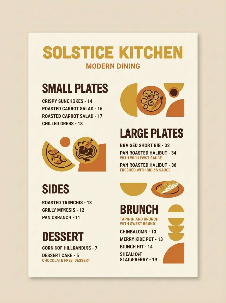
4) Desert Spice
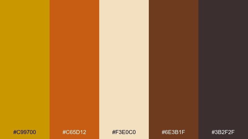
HEX: #C99700 #C65D12 #F3E0C0 #6E3B1F #3B2F2F
Mood: spicy, sunbaked, bold
Best for: restaurant menus and food packaging
Spicy and sunbaked, like dunes, paprika, and clay pots at golden hour. This goldenrod color palette shines on menus when you balance it with toasted orange and dark cocoa for depth. Cream keeps sections legible and prevents the warm tones from blending together. Tip: print the darkest brown for small type and use the gold for section headers.
Image example of desert spice generated using media.io
5) Vintage Brass
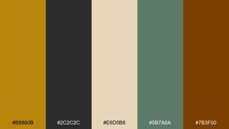
HEX: #B8860B #2C2C2C #E6D5B8 #5B7A6A #7B3F00
Mood: heritage, refined, moody
Best for: craft spirits labels and premium logos
Heritage and refined, like aged brass fixtures and worn leather-bound books. The muted gold reads upscale when paired with charcoal and a warm parchment neutral. Add dusty green for a subtle modern edge that still feels classic. Tip: emboss the gold on dark stock to make the label feel tactile and premium.
Image example of vintage brass generated using media.io

6) Honeyed Clay
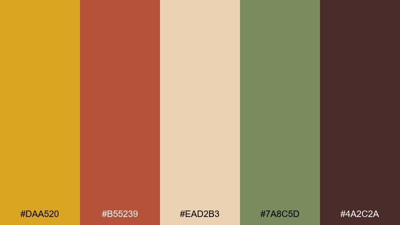
HEX: #DAA520 #B55239 #EAD2B3 #7A8C5D #4A2C2A
Mood: cozy, artisanal, warm
Best for: ceramics shops and handmade product pages
Cozy and artisanal, like fresh honey drizzled over terracotta pottery. The warm gold and clay red work beautifully for hero banners and product tags. Sage green softens the heat and adds a handmade, natural vibe. Tip: keep backgrounds creamy and let the darker brown handle text and outlines for clarity.
Image example of honeyed clay generated using media.io
7) Golden Meadow
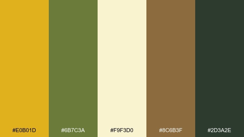
HEX: #E0B01D #6B7C3A #F9F3D0 #8C6B3F #2D3A2E
Mood: fresh, pastoral, optimistic
Best for: eco brands and seasonal campaigns
Fresh and pastoral, like a meadow path lined with wild grasses and seed heads. Use the buttery gold as a friendly highlight and let olive and deep green bring an eco-minded backbone. The creamy tone keeps layouts bright without looking sterile. Tip: combine the dark green with gold for buttons to get strong contrast that still feels natural.
Image example of golden meadow generated using media.io

8) Art Deco Gild
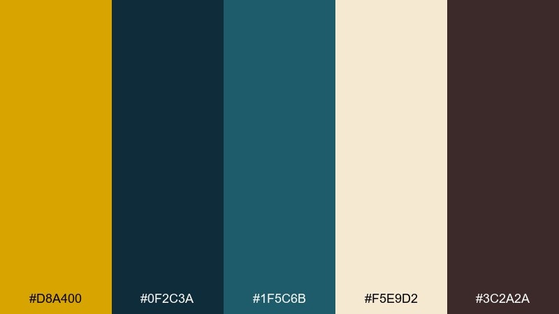
HEX: #D8A400 #0F2C3A #1F5C6B #F5E9D2 #3C2A2A
Mood: glamorous, geometric, upscale
Best for: event posters and luxury branding
Glamorous and geometric, like a theater marquee with crisp brass lines. The deep blue-green tones make the gold feel polished and dramatic rather than sunny. Use the cream as a paper-like base for elegant typography and spacing. Tip: add thin deco borders in gold to amplify the luxe vibe without overwhelming the layout.
Image example of art deco gild generated using media.io

9) Warm Minimal UI
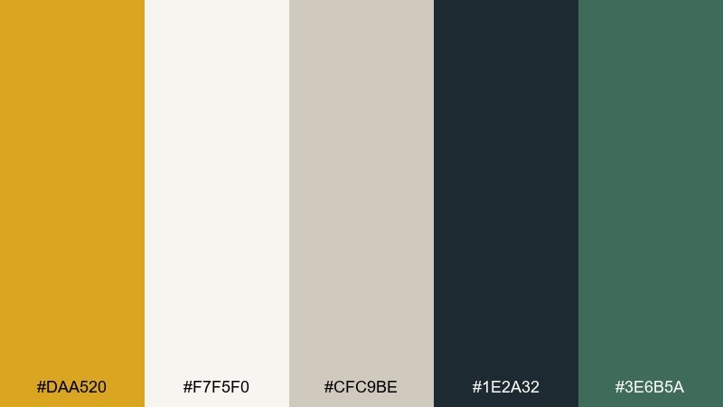
HEX: #DAA520 #F7F5F0 #CFC9BE #1E2A32 #3E6B5A
Mood: modern, clean, confident
Best for: dashboard UI and SaaS onboarding screens
Modern and clean, with a calm warmth that feels trustworthy and focused. This goldenrod color scheme works best when the gold is used sparingly for active states, progress, and key metrics. Soft off-white and greige keep panels subtle, while deep slate and teal handle contrast. Tip: test accessibility early and keep gold on light backgrounds mainly for icons and small highlights.
Image example of warm minimal ui generated using media.io

10) Autumn Workshop
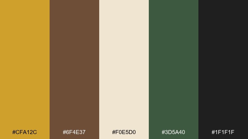
HEX: #CFA12C #6F4E37 #F0E5D0 #3D5A40 #1F1F1F
Mood: crafty, grounded, practical
Best for: diy blogs and workshop flyers
Crafty and grounded, like sawdust, coffee, and a well-used workbench. The warm gold gives headers energy without looking flashy. Pair it with walnut brown and a sturdy green for a dependable, hands-on feel. Tip: keep black for strong titles and use the cream as your main canvas to avoid heaviness.
Image example of autumn workshop generated using media.io

11) Citrus Herb
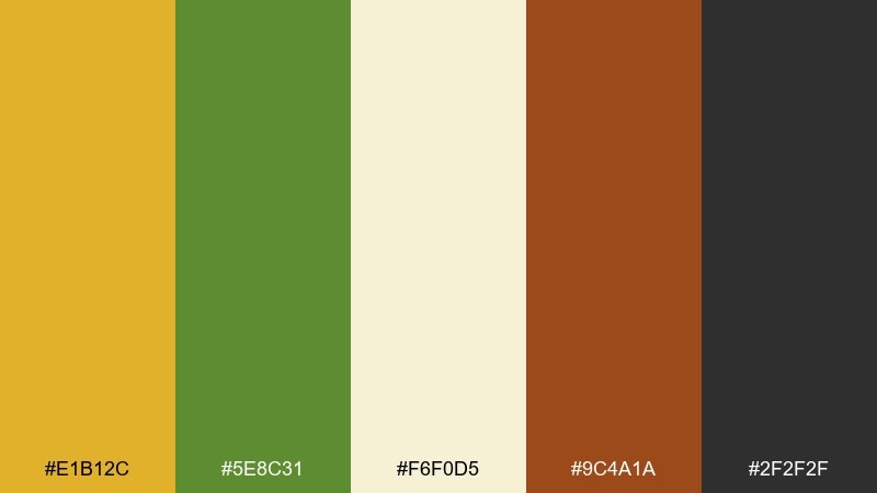
HEX: #E1B12C #5E8C31 #F6F0D5 #9C4A1A #2F2F2F
Mood: zesty, organic, cheerful
Best for: juice bars and natural food brands
Zesty and organic, like citrus peel, fresh herbs, and sunlit kitchen counters. Use the lively gold for brand marks and callouts, then lean on leafy green for balance. The cream tone helps packaging look clean and appetizing, while burnt orange adds a spicy pop. Tip: keep the darker gray for ingredient lists to maintain readability on small labels.
Image example of citrus herb generated using media.io
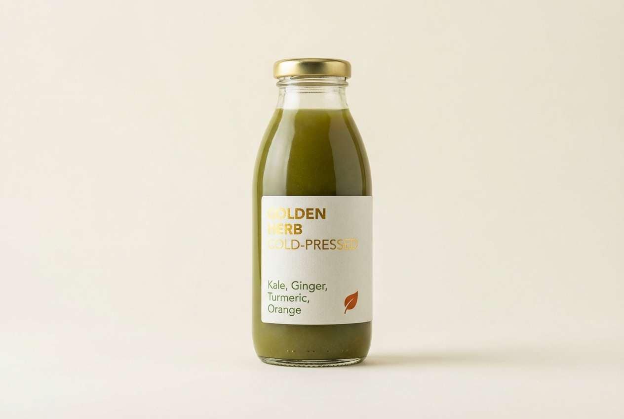
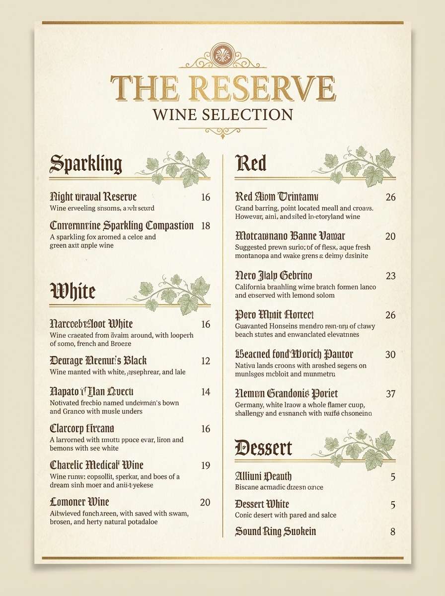
12) Candlelit Bistro
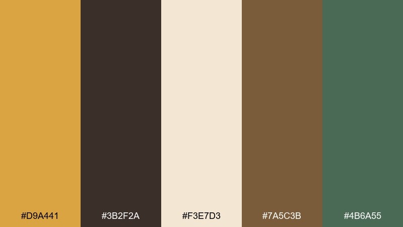
HEX: #D9A441 #3B2F2A #F3E7D3 #7A5C3B #4B6A55
Mood: intimate, cozy, classic
Best for: wine lists and hospitality branding
Intimate and cozy, like candlelight reflecting off wood tables and vintage glassware. The warm gold works beautifully for borders, icons, and subtle highlights on menus. Coffee brown and bark tones bring sophistication, while muted green keeps it from feeling too heavy. Tip: use the cream as the primary background to preserve a welcoming, readable menu flow.
Image example of candlelit bistro generated using media.io
13) Rustic Lodge
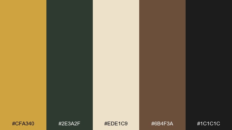
HEX: #CFA340 #2E3A2F #EDE1C9 #6B4F3A #1C1C1C
Mood: rugged, warm, masculine
Best for: cabin rentals and adventure travel ads
Rugged and warm, like a lodge fireplace and pine beams after a day outdoors. The gold reads like lantern light when paired with near-black and forested tones. Use the parchment neutral for breathing room in web banners and booking pages. Tip: keep photography earthy and desaturated so the gold accent feels intentional, not flashy.
Image example of rustic lodge generated using media.io

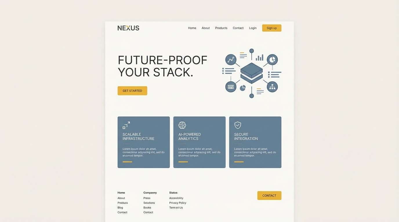
14) Saffron Sky
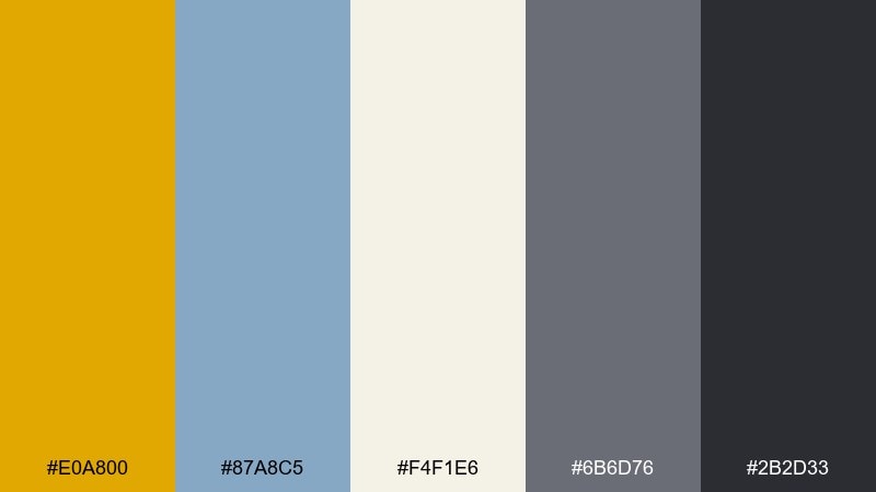
HEX: #E0A800 #87A8C5 #F4F1E6 #6B6D76 #2B2D33
Mood: airy, modern, balanced
Best for: tech landing pages and modern presentations
Airy and modern, like saffron light against a cool morning sky. The golden accent feels fresh when paired with soft blue-gray and deep graphite. Use the off-white for spacious slides and hero sections, and let gray handle supporting text. Tip: keep the gold to one or two UI elements per screen so it reads as a clear focal point.
Image example of saffron sky generated using media.io
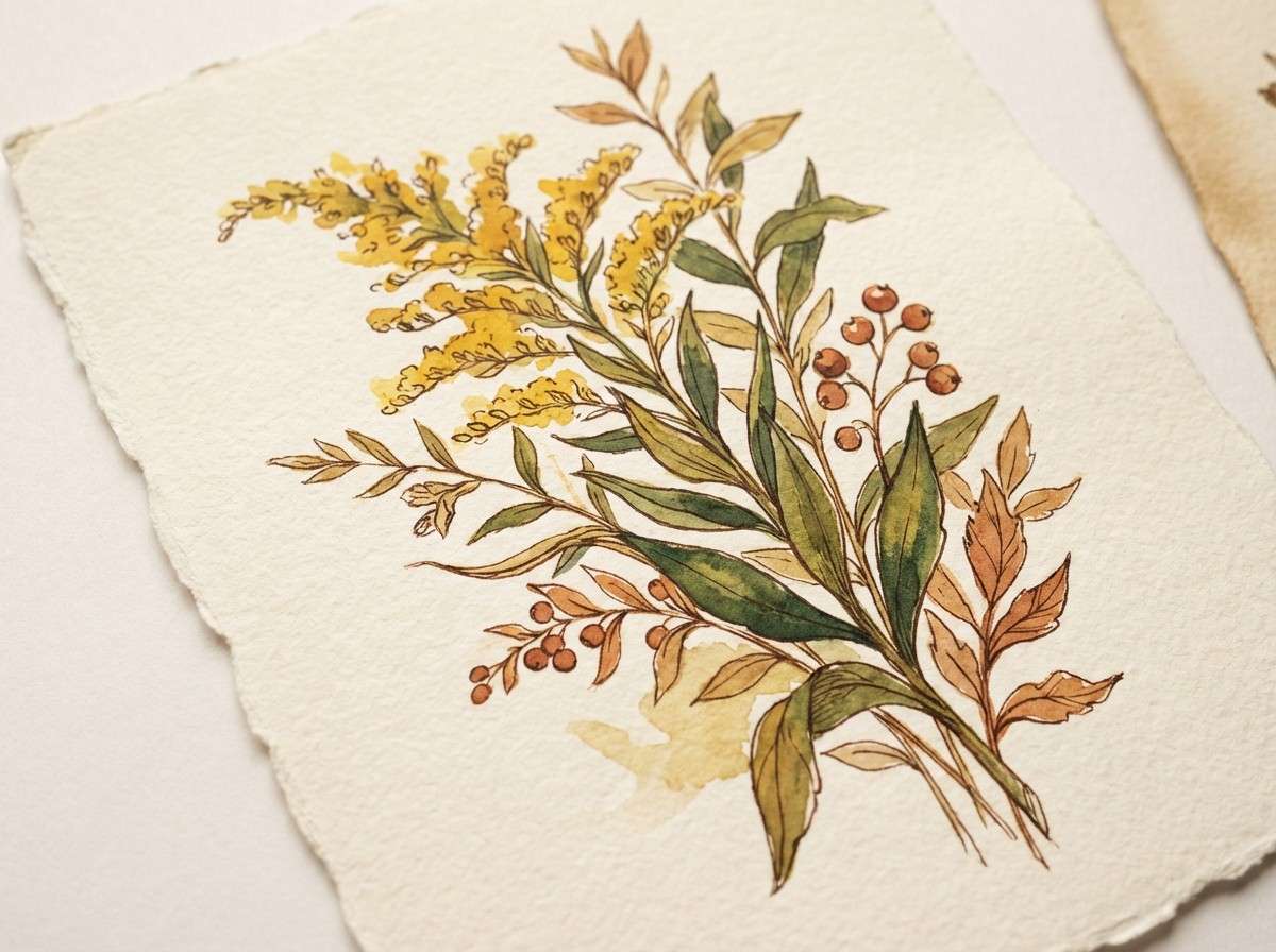
15) Botanical Sketch
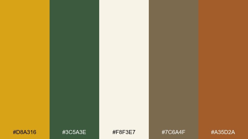
HEX: #D8A316 #3C5A3E #F8F3E7 #7C6A4F #A35D2A
Mood: natural, artistic, gentle
Best for: botanical illustrations and stationery
Natural and artistic, like a sketchbook page filled with pressed leaves and watercolor washes. This goldenrod color palette pairs beautifully with soft cream paper tones and a deep, leafy green. Use the bark brown and warm terracotta for linework, stamps, and small headings. Tip: keep textures subtle so the gold stays bright and readable on print.
Image example of botanical sketch generated using media.io
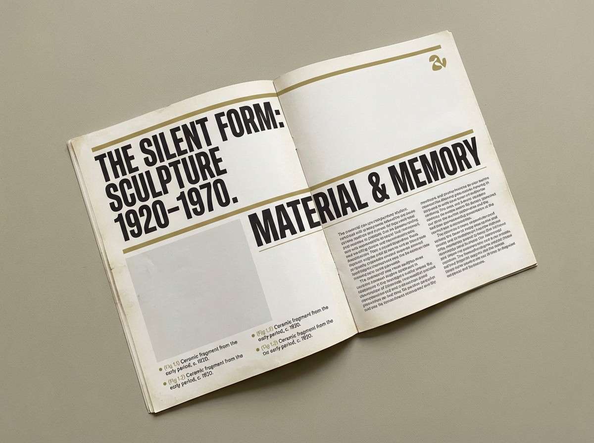
16) Museum Label
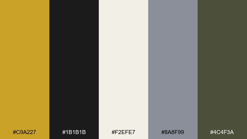
HEX: #C9A227 #1B1B1B #F2EFE7 #8A8F99 #4C4F3A
Mood: quiet, curated, intellectual
Best for: exhibition guides and editorial typography
Quiet and curated, like gallery placards and carefully set type on matte paper. The subdued gold adds prestige without turning decorative. Pair it with crisp near-black and cool gray for strong hierarchy in catalogs and guides. Tip: use the olive tone for small navigational markers to keep pages organized and calm.
Image example of museum label generated using media.io
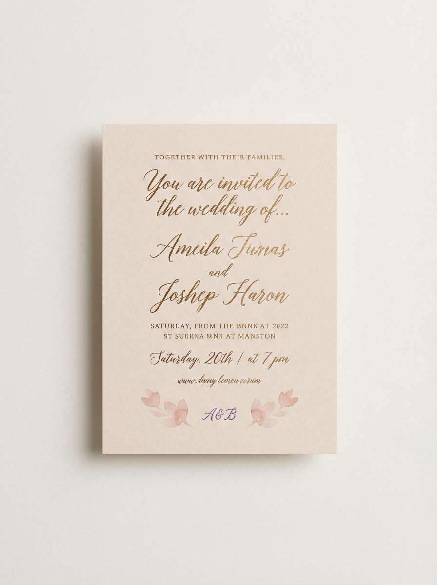
17) Wedding Glow
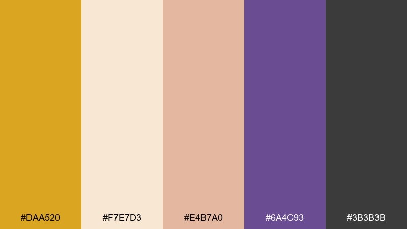
HEX: #DAA520 #F7E7D3 #E4B7A0 #6A4C93 #3B3B3B
Mood: romantic, elegant, modern
Best for: wedding invitations and event branding
Romantic and elegant, like warm lights, blush florals, and a hint of velvet. Gold and soft peach create a celebratory feel, while violet adds a modern twist for monograms and details. Use the pale nude as a clean base so typography stays crisp. Tip: keep the darkest gray for names and dates, and use gold sparingly for foil-style accents.
Image example of wedding glow generated using media.io
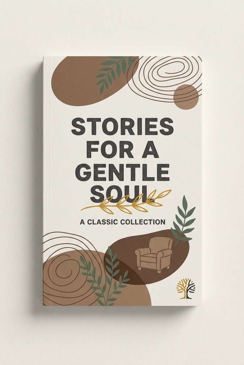
18) Cozy Reading Nook
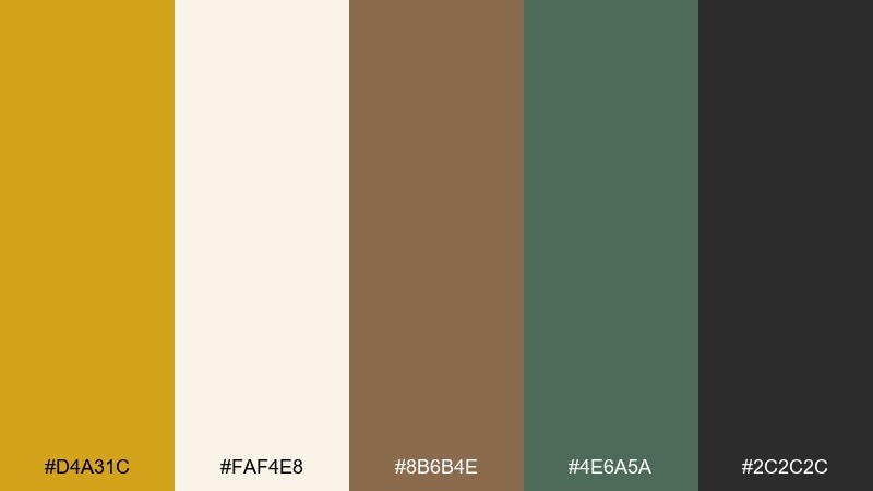
HEX: #D4A31C #FAF4E8 #8B6B4E #4E6A5A #2C2C2C
Mood: cozy, quiet, comforting
Best for: book covers and cafe promotions
Cozy and quiet, like a worn paperback, knitted throw, and a mug cooling on the windowsill. The golden accent works best for title highlights or small icons rather than full backgrounds. Pair it with walnut and evergreen tones to keep the mood grounded and comforting. Tip: use the off-white for negative space so the design feels calm, not crowded.
Image example of cozy reading nook generated using media.io
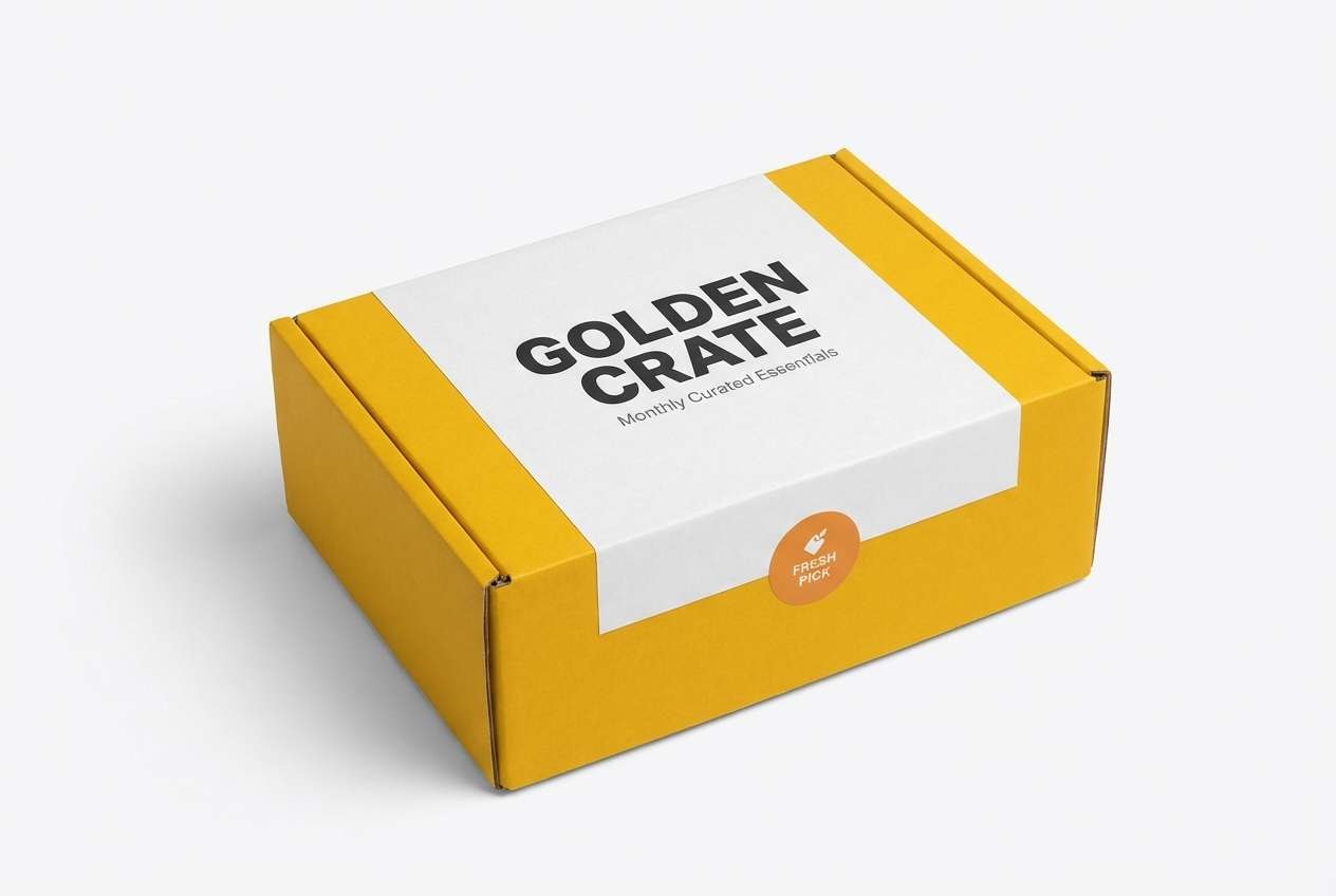
19) Modern Packaging
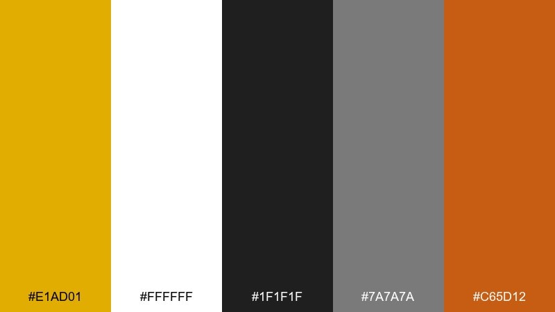
HEX: #E1AD01 #FFFFFF #1F1F1F #7A7A7A #C65D12
Mood: bold, clean, high-contrast
Best for: subscription boxes and retail packaging
Bold and clean, like modern retail shelves with crisp typography and sharp contrast. The bright gold becomes instantly recognizable when set against white and near-black. Use mid-gray for secondary copy and let the warm orange act as a smaller energy boost. Tip: keep one large area of white space so the gold feels premium rather than noisy.
Image example of modern packaging generated using media.io
20) Retro Poster Pop
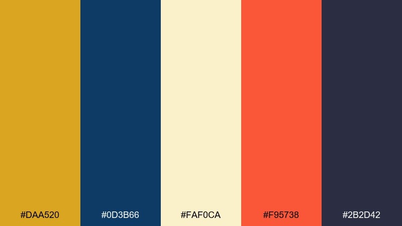
HEX: #DAA520 #0D3B66 #FAF0CA #F95738 #2B2D42
Mood: playful, retro, energetic
Best for: music posters and social media promo graphics
Playful and retro, like screen-printed gig posters with punchy shapes and bold type. These goldenrod color combinations feel extra lively next to deep navy and a creamy paper tone. Coral brings the pop for headlines and stickers, while indigo anchors the composition. Tip: limit gradients and lean into flat color blocks to keep the vintage vibe authentic.
Image example of retro poster pop generated using media.io

What Colors Go Well with Goldenrod?
Goldenrod looks especially strong with deep, cool contrasts like navy, deep teal, and charcoal. These shades keep the palette mature and help goldenrod act as a highlight rather than a wash of warmth.
For a softer, natural look, pair goldenrod with cream, sand, greige, olive, and forest green. This combination feels organic and “crafted,” which is great for lifestyle brands, packaging, and editorial layouts.
If you want more punch, add controlled warm accents—burnt orange, clay red, or a small coral note. Use those sparingly so goldenrod remains the primary warmth.
How to Use a Goldenrod Color Palette in Real Designs
In branding, treat goldenrod as an accent color for logos, seals, and emphasis elements, then build the system around neutrals for flexibility. This keeps the brand recognizable while still letting photography and content breathe.
In UI, reserve goldenrod for states that need attention: primary buttons, active tabs, progress, and key metrics. Support it with off-white surfaces and dark text colors for legibility, and check contrast early for accessibility.
In print, goldenrod shines on paper-like backgrounds, and it pairs beautifully with near-black typography. If you’re using metallic/foil effects, keep the layout minimal so the “gold” reads premium rather than busy.
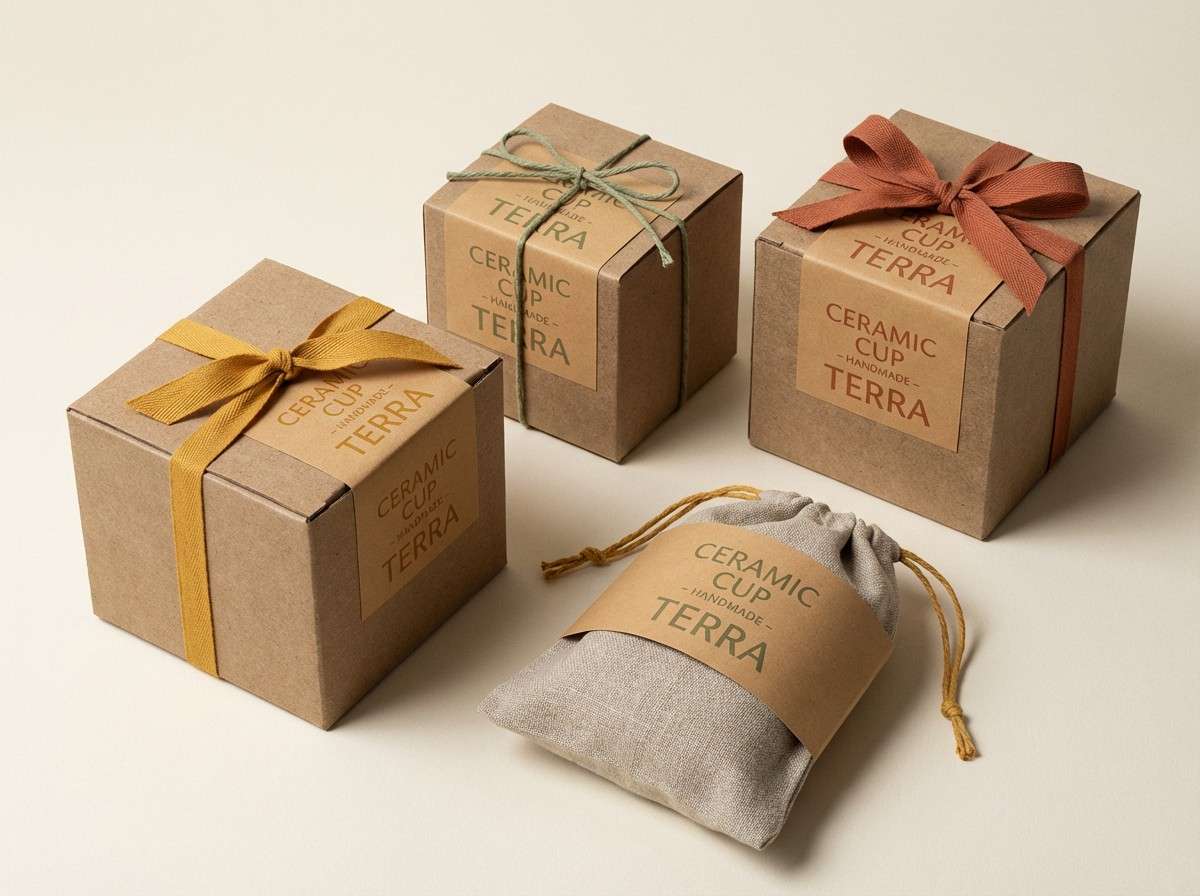
Create Goldenrod Palette Visuals with AI
If you want to preview how a goldenrod color scheme will feel in a real design (labels, posters, UI screens, invitations), generating mock visuals is one of the fastest ways to validate the mood.
Start with one palette, describe the design format, and call out where goldenrod should appear (buttons, borders, headlines, stickers). Then iterate by adjusting lighting, materials, and background tone until it matches your brand.
With Media.io, you can turn a simple prompt into consistent palette-based image concepts in minutes—ideal for pitches, moodboards, and early creative direction.
Goldenrod Color Palette FAQs
-
What is the HEX code for goldenrod?
A common web goldenrod is #DAA520. You’ll also see close variations like #D8A400 or #E1AD01 depending on how bright or muted you want the gold to feel. -
Is goldenrod warm or cool?
Goldenrod is a warm hue. It leans toward yellow/amber, so it naturally feels sunny, friendly, and energetic—especially next to creams and warm browns. -
What colors complement goldenrod best?
Deep blues and blue-greens (navy, deep teal) complement goldenrod well, because they create strong contrast. Charcoal and near-black also make goldenrod look more premium and controlled. -
How do I keep a goldenrod palette from looking too bright?
Use goldenrod as an accent (5–15% of the layout), and surround it with soft neutrals like off-white and greige. Add grounding colors like forest green, espresso brown, or charcoal for balance. -
Can I use goldenrod in UI design and still be accessible?
Yes, but test contrast. Goldenrod on white often works best for icons, highlights, and small UI details; for button backgrounds, pair goldenrod with very dark text or use it as a border/outline with a dark fill. -
What industries work well with goldenrod color schemes?
Goldenrod fits food and hospitality, craft and heritage brands, eco and outdoor products, and premium packaging. It’s also effective for event posters when paired with deep teals or dark neutrals. -
How many colors should a goldenrod palette include?
For most branding systems, 4–6 colors is enough: one goldenrod accent, 1–2 neutrals, one dark text/anchor color, and 1–2 supporting hues (like olive, teal, or clay).


