

Glaucous is a muted blue-gray that feels airy, calm, and quietly modern. It’s a go-to choice for brands and layouts that want clarity without the harshness of pure cool grays.
Below are 20+ glaucous color palette ideas with HEX codes, plus practical pairing and usage tips for UI, print, interiors, and marketing visuals.
In this article
- Why Glaucous Palettes Work So Well
-
- misty harbor
- nordic slate
- sea glass minimal
- cloudline ui
- coastal terracotta accent
- winter haze
- museum ink
- botanical dusk
- steel and silk
- rainy day editorial
- sunlit pier
- indigo fog
- chalkboard coast
- lavender shore
- quiet luxury
- arctic mint
- stormy ceramic
- gallery paper
- techno calm
- sunset marina
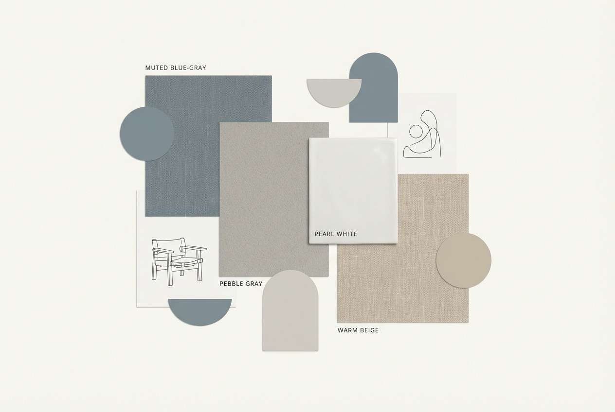
- pebble and pearl
- blueprint studio
- What Colors Go Well with Glaucous?
- How to Use a Glaucous Color Palette in Real Designs
- Create Glaucous Palette Visuals with AI
Why Glaucous Palettes Work So Well
Glaucous sits between blue and gray, so it reads as calm and professional without feeling sterile. That balance makes it especially strong for interfaces, editorial layouts, and brand systems that need to feel trustworthy.
Because it’s naturally muted, glaucous plays well with both warm and cool accents. You can push it coastal and airy with sands and off-whites, or sharpen it into a modern tech look with navy, charcoal, and a single bright highlight.
It also supports readability: darker slate tones give you strong type contrast, while pale blue-grays keep large backgrounds soft on the eyes—ideal for long-scroll pages and content-heavy designs.
20+ Glaucous Color Palette Ideas (with HEX Codes)
1) Misty Harbor
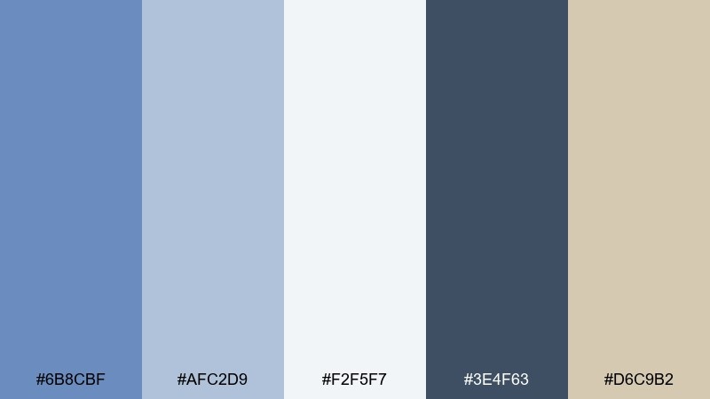
HEX: #6B8CBF #AFC2D9 #F2F5F7 #3E4F63 #D6C9B2
Mood: calm, coastal, airy
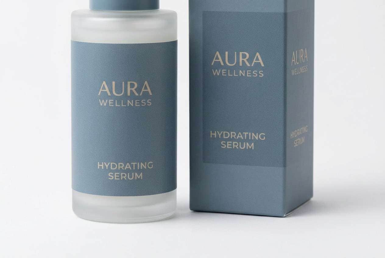
Best for: brand identity for wellness or skincare
Calm and coastal like early fog rolling over a quiet pier, these tones feel clean without turning cold. Use the soft blue-gray as the primary field color, then ground layouts with the deep slate for type and logos. Warm sand keeps the palette human and approachable, especially on packaging and labels. Tip: print tests matter here, so bump contrast slightly for small text on the light background.
Image example of misty harbor generated using media.io
Media.io is an online AI studio for creating and editing video, image, and audio in your browser.

2) Nordic Slate
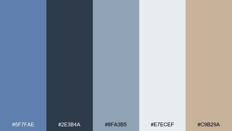
HEX: #5F7FAE #2E3B4A #8FA3B5 #E7ECEF #C9B29A
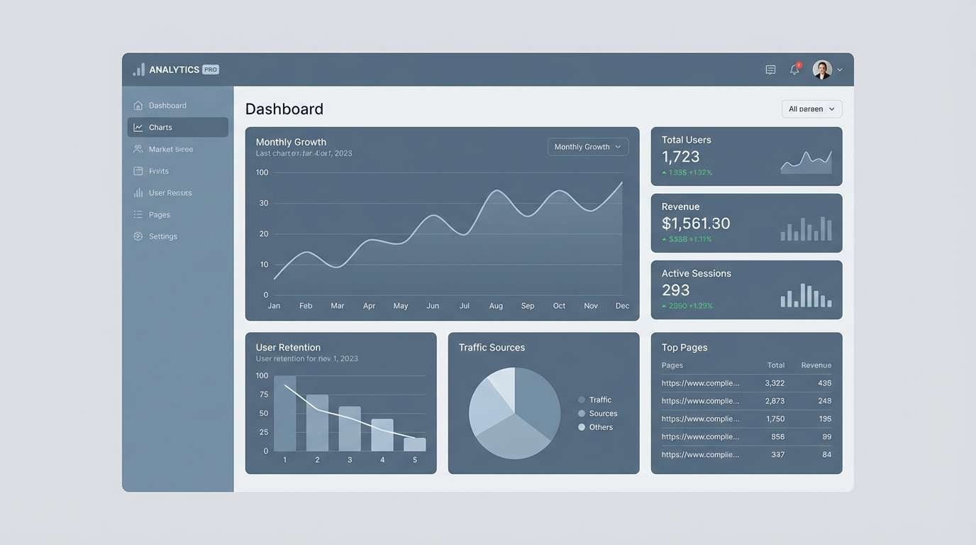
Mood: minimal, modern, grounded
Best for: web dashboards and admin UI
Minimal and steady, it evokes Scandinavian interiors with crisp light and dark slate shadows. The deep charcoal-blue is strong for navigation bars, while the pale gray-blue keeps content areas open and readable. Add the warm taupe sparingly for active states or KPI highlights to avoid visual fatigue. Tip: keep icon strokes slightly thicker so they stay clear against the light background.
Image example of nordic slate generated using media.io
3) Sea Glass Minimal
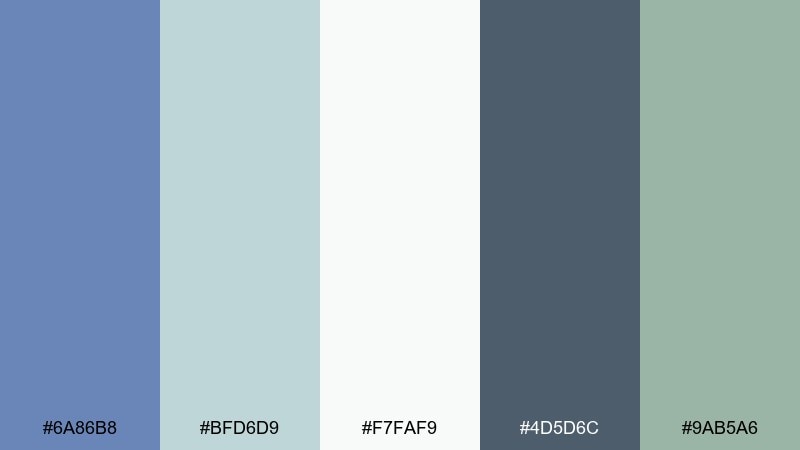
HEX: #6A86B8 #BFD6D9 #F7FAF9 #4D5D6C #9AB5A6
Mood: fresh, clean, spa-like
Best for: health blog header and social templates
Fresh and light like sea glass collected in the morning, this mix reads soothing and hygienic. Pair the airy mint and off-white for backgrounds, then use the darker blue-gray for headings and CTA buttons. The green-gray accent works beautifully in icons, dividers, or subtle gradients. Tip: limit gradients to one direction to keep the overall feel minimal.
Image example of sea glass minimal generated using media.io
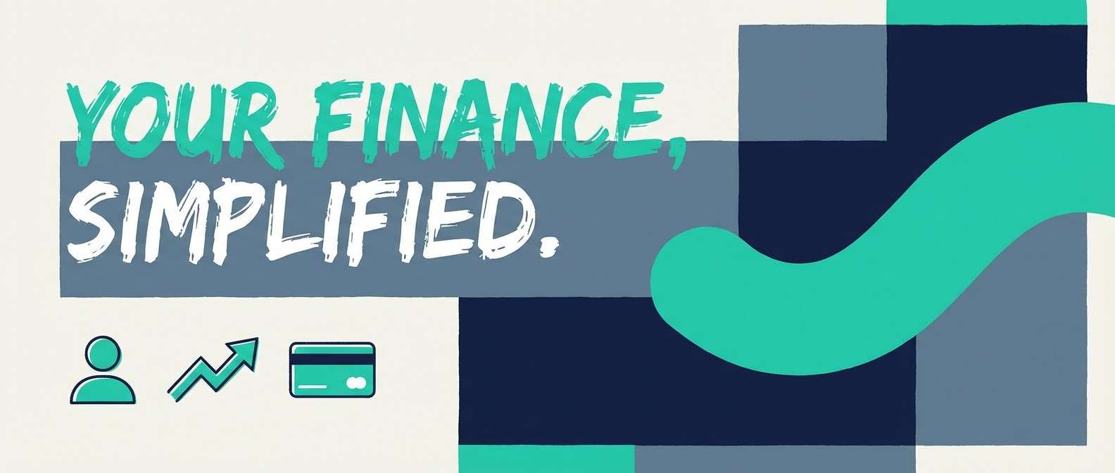
4) Cloudline UI
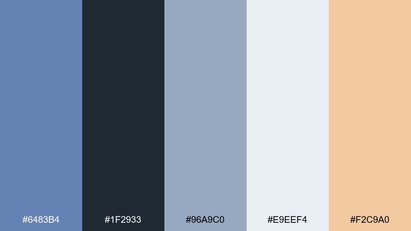
HEX: #6483B4 #1F2933 #96A9C0 #E9EEF4 #F2C9A0
Mood: sleek, friendly, tech-forward
Best for: SaaS landing page UI
Sleek and optimistic like bright clouds over a steel-blue skyline, it balances clarity with warmth. These glaucous color combinations work best when the light blue-gray sets the page tone and the peach is reserved for one standout action. Keep typography in the near-black for crisp contrast and a modern feel. Tip: use the peach only on primary CTAs so conversion elements stay obvious.
Image example of cloudline ui generated using media.io

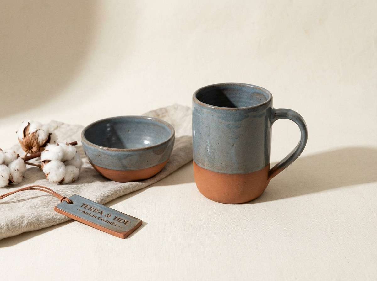
5) Coastal Terracotta Accent
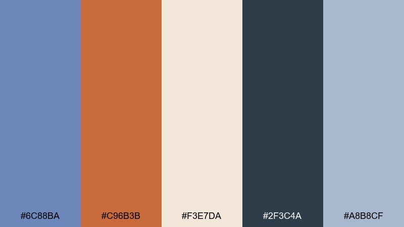
HEX: #6C88BA #C96B3B #F3E7DA #2F3C4A #A8B8CF
Mood: sun-warmed, artisan, coastal
Best for: ceramics shop product ad
Sun-warmed and artisan, it feels like hand-thrown clay beside weathered seaside paint. Let the creamy neutral carry most of the space, then bring in terracotta for badges, prices, or seasonal promos. The darker navy-slate keeps headlines sharp and gives the warm accent more authority. Tip: add subtle texture in the cream background to enhance the handmade vibe without clutter.
Image example of coastal terracotta accent generated using media.io
6) Winter Haze
HEX: #6E8FBE #C7D2E2 #F8F9FB #5A6675 #B7B0A6
Mood: quiet, wintry, refined
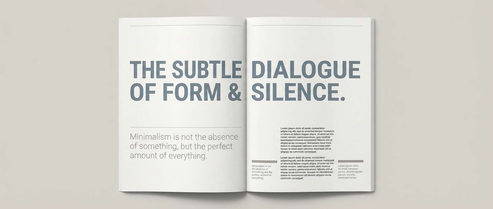
Best for: editorial magazine spread
Quiet and wintry, it suggests soft light on concrete and pale skies after snow. Use the light tints for margins and negative space, with the mid blue-gray for section blocks and pull quotes. The greige neutral adds a subtle fashion edge that works well with serif typography. Tip: keep photos slightly desaturated so the layout colors stay cohesive.
Image example of winter haze generated using media.io
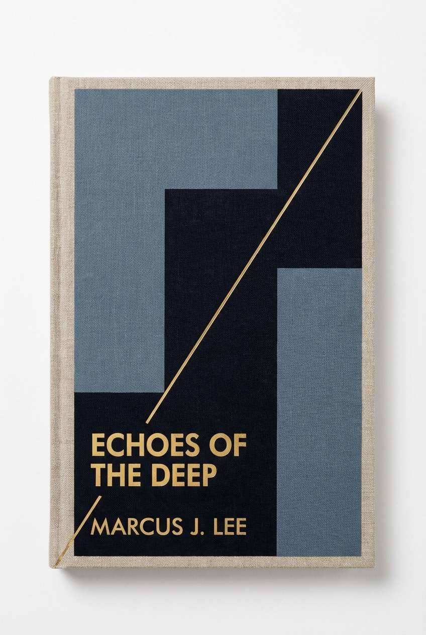
7) Museum Ink
HEX: #5C78A7 #0F1B2A #7D8EA6 #E6E2DB #B58F6B
Mood: dramatic, cultured, timeless
Best for: book cover design
Dramatic and cultured, it feels like gallery walls, inked captions, and warm spotlighted frames. A glaucous color scheme like this shines when the near-black handles titles and the muted blue-gray supports large shapes or bands. The antique brass note adds prestige and pairs beautifully with embossed type or foil effects. Tip: keep the brass accent under 10 percent of the cover for a premium finish.
Image example of museum ink generated using media.io
8) Botanical Dusk
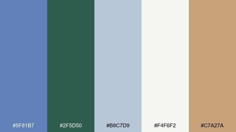
HEX: #5F81B7 #2F5D50 #B8C7D9 #F4F6F2 #C7A27A
Mood: earthy, calm, garden-like
Best for: botanical illustration set
Earthy and calm, it evokes leafy shadows at dusk with a cool sky overhead. The forest green plays nicely against the soft blue-gray, while the warm tan keeps it grounded and organic. Use the off-white as paper tone to make illustrated details feel airy. Tip: for a natural look, vary pigment density and keep outlines minimal.
Image example of botanical dusk generated using media.io
9) Steel and Silk
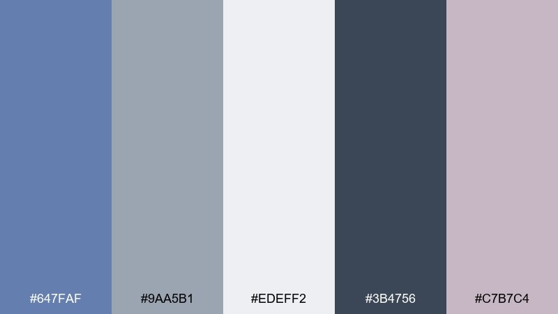
HEX: #647FAF #9AA5B1 #EDEFF2 #3B4756 #C7B7C4
Mood: polished, soft, contemporary
Best for: fashion lookbook layout
Polished yet soft, it feels like brushed metal paired with a whisper of satin. Use the blue-gray and steel neutrals for structure, then let the dusty mauve appear in small editorial elements like page numbers or section markers. The darker slate anchors the grid and keeps text legible on pale panels. Tip: choose one consistent corner radius to maintain the refined look.
Image example of steel and silk generated using media.io
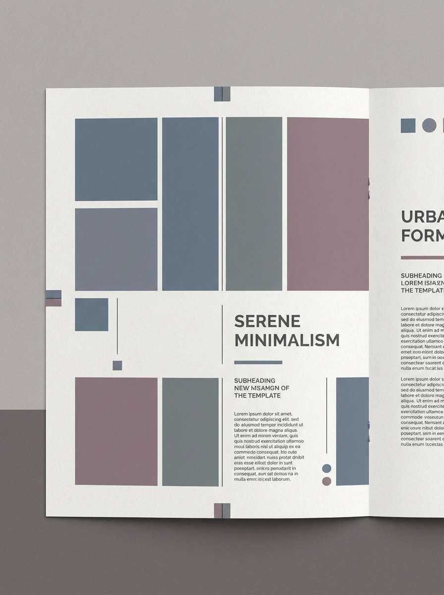
10) Rainy Day Editorial
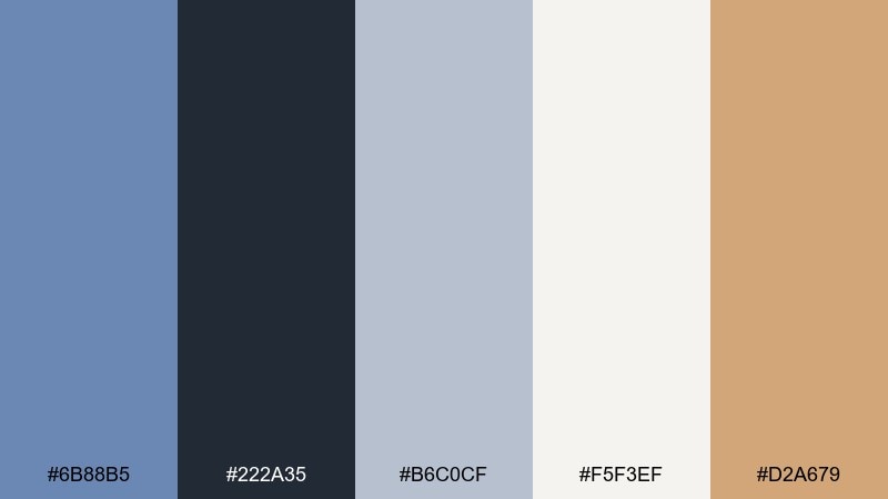
HEX: #6B88B5 #222A35 #B6C0CF #F5F3EF #D2A679
Mood: moody, intelligent, understated
Best for: newsletter template
Moody and intelligent, it recalls rain on city windows and warm café light. This glaucous color palette is ideal for long-form reading when the cream background and blue-gray blocks do the heavy lifting. Use the deep charcoal for headings, and reserve the golden tan for link highlights or small badges. Tip: keep line height generous to prevent the darker tones from feeling heavy.
Image example of rainy day editorial generated using media.io
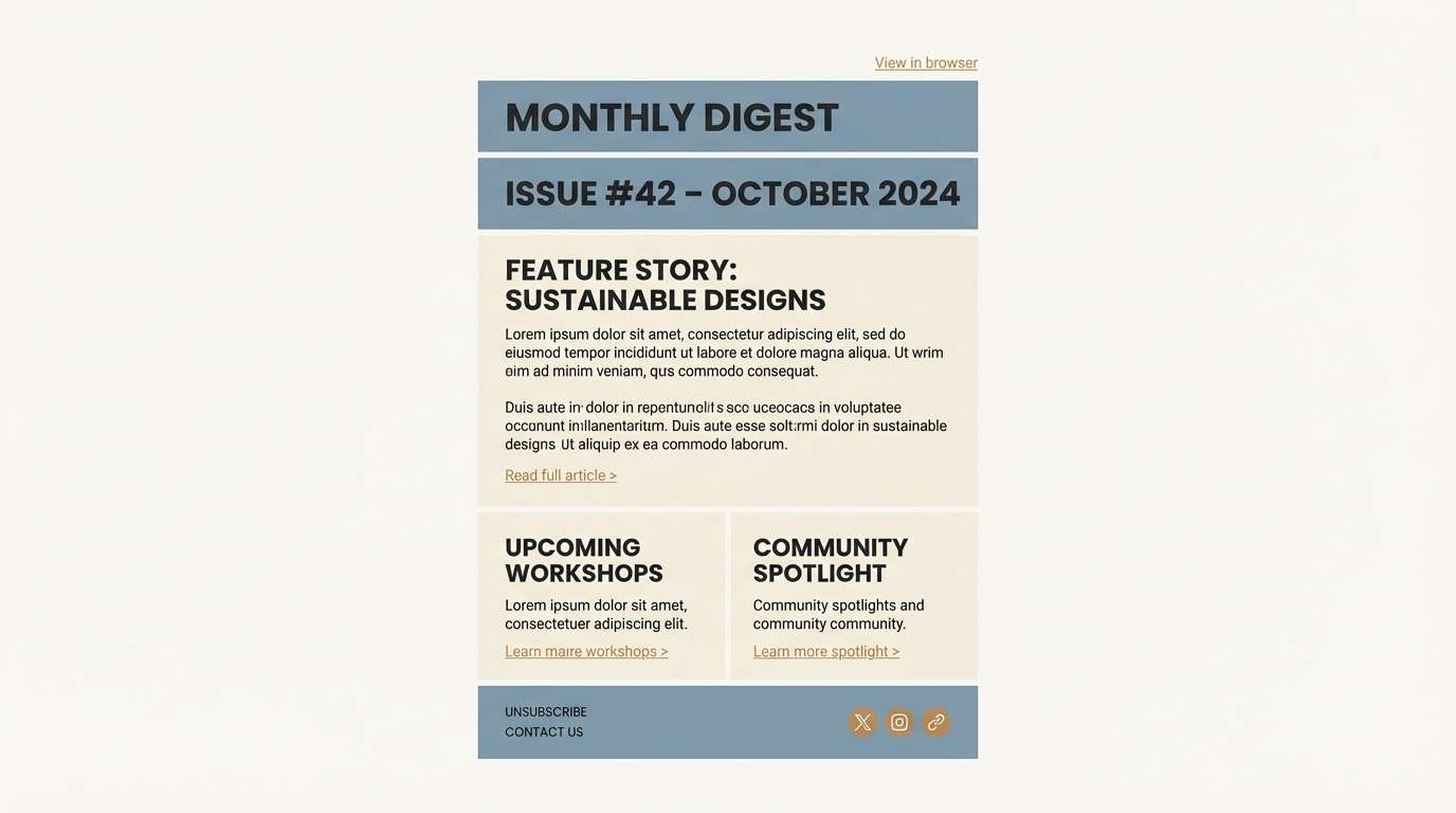
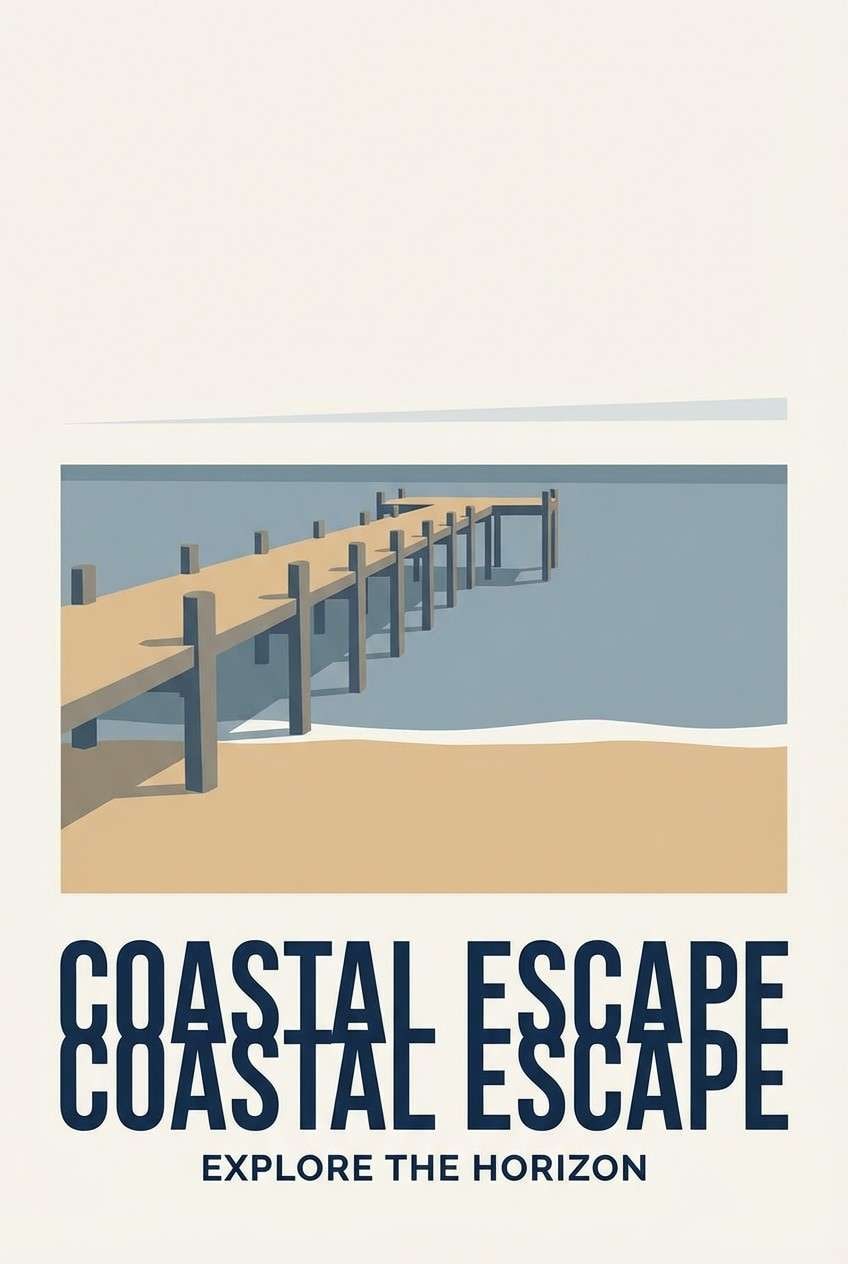
11) Sunlit Pier
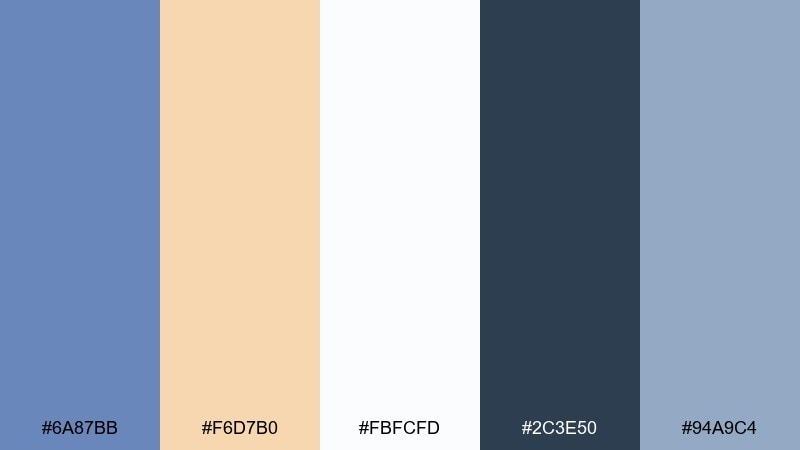
HEX: #6A87BB #F6D7B0 #FBFCFD #2C3E50 #94A9C4
Mood: bright, breezy, optimistic
Best for: travel poster design
Bright and breezy, it feels like sun hitting pale wood boards and calm water. Keep the off-white dominant, then use the warm sand for big shapes or borders that suggest sunlight. The deep navy is perfect for bold poster type that needs to read from afar. Tip: use a limited two-color illustration style to keep the travel vibe modern.
Image example of sunlit pier generated using media.io
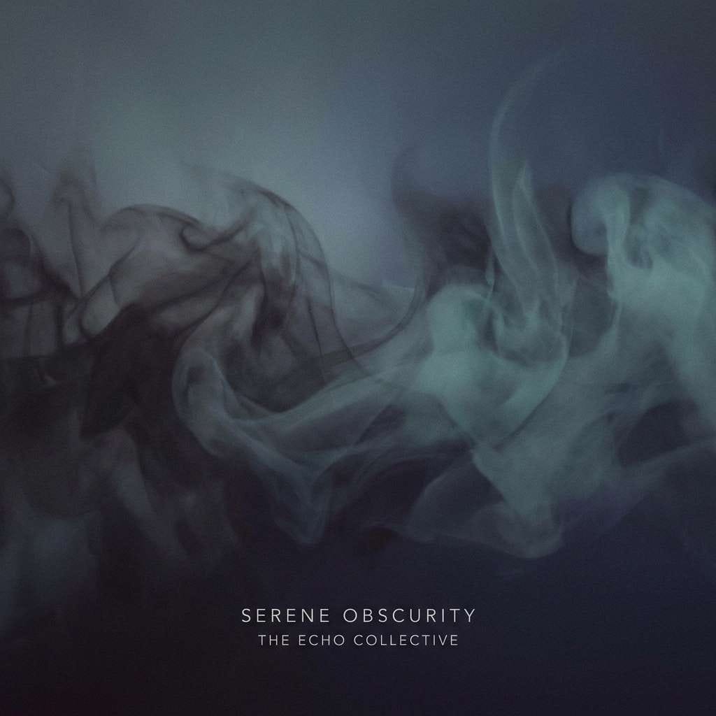
12) Indigo Fog
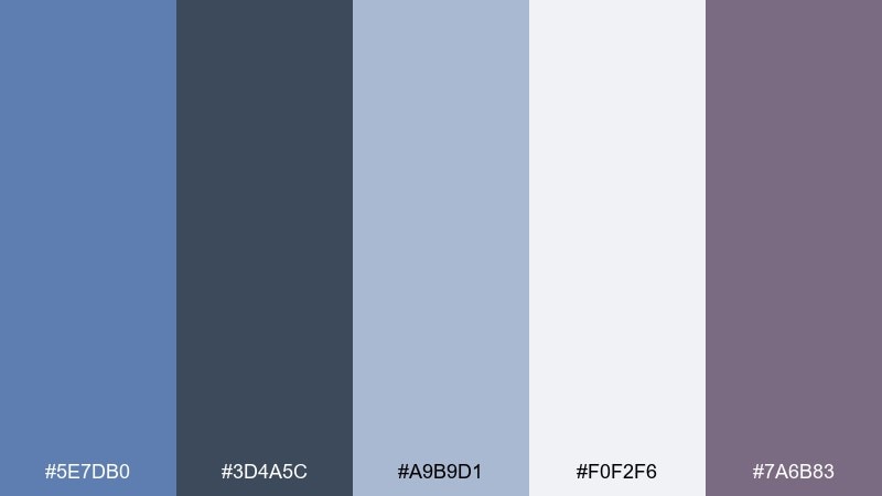
HEX: #5E7DB0 #3D4A5C #A9B9D1 #F0F2F6 #7A6B83
Mood: mysterious, calm, modern
Best for: music album cover
Mysterious and calm, it evokes foggy evenings with a faint indigo hush. Use the deeper slate and indigo as the base for cover art, then lift details with the pale mist tones. The mauve-gray accent adds emotion without turning loud. Tip: add subtle grain to large color fields to avoid banding in digital exports.
Image example of indigo fog generated using media.io
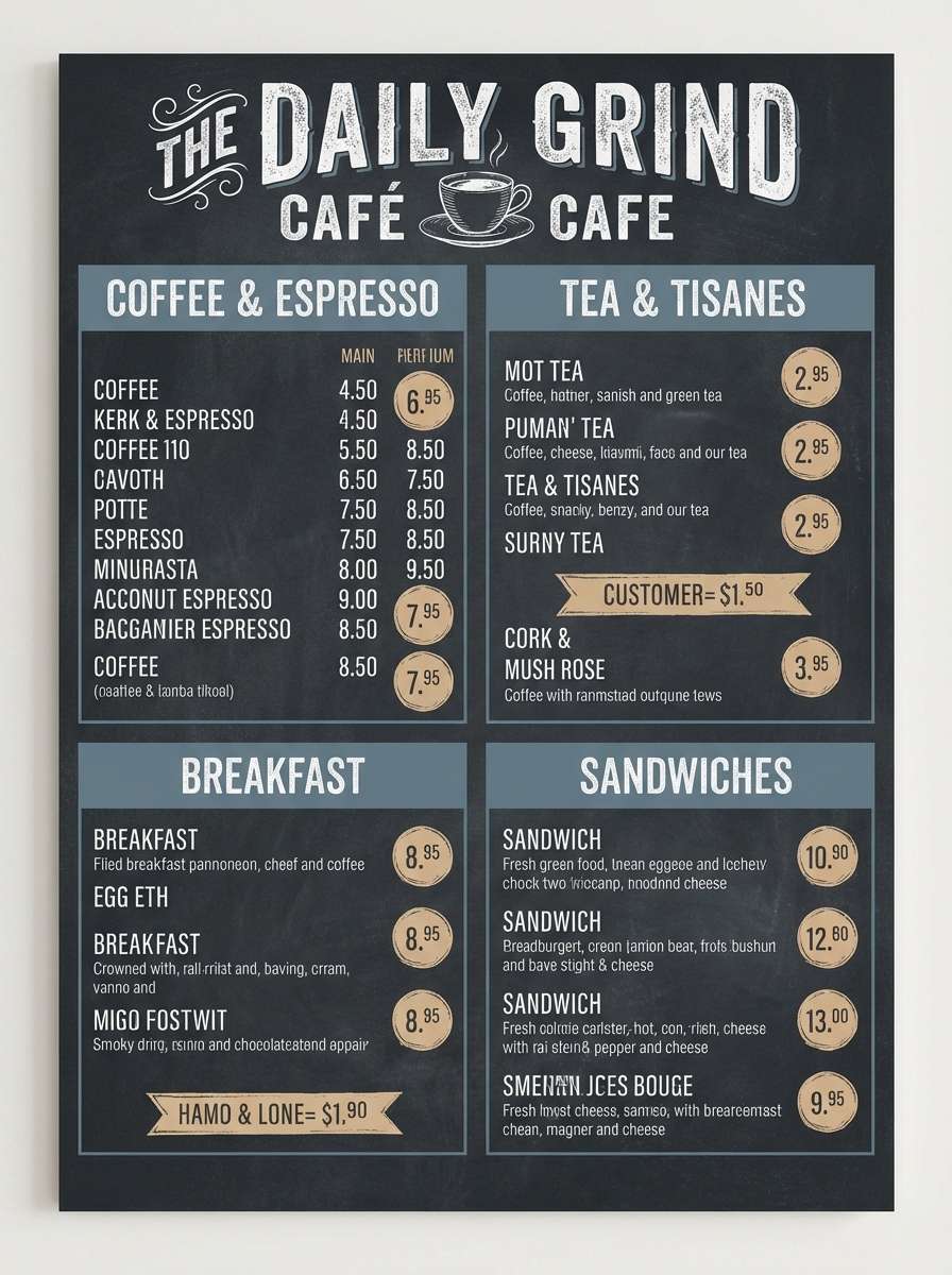
13) Chalkboard Coast
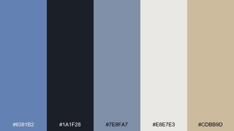
HEX: #6381B2 #1A1F28 #7E8FA7 #E8E7E3 #CDBB9D
Mood: smart, cozy, practical
Best for: cafe menu design
Smart and cozy, it brings to mind chalkboard specials with a coastal twist. Use the near-black for the menu base and type, then layer in the blue-gray for panels and section headers. The warm beige is a great highlight for prices or chef picks without breaking the calm mood. Tip: stick to two font families to keep the menu readable and elegant.
Image example of chalkboard coast generated using media.io
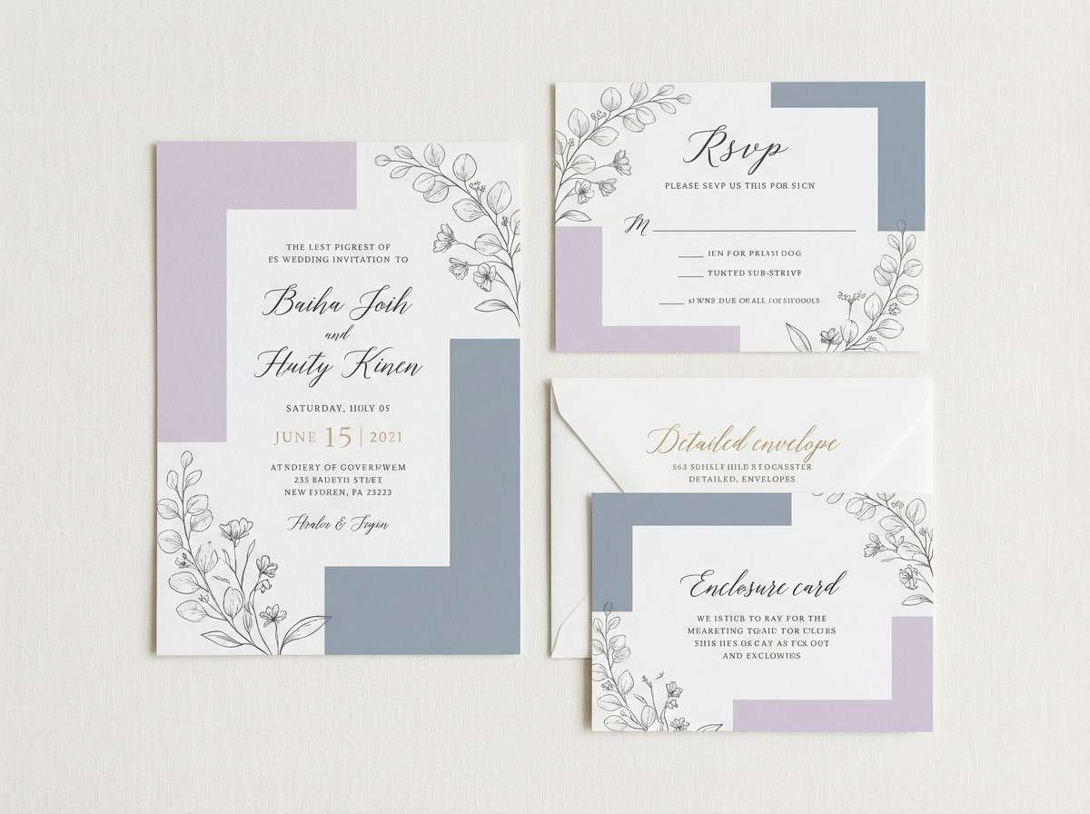
14) Lavender Shore
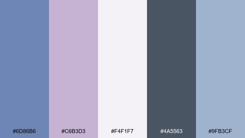
HEX: #6D86B6 #C6B3D3 #F4F1F7 #4A5563 #9FB3CF
Mood: romantic, soft, dreamy
Best for: wedding invitation suite
Romantic and soft, it feels like twilight on the water with a hint of lavender in the air. The pale lilac and off-white make an elegant paper base, while the blue-gray keeps it modern rather than overly sweet. Use the darker slate for names and key details so print contrast stays strong. Tip: choose a warm white stock to make the lavender look richer in real life.
Image example of lavender shore generated using media.io
15) Quiet Luxury
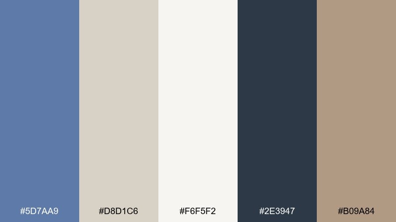
HEX: #5D7AA9 #D8D1C6 #F6F5F2 #2E3947 #B09A84
Mood: premium, understated, warm
Best for: luxury real estate brochure
Premium and understated, it suggests tailored textiles, stone countertops, and soft natural light. Use the cream and greige as spacious page backgrounds, then apply the deep slate for headings and property details. The warm brown-taupe reads like leather accents and pairs well with architectural photography. Tip: keep accent blocks thin and aligned to a strict grid for a truly upscale feel.
Image example of quiet luxury generated using media.io
16) Arctic Mint
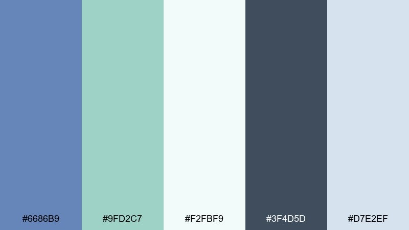
HEX: #6686B9 #9FD2C7 #F2FBF9 #3F4D5D #D7E2EF
Mood: crisp, refreshing, clean
Best for: app onboarding screens
Crisp and refreshing, it feels like cold air and bright ice with a minty lift. The pale aqua and near-white are ideal for onboarding backgrounds, while the darker slate keeps labels readable. Use the main blue-gray for illustration outlines and progress indicators to maintain consistency. Tip: ensure CTA buttons use the darkest tone for accessibility on light screens.
Image example of arctic mint generated using media.io
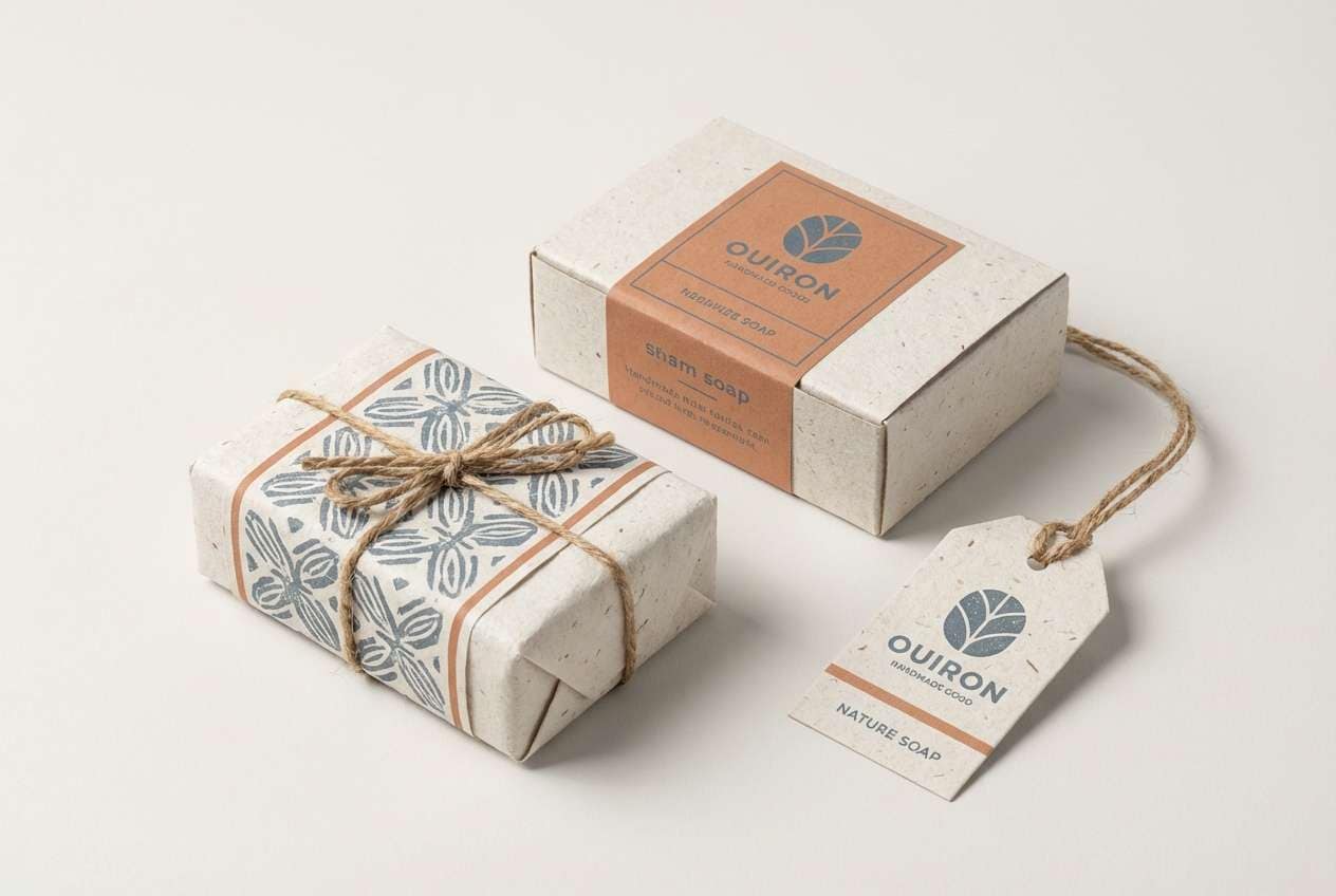
17) Stormy Ceramic
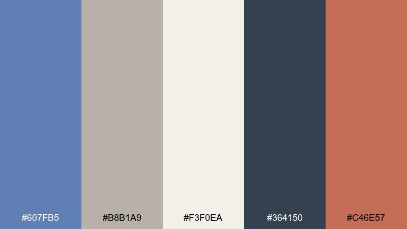
HEX: #607FB5 #B8B1A9 #F3F0EA #364150 #C46E57
Mood: rustic, stormy, tactile
Best for: handmade goods packaging
Rustic and stormy, it evokes kiln-fired pottery and overcast skies. The warm clay accent energizes the cooler blues and grays, making labels feel handcrafted but contemporary. Use the off-white for roomy negative space, and keep the darkest tone for stamps or brand marks. Tip: try uncoated paper to enhance the tactile, artisan impression.
Image example of stormy ceramic generated using media.io
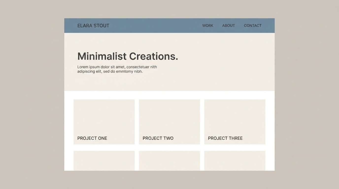
18) Gallery Paper
HEX: #6A89B8 #EDE7DE #FAFAF8 #2A3441 #A7B8D3
Mood: clean, curated, contemporary
Best for: portfolio website theme
Clean and curated, it feels like a quiet gallery with soft paper textures and sharp labels. The warm off-white makes work samples pop, while the blue-gray supports calm navigation and hover states. Use the charcoal for crisp type and subtle separators. Tip: keep shadows light and rely on spacing to separate sections for a modern portfolio look.
Image example of gallery paper generated using media.io
19) Techno Calm
HEX: #5F82B6 #4A9DA0 #1D2B3A #A9BEDA #F0F6FF
Mood: confident, calm, modern tech
Best for: fintech app marketing banner
Confident and calm, it reads like modern tech with a trustworthy, oceanic undertone. The teal brings energy without feeling neon, while the deep navy anchors trust signals and headlines. Keep the light blue tint for background gradients or card surfaces. Tip: use teal only for highlights like rates, icons, or one primary button to avoid visual noise.
Image example of techno calm generated using media.io
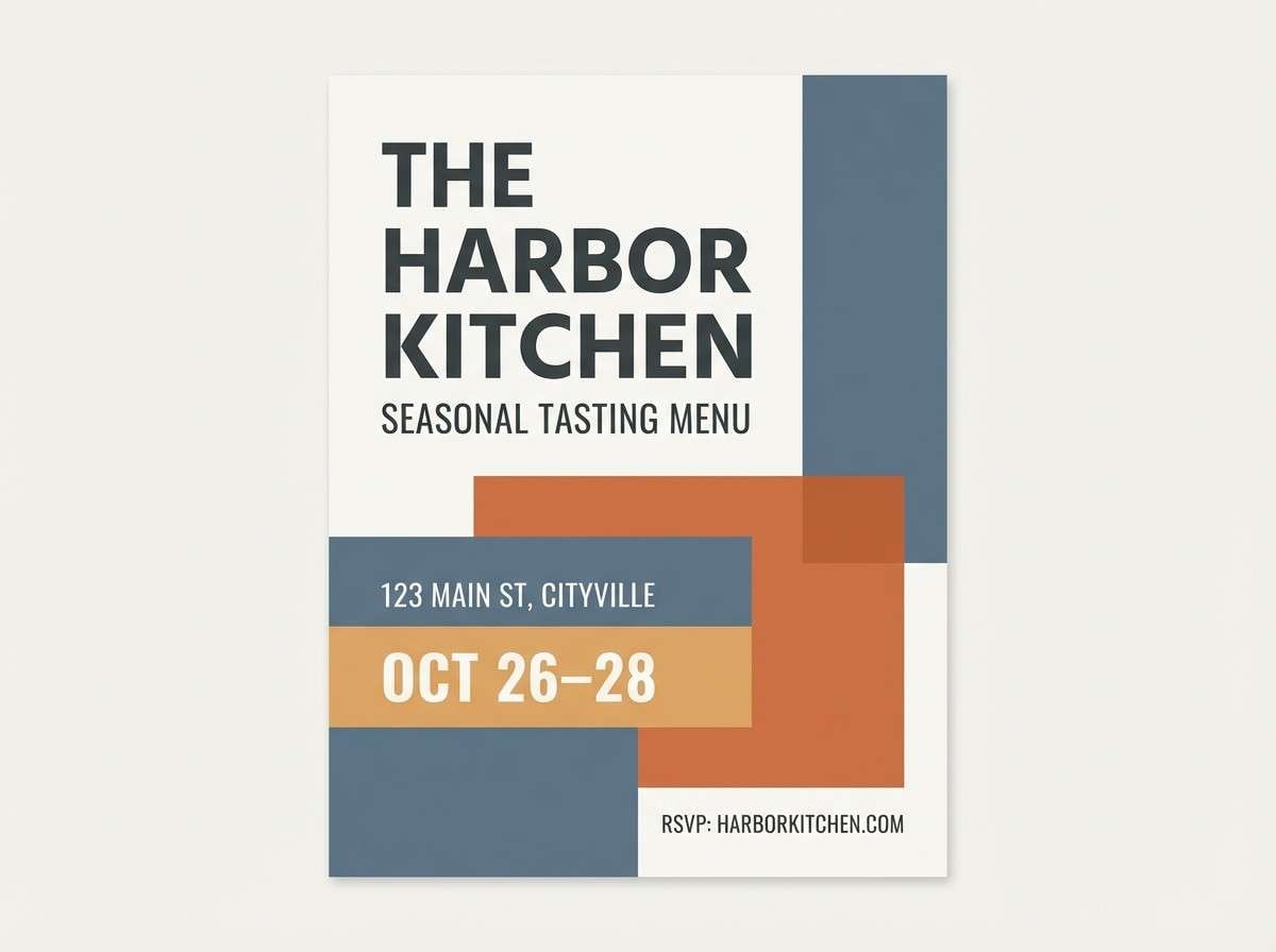
20) Sunset Marina
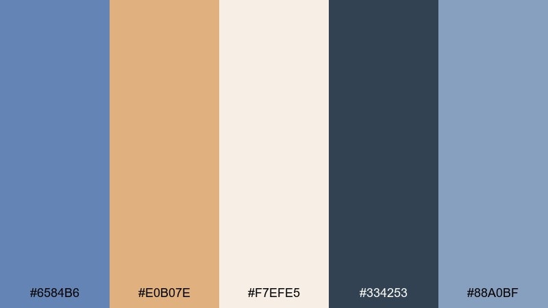
HEX: #6584B6 #E0B07E #F7EFE5 #334253 #88A0BF
Mood: warm, relaxed, inviting
Best for: restaurant flyer
Warm and relaxed, it suggests a marina at golden hour with cool water nearby. The sandy orange-tan pairs naturally with the blue-gray, making headlines and offers feel welcoming. Use the cream as the main background and the deep slate for legible details like dates and locations. Tip: set the accent color on one side of the layout to guide the eye through the flyer.
Image example of sunset marina generated using media.io
21) Pebble and Pearl
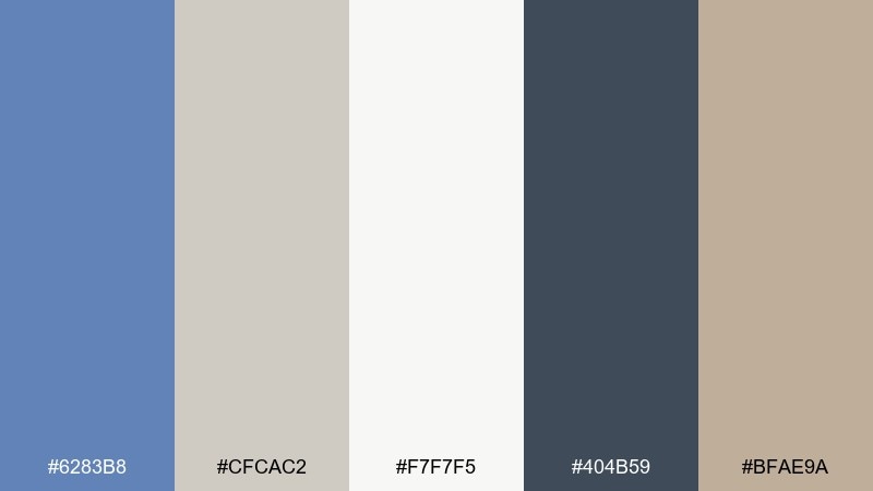
HEX: #6283B8 #CFCAC2 #F7F7F5 #404B59 #BFAE9A
Mood: soft, neutral, serene
Best for: interior mood board
Soft and serene, it feels like smooth pebbles and pearl-toned textiles in a bright room. The layered neutrals make the blue-gray feel subtle and sophisticated rather than bold. Pair it with light oak, linen, and matte black hardware for a modern organic interior. Tip: repeat the warm beige at least three times across the board to keep the palette cohesive.
Image example of pebble and pearl generated using media.io
22) Blueprint Studio
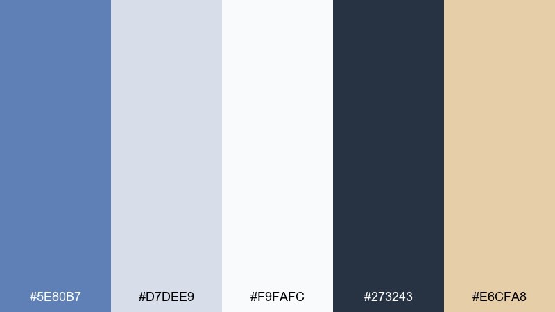
HEX: #5E80B7 #D7DEE9 #F9FAFC #273243 #E6CFA8
Mood: precise, professional, airy
Best for: architecture firm branding
Precise and professional, it brings to mind blueprint paper, clean margins, and measured lines. A glaucous color palette like this works beautifully for architectural brands that need calm authority. Use the dark navy for wordmarks and the pale tints for stationery, with the warm sand as a subtle signature accent. Tip: keep logos single-color in the dark tone for maximum versatility across prints and site headers.
Image example of blueprint studio generated using media.io

What Colors Go Well with Glaucous?
Glaucous pairs naturally with soft whites, light grays, and charcoal slates, giving you an instant calm foundation for modern branding and UI. For contrast, deepen the palette with near-black blue tones for navigation, headlines, and icons.
To warm things up, add sand, taupe, terracotta, or brass accents—these keep the blue-gray from feeling too cool and help highlight key actions (CTAs, prices, badges). For a fresher direction, mint, sea-glass green, or a restrained teal can add energy without breaking the muted mood.
If you want a more expressive look, try a dusty mauve or lavender accent; it harmonizes well with glaucous while still feeling sophisticated and editorial.
How to Use a Glaucous Color Palette in Real Designs
Start by assigning roles: use a light glaucous tint as your background, a mid-tone for surfaces/cards/sections, and a deep slate for typography. This simple hierarchy keeps layouts readable and consistent across pages.
Keep accents intentional. Choose one warm (peach, sand, terracotta) or one cool (mint, teal) highlight color and reserve it for primary CTAs, active states, or key data points to avoid visual noise.
For print and product work, test contrast and paper texture. Glaucous can shift depending on stock and lighting, so increase contrast slightly for small text and consider uncoated paper for a softer, premium feel.
Create Glaucous Palette Visuals with AI
Want to see how a glaucous color scheme looks on real assets like packaging, posters, dashboards, or invitations? Generate styled mockups quickly by describing the layout, materials, and lighting—then iterate until it matches your brand mood.
With Media.io’s text-to-image tool, you can turn any of the prompts above into fresh variations for ads, UI concepts, mood boards, and social templates—without starting from scratch in a design file.
Keep your prompt focused: specify subject, style, background, and one key accent color. Then reuse your HEX choices consistently across outputs for a cohesive visual system.
Glaucous Color Palette FAQs
-
What is a glaucous color in design terms?
Glaucous is a muted blue-gray, often described as a soft, dusty blue with a gray undertone. It’s popular for calm, modern palettes because it feels cooler than beige but gentler than saturated blue. -
Is glaucous better for backgrounds or accents?
Glaucous is strong as a background or primary UI surface because it’s low-saturation and easy on the eyes. Use deeper slate/charcoal for text and reserve brighter accents (peach, sand, teal) for CTAs and highlights. -
What warm colors pair well with glaucous?
Sand, taupe, terracotta, peach, and brass/gold tones pair especially well. Warm accents prevent the palette from feeling chilly and make important elements (buttons, labels, badges) stand out. -
What cool colors pair well with glaucous?
Mint, sea-glass green, restrained teal, and soft lavender work well. Keep saturation moderate so the overall scheme stays cohesive and doesn’t turn overly bright. -
How do I make glaucous palettes accessible for web UI?
Use a dark slate or near-black for body text and key UI labels, and avoid placing mid-tone glaucous text on light glaucous backgrounds. Check contrast for text sizes and ensure primary buttons use the darkest tone or a high-contrast accent. -
Does glaucous print accurately?
It can shift depending on paper and ink profiles, sometimes appearing more gray or more blue. Do a quick test print and slightly increase contrast for small typography and fine lines. -
Can I generate glaucous palette mockups with AI?
Yes—describe the asset (packaging, UI, poster), the mood, and the materials, then mention your glaucous tones and one accent color. Media.io makes it easy to iterate on prompts and produce consistent concept visuals.


