

Dark orange sits in the sweet spot between energetic orange and grounded brown, making it one of the most versatile warm hues for modern design. It can feel spicy and bold, or earthy and premium—depending on the neutrals and accents you pair it with.
Below are 20+ dark orange color palette ideas with HEX codes, plus practical tips for branding, UI, print, and creating palette visuals with AI.
In this article
- Why Dark Orange Palettes Work So Well
-
- ember clay
- canyon spice
- copper sunset
- terracotta studio
- pumpkin leather
- saffron roast
- molten marmalade
- autumn brick
- smoked apricot
- rustic harvest
- desert copper
- paprika night
- orange espresso
- burnt citrus
- amberwood neutral
- vintage poster orange
- cozy cabin glow
- marigold botanical
- clay and slate
- spice market night
- teal contrast pop
- What Colors Go Well with Dark Orange?
- How to Use a Dark Orange Color Palette in Real Designs
- Create Dark Orange Palette Visuals with AI
Why Dark Orange Palettes Work So Well
Dark orange brings warmth without the “safety cone” intensity of bright orange, so it reads more sophisticated and easier to use across backgrounds. It naturally suggests craft, heat, food, autumn, clay, copper, and sunbaked landscapes—useful cues for brand storytelling.
In UI and branding, it’s a strong accent color for CTAs and highlights because it grabs attention while still feeling grounded. When paired with charcoal, navy, slate, or warm off-whites, dark orange stays readable and modern rather than loud.
For print, dark orange tones also hold up well on uncoated and textured stocks. That makes them ideal for labels, menus, posters, and packaging where you want warmth, depth, and a tactile feel.
20+ Dark Orange Color Palette Ideas (with HEX Codes)
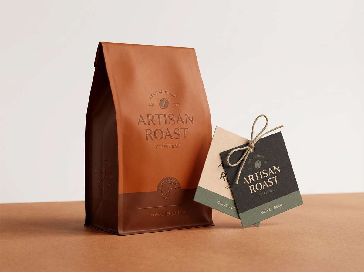
1) Ember Clay
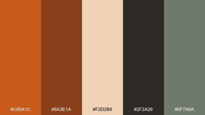
HEX: #C85A1C #8A3E1A #F2D2B6 #2F2A26 #6F7A6A
Mood: earthy, grounded, cozy
Best for: artisan coffee packaging
Earthy warmth and kiln-fired clay vibes make this mix feel handcrafted and comforting. It works beautifully on kraft textures, labels, and minimal packaging where orange needs depth rather than flash. Pair the ember orange with the espresso-charcoal for typography, then use the cream for breathing room. Tip: keep the green-gray as a small accent to signal natural ingredients without turning the design too rustic.
Image example of ember clay generated using media.io
Media.io is an online AI studio for creating and editing video, image, and audio in your browser.

2) Canyon Spice
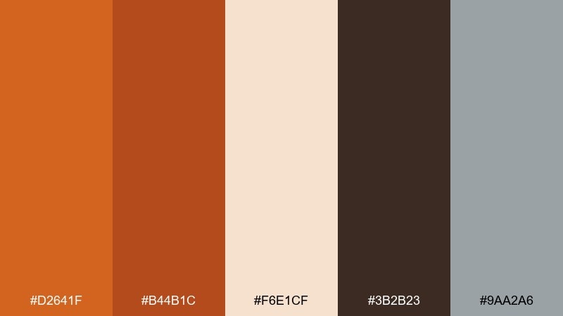
HEX: #D2641F #B44B1C #F6E1CF #3B2B23 #9AA2A6
Mood: bold, sunbaked, modern
Best for: landing page hero section
Sunbaked canyon walls and toasted spice notes give this set a confident, outdoorsy punch. Use the brighter orange as the hero CTA color, and rely on the deep brown for headings and UI anchors. The soft cream keeps sections readable while the cool gray-blue helps balance the heat. Tip: limit the two oranges to primary and hover states so the interface feels intentional, not noisy.
Image example of canyon spice generated using media.io
3) Copper Sunset
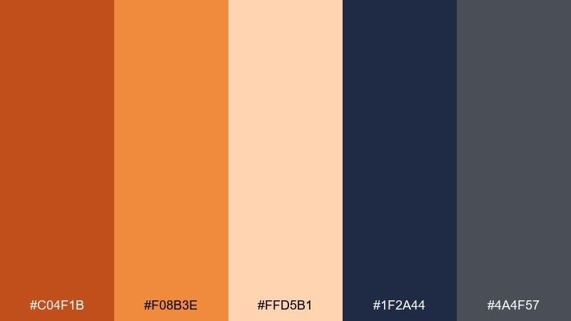
HEX: #C04F1B #F08B3E #FFD5B1 #1F2A44 #4A4F57
Mood: cinematic, energetic, polished
Best for: sports event poster
Cinematic sunset copper meets cool midnight navy for a high-impact, stadium-ready look. This dark orange color combination shines on bold headlines, gradients, and dynamic shapes where contrast matters. Pair the navy with the charcoal gray for structure, then reserve the pale peach for date blocks and sponsor lines. Tip: add a subtle grain overlay to make the warm tones feel more tactile and less flat.
Image example of copper sunset generated using media.io

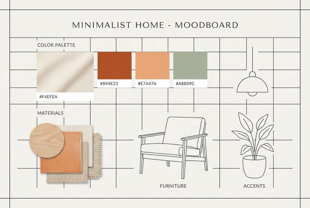
4) Terracotta Studio
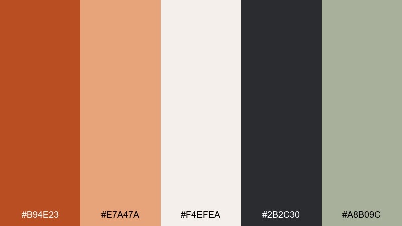
HEX: #B94E23 #E7A47A #F4EFEA #2B2C30 #A8B09C
Mood: creative, calm, design-forward
Best for: interior design moodboard
Soft terracotta and linen-like neutrals evoke a quiet studio filled with natural light. The near-white background keeps swatches, materials, and captions clean, while the dark graphite adds editorial contrast. Use the muted green as a plant-inspired accent that complements warm wood and clay decor. Tip: stick to large terracotta blocks and thin charcoal rules for a crisp, gallery-style layout.
Image example of terracotta studio generated using media.io
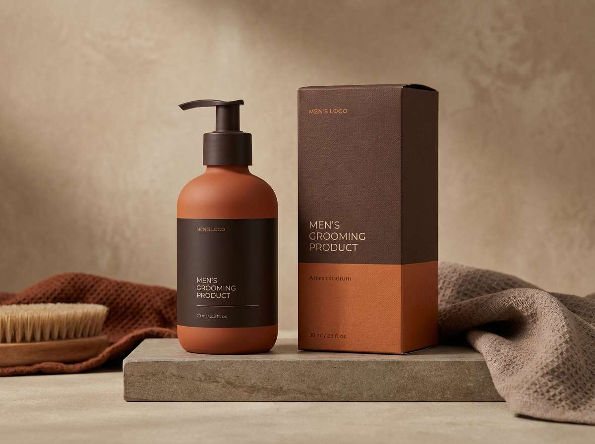
5) Pumpkin Leather
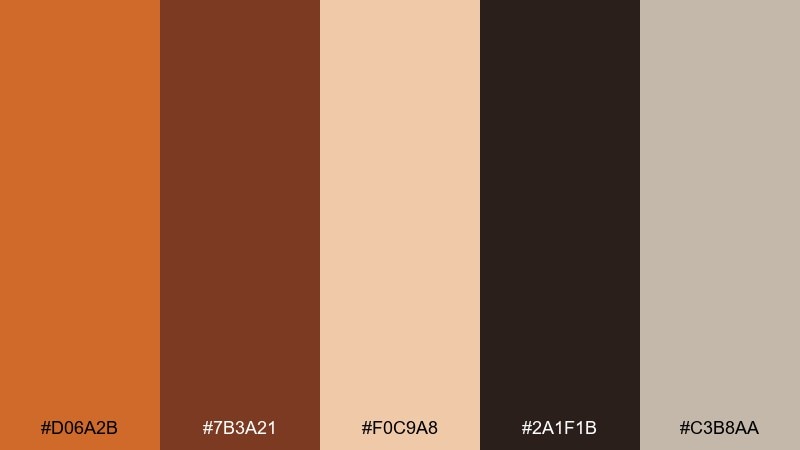
HEX: #D06A2B #7B3A21 #F0C9A8 #2A1F1B #C3B8AA
Mood: heritage, rugged, warm
Best for: mens grooming product ad
Rugged leather and pumpkin spice tones create a heritage feel with premium weight. Use the rich brown and near-black for logotypes and fine print, letting the orange carry the hero highlight and callouts. The muted beige and warm gray support a clean studio look without washing out the warmth. Tip: keep reflections minimal so the palette reads matte and masculine rather than glossy.
Image example of pumpkin leather generated using media.io
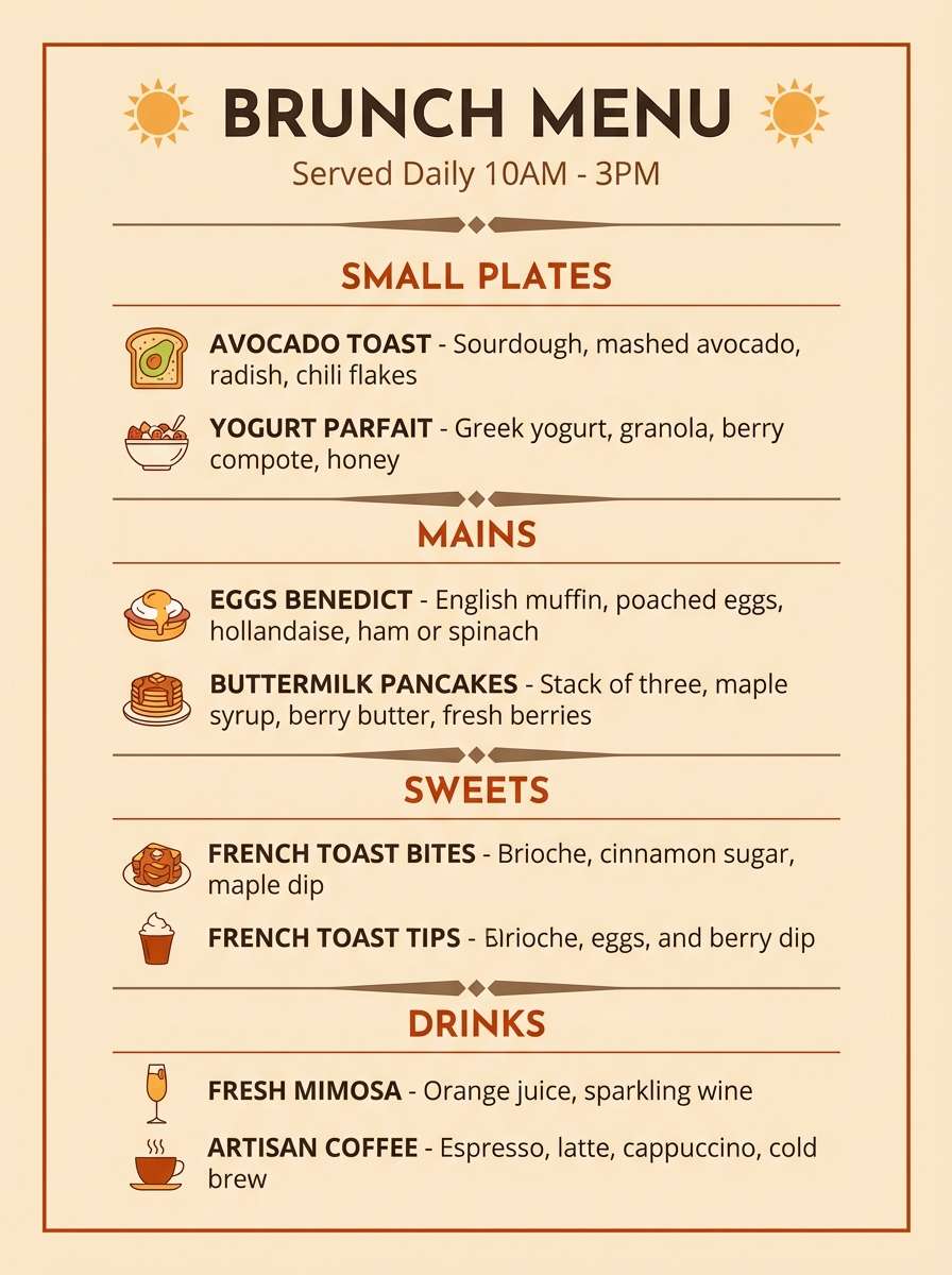
6) Saffron Roast
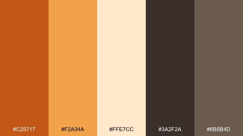
HEX: #C25717 #F2A34A #FFE7CC #3A2F2A #6B5B4D
Mood: toasty, inviting, café-chic
Best for: brunch menu design
Toasty saffron and roasted espresso hues feel like a late-morning café with warm pastries on display. Use the bright saffron for section headers and icons, while the darker orange and browns keep the menu grounded and readable. The pale cream works well as the paper base and helps photos look warmer without a heavy filter. Tip: set body text in deep brown instead of black for a softer, more appetizing finish.
Image example of saffron roast generated using media.io
7) Molten Marmalade
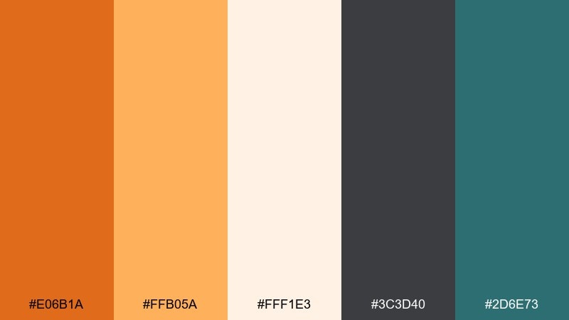
HEX: #E06B1A #FFB05A #FFF1E3 #3C3D40 #2D6E73
Mood: playful, bright, contemporary
Best for: app onboarding screens
Molten marmalade brightness gives an upbeat first impression, like morning sunlight through a kitchen window. Anchor the UI with charcoal for text, then bring in teal as a modern counterpoint for secondary buttons and links. The warm off-white keeps onboarding steps friendly and uncluttered. Tip: use the lighter orange for progress indicators so the primary orange stays special for key actions.
Image example of molten marmalade generated using media.io
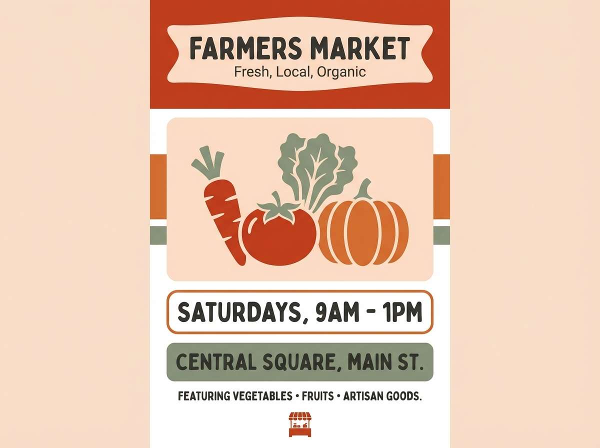
8) Autumn Brick
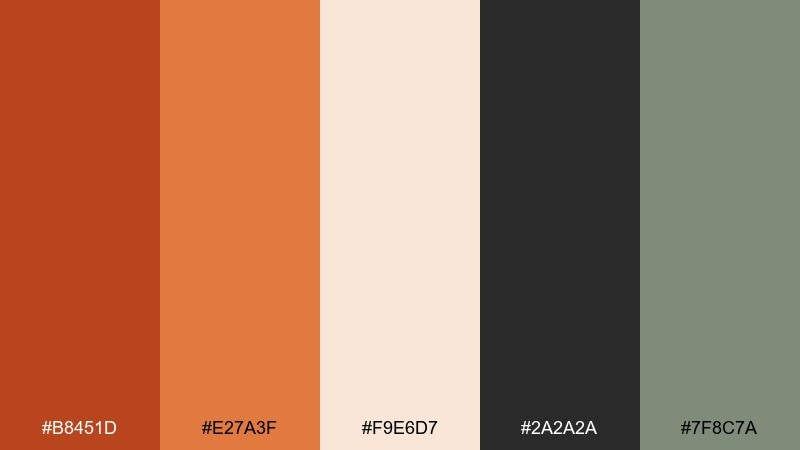
HEX: #B8451D #E27A3F #F9E6D7 #2A2A2A #7F8C7A
Mood: rustic, nostalgic, approachable
Best for: farmers market flyer
Rustic brick and orchard-orange tones feel like crisp air, canvas totes, and weekend markets. Use the deeper brick for bold headers and the softer orange for shapes and price highlights. The pale blush cream keeps everything legible while the sage adds a natural cue for produce and handmade goods. Tip: keep illustrations simple and flat so the warm colors do the storytelling.
Image example of autumn brick generated using media.io
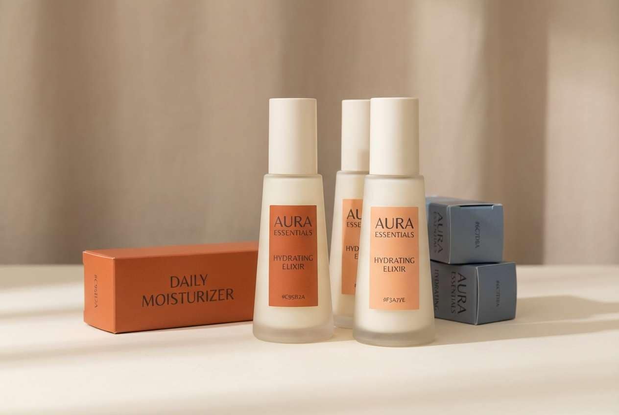
9) Smoked Apricot
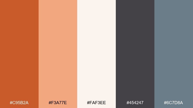
HEX: #C95B2A #F3A77E #FAF3EE #454247 #6C7D8A
Mood: soft, modern, understated
Best for: skincare brand identity
Soft apricot with a smoky edge feels clean, gentle, and quietly premium. This dark orange color palette works well for skincare where warmth should read nurturing, not loud. Pair the charcoal for type and outlines, then use the steel blue as a clinical hint that keeps the brand from feeling too sweet. Tip: print on uncoated paper so the pale tones stay velvety and natural.
Image example of smoked apricot generated using media.io
10) Rustic Harvest
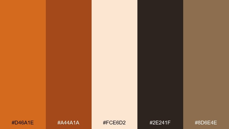
HEX: #D46A1E #A44A1A #FCE6D2 #2E241F #8D6E4E
Mood: seasonal, hearty, welcoming
Best for: thanksgiving email header
Hearty harvest tones evoke roasted squash, wood tables, and a warm kitchen glow. Use the brighter orange for headline emphasis, then lean on deep brown for body copy and divider lines. The creamy background supports long reads and keeps the design feeling generous rather than heavy. Tip: add a subtle gradient from orange to cream to create a cozy, candlelit depth.
Image example of rustic harvest generated using media.io

11) Desert Copper
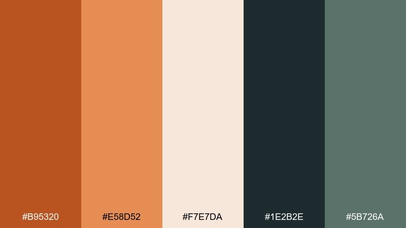
HEX: #B95320 #E58D52 #F7E7DA #1E2B2E #5B726A
Mood: adventurous, airy, refined
Best for: travel blog cover
Desert copper warmth paired with deep green-gray feels like dunes at golden hour and cool air after sunset. Use the copper shades for titles and highlights, while the dark teal-gray brings readability and a sense of distance. The soft sand tone keeps layouts light and photo-friendly. Tip: apply the darker accent to navigation and tags so the page feels curated, not cluttered.
Image example of desert copper generated using media.io
12) Paprika Night
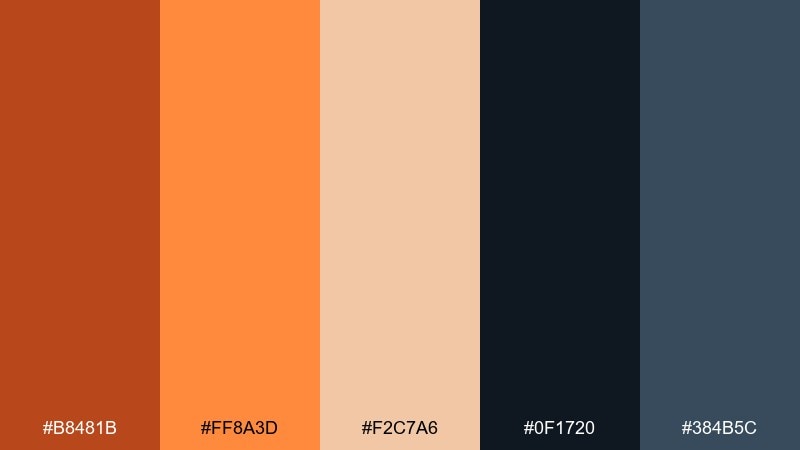
HEX: #B8481B #FF8A3D #F2C7A6 #0F1720 #384B5C
Mood: dramatic, bold, nightlife
Best for: music festival ticket design
Paprika heat against inky midnight tones feels like neon signage and late-night energy. This dark orange color palette is ideal for tickets and passes where you want instant contrast and a premium edge. Let the dark navy carry the base, then use the brighter orange for scannable details like dates, tiers, and QR accents. Tip: keep gradients subtle so the navy stays rich and the orange stays punchy.
Image example of paprika night generated using media.io

13) Orange Espresso
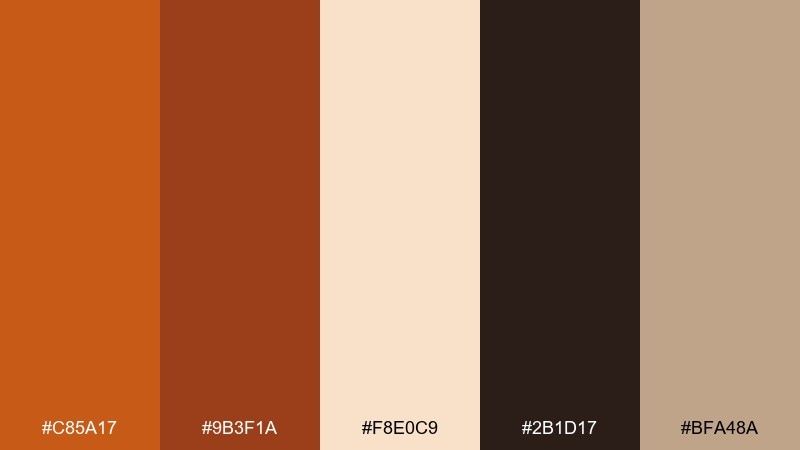
HEX: #C85A17 #9B3F1A #F8E0C9 #2B1D17 #BFA48A
Mood: rich, classic, intimate
Best for: restaurant logo and menu set
Rich espresso browns with a caramel-orange glow feel intimate and upscale. Use the darkest tone for the logo mark and main type, then bring in orange as a tasteful accent for section titles and special dishes. The creamy peach keeps the set readable under warm lighting and prints well on textured stock. Tip: emboss the darkest brown and foil the orange for a subtle, high-end finish.
Image example of orange espresso generated using media.io
14) Burnt Citrus
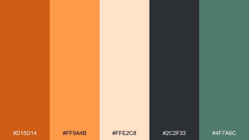
HEX: #D15D14 #FF9A4B #FFE2C8 #2C2F33 #4F7A6C
Mood: fresh, zesty, confident
Best for: fitness brand social ad
Zesty citrus energy with a burnt edge feels active, optimistic, and sharp. Use the vivid orange for motion graphics and headline punches, while charcoal keeps text crisp on small screens. The muted green adds a healthy cue that pairs well with wellness and outdoor training visuals. Tip: reserve the light peach for whitespace and captions so the ad stays legible in fast scroll.
Image example of burnt citrus generated using media.io

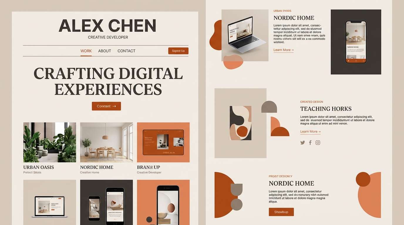
15) Amberwood Neutral
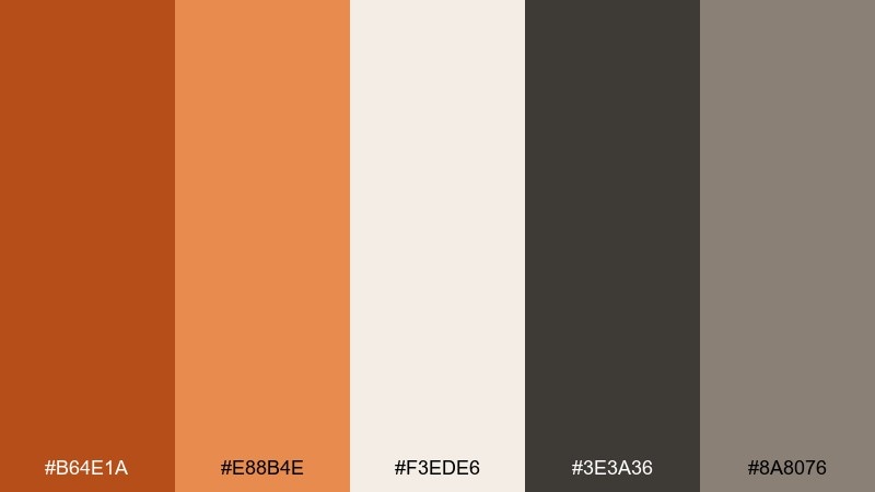
HEX: #B64E1A #E88B4E #F3EDE6 #3E3A36 #8A8076
Mood: minimal, warm, timeless
Best for: portfolio website theme
Warm minimalism and amberwood calm create a timeless, designerly feel. Keep backgrounds in the soft off-white, then use the deep charcoal for typography and the darker orange for subtle emphasis. This dark orange color scheme pairs especially well with monochrome photography and warm wood textures. Tip: use the lighter orange only for hover states and small badges to avoid overwhelming the layout.
Image example of amberwood neutral generated using media.io
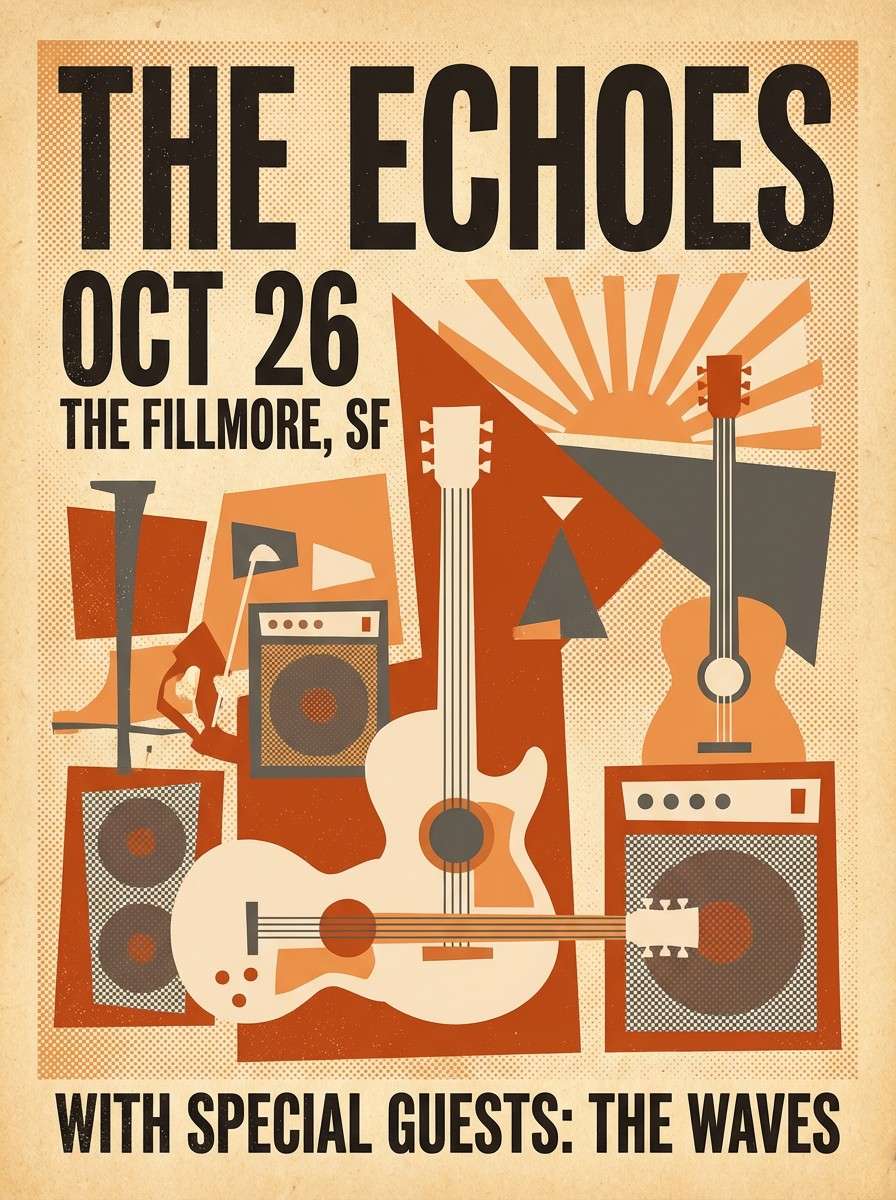
16) Vintage Poster Orange
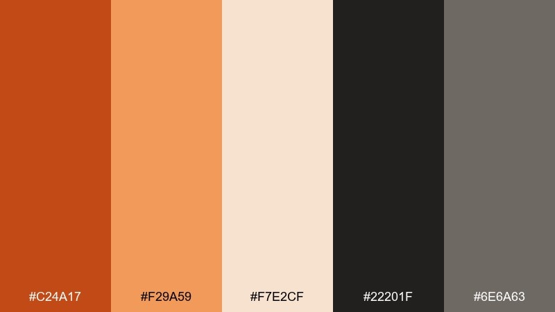
HEX: #C24A17 #F29A59 #F7E2CF #22201F #6E6A63
Mood: retro, punchy, graphic
Best for: retro gig poster
Retro print warmth and slightly faded orange tones evoke screen-printed posters and old venue walls. Use the near-black for bold type and thick outlines, letting the orange duo handle the main shapes and title blocks. The warm cream supports that aged-paper feel without looking dirty. Tip: add halftone dots in the gray to amplify the vintage texture while keeping it clean.
Image example of vintage poster orange generated using media.io
17) Cozy Cabin Glow
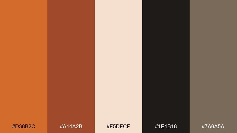
HEX: #D36B2C #A14A2B #F5DFCF #1E1B18 #7A6A5A
Mood: cozy, intimate, winter-warm
Best for: holiday sale banner
Cozy cabin glow brings the feeling of warm firelight against dark wood. Use the brighter orange for discount badges and buttons, and let the deep brown and near-black carry the bold type. The soft cream keeps the banner friendly and readable even with dense messaging. Tip: add a thin border in the muted taupe to frame the banner and prevent the dark tones from bleeding into the edges.
Image example of cozy cabin glow generated using media.io

18) Marigold Botanical
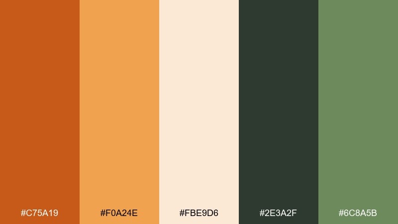
HEX: #C75A19 #F0A24E #FBE9D6 #2E3A2F #6C8A5B
Mood: fresh, botanical, sunny
Best for: spring botanical illustration
Sunny marigold warmth with leafy greens feels like a garden sketchbook in early spring. Use the orange tones for petals and focal blooms, while the deeper green anchors stems and shadows. The pale cream works as watercolor paper and keeps the illustration airy. Tip: limit the darkest green to linework and small details so the orange remains the star.
Image example of marigold botanical generated using media.io
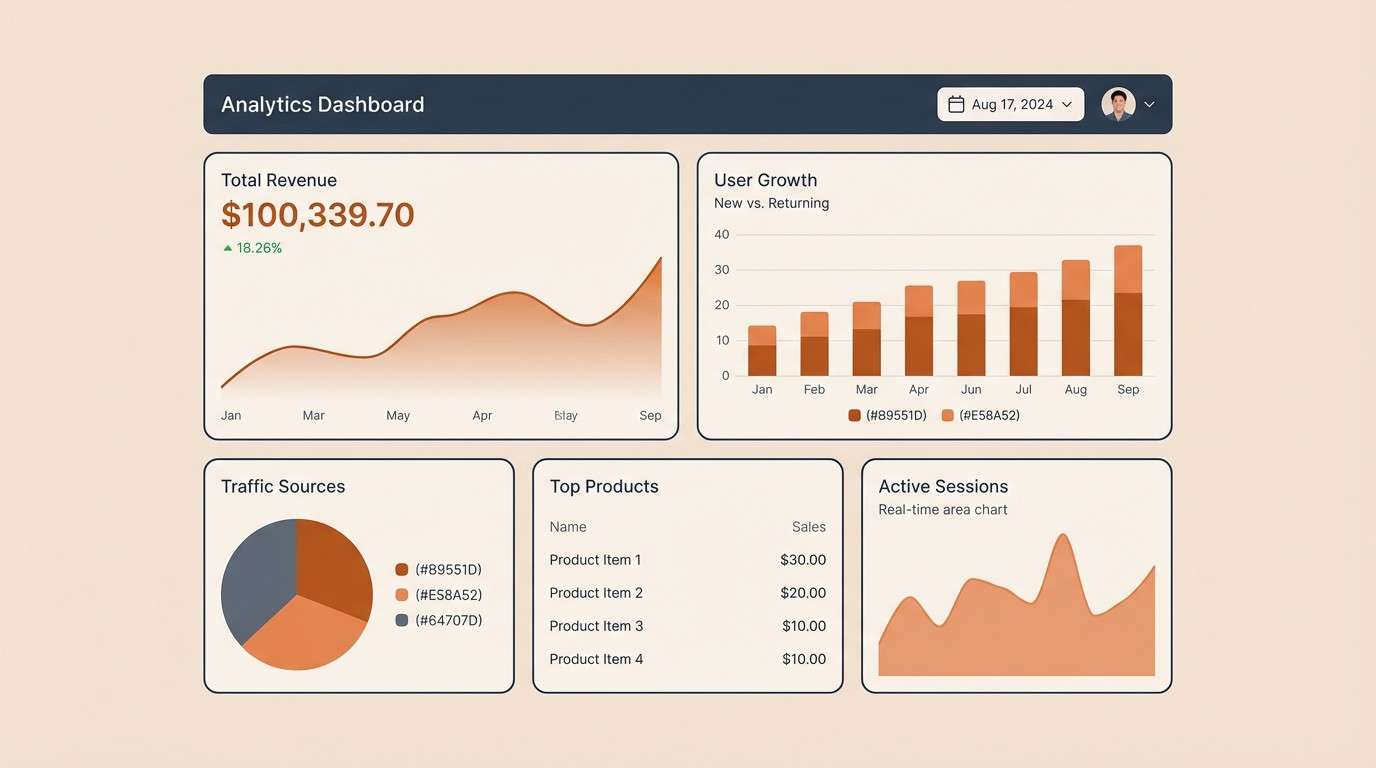
19) Clay and Slate
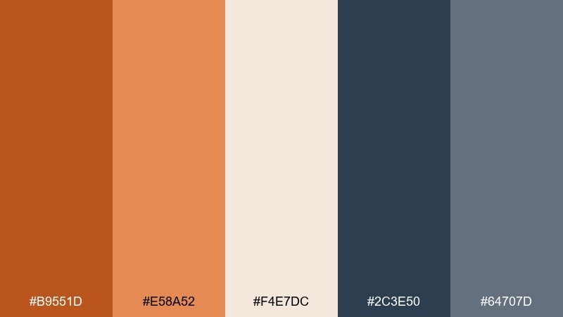
HEX: #B9551D #E58A52 #F4E7DC #2C3E50 #64707D
Mood: professional, balanced, tech-friendly
Best for: analytics dashboard UI
Warm clay against cool slate reads professional, calm, and quietly confident. Use slate and blue-gray for navigation, grids, and charts, then apply the orange tones to highlight key metrics and alerts. The soft beige keeps long dashboard sessions easy on the eyes. Tip: use orange sparingly for one or two KPI tiles so attention lands exactly where you want it.
Image example of clay and slate generated using media.io
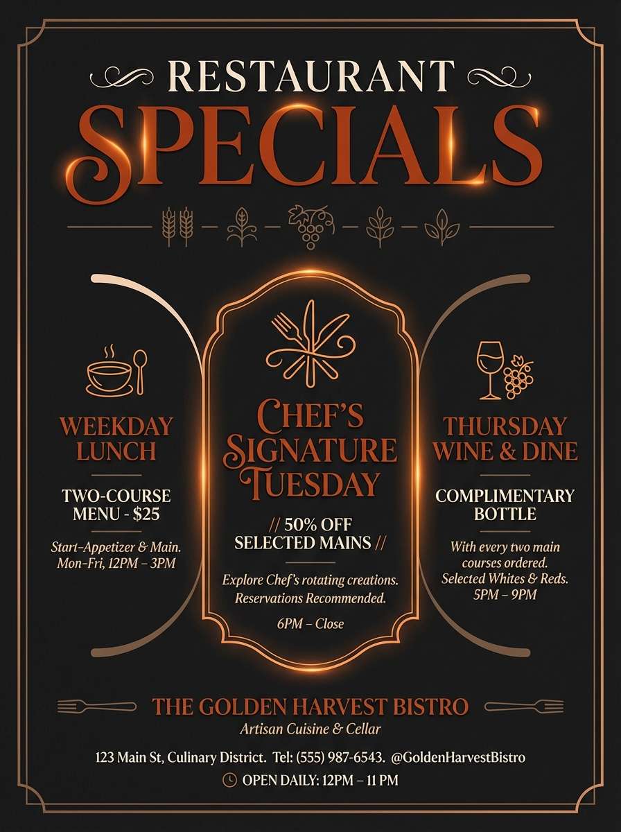
20) Spice Market Night
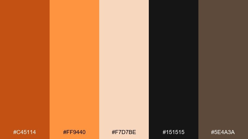
HEX: #C45114 #FF9440 #F7D7BE #151515 #5E4A3A
Mood: moody, exotic, high-contrast
Best for: restaurant special poster
Moody spice-market warmth feels like lantern light, toasted cumin, and late-night street food. Set the background in deep near-black to make the oranges glow, then use the soft peach for readable details. The warm brown adds depth for secondary blocks and illustrated elements. Tip: keep margins wide so the poster stays premium instead of crowded.
Image example of spice market night generated using media.io
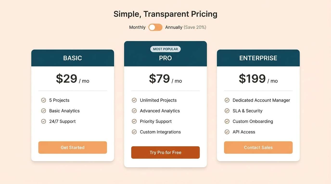
21) Teal Contrast Pop
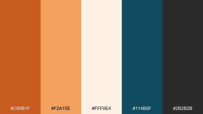
HEX: #C85B1F #F2A15E #FFF0E4 #114B5F #2B2B2B
Mood: fresh, trendy, high-clarity
Best for: SaaS pricing page
Fresh contrast between spicy orange and deep teal feels modern, clear, and conversion-focused. These dark orange color combinations are great for pricing tables where you need a strong highlight without sacrificing trust. Use teal for navigation and section anchors, then apply orange to the recommended plan and key CTAs. Tip: keep the off-white as the main canvas so both accent colors stay crisp.
Image example of teal contrast pop generated using media.io
What Colors Go Well with Dark Orange?
Dark orange pairs naturally with warm neutrals like cream, sand, beige, taupe, and espresso browns. These combinations keep the palette cohesive and “earthy,” which is ideal for packaging, hospitality, and lifestyle brands.
For a modern, high-contrast look, match dark orange with cool anchors like navy, slate, blue-gray, or deep teal. The cool tones control the heat of orange and make CTAs, badges, and highlights stand out more cleanly.
If you want a natural accent that doesn’t compete, try muted greens such as sage, olive, or green-gray. These add freshness and balance while keeping dark orange as the main character.
How to Use a Dark Orange Color Palette in Real Designs
In branding, treat dark orange as a signature accent: use it on your logo detail, icon set, packaging highlights, or a single “hero” shape. Pair it with charcoal or deep brown for typography so your design stays readable and premium.
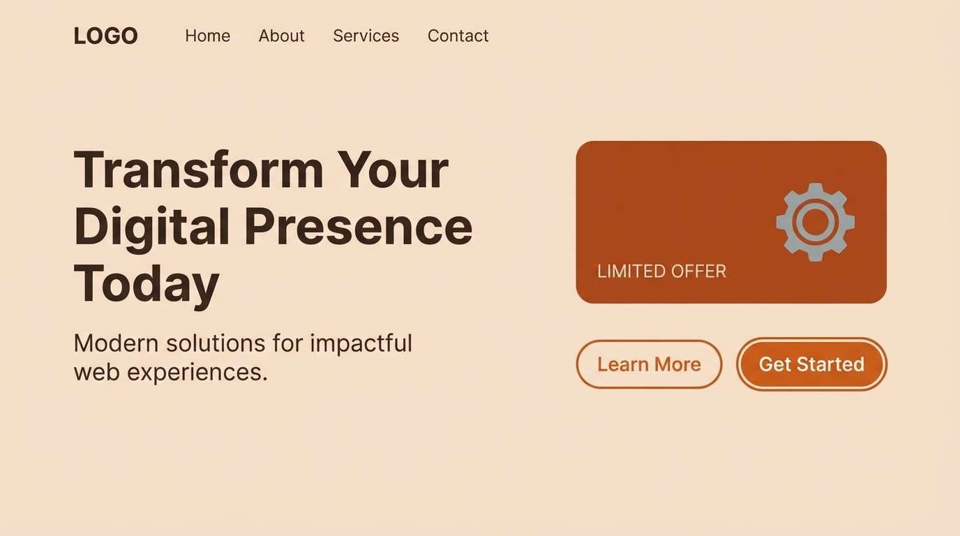
In UI, use dark orange for primary actions (CTA buttons), key states (selected tabs), and small attention cues (notifications, KPI highlights). Keep backgrounds in warm off-white or soft beige to prevent the interface from feeling overly saturated.
In print, dark orange works best when you give it texture—uncoated paper, subtle grain, or halftone effects. Combine with near-black for type and let lighter peach/cream tones create whitespace and hierarchy.
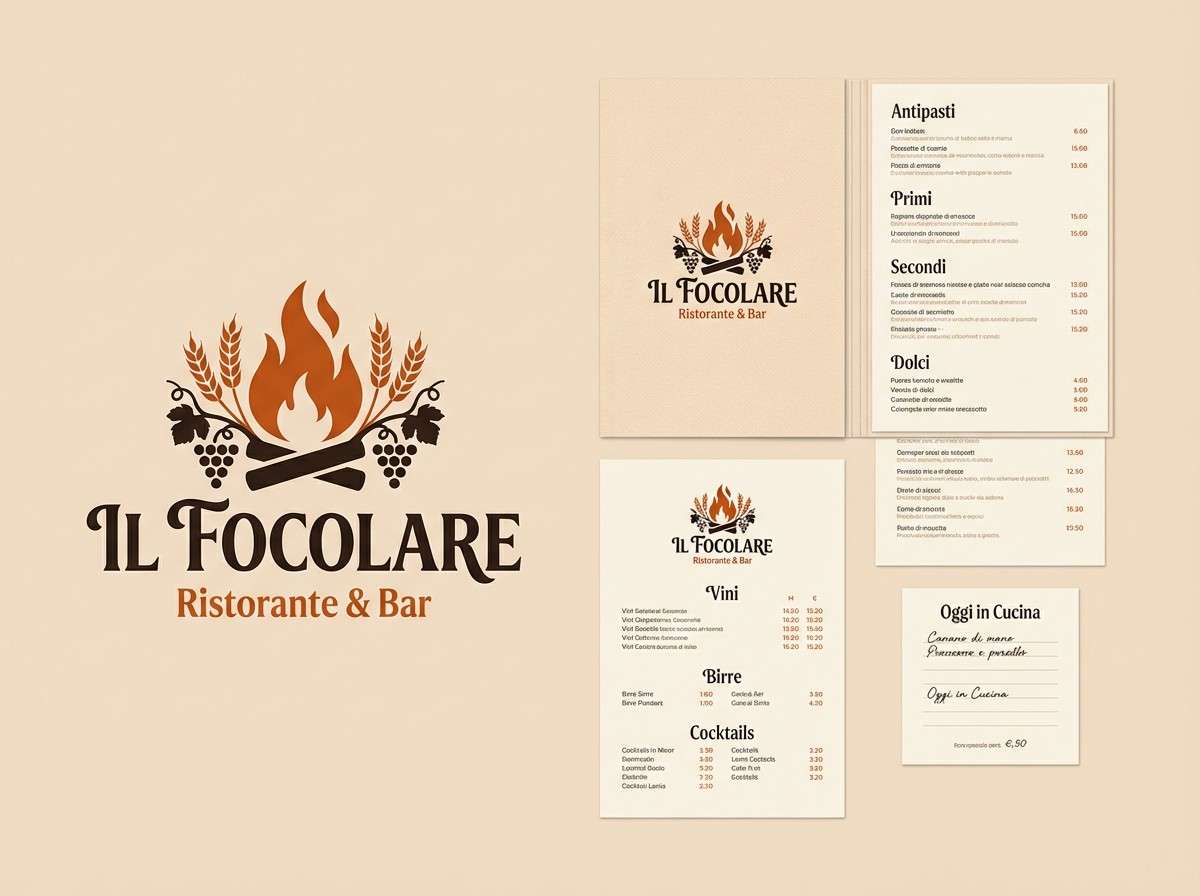
Create Dark Orange Palette Visuals with AI
If you already have HEX codes, you can turn them into real-looking mockups fast using AI—like menus, product labels, posters, and dashboards. This is especially helpful when you need to pitch a direction or explore variations before final design production.
Start by describing the scene (poster, packaging, UI), then specify which colors should be dominant and which are accents. A short note about materials (matte paper, uncoated stock, soft shadows) helps dark orange look richer and more realistic.
With Media.io, you can generate multiple palette-based visuals quickly, then iterate on layout, mood, and contrast until the orange feels exactly right.
Dark Orange Color Palette FAQs
-
What is a dark orange color palette?
A dark orange color palette is a curated set of colors built around deeper orange hues (often burnt orange, copper, or terracotta), usually balanced with creams, browns, charcoals, or cool blues/teals for contrast and readability. -
Is burnt orange the same as dark orange?
They’re closely related, but not identical. Burnt orange typically leans more brown/red and “smoky,” while dark orange can include cleaner copper or clay tones. In practice, both work similarly and depend on the supporting neutrals you choose. -
What colors complement dark orange best?
Deep teal, navy, slate, charcoal, and cool gray-blue create strong contrast. For softer pairings, use cream, sand, beige, and warm browns. Muted sage/olive greens also complement dark orange without overpowering it. -
Can I use dark orange for UI buttons and CTAs?
Yes—dark orange is excellent for CTAs because it feels energetic but more refined than bright orange. Keep the rest of the UI neutral, and check contrast for accessibility (especially on light peach or cream backgrounds). -
Does dark orange work for professional or tech brands?
It can, especially when paired with slate, blue-gray, or navy. Use orange sparingly for highlights (recommended plans, key metrics, alerts) while keeping navigation and typography in cool, stable tones. -
How do I keep a dark orange palette from looking too “autumn”?
Choose crisp neutrals (off-white + charcoal) and add a modern cool counterpoint like teal or steel blue. Avoid overly rustic textures and limit secondary warm tones so the palette feels contemporary, not seasonal. -
How can I generate dark orange palette mockups quickly?
Use an AI text-to-image tool and specify your HEX colors as dominant and accent tones in the prompt. Generate a few variations (materials, lighting, layout), then refine until the dark orange looks balanced and intentional.
Next: Supernova Color Palette


