

Dollar bill green is more than a single shade—it’s a whole family of calm, trustworthy greens and muted neutrals that feel instantly familiar.
Below are 20 ready-to-use dollar bill color palette ideas (with HEX codes), plus practical pairing tips for branding, UI, and print.
In this article
Why Dollar Bill Palettes Work So Well
Dollar bill palettes feel “right” because they balance deep greens with softened tints and paper-like neutrals, creating instant hierarchy without harsh contrast.
They also signal trust, stability, and practicality—great for finance, wellness, eco brands, and any design that needs a calm, confident base.
Because the greens sit in a familiar mid-range, they play nicely with typography and photography, making them dependable for both screens and print.
20+ Dollar Bill Color Palette Ideas (with HEX Codes)
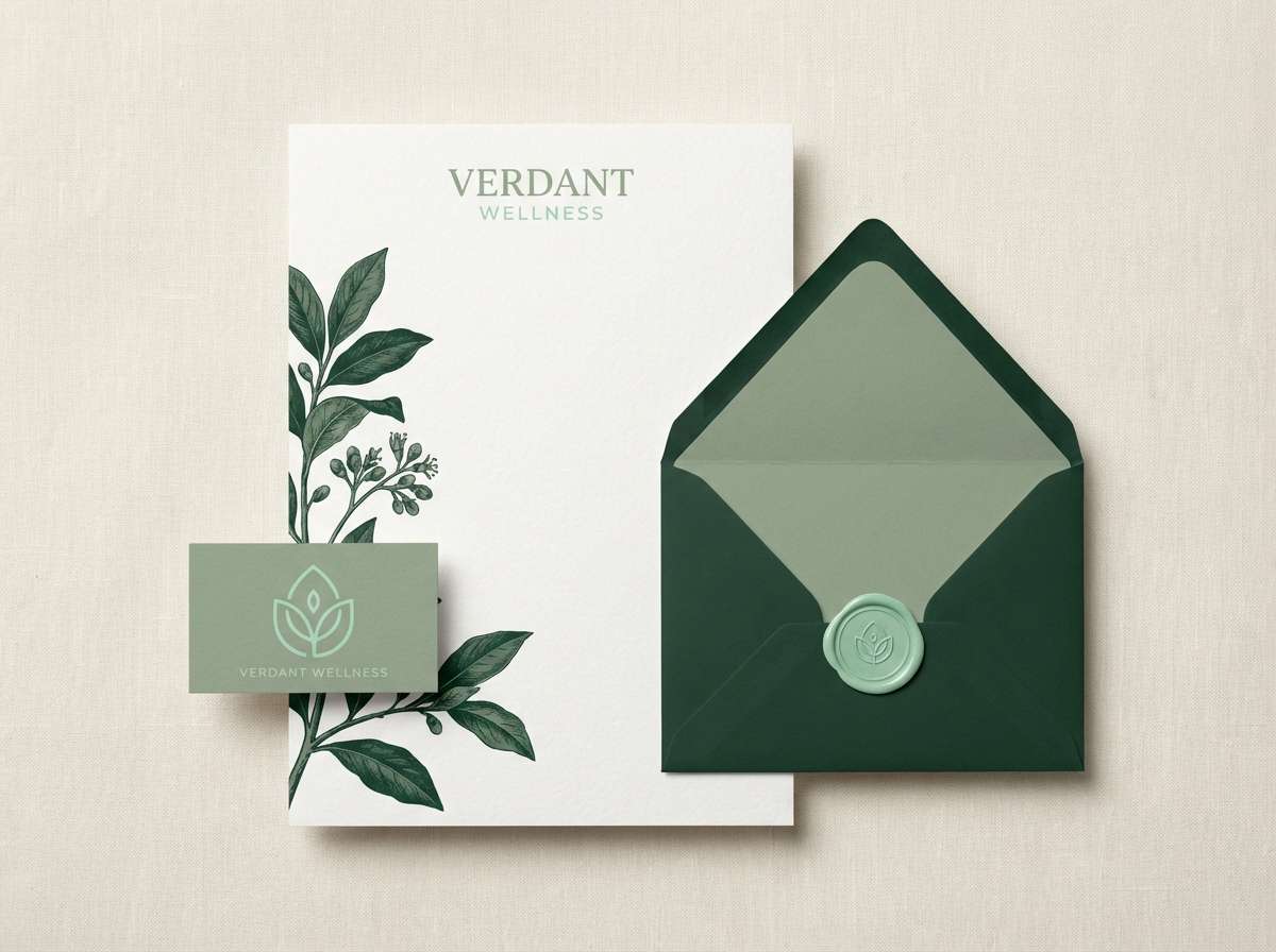
1) Minted Linen
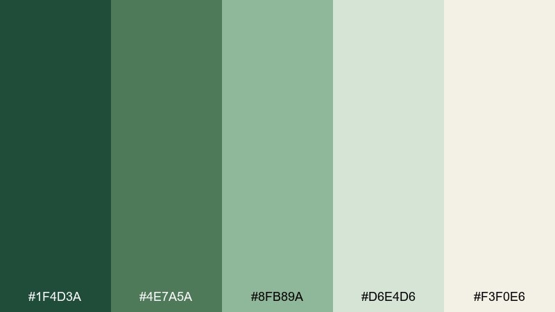
HEX: #1F4D3A #4E7A5A #8FB89A #D6E4D6 #F3F0E6
Mood: fresh, calm, clean
Best for: wellness branding and minimalist stationery
Fresh and airy like mint leaves on warm linen, these greens feel polished without trying too hard. Use it for wellness brands, boutique packaging, and calm editorial headers. Pair the light tints with deep green text for readability, then add linen as breathing room. Usage tip: keep the darkest green for type and icons, and let the pale green carry large background blocks.
Image example of minted linen generated using media.io
Media.io is an online AI studio for creating and editing video, image, and audio in your browser.

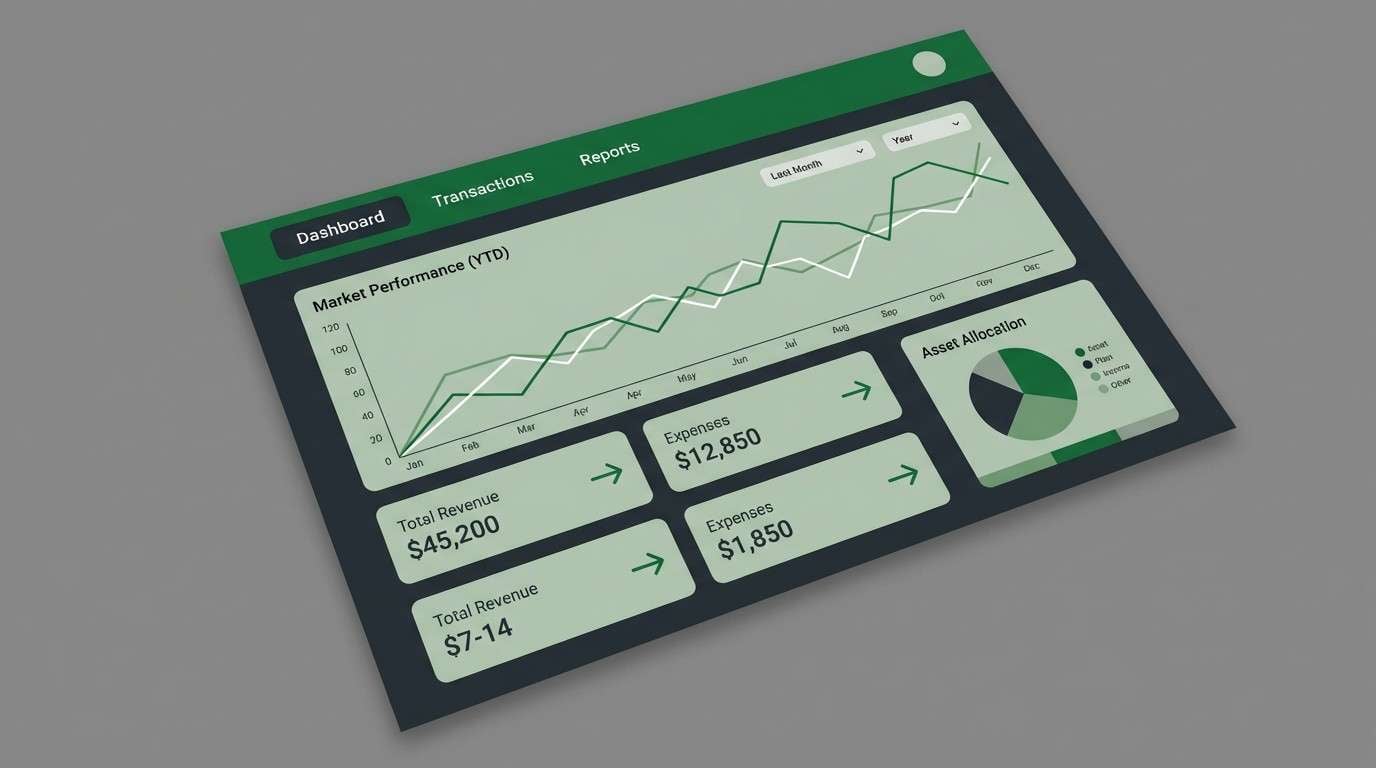
2) Treasury Sage
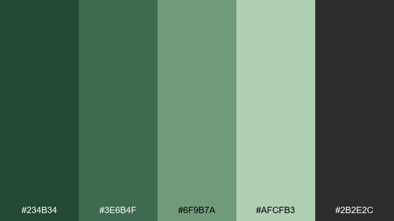
HEX: #234B34 #3E6B4F #6F9B7A #AFCFB3 #2B2E2C
Mood: trustworthy, grounded, professional
Best for: finance dashboards and B2B landing pages
Grounded sage and charcoal evoke confidence, like a tailored suit with a soft green tie. It works especially well for fintech UI, enterprise websites, and data-heavy layouts. Use charcoal for navigation and labels, then reserve the pale green for cards and status states. Usage tip: keep contrast high by pairing the lightest green with the charcoal, not the mid-tones.
Image example of treasury sage generated using media.io
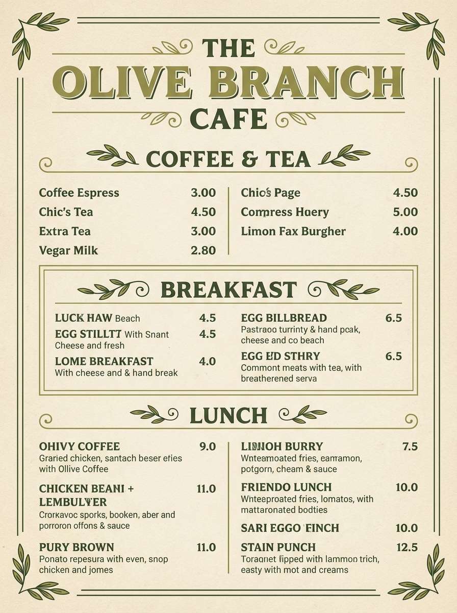
3) Olive Ledger
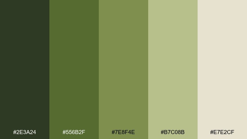
HEX: #2E3A24 #556B2F #7E8F4E #B7C08B #E7E2CF
Mood: earthy, vintage, utilitarian
Best for: heritage labels and café menus
Earthy olives and paper beige feel like old book covers and stamped receipts. This dollar bill color palette suits heritage packaging, coffee labels, and menu design where warmth matters more than shine. Pair it with classic serif typography and subtle line art for a crafted look. Usage tip: use the beige as your main background to keep the darker olives from feeling heavy.
Image example of olive ledger generated using media.io
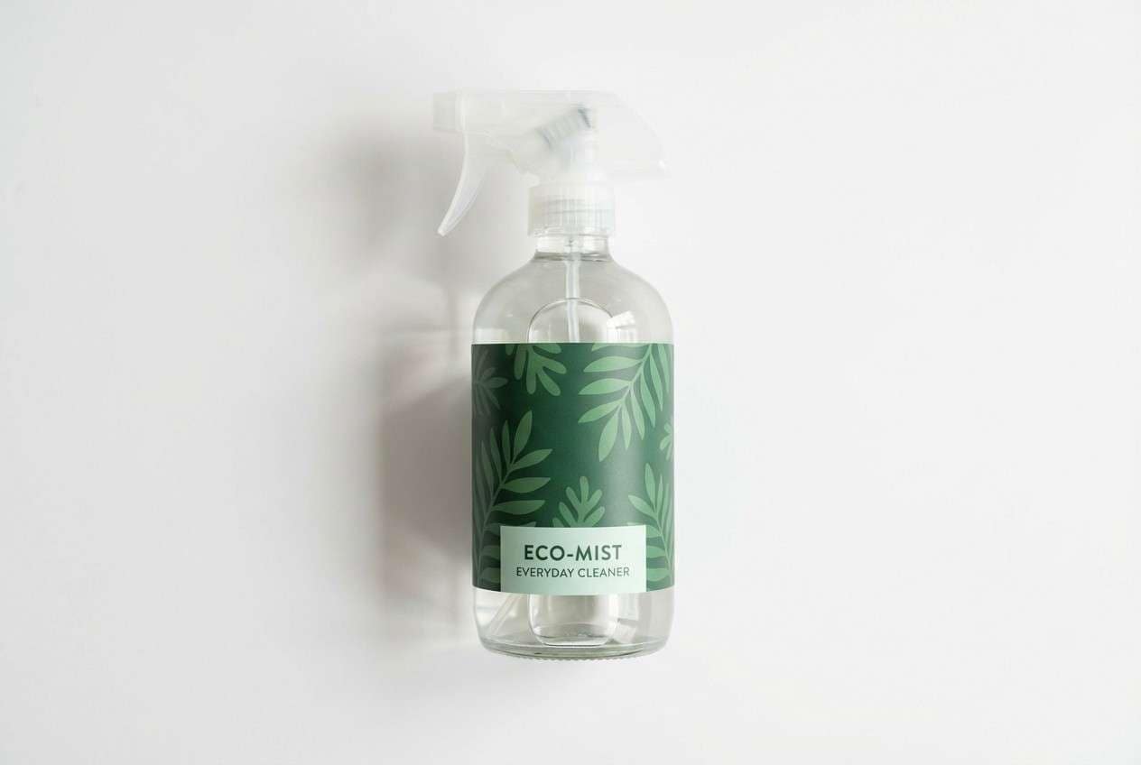
4) Garden Vault
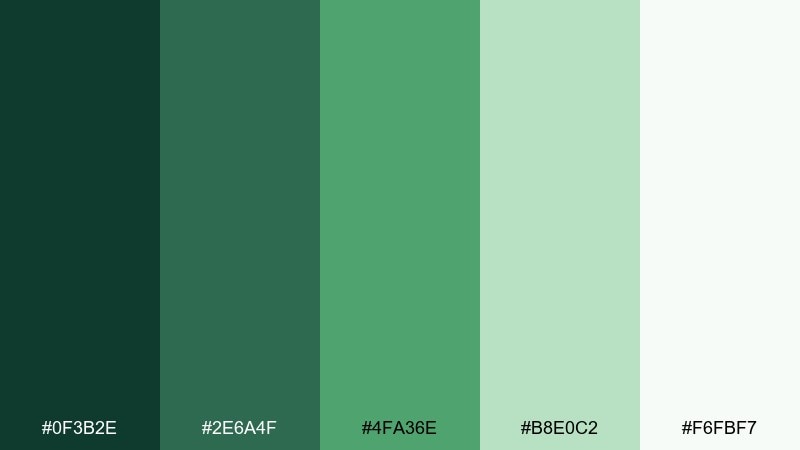
HEX: #0F3B2E #2E6A4F #4FA36E #B8E0C2 #F6FBF7
Mood: bright, lively, natural
Best for: eco product ads and spring campaigns
Lively greens with a bright, garden-fresh lift bring instant energy and optimism. They work beautifully for eco campaigns, outdoor brands, and seasonal promos that need a clean pop. Pair the vivid mid-green with soft mint backgrounds to keep things modern. Usage tip: limit the most saturated green to buttons, price tags, or short headlines so it stays punchy.
Image example of garden vault generated using media.io
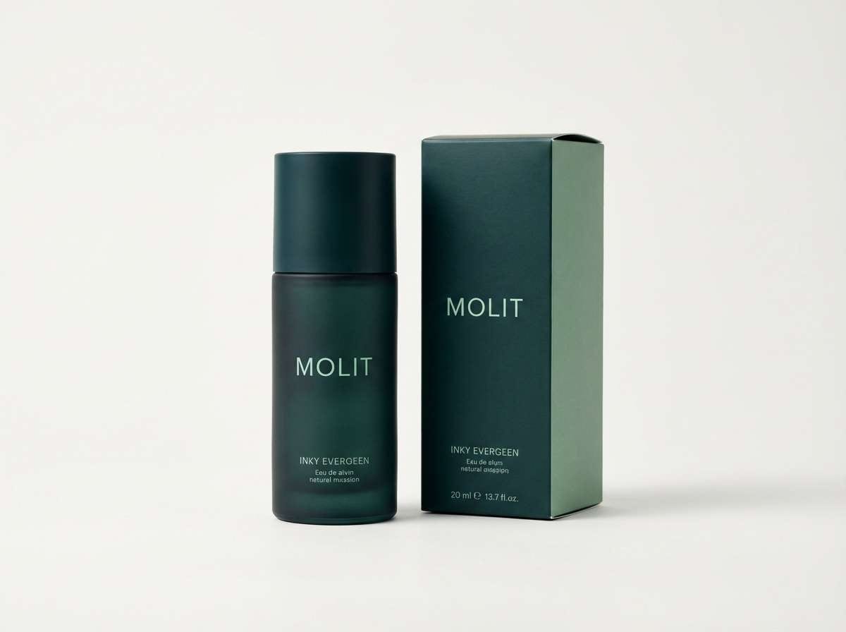
5) Evergreen Ink
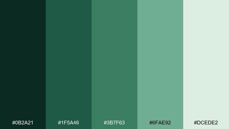
HEX: #0B2A21 #1F5A46 #3B7F63 #6FAE92 #DCEDE2
Mood: moody, refined, confident
Best for: premium brand systems and packaging
Inky evergreen tones feel upscale, like a dark green bottle under soft studio lights. Use it for premium brand systems, wine labels, and boutique packaging where you want depth without black. Pair the deep green with the airy mint to create hierarchy in layouts. Usage tip: add texture through subtle emboss or grain rather than introducing extra colors.
Image example of evergreen ink generated using media.io
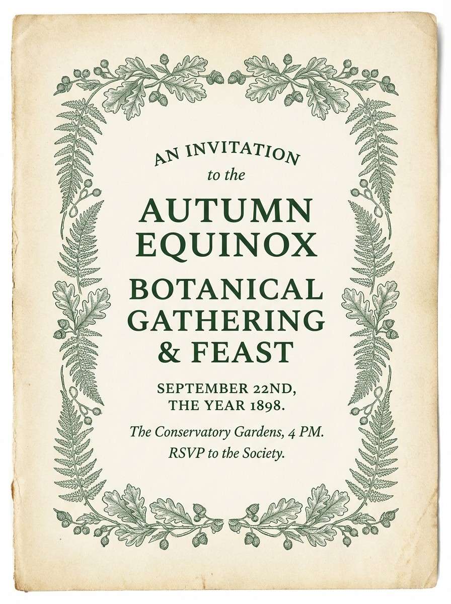
6) Antique Note
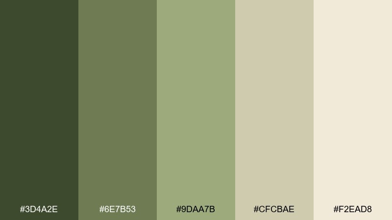
HEX: #3D4A2E #6E7B53 #9DAA7B #CFCBAE #F2EAD8
Mood: nostalgic, soft, warm
Best for: event invitations and rustic posters
Soft, nostalgic greens and warm parchment neutrals evoke keepsake notes and sun-faded paper. It fits invitations, community posters, and storytelling brands that lean cozy. Pair it with hand-drawn flourishes or a gentle script for extra charm. Usage tip: let the parchment tone dominate, then use the darker green only for titles and dividers.
Image example of antique note generated using media.io
7) Mossy Marble
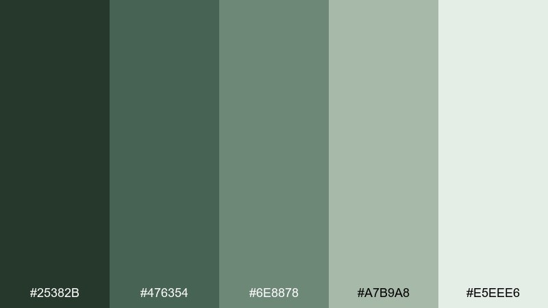
HEX: #25382B #476354 #6E8878 #A7B9A8 #E5EEE6
Mood: quiet, balanced, organic
Best for: interior mood boards and lifestyle blogs
Quiet moss tones with a misty light green feel like marble veined with nature. It works for interior design mood boards, lifestyle blog graphics, and calm social templates. Pair it with warm wood photography and soft shadows for a grounded look. Usage tip: use the palest green as an overlay to unify busy images without dulling them.
Image example of mossy marble generated using media.io
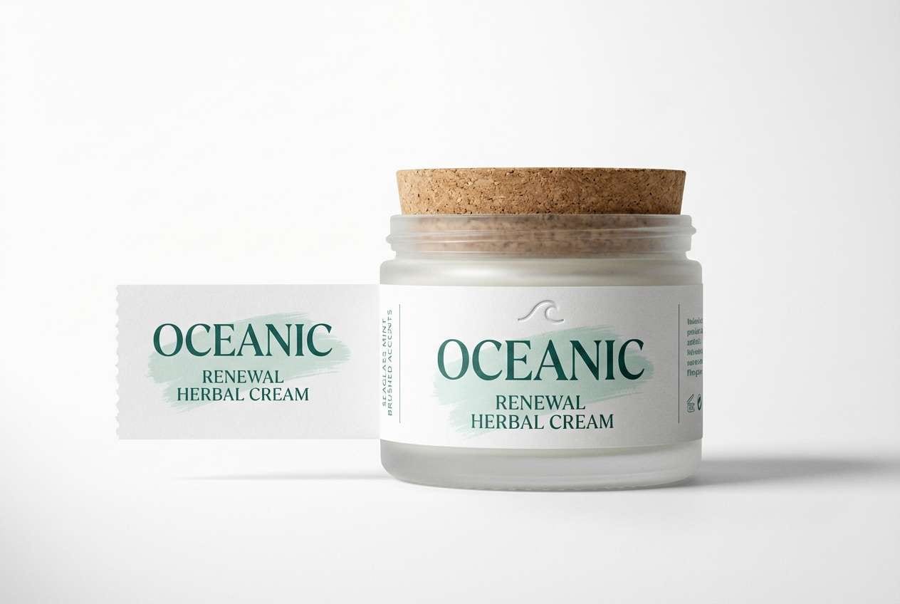
8) Seaglass Stamp
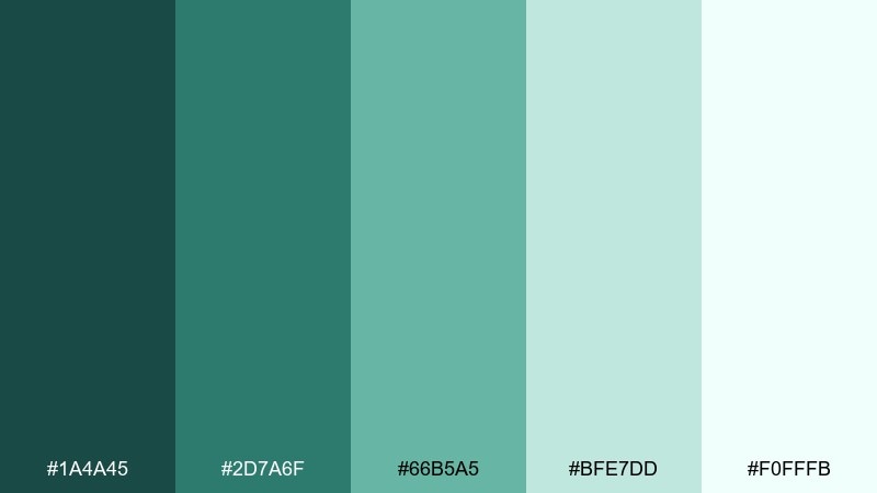
HEX: #1A4A45 #2D7A6F #66B5A5 #BFE7DD #F0FFFB
Mood: coastal, light, refreshing
Best for: spa promos and skincare labels
Refreshing seaglass greens bring a clean, coastal calm that feels instantly breathable. Use it for spa promos, skincare labels, and landing pages that need a crisp, watery vibe. Pair the darker teal-green with lots of near-white negative space to keep it airy. Usage tip: make buttons the deeper teal and reserve the bright mint for subtle highlights and icons.
Image example of seaglass stamp generated using media.io
9) Basil Brass
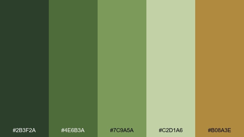
HEX: #2B3F2A #4E6B3A #7C9A5A #C2D1A6 #B08A3E
Mood: rustic, confident, crafted
Best for: craft food packaging and label design
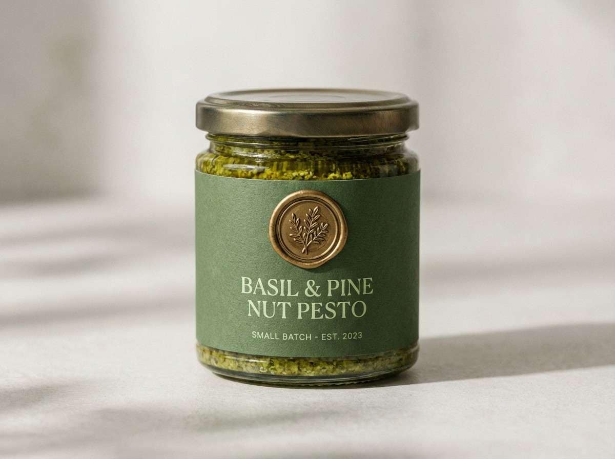
Herby basil greens with a brass accent feel like a pantry staple wrapped in quality. These dollar bill color combinations are great for craft food packaging, sauce labels, and market signage. Pair the brass with the darkest green for badges, seals, and callouts. Usage tip: keep brass small and intentional so it reads premium rather than mustardy.
Image example of basil brass generated using media.io
10) Cashmere Fern
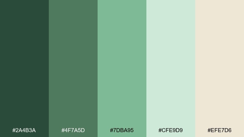
HEX: #2A4B3A #4F7A5D #7DBA95 #CFE9D9 #EFE7D6
Mood: soft, elegant, welcoming
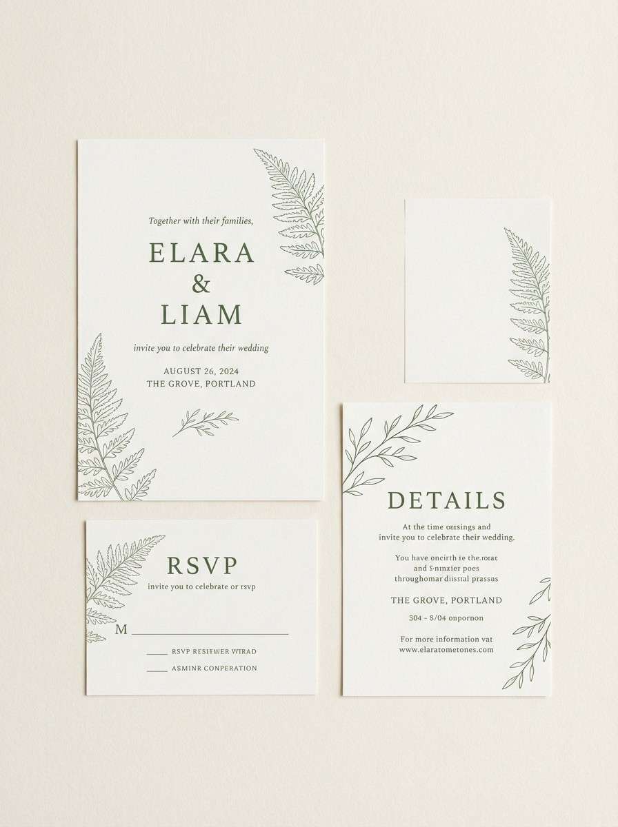
Best for: wedding stationery and lifestyle branding
Soft fern greens with a cashmere-neutral base feel gentle, romantic, and understated. It suits wedding suites, lifestyle branding, and calm e-commerce pages. Pair the cream tone with fern line art or florals for an airy look. Usage tip: print the mid-green on uncoated paper to get a velvety, natural finish.
Image example of cashmere fern generated using media.io
11) Verdant Minimal
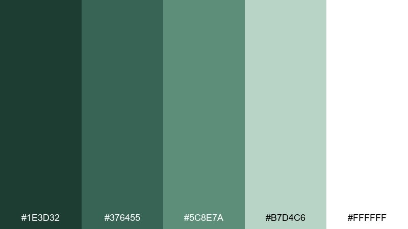
HEX: #1E3D32 #376455 #5C8E7A #B7D4C6 #FFFFFF
Mood: minimal, modern, airy
Best for: SaaS UI kits and clean web layouts
Modern and airy, these verdant greens sit beautifully against crisp white. It works for SaaS UI kits, clean landing pages, and minimalist portfolios where spacing does the heavy lifting. Pair the darkest green with white for headers and navigation, then use the pale green for cards and form fields. Usage tip: keep shadows subtle and rely on color blocks for hierarchy.
Image example of verdant minimal generated using media.io
12) Herbal Clay
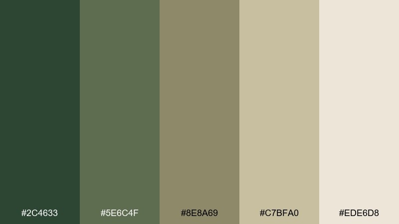
HEX: #2C4633 #5E6C4F #8E8A69 #C7BFA0 #EDE6D8
Mood: earthy, muted, natural
Best for: sustainable packaging and ceramics brands
Muted herbal greens mixed with clay neutrals feel handmade and grounded. Use it for sustainable packaging, ceramics brands, and calm product storytelling. Pair the taupe-beige tones with deep green typography for a natural contrast. Usage tip: keep photography warm and desaturated so the palette stays cohesive.
Image example of herbal clay generated using media.io
13) Mint Circuit
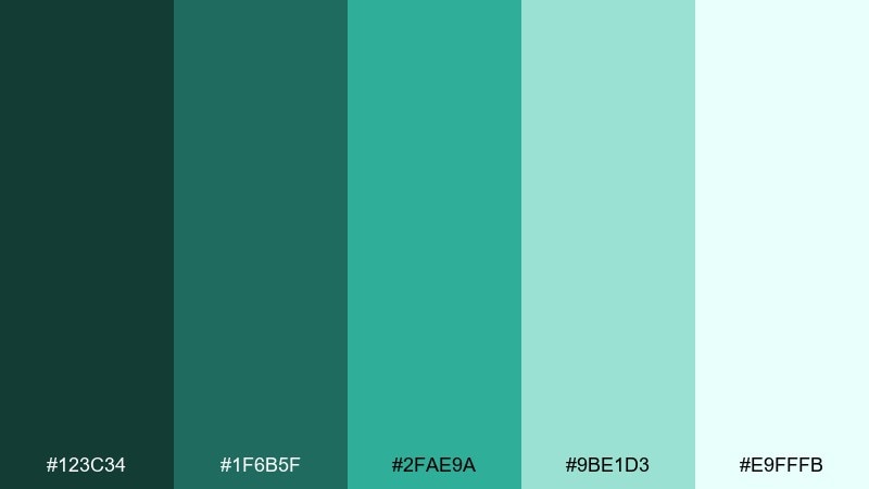
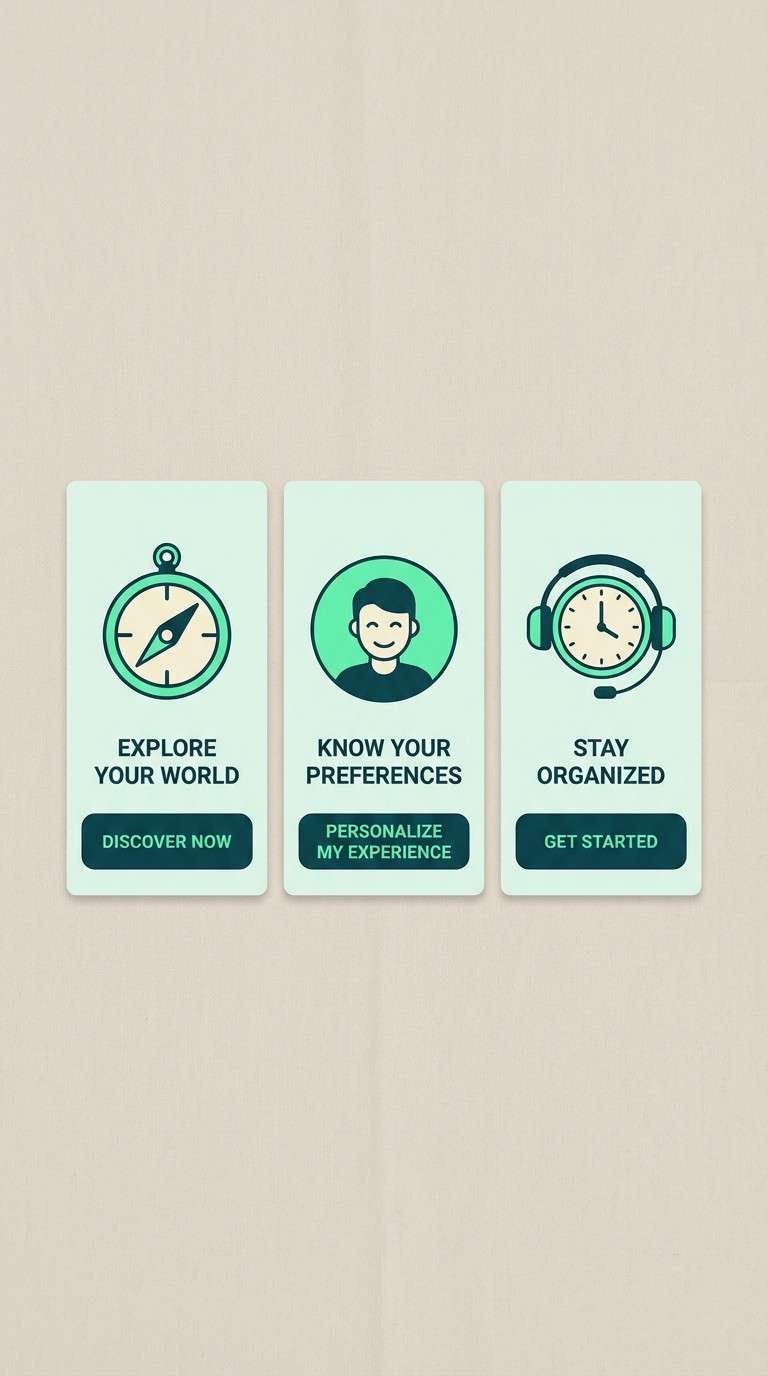
HEX: #123C34 #1F6B5F #2FAE9A #9BE1D3 #E9FFFB
Mood: techy, energetic, clean
Best for: app onboarding screens and fintech ads
Bright mint energy with deep teal grounding feels like polished tech with a friendly pulse. This dollar bill color scheme is ideal for onboarding flows, fintech ads, and feature callouts that need clarity. Pair the vivid mint with the deep teal for buttons and key actions, keeping the lightest tint for backgrounds. Usage tip: use the saturated mint sparingly to avoid a neon look on large surfaces.
Image example of mint circuit generated using media.io
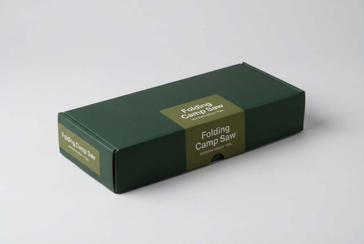
14) Forest Receipt
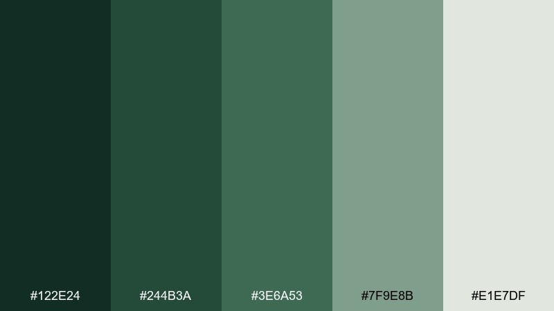
HEX: #122E24 #244B3A #3E6A53 #7F9E8B #E1E7DF
Mood: practical, calm, slightly rugged
Best for: outdoor brands and utility packaging
Rugged forest greens with a cool gray-green base feel practical and outdoorsy. Use it for utility packaging, outdoor brands, and product sheets that need a no-nonsense tone. Pair the mid-green with the gray-green for readable charts and feature grids. Usage tip: add a single bold accent through typography weight rather than introducing a new color.
Image example of forest receipt generated using media.io
15) Soft Patina
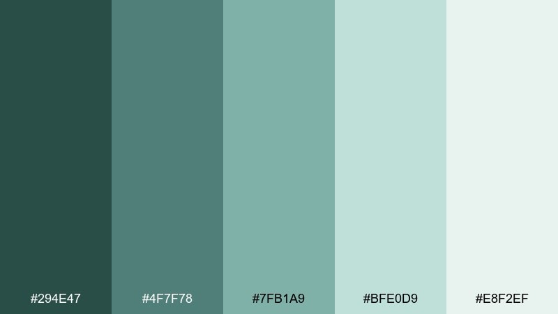
HEX: #294E47 #4F7F78 #7FB1A9 #BFE0D9 #E8F2EF
Mood: serene, coastal, modern
Best for: hotel branding and calm social templates
Serene patina tones feel like weathered sea glass and quiet mornings. It suits boutique hotel branding, calm social templates, and travel guides with a modern edge. Pair the deeper green-blue with pale tints for layered depth that still feels light. Usage tip: use gradients between the middle two shades for subtle, premium transitions.
Image example of soft patina generated using media.io
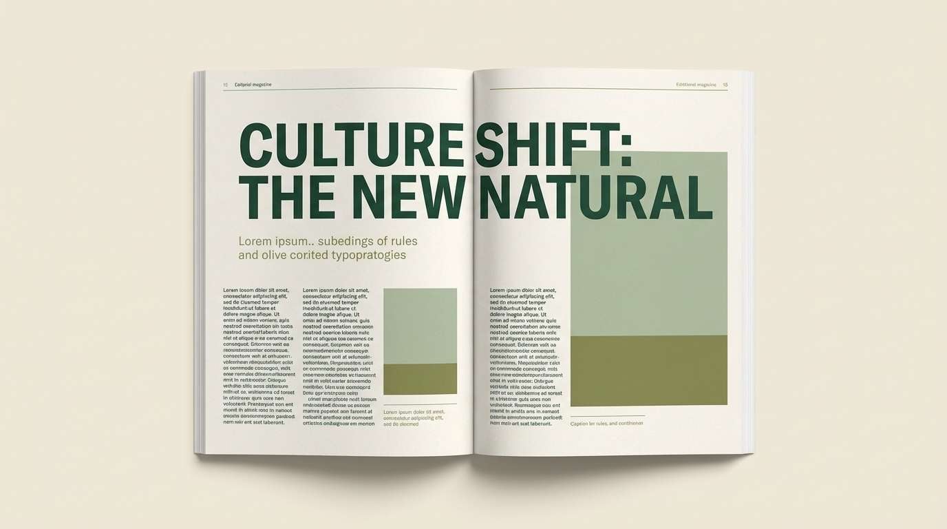
16) Greenroom Editorial
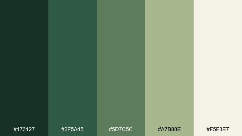
HEX: #173127 #2F5A45 #5D7C5C #A7B88E #F5F3E7
Mood: editorial, sophisticated, grounded
Best for: magazine layouts and brand lookbooks
Sophisticated greenroom tones feel like backstage quiet, paper stock, and confident typography. These dollar bill color combinations work for magazine layouts, brand lookbooks, and long-form reads where comfort matters. Pair the cream with the deepest green for high-contrast headlines, then use the olive-sage for subheads and pull quotes. Usage tip: keep imagery slightly warm so the greens feel inviting, not cold.
Image example of greenroom editorial generated using media.io
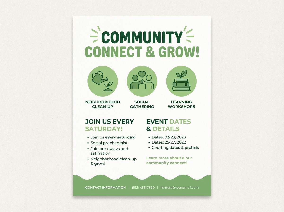
17) Sprout Stationery
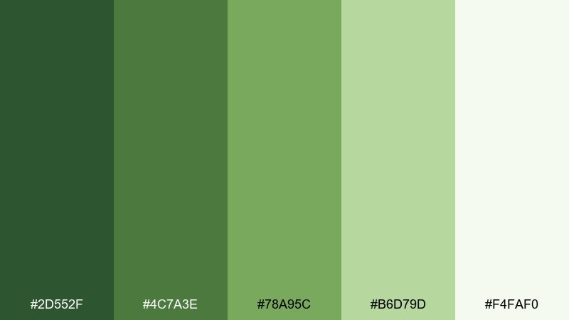
HEX: #2D552F #4C7A3E #78A95C #B6D79D #F4FAF0
Mood: cheerful, spring, optimistic
Best for: school projects and community flyers
Cheerful sprout greens feel like fresh growth and sunny community boards. Use it for school projects, community flyers, and playful brand moments that still look tidy. Pair the brightest green with the soft off-white for clean contrast. Usage tip: keep body text in the darkest green to avoid readability issues on lighter shades.
Image example of sprout stationery generated using media.io
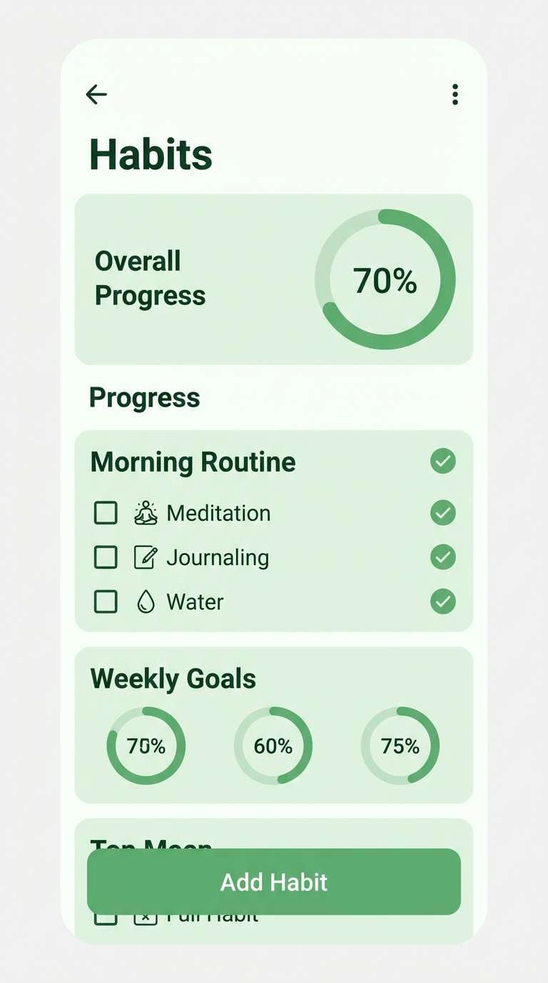
18) Cucumber UI
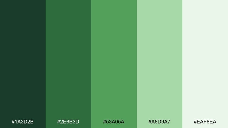
HEX: #1A3D2B #2E6B3D #53A05A #A6D9A7 #EAF6EA
Mood: clean, friendly, functional
Best for: health apps and habit trackers
Clean cucumber greens feel friendly and functional, like a well-organized habit tracker. It fits health apps, progress dashboards, and onboarding checklists that need clarity without harsh contrast. Pair the mid-green with the pale green for success states and progress bars. Usage tip: reserve the brightest green for confirmations and positive metrics, not for every button.
Image example of cucumber ui generated using media.io
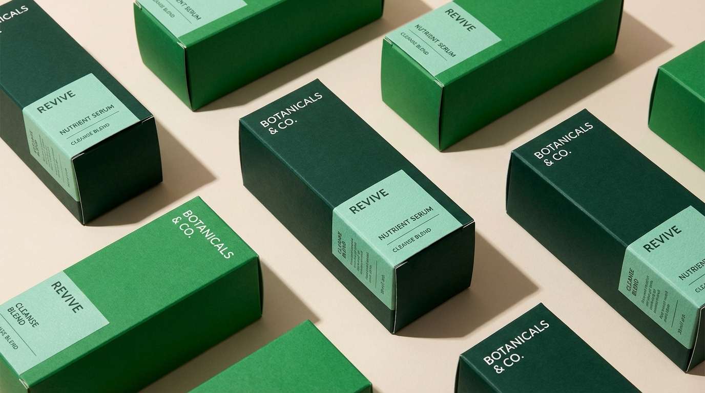
19) Lush Packaging
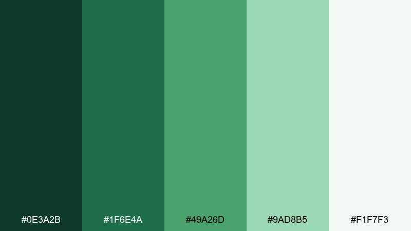
HEX: #0E3A2B #1F6E4A #49A26D #9AD8B5 #F1F7F3
Mood: bold, vibrant, modern
Best for: product packaging and ecommerce hero images
Bold, lush greens feel juicy and modern, like fresh-cut leaves under bright light. Use it for packaging, ecommerce hero banners, and product ads where you want instant vitality. Pair the saturated green with the soft mint to create depth while keeping a clean finish. Usage tip: set headlines in the deepest shade and let the vivid green carry the main product panel.
Image example of lush packaging generated using media.io
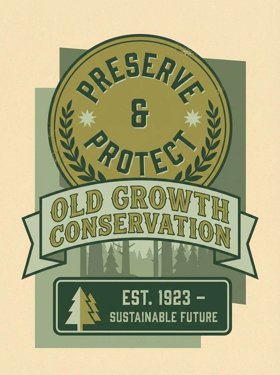
20) Vintage Teller
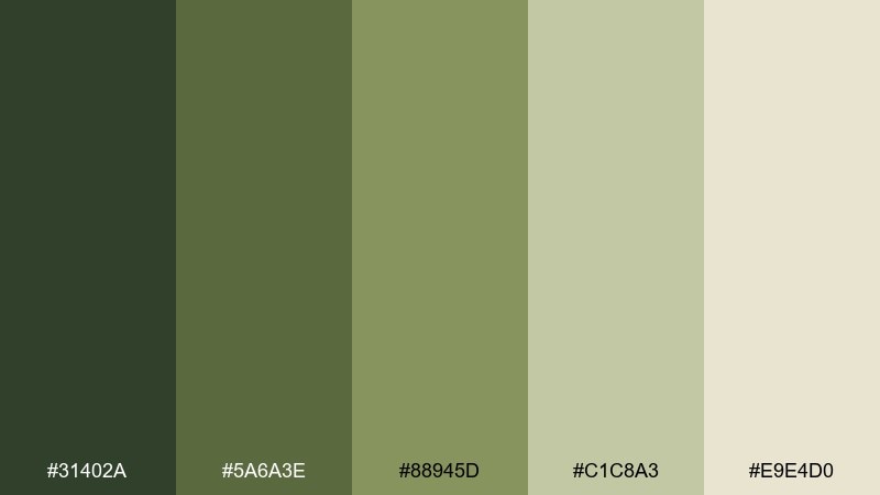
HEX: #31402A #5A6A3E #88945D #C1C8A3 #E9E4D0
Mood: classic, muted, dependable
Best for: retro posters and brand badges
Classic muted greens with aged neutral paper feel dependable and a little retro. They work for badge designs, retro posters, and small business branding that wants a familiar tone. Pair the mid-olive with the pale sage for subtle contrast in patterns and borders. Usage tip: add a slightly distressed texture to backgrounds to enhance the vintage feel without changing the color mix.
Image example of vintage teller generated using media.io
What Colors Go Well with Dollar Bill?
Dollar bill greens pair naturally with warm neutrals like parchment, linen, cream, and beige—these keep designs breathable and “paper-like,” perfect for print and editorial layouts.
For sharper contrast in UI, add charcoal or near-black for navigation, labels, and data text. This keeps accessibility strong while staying softer than pure black.
If you need an accent, try brass/gold for a premium hint, or cool mint/teal for a cleaner, modern feel—just keep accents smaller than the core greens.
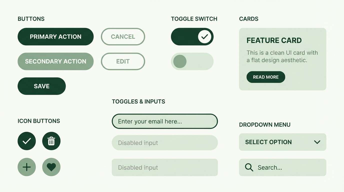
How to Use a Dollar Bill Color Palette in Real Designs
Start with roles: pick one dark green for text/icons, one mid green for interactive elements, one pale green for surfaces (cards, sections), and one neutral for the page background.
In branding, let neutrals dominate large areas and reserve saturated greens for logos, badges, and key headings. This prevents the palette from feeling heavy or overly “military.”
For print, test on your chosen paper stock—uncoated paper can soften mid-greens nicely, while coated stock increases contrast and saturation.
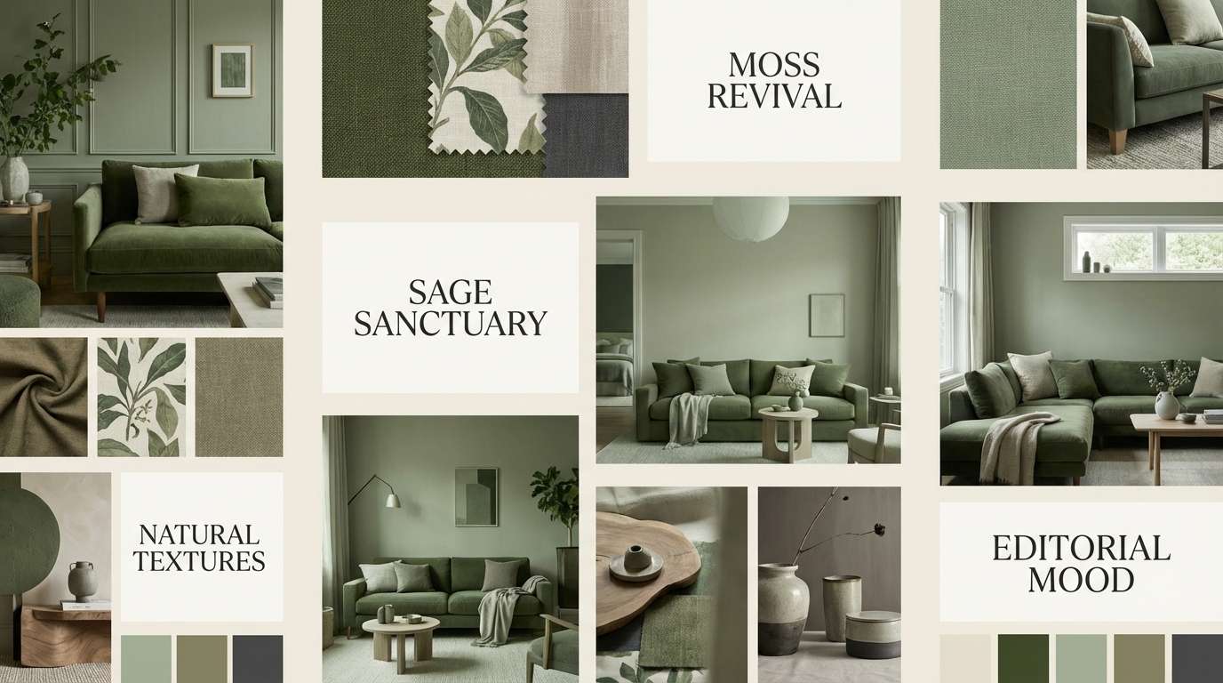
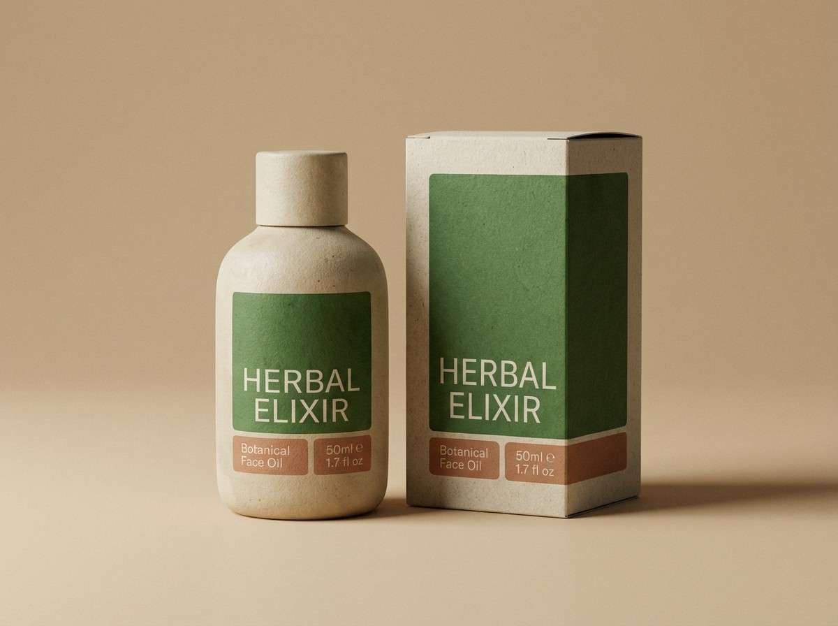
Create Dollar Bill Palette Visuals with AI
Want to see these HEX combos in real-looking designs? Turn any palette into a UI mockup, label, poster, or mood board so you can judge contrast, vibe, and hierarchy quickly.
With Media.io text-to-image, you can paste a prompt, describe your design scenario, and generate on-brand visuals in minutes—great for pitching concepts or building a style guide.
Try generating a few variations (minimal, vintage, premium) using the same palette to find the best fit before committing to production files.
Dollar Bill Color Palette FAQs
-
What is “dollar bill green”?
Dollar bill green usually refers to the muted, slightly olive-leaning greens associated with US currency, often paired with soft gray-green tints and paper-like off-whites. -
Is a dollar bill palette good for fintech or finance branding?
Yes. These greens communicate stability and trust, and they pair well with charcoal/near-black for readable dashboards, tables, and forms. -
How do I keep green palettes from feeling too dark?
Use a light neutral (linen/cream/near-white) as the main background, then limit the deepest green to typography and key UI elements like navigation. -
What accent colors work best with dollar bill greens?
Brass/gold looks premium, teal/mint feels modern, and warm parchment neutrals keep it vintage or editorial. Keep accents small so the greens remain the hero. -
Which palette here is best for clean UI design?
Try Verdant Minimal for a crisp white-based layout, or Treasury Sage if you want a more enterprise look with charcoal contrast. -
Which palette is best for packaging?
Evergreen Ink works well for premium packaging, while Lush Packaging is better for bright, energetic ecommerce and product hero visuals. -
Can I generate palette mockups without design software?
Yes. You can use Media.io’s AI text-to-image tool to generate mockups (labels, posters, UI screens) from prompts and quickly visualize how your HEX colors behave.
Next: Blue Rose Color Palette


