

A fairy forest color palette blends deep greens, misty sages, warm bark browns, and soft creams to feel both grounded and magical. It’s an easy way to make modern designs feel organic without turning rustic.
Below are 20+ fairy forest color palette ideas with HEX codes, plus practical tips for branding, UI, wedding invites, and illustration—so you can keep the vibe enchanting and still readable.
In this article
Why Fairy Forest Palettes Work So Well
Fairy forest palettes balance contrast and comfort: deep evergreen shades create structure, while creamy neutrals keep layouts breathable. That mix feels natural, like shade and sunlight on the forest floor.
They also read “premium” fast, because muted greens and warm browns are easy on the eyes and pair well with elegant typography. Even playful concepts feel more intentional when the base colors are earthy.
Most importantly, fairy forest color schemes are flexible across mediums—UI, packaging, print invites, and illustration—because you can dial the mood from bright and springy to cinematic and nocturnal.
20+ Fairy Forest Color Palette Ideas (with HEX Codes)
1) Moss Glow
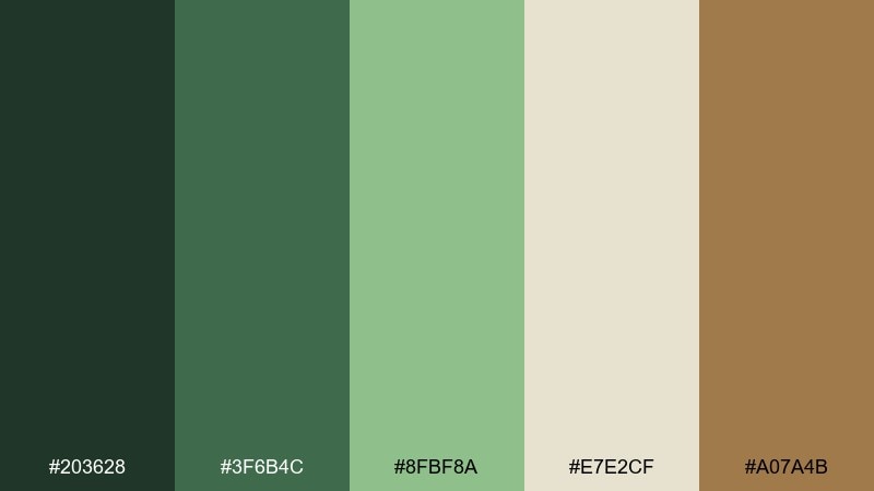
HEX: #203628 #3f6b4c #8fbf8a #e7e2cf #a07a4b
Mood: fresh, earthy, quietly magical
Best for: 2D UI dashboard for a wellness app
Fresh, earthy greens with a soft glow evoke mossy stones and filtered sunlight under a canopy. Use the deep pine tone for navigation, then let the pale linen carry backgrounds without feeling sterile. Warm bark brown keeps charts and badges from looking too cold beside the greens. For a clean UI, reserve the brightest leaf color for one primary action and keep secondary states muted.
Image example of moss glow generated using media.io
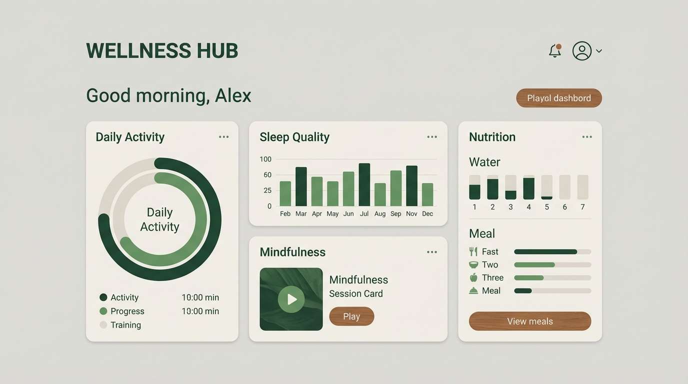
Media.io is an online AI studio for creating and editing video, image, and audio in your browser.

2) Fern Mist
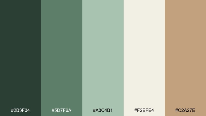
HEX: #2b3f34 #5d7f6a #a8c4b1 #f2efe4 #c2a27e
Mood: calm, airy, botanical
Best for: watercolor botanical illustration set
Calm, misty greens feel like early morning fog drifting through ferns. The pale parchment tone gives your washes room to breathe, while the muted tan adds a natural paper warmth. Keep outlines soft and lean on layered transparency to preserve the airy vibe. Pair with delicate linework and avoid harsh blacks by using the darkest green for details instead.
Image example of fern mist generated using media.io
3) Pixie Path
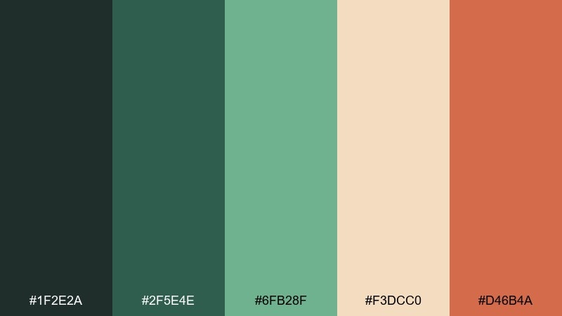
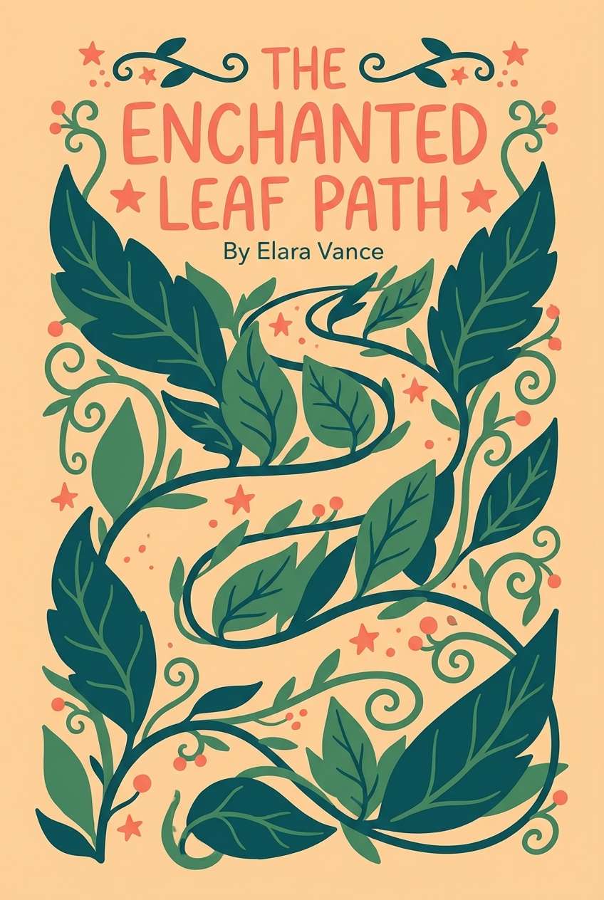
HEX: #1f2e2a #2f5e4e #6fb28f #f3dcc0 #d46b4a
Mood: playful, storybook, warm
Best for: children's book cover design
Playful greens and peachy light feel like stepping onto a tiny lantern-lit trail. Use the inky green for title contrast, then let the soft apricot act as your breathing space behind characters and typography. The coral accent is perfect for a single focal element like a toadstool cap or subtitle highlight. Keep the composition simple and let one warm accent guide the eye.
Image example of pixie path generated using media.io
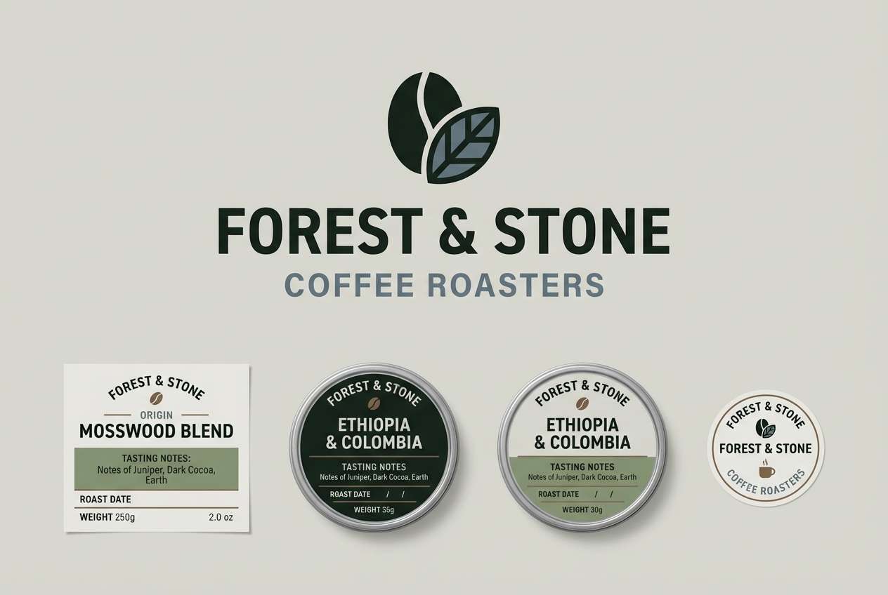
4) Woodland Dusk
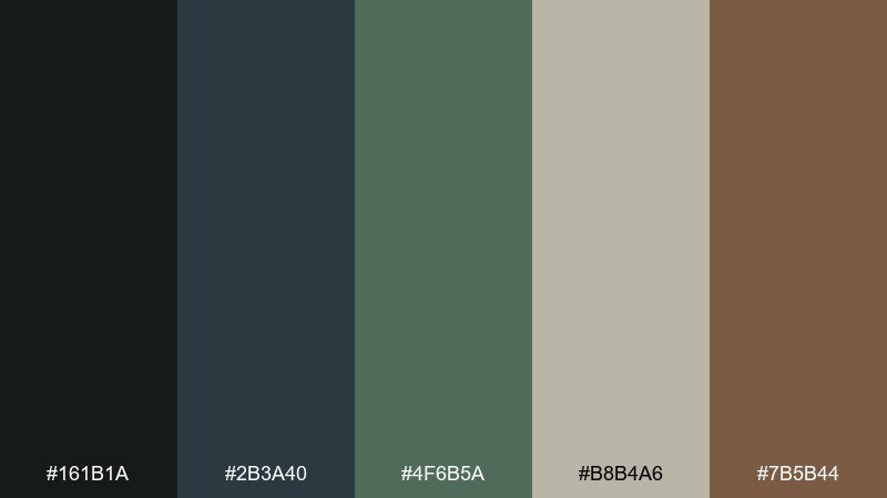
HEX: #161b1a #2b3a40 #4f6b5a #b8b4a6 #7b5b44
Mood: moody, cinematic, grounded
Best for: craft coffee brand logo and labels
Moody dusk tones bring to mind wet bark, shadowy leaves, and a quiet forest at closing time. The near-black green anchors logos beautifully, while the cool slate adds sophistication for type and line art. Use the greige as label stock color and let the walnut brown support secondary information like roast notes. For print, increase spacing and keep ink coverage balanced to avoid muddy darks.
Image example of woodland dusk generated using media.io
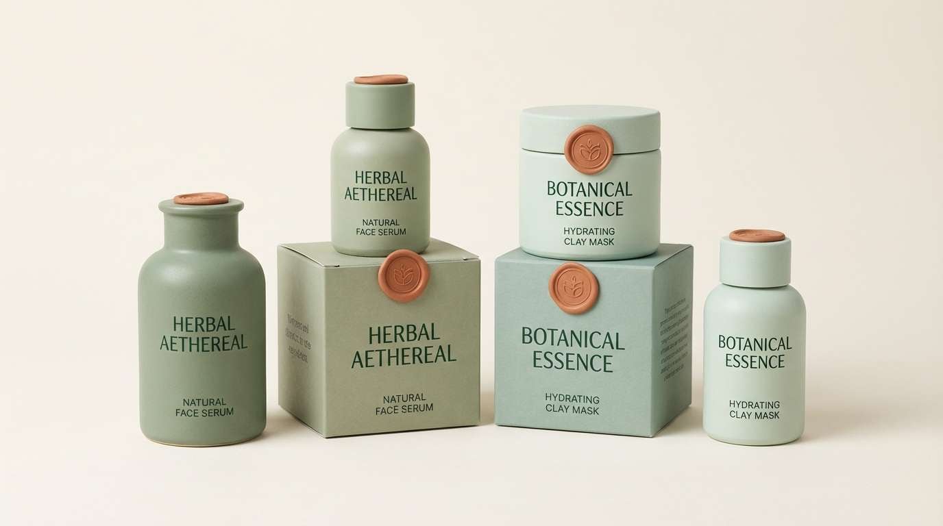
5) Dewdrop Sage
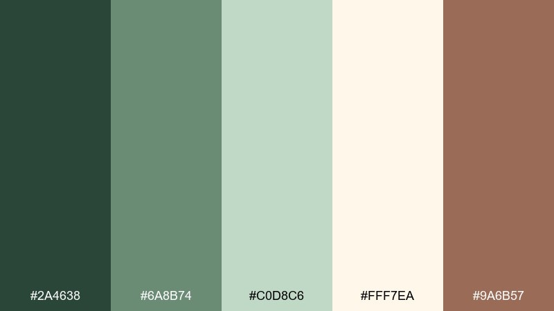
HEX: #2a4638 #6a8b74 #c0d8c6 #fff7ea #9a6b57
Mood: soft, clean, soothing
Best for: skincare packaging product ad
Soft sage and creamy ivory feel like dew on leaves and a freshly cleaned vanity. The gentle mint tone works well for bottles and cartons, while the deep green keeps ingredient text readable without harshness. Add the warm clay note sparingly for seals or icons to keep the look premium. For a luxe finish, use matte surfaces and limit glossy highlights to the cap or logo mark.
Image example of dewdrop sage generated using media.io
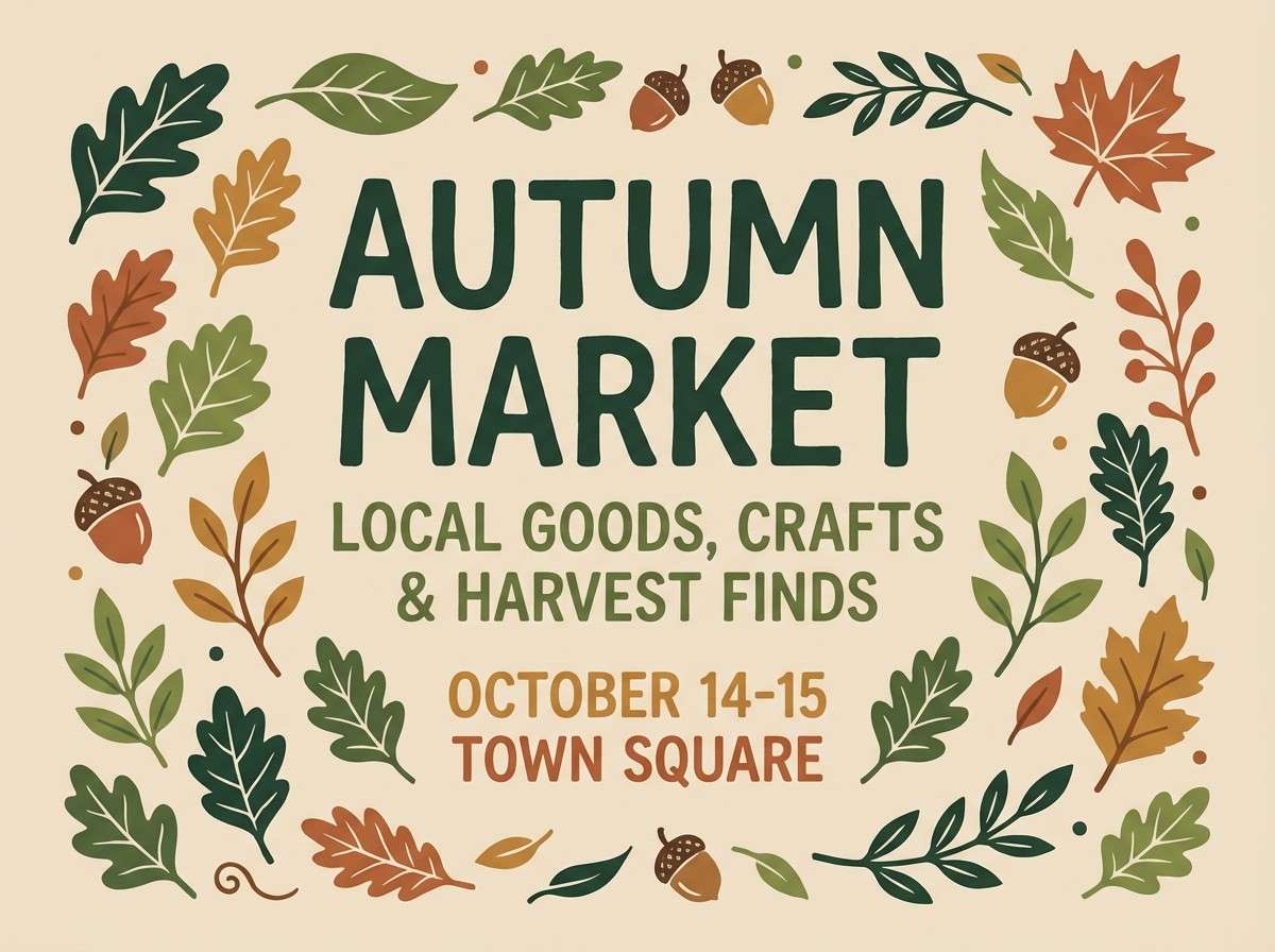
6) Gnome Cottage
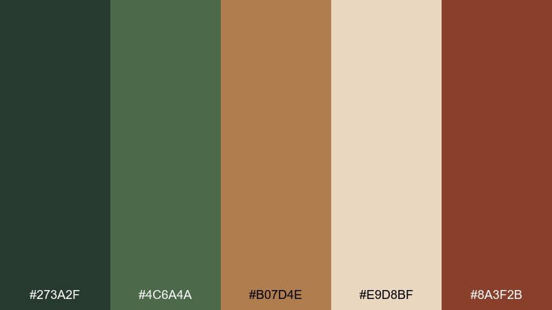
HEX: #273a2f #4c6a4a #b07d4e #e9d8bf #8a3f2b
Mood: cozy, rustic, handmade
Best for: fall market poster design
Cozy greens and spiced browns feel like a tiny cottage tucked under roots and ivy. Use the buttery beige as your poster base so the darker greens can carry headers and borders. The terracotta red adds a friendly handmade touch for stamps, price tags, or a small illustration. Keep textures subtle and lean into blocky typography for an old-town noticeboard vibe.
Image example of gnome cottage generated using media.io
7) Lichen Stone
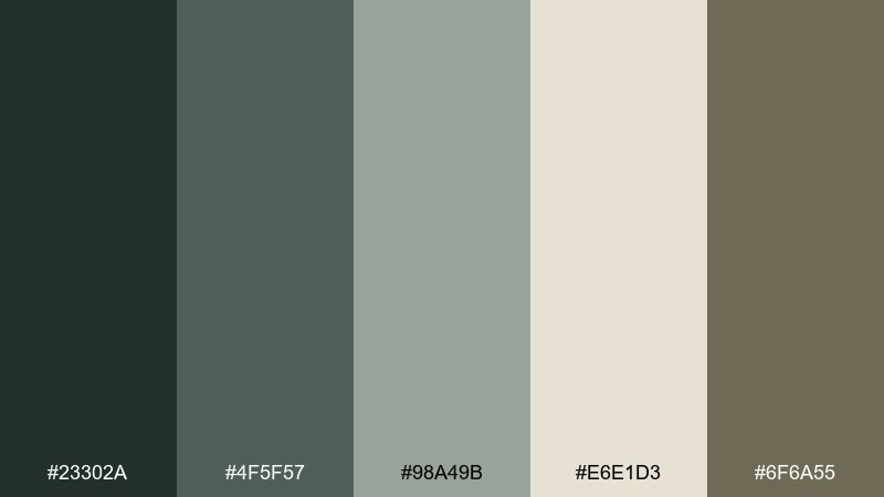
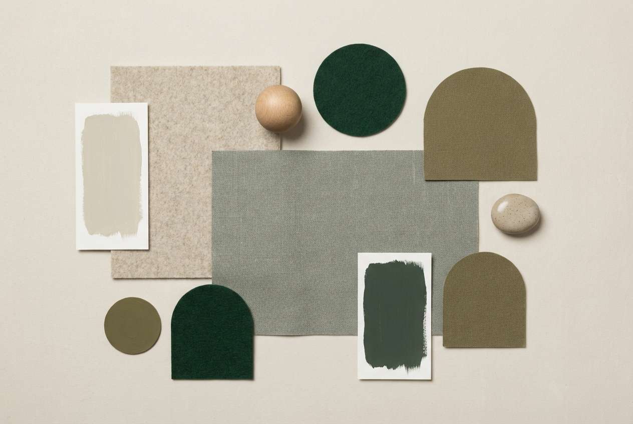
HEX: #23302a #4f5f57 #98a49b #e6e1d3 #6f6a55
Mood: minimal, natural, modern
Best for: interior design mood board
Quiet lichen and stone neutrals evoke smooth pebbles, weathered wood, and soft shade. Use the pale oatmeal as wall paint and layer the mid sage-gray in textiles for a calm, modern base. The olive-khaki reads beautifully as a grounded accent for cabinetry or a reading chair. Tip: repeat one dark green note in small hardware details so the room feels intentional, not heavy.
Image example of lichen stone generated using media.io
8) Moonlit Canopy
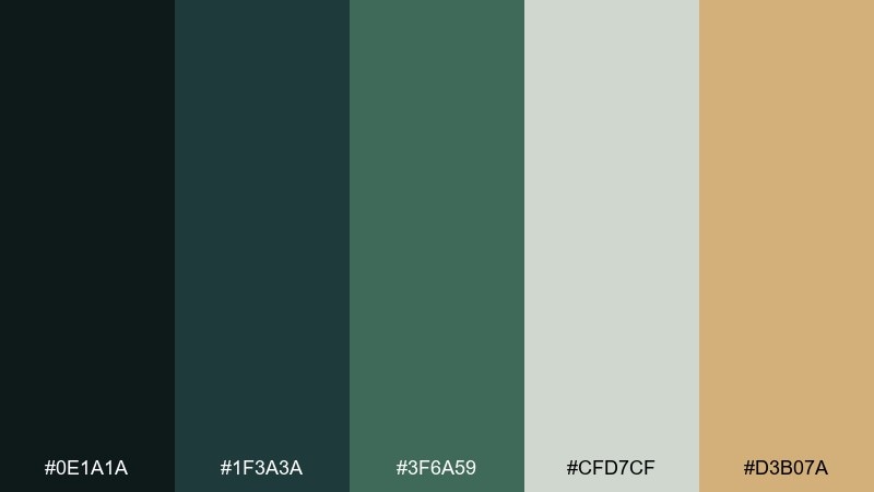
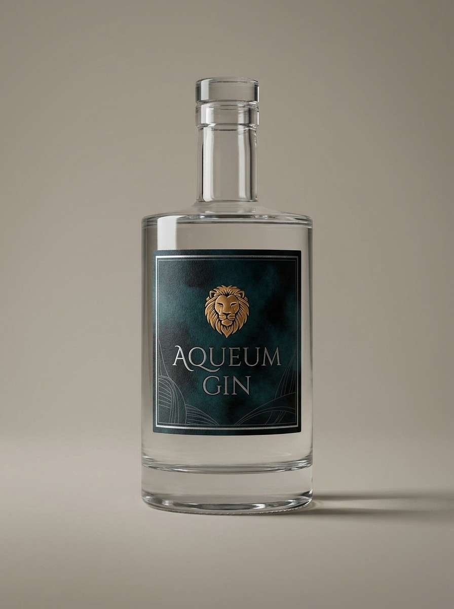
HEX: #0e1a1a #1f3a3a #3f6a59 #cfd7cf #d3b07a
Mood: mysterious, elegant, nocturnal
Best for: luxury gin label packaging
Mysterious blue-green shadows suggest moonlight filtering through dense leaves. The silver-gray brings an upscale foil-like feel, while the honey gold reads as a refined highlight for crests or batch numbers. Keep the darkest tone for the label field so type looks crisp and premium. For the best result, pair with thin serif typography and one gold accent line instead of multiple ornaments.
Image example of moonlit canopy generated using media.io
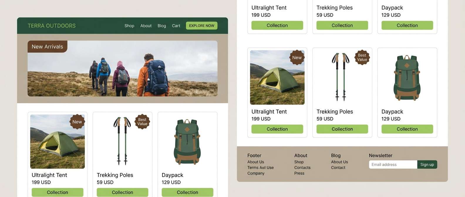
9) Sprout and Bark
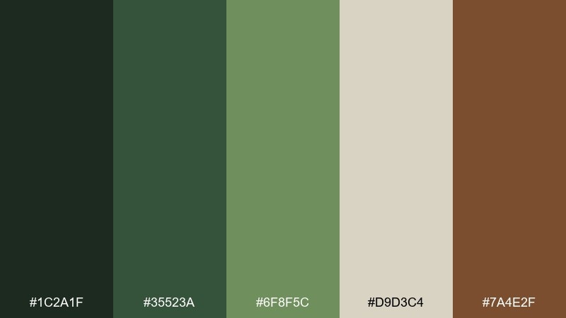
HEX: #1c2a1f #35523a #6f8f5c #d9d3c4 #7a4e2f
Mood: earthy, optimistic, outdoorsy
Best for: outdoor gear ecommerce homepage UI
Earthy greens with a sturdy bark brown feel like new sprouts pushing through soil. Use the warm stone neutral for sections and product grids so photos do not fight the palette. The bright sprout tone works as a confident CTA color when paired with the deep green header. Keep icons simple and use the bark brown only for secondary badges to avoid visual noise.
Image example of sprout and bark generated using media.io
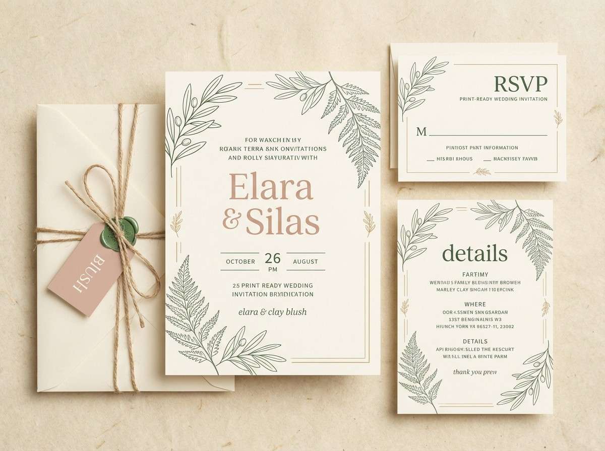
10) Fairy Ring
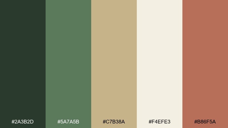
HEX: #2a3b2d #5a7a5b #c7b38a #f4efe3 #b86f5a
Mood: whimsical, warm, inviting
Best for: wedding invitation suite
Whimsical greens and creamy parchment recall a quiet clearing with tiny mushrooms circling in the grass. The blush clay accent adds romance without turning the suite overly pink. These fairy forest color combinations work best with lots of margin, light botanical line art, and a single accent color used for names or RSVP details. Tip: print the green text slightly softer than pure black for a more organic feel.
Image example of fairy ring generated using media.io
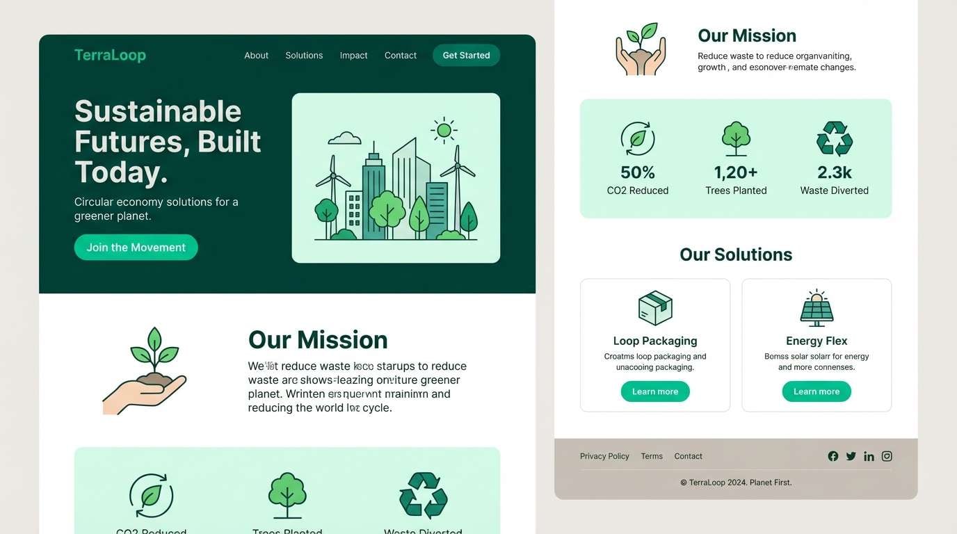
11) Emerald Brook
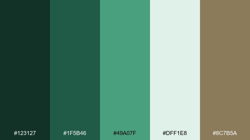
HEX: #123127 #1f5b46 #49a07f #dff1e8 #8c7b5a
Mood: fresh, sparkling, lively
Best for: eco startup landing page
Sparkling emerald and mint tones feel like water running over stones in a shaded creek. Use the light aqua as airy background sections and keep the darkest green for headlines to maintain contrast. The soft taupe adds credibility for footers and secondary UI elements. For a modern landing page, let one bright teal-green highlight your primary button and keep everything else restrained.
Image example of emerald brook generated using media.io
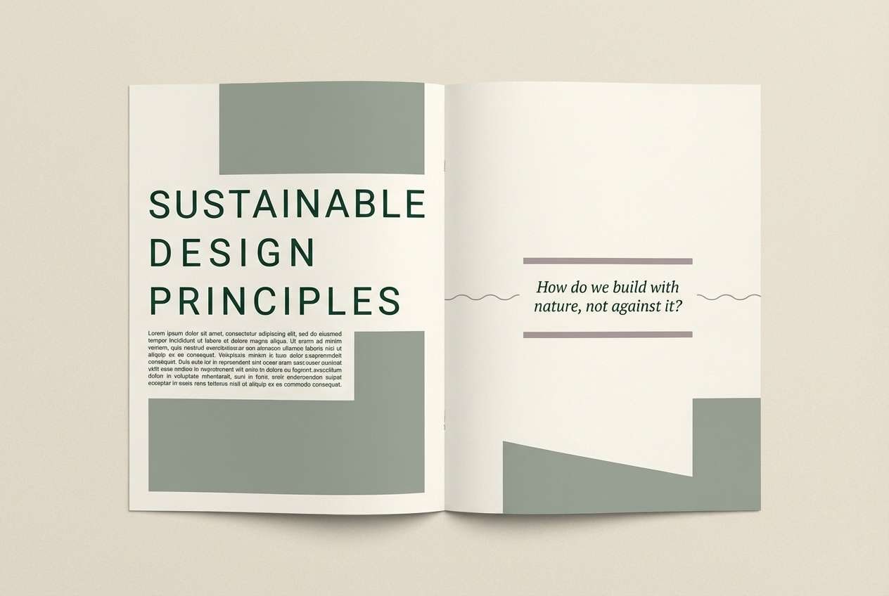
12) Thistle Shade
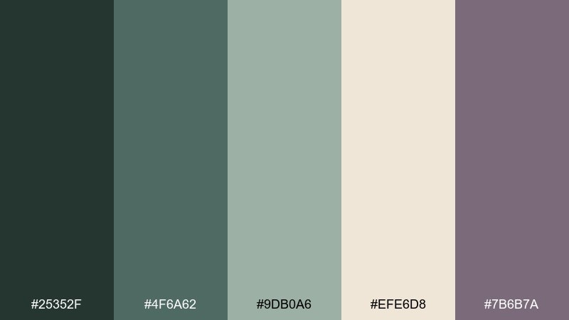
HEX: #25352f #4f6a62 #9db0a6 #efe6d8 #7b6b7a
Mood: quiet, artistic, slightly smoky
Best for: editorial magazine spread
Quiet greens with a smoky mauve-gray hint evoke thistles in shadow and worn linen pages. Use the warm cream for generous negative space, then set body copy in the deeper green to keep it softer than black. The mauve-gray is ideal for pull quotes, rules, and caption details. Tip: limit the accent to one column element so the spread stays calm and readable.
Image example of thistle shade generated using media.io
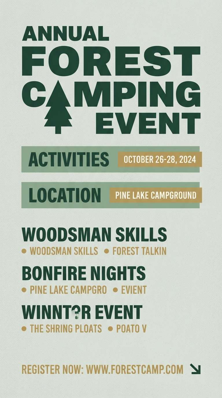
13) Pine Needle
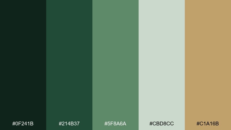
HEX: #0f241b #214b37 #5f8a6a #cbd8cc #c1a16b
Mood: crisp, evergreen, outdoors
Best for: camping event flyer
Crisp evergreen tones bring the scent of pine needles and cool air. The pale gray-green acts like foggy sky, keeping the layout light while the darker greens hold bold headers. Add the golden tan for icons or date highlights to make details pop without breaking the natural feel. Keep the flyer simple with strong hierarchy and a single accent color for calls to action.
Image example of pine needle generated using media.io
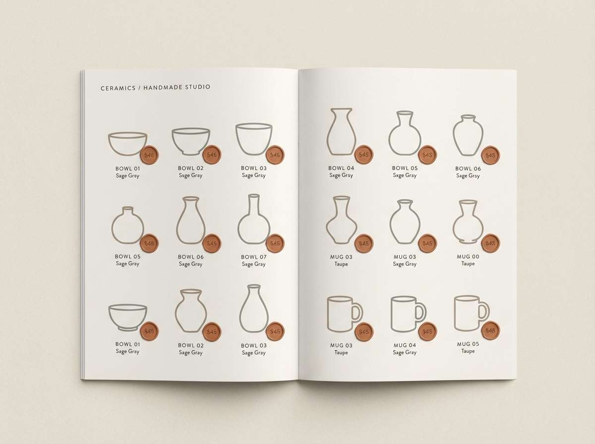
14) Mushroom Taupe
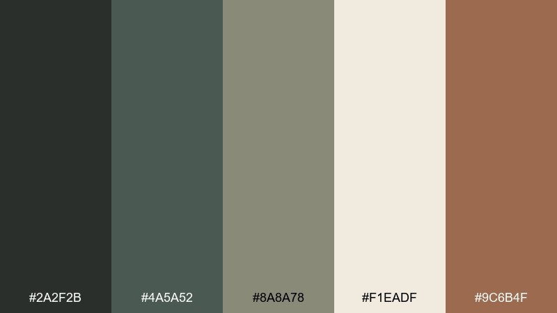
HEX: #2a2f2b #4a5a52 #8a8a78 #f1eadf #9c6b4f
Mood: neutral, cozy, organic
Best for: minimalist ceramic product catalog
Neutral taupes and soft greens feel like mushrooms, clay, and shaded undergrowth. The warm off-white makes an excellent catalog background, letting product photography and typography breathe. Use the cinnamon clay accent for small price tags or section tabs to add warmth. Tip: keep your photo shadows slightly warm so the palette stays cohesive on print.
Image example of mushroom taupe generated using media.io
15) Enchanted Fern
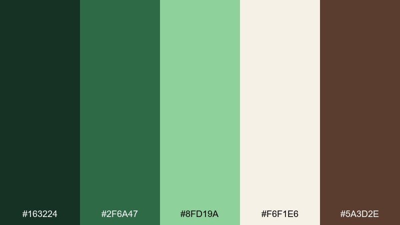
HEX: #163224 #2f6a47 #8fd19a #f6f1e6 #5a3d2e
Mood: bright, magical, clean
Best for: app onboarding screens
Bright fern greens and creamy light evoke enchanted leaves catching sun after rain. The minty highlight works well for progress indicators and friendly illustrations. If you want a cohesive fairy forest color palette for onboarding, keep backgrounds creamy, use deep green for headings, and reserve the brightest green for one key element per screen. Tip: maintain consistent icon stroke weight so the lively colors do not feel chaotic.
Image example of enchanted fern generated using media.io
16) Cedar Smoke
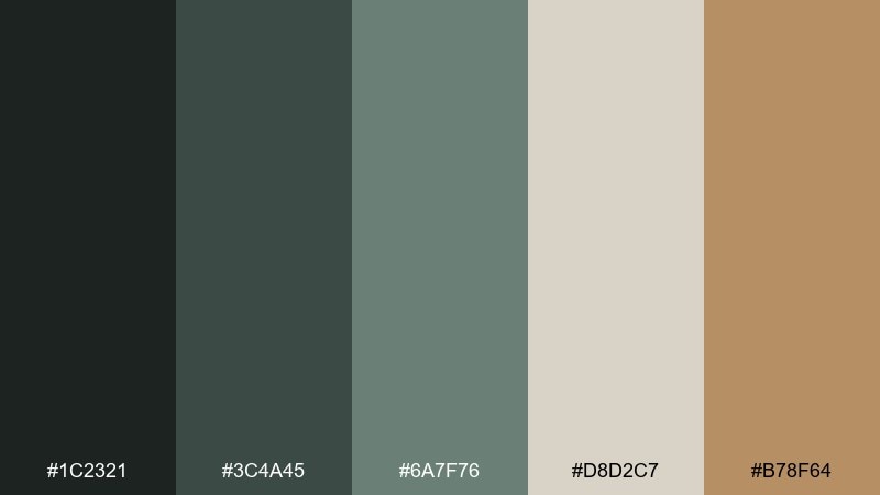
HEX: #1c2321 #3c4a45 #6a7f76 #d8d2c7 #b78f64
Mood: smoky, mature, understated
Best for: premium candle packaging
Smoky cedar grays and warm amber feel like a cabin evening with a soft burning wick. Use the light stone tone as label paper and the charcoal-green for brand marks to keep things refined. The honeyed tan works best as a single metallic detail, like a small emblem or scent name. Tip: choose uncoated stock and keep finishes matte so the palette reads calm and premium.
Image example of cedar smoke generated using media.io
17) Spring Moss
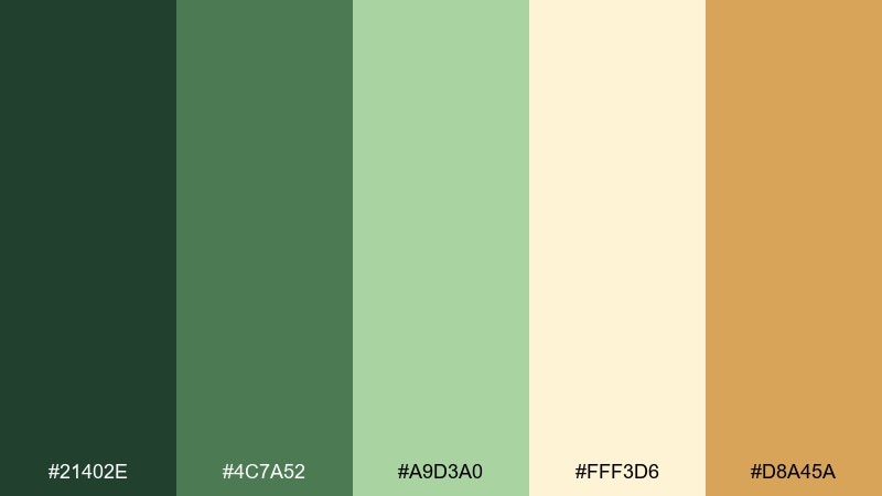
HEX: #21402e #4c7a52 #a9d3a0 #fff3d6 #d8a45a
Mood: cheerful, springy, sunlit
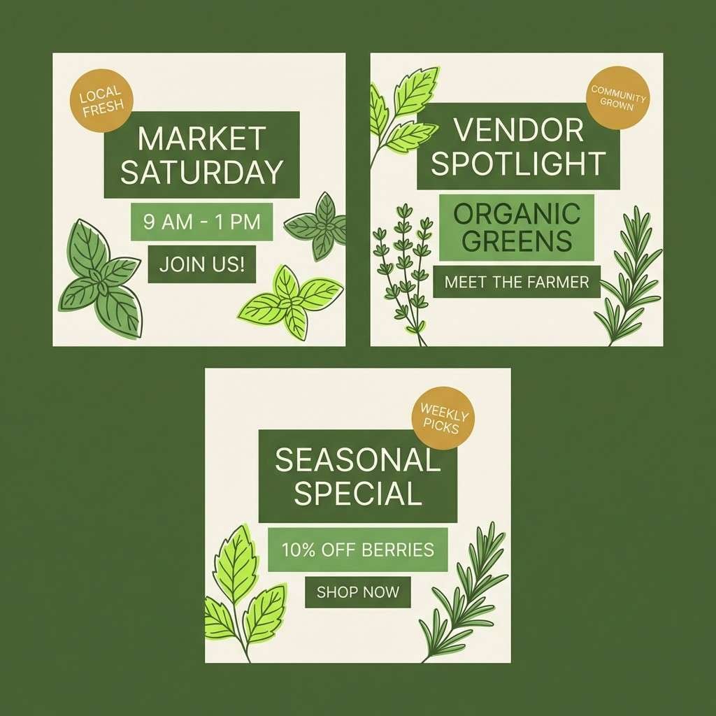
Best for: farmers market social post templates
Sunlit greens and buttery cream feel like fresh herbs laid out on a market table. The soft yellow-cream background keeps templates bright, while the mossy greens give structure for headings and price callouts. Use the warm gold as a cheerful highlight for stickers or limited-time badges. Tip: repeat the lightest green as a subtle pattern so the set looks consistent across posts.
Image example of spring moss generated using media.io
18) Silken Leaf
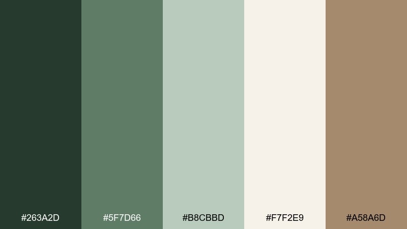
HEX: #263a2d #5f7d66 #b8cbbd #f7f2e9 #a58a6d
Mood: soft, elegant, calming
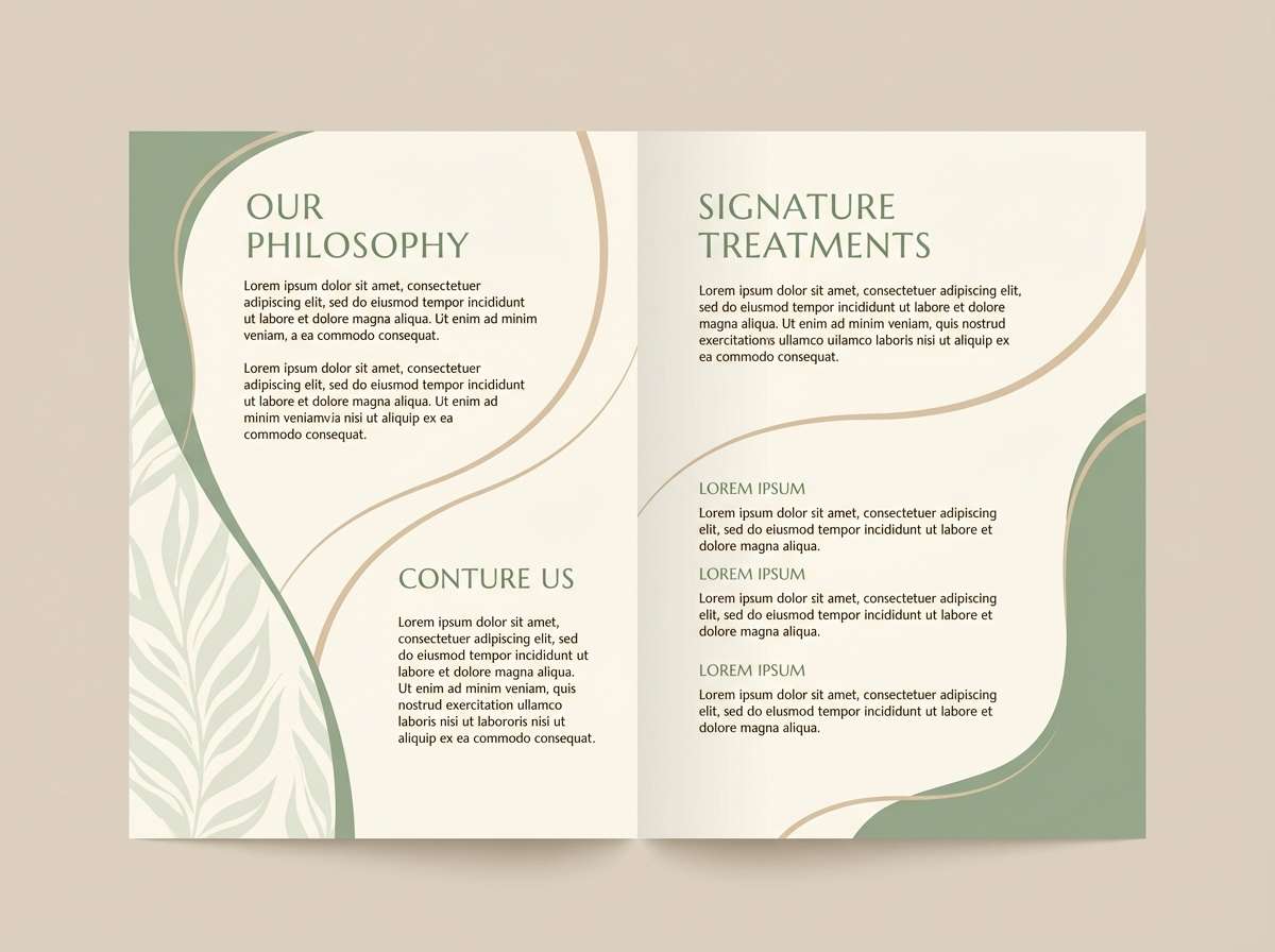
Best for: spa brochure design
Silky greens and warm cream evoke folded linen, gentle steam, and leafy calm. The mid sage is perfect for section headers and icons, while the pale leaf tint works as subtle background panels. Add the sand-tan for understated dividers or pricing tables so the brochure feels grounded. Tip: keep photography desaturated so it harmonizes with the muted tones instead of overpowering them.
Image example of silken leaf generated using media.io
19) Ancient Grove
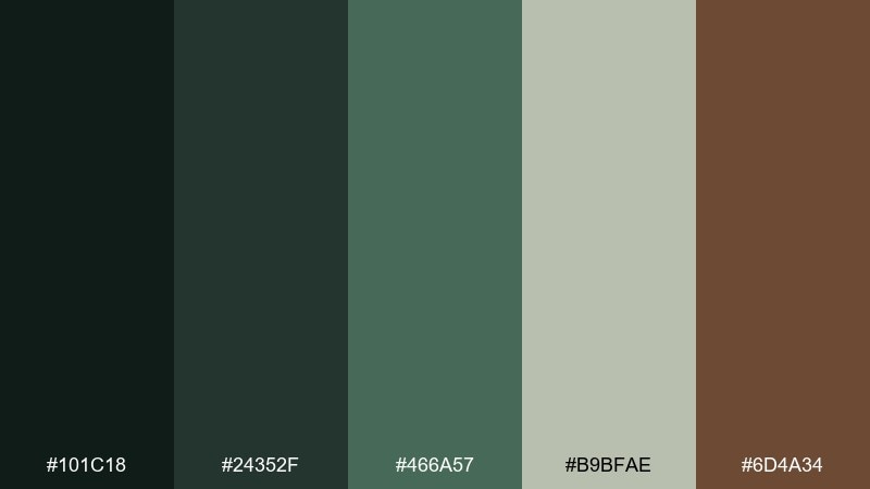
HEX: #101c18 #24352f #466a57 #b9bfae #6d4a34
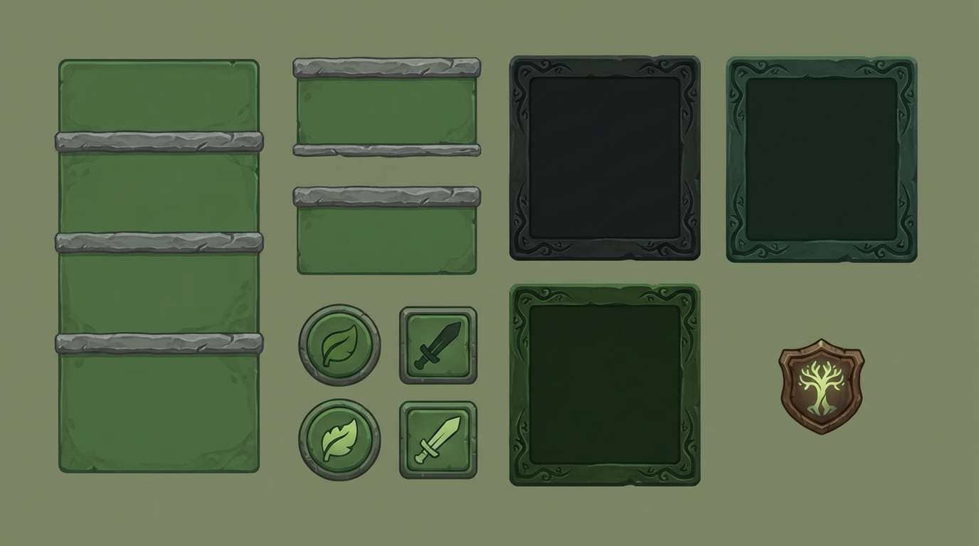
Mood: ancient, grounded, dramatic
Best for: fantasy game UI kit
Deep shadowy greens and bark brown feel like ancient trunks and moss-covered ruins. Use the near-black as your UI base, then layer the mid green for panels and hover states to keep the interface readable. The muted stone green helps soften borders and separators so everything does not look harsh. Tip: add subtle texture overlays at low opacity to sell the fantasy atmosphere without hurting clarity.
Image example of ancient grove generated using media.io
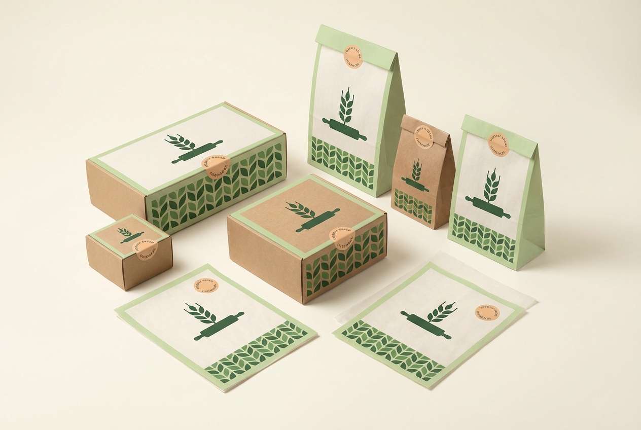
20) Nectar Meadow
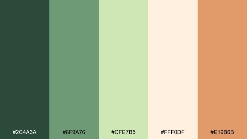
HEX: #2c4a3a #6f9a76 #cfe7b5 #fff0df #e19b6b
Mood: warm, inviting, gently whimsical
Best for: bakery brand identity and packaging
Warm greens with honeyed peach feel like nectar drifting over meadow flowers at the forest edge. The creamy base suits wrappers and boxes, while the soft peach adds a friendly appetite cue. For a distinct fairy forest color combination, keep logos in the deepest green and use the lightest green as a subtle pattern behind product names. Tip: limit the peach to one or two spots per item so the packaging stays fresh, not sugary.
Image example of nectar meadow generated using media.io
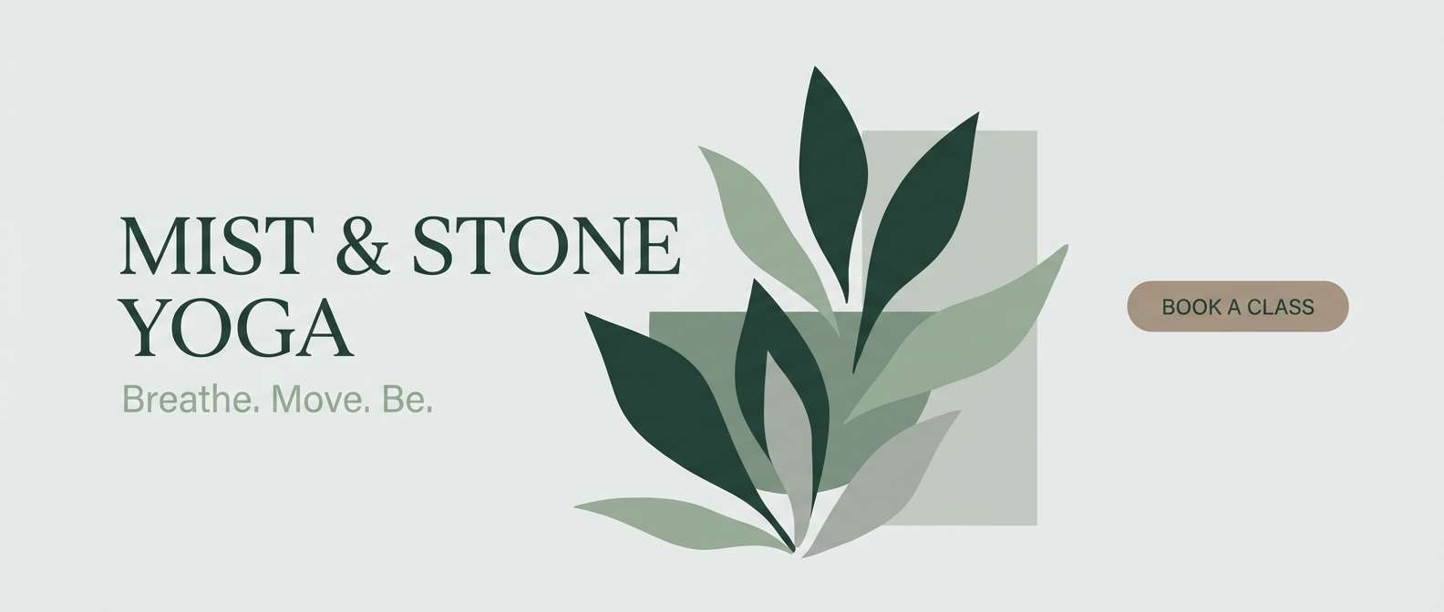
21) Willow Whisper
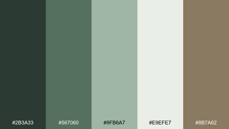
HEX: #2b3a33 #567060 #9fb6a7 #e9efe7 #8b7a62
Mood: gentle, airy, serene
Best for: yoga studio website header
Gentle willow greens and cool mist tones suggest slow movement and quiet breath. Use the light gray-green as a wide header background and set text in the darkest shade for crisp readability. The warm taupe works well for subtle buttons or schedule tags without feeling distracting. Tip: pair with rounded typography and plenty of line spacing to keep the design feeling open.
Image example of willow whisper generated using media.io
What Colors Go Well with Fairy Forest?
Fairy forest tones pair best with soft neutrals (linen, parchment, oatmeal) because they keep greens looking lush instead of heavy. These light bases also improve contrast for UI and editorial layouts.
For accents, choose warm naturals like honey gold, clay blush, walnut, or cinnamon to add a “lantern glow” feeling. If you want a cooler twist, add a restrained slate or silver-gray for moonlit sophistication.
When in doubt, follow a simple ratio: one deep evergreen for structure, one mid sage for surfaces, one pale neutral for background, and one warm accent for emphasis.
How to Use a Fairy Forest Color Palette in Real Designs
In branding, use the deepest green for logos and typography, then keep packaging or backgrounds creamy so the mark stays crisp. Add one warm accent (gold, tan, clay) for seals, icons, or key details.
In UI, reserve the brightest leaf/teal shade for primary actions only, and keep secondary states muted to avoid a “gamey” look. Pair with generous spacing and avoid pure black—deep green often reads softer and more premium.
For invitations and illustration, lean into texture: paper warmth, watercolor washes, or subtle grain. A fairy forest color scheme looks most believable when the tones feel slightly desaturated and natural.
Create Fairy Forest Palette Visuals with AI
If you already have HEX codes but need polished visuals (mockups, posters, onboarding screens, labels), AI can help you prototype the look fast. The key is to describe the design type, lighting, and how each color should be used (dominant, background, accents).
With Media.io text-to-image, you can generate consistent palette-based examples for branding and UI, then iterate prompts until the contrast and mood feel right. Start with a simple layout prompt and refine one element at a time.
Fairy Forest Color Palette FAQs
-
What is a fairy forest color palette?
A fairy forest color palette is a set of earthy, enchanted-leaning tones—typically deep forest greens, sage or moss mids, soft cream/linen neutrals, and warm bark or honey accents—used to create a grounded yet magical feel. -
Which HEX colors are most common in fairy forest color schemes?
Common choices include deep evergreen/near-black greens, muted sage greens, parchment or cream off-whites, and warm browns/tans. Many palettes also add a small gold, peach, or clay accent for a “glow” highlight. -
How do I keep a fairy forest palette from looking too dark?
Use a light neutral (cream, oatmeal, parchment) as the main background, and reserve the darkest greens for headers, navigation, or small text blocks. Add one warm accent to lift the composition without increasing saturation. -
What accent colors go well with fairy forest greens?
Honey gold, walnut brown, clay blush, cinnamon, and muted peach are reliable accents. For a cooler, moonlit direction, try silver-gray or slate blue-gray as a restrained secondary accent. -
Is a fairy forest color palette good for UI design?
Yes—these palettes often provide strong hierarchy: deep greens for structure, mid sages for surfaces, and creamy neutrals for readability. Keep your brightest green/teal for primary CTAs and ensure contrast meets accessibility needs. -
What fonts match fairy forest branding?
Pair fairy forest colors with elegant serifs (for premium, magical packaging) or clean rounded sans-serifs (for calm wellness and modern UI). Avoid overly harsh black; deep green text can feel softer while staying legible. -
How can I generate fairy forest visuals from a palette?
Use a text-to-image tool and specify the design format (label, poster, UI), the dominant/background/accent roles for the colors, and the overall mood (misty, moonlit, cozy). Iterate by adjusting lighting and limiting accents to keep it natural.
Next: White Wine Color Palette


