

An elegant color palette is all about restraint: refined neutrals, softened hues, and confident contrast that never feels loud. It’s a go-to for branding, UI, print, and events when you want a premium look that still feels modern.
Below are 20 elegant color combinations with HEX codes, mood notes, and real-world use cases—plus AI-ready prompts you can use to generate matching visuals in seconds.
In this article
Why Elegant Palettes Work So Well
Elegant palettes feel “designed” because they rely on subtle shifts in tone rather than high saturation. This creates a calm visual rhythm—ideal for typography-led layouts, premium packaging, and editorial-style UI.
They also photograph and print well. Muted neutrals and softened accents translate consistently across screens, paper stocks, and lighting conditions, which helps brands stay cohesive across campaigns.
Most importantly, elegance is versatile: you can push it romantic (blush, mauve), modern (ink, platinum), or cinematic (midnight + brass) without losing that refined baseline.
20+ Elegant Color Palette Ideas (with HEX Codes)
1) Apricot Silk
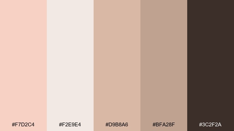
HEX: #F7D2C4 #F2E9E4 #D9B8A6 #BFA28F #3C2F2A
Mood: soft, polished, romantic
Best for: wedding invitations, luxury skincare branding, thank-you cards
Soft and glowing like late-afternoon light on silk, these tones feel gentle but elevated. The warm apricot and creamy neutrals keep layouts airy, while the deep espresso adds grown-up contrast. It works beautifully for invitations, packaging, and small-format print where subtle texture matters. Tip: use the dark brown for typography and keep the apricot as a restrained accent for seals, borders, or icons.
Image example of apricot silk generated using media.io
Media.io is an online AI studio for creating and editing video, image, and audio in your browser.

2) Pearl Champagne
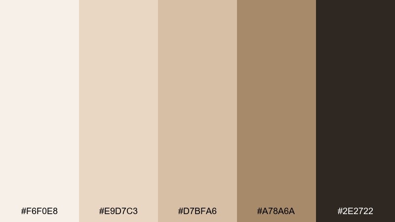
HEX: #F6F0E8 #E9D7C3 #D7BFA6 #A78A6A #2E2722
Mood: warm, celebratory, premium
Best for: champagne bar menus, event programs, luxury service branding
Creamy pearl and champagne beige create a quiet sparkle that reads instantly upscale. The mid tans keep the design grounded, and the near-black brown gives crisp legibility for menus and programs. This pairing shines with serif headlines and generous margins, especially on textured stock. Tip: let the lightest tones dominate, then reserve the gold-tan for dividers, icons, and small highlights.
Image example of pearl champagne generated using media.io
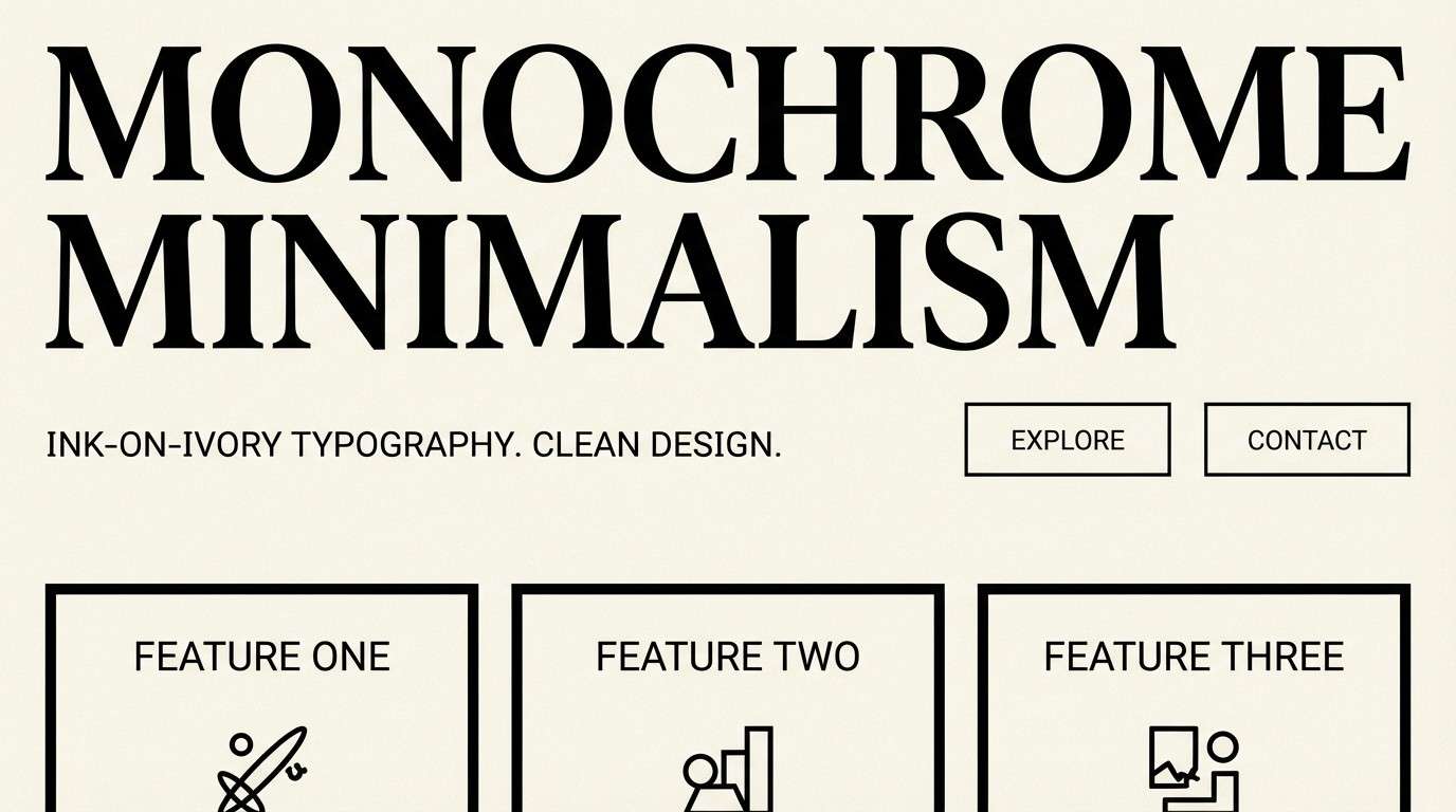
3) Ink and Ivory
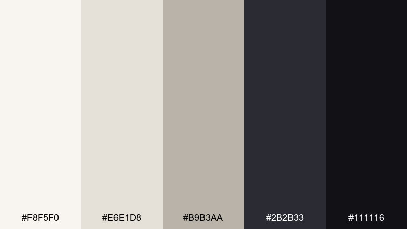
HEX: #F8F5F0 #E6E1D8 #B9B3AA #2B2B33 #111116
Mood: minimal, editorial, confident
Best for: minimalist UI, editorial headers, portfolio sites
Crisp ivory and cool grays evoke clean paper, sharp ink, and modern restraint. The dark charcoals give strong hierarchy without the harshness of pure black, making it ideal for reading-heavy layouts. These elegant color combinations are perfect for UI screens, magazines, and portfolios where typography leads. Tip: use the lightest ivory as the main canvas and apply the deepest shade only for headlines and key actions.
Image example of ink and ivory generated using media.io
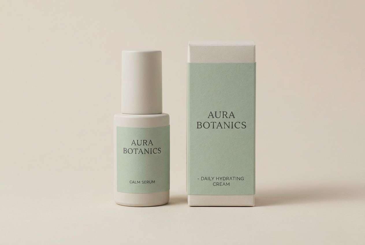
4) Sage Cashmere
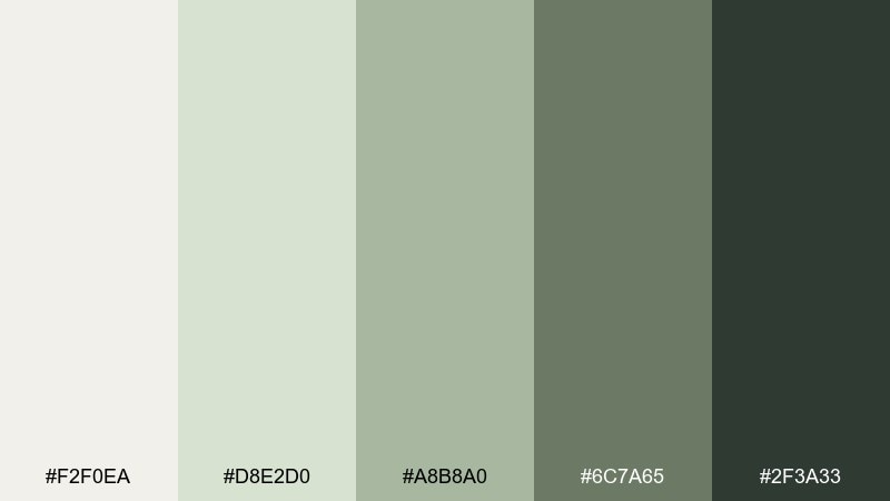
HEX: #F2F0EA #D8E2D0 #A8B8A0 #6C7A65 #2F3A33
Mood: calm, clean, restorative
Best for: wellness branding, spa packaging, mindful product labels
Muted sage and creamy stone tones feel like fresh linen, eucalyptus, and a quiet studio space. The deeper green-gray provides structure for labels and navigation, while the off-white keeps everything breathable. This mix suits wellness packaging, landing pages, and signage where you want calm authority. Tip: pair with uncoated paper textures and keep saturation low to preserve the cashmere-like softness.
Image example of sage cashmere generated using media.io
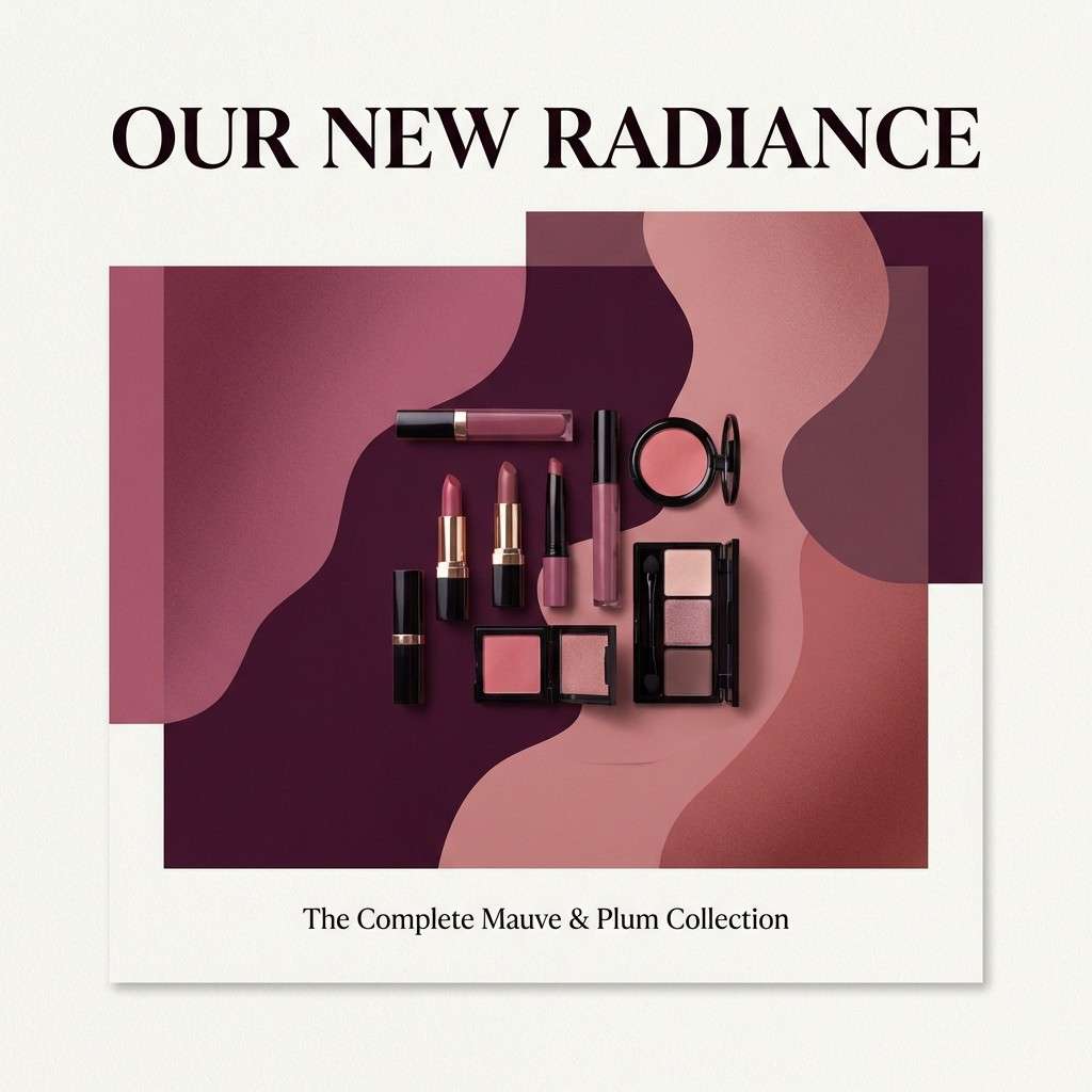
5) Mauve Velvet
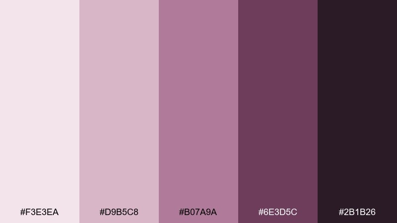
HEX: #F3E3EA #D9B5C8 #B07A9A #6E3D5C #2B1B26
Mood: romantic, luxe, dramatic
Best for: boutique cosmetics ads, beauty social posts, gift sets
Plush mauves and berry shadows evoke velvet curtains and evening glamour. The pale pink-lilac base keeps it soft, while the wine tones bring depth that feels expensive. It plays well with metallic foils and high-contrast product photography. Tip: anchor layouts with the deep plum, then use the lighter mauves as large color fields to avoid a heavy look.
Image example of mauve velvet generated using media.io
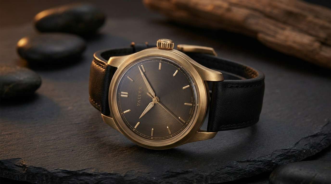
6) Midnight Brass
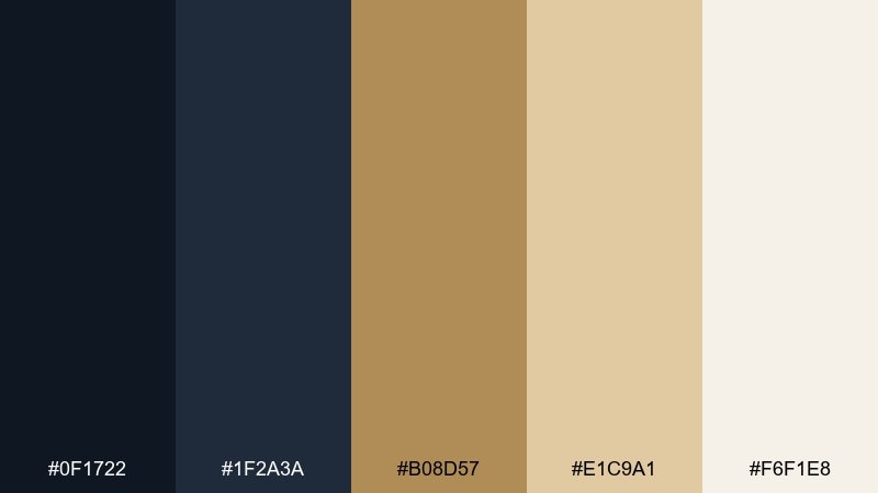
HEX: #0F1722 #1F2A3A #B08D57 #E1C9A1 #F6F1E8
Mood: nighttime, prestigious, cinematic
Best for: luxury watch ads, high-end tech launches, premium landing pages
Deep midnight blues with brass highlights suggest city lights, polished metal, and quiet confidence. The warm gold notes bring focus without turning flashy, making it a strong elegant color palette for hero sections and product ads. It works best with minimal layouts, crisp sans-serif type, and lots of negative space. Tip: keep the background in the darkest two shades and use brass only for logos, buttons, and key details.
Image example of midnight brass generated using media.io
7) Blush and Pebble
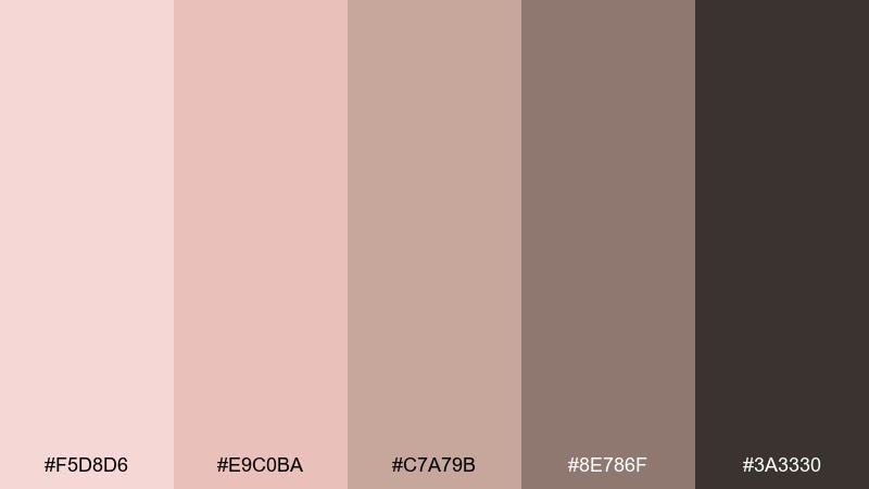
HEX: #F5D8D6 #E9C0BA #C7A79B #8E786F #3A3330
Mood: cozy, refined, approachable
Best for: interior mood boards, lifestyle blog graphics, boutique lookbooks
Warm blushes and stony neutrals feel like cashmere throws, sunlit plaster, and natural wood. The mid taupes help photography blend seamlessly with type, especially for lifestyle content. Use it for lookbooks, mood boards, and social templates that need softness without looking childish. Tip: set body text in the deepest brown and use pebble tones for cards and subtle section breaks.
Image example of blush and pebble generated using media.io
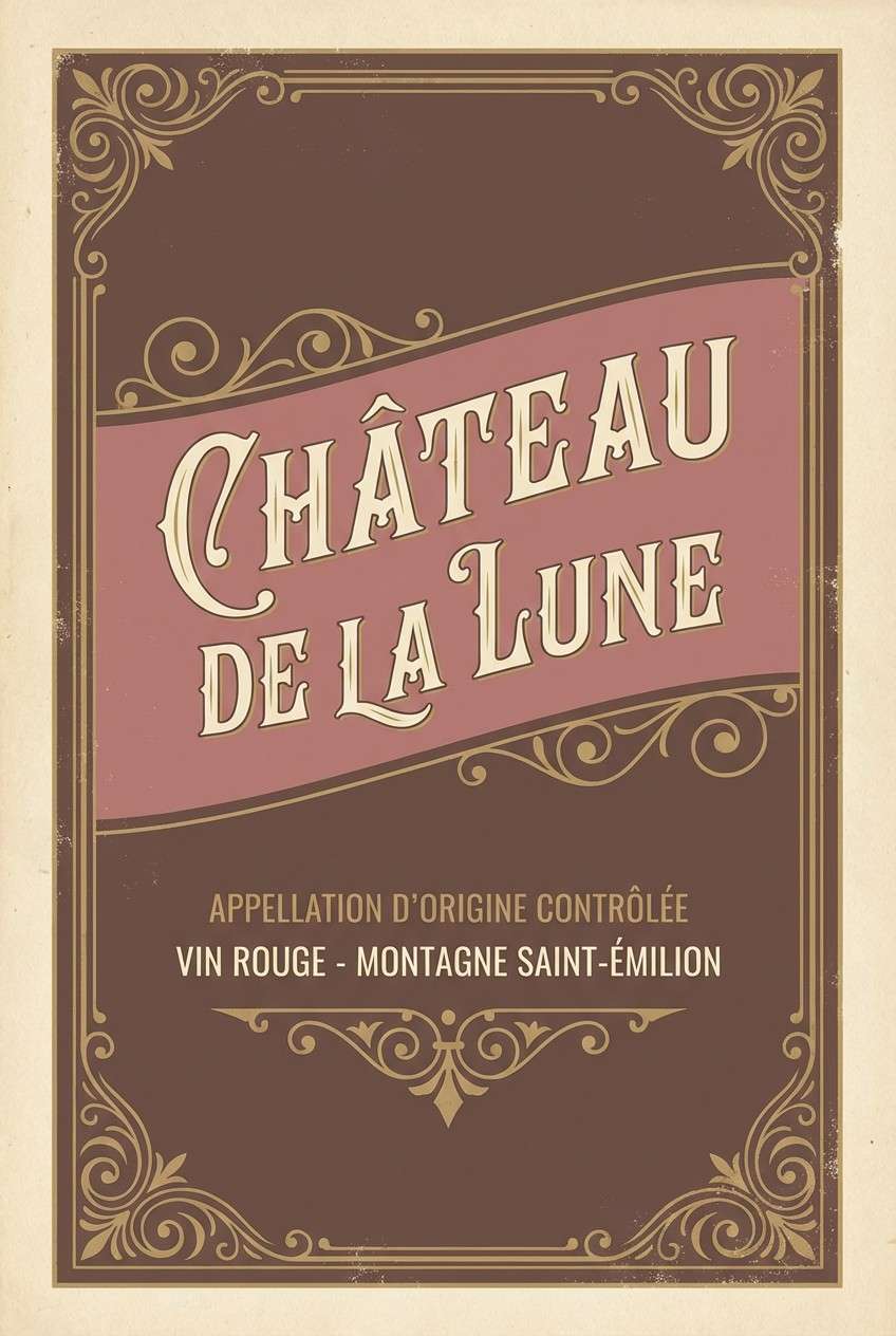
8) Cocoa Rose
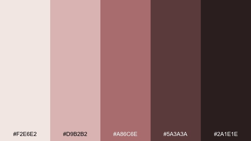
HEX: #F2E6E2 #D9B2B2 #A86C6E #5A3A3A #2A1E1E
Mood: intimate, vintage, comforting
Best for: winery labels, romantic stationery, candle packaging
Dusty rose and cocoa browns create a soft, nostalgic warmth like dried petals and chocolate. The darker shades add depth for labels and seals, while the pale base keeps the composition light. It pairs nicely with hand-drawn flourishes and classic typography for a boutique feel. Tip: use the mid rose for brand marks and keep the deepest brown for small text to avoid a muddy finish.
Image example of cocoa rose generated using media.io
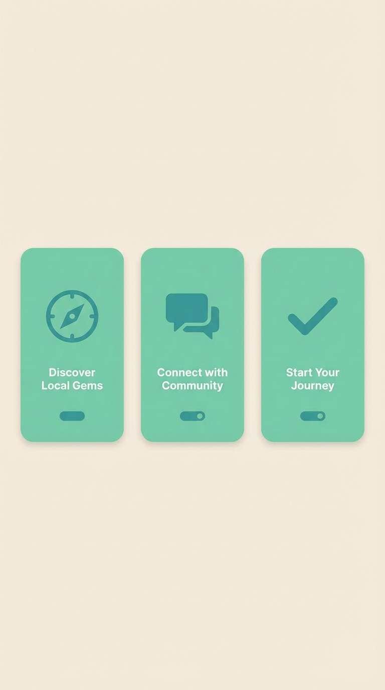
9) Seafoam Linen
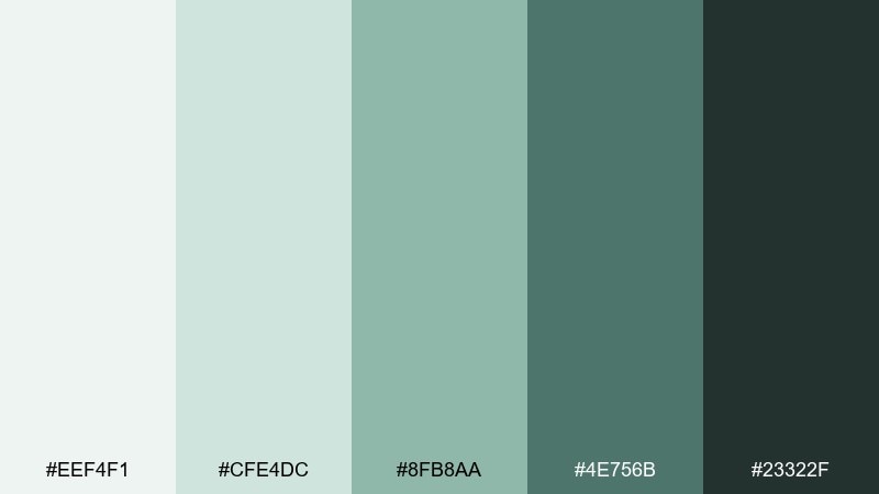
HEX: #EEF4F1 #CFE4DC #8FB8AA #4E756B #23322F
Mood: fresh, airy, coastal
Best for: eco startup websites, app onboarding screens, wellness newsletters
Seafoam and deep green-blue feel like clean air, coastal water, and crisp linen. The light tones keep interfaces calm, while the darker teal supports accessible buttons and headings. This set is great for brands that want modern freshness without loud color. Tip: keep gradients subtle and use the darkest shade sparingly for primary CTAs and navigation.
Image example of seafoam linen generated using media.io
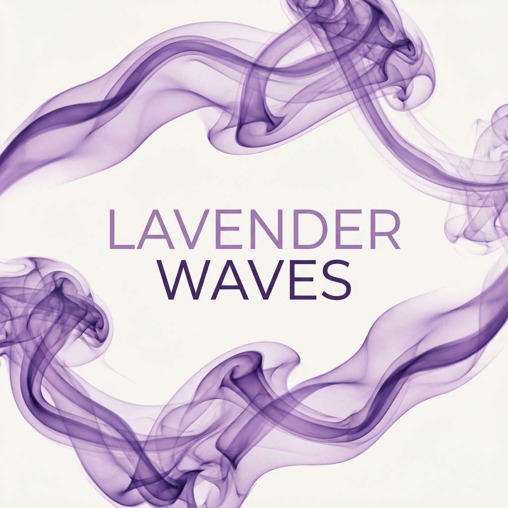
10) Lavender Smoke
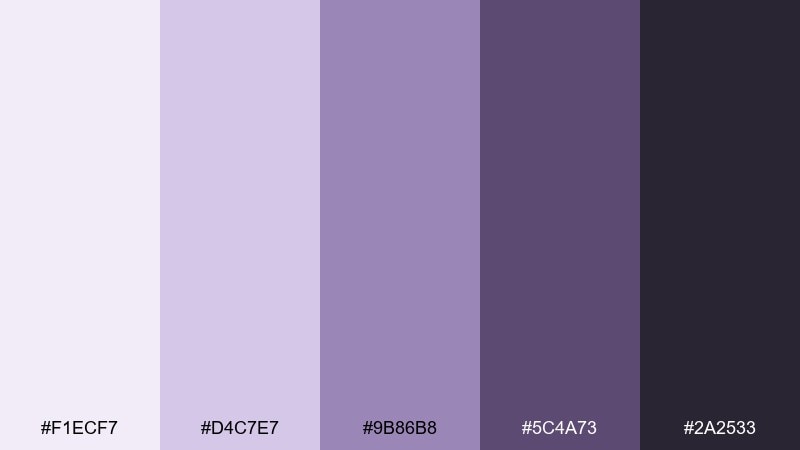
HEX: #F1ECF7 #D4C7E7 #9B86B8 #5C4A73 #2A2533
Mood: dreamy, modern, artistic
Best for: podcast covers, artisan perfume branding, creator portfolios
Hazy lavender and smoky violet bring a soft, creative edge that still feels polished. The deep purple-black anchors typography, while the pastel top notes keep the overall look light. It works well for cover art, beauty branding, and portfolios that need personality without neon. Tip: use the mid violet for iconography and keep the palest lavender as a calm background field.
Image example of lavender smoke generated using media.io
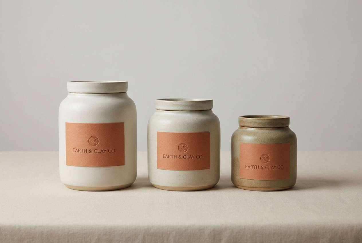
11) Terracotta Marble
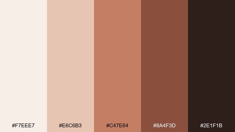
HEX: #F7EEE7 #E6C6B3 #C47E64 #8A4F3D #2E1F1B
Mood: earthy, artisanal, warm
Best for: restaurant brand identity, ceramic packaging, cafe signage
Creamy clay and terracotta tones evoke handmade ceramics, sun-baked stone, and inviting kitchens. The richer brown-red shades are strong enough for logos and wayfinding, while the pale base keeps menus readable. These elegant color combinations fit hospitality brands that want warmth without looking rustic or loud. Tip: add subtle marble-like textures in the lightest tones and keep terracotta as the hero accent for stamps and icons.
Image example of terracotta marble generated using media.io
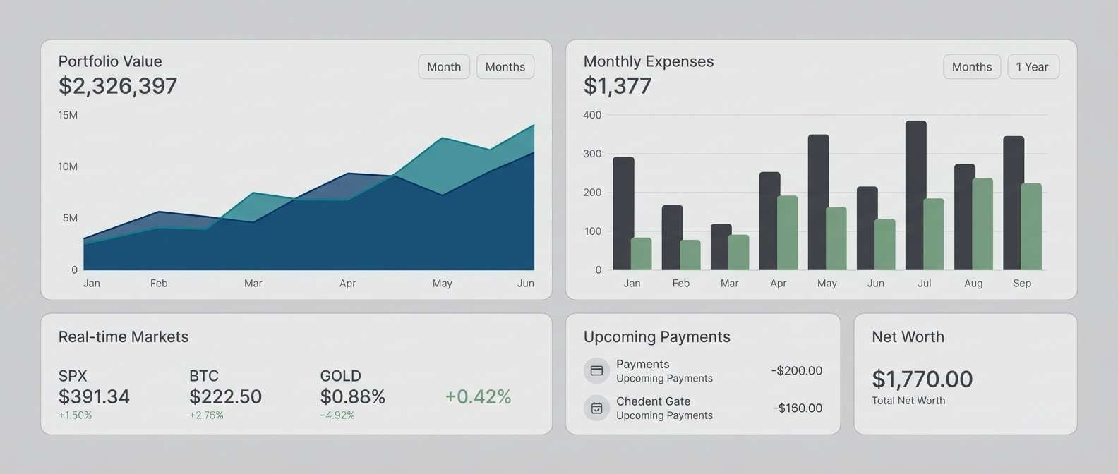
12) Icy Platinum
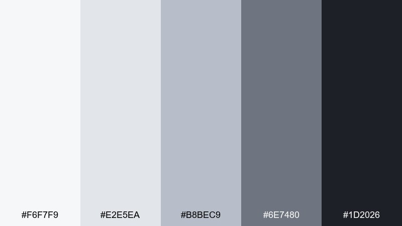
HEX: #F6F7F9 #E2E5EA #B8BEC9 #6E7480 #1D2026
Mood: cool, sleek, professional
Best for: fintech dashboards, corporate slide decks, SaaS reports
Frosted whites and platinum grays feel like glass, steel, and clean data visuals. The charcoal base gives structure for charts and navigation, while the pale tones keep the interface spacious. It suits analytics-heavy products, annual reports, and B2B presentations where clarity is the priority. Tip: differentiate layers with subtle gray steps instead of shadows for a sharper, more modern look.
Image example of icy platinum generated using media.io
13) Forest and Cream
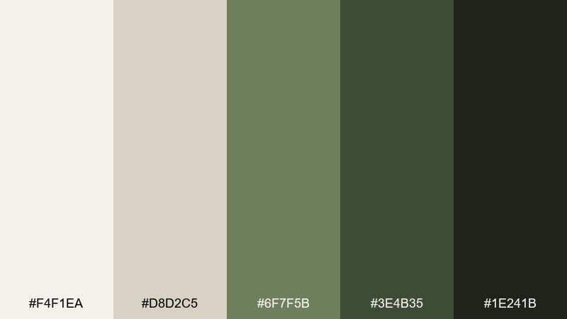
HEX: #F4F1EA #D8D2C5 #6F7F5B #3E4B35 #1E241B
Mood: natural, grounded, timeless
Best for: botanical illustration sets, sustainable packaging, outdoor brands
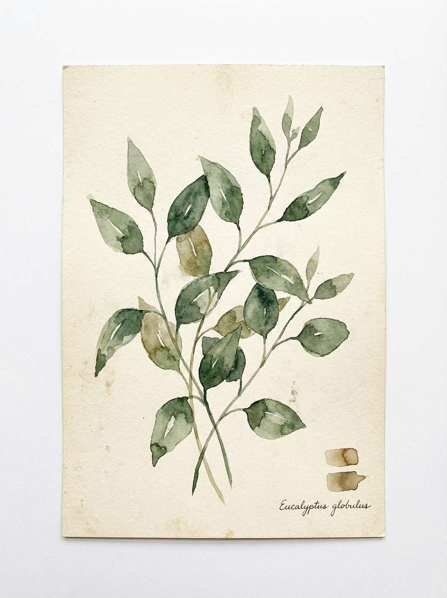
Cream paper and layered forest greens bring a quiet, heritage feel like field guides and shaded trails. The muted green midtone works well for icons and label borders, while the deepest shade reads clean for type. It pairs nicely with watercolor textures and recycled materials. Tip: keep the cream dominant and use greens in two levels to create depth without visual noise.
Image example of forest and cream generated using media.io
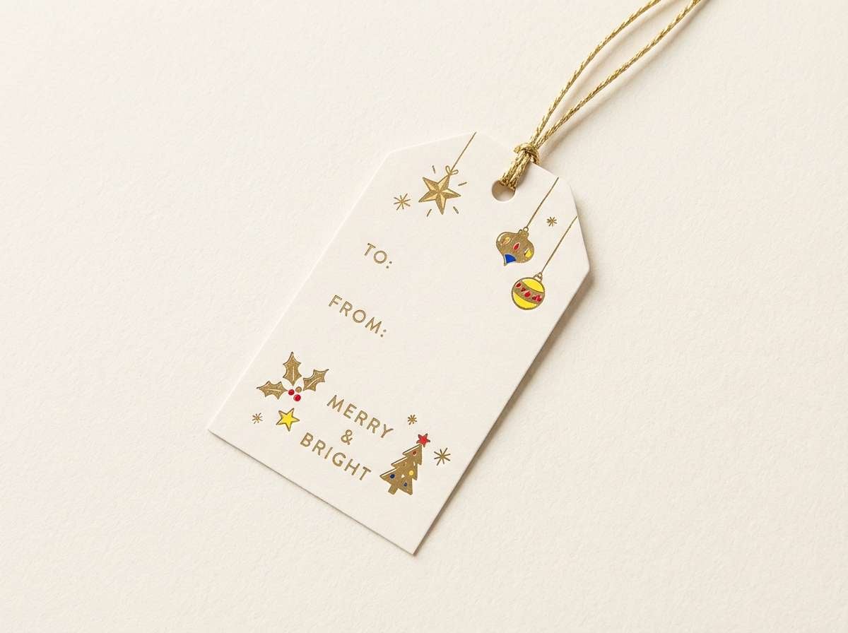
14) Sandstone Gold
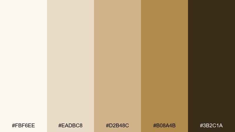
HEX: #FBF6EE #EADBC8 #D2B48C #B08A4B #3B2C1A
Mood: sunlit, classic, luxurious
Best for: jewelry branding, holiday gift tags, premium retail signage
Soft sandstone and warm gold feel like sun on stone and brushed metal. The deeper caramel-brown gives weight for typography, and the creamy base keeps it bright for retail. Use it for gift tags, small packaging, and boutique branding where you want warmth and a touch of glow. Tip: treat the gold shade as a highlight color and rely on the neutrals for most surfaces.
Image example of sandstone gold generated using media.io
15) Plum Truffle
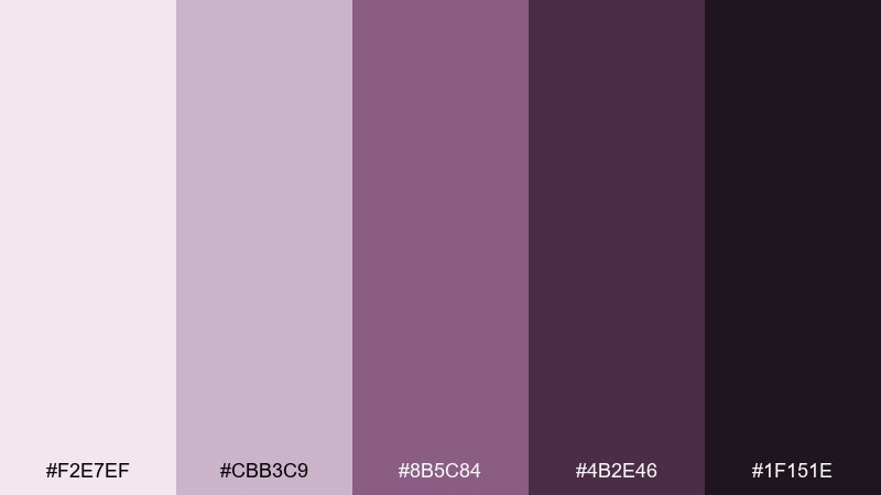
HEX: #F2E7EF #CBB3C9 #8B5C84 #4B2E46 #1F151E
Mood: moody, sophisticated, intimate
Best for: fine dining promos, luxury salon logos, evening event posters
Velvety plum and truffle shadows create a rich, after-dark elegance. The pale lilac keeps the palette from feeling heavy, while the deep aubergine supports bold headlines and logos. It works beautifully for night events, premium beauty, and high-end hospitality. Tip: pair with matte finishes and keep text high-contrast for readability on dark backgrounds.
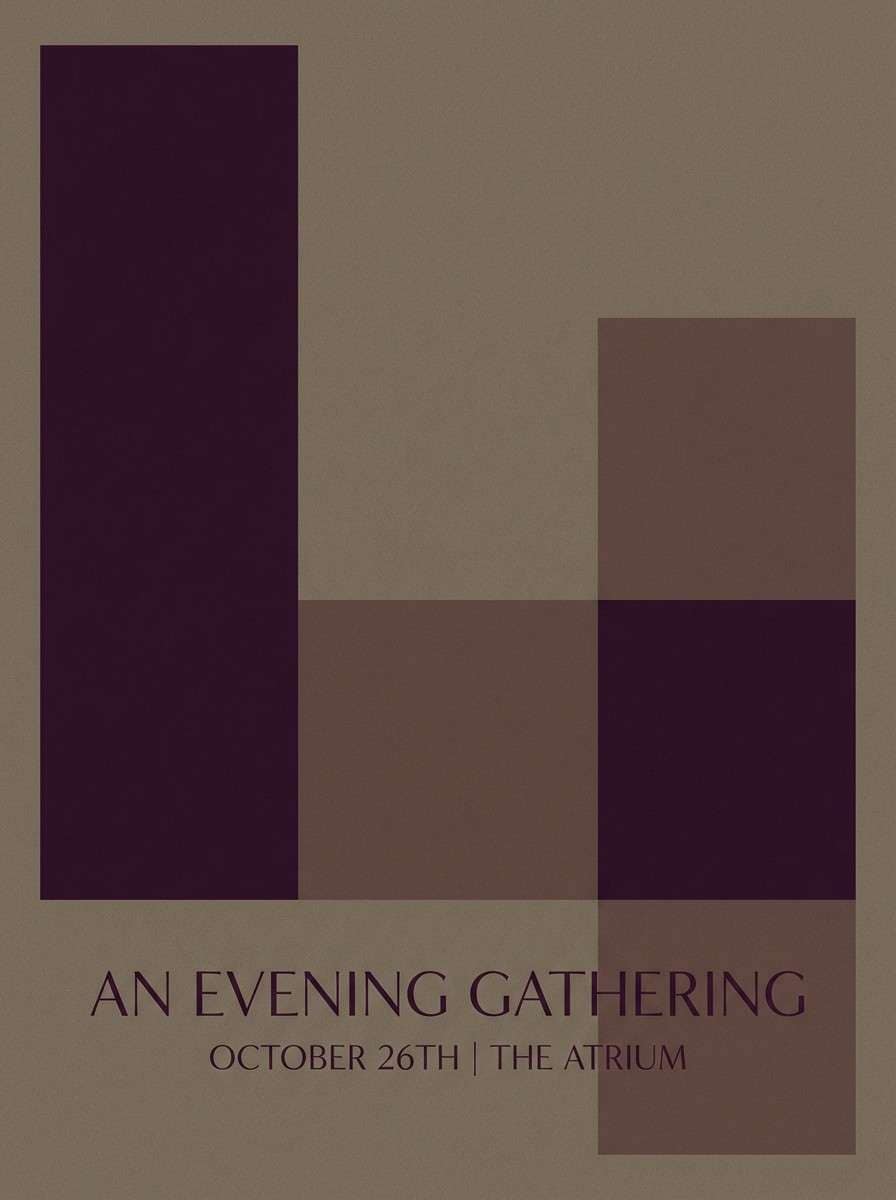
Image example of plum truffle generated using media.io
16) Dusty Blue Suede
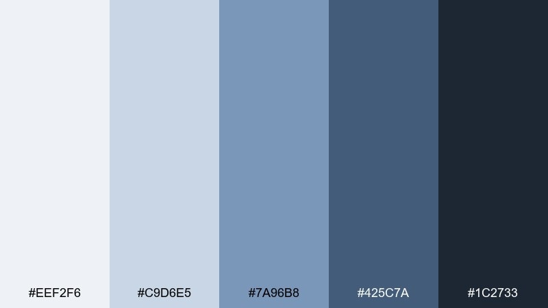
HEX: #EEF2F6 #C9D6E5 #7A96B8 #425C7A #1C2733
Mood: cool, dependable, modern
Best for: modern SaaS UI kits, pitch decks, product onboarding
Dusty blues and inky navy evoke soft suede, crisp shirts, and quiet competence. The mid blue is ideal for links and secondary buttons, while the deep slate supports strong navigation. As an elegant color palette, it brings clarity to SaaS interfaces and presentations without feeling sterile. Tip: keep background surfaces in the palest two shades and reserve the darkest navy for headers and key actions.
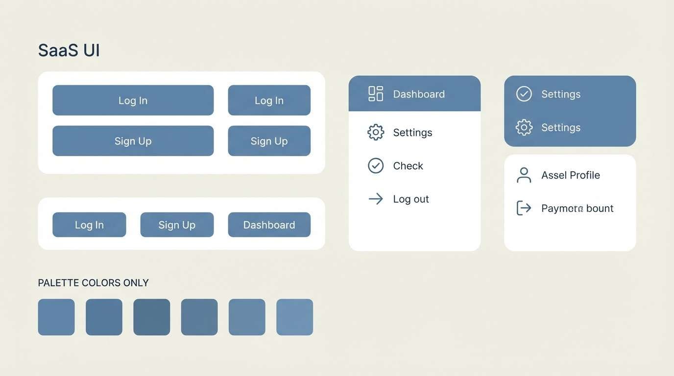
Image example of dusty blue suede generated using media.io
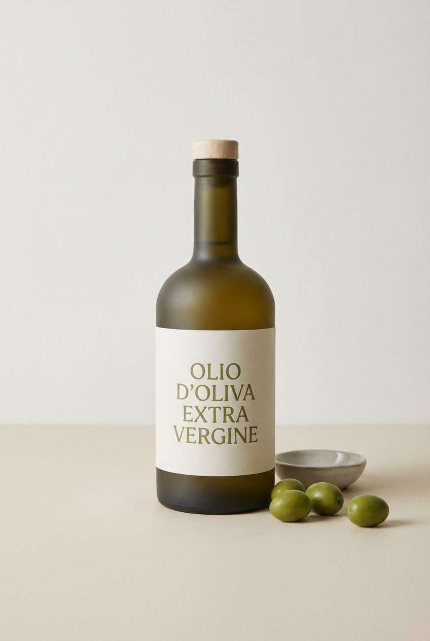
17) Olive Porcelain
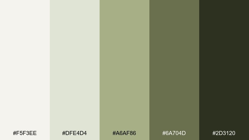
HEX: #F5F3EE #DFE4D4 #A6AF86 #6A704D #2D3120
Mood: organic, understated, refined
Best for: kitchenware packaging, organic food labels, minimal shop signage
Porcelain off-white and quiet olives feel like ceramic bowls, herb gardens, and clean kitchens. The medium olive adds brand personality without overpowering product photography. It suits labels, small packaging, and storefront graphics where you want a natural look that still feels designed. Tip: use the darkest olive for small text and keep large areas in porcelain to maintain a fresh, premium finish.
Image example of olive porcelain generated using media.io
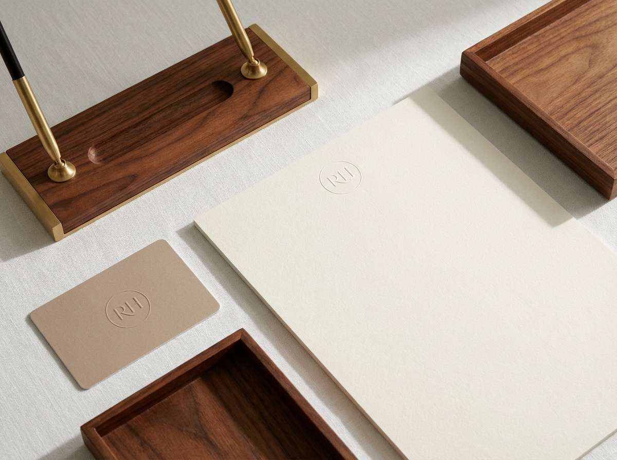
18) Rosewood Neutral
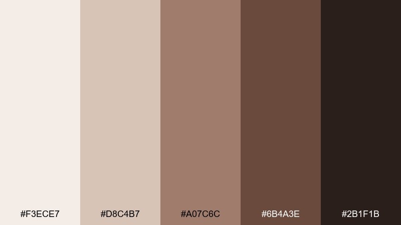
HEX: #F3ECE7 #D8C4B7 #A07C6C #6B4A3E #2B1F1B
Mood: heritage, warm, understated
Best for: hotel branding, stationery systems, signage mockups
Rosewood browns and warm parchment tones suggest leather, aged paper, and classic hospitality. The mid browns are strong enough for monograms and wayfinding, while the soft base keeps stationery feeling airy. It pairs well with embossed details, small patterns, and serif type. Tip: keep contrast high for accessibility by using the darkest brown for all primary text.
Image example of rosewood neutral generated using media.io
19) Copper Mist
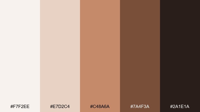
HEX: #F7F2EE #E7D2C4 #C48A6A #7A4F3A #2A1E1A
Mood: glowing, warm, modern classic
Best for: autumn wedding suites, copper foil invites, lifestyle packaging
Soft misty neutrals with copper warmth feel like candlelight on metal and fresh paper. The medium copper adds instant richness, while the deep brown keeps everything grounded and readable. These elegant color combinations shine on invitations, labels, and seasonal campaigns when you want warmth without going overly rustic. Tip: simulate foil by using copper as a small, high-contrast accent against the pale base rather than a full background.
Image example of copper mist generated using media.io
20) Charcoal Orchid

HEX: #F4EFF6 #D6C9DE #9C7FA8 #3A2F42 #141017
Mood: fashion-forward, sleek, refined
Best for: fashion editorial layouts, lookbooks, premium blog themes
Powdery orchid and charcoal shadows feel like couture fabric and studio lighting. The pale violet keeps spreads bright, while the deep charcoal adds strong structure for grids and captions. It is a stylish choice for editorial design, lookbooks, and brand stories that lean modern. Tip: keep photography framed by light lavender margins and use charcoal for type to maintain crisp contrast.
Image example of charcoal orchid generated using media.io
What Colors Go Well with Elegant?
Elegant color schemes pair best with softened neutrals (ivory, stone, pearl gray), grounded darks (espresso, charcoal, deep navy), and one restrained accent (apricot, mauve, sage, brass). This balance keeps designs polished and easy to read.
Warm elegant palettes often lean into beige, champagne, terracotta, and copper; cool elegant palettes prefer platinum, ink, dusty blue, and smoky violet. In both cases, elegance comes from low-to-mid saturation and clean contrast.
If you want “luxury” without stiffness, pick a light base, a mid-tone for surfaces, a deep shade for typography, and use the accent only for small highlights like buttons, icons, rules, or seals.
How to Use a Elegant Color Palette in Real Designs
Start with hierarchy: assign one light color for backgrounds, one dark for text, and keep the remaining three for UI layers (cards, dividers, hovers) and small brand moments. This prevents elegant palettes from turning muddy or flat.
In print, favor uncoated or lightly textured stock and let the palette do the work—thin rules, generous whitespace, and classic typography elevate even the softest tones. In UI, reduce shadows and rely on tonal steps to keep the layout crisp.
For accessibility, always test contrast for body text and buttons. Elegant palettes often use close neutrals, so the darkest shade should handle primary text, while accents stay decorative or used in larger, readable sizes.
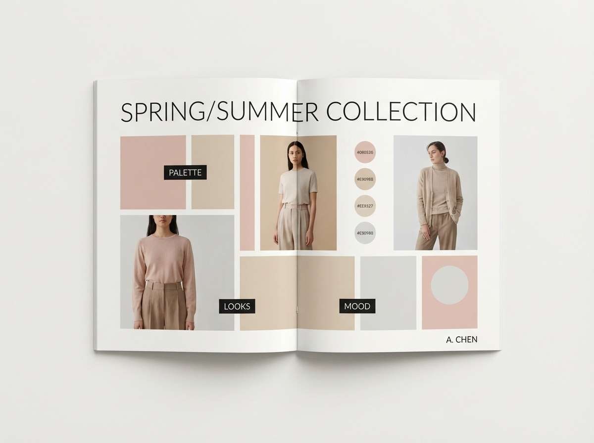
Create Elegant Palette Visuals with AI
If you’re building a brand board, invitation set, or UI concept, generating palette-matched images helps you validate mood fast. With Media.io, you can turn any palette idea into consistent visuals using simple prompts.
Copy a prompt from the palette examples above, keep the “palette colors only” instruction, and adjust the subject (menu, packaging, dashboard, poster) to match your project. You’ll get cohesive outputs that look intentional, not random.
Elegant Color Palette FAQs
-
What makes a color palette look elegant?
Elegant palettes typically use muted saturation, refined neutrals, and clear contrast (often a light base + deep text color) with one restrained accent for highlights. -
What are the best elegant colors for branding?
Ivory, champagne, warm beige, charcoal, espresso, deep navy, muted sage, dusty rose, and brass/gold-like tones are common luxury branding colors because they feel premium and timeless. -
How many colors should an elegant color scheme include?
Five is a practical sweet spot: one background, one surface, one mid-tone, one dark for typography, and one accent for CTAs or small details. -
Do elegant palettes work for modern UI design?
Yes—palettes like Ink and Ivory, Icy Platinum, or Dusty Blue Suede are great for modern UI because they support strong typography, clean spacing, and calm interface layers. -
How do I keep elegant palettes from looking dull?
Increase contrast with a deep text color, add texture (paper grain, subtle gradients), and use the accent strategically (icons, dividers, buttons) instead of covering large areas. -
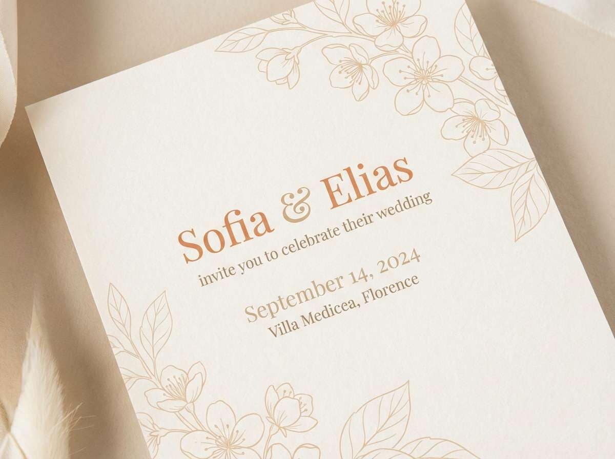
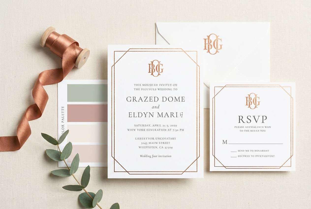
What elegant palette is best for weddings and stationery?
Apricot Silk, Pearl Champagne, and Copper Mist are especially strong for wedding invitations because they print beautifully and feel romantic without being overly bright. -
Can I generate elegant palette images with AI using HEX codes?
You can guide AI with palette language (“apricot, champagne, ivory, espresso”) and instructions like “palette-driven colors only.” Then refine results by iterating the prompt and keeping compositions minimal.


