

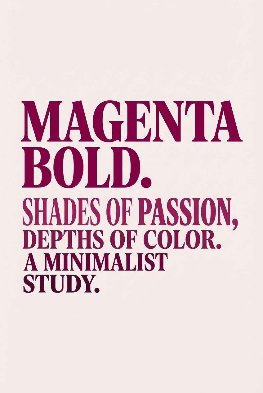
Deep magenta is a statement color: rich, confident, and instantly premium. It can read romantic, futuristic, or earthy depending on what you pair it with.
Below are 20 deep magenta palette ideas with HEX codes—built for branding, UI, print, and social—plus AI prompts you can use to generate matching visuals fast.
In this article
- Why Deep Magenta Palettes Work So Well
-
- velvet orchid nights
- raspberry rose quartz
- neon bougainvillea pop
- fig jam and linen
- midnight berry gradient
- cabernet and copper
- blush plum wedding suite
- sakura ink editorial
- cosmic magenta aurora
- antique silk and merlot
- magenta and moss contrast
- berry sorbet social
- mulberry monochrome
- orchid tech ui
- pomegranate noir poster
- cranberry and cream bakery
- amethyst plum nightfall
- magenta clay ceramic
- rosewood cyberpunk accent
- mulberry sunset gradient
- What Colors Go Well with Deep Magenta?
- How to Use a Deep Magenta Color Palette in Real Designs
- Create Deep Magenta Palette Visuals with AI
Why Deep Magenta Palettes Work So Well
Deep magenta sits in a sweet spot between red and purple, so it carries both warmth and sophistication. That makes it versatile: it can feel sensual and luxe, or clean and modern when paired with cool neutrals.
It also performs well across mediums. In print, deep magenta looks rich (especially with uncoated stock or foil accents). On screens, it delivers strong focal points for buttons, headers, and brand marks without relying on pure neon.
Most importantly, deep magenta creates instant hierarchy. A small amount can signal “primary action” or “hero moment,” while tints and shades can build a cohesive system without adding more colors.
20+ Deep Magenta Color Palette Ideas (with HEX Codes)
1) Velvet Orchid Nights
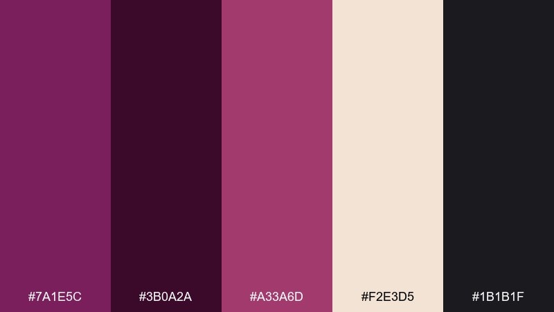
HEX: #7a1e5c #3b0a2a #a33a6d #f2e3d5 #1b1b1f
Mood: dramatic, luxe, nocturnal
Best for: luxury brand identity and packaging
Dramatic and velvety, this mix feels like stage lights on satin and dark florals after midnight. Use the near-black as your grounding base, then let the magenta and rosewood do the storytelling. Champagne keeps layouts breathable and premium, especially for labels and boxed goods. Tip: reserve the brightest accent for logos or seals so it reads expensive, not loud.
Image example of velvet orchid nights generated using media.io
Media.io is an online AI studio for creating and editing video, image, and audio in your browser.

2) Raspberry Rose Quartz
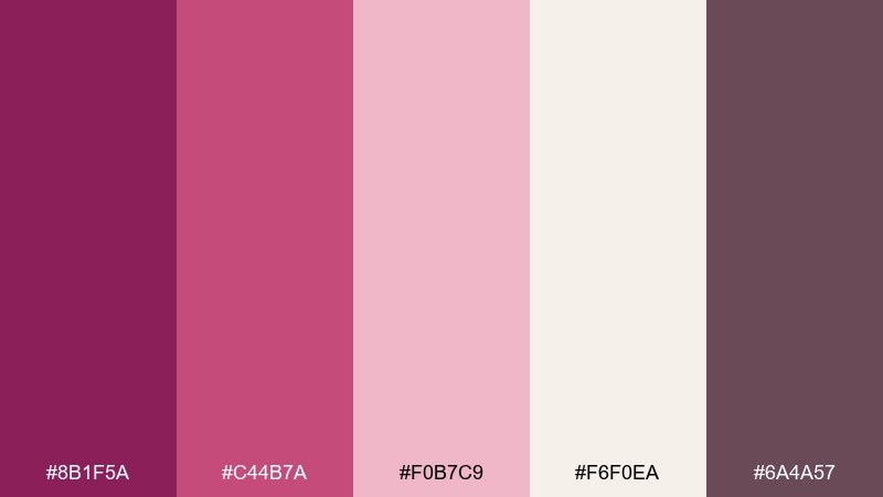
HEX: #8b1f5a #c44b7a #f0b7c9 #f6f0ea #6a4a57
Mood: romantic, gentle, polished
Best for: skincare packaging and beauty ads
Romantic and silky, these tones evoke berry sorbet, rose quartz, and soft-focus studio light. The contrast stays friendly, making it ideal for labels, tubes, and minimal ad layouts. For a deep magenta color palette that still feels airy, lean on the warm off-white as your canvas and keep the darker mauve for type. Tip: use the blush as large background blocks and reserve the darkest shade for ingredient lists and compliance text.
Image example of raspberry rose quartz generated using media.io
3) Neon Bougainvillea Pop
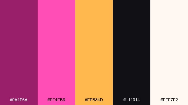
HEX: #9a1f6a #ff4fb6 #ffb84d #111014 #fff7f2
Mood: bold, playful, high-energy
Best for: event posters and promo flyers
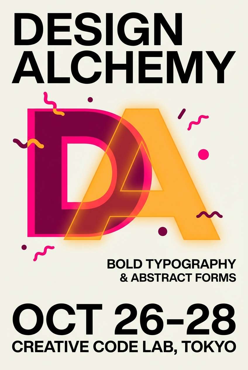
Bold and electric, this palette feels like bougainvillea petals against a hot night skyline. Pair the inky black with neon pink for headlines, then add the warm amber to spotlight dates, prices, or calls to action. The soft white keeps the design from tipping into chaos and helps small text stay readable. Tip: set pink as the hero and use amber only as a tight accent to avoid competing focal points.
Image example of neon bougainvillea pop generated using media.io
4) Fig Jam and Linen
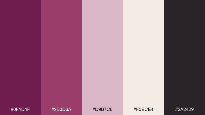
HEX: #6f1d4f #9b3d6a #d9b7c6 #f3ece4 #2a2429
Mood: cozy, modern, understated
Best for: minimalist website and app UI
Cozy and grounded, these tones suggest fig jam on linen with a warm, modern edge. Use the off-white for screens and cards, then bring in the plum tones for primary buttons and focus states. The charcoal is perfect for body text without the harshness of pure black. Tip: keep the mid-mauve for secondary UI elements so your main actions stay obvious.
Image example of fig jam and linen generated using media.io
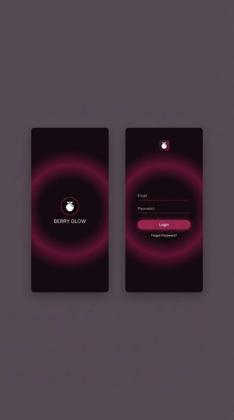
5) Midnight Berry Gradient
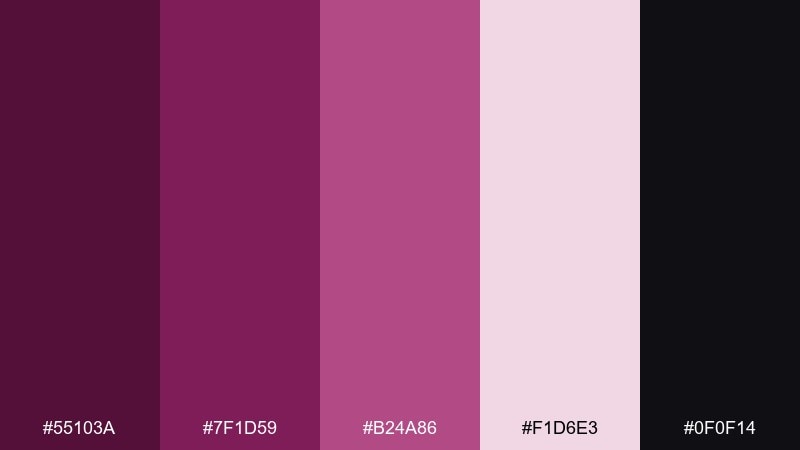
HEX: #55103a #7f1d59 #b24a86 #f1d6e3 #0f0f14
Mood: moody, sleek, techy
Best for: app splash screens and hero headers
Moody and sleek, this set feels like berry tones dissolving into midnight. The dark base gives instant depth for splash screens, while the lighter pink works well as glow, gradients, and subtle overlays. Use the soft blush for small UI highlights, badges, or micro-interactions. Tip: build a two-stop gradient from plum to magenta and keep text on the near-black for maximum clarity.
Image example of midnight berry gradient generated using media.io
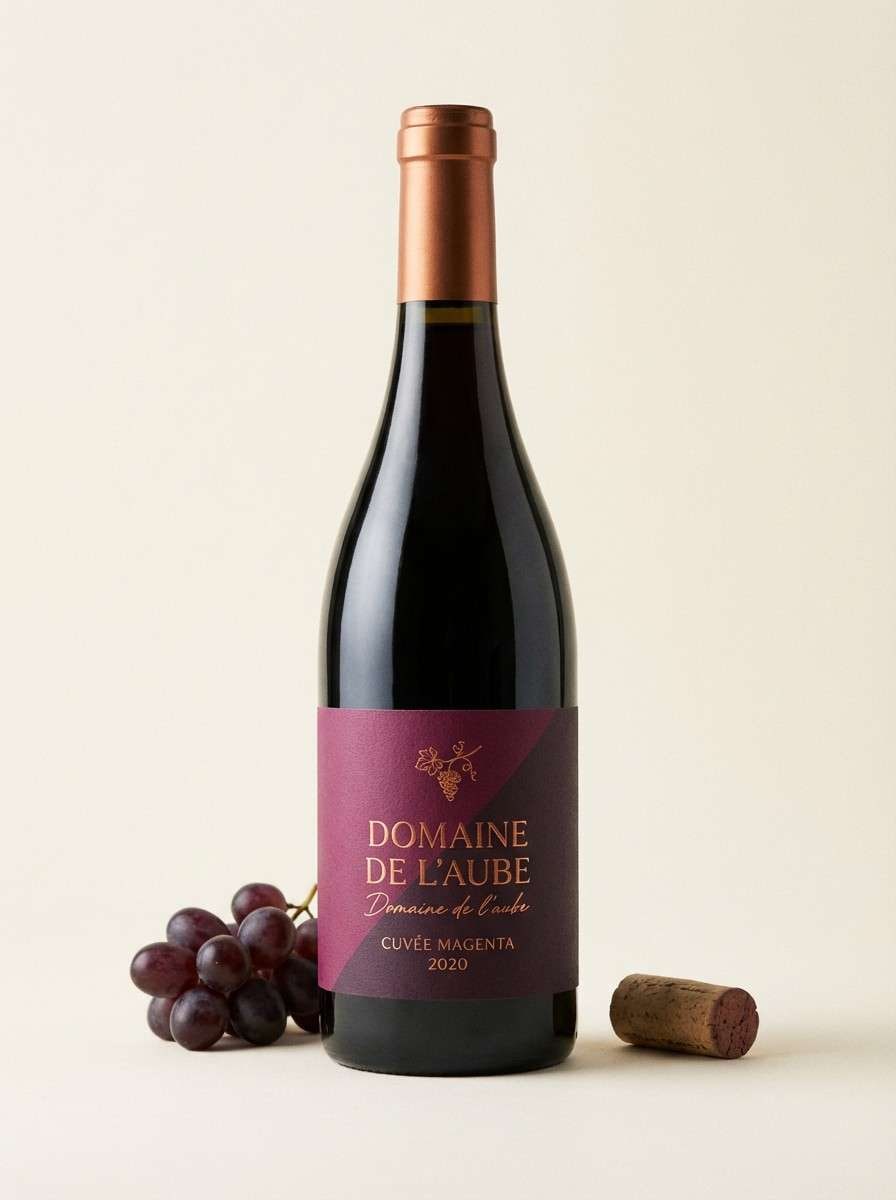
6) Cabernet and Copper
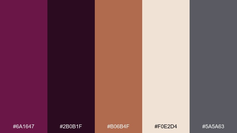
HEX: #6a1647 #2b0b1f #b06b4f #f0e2d4 #5a5a63
Mood: rich, earthy, sophisticated
Best for: wine labels and premium product ads
Rich and earthy, these shades evoke cabernet in a glass and warm copper foil on textured paper. The copper tone makes a refined accent for borders, monograms, or metallic print finishes. Cream keeps the composition bright enough for readability, especially on labels. Tip: treat copper as a small highlight and let the deeper tones carry the brand mood.
Image example of cabernet and copper generated using media.io
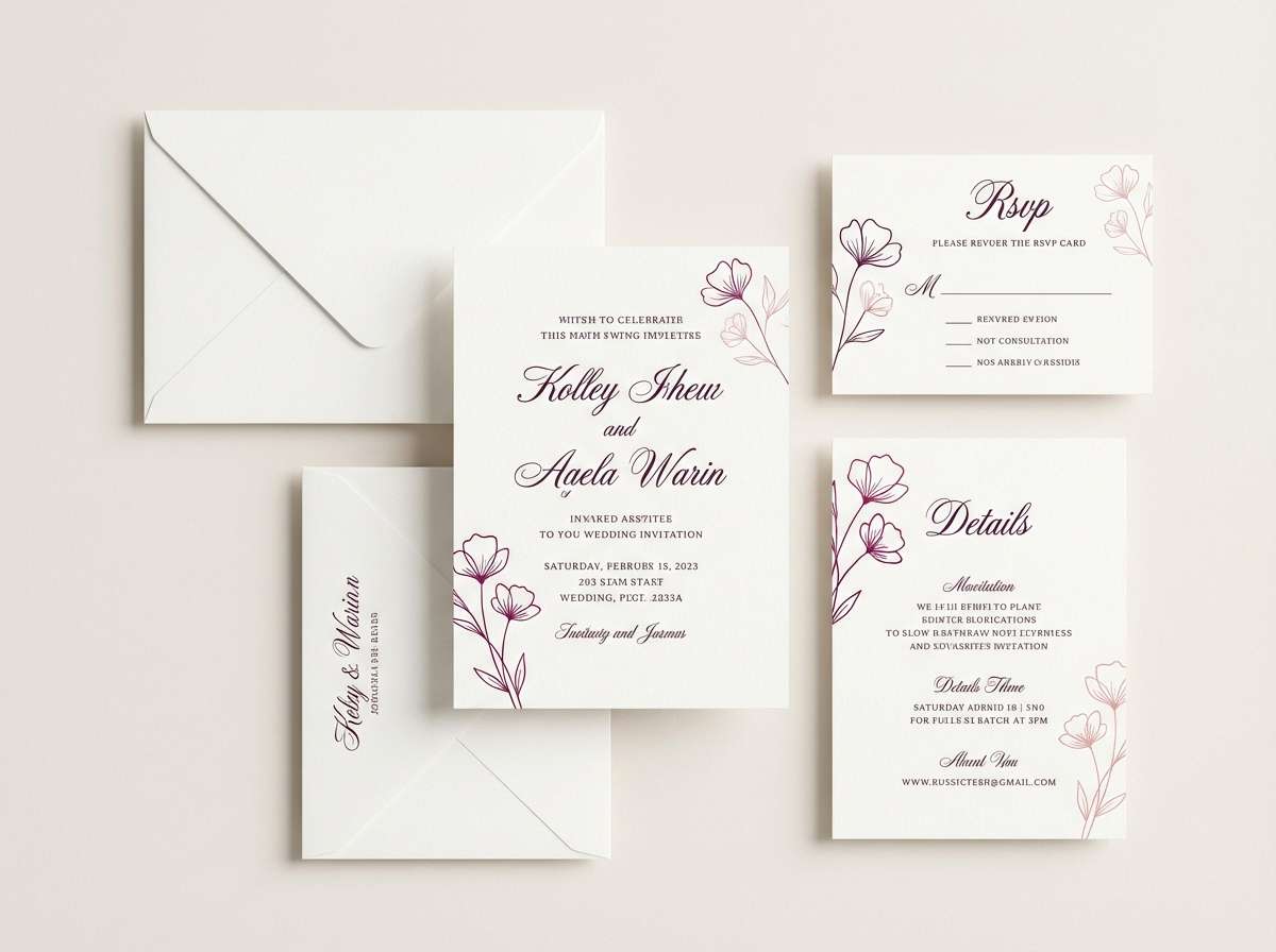
7) Blush Plum Wedding Suite
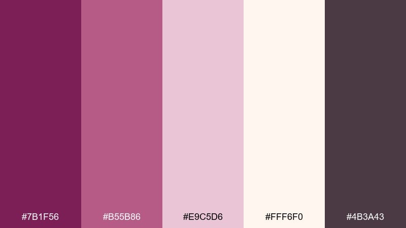
HEX: #7b1f56 #b55b86 #e9c5d6 #fff6f0 #4b3a43
Mood: elegant, romantic, timeless
Best for: wedding invitations and stationery
Elegant and romantic, these hues feel like pressed petals, handwritten vows, and candlelit receptions. Use the creamy white for the main invitation stock, with plum for names and key details. The soft blush works beautifully for envelope liners, wax-seal motifs, or subtle floral illustrations. Tip: keep contrast high for readability by pairing dark text with the lightest background.
Image example of blush plum wedding suite generated using media.io
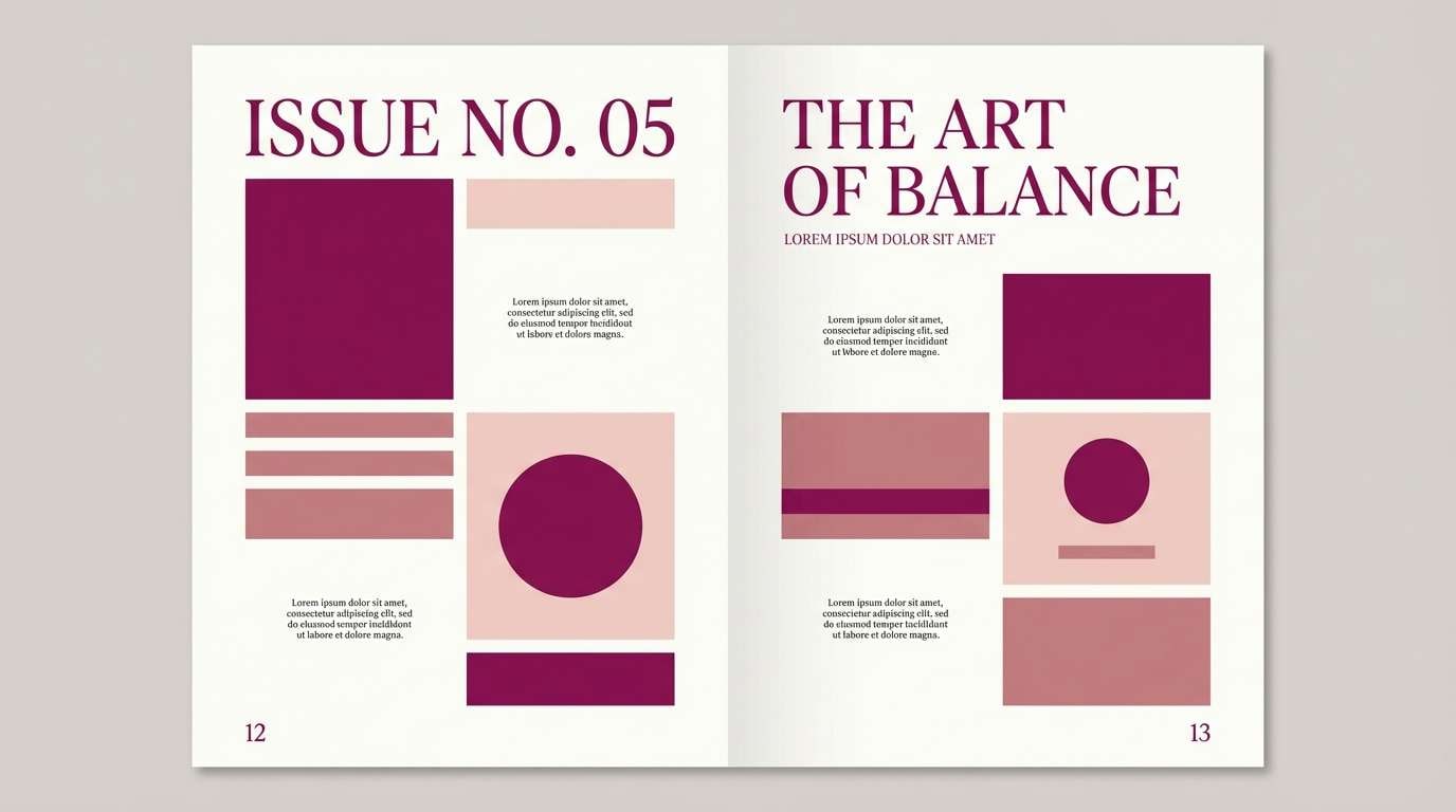
8) Sakura Ink Editorial
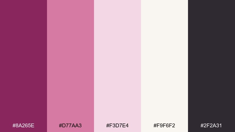
HEX: #8a265e #d77aa3 #f3d7e4 #f9f6f2 #2f2a31
Mood: editorial, airy, refined
Best for: magazine spreads and lookbooks
Airy and refined, this palette reads like sakura petals washed in ink on premium paper. The soft neutrals give you plenty of whitespace for editorial layouts and product storytelling. Use the magenta and rose tones for pull quotes, section dividers, and small graphic motifs. Tip: keep images warm-toned and let the accent color appear in consistent, repeating details to unify the spread.
Image example of sakura ink editorial generated using media.io
9) Cosmic Magenta Aurora
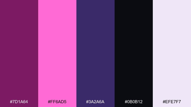
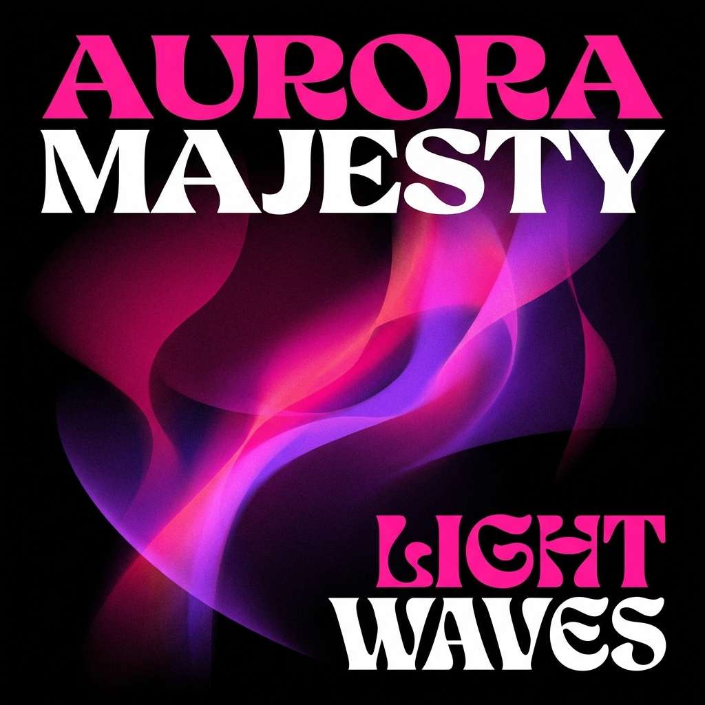
HEX: #7d1a64 #ff6ad5 #3a2a6a #0b0b12 #efe7f7
Mood: futuristic, dreamy, cinematic
Best for: album covers and music promo art
Futuristic and dreamy, these tones feel like an aurora blooming over deep space. Push contrast by pairing the near-black with neon pink for titles and artist names. For deep magenta color combinations that still feel cinematic, blend the violet into gradients and keep the light lavender as a soft halo. Tip: limit neon elements to one focal zone so the design stays readable at thumbnail size.
Image example of cosmic magenta aurora generated using media.io
10) Antique Silk and Merlot
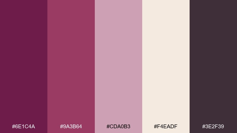
HEX: #6e1c4a #9a3b64 #cda0b3 #f4eadf #3e2f39
Mood: vintage, warm, sophisticated
Best for: boutique catalog pages and ads
Vintage and warm, these tones bring to mind antique silk, merlot stains, and softly aged paper. Use the cream as your base and let merlot carry headers, price tags, or callouts. The dusty pink works best as a background panel behind products or testimonials. Tip: choose one serif font and one clean sans font to reinforce the classic-meets-modern feel.
Image example of antique silk and merlot generated using media.io
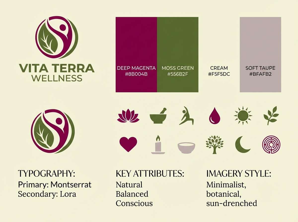
11) Magenta and Moss Contrast
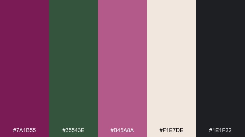
HEX: #7a1b55 #35543e #b45a8a #f1e7de #1e1f22
Mood: modern, grounded, confident
Best for: wellness branding and web design
Grounded yet confident, this set feels like wild berries against forest moss and stone. The green brings a natural counterbalance that keeps the magenta from feeling too sweet. For a deep magenta color palette with a fresh edge, use cream for breathing room and charcoal for typography. Tip: treat moss as the supporting color for navigation and use magenta only for primary actions and brand marks.
Image example of magenta and moss contrast generated using media.io
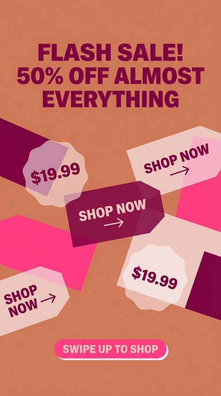
12) Berry Sorbet Social
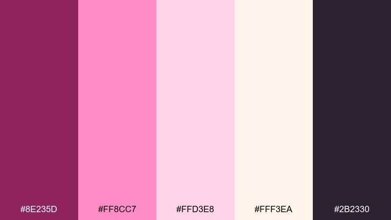
HEX: #8e235d #ff8cc7 #ffd3e8 #fff3ea #2b2330
Mood: cheerful, trendy, sweet
Best for: social media ads and story templates
Cheerful and trendy, these hues look like berry sorbet swirls and glossy confectionery packaging. The light pinks give you instant background options for quote cards and product callouts. Add the dark plum for readable text and a crisp sense of structure. Tip: keep one bright sticker-style element in hot pink so the layout pops in fast-scrolling feeds.
Image example of berry sorbet social generated using media.io
13) Mulberry Monochrome
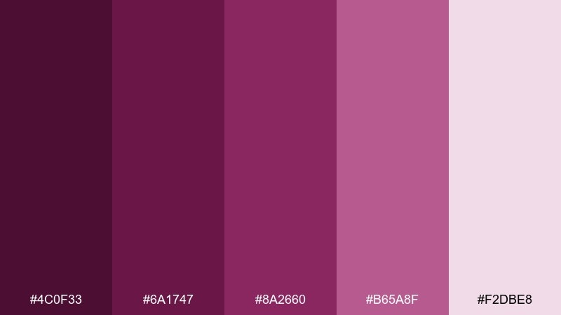
HEX: #4c0f33 #6a1747 #8a2660 #b65a8f #f2dbe8
Mood: minimal, moody, cohesive
Best for: typography-led posters and branding systems
Minimal and moody, this monochrome run feels like mulberry ink layered from shadow to blush. It is ideal when you want a single-hue identity with clear hierarchy across headings, buttons, and backgrounds. Use the palest tint for negative space and the darkest shade for typography. Tip: introduce texture through grain or paper effects instead of adding extra colors.
Image example of mulberry monochrome generated using media.io
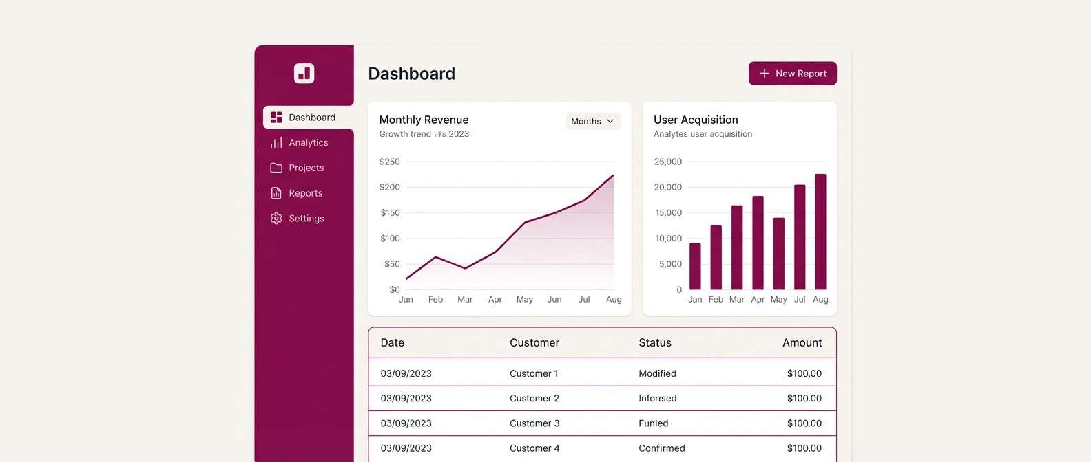
14) Orchid Tech UI
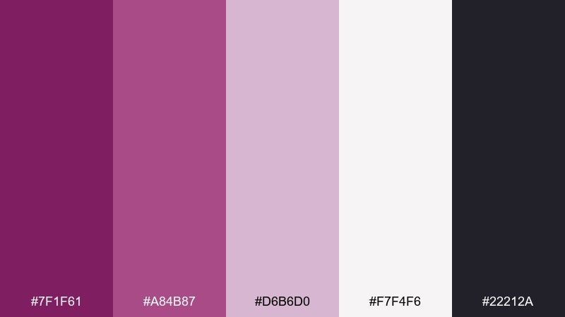
HEX: #7f1f61 #a84b87 #d6b6d0 #f7f4f6 #22212a
Mood: clean, modern, approachable
Best for: saas dashboards and settings screens
Clean and modern, these orchid tones feel friendly without losing sophistication. The soft gray-white base works for dense dashboards, while the magenta shades guide attention to key controls. Keep the darkest tone for primary text and icons to maintain accessibility. Tip: use the mid-magenta for active states and save the deepest shade for primary buttons only.
Image example of orchid tech ui generated using media.io
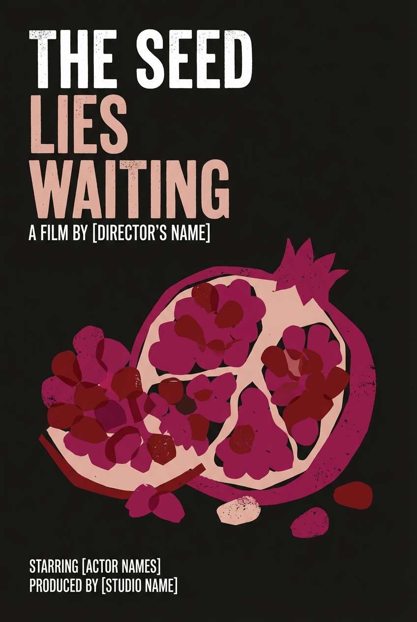
15) Pomegranate Noir Poster
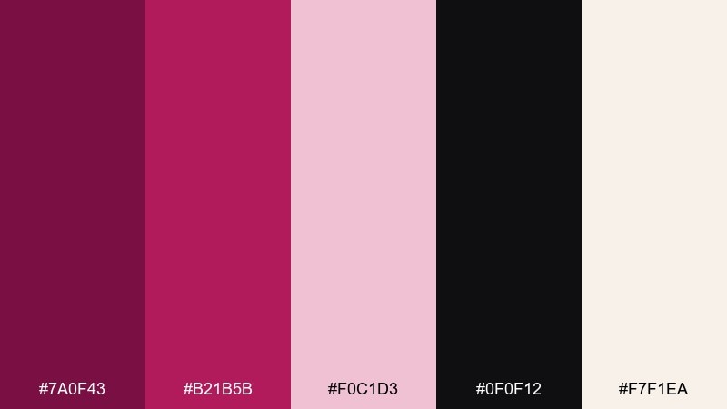
HEX: #7a0f43 #b21b5b #f0c1d3 #0f0f12 #f7f1ea
Mood: cinematic, intense, stylish
Best for: film posters and theatrical promos
Cinematic and intense, this palette suggests pomegranate juice, sharp shadows, and a spotlight cutting through smoke. Use noir black as the dominant field and let the reds and magentas carry the drama in titles and graphic shapes. The pale blush is perfect for credits blocks or subtle texture overlays. Tip: keep the poster to one main accent shape so the typography remains the hero.
Image example of pomegranate noir poster generated using media.io
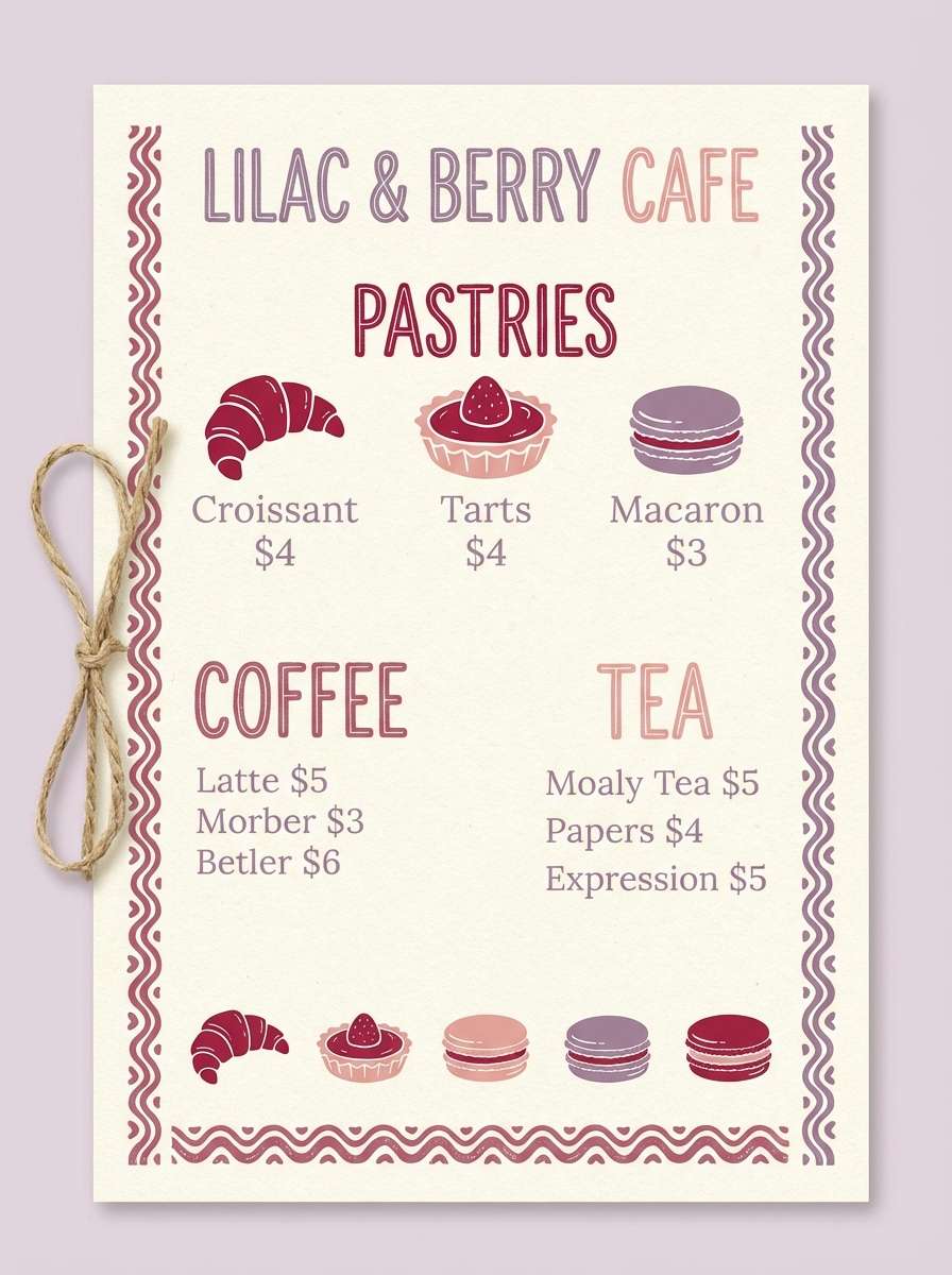
16) Cranberry and Cream Bakery
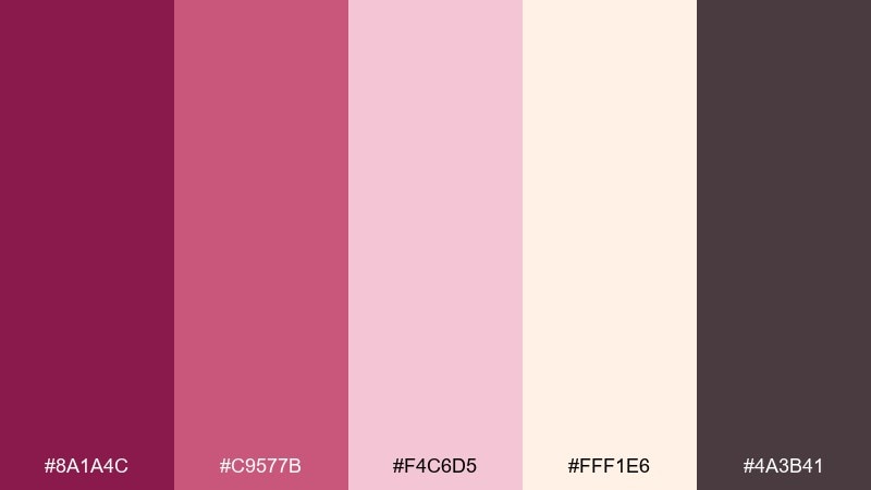
HEX: #8a1a4c #c9577b #f4c6d5 #fff1e6 #4a3b41
Mood: welcoming, sweet, handcrafted
Best for: cafe menus and food flyers
Welcoming and sweet, these shades feel like cranberry glaze, buttercream, and warm bakery paper. Cream makes a great base for menus, while the cranberry tone calls out bestsellers and seasonal specials. Use the muted brownish plum for body text so it feels softer than black. Tip: add small icon accents in the brighter pink to guide scanning without clutter.
Image example of cranberry and cream bakery generated using media.io
17) Amethyst Plum Nightfall
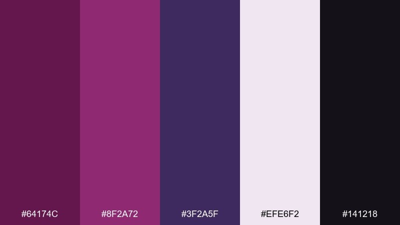
HEX: #64174c #8f2a72 #3f2a5f #efe6f2 #141218
Mood: mysterious, artistic, luxe
Best for: fashion lookbooks and launch campaigns
Mysterious and artistic, this mix resembles amethyst facets fading into nightfall. Use the dark base for dramatic hero sections and the pale lavender as clean breathing space for product details. Violet adds a creative twist that pairs well with editorial photography and minimal type. Tip: keep buttons in plum and use violet only for subtle dividers or gradients.
Image example of amethyst plum nightfall generated using media.io
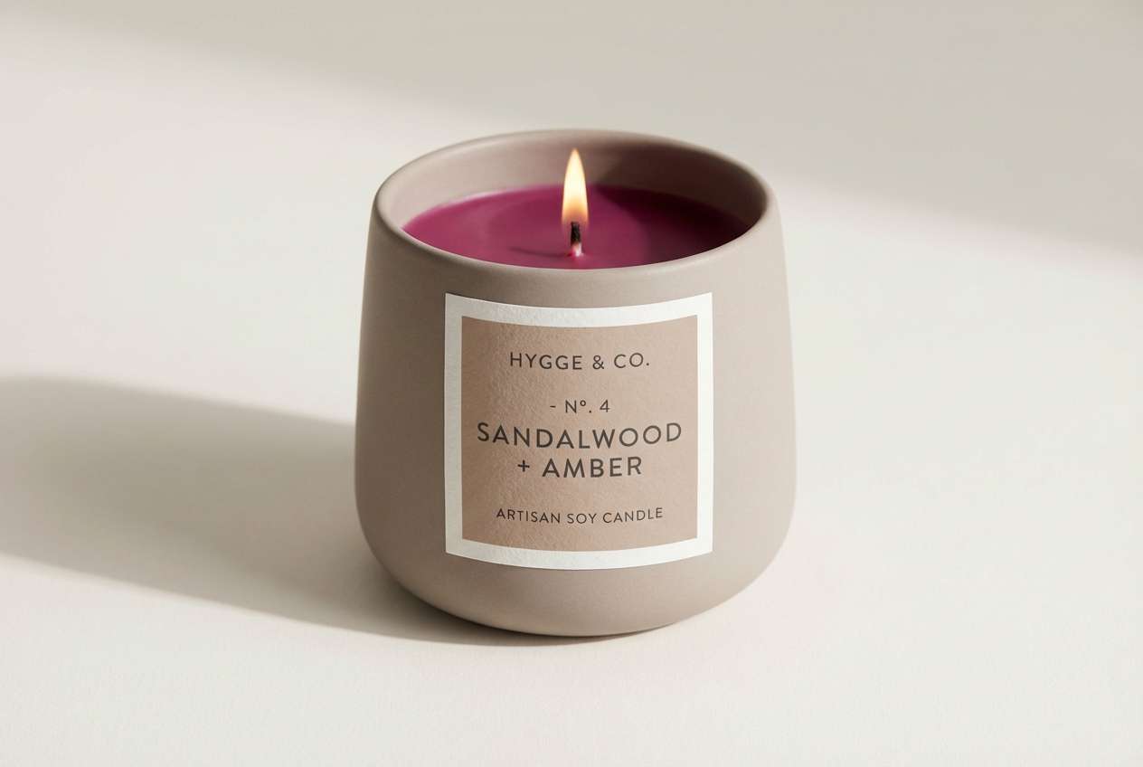
18) Magenta Clay Ceramic
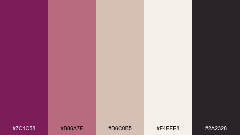
HEX: #7c1c58 #b86a7f #d6c0b5 #f4efe8 #2a2328
Mood: earthy, artisan, calm
Best for: candle packaging and handmade product brands
Earthy and artisan, these tones feel like dyed clay, glazed ceramics, and a calm studio shelf. The warm taupe and off-white are ideal for labels where you want a natural, crafted vibe. For a deep magenta color combination that stays grounded, use magenta for stamps or seals and keep type in the deep brown-black. Tip: print on uncoated stock to preserve the soft, handmade look.
Image example of magenta clay ceramic generated using media.io
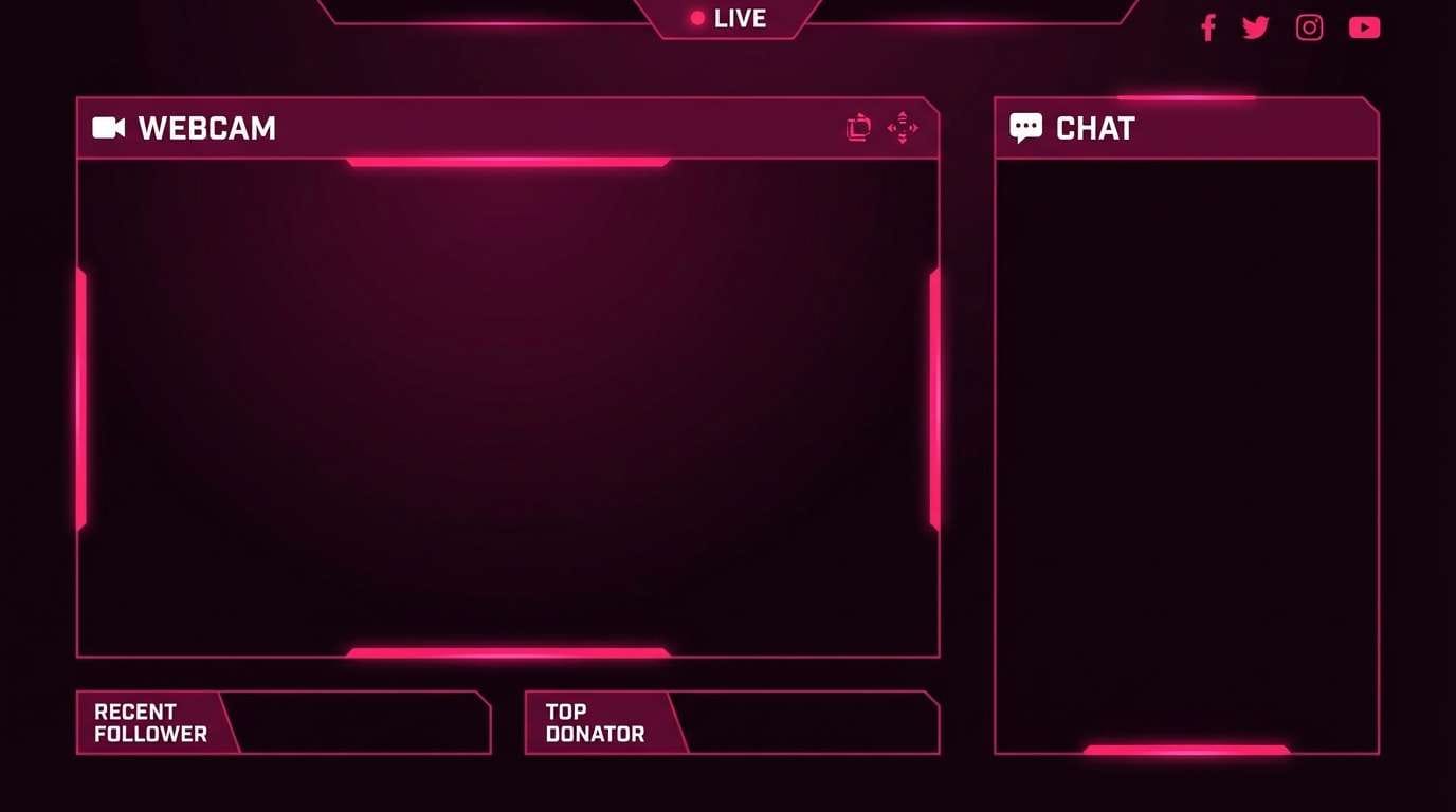
19) Rosewood Cyberpunk Accent
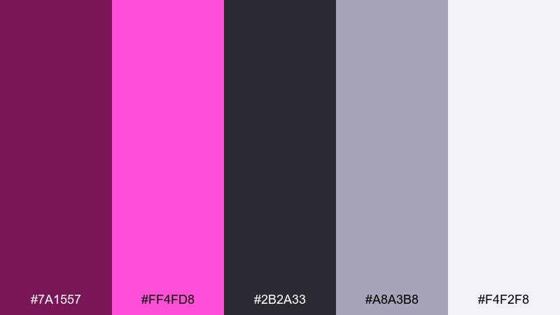
HEX: #7a1557 #ff4fd8 #2b2a33 #a8a3b8 #f4f2f8
Mood: edgy, modern, high-contrast
Best for: stream overlays and creator graphics
Edgy and high-contrast, these colors resemble neon signage reflecting off wet pavement. Use the near-black and cool gray for layout structure, then drop neon pink only where you want instant attention. The pale lavender-white keeps panels readable for long sessions. Tip: apply neon sparingly to alerts and key labels so it stays impactful.
Image example of rosewood cyberpunk accent generated using media.io
20) Mulberry Sunset Gradient
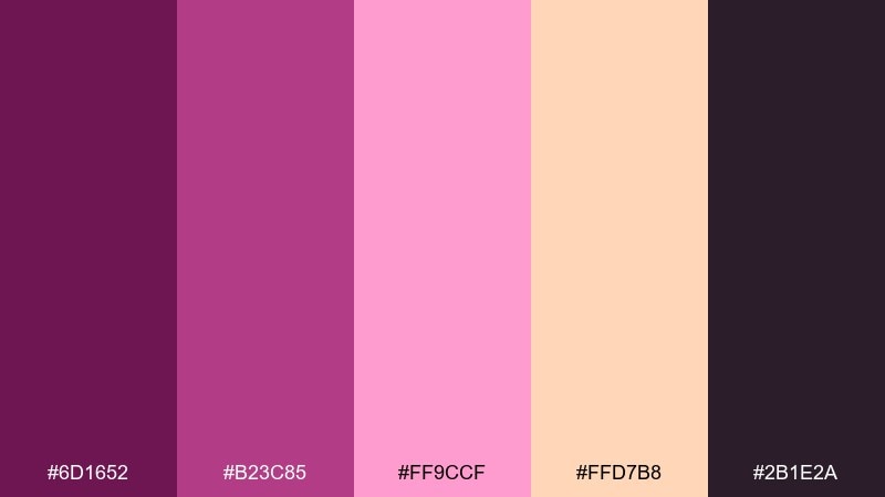
HEX: #6d1652 #b23c85 #ff9ccf #ffd7b8 #2b1e2a
Mood: warm, upbeat, modern
Best for: instagram reels covers and promo tiles
Warm and upbeat, this blend feels like a mulberry sunset with a soft peach horizon. Use the darker plum as a frame or footer bar, then let the pink-to-peach transition carry the focal area. It works especially well for short-form video covers where you need instant energy. Tip: keep text in the darkest shade and add a subtle shadow only if the gradient gets too bright behind it.
Image example of mulberry sunset gradient generated using media.io

What Colors Go Well with Deep Magenta?
Deep magenta pairs beautifully with creamy whites, warm beiges, and soft blush tints—these lighten the mood while keeping the palette elegant. If you want a luxury feel, add near-black or charcoal for contrast and structure.
For fresher, more modern deep magenta color combinations, reach for moss or forest greens, cool grays, and muted violets. These counterbalance magenta’s sweetness and create a grounded, confident look.
If you need high energy, neon pink accents, amber/orange highlights, and deep purples can push a cinematic or cyberpunk vibe—just keep one color as the “hero” so the design stays readable.
How to Use a Deep Magenta Color Palette in Real Designs
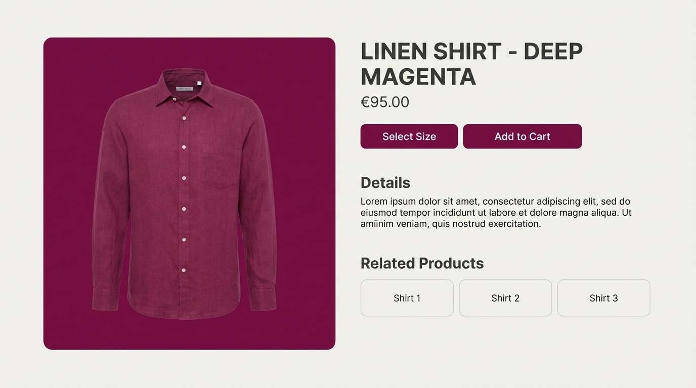
Start with roles: pick one deep magenta as your brand anchor (logos, key headers, primary buttons), then use a near-black for text and a light neutral for backgrounds. This keeps contrast predictable across UI and print layouts.
Use tints for large areas and shades for emphasis. On websites, light blush panels work well for sections and cards, while deeper plum/magenta tones handle CTAs and active states without feeling harsh.
In print, consider finishes: copper/foil accents, uncoated stocks, and subtle grain can make deep magenta feel even richer. Always proof contrast for small type—magenta on cream tends to read better than magenta on bright white.
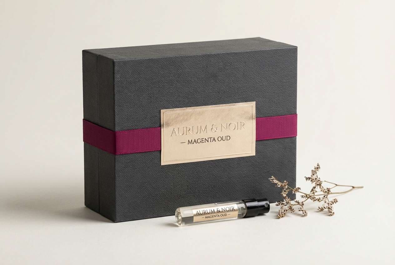
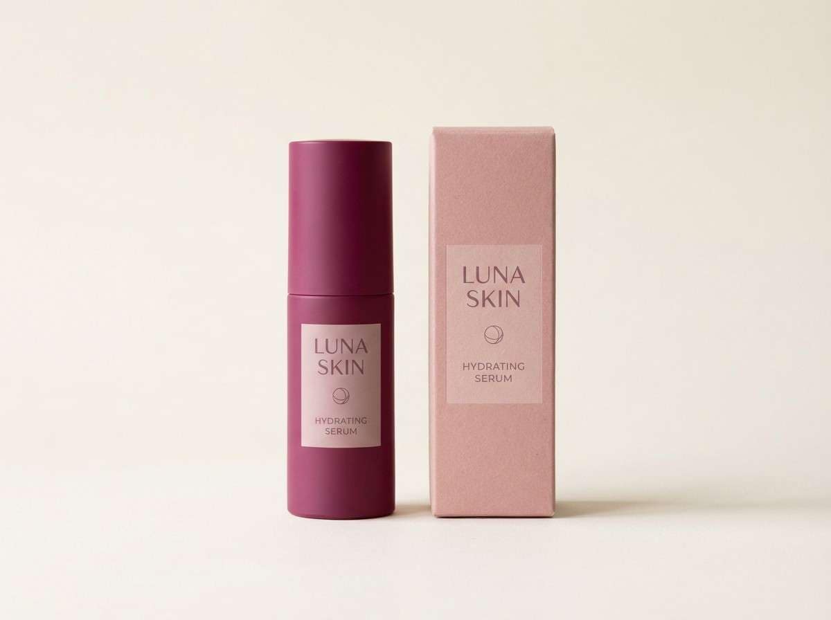
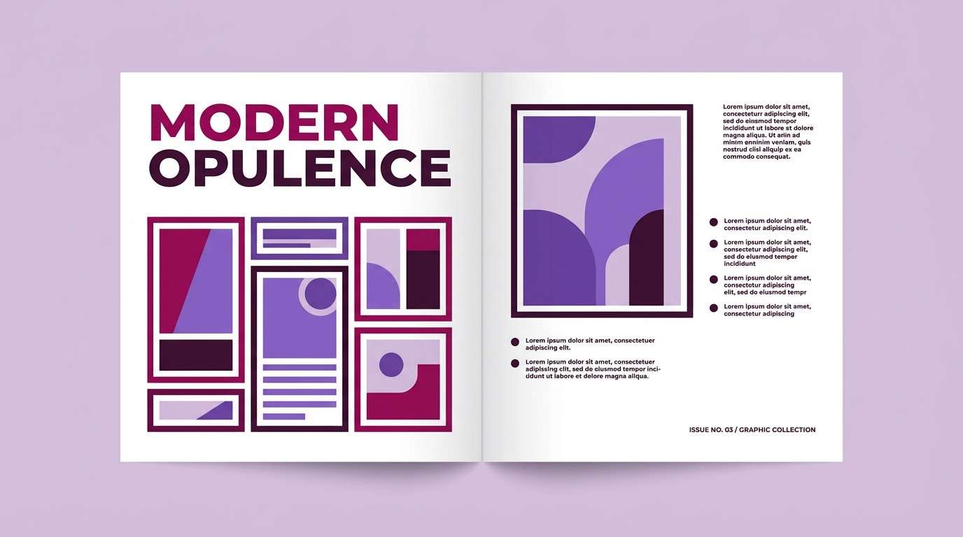
Create Deep Magenta Palette Visuals with AI
If you have HEX codes but need on-brand images, mockups, or social tiles, AI can help you visualize the palette instantly. The prompts above are designed for repeatable results (packaging, posters, UI, and editorial layouts).
With Media.io, you can generate consistent visuals, then iterate quickly—swap mood words, change lighting, or adjust the aspect ratio to fit your use case. It’s a fast way to test deep magenta pairings before committing to a full design system.
Try generating a few variants per palette, then keep the best-performing look as your style reference for future assets.
Deep Magenta Color Palette FAQs
-
What HEX code is considered “deep magenta”?
Deep magenta is typically a darker, richer magenta in the plum/berry range. Common starting points include shades like #7a1e5c or #7f1d59, then you can tweak lighter/darker to match your brand. -
Does deep magenta work for professional branding?
Yes—deep magenta can look premium and authoritative when paired with charcoal/near-black and warm neutrals (cream, champagne). It’s especially effective for beauty, fashion, boutique retail, and modern tech brands. -
What’s the best neutral to pair with deep magenta?
Warm off-whites (cream, linen, champagne) are the most forgiving and make deep magenta feel luxe rather than loud. Cool grays also work well for a more modern, UI-friendly look. -
What accent color makes deep magenta pop the most?
Neon pink creates the highest “pop,” but use it sparingly. For a refined pop, try copper/amber accents or a muted violet—both add contrast without overwhelming the composition. -
Is deep magenta good for UI and accessibility?
It can be, as long as you maintain contrast. Use light backgrounds for readability, keep body text in charcoal/near-black, and test button/text contrast ratios—deep magenta works best as a controlled accent or primary action color. -
How do I keep a deep magenta palette from feeling too sweet?
Balance it with grounded colors like moss green, charcoal, slate gray, or deep violet. Limiting pink tints and using more earthy neutrals also shifts the vibe from “cute” to “confident.” -
Can I generate matching palette images without design skills?
Yes. Use an AI text-to-image tool with a clear prompt (subject, background, lighting, style) and keep your palette consistent. Media.io makes it easy to generate mockups, posters, UI screens, and brand boards that match your deep magenta tones.
Next: Woodland Color Palette


