

Edwardian color palettes feel refined because they balance soft, muted hues with grounded darks and gentle metallic warmth. The result is a look that reads timeless in both print and digital work.
Below are 20+ Edwardian palette ideas with HEX codes, plus practical ways to pair them for invitations, branding, interiors, and modern UI.
In this article
- Why Edwardian Palettes Work So Well
-
- parlor sage
- tea rose lace
- antique library
- garden party
- velvet evening
- porcelain blue
- brass and mahogany
- seaside veranda
- ink and parchment
- pearl powder
- orchid boudoir
- conservatory greens
- cameo portrait
- gilded stationery
- smoky hearth
- opera house
- botanical plate
- edwardian minimal
- foxglove and fern
- carriage house
- silk umbrella
- amber conservatory
- What Colors Go Well with Edwardian?
- How to Use a Edwardian Color Palette in Real Designs
- Create Edwardian Palette Visuals with AI
Why Edwardian Palettes Work So Well
Edwardian palettes are built on restraint: pale creams, dusty florals, and softened greens that keep compositions airy and elegant. They naturally create “breathing room,” which helps typography and ornamentation feel intentional instead of busy.
They also rely on strong anchors—charcoal, taupe, wine, or deep olive—to protect legibility. That dark-to-light structure is why Edwardian colors translate well from stationery and interiors to modern web layouts.
Finally, the warmth is subtle rather than loud. Antique golds, parchment beiges, and brass tans add heritage without turning the design overly saturated or trendy.
20+ Edwardian Color Palette Ideas (with HEX Codes)
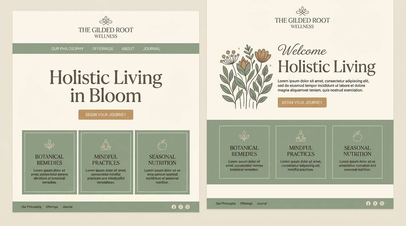
1) Parlor Sage
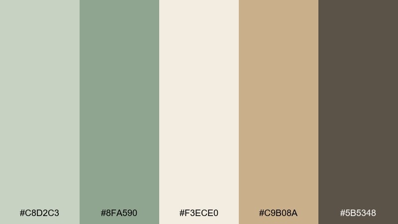
HEX: #c8d2c3 #8fa590 #f3ece0 #c9b08a #5b5348
Mood: calm, heritage, airy
Best for: wellness brand landing page UI
Calm, heritage tones that feel like morning light in a quiet parlor, with sage greens and warm linen. Use it for clean layouts, mindful brands, and gentle product storytelling where clarity matters. Pair the soft greens with cream backgrounds and use the deep taupe for headings and UI outlines. Tip: reserve the brass-like tan for primary buttons so the interface stays elegant, not busy.
Image example of parlor sage generated using media.io
Media.io is an online AI studio for creating and editing video, image, and audio in your browser.

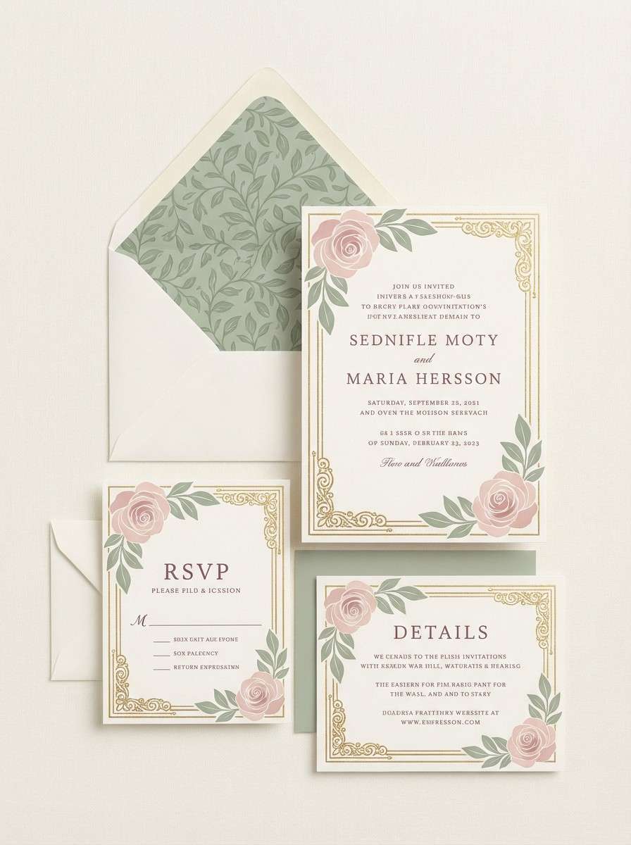
2) Tea Rose Lace
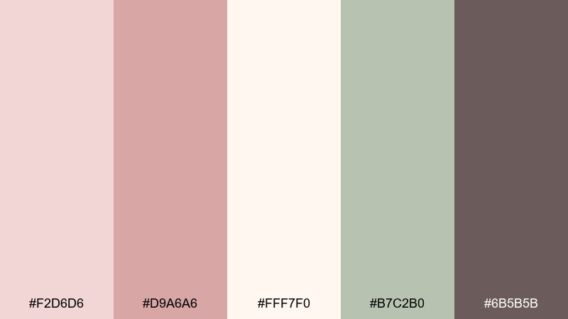
HEX: #f2d6d6 #d9a6a6 #fff7f0 #b7c2b0 #6b5b5b
Mood: romantic, delicate, nostalgic
Best for: wedding invitation suite
Romantic and delicate, like tea roses pressed into lace and kept in a letter box. This edwardian color palette shines on invitations, menus, and RSVP cards with plenty of breathing room. Pair blush and ivory for the base, then bring in the muted sage for borders or monograms. Tip: print the darkest mauve as a single-ink layer to keep details crisp and legible.
Image example of tea rose lace generated using media.io
3) Antique Library
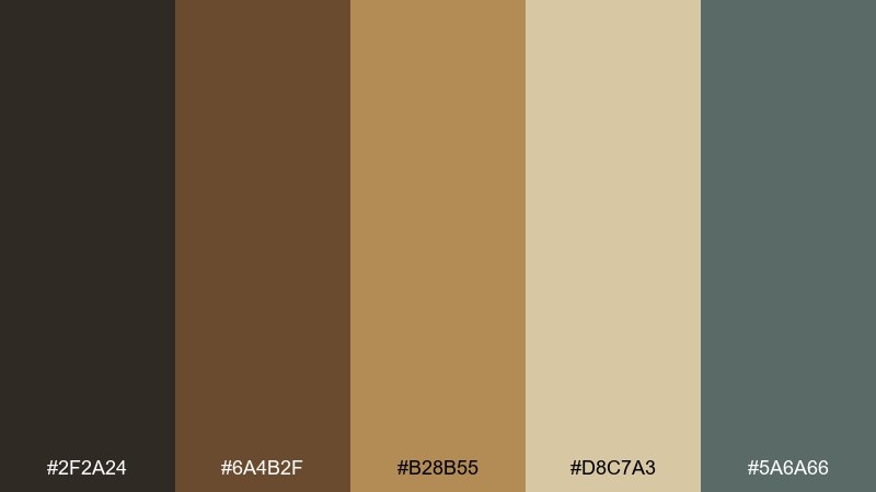
HEX: #2f2a24 #6a4b2f #b28b55 #d8c7a3 #5a6a66
Mood: scholarly, warm, grounded
Best for: book cover design
Scholarly and warm, evoking leather spines, polished wood, and the hush of old stacks. It works beautifully for book covers, publishing marks, and author websites that need gravitas. Pair the parchment beige with the walnut brown to keep type readable, then use the muted teal-gray as a modern counterpoint. Tip: keep gold-tan accents small, like rules and chapter icons, for an authentic vintage feel.
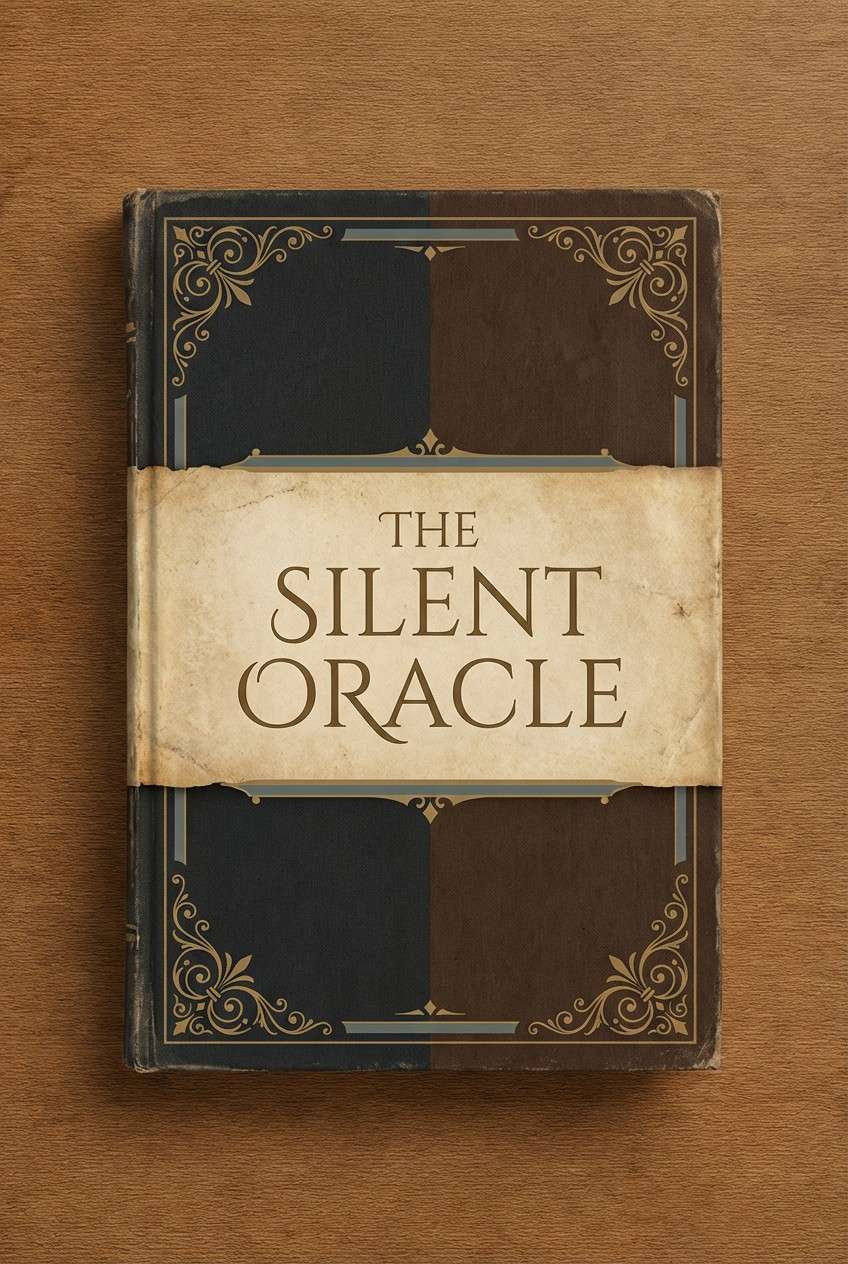
Image example of antique library generated using media.io
4) Garden Party
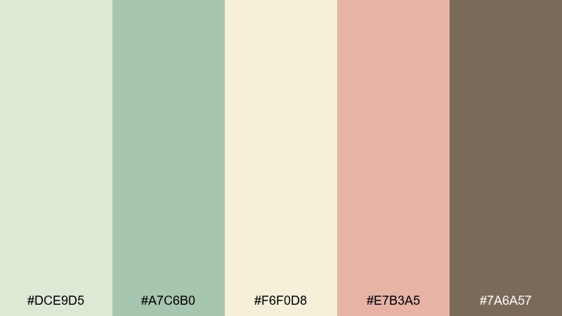
HEX: #dce9d5 #a7c6b0 #f6f0d8 #e7b3a5 #7a6a57
Mood: fresh, social, sunlit
Best for: spring event flyer
Fresh and social, like linen tablecloths under trees and soft florals in glass jars. Use it for spring flyers, pop-up posters, and community events that should feel welcoming. Pair creamy yellow with the tender greens as the base, then add the dusty coral for calls to action. Tip: keep the brown only for the smallest text so the layout stays light and airy.
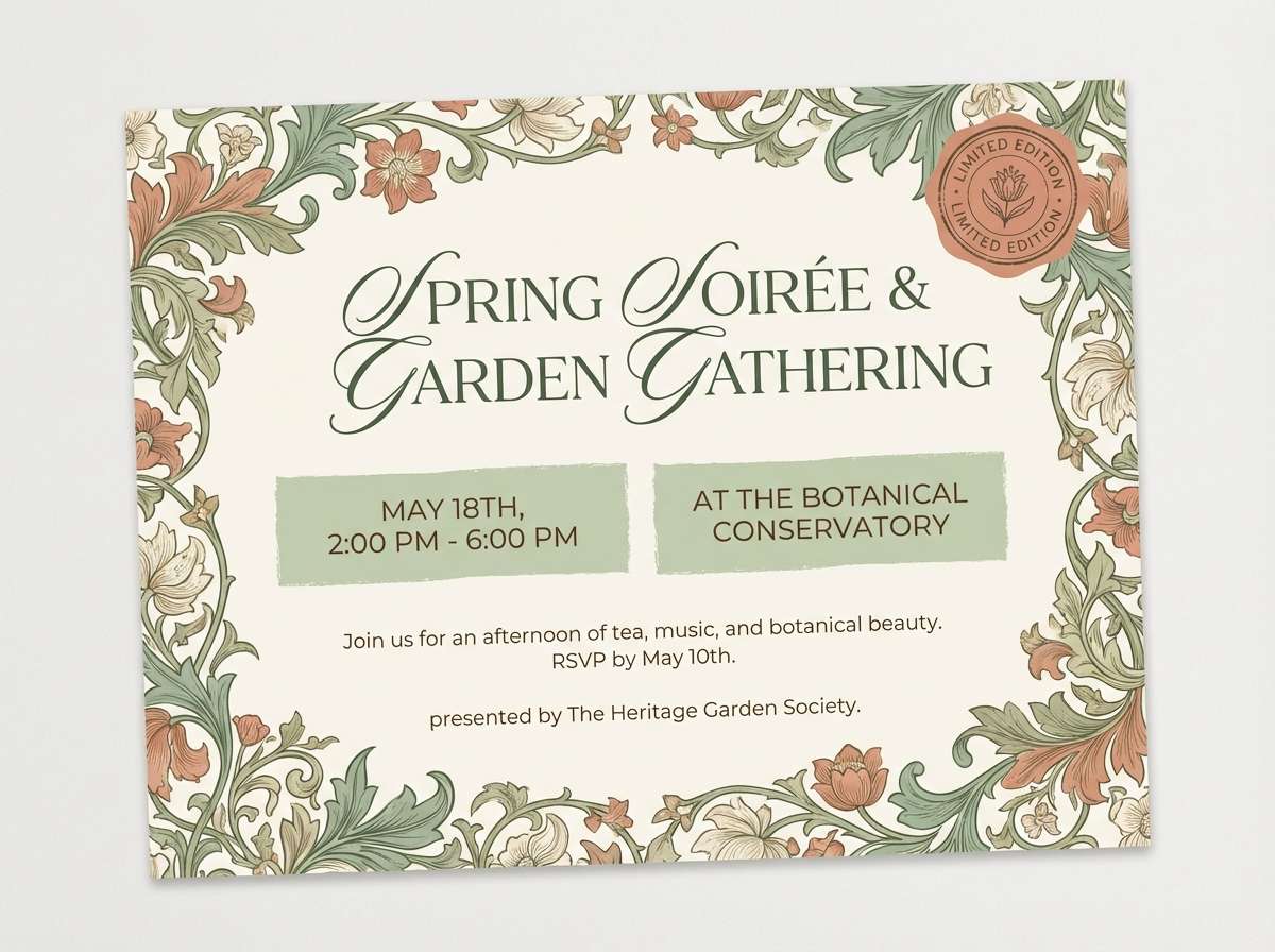
Image example of garden party generated using media.io
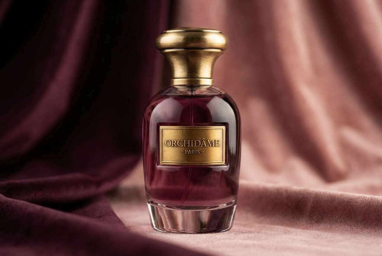
5) Velvet Evening
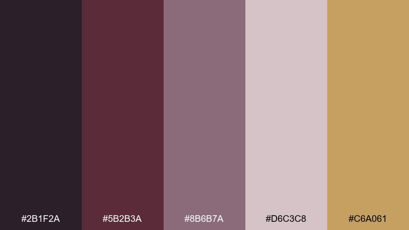
HEX: #2b1f2a #5b2b3a #8b6b7a #d6c3c8 #c6a061
Mood: dramatic, plush, refined
Best for: luxury perfume ad
Dramatic and plush, like velvet curtains and soft lamplight in an evening salon. These edwardian color combinations work well for luxury ads, fragrance branding, and premium social posts. Pair the deep plum with muted blush for the main contrast, then add antique gold for a restrained shine. Tip: use gold only for the logo and one key highlight to avoid a flashy look.
Image example of velvet evening generated using media.io
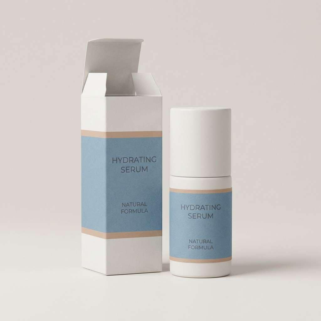
6) Porcelain Blue
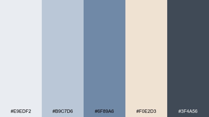
HEX: #e9edf2 #b9c7d6 #6f89a6 #f0e2d3 #3f4a56
Mood: clean, poised, airy
Best for: skincare packaging
Clean and poised, like glazed porcelain with a cool blue wash and a warm blush of clay. It suits skincare packaging, apothecary labels, and minimalist product pages that need trust. Pair the icy gray-white with slate for typography, and keep the warm nude as a gentle secondary accent. Tip: choose one blue tone for the main brand block and use the rest as subtle gradients or tints.
Image example of porcelain blue generated using media.io
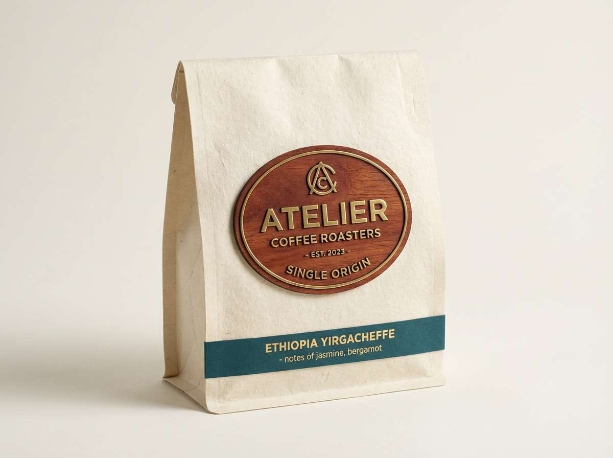
7) Brass and Mahogany
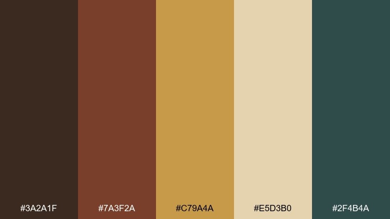
HEX: #3a2a1f #7a3f2a #c79a4a #e5d3b0 #2f4b4a
Mood: heritage, confident, tactile
Best for: craft coffee brand identity
Heritage and confident, like polished brass fittings against mahogany furniture. It fits craft coffee branding, roaster packaging, and menu boards where warmth sells the story. Pair mahogany and cream for the core, then let brass carry badges and seals. Tip: use the deep teal as a quiet separator line or background panel to keep the browns from feeling too heavy.
Image example of brass and mahogany generated using media.io
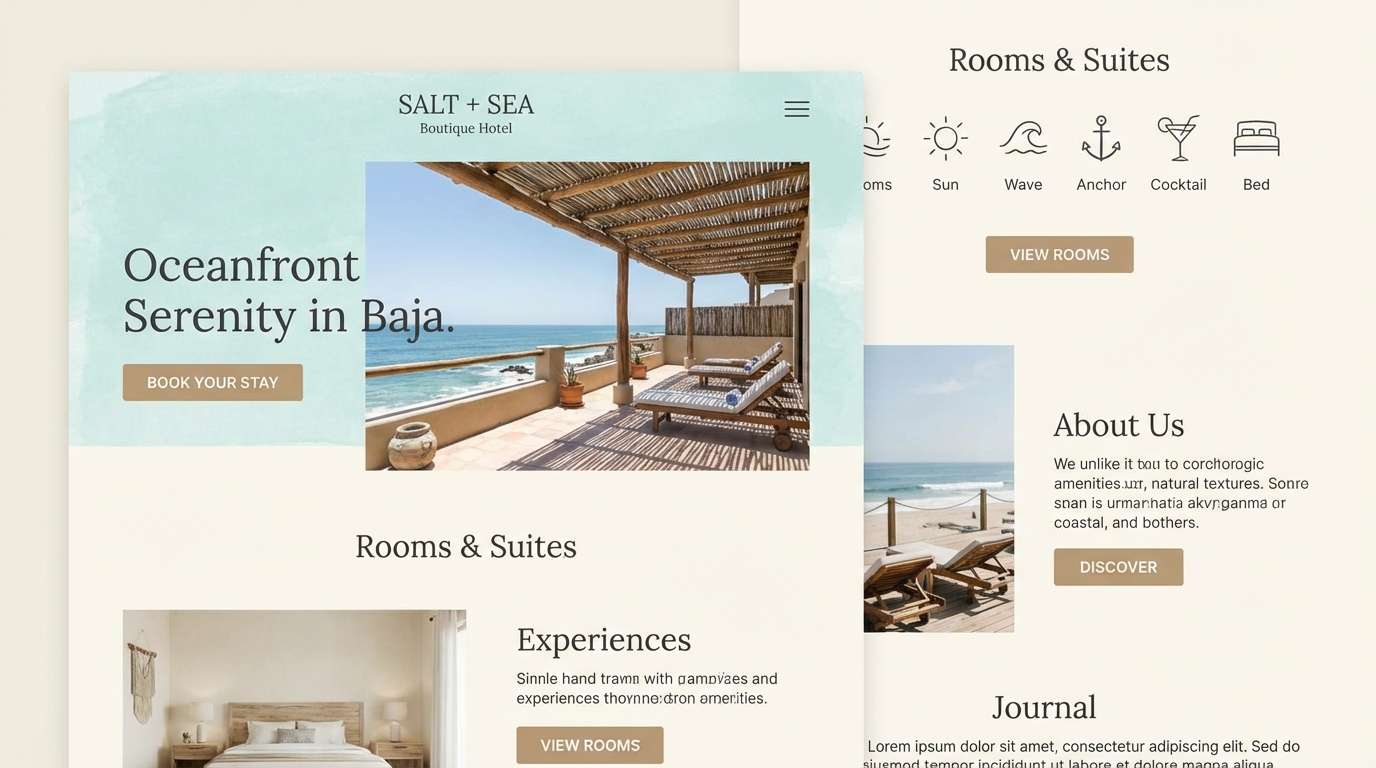
8) Seaside Veranda
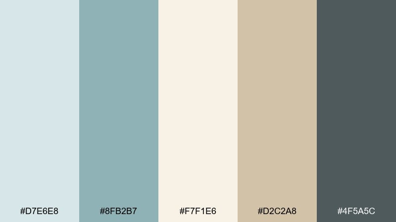
HEX: #d7e6e8 #8fb2b7 #f7f1e6 #d2c2a8 #4f5a5c
Mood: breezy, relaxed, elegant
Best for: boutique hotel website UI
Breezy and relaxed, like sea air drifting through a painted veranda. This edwardian color palette is great for boutique hotel sites, travel newsletters, and calm booking flows. Pair the pale aqua with warm ivory for sections, and use the driftwood tan for icons or highlights. Tip: keep the charcoal-gray only for text and nav elements to preserve the airy atmosphere.
Image example of seaside veranda generated using media.io
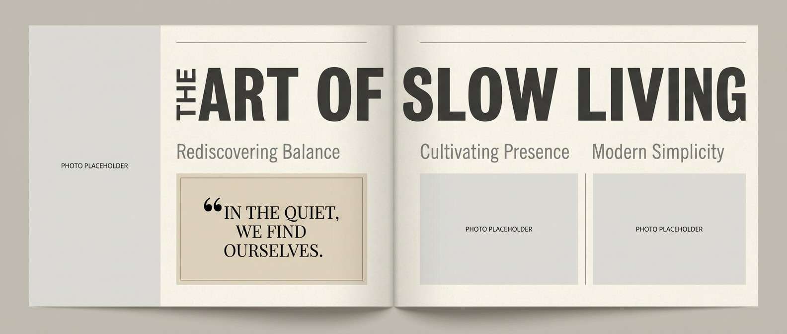
9) Ink and Parchment
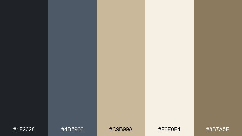
HEX: #1f2328 #4d5966 #c9b99a #f6f0e4 #8b7a5e
Mood: classic, editorial, thoughtful
Best for: magazine editorial layout
Classic and editorial, like fountain-pen ink on creamy parchment paper. Use it for long reads, magazine spreads, and report design where hierarchy matters. Pair the warm ivory with charcoal for maximum readability, then introduce sand tones for pull quotes and section dividers. Tip: keep images slightly desaturated so the typography stays the star.
Image example of ink and parchment generated using media.io
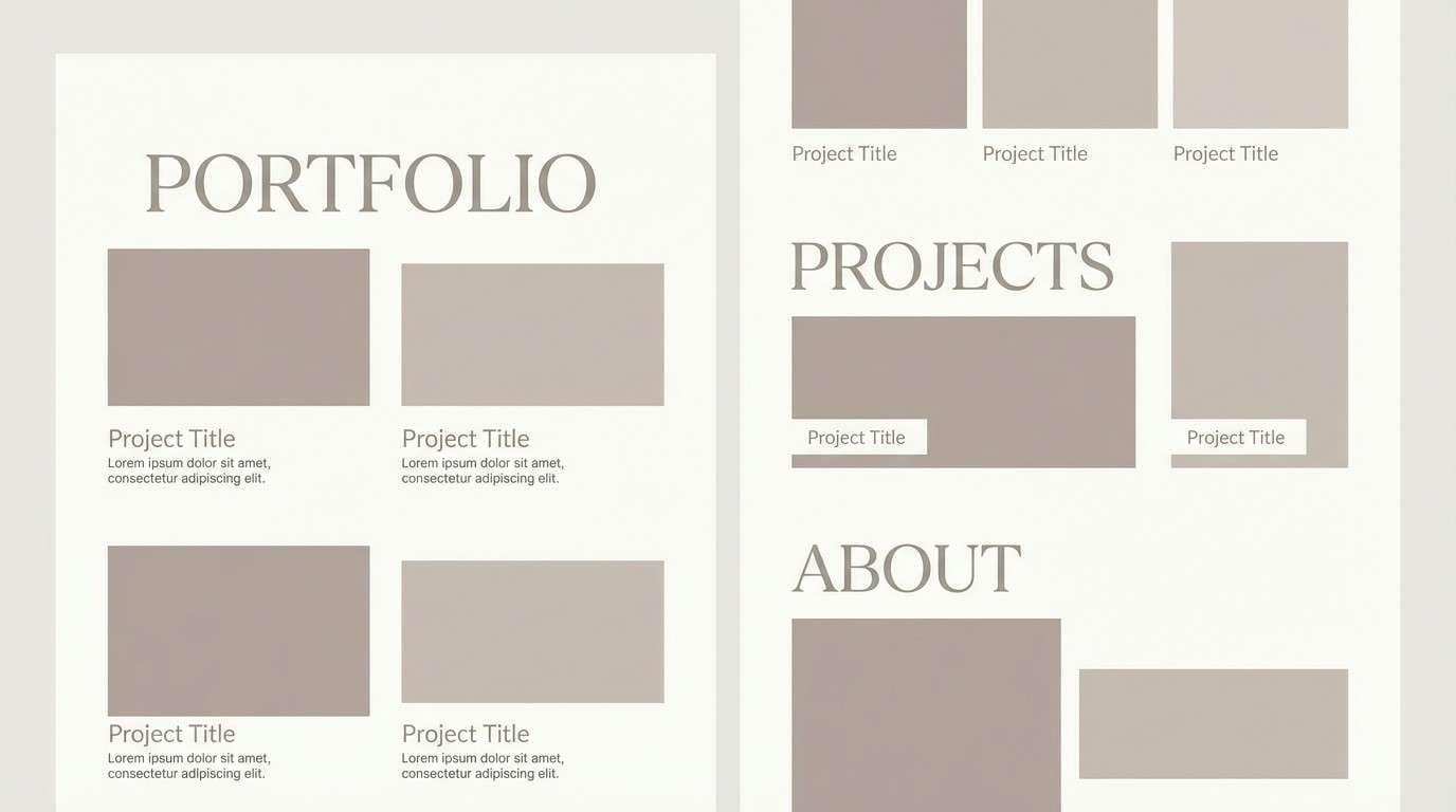
10) Pearl Powder
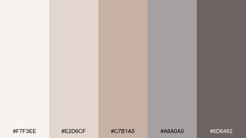
HEX: #f7f3ee #e2d6cf #c7b1a5 #a6a0a0 #6d6462
Mood: soft, minimal, sophisticated
Best for: portfolio website
Soft and minimal, like pearl powder and warm stone under diffused light. It suits portfolios, architecture studios, and personal brands that want quiet confidence. Pair the off-white and light taupe for backgrounds, and let the deeper gray-brown handle navigation and captions. Tip: add texture through spacing and type scale rather than extra colors.
Image example of pearl powder generated using media.io
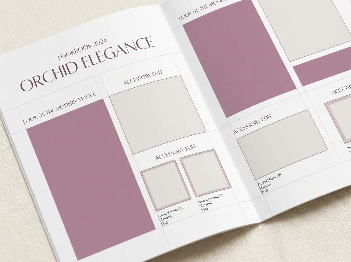
11) Orchid Boudoir
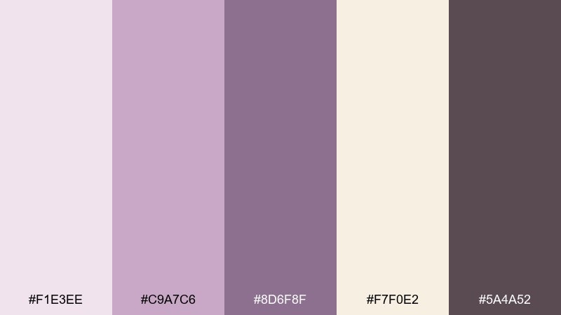
HEX: #f1e3ee #c9a7c6 #8d6f8f #f7f0e2 #5a4a52
Mood: intimate, artistic, vintage-glam
Best for: lingerie lookbook
Intimate and artistic, like orchid petals and powdery silk in a softly lit boudoir. As an edwardian color scheme, it feels luxurious without turning loud, making it ideal for lookbooks and boutique campaigns. Pair lavender and cream for the page base, then use the deep plum-gray for captions and pricing. Tip: keep photography warm and low-contrast so the mauves stay cohesive.
Image example of orchid boudoir generated using media.io
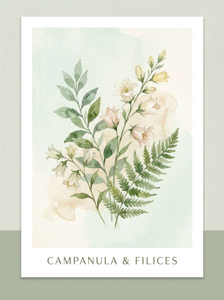
12) Conservatory Greens
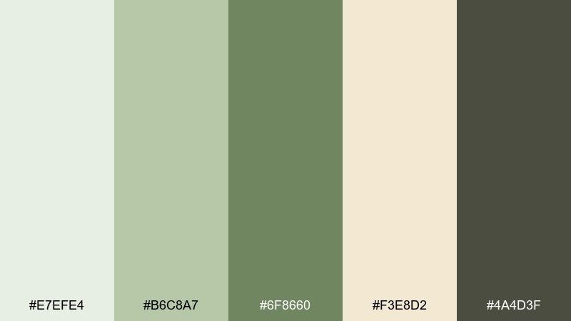
HEX: #e7efe4 #b6c8a7 #6f8660 #f3e8d2 #4a4d3f
Mood: botanical, restorative, sun-dappled
Best for: watercolor botanical print
Botanical and restorative, like a glass conservatory filled with leafy shadows. Use it for botanical prints, garden brand marks, or packaging that needs natural credibility. Pair the pale mint and cream as the paper tone, then layer mid and deep greens for stems and type. Tip: add the warm beige only in small touches to mimic aged paper, not a modern tan.
Image example of conservatory greens generated using media.io
13) Cameo Portrait
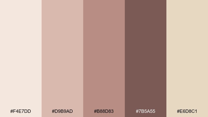
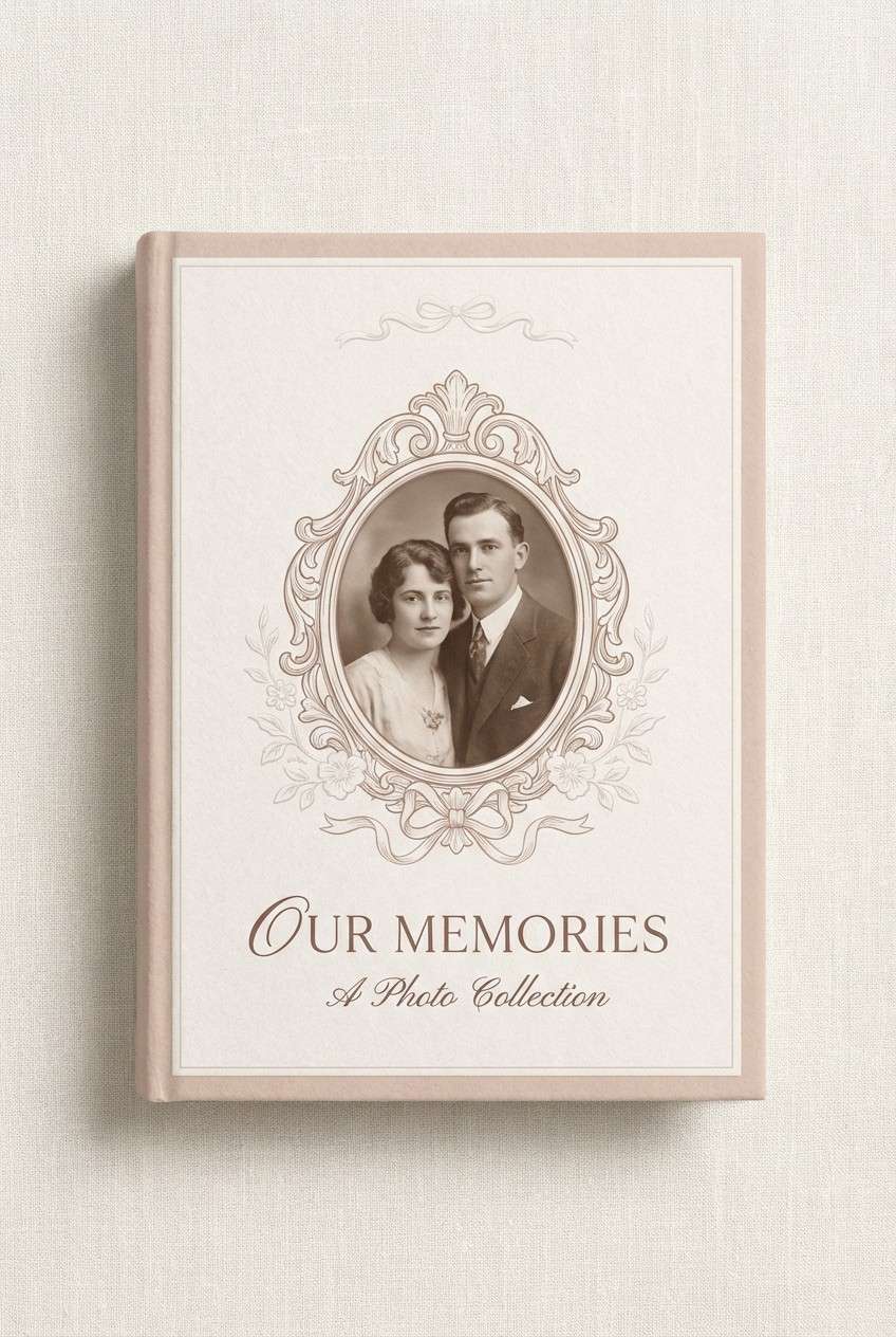
HEX: #f4e7dd #d9b9ad #b88d83 #7b5a55 #e6d8c1
Mood: nostalgic, warm, intimate
Best for: family photo album cover
Nostalgic and warm, like a cameo portrait framed in rose-tinted sepia. It works beautifully for album covers, memory books, and heritage storytelling pages. Pair the light blush-beige with cream for the cover field, then anchor titles in the deeper cocoa rose. Tip: emboss the darkest tone or use subtle foil to mimic old keepsake craftsmanship.
Image example of cameo portrait generated using media.io
14) Gilded Stationery
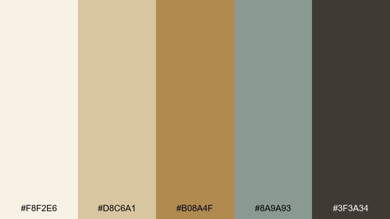
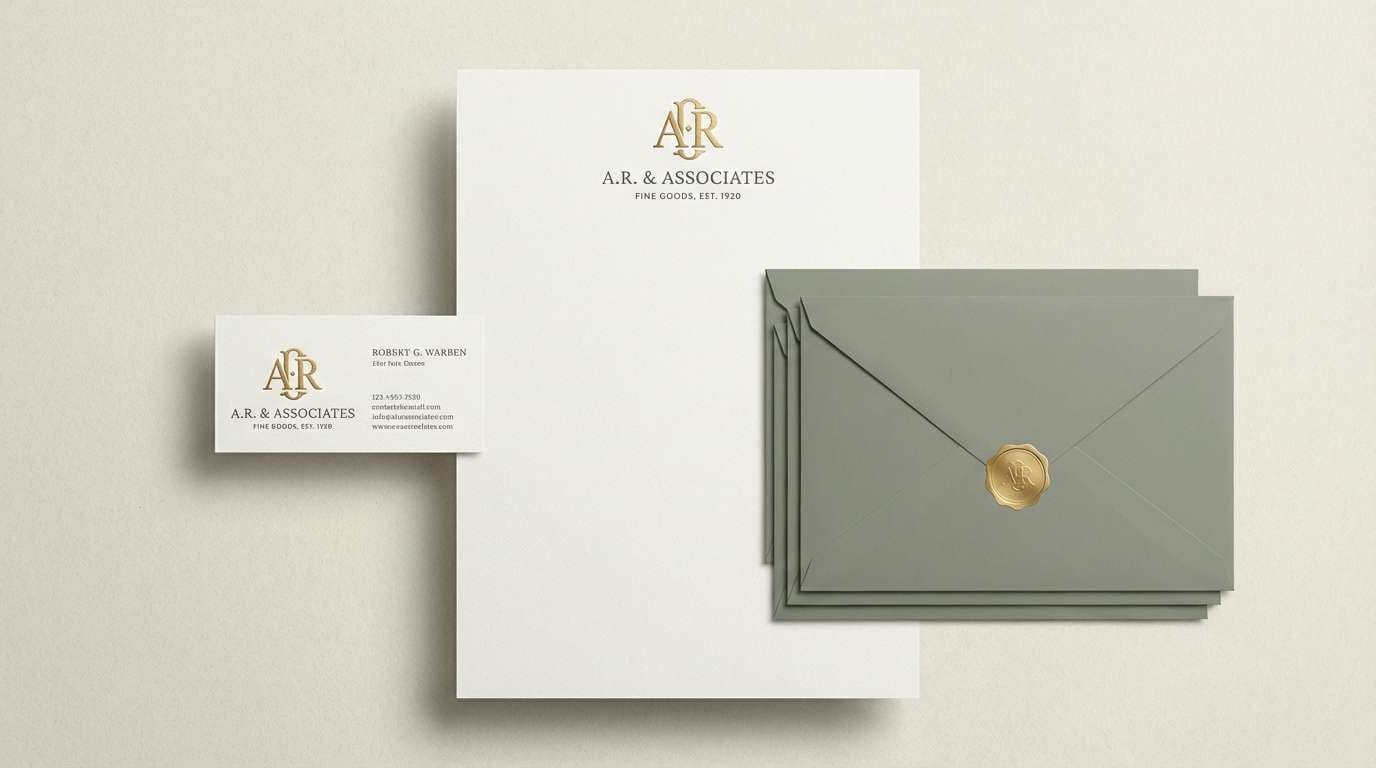
HEX: #f8f2e6 #d8c6a1 #b08a4f #8a9a93 #3f3a34
Mood: polished, classic, premium
Best for: brand stationery set
Polished and classic, like thick stationery stock with a quiet gilded edge. These edwardian color combinations are made for business cards, letterheads, and premium packaging inserts. Pair ivory and slate-brown for the main layout, then use antique gold for a crest or monogram. Tip: keep the green-gray as a background tint or envelope color to add distinction without stealing focus.
Image example of gilded stationery generated using media.io
15) Smoky Hearth
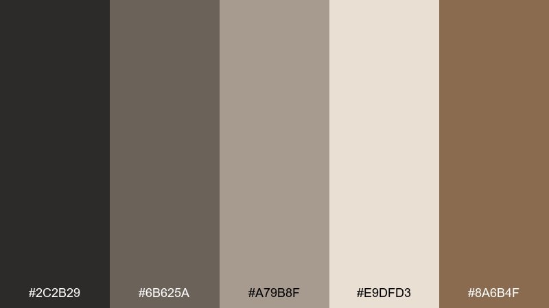
HEX: #2c2b29 #6b625a #a79b8f #e9dfd3 #8a6b4f
Mood: cozy, rustic-elegant, moody
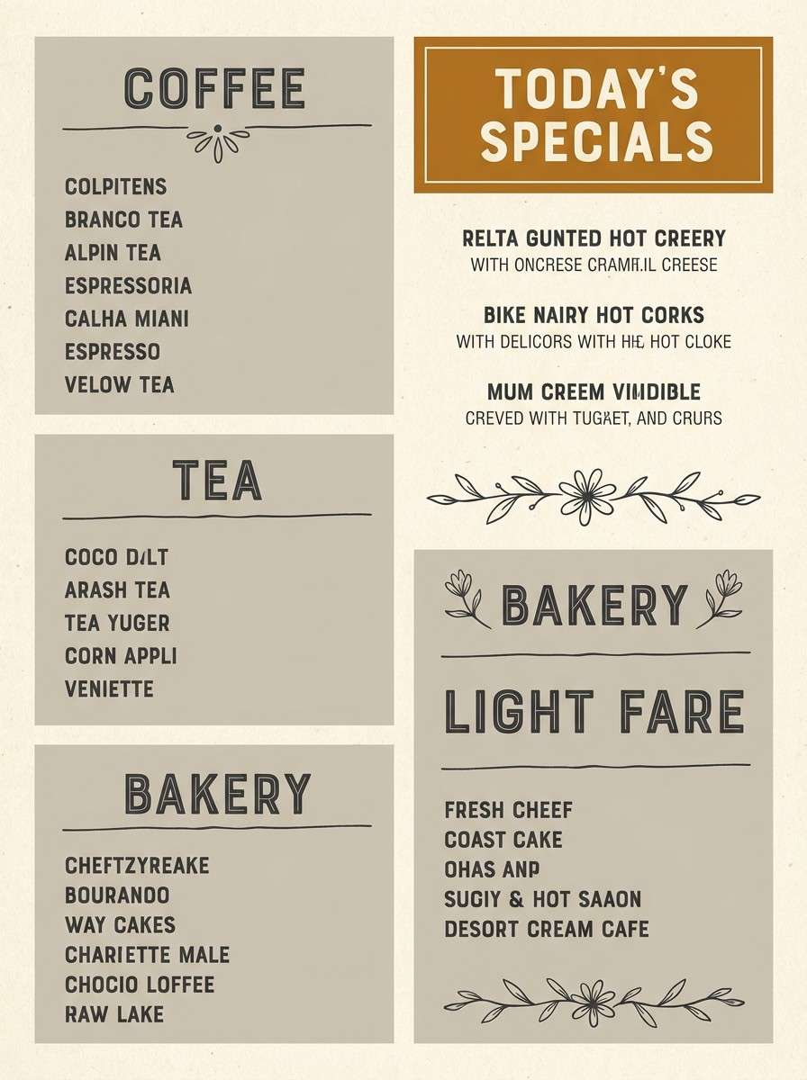
Best for: cafe menu board
Cozy and moody, like smoke curling from a hearth and settling into warm stone. It suits cafe menus, chalkboard-style posters, and seasonal campaigns that feel handmade but refined. Pair the cream and warm greige for the background, then use charcoal for pricing and headings. Tip: keep the amber-brown as a highlight for specials so the menu reads fast from a distance.
Image example of smoky hearth generated using media.io
16) Opera House
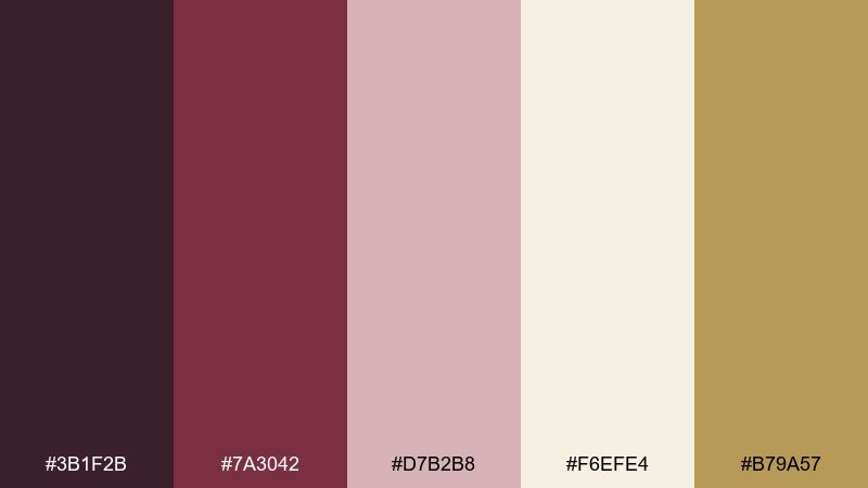
HEX: #3b1f2b #7a3042 #d7b2b8 #f6efe4 #b79a57
Mood: theatrical, elegant, celebratory
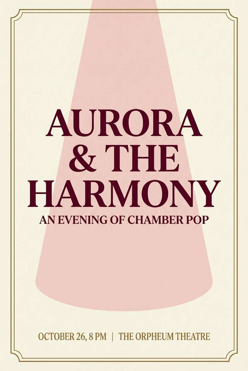
Best for: concert poster
Theatrical and elegant, like velvet seats, programs on cream paper, and warm gilded trim. Use it for concert posters, gala signage, and high-end event promos that need drama without neon. Pair the cream base with deep wine for typography, then add gold as a small framing element. Tip: let the blush serve as a soft spotlight behind the headline to guide the eye.
Image example of opera house generated using media.io
17) Botanical Plate
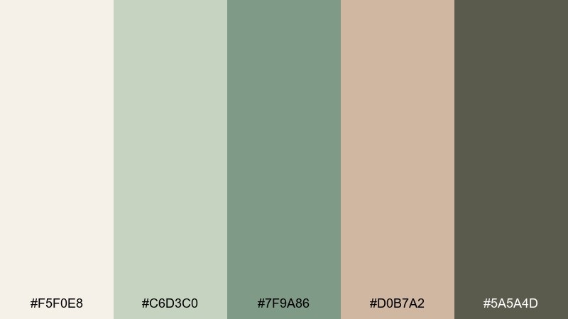
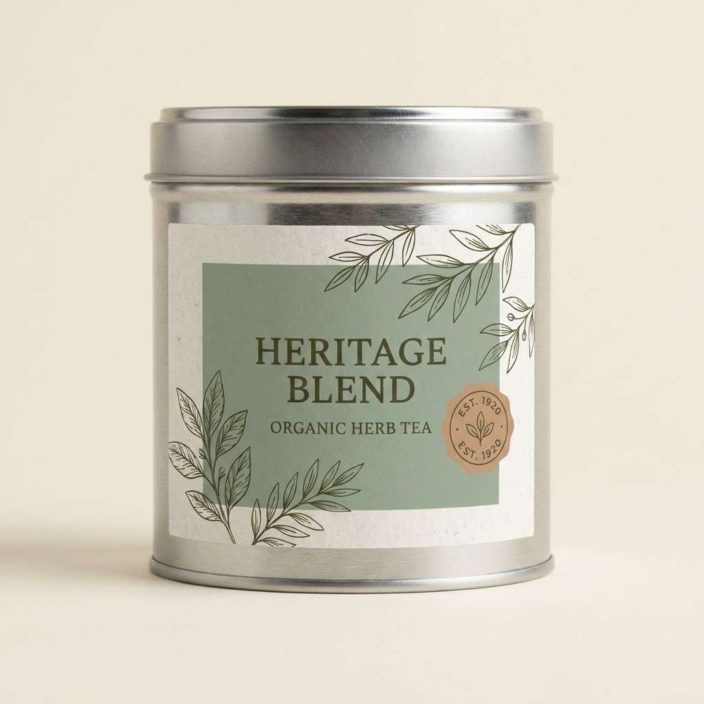
HEX: #f5f0e8 #c6d3c0 #7f9a86 #d0b7a2 #5a5a4d
Mood: natural, curated, museum-like
Best for: herb tea packaging label
Natural and curated, like a botanical plate pulled from a museum drawer. It works well for herb tea labels, pantry goods, and small-batch packaging that leans artisanal. Pair the warm paper tone with dusty green for the label field, then use the dark olive for ingredient text. Tip: keep the clay-tan as a secondary badge so the design stays calm and trustworthy.
Image example of botanical plate generated using media.io
18) Edwardian Minimal
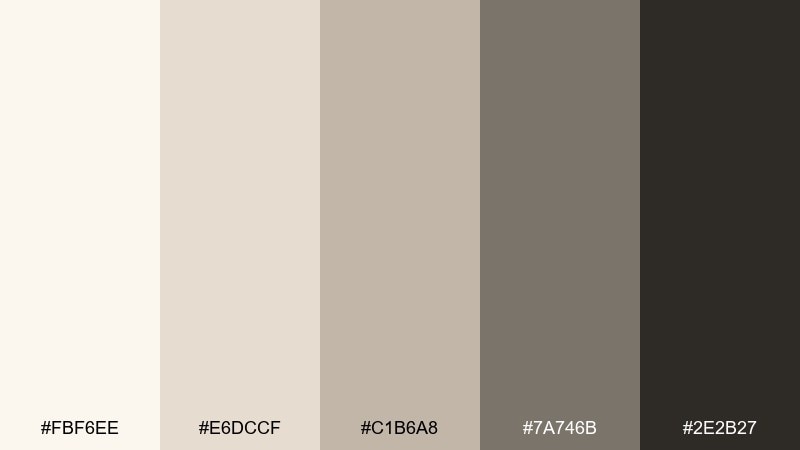
HEX: #fbf6ee #e6dccf #c1b6a8 #7a746b #2e2b27
Mood: quiet, timeless, modern-classic
Best for: presentation slide deck
Quiet and timeless, like uncoated paper, pencil lines, and well-worn bindings. This edwardian color palette feels modern when you keep the layout spare and typographic. Pair the lightest tones for backgrounds and cards, then use the near-black for headings and charts. Tip: limit graphs to one mid-tone and one dark tone so the deck stays cohesive across many slides.
Image example of edwardian minimal generated using media.io
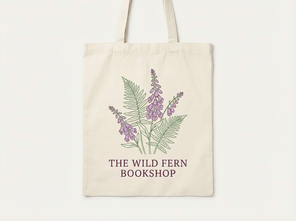
19) Foxglove and Fern
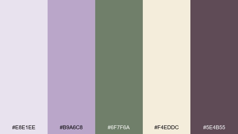
HEX: #e8e1ee #b9a6c8 #6f7f6a #f4eddc #5e4b55
Mood: poetic, floral, slightly moody
Best for: bookshop tote bag design
Poetic and floral, like foxgloves beside shaded ferns with a hint of dusk. An edwardian color combination like this suits bookshops, poetry events, and literary merch that feels thoughtful. Pair the cream with fern green for the base, then bring in lavender as a gentle motif color. Tip: print the darkest plum only for linework and type so the tote stays readable at a distance.
Image example of foxglove and fern generated using media.io
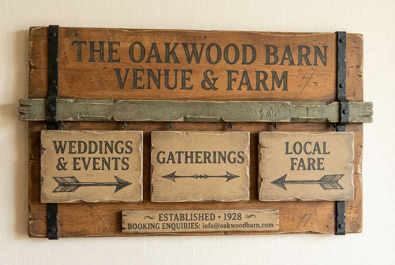
20) Carriage House
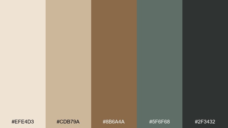
HEX: #efe4d3 #cdb79a #8b6a4a #5f6f68 #2f3432
Mood: heritage, sturdy, outdoorsy
Best for: rustic venue branding
Heritage and sturdy, like timber beams, stable doors, and sun-faded canvas. It works for rustic venue branding, signage, and wedding wayfinding that needs to feel grounded. Pair cream and tan as the base, then use the saddle brown for titles and directional arrows. Tip: keep the deep charcoal for only the most important text to ensure readability outdoors.
Image example of carriage house generated using media.io
21) Silk Umbrella
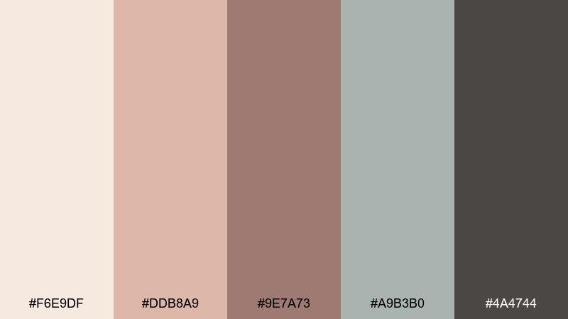
HEX: #f6e9df #ddb8a9 #9e7a73 #a9b3b0 #4a4744
Mood: soft, rainy-day, refined
Best for: fashion newsletter header
Soft and refined, like a silk umbrella on a drizzly afternoon street. It fits fashion newsletter headers, seasonal look drops, and quiet luxury social templates. Pair the blush and cream for the hero band, then use the warm taupe for typography and links. Tip: keep the cool gray-green as a thin divider or background tint to avoid a flat, overly pink layout.
Image example of silk umbrella generated using media.io
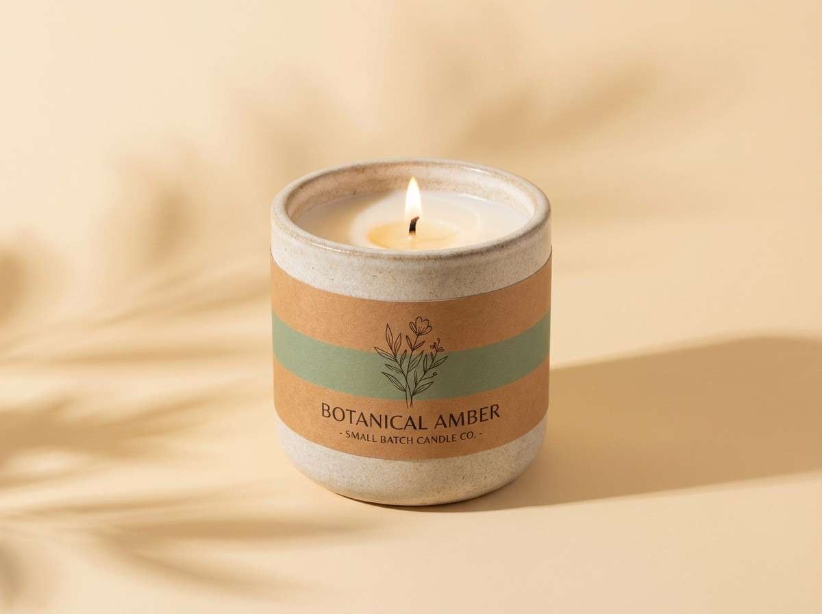
22) Amber Conservatory
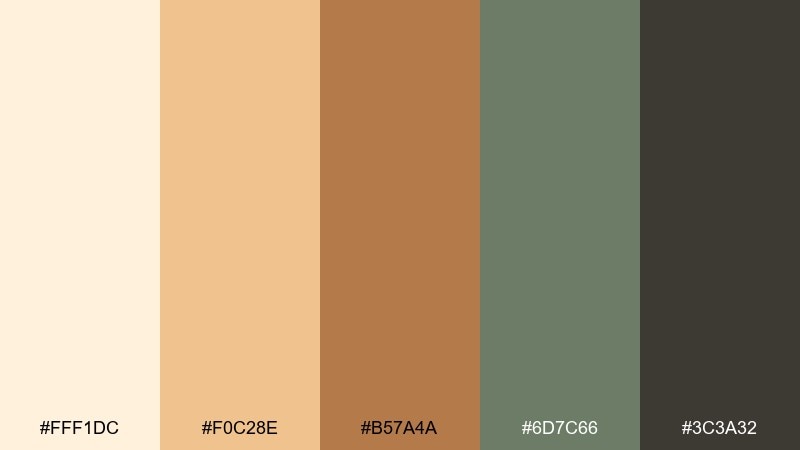
HEX: #fff1dc #f0c28e #b57a4a #6d7c66 #3c3a32
Mood: golden, botanical, optimistic
Best for: artisan candle product ad
Golden and botanical, like late sun warming glass panes and dried leaves. These edwardian color combinations bring a cozy glow to product ads, especially for candles, soaps, and home fragrance. Pair the pale amber with warm brown for the label, and use the muted green as a natural counterweight. Tip: light the scene softly so highlights stay creamy rather than turning bright yellow.
Image example of amber conservatory generated using media.io
What Colors Go Well with Edwardian?
Edwardian colors pair best with quiet neutrals like ivory, parchment, warm gray, and soft taupe. These tones act like “paper” in the design, keeping the overall look polished and readable.
For contrast, add a single deep anchor such as charcoal, wine, deep plum, or dark olive. That one darker shade helps headings, borders, and icons feel crisp without breaking the vintage softness.
If you want a touch of richness, use antique gold, brass tan, or clay-beige as a small accent. Keep metallic-like warmth minimal so the palette stays refined rather than flashy.
How to Use a Edwardian Color Palette in Real Designs
Start with a light base (cream/ivory) and choose one mid-tone for blocks or panels (sage, dusty rose, muted blue). This gives you structure while still feeling airy and classic.
Assign the darkest tone to typography and UI essentials only—navigation, pricing, form labels, or fine rules—so your hierarchy stays clear. Edwardian palettes shine when the contrast is intentional and not scattered.
Finally, treat accents as “jewelry”: one button color, one badge color, or one border color. Limiting accents makes ornate type, monograms, and vintage motifs look purposeful instead of crowded.
Create Edwardian Palette Visuals with AI
If you’re building a mood board, invitation mockup, or brand concept, AI images can help you test how your Edwardian palette behaves in real layouts. This is especially useful for checking contrast, spacing, and how “aged” or “modern” the tones feel together.
Use a consistent prompt style (subject + materials + lighting + layout) and swap only the palette cues to compare results. You’ll quickly see which shades should be backgrounds, which should be type, and which should stay as highlights.
Create your own Edwardian-inspired visuals in minutes, then refine the prompt until the mood matches your project.
Edwardian Color Palette FAQs
-
What defines an Edwardian color palette?
An Edwardian color palette typically uses soft creams, dusty florals, muted greens/blues, and a deep ink-like neutral for contrast. The overall effect is airy, refined, and slightly antique rather than bright or modern-saturated. -
Are Edwardian colors the same as Victorian colors?
They’re related but not identical. Victorian palettes often feel heavier and darker, while Edwardian palettes tend to be lighter, cleaner, and more pastel-leaning, with more “breathing room” and softer contrast. -
What background color works best for Edwardian designs?
Warm ivory, parchment, and off-white are the most reliable bases because they mimic paper and keep typography readable. They also make dusty roses, sages, and muted blues feel authentic instead of overly sweet. -
How do I keep an Edwardian palette from looking washed out?
Add one strong anchor (charcoal, deep taupe, wine, or dark olive) and use it consistently for text and key UI elements. Then keep mid-tones for panels and accents rather than using only pale shades everywhere. -
Can I use an Edwardian color scheme for modern UI?
Yes—Edwardian palettes work well in modern UI when layouts are minimal and typographic. Use cream or off-white backgrounds, reserve the darkest shade for text, and choose one accent (like brass tan) for primary actions. -
What accent colors pair well with Edwardian palettes?
Antique gold/brass, driftwood tan, clay-beige, and muted teal-gray are strong accent choices. Use accents sparingly—logos, buttons, thin borders, or small badges—so the look stays elegant. -
How can I generate Edwardian palette mockups quickly?
Use a text-to-image tool to create invitation suites, packaging, posters, or UI mockups with prompts that specify “cream paper,” “muted sage,” “dusty rose,” and “antique gold accents.” Generate a few variations and keep the one with the clearest contrast and most cohesive mood.


