

Dark tangerine is a warm orange that feels confident, energetic, and slightly earthy—making it a versatile anchor for modern palettes.
Below are dark tangerine color palette ideas with HEX codes you can use for branding, UI, posters, packaging, and cozy interior mood boards.
In this article
Why Dark Tangerine Palettes Work So Well
Dark tangerine sits in the sweet spot between bright orange and earthy terracotta, so it can read playful or premium depending on what you pair it with. It adds instant warmth without looking flat.
It also performs well as an accent color: a little goes a long way for buttons, badges, highlights, and calls to action. When you anchor it with charcoal, navy, slate, or warm neutrals, it stays sophisticated.
Because dark tangerine naturally suggests sunlight, spice, and energy, it’s a great choice for brands that want approachability plus momentum—especially in UI where contrast and hierarchy matter.
20+ Dark Tangerine Color Palette Ideas (with HEX Codes)
1) Citrus Noir
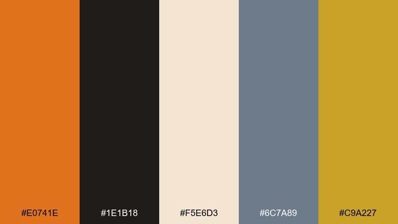
HEX: #e0741e #1e1b18 #f5e6d3 #6c7a89 #c9a227
Mood: bold, editorial, moody
Best for: fashion branding and lookbooks
Bold, editorial contrast that feels like a late-night gallery opening lit by warm amber. The deep near-black anchors the orange so it reads premium instead of loud. Pair it with creamy paper textures and a touch of muted steel for modern balance. Usage tip: keep the orange for headlines and small blocks, then let the dark base do the heavy lifting.
Image example of citrus noir generated using media.io

Media.io is an online AI studio for creating and editing video, image, and audio in your browser.

2) Terracotta Linen
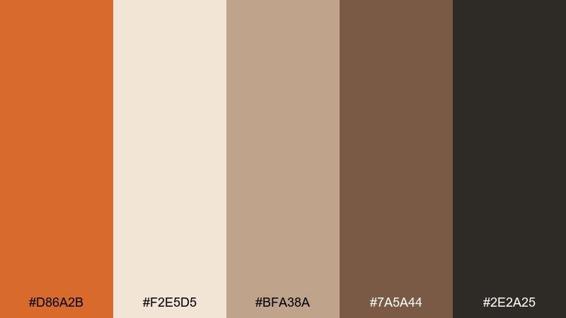
HEX: #d86a2b #f2e5d5 #bfa38a #7a5a44 #2e2a25
Mood: warm, rustic, grounded
Best for: home decor mood boards
Warm, rustic tones that evoke sunbaked clay, linen drapes, and handmade ceramics. This dark tangerine color combination works best when the lighter neutrals take the largest area. Add the cocoa brown for depth in typography or trim. Usage tip: use the mid tan as a bridge color between the orange and the dark accents for a softer transition.
Image example of terracotta linen generated using media.io
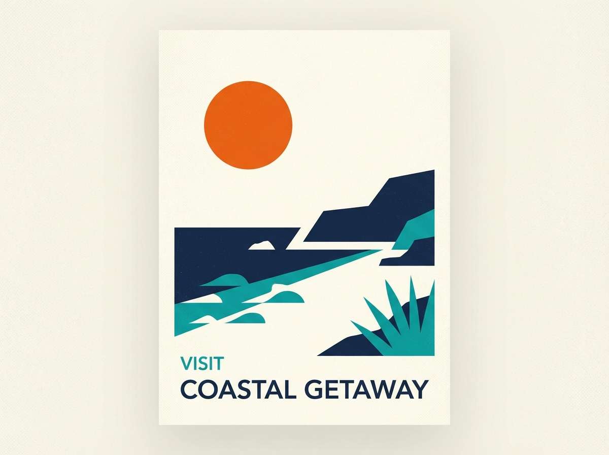
3) Sunset Harbor
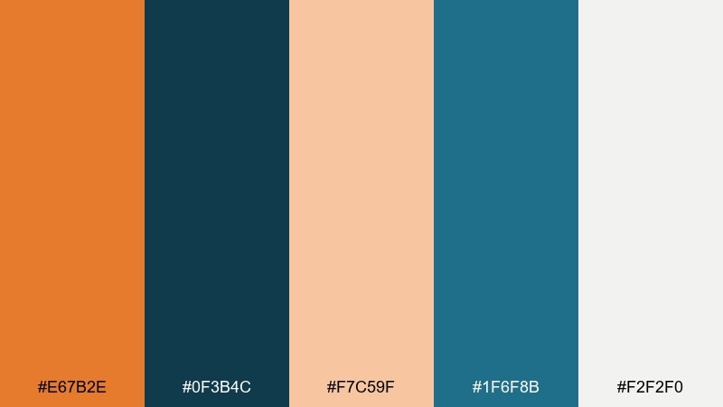
HEX: #e67b2e #0f3b4c #f7c59f #1f6f8b #f2f2f0
Mood: fresh, coastal, confident
Best for: travel posters and destination ads
Fresh coastal energy, like a harbor at golden hour with cool water shadows. The navy and teal keep the orange from feeling too autumnal, making it crisp for travel work. Pair it with clean off-white space and simple geometric shapes. Usage tip: reserve teal for secondary icons and let the orange own the main call to action.
Image example of sunset harbor generated using media.io
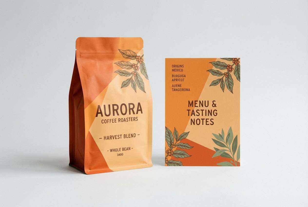
4) Spiced Apricot
HEX: #f08a3c #ffd7b0 #a64b2a #5e6b4e #2b2b2b
Mood: cozy, appetizing, artisanal
Best for: coffee packaging and cafe menus
Cozy, appetizing warmth that brings to mind baked fruit, cinnamon bark, and wood shelves. The green adds a savory counterpoint, perfect for food brands that want depth. Pair the pale apricot with dark type for readability. Usage tip: use the darkest brown for body text and keep the orange for badges and flavor cues.
Image example of spiced apricot generated using media.io
5) Amber Slate
HEX: #d9772a #2f3a44 #8fa1b3 #f1efe9 #b65d1a
Mood: modern, professional, steady
Best for: SaaS branding and landing pages
Modern and steady, like warm light hitting brushed metal in a clean workspace. This dark tangerine color palette feels reliable when slate and blue-gray dominate the layout. Pair it with generous off-white margins and crisp sans serif type. Usage tip: keep the deeper orange as a hover or active state to make interactions feel intentional.
Image example of amber slate generated using media.io

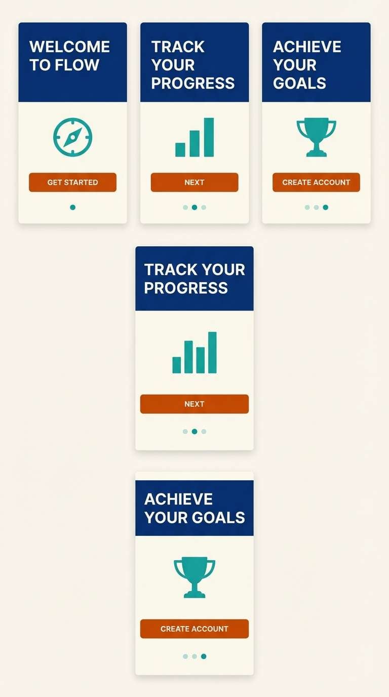
6) Tangerine Teal
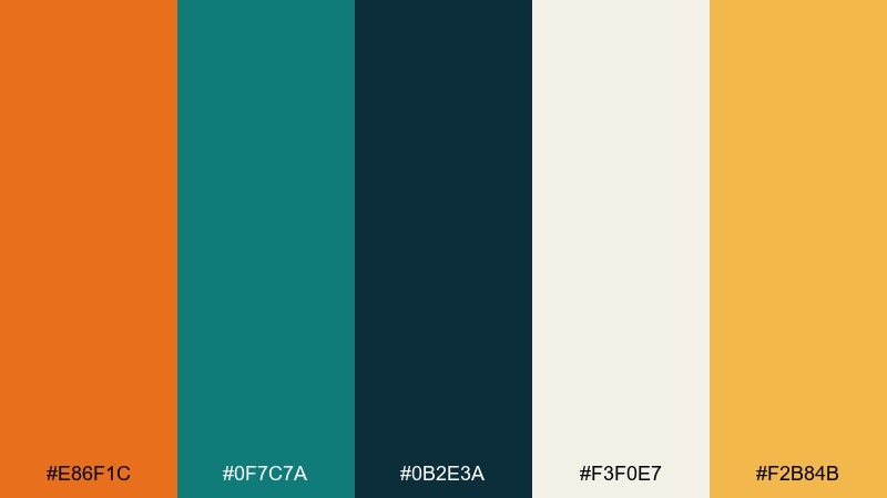
HEX: #e86f1c #0f7c7a #0b2e3a #f3f0e7 #f2b84b
Mood: vibrant, sporty, energetic
Best for: app onboarding screens
Vibrant, sporty energy that feels like a sunrise run beside cool water. Dark tangerine color combinations shine here because teal brings instant contrast without turning harsh. Pair the off-white with generous padding so the interface stays breathable. Usage tip: use the golden accent for progress indicators and reserve teal for secondary actions.
Image example of tangerine teal generated using media.io
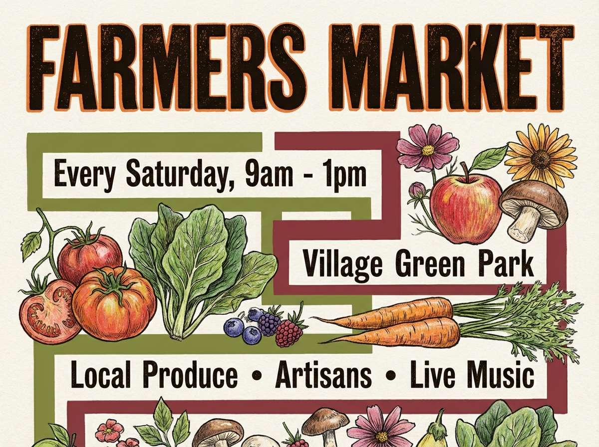
7) Autumn Market
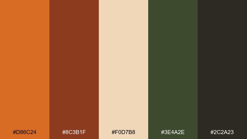
HEX: #d86c24 #8c3b1f #f0d7b8 #3e4a2e #2c2a23
Mood: earthy, nostalgic, hearty
Best for: farmers market flyers
Earthy, nostalgic warmth that recalls stacked pumpkins, kraft paper tags, and dried herbs. The deep maroon and olive give the orange a handcrafted, seasonal edge. Pair it with simple illustrations and chunky headings for quick readability. Usage tip: print on uncoated stock to make the tones look richer and more natural.
Image example of autumn market generated using media.io
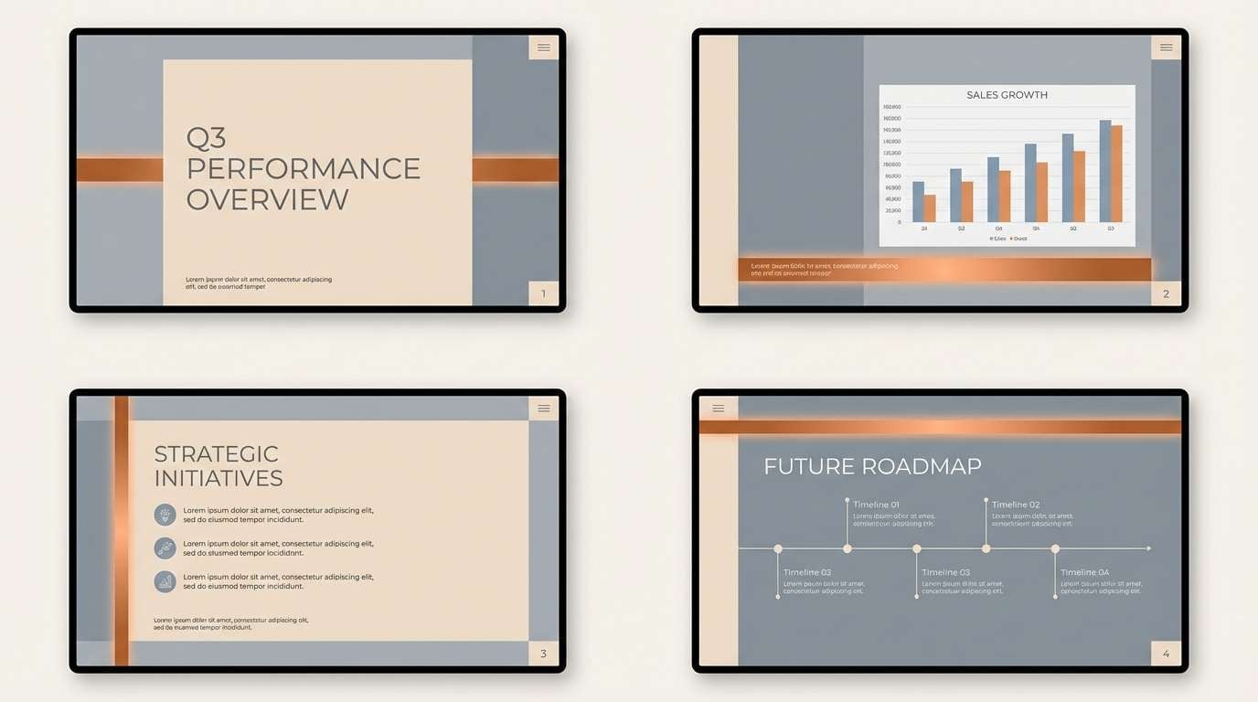
8) Copper Cloud
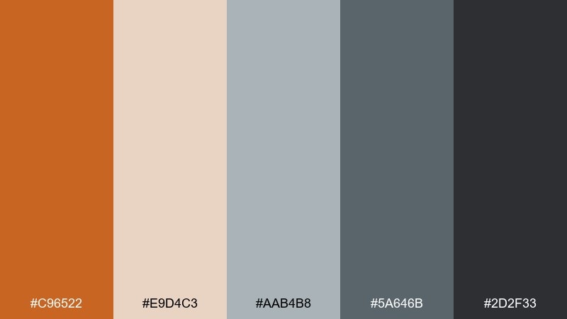
HEX: #c96522 #e9d4c3 #aab4b8 #5a646b #2d2f33
Mood: calm, industrial, refined
Best for: presentation templates
Calm and refined, like copper details against soft fog and concrete. The cool grays prevent the orange from overpowering slides and charts. Pair it with minimal line icons and consistent spacing. Usage tip: set the orange as your highlight color for key numbers and keep the rest in gray for clarity.
Image example of copper cloud generated using media.io
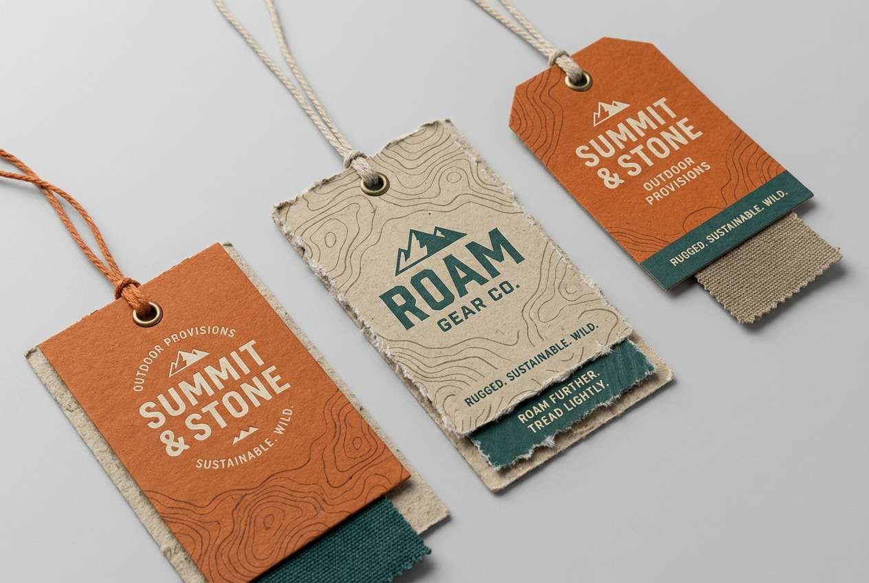
9) Desert Dusk
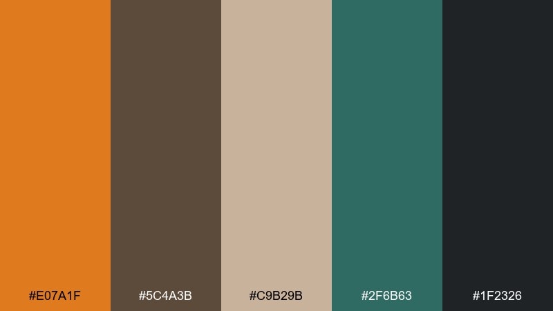
HEX: #e07a1f #5c4a3b #c9b29b #2f6b63 #1f2326
Mood: adventurous, grounded, cinematic
Best for: outdoor brand packaging
Adventurous and cinematic, like desert trails cooling down after sunset. The teal-green feels like an oasis note against sand and stone browns. Pair it with rugged typography and simple badge marks. Usage tip: use the darkest tone for outlines and labels so the warm hues stay the star.
Image example of desert dusk generated using media.io
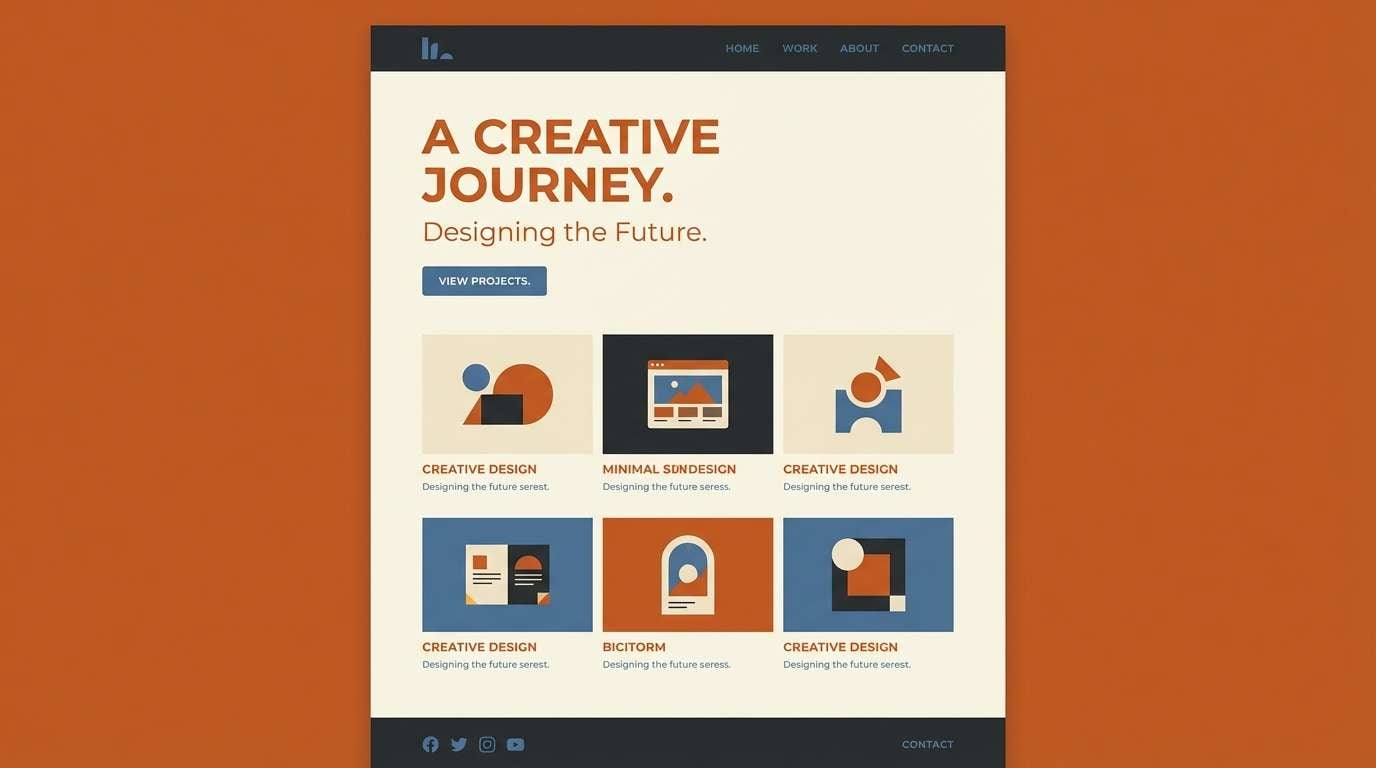
10) Persimmon Studio
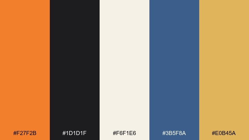
HEX: #f27f2b #1d1d1f #f6f1e6 #3b5f8a #e0b45a
Mood: creative, polished, high-contrast
Best for: portfolio websites
Creative polish with high contrast, like studio spotlights on a warm backdrop. This dark tangerine color scheme gains sophistication from inky charcoal and a denim-blue accent. Pair it with generous whitespace to keep the layout modern. Usage tip: use the golden tone for subtle dividers and hover states instead of adding extra colors.
Image example of persimmon studio generated using media.io
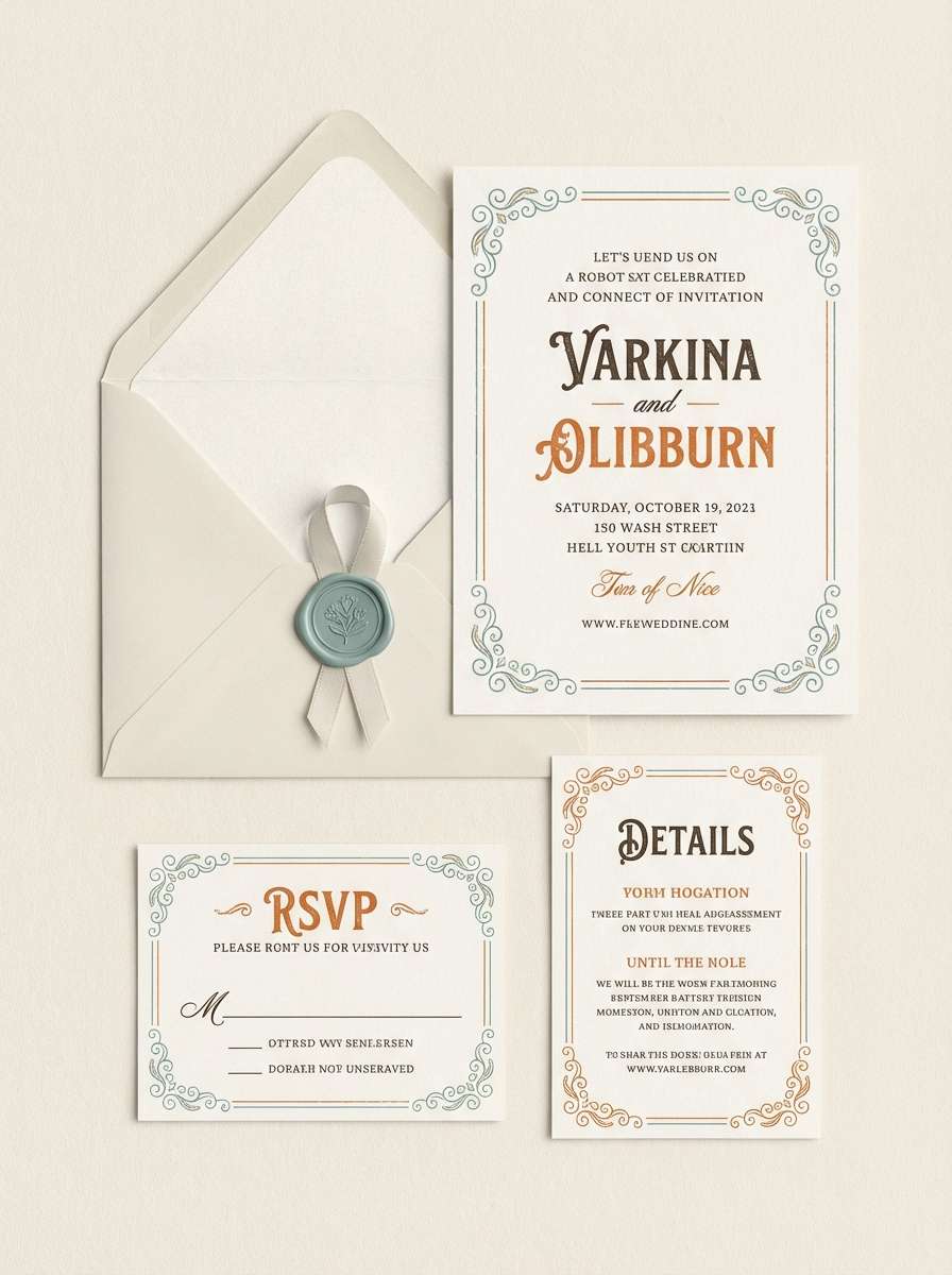
11) Vintage Postcard
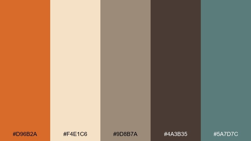
HEX: #d96b2a #f4e1c6 #9d8b7a #4a3b35 #5a7d7c
Mood: nostalgic, soft, travel-worn
Best for: wedding stationery suites
Nostalgic softness that feels like sun-faded ink on a well-traveled postcard. The muted teal acts as a gentle counterbalance to the warm orange and browns. Pair it with textured paper and elegant serif type for a timeless look. Usage tip: keep the orange for monograms or small flourishes so the suite stays delicate.
Image example of vintage postcard generated using media.io
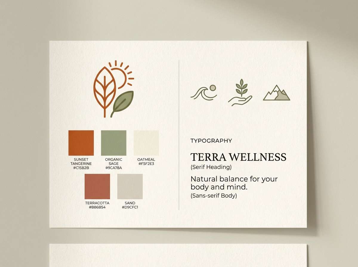
12) Clay & Sage
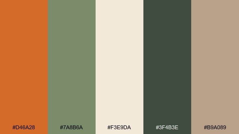
HEX: #d46a28 #7a8b6a #f3e9da #3f4b3e #b9a089
Mood: natural, balanced, calming
Best for: wellness brand identity
Natural balance that evokes terracotta planters, crushed herbs, and warm sunlight. Sage greens keep the palette calm and make the orange feel more organic. Pair it with soft gradients or paper grain for a gentle finish. Usage tip: use sage for backgrounds and let the orange mark key benefits and icons.
Image example of clay & sage generated using media.io
13) Bonfire Night
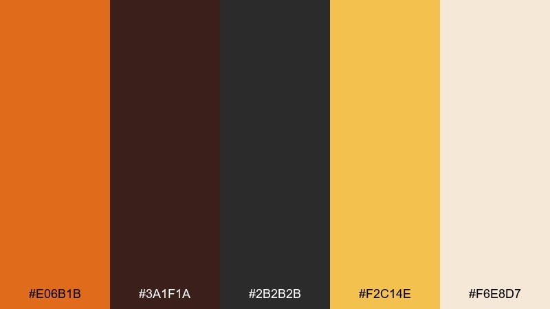
HEX: #e06b1b #3a1f1a #2b2b2b #f2c14e #f6e8d7
Mood: dramatic, warm, festive
Best for: event posters and ticket graphics
Dramatic warmth like sparks against a night sky, with ember gold lighting up the edges. The deep browns and black give the orange a loud, celebratory punch without feeling childish. Pair it with bold condensed type and simple icons. Usage tip: use the cream as a spotlight zone for dates and venue details.
Image example of bonfire night generated using media.io

14) Orchard Cream
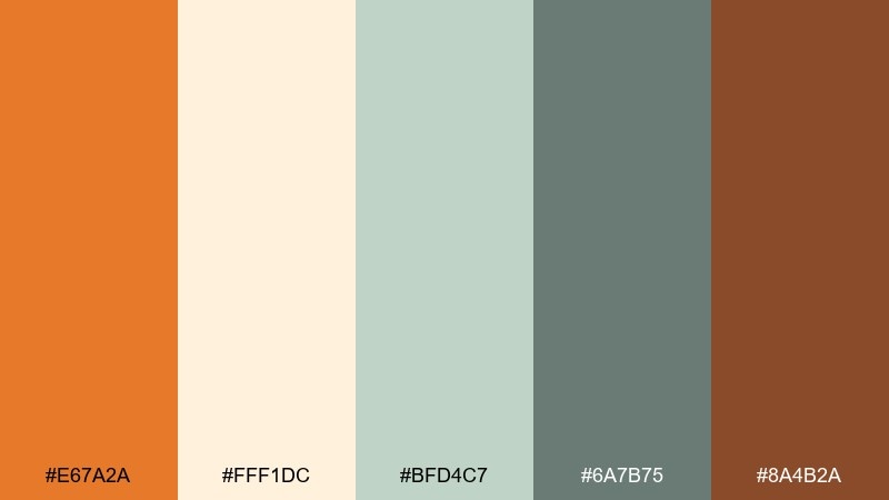
HEX: #e67a2a #fff1dc #bfd4c7 #6a7b75 #8a4b2a
Mood: fresh, airy, wholesome
Best for: organic food labels
Fresh, airy tones that feel like an orchard picnic with light cream and soft greens. The gentle minty notes keep the orange bright and clean for food and beverage work. Pair it with simple illustrations and plenty of breathing room. Usage tip: print the orange as a spot color for consistent vibrancy across label batches.
Image example of orchard cream generated using media.io
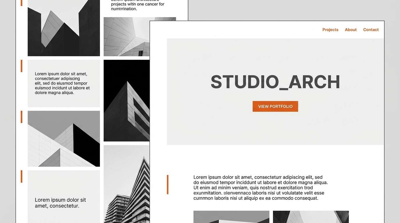
15) Urban Brick
HEX: #c85d22 #2b3036 #c7cdd1 #f2f2f2 #7b4a2e
Mood: urban, clean, understated
Best for: architecture studio websites
Urban understatement, like brick warmed by afternoon light against steel and concrete. The grays keep the orange grounded and modern rather than playful. Pair it with sharp grids, thin rules, and monochrome photography. Usage tip: use the orange sparingly for navigation highlights and key links to avoid visual noise.
Image example of urban brick generated using media.io
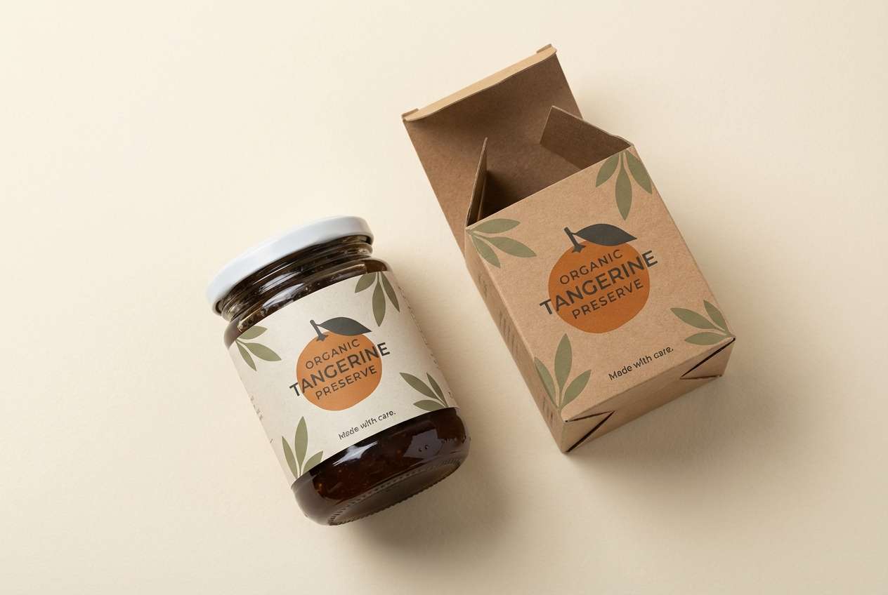
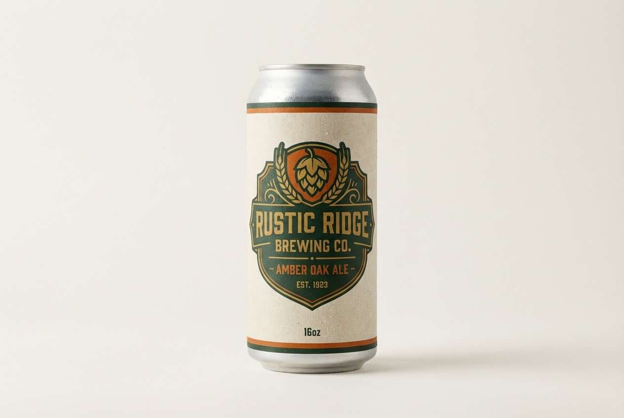
16) Golden Rust
HEX: #d46b1e #b97a2b #5b3a29 #e7d6c5 #2c3e3a
Mood: heritage, outdoorsy, tactile
Best for: craft beer can designs
Heritage warmth with a tactile, outdoorsy feel, like worn leather and brass hardware. The deep green adds a classic counterweight that makes the oranges feel aged and intentional. Pair it with badge logos and textured patterns. Usage tip: keep the cream for negative space so the darker tones do not crowd the design.
Image example of golden rust generated using media.io
17) Warm Minimal UI
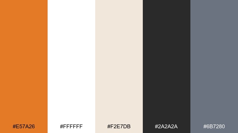
HEX: #e57a26 #ffffff #f2e7db #2a2a2a #6b7280
Mood: minimal, friendly, modern
Best for: mobile UI kits
Minimal and friendly, like warm sunlight on a white desk with a single bold accent. This dark tangerine color palette is ideal when you want one standout action color without sacrificing clarity. Pair it with charcoal text and soft warm grays for surfaces. Usage tip: use the orange only for primary buttons and toggles to keep accessibility strong.
Image example of warm minimal ui generated using media.io
18) Botanical Tangerine
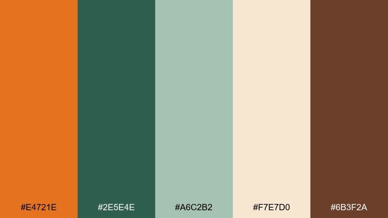
HEX: #e4721e #2e5e4e #a6c2b2 #f7e7d0 #6b3f2a
Mood: fresh, botanical, soothing
Best for: spring illustrations and greeting cards
Fresh botanical calm, like citrus blossoms and leafy stems painted in soft washes. The layered greens keep the orange from dominating and help it feel natural. Pair it with hand-lettered type and textured paper backgrounds. Usage tip: choose one green as your shadow tone so the illustration stays cohesive.
Image example of botanical tangerine generated using media.io
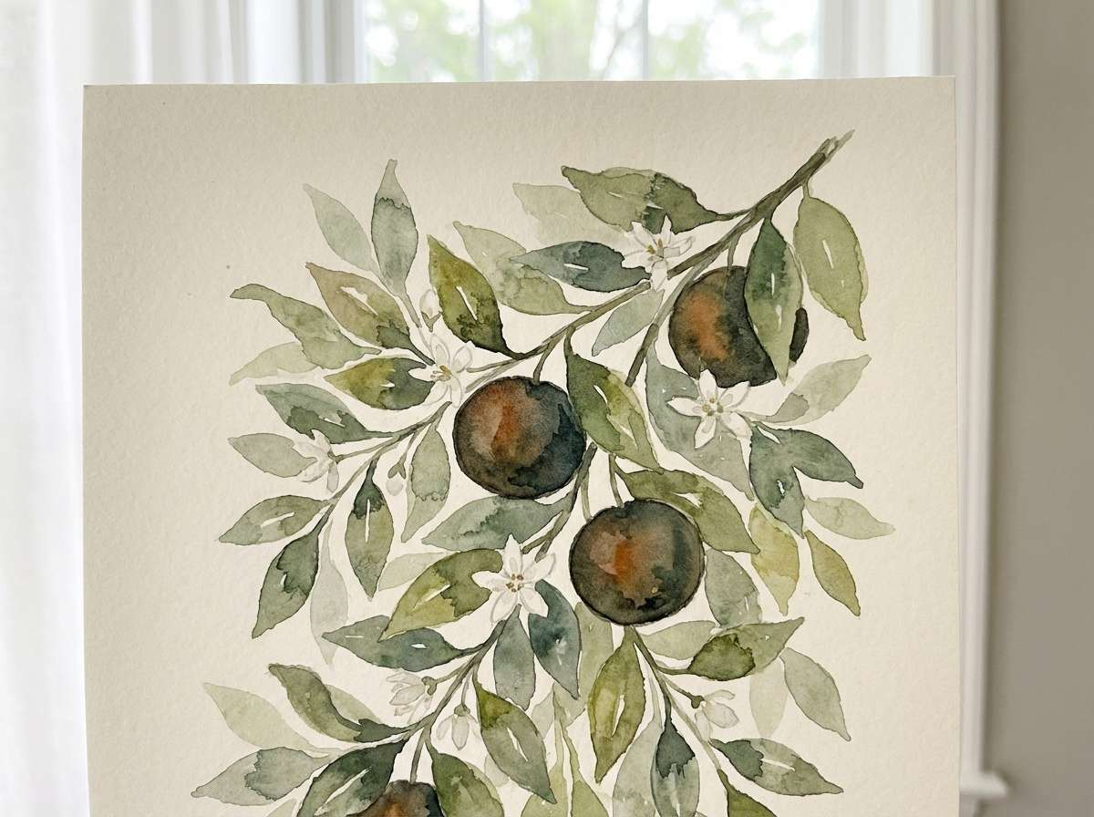
19) Festival Poster
HEX: #f06e1d #f2c94c #1b3a57 #f6f1e9 #d64545
Mood: playful, loud, contemporary
Best for: music festival posters
Playful and loud, like stage lights bouncing off bold paper shapes. Dark tangerine color combinations feel extra modern here when grounded by navy and warmed with sunny yellow. Pair it with big type and simple geometry for instant impact from a distance. Usage tip: keep the red as a tiny accent for dates or sold-out tags, not a main block.
Image example of festival poster generated using media.io

20) Cozy Cabin
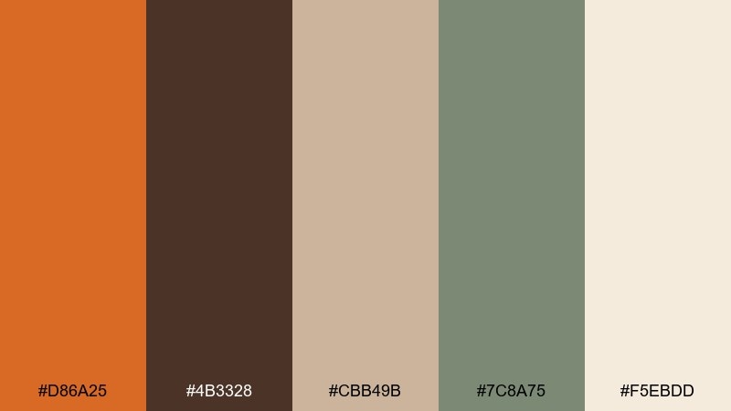
HEX: #d86a25 #4b3328 #cbb49b #7c8a75 #f5ebdd
Mood: cozy, calm, lived-in
Best for: lifestyle blog headers
Cozy cabin comfort, like knit blankets, warm wood, and late-afternoon tea. The sage gray-green cools the orange just enough to feel relaxed. Pair it with soft photography and serif headlines for a homey vibe. Usage tip: use the cream as the background and bring in orange only for small highlights and icons.
Image example of cozy cabin generated using media.io
What Colors Go Well with Dark Tangerine?
Dark tangerine pairs beautifully with deep neutrals like charcoal, near-black, espresso brown, and slate gray. These shades keep the orange looking premium and give you strong contrast for typography and UI components.
For cooler balance, reach for teal, denim blue, navy, and blue-gray—these complements make dark tangerine feel crisp and contemporary instead of overly seasonal. Off-white, cream, and warm paper tones also help the palette breathe.
If you want an earthy direction, add sage, olive, sand, and clay browns. This combination reads natural and grounded, which is great for wellness, food, and decor.
How to Use a Dark Tangerine Color Palette in Real Designs
Use dark tangerine as an accent first: primary buttons, key icons, badges, and highlights. Keeping it to a small percentage of the layout makes your hierarchy clearer and prevents the interface from feeling too loud.
For print, dark tangerine excels in headlines, shapes, and callouts, especially when you pair it with textured creams or uncoated paper aesthetics. Add a dark base (charcoal or deep brown) for legibility and a cool accent (teal or slate) for modern contrast.
In branding systems, define one main orange, one deeper hover/active orange, and two neutrals (light surface + dark text). This keeps your components consistent across web, packaging, and social templates.
Create Dark Tangerine Palette Visuals with AI
If you already have HEX codes but need visuals—posters, UI mockups, label concepts, or mood boards—AI image generation can help you explore styles quickly without starting from a blank canvas.
Use the prompts above as templates, then swap in your product, layout type, and aspect ratio. Keep the color words (dark tangerine, cream, slate, teal, etc.) consistent so the outputs stay on palette.
Generate a few variations, pick the strongest composition, and iterate by tightening the prompt (typography style, negative space, material texture) until it matches your brand.
Dark Tangerine Color Palette FAQs
-
What is the HEX code for dark tangerine?
Dark tangerine can vary by palette, but common options in this article include #e0741e, #e07a1f, and #d9772a—each a warm orange with deeper, slightly earthy undertones. -
Is dark tangerine more “orange” or “terracotta”?
It’s in-between: brighter than terracotta but more grounded than a vivid neon orange. Pair it with cream for a sunny feel, or with browns/clays for a more terracotta-leaning look. -
What’s the best contrasting accent for dark tangerine?
Teal and blue-green accents are a top choice because they sit opposite orange on the color wheel, creating strong but pleasant contrast. Navy and slate blue also work when you want a more professional vibe. -
Can I use dark tangerine in a minimalist UI?
Yes—use it as a single primary action color (buttons, toggles, active states) and keep backgrounds white/off-white with charcoal text. This preserves clarity and helps accessibility. -
How do I keep dark tangerine from feeling too “autumn”?
Balance it with cool tones like teal, navy, steel blue, and neutral grays. Also increase white space and use cleaner typography to push the look toward modern rather than seasonal. -
What neutrals pair best with dark tangerine?
Cream, warm off-white, beige paper tones, and charcoal are the most reliable. These neutrals make dark tangerine look richer and keep text and UI elements readable. -
How can I generate dark tangerine palette images for my brand?
Use Media.io’s text-to-image tool with a clear prompt that includes your subject (poster/UI/label), your style (minimal, editorial, watercolor), and your color words plus HEX references if needed, then iterate with small changes.
Next: Subway Color Palette


