

Blue rose palettes blend cool blues with romantic lilacs and soft blushes, making them feel both modern and floral. They’re a strong choice when you want elegance without the heaviness of pure navy or the sweetness of all-pink tones.
Below are 20 blue rose color palette ideas with HEX codes, mood notes, and practical pairing tips for branding, UI, weddings, and artwork.
In this article
- Why Blue Rose Palettes Work So Well
-
- midnight petal
- velvet bloom
- rainwashed rose
- mauve twilight
- icy petal pop
- cloudy periwinkle
- antique rose blue
- neon orchid edge
- sage stem contrast
- cocoa petal
- silver lining
- blush navy mix
- sunlit lilac
- graphite orchid
- berry sorbet
- coastal blue rose
- tea rose neutral
- electric iris poster
- minimal rose tech
- watercolor garden
- What Colors Go Well with Blue Rose?
- How to Use a Blue Rose Color Palette in Real Designs
- Create Blue Rose Palette Visuals with AI
Why Blue Rose Palettes Work So Well
Blue rose palettes are compelling because they sit between calm and romantic: blues communicate trust and clarity, while rose-lilac notes add softness and emotion. That balance makes the scheme versatile across both editorial and product-driven layouts.
They also create natural depth. Deep indigos and navy-plums anchor typography and navigation, mid periwinkles handle buttons and highlights, and pale porcelain tints give you airy whitespace that still feels on-theme.
Finally, blue rose tones photograph and render beautifully in gradients. Subtle transitions between indigo, periwinkle, and lavender often look premium without needing heavy textures or complex effects.
20+ Blue Rose Color Palette Ideas (with HEX Codes)
1) Midnight Petal
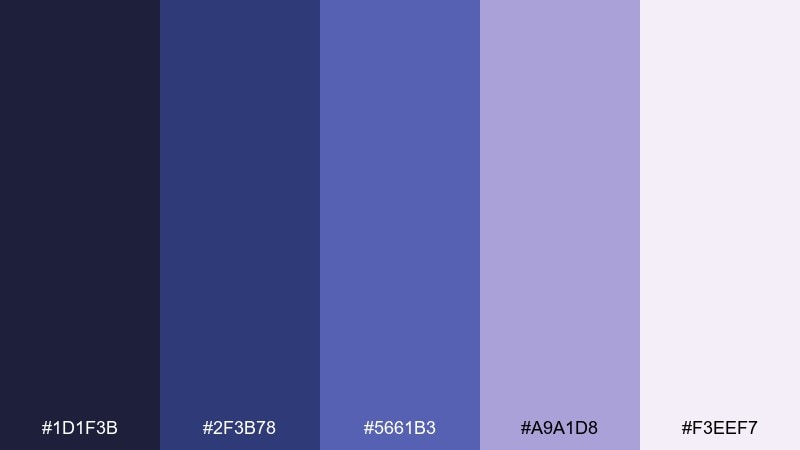
HEX: #1d1f3b #2f3b78 #5661b3 #a9a1d8 #f3eef7
Mood: moody, elegant, nocturnal
Best for: Luxury branding and editorial headers
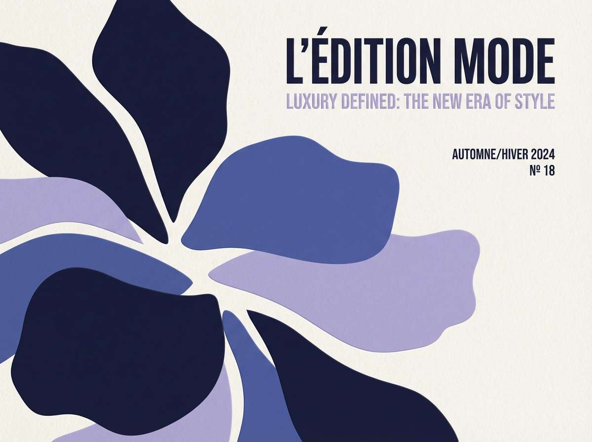
Moody and velvety, these tones feel like twilight roses under city lights. The deep indigo base gives layouts instant sophistication, while lavender keeps it romantic instead of heavy. Use the light porcelain tint for generous whitespace and the periwinkle for buttons or pull quotes. Pair with thin serif typography and subtle grain for a high-end finish.
Image example of midnight petal generated using media.io
Media.io is an online AI studio for creating and editing video, image, and audio in your browser.

2) Velvet Bloom
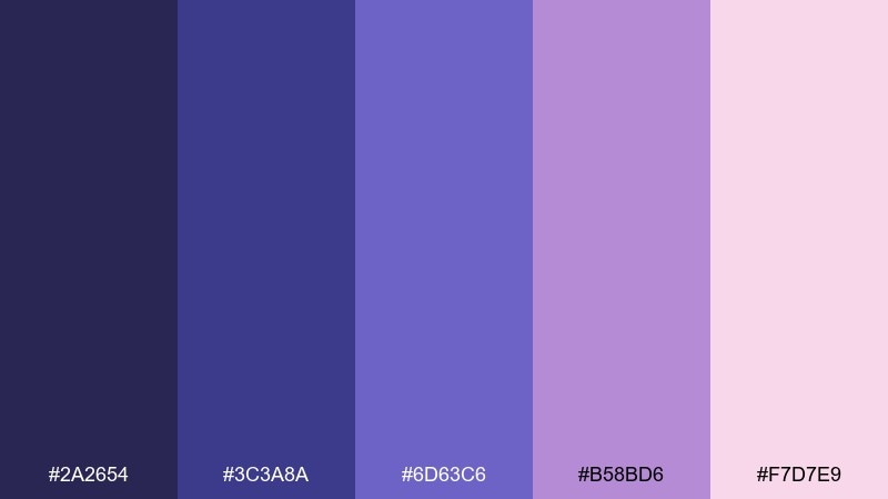
HEX: #2a2654 #3c3a8a #6d63c6 #b58bd6 #f7d7e9
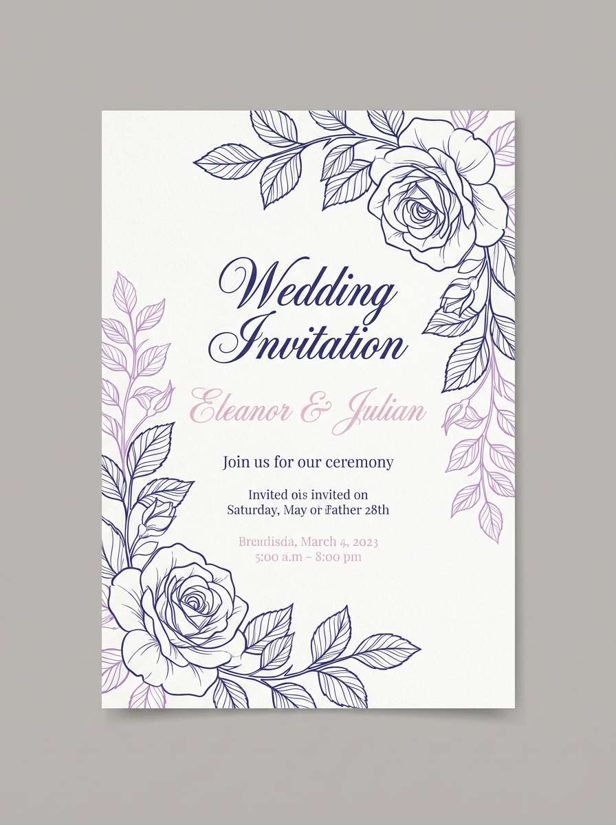
Mood: romantic, plush, refined
Best for: Wedding invitations and stationery
Romantic and plush, it reads like satin ribbon and fresh petals. This blue rose color palette balances a dramatic violet base with airy lilac and soft blush for warmth. Keep text in the darkest shade for legibility and let blush act as the paper tone. A simple tip: use the mid lavender for monograms so the details stay crisp when printed.
Image example of velvet bloom generated using media.io
3) Rainwashed Rose
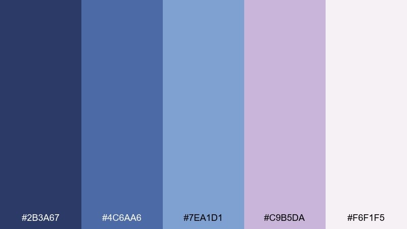
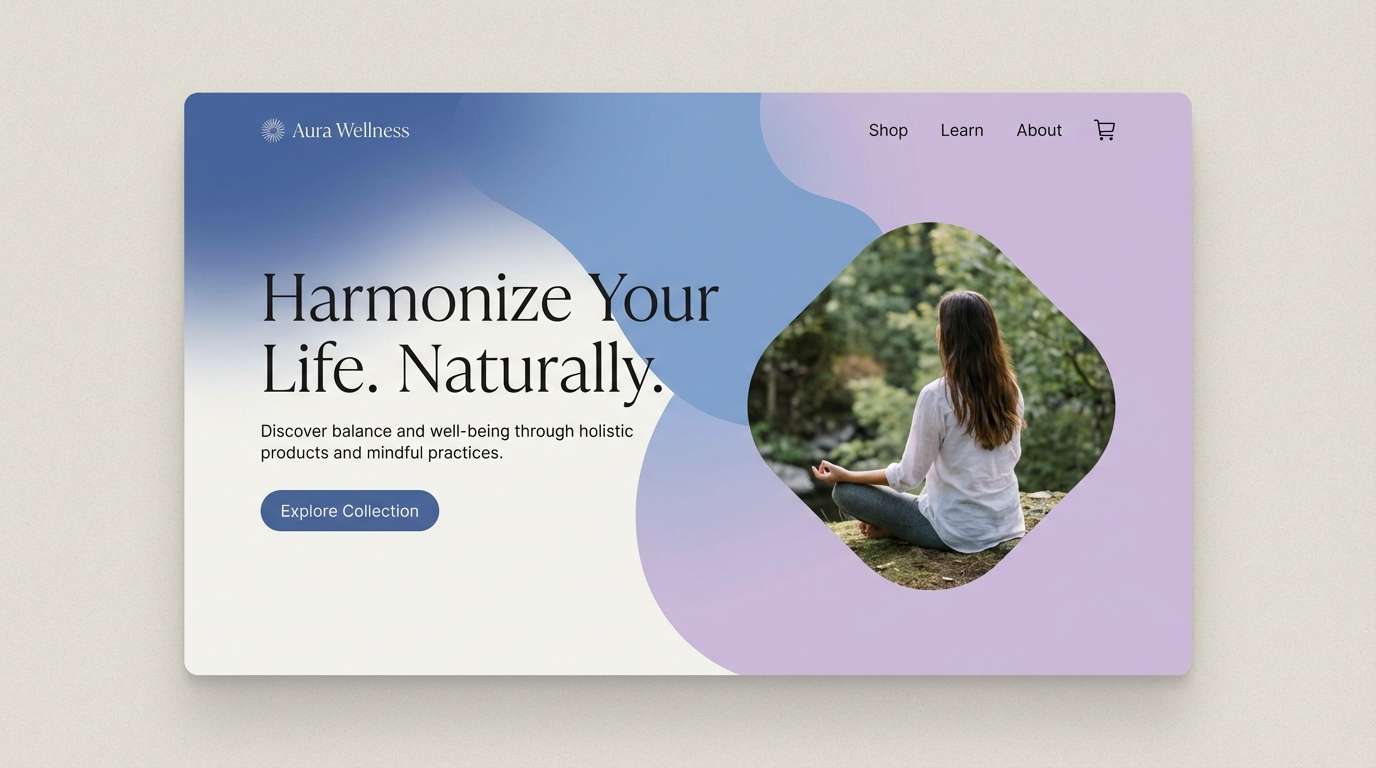
HEX: #2b3a67 #4c6aa6 #7ea1d1 #c9b5da #f6f1f5
Mood: calm, airy, coastal
Best for: Wellness websites and blog themes
Calm and breezy, these shades feel like petals after a soft rain. The blue range stays gentle, making it ideal for long-form pages and soothing hero sections. Use the pale off-white as the base, then reserve the deeper navy for headings and links. For a polished look, add light gradients between the two mid blues in backgrounds.
Image example of rainwashed rose generated using media.io
4) Mauve Twilight
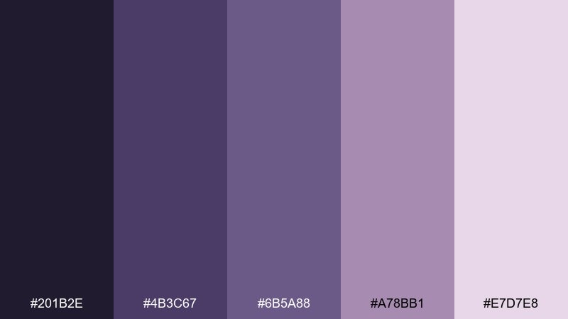
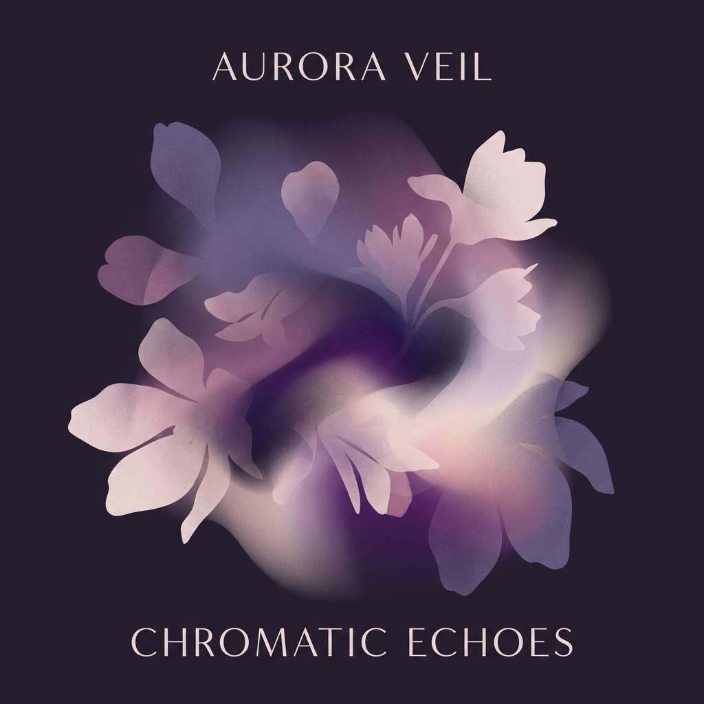
HEX: #201b2e #4b3c67 #6b5a88 #a78bb1 #e7d7e8
Mood: cinematic, introspective, soft-dark
Best for: Book covers and album artwork
Cinematic and introspective, it evokes dusk haze and muted florals. The near-black plum anchors the palette, while mauve-lilac tones soften the mood for storytelling visuals. Use the lightest tint as a spotlight area behind titles to improve readability. Pair with textured paper or subtle film grain to keep the shadows from feeling flat.
Image example of mauve twilight generated using media.io
5) Icy Petal Pop
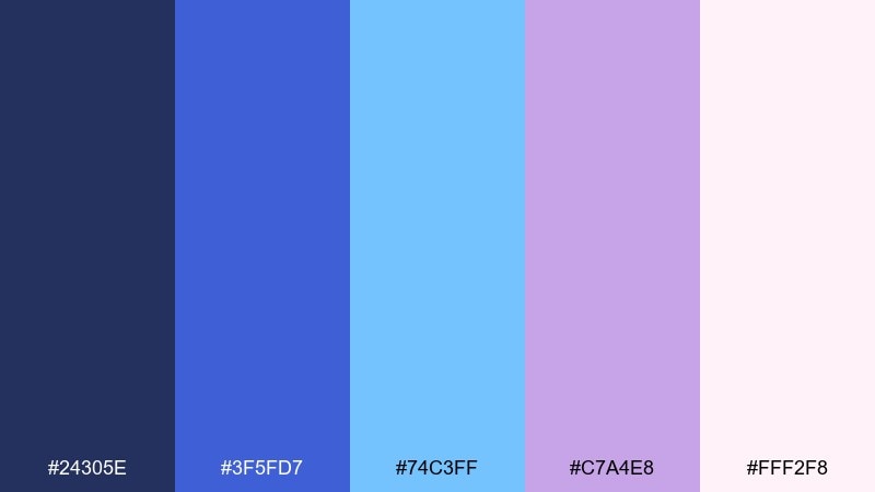
HEX: #24305e #3f5fd7 #74c3ff #c7a4e8 #fff2f8
Mood: fresh, playful, bright
Best for: Social ads and launch graphics
Fresh and playful, it looks like frosted petals with a burst of electric sky. These blue rose color combinations work best when you pick one bright blue as the hero and keep the pink-white as breathing room. The violet tint is perfect for badges, discount chips, or highlight strokes. Tip: use the icy cyan sparingly so it reads as sparkle rather than noise.
Image example of icy petal pop generated using media.io

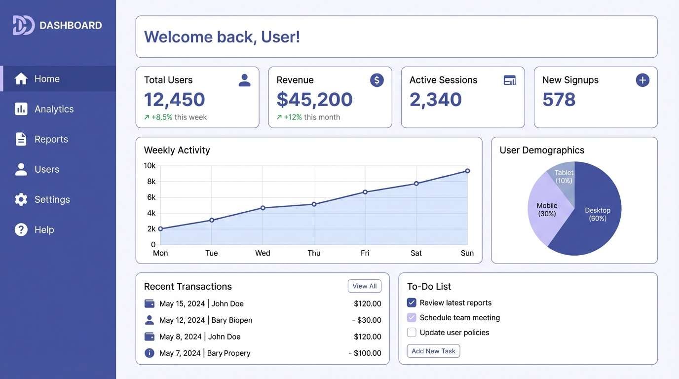
6) Cloudy Periwinkle
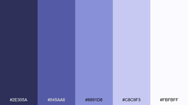
HEX: #2e305a #545aa6 #8891d8 #c8c9f3 #fbfbff
Mood: soft, minimal, airy
Best for: SaaS dashboards and settings screens
Soft and airy, it feels like morning clouds tinted with periwinkle. The gentle steps between shades make hierarchy easy for tables, cards, and empty states. Keep the darkest tone for navigation, then use the mid periwinkle for active states and toggles. A practical tip: set borders in the palest lavender so the UI stays defined without looking busy.
Image example of cloudy periwinkle generated using media.io
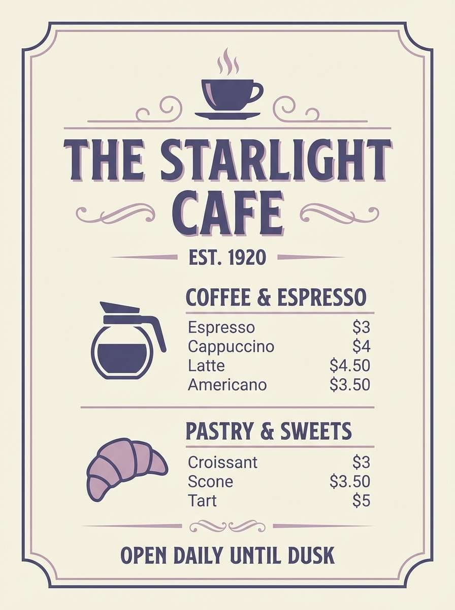
7) Antique Rose Blue
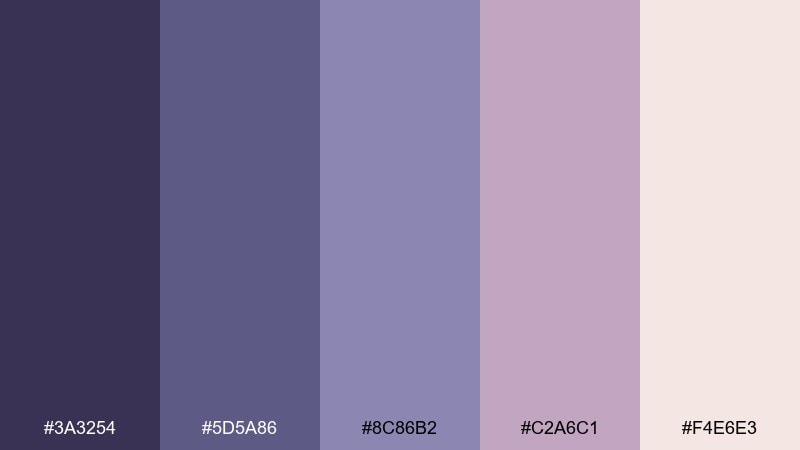
HEX: #3a3254 #5d5a86 #8c86b2 #c2a6c1 #f4e6e3
Mood: vintage, cozy, romantic
Best for: Cafe menus and boutique signage
Vintage and cozy, it recalls dried petals, old books, and candlelit corners. The dusty neutrals make it friendly for menus, labels, and signage that should feel handcrafted. Use the cream tone as the base, and keep the deeper purple for section headers and prices. Pair with warm paper textures and delicate line icons for a nostalgic touch.
Image example of antique rose blue generated using media.io
8) Neon Orchid Edge
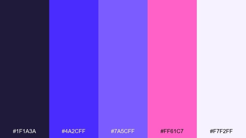
HEX: #1f1a3a #4a2cff #7a5cff #ff61c7 #f7f2ff
Mood: bold, energetic, futuristic
Best for: Event posters and nightlife promos
Bold and electric, it feels like neon signage glowing through purple fog. The hot orchid accent instantly grabs attention, while the deep base keeps the whole look grounded. Use the brightest violet for key type and the pink for a single focal element like the date or callout. Tip: add lots of negative space so the neon stays sharp, not chaotic.
Image example of neon orchid edge generated using media.io
9) Sage Stem Contrast
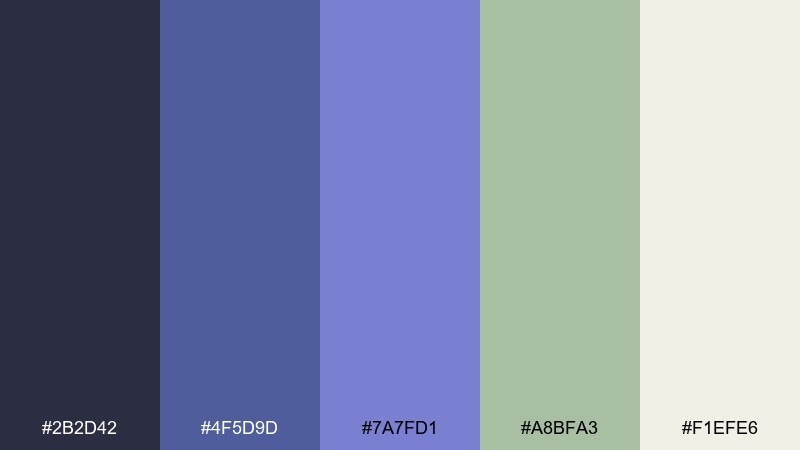
HEX: #2b2d42 #4f5d9d #7a7fd1 #a8bfa3 #f1efe6
Mood: balanced, grounded, modern
Best for: Eco brands and packaging systems
Balanced and grounded, it brings to mind violet petals with a leafy stem. This blue rose color scheme feels modern because the sage green cools down the purples and adds a natural counterpoint. Use the cream as your label base, then alternate the two blues for product tiers. A simple usage tip: keep green as an accent color only, so it reads as botanical rather than minty.
Image example of sage stem contrast generated using media.io
10) Cocoa Petal
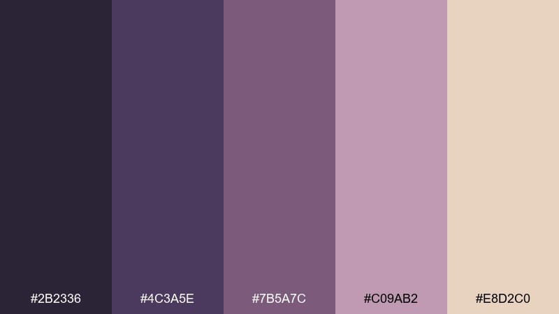
HEX: #2b2336 #4c3a5e #7b5a7c #c09ab2 #e8d2c0
Mood: warm, intimate, artisanal
Best for: Handmade product labels and crafts
Warm and intimate, it reads like cocoa dust over mauve petals. The brown-beige base makes the purples feel more artisanal than icy, which suits handmade goods and cozy storefronts. Use the beige for background stock and the darkest plum for text and barcodes. Tip: try embossing or foil on the mid mauve to highlight the craft vibe.
Image example of cocoa petal generated using media.io
11) Silver Lining
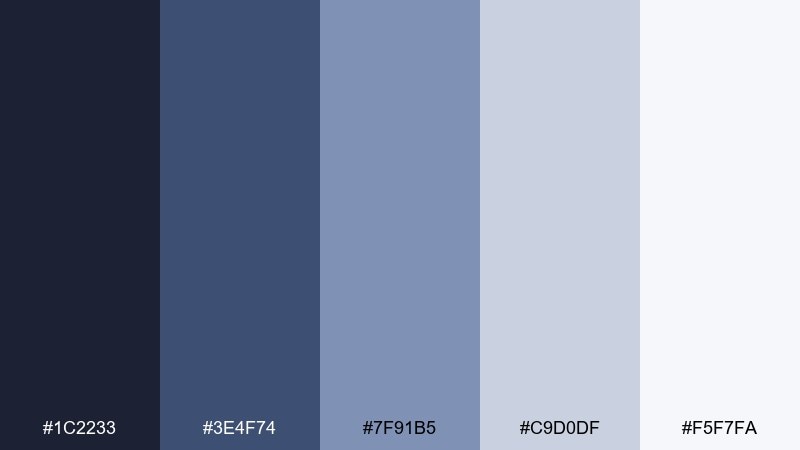
HEX: #1c2233 #3e4f74 #7f91b5 #c9d0df #f5f7fa
Mood: cool, corporate, trustworthy
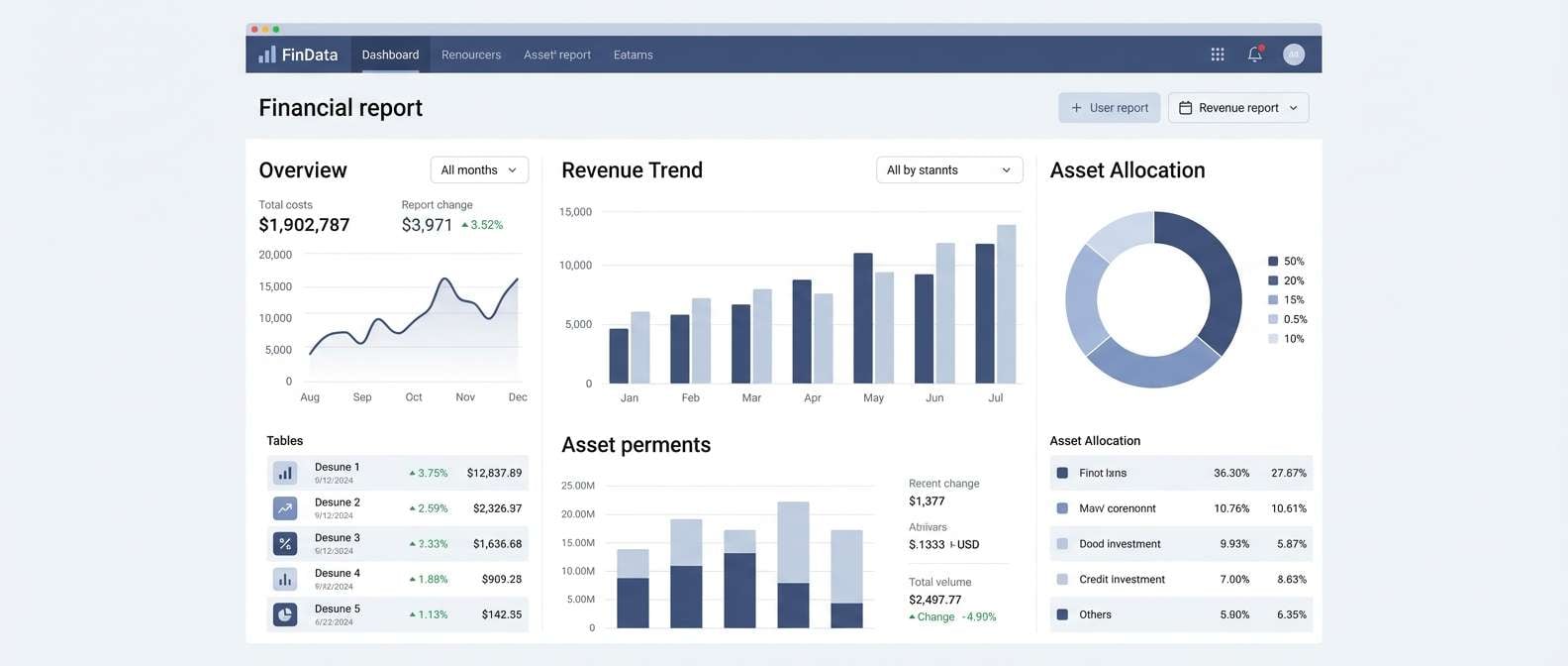
Best for: Fintech UI and reports
Cool and composed, it suggests polished steel with a hint of soft bloom. The blue-grays create clean structure for data-heavy screens and long reports. Let the near-white carry most surfaces, then use slate and steel for charts and navigation. Tip: reserve the mid blue-gray for interactive states so the interface stays calm.
Image example of silver lining generated using media.io
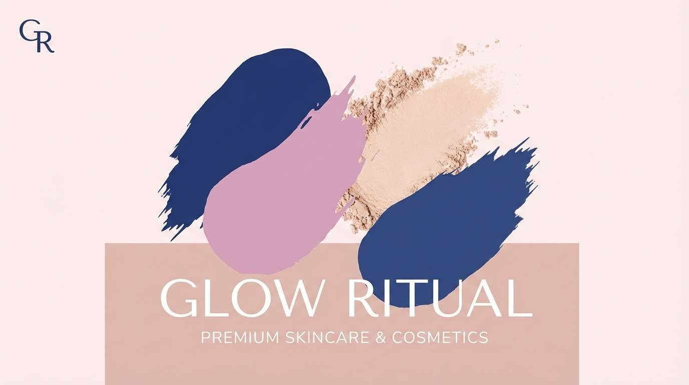
12) Blush Navy Mix
HEX: #14162c #263a77 #6c7fd1 #d6a6c9 #fff0f4
Mood: chic, confident, romantic-modern
Best for: Beauty brand ads and banners
Chic and confident, it feels like navy eyeliner with a blush wash. The deep base gives authority while the pinks keep the tone approachable and luxe. Use the pale blush as the background to soften contrast, then push CTAs in the brighter periwinkle. Tip: keep body text in navy and avoid pure black to maintain the velvety mood.
Image example of blush navy mix generated using media.io
13) Sunlit Lilac
HEX: #2a2d57 #5f6cd0 #9aa6f0 #d9b2e5 #fff7e6
Mood: optimistic, light, dreamy
Best for: Spring campaigns and lookbooks
Optimistic and dreamy, these colors feel like lilacs catching soft afternoon sun. The warm creamy base prevents the blues from turning cold, making it ideal for seasonal promos and airy layouts. Use the bright cornflower as your main accent and the pale blue for backgrounds or soft gradients. Tip: add thin outlines in the darkest shade to keep elements from drifting on light surfaces.
Image example of sunlit lilac generated using media.io
14) Graphite Orchid
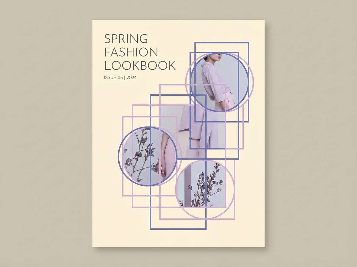
HEX: #111217 #3a3e52 #5d5b86 #9f88b7 #eae6f2
Mood: sleek, technical, sophisticated
Best for: Product pages and tech branding
Sleek and technical, it resembles graphite shadows with an orchid glow. The near-black and charcoal tones create strong contrast for product pages, while lavender adds personality without feeling cute. Use the pale tint for section backgrounds and the charcoal for headlines and icons. Tip: keep lavender to key highlights like tags, progress, and hover states for a premium rhythm.
Image example of graphite orchid generated using media.io
15) Berry Sorbet
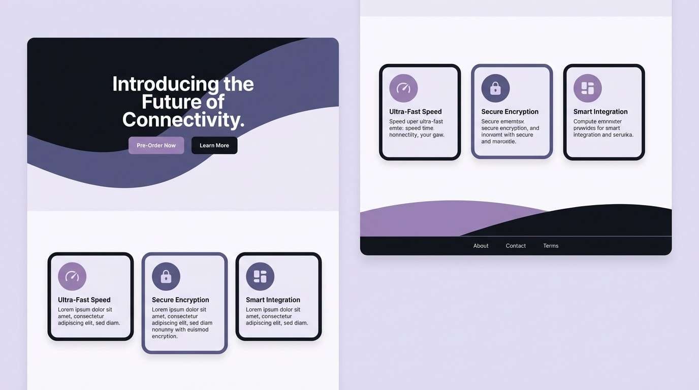
HEX: #2b1f3c #5a3b8a #8b5fbf #d46fb1 #ffe3f2
Mood: sweet, bold, expressive
Best for: Creator brands and merch graphics
Sweet and bold, it feels like berry sorbet served in a midnight bowl. The saturated purple-pink middle gives instant personality for creator logos and merch drops. Let the pale pink act as a soft canvas, then punch in the magenta for emphasis on key words. Tip: keep gradients short and controlled to avoid a candy-like blur.
Image example of berry sorbet generated using media.io
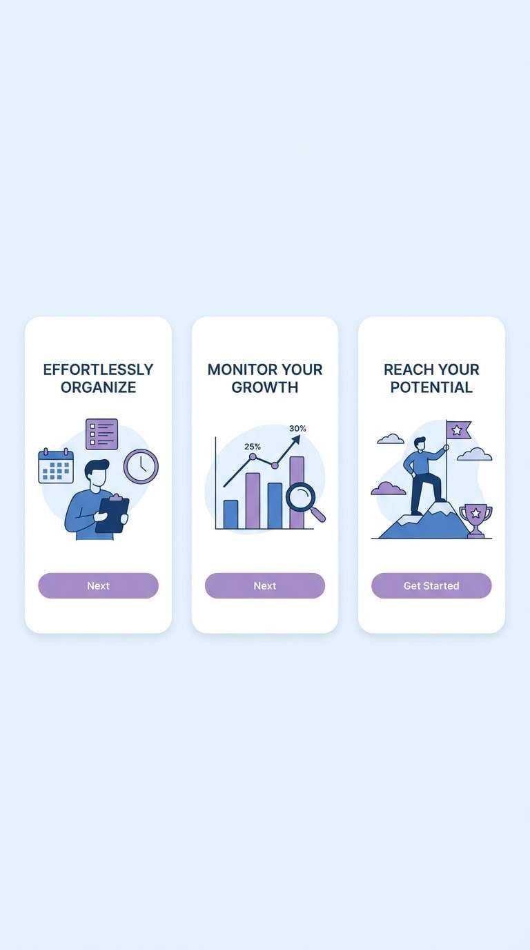
16) Coastal Blue Rose
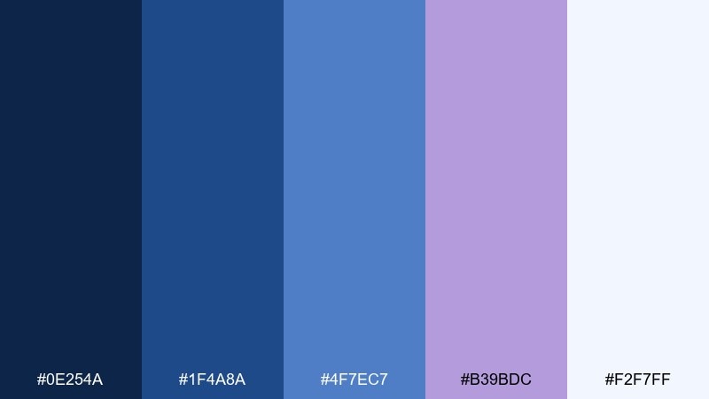
HEX: #0e254a #1f4a8a #4f7ec7 #b39bdc #f2f7ff
Mood: fresh, coastal, uplifting
Best for: Travel branding and app onboarding
Fresh and uplifting, it brings ocean air into soft petal tones. This blue rose color palette works beautifully in onboarding flows where you want clarity plus a hint of romance. Use the near-white for screens, the mid blue for primary buttons, and lavender for illustrations or friendly highlights. Tip: keep the darkest navy for text only so the interface stays light and inviting.
Image example of coastal blue rose generated using media.io
17) Tea Rose Neutral
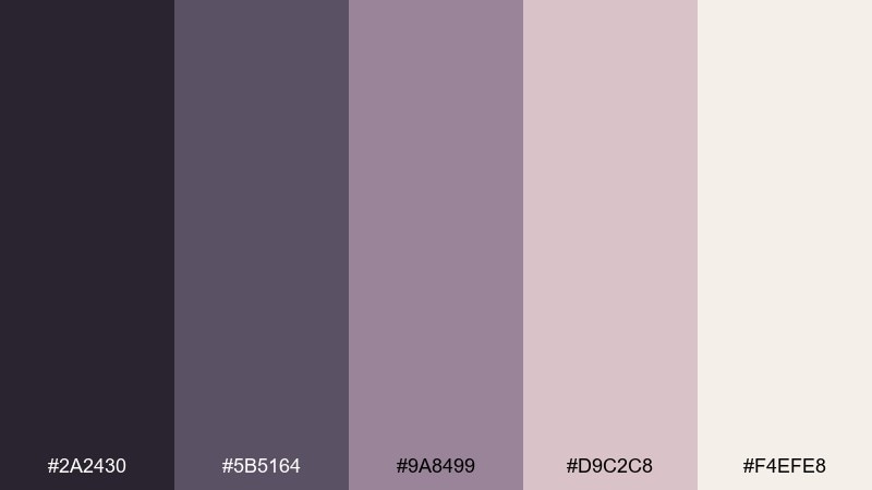
HEX: #2a2430 #5b5164 #9a8499 #d9c2c8 #f4efe8
Mood: soft, neutral, comforting
Best for: Home decor moodboards and interiors
Soft and comforting, it resembles tea-stained linen with a whisper of mauve. The muted range is ideal for home decor boards, where you want cohesion rather than contrast. Use the light neutral as the main field, then layer mauve in textiles and the deeper plum in small decor accents. Tip: add natural wood textures alongside these tones to keep the look warm and lived-in.
Image example of tea rose neutral generated using media.io
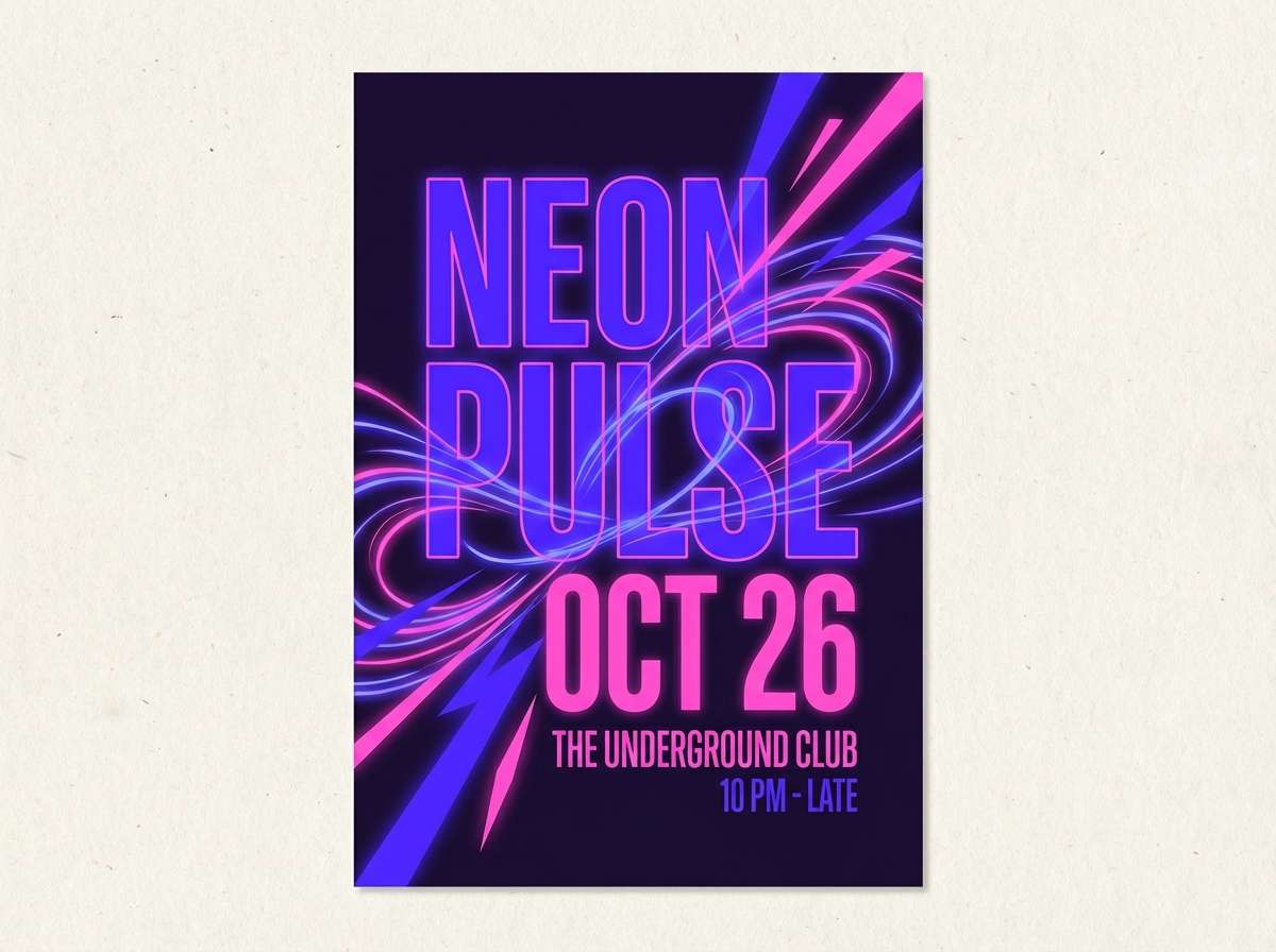
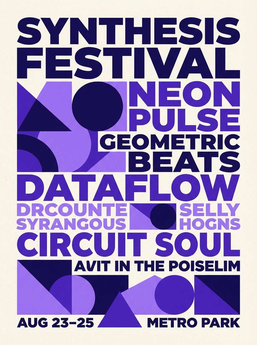
18) Electric Iris Poster
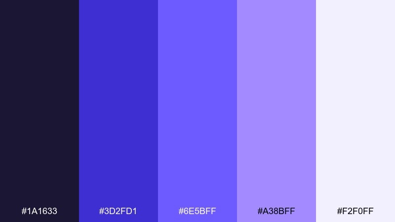
HEX: #1a1633 #3d2fd1 #6e5bff #a38bff #f2f0ff
Mood: vivid, modern, high-energy
Best for: Music posters and festival lineups
Vivid and modern, it looks like iris petals lit by stage LEDs. These blue rose color combinations shine in big type, gradients, and geometric motifs, especially for lineups and cover art. Keep the darkest shade as a framing color, then push the bright violet for names and dates. Tip: limit yourself to one gradient per layout so the poster stays readable from a distance.
Image example of electric iris poster generated using media.io
19) Minimal Rose Tech
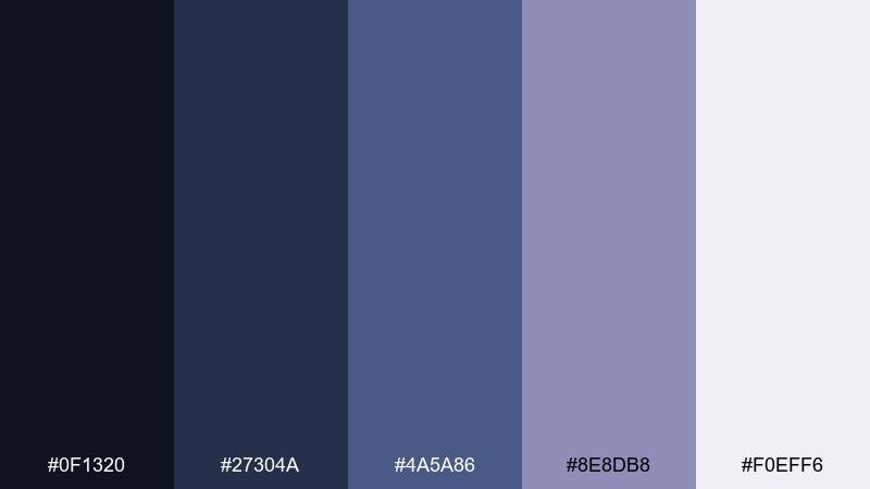
HEX: #0f1320 #27304a #4a5a86 #8e8db8 #f0eff6
Mood: clean, smart, understated
Best for: B2B decks and presentation templates
Clean and smart, it reads like a quiet night sky with a soft floral tint. The restrained steps between shades make slides feel consistent across charts, diagrams, and dense text. Use the light gray-lilac for backgrounds, then keep headings in the dark navy for crisp contrast. Tip: choose one accent shade for highlights and stick to it across the whole deck for cohesion.
Image example of minimal rose tech generated using media.io
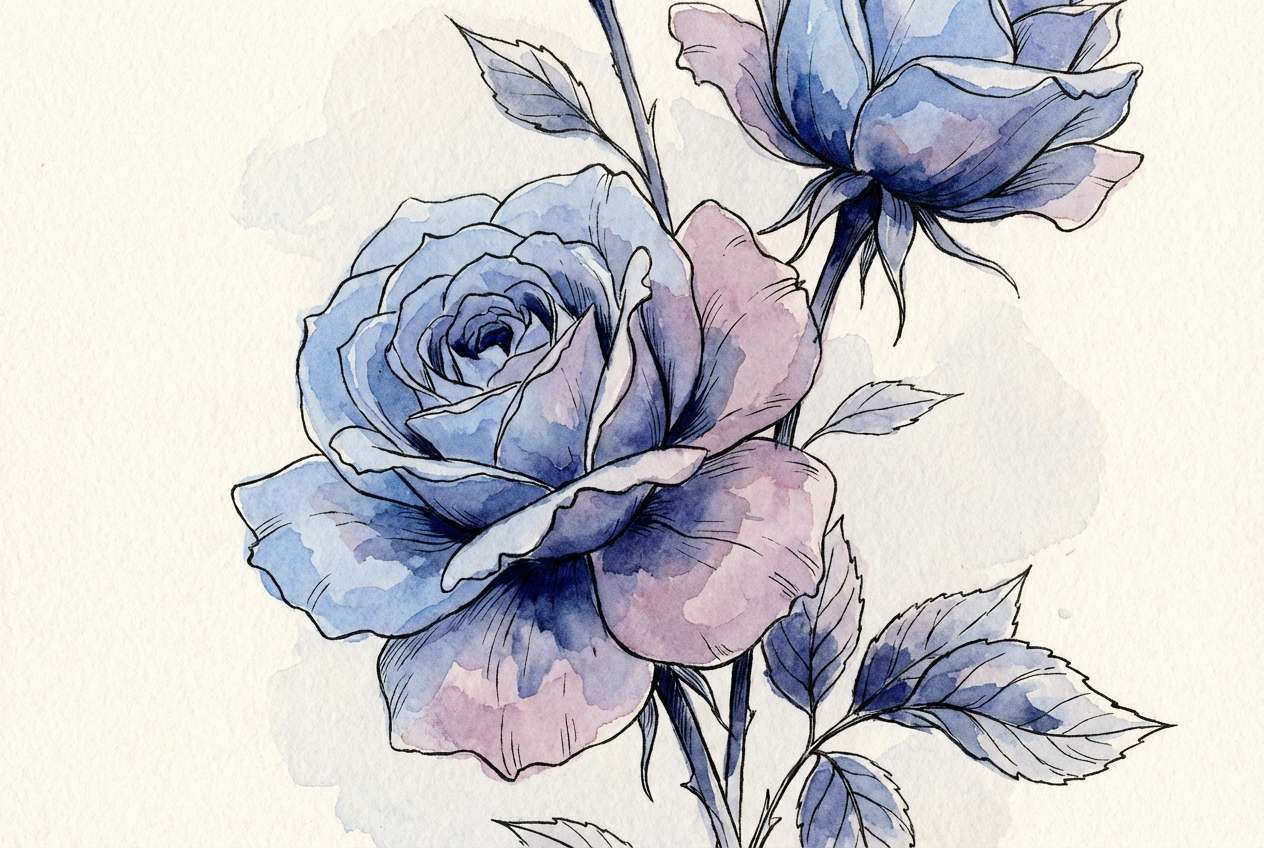
20) Watercolor Garden
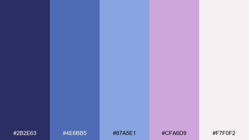
HEX: #2b2e63 #4e6bb5 #87a5e1 #cfa6d9 #f7f0f2
Mood: gentle, artistic, floral
Best for: Botanical illustrations and wall art
Gentle and artistic, it feels like a watercolor bouquet bleeding softly into paper. The mid blues create delicate depth, while lavender adds a petal-like haze that reads instantly floral. Use the pale rose-white as paper tone, then layer washes from light blue to indigo for dimension. Tip: keep edges soft and save the darkest shade for just a few defining strokes.
Image example of watercolor garden generated using media.io
What Colors Go Well with Blue Rose?
Blue rose shades pair naturally with soft neutrals like porcelain white, cream, and pale greige because they keep the palette airy and romantic. These light bases also make periwinkle and lavender accents feel more intentional and readable.
For contrast, add deep anchors like ink navy, charcoal, or plum-black to handle text, navigation, and framing. If you want a botanical twist, a muted sage or dusty green works well—just keep it secondary so the look stays “blue rose,” not “mint.”
For a more energetic vibe, a single high-chroma accent (electric violet, orchid pink, or icy cyan) can work as a spotlight color. The key is restraint: one pop, lots of breathing room.
How to Use a Blue Rose Color Palette in Real Designs
Start by assigning roles, not just colors: pick one darkest shade for text and UI chrome, one mid tone for primary actions, and one very light tint for backgrounds. This keeps your design consistent across pages, banners, and templates.
If you’re designing for print (wedding suites, packaging, menus), let the lightest blush/cream act as the “paper” color and keep saturated purples to headings, borders, and monograms. For screens, use lavender or periwinkle as hover/focus states so interactions feel soft but clear.
Blue rose palettes shine with subtle gradients and gentle textures. A light grain, watercolor wash, or soft shadow can help the florals feel tactile without becoming busy.
Create Blue Rose Palette Visuals with AI
If you already have HEX codes, you can turn them into posters, UI mockups, invitation layouts, and brand visuals quickly with AI. The easiest approach is to describe the design format (poster, landing page, label) and call out your dominant and accent colors.
To keep results cohesive, repeat the same subject and layout keywords across generations, then swap only one element at a time (like “wedding invitation” to “save the date,” or “dashboard” to “settings screen”). This makes it easier to build a consistent set.
Blue Rose Color Palette FAQs
-
What is a blue rose color palette?
A blue rose color palette is a coordinated set of blues (navy, periwinkle, cornflower) blended with rose-adjacent tones like lavender, lilac, and soft blush to create a floral, romantic look with a cool base. -
Is “blue rose” more blue or more purple?
Most blue rose palettes lean slightly purple because lilac and lavender are key to the “rose” mood. You can shift it bluer by emphasizing indigo/cornflower and reducing pink accents. -
What background color works best with blue rose tones?
Porcelain white, blush-white, and warm cream backgrounds work best because they keep the palette light and elegant while preserving contrast for headings and buttons. -
Can I use a blue rose palette for a website UI?
Yes. Use the darkest navy/plum for text and navigation, mid periwinkle for primary buttons, and the palest tint for surfaces and cards. Reserve brighter accents (cyan/pink) for small highlights only. -
How do I keep blue rose designs from looking too “sweet”?
Reduce blush/pink coverage, add a charcoal or ink-navy anchor, and rely on muted lavender/periwinkle rather than bright magenta. Minimal typography and plenty of whitespace also help. -
What accent colors pair well with a blue rose palette?
Muted sage green, silver-blue gray, and soft champagne/cream are reliable accents. For bold modern designs, try a single neon orchid or electric violet as a controlled focal point. -
How can I generate blue rose palette images with AI?
Use a text-to-image tool and specify the design type (poster, invitation, UI mockup), then list your dominant and accent HEX colors in the prompt. Generate a few variations and refine by keeping layout terms consistent.
Next: Canary Color Palette


