

Dark goldenrod (#B8860B) sits in that sweet spot between classic gold and grounded mustard, making it easy to use across modern branding, UI, and print.
Below are 20 dark goldenrod color palette ideas with HEX codes, mood notes, and real-world pairing tips so you can move from inspiration to a usable system fast.
In this article
- Why Dark Goldenrod Palettes Work So Well
-
- sunlit brass and cream
- autumn orchard
- modern mustard ui
- desert dusk
- heritage library
- botanical honey
- midnight gild
- rustic market
- minimal linen
- art deco theater
- clay and copper
- coastal sandstone
- espresso and gold
- wedding glow
- playful classroom
- luxury skincare glow
- warm data story
- vintage travel ticket
- cozy cabin knit
- urban night signage
- What Colors Go Well with Dark Goldenrod?
- How to Use a Dark Goldenrod Color Palette in Real Designs
- Create Dark Goldenrod Palette Visuals with AI
Why Dark Goldenrod Palettes Work So Well
Dark goldenrod brings warmth without the “highlighter” intensity of bright yellow, so it feels premium, steady, and easy to read as an accent. It can suggest brass, honey, parchment, or vintage gilding depending on the supporting tones.
Because it sits comfortably with neutrals (cream, taupe, charcoal) and deeper hues (navy, forest green, espresso brown), it’s versatile across digital and print. In UI, it behaves like a confident highlight color; in packaging, it signals craft and quality.
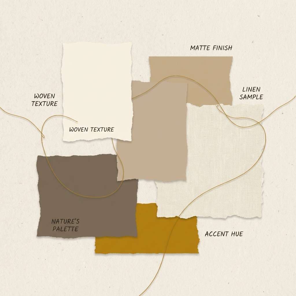
It also pairs well with texture cues: uncoated paper, linen backgrounds, subtle grain, and matte finishes. Those materials make goldenrod feel intentional and tactile rather than loud.
20+ Dark Goldenrod Color Palette Ideas (with HEX Codes)
1) Sunlit Brass and Cream
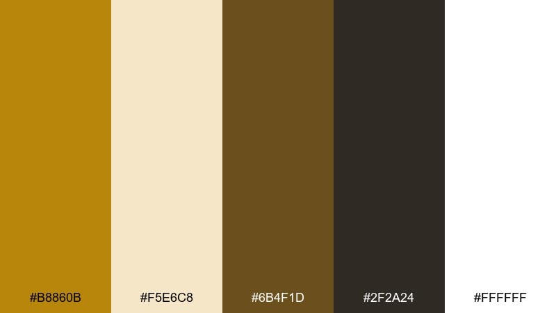
HEX: #b8860b #f5e6c8 #6b4f1d #2f2a24 #ffffff
Mood: warm, welcoming, classic
Best for: cafe menu and small business branding
Warm brass on creamy paper feels like late-afternoon light across a countertop. Use the cream as the main canvas and let dark goldenrod carry headers, icons, and price highlights. Deep brown keeps typography readable and adds a handcrafted feel. Tip: reserve pure white for small breathing space so the cream stays the star.
Image example of sunlit brass and cream generated using media.io
Media.io is an online AI studio for creating and editing video, image, and audio in your browser.

2) Autumn Orchard
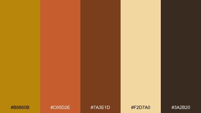
HEX: #b8860b #c65d2e #7a3e1d #f2d7a0 #3a2b20
Mood: harvest, cozy, rustic
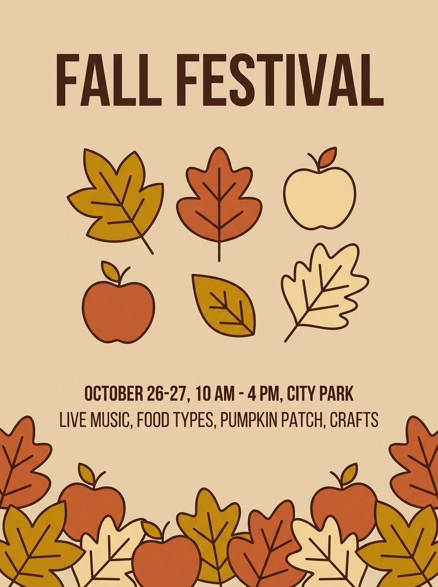
Best for: fall festival flyer and seasonal social posts
Harvest gold with baked-orange tones brings to mind apple peels, cider, and leaf piles. Let the light tan act as your background so the oranges can headline without feeling loud. Pair the darkest brown with bold sans-serif type for high contrast and easy readability. Tip: use the orange as a call-to-action color and keep golden accents for borders and badges.
Image example of autumn orchard generated using media.io
3) Modern Mustard UI
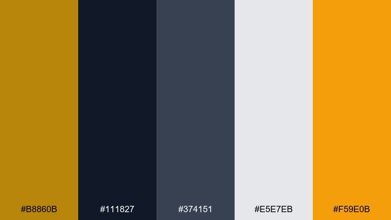
HEX: #b8860b #111827 #374151 #e5e7eb #f59e0b
Mood: modern, sharp, confident
Best for: fintech dashboard UI
Crisp charcoal and clean grays make the golden accents feel precise and premium. For a dark goldenrod color palette in UI, keep the gold to active states, key metrics, and small highlights rather than large fills. Use light gray panels to separate content without adding visual noise. Tip: apply the brighter amber for hover states so interaction feels responsive but consistent.
Image example of modern mustard ui generated using media.io

4) Desert Dusk
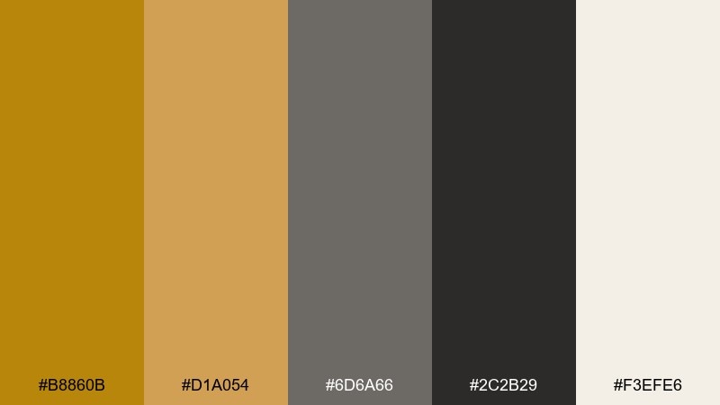
HEX: #b8860b #d1a054 #6d6a66 #2c2b29 #f3efe6
Mood: earthy, muted, grounded
Best for: outdoor brand packaging and labels
Muted sand and stone tones feel like a trail at sunset with dust in the air. Use the off-white as a clean base, then layer goldenrod and tan for badges, emblems, and subtle patterns. The charcoal anchors copy and keeps the palette from drifting too warm. Tip: a small goldenrod stripe on the edge of packaging reads premium without overpowering the label.
Image example of desert dusk generated using media.io
5) Heritage Library
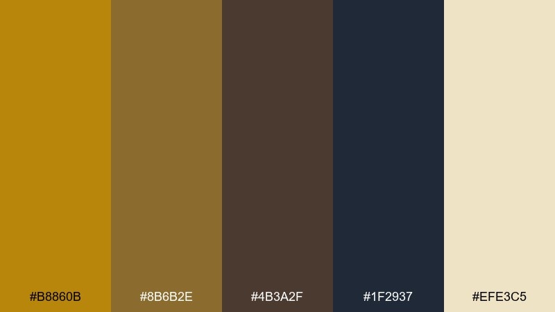
HEX: #b8860b #8b6b2e #4b3a2f #1f2937 #efe3c5
Mood: academic, vintage, refined
Best for: book cover and editorial layouts
Antique gold with ink-dark shadows evokes old bindings, quiet stacks, and brass desk lamps. Let the parchment tone carry large areas, then use the deeper browns for frames and typographic hierarchy. A navy-charcoal accent adds sophistication without cooling the palette too much. Tip: keep golden elements matte, not glossy, to preserve the archival vibe.
Image example of heritage library generated using media.io

6) Botanical Honey
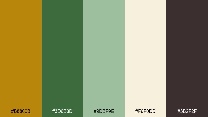
HEX: #b8860b #3d6b3d #9dbf9e #f6f0dd #3b2f2f
Mood: natural, fresh, comforting
Best for: botanical label and wellness branding
Honey gold paired with leafy greens feels like a garden shop with dried herbs and warm sunlight. Use the soft cream for backgrounds and let green carry secondary blocks, tags, and dividers. The dark neutral is ideal for ingredient lists and small print. Tip: add small illustrated sprigs in the mid-green to make gold accents feel more organic than flashy.
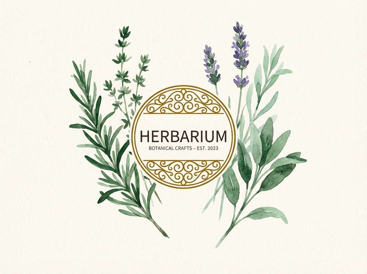
Image example of botanical honey generated using media.io
7) Midnight Gild
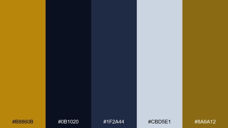
HEX: #b8860b #0b1020 #1f2a44 #cbd5e1 #8a6a12
Mood: dramatic, luxe, cinematic
Best for: night event poster and hero banners
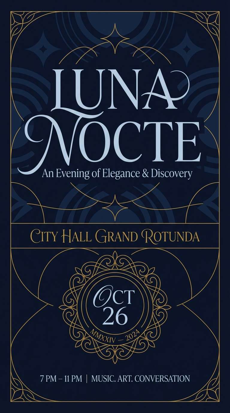
Deep midnight blues with gilded gold feels like velvet curtains and a spotlight hitting metal. This dark goldenrod color scheme works best when gold is used as a pinpoint accent against large dark areas. Keep text mostly in the pale silver-blue for readability, then use gold for dates, separators, and logos. Tip: limit gradients and rely on crisp contrast to keep the look expensive.
Image example of midnight gild generated using media.io
8) Rustic Market
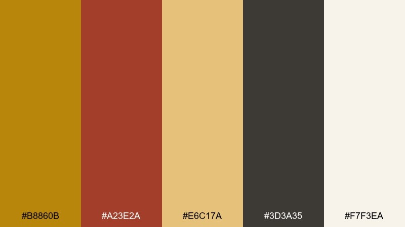
HEX: #b8860b #a23e2a #e6c17a #3d3a35 #f7f3ea
Mood: handmade, friendly, artisanal
Best for: farmers market signage and stall banners
Toasty gold and brick red feel like handmade tags, woven baskets, and spice jars. Use the warm off-white for large sign backgrounds so the darker text stays legible from a distance. Bring in brick red for price circles or seasonal callouts to create a clear hierarchy. Tip: keep icons simple and bold so the palette reads well on textured paper or canvas.
Image example of rustic market generated using media.io

9) Minimal Linen
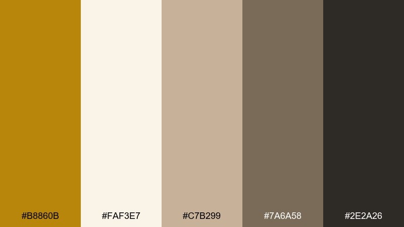
HEX: #b8860b #faf3e7 #c7b299 #7a6a58 #2e2a26
Mood: calm, airy, understated
Best for: interior moodboard and lifestyle blog graphics
Soft linen neutrals with a quiet gold accent evoke sunlit rooms and natural fabrics. Keep backgrounds light and let goldenrod appear as a thin rule, a small icon set, or a single highlight word. The taupe and coffee tones are ideal for body text and subtle frames. Tip: use plenty of whitespace so the gold reads intentional rather than decorative.
Image example of minimal linen generated using media.io
10) Art Deco Theater
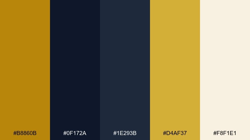
HEX: #b8860b #0f172a #1e293b #d4af37 #f8f1e1
Mood: glamorous, structured, bold
Best for: hotel branding and marquee posters
Gleaming gold on deep navy feels like a vintage marquee with geometric trims. Dark goldenrod color combinations shine here when you pair them with sharp lines, symmetry, and plenty of negative space. Use the pale cream as a secondary background for ticket-style sections or fine print. Tip: keep gold to two tones max so the deco geometry stays clean, not busy.
Image example of art deco theater generated using media.io

11) Clay and Copper
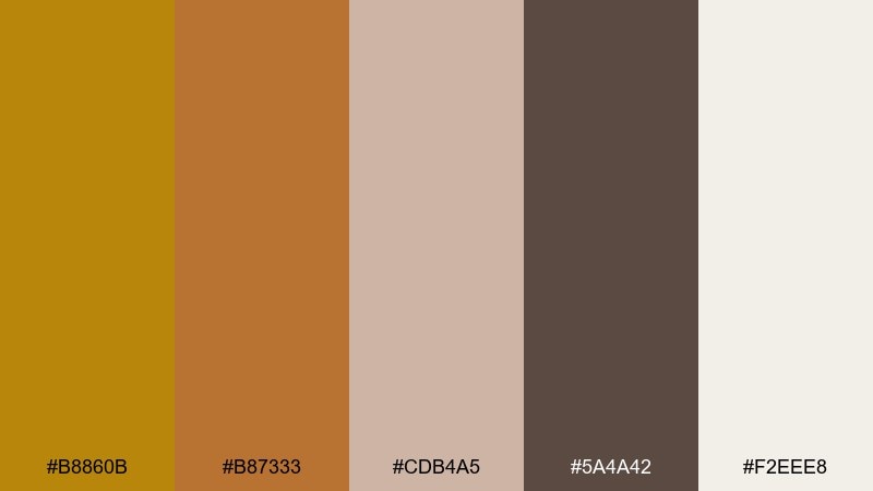
HEX: #b8860b #b87333 #cdb4a5 #5a4a42 #f2eee8
Mood: earthy, tactile, handcrafted
Best for: ceramic studio logo and lookbook
Clay pinks and copper warmth suggest kiln-fired pottery and studio shelves. Use the pale blush as a soft background and reserve goldenrod for stamps, seals, and small brand marks. The deep brown works well for serif headlines and product names. Tip: print on uncoated stock to keep the colors looking natural and touchable.
Image example of clay and copper generated using media.io
12) Coastal Sandstone
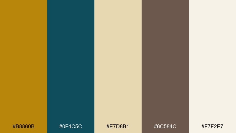
HEX: #b8860b #0f4c5c #e7d8b1 #6c584c #f7f2e7
Mood: relaxed, boutique, sun-warmed
Best for: boutique hotel website hero section
Warm sandstone and a deep sea-teal accent feel like sun on stone near the water. Use the creamy off-white for large sections, then place teal in navigation and footers for crisp structure. Goldenrod works best as a small luxury detail for icons, ratings, or booking highlights. Tip: keep photography neutral so the teal and gold stay cohesive rather than competing with the imagery.
Image example of coastal sandstone generated using media.io

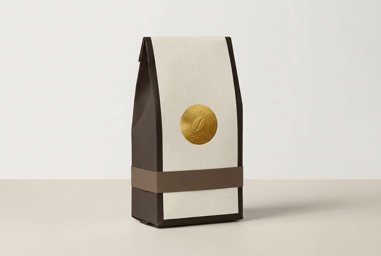
13) Espresso and Gold
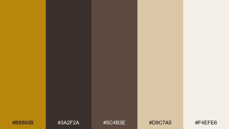
HEX: #b8860b #3a2f2a #5c4b3e #d9c7a5 #f4efe6
Mood: rich, cozy, premium
Best for: coffee packaging and subscription cards
Dark espresso browns with warm gold read like roasted beans and crema. Use the deep tones for the main pack color and let goldenrod highlight origin, roast level, or a signature stamp. The light beige is perfect for tasting notes panels and barcode areas. Tip: add a subtle pattern in the mid-brown to keep large dark surfaces from feeling flat.
Image example of espresso and gold generated using media.io
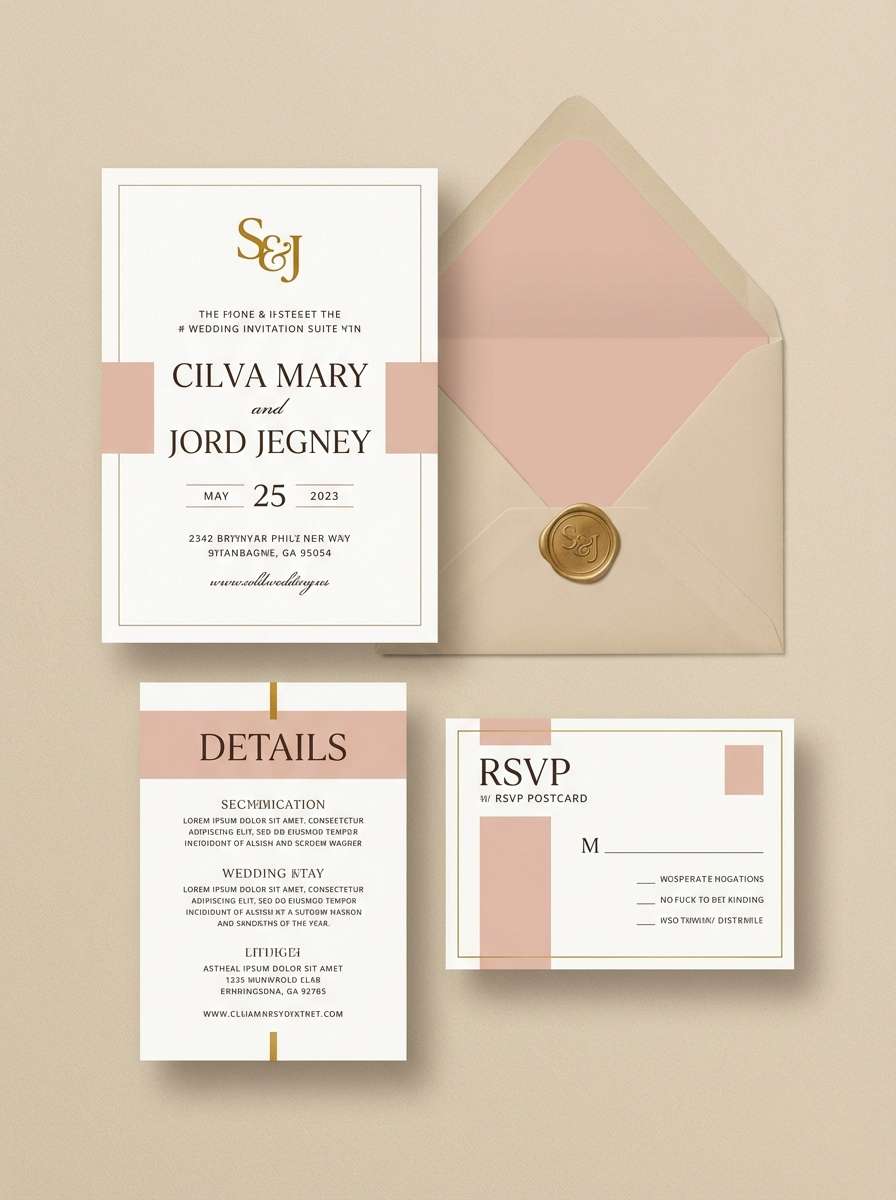
14) Wedding Glow
HEX: #b8860b #f8e8c8 #e2b8a8 #8c4a2f #3b2a24
Mood: romantic, soft, elegant
Best for: wedding invitation suite
Soft champagne and blush with a golden highlight feels like candlelight on satin. For a dark goldenrod color combination that stays refined, keep gold to foil-style accents, monograms, or thin borders. Use the warm brown for names and details so everything stays readable on the light papers. Tip: pair with a textured cream envelope liner to amplify the glow without adding more color.
Image example of wedding glow generated using media.io
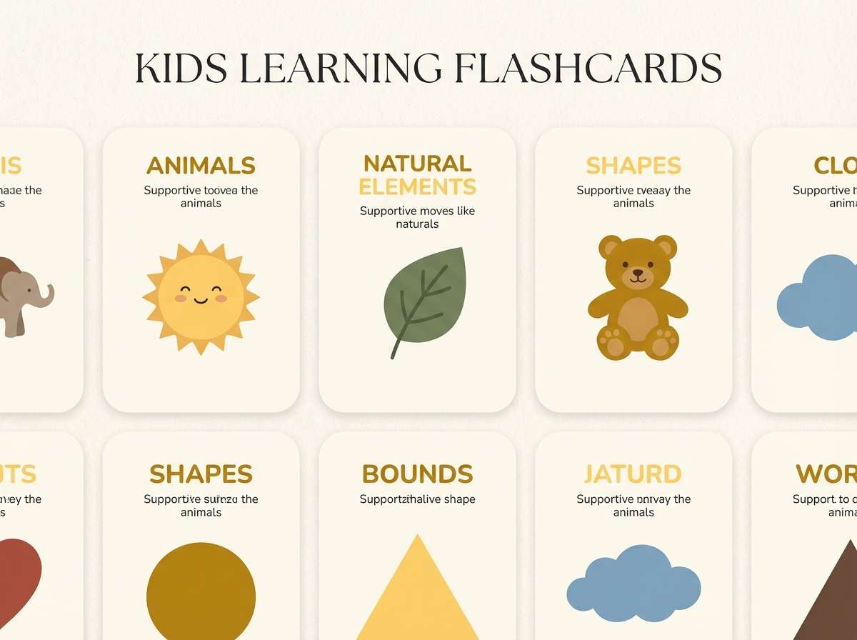
15) Playful Classroom
HEX: #b8860b #ffd166 #fef9ef #5f6f52 #2b2b2b
Mood: bright, friendly, energetic
Best for: kids learning flashcards and worksheets
Sunny yellows with a grounded green feel upbeat without turning neon. Use the near-white for worksheet space and keep the darker gray for text so instructions stay clear. Goldenrod and bright yellow can tag categories, headers, and simple shapes for visual cues. Tip: limit each card to two accent colors to reduce distraction while keeping the set playful.
Image example of playful classroom generated using media.io
16) Luxury Skincare Glow
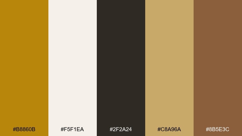
HEX: #b8860b #f5f1ea #2f2a24 #c8a96a #8b5e3c
Mood: luxury, clean, warm
Best for: skincare product ad and packaging
Warm gold against creamy neutrals feels like soft light on glass and satin. A dark goldenrod color palette works beautifully for beauty when you use gold sparingly as a highlight, not a full background. Keep copy in near-black for clarity and use the tan-gold for secondary details like claims and separators. Tip: choose a matte cream background so metallic-looking accents feel intentional and upscale.
Image example of luxury skincare glow generated using media.io
17) Warm Data Story
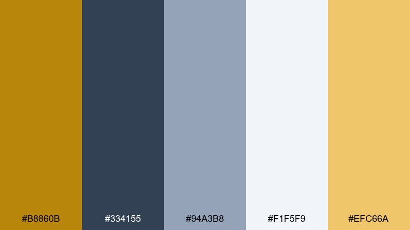
HEX: #b8860b #334155 #94a3b8 #f1f5f9 #efc66a
Mood: clear, trustworthy, approachable
Best for: business infographic and presentation slides
Clean slate grays with warm gold accents make charts feel human and less sterile. Use the light background for readability, then apply goldenrod to highlight the key series or top KPI. The steel blues should handle axes, labels, and secondary data to keep hierarchy intact. Tip: keep one gold for highlights and a lighter gold for fills so your graphs stay consistent slide to slide.
Image example of warm data story generated using media.io

18) Vintage Travel Ticket
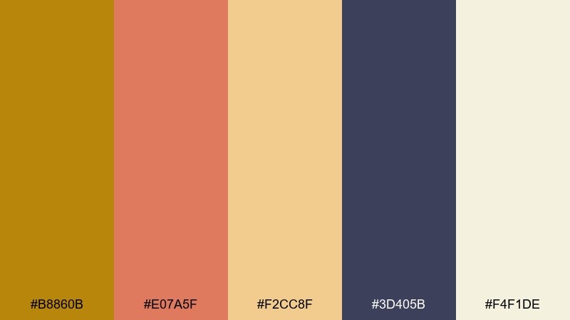
HEX: #b8860b #e07a5f #f2cc8f #3d405b #f4f1de
Mood: nostalgic, adventurous, sunny
Best for: retro travel poster
Sun-faded coral and sand with a deep indigo shadow feels like a well-loved ticket stub. Dark goldenrod color combinations add that stamped, collectible detail when used for seals, stars, or route lines. Keep the cream as your base so the coral can pop without overwhelming the page. Tip: use slightly distressed texture on shapes to sell the vintage print effect.
Image example of vintage travel ticket generated using media.io

19) Cozy Cabin Knit
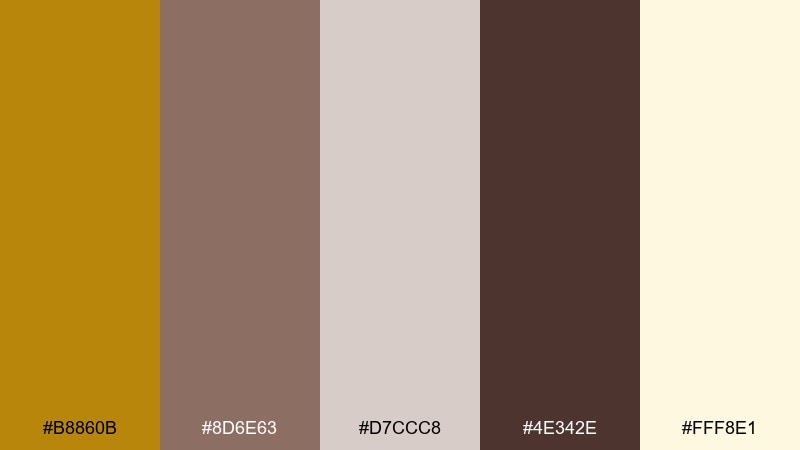
HEX: #b8860b #8d6e63 #d7ccc8 #4e342e #fff8e1
Mood: cozy, homey, comforting
Best for: knitwear product listing images
Warm browns and creamy lights evoke wool textures, cedar wood, and a fireplace glow. Use the creamy tone as a background and let the darker browns handle product names and pricing. Goldenrod is best as a small badge for limited drops or seasonal edits. Tip: keep lighting warm in product shots so the gold reads natural rather than yellow.
Image example of cozy cabin knit generated using media.io
20) Urban Night Signage
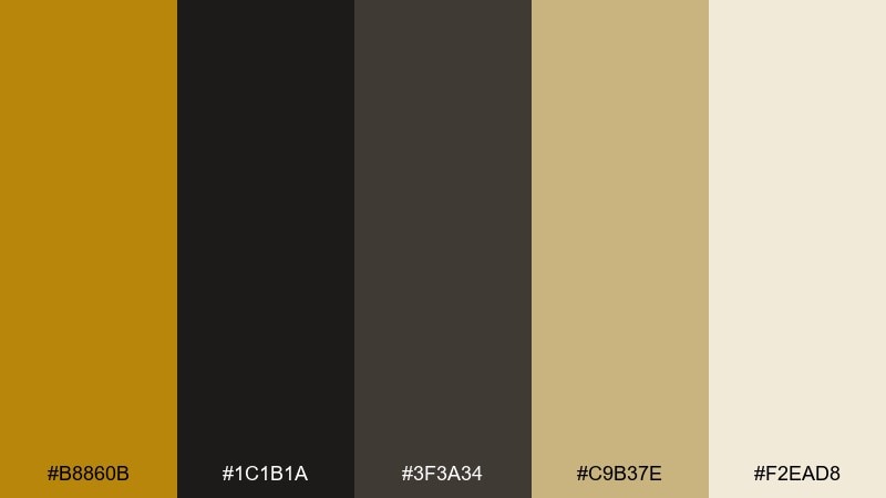
HEX: #b8860b #1c1b1a #3f3a34 #c9b37e #f2ead8
Mood: urban, bold, sophisticated
Best for: wayfinding signage and brand guidelines
Dark concrete neutrals with muted gold accents feel like city lights reflecting on metal. Use the near-black for primary backgrounds and reserve gold for arrows, section headers, and key symbols. The light cream helps with contrast when you need an alternate sign variant or small print blocks. Tip: test readability at distance and keep gold lines slightly thicker than you think you need.
Image example of urban night signage generated using media.io

What Colors Go Well with Dark Goldenrod?
Dark goldenrod pairs naturally with creamy off-whites, parchment, and warm beiges because they preserve its sunny warmth while keeping layouts readable. These neutrals are especially useful for backgrounds in print, packaging, and editorial design.
For contrast, match it with deep charcoals, espresso browns, or near-black to keep typography crisp and modern. If you want a more elevated look, bring in navy or midnight blue—goldenrod becomes more “gilded” against cooler darks.
To add personality without losing balance, introduce one supporting accent like sea-teal, brick red, or leafy green. Keep goldenrod as the highlight color so the palette stays cohesive.
How to Use a Dark Goldenrod Color Palette in Real Designs
In branding, treat dark goldenrod like a signature detail: a stamp, icon fill, underline, or badge color. It works best when it shows up consistently in small moments rather than covering large areas.
For UI, reserve goldenrod for interactive states (active tabs, primary buttons, selected toggles, key KPIs). Pair it with structured grays or deep nav bars so the accent reads instantly as “important” and stays accessible.
In print and packaging, lean into matte stocks and subtle texture to make the palette feel crafted. If you’re using a second gold (lighter or brighter), keep it limited to separators or small highlights to avoid a busy “multi-metal” effect.
Create Dark Goldenrod Palette Visuals with AI
If you want to preview how these HEX combinations look in a real layout, generate quick mockups such as posters, labels, menus, or UI cards. Seeing the palette applied helps you confirm hierarchy, contrast, and the right balance of gold.
Start by pasting one palette’s HEX codes into your prompt, then describe the design format (e.g., “wedding invitation suite” or “dashboard cards”) and add a lighting/finish note (matte paper, soft shadows, flat vector, etc.). Iterate by adjusting how much goldenrod appears.
Media.io makes it easy to produce multiple variations fast, so you can compare styles before committing to final brand or campaign assets.
Dark Goldenrod Color Palette FAQs
-
What is the HEX code for dark goldenrod?
The standard web HEX for dark goldenrod is #B8860B. It’s a warm, muted gold that reads more grounded than bright yellow. -
Is dark goldenrod more “gold” or more “mustard”?
It sits between the two. In clean UI with charcoals it feels like a refined gold accent, while next to tans and browns it shifts toward a mustard/brass vibe. -
What colors complement dark goldenrod best?
Deep navy/midnight blue, charcoal, espresso brown, creamy off-whites, and forest/leaf greens are strong complements. Sea-teal and brick red can also work as controlled accents. -
Can I use dark goldenrod for text?
It’s usually better as an accent rather than body text. For readability, set most text in charcoal/near-black and use dark goldenrod for highlights, labels, icons, or short headings. -
How do I keep a dark goldenrod palette from looking dated?
Pair it with modern neutrals (cool grays, charcoal) and use it sparingly with plenty of whitespace. Avoid overusing multiple gold tones unless your concept is explicitly vintage or art deco. -
Does dark goldenrod print well on packaging?
Yes—especially on uncoated or matte stocks where it reads like brass/ink rather than neon yellow. Always run a proof because paper tone can shift the warmth of gold hues. -
What’s a good second accent color with dark goldenrod?
Pick one: teal for boutique/nautical polish, green for botanical/natural brands, or coral/brick for retro and seasonal campaigns. Keeping it to one secondary accent preserves clarity.
Next: Puce Color Palette


