

A blue pastel yellow color palette pairs calm, airy blues with warm, gentle yellows for a look that feels friendly, modern, and easy on the eyes. It’s a go-to combo for UI, branding, and invitations when you want brightness without harsh contrast.
Below are 20 ready-to-use blue and pastel yellow palettes with HEX codes, plus quick tips on balance, readability, and accents you can add without breaking the soft vibe.
In this article
- Why Blue Pastel Yellow Palettes Work So Well
-
- buttercream sky
- sunlit denim
- lemon mist studio
- sea glass picnic
- powder blue daffodil
- cloudy lemonade
- vintage postcard
- playroom pop
- calm clinic
- brunch menu
- spring botanica wash
- gallery minimal
- pastel tech gradient
- soft sportswear
- wedding stationery
- sunny workspace
- ice cream truck
- quiet library
- evening boardwalk
- modern classroom
- What Colors Go Well with Blue Pastel Yellow?
- How to Use a Blue Pastel Yellow Color Palette in Real Designs
- Create Blue Pastel Yellow Palette Visuals with AI
Why Blue Pastel Yellow Palettes Work So Well
Pastel blue brings clarity and trust, while pastel yellow adds warmth and optimism. Together, they create a balanced temperature mix that feels inviting without looking overly sweet or childish.
Because both colors can be light in value, the overall result is “breathable” and UI-friendly—ideal for clean layouts, soft branding, and gentle editorial designs. The trick is using deeper blues (or a dark neutral) for readable text and hierarchy.
This pairing also offers flexible accent options: mint or aqua for freshness, lilac or mauve for romance, and navy for strong contrast. That makes a blue pastel yellow color scheme easy to scale into a full design system.
20+ Blue Pastel Yellow Color Palette Ideas (with HEX Codes)
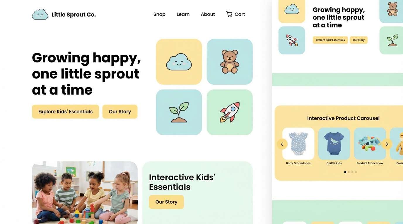
1) Buttercream Sky
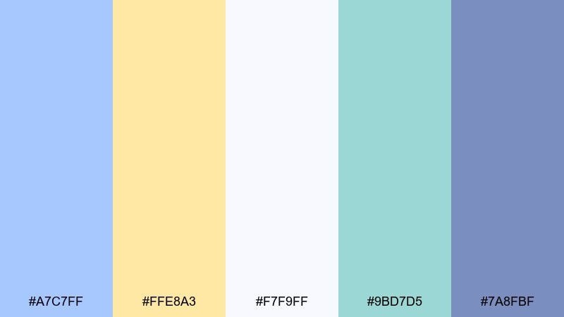
HEX: #A7C7FF #FFE8A3 #F7F9FF #9BD7D5 #7A8FBF
Mood: airy, cheerful, gentle
Best for: children's brand landing page UI
Airy like a clear morning with buttercream highlights, this mix feels friendly and optimistic. It works especially well for a blue pastel yellow color palette in kids, family, and learning experiences where you want softness without feeling dull. Pair it with plenty of white space and rounded UI shapes to keep it breathable. Usage tip: reserve the deepest blue for CTAs and use the yellow only for small highlights to avoid glare.
Image example of buttercream sky generated using media.io
Media.io is an online AI studio for creating and editing video, image, and audio in your browser.

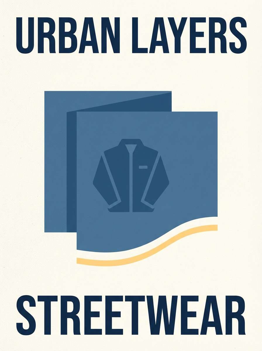
2) Sunlit Denim
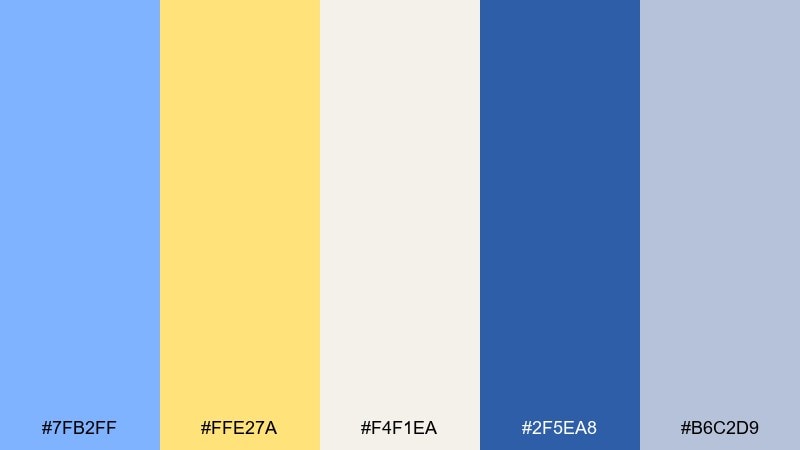
HEX: #7FB2FF #FFE27A #F4F1EA #2F5EA8 #B6C2D9
Mood: bright, modern, confident
Best for: streetwear product ad poster
Bright denim blues and a sun-hit yellow give a crisp, sporty edge that still reads approachable. The deeper navy brings structure, while the warm off-white keeps the layout clean and premium. Use this for posters and ads where you need legibility from a distance and punchy contrast. Usage tip: keep body text in the navy and let the yellow appear in badges, pricing, or limited-time labels.
Image example of sunlit denim generated using media.io
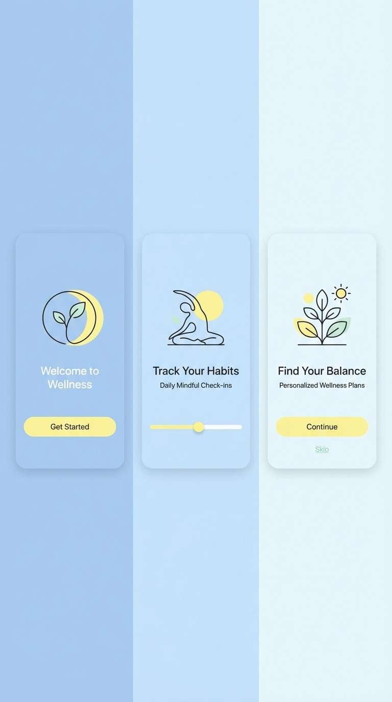
3) Lemon Mist Studio
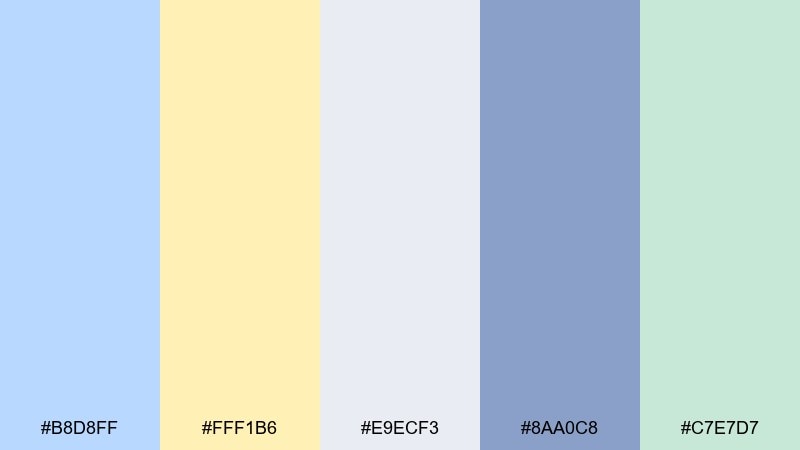
HEX: #B8D8FF #FFF1B6 #E9ECF3 #8AA0C8 #C7E7D7
Mood: calm, tidy, pastel
Best for: wellness app onboarding screens
Calm and slightly foggy, these tones feel like a quiet studio with soft daylight. The pale blue and milky lemon read soothing on screens, while the slate blue adds just enough hierarchy for headings. Great for onboarding flows, reminders, and gentle progress states. Usage tip: use the gray-blue for icon strokes so the UI stays crisp without turning harsh.
Image example of lemon mist studio generated using media.io
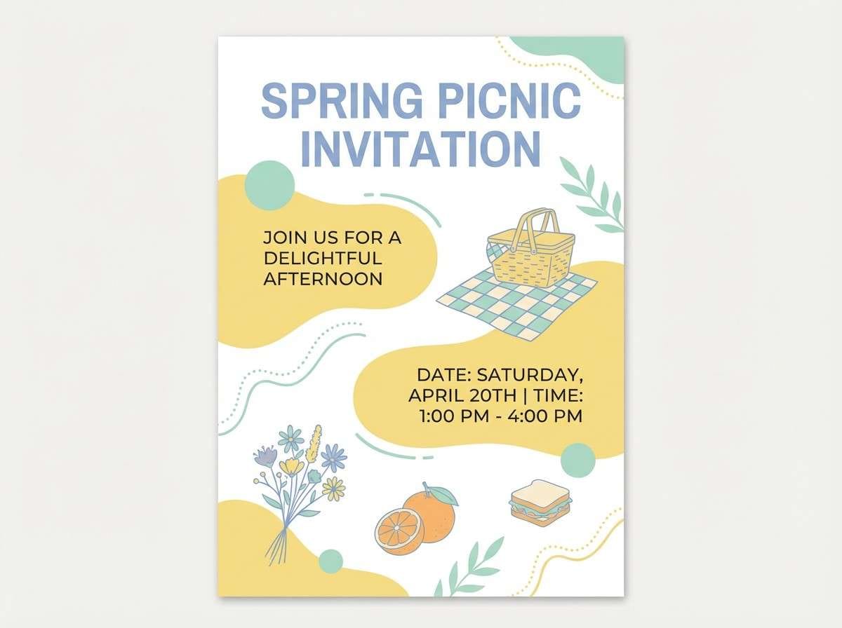
4) Sea Glass Picnic
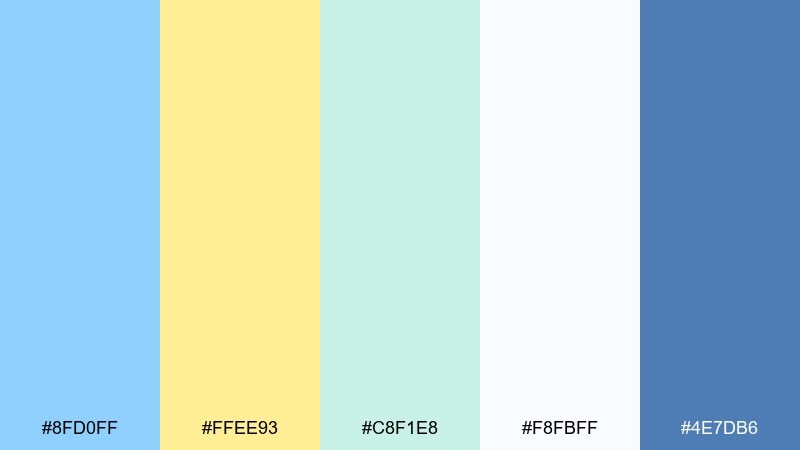
HEX: #8FD0FF #FFEE93 #C8F1E8 #F8FBFF #4E7DB6
Mood: fresh, summery, light
Best for: spring picnic invitation flyer
Fresh like sea glass and lemonade on a warm day, the colors feel playful but not loud. The teal-mint provides a natural bridge between the cool blue and the buttery yellow. Use it for invitations and casual event flyers where you want instant seasonal energy. Usage tip: set the headline in the deeper blue and keep the mint as a thin border or pattern for polish.
Image example of sea glass picnic generated using media.io
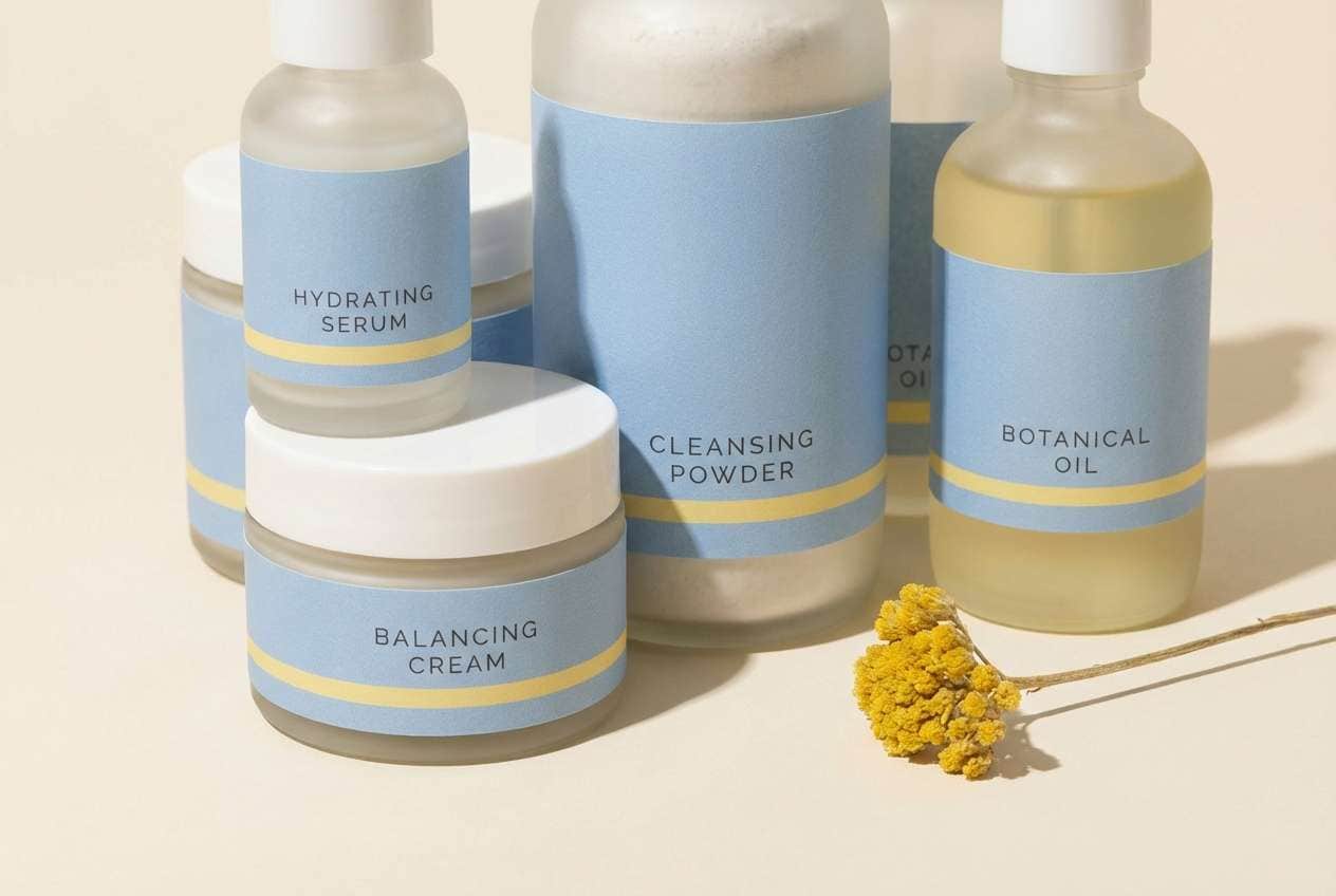
5) Powder Blue Daffodil
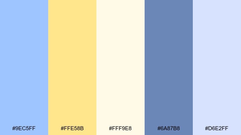
HEX: #9EC5FF #FFE58B #FFF9E8 #6A87B8 #D6E2FF
Mood: soft, sunny, elegant
Best for: brand identity for a skincare line
Soft powder blues and daffodil warmth create an elegant, clean-breeze feeling. The contrast is gentle, making this blue pastel yellow color combination ideal for skincare, beauty, and sensitive-skin positioning. Pair it with minimal serif headlines and plenty of cream background for a refined look. Usage tip: print the yellow as a spot accent on labels and keep the blues for the main brand system.
Image example of powder blue daffodil generated using media.io
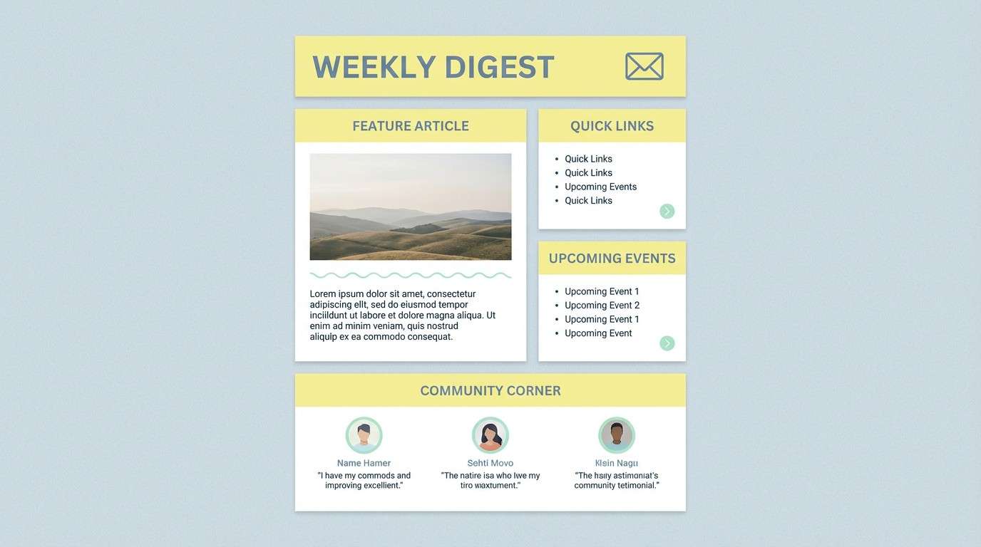
6) Cloudy Lemonade
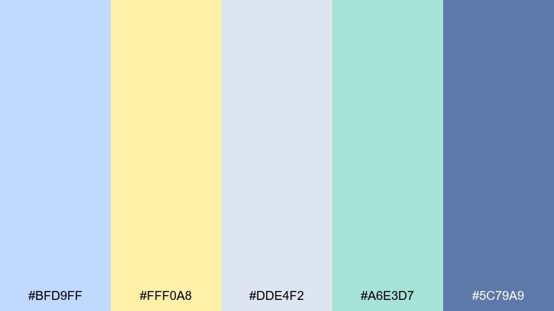
HEX: #BFD9FF #FFF0A8 #DDE4F2 #A6E3D7 #5C79A9
Mood: cozy, gentle, relaxed
Best for: email newsletter template
Cozy like cloudy lemonade on a porch, the palette feels welcoming and easy to read. The mid blue anchors typography, while the light yellow keeps sections feeling warm and human. Use it for newsletters where clarity matters but you still want personality. Usage tip: keep backgrounds in the pale blue-gray and use yellow for section headers or small callouts only.
Image example of cloudy lemonade generated using media.io
7) Vintage Postcard
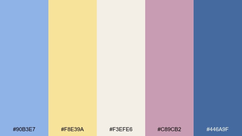
HEX: #90B3E7 #F8E39A #F3EFE6 #C89CB2 #446A9F
Mood: nostalgic, romantic, soft
Best for: travel blog header and hero
Nostalgic like a faded postcard, this mix blends soft blue with mellow yellow and a hint of dusty mauve. It suits travel storytelling, lifestyle blogs, and editorial-like hero sections where emotion matters. Pair it with grainy textures and elegant serif headings for an old-world touch. Usage tip: keep the mauve minimal, using it for tiny separators or links so the theme stays cohesive.
Image example of vintage postcard generated using media.io
8) Playroom Pop
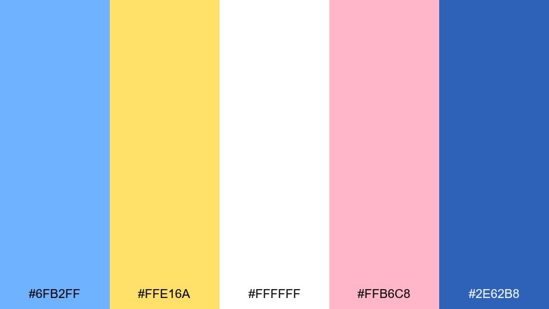
HEX: #6FB2FF #FFE16A #FFFFFF #FFB6C8 #2E62B8
Mood: playful, bold, energetic
Best for: toy store promo poster
Playful and punchy, the stronger blue and sunny yellow feel like building blocks and sticker sheets. A touch of pink adds extra fun without taking over the design. Great for toy promos, kids events, and bold seasonal offers. Usage tip: place the yellow behind big numbers or short words so it reads instantly and stays accessible.
Image example of playroom pop generated using media.io
9) Calm Clinic
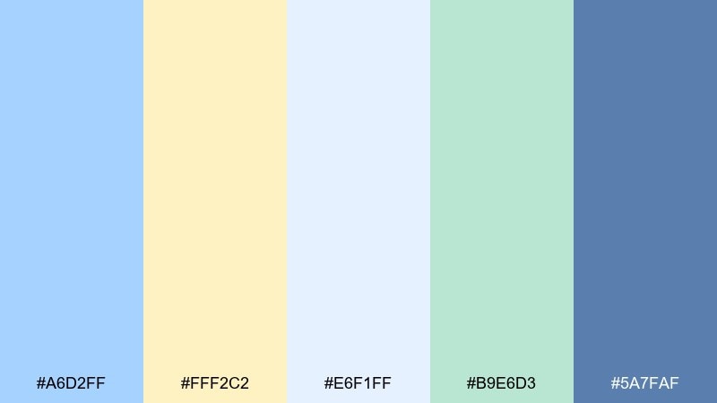
HEX: #A6D2FF #FFF2C2 #E6F1FF #B9E6D3 #5A7FAF
Mood: reassuring, clean, professional
Best for: medical appointment booking UI
Reassuring and clean, these pastels feel like a bright waiting room with soft lighting. The deeper blue provides the trust signal, while the pale yellow keeps the interface from feeling cold. Use it for booking, forms, and patient portals where calm clarity is crucial. Usage tip: maintain high contrast by placing dark blue text on the lightest backgrounds and keep yellow for status hints, not paragraphs.
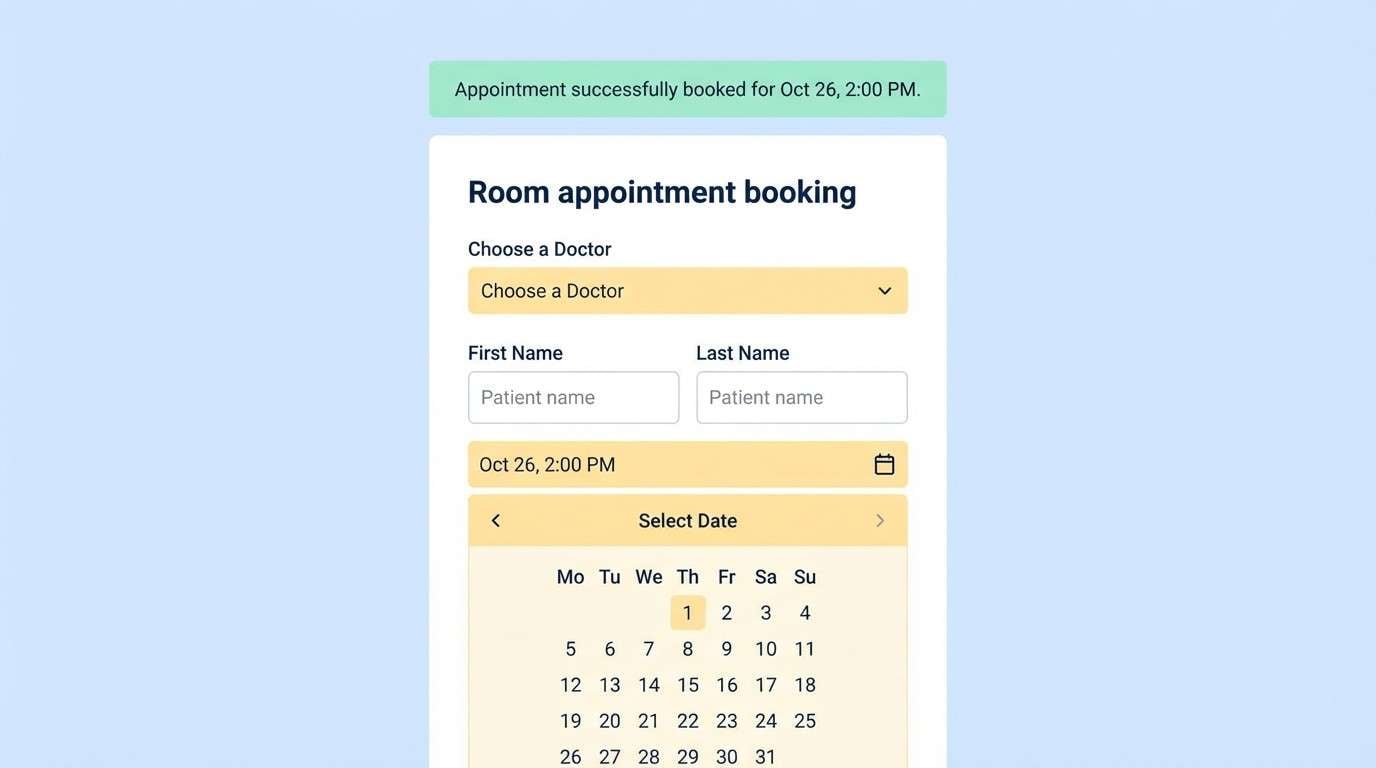
Image example of calm clinic generated using media.io
10) Brunch Menu
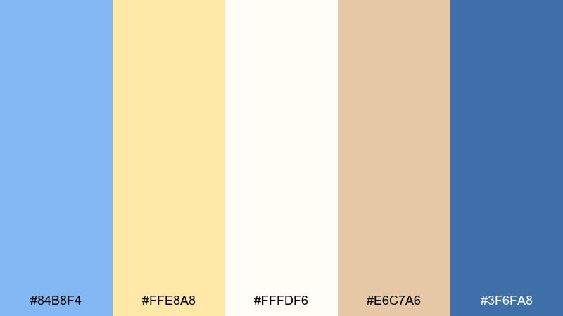
HEX: #84B8F4 #FFE8A8 #FFFDF6 #E6C7A6 #3F6FA8
Mood: warm, inviting, casual-chic
Best for: cafe menu design
Warm and inviting like weekend brunch, the creamy base and soft yellow feel cozy beside a fresh blue. The tan accent adds a food-friendly note that keeps the palette grounded and appetizing. Use it for menus, table tents, and cafe posters where readability matters. Usage tip: stick to the darker blue for prices and section titles, and keep the yellow as a highlight bar behind specials.
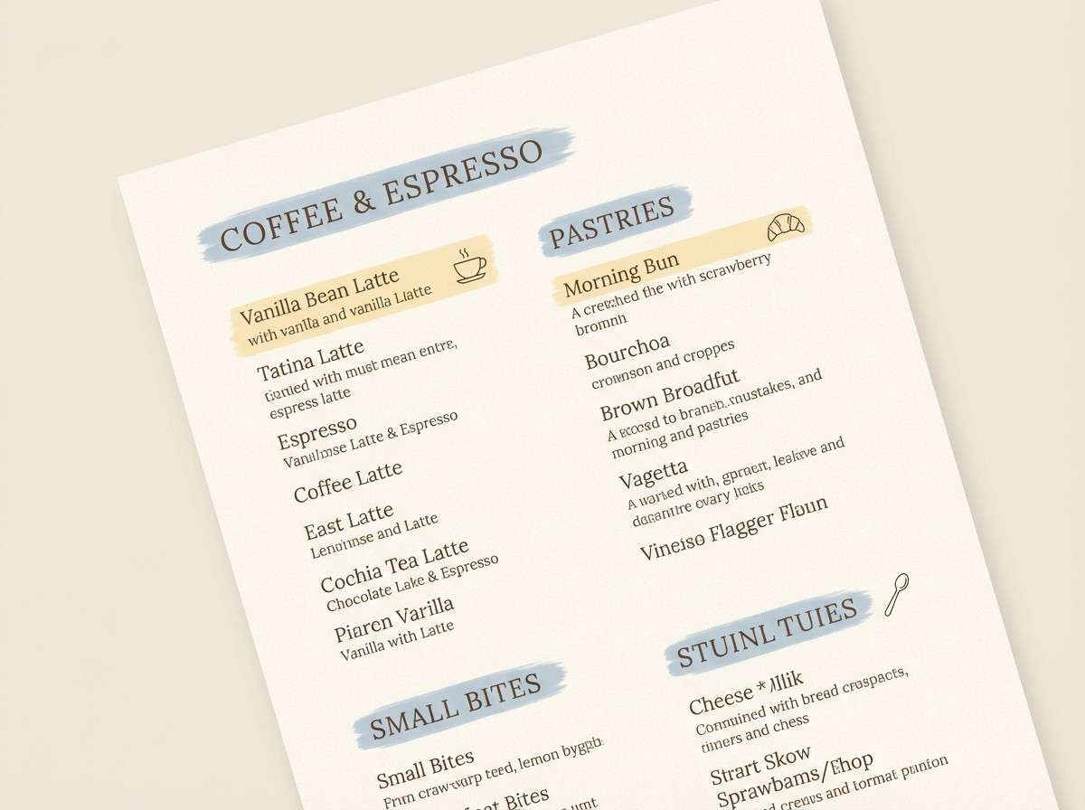
Image example of brunch menu generated using media.io
11) Spring Botanica Wash
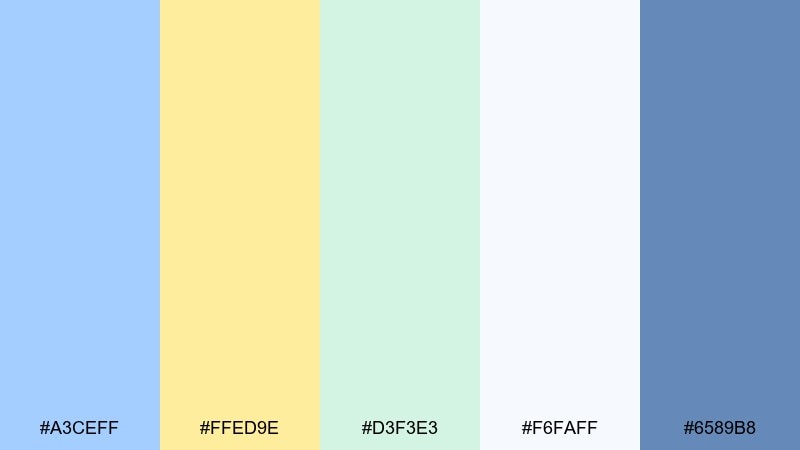
HEX: #A3CEFF #FFED9E #D3F3E3 #F6FAFF #6589B8
Mood: springy, delicate, nature-inspired
Best for: watercolor botanical poster
Springy and delicate, these tones feel like watercolor petals and fresh stems after rain. The mint green keeps the look botanical, while the blue-yellow pairing stays light and optimistic. Perfect for seasonal wall art, garden event posters, or gentle packaging inserts. Usage tip: let the white and pale blue do most of the work, then add yellow only in a few blooms for balance.
Image example of spring botanica wash generated using media.io
12) Gallery Minimal
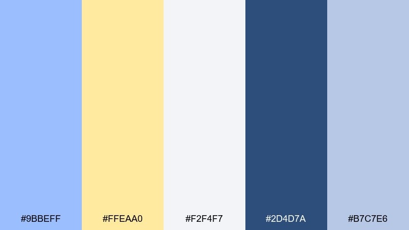
HEX: #9BBEFF #FFEAA0 #F2F4F7 #2D4D7A #B7C7E6
Mood: minimal, curated, modern
Best for: art gallery event flyer
Minimal and curated, this set feels like a quiet gallery wall with a single spotlight. The navy offers strong typographic contrast, while the soft yellow reads like a tasteful highlighter rather than a loud accent. Use it for event flyers, exhibition programs, and clean promotional graphics. Usage tip: keep the layout mostly neutral and use yellow only to mark dates, locations, or one key artwork title.
Image example of gallery minimal generated using media.io
13) Pastel Tech Gradient
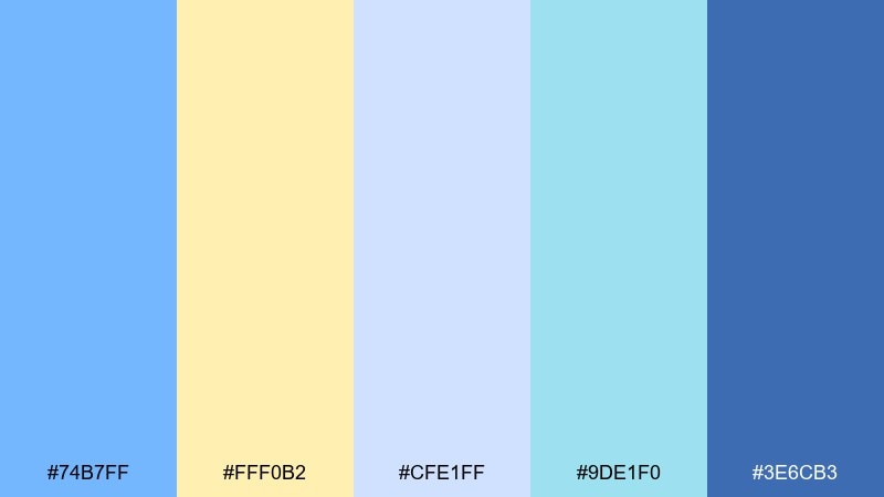
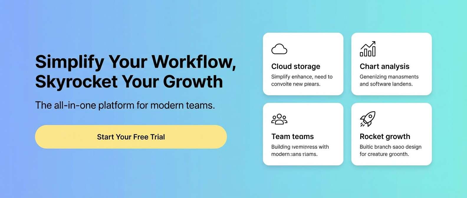
HEX: #74B7FF #FFF0B2 #CFE1FF #9DE1F0 #3E6CB3
Mood: fresh, techy, optimistic
Best for: SaaS website hero section
Fresh and techy, these colors feel like a gentle gradient across a clear sky. The brighter blue gives modern momentum, while the pale yellow keeps the hero from feeling overly corporate. Great for SaaS landing pages, feature highlights, and signup prompts. Usage tip: build your hero background with blue-to-aqua gradients and place yellow only on primary buttons and small icons.
Image example of pastel tech gradient generated using media.io
14) Soft Sportswear
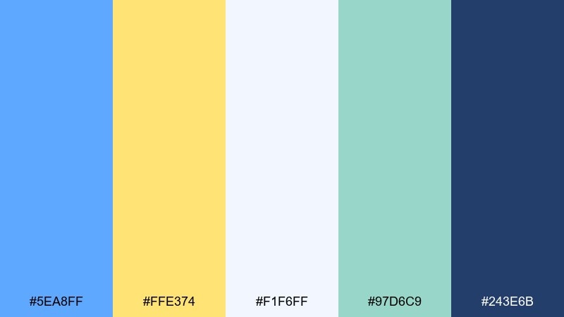
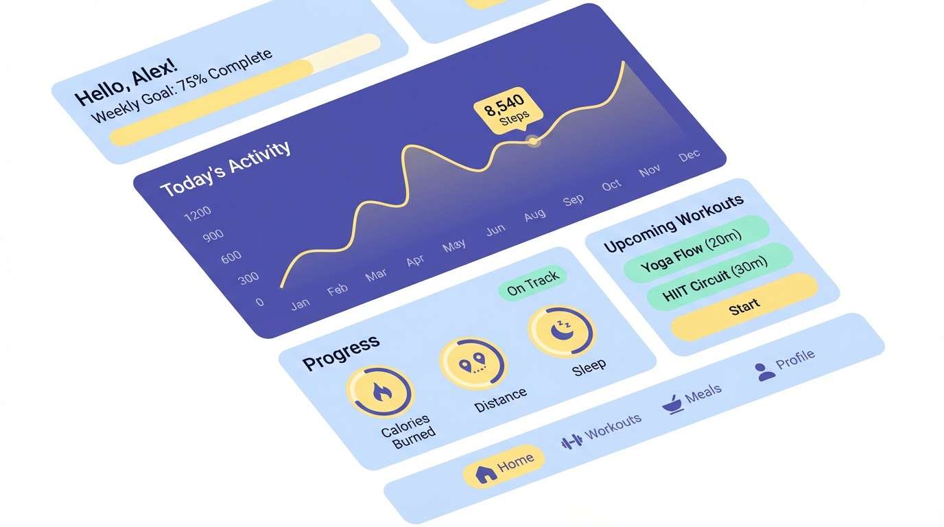
HEX: #5EA8FF #FFE374 #F1F6FF #97D6C9 #243E6B
Mood: active, clean, upbeat
Best for: fitness app dashboard UI
Active and clean, the brighter blue brings energy while the warm yellow adds a friendly spark. The deeper indigo gives you a solid base for metrics and text, keeping dashboards readable. Use it for fitness tracking, habit apps, and lightweight gamification. Usage tip: apply yellow only to streaks, badges, and progress indicators so it stays motivational, not distracting.
Image example of soft sportswear generated using media.io
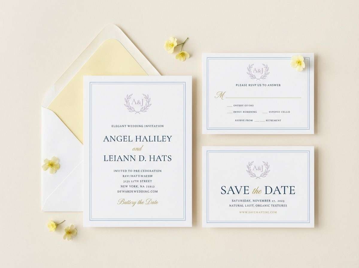
15) Wedding Stationery
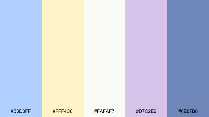
HEX: #B0D0FF #FFF4C8 #FAFAF7 #D7C2E9 #6E87B8
Mood: romantic, airy, delicate
Best for: wedding invitation suite
Romantic and airy, the soft blue and buttery cream feel like light silk and spring florals. A gentle lilac accent adds a subtle celebratory note without shifting the mood too sweet. Use it for invitation suites, RSVP cards, and wedding websites that want a modern pastel vibe. Usage tip: print the text in the darker blue for sharpness and keep lilac for small monograms or edge details.
Image example of wedding stationery generated using media.io
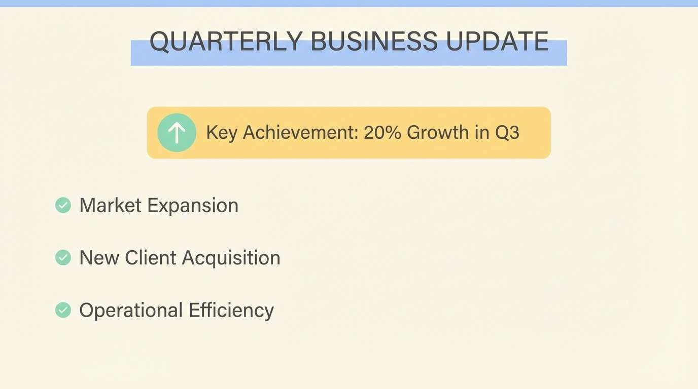
16) Sunny Workspace
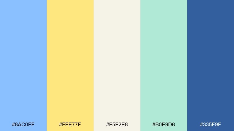
HEX: #8AC0FF #FFE77F #F5F2E8 #B0E9D6 #335F9F
Mood: bright, organized, friendly
Best for: presentation slide deck theme
Bright and organized, these tones feel like a tidy workspace with sun across the desk. The cream base keeps slides calm, while the yellow brings emphasis without shouting. Ideal for decks, reports, and workshops that need a friendly but credible look. Usage tip: use yellow for key takeaways and keep charts mostly in blues for consistency across slides.
Image example of sunny workspace generated using media.io
17) Ice Cream Truck
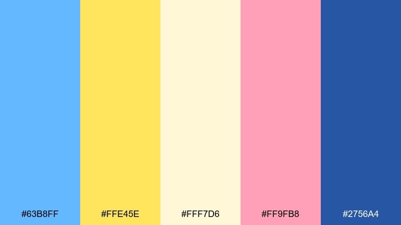
HEX: #63B8FF #FFE45E #FFF7D6 #FF9FB8 #2756A4
Mood: fun, nostalgic, bright
Best for: summer festival poster
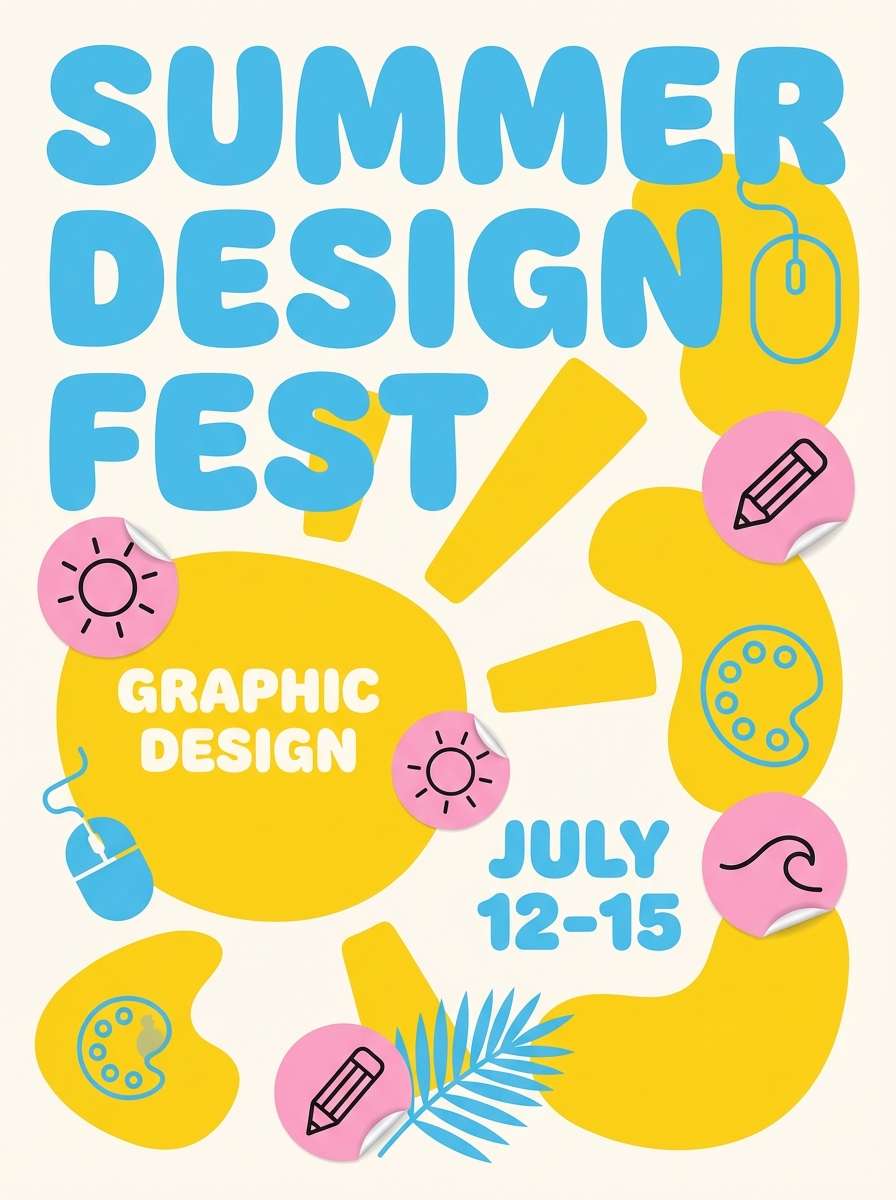
Fun and nostalgic, the colors feel like an ice cream truck sign under a bright sky. Among blue pastel yellow color combinations, this one leans more playful thanks to the bubblegum pink. Use it for festivals, pop-ups, and summer promos where you want instant joy and high visibility. Usage tip: keep the pink to small bursts and let blue and yellow carry the main hierarchy for a cleaner read.
Image example of ice cream truck generated using media.io
18) Quiet Library
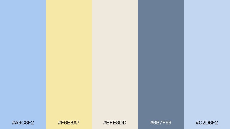
HEX: #A9C8F2 #F6E8A7 #EFE8DD #6B7F99 #C2D6F2
Mood: soft, thoughtful, academic
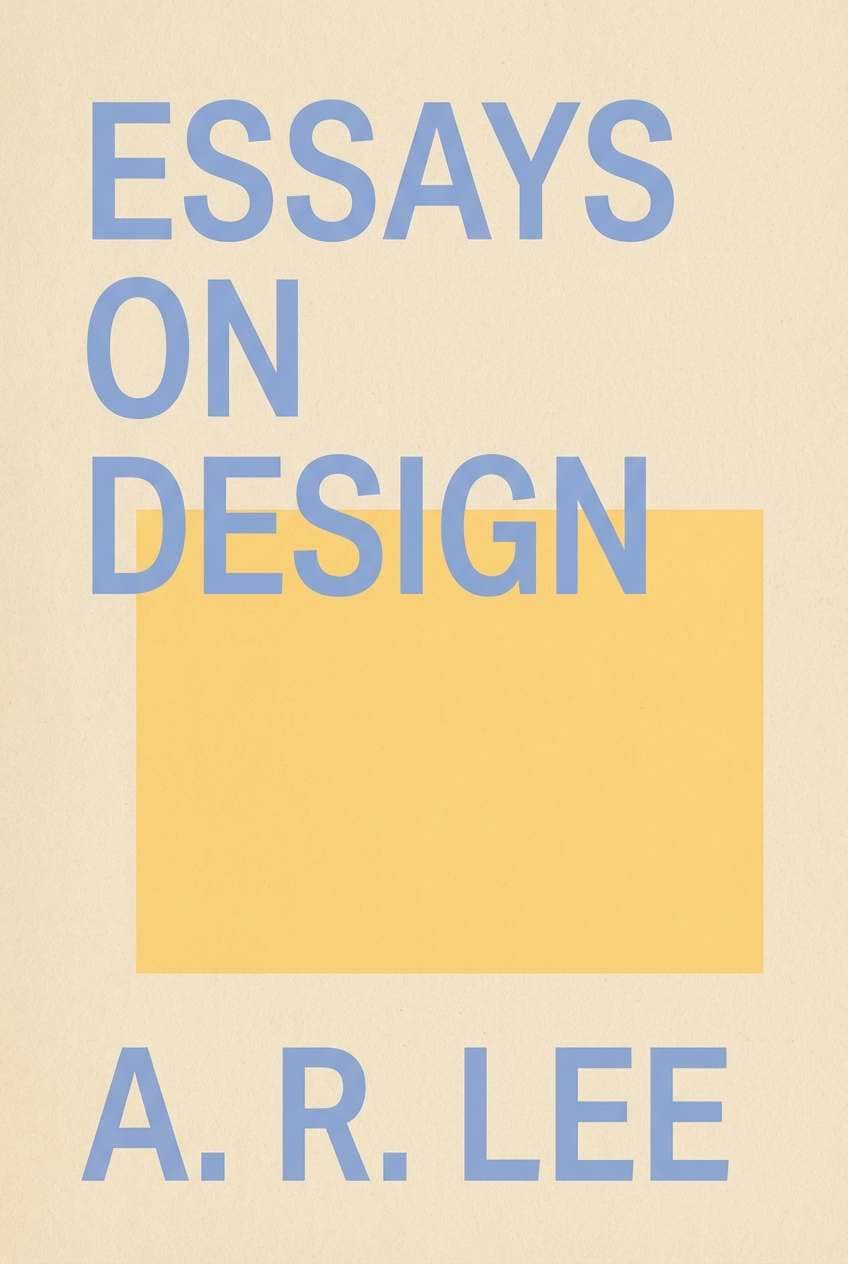
Best for: book cover design
Soft and thoughtful, the palette feels like sunlight on old pages in a quiet reading room. The warm beige keeps it grounded, while the muted blue tones add an academic calm. Use it for book covers, journals, and educational materials that aim for warmth over stark minimalism. Usage tip: choose the deeper gray-blue for titles and keep the yellow as a gentle highlight behind a subtitle or badge.
Image example of quiet library generated using media.io
19) Evening Boardwalk
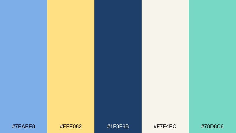
HEX: #7EAEE8 #FFE082 #1F3F6B #F7F4EC #78D8C6
Mood: coastal, balanced, slightly moody
Best for: travel app feature banner
Coastal and slightly moody, the deep blue feels like evening water while the yellow glows like boardwalk lights. The aqua accent brings a breezy contrast that keeps the design from turning too dark. Use it for travel banners, destination cards, and feature callouts that need a bit more drama. Usage tip: keep the dark blue as the background and place yellow only on key icons or short labels for instant focus.
Image example of evening boardwalk generated using media.io
20) Modern Classroom
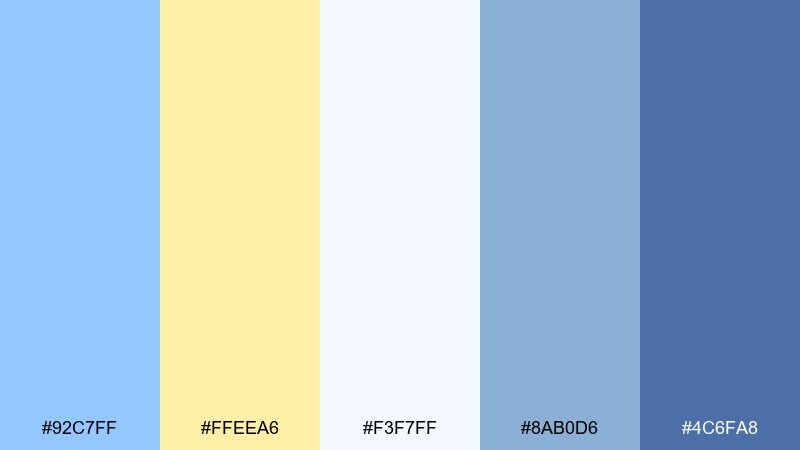
HEX: #92C7FF #FFEEA6 #F3F7FF #8AB0D6 #4C6FA8
Mood: fresh, approachable, focused
Best for: e-learning course cover
Fresh and approachable, these tones feel like a modern classroom with daylight and tidy notebooks. The lightest blue keeps the layout clean, while the soft yellow adds warmth for emphasis and navigation. As a blue pastel yellow color palette, it fits course covers, lesson thumbnails, and teacher resources where clarity is the priority. Usage tip: use the mid blue for titles and keep yellow for small markers like lesson numbers or progress tags.
Image example of modern classroom generated using media.io

What Colors Go Well with Blue Pastel Yellow?
Soft neutrals like warm white, cream, and light gray-blue help blue and pastel yellow look intentional rather than “too cute.” They also create space for typography and product imagery.
For fresh accents, try mint, aqua, or seafoam—these sit naturally between blue and yellow and keep the palette light. For romantic or editorial touches, dusty lilac and muted mauve add personality without overpowering the base.
If you need stronger contrast for accessibility, bring in a navy, deep slate, or indigo for text, charts, and CTAs. Dark anchors make pastel backgrounds feel clean and premium.
How to Use a Blue Pastel Yellow Color Palette in Real Designs
Start with roles: assign one pastel blue as the primary background, reserve a deeper blue for typography and buttons, and treat pastel yellow as a highlight color. This keeps the design readable and prevents yellow glare on large blocks.
In UI, use yellow for small interactive states (badges, tags, progress, selected items) and keep long-form text on light neutrals. For print, test yellow on your paper stock—pastel yellows can shift quickly under different lighting.
To make the system feel complete, add one “bridge” accent (mint/aqua) and one neutral (cream/off-white). You’ll get more layout flexibility without losing the soft spring-like mood.
Create Blue Pastel Yellow Palette Visuals with AI
If you want to preview how a blue pastel yellow color palette looks on a landing page, poster, invitation, or product mockup, generating quick concept images can save hours. It’s also a great way to test contrast and hierarchy before committing to a full layout.
With Media.io text-to-image, you can paste a prompt, specify an aspect ratio, and iterate until the palette feels right for your brand or project. Try describing your design type (UI, flyer, packaging) and call out your key colors.
Blue Pastel Yellow Color Palette FAQs
-
Is blue and pastel yellow a good combination for websites?
Yes. Pastel blue feels calm and trustworthy, while pastel yellow adds warmth. Use a darker blue (navy/indigo) for text and CTAs to keep contrast strong and readability high. -
What background color works best with pastel blue and yellow?
Warm white, cream, and very light blue-gray backgrounds work best. They keep the layout airy and prevent the yellow from becoming too bright over large areas. -
What accent colors pair well with a blue pastel yellow color palette?
Mint, aqua, and seafoam add freshness; lilac or dusty mauve adds a soft romantic note; and navy or deep slate provides a strong anchor for type and icons. -
How do I keep pastel yellow from looking harsh on screens?
Use yellow sparingly (badges, highlights, small shapes) and avoid large yellow panels behind paragraphs. When in doubt, put yellow on light neutrals and reserve darker blues for text. -
Which industries commonly use pastel blue and yellow brand colors?
Education, kids/family brands, wellness, skincare, and friendly SaaS products often use this combo because it feels approachable, optimistic, and clean. -
Can a blue pastel yellow palette look premium?
Yes—pair it with plenty of whitespace, restrained yellow accents, and a deep navy for typography. Minimal layouts and high-quality type choices make pastels feel curated rather than playful. -
How can I generate mockups that match my palette quickly?
Use Media.io’s text-to-image tool and describe the layout (e.g., “SaaS hero,” “wedding invite,” “product label”), then specify pastel blue and buttery yellow accents plus a neutral background for accurate palette control.


