

Crimson red sits right in the sweet spot between classic red and modern berry tones—bold enough to feel premium, but flexible enough to go soft, romantic, or editorial.
Below are reusable crimson red color combinations with HEX codes, plus practical pairing notes for branding, UI, print, and event design.
In this article
- Why Crimson Red Color Combinations Work So Well
-
- velvet garnet
- crimson clay
- ruby noir
- winter berry
- rosewood linen
- spiced pomegranate
- studio scarlet
- merlot midnight
- antique crimson
- crimson citrus
- botanical cranberry
- modern maroon ui
- opera house poster
- bridal crimson blush
- heritage wine label
- cozy cabin interior
- minimal crimson mono
- crimson streetwear
- cherry blossom editorial
- festive crimson gold
- What Colors Go Well with Crimson Red?
- How to Use a Crimson Red Color Combination in Real Designs
- Create Crimson Red Palette Visuals with AI
Why Crimson Red Color Combinations Work So Well
Crimson red feels confident and expressive, so it naturally grabs attention in logos, headlines, calls to action, and hero visuals. Compared with brighter reds, it often reads more refined—less “warning” and more “premium.”
It also blends easily across styles. Push it toward black and charcoal for cinematic luxury, mix it with blush and parchment for romance, or pair it with teal and gold for modern contrast.
Most importantly, crimson red plays well with neutrals. Creams, grays, taupes, and near-blacks give it space, helping you control intensity and keep layouts readable.
20+ Crimson Red Color Palette Ideas (with HEX Codes)
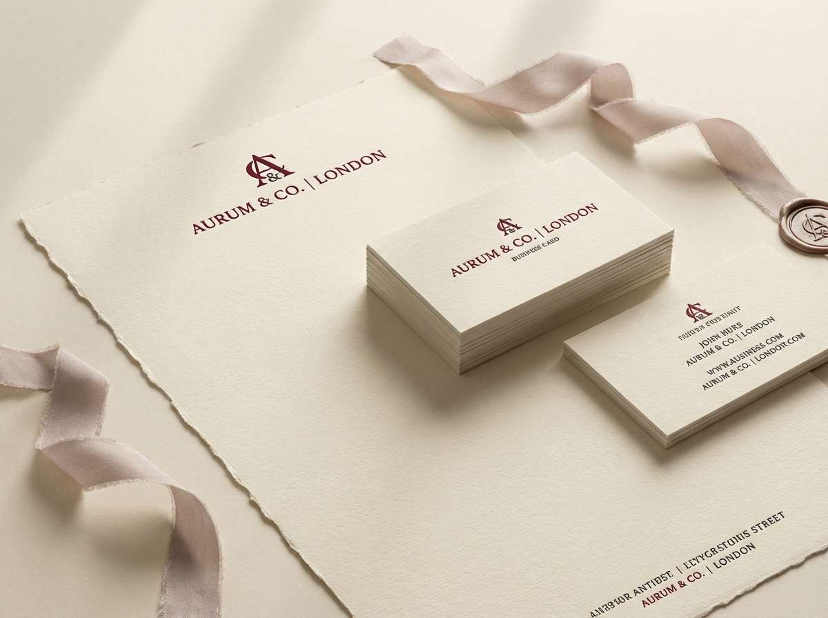
1) Velvet Garnet
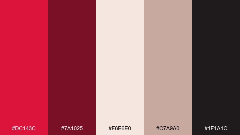
HEX: #DC143C #7A1025 #F6E6E0 #C7A9A0 #1F1A1C
Mood: luxurious, dramatic, intimate
Best for: luxury branding and stationery
Plush and dramatic, this crimson red color palette evokes velvet drapes, candlelit rooms, and rich fabric texture. Use the deep garnet as the hero tone, then soften with warm creams for readable layouts. Pair it with matte black for premium contrast and a touch of dusty rose for warmth. Tip: keep metallic finishes subtle so the reds stay sophisticated rather than flashy.
Image example of velvet garnet generated using media.io
Media.io is an online AI studio for creating and editing video, image, and audio in your browser.

2) Crimson Clay
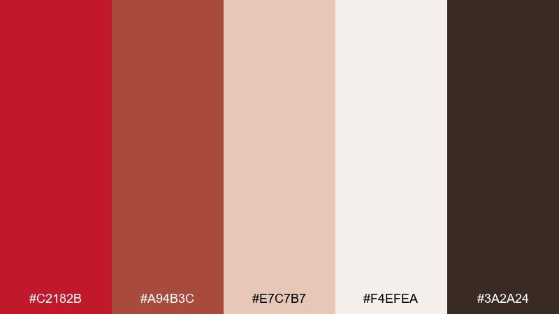
HEX: #C2182B #A94B3C #E7C7B7 #F4EFEA #3A2A24
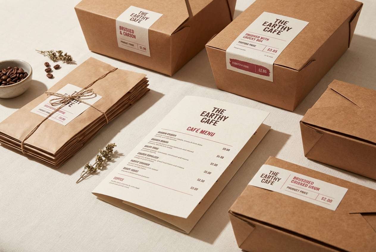
Mood: earthy, warm, grounded
Best for: rustic packaging and cafe menus
Warm and grounded, it feels like sun-baked clay, paprika, and linen napkins. Let the clay browns carry the background while the red adds appetite and energy. It pairs well with kraft textures, off-white stock, and simple serif typography. Tip: use the darkest brown for headings to keep contrast high without turning harsh.
Image example of crimson clay generated using media.io
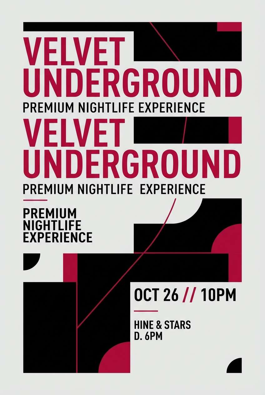
3) Ruby Noir
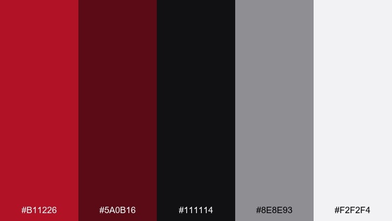
HEX: #B11226 #5A0B16 #111114 #8E8E93 #F2F2F4
Mood: moody, sleek, high-contrast
Best for: nightlife posters and premium ads
Moody and sleek, it brings to mind city nights, glossy lipstick, and neon reflections on wet pavement. This crimson red color combination works best with heavy black space and tight, modern typography. Add cool gray for structure and reserve the ruby for focal elements like headlines or product details. Tip: keep gradients minimal and lean into crisp edges for a sharper look.
Image example of ruby noir generated using media.io
4) Winter Berry
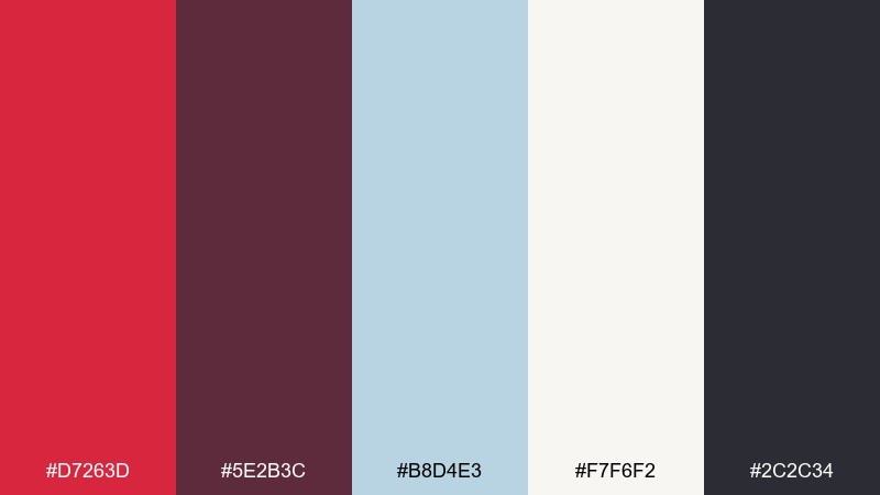
HEX: #D7263D #5E2B3C #B8D4E3 #F7F6F2 #2C2C34
Mood: crisp, festive, airy
Best for: holiday social posts and seasonal banners
Crisp and festive, it feels like berries on snow with a cold blue breeze. Use the icy blue as negative space to keep the reds from becoming too heavy. The plum tone adds depth for shadows, borders, and secondary text. Tip: keep the red for calls to action so the layout stays clean and winter-bright.
Image example of winter berry generated using media.io

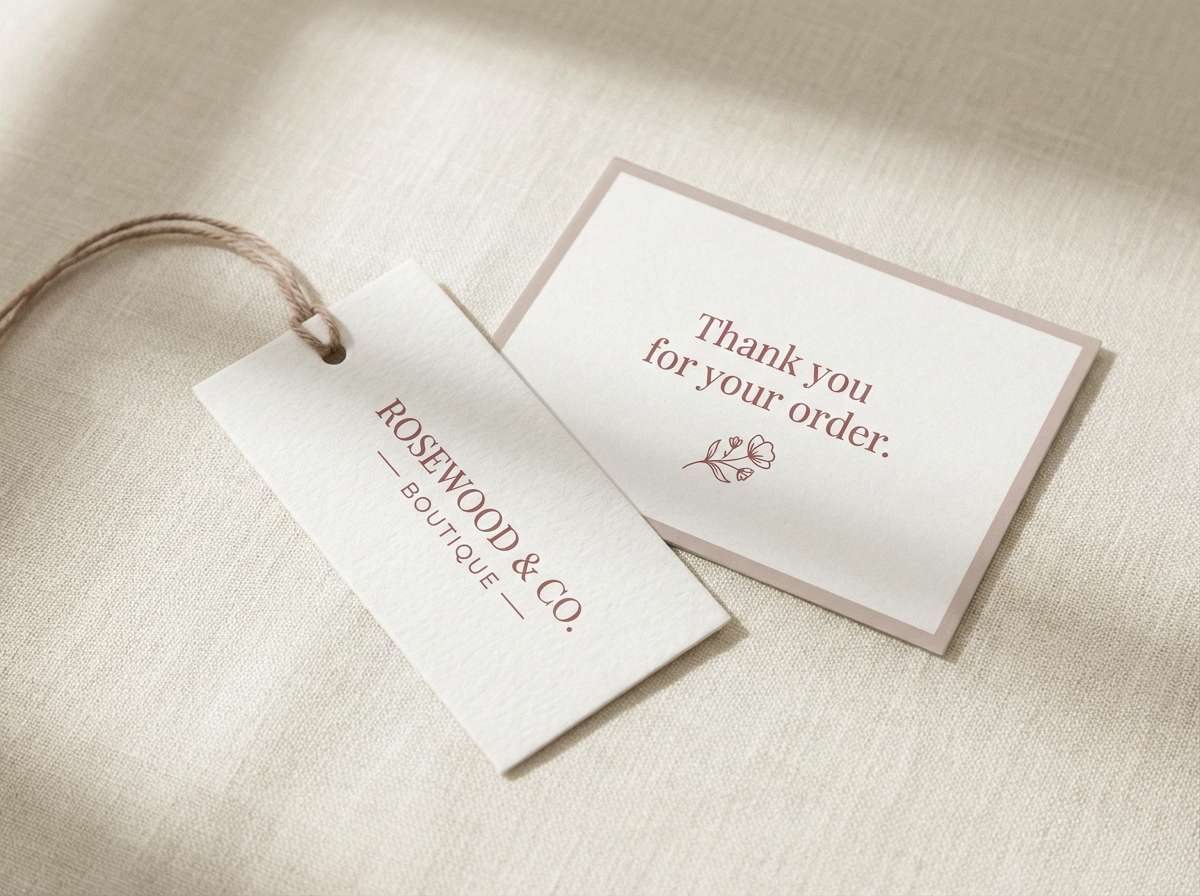
5) Rosewood Linen
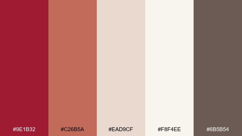
HEX: #9E1B32 #C26B5A #EAD9CF #F8F4EE #6B5B54
Mood: soft, vintage, cozy
Best for: boutique branding and wedding details
Soft and vintage, it evokes rosewood furniture, blush ceramics, and linen table settings. Build most layouts with the creamy neutrals, then bring in the muted red for logos and highlights. It pairs beautifully with warm photography, natural fibers, and copper accents. Tip: choose rounded typography or gentle serifs to match the cozy tone.
Image example of rosewood linen generated using media.io
6) Spiced Pomegranate
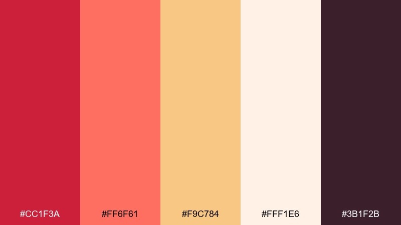
HEX: #CC1F3A #FF6F61 #F9C784 #FFF1E6 #3B1F2B
Mood: playful, spicy, inviting
Best for: restaurant promos and foodie content
Playful and spicy, it feels like pomegranate seeds, citrus zest, and warm bakery light. The coral and saffron tones keep the red lively and approachable for food-forward designs. Use the dark plum sparingly for text and outlines to anchor the warmth. Tip: reserve the brightest coral for buttons or price tags to guide the eye.
Image example of spiced pomegranate generated using media.io

7) Studio Scarlet
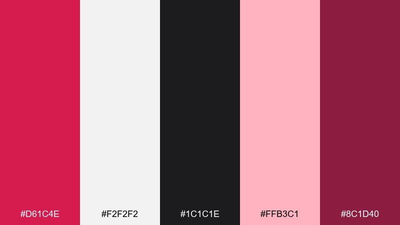
HEX: #D61C4E #F2F2F2 #1C1C1E #FFB3C1 #8C1D40
Mood: bold, modern, punchy
Best for: creative brand kits and launch graphics
Bold and punchy, it brings runway lights, glossy posters, and confident motion graphics to mind. A crimson red color palette like this shines when you lean on clean grays and black for structure. Use the soft pink as a buffer for spacing, cards, and secondary buttons. Tip: keep the accent pink at small percentages so the scarlet stays in control.
Image example of studio scarlet generated using media.io
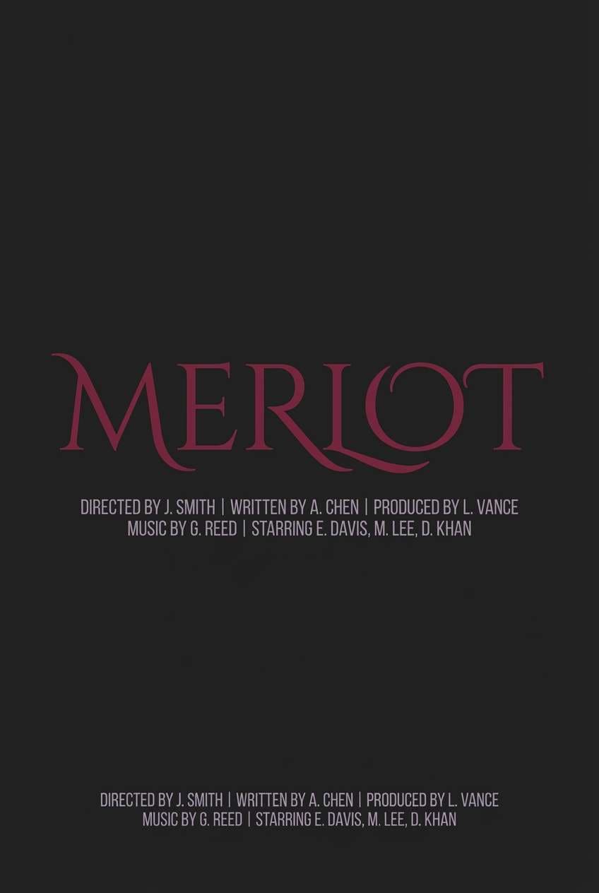
8) Merlot Midnight
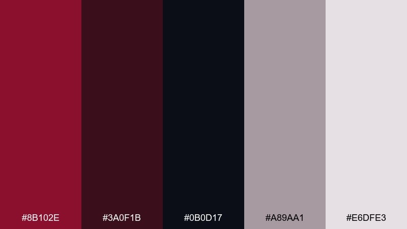
HEX: #8B102E #3A0F1B #0B0D17 #A89AA1 #E6DFE3
Mood: mysterious, refined, cinematic
Best for: film posters and luxury campaigns
Mysterious and refined, it suggests merlot in a dim bar and velvet shadows on a stage. Use the near-black as the canvas and let the merlot provide quiet intensity. The lilac-gray tones are perfect for subheads, credits, and soft gradients. Tip: add gentle grain to backgrounds to make the dark tones feel cinematic, not flat.
Image example of merlot midnight generated using media.io
9) Antique Crimson
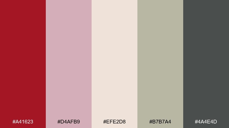
HEX: #A41623 #D4AFB9 #EFE2D8 #B7B7A4 #4A4E4D
Mood: nostalgic, elegant, calm
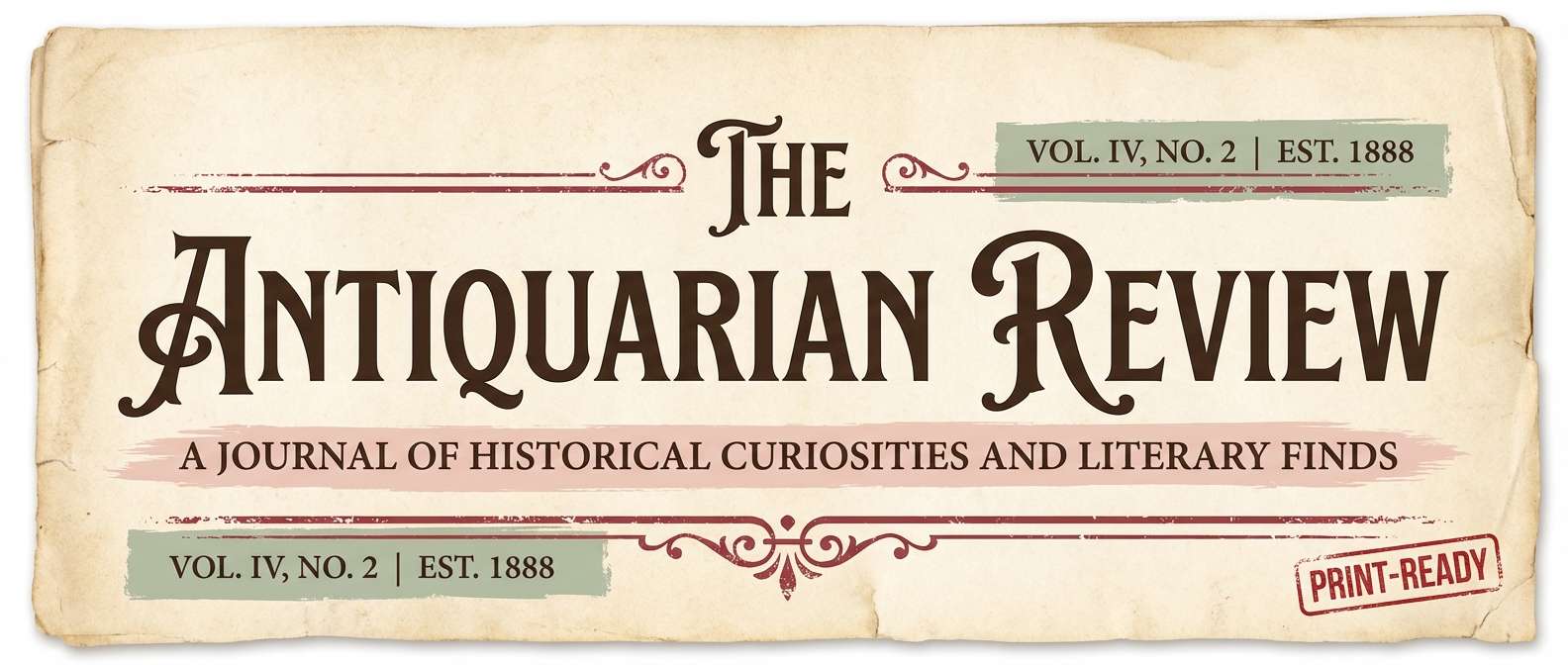
Best for: heritage brands and editorial headers
Nostalgic and elegant, it recalls antique books, pressed petals, and soft patina. Keep the blush and parchment tones dominant for an airy, archival feel. Use the antique red as a seal-like accent for icons, drop caps, or section dividers. Tip: pair with understated photography and plenty of margins for a museum-grade finish.
Image example of antique crimson generated using media.io
10) Crimson Citrus
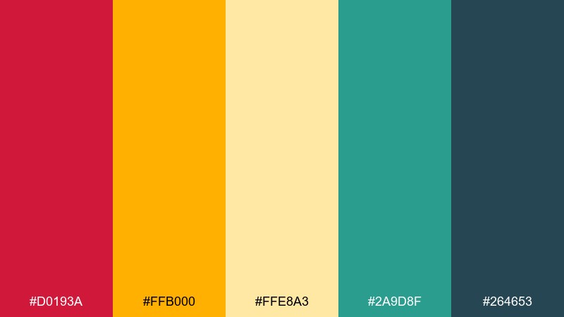
HEX: #D0193A #FFB000 #FFE8A3 #2A9D8F #264653
Mood: energetic, sunny, contemporary
Best for: event promos and summer ads
Energetic and sunny, it feels like a red spritz with citrus peel and bold modern signage. The golden tones brighten the red and prevent it from reading too serious. Add teal as a cool counterpoint for buttons, icons, or supporting shapes. Tip: keep teal to small doses so the warm hues remain the visual lead.
Image example of crimson citrus generated using media.io

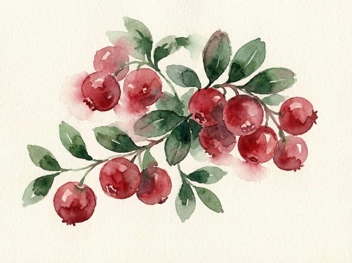
11) Botanical Cranberry
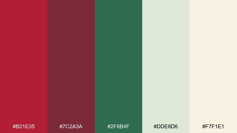
HEX: #B21E35 #7C2A3A #2F6B4F #DDE8D6 #F7F1E1
Mood: natural, fresh, handcrafted
Best for: botanical labels and wellness packaging
Natural and fresh, it evokes cranberries, evergreen leaves, and paper-wrapped gifts. Use the greens as calming support while the red adds a ripe, appetizing focal point. Creamy off-white works well for label backgrounds and ingredient panels. Tip: choose organic line art and avoid high-gloss finishes to keep it handmade.
Image example of botanical cranberry generated using media.io
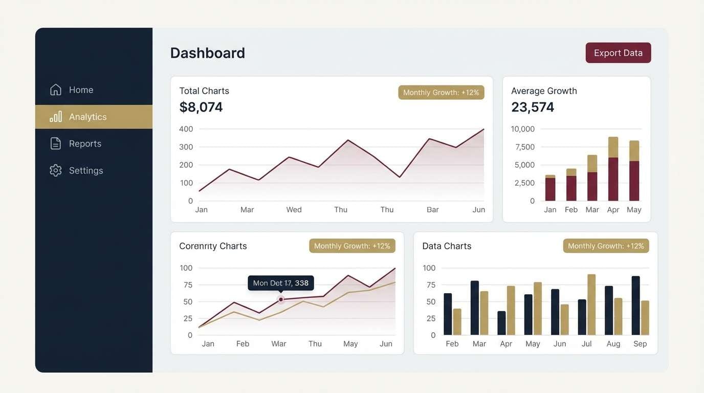
12) Modern Maroon UI
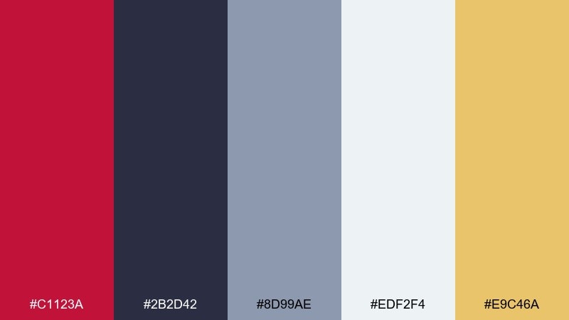
HEX: #C1123A #2B2D42 #8D99AE #EDF2F4 #E9C46A
Mood: clean, professional, confident
Best for: dashboard UI and product design
Clean and confident, it feels like a sharp interface with purposeful highlights and quiet depth. This crimson red color combination works best when maroon is reserved for primary actions and alerts, not full backgrounds. The cool grays keep data tables readable, while the muted gold adds warmth for badges or key metrics. Tip: test contrast states early so the maroon stays accessible on light and dark panels.
Image example of modern maroon ui generated using media.io
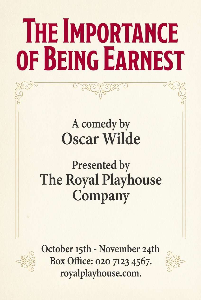
13) Opera House Poster
HEX: #C01F3B #F8F1E5 #1B1B1D #C9A227 #6D2E46
Mood: grand, theatrical, classic
Best for: theater posters and concert programs
Grand and theatrical, it suggests velvet seats, gilded balconies, and a spotlight on opening night. Use cream as the main field so typography stays elegant and legible. Gold and plum add old-world richness without competing with the red headline. Tip: keep ornamentation minimal and let spacing and hierarchy do the heavy lifting.
Image example of opera house poster generated using media.io
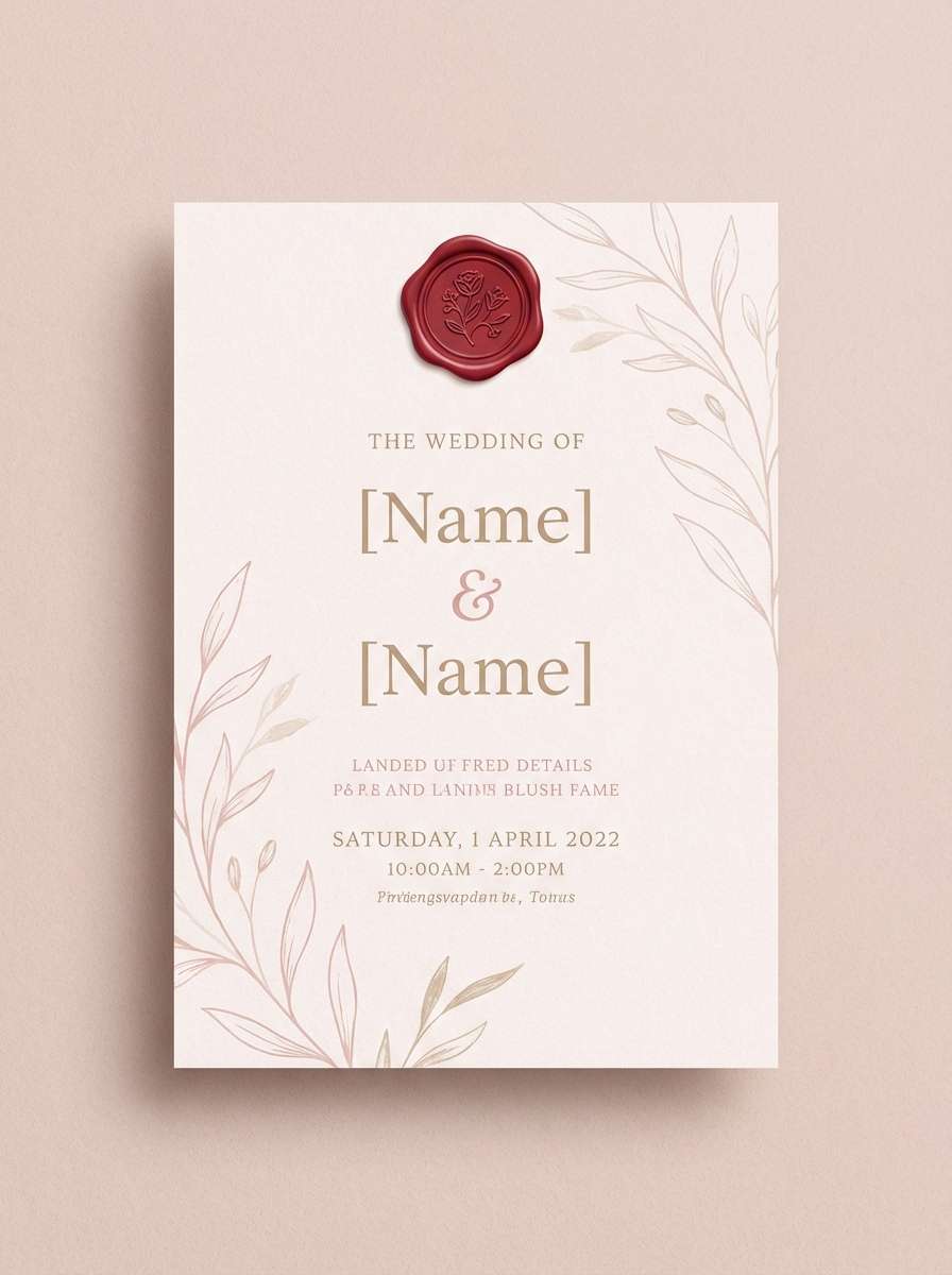
14) Bridal Crimson Blush
HEX: #D01E3A #F3B7C6 #FBE9E7 #C9B6A6 #2D2424
Mood: romantic, soft, elevated
Best for: wedding invitations and event suites
Romantic and soft, it feels like blush petals with a bold bouquet ribbon. Let the pale pinks handle the background so the deep red reads as a meaningful accent. The warm beige keeps it grounded for envelopes, menus, and place cards. Tip: use the dark cocoa for text instead of pure black to maintain a gentle tone.
Image example of bridal crimson blush generated using media.io
15) Heritage Wine Label
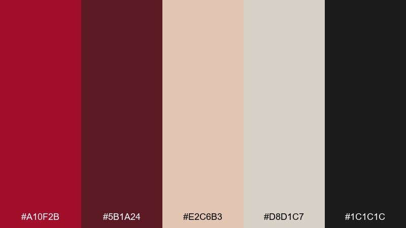
HEX: #A10F2B #5B1A24 #E2C6B3 #D8D1C7 #1C1C1C
Mood: heritage, premium, earthy
Best for: wine labels and gourmet packaging
Heritage and premium, it evokes cellar doors, stamped paper, and oak-aged warmth. This crimson red color combination looks best with textured creams and deep ink-like shadows. Use the darkest tones for crests and typography, then reserve the red for seals, ribbons, or varietal names. Tip: print tests on uncoated stock will make the palette feel even more authentic.
Image example of heritage wine label generated using media.io
16) Cozy Cabin Interior
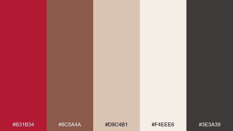
HEX: #B31B34 #8C5A4A #D9C4B1 #F4EEE6 #3E3A39
Mood: cozy, rustic, welcoming
Best for: interior mood boards and lifestyle blogs
Cozy and welcoming, it brings to mind knit blankets, cedar wood, and a crackling fireplace. Use the warm creams as the base, then layer in brown and charcoal for depth and furniture-like weight. The red works best as a throw pillow accent, small graphic motif, or headline color. Tip: keep patterns simple so the palette reads calm rather than busy.
Image example of cozy cabin interior generated using media.io
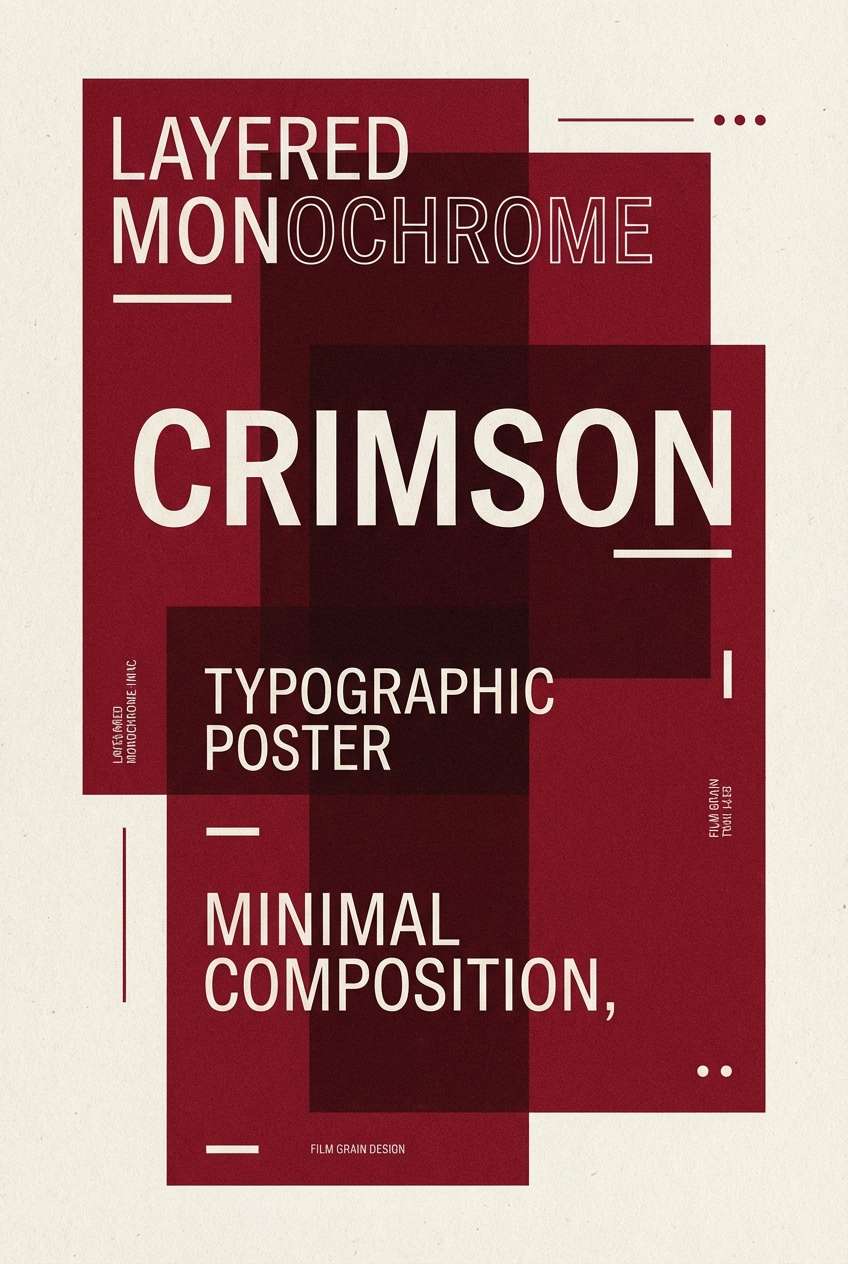
17) Minimal Crimson Mono
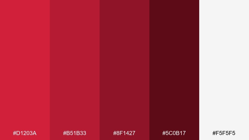
HEX: #D1203A #B51B33 #8F1427 #5C0B17 #F5F5F5
Mood: minimal, bold, focused
Best for: logo explorations and typographic posters
Minimal and focused, it feels like a monochrome print series with confident ink coverage. Stack the reds by value to create depth without adding new hues. Off-white provides breathing room for negative space and crisp edges. Tip: use the darkest maroon for body text and keep the brightest red for emphasis only.
Image example of minimal crimson mono generated using media.io
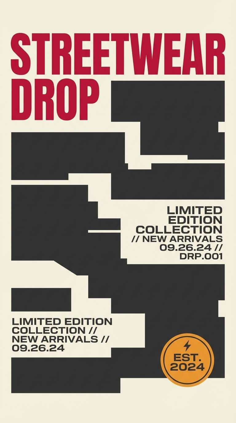
18) Crimson Streetwear
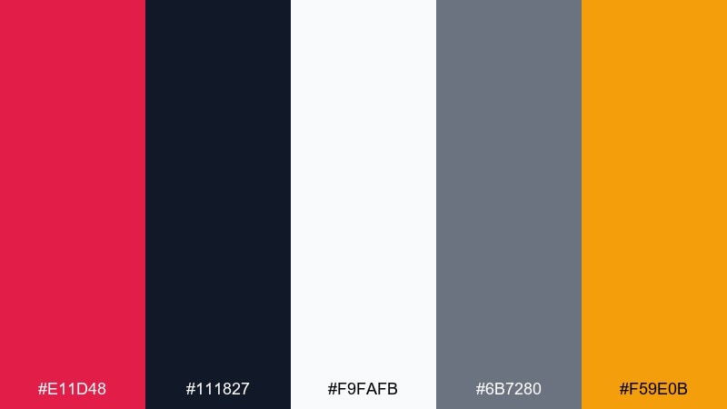
HEX: #E11D48 #111827 #F9FAFB #6B7280 #F59E0B
Mood: urban, sporty, high-energy
Best for: streetwear drops and sports promos
Urban and high-energy, it channels bold jerseys, asphalt tones, and a flash of golden detail. Use charcoal and gray for the foundation, then let the bright red carry the headline. The warm amber makes a great highlight for prices, dates, or limited-drop badges. Tip: keep the layout punchy with big type and strong grids to match the vibe.
Image example of crimson streetwear generated using media.io
19) Cherry Blossom Editorial
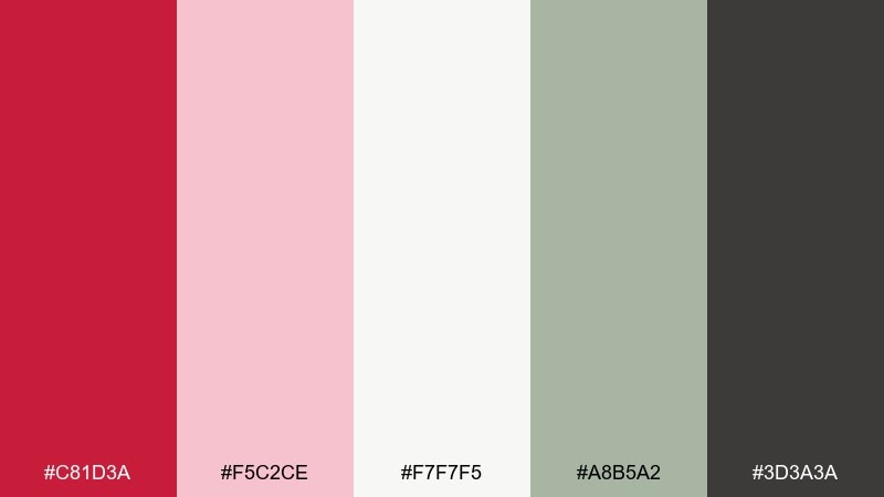
HEX: #C81D3A #F5C2CE #F7F7F5 #A8B5A2 #3D3A3A
Mood: fresh, romantic, editorial
Best for: magazine layouts and lookbooks
Fresh and editorial, it feels like spring blossoms against calm, modern neutrals. Use the pink and off-white as generous space for imagery and long-form text. The sage tone adds an unexpected, stylish counterbalance to the cherry red. Tip: treat the red like a lipstick accent, small but instantly attention-grabbing.
Image example of cherry blossom editorial generated using media.io
20) Festive Crimson Gold
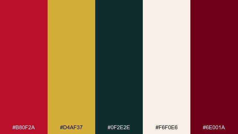
HEX: #B80F2A #D4AF37 #0F2E2E #F6F0E6 #6E001A
Mood: festive, rich, celebratory
Best for: holiday cards and premium sale banners
Festive and rich, it evokes ornament boxes, gold foil, and evergreen shadows. Keep the cream tone as the base to make gold accents feel polished and readable. Use deep crimson for headlines and the dark green for supporting blocks or borders. Tip: if you add sparkle effects, limit them to the gold so the palette stays upscale.
Image example of festive crimson gold generated using media.io

What Colors Go Well with Crimson Red?
Crimson red pairs beautifully with warm neutrals like cream, parchment, beige, and taupe when you want an elegant, editorial look. These backgrounds reduce visual strain and keep crimson from overpowering the layout.
For contrast, lean into near-black, charcoal, and cool gray—great for premium ads, posters, and UI where you need sharp hierarchy. If you want something fresher, add teal/evergreen or muted sage to cool down the warmth without making it feel neon.
Gold and amber can add celebration and “limited edition” energy, especially in packaging and seasonal banners. Use metallic-like tones as accents so crimson remains the main character.
How to Use a Crimson Red Color Combination in Real Designs
Use crimson as a controlled accent first: logos, key headlines, active nav states, badges, or primary buttons. This keeps your design feeling intentional instead of “all red,” which can quickly become loud.
In print, crimson loves texture. Uncoated stock, linen paper, embossing, or subtle grain makes the palette feel richer and more tactile—especially with cream and near-black companions.
In UI, test accessibility early: crimson on white can be strong, but crimson on dark backgrounds may need lighter tints for hover/focus states. Build a small scale (dark, base, light, and soft background tint) to keep components consistent.
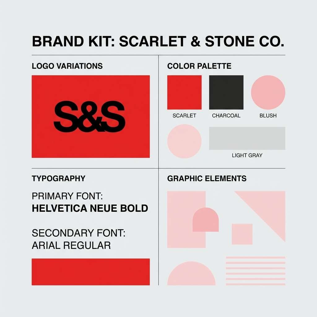
Create Crimson Red Palette Visuals with AI
If you already have HEX codes, the fastest way to validate a palette is to see it applied to real scenes—posters, labels, invitations, or UI mockups. Visuals reveal whether the red feels too bright, too dark, or perfectly balanced.
With Media.io Text to Image, you can paste a prompt, specify a style (studio photo, poster layout, watercolor, etc.), and generate on-brand examples in minutes. It’s an easy way to compare multiple crimson red color combinations before committing to a full design system.
Try generating a few variations by swapping backgrounds (cream vs. charcoal) or changing accent colors (teal vs. gold) to find the most scalable scheme.
Crimson Red Color Palette FAQs
-
What is the HEX code for classic crimson red?
A commonly referenced crimson red HEX is #DC143C. It’s a vivid, slightly cool-leaning red that works well as a hero accent or headline color. -
Is crimson red warm or cool?
Crimson is usually considered a cooler red compared to orange-leaning scarlet. It can still feel warm depending on its pairings (cream, gold, taupe) or cooler with blues/teals and grays. -
What neutral colors pair best with crimson red?
Cream, off-white, parchment, warm gray, taupe, and charcoal are the most reliable neutrals. They help control intensity and keep typography readable in both print and digital layouts. -
What’s a good contrasting accent color for crimson red?
Teal and deep green are strong complementary-style contrasts that feel modern and balanced. Muted sage works for softer, editorial looks, while gold/amber adds a premium, celebratory accent. -
How do I use crimson red in UI without overwhelming the screen?
Reserve crimson for primary actions, highlights, and alerts rather than large backgrounds. Support it with cool grays and test hover/focus states to maintain consistent contrast and accessibility. -
Does crimson red print darker than it looks on screen?
It can—especially on uncoated paper or with heavier ink coverage. If printing matters, run a proof and consider slightly brightening the red or using a softer cream background to keep it vibrant. -
Which crimson color combination works best for weddings?
Soft pairings like blush, warm beige, and cocoa text (instead of pure black) feel romantic and elevated. Try palettes like Bridal Crimson Blush or Rosewood Linen for invitations and day-of stationery.
Next: Rose Taupe Color Palette


