

Rose taupe sits in that sweet spot between blush and brown—warm, muted, and instantly calming. It reads premium in branding, cozy in interiors, and clean in UI when you need softness without going pastel.
Below are rose taupe color combinations with HEX codes you can copy fast, plus AI prompts to generate matching visuals for mockups, mood boards, and layouts.
In this article
- Why Rose Taupe Color Combinations Work So Well
-
- blush clay neutrals
- vintage rosewood
- minimal warm studio
- soft mauve linen
- botanical taupe garden
- cocoa petal contrast
- modern brass accent
- cozy autumn tea
- airy spa calm
- nightfall rose taupe
- editorial dusty rose
- wedding silk and stone
- matte cosmetic branding
- scandinavian sunset
- terracotta atelier
- sage and smoke
- copper and cream
- monochrome rose taupe
- coastal sandstone
- plum velvet depth
- What Colors Go Well with Rose Taupe?
- How to Use a Rose Taupe Color Combination in Real Designs
- Create Rose Taupe Palette Visuals with AI
Why Rose Taupe Color Combinations Work So Well
Rose taupe is a modern neutral: it has the warmth of blush with the stability of taupe, so it feels welcoming without becoming overly sweet. That balance makes it easy to use across a full system—backgrounds, surfaces, text, and accents.
It also plays nicely with both warm and cool partners. You can pair it with creamy whites and cocoa browns for a soft, organic look, or add slate/charcoal for a sleeker, more editorial contrast.
Because the saturation is typically low, rose taupe palettes tend to photograph and print well. They’re forgiving across materials like paper stock, packaging finishes, and interior surfaces where lighting can change the perceived tone.
20+ Rose Taupe Color Palette Ideas (with HEX Codes)
1) Blush Clay Neutrals
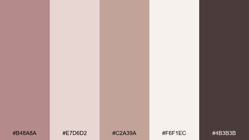
HEX: #B48A8A #E7D6D2 #C2A39A #F6F1EC #4B3B3B
Mood: soft, grounded, modern
Best for: minimal brand identity and stationery
Soft and grounded like sunlit clay with a blush haze, this rose taupe mix feels calm and quietly premium. Use it for stationery, lookbooks, and boutique branding where warmth matters more than contrast. Pair the creamy off-white with the espresso tone for legible text, and let rose taupe carry headers and key shapes. Tip: keep the darkest shade to under 10% so the layout stays airy.
Image example of blush clay neutrals generated using media.io
Media.io is an online AI studio for creating and editing video, image, and audio in your browser.

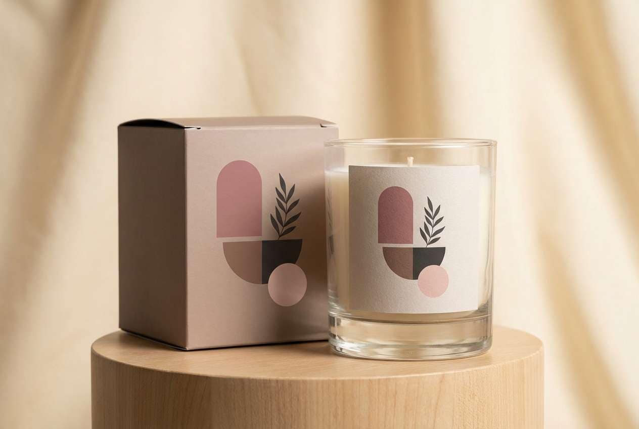
2) Vintage Rosewood
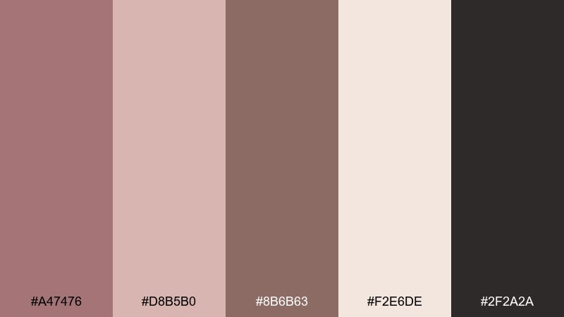
HEX: #A47476 #D8B5B0 #8B6B63 #F2E6DE #2F2A2A
Mood: vintage, intimate, refined
Best for: editorial covers and boutique packaging
Moody rosewood and softened blush create a nostalgic, bookish feel with a hint of romance. It works beautifully for editorial cover layouts, candle labels, and artisan packaging that needs depth without harshness. Balance the near-black with the warm cream for strong hierarchy, and use the mid taupe as a bridge tone. Tip: add subtle paper grain so the darker shades feel less heavy.
Image example of vintage rosewood generated using media.io
3) Minimal Warm Studio
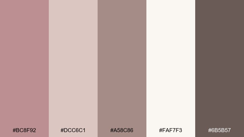
HEX: #BC8F92 #DCC6C1 #A58C86 #FAF7F3 #6B5B57
Mood: clean, warm, professional
Best for: dashboard UI and product landing pages
Clean warmth like a quiet design studio at golden hour makes this set feel trustworthy and modern. These rose taupe color combinations fit dashboards and landing pages where you want gentle contrast and long-read comfort. Use the off-white for backgrounds, keep taupe for cards, and reserve the deeper gray-brown for navigation and data labels. Tip: apply the blush tint only on active states so the UI stays focused.
Image example of minimal warm studio generated using media.io

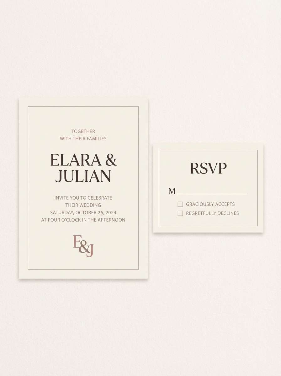
4) Soft Mauve Linen
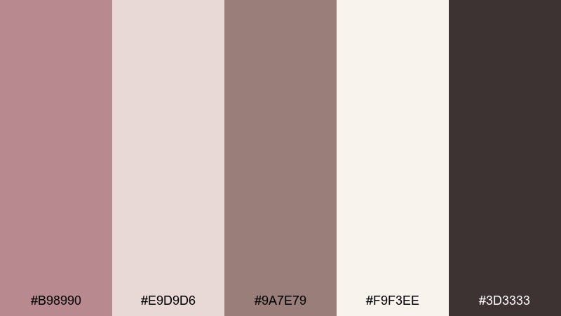
HEX: #B98990 #E9D9D6 #9A7E79 #F9F3EE #3D3333
Mood: cozy, delicate, elegant
Best for: wedding invitations and RSVP suites
Cozy mauve-linen tones evoke folded fabric, handwritten notes, and a gentle evening glow. It suits invitations, menus, and RSVP suites where romance should feel modern rather than sugary. Keep the darkest brown for names and dates, and let the pale blush handle borders and monograms. Tip: use letterpress-style shading with the mid taupe to add depth without adding new colors.
Image example of soft mauve linen generated using media.io
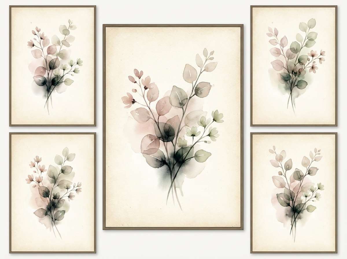
5) Botanical Taupe Garden
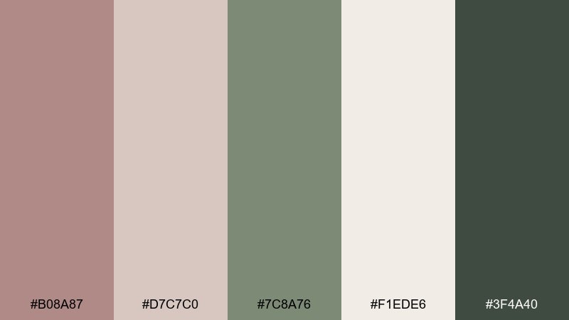
HEX: #B08A87 #D7C7C0 #7C8A76 #F1EDE6 #3F4A40
Mood: natural, balanced, fresh
Best for: botanical illustrations and wellness brands
Natural and balanced like pressed flowers on warm paper, this rose taupe color palette feels restorative and grounded. Use it for wellness brands, herbal packaging, or botanical illustration sets where green should stay muted. Pair the sage with the rose-taupe base for stems and labels, then use the cream as generous negative space. Tip: keep the darkest green for fine outlines so the art stays crisp.
Image example of botanical taupe garden generated using media.io
6) Cocoa Petal Contrast
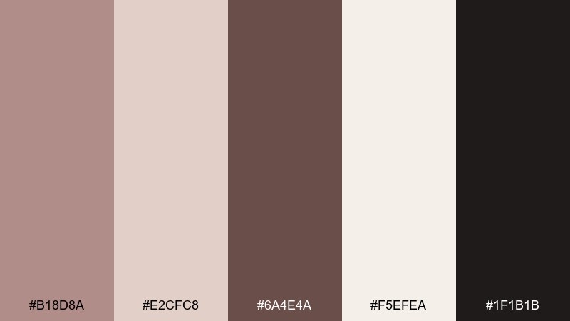
HEX: #B18D8A #E2CFC8 #6A4E4A #F5EFEA #1F1B1B
Mood: rich, romantic, high-contrast
Best for: luxury product ads and fragrance branding
Rich cocoa and petal tones give a romantic, high-contrast look that still feels sophisticated. It is ideal for fragrance branding, luxury ads, and hero banners that need drama without bright colors. Let the near-black define typography and silhouettes, then use the blush and cream to soften the edges. Tip: add a subtle gradient from cocoa to blush for a premium finish.
Image example of cocoa petal contrast generated using media.io
7) Modern Brass Accent
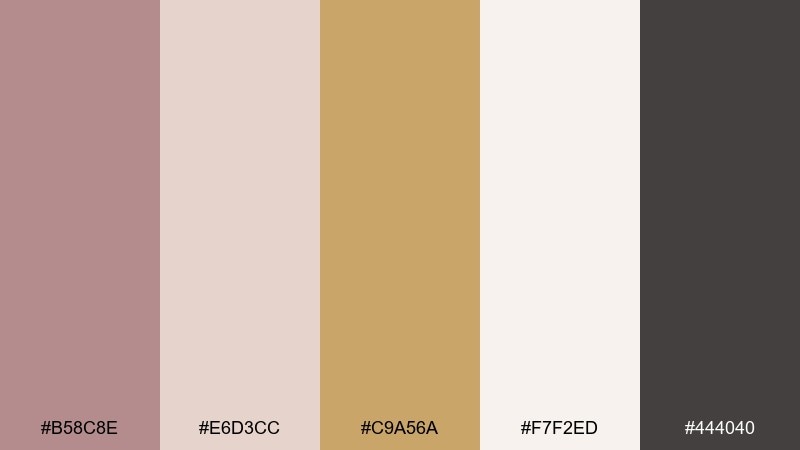
HEX: #B58C8E #E6D3CC #C9A56A #F7F2ED #444040
Mood: polished, upbeat, contemporary
Best for: SaaS branding and pitch decks
Polished and upbeat, these tones feel like matte blush walls with a warm brass glint. As a rose taupe color combination, it supports confident SaaS branding, pitch decks, and clean diagrams without feeling cold. Use the brass as the single accent for buttons, highlights, and key metrics, while the dark neutral handles headings. Tip: keep accent usage consistent so the gold tone signals the same action everywhere.
Image example of modern brass accent generated using media.io
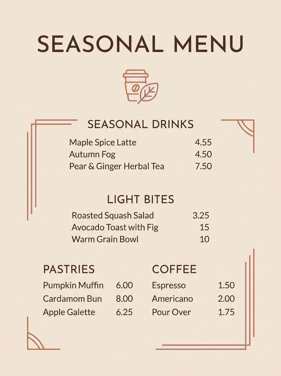
8) Cozy Autumn Tea
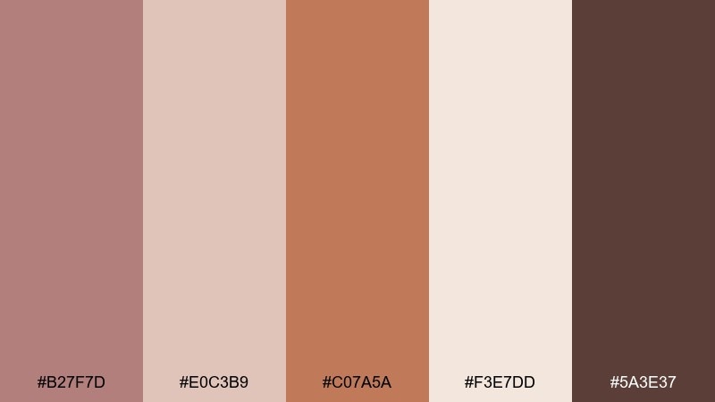
HEX: #B27F7D #E0C3B9 #C07A5A #F3E7DD #5A3E37
Mood: cozy, rustic, inviting
Best for: cafe menus and seasonal social posts
Cozy and rustic like spiced tea and baked clay, this set brings instant warmth to a layout. It works well for cafe menus, fall promos, and food packaging where you want appetizing tones without bright reds. Pair terracotta with the deep brown for headers, and let the blush lighten background panels. Tip: use the cream as the menu base so photos and type stay readable.
Image example of cozy autumn tea generated using media.io
9) Airy Spa Calm
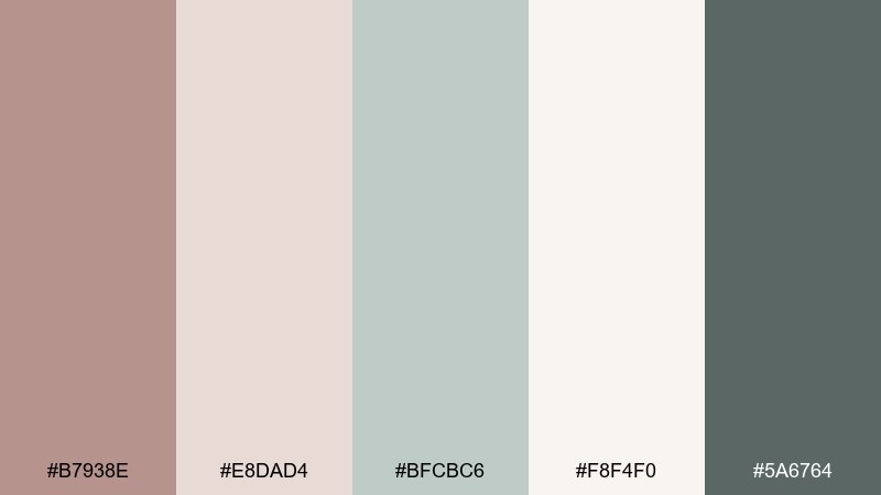
HEX: #B7938E #E8DAD4 #BFCBC6 #F8F4F0 #5A6764
Mood: calm, airy, restorative
Best for: spa websites and skincare guides
Calm and airy like steam, stone, and clean towels, these rose taupe tones feel restorative at a glance. Use it for spa sites, skincare guides, or appointment flows that need a gentle rhythm. The misty green works beautifully for secondary sections and icons, while the deeper gray-green anchors headings. Tip: keep line dividers in the lightest tones so the page feels open.
Image example of airy spa calm generated using media.io
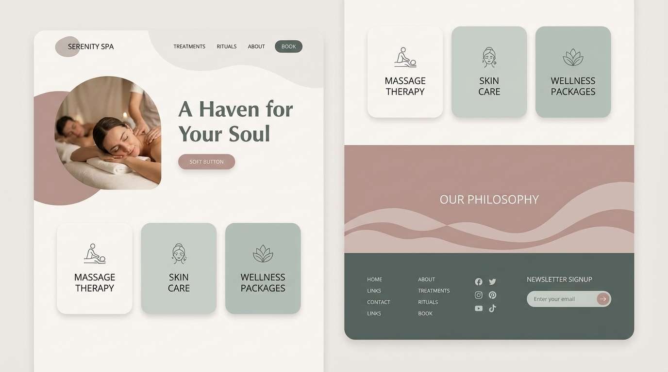
10) Nightfall Rose Taupe
HEX: #A98686 #D9C2BF #6B6470 #F4EEE8 #232327
Mood: sleek, moody, modern
Best for: app onboarding screens
Sleek and moody like dusk light on satin, this mix leans modern without becoming harsh. It fits app onboarding where you want depth, soft gradients, and clear hierarchy. Use the near-black for primary text and the slate for secondary labels, then reserve the blush for progress states. Tip: add subtle shadows in slate so cards separate without stark borders.
Image example of nightfall rose taupe generated using media.io
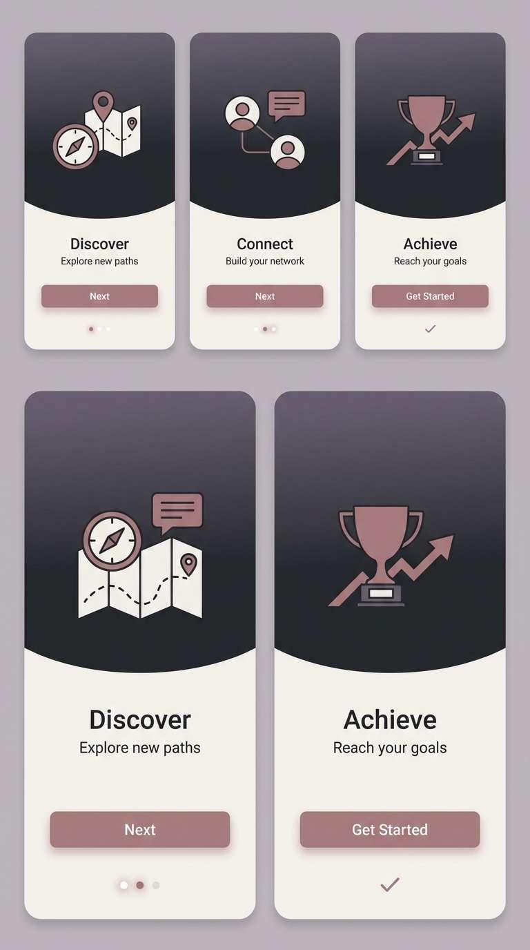
11) Editorial Dusty Rose
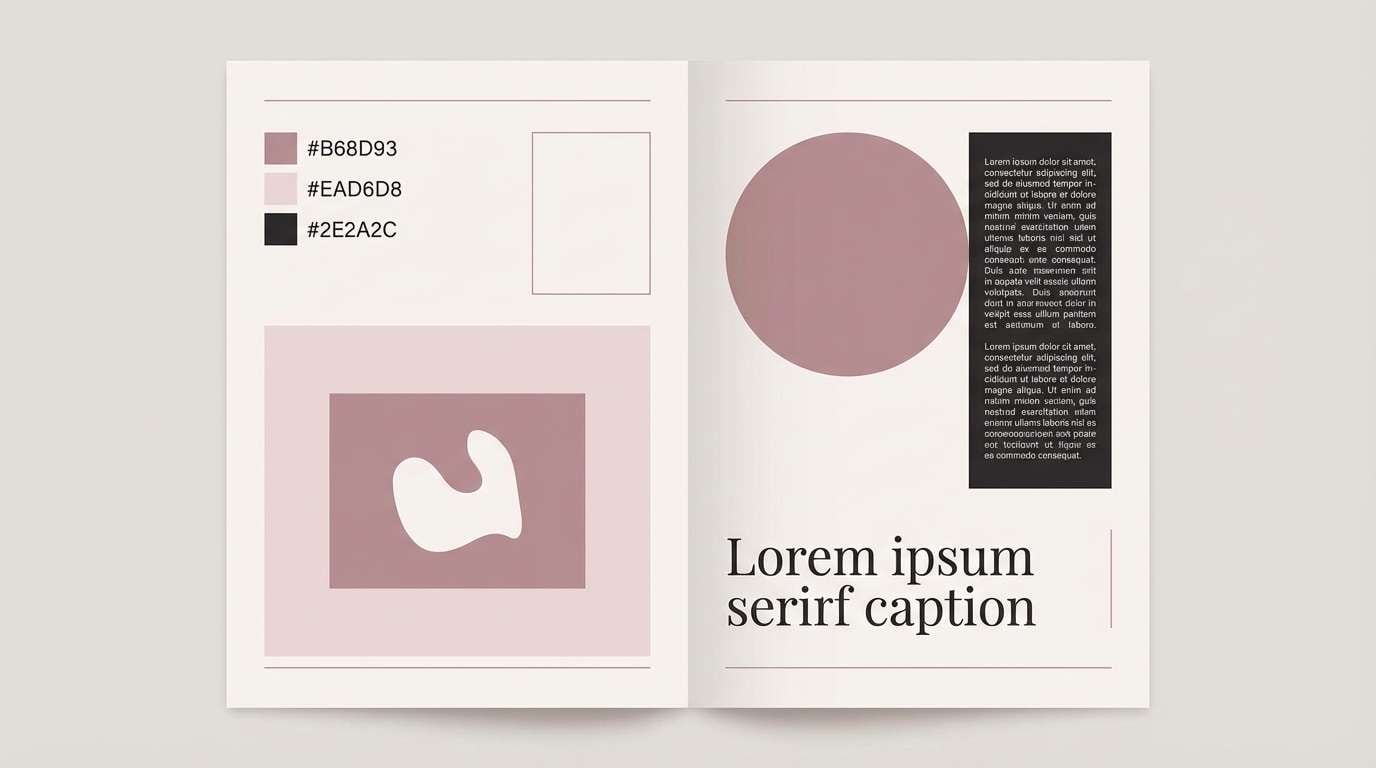
HEX: #B68D93 #EAD6D8 #9F8D8A #F7F1F0 #2E2A2C
Mood: editorial, artistic, refined
Best for: magazine layouts and lookbooks
Editorial and artistic, these dusty rose tones feel like a fashion spread printed on soft matte paper. They shine in lookbooks, magazines, and portfolio pages where typography should lead. Pair the near-black with the pale blush for strong contrast, and use the warm gray as a calm divider tone. Tip: keep photos desaturated so the palette stays in control.
Image example of editorial dusty rose generated using media.io
12) Wedding Silk and Stone
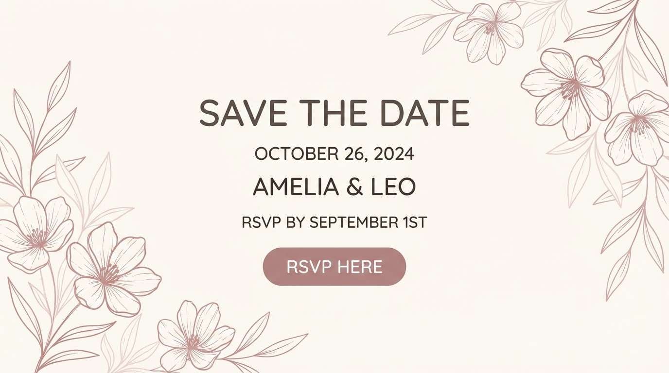
HEX: #B8898C #E7D2D0 #B9B2AA #FFF9F4 #6A5E57
Mood: romantic, classic, soft
Best for: wedding websites and save-the-dates
Romantic and classic, these rose taupe colors feel like silk ribbon against smooth stone. They work well for wedding websites, save-the-dates, and registry pages that need warmth and clarity. Use the stone tone for navigation and section headers, then let blush shades fill accents and badges. Tip: choose one elegant serif for titles and keep body text in the deep taupe for readability.
Image example of wedding silk and stone generated using media.io
13) Matte Cosmetic Branding
HEX: #B58B90 #DCC7C9 #8A7B77 #F6F0EE #3A2F2F
Mood: modern, velvety, premium
Best for: cosmetics packaging and e-commerce banners
Modern and velvety, these rose taupe color combinations evoke matte lipstick, soft blush powder, and clean counters. They are perfect for cosmetics packaging, product cards, and e-commerce banners that need a premium feel. Pair the deep brown with the off-white for clear labeling, and use the mid gray-taupe for secondary copy. Tip: keep the blush shade for callouts like limited edition or new.
Image example of matte cosmetic branding generated using media.io
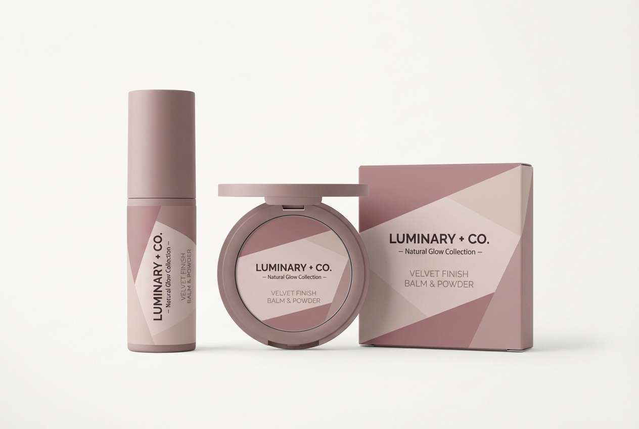
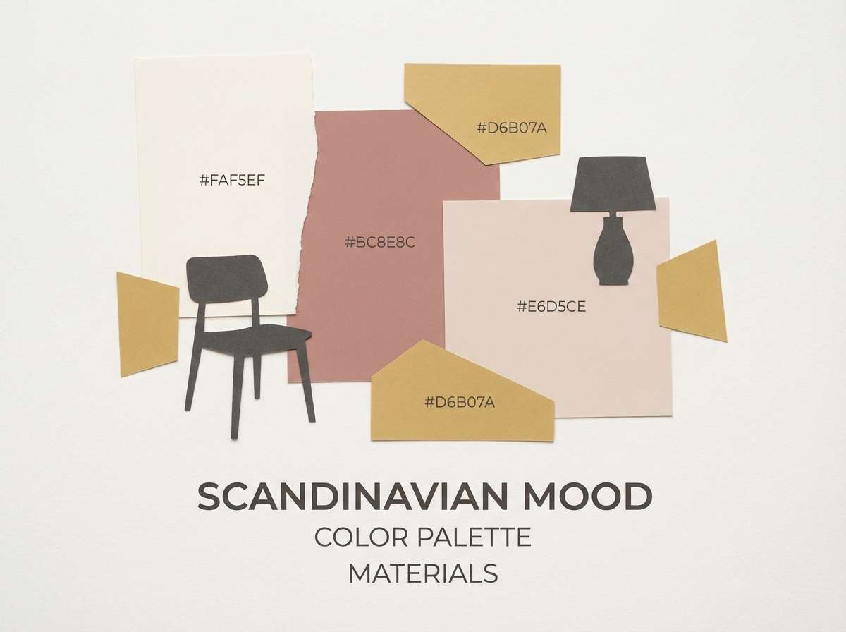
14) Scandinavian Sunset
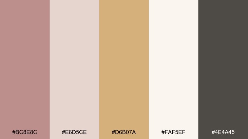
HEX: #BC8E8C #E6D5CE #D6B07A #FAF5EF #4E4A45
Mood: light, cozy, optimistic
Best for: interior mood boards and lifestyle blogs
Light and cozy like a pale sunset across warm wood, this set feels optimistic and lived-in. Use it for interior mood boards, lifestyle blog graphics, and homeware branding. The sandy gold works best as a small highlight against the cream and blush base, while the charcoal-taupe keeps type grounded. Tip: repeat the gold only in one element per section to avoid visual noise.
Image example of scandinavian sunset generated using media.io
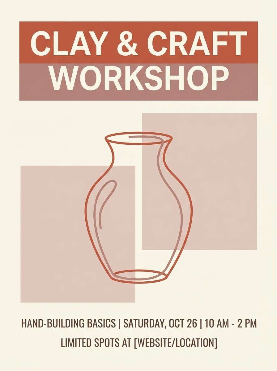
15) Terracotta Atelier
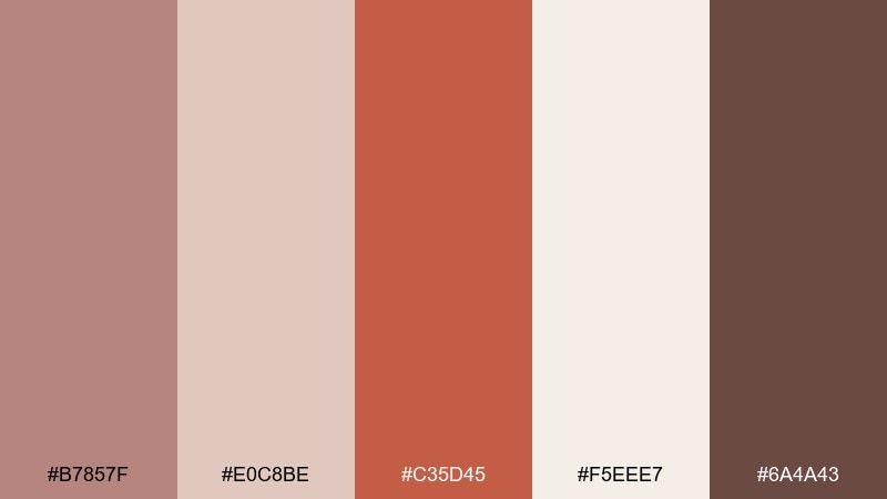
HEX: #B7857F #E0C8BE #C35D45 #F5EEE7 #6A4A43
Mood: creative, earthy, confident
Best for: event posters and workshop flyers
Creative and earthy like a ceramics atelier, these rose taupe tones bring confident warmth to bold typography. They are great for workshop flyers, event posters, and class schedules where you want energy without neon. Use terracotta for the headline block, then soften the layout with blush panels and a creamy base. Tip: set body copy in the deep brown and keep line art in the mid taupe for cohesion.
Image example of terracotta atelier generated using media.io
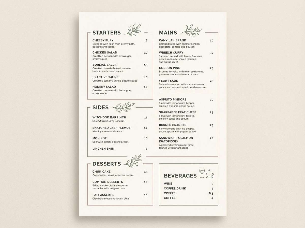
16) Sage and Smoke
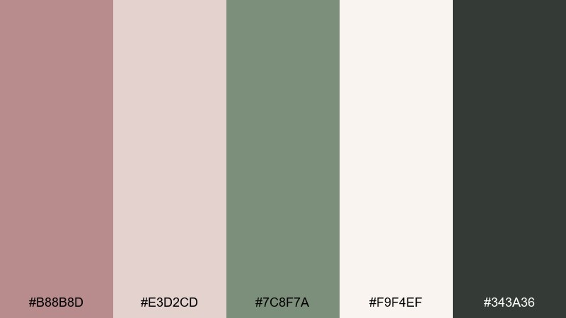
HEX: #B88B8D #E3D2CD #7C8F7A #F9F4EF #343A36
Mood: balanced, earthy, sophisticated
Best for: restaurant branding and menu systems
Balanced and earthy, this mix feels like sage leaves against smoky stoneware. It is one of those rose taupe color combinations that suits restaurants, wine bars, and menus that need warmth plus restraint. Use sage for section markers and icons, keep the cream for the page base, and let the deep charcoal handle pricing and body text. Tip: avoid pure black and use the charcoal instead for a softer print look.
Image example of sage and smoke generated using media.io
17) Copper and Cream
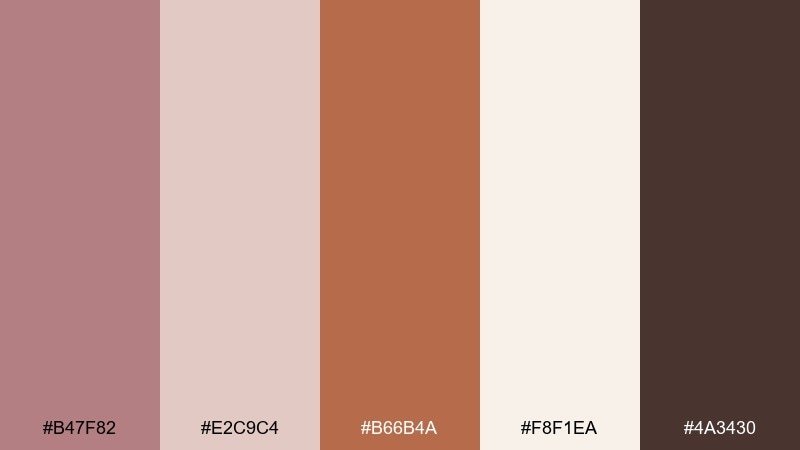
HEX: #B47F82 #E2C9C4 #B66B4A #F8F1EA #4A3430
Mood: warm, crafted, inviting
Best for: handmade product labels and gift tags
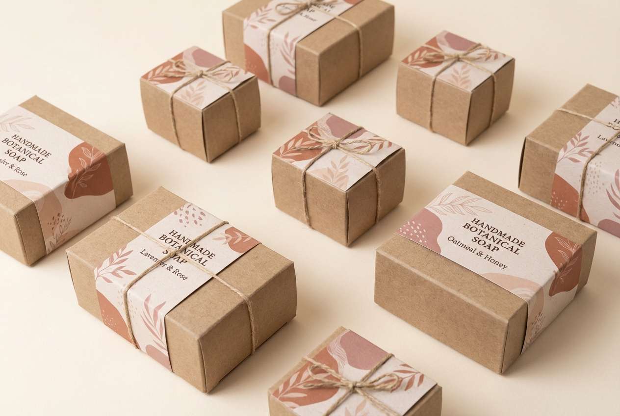
Warm and crafted like copper foil on creamy stock, this rose taupe color palette feels handmade but elevated. Use it for gift tags, soap labels, and small-batch packaging where a tactile impression matters. Pair the copper tone with deep brown for strong type, then soften with blush blocks for secondary details. Tip: add a thin copper border line to tie multiple label sizes together.
Image example of copper and cream generated using media.io
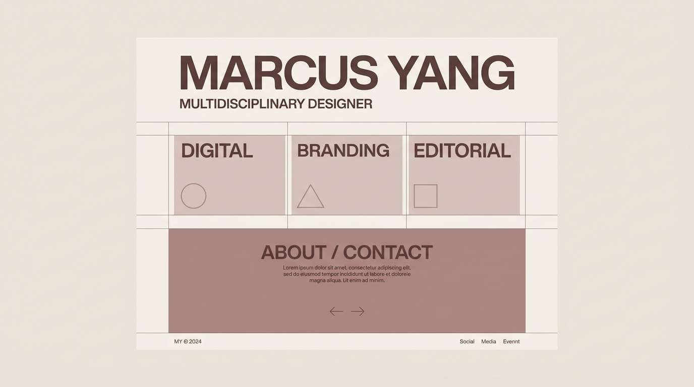
18) Monochrome Rose Taupe
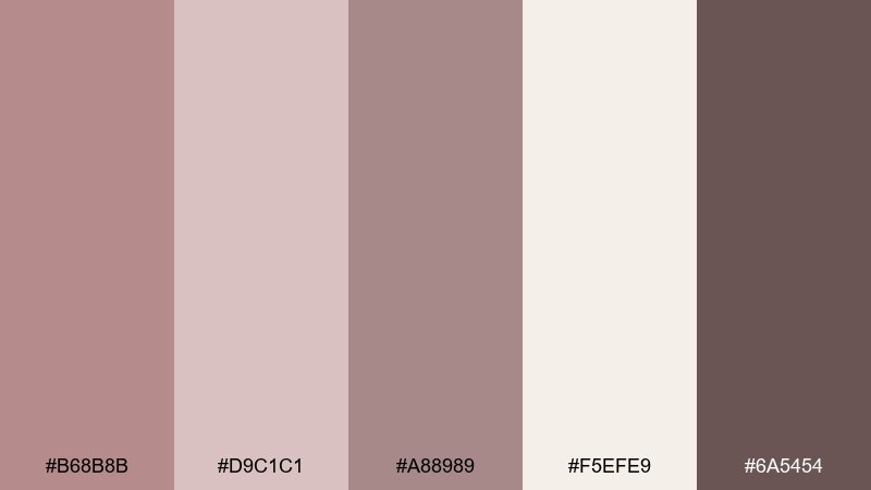
HEX: #B68B8B #D9C1C1 #A88989 #F5EFE9 #6A5454
Mood: serene, cohesive, minimalist
Best for: portfolio sites and typography studies
Serene and cohesive, the near-monochrome shifts feel like layered blush shadows in soft focus. This set works for portfolios and typography-forward pages where you want calm continuity across sections. Use the lightest tone for background, step up through the mid shades for panels, and reserve the darkest for headings. Tip: rely on weight and spacing changes rather than adding more colors.
Image example of monochrome rose taupe generated using media.io
19) Coastal Sandstone
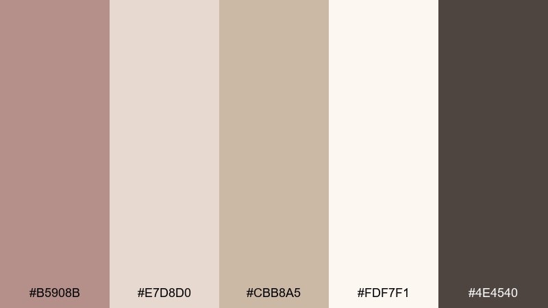
HEX: #B5908B #E7D8D0 #CBB8A5 #FDF7F1 #4E4540
Mood: light, sandy, relaxed
Best for: travel blog graphics and mood boards
Light and sandy like coastal sandstone, these tones feel relaxed and sun-warmed. They are ideal for travel blog graphics, photo captions, and mood boards that need a neutral frame. Pair the sand tone with rose-taupe accents for pins and tags, and use the deep neutral sparingly for readable overlays. Tip: keep backgrounds bright so the palette stays breezy rather than muddy.
Image example of coastal sandstone generated using media.io

20) Plum Velvet Depth
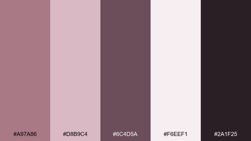
HEX: #A97A86 #D8B9C4 #6C4D5A #F6EEF1 #2A1F25
Mood: dramatic, luxe, expressive
Best for: beauty campaigns and night event flyers
Dramatic and luxe like plum velvet under low light, this palette adds expressive depth. It is perfect for beauty campaigns, night event flyers, and social stories that need bold contrast without neon. Use the deepest shade for the background, bring in plum for large shapes, and reserve the pale pink for highlights and small type areas. Tip: keep gradients subtle so the dark tones stay rich and not muddy.
Image example of plum velvet depth generated using media.io

What Colors Go Well with Rose Taupe?
Rose taupe pairs naturally with soft whites (cream, ivory, eggshell) and warm neutrals (sand, greige, cocoa). These keep the overall look airy and let rose taupe act as the “signature” tone rather than an accent.
For contrast, lean into deep espresso, charcoal, or near-black—these make typography and UI elements crisp without looking stark. For a more organic palette, try muted greens like sage, olive-gray, or eucalyptus.
If you want a modern highlight color, use a restrained metallic-like hue (brass, copper, soft gold) or a terracotta accent. Keep the accent usage tight so the palette stays sophisticated and not busy.
How to Use a Rose Taupe Color Combination in Real Designs
Start with a light neutral background (cream/off-white), then build surfaces using mid taupes for cards, panels, or section blocks. Reserve the deepest shade for text, icons, and dividers to maintain readability—especially on web layouts.
Use rose taupe as your “brand voice” color: headers, key shapes, badges, and subtle UI states (active, hover, progress). Because it’s muted, it works best when you rely on spacing, typography, and hierarchy instead of adding lots of extra colors.
In print and packaging, consider texture and finish: matte stock, paper grain, embossing, or soft shadows help rose taupe feel richer. For interiors, layer it with warm woods, linen whites, and muted greens for a calm, lived-in look.
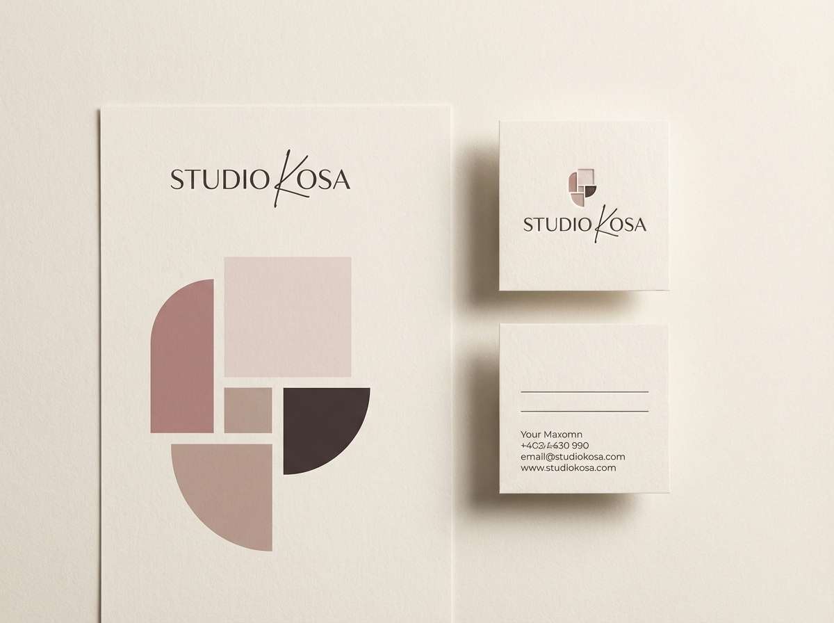
Create Rose Taupe Palette Visuals with AI
When you already have HEX codes, the fastest way to explore real-world applications is to generate mockups that match your palette—like packaging, website heroes, posters, or invitation suites. With AI, you can iterate on style (minimal, editorial, rustic, luxe) without rebuilding assets from scratch.
Copy one of the prompts above, swap in your product or scene, and keep the palette colors in the prompt for consistent results. Then refine with small edits—lighting, materials, composition, and aspect ratio—to get visuals that feel on-brand.
Rose Taupe Color Palette FAQs
-
What is rose taupe, exactly?
Rose taupe is a muted blend of pink/blush and taupe (a gray-brown). It’s typically warm, soft, and low-saturation, making it a versatile “modern neutral” for branding, interiors, and UI. -
Is rose taupe warm or cool?
Most rose taupe shades lean warm because of the pink and brown undertones, but some versions can feel cooler if they include more gray or slate. Pair it with cream for warmth or charcoal/slate for a cooler, modern look. -
What are the best accent colors for a rose taupe palette?
Muted sage greens, brass/copper-gold highlights, terracotta, and deep espresso/charcoal are reliable accents. Choose one primary accent and keep it consistent across buttons, badges, or key design moments. -
What background color works best with rose taupe?
Off-whites like cream, ivory, and eggshell keep rose taupe looking clean and premium. For darker layouts, use near-black/charcoal with rose taupe as the soft highlight to avoid harsh contrast. -
How do I keep rose taupe designs from looking “muddy”?
Use a bright enough base (cream/off-white), increase spacing/negative space, and reserve the darkest tones for text only. Avoid adding multiple mid-tone browns; instead, add one clear dark anchor and one restrained accent. -
Is rose taupe good for UI accessibility?
Yes, if you avoid using rose taupe for small body text on light backgrounds. Use deep taupe/charcoal for text and icons, and keep rose taupe for backgrounds, badges, and interactive states while checking contrast ratios. -
Can I generate brand mockups using these HEX codes?
Yes—include the HEX codes directly in an AI prompt (as shown in the examples) and describe the mockup type (packaging, dashboard, invitation, hero banner). This helps the generated visuals stay aligned with your rose taupe color scheme.
Next: Eggshell Color Palette


