

Plum is a rich purple with a hint of red, so it reads as confident, expressive, and slightly mysterious. It can feel luxurious in dark values, romantic in dusty tints, or modern when paired with crisp neutrals.
Below are plum color palette ideas you can use for branding, interiors, packaging, UI, and posters—each with ready-to-copy HEX codes and an AI prompt to generate matching visuals.
In this article
- Why Plum Palettes Work So Well
-
- velvet orchid evening
- dusty plum neutral
- plum and sage garden
- mulberry mocha luxe
- plum citrus pop
- plum denim street
- plum blush romance
- plum charcoal minimal
- plum gold regency
- plum teal contrast
- plum lavender haze
- plum clay earthworks
- plum midnight galaxy
- plum coral sunset
- plum mint sorbet
- plum copper artisan
- plum ice gray tech
- plum forest cabin
- plum sandstone calm
- plum neon nightlife
- What Colors Go Well with Plum?
- How to Use a Plum Color Palette in Real Designs
- Create Plum Palette Visuals with AI
Why Plum Palettes Work So Well
Plum sits between classic purple and berry red, so it naturally carries both “creative” and “premium” signals. That makes a plum color scheme versatile across industries—from wellness and beauty to hospitality and tech.
It also scales beautifully across tints and shades. Deep plum can replace black for softer luxury, while mauves and blush-plums create breathable backgrounds that still feel distinctive.
Finally, plum plays well with both warm and cool partners. Pair it with golds, tans, and creams for warmth, or with teals, blues, and ice grays for a modern, high-contrast look.
20+ Plum Color Palette Ideas (with HEX Codes)
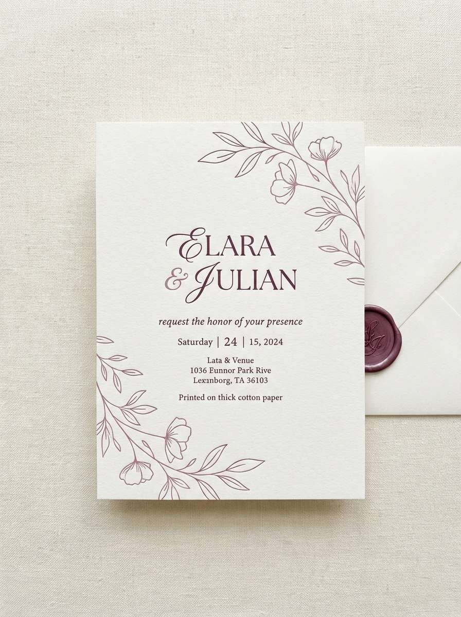
1) Velvet Orchid Evening
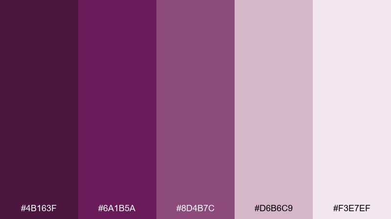
HEX: #4b163f #6a1b5a #8d4b7c #d6b6c9 #f3e7ef
Mood: luxurious, romantic, evening-glam
Best for: wedding invitation design
Luxurious and candlelit, these tones feel like velvet drapes and orchid bouquets at dusk. Use the deep plum as the headline color, then let the mauves and blushy tints soften the layout for readability. It works beautifully for invitations, save-the-dates, and formal event stationery with subtle foil effects. Tip: keep body text on the lightest tint and reserve the darkest shade for names and key details.
Image example of velvet orchid evening generated using media.io
Media.io is an online AI studio for creating and editing video, image, and audio in your browser.

2) Dusty Plum Neutral
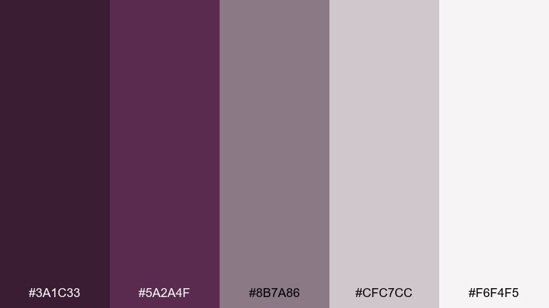
HEX: #3a1c33 #5a2a4f #8b7a86 #cfc7cc #f6f4f5
Mood: soft, muted, calm
Best for: minimalist interior paint guide
Quiet and powdery, this mix evokes brushed plaster walls and dusk-toned linen. Lean on the dusty midtone for swatches and callouts, and use the pale neutrals for generous margins. It suits interior mood boards, paint guides, and calm lifestyle pages where contrast should feel gentle. Tip: add a thin divider line in the deepest shade to keep sections crisp without looking harsh.
Image example of dusty plum neutral generated using media.io
3) Plum and Sage Garden
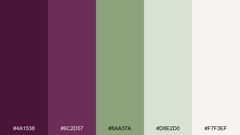
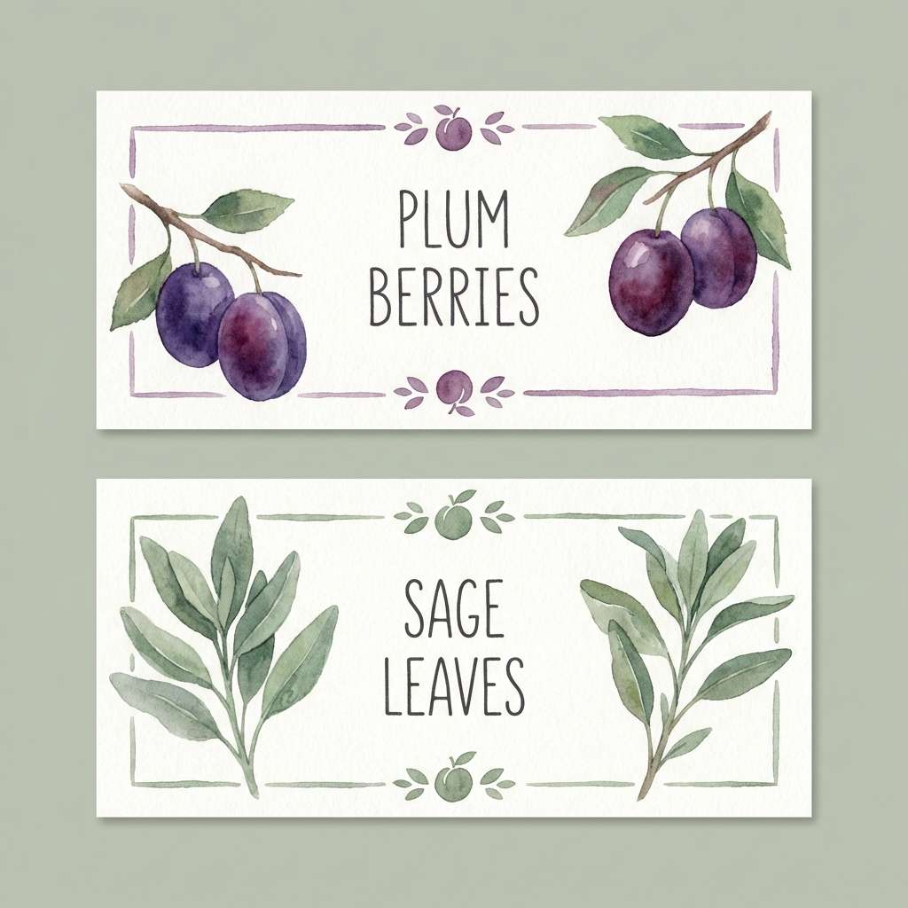
HEX: #4a1538 #6c2d57 #8aa37a #d8e2d0 #f7f3ef
Mood: fresh, botanical, grounded
Best for: botanical brand packaging
Fresh and herbaceous, the pairing feels like ripe fruit tucked into a sage garden. Use plum for the brand mark and product name, then let sage and soft cream carry the background and ingredient details. It fits tea, skincare, and candle labels where you want natural cues without going fully rustic. Tip: keep botanical illustrations in the pale green range so the plum typography stays the hero.
Image example of plum and sage garden generated using media.io
4) Mulberry Mocha Luxe
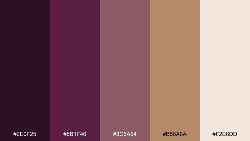
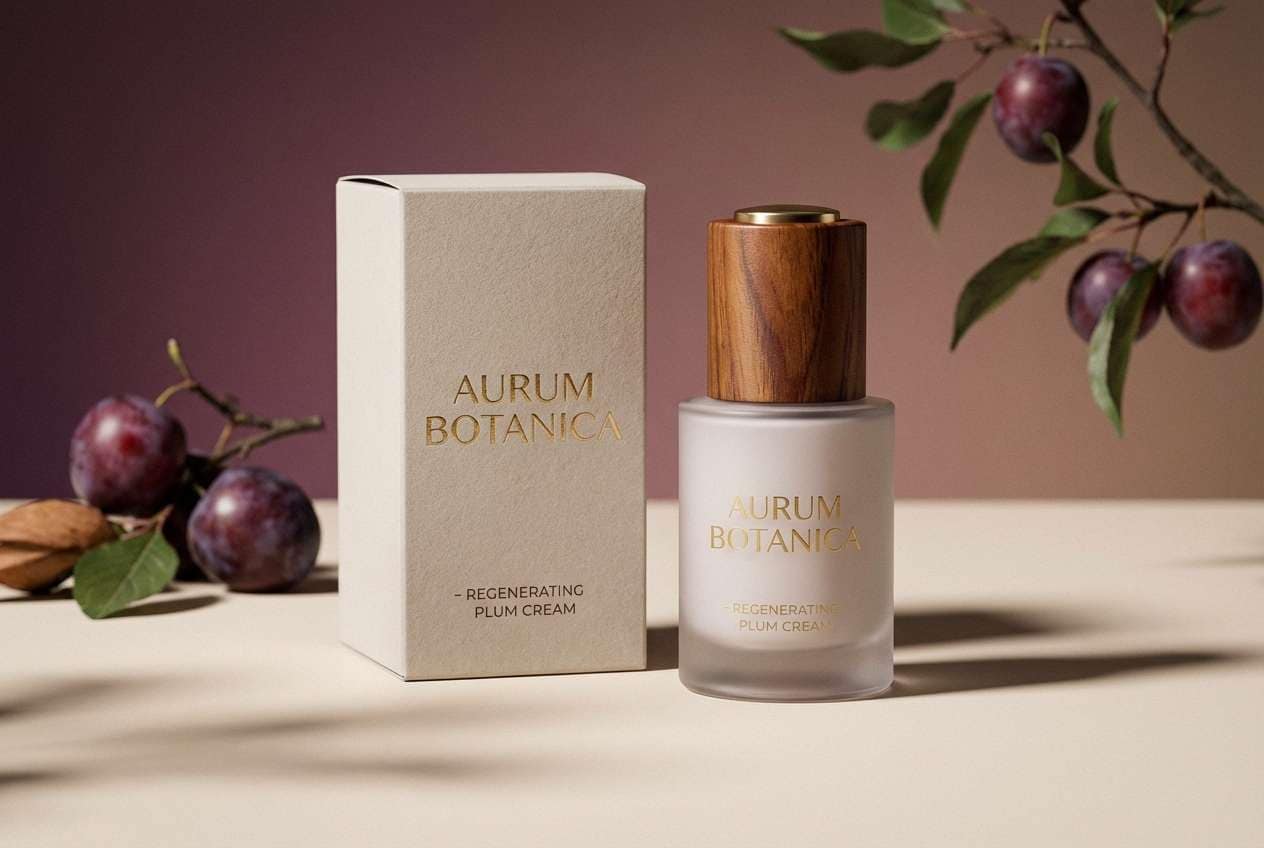
HEX: #2e0f25 #5b1f46 #8c5a64 #b58a6a #f2e6dd
Mood: rich, warm, premium
Best for: premium skincare product ad
Rich and silky, it brings to mind mulberry jam, mocha crema, and warm stone. This plum color palette shines in luxury ads where you need depth without relying on pure black. Pair the warm tan with cream for clean copy blocks, and use the darkest shade for a refined logo lockup. Tip: add a soft gradient from plum to mocha behind the product to create a high-end spotlight effect.
Image example of mulberry mocha luxe generated using media.io
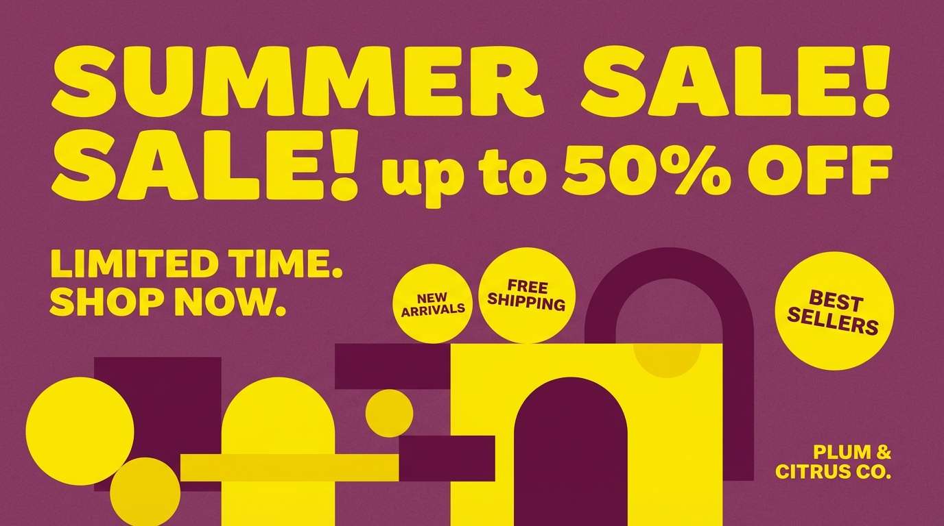
5) Plum Citrus Pop
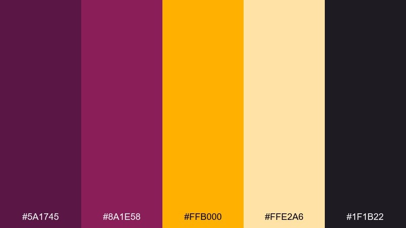
HEX: #5a1745 #8a1e58 #ffb000 #ffe2a6 #1f1b22
Mood: bold, energetic, playful
Best for: social media promo banner
Bold and punchy, these tones feel like neon signage and sliced citrus on a dark bar top. Plum color combinations like this work best when you keep the layout simple and let the accent yellow do the shouting. Use the dark shade for contrast-heavy type, then highlight prices, buttons, or badges in golden tones. Tip: limit yellow to one or two elements per frame so the design stays premium, not noisy.
Image example of plum citrus pop generated using media.io
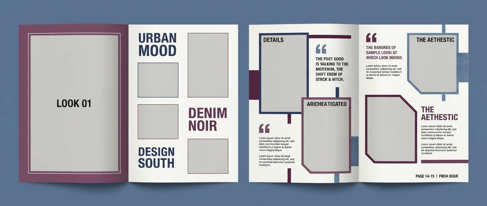
6) Plum Denim Street
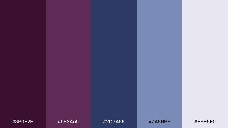
HEX: #3b0f2f #5f2a55 #2d3a66 #7a8bb8 #e8e6f0
Mood: urban, cool, confident
Best for: streetwear lookbook editorial layout
Cool and street-ready, it evokes dark denim, club lighting, and late-night sidewalks. Use the plum shades for section headers and pull quotes, while the blues carry grids and page furniture. It fits lookbooks, fashion editorials, and brand decks that need edge without harsh contrast. Tip: keep photo captions on the lightest lavender-gray so the layout stays airy around imagery.
Image example of plum denim street generated using media.io
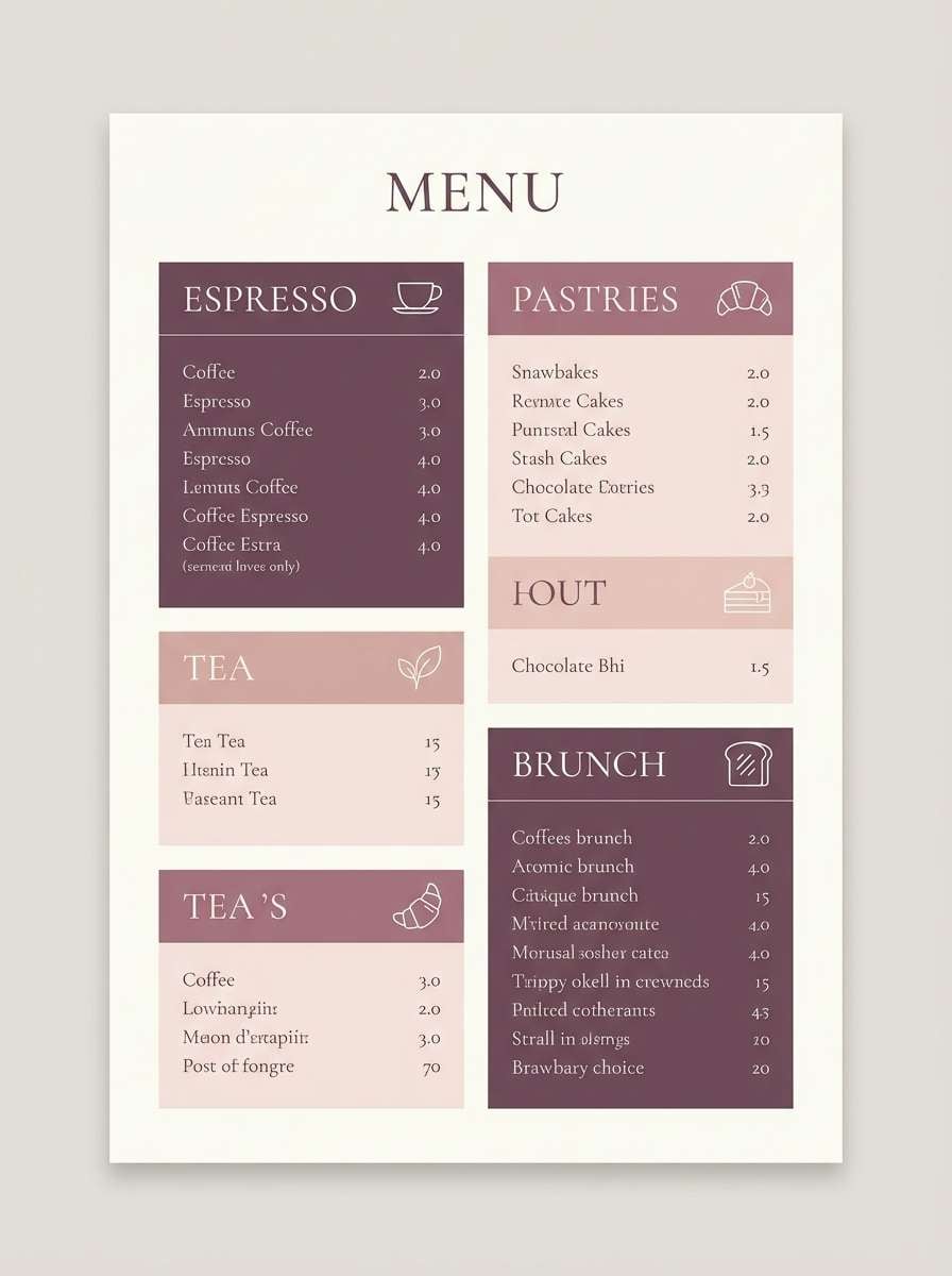
7) Plum Blush Romance
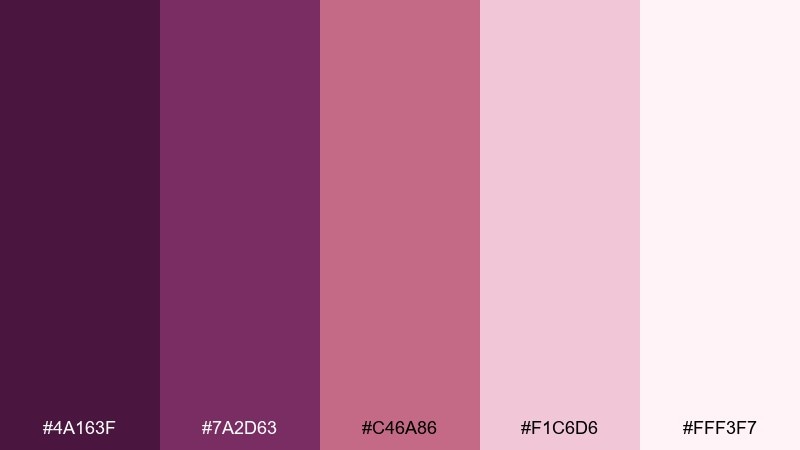
HEX: #4a163f #7a2d63 #c46a86 #f1c6d6 #fff3f7
Mood: sweet, romantic, airy
Best for: romantic cafe menu design
Sweet and rosy, this blend feels like berry macarons and fresh peonies on a marble counter. Use the deeper plum for category titles, then let blush and soft pink carry the background to keep it welcoming. It works for cafe menus, dessert brands, and seasonal specials where you want warmth and charm. Tip: add small icon accents in the mid-rose tone to guide the eye without adding clutter.
Image example of plum blush romance generated using media.io
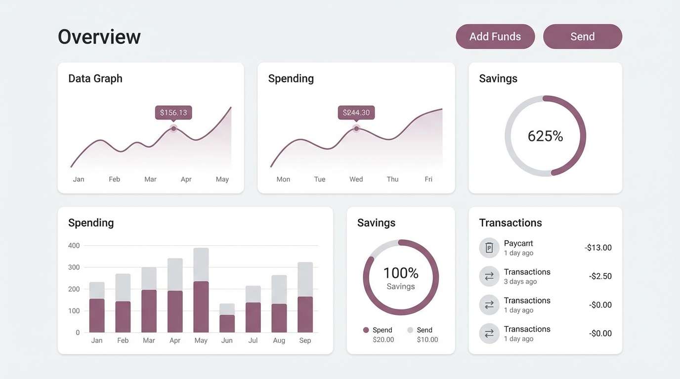
8) Plum Charcoal Minimal
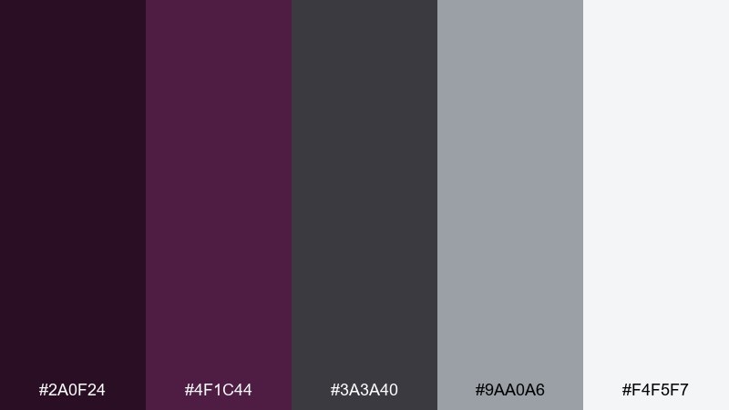
HEX: #2a0f24 #4f1c44 #3a3a40 #9aa0a6 #f4f5f7
Mood: sleek, modern, restrained
Best for: fintech dashboard ui
Sleek and focused, it suggests polished graphite, quiet confidence, and minimal interfaces. A plum color scheme like this is ideal for dashboards where you need hierarchy without bright saturation. Use charcoal and light gray for surfaces, then reserve plum for key states such as active tabs and primary actions. Tip: keep alerts and secondary highlights in neutral grays so plum remains the single source of emphasis.
Image example of plum charcoal minimal generated using media.io
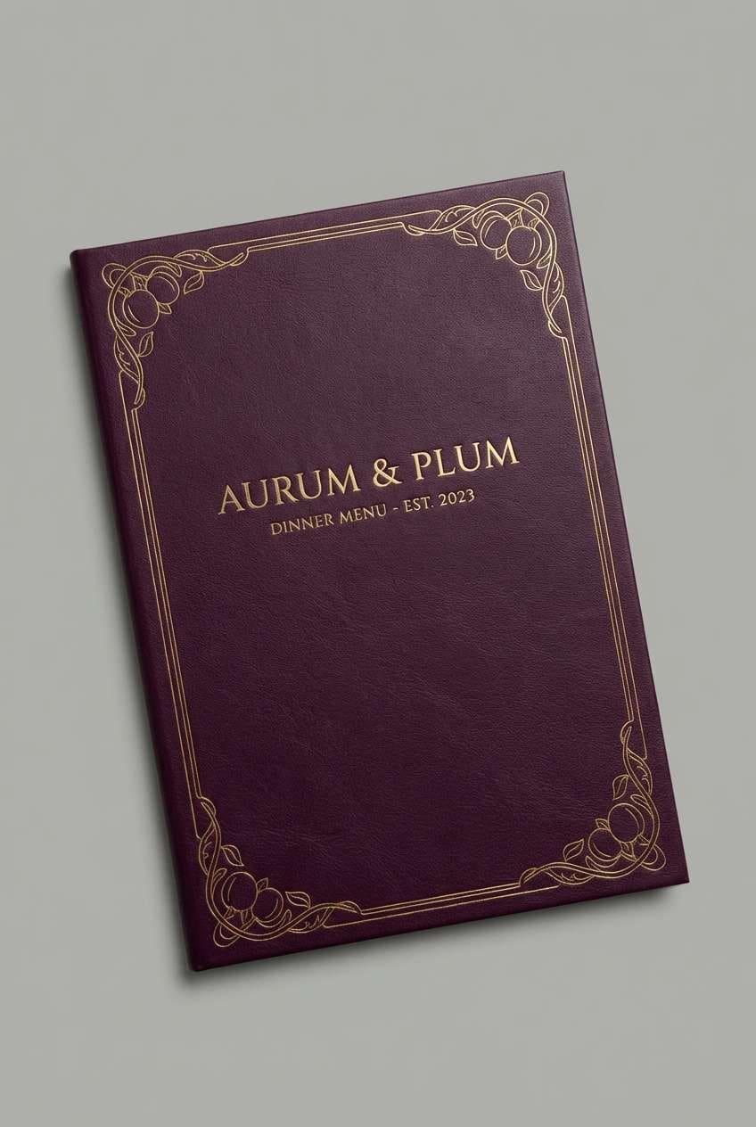
9) Plum Gold Regency
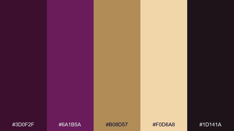
HEX: #3d0f2f #6a1b5a #b08d57 #f0d6a8 #1d141a
Mood: opulent, classic, dramatic
Best for: upscale restaurant menu cover
Opulent and dramatic, it recalls regency wallpaper, brass fixtures, and a dark velvet banquette. Use gold tones for rules and small ornaments, while plum anchors the title and sectioning. It is a strong fit for restaurant menu covers, wine lists, and hospitality branding that leans classic. Tip: print the darkest background and use the pale gold for type to get a premium, high-contrast look.
Image example of plum gold regency generated using media.io
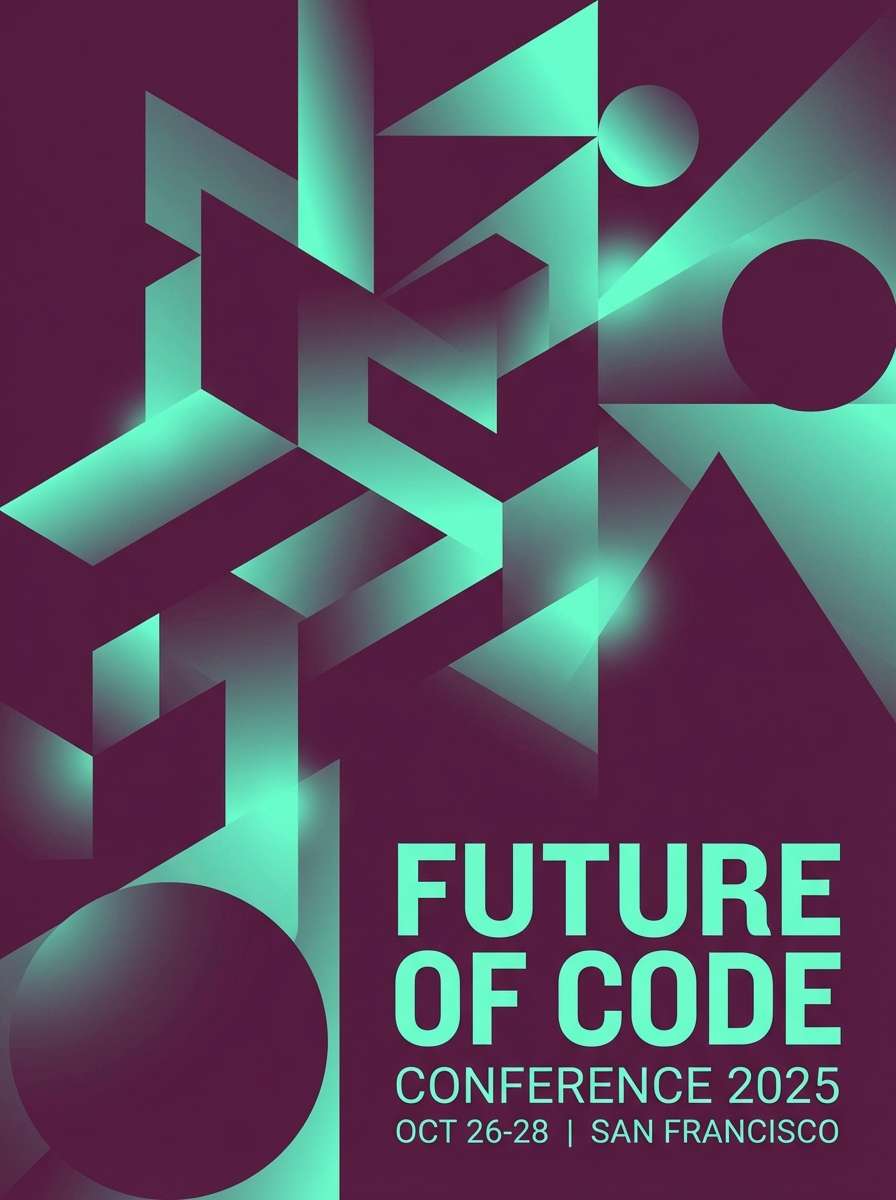
10) Plum Teal Contrast
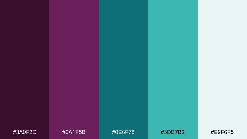
HEX: #3a0f2d #6a1f5b #0e6f78 #3db7b2 #e9f6f5
Mood: vibrant, modern, high-contrast
Best for: tech conference poster
Vibrant and electric, the contrast feels like stage lighting against a dark curtain. Let plum carry the main background while teal becomes your spotlight for dates, location, and CTA. It works especially well for tech events, webinars, and bold announcements where legibility is non-negotiable. Tip: keep teal to the top third or one side panel so the poster reads cleanly from a distance.
Image example of plum teal contrast generated using media.io
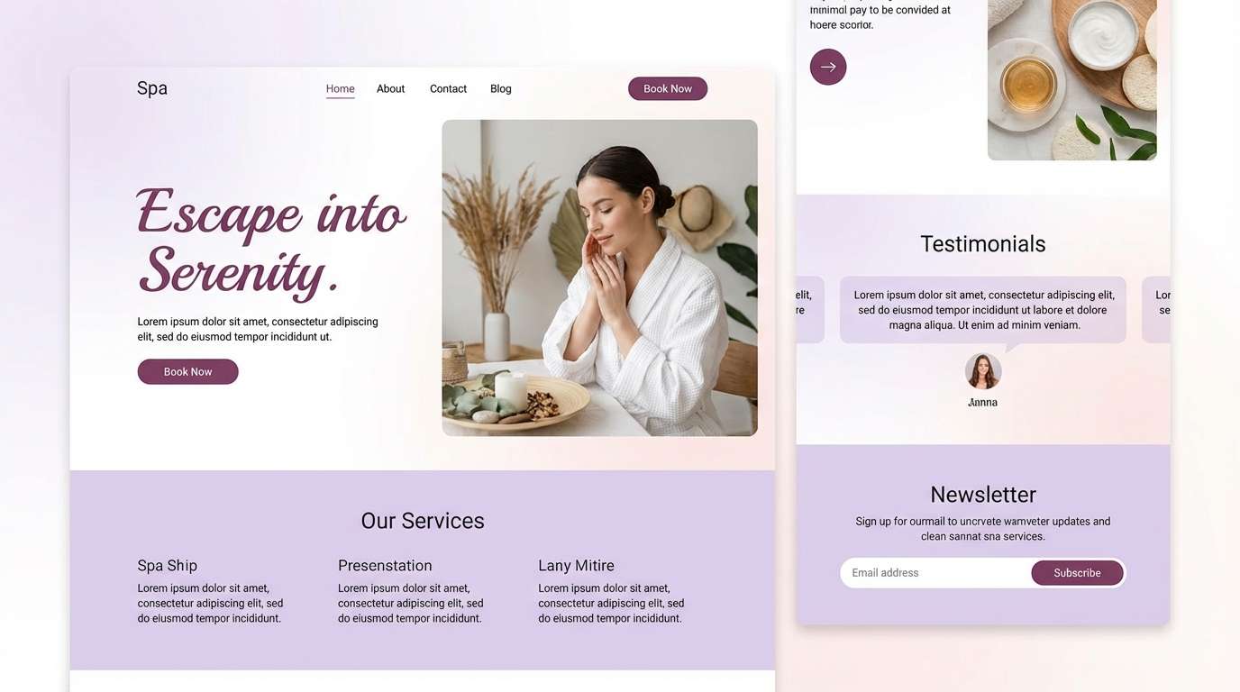
11) Plum Lavender Haze
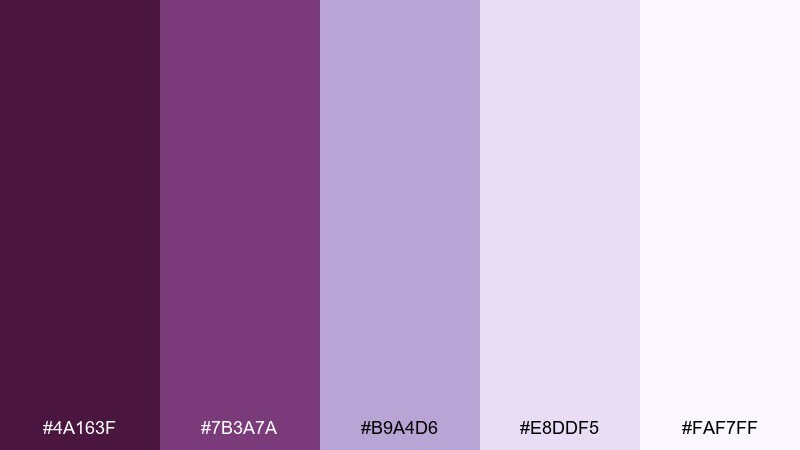
HEX: #4a163f #7b3a7a #b9a4d6 #e8ddf5 #faf7ff
Mood: dreamy, soft, ethereal
Best for: spa website landing ui
Dreamy and weightless, it evokes lavender steam and softly tinted silk. Use the pale lilac tones for spacious sections and overlays, and keep plum for headings and the main button. It suits wellness sites, spa landing pages, and gentle subscription brands where calm matters. Tip: reduce the plum saturation slightly on large blocks to avoid visual heaviness and keep the haze effect.
Image example of plum lavender haze generated using media.io
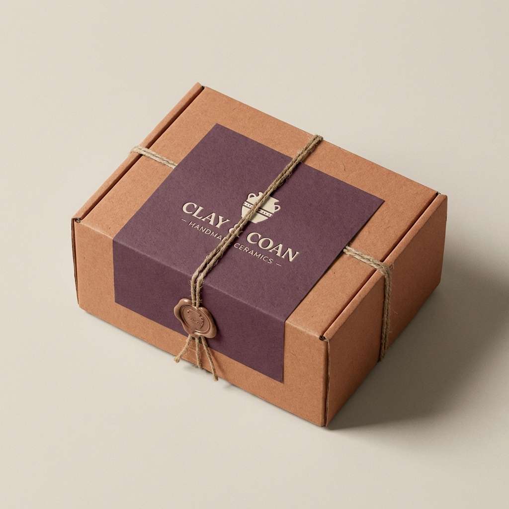
12) Plum Clay Earthworks
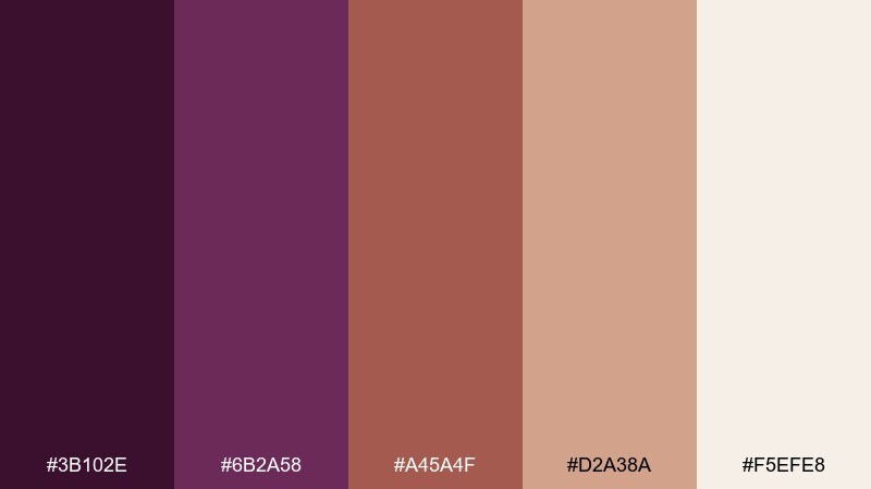
HEX: #3b102e #6b2a58 #a45a4f #d2a38a #f5efe8
Mood: earthy, artisanal, warm
Best for: ceramic pottery packaging
Earthy and hand-thrown, these shades feel like kiln-fired clay and berry glaze. Use the warm terracotta and sand tones for label backgrounds, letting plum handle the brand stamp and small pattern hits. It is ideal for pottery, handmade soaps, and craft markets where a human touch is the point. Tip: add a subtle speckle texture in the lightest tone to make the palette feel more tactile.
Image example of plum clay earthworks generated using media.io
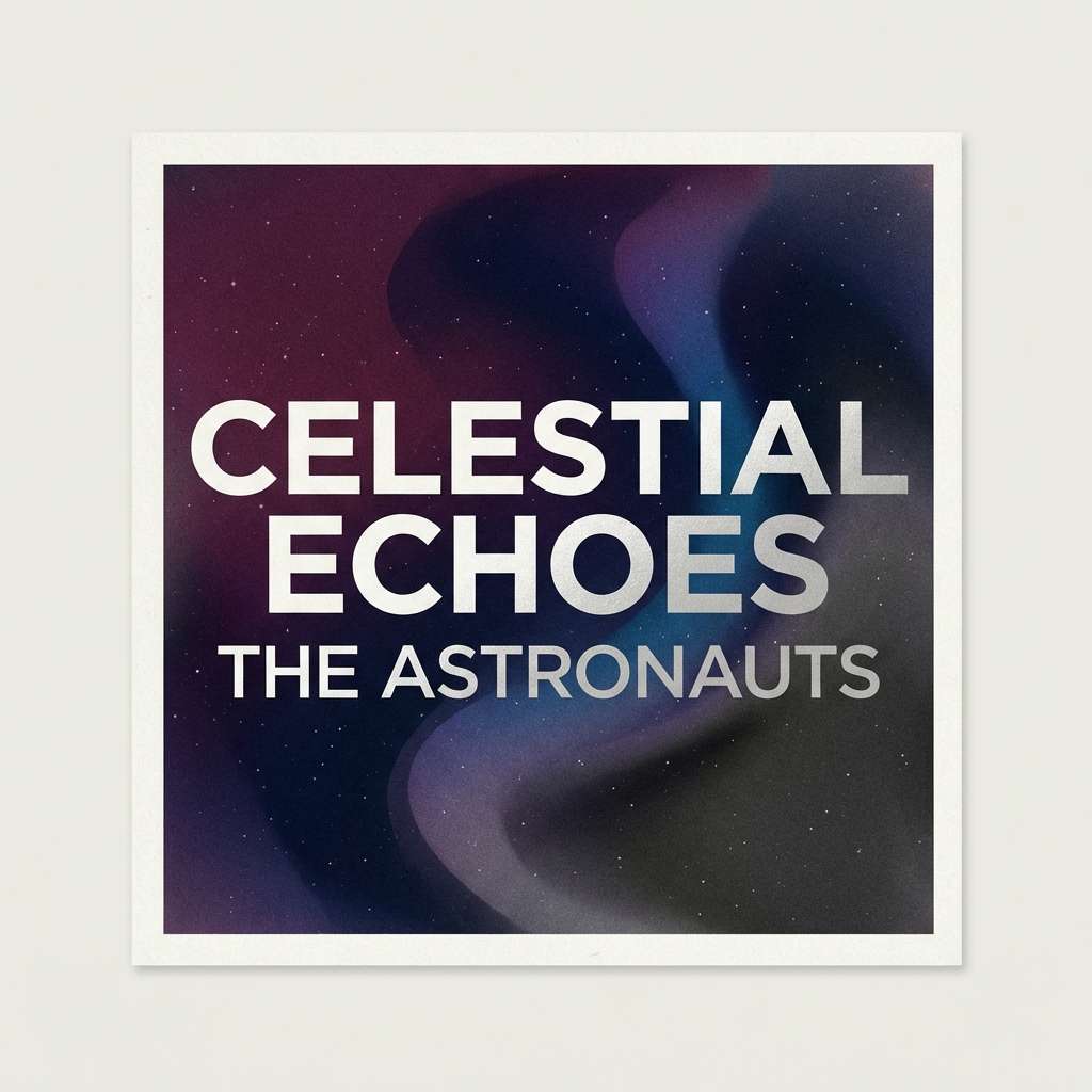
13) Plum Midnight Galaxy
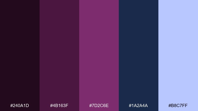
HEX: #240a1d #4b163f #7d2c6e #1a2a4a #b8c7ff
Mood: mysterious, cosmic, cinematic
Best for: music album cover graphic
Mysterious and cinematic, it suggests midnight skies and distant constellations. This plum color palette pairs especially well with deep navy and a cool periwinkle glow for a modern sci-fi vibe. Use the darkest shade for the background, then place titles in the light periwinkle for crisp readability. Tip: add a subtle grain and tiny star-like dots sparingly so the cover stays clean, not busy.
Image example of plum midnight galaxy generated using media.io
14) Plum Coral Sunset
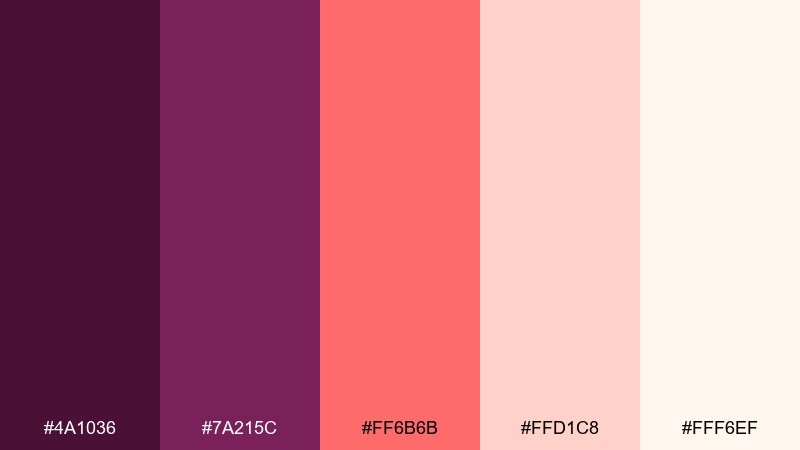
HEX: #4a1036 #7a215c #ff6b6b #ffd1c8 #fff6ef
Mood: warm, lively, optimistic
Best for: summer sale flyer
Warm and lively, it feels like a sunset gradient over a city skyline. Plum color combinations with coral can look modern when you keep the background light and push contrast into headlines. Use coral for discount badges and plum for the main type to avoid the pinks overpowering the message. Tip: add a thin plum border to frame the flyer and keep the layout from feeling too soft.
Image example of plum coral sunset generated using media.io

15) Plum Mint Sorbet
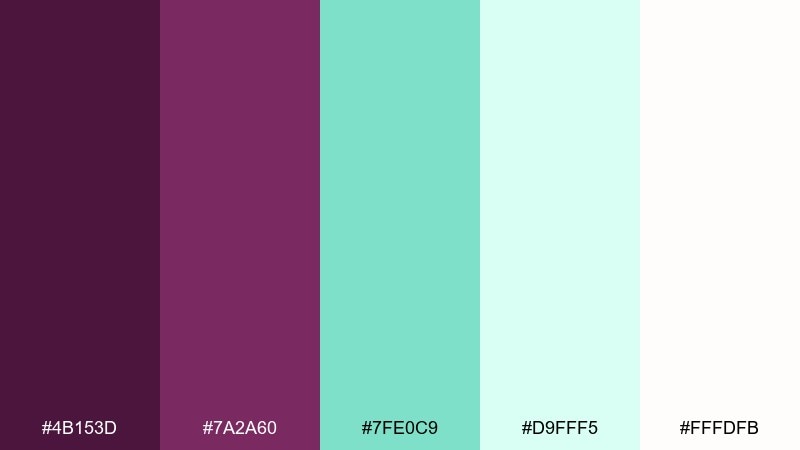
HEX: #4b153d #7a2a60 #7fe0c9 #d9fff5 #fffdfb
Mood: fresh, sweet, youthful
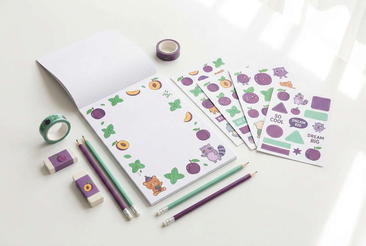
Best for: kids stationery set
Fresh and candy-like, it brings to mind berry sorbet with a cool mint finish. Use mint as the main paper tone and let plum handle headings, doodles, or small patterns so the set stays playful but readable. It is great for stationery, classroom printables, and cheerful social templates. Tip: keep line art in the deeper plum and fill shapes with the pale mint for a clean, friendly look.
Image example of plum mint sorbet generated using media.io
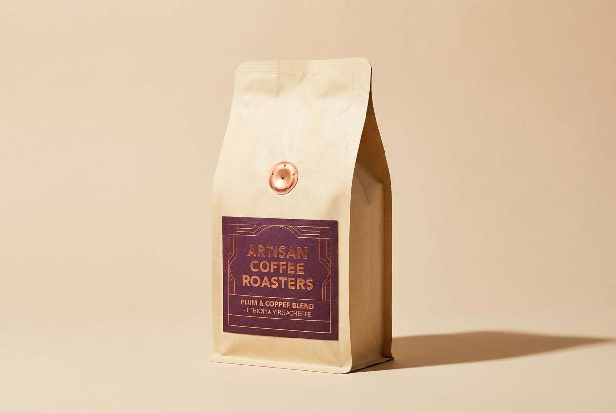
16) Plum Copper Artisan
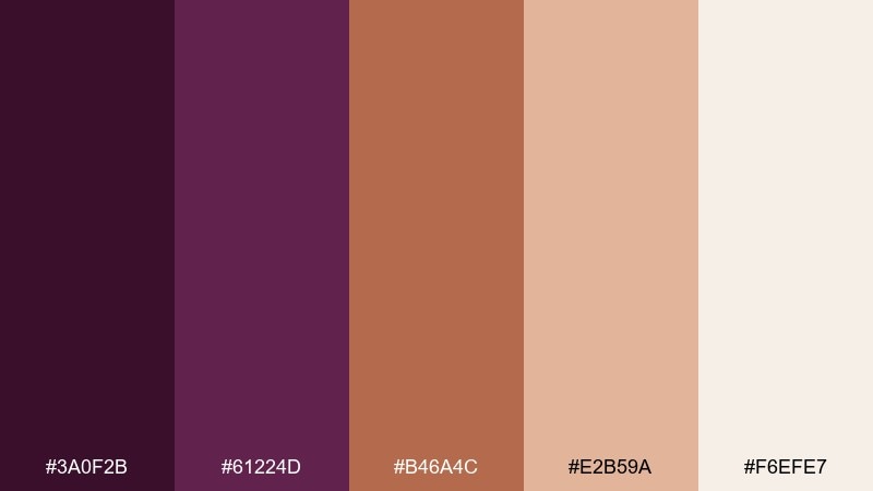
HEX: #3a0f2b #61224d #b46a4c #e2b59a #f6efe7
Mood: handcrafted, warm, refined
Best for: craft coffee bag packaging
Handcrafted and cozy, these tones recall copper kettles and roasted beans. Use plum for the brand badge and roast name, then let copper and cream create an inviting, tactile base. It fits coffee bags, chocolate bars, and specialty foods that want an artisanal story. Tip: add a small copper foil stripe or seal to elevate the package without increasing visual clutter.
Image example of plum copper artisan generated using media.io
17) Plum Ice Gray Tech
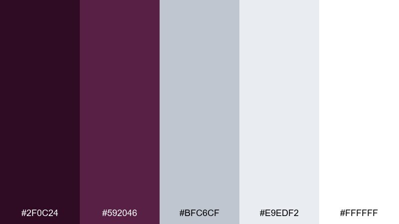
HEX: #2f0c24 #592046 #bfc6cf #e9edf2 #ffffff
Mood: clean, crisp, professional
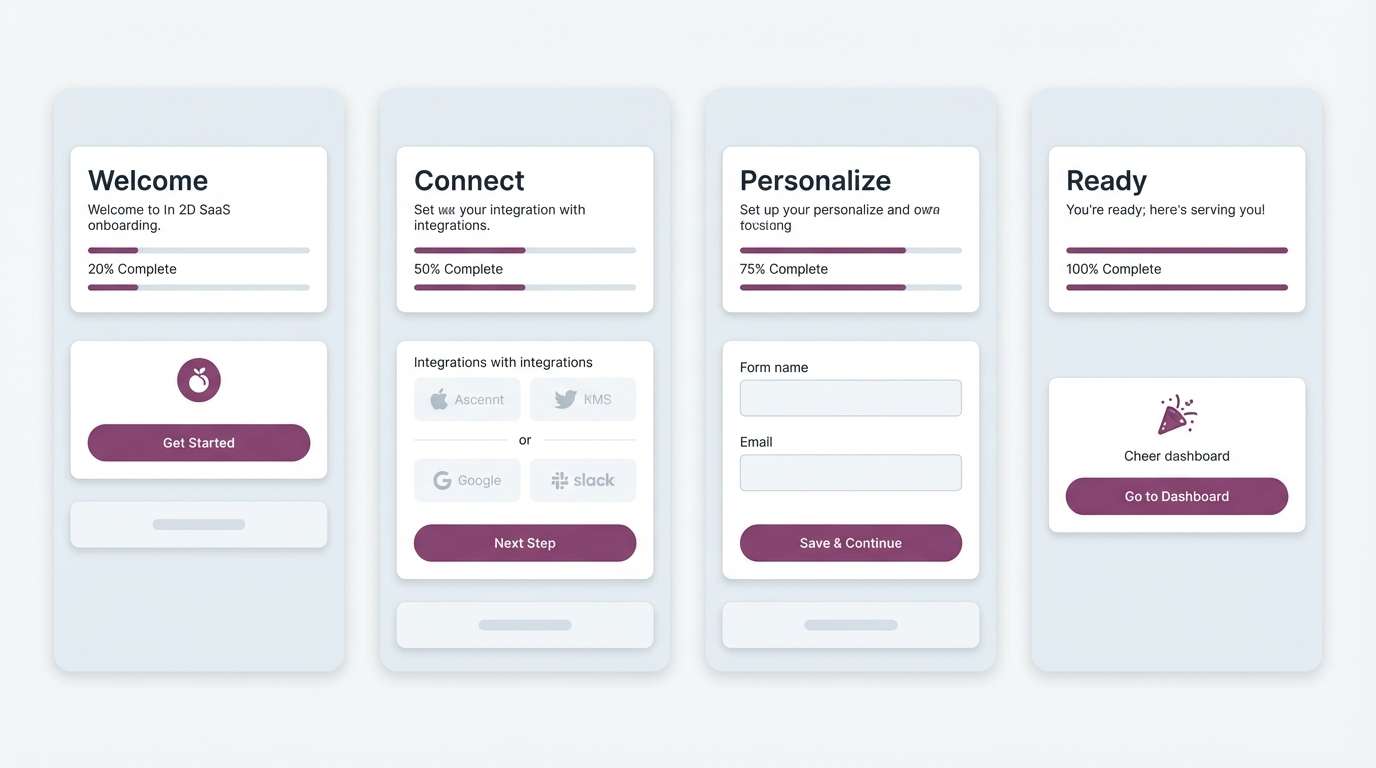
Best for: saas onboarding screens ui
Clean and crisp, it feels like frosted glass and precise typography. Use the ice grays for surfaces and cards, then reserve plum for progress indicators and primary CTAs. It is well-suited to SaaS onboarding, settings screens, and product tours where clarity is everything. Tip: keep icons in the mid-gray and use plum only for active states to maintain a calm flow.
Image example of plum ice gray tech generated using media.io
18) Plum Forest Cabin
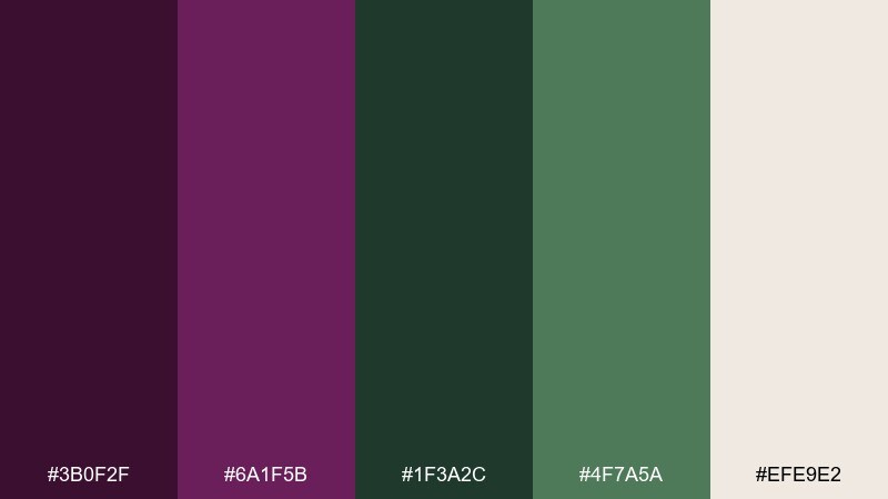
HEX: #3b0f2f #6a1f5b #1f3a2c #4f7a5a #efe9e2
Mood: rustic, cozy, nature-forward
Best for: cabin rental website hero
Cozy and woodsy, it evokes a forest cabin at twilight with a warm glow inside. Let the greens handle supporting blocks and icons, while plum anchors the headline for an elevated, boutique feel. It works well for travel sites, outdoor brands, and seasonal campaigns that want nature without going fully rustic. Tip: use the light beige for overlays and text areas so photos can stay rich and moody.
Image example of plum forest cabin generated using media.io
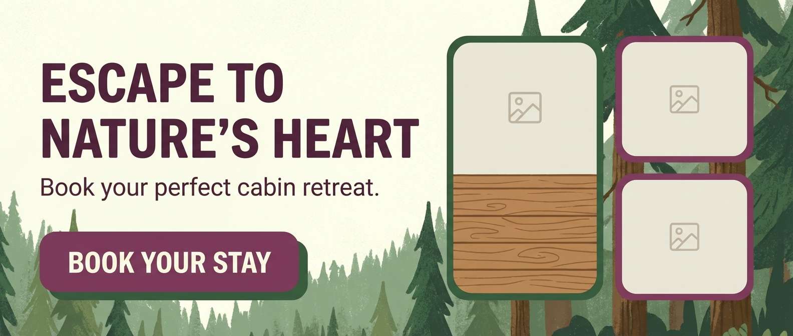
19) Plum Sandstone Calm
HEX: #3a102b #5d234b #c8b7a6 #eadfce #fbf8f3
Mood: calm, timeless, understated
Best for: architectural portfolio layout
Calm and timeless, it feels like sandstone steps with a hint of berry shadow. Use the sandy neutrals for page backgrounds and generous whitespace, letting plum guide navigation and section titles. It is a strong fit for architecture portfolios, case studies, and editorial-style presentations. Tip: keep captions in the mid-sand tone and use plum only for the project name to preserve a gallery-like mood.
Image example of plum sandstone calm generated using media.io
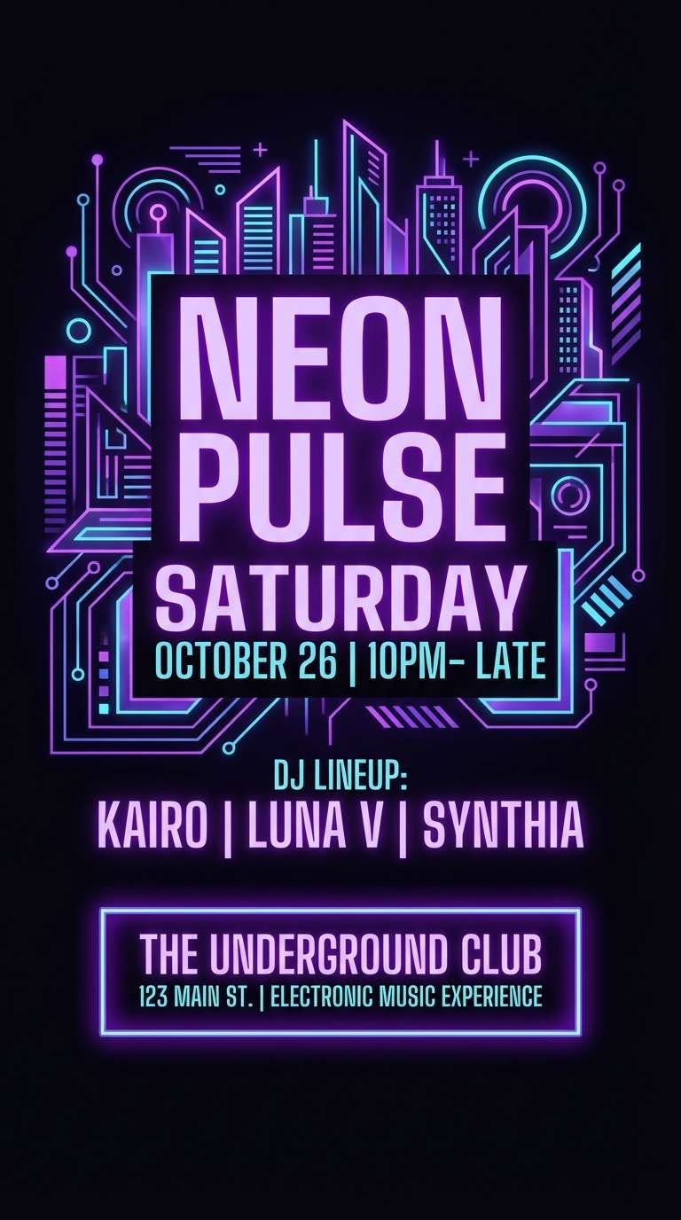
20) Plum Neon Nightlife
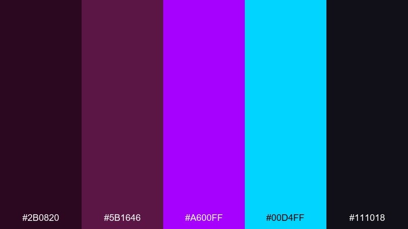
HEX: #2b0820 #5b1646 #a600ff #00d4ff #111018
Mood: electric, bold, nightlife
Best for: nightclub event poster
Electric and high-voltage, it captures neon reflections and late-night energy. Use the deep plum-black as the base, then let violet and cyan create a striking hierarchy for the DJ name and time. It is perfect for club posters, music announcements, and digital stories where you want instant impact. Tip: add a soft glow around the cyan text, but keep the rest of the typography flat for readability.
Image example of plum neon nightlife generated using media.io
What Colors Go Well with Plum?
Plum pairs especially well with soft neutrals like cream, blush, and warm beige because they keep the palette elegant and readable. This is a reliable direction for invitations, beauty packaging, and editorial layouts.
For modern contrast, try cool companions like teal, denim blue, periwinkle, and ice gray. These combinations sharpen the plum and feel more “tech” or “contemporary” than traditional purple pairings.
If you want a premium finish, add metallic-adjacent tones like gold, copper, or mocha-brown. They amplify plum’s richness without needing heavy blacks.
How to Use a Plum Color Palette in Real Designs
Start by assigning roles: use the darkest plum for headlines, logos, or navigation states; keep mid plums for secondary emphasis; and reserve pale tints for backgrounds and spacing. This prevents the design from feeling heavy.
For print and branding, plum looks best when you give it “air”—large margins, simple ornamentation, and one clear accent (gold, coral, mint, or teal). Too many bright accents can make plum look muddy.
For UI, treat plum as an accent rather than a surface color: primary buttons, active tabs, progress, and selected states. Pair it with grays/white so accessibility contrast is easier to control.
Create Plum Palette Visuals with AI
If you already have HEX codes, you can generate matching poster concepts, packaging mockups, UI screens, or social graphics in minutes with text-to-image prompts. This is an easy way to validate mood before you commit to a full design system.
Use one of the prompts above as a starting point, then tweak the subject (menu cover, skincare ad, dashboard UI) while keeping the same plum palette direction. Save multiple variations and compare what reads best at thumbnail size.
When you find a winner, keep the prompt as a reusable template for future campaigns so your brand visuals stay consistent across formats.
Plum Color Palette FAQs
-
What is the HEX code for plum?
There isn’t one single plum HEX, but common “deep plum” ranges look like #4b163f, #5b1646, or #6a1b5a. Choose the exact shade based on whether you want more red (berry) or more blue (purple) in the mix. -
Is plum warm or cool?
Plum can be warm or cool depending on the undertone. Red-leaning plums feel warmer and more romantic, while blue-leaning plums feel cooler and more modern. -
What colors complement plum best?
Great complements include sage/green, teal, gold, cream, blush pink, denim blue, and charcoal. Your best match depends on the mood: botanical (sage), luxury (gold), or high-contrast modern (teal/ice gray). -
How do I make a plum color scheme look modern?
Pair plum with cool neutrals (white, ice gray, charcoal) and add one crisp accent like teal or periwinkle. Keep layouts minimal and use plum mainly for hierarchy (headings, buttons, active states). -
What’s a good background color to use with plum text?
Light tints like #f4f5f7, #faf7ff, #fff3f7, or warm creams like #fbf8f3 usually keep plum text readable and elegant. Test contrast, especially for smaller body text. -
Can plum replace black in branding?
Yes. Very dark plum shades (like #240a1d or #2a0f24) often work as a softer alternative to black while still feeling premium. They can add character without sacrificing seriousness. -
How can I generate plum palette design mockups quickly?
Use Media.io text-to-image with a clear prompt (e.g., “menu cover,” “dashboard UI,” “skincare ad”), then specify plum plus one accent color and a clean layout style. Generate a few variations, then refine the prompt to lock in your preferred look.
Next: Royal Blue Color Palette


