

Cream beige is a warm neutral that instantly makes designs feel calm, clean, and welcoming. It’s a go-to base color for interiors, branding systems, and UI because it softens contrast without looking dull.
Below are 20 curated cream beige color palette ideas with HEX codes, plus practical pairing and usage tips you can apply right away.
In this article
- Why Cream Beige Palettes Work So Well
-
- oat milk morning
- linen and latte
- sandstone studio
- vanilla sage calm
- biscuit and cocoa
- desert blush
- warm minimal ui
- antique paper editorial
- cozy cabin neutrals
- pearl and pewter
- clay pottery
- soft monochrome branding
- garden path neutrals
- sunlit wedding stationery
- museum wall tones
- cappuccino retail
- modern rustic kitchen
- spa serenity
- autumn wheat fields
- nightfall neutrals
- What Colors Go Well with Cream Beige?
- How to Use a Cream Beige Color Palette in Real Designs
- Create Cream Beige Palette Visuals with AI
Why Cream Beige Palettes Work So Well
Cream beige sits in a “safe” warmth zone: it feels brighter than tan, softer than white, and more inviting than cool gray. That makes it ideal for backgrounds, surfaces, and negative space where you want comfort without visual noise.
It also plays well with both warm and cool accents. You can steer it cozy (latte browns, terracotta, golden tones) or modern (sage greens, pewter grays, near-black) while keeping the overall look cohesive.
In digital design, cream beige reduces harsh contrast and screen glare while still supporting readable type. With a strong dark anchor color, it becomes a reliable foundation for UI, editorial layouts, and premium branding.
20+ Cream Beige Color Palette Ideas (with HEX Codes)
1) Oat Milk Morning

HEX: #F7F1E7 #E6D6C3 #CBB79F #A68C72 #5A4A3F
Mood: cozy, clean, welcoming
Best for: kitchen branding and cafe menus
Cozy and sunlit, like warm oat milk in a ceramic mug and soft linen napkins. The creamy base keeps layouts airy, while the mid beiges add appetizing warmth. Pair it with natural paper textures and subtle grain for a handcrafted feel. Usage tip: use the dark mocha tone for headings to keep contrast readable on the lightest cream.
Image example of oat milk morning generated using media.io
Media.io is an online AI studio for creating and editing video, image, and audio in your browser.

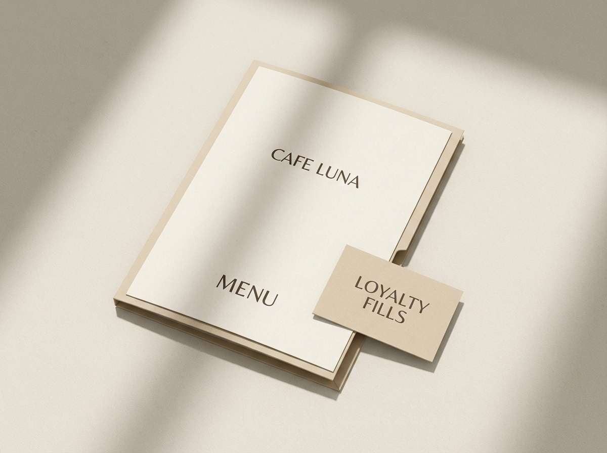
2) Linen and Latte
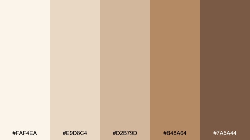
HEX: #FAF4EA #E9D8C4 #D2B79D #B48A64 #7A5A44
Mood: soft, comforting, approachable
Best for: lifestyle blog headers and social templates
Soft and familiar, like folded linen, steamed milk, and a hint of cinnamon. These tones work beautifully for lifestyle content where you want warmth without heavy saturation. Pair with off-white space and a single deep latte brown for type and icons. Usage tip: keep imagery warm-toned so the palette does not feel washed out next to photos.
Image example of linen and latte generated using media.io
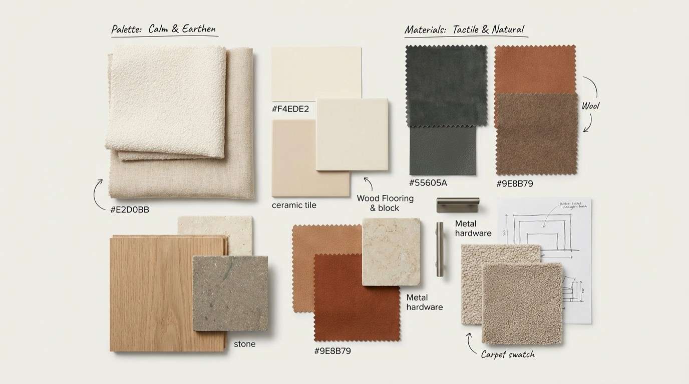
3) Sandstone Studio
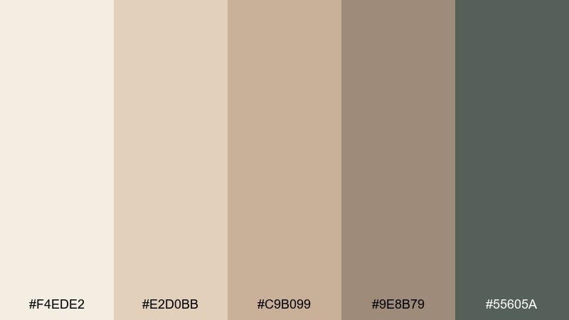
HEX: #F4EDE2 #E2D0BB #C9B099 #9E8B79 #55605A
Mood: grounded, modern, architectural
Best for: interior concept boards and material palettes
Grounded and architectural, like sandstone walls with a cool shadow line. The mix balances warm stone neutrals with a muted green-gray that feels contemporary. For cream beige color combinations, use the gray-green as cabinetry or hardware against light walls and sandy textiles. Usage tip: repeat the deepest neutral in small details to keep the whole board cohesive.
Image example of sandstone studio generated using media.io
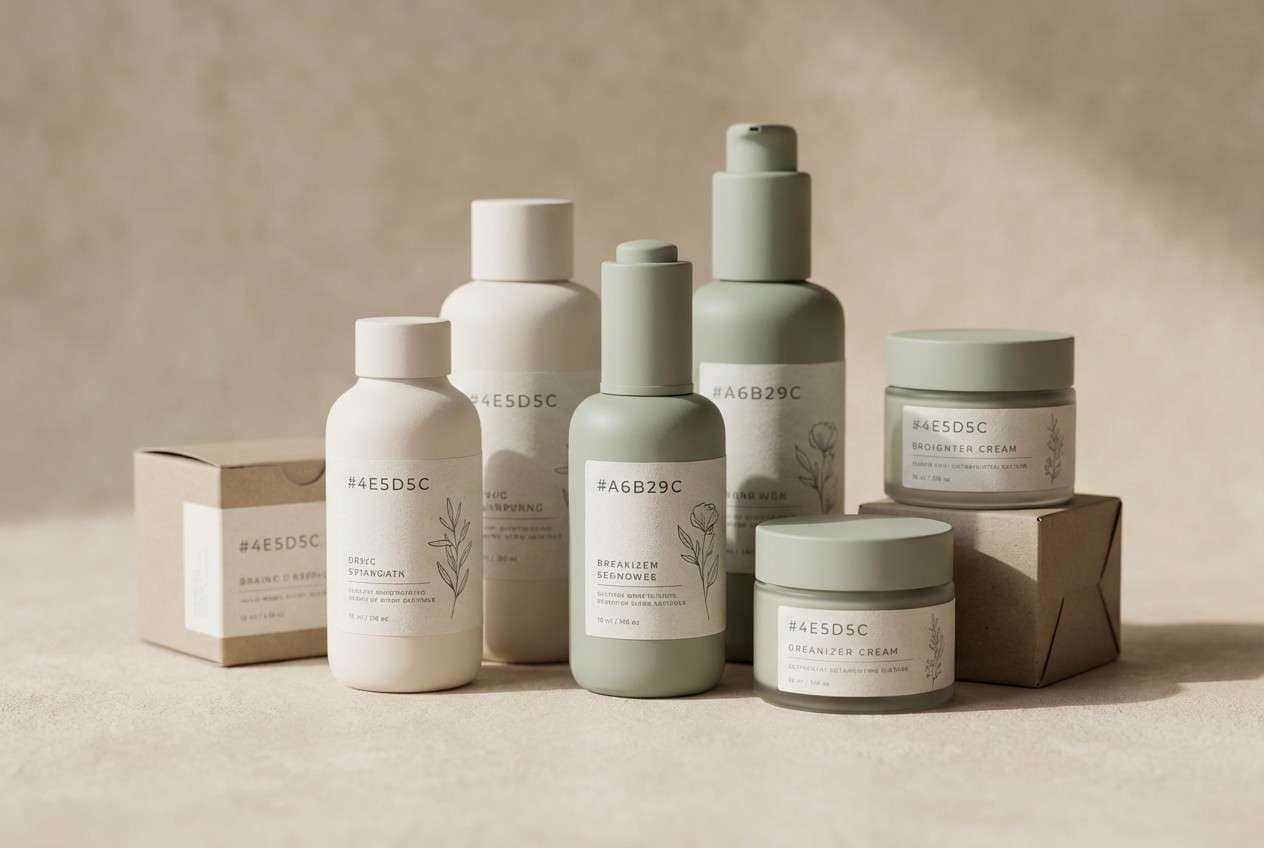
4) Vanilla Sage Calm
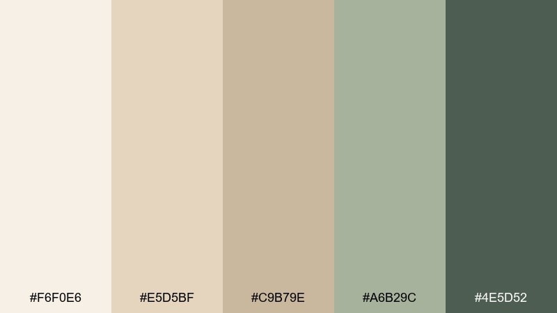
HEX: #F6F0E6 #E5D5BF #C9B79E #A6B29C #4E5D52
Mood: calm, fresh, restorative
Best for: spa websites and wellness packaging
Calm and restorative, like vanilla steam with fresh-cut sage. The pale creams create a clean canvas, while the soft greens add a gentle spa-like cue. Pair with rounded type and lots of breathing room for an easy, premium feel. Usage tip: reserve the darkest green for calls to action so buttons stand out without looking harsh.
Image example of vanilla sage calm generated using media.io
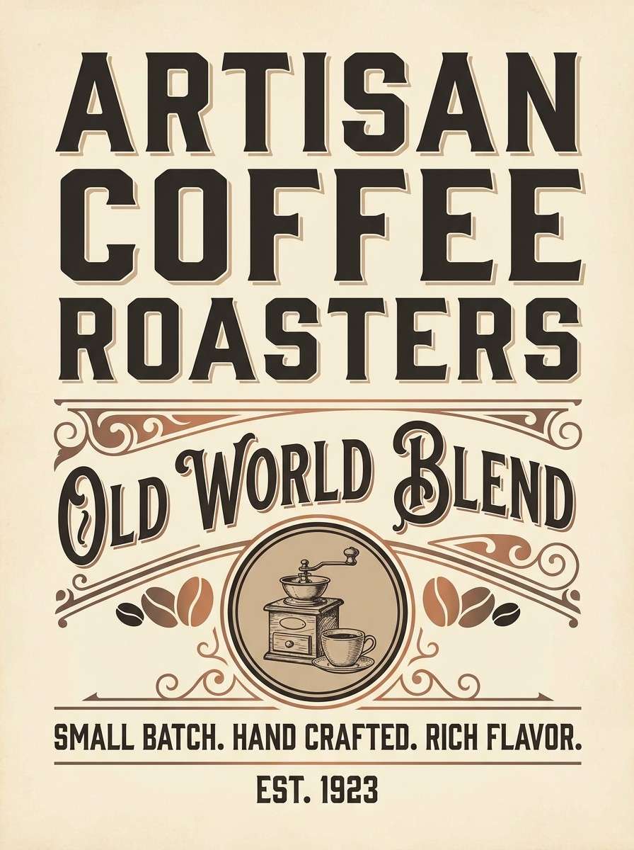
5) Biscuit and Cocoa
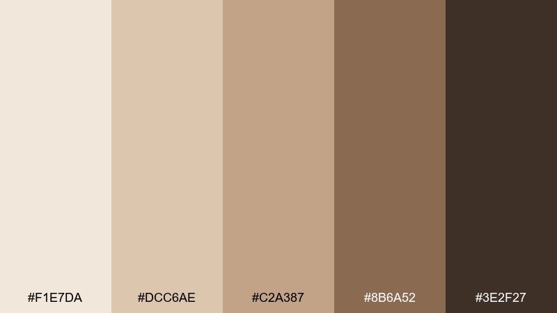
HEX: #F1E7DA #DCC6AE #C2A387 #8B6A52 #3E2F27
Mood: rich, rustic, comforting
Best for: coffee shop posters and artisan labels
Rich and rustic, like baked biscuits and dark cocoa powder. The mid beiges give you plenty of warmth, while the deep brown anchors layouts with a handmade vibe. Pair it with kraft textures, stamp marks, and serif headlines for a small-batch look. Usage tip: keep body text on the two lightest tones to avoid muddy contrast.
Image example of biscuit and cocoa generated using media.io
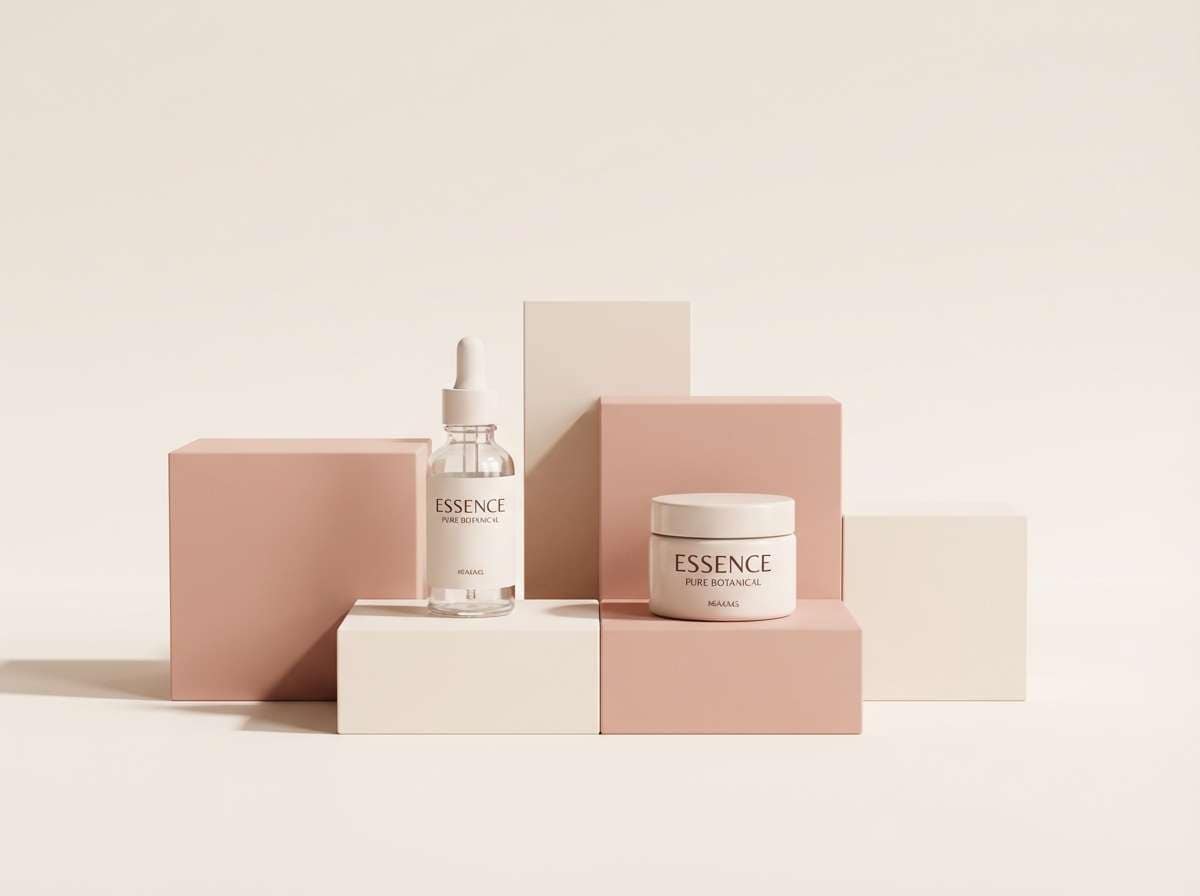
6) Desert Blush
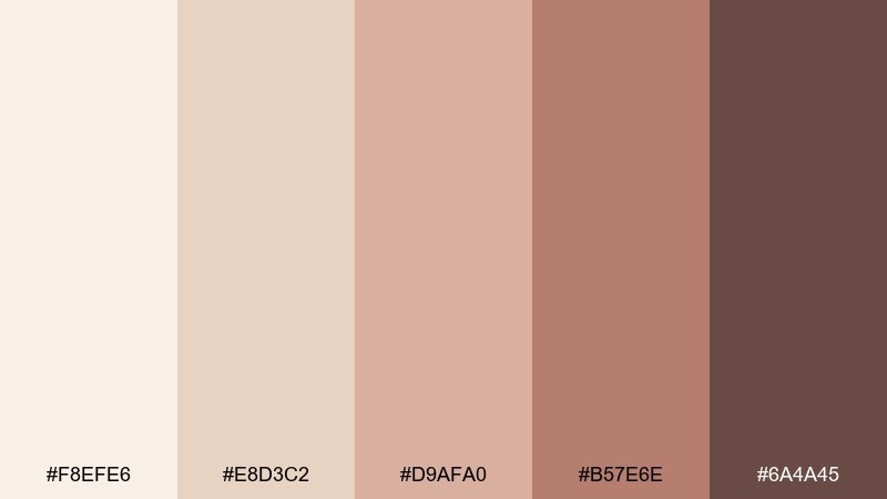
HEX: #F8EFE6 #E8D3C2 #D9AFA0 #B57E6E #6A4A45
Mood: romantic, warm, sun-kissed
Best for: beauty campaigns and lifestyle photography overlays
Romantic and sun-kissed, like desert sand at golden hour with a blush tint. The dusty rose notes soften the neutrals and feel flattering for beauty and lifestyle visuals. Pair with thin-line icons and warm photography to keep everything cohesive. Usage tip: use the rosy midtone for highlights and badges instead of bright pinks.
Image example of desert blush generated using media.io
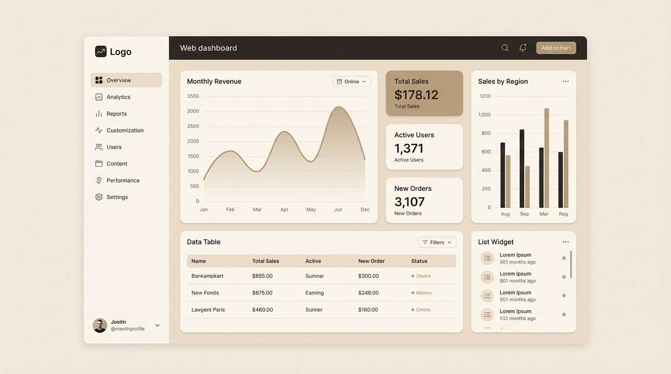
7) Warm Minimal UI
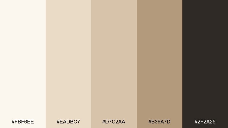
HEX: #FBF6EE #EADBC7 #D7C2AA #B39A7D #2F2A25
Mood: minimal, warm, high-contrast
Best for: dashboard UI and app onboarding screens
Minimal and warm, like clean paper with espresso ink. This cream beige color palette is built for readable interfaces, with a dark neutral that stays softer than pure black. Pair it with simple line icons and subtle shadows to maintain depth without clutter. Usage tip: use the darkest tone only for key text and active states, then let the creams handle the rest.
Image example of warm minimal ui generated using media.io
8) Antique Paper Editorial

HEX: #F9F2E7 #E6D5C1 #D1C0AC #A9A195 #4B4A46
Mood: classic, literary, refined
Best for: magazine layouts and long-form articles
Classic and literary, like antique paper with soft graphite notes. The gray-beige steps give structure to editorial grids without feeling cold. Pair with serif headlines, muted photography, and generous margins for a premium reading experience. Usage tip: use the medium gray-beige for pull quotes so they stand apart without shouting.
Image example of antique paper editorial generated using media.io
9) Cozy Cabin Neutrals
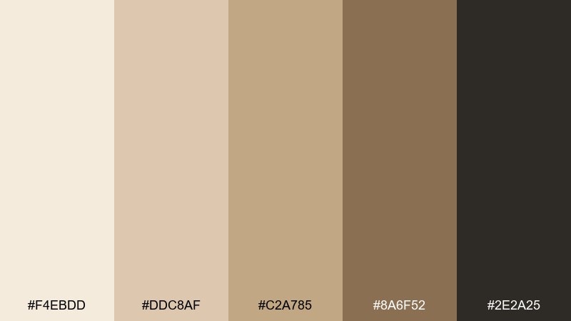
HEX: #F4EBDD #DDC8AF #C2A785 #8A6F52 #2E2A25
Mood: cozy, rustic, outdoorsy
Best for: airbnb listings and travel branding
Cozy and outdoorsy, like cabin light on woodgrain and wool blankets. The palette leans warm and earthy, perfect for hospitality brands that want comfort over polish. Pair with natural textures, wood photography, and a deep near-black for navigation. Usage tip: keep backgrounds light so the darker accents feel intentional, not heavy.
Image example of cozy cabin neutrals generated using media.io
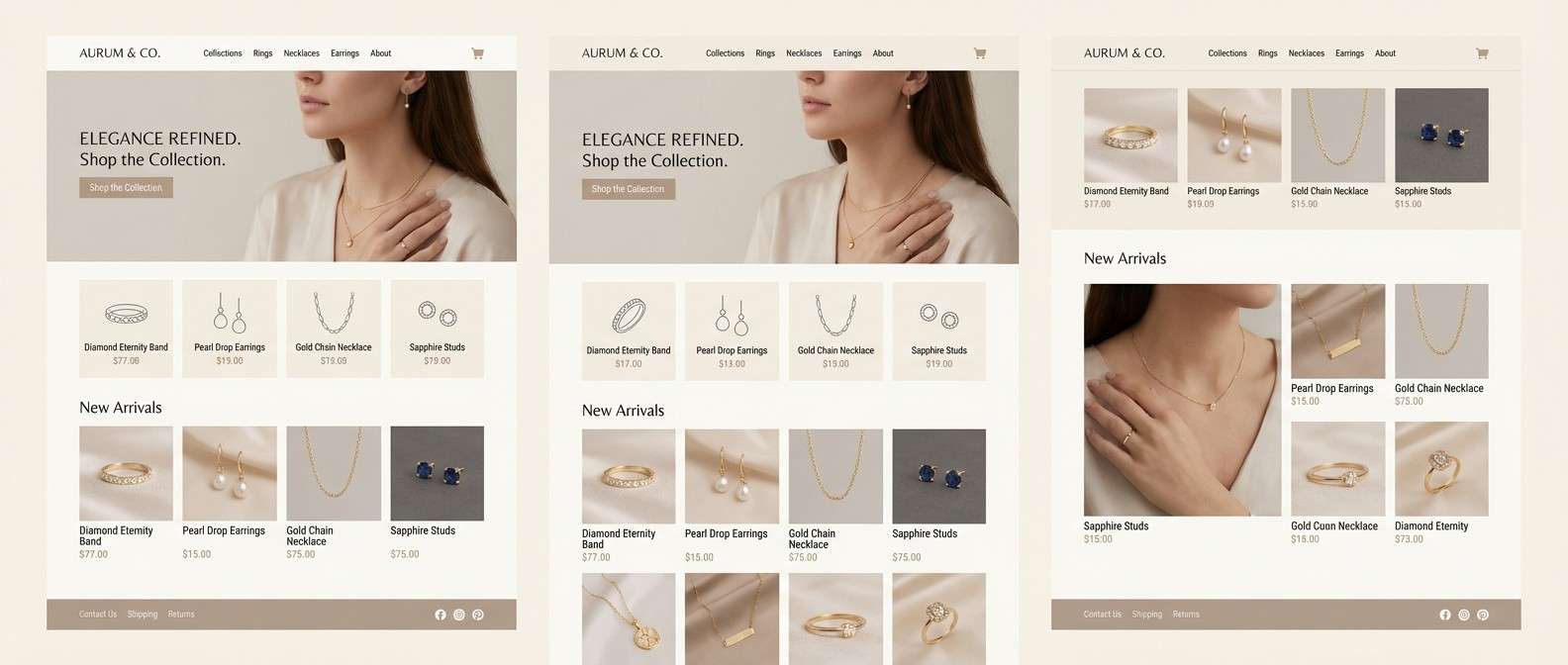
10) Pearl and Pewter
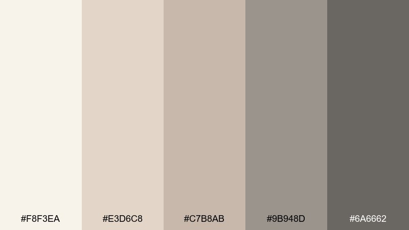
HEX: #F8F3EA #E3D6C8 #C7B8AB #9B948D #6A6662
Mood: quiet luxury, cool, polished
Best for: jewelry websites and premium portfolios
Quiet and polished, like pearl highlights against brushed pewter. These neutrals feel elevated and modern, especially when paired with clean typography and lots of whitespace. Add subtle gradients or satin finishes to echo the metallic vibe without using actual silver. Usage tip: let the mid gray-beige define cards and dividers for a crisp layout.
Image example of pearl and pewter generated using media.io
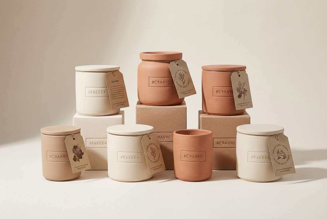
11) Clay Pottery
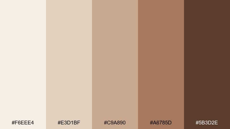
HEX: #F6EEE4 #E3D1BF #C9A890 #A6785D #5B3D2E
Mood: handmade, warm, earthy
Best for: ceramics packaging and maker logos
Handmade and earthy, like sun-dried clay and glazed terracotta. The warm midtones create a strong identity without needing bright colors. Pair with tactile materials, stamped marks, and a deep brown for your logo lockup. Usage tip: use the lightest cream for label backgrounds to keep text sharp and legible.
Image example of clay pottery generated using media.io
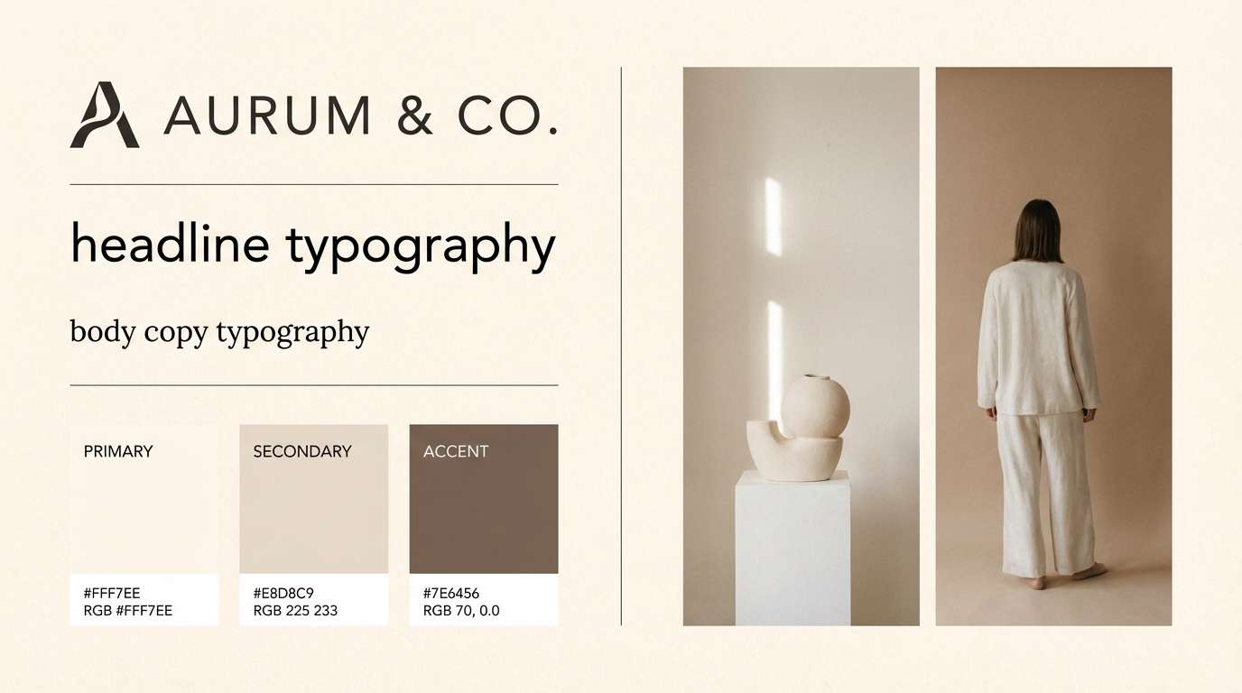
12) Soft Monochrome Branding
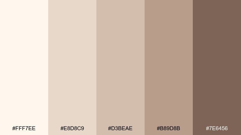
HEX: #FFF7EE #E8D8C9 #D3BEAE #B89D8B #7E6456
Mood: minimal, friendly, modern
Best for: startup branding and pitch decks
Minimal and friendly, like warm paper with a gentle shadow edge. The tonal steps make it easy to build systems for slides, cards, and icons without visual noise. Pair with one bold typeface and clean geometric shapes for a modern brand kit. Usage tip: assign each midtone to a specific UI role, like borders, surfaces, and secondary text.
Image example of soft monochrome branding generated using media.io
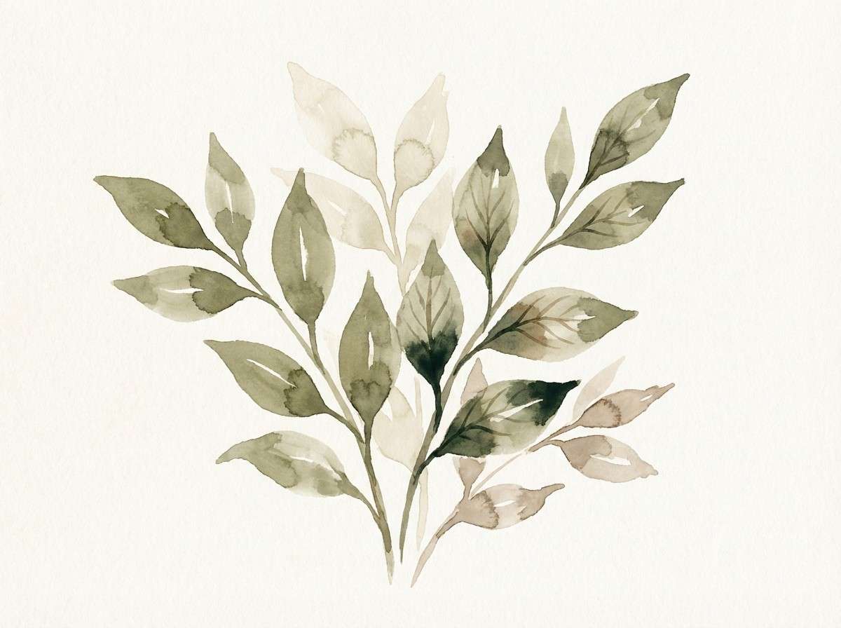
13) Garden Path Neutrals
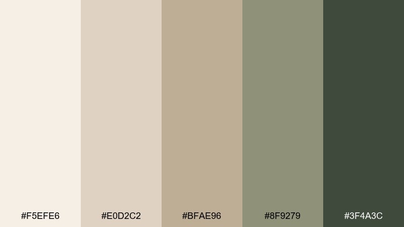
HEX: #F5EFE6 #E0D2C2 #BFAE96 #8F9279 #3F4A3C
Mood: natural, balanced, quietly fresh
Best for: botanical illustrations and eco packaging
Natural and quietly fresh, like dried grasses along a shaded garden path. The olive and forest accents keep the beige tones from feeling too sweet or indoor-only. Pair with watercolor leaves, recycled textures, and minimal copy for an eco-forward look. Usage tip: use the darker greens sparingly as stamps, icons, or small headlines.
Image example of garden path neutrals generated using media.io
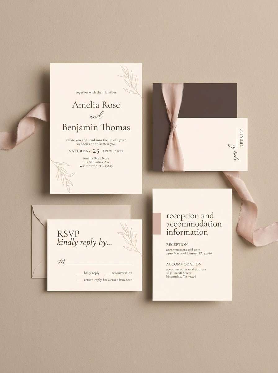
14) Sunlit Wedding Stationery
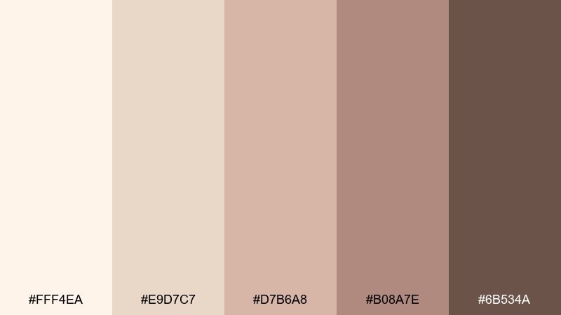
HEX: #FFF4EA #E9D7C7 #D7B6A8 #B08A7E #6B534A
Mood: romantic, airy, timeless
Best for: wedding invitations and event suites
Romantic and airy, like sunlit vows on soft cotton paper. This cream beige color palette keeps the mood timeless while the rosy beige adds a gentle celebratory glow. Pair with delicate serif type, thin rules, and warm photography for an elegant suite. Usage tip: print the darkest brown sparingly for names and dates to maintain a light, refined feel.
Image example of sunlit wedding stationery generated using media.io
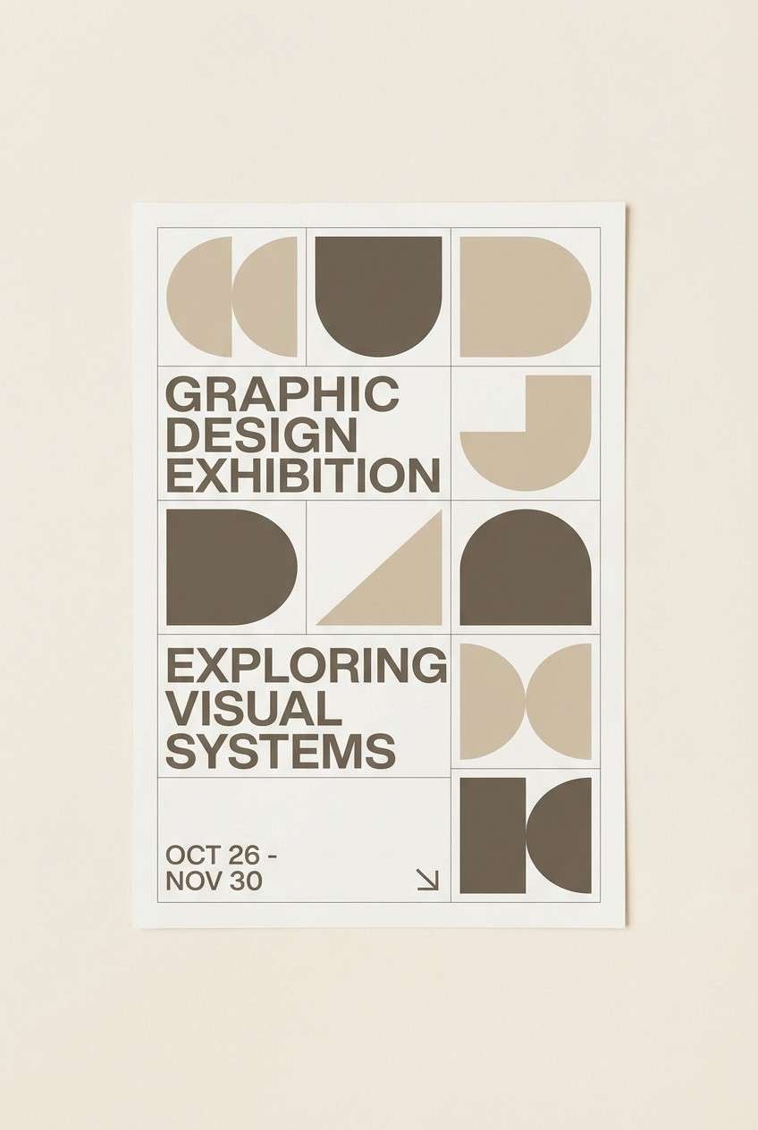
15) Museum Wall Tones
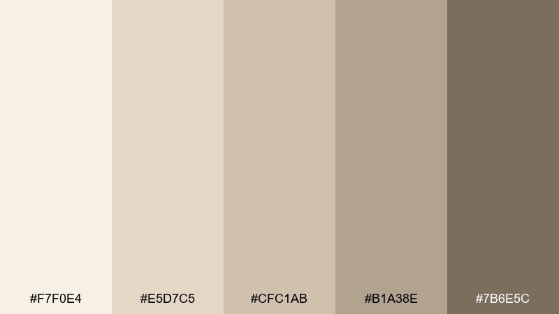
HEX: #F7F0E4 #E5D7C5 #CFC1AB #B1A38E #7B6E5C
Mood: quiet, curated, gallery-like
Best for: portfolio websites and exhibition posters
Quiet and curated, like a museum wall with soft spotlights. The gentle range of beiges supports artwork and photography without competing for attention. Pair with black-and-white imagery, restrained typography, and plenty of negative space. Usage tip: use the medium beige as a consistent frame or margin color across pages.
Image example of museum wall tones generated using media.io
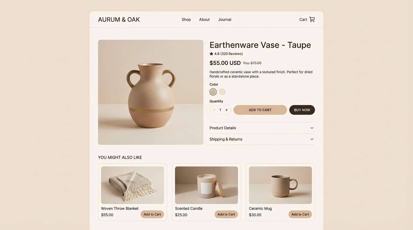
16) Cappuccino Retail
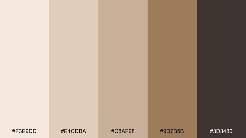
HEX: #F3E9DD #E1CDBA #C8AF98 #9D7B5B #3D3430
Mood: premium, warm, inviting
Best for: shopify themes and product pages
Premium and inviting, like cappuccino foam with a deep roasted finish. These cream beige color combinations work well for retail because they flatter product photography and keep focus on CTAs. Pair with a single dark tone for navigation and a mid beige for price tags or badges. Usage tip: keep button fills dark and use the lightest cream for button text to maximize clarity.
Image example of cappuccino retail generated using media.io
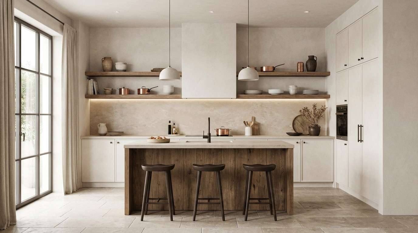
17) Modern Rustic Kitchen
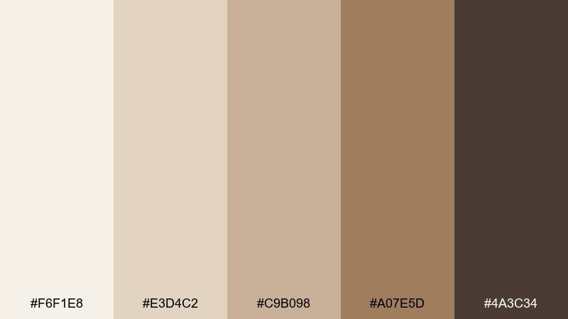
HEX: #F6F1E8 #E3D4C2 #C9B098 #A07E5D #4A3C34
Mood: warm, homey, modern rustic
Best for: kitchen remodel renders and cabinetry selections
Warm and homey, like light oak cabinets with a modern matte finish. The creamy tones keep spaces bright, while the caramel browns add a grounded, lived-in feel. Pair with black fixtures or dark wood accents for a sharper edge. Usage tip: repeat the caramel tone in textiles to make the room feel intentionally layered.
Image example of modern rustic kitchen generated using media.io
18) Spa Serenity
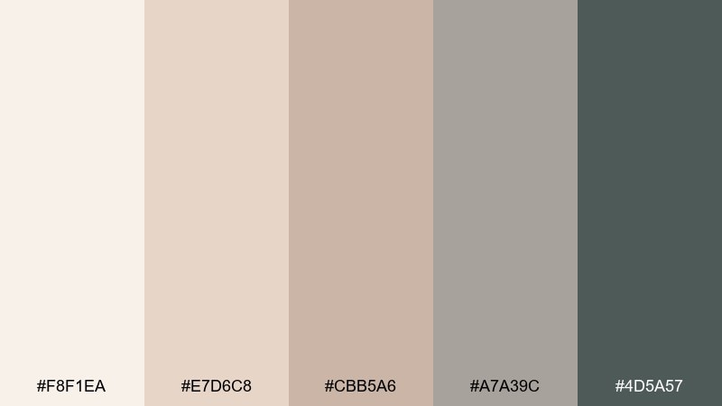
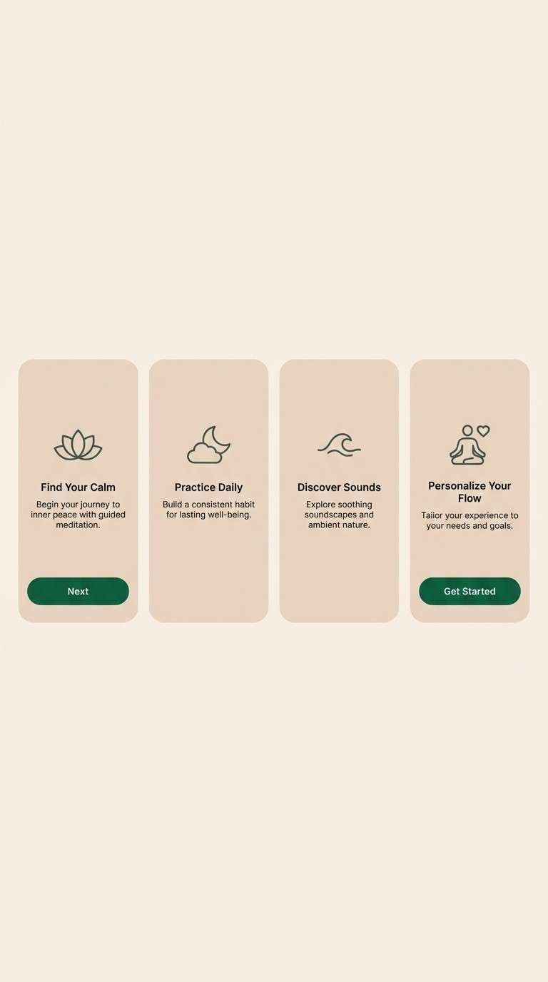
HEX: #F8F1EA #E7D6C8 #CBB5A6 #A7A39C #4D5A57
Mood: serene, airy, balanced
Best for: wellness app onboarding and meditation screens
Serene and airy, like steam, stone, and eucalyptus shadows. The palette stays neutral but adds a cool, calming structure through soft gray-greens. Pair with gentle gradients, rounded cards, and minimal icons for a soothing user flow. Usage tip: keep animations subtle and use the darkest tone only for primary actions.
Image example of spa serenity generated using media.io
19) Autumn Wheat Fields
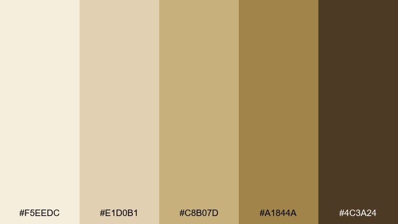
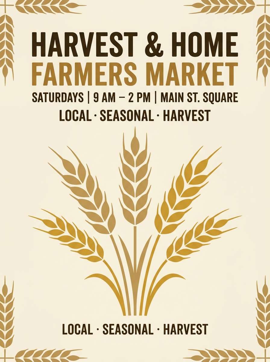
HEX: #F5EEDC #E1D0B1 #C8B07D #A1844A #4C3A24
Mood: harvest, sunny, earthy
Best for: seasonal flyers and farmers market branding
Harvest-warm and sunny, like wheat stalks and toasted grain. The golden tans bring more energy than typical neutrals while staying easy to use in print. Pair with simple illustration, textured paper backgrounds, and dark brown type for a classic market feel. Usage tip: use the golden midtone for badges and pricing so it reads from a distance.
Image example of autumn wheat fields generated using media.io
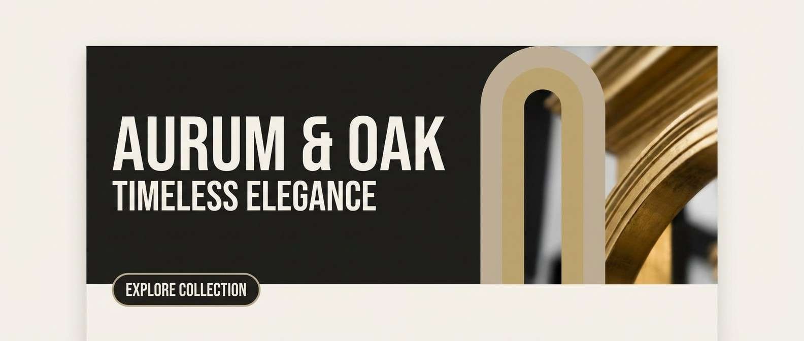
20) Nightfall Neutrals
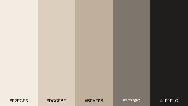
HEX: #F2ECE3 #DCCFBE #BFAF9B #7E756C #1F1E1C
Mood: moody, elegant, high-contrast
Best for: luxury branding and landing pages
Moody and elegant, like evening light on textured plaster. The near-black adds drama and makes the soft beiges feel more refined. Pair with oversized typography, minimal photography, and crisp grid spacing for a luxury landing page. Usage tip: keep most sections on the lightest tones, then use the dark background for one standout hero block.
Image example of nightfall neutrals generated using media.io
What Colors Go Well with Cream Beige?
Cream beige pairs beautifully with deeper browns (espresso, cocoa, walnut) for a cozy, grounded look. This combination is especially effective for menus, packaging, and interiors where warmth equals comfort.
For fresher, more modern schemes, add muted greens like sage, olive, or eucalyptus. These greens temper beige sweetness and create a clean, nature-inspired balance that works well in wellness and eco brands.
If you want a premium, high-contrast style, introduce near-black, pewter gray, or graphite. A dark anchor color makes cream beige feel intentional and elevated, especially in UI, editorial layouts, and luxury landing pages.
How to Use a Cream Beige Color Palette in Real Designs
Start with cream as your main background or surface color, then assign mid-beiges to structure (cards, panels, dividers), and reserve the darkest shade for typography and key UI states. This creates hierarchy without relying on loud color.
In branding and print, cream beige looks best with tactile cues—paper grain, subtle shadows, linen textures, or warm photography. Those details prevent neutrals from feeling flat while keeping the tone minimal.
For accessibility, test contrast early. Cream backgrounds often need a dark mocha/charcoal (instead of light gray) for readable body text and clear buttons, especially on mobile screens.
Create Cream Beige Palette Visuals with AI
If you’re building a mood board, UI mock, packaging concept, or interior inspiration, AI-generated images can help you validate the vibe before you commit to final design assets. Cream beige palettes are especially good for testing materials, lighting, and texture.
Use your palette HEX codes inside a prompt and describe the scene (menu, skincare label, dashboard, invitation suite). Then generate a few variations to explore contrast, warmth, and how accents show up in context.
Media.io makes it simple to create on-brand visuals directly in your browser—no complicated setup, just prompt and iterate.
Cream Beige Color Palette FAQs
-
What is a cream beige color?
Cream beige is a warm, light neutral that sits between off-white and beige. It typically has soft yellow or peach undertones that make it feel brighter and more inviting than standard beige. -
Is cream beige a good background color for websites?
Yes. Cream beige reduces harsh glare compared to pure white and creates a cozy, premium feel. Just pair it with a sufficiently dark text color (espresso, charcoal, near-black) to maintain readability. -
What accent colors work best with cream beige?
Muted greens (sage, olive), warm browns (latte, cocoa), dusty rose/terracotta, pewter gray, and near-black are reliable accents. Choose based on whether you want a natural, cozy, romantic, or luxury direction. -
How do I keep a beige palette from looking “flat”?
Use a clear tonal range (light to dark), add texture (paper grain, fabric, subtle gradients), and introduce one anchor shade for contrast. Small doses of a cool accent (sage/pewter) can also add depth. -
What’s a good text color on cream beige?
Deep mocha, espresso, charcoal, or near-black usually performs best. Avoid mid-grays that can look muddy or fail contrast checks on lighter cream backgrounds. -
Can cream beige work for modern UI design?
Absolutely. A cream base with structured mid-beige surfaces and a dark neutral for key text/active states creates a warm minimal UI that still feels crisp and contemporary. -
How can I generate cream beige palette images for branding or mockups?
Add your HEX codes to an AI prompt and describe the scene (packaging, editorial spread, dashboard, invitation). Tools like Media.io Text-to-Image help you iterate quickly and keep visuals aligned with your palette.
Next: Goldenrod Color Palette


