

Chocolate mint is one of those rare color pairings that feels both indulgent and clean—rich cocoa browns with a cool, modern mint lift.
In this guide, you’ll get 20+ chocolate mint color palette ideas with HEX codes, plus practical tips for branding, UI, packaging, and more.
In this article
- Why Chocolate Mint Palettes Work So Well
-
- after-dinner breeze
- mint truffle
- cocoa garden
- andes sunrise
- café verde
- frosted cacao
- vintage gelato
- dark mint marble
- matcha mocha studio
- botanical bonbon
- peppermint ledger
- velvet emerald cocoa
- cool brown minimal
- spring chocolate box
- minted mocha poster
- heritage confection
- night garden mint
- soft serve neutrals
- copper mint accent
- sweet bistro signage
- crisp cacao mint
- cocoa mint classics
- What Colors Go Well with Chocolate Mint?
- How to Use a Chocolate Mint Color Palette in Real Designs
- Create Chocolate Mint Palette Visuals with AI
Why Chocolate Mint Palettes Work So Well
Chocolate mint palettes balance warmth and freshness in a way that feels instantly familiar. Deep browns bring stability and luxury, while mint greens add clarity, contrast, and a clean finish.
That contrast also helps with hierarchy in design—dark cocoa can anchor typography and structure, while pale mint opens up space for breathable layouts. The result is a palette that reads premium without feeling heavy.
Because it spans both cozy and modern moods, chocolate mint works across seasons: warm enough for autumn/winter campaigns, yet fresh enough for spring packaging, wellness branding, and crisp UI themes.
20+ Chocolate Mint Color Palette Ideas (with HEX Codes)
1) After-Dinner Breeze
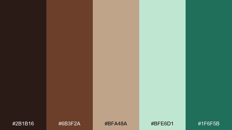
HEX: #2B1B16 #6B3F2A #BFA48A #BFE6D1 #1F6F5B
Mood: cozy, refreshing, upscale
Best for: brand identity
Cozy cocoa shadows meet a cool mint breeze, like dessert served on a crisp night. Use the deep brown as your primary base, then lift layouts with pale mint for breathing room. Pair the tan with elegant serif typography to keep it premium, and use the dark green as a confident accent. Tip: reserve the darkest tones for logos and headers to avoid heavy pages.
Image example of after-dinner breeze generated using media.io
Media.io is an online AI studio for creating and editing video, image, and audio in your browser.

2) Mint Truffle
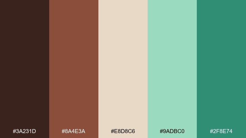
HEX: #3A231D #8A4E3A #E8D8C6 #9ADBC0 #2F8E74
Mood: sweet, playful, boutique
Best for: product packaging
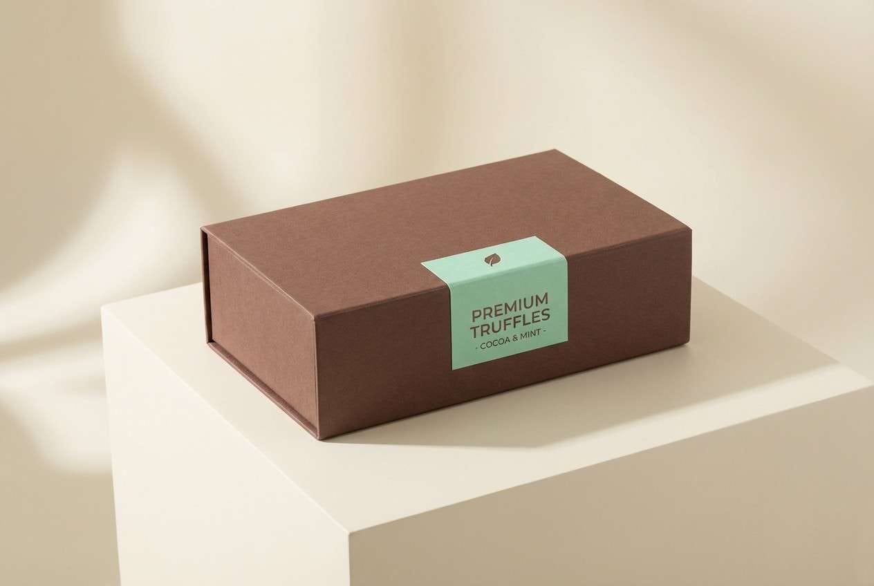
Sweet and glossy like a truffle box with a minty surprise inside. Let the cream shade carry most of the space, then frame the design with cocoa brown for structure. The two mint tones work best as ribbons, seals, or ingredient highlights without overpowering the label. Tip: keep the darker mint for small badges to preserve a boutique feel.
Image example of mint truffle generated using media.io
3) Cocoa Garden
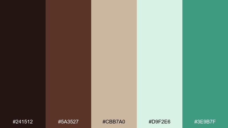
HEX: #241512 #5A3527 #CBB7A0 #D9F2E6 #3E9B7F
Mood: organic, calm, fresh
Best for: botanical illustration
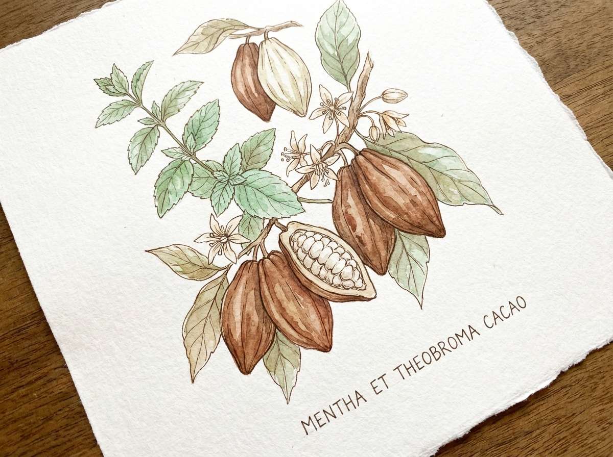
Organic and airy, like cacao pods sketched beside fresh mint leaves. The soft mint wash is ideal for backgrounds, while the warm browns ground the artwork and add depth. Use the brighter green for stems, highlights, and small focal points to keep the illustration lively. Tip: limit the darkest brown to linework so the composition stays light.
Image example of cocoa garden generated using media.io
4) Andes Sunrise
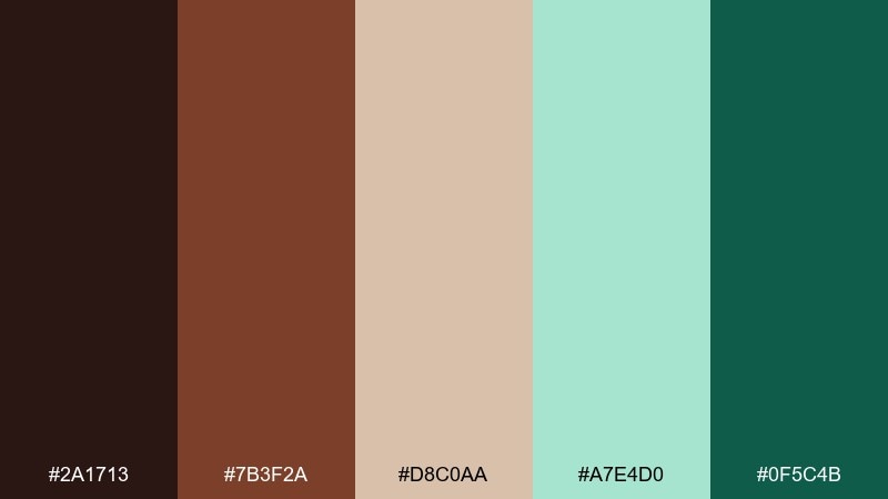
HEX: #2A1713 #7B3F2A #D8C0AA #A7E4D0 #0F5C4B
Mood: energizing, fresh, adventurous
Best for: travel poster
Energizing like a sunrise hike followed by a minty treat. Build bold shapes with the dark teal and espresso tones, then soften transitions using the rosy tan. The pale mint works as atmospheric space behind typography and icons. Tip: use high contrast between dark teal and light mint to make poster text readable from a distance.
Image example of andes sunrise generated using media.io

5) Café Verde
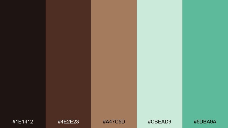
HEX: #1E1412 #4E2E23 #A47C5D #CBEAD9 #5DBA9A
Mood: inviting, modern, café-chic
Best for: menu design
Inviting like a quiet café where warm mocha meets a chilled mint sprig. Use the darkest shades for section headers and dividers, then set body text on the pale mint for a fresh read. The caramel tone works beautifully for price highlights and small icons. Tip: keep the bright mint as a single accent color to avoid a busy menu.
Image example of café verde generated using media.io
6) Frosted Cacao
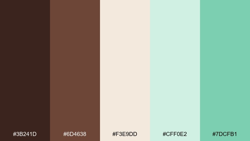
HEX: #3B241D #6D4638 #F3E9DD #CFF0E2 #7DCFB1
Mood: soft, light, airy
Best for: wedding invitation
Soft and airy, like frosted cocoa dusted with mint sugar. The creamy neutral sets an elegant foundation, while the pale mint adds a clean, modern glow. Use the mid-brown for names and monograms, and keep the brighter mint for subtle borders. Tip: choose matte paper to make the gentle colors feel even more refined.
Image example of frosted cacao generated using media.io
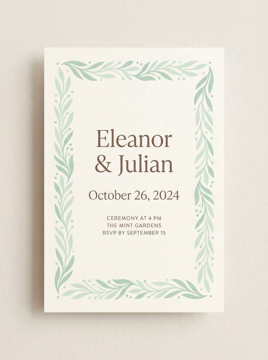
7) Vintage Gelato
HEX: #2D1A14 #7A4A36 #D7C5B4 #B9E7D3 #3C8F73
Mood: nostalgic, charming, friendly
Best for: social media templates
Nostalgic like a gelato shop sign with a minty twist. Use the tan and pale mint as alternating panels to create quick-scrolling variety. The deeper brown keeps captions legible, while the green adds pop for stickers and callouts. Tip: repeat one mint accent shape across posts to build a consistent series.
Image example of vintage gelato generated using media.io
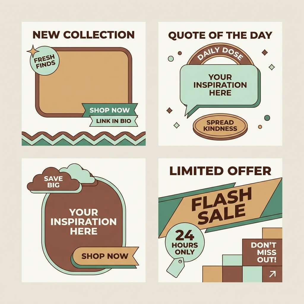
8) Dark Mint Marble
HEX: #160D0B #4B2B22 #8E6A54 #A8E5CF #1C6A57
Mood: dramatic, luxe, bold
Best for: website hero section
Dramatic and luxe, like dark marble veined with cool mint. Let the near-black brown anchor the hero with big type, then add mint blocks for contrast and modernity. The warm mid-brown reads beautifully in secondary text and buttons. Tip: keep the mint as large, clean shapes rather than thin lines for a premium look.
Image example of dark mint marble generated using media.io
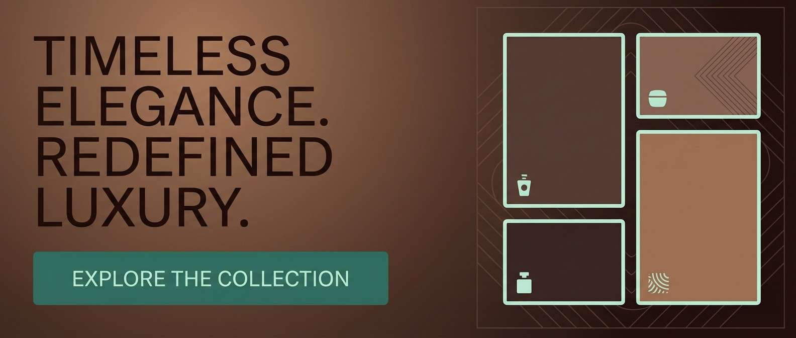
9) Matcha Mocha Studio
HEX: #2A1A15 #5C3A2E #C9B19A #7FE0C2 #2E9B7D
Mood: creative, balanced, contemporary
Best for: UI dashboard
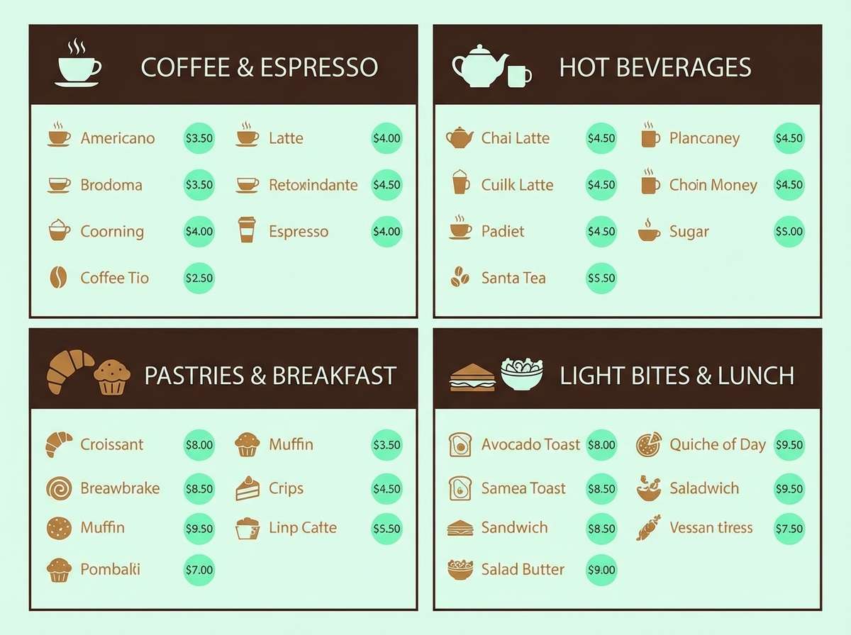
Balanced like matcha stirred into mocha, with just enough contrast to feel contemporary. This chocolate mint color scheme works well for dashboards: deep brown for nav, light tan for cards, and mint for status states. Use the brighter mint for success indicators and the softer mint for selected rows. Tip: keep icons single-color to prevent visual noise.
Image example of matcha mocha studio generated using media.io

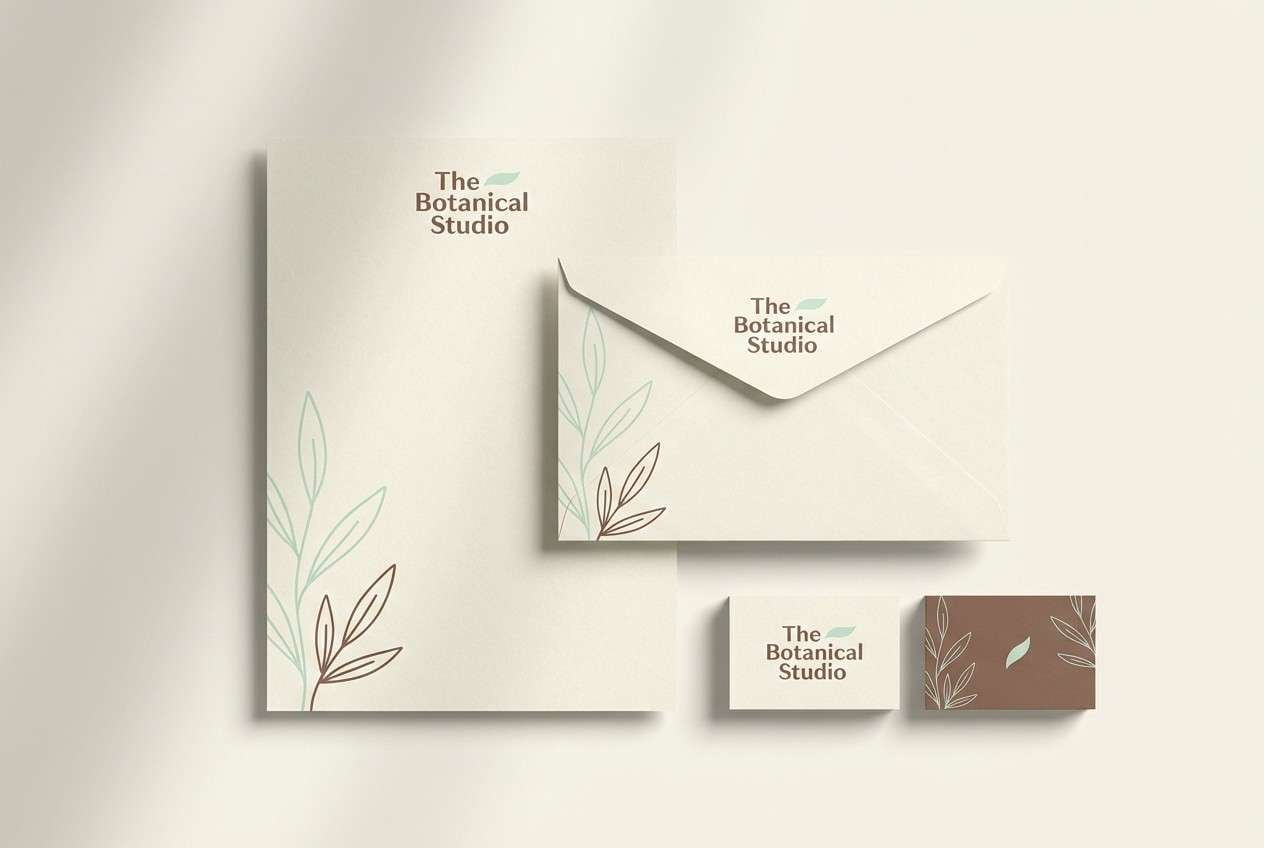
10) Botanical Bonbon
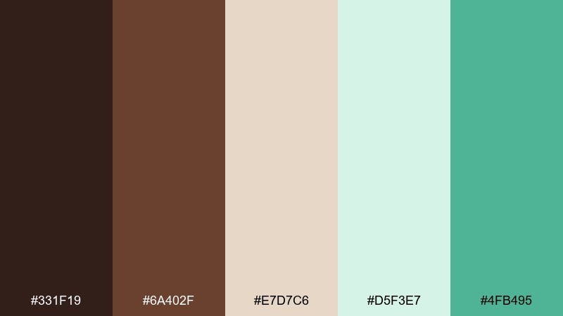
HEX: #331F19 #6A402F #E7D7C6 #D5F3E7 #4FB495
Mood: delicate, springy, artisanal
Best for: stationery set
Delicate and springy, like a bonbon wrapped in tissue with fresh herbs nearby. Keep the cream and pale mint as your paper tones, then bring in cocoa brown for text and small motifs. The saturated mint is perfect for seals, stamps, or envelope liners. Tip: use subtle botanical line art to tie the colors together without clutter.
Image example of botanical bonbon generated using media.io
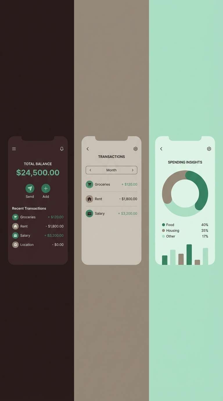
11) Peppermint Ledger
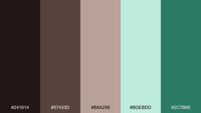
HEX: #241614 #57433D #B8A298 #BDEBDD #2C7B65
Mood: calm, reliable, professional
Best for: finance app UI
Calm and reliable, like a tidy ledger refreshed with mint clarity. Use the darker browns for navigation and key numbers, while the soft mint keeps screens feeling clean. The gray-tan is a practical neutral for dividers, disabled states, and secondary text. Tip: reserve the green accent for positive trends so meaning stays consistent.
Image example of peppermint ledger generated using media.io
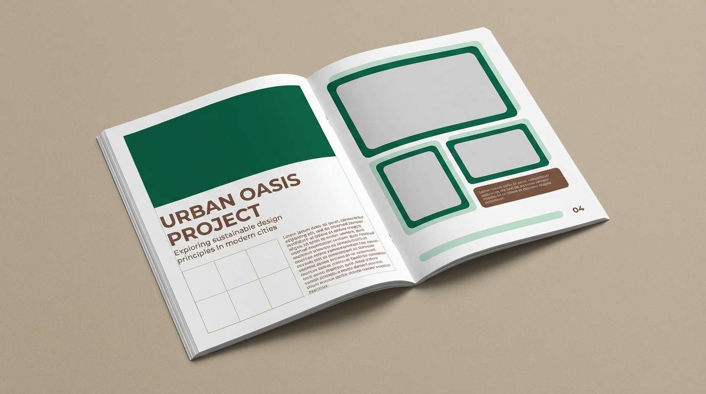
12) Velvet Emerald Cocoa
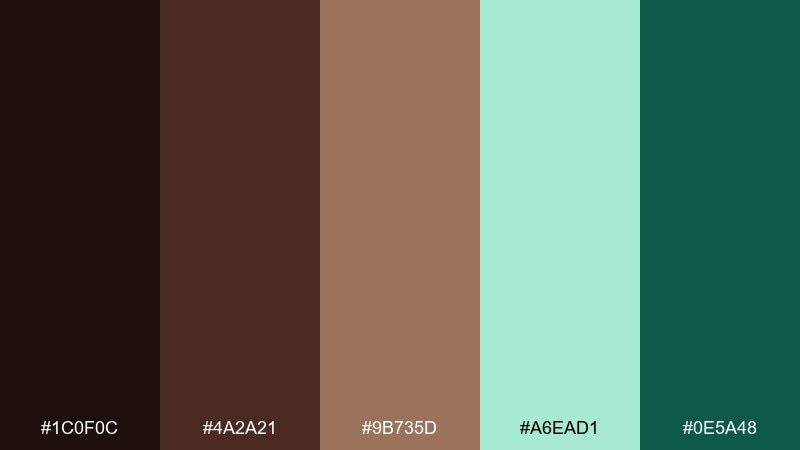
HEX: #1C0F0C #4A2A21 #9B735D #A6EAD1 #0E5A48
Mood: opulent, moody, editorial
Best for: magazine layout
Opulent and moody, like velvet emerald against rich cocoa. The deep green makes a striking header band, while warm brown keeps body text feeling grounded and classic. Add pale mint sparingly for pull quotes or section labels to brighten the spread. Tip: pair with high-contrast photography and plenty of negative space for an editorial finish.
Image example of velvet emerald cocoa generated using media.io
13) Cool Brown Minimal
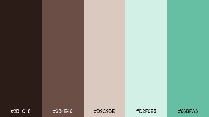
HEX: #2B1C18 #6B4E46 #D9C9BE #D2F0E5 #66BFA3
Mood: minimal, clean, approachable
Best for: landing page
Minimal and clean, like warm coffee foam beside cool mint glassware. Use the pale mint as the page background to make sections feel light, then anchor CTAs with the deeper mint. The soft beige-tan is ideal for card surfaces and subtle separators. Tip: keep your button palette to one mint and one brown for clarity.
Image example of cool brown minimal generated using media.io

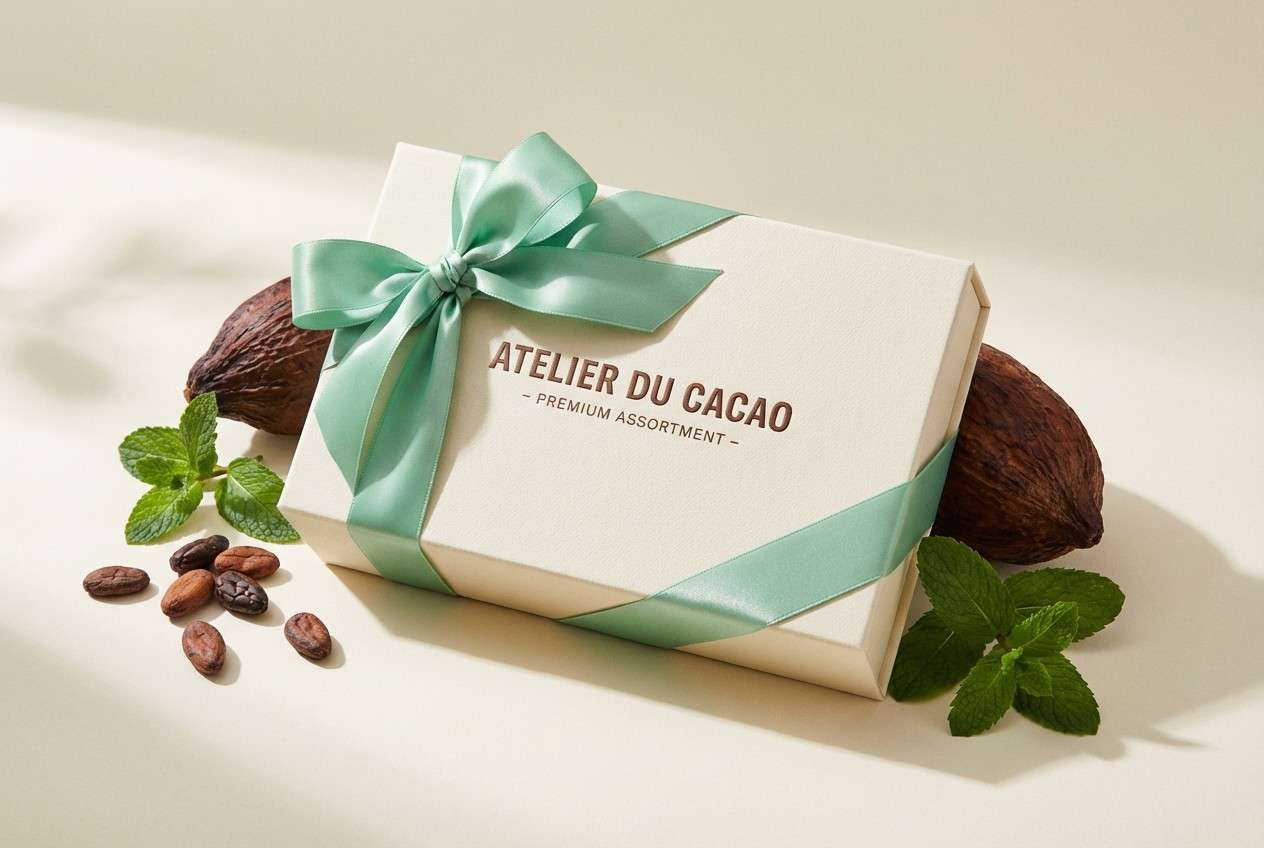
14) Spring Chocolate Box
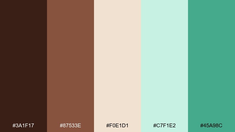
HEX: #3A1F17 #87533E #F0E1D1 #C7F1E2 #45A98C
Mood: cheerful, seasonal, giftable
Best for: gift box design
Cheerful and giftable, like a spring chocolate assortment wrapped with mint ribbon. Let the cream tone dominate the box so the browns read rich rather than heavy. Use the mint shades for ribbons, foil stamps, or interior patterns to add freshness. Tip: a small mint seal on a cocoa base makes the packaging feel intentional.
Image example of spring chocolate box generated using media.io
15) Minted Mocha Poster
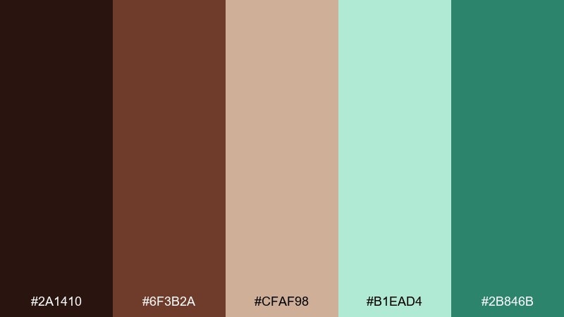
HEX: #2A1410 #6F3B2A #CFAF98 #B1EAD4 #2B846B
Mood: bold, graphic, energetic
Best for: event flyer
Bold and graphic, like a mocha bar poster with mint highlights. These chocolate mint color combinations shine when you push contrast: dark brown for type, pale mint for background blocks, and deep mint for key details. The warm tan smooths transitions between sections and keeps the layout friendly. Tip: use oversized numerals in brown on mint for instant hierarchy.
Image example of minted mocha poster generated using media.io

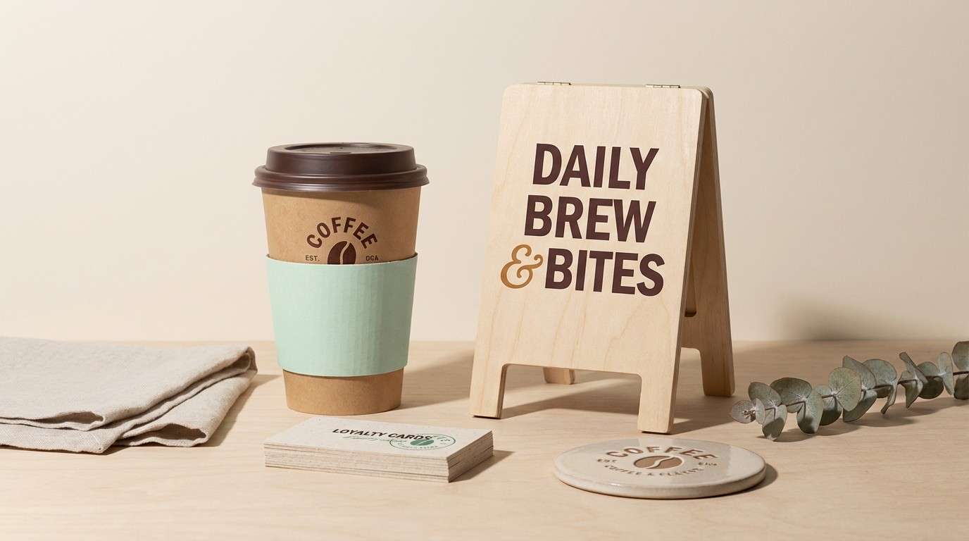
16) Heritage Confection
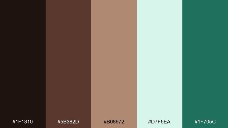
HEX: #1F1310 #5B382D #B08972 #D7F5EA #1F705C
Mood: heritage, warm, refined
Best for: coffee shop branding
Heritage and warm, like a classic confectionery with modern mint accents. Use the caramel tone for signage backgrounds, then set type in deep brown for a timeless look. The pale mint keeps menus and loyalty cards feeling fresh without breaking the vintage vibe. Tip: add a single mint stripe or stamp mark to unify printed items.
Image example of heritage confection generated using media.io
17) Night Garden Mint
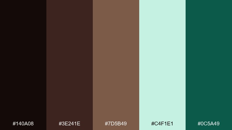
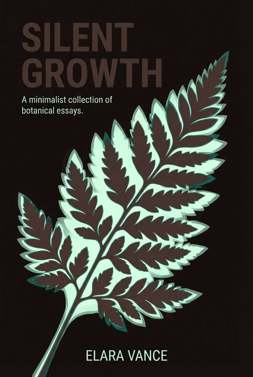
HEX: #140A08 #3E241E #7D5B49 #C4F1E1 #0C5A49
Mood: mysterious, elegant, nighttime
Best for: book cover
Mysterious and elegant, like mint leaves catching moonlight in a dark garden. The near-black and deep brown create strong contrast for titles, while pale mint can suggest glow or fog. Use the mid-brown as a bridge for author names and small ornaments. Tip: keep imagery minimal and let the color contrast carry the drama.
Image example of night garden mint generated using media.io
18) Soft Serve Neutrals
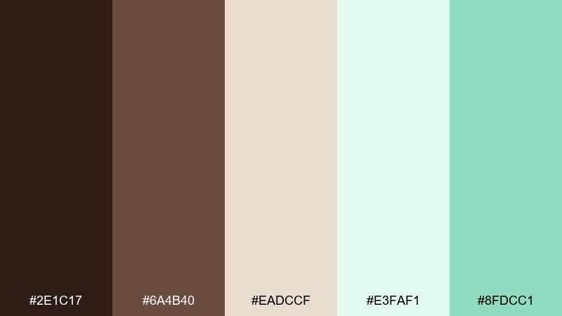
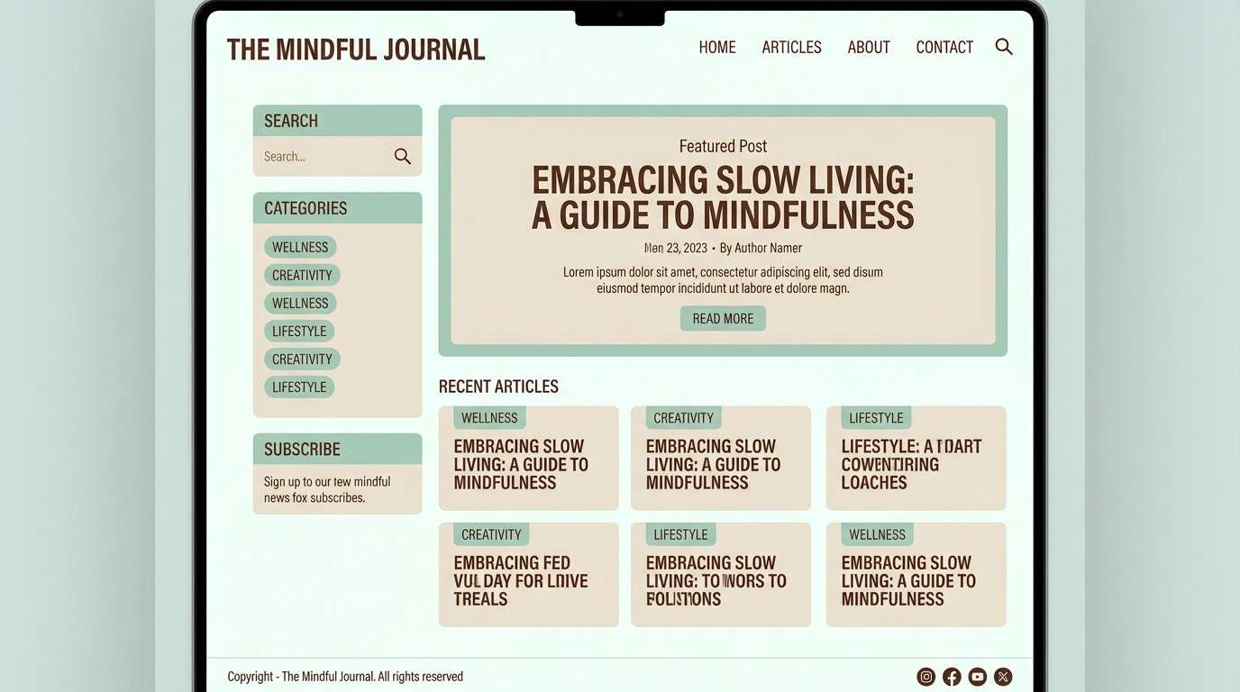
HEX: #2E1C17 #6A4B40 #EADCCF #E3FAF1 #8FDCC1
Mood: soft, airy, approachable
Best for: blog theme
Soft and airy, like a swirl of chocolate and mint soft serve. The nearly-white mint is perfect for wide margins and reading comfort, while cocoa brown keeps headlines crisp. Add the muted mint for links, tags, and subtle hover states without shouting. Tip: avoid pure black text and use brown for a warmer, friendlier page.
Image example of soft serve neutrals generated using media.io
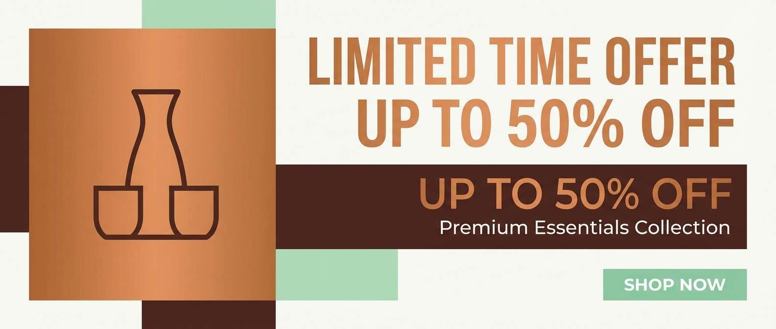
19) Copper Mint Accent
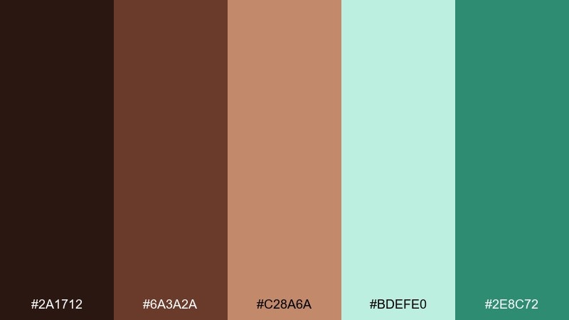
HEX: #2A1712 #6A3A2A #C28A6A #BDEFE0 #2E8C72
Mood: warm, trendy, attention-grabbing
Best for: product ad banner
Warm and trendy, like copper chocolate foil with a cool mint accent. Build the banner with caramel-copper as the hero color, then use mint to spotlight the offer and CTA. The deep brown keeps copy readable and adds a premium edge. Tip: limit mint to one or two elements so the ad feels intentional, not festive.
Image example of copper mint accent generated using media.io
20) Sweet Bistro Signage
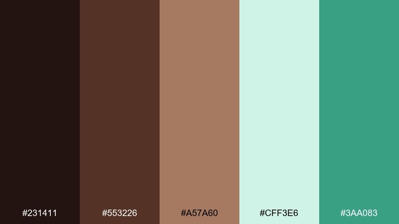
HEX: #231411 #553226 #A57A60 #CFF3E6 #3AA083
Mood: friendly, welcoming, urban
Best for: storefront signage
Friendly and welcoming, like a neighborhood bistro that serves mint hot chocolate. Use the dark brown for lettering to keep signage readable outdoors, and bring in mint as a supporting panel color. The warm tan helps balance the coolness and feels approachable on print. Tip: test contrast at distance and keep the mint as background, not text.
Image example of sweet bistro signage generated using media.io

21) Crisp Cacao Mint
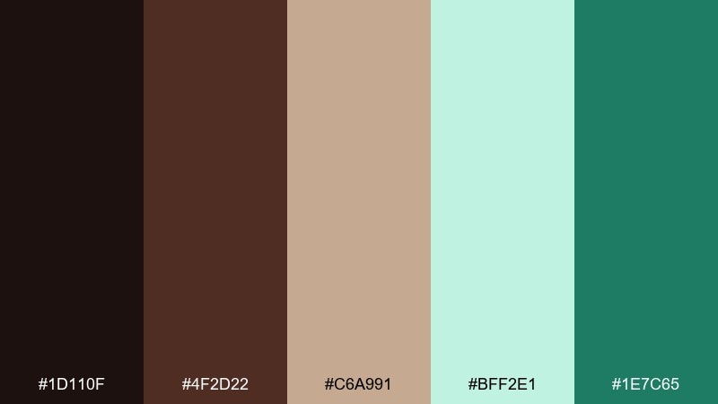
HEX: #1D110F #4F2D22 #C6A991 #BFF2E1 #1E7C65
Mood: fresh, modern, confident
Best for: mobile app onboarding
Fresh and confident, like crisp mint chocolate snapped in clean lines. A chocolate mint color combination like this works great for onboarding screens where you need clear hierarchy and gentle energy. Use the pale mint for backgrounds, then step up contrast with deep green for progress indicators and buttons. Tip: keep illustrations monochrome in brown to let mint drive the actions.
Image example of crisp cacao mint generated using media.io

22) Cocoa Mint Classics
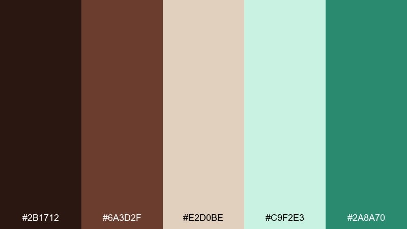
HEX: #2B1712 #6A3D2F #E2D0BE #C9F2E3 #2A8A70
Mood: timeless, balanced, versatile
Best for: logo and color system
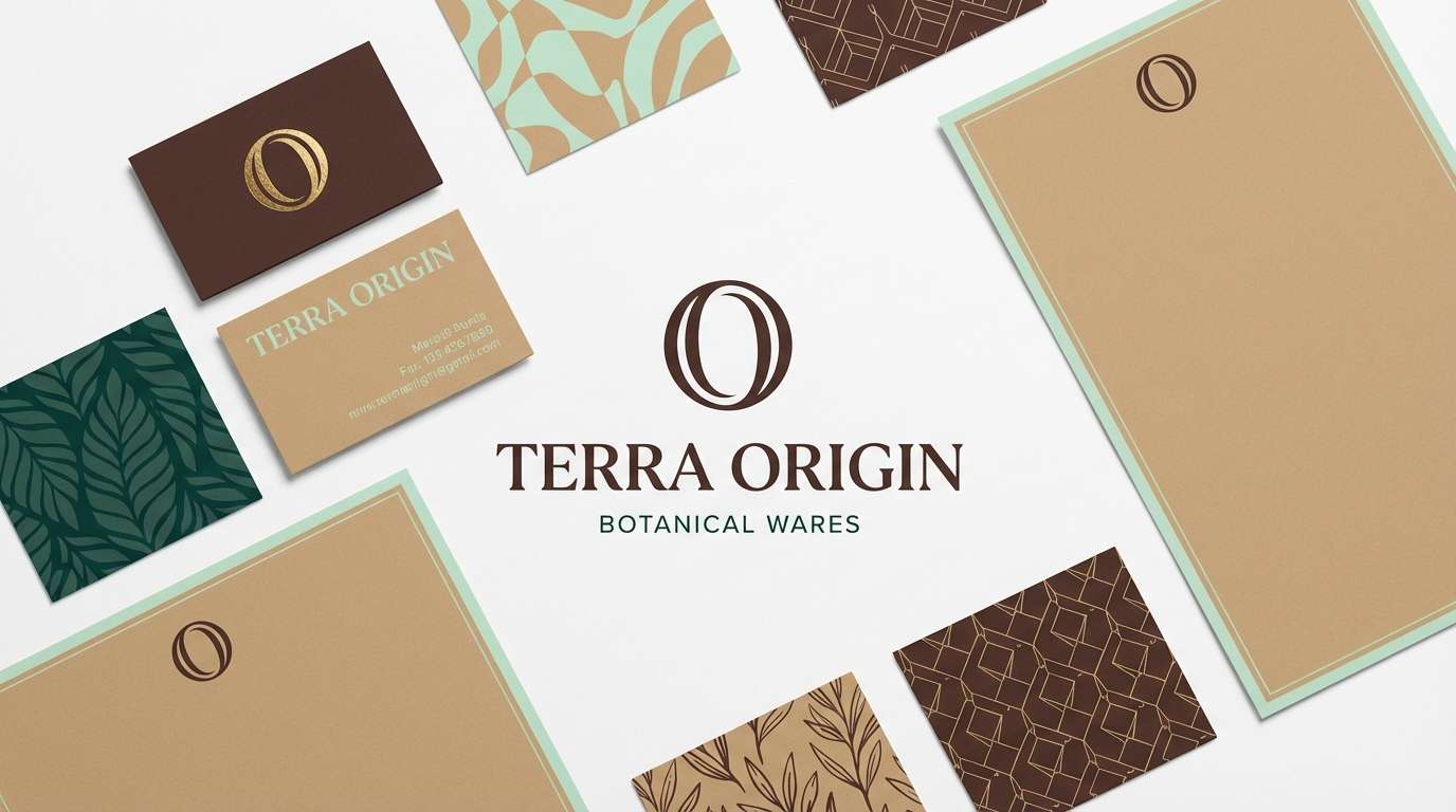
Timeless and balanced, like a dependable dessert pairing you never get tired of. This chocolate mint color palette is versatile for logos, supporting neutrals, and a clear accent green. Keep the cream and tan as your system backgrounds, then alternate between brown and green for brand states. Tip: define one primary accent (green) and one secondary accent (tan) for consistency.
Image example of cocoa mint classics generated using media.io
What Colors Go Well with Chocolate Mint?
Chocolate mint pairs naturally with creamy neutrals (ivory, vanilla, warm beige) that keep layouts light and help both brown and mint look intentional rather than overpowering.
For extra depth, add dark accents like espresso, near-black cocoa, or deep teal-green. These shades strengthen contrast for type, navigation, and hero sections without losing the palette’s “fresh dessert” vibe.
If you want a trend-forward twist, introduce copper/caramel tones or dusty rose-tans. They act as bridges between warm browns and cool mints—great for packaging, posters, and brand systems.
How to Use a Chocolate Mint Color Palette in Real Designs
Start with role assignment: use chocolate brown for structure (headers, logos, key type) and pale mint for backgrounds and spacing. This keeps the design readable and prevents the browns from feeling too heavy.
Use saturated mint sparingly as your “action color” for CTAs, badges, and highlights. In UI, keep meaning consistent—mint for success/positive states and browns/taupes for neutral or inactive elements.
For print, prioritize contrast testing: mint often works best as a background or ribbon color, while brown remains the text color. Matte paper and soft shadows can make the palette feel more premium.
Create Chocolate Mint Palette Visuals with AI
Want to see how these chocolate mint tones look on a poster, packaging mockup, or UI screen? Generate quick concept visuals and iterate before you commit to a full design direction.
With Media.io’s text-to-image tool, you can paste a prompt (like the examples above), adjust style and aspect ratio, and create consistent visuals for mood boards, client previews, or brand explorations.
Try generating several variations using the same palette, then refine by changing only one element at a time (lighting, material, layout) to keep your results cohesive.
Chocolate Mint Color Palette FAQs
-
What is a chocolate mint color palette?
A chocolate mint color palette combines cocoa/espresso browns with mint greens (often plus cream or beige neutrals) to create a warm-but-fresh scheme that feels both cozy and modern. -
Is chocolate mint a good palette for branding?
Yes—brown communicates warmth, craft, and premium quality, while mint adds clarity and energy. It’s especially strong for cafés, confectionery, skincare, and modern lifestyle brands. -
What background works best with mint and brown?
Soft cream, warm beige, or very pale mint backgrounds work best. They keep the layout airy and make dark brown text highly readable. -
How do I keep chocolate mint designs from looking too dark?
Use deep cocoa only for key elements (logo, headlines, nav), and let cream or pale mint take up most of the surface area. Add mid-tans to soften transitions. -
What accent color can I add to chocolate mint?
Copper/caramel for a trendy premium feel, dusty rose-tan for softer editorial warmth, or deep teal for a bold, luxe contrast—use accents sparingly for clarity. -
Does chocolate mint work for UI design?
It does when you assign roles: brown for typography and structure, pale mint for backgrounds, and saturated mint for CTAs and positive states. Always verify contrast for accessibility. -
Where can I generate chocolate mint palette mockups quickly?
You can use Media.io’s AI text-to-image tool to generate posters, packaging, UI screens, and brand boards using prompts—ideal for fast concepting and mood boards.
Next: Waterfall Color Palette


