

Copper bronze is a warm metallic family that sits between earthy browns and glowing oranges, so it feels both grounded and premium. In palettes, it adds a “crafted” highlight that reads well in print, interiors, and modern UI.
Below are 20 copper bronze color palette ideas with HEX codes, plus practical pairing tips and AI prompts you can reuse to generate on-brand visuals quickly.
In this article
- Why Copper Bronze Palettes Work So Well
-
- smoked copper atelier
- desert bronze dunes
- verdigris bronze patina
- cocoa copper comfort
- copper rose glow
- industrial bronze steel
- autumn copper harvest
- museum bronze velvet
- coastal copper sandbar
- copper bronze noir
- sunlit bronze linen
- copper spice market
- bronze garden shade
- copper clay studio
- modern copper minimal ui
- bronze ember poster
- copper bronze wedding invite
- copper product packaging
- copper bronze editorial spread
- nightfall bronze bar menu
- What Colors Go Well with Copper Bronze?
- How to Use a Copper Bronze Color Palette in Real Designs
- Create Copper Bronze Palette Visuals with AI
Why Copper Bronze Palettes Work So Well
Copper bronze brings “warm shine” without the harshness of bright yellows or the flatness of standard browns. That makes it ideal when you want a premium accent that still feels natural and approachable.
Because it sits close to skin tones and autumn neutrals, copper bronze often looks flattering in lifestyle branding and product photography. It also plays nicely with dark charcoals for high contrast, so typography and UI elements stay legible.
Finally, copper bronze palettes can swing rustic or modern depending on your supporting neutrals. Add cream and linen for minimal elegance, or add espresso and olive for a more outdoorsy, heritage mood.
20+ Copper Bronze Color Palette Ideas (with HEX Codes)
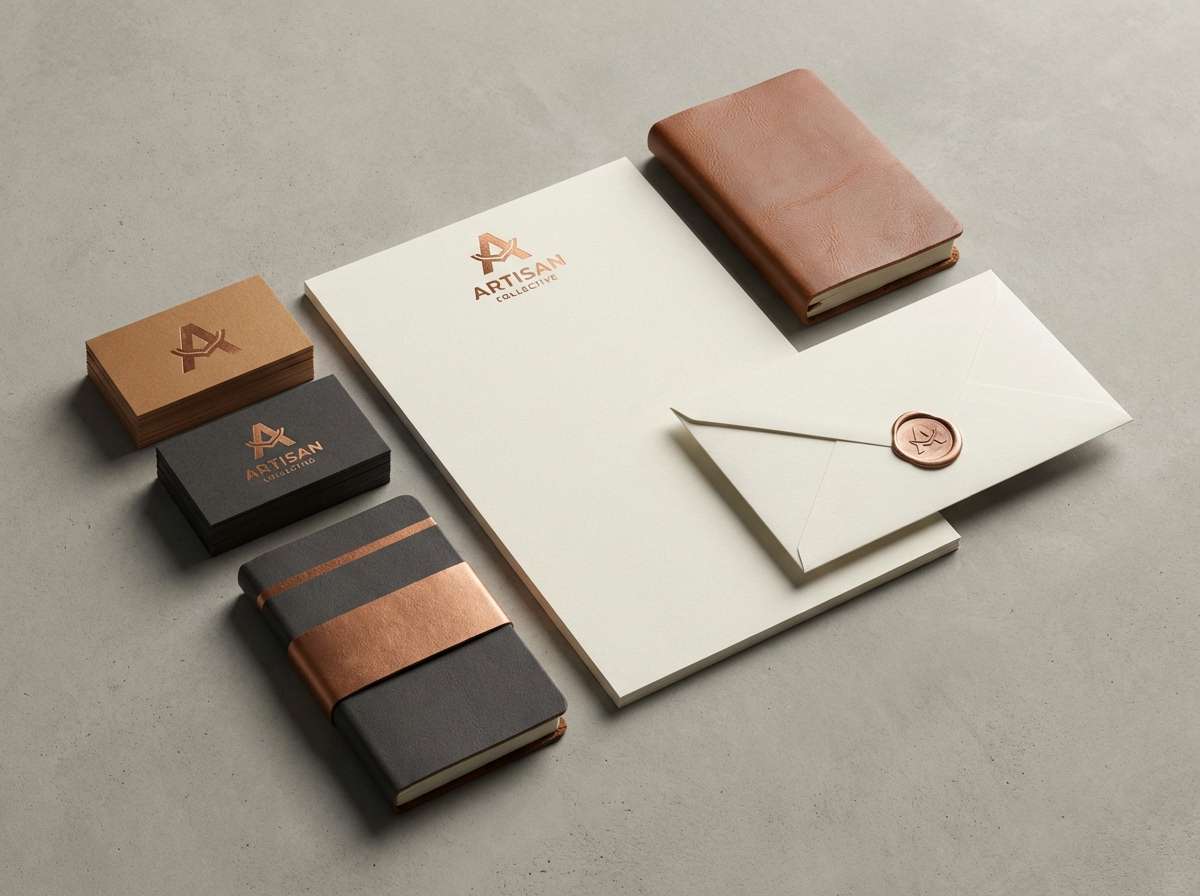
1) Smoked Copper Atelier
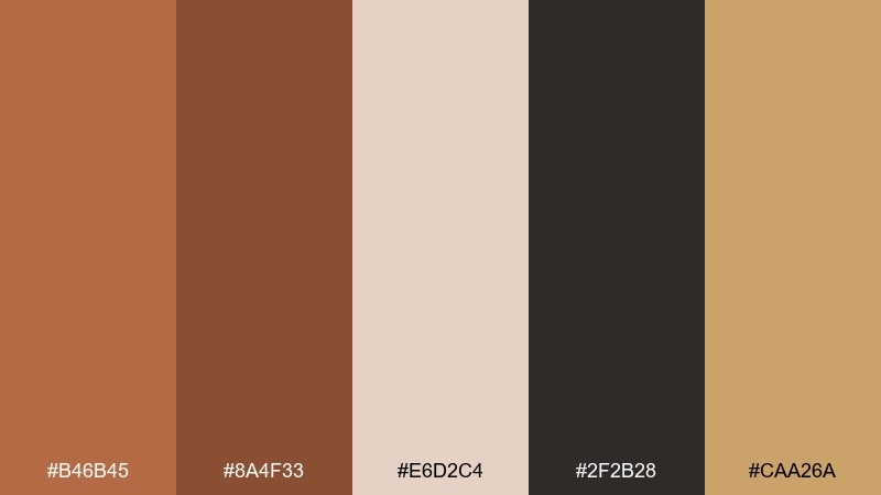
HEX: #b46b45 #8a4f33 #e6d2c4 #2f2b28 #caa26a
Mood: refined, warm, crafted
Best for: branding for artisan goods and boutique services
Refined and workshop-warm, these tones feel like brushed metal, oiled wood, and soft parchment. They suit logos, labels, and business cards where you want a premium but approachable look. Pair the darker espresso note with the cream for clear contrast, then use the gold-tan as a subtle highlight. Tip: reserve the copper shade for key accents like icons, seals, or call-to-action buttons.
Image example of smoked copper atelier generated using media.io
Media.io is an online AI studio for creating and editing video, image, and audio in your browser.

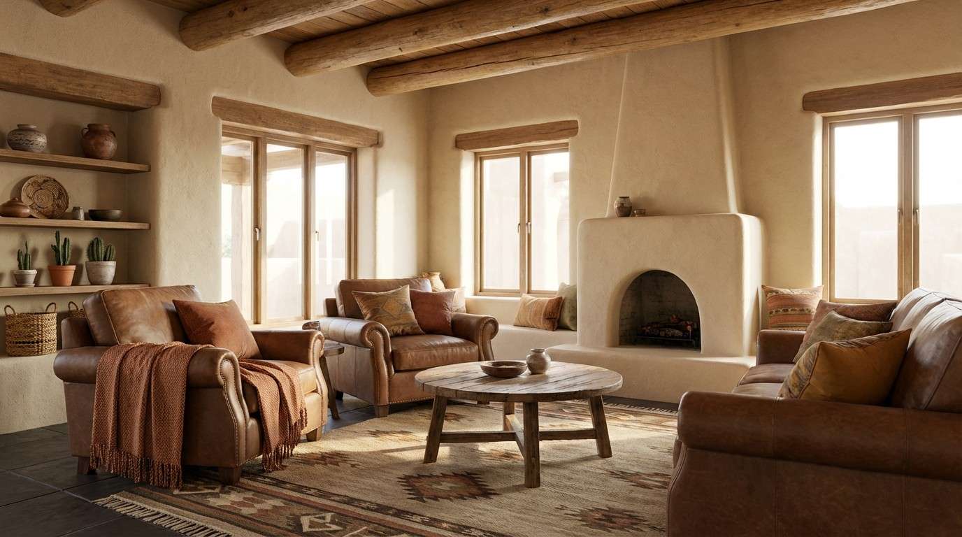
2) Desert Bronze Dunes
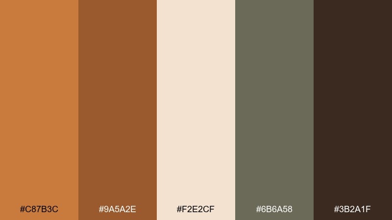
HEX: #c87b3c #9a5a2e #f2e2cf #6b6a58 #3b2a1f
Mood: sunbaked, grounded, natural
Best for: southwest-inspired interior styling and mood boards
Sunbaked and grounded, this mix evokes wind-shaped dunes, clay walls, and weathered leather. It works beautifully for living rooms, entryways, and cozy reading nooks where warmth matters. Keep the sand-cream as the main field color and anchor with the deep brown for furniture or trim. Tip: add texture like linen, rattan, or matte plaster to make the bronze tones feel even richer.
Image example of desert bronze dunes generated using media.io
3) Verdigris Bronze Patina
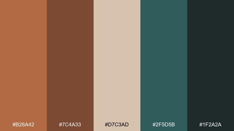
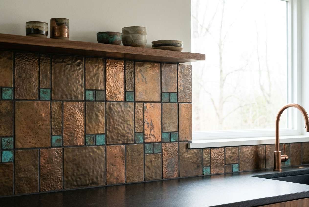
HEX: #b26a42 #7c4a33 #d7c3ad #2f5d5b #1f2a2a
Mood: antique, moody, architectural
Best for: kitchen backsplash tiles and hardware pairings
Antique and architectural, these hues bring to mind patinated metal, aged timber, and cool stone shadows. The teal-green note creates one of the most versatile copper bronze color combinations for spaces that need depth without feeling dark. Use the cream-beige for grout or wall paint, then pull the copper and brown into hardware and wood finishes. Tip: keep the teal as a supporting accent so the bronze reads as the hero.
Image example of verdigris bronze patina generated using media.io
4) Cocoa Copper Comfort
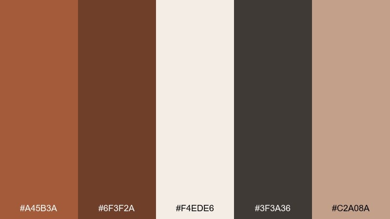
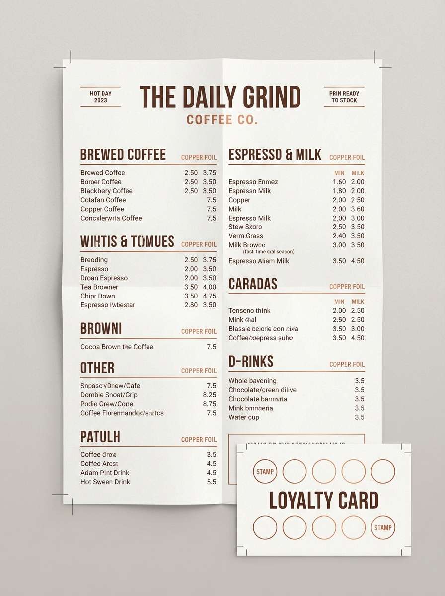
HEX: #a45b3a #6f3f2a #f4ede6 #3f3a36 #c2a08a
Mood: cozy, familiar, café-warm
Best for: coffee shop menus and loyalty cards
Cozy and familiar, this set feels like steamed milk, cocoa powder, and a copper espresso machine. It is ideal for menus, loyalty cards, and signage where readability must stay high. Let the off-white carry most of the space, then use the dark charcoal-brown for text and structure. Tip: apply the warm copper as a small pop on prices, stamps, or section headers for a handcrafted finish.
Image example of cocoa copper comfort generated using media.io
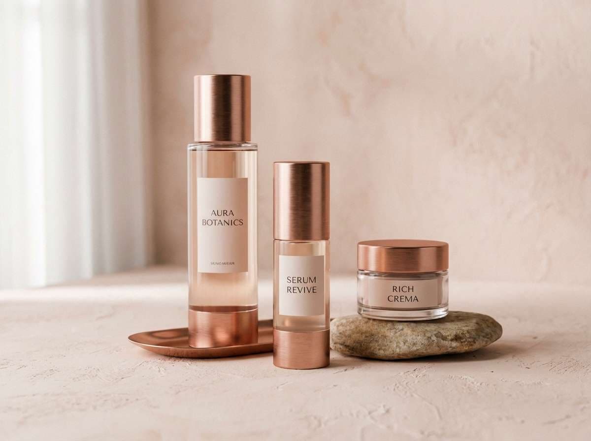
5) Copper Rose Glow
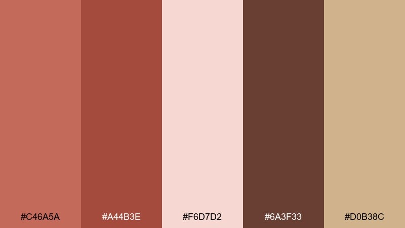
HEX: #c46a5a #a44b3e #f6d7d2 #6a3f33 #d0b38c
Mood: romantic, luminous, soft-metallic
Best for: beauty branding and skincare social posts
Romantic and luminous, these shades suggest rose-tinted metal, warm skin tones, and a soft blush haze. They shine in skincare and beauty visuals where you want warmth without going overly sweet. Balance the pink-cream with the deeper cocoa tone to keep typography crisp and modern. Tip: use the champagne-tan for subtle gradients behind product names or ingredient callouts.
Image example of copper rose glow generated using media.io
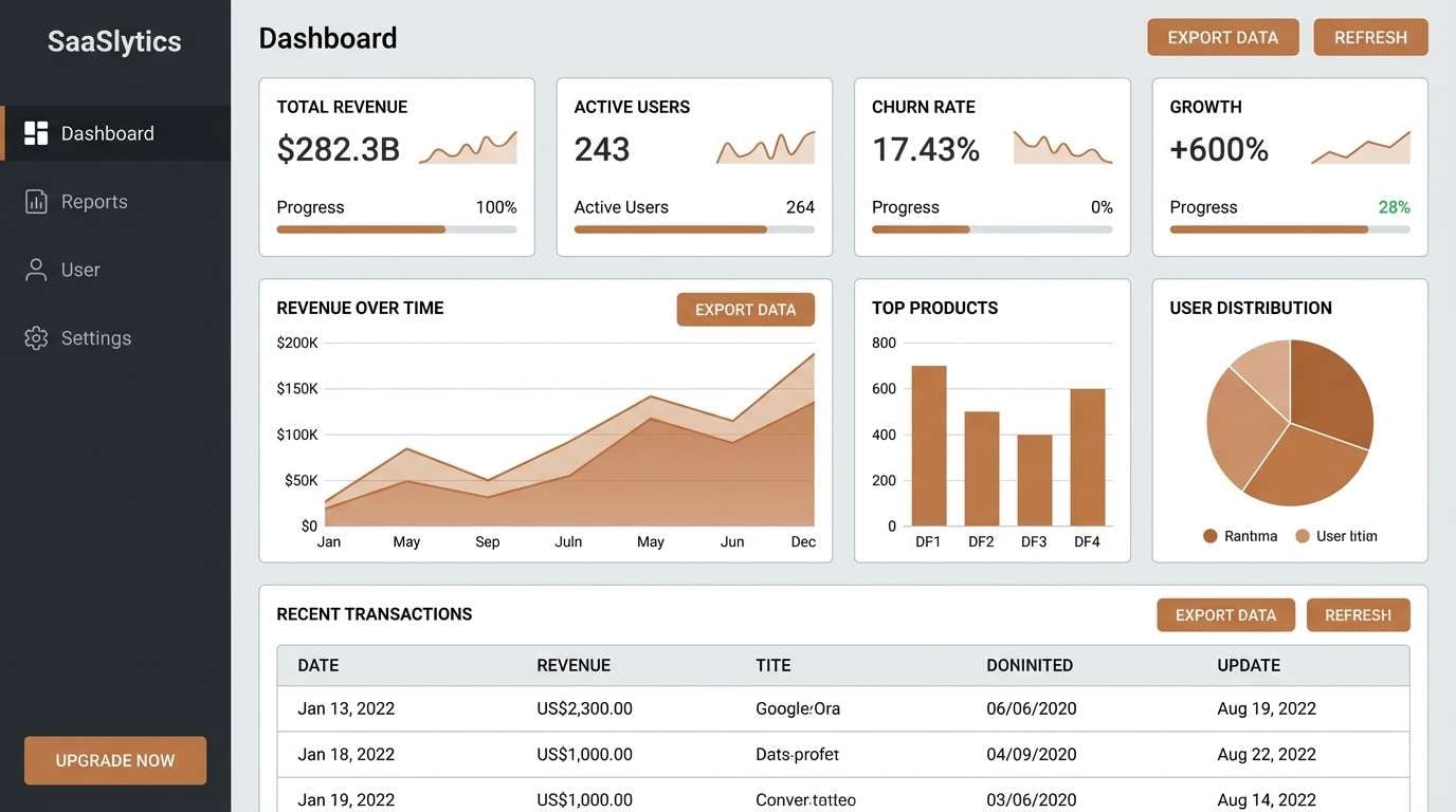
6) Industrial Bronze Steel
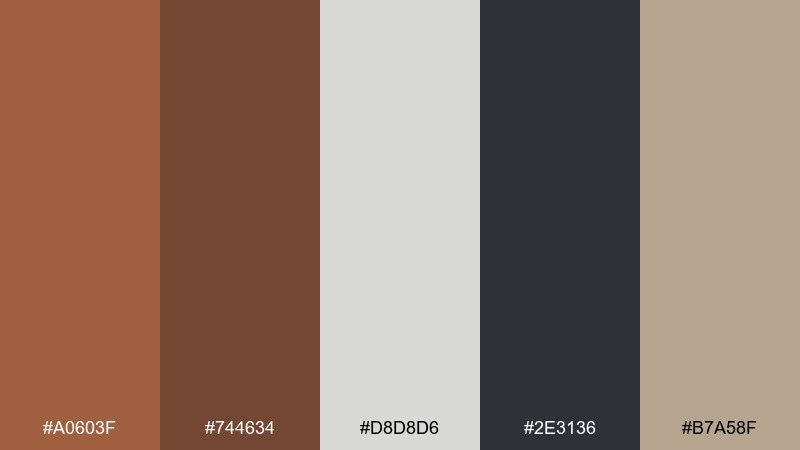
HEX: #a0603f #744634 #d8d8d6 #2e3136 #b7a58f
Mood: modern, sturdy, utilitarian
Best for: SaaS dashboards and analytics UI
Modern and sturdy, this palette reads like steel beams warmed by bronze details. It is a strong fit for dashboards where hierarchy and contrast need to be instantly clear. Keep the light gray as the main canvas, then build structure with near-black and warm browns for navigation and cards. Tip: use the bronze as a status or highlight color, and avoid using it for long text blocks.
Image example of industrial bronze steel generated using media.io
7) Autumn Copper Harvest
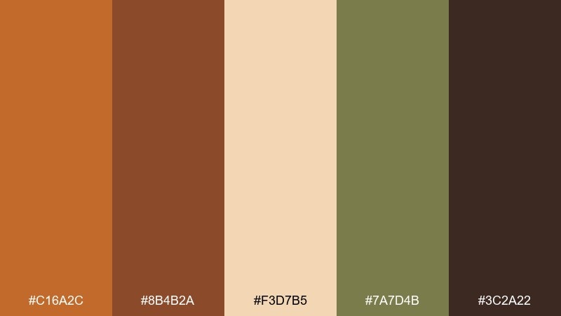
HEX: #c16a2c #8b4b2a #f3d7b5 #7a7d4b #3c2a22
Mood: rustic, seasonal, outdoorsy
Best for: farmers market posters and fall event flyers
Rustic and seasonal, these colors feel like pumpkin skin, dried leaves, and sunlit hay. They are great for posters and flyers that need to read warm, welcoming, and local. Use the light wheat tone to give breathing room, then lean on the copper and brown for headlines. Tip: pull the muted olive into small icons or borders to keep the layout from looking too monochrome.
Image example of autumn copper harvest generated using media.io

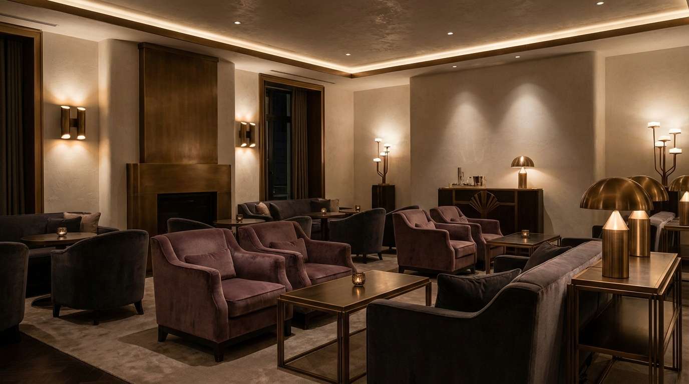
8) Museum Bronze Velvet
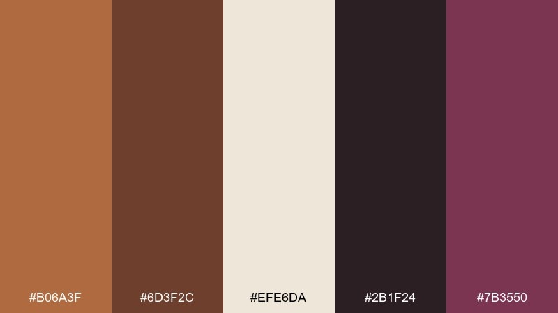
HEX: #b06a3f #6d3f2c #efe6da #2b1f24 #7b3550
Mood: luxurious, dramatic, gallery-like
Best for: hotel lounge interiors and upscale hospitality
Luxurious and dramatic, the mix recalls velvet drapes, gallery lighting, and antique frames. This copper bronze color palette works especially well for hospitality spaces that aim for intimate, elevated comfort. Pair the deep near-black with the cream for contrast, then use the plum tone as a rich secondary accent. Tip: repeat the copper shade in small metallic touches like lamp bases or trim for a cohesive finish.
Image example of museum bronze velvet generated using media.io
9) Coastal Copper Sandbar
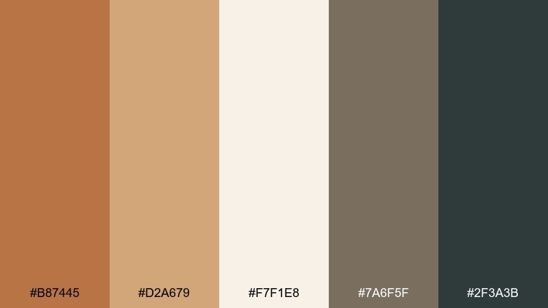
HEX: #b87445 #d2a679 #f7f1e8 #7a6f5f #2f3a3b
Mood: relaxed, breezy, sunwashed
Best for: travel blog hero banners and headers
Relaxed and sunwashed, these tones evoke driftwood, sandy paths, and warm copper light at golden hour. They suit website headers where you want warmth without sacrificing a clean, airy feel. Keep the near-white as your background and use the darker slate for type and navigation. Tip: let the copper show up in one focal element, like a button or badge, so it reads intentional.
Image example of coastal copper sandbar generated using media.io

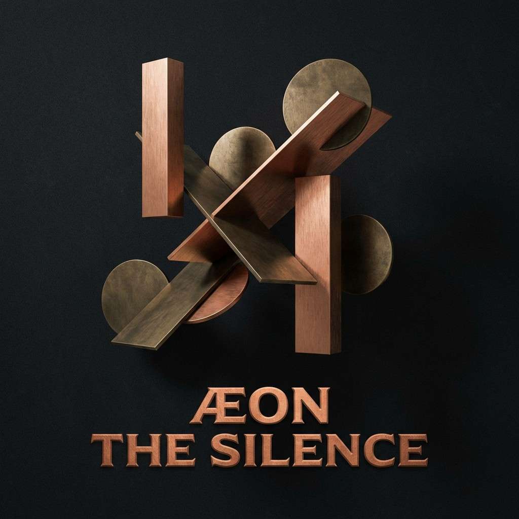
10) Copper Bronze Noir
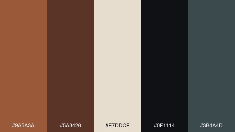
HEX: #9a5a3a #5a3426 #e7ddcf #0f1114 #3b4a4d
Mood: cinematic, sleek, high-contrast
Best for: album cover artwork and moody creatives
Cinematic and sleek, this set feels like spotlighted copper against midnight shadows. It is a great fit for album covers and creative projects that need bold contrast and a premium edge. Use the near-black for big shapes and negative space, then introduce copper on titles or key marks. Tip: keep the cool slate as a quiet supporting tone to stop the browns from feeling too heavy.
Image example of copper bronze noir generated using media.io
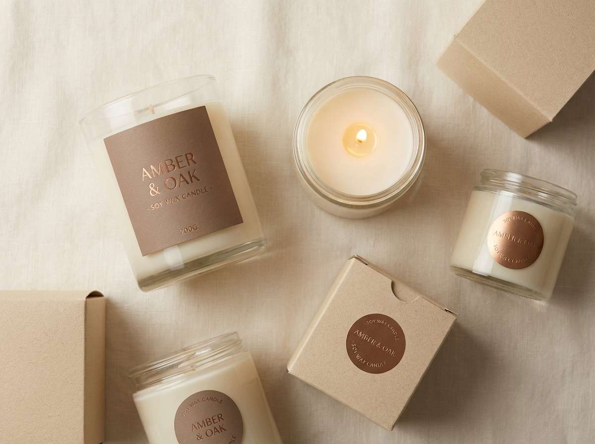
11) Sunlit Bronze Linen
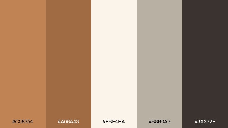
HEX: #c08354 #a06a43 #fbf4ea #b8b0a3 #3a332f
Mood: clean, calm, softly upscale
Best for: candle labels and home fragrance packaging
Clean and calm, these shades bring to mind sunlit linen, warm wax, and a touch of polished bronze. They work beautifully on minimalist labels where typography and spacing do the heavy lifting. Keep the cream dominant, then use the deep brown for text and the bronze for small brand marks. Tip: add the warm gray as a background panel to separate scent variants without changing the whole layout.
Image example of sunlit bronze linen generated using media.io
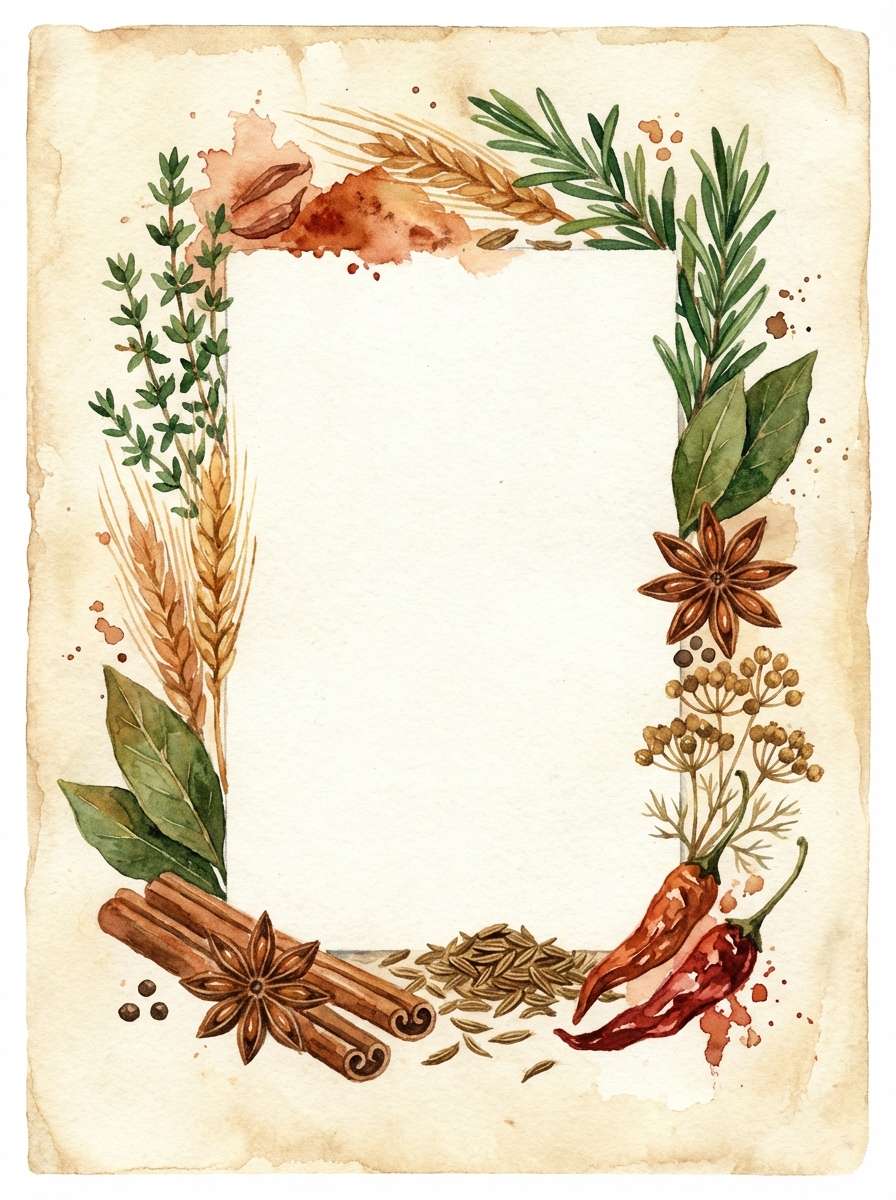
12) Copper Spice Market
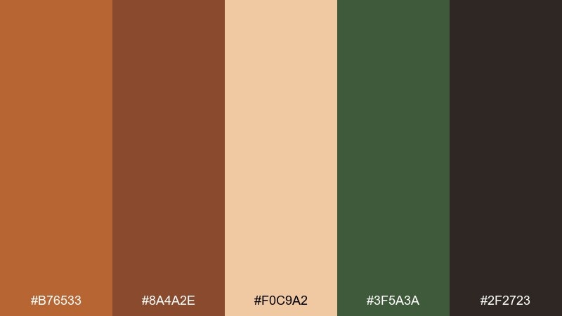
HEX: #b76533 #8a4a2e #f0c9a2 #3f5a3a #2f2723
Mood: vibrant, earthy, aromatic
Best for: recipe cards and food blog graphics
Vibrant and earthy, it evokes toasted paprika, cinnamon bark, and herb bundles on a wooden counter. These copper bronze color combinations are ideal for food content that wants warmth and appetite appeal without going loud. Pair the spiced orange with the deep green for contrast, and let the pale wheat tone keep layouts readable. Tip: use the green for section dividers or ingredient icons to create quick scanning cues.
Image example of copper spice market generated using media.io
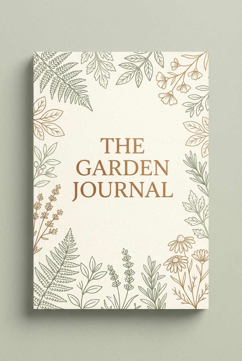
13) Bronze Garden Shade
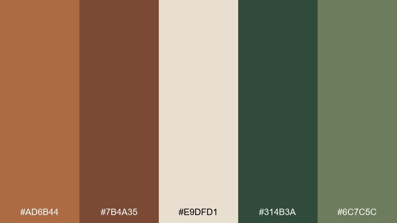
HEX: #ad6b44 #7b4a35 #e9dfd1 #314b3a #6c7c5c
Mood: botanical, shaded, earthy
Best for: garden journals and stationery sets
Botanical and shaded, these tones feel like terracotta pots tucked under leafy canopies. They are a strong match for journals, notebooks, and stationery where you want nature vibes with a refined edge. Use the cream as paper color, then bring in green for borders and secondary headings. Tip: keep the darker brown for small details like page numbers to avoid overpowering the softer neutrals.
Image example of bronze garden shade generated using media.io
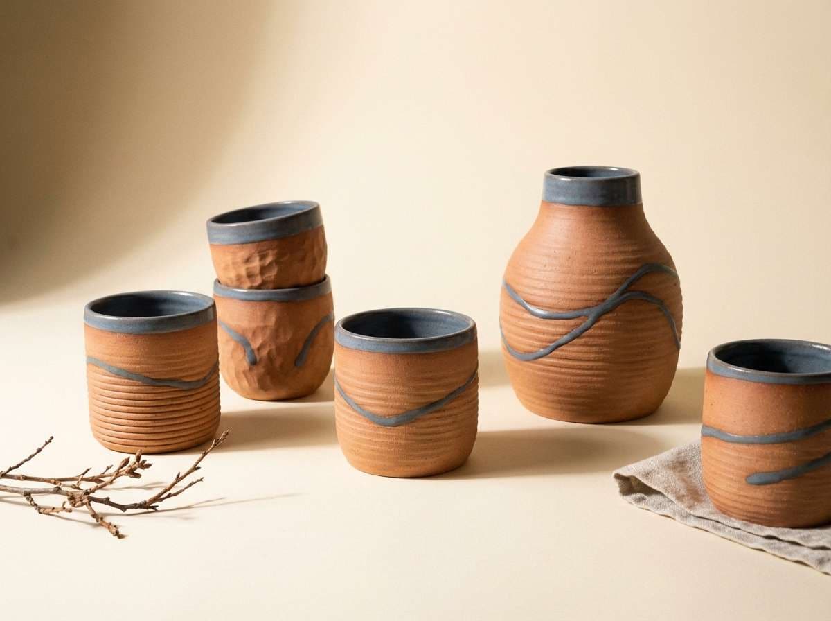
14) Copper Clay Studio
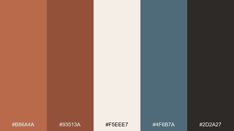
HEX: #b86a4a #93513a #f5eee7 #4f6b7a #2d2a27
Mood: creative, balanced, modern-craft
Best for: ceramic product photography and maker shops
Creative and balanced, it suggests clay on hands, kiln heat, and cool slate tools in a studio. The subtle blue-gray keeps the warm tones feeling contemporary rather than rustic. Use the cream as a clean backdrop, then let copper and clay-brown define the product and brand marks. Tip: introduce the slate tone in small props or shadows to add depth without cooling the whole scene.
Image example of copper clay studio generated using media.io
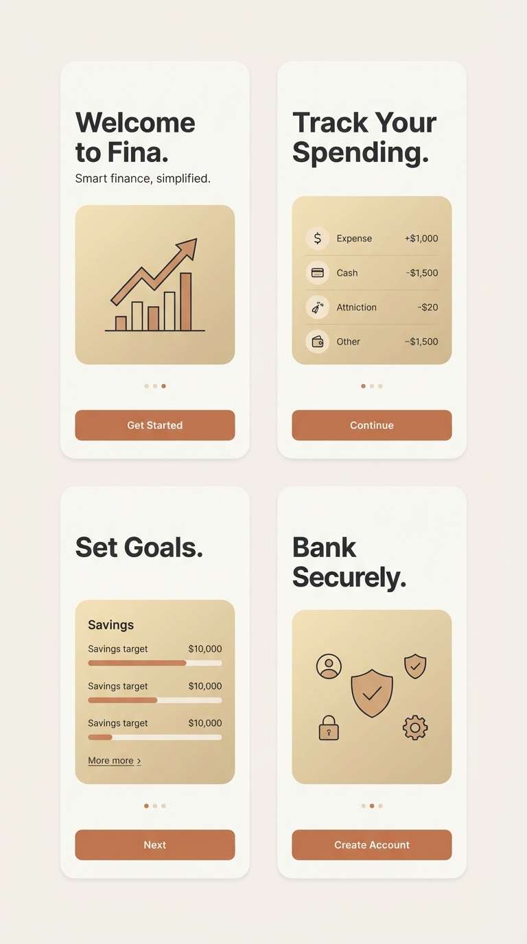
15) Modern Copper Minimal UI

HEX: #b36a43 #8a5136 #f6f0e8 #1f2328 #d0b08a
Mood: minimal, confident, premium
Best for: finance apps and onboarding screens
Minimal and premium, these tones feel like polished bronze on a crisp paper surface. A copper bronze color palette like this is excellent for fintech UI because it stays warm while still reading serious. Use the off-white for screens, the near-black for text, and reserve copper for primary buttons and progress states. Tip: keep the champagne tone for cards and surfaces to create depth without adding visual noise.
Image example of modern copper minimal ui generated using media.io
16) Bronze Ember Poster
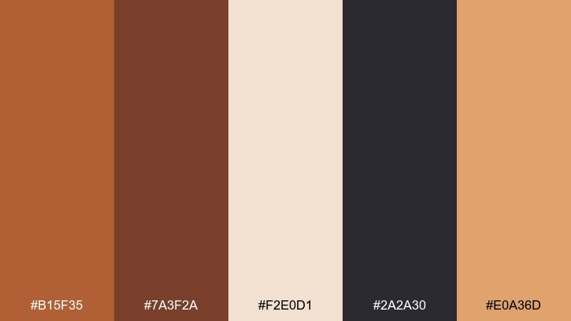
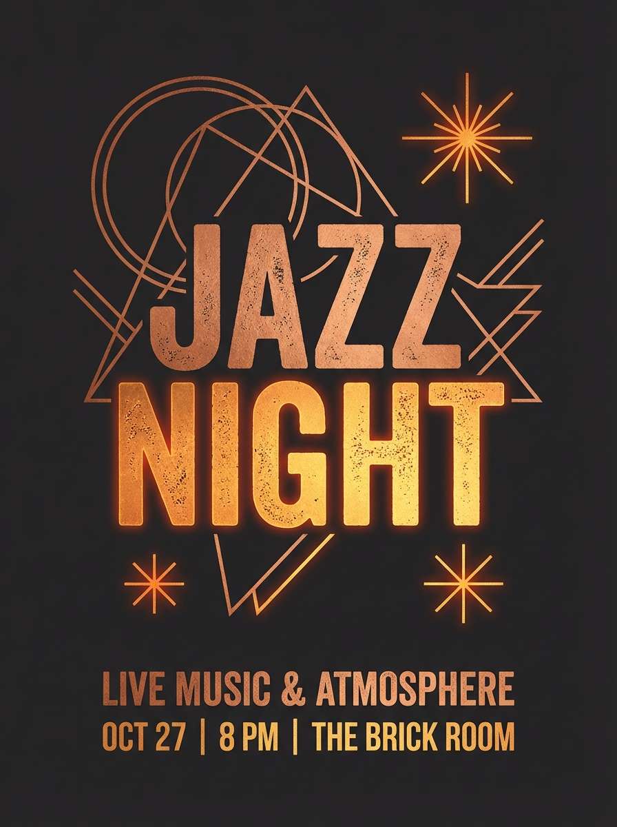
HEX: #b15f35 #7a3f2a #f2e0d1 #2a2a30 #e0a36d
Mood: energetic, bold, firelit
Best for: music night posters and venue promos
Energetic and firelit, this blend feels like embers glowing against a dark stage. It is great for posters where you want the headline to hit hard and still feel warm. Use the deep charcoal for the background and the ember-gold for key details like dates and location. Tip: keep the pale blush-cream for small text blocks so the layout stays readable from a distance.
Image example of bronze ember poster generated using media.io
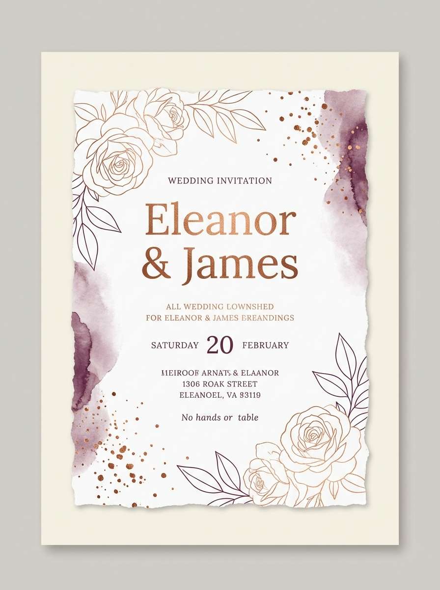
17) Copper Bronze Wedding Invite
HEX: #b9724c #a35a40 #f7efe7 #5b3b4b #d7c2a8
Mood: romantic, elegant, timeless
Best for: wedding invitations and day-of stationery
Romantic and timeless, these hues call up candlelight, copper foil, and soft blush paper. They are ideal for invitations and place cards that need elegance without feeling overly formal. Pair the warm copper with the plum-brown for names and headings, then keep the cream as the main paper tone. Tip: use the champagne beige for a subtle border or monogram to add detail without clutter.
Image example of copper bronze wedding invite generated using media.io
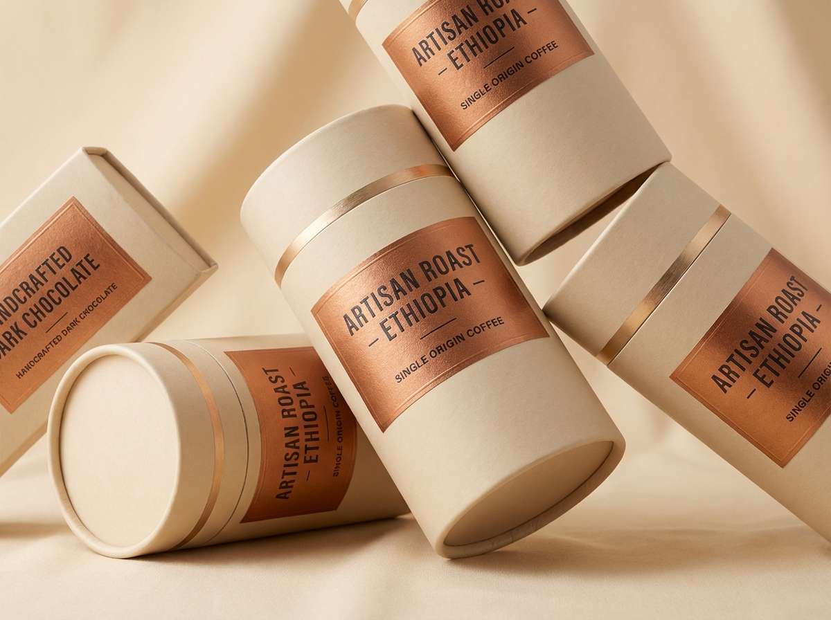
18) Copper Product Packaging
HEX: #b06b43 #7a4530 #f1e6dc #3b3a36 #c9a56c
Mood: premium, tactile, retail-ready
Best for: gourmet chocolate or coffee packaging
Premium and tactile, these colors feel like embossed paper, roasted beans, and warm metallic ink. They fit retail packaging where you want to signal quality at a glance. Use the cream for the box base and push the dark brown into typography and ingredient panels. Tip: add the gold-tan as a thin foil line or stamp to elevate the shelf presence without overpowering the design.
Image example of copper product packaging generated using media.io
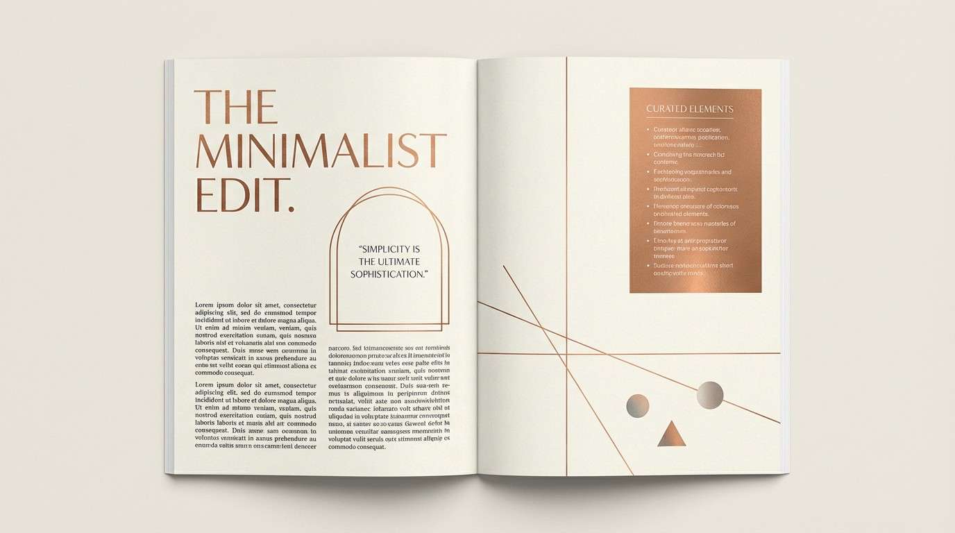
19) Copper Bronze Editorial Spread
HEX: #af6a44 #84503a #f8f2ea #2f2b2a #6b5f58
Mood: editorial, calm, sophisticated
Best for: magazine layouts and lookbooks
Sophisticated and calm, this set evokes warm paper stock, leather-bound covers, and understated ink. A copper bronze color palette like this works well for editorial design because it supports long-form reading while still feeling distinctive. Use the soft cream for margins, the near-black for body text, and copper for pull quotes or section openers. Tip: repeat the warm gray-brown as a grid or caption style to unify the spread.
Image example of copper bronze editorial spread generated using media.io
20) Nightfall Bronze Bar Menu
HEX: #a95f3d #6a3b2a #f0e5dc #1a1a1f #c08b5a
Mood: moody, intimate, upscale
Best for: cocktail bar menus and signage
Moody and intimate, these tones feel like dim amber light hitting bronze fixtures after dark. They are ideal for cocktail menus where you want an upscale vibe and strong readability. Use the near-black as the main background, then bring in cream for the drink list and bronze for section titles. Tip: keep the copper accent consistent across icons and dividers so the menu looks curated rather than busy.
Image example of nightfall bronze bar menu generated using media.io
What Colors Go Well with Copper Bronze?
Neutrals are copper bronze’s best friend: cream, parchment, linen, warm gray, and deep espresso help the metallic warmth feel intentional rather than orange. For contrast that still looks premium, pair copper bronze with charcoal or near-black.
For more personality, bring in muted greens (olive, forest, patina teal) to echo natural oxidation and create a refined complementary balance. Dusty pinks and champagnes also work well when you want a softer, romantic direction.
If you need a modern “tech” twist, cool slate or steel gray can stabilize the warmth, making copper bronze feel crisp and contemporary in dashboards, UI, and editorial layouts.
How to Use a Copper Bronze Color Palette in Real Designs
Use copper bronze as an accent first, not a background. It performs best on buttons, icons, borders, foil-like lines, and small highlight areas where you want a crafted “spark” without overwhelming the layout.
Lock in readability by choosing one very light neutral (for canvas) and one very dark neutral (for text). Then treat copper/bronze as your brand signature color and add one supporting hue (olive, slate, plum) for variety.
In print and packaging, copper bronze looks more premium when you keep spacing clean and typography confident. In digital, consider using it for states (active, selected, featured) and keep long text in dark neutrals.
Create Copper Bronze Palette Visuals with AI
If you already have HEX codes, you can quickly turn them into mockups by prompting for a specific use case: “menu layout,” “skincare ad,” “dashboard UI,” or “wedding invite.” The clearer the format and lighting cues, the more consistent your results.
For best control, keep your prompt focused on composition (poster, label, hero header), materials (brushed metal, linen paper, leather), and lighting (soft daylight, low gallery light). Then reuse the same prompt structure across variants to keep a cohesive brand look.
Media.io’s text-to-image tool makes it easy to generate multiple copper bronze visuals fast, so you can compare directions before committing to final design files.
Copper Bronze Color Palette FAQs
-
What is the difference between copper and bronze in design palettes?
Copper tends to read more orange-red and luminous, while bronze leans browner and slightly muted. In palettes, copper often works as the brighter accent, and bronze acts as the grounded “metallic neutral.” -
Is copper bronze a good color for branding?
Yes—copper bronze signals craftsmanship, warmth, and premium quality. It’s especially effective for artisan brands, hospitality, beauty, and packaged goods when paired with clean creams and deep charcoals for contrast. -
What background colors make copper bronze stand out?
Off-white, cream, parchment, and light warm gray give copper bronze a refined, airy look. For dramatic contrast, use charcoal or near-black backgrounds and keep copper bronze for titles, lines, and key highlights. -
What accent colors pair best with copper bronze?
Muted greens (olive, forest, patina teal) are a top choice because they balance warmth and add depth. Dusty blush, plum-browns, and slate blue-grays also complement copper bronze without clashing. -
How do I keep copper bronze palettes readable in UI?
Use a very light neutral for surfaces and a near-black for text, then reserve copper bronze for primary actions (buttons), focus states, badges, or chart highlights. Avoid using copper bronze for long paragraphs or small body text. -
Can copper bronze work for modern minimal design?
Yes—choose clean off-whites and structured dark neutrals, then apply copper bronze sparingly as a single “signature” accent. Adding champagne or warm gray panels helps create depth without making the layout feel rustic. -
How can I generate copper bronze palette images consistently with AI?
Reuse a stable prompt template (format + materials + lighting) and only swap the subject (menu, label, UI, poster). Keeping the same composition and lighting terms improves consistency across a series.
Next: Bridge Color Palette


