

Bridge-inspired palettes capture the balance of strength and openness: sturdy dark anchors, airy light tints, and a single warm accent that feels human.
Below are modern bridge color palette ideas you can use for branding, UI, print, and social designs—each with HEX codes, usage tips, and an AI-ready prompt.
In this article
- Why Bridge Palettes Work So Well
-
- steel span
- misty riverwalk
- cable car charcoal
- sunset truss
- harbor timber
- concrete arch
- foggy skyline
- nautical rope
- lantern glow
- weathered stone
- verdigris rail
- rusted rivet
- midnight crossing
- sandbar support
- seaglass suspension
- pebble path
- copper beacon
- overcast deck
- tidepool shadow
- golden hour piers
- ironclad harbor
- slate footpath
- pier light neutral
- railway mist
- What Colors Go Well with Bridge?
- How to Use a Bridge Color Palette in Real Designs
- Create Bridge Palette Visuals with AI
Why Bridge Palettes Work So Well
Bridge palettes feel instantly usable because they’re built on structure: deep charcoals and navies for “steel,” mid-tones for surfaces, and light grays for breathing room. That natural hierarchy maps perfectly to UI layouts and print grids.
They also mix “cool trust” with “warm humanity.” A small bronze, sand, or copper accent keeps the scheme from feeling sterile, which helps branding feel more approachable without losing professionalism.
Finally, bridge tones tend to be camera- and print-friendly. Neutral foundations stay consistent across screens, and a single accent color scales from subtle highlights to bold calls-to-action.
20+ Bridge Color Palette Ideas (with HEX Codes)
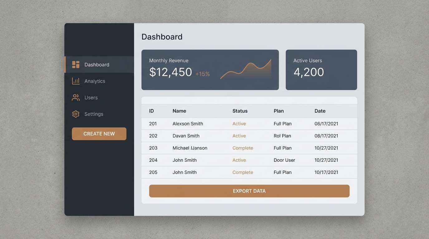
1) Steel Span
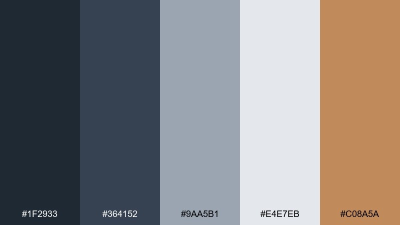
HEX: #1f2933 #364152 #9aa5b1 #e4e7eb #c08a5a
Mood: Industrial and confident
Best for: SaaS dashboard UI
Industrial confidence meets clean structure, like steel beams against a pale sky. The cool grays keep layouts readable, while the warm bronze accent adds a human touch. Use it for data-heavy screens, navigation, and components that need clear hierarchy. Tip: reserve the bronze for primary CTAs and key status highlights so the interface stays calm.
Image example of steel span generated using media.io
Media.io is an online AI studio for creating and editing video, image, and audio in your browser.

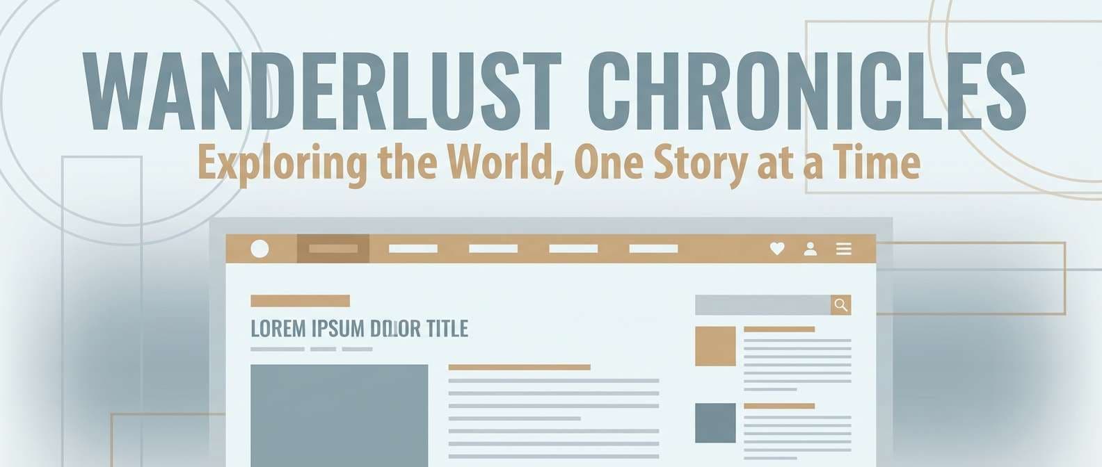
2) Misty Riverwalk
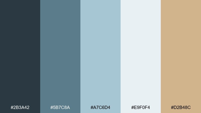
HEX: #2b3a42 #5b7c8a #a7c6d4 #e9f0f4 #d2b48c
Mood: Soft and airy
Best for: Travel blog header and post templates
Soft and airy tones evoke morning fog over a calm riverwalk. The blue-grays feel spacious, while the sand note adds gentle warmth without turning sugary. It works beautifully for editorial-style travel layouts, hero banners, and calm photo overlays. Tip: set text in the deep blue-gray and keep the lightest tint for generous negative space.
Image example of misty riverwalk generated using media.io
3) Cable Car Charcoal
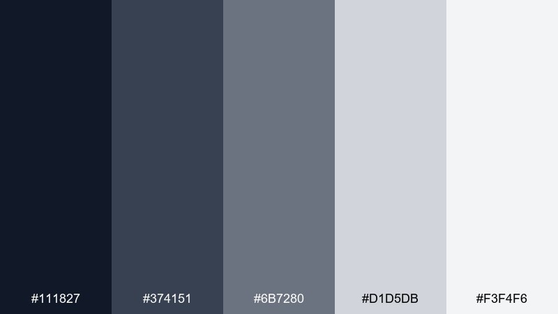
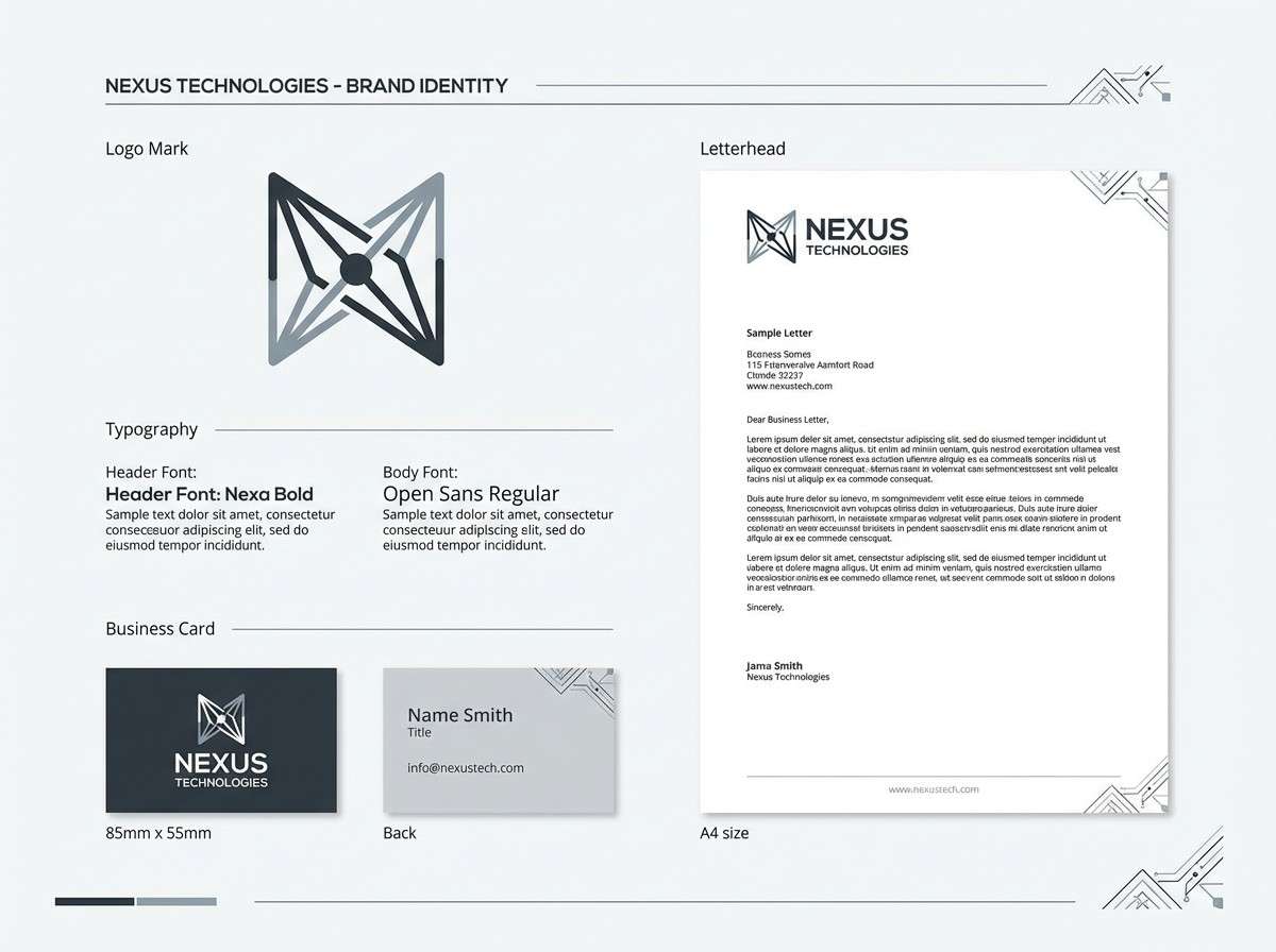
HEX: #111827 #374151 #6b7280 #d1d5db #f3f4f6
Mood: Minimal and modern
Best for: Tech brand identity system
Minimal and modern, like a cable line cutting through a winter skyline. These neutrals create instant clarity and pair well with bold typography or strong photography. Use it for brand systems, icon sets, and clean product pages where restraint is the goal. Tip: introduce texture through line weights and shadows rather than adding extra colors.
Image example of cable car charcoal generated using media.io
4) Sunset Truss
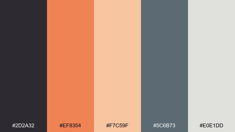
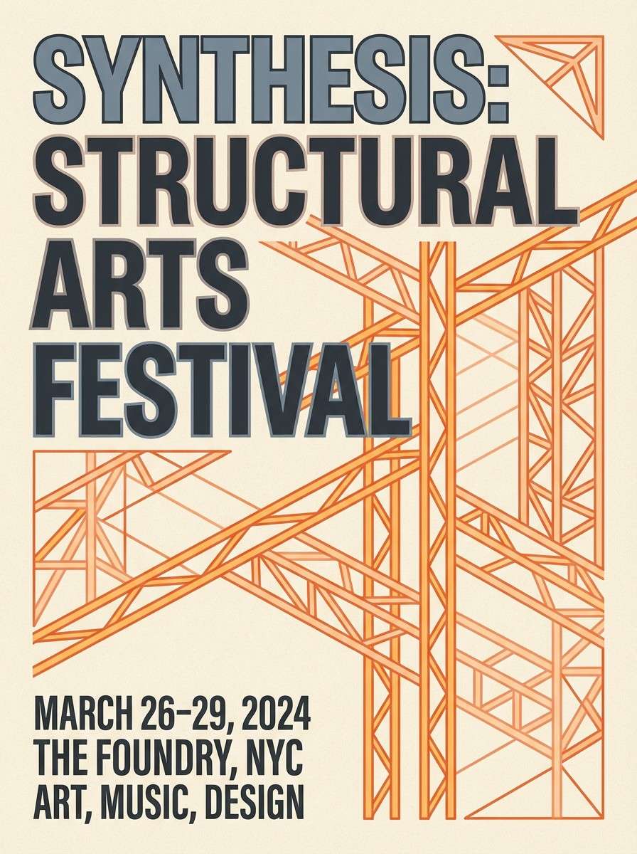
HEX: #2d2a32 #ef8354 #f7c59f #5c6b73 #e0e1dd
Mood: Warm and energetic
Best for: Event poster design
Warm and energetic, like sunset light catching a truss silhouette. The orange and peach bring lift, while the slate tones keep it grounded and adult. These bridge color combinations shine on posters, social promos, and punchy headings where you want warmth without chaos. Tip: keep backgrounds light and use the darkest charcoal for type to hold contrast.
Image example of sunset truss generated using media.io
5) Harbor Timber
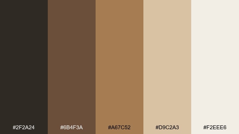
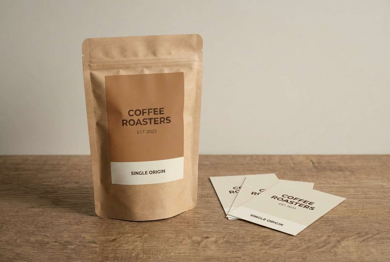
HEX: #2f2a24 #6b4f3a #a67c52 #d9c2a3 #f2eee6
Mood: Rustic and welcoming
Best for: Coffee packaging and labels
Rustic and welcoming, like timber planks by a harbor pier. The browns and creams feel tactile and honest, ideal for brands that lean craft and heritage. Use it on packaging, labels, and menus with paper textures or emboss effects. Tip: set the darkest brown for logotypes and keep the mid-brown for secondary copy to avoid heaviness.
Image example of harbor timber generated using media.io
6) Concrete Arch
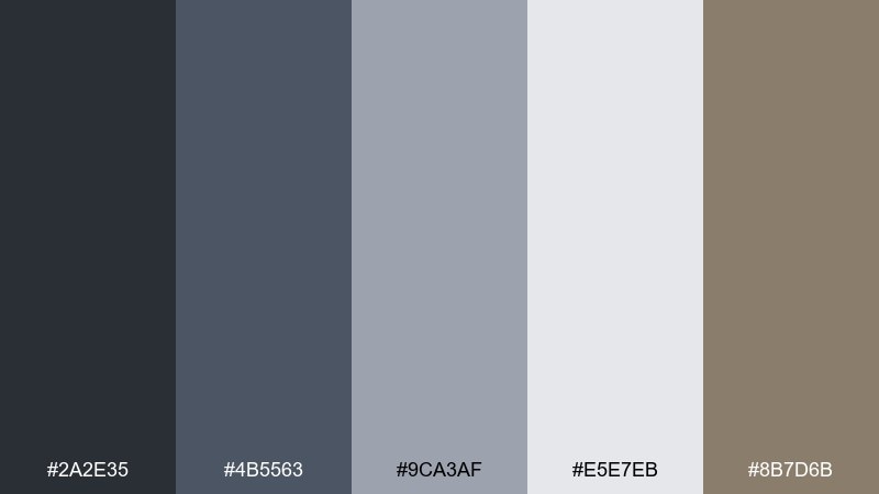
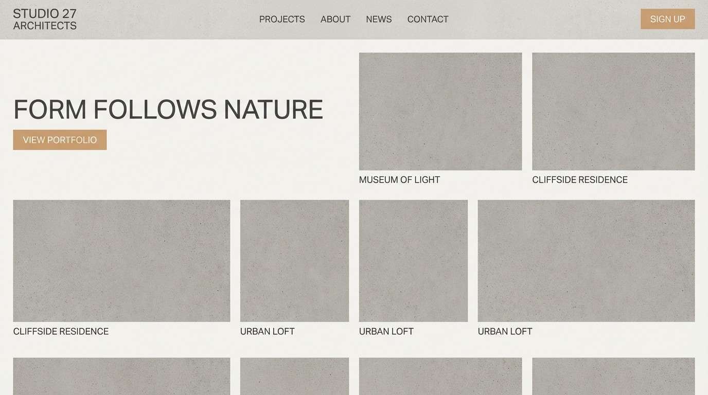
HEX: #2a2e35 #4b5563 #9ca3af #e5e7eb #8b7d6b
Mood: Grounded and architectural
Best for: Architecture firm website
Grounded and architectural, like a concrete arch with crisp edges and soft weathering. The gray range keeps pages professional, while the warm stone note prevents the look from feeling cold. This bridge color palette works well for portfolios, case studies, and layouts heavy on drawings or renders. Tip: use the light gray as the main canvas and apply the deepest tone sparingly for section headers.
Image example of concrete arch generated using media.io
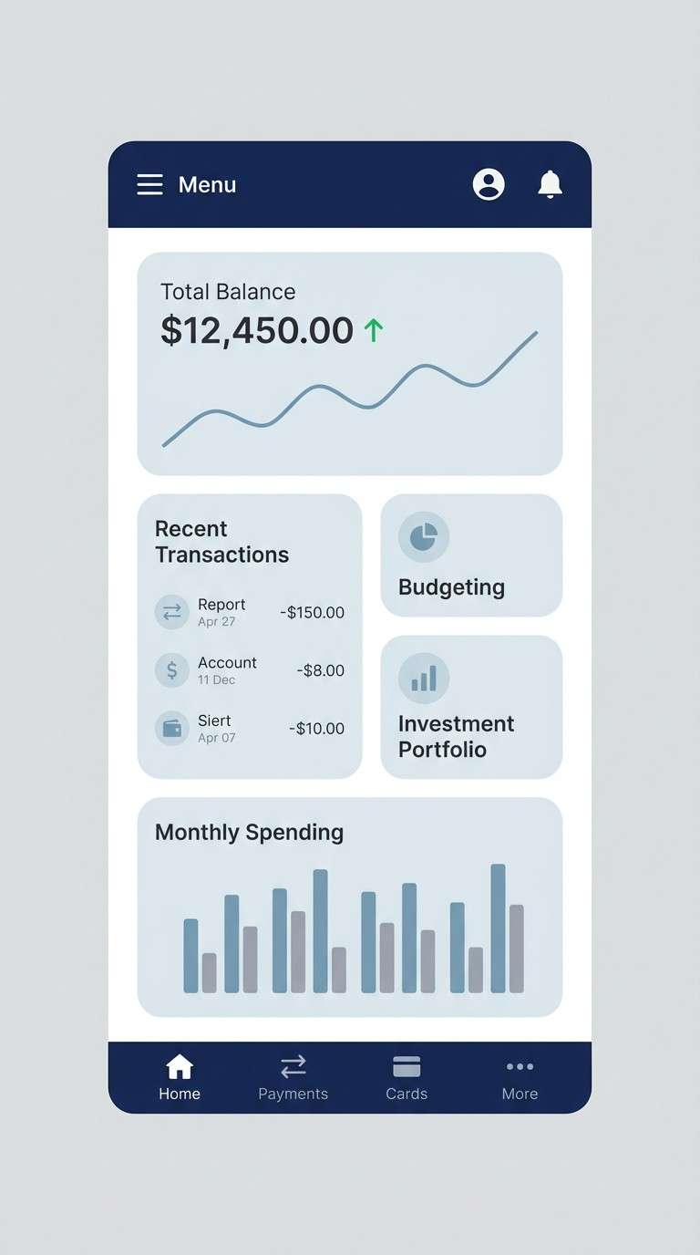
7) Foggy Skyline
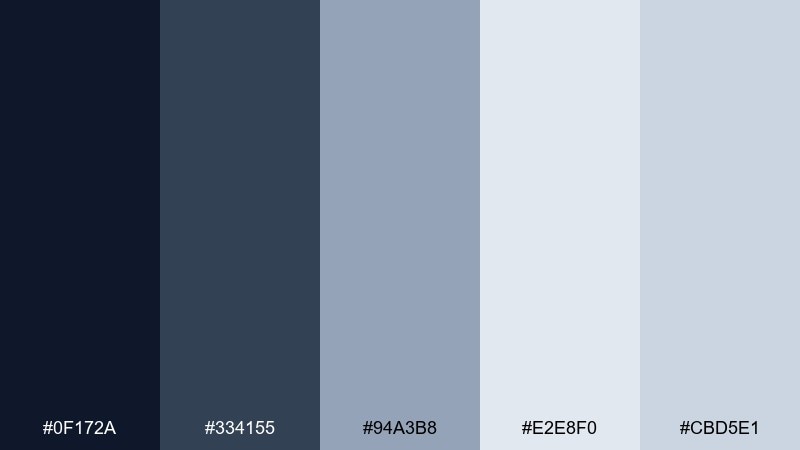
HEX: #0f172a #334155 #94a3b8 #e2e8f0 #cbd5e1
Mood: Calm and contemporary
Best for: Fintech mobile app UI screens
Calm and contemporary, like a skyline fading into fog at dawn. The deep navy anchors key actions while the pale blue-grays keep information breathable. It suits finance, productivity, and any UI that needs trust without feeling stiff. Tip: pair the navy with the lightest tint for cards to maintain a clear, accessible contrast rhythm.
Image example of foggy skyline generated using media.io
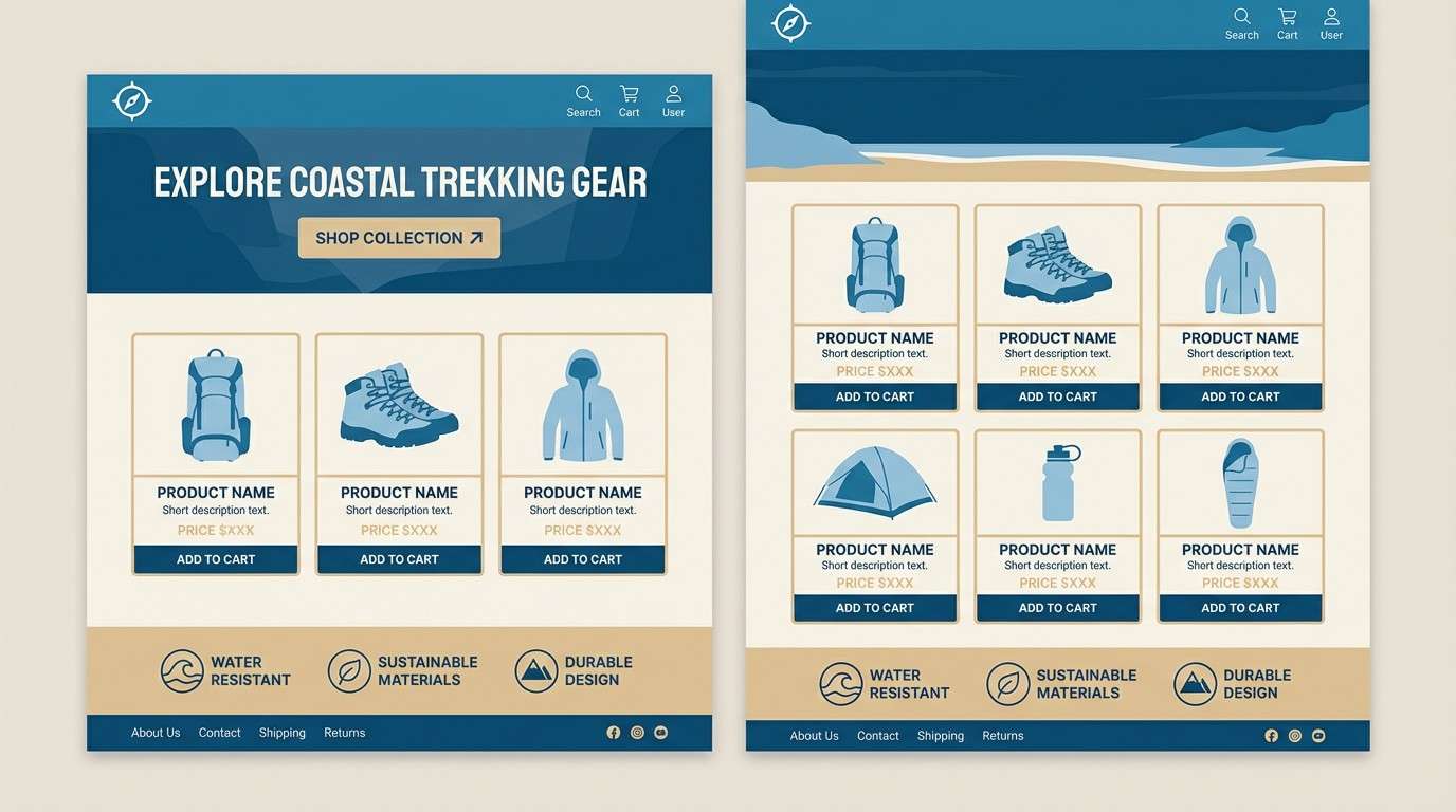
8) Nautical Rope
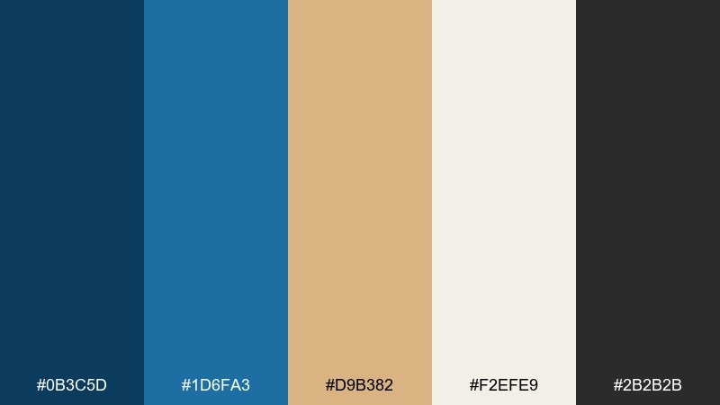
HEX: #0b3c5d #1d6fa3 #d9b382 #f2efe9 #2b2b2b
Mood: Coastal and sturdy
Best for: Outdoor gear product page
Coastal and sturdy, like rope fibers against painted steel. The ocean blues bring clarity and depth, balanced by a sandy neutral that feels practical and outdoorsy. Use it for ecommerce sections, spec tables, and feature callouts where durability is the story. Tip: let the lighter sand tone support long-form copy, and keep the darker blue for buttons and links.
Image example of nautical rope generated using media.io
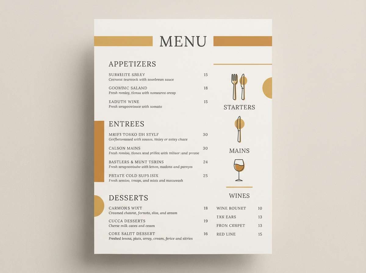
9) Lantern Glow
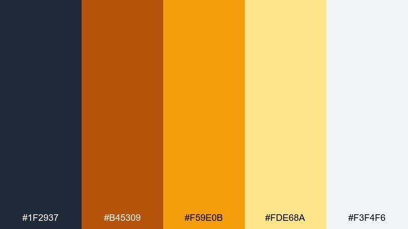
HEX: #1f2937 #b45309 #f59e0b #fde68a #f3f4f6
Mood: Cozy and luminous
Best for: Restaurant menu design
Cozy and luminous, like lanterns reflecting on dark water. Amber and gold create appetite appeal, while the charcoal keeps everything feeling upscale rather than playful. It works for menus, signage, and promo cards that need warmth and legibility. Tip: use the pale gold for highlight panels and keep body text in charcoal for a premium finish.
Image example of lantern glow generated using media.io
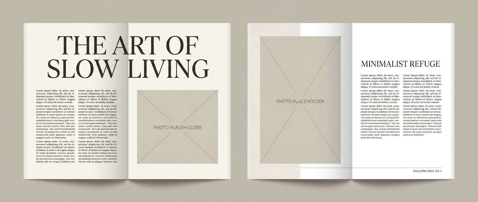
10) Weathered Stone
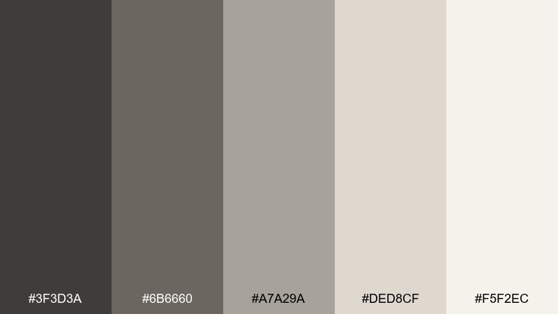
HEX: #3f3d3a #6b6660 #a7a29a #ded8cf #f5f2ec
Mood: Quiet and timeless
Best for: Editorial magazine spread
Quiet and timeless, like stonework softened by years of rain. The muted neutrals create an elegant base that makes photography and typography feel intentional. Use it for magazine spreads, lookbooks, and long reads where pacing matters. Tip: add contrast with bold serif headings and keep the lightest tone for margins and breathing room.
Image example of weathered stone generated using media.io
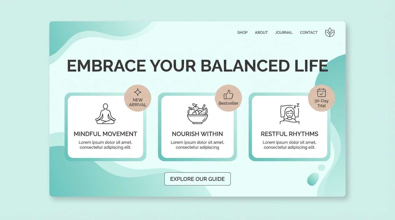
11) Verdigris Rail
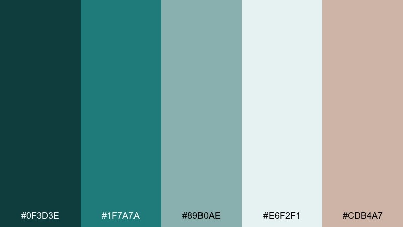
HEX: #0f3d3e #1f7a7a #89b0ae #e6f2f1 #cdb4a7
Mood: Fresh and refined
Best for: Wellness brand landing page
Fresh and refined, like verdigris patina on a rail after sea air. The teal family feels cleansing and modern, softened by a blush-tan accent that reads human and calm. It suits wellness, skincare, and mindful products that want color without loudness. Tip: keep teal as the dominant block color and use the blush-tan only for micro-highlights and badges.
Image example of verdigris rail generated using media.io
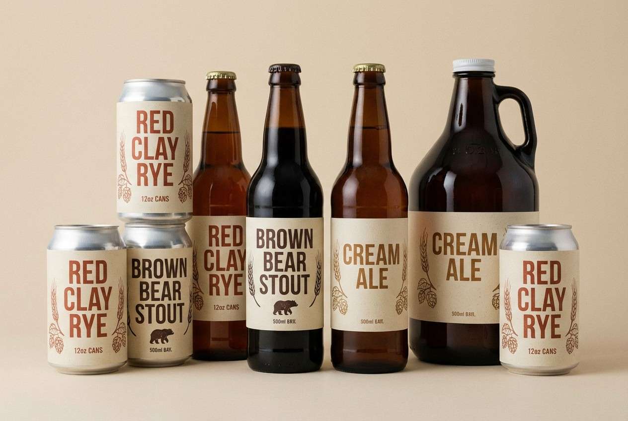
12) Rusted Rivet
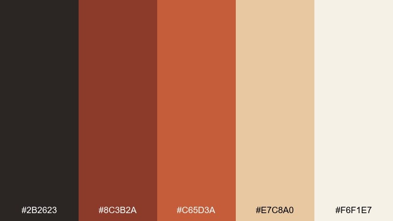
HEX: #2b2623 #8c3b2a #c65d3a #e7c8a0 #f6f1e7
Mood: Bold and vintage
Best for: Craft brewery label set
Bold and vintage, like rusted rivets on old ironwork. The clay reds bring character, balanced by creamy paper tones that feel handcrafted and authentic. These bridge color combinations fit labels, stamps, and merch graphics where you want grit without looking dirty. Tip: print the reds slightly desaturated and let the cream dominate to keep the set readable from a distance.
Image example of rusted rivet generated using media.io
13) Midnight Crossing
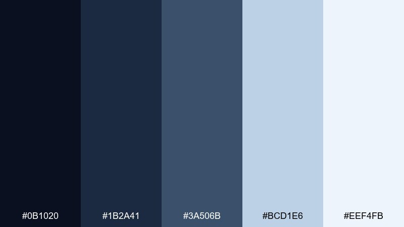
HEX: #0b1020 #1b2a41 #3a506b #bcd1e6 #eef4fb
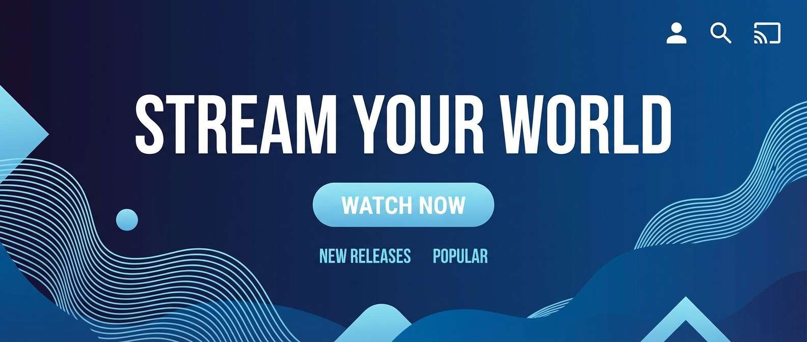
Mood: Moody and cinematic
Best for: Streaming app hero banner
Moody and cinematic, like a night crossing with headlights in the distance. Deep blues create drama while the icy tints keep it sharp and modern. Use it for hero banners, title cards, and product storytelling where you want depth without heavy blacks. Tip: add subtle gradients between the mid and deep blues to avoid flat blocks on large screens.
Image example of midnight crossing generated using media.io
14) Sandbar Support
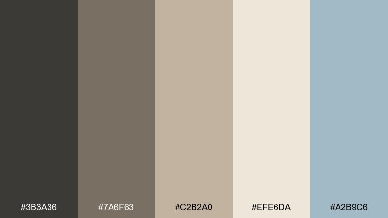
HEX: #3b3a36 #7a6f63 #c2b2a0 #efe6da #a2b9c6
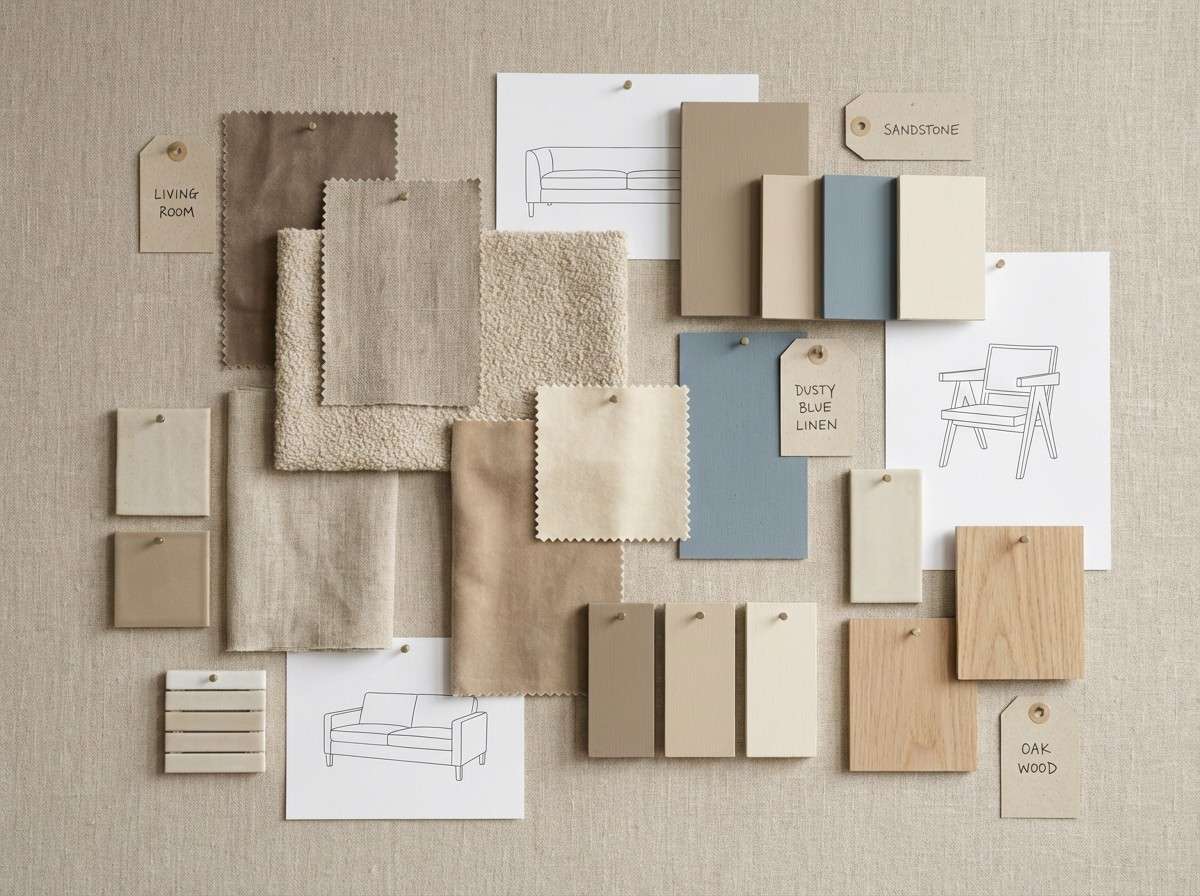
Mood: Natural and balanced
Best for: Interior design mood board
Natural and balanced, like sandbars and stone supports under soft daylight. The warm neutrals feel livable, and the dusty blue adds a quiet contemporary twist. It works for interiors, lifestyle branding, and calm packaging where texture matters. Tip: use the dusty blue as a single accent across pillows, icons, or section dividers to keep the palette cohesive.
Image example of sandbar support generated using media.io
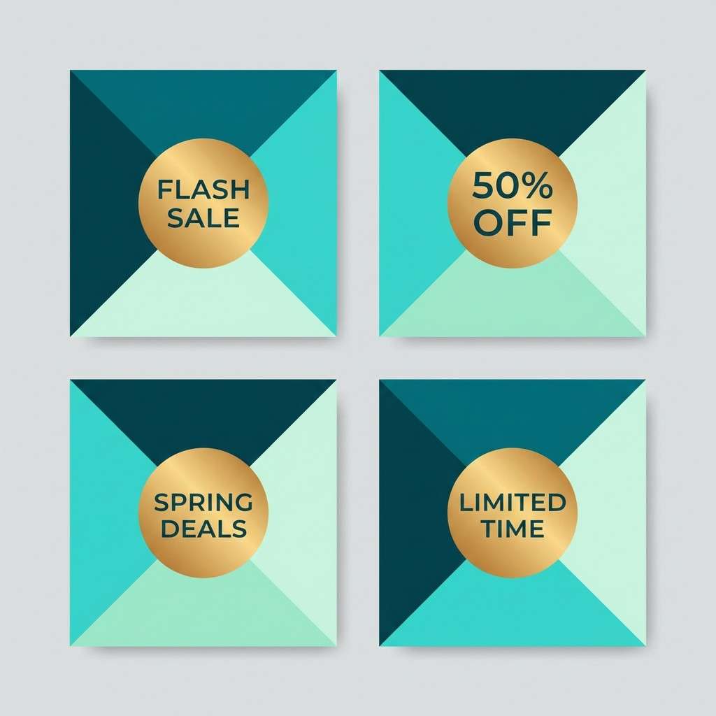
15) Seaglass Suspension
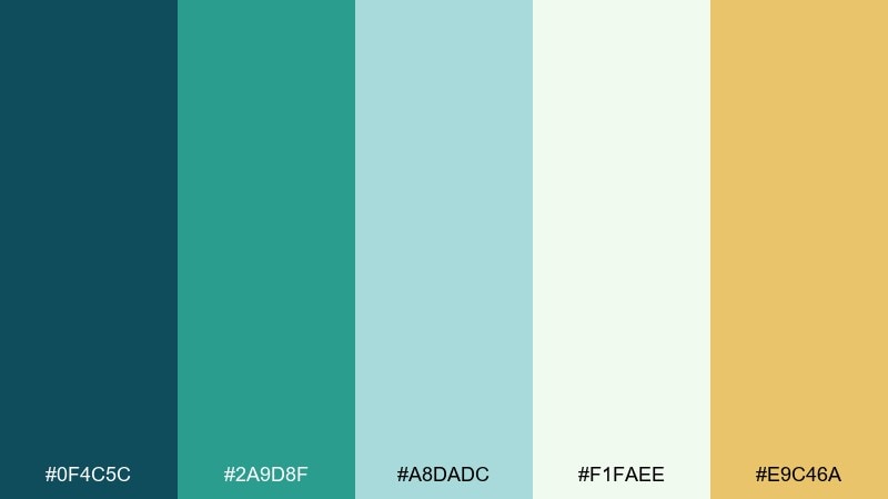
HEX: #0f4c5c #2a9d8f #a8dadc #f1faee #e9c46a
Mood: Bright and breezy
Best for: Summer sale social templates
Bright and breezy, like sea glass catching light near the waterline. The aqua and teal tones feel refreshing, with a sunny gold accent that adds energy. Use it for seasonal campaigns, social templates, and lightweight illustrations. Tip: keep the gold limited to price tags or buttons so the cool tones remain dominant.
Image example of seaglass suspension generated using media.io
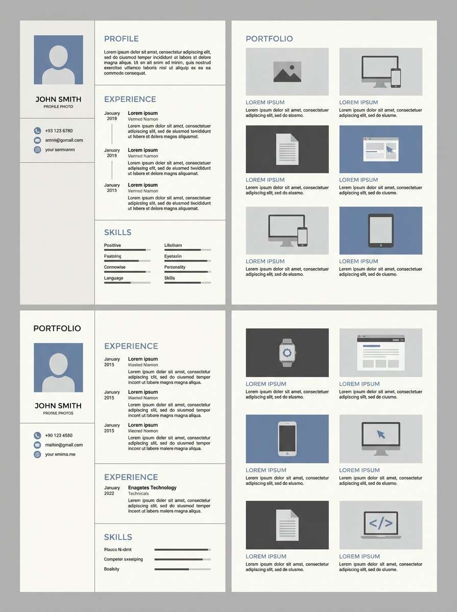
16) Pebble Path
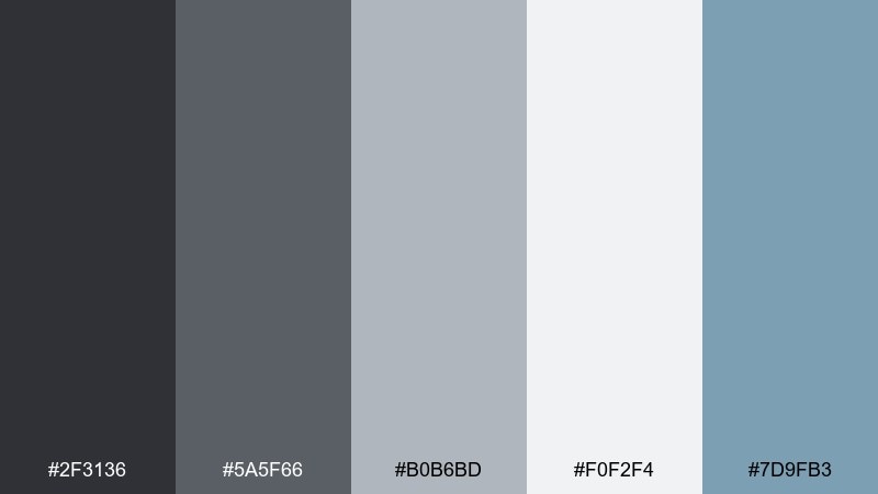
HEX: #2f3136 #5a5f66 #b0b6bd #f0f2f4 #7d9fb3
Mood: Clean and practical
Best for: Resume and portfolio template
Clean and practical, like smooth pebbles under a steady walkway. The grayscale base reads professional, while the muted blue adds a friendly, contemporary edge. It fits resumes, portfolios, and presentation decks where you want clarity first. Tip: use the blue only for section titles and links to guide scanning without distracting from content.
Image example of pebble path generated using media.io
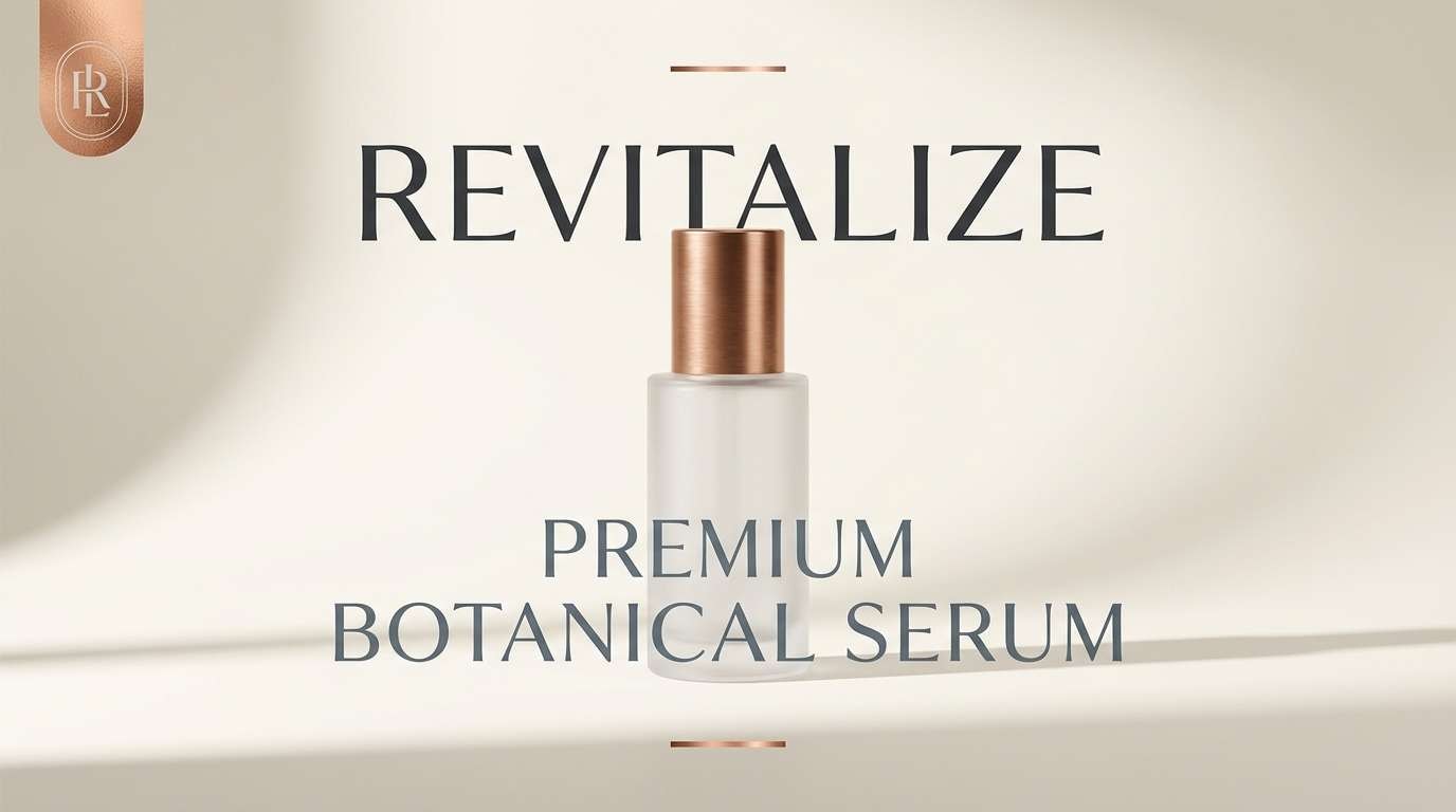
17) Copper Beacon
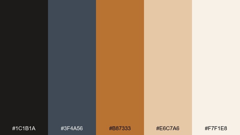
HEX: #1c1b1a #3f4a56 #b87333 #e6c7a6 #f7f1e8
Mood: Elegant and warm
Best for: Luxury product ad banner
Elegant and warm, like a copper beacon against dusk-toned steel. The copper accent reads premium and pairs naturally with charcoal and soft cream. Use it for luxury banners, landing pages, and minimal product storytelling. Tip: give copper plenty of whitespace and use it in small areas so it feels intentional and high-end.
Image example of copper beacon generated using media.io
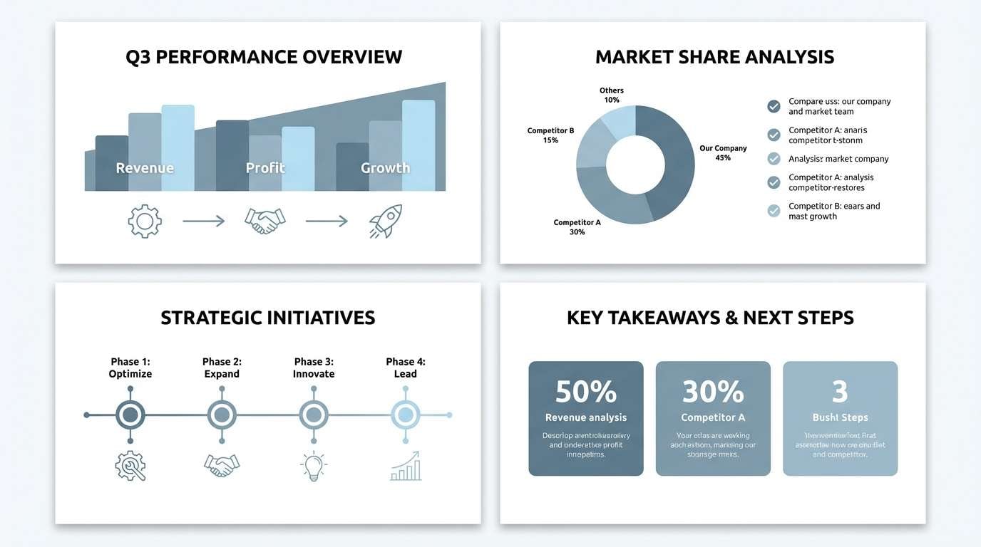
18) Overcast Deck
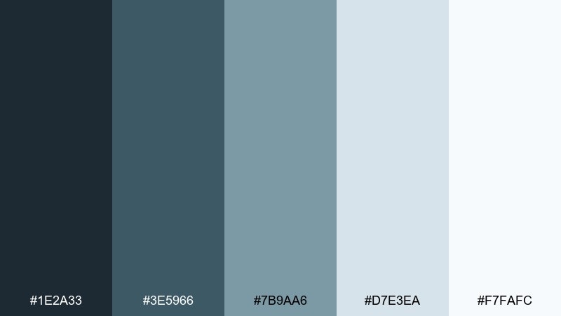
HEX: #1e2a33 #3e5966 #7b9aa6 #d7e3ea #f7fafc
Mood: Cool and steady
Best for: Corporate presentation deck
Cool and steady, like an overcast day that makes details pop. The layered blue-grays feel professional and dependable without leaning sterile. It is a strong choice for decks, reports, and infographics that need visual order. Tip: use the mid-tone blue-gray for charts and the lightest tint for slide backgrounds to keep contrast consistent.
Image example of overcast deck generated using media.io
19) Tidepool Shadow
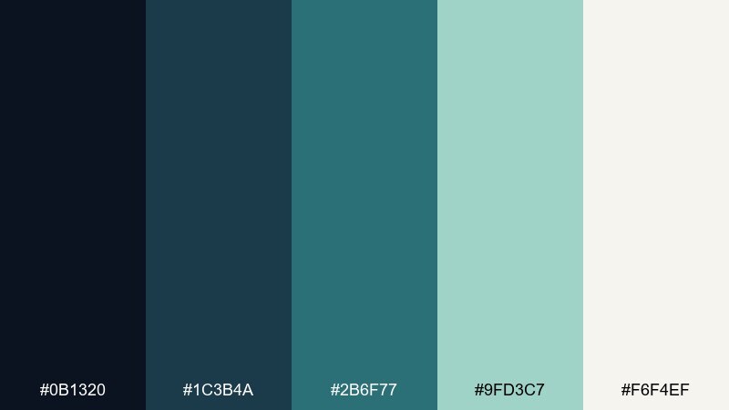
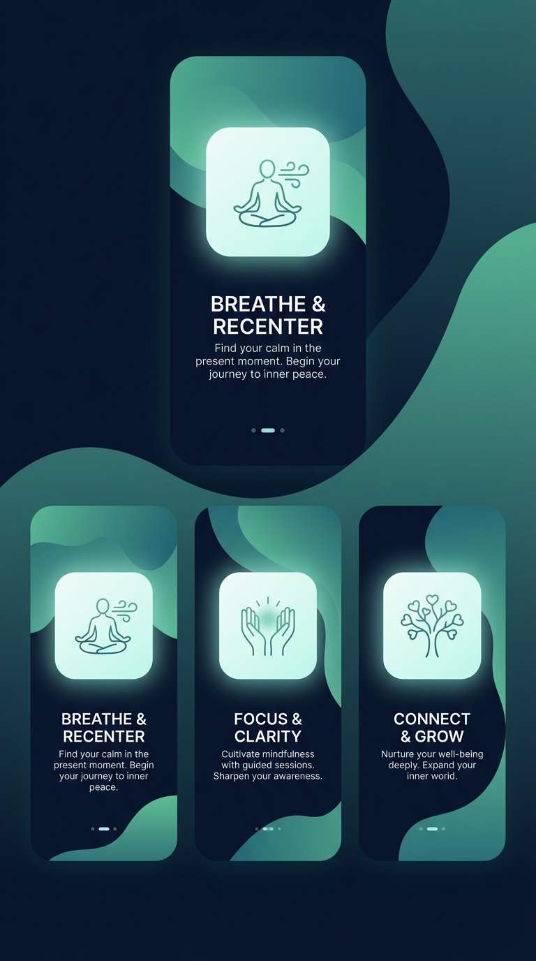
HEX: #0b1320 #1c3b4a #2b6f77 #9fd3c7 #f6f4ef
Mood: Deep and tranquil
Best for: Meditation app onboarding screens
Deep and tranquil, like tidepools shaded by a long structure overhead. The dark base makes the sea tones glow, creating a soothing rhythm for guided content. Use it for onboarding, calm notifications, and gentle gradients that guide attention. Tip: keep animations slow and minimal, and let the light mint act as the primary focus color.
Image example of tidepool shadow generated using media.io
20) Golden Hour Piers
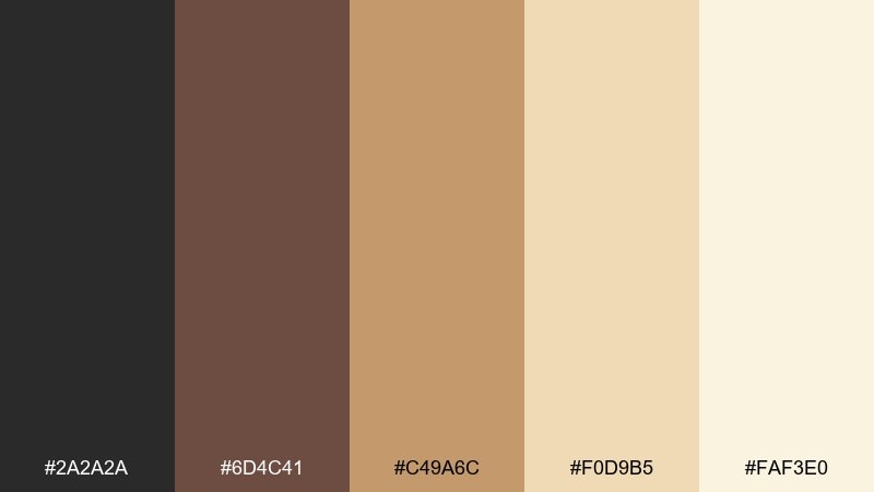
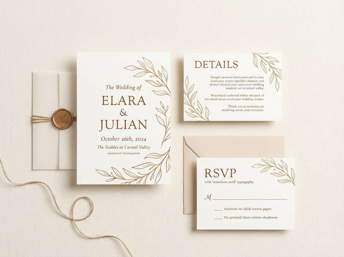
HEX: #2a2a2a #6d4c41 #c49a6c #f0d9b5 #faf3e0
Mood: Sunlit and nostalgic
Best for: Wedding invitation suite
Sunlit and nostalgic, like golden hour hitting wooden piers and warm stone. The caramel and cream tones feel romantic, while charcoal keeps details crisp. It works for invitations, stationery, and elegant announcements that need warmth and readability. Tip: print on soft off-white stock and use the darkest tone for names and key dates.
Image example of golden hour piers generated using media.io
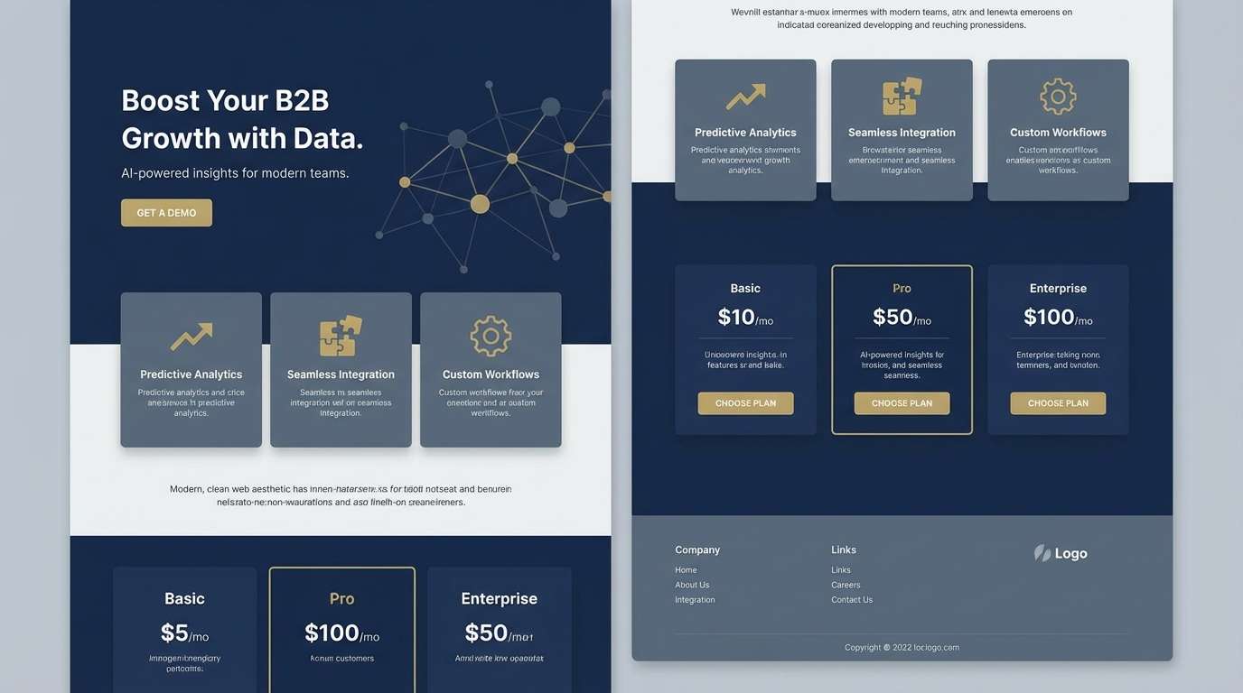
21) Ironclad Harbor
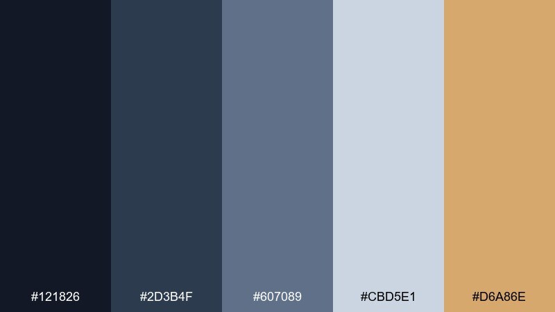
HEX: #121826 #2d3b4f #607089 #cbd5e1 #d6a86e
Mood: Strong and polished
Best for: B2B landing page
Strong and polished, like ironwork finished with a subtle warm highlight. The navy-to-slate range builds trust fast, and the muted gold gives you an upscale accent without shouting. It is ideal for B2B pages, feature sections, and pricing blocks where hierarchy matters. Tip: use the gold only for one primary action per screen to keep focus tight.
Image example of ironclad harbor generated using media.io
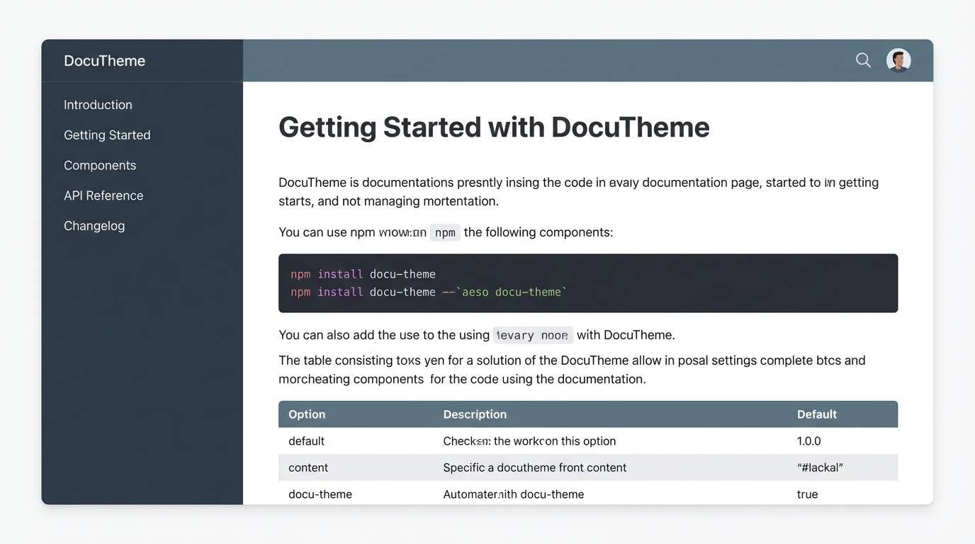
22) Slate Footpath
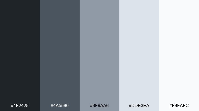
HEX: #1f2428 #4a5560 #8f9aa6 #dde3ea #f8fafc
Mood: Orderly and calm
Best for: Documentation site theme
Orderly and calm, like a slate footpath guiding you forward. The stepped grays make navigation intuitive and help code blocks and tables stand out. Use it for docs, knowledge bases, and product help centers that need long-session comfort. Tip: set links in the mid-tone and reserve the darkest shade for headings so scanning stays effortless.
Image example of slate footpath generated using media.io
23) Pier Light Neutral
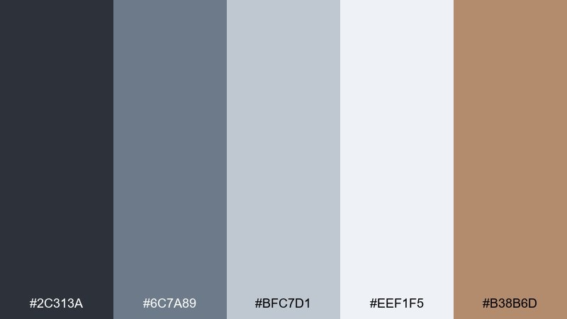
HEX: #2c313a #6c7a89 #bfc7d1 #eef1f5 #b38b6d
Mood: Soft and professional
Best for: Brand guidelines PDF
Soft and professional, like gentle light along a pier on a cool afternoon. The silvery neutrals keep layouts crisp, with a warm tan accent that adds approachability. This bridge color palette is a smart fit for guideline documents, brand systems, and templates that will be reused often. Tip: assign the tan to callouts and section markers so readers can navigate quickly.
Image example of pier light neutral generated using media.io
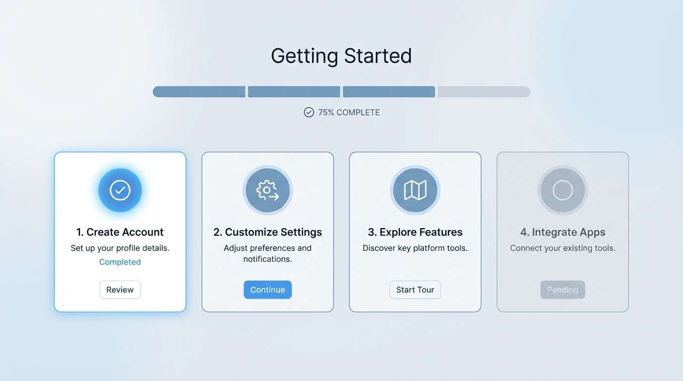
24) Railway Mist
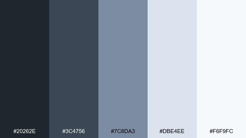
HEX: #20262e #3c4756 #7c8da3 #dbe4ee #f6f9fc
Mood: Quiet and modern
Best for: Product onboarding checklist UI
Quiet and modern, like railway mist settling over clean lines. The cool blues and soft grays create an easy rhythm for step-by-step moments. Use it for checklists, setup flows, and in-app education where clarity needs to feel friendly. Tip: highlight the current step with the mid-blue and keep completed states in the light gray to reduce noise.
Image example of railway mist generated using media.io
What Colors Go Well with Bridge?
Bridge tones pair best with dependable neutrals (charcoal, slate, steel gray, off-white) because they mimic the materials you’d see in real structures. This keeps designs grounded and easy to read.
For contrast, add one warm accent like bronze, copper, sand, or muted gold. It creates a “signal color” for buttons, highlights, and key details without overpowering the calm base.
If you want a fresher feel, introduce a restrained coastal hue (teal, misty blue, dusty aqua). Keep it mid-saturation so it still looks structural rather than playful.
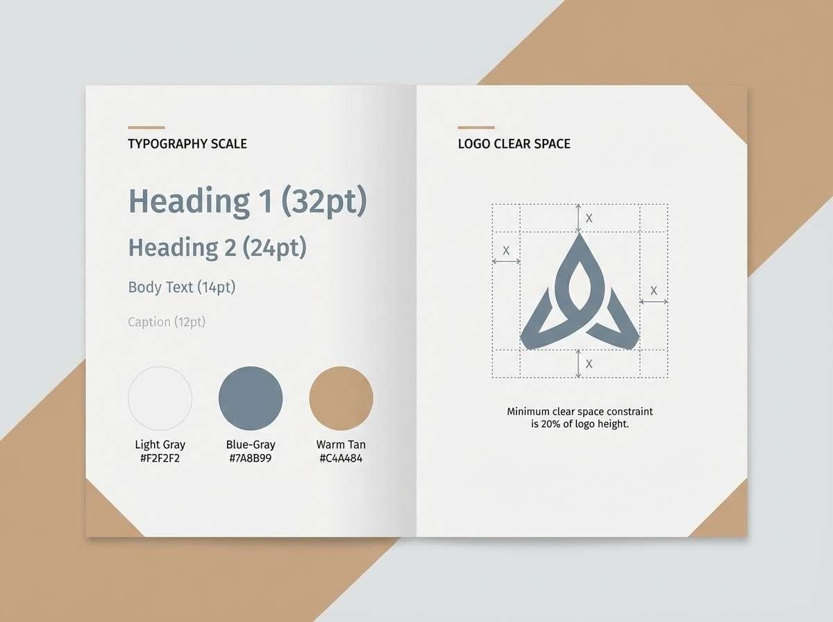
How to Use a Bridge Color Palette in Real Designs
Start with a simple hierarchy: dark for headings/navigation, mid-tones for surfaces and dividers, and light tints for backgrounds. This mirrors real-world contrast and makes layouts feel organized.
Limit your accent to one job per screen or page—primary CTA, pricing highlight, or section badge—so the palette stays “engineered” instead of decorative. In print, keep accents small to avoid muddy color shifts.
When you need depth, use subtle gradients within the same hue family (navy-to-slate, teal-to-mint). This adds dimension while keeping the bridge-inspired restraint.
Create Bridge Palette Visuals with AI
If you’re pitching a concept or building a mood board, AI visuals help you test bridge color combinations quickly—without waiting for full mockups. You can generate UI screens, posters, packaging scenes, and brand sheets in minutes.
To get consistent results, describe the layout style (2D mockup, studio product shot, editorial spread), specify the dominant tones, and call out the accent color’s role (CTA buttons, badges, highlights).
Once you like the direction, reuse the same prompt structure across multiple sizes to create a cohesive set for web, social, and print.
Bridge Color Palette FAQs
-
What is a bridge color palette?
A bridge color palette is a set of tones inspired by bridge materials and atmosphere—steel grays, deep navies/charcoals, soft foggy tints, and a warm accent like bronze, sand, or copper for highlights. -
Are bridge color schemes good for UI design?
Yes. Bridge palettes naturally create hierarchy (dark anchors, mid surfaces, light backgrounds), which works well for dashboards, navigation, cards, and data-heavy layouts. -
What accent color works best with bridge tones?
Muted warm accents—bronze, copper, tan, sand, or soft gold—pair especially well because they add contrast and approachability without breaking the neutral, architectural feel. -
How do I keep a bridge palette from looking too cold?
Use an off-white (not pure white) for backgrounds and introduce a single warm accent for CTAs or callouts. You can also soften the coldness with a dusty blue or teal mid-tone. -
Which bridge palette is best for branding?
For minimal tech branding, choose Cable Car Charcoal. For premium branding, Copper Beacon or Ironclad Harbor work well because the metallic accents feel upscale and intentional. -
How many colors should I use from a bridge palette?
In most real projects, 3–4 is enough: one dark, one mid-tone, one light background, and one accent. Keep the fifth color as a supporting tint for states, borders, or secondary surfaces. -
Can I generate bridge palette mockups with AI?
Yes. Use Media.io Text-to-Image prompts that specify the design type (UI, poster, packaging), the dominant dark-to-light neutrals, and the warm accent’s role (buttons, badges, highlights) for consistent outputs.


