Cottagecore color palettes blend soft neutrals, weathered greens, and gentle vintage accents to create designs that feel calm, handmade, and welcoming.
Below are 20 curated cottagecore palettes with HEX codes, plus pairing tips and AI prompts you can use to generate matching visuals in minutes.
In this article
- Why Cottagecore Palettes Work So Well
-
- wildflower linen
- mossy stone kitchen
- strawberry jam sunset
- herb garden notebook
- vintage quilt patch
- rainy greenhouse
- baked clay and cream
- lavender milk tea
- golden wheat field
- apple orchard morning
- dusty blue apron
- rosemary and butter
- sunlit attic books
- pond lily pastels
- sepia cottage photo
- thistle and dusk
- milkpaint porch
- pear tart picnic
- forest path candlelight
- heirloom brass and sage
- What Colors Go Well with Cottagecore?
- How to Use a Cottagecore Color Palette in Real Designs
- Create Cottagecore Palette Visuals with AI
Why Cottagecore Palettes Work So Well
Cottagecore palettes feel instantly comforting because they borrow from familiar, real-world materials: linen, clay, herbs, aged paper, and sun-faded fabric. Those references make even modern layouts feel more human and lived-in.
They also rely on muted contrast and warm undertones, which keeps screens and print designs easy on the eyes. Instead of harsh blacks and neon accents, you get soft transitions that still read clearly.
Most importantly, cottagecore colors are flexible: they can look romantic and delicate, or grounded and rustic—depending on how you balance light creams with deeper greens and browns.
20+ Cottagecore Color Palette Ideas (with HEX Codes)
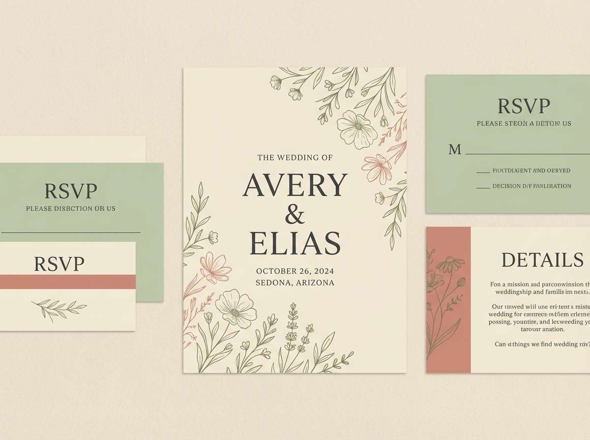
1) Wildflower Linen
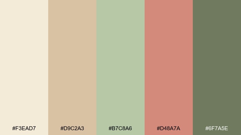
HEX: #f3ead7 #d9c2a3 #b7c8a6 #d48a7a #6f7a5e
Mood: airy, rustic, gentle
Best for: rustic wedding invitation suite
Airy linen neutrals and garden-fresh greens feel like pressed wildflowers tucked into an old book. It works beautifully for invitations, stationery, and any design that needs warmth without looking heavy. Balance the dusty rose against sage for headlines, then let cream do most of the background work. For a cohesive cottagecore color palette, keep contrast soft and use the olive tone for small anchors like dates or icons.
Image example of wildflower linen generated using media.io
Media.io is an online AI studio for creating and editing video, image, and audio in your browser.

2) Mossy Stone Kitchen
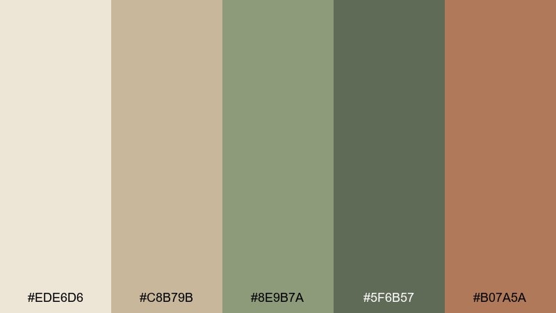
HEX: #ede6d6 #c8b79b #8e9b7a #5f6b57 #b07a5a
Mood: grounded, homey, earthy
Best for: recipe blog hero banner illustration
Grounded moss and stone tones evoke a quiet kitchen with herb bundles drying near the window. The warm clay accent keeps the palette from feeling too cool, especially when paired with the creamy base. Use the mid sage for large shapes and the deeper green for text and separators to maintain readability. A subtle paper texture overlay can make the colors feel even more handmade.
Image example of mossy stone kitchen generated using media.io
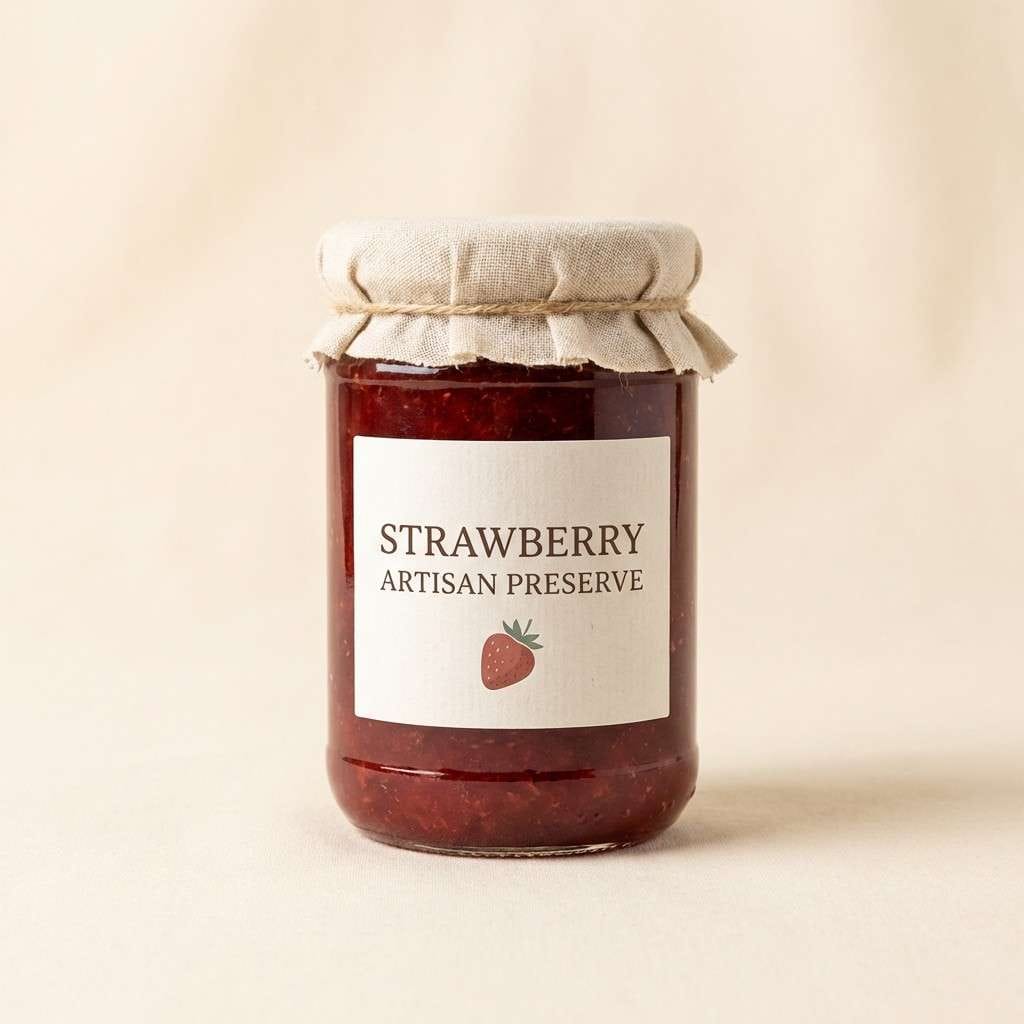
3) Strawberry Jam Sunset
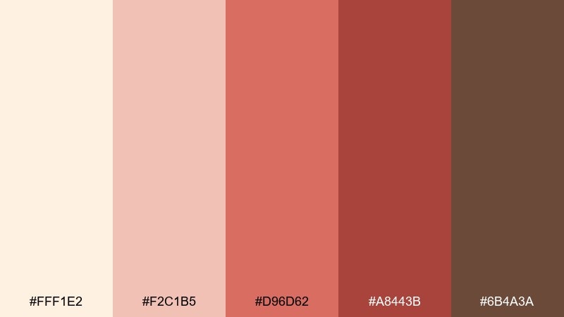
HEX: #fff1e2 #f2c1b5 #d96d62 #a8443b #6b4a3a
Mood: sweet, nostalgic, cozy
Best for: artisan jam label and jar packaging
Sweet berry reds and toasted brown feel like jam simmering at golden hour. The pale cream keeps labels readable, while the deeper red adds instant shelf pop. Pair the two red tones for brand marks and borders, then reserve the brown for small type and ingredient details. A matte paper label finish makes the palette look less glossy and more farmhouse.
Image example of strawberry jam sunset generated using media.io
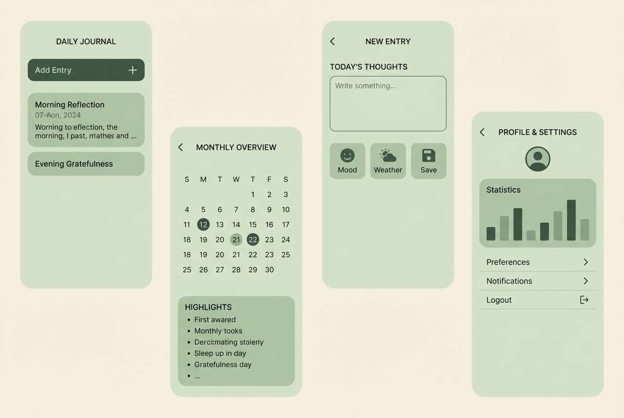
4) Herb Garden Notebook
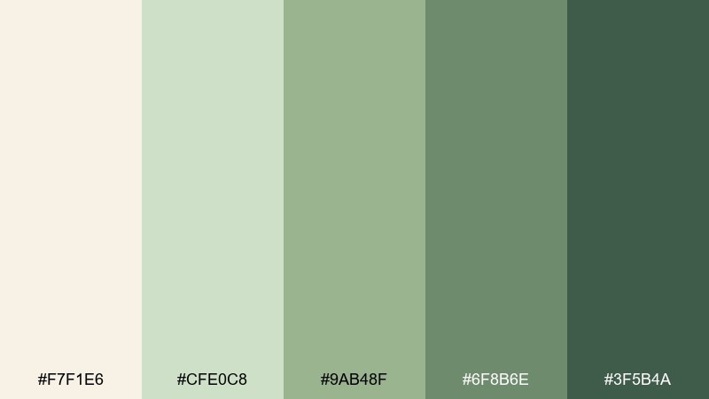
HEX: #f7f1e6 #cfe0c8 #9ab48f #6f8b6e #3f5b4a
Mood: fresh, calm, organized
Best for: journaling app UI screens
Fresh garden greens on a creamy base suggest tidy pages, pressed leaves, and quiet mornings. These cottagecore color combinations are ideal for UI because the contrast steps are gentle but still clear. Use the light mint for panels, mid sage for buttons, and the deep green for navigation and active states. Add generous spacing and thin dividers so the tones feel breathable rather than busy.
Image example of herb garden notebook generated using media.io
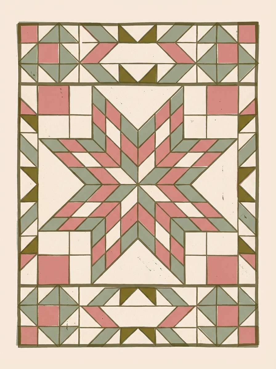
5) Vintage Quilt Patch
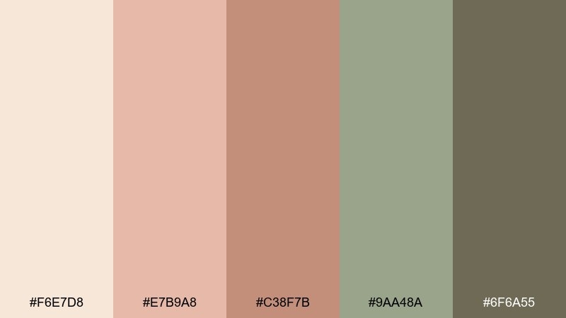
HEX: #f6e7d8 #e7b9a8 #c38f7b #9aa48a #6f6a55
Mood: nostalgic, crafted, soft
Best for: patchwork pattern poster design
Soft peach, faded khaki, and weathered sage recall a well-loved quilt folded at the end of a bed. The muted contrast makes it great for repeating patterns and large decorative blocks without visual fatigue. Pair the peach tones as the main tiles, then use the olive-khaki as the stitch-like outlines. Keep type minimal and let the pattern do the storytelling.
Image example of vintage quilt patch generated using media.io
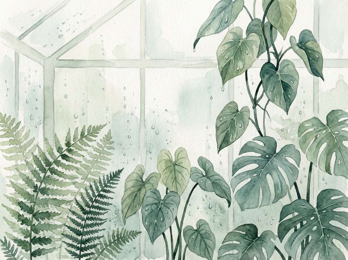
6) Rainy Greenhouse
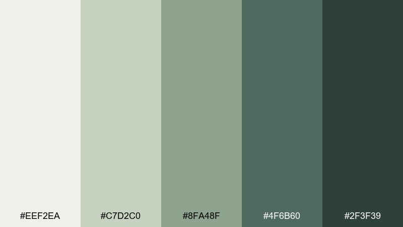
HEX: #eef2ea #c7d2c0 #8fa48f #4f6b60 #2f3f39
Mood: misty, quiet, botanical
Best for: watercolor botanical print
Misty greens and cool gray-cream feel like raindrops on greenhouse glass. The tonal range supports depth in leaves without needing bright accents. Use the palest shade as negative space, then layer mid greens for stems and shadows. A soft edge brush and light granulation will keep it airy rather than muddy.
Image example of rainy greenhouse generated using media.io
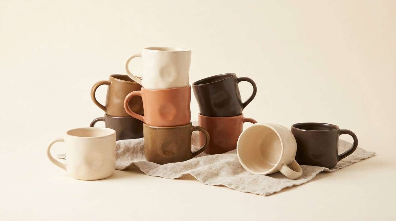
7) Baked Clay and Cream
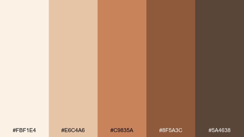
HEX: #fbf1e4 #e6c4a6 #c9835a #8f5a3c #5a4638
Mood: warm, handmade, grounded
Best for: handmade ceramics product ad
Warm clay tones and buttery cream evoke freshly fired pottery cooling on a wooden shelf. The palette reads premium when the darkest brown is used sparingly, like a signature stamp. Keep the background light and let the terracotta shade carry the hero product areas. Use soft directional lighting so the colors look tactile, not flat.
Image example of baked clay and cream generated using media.io
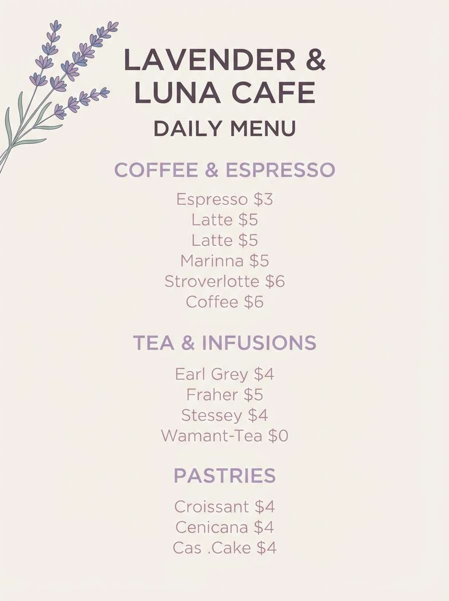
8) Lavender Milk Tea
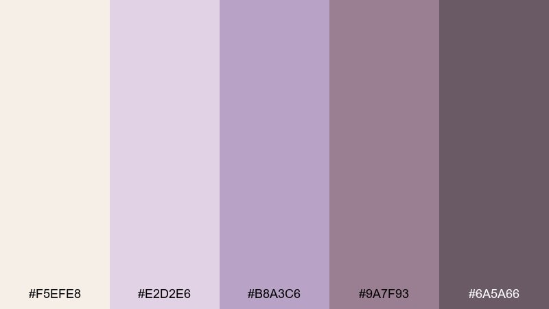
HEX: #f5efe8 #e2d2e6 #b8a3c6 #9a7f93 #6a5a66
Mood: soft, romantic, dreamy
Best for: cafe menu flyer design
Creamy lilac and dusty mauve feel like a quiet tea shop with dried lavender in small jars. The mid purple works well for section headers, while the deeper mauve grounds prices and fine print. For a cottagecore color palette that still feels modern, keep layouts minimal and lean on whitespace. Add one small floral illustration and let the gentle tones do the rest.
Image example of lavender milk tea generated using media.io
9) Golden Wheat Field
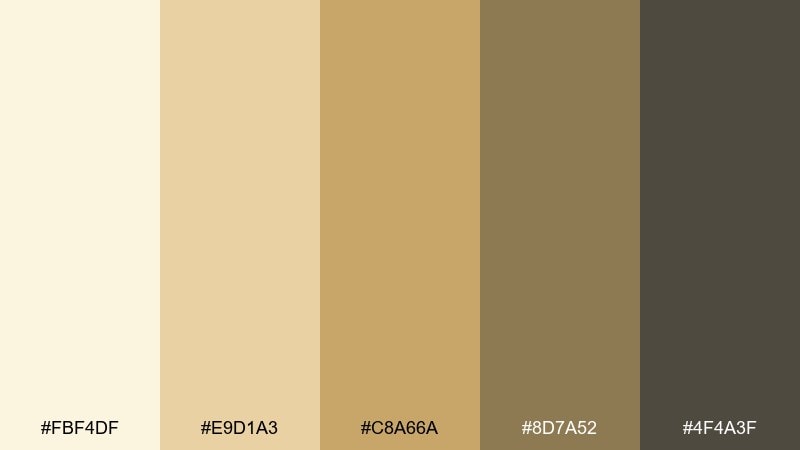
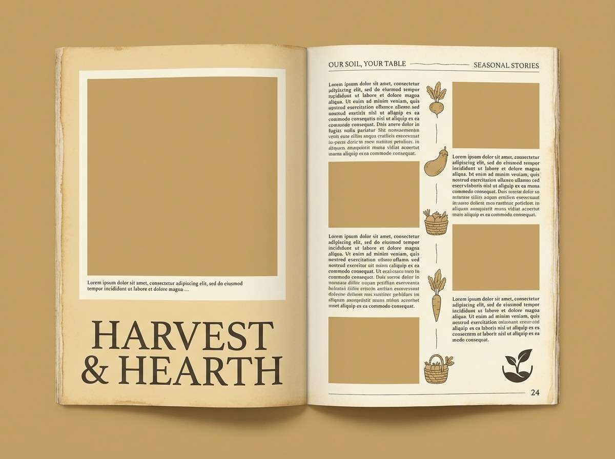
HEX: #fbf4df #e9d1a3 #c8a66a #8d7a52 #4f4a3f
Mood: sunlit, pastoral, steady
Best for: farm-to-table brand editorial spread
Sunlit wheat and toasted grain browns suggest harvest season and simple, honest meals. The warm neutrals make photography feel inviting while still leaving room for clear typography. Use the pale cream as page margins, then bring in the gold for pull quotes and callouts. Keep black to a minimum and use the deepest brown for body text instead.
Image example of golden wheat field generated using media.io
10) Apple Orchard Morning
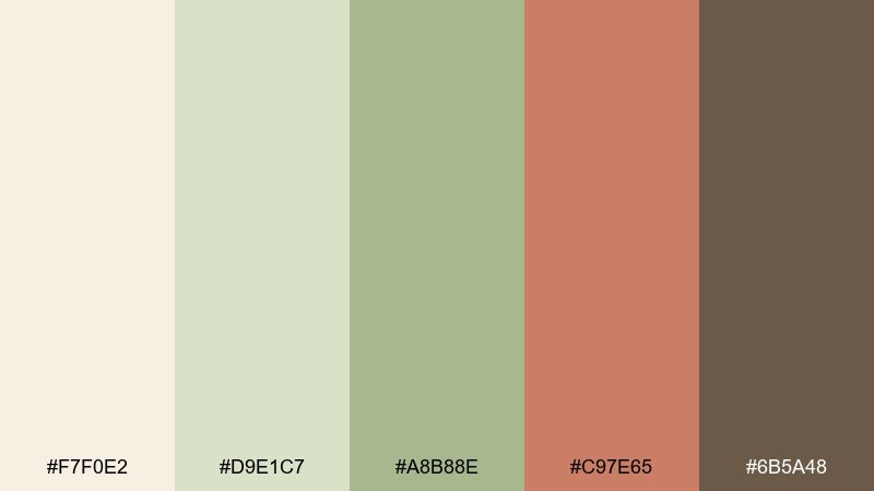
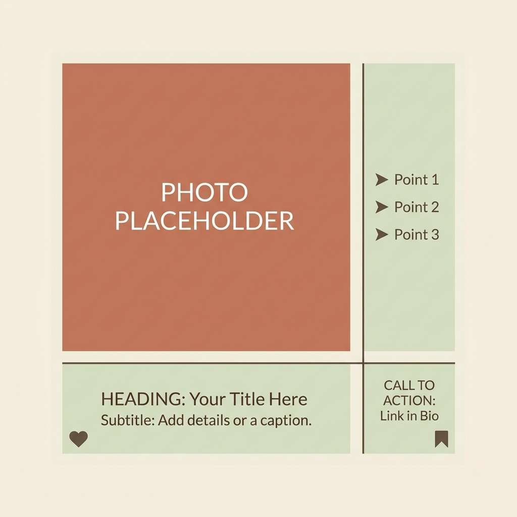
HEX: #f7f0e2 #d9e1c7 #a8b88e #c97e65 #6b5a48
Mood: fresh, friendly, rustic
Best for: instagram post template for a small farm shop
Fresh greens with a warm apple-skin accent feel like morning light in an orchard. The palette is versatile for social templates because it supports both photos and illustrated elements. Use the soft cream for margins and text blocks, then bring in the coral-brown for buttons or discount badges. Keep the deepest brown for type so captions stay readable over light imagery.
Image example of apple orchard morning generated using media.io
11) Dusty Blue Apron
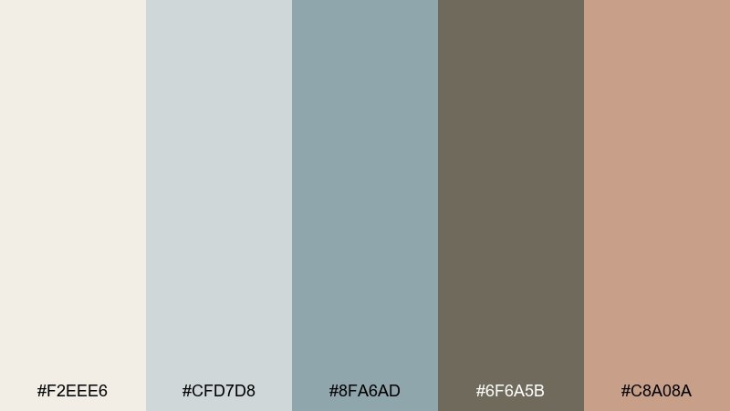
HEX: #f2eee6 #cfd7d8 #8fa6ad #6f6a5b #c8a08a
Mood: calm, clean, lived-in
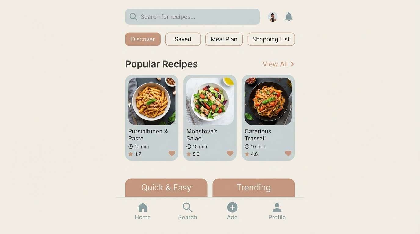
Best for: recipe app dashboard UI
Dusty blue-gray feels like a well-worn apron and enamelware drying on a rack. It brings a cooler note to warm neutrals, which is helpful for UI hierarchy and long reading sessions. Use the light gray as the main canvas, then apply the blue as navigation and selected states. Reserve the rosy tan for small highlights like ratings or saved icons to avoid overpowering the calm base.
Image example of dusty blue apron generated using media.io
12) Rosemary and Butter
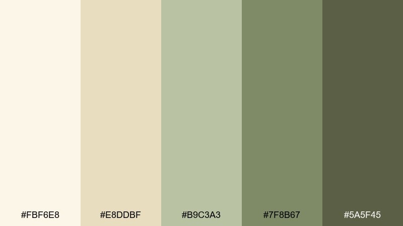
HEX: #fbf6e8 #e8ddbf #b9c3a3 #7f8b67 #5a5f45
Mood: comforting, fresh, understated
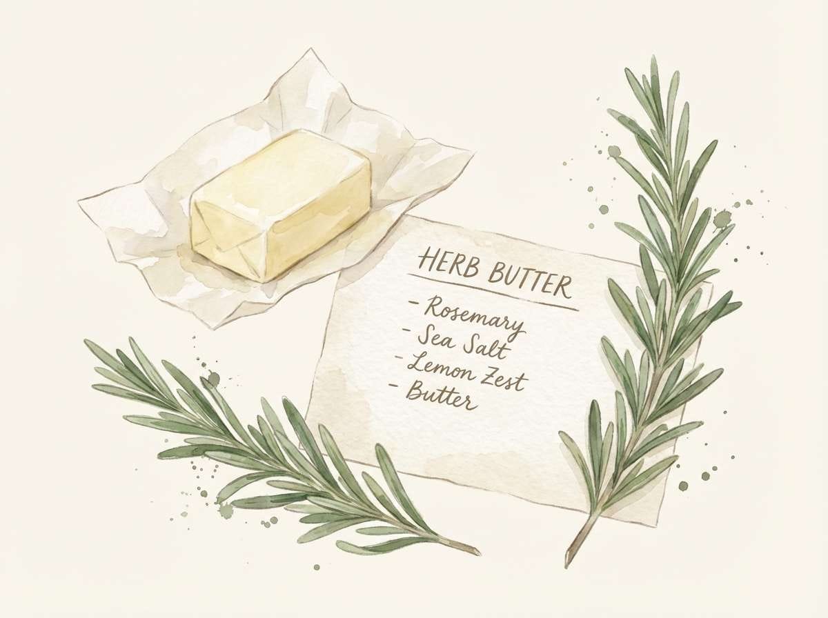
Best for: watercolor food illustration for a recipe card
Buttery cream with rosemary greens brings to mind a warm loaf, herb sprigs, and a well-used cutting board. The soft neutrals keep the look appetizing without turning overly saturated. Use the mid green for foliage and the deeper olive for shadows, letting the creams handle highlights. A light hand-lettered title pairs nicely with the homemade feel.
Image example of rosemary and butter generated using media.io
13) Sunlit Attic Books
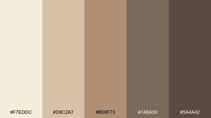
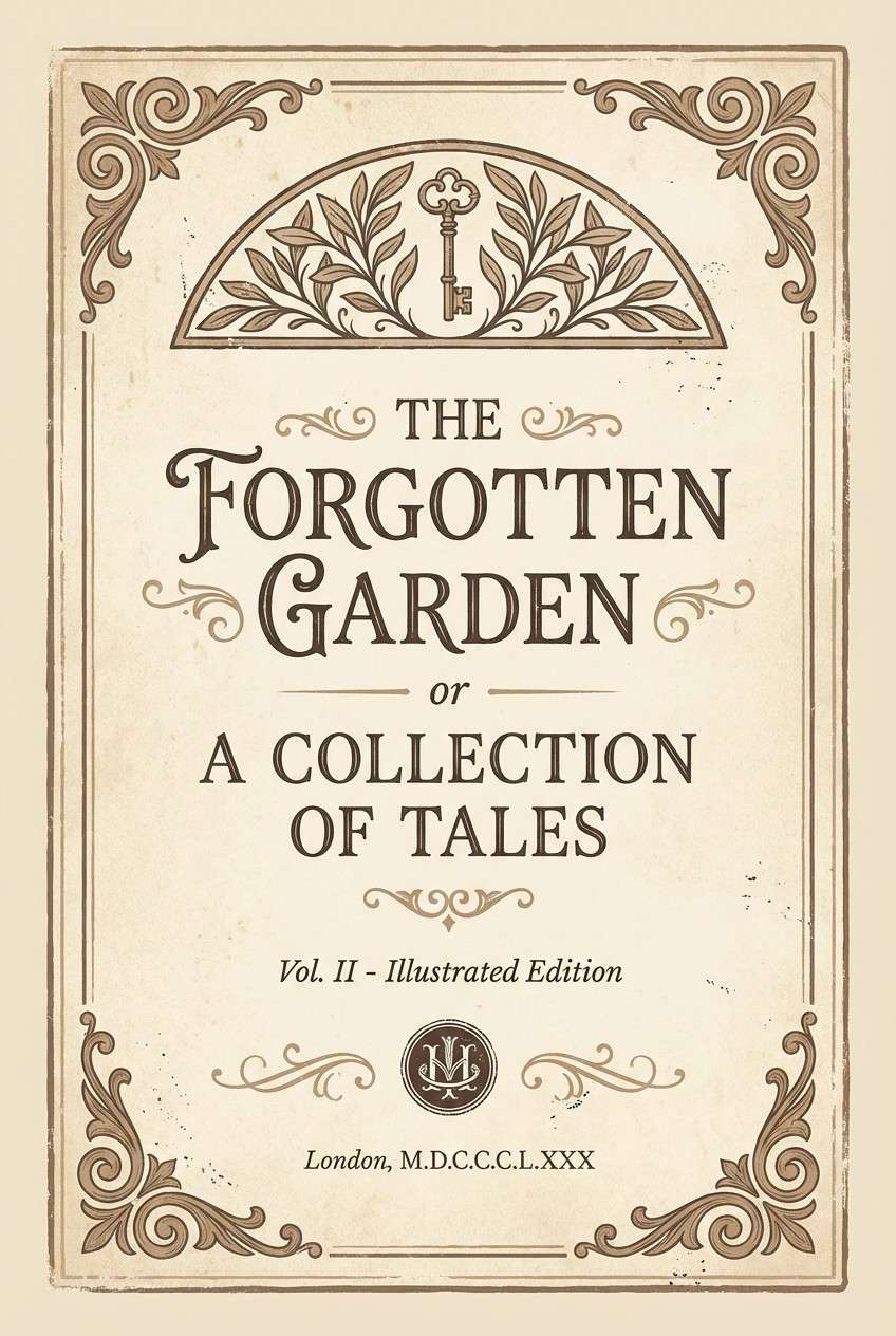
HEX: #f7eddc #d8c2a7 #b08f73 #7a6a59 #5a4a42
Mood: nostalgic, cozy, literary
Best for: vintage-inspired book cover design
Dusty parchment and worn leather browns feel like sunbeams across stacked attic books. The mid tan provides a strong focal tone without fighting the softer background. Use the darkest brown for the title and small ornament lines, then keep the rest tonal for a calm, collectible look. A subtle grain texture helps the colors feel printed rather than digital.
Image example of sunlit attic books generated using media.io
14) Pond Lily Pastels
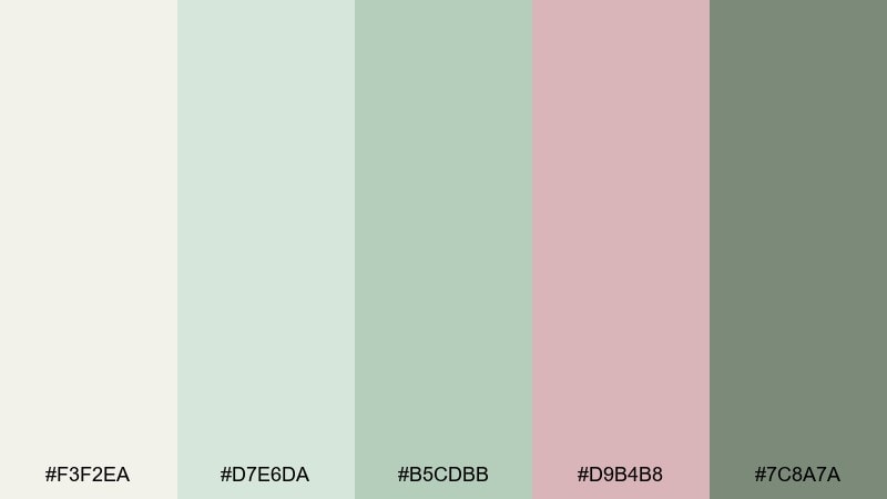
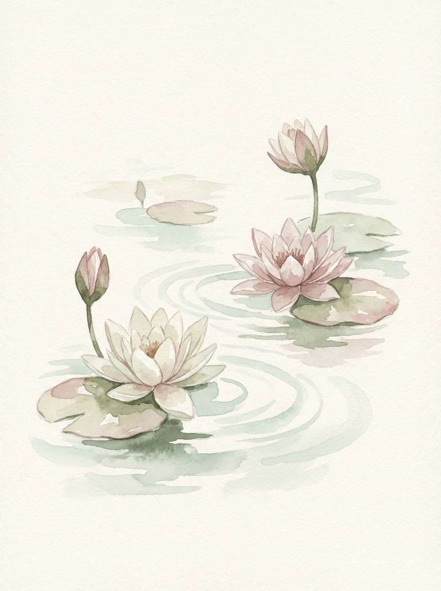
HEX: #f3f2ea #d7e6da #b5cdbb #d9b4b8 #7c8a7a
Mood: soft, watery, peaceful
Best for: watercolor pond lily print
Watery greens and a blush petal pink evoke lilies drifting on a quiet pond. The palette stays gentle even when layered, making it great for botanical studies and spring prints. Use the pale cream as paper tone, then build leaves with the two greens and add blush sparingly for blooms. Keep edges loose so the scene feels airy and natural.
Image example of pond lily pastels generated using media.io
15) Sepia Cottage Photo
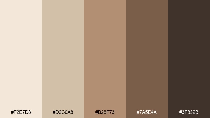
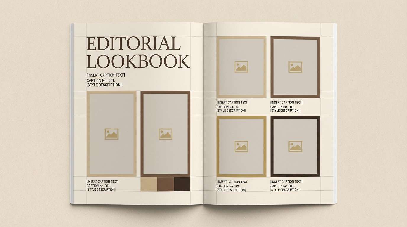
HEX: #f2e7d8 #d2c0a8 #b28f73 #7a5e4a #3f332b
Mood: heritage, warm, timeless
Best for: brand lookbook editorial layout
Sepia browns and aged paper cream feel like a family photo album from a small countryside cottage. These cottagecore color combinations shine in lookbooks where type, margins, and image frames need to feel classic. Use the light cream for the page, the mid tan for captions, and the darkest brown for headlines. Add thin rules and plenty of breathing room to keep the vintage mood refined.
Image example of sepia cottage photo generated using media.io
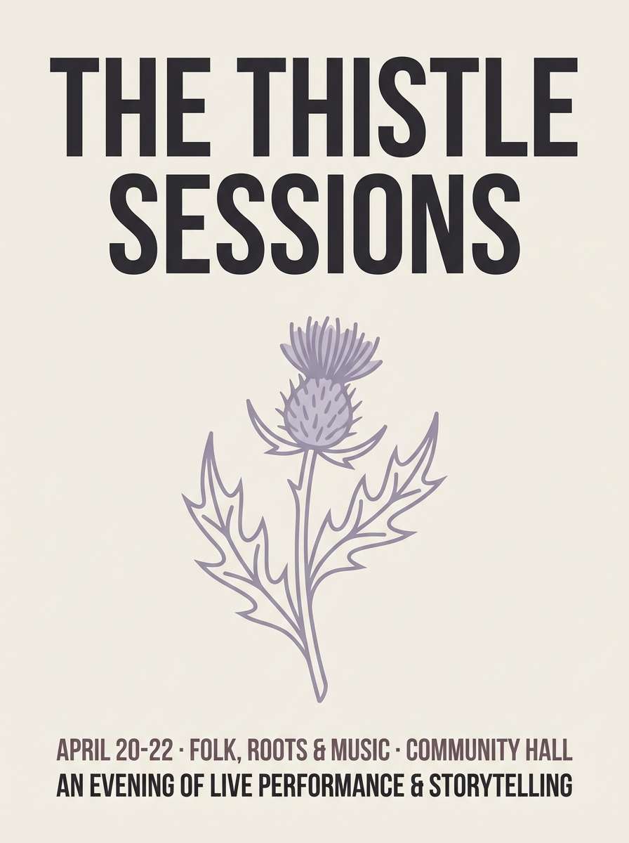
16) Thistle and Dusk
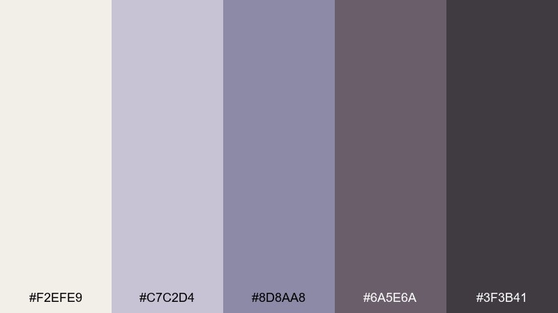
HEX: #f2efe9 #c7c2d4 #8d8aa8 #6a5e6a #3f3b41
Mood: moody, delicate, twilight
Best for: folk concert poster design
Soft lavender-grays and dusk charcoal suggest thistles silhouetted against an evening sky. The palette feels calm but not overly sweet, making it great for posters and cultural events. Use the charcoal for typography, then let the pale neutrals and muted purple handle blocks and shapes. A simple grain and a few line-drawn botanical elements will keep it atmospheric.
Image example of thistle and dusk generated using media.io
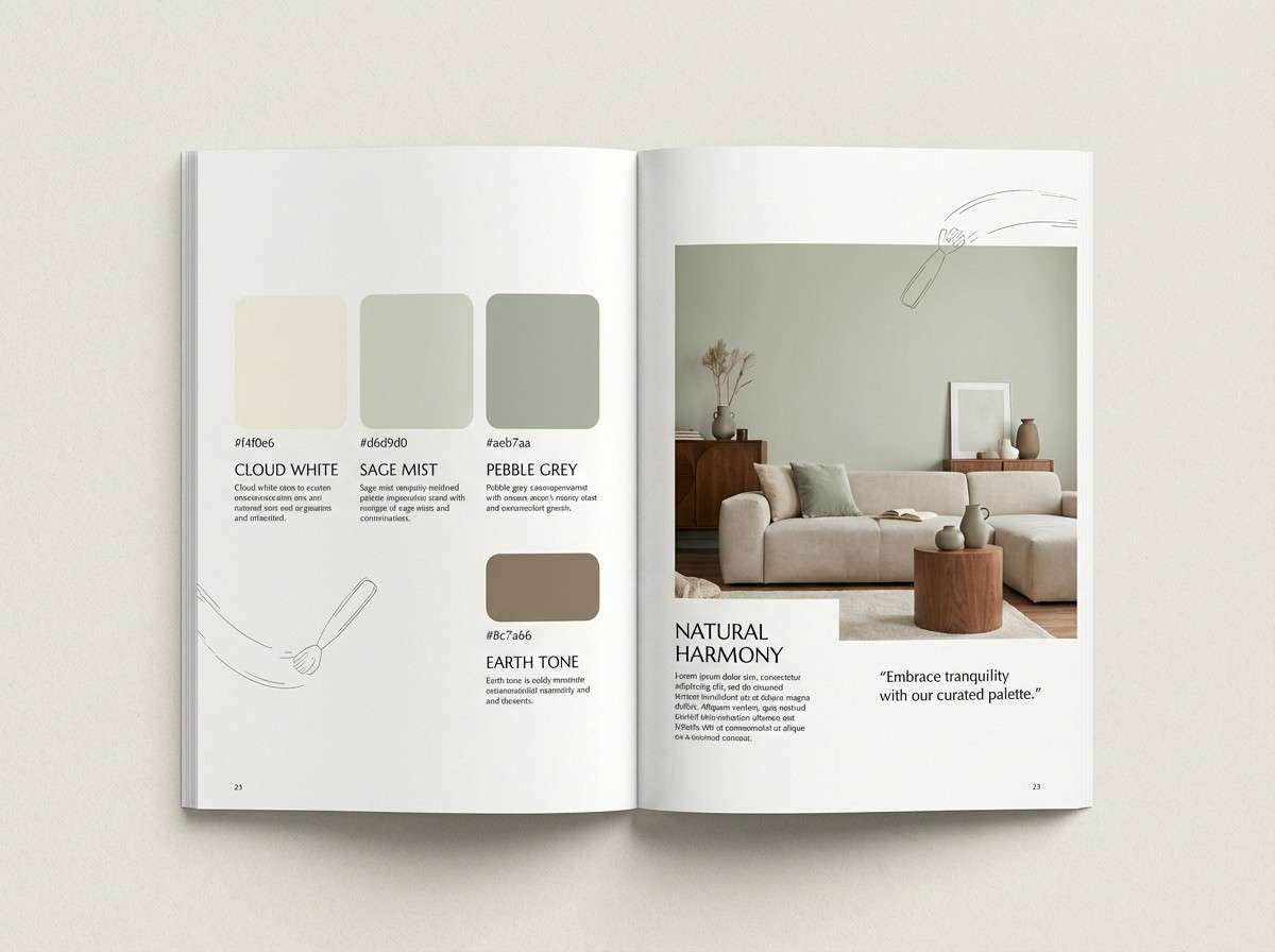
17) Milkpaint Porch
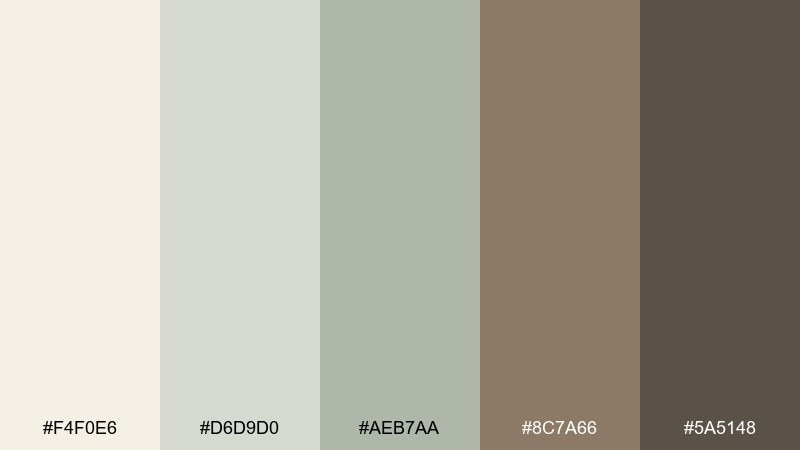
HEX: #f4f0e6 #d6d9d0 #aeb7aa #8c7a66 #5a5148
Mood: weathered, calm, practical
Best for: interior paint brochure spread
Weathered porch neutrals feel like milkpainted wood, soft shadows, and old wicker chairs. The gray-greens keep things clean, while the warm taupe prevents the set from going cold. Use the lightest cream as the page base and the mid gray-green for swatches and headings. Add a single warm accent block to highlight the hero paint name or collection.
Image example of milkpaint porch generated using media.io
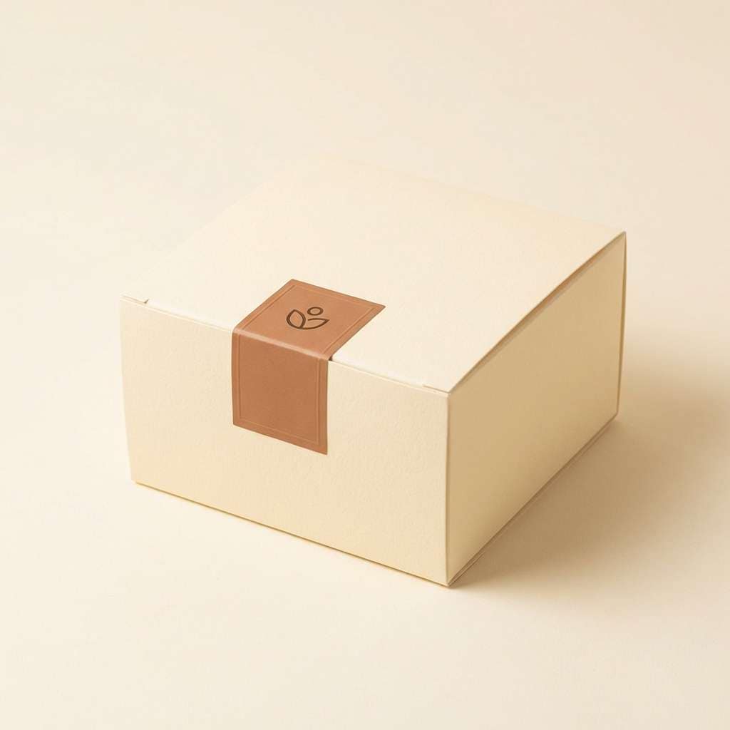
18) Pear Tart Picnic
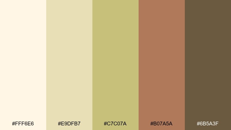
HEX: #fff6e6 #e9dfb7 #c7c07a #b07a5a #6b5a3f
Mood: cheerful, cozy, appetizing
Best for: bakery box packaging mockup
Cream, pear-gold, and warm caramel bring to mind a picnic blanket and a tart cooling by the window. The palette is sweet without looking candy-bright, which helps artisan packaging feel elevated. Use the cream as the box base, then apply pear-gold for pattern blocks and the caramel for the logo. Keep the dark olive-brown for small text so the overall look stays light.
Image example of pear tart picnic generated using media.io
19) Forest Path Candlelight
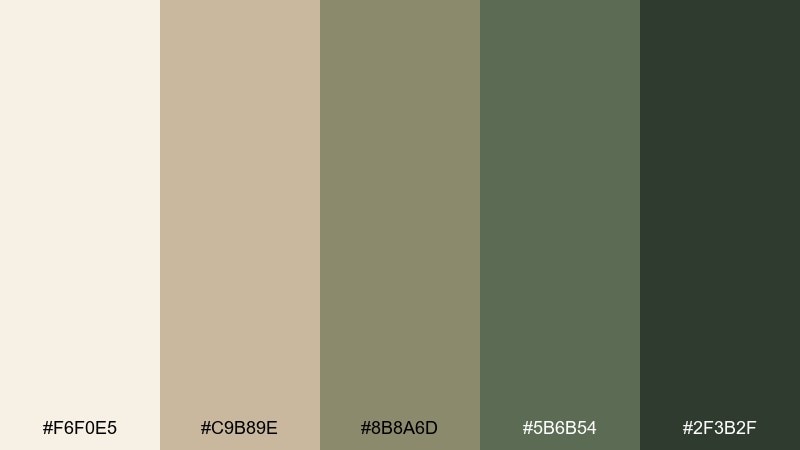
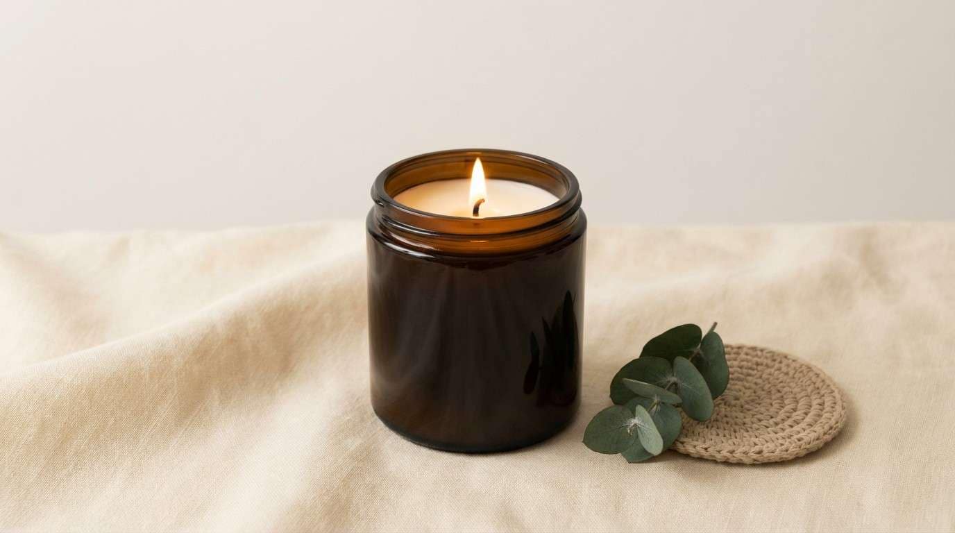
HEX: #f6f0e5 #c9b89e #8b8a6d #5b6b54 #2f3b2f
Mood: cozy, woodsy, intimate
Best for: soy candle product ad
Woodsy greens and muted tans feel like a forest path lit by a small candle in a lantern. These cottagecore color combinations create a natural, premium mood for product ads, especially with soft shadows. Use the cream as negative space, then choose the deep green for brand type and the mossy green for secondary labels. One tip: keep highlights warm and subtle so the palette stays inviting rather than stark.
Image example of forest path candlelight generated using media.io
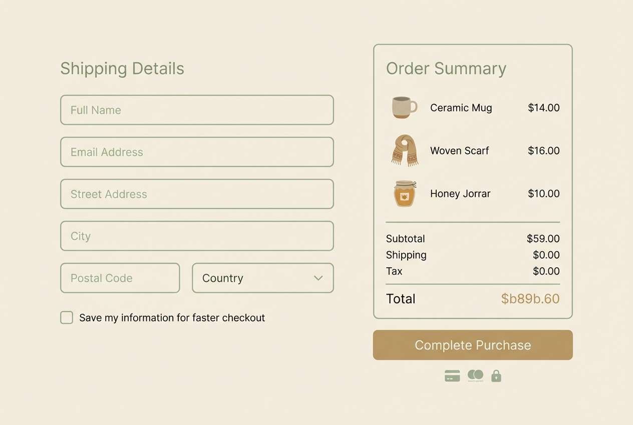
20) Heirloom Brass and Sage
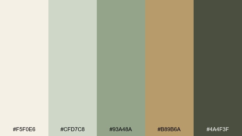
HEX: #f5f0e6 #cfd7c8 #93a48a #b89b6a #4a4f3f
Mood: heritage, clean, softly luxe
Best for: artisan shop checkout UI
Muted sage with a hint of heirloom brass suggests old tools, warm lamplight, and careful craft. The brass tone makes a refined accent for CTAs without feeling too flashy. Use the pale cream as the main surface, sage for fields and panels, and the deep olive for text and icon strokes. Keep the brass limited to one primary action so the interface stays calm and trustworthy.
Image example of heirloom brass and sage generated using media.io
What Colors Go Well with Cottagecore?
Cottagecore pairs beautifully with soft neutrals (cream, oatmeal, warm beige) because they mimic natural fibers and keep the mood light. These tones also make stronger accents—like terracotta or dusty rose—feel more refined.
Greens are the easiest “core” companion: sage, moss, olive, and eucalyptus all read botanical without becoming loud. If you want more contrast, use deep forest green or charcoal-brown instead of pure black.
For a slightly more modern cottagecore look, add a cool whisper tone—dusty blue-gray or lavender-gray—while keeping saturation low so everything still feels pastoral.
How to Use a Cottagecore Color Palette in Real Designs
Start with a creamy base as your main background, then choose one mid-tone (sage, wheat, or tan) for large surfaces like cards, panels, or big shapes. This keeps the design breathable and prevents the palette from turning muddy.
Use the darkest shade for text and anchors (headlines, nav, borders) to maintain readability while staying softer than black. Reserve the warm accent—rose, clay, brass—for small moments like buttons, badges, or icons.
If you’re working with photography, apply these colors as frames, overlays, or label blocks, and add subtle texture (paper grain, watercolor wash) to reinforce the handmade cottagecore aesthetic.
Create Cottagecore Palette Visuals with AI
If you have a palette but need matching visuals (posters, UI mockups, packaging, or prints), an AI image generator helps you explore styles quickly without starting from scratch.
Copy one of the prompts above, keep the HEX colors inside the prompt, and adjust only the subject (invite, menu, label, or UI). You’ll get consistent cottagecore tones across a whole set of assets.
With Media.io, you can generate, iterate, and download variations directly in your browser—ideal for building a cohesive brand moodboard fast.
Cottagecore Color Palette FAQs
-
What are cottagecore colors?
Cottagecore colors are muted, nature-inspired tones like cream, warm beige, sage green, olive, dusty rose, terracotta, and soft browns—often with a slightly vintage, sun-faded feel. -
Is sage green a cottagecore color?
Yes. Sage green is one of the most recognizable cottagecore colors because it feels botanical, calm, and easy to pair with warm neutrals like linen, butter-cream, and tan. -
How do I keep a cottagecore palette from looking dull?
Use one deeper anchor (forest green, charcoal-brown, or deep mauve) for text and contrast, and add a small warm accent (clay, rose, or brass) for focal points while keeping most backgrounds light. -
What’s a good cottagecore palette for branding?
Try a cream base + sage mid-tone + warm accent like dusty rose or brass, with a dark olive/brown for type. It feels handmade and trustworthy without looking overly themed. -
What cottagecore colors work best for UI design?
Soft creams and gray-greens are ideal for large surfaces, while deeper greens or browns work for navigation and text. Keep accents limited to key actions to maintain a calm interface. -
Can I mix cottagecore with modern styles?
Yes—keep the palette muted and use modern layout choices like clean grids, generous whitespace, and minimal typography. Dusty blue-gray or lavender-gray can add a modern edge while staying cozy. -
How can I generate cottagecore images that match my HEX codes?
Use a text-to-image prompt that includes your subject, style (watercolor, print, flat UI), and your HEX codes as dominant colors and accents. Generating multiple variations helps you lock in a consistent look.