

Cinematic color palettes are built for emotion: deep shadows, intentional contrast, and a “graded” look that feels like a film still.
Below are 20+ cinematic color palette ideas with HEX codes, plus practical tips and AI prompts you can use for posters, UI, packaging, and branding.
In this article
- Why Cinematic Palettes Work So Well
-
- neon noir alley
- golden hour drama
- desert western reel
- deep sea suspense
- velvet curtain romance
- frosted sci fi
- rainy street reflections
- vintage film stock
- midnight carnival
- emerald shadow woods
- sunlit studio minimal
- cosmic purple fade
- rust and steel action
- pastel dream montage
- smoke and whiskey
- coral reef adventure
- autumn roadtrip
- monochrome thriller
- sapphire and sand
- rose gold premiere
- paper lantern night
- What Colors Go Well with Cinematic?
- How to Use a Cinematic Color Palette in Real Designs
- Create Cinematic Palette Visuals with AI
Why Cinematic Palettes Work So Well
Cinematic palettes work because they mimic film color grading: shadows are richer, highlights are controlled, and midtones are pushed toward a “signature” hue (teal, amber, purple, or olive).
They also create instant hierarchy. A dark base color holds negative space, a soft neutral supports readability, and one or two accents pull focus to titles, CTAs, or key objects.
Most importantly, cinematic colors feel intentional. Even simple layouts look premium when contrast, saturation, and warmth/cool balance are designed like a scene.
20+ Cinematic Color Palette Ideas (with HEX Codes)
1) Neon Noir Alley
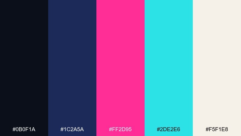
HEX: #0B0F1A #1C2A5A #FF2D95 #2DE2E6 #F5F1E8
Mood: neon, noir, electric
Best for: movie poster typography on a plain background
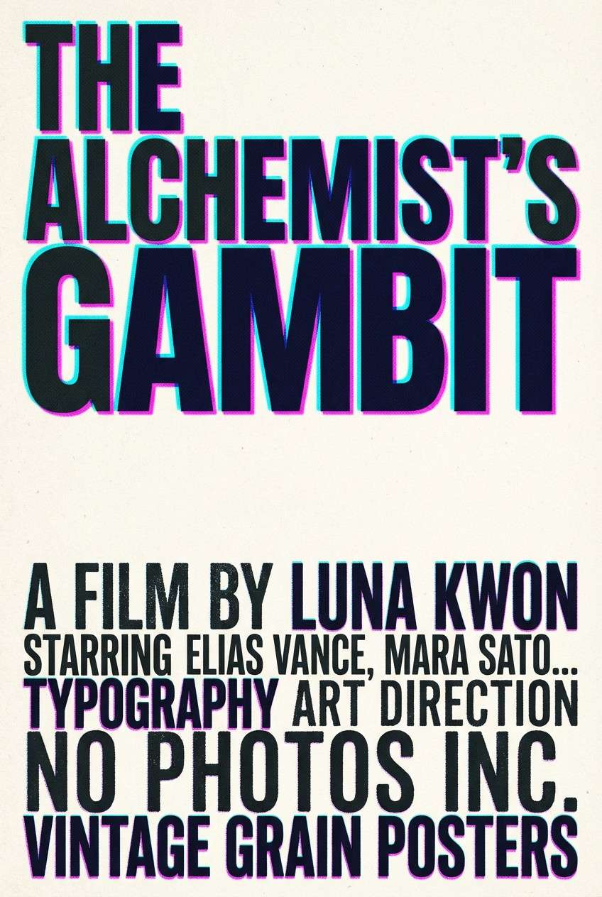
Electric neon against deep night feels like rain-slick streets and buzzing signs. Use the near-black and navy for large negative space, then let magenta and cyan carry titles or key shapes. Pair with condensed sans fonts and high-contrast grain for a gritty finish. Tip: keep cyan as the secondary accent so the magenta stays the hero.
Image example of neon noir alley generated using media.io
Media.io is an online AI studio for creating and editing video, image, and audio in your browser.

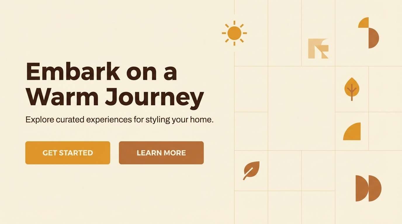
2) Golden Hour Drama
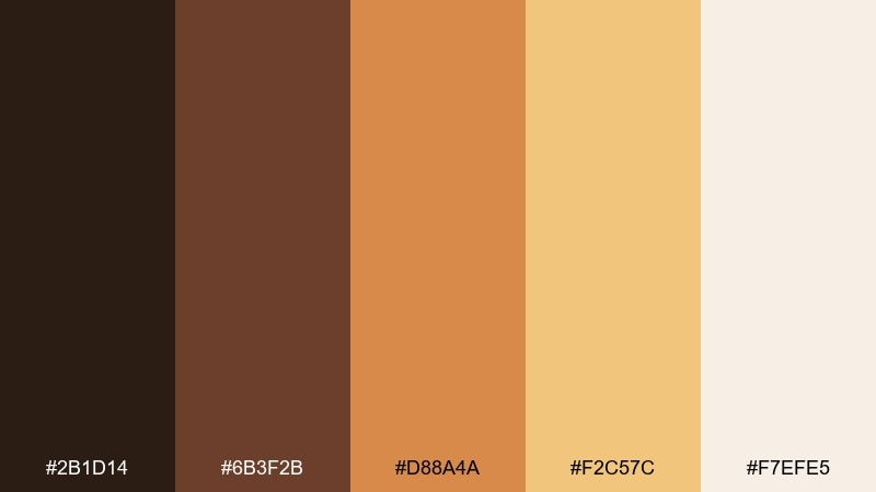
HEX: #2B1D14 #6B3F2B #D88A4A #F2C57C #F7EFE5
Mood: warm, nostalgic, luminous
Best for: brand landing page hero UI mockup
Warm amber light and toasted browns evoke late-day sun spilling over a quiet set. This cinematic color scheme works beautifully for lifestyle brands, film portfolios, and premium newsletters where warmth signals trust. Pair the light cream with dark espresso text for readability, then use amber for one primary button. Tip: reserve the brightest gold for hover and micro-interactions to avoid a washed look.
Image example of golden hour drama generated using media.io
3) Desert Western Reel
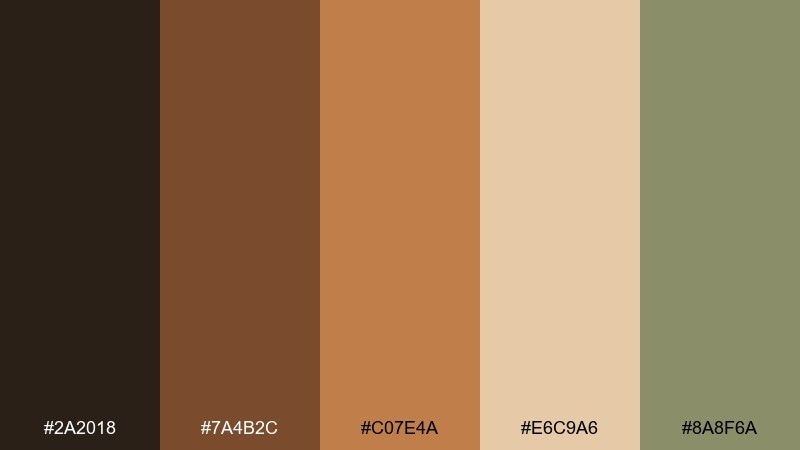
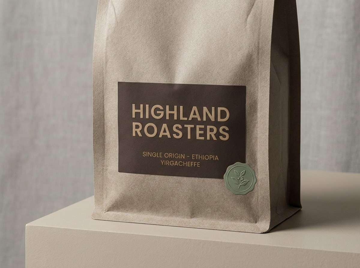
HEX: #2A2018 #7A4B2C #C07E4A #E6C9A6 #8A8F6A
Mood: dusty, rugged, sunbaked
Best for: product packaging for artisanal coffee
Dusty browns and sand tones feel like heat haze, leather, and wide open roads. Use the dark brown for the label base, then layer tan and sandstone for typography blocks and texture. The muted sage works as a subtle stamp color for origin notes or icons. Tip: add a tiny amount of grain to the tan areas so the palette stays tactile, not flat.
Image example of desert western reel generated using media.io
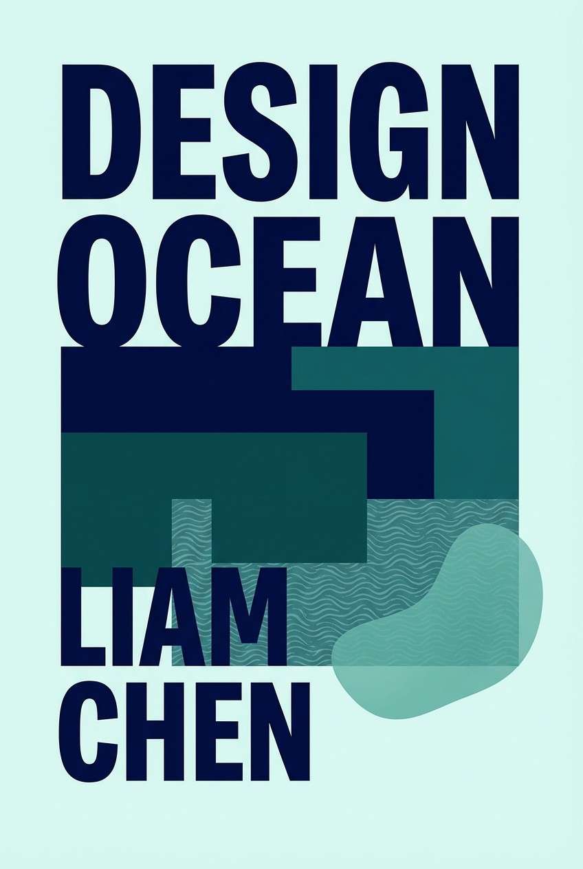
4) Deep Sea Suspense
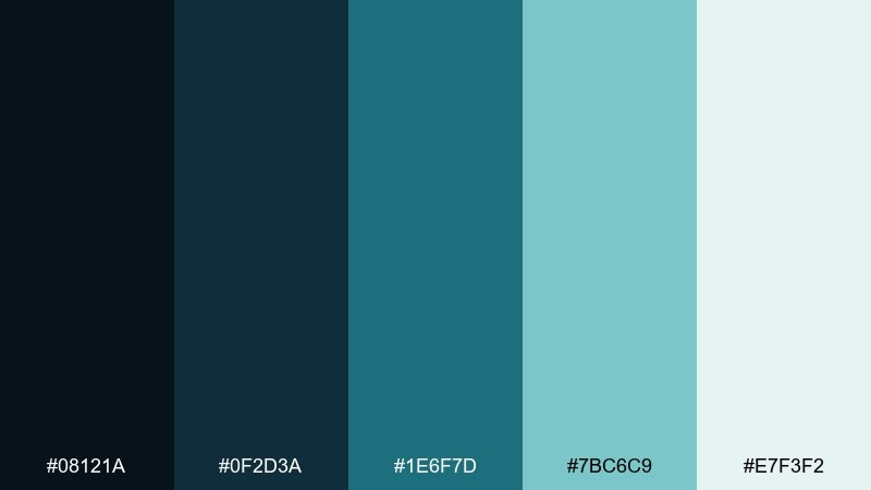
HEX: #08121A #0F2D3A #1E6F7D #7BC6C9 #E7F3F2
Mood: tense, cool, submerged
Best for: thriller book cover design on plain background
Inky depths and teal currents create a claustrophobic, underwater tension. Let the darkest tones hold the title block, then use sea-glass teal for a single focal shape or underline. Pale misty aqua can soften secondary text without breaking the chill. Tip: keep contrast high by placing small light text only on the two darkest swatches.
Image example of deep sea suspense generated using media.io
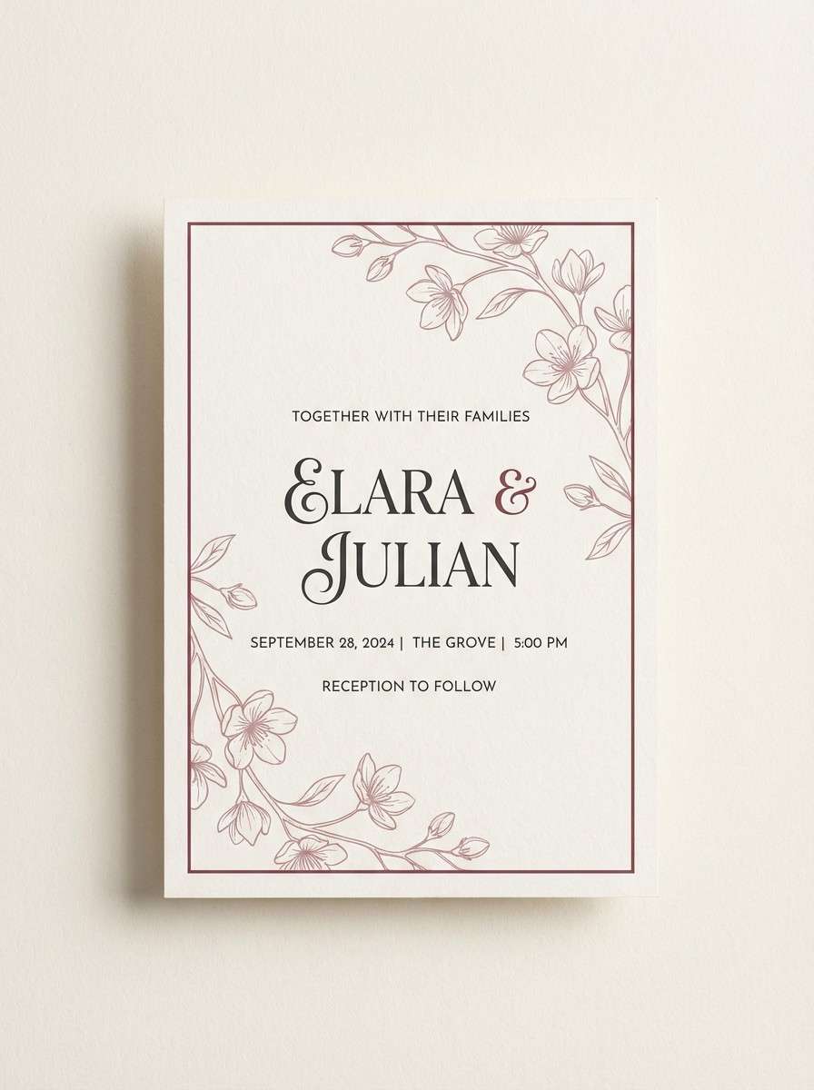
5) Velvet Curtain Romance
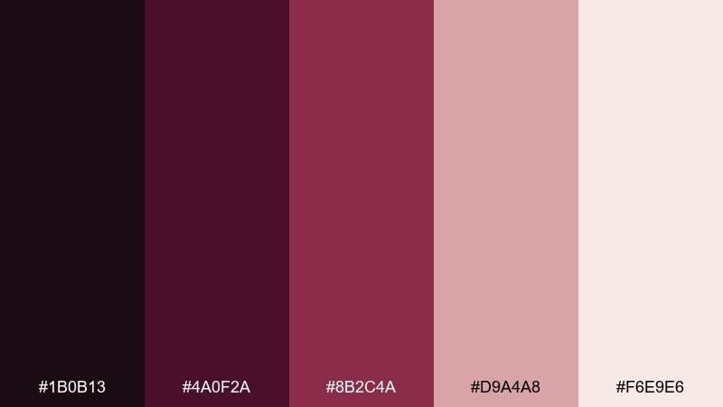
HEX: #1B0B13 #4A0F2A #8B2C4A #D9A4A8 #F6E9E6
Mood: romantic, theatrical, plush
Best for: wedding invitation suite
Plush burgundy and rose blush feel like velvet curtains and soft stage light. Use the near-black wine for elegant type, then bring in dusty rose for borders and monograms. The pale cream keeps the layout airy and print-friendly. Tip: foil-stamp the mid-rose tone for a luxe look without overpowering the text.
Image example of velvet curtain romance generated using media.io
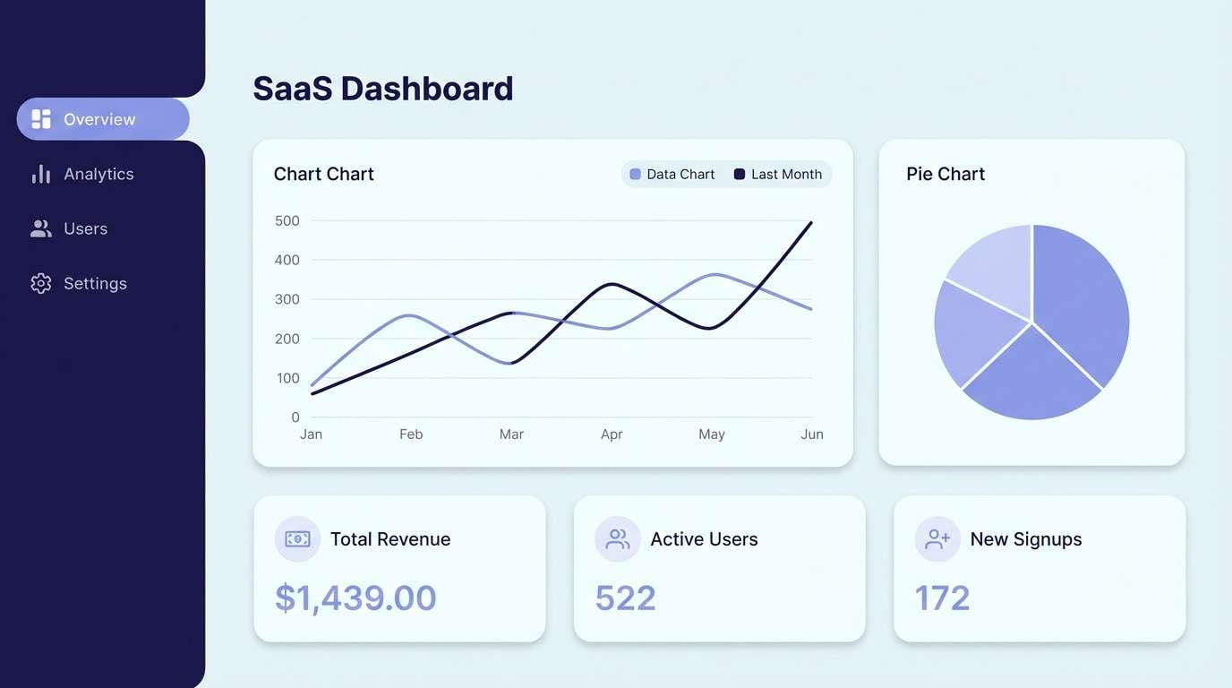
6) Frosted Sci Fi
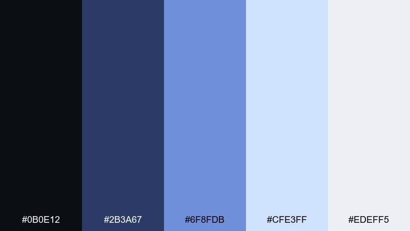
HEX: #0B0E12 #2B3A67 #6F8FDB #CFE3FF #EDEFF5
Mood: futuristic, crisp, icy
Best for: SaaS dashboard UI mockup
Icy blues and midnight ink evoke starship corridors and clean holographic panels. Use the off-white and pale ice as surfaces, with indigo for navigation and structure. The bright periwinkle reads as an energetic status color for charts and badges. Tip: keep gradients subtle and short so the interface stays sharp rather than dreamy.
Image example of frosted sci fi generated using media.io
7) Rainy Street Reflections
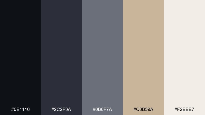
HEX: #0E1116 #2C2F3A #6B6F7A #C8B59A #F2EEE7
Mood: moody, urban, reflective
Best for: editorial magazine layout
Charcoal and foggy gray feel like streetlights bouncing off wet pavement. This cinematic color palette is strong for long-form editorial, architecture features, and minimalist lookbooks. Use warm beige for pull quotes and section dividers to keep pages from going cold. Tip: set body text in dark charcoal rather than pure black for a softer print finish.
Image example of rainy street reflections generated using media.io
8) Vintage Film Stock
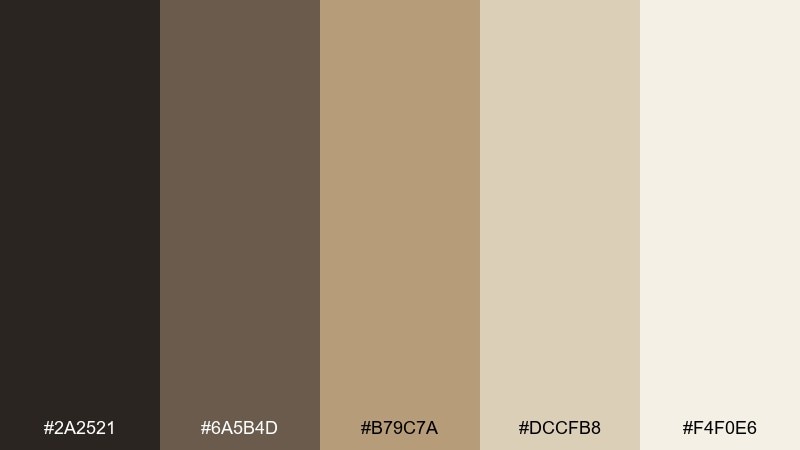
HEX: #2A2521 #6A5B4D #B79C7A #DCCFB8 #F4F0E6
Mood: retro, soft, timeless
Best for: photo preset landing page UI mockup
Warm taupe and faded tan evoke aged negatives and soft grain. Use the mid-tan as the primary brand color, then ground the layout with a deep espresso for headings and buttons. The light cream reads like matte paper, perfect for a subtle background. Tip: add a gentle vignette effect in mockups to reinforce the vintage feel without darkening the whole page.
Image example of vintage film stock generated using media.io
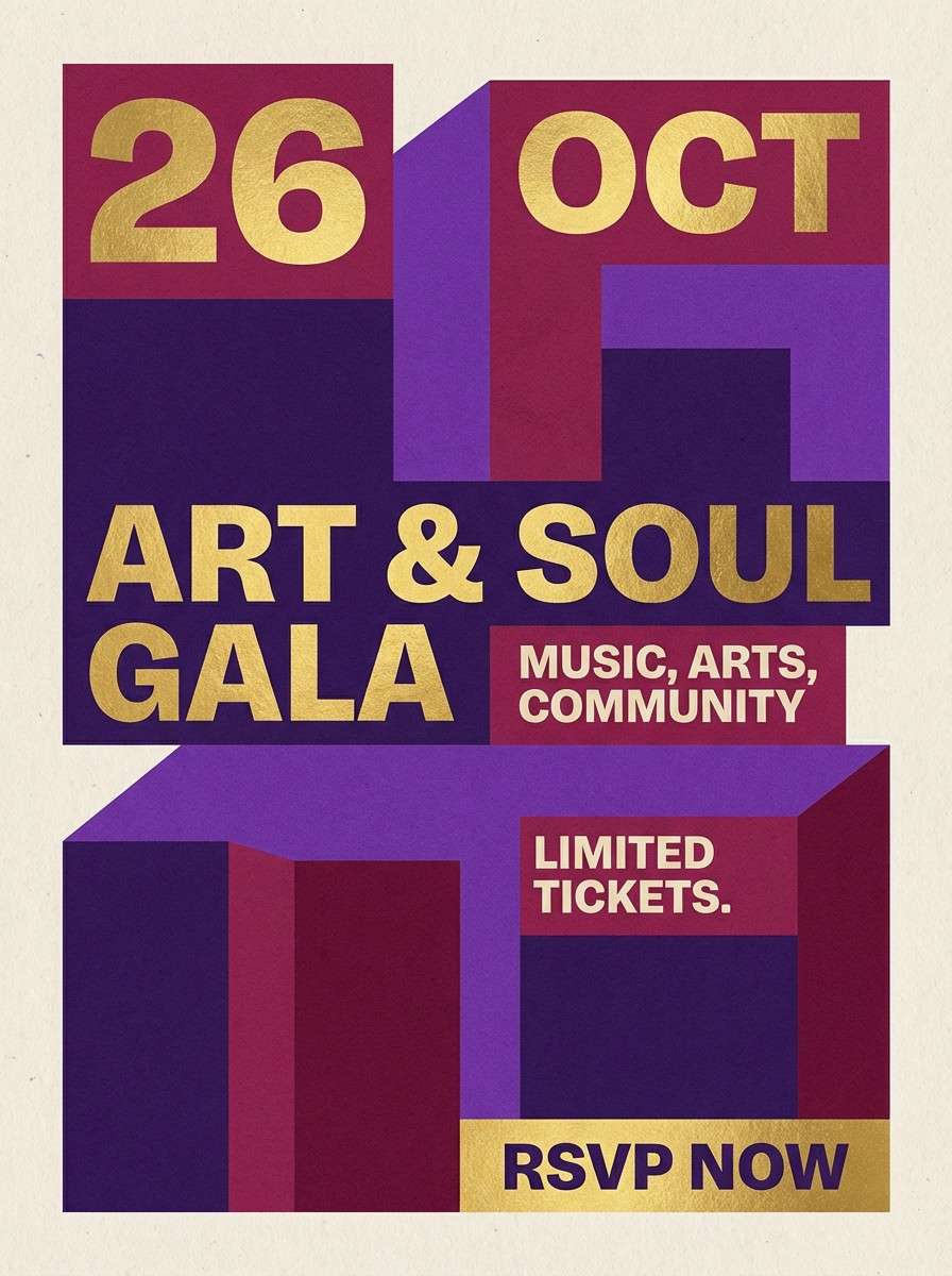
9) Midnight Carnival
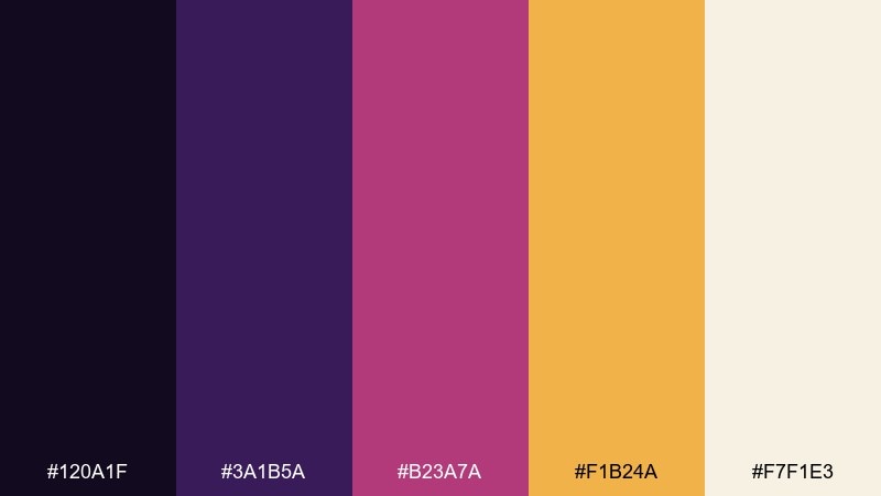
HEX: #120A1F #3A1B5A #B23A7A #F1B24A #F7F1E3
Mood: whimsical, bold, night-lit
Best for: event flyer graphic design
Deep purple and hot berry feel like fairground lights glowing after dark. Use the midnight tone for the background, then let gold act as the spotlight for dates and ticket info. Berry and violet make lively headers and graphic shapes without going neon. Tip: keep the cream for small text blocks so legibility stays high on a dark flyer.
Image example of midnight carnival generated using media.io
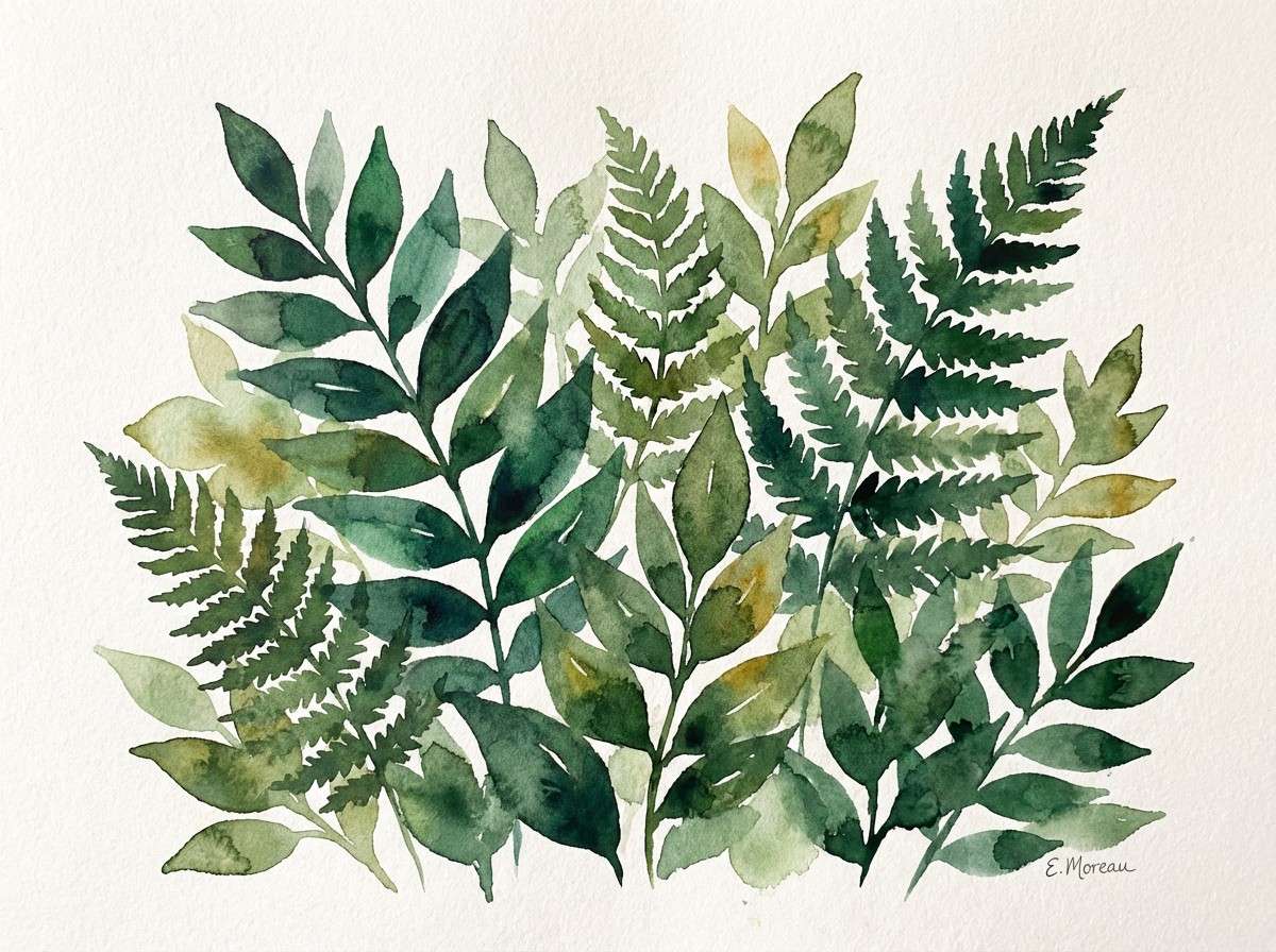
10) Emerald Shadow Woods
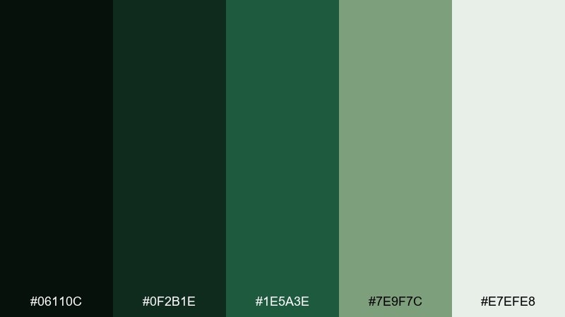
HEX: #06110C #0F2B1E #1E5A3E #7E9F7C #E7EFE8
Mood: mysterious, earthy, quiet
Best for: botanical watercolor illustration
Deep greens and soft moss feel like a forest path fading into shadow. Use the darkest green for silhouettes and linework, then layer mid-emerald washes for depth. Pale mint works beautifully as negative space around leaves and petals. Tip: keep the mossy green slightly desaturated so the illustration stays natural, not neon.
Image example of emerald shadow woods generated using media.io
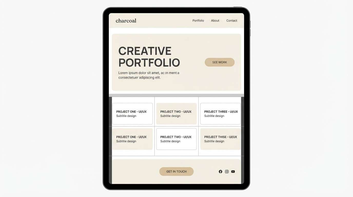
11) Sunlit Studio Minimal
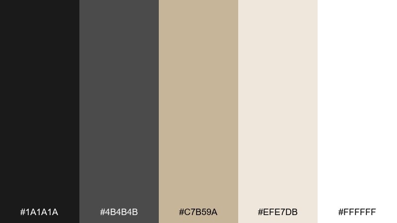
HEX: #1A1A1A #4B4B4B #C7B59A #EFE7DB #FFFFFF
Mood: clean, modern, airy
Best for: portfolio website UI mockup
Soft beige and bright white feel like sunlight in a quiet studio. Use charcoal for navigation and body text, then bring the warm sand tone into buttons, tags, or section headers. The palette stays neutral while still feeling premium and human. Tip: use the gray sparingly for dividers so the layout keeps its calm, open look.
Image example of sunlit studio minimal generated using media.io
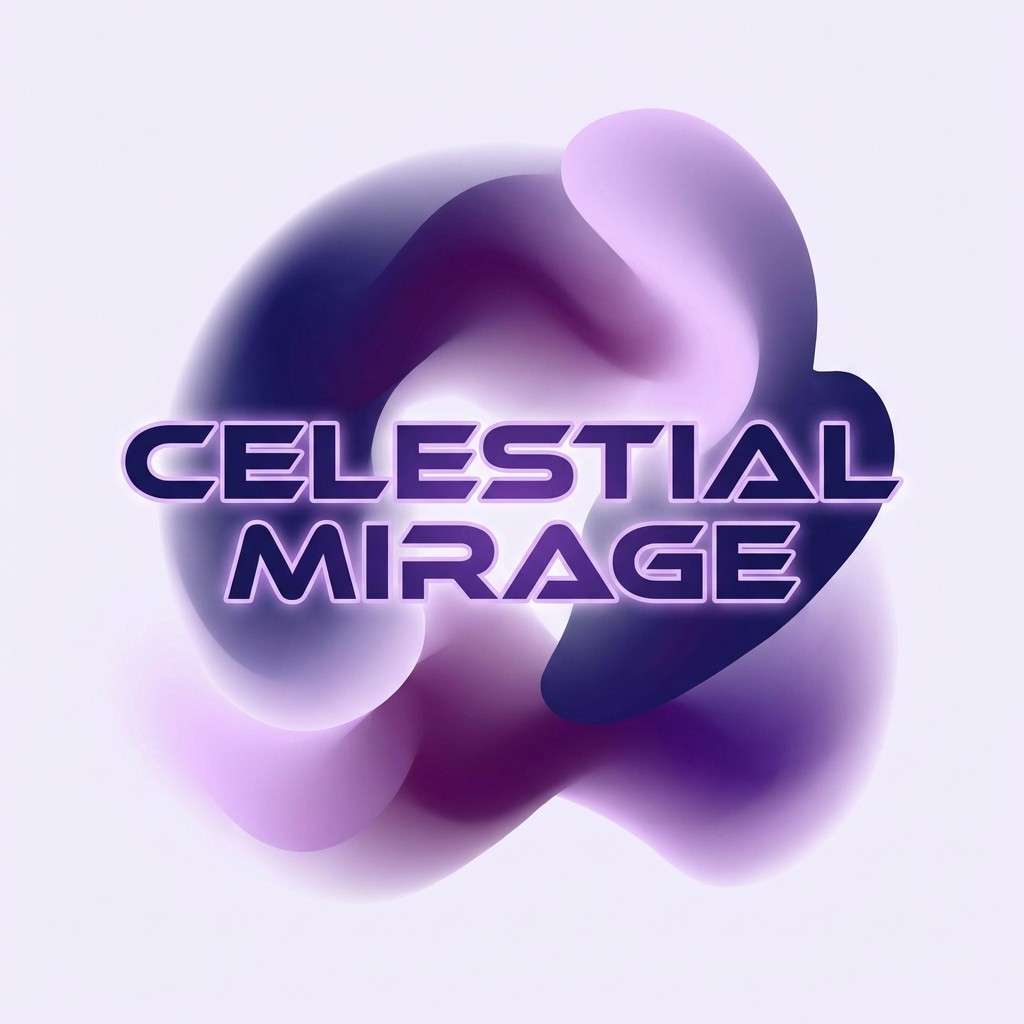
12) Cosmic Purple Fade
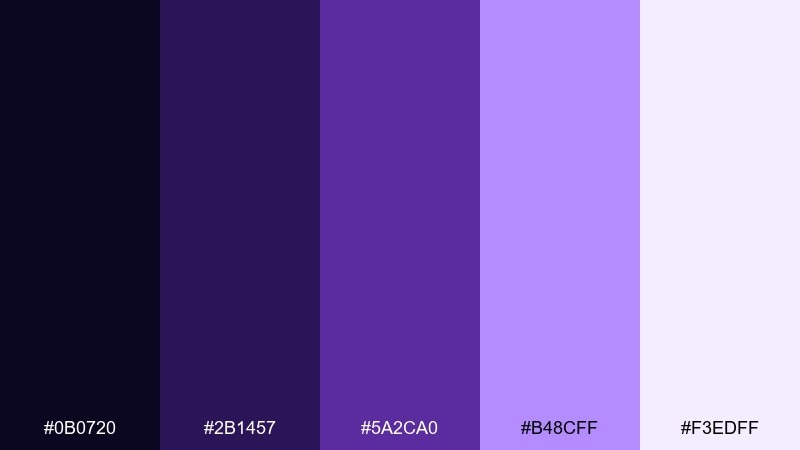
HEX: #0B0720 #2B1457 #5A2CA0 #B48CFF #F3EDFF
Mood: dreamy, cosmic, intense
Best for: album cover graphic design
Velvety purples and lavender glow evoke nebula haze and slow-motion wonder. These cinematic color combinations shine on album art, streaming thumbnails, and creator branding where you want a bold identity. Pair the deepest indigo with large type, then use lilac as a luminous gradient edge or highlight. Tip: keep one big dark area for contrast so the glow does not overwhelm the composition.
Image example of cosmic purple fade generated using media.io
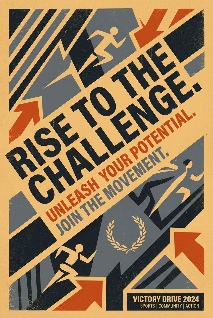
13) Rust and Steel Action
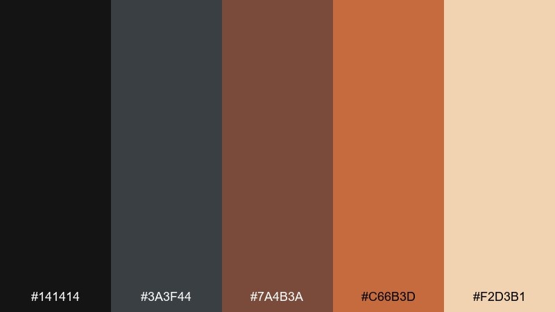
HEX: #141414 #3A3F44 #7A4B3A #C66B3D #F2D3B1
Mood: gritty, industrial, energetic
Best for: sports campaign poster design
Dark steel and rust orange feel like sparks, concrete, and high-impact motion. Use the charcoal and slate for big blocks, then hit key words with bright rust for urgency. The warm sand tone can soften secondary copy and keep the poster from going too harsh. Tip: add diagonal shapes in slate to amplify movement without needing extra colors.
Image example of rust and steel action generated using media.io
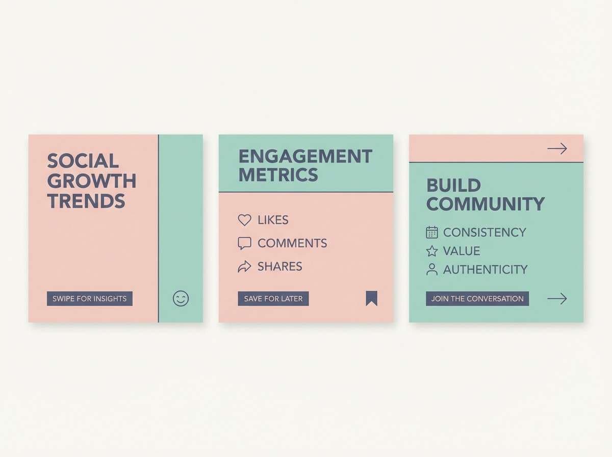
14) Pastel Dream Montage
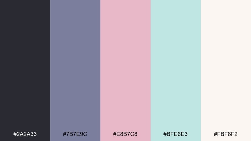
HEX: #2A2A33 #7B7E9C #E8B7C8 #BFE6E3 #FBF6F2
Mood: soft, hopeful, modern
Best for: social media carousel templates
Muted pastels with a smoky base feel like a tender montage and gentle lens flare. Use the off-white as your canvas, then alternate blush and seafoam blocks for slides and highlights. The desaturated indigo-gray keeps typography grounded and readable. Tip: pick one accent per slide to avoid a candy-like mix across the carousel.
Image example of pastel dream montage generated using media.io
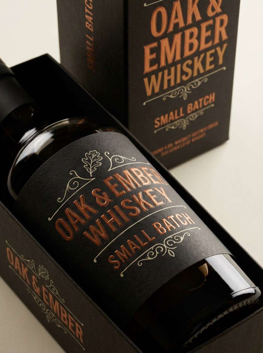
15) Smoke and Whiskey
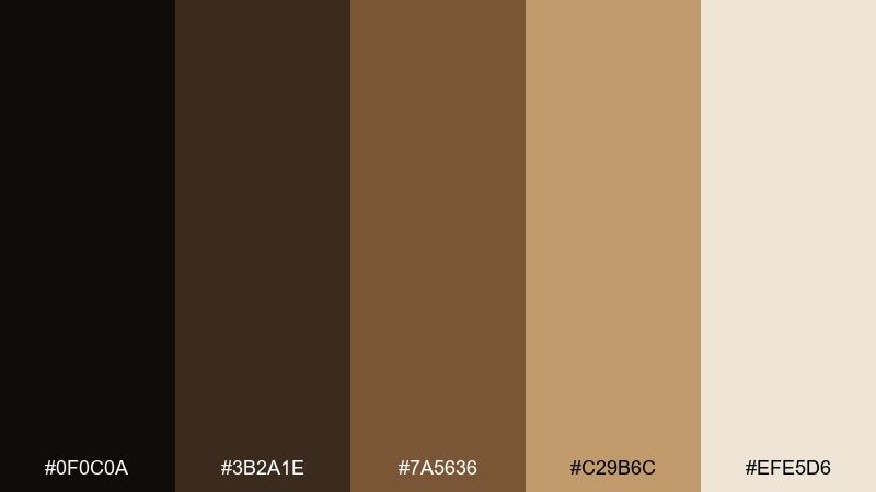
HEX: #0F0C0A #3B2A1E #7A5636 #C29B6C #EFE5D6
Mood: smoky, mature, intimate
Best for: whiskey bottle label and packaging
Smoky blacks and caramel browns evoke dim bars, oak barrels, and slow conversations. A cinematic color combination like this suits spirits packaging, vintage menus, and premium membership cards. Use the darkest tone for the label base, then bring in caramel for hierarchy and small brand marks. Tip: keep the light cream for fine print only, so it feels like aged paper, not bright white.
Image example of smoke and whiskey generated using media.io
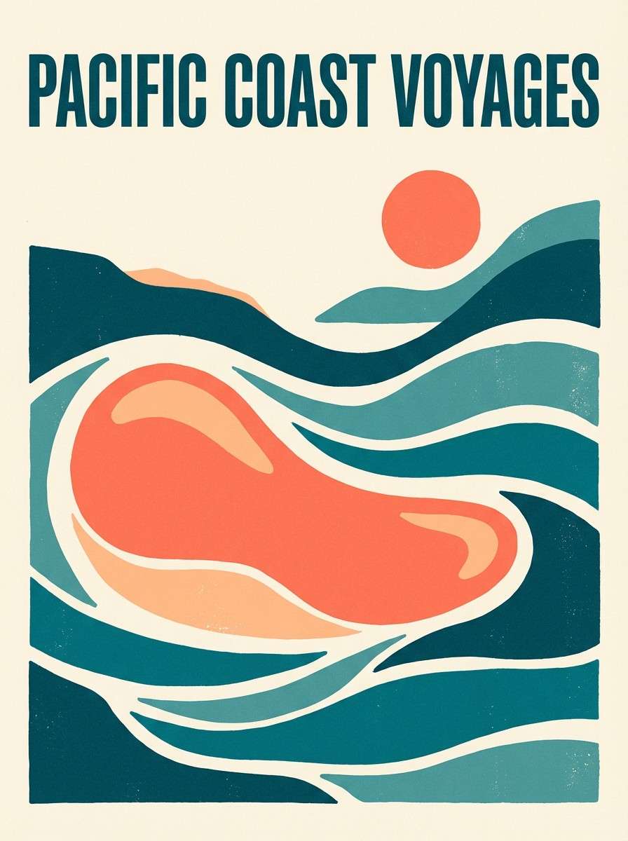
16) Coral Reef Adventure
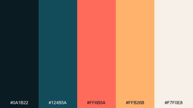
HEX: #0A1B22 #124B5A #FF6B5A #FFB26B #F7F0E8
Mood: adventurous, vibrant, tropical
Best for: travel poster graphic design
Deep teal and coral feel like reef shadows and sunlit water. Use the dark ocean tones for the main backdrop, then pop coral for location names and focal shapes. Warm peach works well for secondary highlights and decorative badges. Tip: limit coral to one or two strong elements so it reads punchy rather than busy.
Image example of coral reef adventure generated using media.io
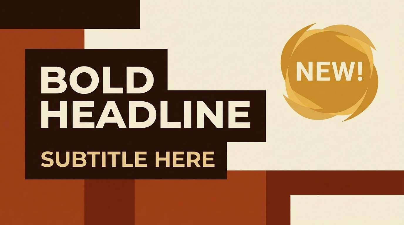
17) Autumn Roadtrip
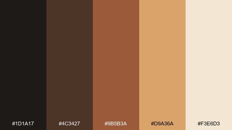
HEX: #1D1A17 #4C3427 #9B5B3A #D9A36A #F3E6D3
Mood: cozy, grounded, nostalgic
Best for: YouTube thumbnail template
Burnt browns and warm tan feel like roadside diners and late-fall light. Use the darkest tone for bold title contrast, then frame the layout with caramel and honey for warmth. The pale cream keeps small labels readable, especially in busy thumbnails. Tip: make honey your single highlight color for arrows or badges so the design stays clear at small sizes.
Image example of autumn roadtrip generated using media.io
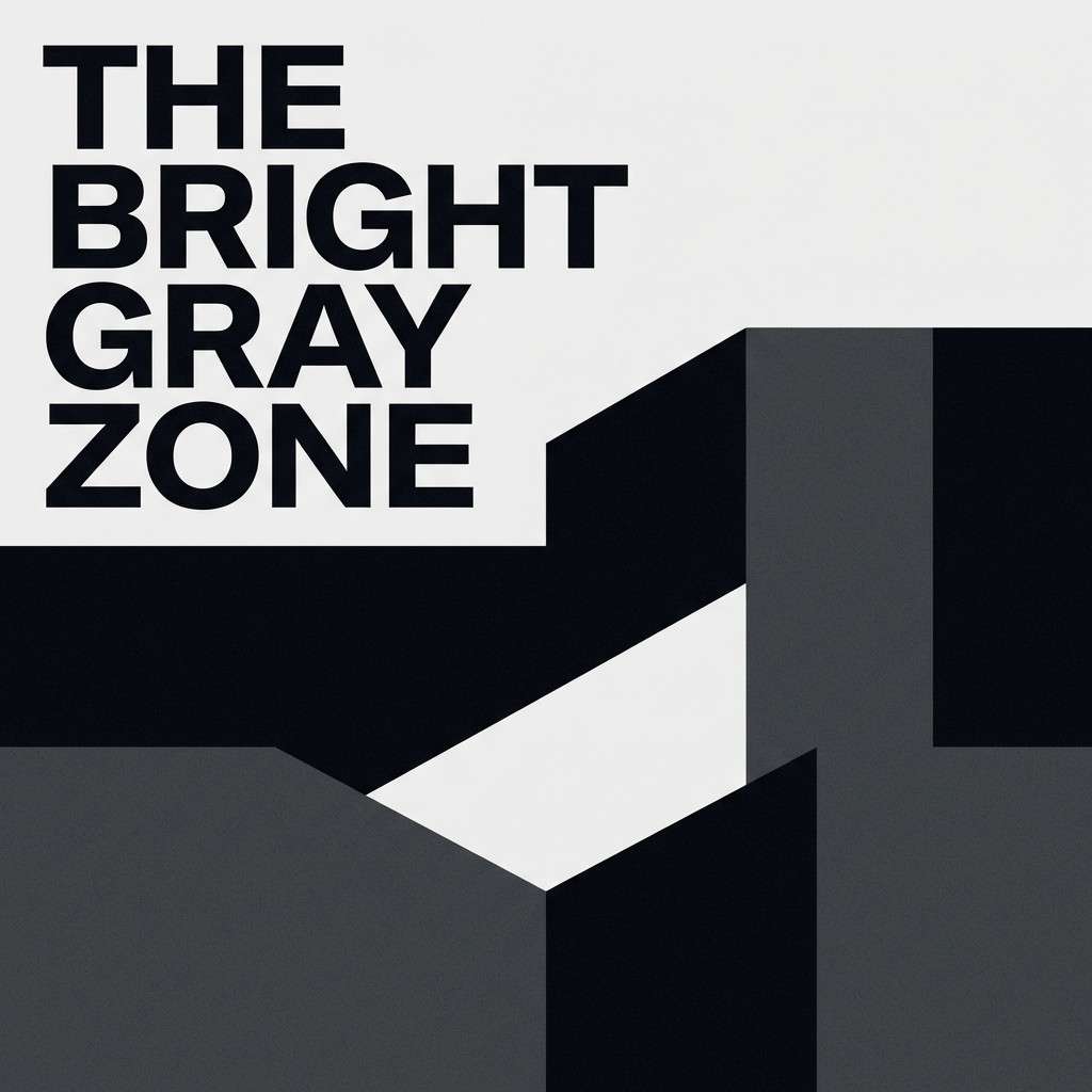
18) Monochrome Thriller
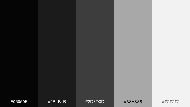
HEX: #050505 #1B1B1B #3D3D3D #A8A8A8 #F2F2F2
Mood: tense, minimal, sharp
Best for: crime podcast cover art
Hard blacks and silvery grays evoke interrogation rooms and stark shadows. This cinematic color palette is perfect for crime podcasts, investigative newsletters, and minimalist noir branding. Use near-black for the background, then push one bright gray element to guide the eye to the title. Tip: add a single thick rule line in mid-gray to create hierarchy without adding new colors.
Image example of monochrome thriller generated using media.io
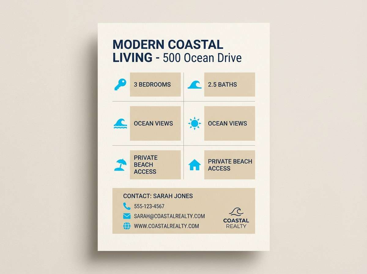
19) Sapphire and Sand
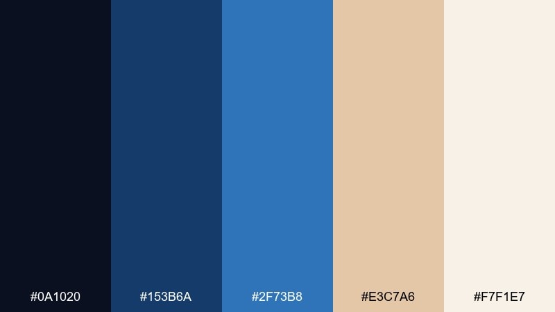
HEX: #0A1020 #153B6A #2F73B8 #E3C7A6 #F7F1E7
Mood: confident, coastal, polished
Best for: real estate brochure layout
Deep sapphire with sandy neutrals feels like coastline dusk and tailored linen. Use navy for section headers and key stats, then let sand tone highlight features and callouts. The brighter blue works best as a sparing accent for icons or maps. Tip: keep backgrounds mostly cream so the blues look crisp rather than heavy.
Image example of sapphire and sand generated using media.io
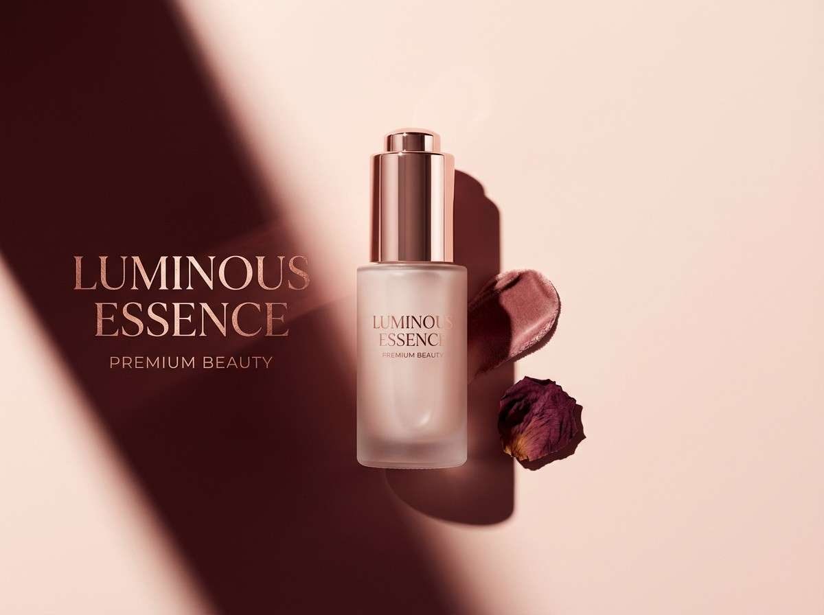
20) Rose Gold Premiere
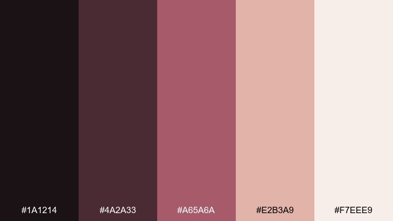
HEX: #1A1214 #4A2A33 #A65A6A #E2B3A9 #F7EEE9
Mood: glamorous, warm, elegant
Best for: beauty product ad in studio
Rosewood and blush highlights evoke premiere-night glow and soft spotlight makeup. Use the deep plum-brown for luxury contrast, then bring rose gold tones into the product name and key benefits. The pale blush background keeps everything looking clean and premium. Tip: use the mid-rose as the only saturated tone so the ad feels expensive, not overly sweet.
Image example of rose gold premiere generated using media.io
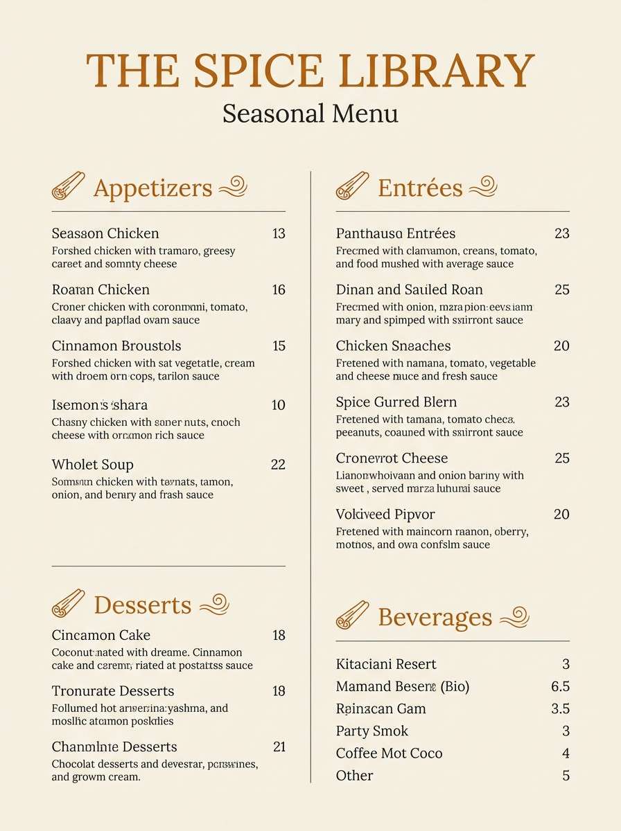
21) Paper Lantern Night
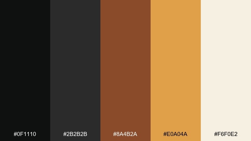
HEX: #0F1110 #2B2B2B #8A4B2A #E0A04A #F6F0E2
Mood: intimate, warm, lantern-lit
Best for: restaurant menu design
Warm lantern amber against dark neutrals feels like late-night street food and glowing paper shades. Use charcoal for the menu base and typography, then add amber for section headers and specials. The light cream keeps the design legible and print-ready. Tip: use the cinnamon brown for small icons or separators to add richness without clutter.
Image example of paper lantern night generated using media.io
What Colors Go Well with Cinematic?
Cinematic colors pair best with supportive neutrals: near-black, charcoal, off-white, fog gray, and warm cream. These “quiet” colors leave room for bold accents to feel intentional instead of loud.
For a modern film-grade look, combine cool shadows (navy, teal, indigo) with warm highlights (amber, sand, blush). This warm/cool split is a classic way to create depth and drama.
If you need extra flexibility, add one restrained accent (muted sage, dusty rose, or desaturated periwinkle) for labels, icons, and UI states—without breaking the cinematic mood.
How to Use a Cinematic Color Palette in Real Designs
Start with roles, not swatches: choose a dark base for backgrounds, a light neutral for surfaces, and one hero accent for calls-to-action or key titles. Then assign the remaining colors to secondary accents and dividers.
Keep contrast purposeful. Cinematic designs often use large dark areas and small bright details; that ratio helps your highlights feel like “light in a scene,” especially in posters and thumbnails.
Finish with texture cues—subtle grain, vignette, or soft shadow—so flat shapes feel like a graded frame. Use these effects lightly so your typography stays crisp.
Create Cinematic Palette Visuals with AI
If you want to preview a cinematic color scheme fast, generate simple poster, cover, UI, or packaging mockups from a prompt. This makes it easier to evaluate contrast, readability, and how accents behave at real sizes.
With Media.io, you can iterate quickly: tweak one color, swap ratios (1:1, 2:3, 16:9), and regenerate until the palette feels like the right “scene.”
Use the prompts under each palette as a starting point, then add your subject, brand name, and preferred typography style.
Cinematic Color Palette FAQs
-
What makes a color palette feel cinematic?
A cinematic palette usually has strong value contrast (deep shadows + controlled highlights), a limited number of saturated accents, and a warm/cool balance that mimics film color grading. -
How many colors should a cinematic palette include?
Five is a practical sweet spot: 1 dark base, 1–2 neutrals for surfaces/text, and 1–2 accents for focal points like titles, buttons, or badges. -
What are common cinematic color combinations?
Popular combinations include teal + amber, neon magenta + cyan on near-black, deep purple + lavender glow, and monochrome noir with one bright gray highlight. -
How do I keep cinematic palettes readable for UI?
Use neutrals for surfaces and text (off-white/charcoal), keep saturated colors for small components, and test contrast on the darkest two swatches before finalizing. -
Are cinematic palettes good for branding?
Yes—because they create a strong mood quickly. Anchor the brand with a neutral base and use one distinctive accent consistently across web, print, and social. -
How do I avoid making a cinematic palette look “too dark”?
Increase the share of light neutrals in backgrounds, reserve near-black for sections or overlays, and limit accents to one hero color so the design stays clear. -
Can I generate cinematic palette mockups with AI prompts?
Yes. Start with a layout-only prompt (poster/UI/cover), specify your dominant base color plus one accent, and add “subtle film grain” if you want a graded, tactile finish.


