

Chinese New Year palettes are built around symbolism: lucky reds, prosperity golds, and calming neutrals that keep the message readable across print and digital.
Below are modern Chinese New Year color palette ideas with HEX codes—ready for posters, invites, branding, UI, and social posts.
In this article
- Why Chinese New Year Palettes Work So Well
-
- lantern glow
- jade fortune
- firecracker pop
- porcelain gold
- lion dance pride
- lucky envelope
- plum blossom mist
- temple roof
- gold ingot shine
- midnight sparklers
- peach orchard blessing
- dragon parade neon
- paper cut classic
- cherry silk
- bamboo tea house
- crimson and charcoal ui
- apricot gold serenity
- gilded knot
- rice paper minimal
- festival night market
- red seal + ivory
- spring couplets fresh
- What Colors Go Well with Chinese New Year?
- How to Use a Chinese New Year Color Palette in Real Designs
- Create Chinese New Year Palette Visuals with AI
Why Chinese New Year Palettes Work So Well
Chinese New Year colors communicate celebration instantly—especially red and gold, which people associate with luck, joy, and prosperity across invitations, storefronts, and social graphics.
They also scale well. Strong warm hues create impact at thumbnail size, while supportive creams, charcoals, and deep blues keep typography crisp for schedules, pricing, and details.
Most importantly, the palettes flex from traditional to modern. You can go classic with rich reds and metallic gold, or shift toward jade greens and clean neutrals for contemporary branding.
20+ Chinese New Year Color Palette Ideas (with HEX Codes)
1) Lantern Glow
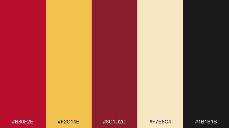
HEX: #B80F2E #F2C14E #8C1D2C #F7E6C4 #1B1B1B
Mood: festive, warm, cinematic
Best for: lunar new year event poster
Festive and cinematic like lantern light against a night street. Use the deep red as the headline color, then bring in gold for seals, borders, and icons. The cream keeps layouts readable, while the near-black grounds the whole look for print. Tip: add subtle paper texture so the gold feels less flat.
Image example of lantern glow generated using media.io
Media.io is an online AI studio for creating and editing video, image, and audio in your browser.

2) Jade Fortune
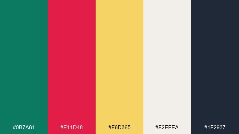
HEX: #0B7A61 #E11D48 #F6D365 #F2EFEA #1F2937
Mood: lucky, polished, modern
Best for: brand identity for a restaurant
Lucky and polished, like jade jewelry paired with a crisp red stamp. Let the green carry your primary brand blocks, then use bright red sparingly for calls to action and stamps. Warm gold reads as premium without looking flashy, while soft off-white keeps menus clean. Tip: keep the red to 10 to 15 percent so the jade stays sophisticated.
Image example of jade fortune generated using media.io
3) Firecracker Pop
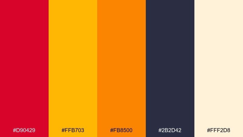
HEX: #D90429 #FFB703 #FB8500 #2B2D42 #FFF2D8
Mood: bold, energetic, playful
Best for: social media promo carousel
Bold and energetic, like firecrackers cracking open the night. These high-contrast reds and yellows make a chinese new year color palette that pops fast on small screens. Use the deep slate for type and dividers so the warm tones do not blur together. Tip: reserve the orange for one highlight element per slide to avoid visual noise.
Image example of firecracker pop generated using media.io
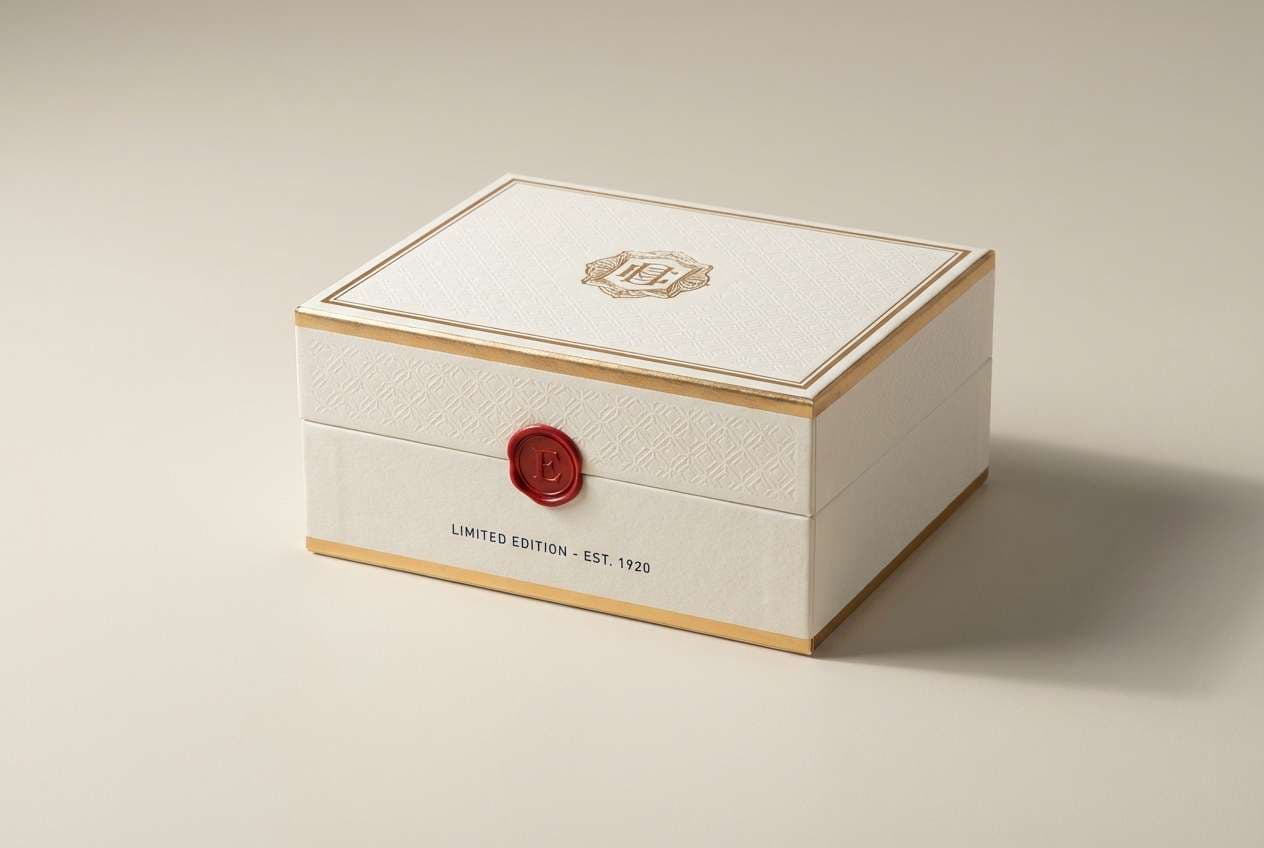
4) Porcelain Gold
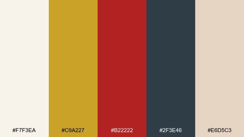
HEX: #F7F3EA #C9A227 #B22222 #2F3E46 #E6D5C3
Mood: elegant, airy, refined
Best for: premium gift box packaging
Elegant and airy, like porcelain with a thin gilded edge. Keep the off-white dominant for a luxury feel, then use metallic gold for lines, patterns, and foiled logos. The classic red works best as a small seal mark, while the blue-gray deepens text and shadows. Tip: pair gold with plenty of blank space to make it feel intentional, not busy.
Image example of porcelain gold generated using media.io
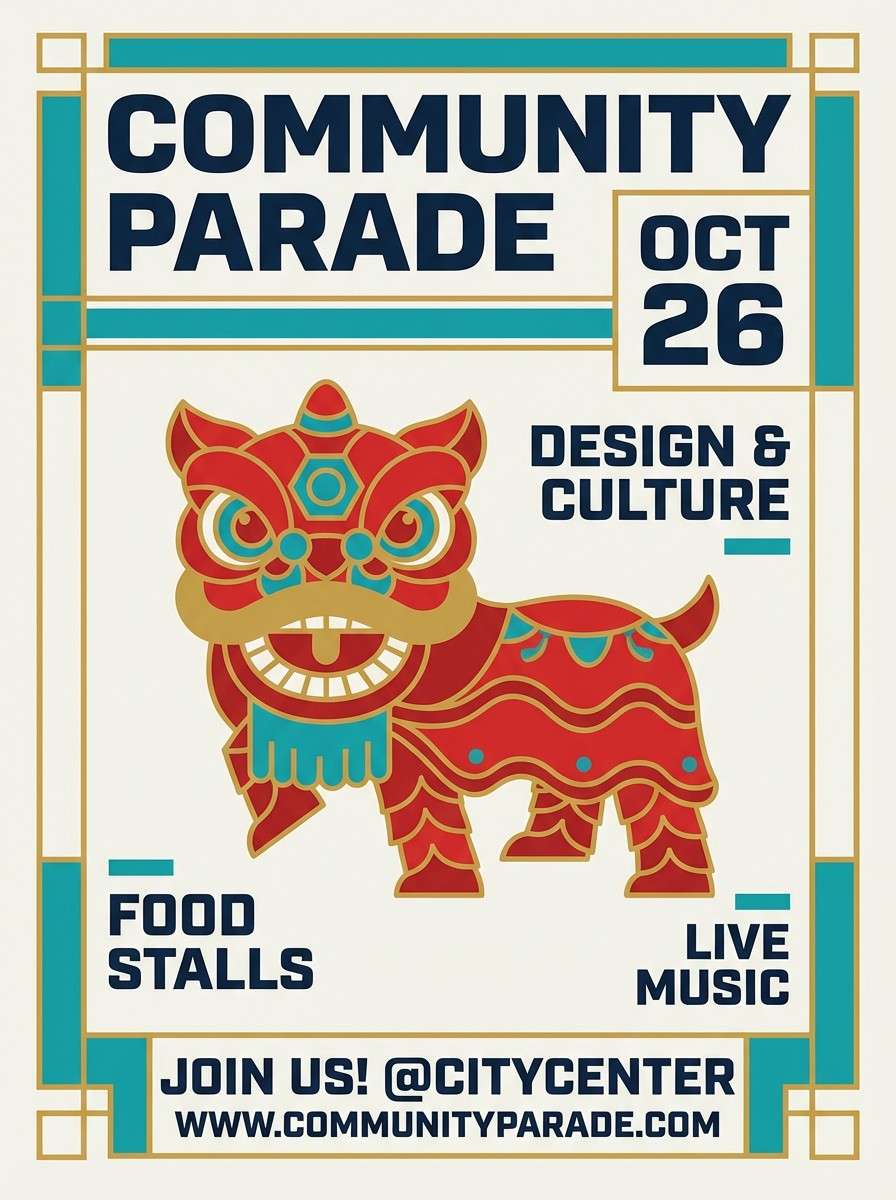
5) Lion Dance Pride
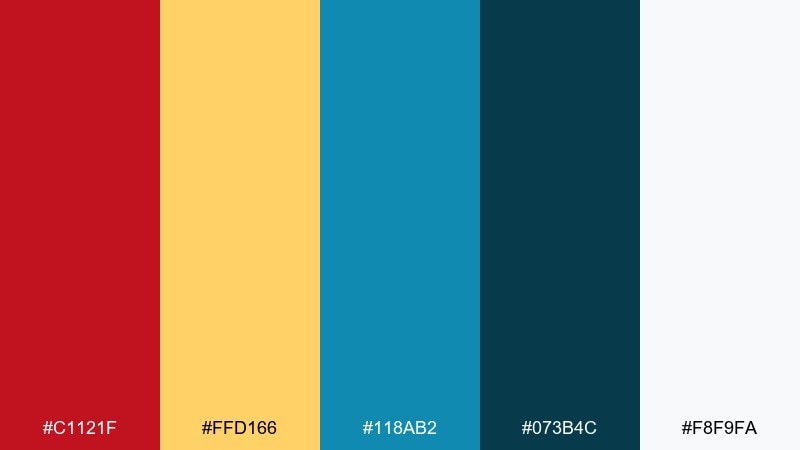
HEX: #C1121F #FFD166 #118AB2 #073B4C #F8F9FA
Mood: confident, lively, street-festival
Best for: community parade flyer
Confident and lively, like a lion dance costume under bright midday light. Let the red and gold lead the hierarchy, then use teal blues to add youthful contrast without losing tradition. White keeps the layout breathable, especially for schedules and locations. Tip: use the dark blue for body text so the red can stay reserved for titles and dates.
Image example of lion dance pride generated using media.io
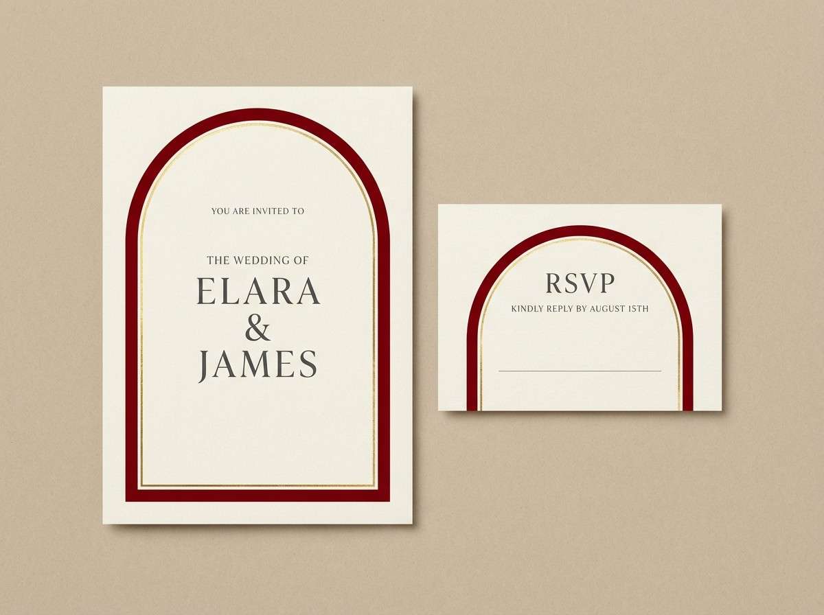
6) Lucky Envelope
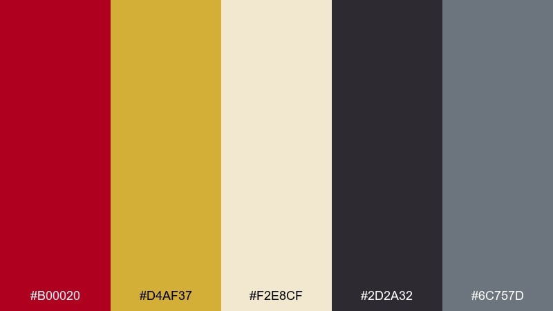
HEX: #B00020 #D4AF37 #F2E8CF #2D2A32 #6C757D
Mood: classic, auspicious, formal
Best for: wedding invitation set
Classic and formal, like a red envelope tied with a neat gold cord. These chinese new year color combinations work beautifully for invitation suites that need warmth without clutter. Use the cream for the base card, red for monograms and headers, and gold for borders or emboss details. Tip: keep body copy in charcoal and use gray for secondary lines to maintain a premium look.
Image example of lucky envelope generated using media.io
7) Plum Blossom Mist
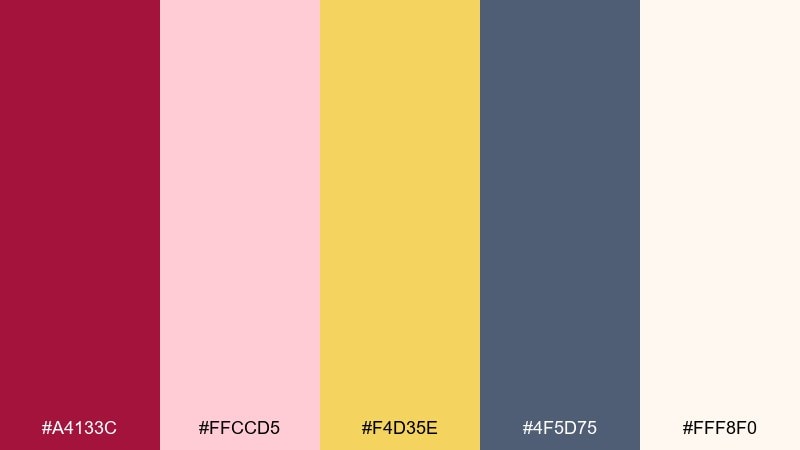
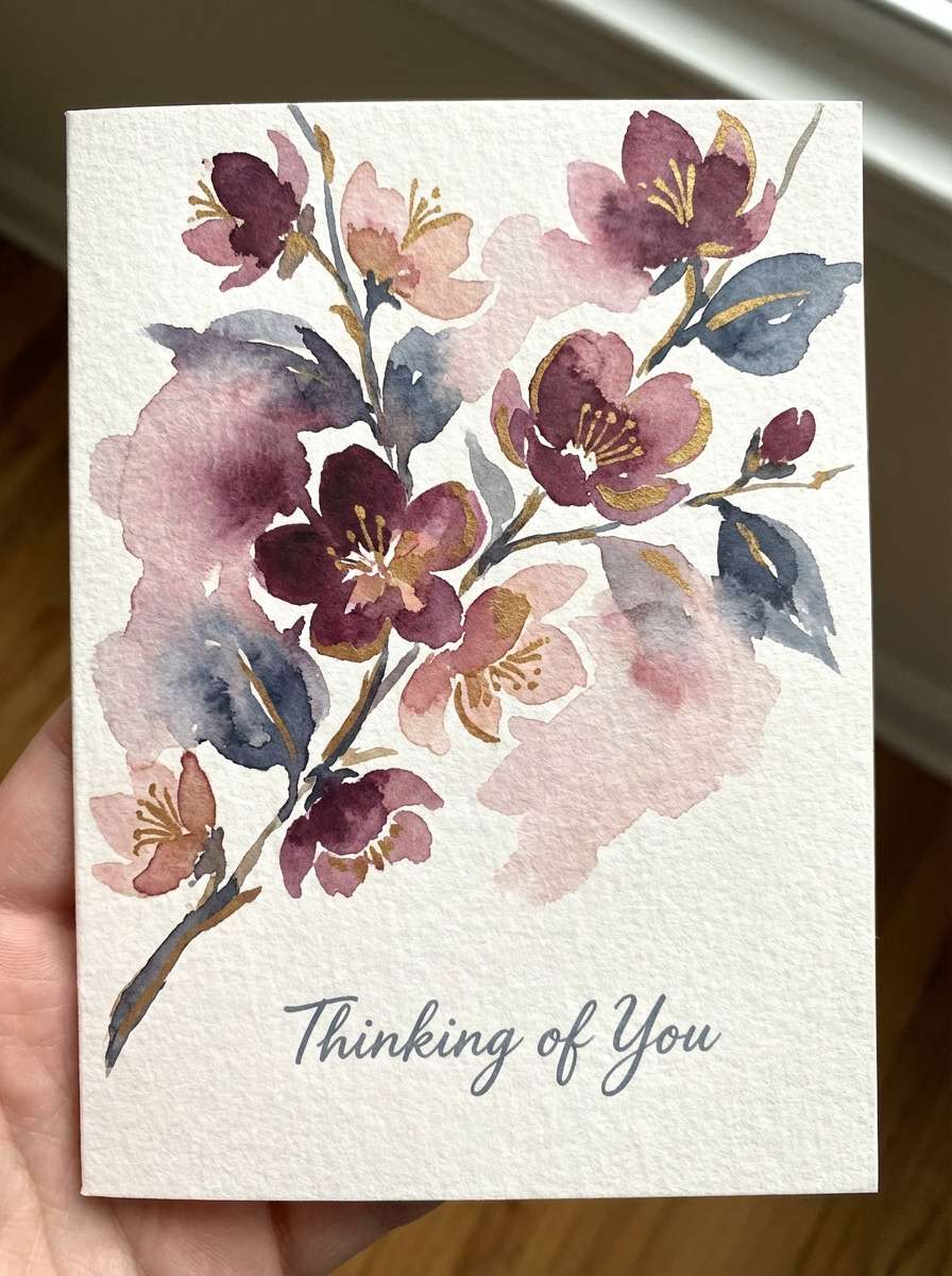
HEX: #A4133C #FFCCD5 #F4D35E #4F5D75 #FFF8F0
Mood: soft, romantic, hopeful
Best for: springtime greeting card illustration
Soft and hopeful, like plum blossoms in a light morning fog. Use the plum as your anchor shade and let blush pink fill large shapes for an airy, friendly feel. A small hit of warm gold adds celebration without turning the card too loud. Tip: keep outlines in the muted slate so the illustration stays gentle.
Image example of plum blossom mist generated using media.io
8) Temple Roof
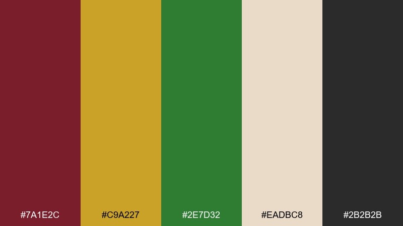
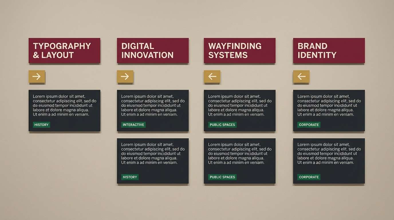
HEX: #7A1E2C #C9A227 #2E7D32 #EADBC8 #2B2B2B
Mood: heritage, grounded, stately
Best for: museum exhibit signage
Grounded and stately, like painted beams and roof tiles in an old courtyard. Use the maroon for headers and directional arrows, then bring in gold for section markers. The deep green makes a strong accent for highlights or category tags without competing with red. Tip: keep the beige as your main background so the signage reads clearly from a distance.
Image example of temple roof generated using media.io
9) Gold Ingot Shine
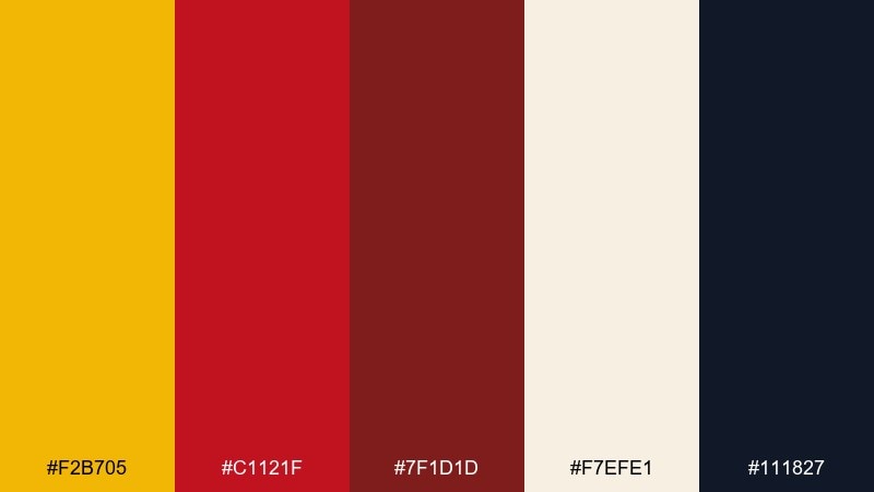
HEX: #F2B705 #C1121F #7F1D1D #F7EFE1 #111827
Mood: rich, celebratory, high-contrast
Best for: ecommerce hero banner
Rich and celebratory, like gold ingots catching a spotlight. Let the gold dominate the hero area, then use layered reds for urgency and depth in price tags or badges. Cream keeps the banner from feeling heavy, and near-black makes small text legible. Tip: use the darkest red for shadows and outlines to avoid muddy gradients.
Image example of gold ingot shine generated using media.io

10) Midnight Sparklers
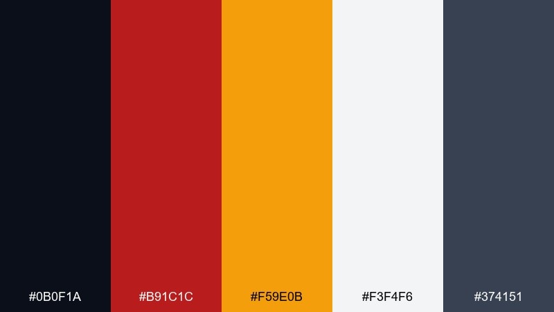
HEX: #0B0F1A #B91C1C #F59E0B #F3F4F6 #374151
Mood: dramatic, modern, night-market
Best for: mobile app splash screen
Dramatic and modern, like sparklers glowing in a midnight crowd. Use the near-black as the main field so the red and amber feel electric and focused. Light gray keeps logos and microcopy readable without turning the screen stark white. Tip: keep gradients subtle and let the amber be the only bright glow element.
Image example of midnight sparklers generated using media.io
11) Peach Orchard Blessing
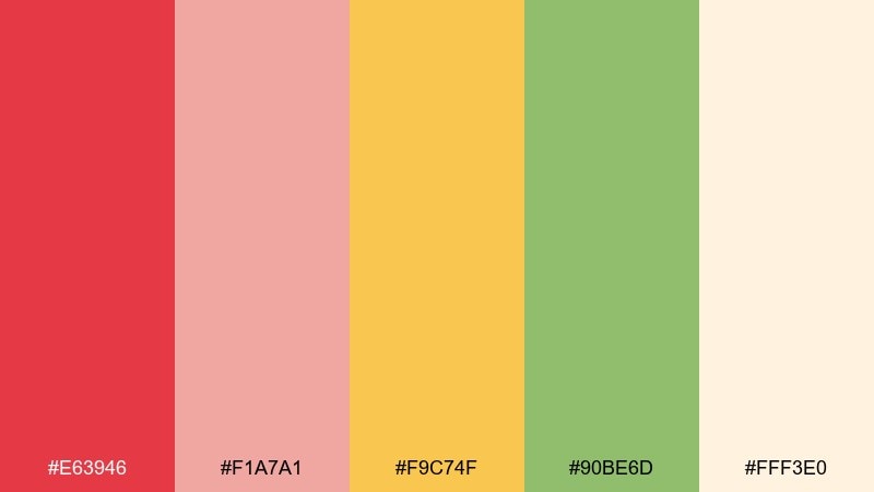
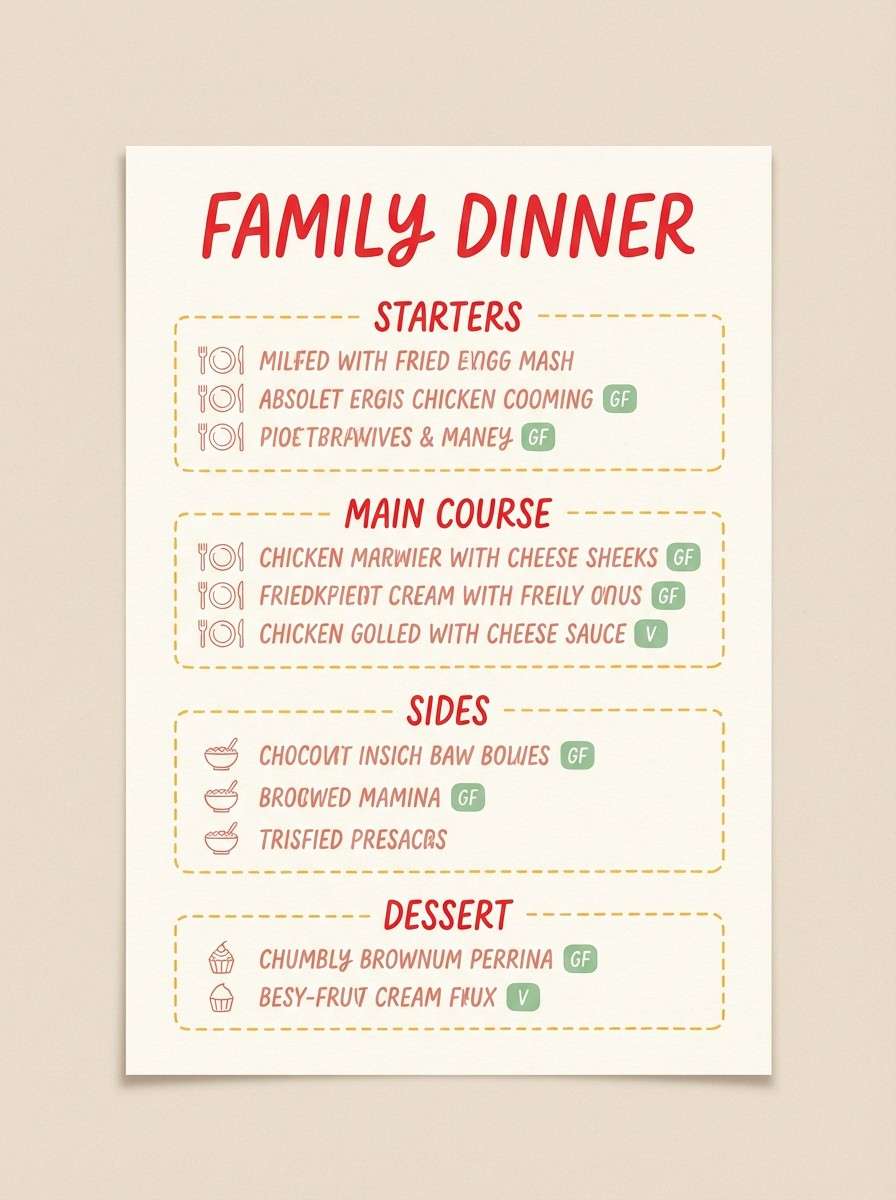
HEX: #E63946 #F1A7A1 #F9C74F #90BE6D #FFF3E0
Mood: sweet, welcoming, family-friendly
Best for: family dinner menu card
Sweet and welcoming, like a peach orchard picnic with festive touches. Use the blush and cream as your main canvas, then bring in the bright red for section titles and small icons. Yellow adds a cheerful highlight, while the green feels fresh for vegetarian labels or side notes. Tip: keep the red limited to key hierarchy so the softer tones stay in control.
Image example of peach orchard blessing generated using media.io
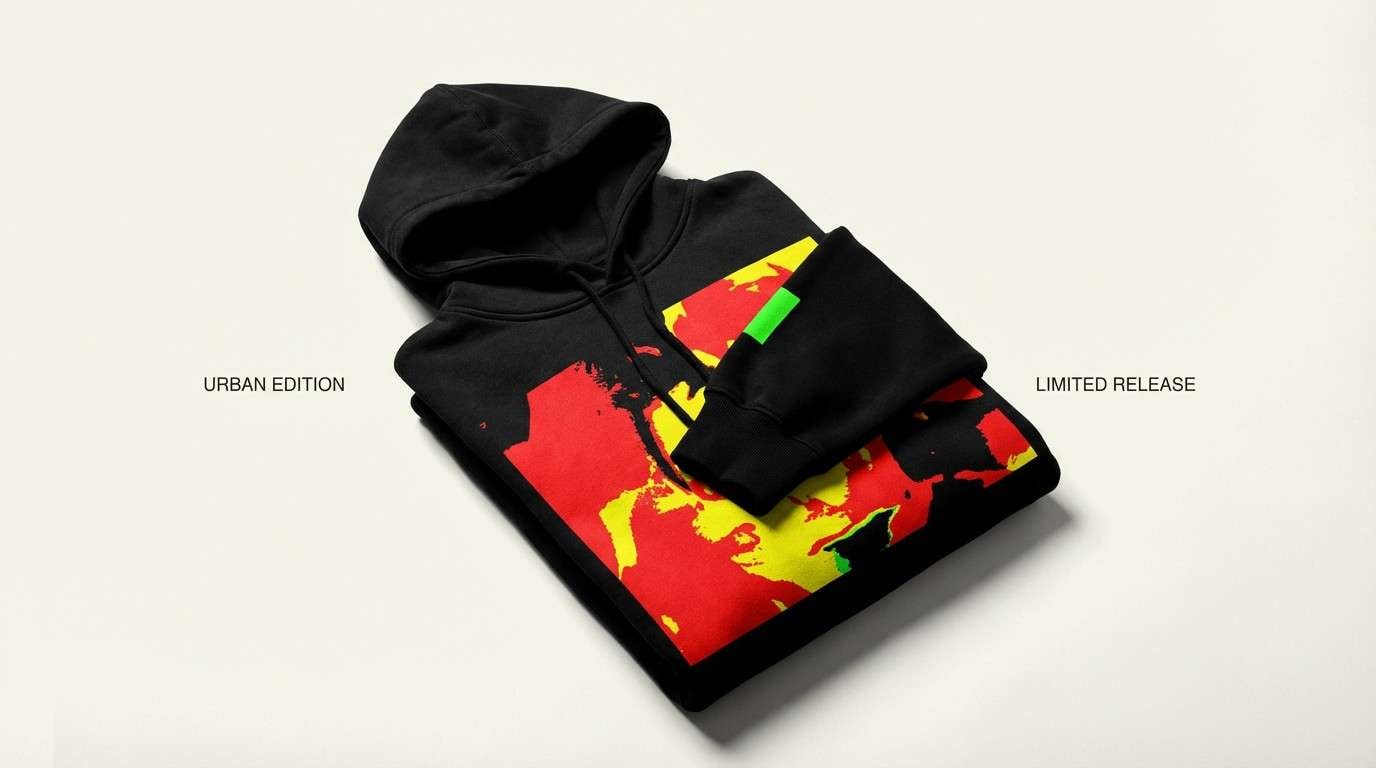
12) Dragon Parade Neon
HEX: #E10600 #FFCC00 #00A676 #0A0A0A #F5F1E8
Mood: electric, youthful, attention-grabbing
Best for: streetwear product ad
Electric and youthful, like a dragon parade lit by storefront signs. Use black as the base so the red and yellow read like neon, then add green for a sharp secondary pop. The off-white works for small copy blocks and labels without stealing contrast. Tip: keep shapes chunky and simple so the colors do the heavy lifting.
Image example of dragon parade neon generated using media.io
13) Paper Cut Classic
HEX: #9B111E #CDA434 #F4E7D3 #6B705C #2F2F2F
Mood: traditional, cozy, handcrafted
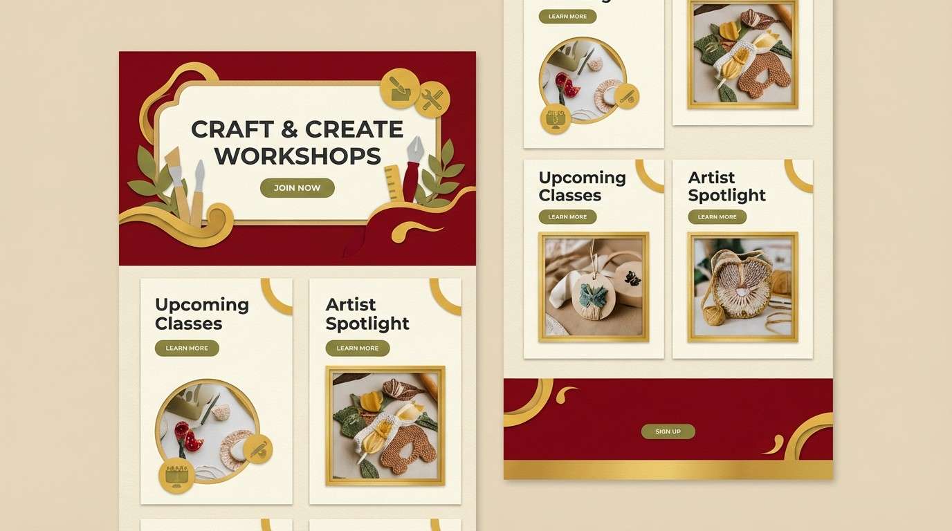
Best for: craft workshop landing page
Traditional and handcrafted, like paper-cut art pinned to a warm wall. This chinese new year color palette feels authentic when you lean on the rich red and pair it with soft, fibrous neutrals. Use the olive tone for secondary buttons or badges, keeping charcoal for readable body text. Tip: add subtle cutout shadows to reinforce the handmade vibe without clutter.
Image example of paper cut classic generated using media.io
14) Cherry Silk
HEX: #C2185B #8E2A3A #F6E3D5 #D4AF37 #3D3A4B
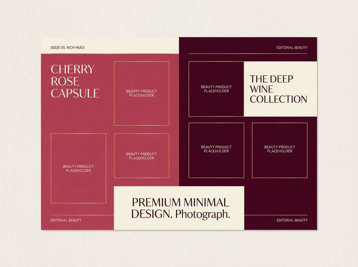
Mood: luxurious, romantic, editorial
Best for: beauty campaign lookbook
Luxurious and romantic, like cherry silk with a gold clasp. Use the rose and wine tones for large color fields and cover typography, then let cream soften product descriptions. Gold is best as a foil detail or small line work so it stays elegant. Tip: keep background photography minimal and warm-toned so the palette reads clearly on the page.
Image example of cherry silk generated using media.io
15) Bamboo Tea House
HEX: #2D6A4F #40916C #B5172D #F2E8CF #1B4332
Mood: calm, natural, balanced
Best for: tea packaging labels
Calm and natural, like steam rising in a bamboo tea house. Use layered greens for the label base and ingredient panels, then add a small red stamp for authenticity and contrast. The warm cream gives plenty of breathing room for typography and icons. Tip: keep the darkest green for barcodes and fine print to maintain a cohesive, earthy look.
Image example of bamboo tea house generated using media.io
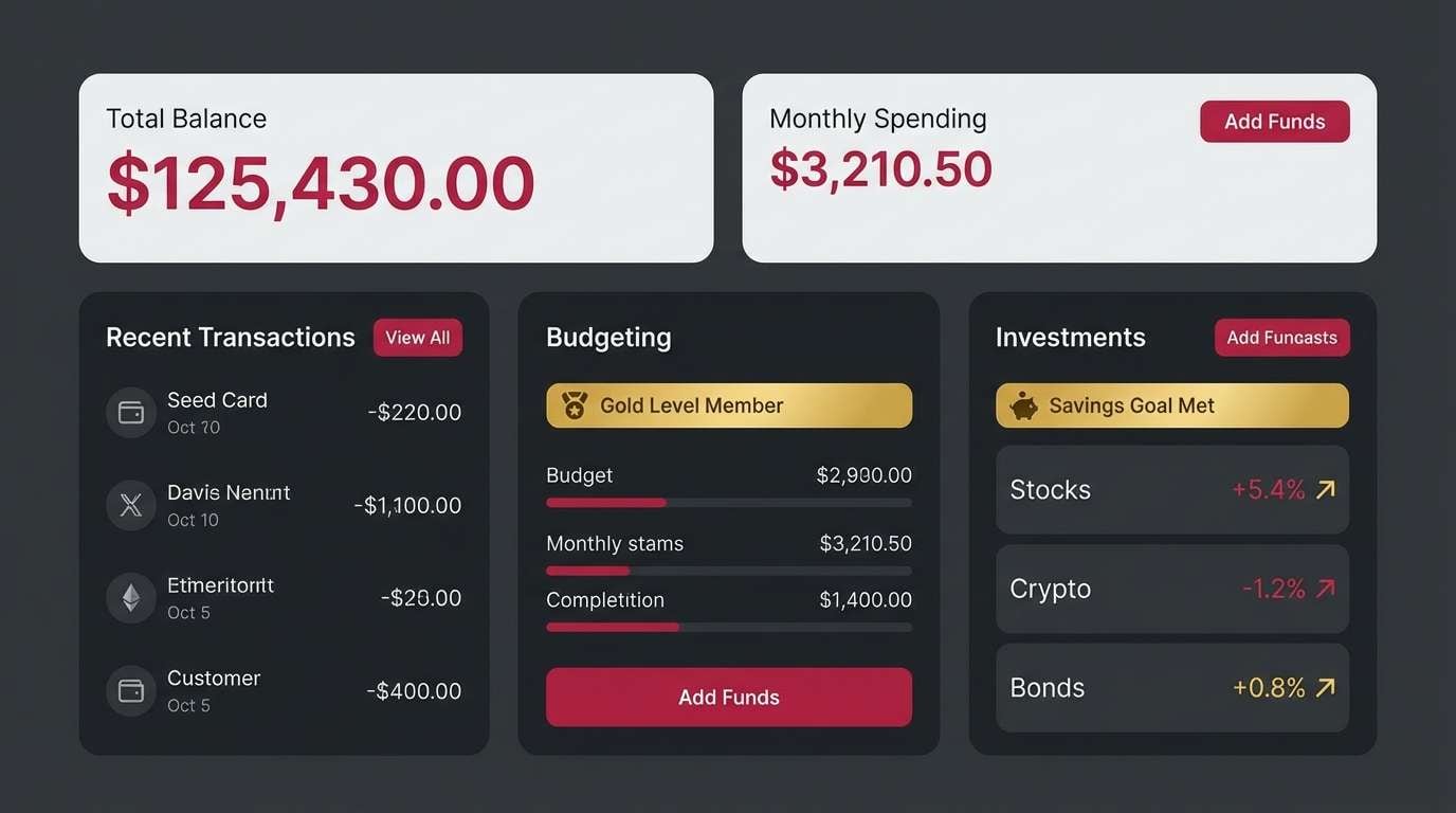
16) Crimson and Charcoal UI
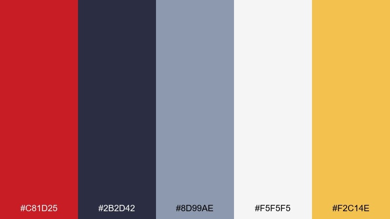
HEX: #C81D25 #2B2D42 #8D99AE #F5F5F5 #F2C14E
Mood: sleek, structured, professional
Best for: finance dashboard UI
Sleek and structured, like a red seal on crisp paperwork. Use charcoal and light gray for the core interface, then reserve crimson for primary actions and critical alerts. Warm gold works nicely for progress highlights and badges without looking like a warning color. Tip: keep red elements consistent in size so the hierarchy stays calm and predictable.
Image example of crimson and charcoal ui generated using media.io
17) Apricot Gold Serenity
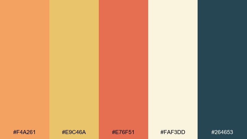
HEX: #F4A261 #E9C46A #E76F51 #FAF3DD #264653
Mood: soft, sunny, optimistic
Best for: wellness studio flyer
Soft and sunny, like apricot light through a window. Use the creamy background to keep the flyer calm, then layer apricot and gold for headings and gentle shapes. The teal adds a grounded counterpoint for schedules and contact details. Tip: avoid heavy outlines and instead separate sections with color blocks at low contrast.
Image example of apricot gold serenity generated using media.io

18) Gilded Knot
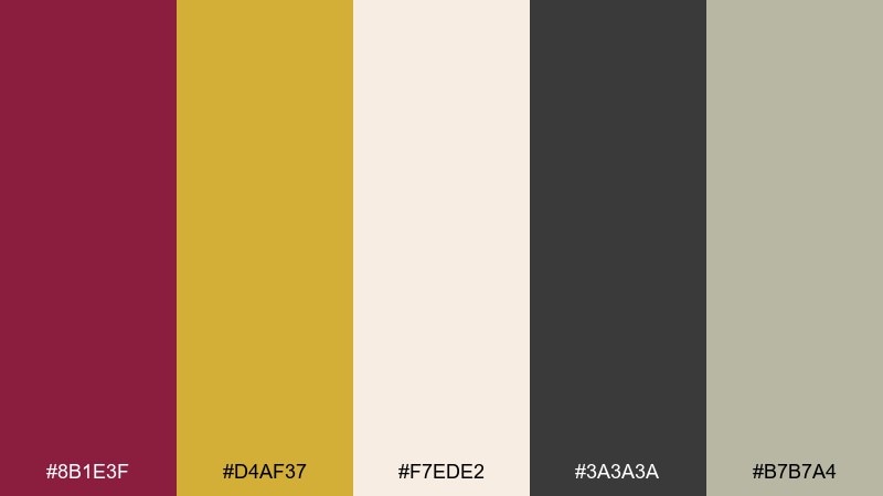
HEX: #8B1E3F #D4AF37 #F7EDE2 #3A3A3A #B7B7A4
Mood: ornate, ceremonial, timeless
Best for: luxury hotel seasonal campaign
Ornate and ceremonial, like a decorative knot with polished brass. Build your campaign with soft cream and warm gray-green, then elevate key moments with maroon and gold. The charcoal keeps headlines sharp and modern, especially on web banners. Tip: use gold for thin strokes, not fills, so it reads as refinement rather than glitter.
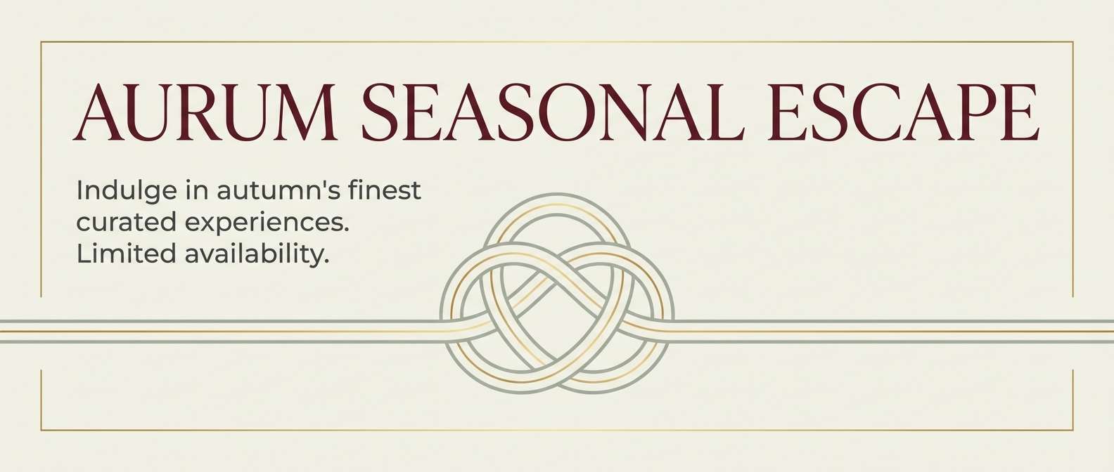
Image example of gilded knot generated using media.io
19) Rice Paper Minimal
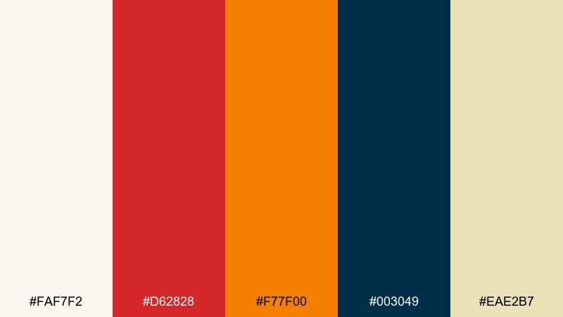
HEX: #FAF7F2 #D62828 #F77F00 #003049 #EAE2B7
Mood: clean, modern, quietly festive
Best for: minimalist menu UI
Clean and quietly festive, like ink on rice paper with a small red seal. This chinese new year color combinations set makes it easy to keep screens bright while still feeling celebratory. Use navy for text and navigation, keep the off-whites dominant, and bring in red or orange only for selected states. Tip: choose one warm accent per view so the interface stays calm.
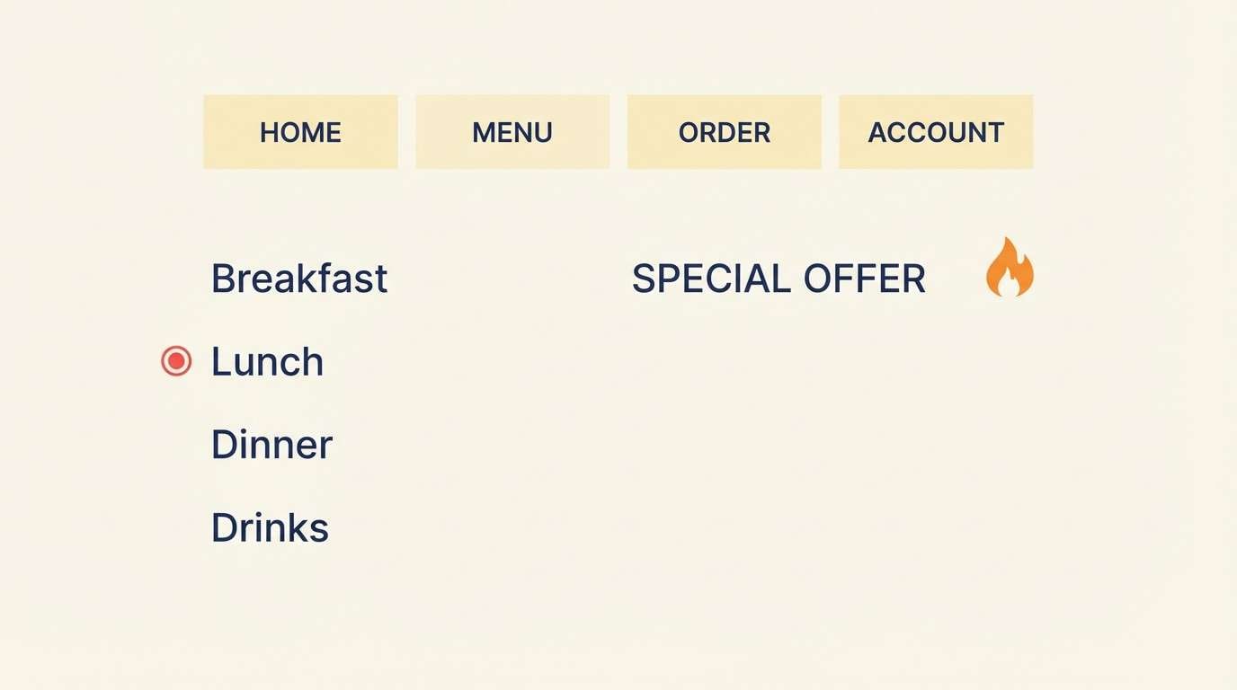
Image example of rice paper minimal generated using media.io
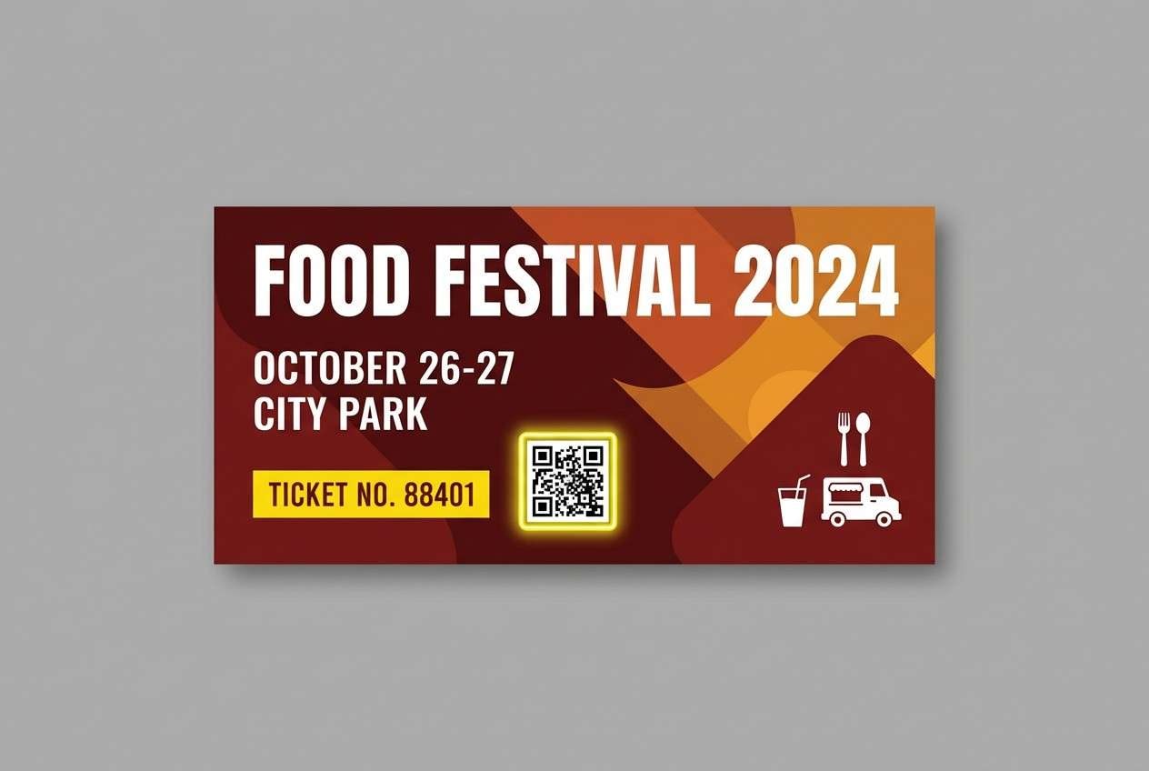
20) Festival Night Market
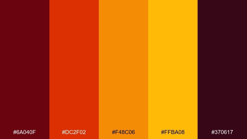
HEX: #6A040F #DC2F02 #F48C06 #FFBA08 #370617
Mood: spicy, warm, immersive
Best for: food festival ticket design
Spicy and immersive, like smoky grills and glowing stall lights. Treat the darkest maroon as your base, then stack orange and amber for energy and movement. The bright yellow is best for ticket numbers, QR frames, or a single punchy badge. Tip: keep text in the deepest tone and avoid pure black so the palette stays cohesive.
Image example of festival night market generated using media.io
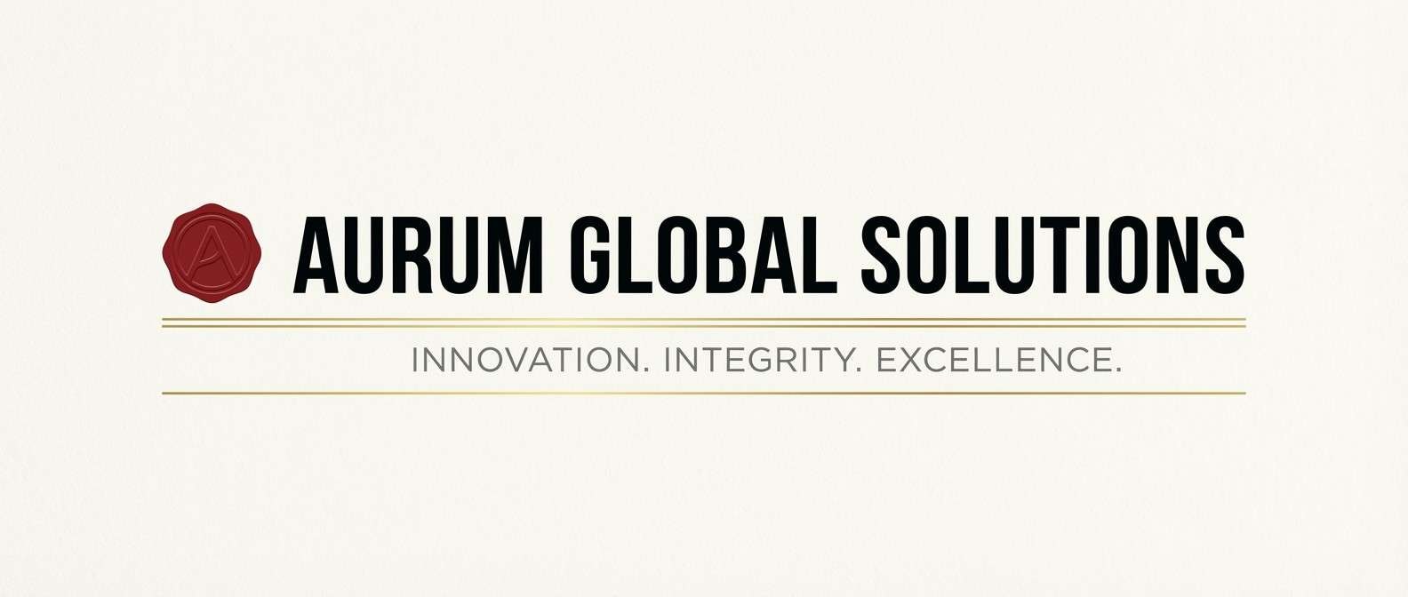
21) Red Seal + Ivory
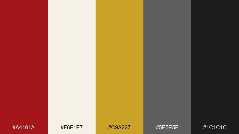
HEX: #A4161A #F6F1E7 #C9A227 #5E5E5E #1C1C1C
Mood: formal, balanced, print-ready
Best for: corporate new year email header
Formal and print-ready, like an ivory letterhead finished with a red seal. The ivory base keeps messaging clean, while gold adds a subtle premium cue for dividers and icons. Use gray for secondary copy and near-black for the main headline to maintain clarity. Tip: make the red a single focal mark so the header feels confident, not loud.
Image example of red seal + ivory generated using media.io
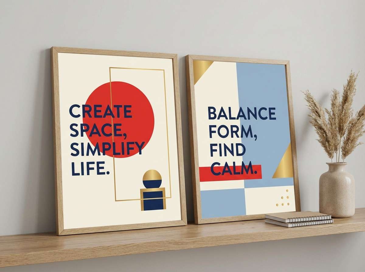
22) Spring Couplets Fresh
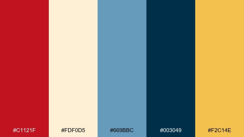
HEX: #C1121F #FDF0D5 #669BBC #003049 #F2C14E
Mood: cheerful, airy, contemporary
Best for: home decor mock poster set
Cheerful and airy, like fresh couplets on a bright doorway. Use red and cream for the main poster pair, then bring in blues as a contemporary counterbalance that still feels calm. Gold is perfect for small motifs and corner marks to hint at tradition. Tip: keep the blue reserved for one poster in the set to create a clear focal point.
Image example of spring couplets fresh generated using media.io
What Colors Go Well with Chinese New Year?
Red pairs naturally with gold, cream, and near-black for a classic festive look that still reads clean in modern layouts. Adding ivory or warm beige prevents large red areas from feeling heavy.
For a contemporary twist, combine red and gold with jade/emerald greens or deep teal blues. These cooler accents create contrast while keeping the cultural cues intact.
If you need a calmer aesthetic (menus, wellness, minimal UI), keep off-whites dominant and use red as a “seal” accent, backed by navy or charcoal for text.
How to Use a Chinese New Year Color Palette in Real Designs
Start with hierarchy: pick one dominant background (cream, ivory, near-black), one primary festive color (red or jade), and one accent (gold or amber). This keeps banners, posters, and carousels consistent.
For print (packaging, invitations), lean on high-contrast pairings like red + ivory + charcoal, and reserve gold for thin lines, borders, or foil-like highlights.
For screens (UI, email headers), keep warm accents limited to key states: primary buttons, badges, date blocks, or a single hero element—so the interface stays readable and premium.
Create Chinese New Year Palette Visuals with AI
If you already have HEX codes, you can turn them into posters, banners, product mockups, and social templates by describing a layout and specifying which colors should dominate.
With Media.io, you can generate multiple visual directions fast—traditional, minimalist, luxury, or neon—then iterate by adjusting motifs (lanterns, seals, knots) and lighting.
Use the prompts above as a starting point, then swap typography style, aspect ratio, and scene type to match your brand.
Chinese New Year Color Palette FAQs
-
What are traditional Chinese New Year colors?
Traditional Chinese New Year colors are red and gold, often supported by black/charcoal and cream/ivory for contrast and readability. -
Why is red used so much in Chinese New Year designs?
Red is widely associated with good fortune and celebration, so it instantly signals the holiday—especially in posters, envelopes, and storefront graphics. -
Can I use green in a Chinese New Year color palette?
Yes. Jade and emerald greens work well as modern secondary colors, especially with warm gold and off-white to keep the look balanced. -
How do I keep a red-and-gold palette from looking too loud?
Make a neutral (ivory, cream, or near-black) the dominant background, and use gold as thin strokes or small highlights instead of large fills. -
What are good neutral colors to pair with Chinese New Year reds?
Ivory, warm beige, soft off-white, charcoal, and deep navy are dependable neutrals that preserve contrast and keep layouts premium. -
Which Chinese New Year palette works best for UI design?
Try “Crimson and Charcoal UI” or “Rice Paper Minimal” because they prioritize readable neutrals and use red/orange as controlled action accents. -
How can I generate Chinese New Year visuals from a palette?
Use an AI text-to-image tool, describe the design type (poster, ticket, banner), specify dominant colors, and include a simple motif like a seal, lantern, or knot.
Next: Tuscan Red Color Palette


